By Phil Hecken
Follow @PhilHecken
Greetings and Happy Saturday, folks! We made it to the weekend. Hope everyone had a good week.
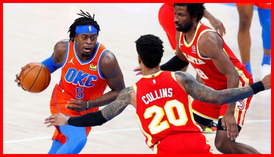
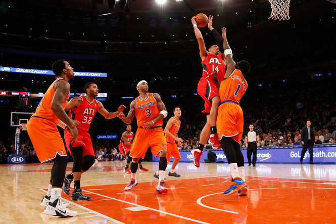
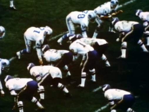
As you may have heard by now, there was a major uni screwup in OKC last night, as the visiting Atlanta Hawks, wearing their “icon” (red) uniforms took the court against the Oklahoma City Thunder, who were dressed in their “statement” (orange) uniforms. The lack of contrast was, predictably, awful:
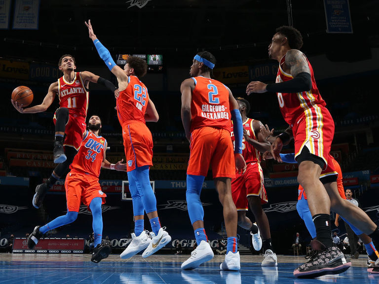
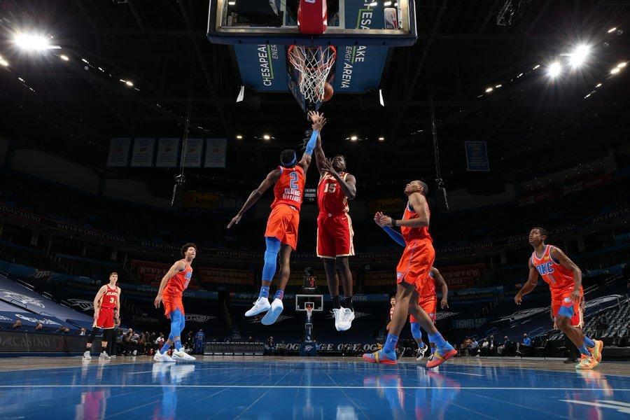
From a distance it was tough to tell which team was which. It wasn’t much better in close:
For those watching on television, it was pretty brutal:
JC went to work in the first half! He leads the squad with 15 points and 6 rebounds.
📹 Presented by @Verizon pic.twitter.com/vyoIZ44yV8
— Atlanta Hawks (@ATLHawks) February 27, 2021
The matchup was so comically bad, even the NBA on ESPN’s twitter account had some fun with it:
The red vs. orange jerseys 😅😅😅 pic.twitter.com/by73UAz2KL
— NBA on ESPN (@ESPNNBA) February 27, 2021
…which did not go unnoticed by the road team…
.@okcthunder maybe y'all should change? 🤷♂️ https://t.co/Wf4KrQ5gxJ
— Atlanta Hawks (@ATLHawks) February 27, 2021
Now, the red vs. orange, in and of itself, was particularly uni-noteworthy. The question is how did this even get on the court? I was reminded of a very similar situation, which happened in 2013, between the New York Knicks and those same Atlanta Hawks:
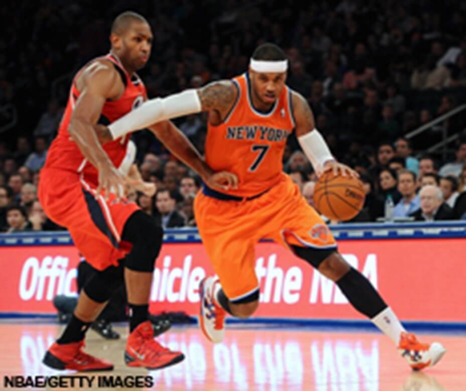
So, red vs. orange isn’t even unprecedented in the NBA. But this wasn’t supposed to happen under Nike — every game has the uniforms scripted, and if the colors are too close, then the matchups are rejected. Back in 2013, the protocol was different, and (I’m doing this from memory but I’m pretty sure) back then color uniforms were designated as “light” and “dark” — so you couldn’t have a dark vs. dark or light vs. light matchup. The Knicks orange alternates were actually designated as “light,” so the red/orange pairing was deemed acceptable. Obviously, it wasn’t and the NBA vowed never to let something like this happen again. But yet, it did.
Someone obviously screwed up, but who? Early reports were blaming the Hawks:
Per an OKC spokesperson: "The Hawks are wearing the incorrect uniform color for the game. The league process of inputting uniform colors should have caught the orange/red combo, but because the Hawks only have red uniforms on the trip, the Thunder will switch to white…"
— Royce Young (@royceyoung) February 27, 2021
Since the Hawks were on the road, they had only brought along their red uniforms. So should they have brought along another of the half dozen or so they could wear?
Not so fast. According to “LockerVision,” which lists all the matchups, it was the Thunder who were at fault:
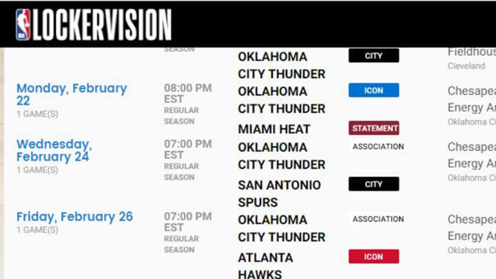
The Thunder’s “association” uniform is white (it’s the “statement” uniform that is orange), so they should have been in their white unis for last night’s game. But…was it?
Here’s a listing of the OKC Thunder uniforms for 2020-21.
OK, so it was a simple screwup, right? Not so fast. Somehow the uniform matchup had to have been listed as the Hawks in their red (icon) uniforms, vs. the Thunder in their orange (statement) uniforms, because the great uni tracking site, OKC Tracker, noticed the potential snafu the day before this game (February 25):
Tomorrow's uniform matchup is scheduled to be the Thunder in orange vs the Hawks in red.
What did we do to deserve this? 😳 pic.twitter.com/0VW9xM7rBG
— OKC ⚡️ Tracker (@OKCTracker) February 25, 2021
UPDATE:
Turns out LockerVision originally had the matchup scheduled to be orange vs. red:
Thunder PR threw Atlanta under the bus but they wore the correct uniforms. @UniWatch pic.twitter.com/uO7f3EtJu5
— Patrick (@PatrickCahiII) February 27, 2021
Turns out it was retroactively “updated” to show the Thunder as wearing white, but that one slipped through the cracks. So who’s at fault? If the Thunder were supposed to wear orange, then it’s just one of those things (the once in 4,000 as described in the ESPN piece below). Maybe it wasn’t the Thunder — but it definitely wasn’t the Hawks.
So clearly, somehow, this game was destined to have a uni snafu. If you’re not familiar with NBA uniform matchup protocol, this ESPN article offers a good bit of instruction:
With teams having multiple combinations and alternates to wear, and no longer observing the traditional standard of home white and road color, the uniform-selection process is done before the season for the entire schedule using an input system called LockerVision. The home team picks first, then the road team.
The league double-checks all combinations and approves them, but the Thunder and Hawks mistakenly slipped through the approval process, according to a league spokesperson.
Typically, when there are close contrasts, such as the red-orange issue with OKC and Atlanta, the league catches it and corrects it before it happens. According to a league source, this is the first time in more than 4,000 games since the system was introduced that this has happened.
So, how did this become an NBA first (especially if the Knicks and Hawks had basically made this same mistake about eight years earlier)? Well, in that Knicks/Hawks game, both teams played the entire game in red/orange. What was a first (at least as far as I can tell) was the fact that the NBA put the kibosh on the matchup, telling the Thunder to switch to their white uniforms. They made the switch at halftime, and it’s believed this is the first time an NBA team has ever switched uniforms at halftime.
The twitter account for the NBA on ESPN had some more fun with that switch:
OKC changed to white uniforms at the half 😅 pic.twitter.com/RBfMTK1KJ1
— NBA on ESPN (@ESPNNBA) February 27, 2021
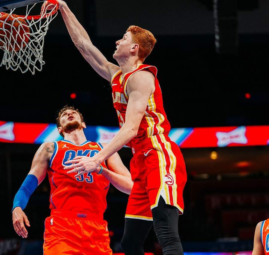
Obviously the game looked much better with OKC in white:
The hands. The eyes. The feet. #SGA | #ThunderUp pic.twitter.com/TGBMrdhC1S
— OKC THUNDER (@okcthunder) February 27, 2021
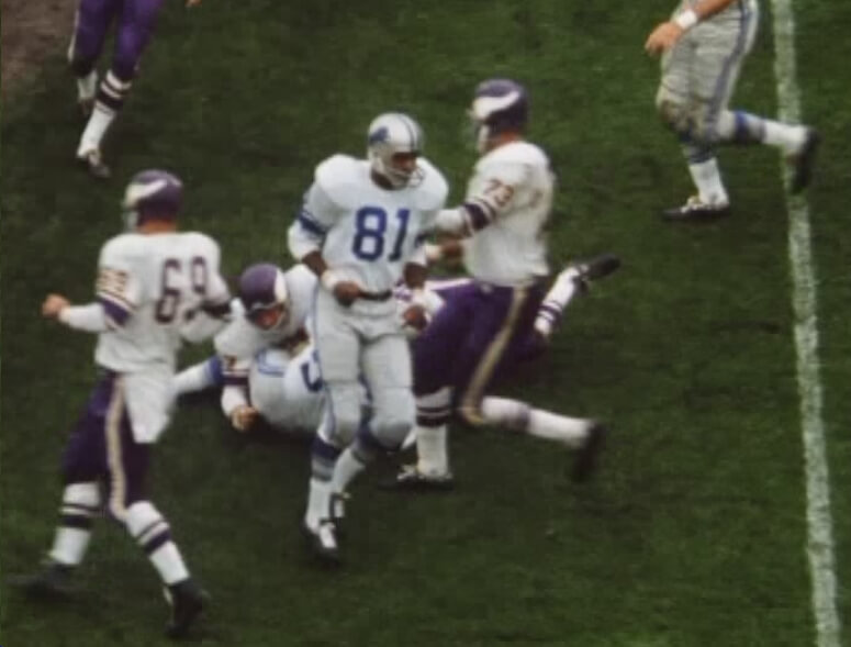
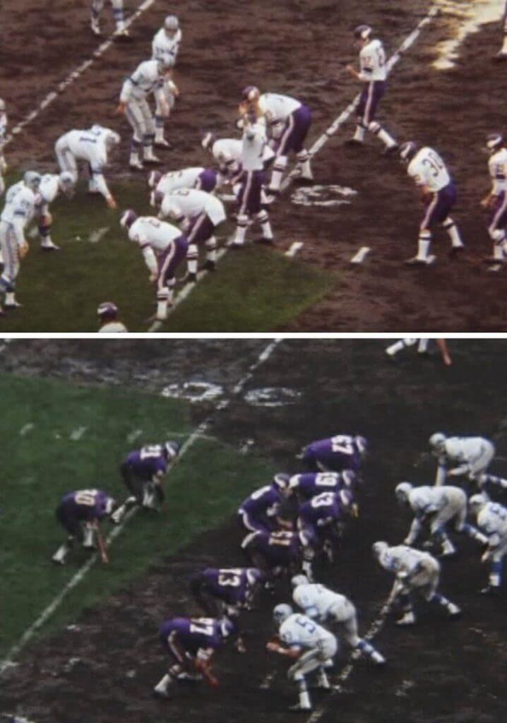
We’ve had teams bring the “wrong” uniforms to games before, and sometimes they’ve brought along different jerseys to switch into, teams have had uniforms lost or stolen, forcing them to wear their opponents’ contrasting jerseys (or unis), so the bad color vs. color matchup isn’t unprecedented. In fact, one of the more epic uns snafus occured way back in 1964, when the Minnesota Vikings played the Detroit Lions. The Vikings had introduced purple pants that season, and wanted to show them off for their home fans. So they wore white over purple vs. the Lions. The Lions, however, brought only their white jerseys (expecting the Vikings to be in purple jerseys). The two teams played a quarter of football in white vs. white jerseys, before the Vikings switched to their purple jerseys at the end of the first 15 minutes. This also resulted in the first mono-purple game for the Vikes, even though it wasn’t intentional.
The Thunder ended up winning the game, which is also likely an NBA first: the first team to win a game wearing two different uniforms in the same game.


Uni Concepts & Tweaks
Time for more Uni Tweaks from the UW readership.
I hope you guys like this feature and will want to continue to submit your concepts and tweaks to me. If you do, Shoot me an E-mail (Phil (dot) Hecken (at) gmail (dot) com).
Today’s concept come from Chad Buley, who, in what I believe is a Uni Watch tweaks/concepts first, included a video presentation of his concepts along with the concepts themselves. We’ll start with the video, and then his redesigns/rebranding for the Washington Football Team.
Hey Phil!
Here’s a Washington Football Team rebrand I’ve been working on. The logo & shoulder stripes are based on the Tuskegee Airmen’s 99th Fighter Squadron patch, and the number font comes from WWII fuselage codes.
Thank you for your time!
Best,
Chad B.
And here are Chad’s concepts:
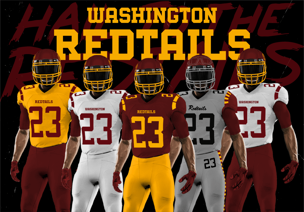
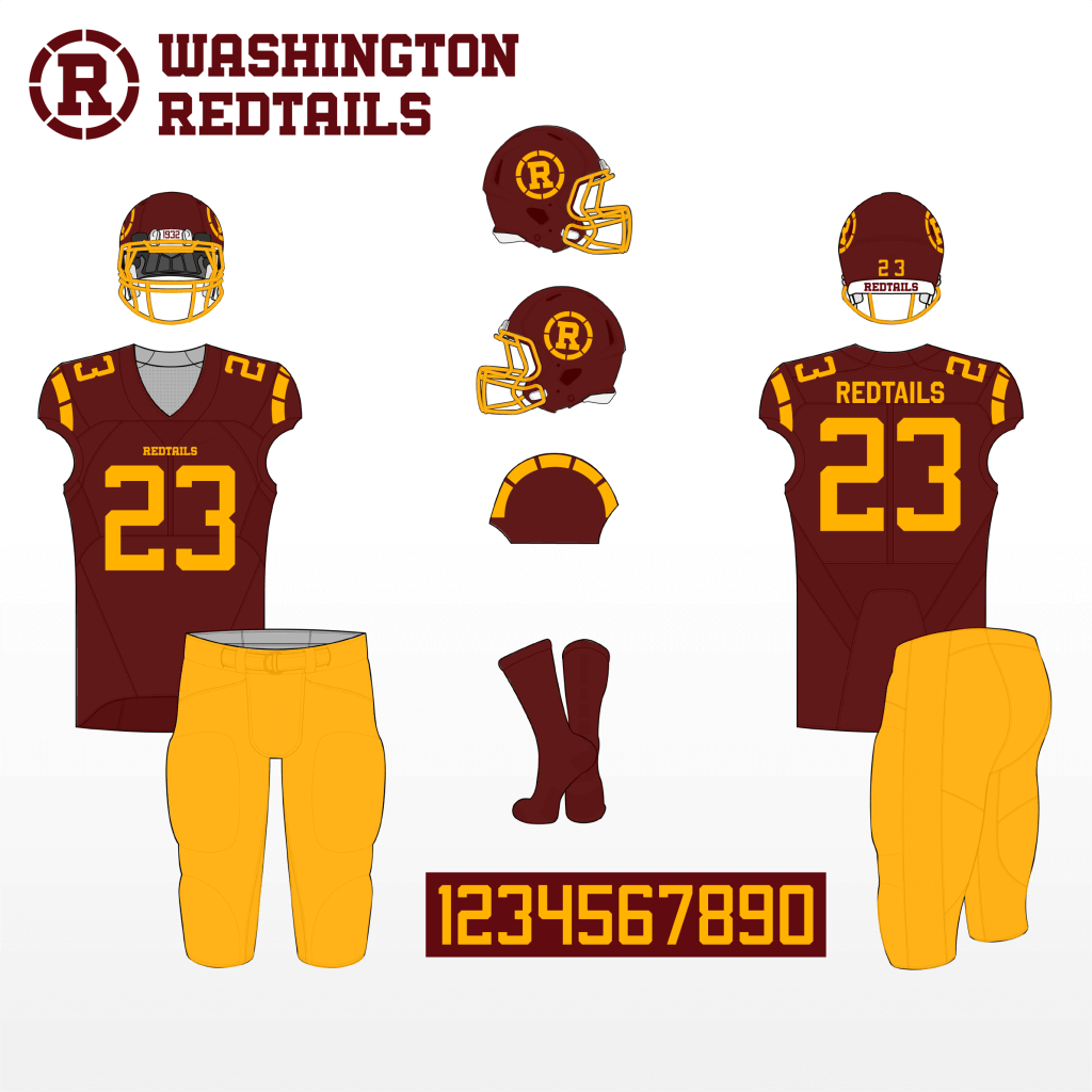
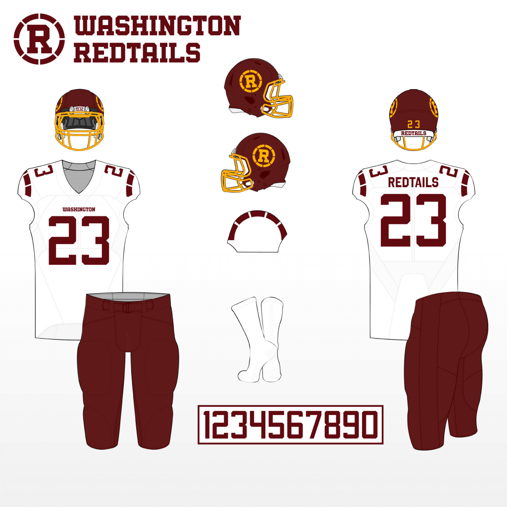
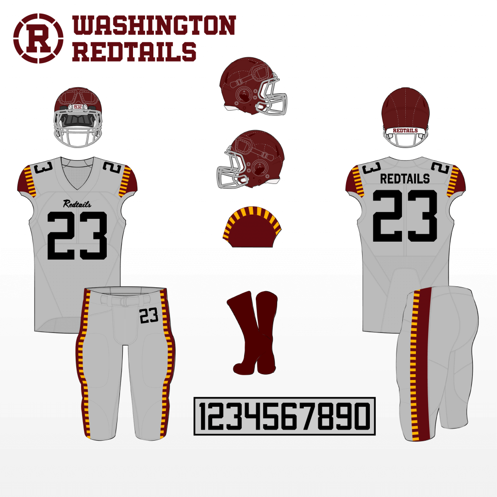
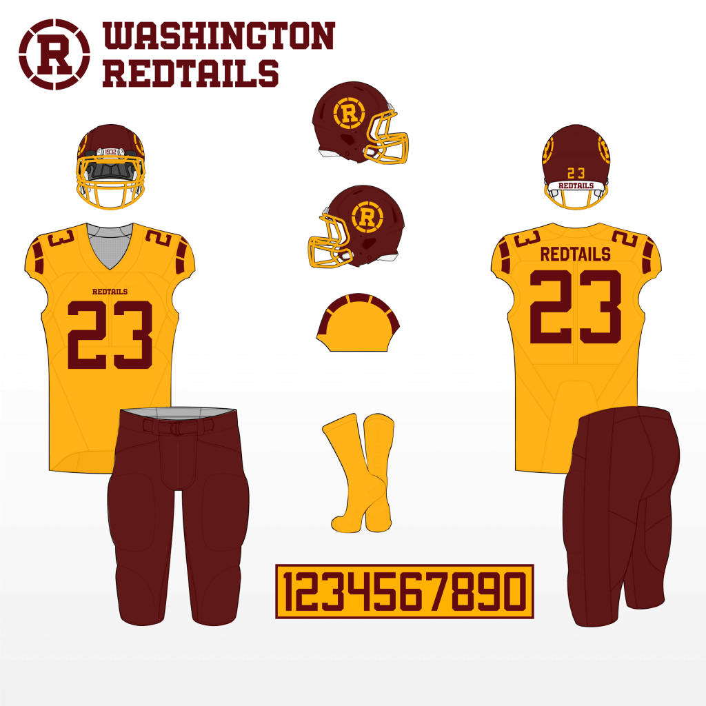
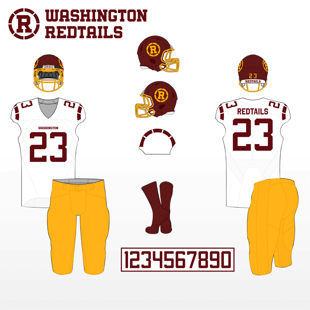
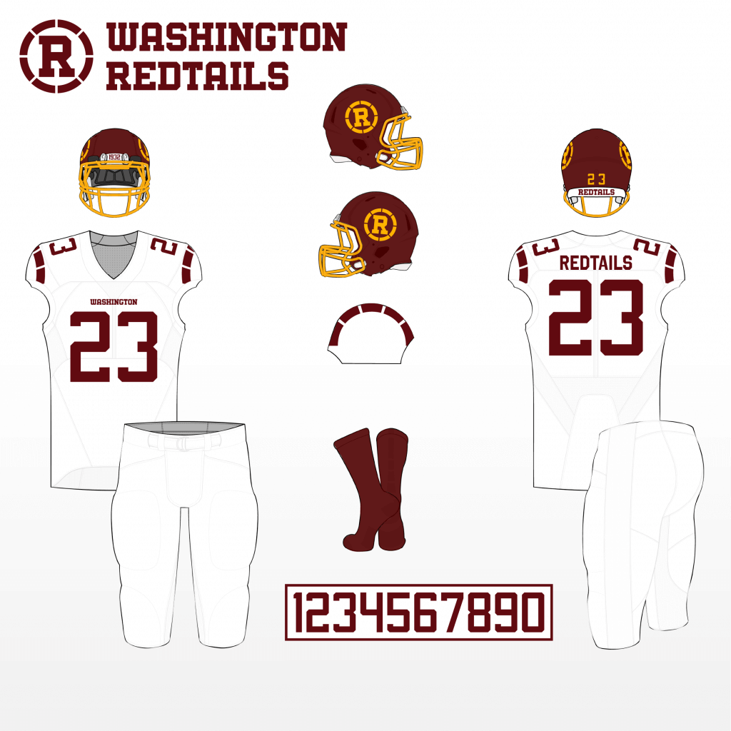
Thanks Chad!
OK readers (and concepters). If you have some tweaks or concepts, shoot ’em my way with a brief description of your creation and I’ll run ’em here.

Guess The Game…
from the scoreboard
Today’s scoreboard comes from Nick East.
The premise of the game (GTGFTS) is simple: I’ll post a scoreboard and you guys simply identify the game depicted. In the past, I don’t know if I’ve ever completely stumped you (some are easier than others).
Here’s the Scoreboard. In the comments below, try to identify the game (date & location, as well as final score). If anything noteworthy occurred during the game, please add that in (and if you were AT the game, well bonus points for you!):
Please continue sending these in! You’re welcome to send me any scoreboard photos (with answers please), and I’ll keep running them.
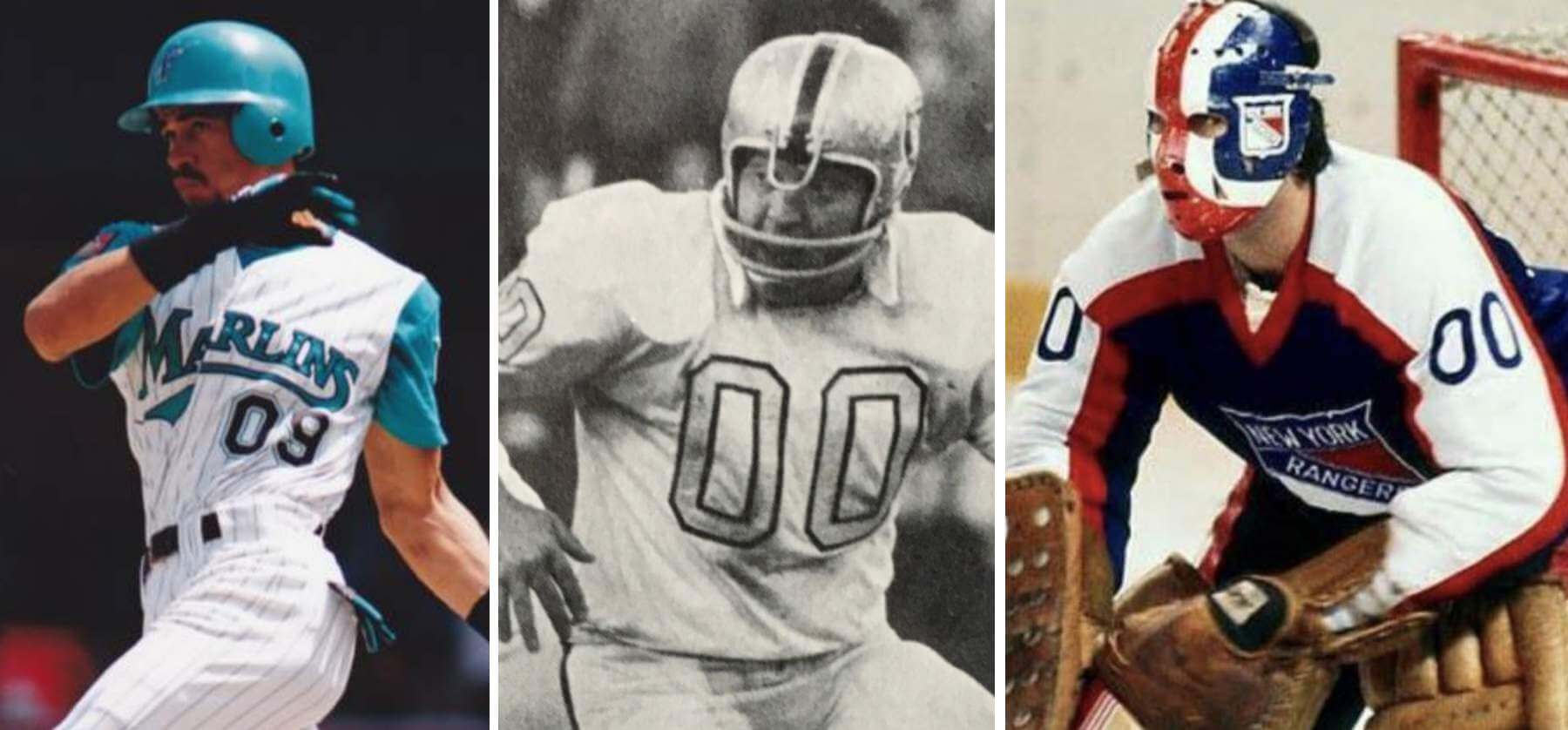
Podcast reminder: Paul here. In case you missed it, for this week’s episode of Unified, the recent scenario in which the Mets’ starting rotation could have featured both a No. 0 and a No. 00, which I wrote about on Monday, led us to explore various situations featuring zero and double-zero (including, as shown above, such famously zero-clad players as Benito Santiago, Jim Otto, and John Davidson). It was a really fun discussion, in part because Chris isn’t usually that into uniform numbers, but he still ended up having a lot to say!
We also talked about the Jags’ new emphasis on teal, the news that the Washington Football Team’s placeholder identity will be extended for another year, the ЯR uniforms that we think deserve to be upgraded to full-time status, and more.
You can listen to this episode, and subscribe to future ones, on Apple, Google, Stitcher, TuneIn, and Spotify, or just use the player below:
The show notes from this episode, which include photos of most of the things we discussed, are here. Those photos also appear in the video version of this episode, which you can watch here:
Enjoy the episode, and thanks for all the enthusiasm and positive feedback on this project.
Also of note: Today is longtime Uni Watch pal/ally Todd Radom’s birthday. Enjoy your special day, buddy!
The Ticker
By Anthony Emerson

Baseball News: The Giants wore two different versions of their black alternate jersey in 1981 — one with vertically arched NOBs and one with radially arched NOBs. The ones with radially-arched NOBs are mesh created by a local company (from @jessir717). … Mets 1B Pete Alonso wants the black jerseys to return, and wants to turn it into a routine Friday promotion (from @ColHapablap). … Dodgers P Trevor Bauer wore the team’s Spring Training cap in his official headshot (from Josh Claywell). … New jersey for Georgia Tech (from Timmy Donahue). … New jerseys for Oklahoma State (from Sam Kissel). … The Blue Jays posted a video about their new player development facility in Dunedin, Fl. (from Andreas Papadopoulos). … Thursday night’s Oregon State/Grand Canyon matchup featured a pitcher wearing stirrups facing a batter wearing stirrups. The kids are alright! (from Eric Fisk). … This great footage of Michael Jordan in the Arizona Fall League unfortunately features two uni ads on Jordan’s jersey (from Eric S.)

Hockey News: The Sabres wore their ЯR unis at home against the Devils on Thursday night, which means they went white at home (from Daniel Estabrooks). … The Golden Knights wore their regular black helmets on Thursday night, shifting away from the metallic gold helmets they wore with their black jerseys a few times earlier this season. Their AHL affiliates, the Henderson Silver Knights, are still wearing their metallic lids (from Thomas Juettner). … The Maple Leafs have a giant Ford logo at center ice of their practice arena (from Moe Khan).

NBA News: New Nets PF Tyler Cook will wear No. 2 (from Etienne Catalan). … Also from Etienne: New Kings C Norvel Pelle will wear No. 31.
.

Soccer News: Newport County AFC is celebrating the 40th anniversary of the European Cup Winners’ Cup quarter-final against FC Carl Zeiss Jena with a reissue of the kit from that match (from Ed Żelaski). … Also from Ed: Last night’s 2. Bundesliga match between SSV Jahn Regensburg and SC Paderborn featured Paderborn keeper Leopold Zingerle in a new bright yellow keeper’s kit based on the template of their 2014 home kit. … Minnesota United posted some teaser images of a new kit yesterday (from Tim Nieman).

Grab Bag: A study has found that women in the military pay twice as much for uniforms as men (from Timmy Donahue).
And finally… that’s all for today, folks. Big Happy Birthday shout out to the one and only Todd Radom. Enjoy another trip around the sun, buddy!
Everyone have a good Saturday, and I’ll catch you guys back here again tomorrow.
Peace,
PH
Regarding that 1964 Lions-Vikings white-jersey uniform snafu, it looks like rather than ’64 being the first season the Vikes wore the purple pants with their white jerseys, it was their last. And this mix-up apparently led to the disappearance of the purple pants altogether. According to the Gridiron Uniform Database, the purple trousers were added in 1961 and remained in use through the 1964 season and were gone by ’65 (except during that year’s preseason). And somewhere I read (or more likely saw, perhaps on an NFL Films segment) that Vikings coach Norm Van Brocklin was so dsipleased with how the all-purple Vikings looked that day that he decided to get rid of the purple pants altogether. And whatever the case, they were gone by next season.
Slight error in the link above. Here are the Sabres ЯR unis
link
Given the chance to see both of the orange vs. red games here, can we all agree that the Oklahoma City “orange” jerseys are red and the Knicks orange jerseys are orange?
“The Golden Knights wore their regular black helmets on Thursday night”
Mentioned in the Ticker about the Golden Knights regular black jerseys too? A typo that needs to be addressed considering this is a uniform website. The team does not have black helmets or jerseys. They are dark grey.
Sometime in the nineties at Maryland, Virginia basketball changed from orange to blue at halftime.
In 1979, Maryland lacrosse changed from white to red at the half against Johns Hopkins, with their coach saying it was to provide better contrast to Hopkins’ light blue.
Sorry, no video or photographic evidence of either.
More lacrosse kit changes. Friday night, Duke went from blue tops to black tops. But it wasn’t for contrast, since UNC wore white. My guess is that it’s because the black shirts were dry ones, and it was a downpour at Anson Dorrance Field yesterday.
GTGFTS: it’s Mariners at Rangers from Arlington (believe it was Rangers Ballpark in Arlington at the time). The game featured back to back 8 run innings (2nd/3rd) for Seattle. Finished as a 21-8 Mariners win. Truly one to forget for our Rangers.
Was actually at the game before this one.
link
I’m guessing, but is the basketball one June 12, 1984, the Celtics clinching game 7 vs LA? The only player I can identify is #31, Cornbread Maxwell.
Why didn’t OKC switch to their white uniforms before the game? According to the OKC Tracker they knew the day before, but even if it had just happened minutes before the game when the players removed their sweats, they should have delayed the game and gone into their locker room to change.
I’m sorry, but Pete Alonso needs to STFU already about the g**d*** black jerseys. I am sick to death of hearing (and talking (and writing)) about who wants them to come back and who doesn’t, whether that’s a good idea or not, how they should do it, &c. Every to weeks with this nonsense.
Just bring them back as a “throwback,” wear them once a month, leave the other uniforms alone, and be done with it.
Sheesh.
I’m with GZ as far as Alonso goes. But the only way I’d be happy to see the Mets BFBS units once a month is if the team performs a pregame ritual burning of them to remind fans, and apparently players, that the team colors are blue and orange.
I don’t want to see them either, because if they come back they’re likely to become a gateway drug — as they did the last time — for poisoning the other uniforms with unsightly black elements and accents, and become the “preferred” jersey to supplant the primary jersey — as they did the last time.
But if bringing them back as a once-a-month “throwback” and remaining ever vigilant about keeping the primary uniforms primary and as-is and black-free will make Alonso et al. STFU about it, then maybe it’s worth the risk.
Even *if* the team brought them back “once-a-month”, that’s still once-a-month too many times. The ONLY time these jerseys should ever be worn is if they’re honoring a player (or retiring a number) from a squad which wore them. I’d have been OK if they wore them to retire Piazza’s number or if they have say, Al Leiter Day. That’s it. The Mets don’t belong in black jerseys ever again.
Again, I don’t disagree. The Mets should never wear black. Ever.
That said, I can appreciate the sentiment of those fans who grew up watching the Piazza/Leiter era and the 2006 squad win a Wild Card, a Pennant, and an NL East crown in those jerseys; watching Robin Ventura hit a walkoff grand-slam-single in those jerseys; watching the best infield ever sling the ball around the diamond in those jerseys. Even though they looked terrible doing it.
Along those lines, they could have special events to honor the 1999, 2000 and 2006 teams and bring some of the alumni back, in addition to a Leiter Day or an Edgardo Alfonzo day.
Again, I hope it doesn’t happen, but at this point I’m sick of Alonso (who slashed .231/.326/.490 last year) bringing this up and making news out of it every two weeks. Let him work on his batting average.
Hate to be the bastard at the family reunion, but this true believer’s favorite Met uniform is the 1998 home solid white with the black base layer and blue+black cap, and the second is the grey road uniform with the same elements. Not that the current set is bad by any stretch, to me the addition of black made the team look more “grown up”, and strengthened the connection to the New York Baseball Giants, one of history’s best uniforms. Worst Mets’ uniform? The henleys from the ’70s.
Don’t worry Walter. The Mets will never don henleys again.
…so for Mets fans the black jersey is the equivalent of a Deadhead sticker on a Cadillac>
“[T]he 1998 home solid white with the black base layer and blue+black cap” is not only the worst-looking Mets uniform of all time, it’s a travesty for a slew of non-aesthetic reasons: inter alia, it was used as the de facto primary home uniform for a decade despite being officially designated as an alternate, while the actual primary home uniform was almost never worn, then to add insult to injury the hideous “blue+black cap” became the designated road cap in 2000, with had the effect of not only eliminating the best uniform in baseball (the current, 1995-97 and 1962-73 road greys) but of making the Mets the only team in MLB with a designated road cap to ever wear that road cap at home, let alone do so in practically every game.
I absolutely despise that uniform.
(fixed)
But in all seriousness, the solid black jersey (which for a time came in both home AND road versions) with the black cap is the worst; possibly the next worst uni (jersey/cap) combo was the camo over pin pants.
I don’t love the snow whites with the black dropshadow and blue/black cap at all, but it’s FAR better than the black jersey/cap crap.
[Phil and I have had this discussion before, but for those joining us late… ;)]
The white jerseys with the black-drop-shadowed graphics bothered me more than the black jerseys, because the graphics on the black jerseys were blue, orange and white; i.e., Mets colors on a black canvas. As opposed to the drop-shadowed graphics wherein the blue and orange were bespoiled by the black accents; mixing Mets colors with a non-Mets color. Plus they were always worn with the black accessories which further subdued what little blue and orange could be seen. The black jerseys might have been ugly and wildly inappropriate, but at least the Mets colors and graphics popped.
The “racing stripes” never bothered me — they were introduced around the time I first started watching the Mets — although I never liked the 1988-92 road jerseys with the white outlines and the Yankees’ block “NEW YORK” on the front with no numbers. The 1987 cursive “new York” was ugly; the 1993-94 cursive “New York” was better-proportioned (and had a proper capital “N”), but had it the white outline which made it clunkier than it needed to be. Always wondered what the 1994 road jersey (which was superior to ’93 in that it had numerals on the front and no elastic sleeve-cuff striping) would have looked like with the placket piping and without the white outlines.
[Yes, Jay and I have had this convo several times at UW gatherings]
But here’s the hierarchy:
BAD:
WORSE:
WORST:
(PS – I was at that Todd Pratt game, sitting in the left field stands; couldn’t see whether or not it left the park, and didn’t know for sure until Finley came back down and looked into his glove…and the ball wasn’t there!)
I have learned one thing from this give+take: The henleys are not the worst Mets’ uniform of all time, the camouflage jerseys are.
I think the black accents work if it’s link, but if you add NOBs it looks really bad. Shadows plus NOBs plus pinstripes looks way too busy. But the shirts in that picture I linked to? Those look fine.
On a semi-related note, check this out:
link
If an organ of MLB is calling these the best caps ever, shouldn’t the Commissioner have every team wear them? (The hazards of in-house media.)
Save me the trouble of MLB giving me cookies…are the Twins red caps from the 80s and the original Marlins caps on this list? If not, it’s an illegitimate list.
Put it this way…if a list has to go back over 100 years to find the best looking cap for the Cleveland franchise-to-be-renamed-later, it’s bogus.
Spoiler Alert:
When it comes to the cap chosen to represent the Atlanta Braves, it’s probably safe to say You’d Wear That.
With only a few exceptions, the list pegged all my favorites; especially the San Diego taco-sauce caps from the early 1980s.
D2: The Mighty Ducks
With most NBA teams having a million different uni-combis, It was only a matter of time until we got a debacle like OKC/Houston.
The “orange” vs red game seems like a pretty good simulation for those of us with normal color vision of what the world too often looks like for those with colorblindness.
I love absolutely everything about that Redtails concept except the standard helmet logo. Make it a W instead of an R and it’s my favorite WFT concept to date.
Burgundy helmet with a W, yes, or (and?) a yellow helmet with an R.
Any option is a good look. Nice work!
I’m a Washington NFL Football fan, and I’m anxious about the derogatory headlines a “Redtail” identity could bring after a divisional butt-kicking. That being said, any Redtails’ uniform needs to include at least one citation of the red tail fin of a fighter plane to explain the name. It’s an identity that fails without an ever-present reference to the Tuskegee Airmen.
Clash jumpers happens all the time playing NBA Live Mobile.
There was an orange v. cardinal NCAA basketball game a while back, Illinois wore orange at home v. Wisconsin. Late 1990s? Early 2000s?
Happy Birthday Todd! Constantine the Great and the poet Longfellow share your day. Looking over the list…..you got to be the most famous Canadian born today. Apologies to Donal Logue
Happy Birthday, Todd! You’ve made a living at something I’ve dreamed about. I’d be a wealthy man if I had a dime for every time one of my friends saw my uniform drawings and said, “You should send these in.”
Orange vs Red reminded me of my beer league days. Not sure if it happened because of the reducing of an A and B division to one division because of less teams, or if it was always that way. Didn’t seem to be a problem for the players; can`t say how it was for the “fans” (who when there were any were heavily outnumbered by players).
Here is a short clip from a dozen years ago and the team I`m on is orange, and yes our goalie is still playing to this day with 1970’s gear and fibreglass masks of the era.
link
Also ties in to the 0/00 discussion. Our centre in the clip is Miles with number 0. Believe he had that number for several seasons.
Wisconsin(red) – Illinois(orange) basketball had a brutal matchup during the 2002-03 season
Good gosh, has it been that long?
It has, but I remember turning off the game because I couldn’t tell which team was which. Makes you realize what an advancement HDTV is.
It didn’t make it on the field, but there was an NFL uniform controversy in 2003, when the Broncos played the Chargers in San Diego.
The Broncos brought their white jerseys although the host Chargers already told the league they would wear their whites. The Chargers were forced to wear blue jerseys for the game, but the Broncos were fined $25,000 and the Chargers were given the uniform choice for their game in Denver later in the season.
Of course, the Chargers picked blue in that game and the Broncos wore white at home for the first time in 20 years.
The OKC-Hawks befoulment just proves that we don’t need 6 different uniforms per team. Although, as noted above, the Thunder should have noticed this just before the opening tip and could have made the swap then. Or even between the first and second quarter. I’m sure there could have been time to do so.
I believe those Vegas hockey helmets are charcoal gray and not black.
Michigan State unveiled a football helmet with a “State” script logo, akin to their throwback basketball jerseys. link
Amen. Surprised this wasn’t a more common sentiment. If teams went back to 2 uniforms (home/away, or primary/clash), this would not have happened.