For all images, click to enlarge
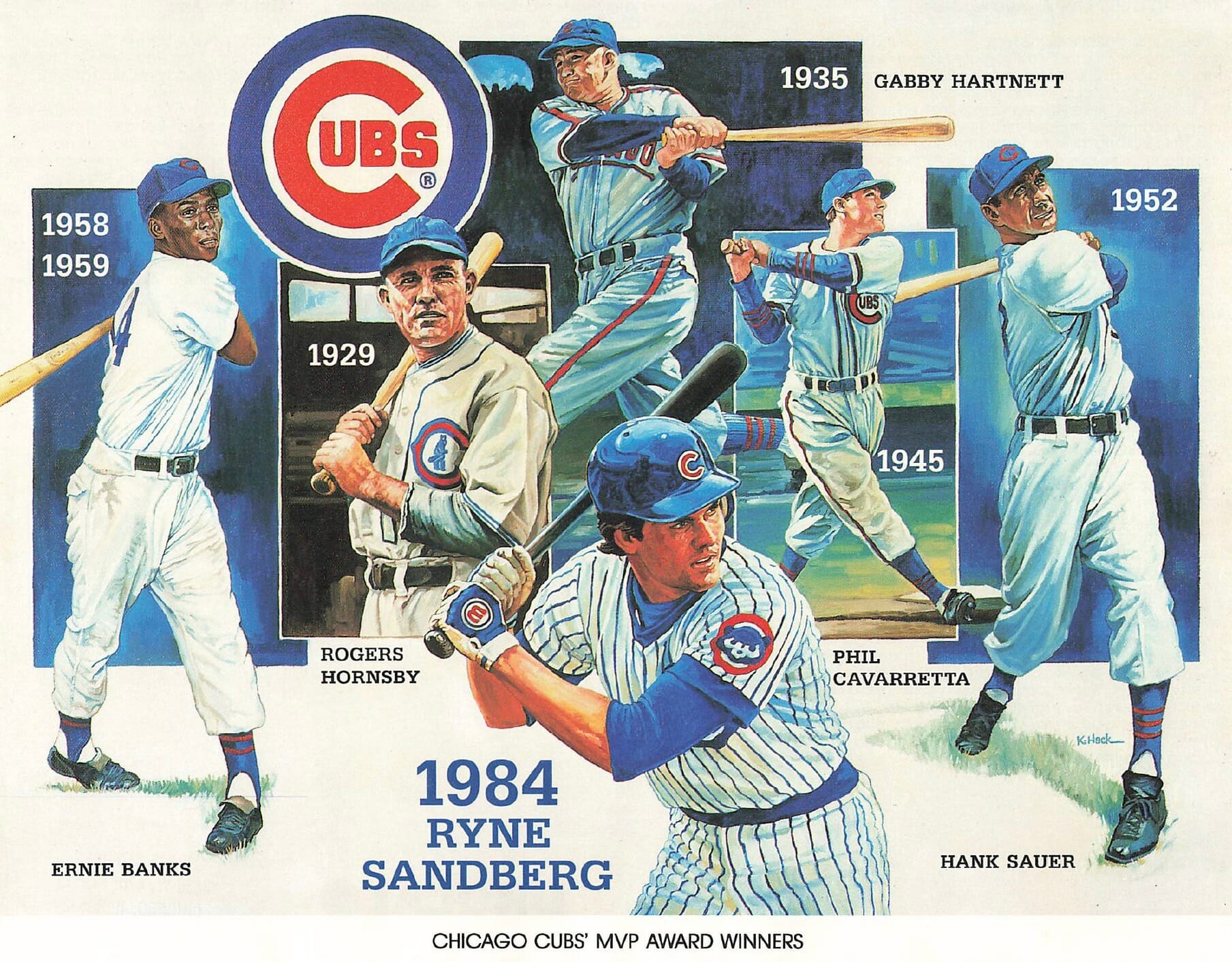
Check out this illustration showing various Cubs players who won the National League MVP Award. A great composition, and so many great uniforms!
That wonderful illo appeared on an 8.5″ x 11″ print that was given away in the mid-1980s by Chicago-area Unocal 76 gas stations. There was lots of descriptive text on the back — along with, I’m happy to see, a little “About the Artist” section for the illustrator, Konrad Hack:
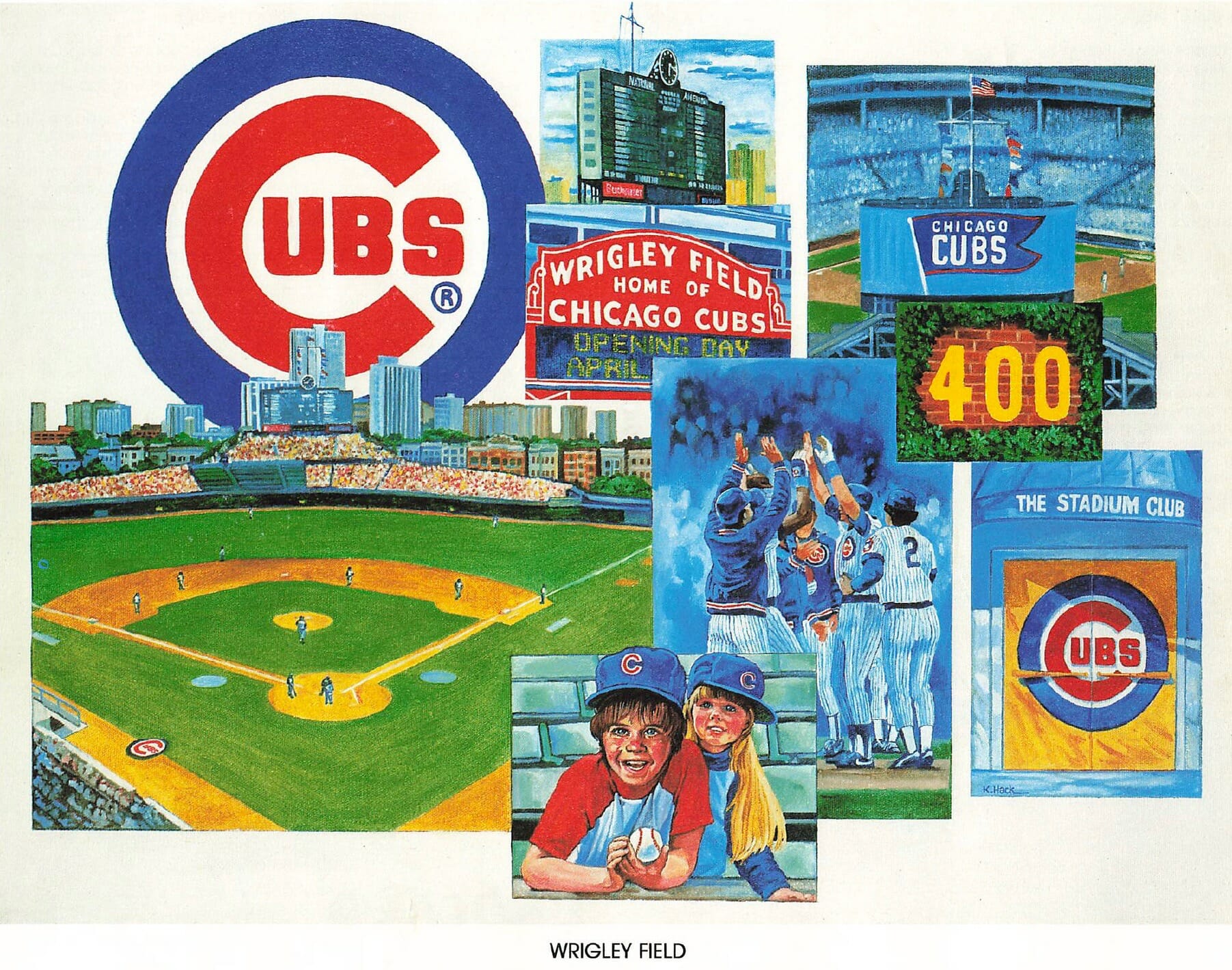
That is one of 15 prints that Uni Watch reader Darren Rusakiewicz recently came across. I’d never seen them until Darren recently sent scans of them to me. “My grandpa collected them in the 1980s,” he says. “They must’ve been a giveaway with a tank of gas or something like that. I can’t remember.” The running theme in most of the prints is the Cubs’ division-winning 1984 season in general and Ryne Sandberg in particular, so the prints were presumably given away in 1985.
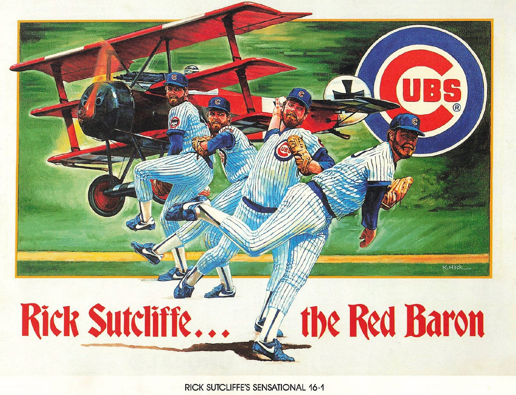
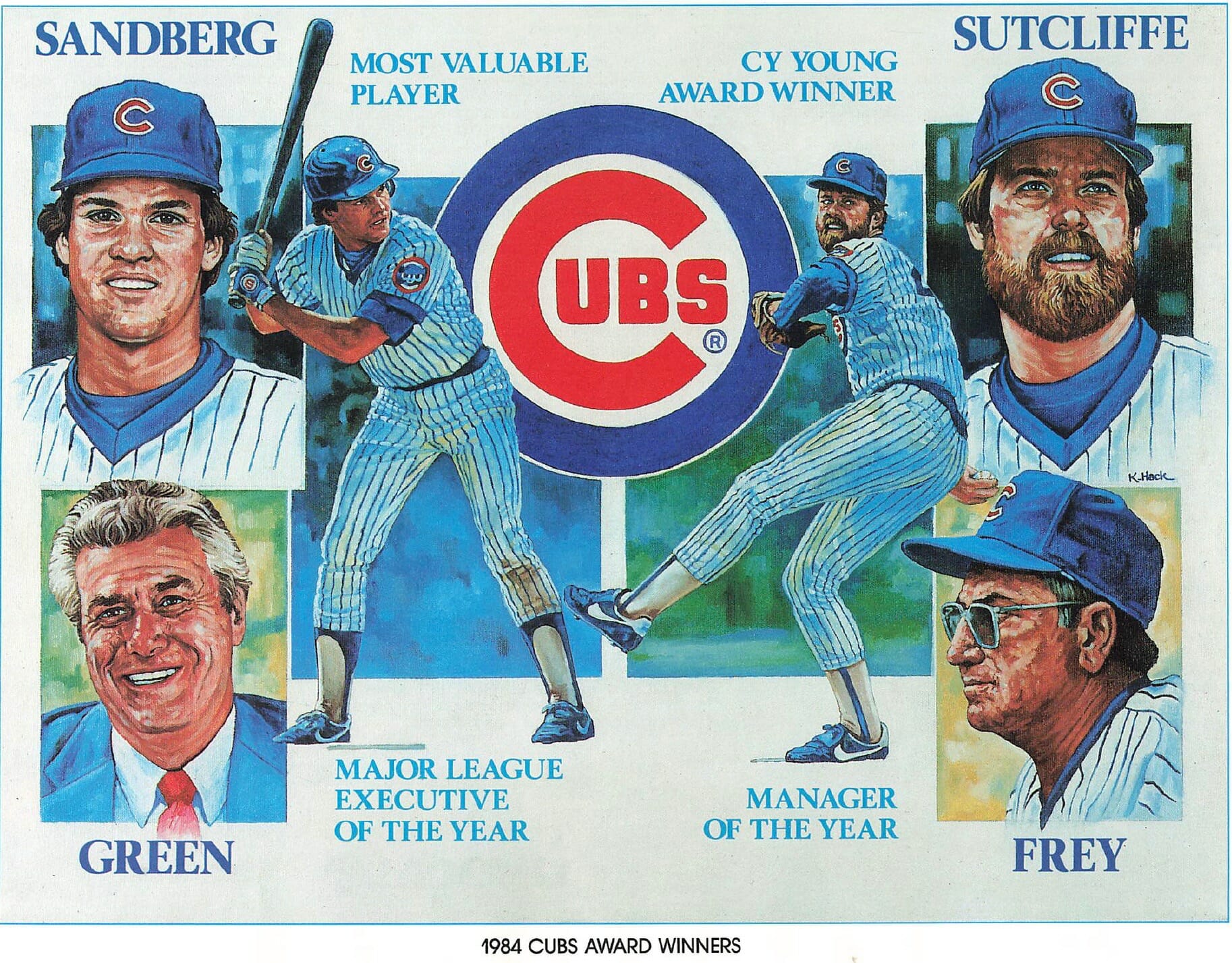
Four separate artists, all from and/or based in Chicago, are credited on Darren’s 15 prints. Konrad Hack — the guy who did the MVPs illo — is my favorite. Here are the other three that he did:
Hack is now about 75 years old and is still active as an artist. I found this listing for a showing of his work from just a few months ago.
Darren’s collection also includes three prints by an artist named Lawrence Salk, and I like his stuff almost as much as Hack’s. Here are Salk’s three illos:
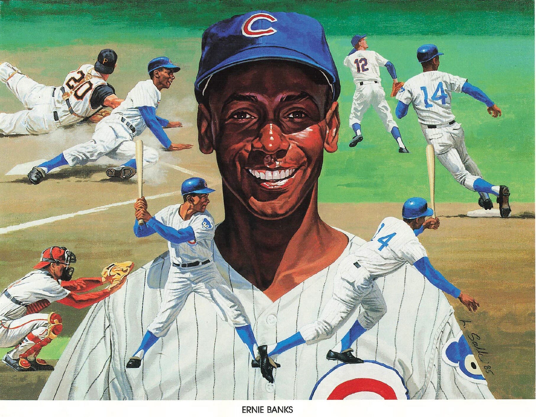
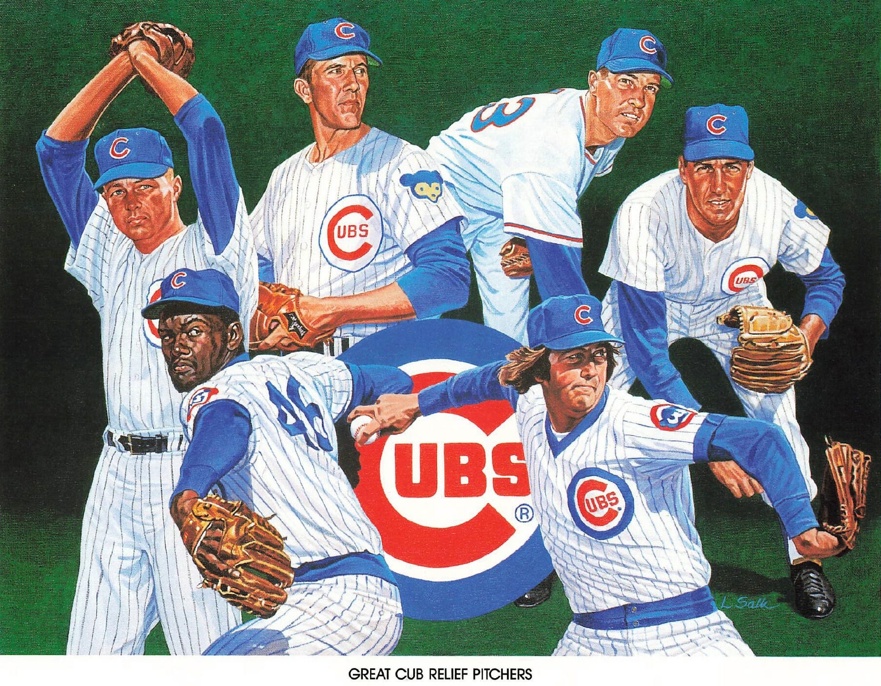
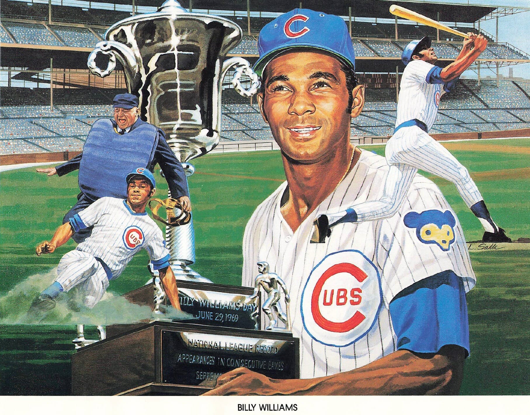
Such gorgeous stuff! Unfortunately, Salk died in 2004. (Fun fact: Among tons of other work, he did the portrait of Kramer that figures prominently in an episode of Seinfeld.)
There are also four prints by a guy named Tom Sulek. Solid work, although I found his style a bit grainier than I prefer:
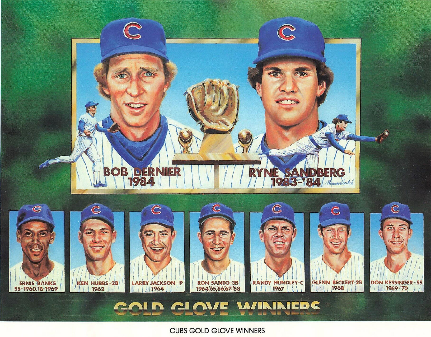
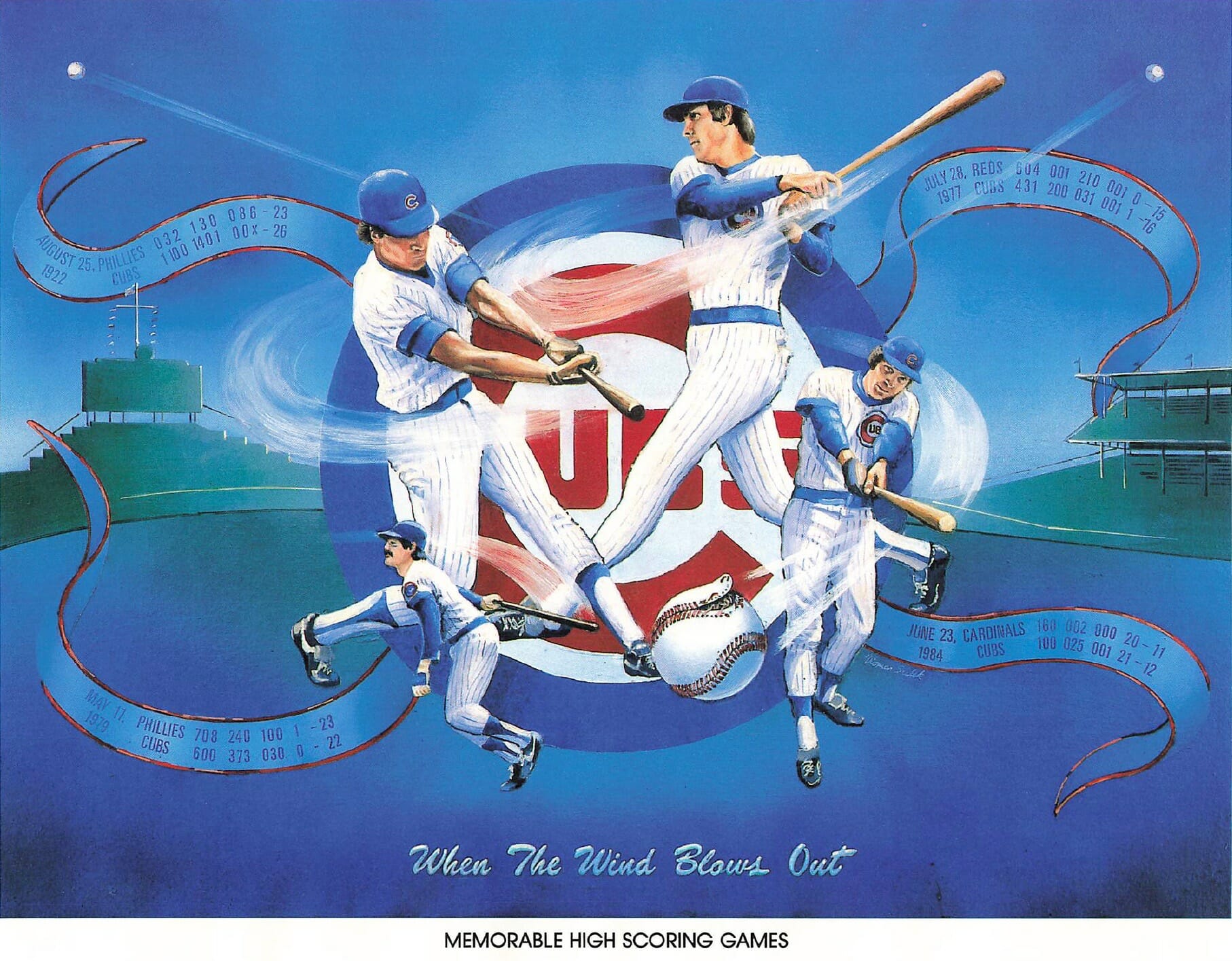
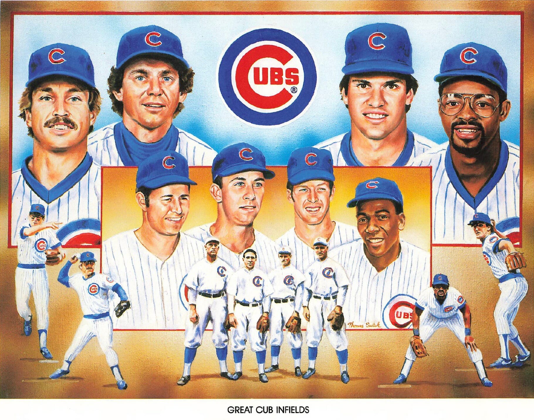
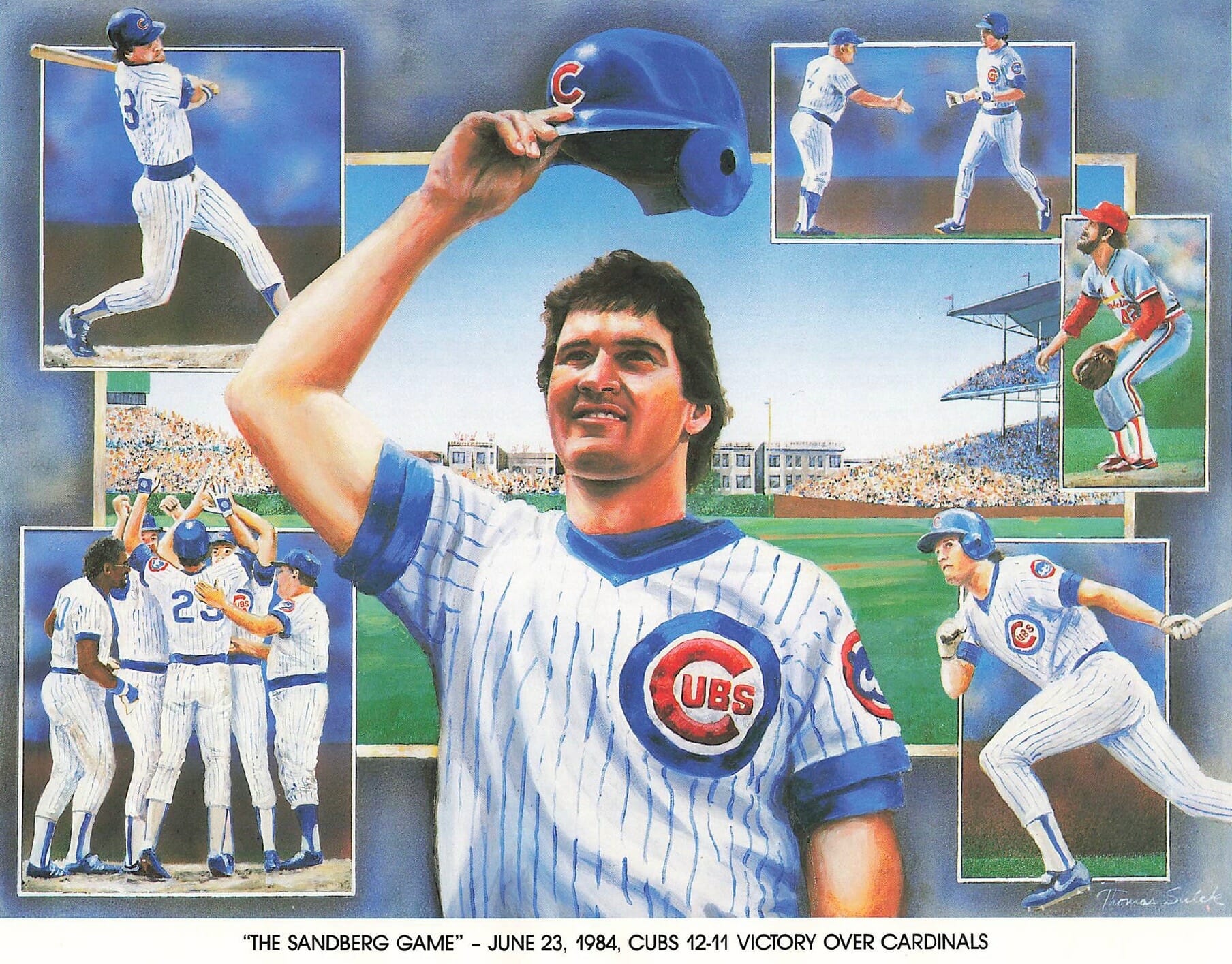
According to Sulek’s LinkedIn page, he got out of the freelance illustration game in 1991 (and also worked for six years for the White Sox!).
Finally, there are four prints by Todd Doney. His style was much more stylized and less photo-realistic than the other guys’ and, honestly, not as much to my taste. Very nice compositions, though:
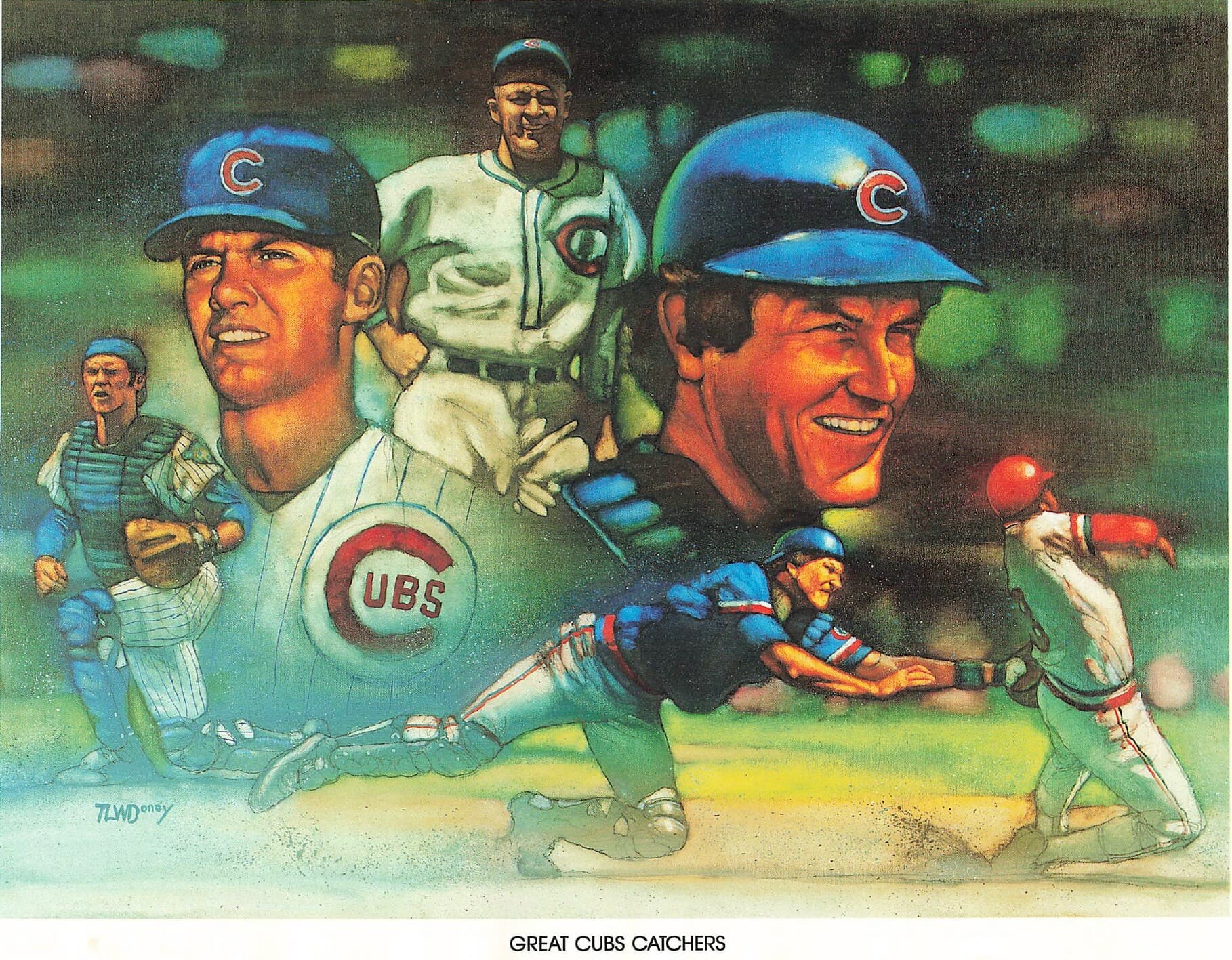
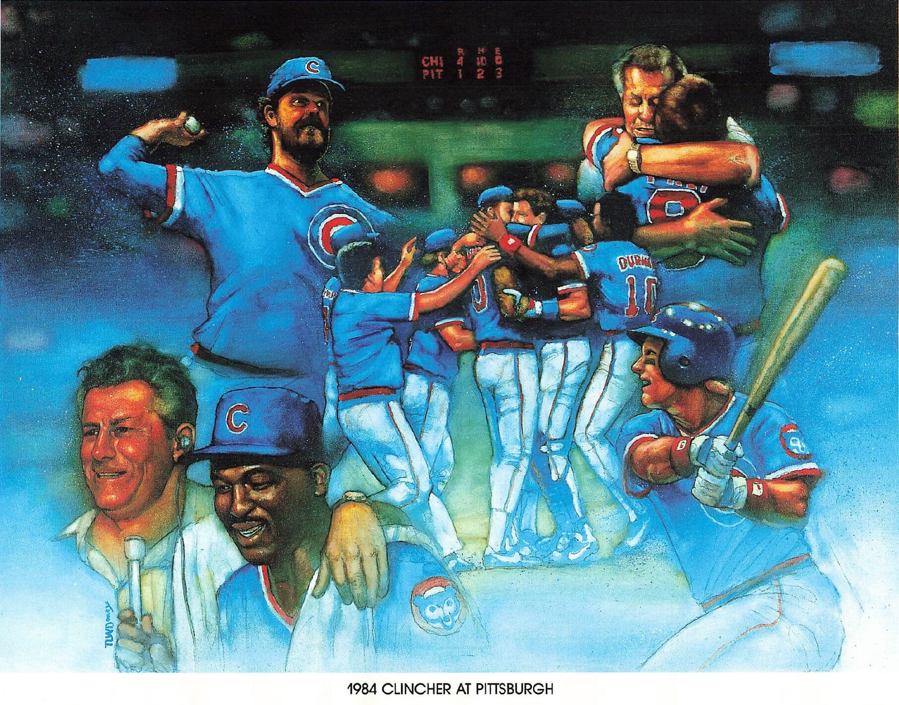
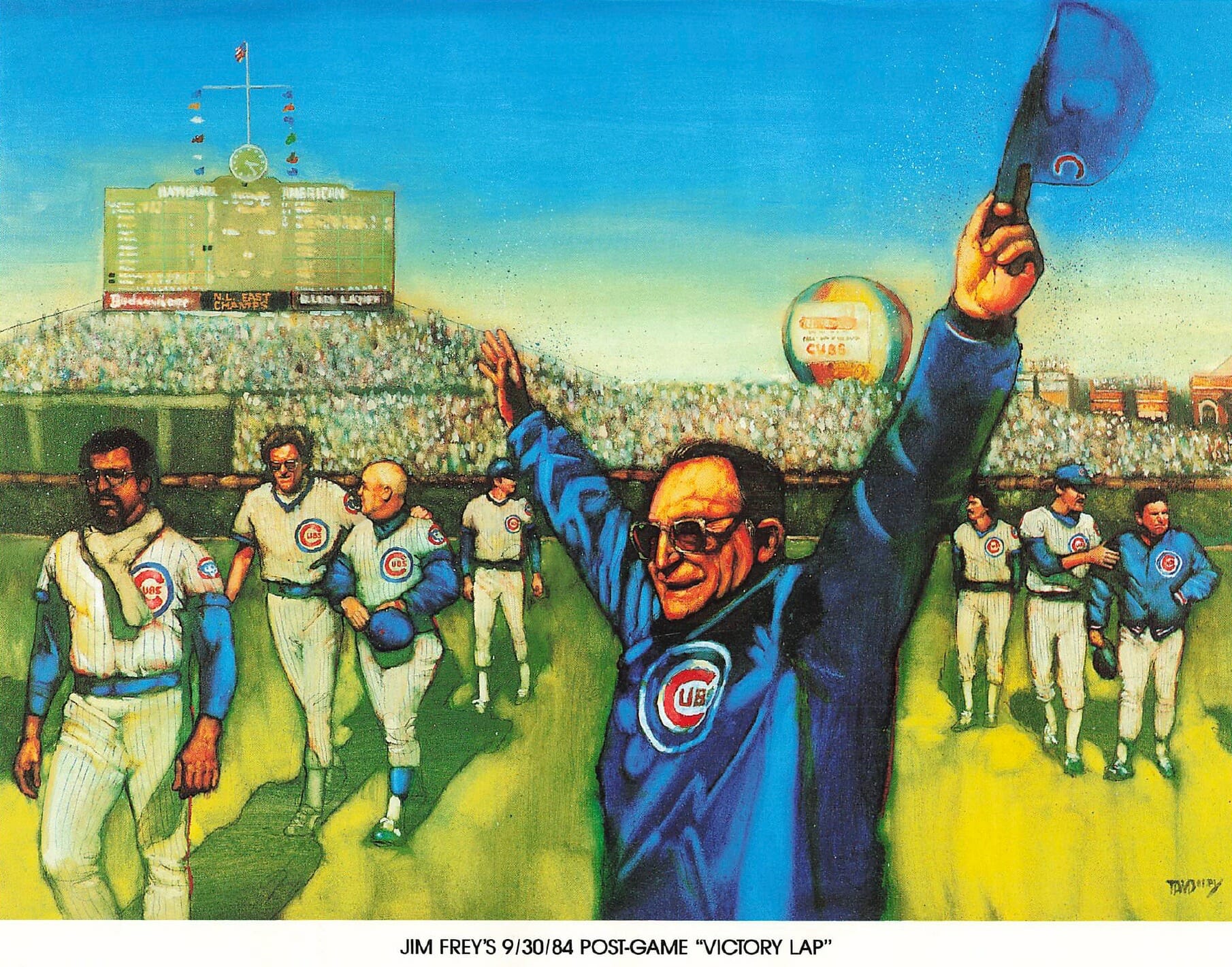
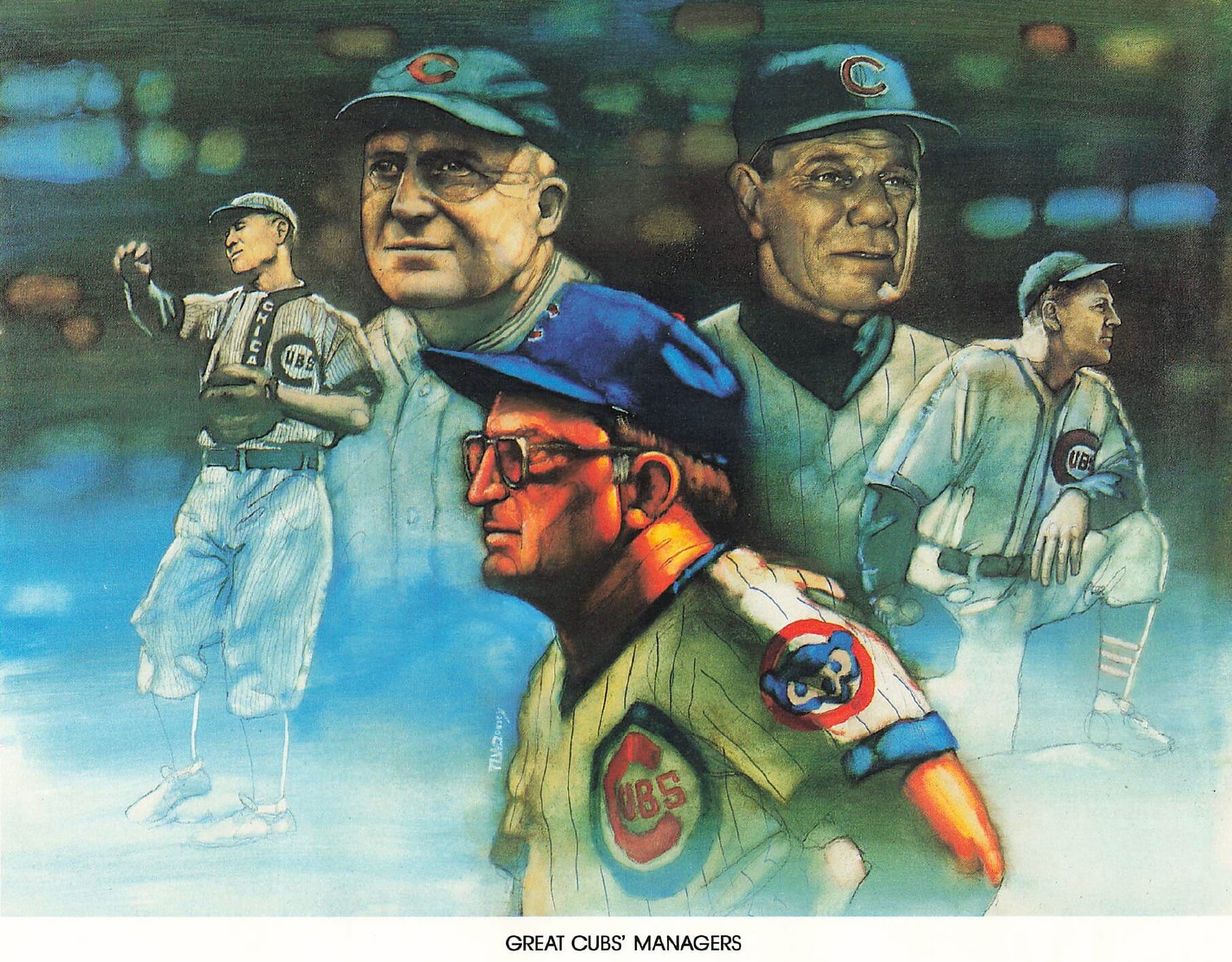
Doney has had a long art/illustration career and is apparently still going strong.
I poked around online to see if this series included any other prints that weren’t part of Darren’s collection. I found this Fergie Jenkins print, which looks like it was done by Salk. (Darren, if you’re reading this, you should buy that one to complete the collection!)
You can see all of Darren’s prints, including the text on the back, here. Please join me in thanking him for sharing this great artwork with us!
Click to enlarge
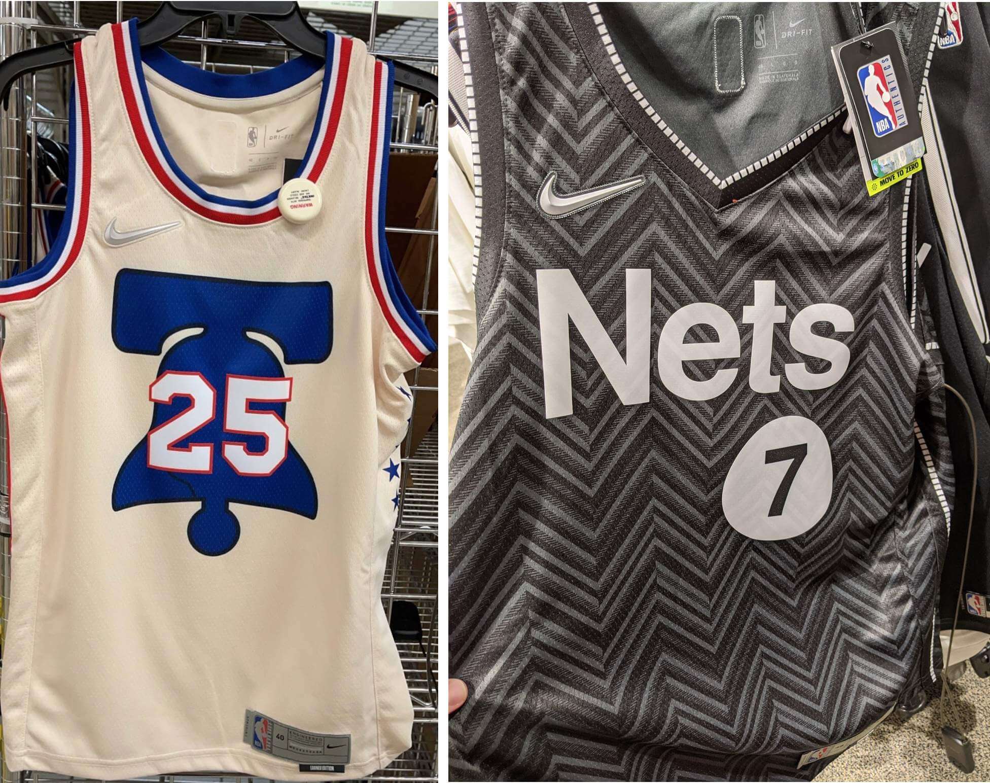
More NBA leaks: The latest NBA Participation Trophy Earned designs to leak are for the 76ers and the Nets.
The Nets entry, like most of the Earned uniforms, is useless merch-dump slop. But I really like the Sixers design — a lot! I do kinda wish that the numerals either fit entirely within the Liberty Bell or, better yet, that the bell could be smaller and allow the numbers to overflow the bell’s bounds a bit more, but it’s still pretty good. How often do you see an NBA jersey without the team’s name, city, or logo on the front? Nicely done!
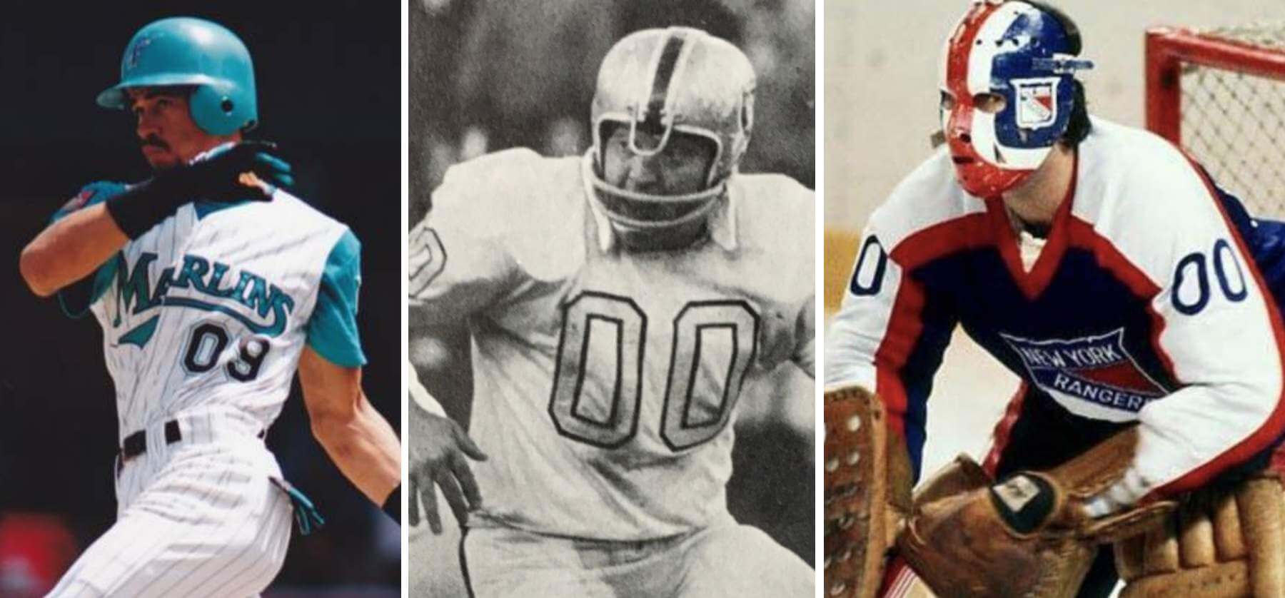
Podcast reminder: In case you missed it yesterday: For this week’s episode of Unified, the recent scenario in which the Mets’ starting rotation could have featured both a No. 0 and a No. 00, which I wrote about on Monday, led us to explore various situations featuring zero and double-zero (including, as shown above, such famously zero-clad players as Benito Santiago, Jim Otto, and John Davidson). It was a really fun discussion, in part because Chris isn’t usually that into uniform numbers, but he still ended up having a lot to say!
We also talked about the Jags’ new emphasis on teal, the news that the Washington Football Team’s placeholder identity will be extended for another year, the ЯR uniforms that we think deserve to be upgraded to full-time status, and more.
You can listen to this episode, and subscribe to future ones, on Apple, Google, Stitcher, TuneIn, and Spotify, or just use the player below:
The show notes from this episode, which include photos of most of the things we discussed, are here. Those photos also appear in the video version of this episode, which you can watch here:
Enjoy the episode, and thanks for all the enthusiasm and positive feedback on this project.
Speaking of double-zero: After checking out this week’s podcast episode about “heroes of zero,” reader/listener Marty Stevenson checked in with this anecdote I’d never heard before:
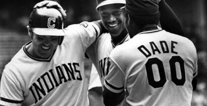
In 1977, outfielder Paul Dade wore No. 00 for the Cleveland Indians. On second base late in a close game, he took off to steal third (he made it).
After the game, which the Cleveland won, manager Frank Robinson was quoted as saying, “I don’t know why he wears that number, but when he took off, I thought, ‘Oh-oh.'”
Hmmmm. That’s a great story — if it’s true! Sounds potentially apocryphal, but I haven’t had time to fully research it yet. Made me smile, though!
Update: The story is indeed true, at least according to an item at the bottom of this 1977 Sports Illustrated page (which was located by reader/commenter James Gilbert — thanks!).
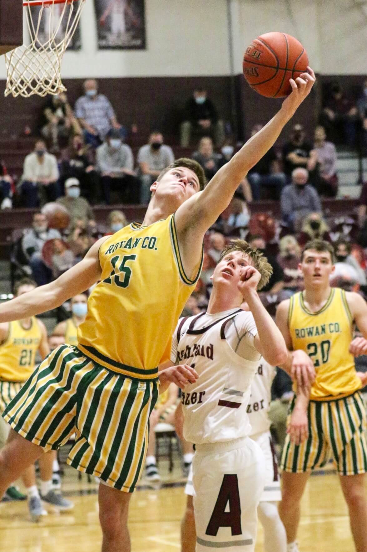
Photo by Matt Jones, The Daily Independent; cick to enlarge
Too good for the Ticker: I love green and yellow, and I also love stripes. But the boys’ basketball uniforms worn by Rowan County High School in Kentucky might be too much, even for me. Yowza!
Also uni-notable: The opposing team in that game — Paul G. Blazer High — was wearing TNOB:
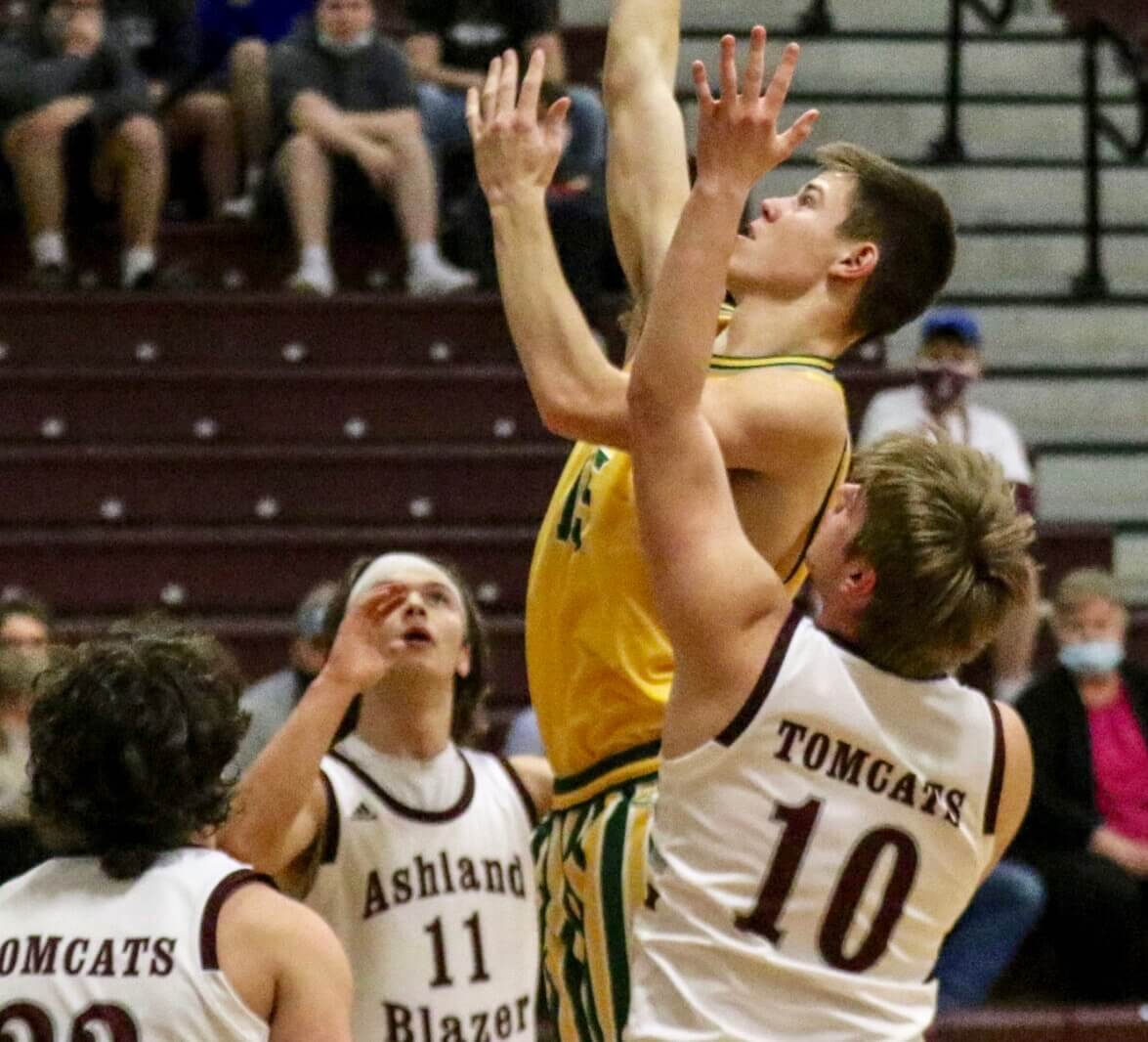
You can see more photos from this game here.
Regarding that “Tomcats” team name: A tomcat is, by definition, male, so I wondered what the school’s girls’ teams are called. According to Wikipedia, they go with “Kittens,” which is some serious sexist bullshit — the boys get an adult name while the girls get a diminutive/infantilizing name. That should be changed.
(Big thanks to Ray Schaefer for this one.)
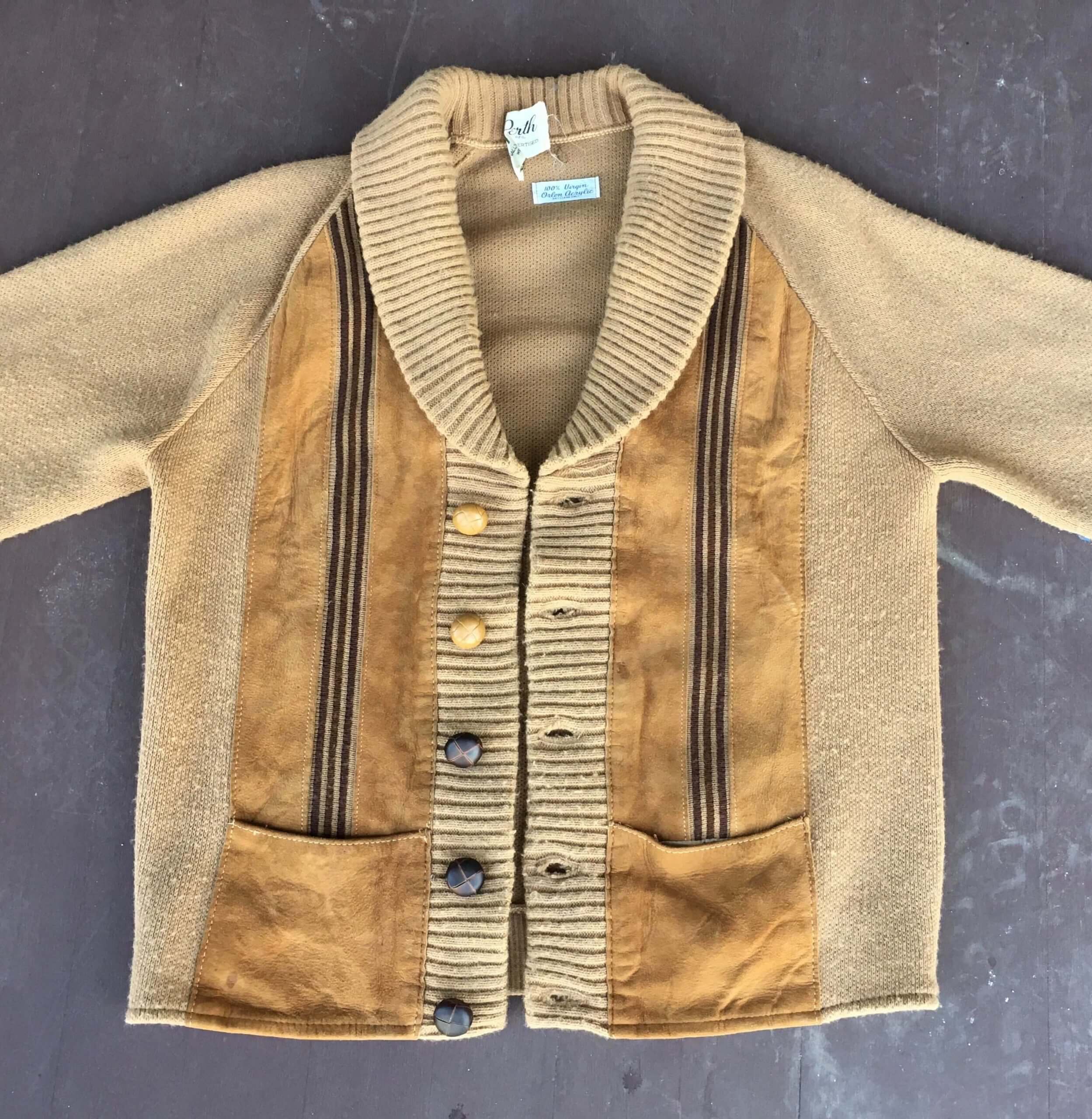
Click to enlarge
So what? Sew buttons! I recently scored this great vintage cardigan. Loved everything about it but the buttons, which were molded plastic designed to simulate leather buttons (not ideal, but I could live with it) and a pale yellow/tan color that didn’t offer much contrast from the background fabric (a much bigger issue, at least for me). So I got some brown leather buttons, which I figured would match the vertical stripes, and swapped them in.
The photo above shows three of the five original buttons replaced with the new ones. (After taking the photos, I finished the job.) The new ones look so much better! Here’s another shot:
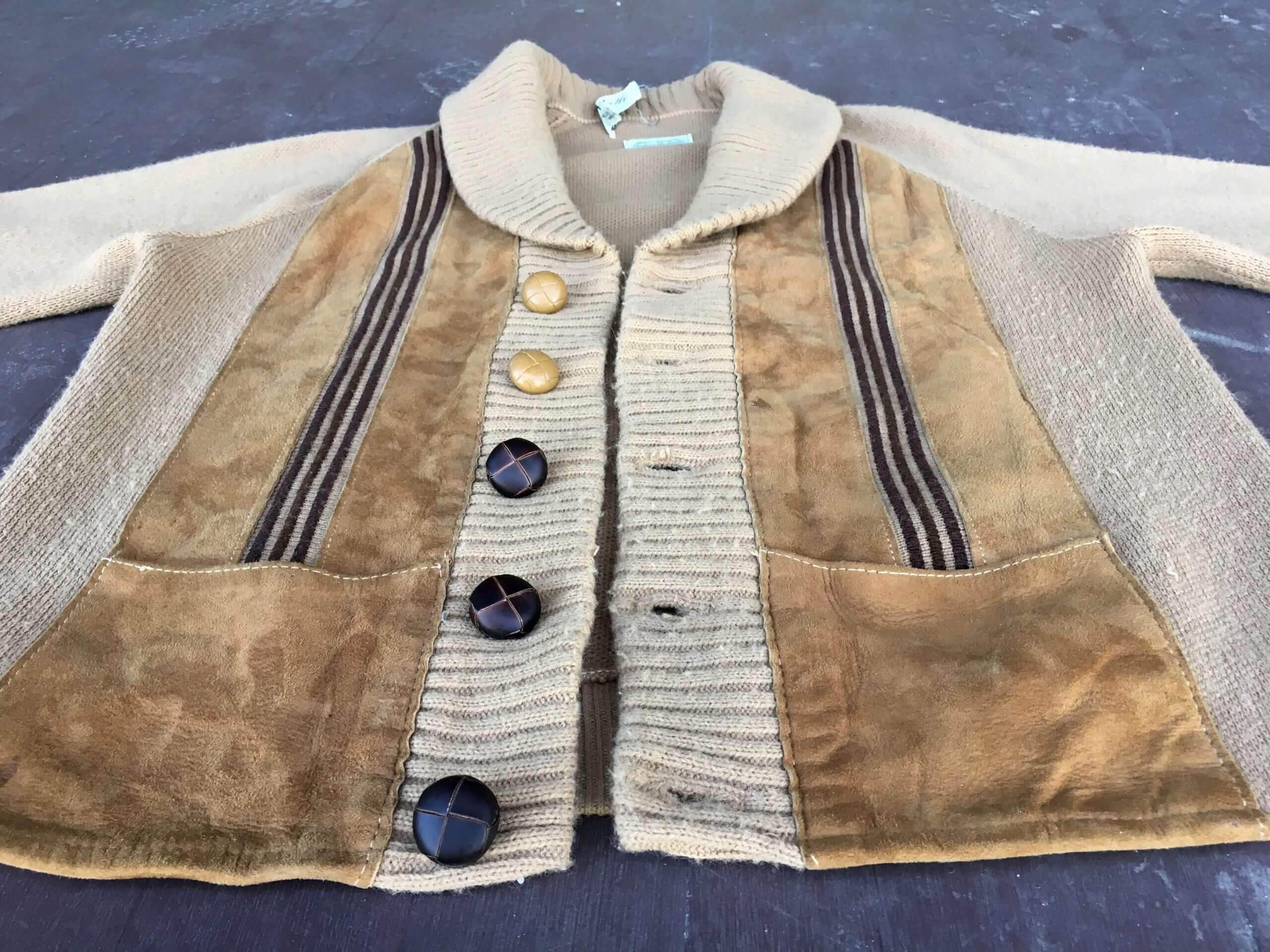
My sewing skills are very rudimentary, but it always feels good to work with my hands like this, even for something as simple as a few buttons.
The Ticker
By Anthony Emerson

Baseball News: New Mets SS Francisco Lindor wore Eddie Murphy’s jacket from Coming 2 America to Spring Training (from Mike Chamernik). … Also from Mike: Once upon a time, Earl Weaver grabbed his pitcher’s glove to prove a point to an obstinate umpire who had called the pitcher for a balk. … Here’s a look at Florida State’s many uniforms for this season (from multiple readers).
College Football News: Michigan and Northwestern have created a new rivalry trophy named after George Jewett, the first Black football player at both universities (from Mike Chamernik and Timmy Donahue).

Hockey News: The Caps wore Black History Month pregame sweaters last night, complete with a clever anti-racism shoulder patch. More looks here (from our own Jamie Rathjen and Brandon Weir). … Also from Brandon: here’s a video of Michigan State goalies discussing their masks. … Looks like Bruins D Urho Vaakanainen’s name is just short enough to allow him to have regular-sized letters on his nameplate (from @artofscorebug).

NBA News: Sportswriter Jeremy Schaap has some interesting thoughts on Nets PG Kyrie Irving wanting to change the NBA logo to honor Kobe Bryant instead of Jerry West. Irving also gave some additional thoughts about it (from @boss_hogge). … A Grizzlies blog has ranked the team’s top five uniforms. … The Mavs have worn five different uniforms in their past five games.

College/High School Hoops News: UNC wore Carolina Blue at home, creating a blue-vs-blue matchup against Georgia Tech (from James Gilbert).

Soccer News: New dark kit for FC Cincinnati (from multiple readers). … Toronto FC ST Jozy Altidore accidentally leaked the team’s new home kits in a hastily-deleted Instagram story. … It appears Rangers covered up their back ad with a piece of blue tape during their Europa League match against Antwerp. UEFA prohibits more than one ad on a kit during continental play (thanks, Jamie). … New shirts and outfitter for Belarusian club FC Vitebsk. “The shirts keep the El Lissitzky influences from last year’s Cup shirt,” says Ed Zelaski.

Grab Bag: The bib for pro golfer Rory McIlroy’s caddy misspelled McIlroy’s name (from @markinvictoria). … Temple University is retiring all of their owl-based logos (from multiple readers). … An Australian study has indicated that uncomfortable and inappropriate uniforms are turning some girls off from sports. … If you looked at a computer any time between like 2003 and 2013, you probably saw the iconic Windows XP default desktop. Here’s the fascinating story behind the photo, and the man who took it. … Cycling New Zealand has rejected a jersey design based on the country’s All-Blacks rugby jersey (from Gareth Hooton). … Third-tier Engligh rugby league team Keighley Cougars have become the first professional sports team to wear the LGBTQ+ Progress Flag on their kit (from Philip Brown). … New senior academy logos for the rugby union team Toronto Arrows RFC. … Graphic designer Rajie Cook, who designed the now-ubiquitous pictographs that appear all over airports, parks, and other public spaces, has died (from Jerry Kulig).

That’s a wrap for this week. Stay safe, enjoy Phil’s weekend content, check out the podcast if you haven’t done so already, and I’ll see you back here on Monday.
Agreed on the Tomcats/Kittens. A high school in my town is nicknamed “The Presidents” and the girls team’s are generally referred to as “the lady Presidents.” Ridiculous.
With no more information than we currently have, no, it’s definitely not a good look. It might be worth someone reaching out to inquire about the history of the nickname, though, as it does not seem impossible that the girls of the school might at some point in the past have chosen it themselves. Hey, this would be a hilarious reason for UniWatch to seek an interview with, say, 2006 Cy Young Award winner Brandon Webb…
Is the “tomcat” supposed to designate the F-14 fighter jet? If so, the school should keep the same name for both genders.
Oh, and while male cats are called “toms” in the cat-breeding context, female cats are called “queens.”
Thanks for that tidbit, Tom. I wondered what the female cat equivalent name was. And, yeah, it’d be fascinating to learn the origins of the school’s team names.
Opinion: if the folks at the school or in their local community are fine with the kittens moniker, then leave it be. It may not be the greatest team name — and, assuming the boys team is not named after F-14s, neither is tomcats, since it conjures images of promiscuity — but it’s their choice.
-C.
Strongly disagree. As a society, we all have an obligation to encourage equal status and non-hierarchical role modeling for all children. Schools are a huge part of that. You don’t have to live in that particular school district to have a stake in this.
Saying, “It’s their choice” is like saying they can choose not to teach math or science if they don’t feel like it. We all have a stake in that as well.
My high school mascot are the Whalers and I see the girls team referred to as Lady Whalers, equally ridiculous. And for a comment below using woke as a pejorative, obviously those who say that have no interest in seeing how words shape thoughts and how people are treated, so calling the girls team something different, especially something like kitten, is so demeaning.
Separate names for boys’ and girls’ athletics teams is almost always a mistake. Even the common Mascots/Lady Mascots formulation belittles the girls. If a school has a nickname, both boys and girls teams and programs should play under that name. I could see a situation where separate nicknames could be done in a linguistically and culturally equitable way – like, say, the school is the Chickens but the boys teams play as the Cockerels and the girls as the Pullets – but I can’t recall ever seeing such an example in practice in the real world.
Schools, pick a nickname and use it across the board. And journalists, if you use a gender adjective to distinguish between teams, use an adjective for each gender. So if you call it a girls game, then also describe it as a boys game when a boys team plays. The only exception being instances where there is no team of the alternate gender in existence. So in reference to my own alma mater, Eagles boys hockey and Eagles girls hockey, but Eagles football and Eagles softball.
Another option besides queens if they want a separate name for the girls’ team would be calicos.
“Molly” is the female version of “Tomcat”. Not Mollycat. Besides it being just wrong to have a different name for the boys and girls teams, Molly today is the slang for ecstasy.
My favorite of these in Central Missouri, the Mules and the Jennies.
Nifty cardigan. Perfect for both a night out on the porch or a game on the curling sheet.
I thought 100% Virgin Orlon Acrylic was interesting. Virgin implying “natural?” Also: Dry Clean Only. I thought you could wash Acrylic in the washing machine? Maybe not now, with the nice buttons…
“Better living….”
Despite all the gimmicky, not great uniforms we see these days, last night was a night when we could celebrate some great recent uniform changes. A progression to a better look.
Calgary Flames at Ottawa Senators looked a lot better last night:
link
Compared to last year and the last few seasons:
link
IMO Flames look better, I think the Senators look worse.
The Senators look fine, but their return to black is weird. They leaned so hard into their identity as a “red” team, so much of their arena and fan branding is around red, going back to a black team is strange.
The “Kittens” nickname isn’t very good. What’s interesting is that a female cat can be referred to as a “Queen,” and the school doesn’t use that for a nickname. It would fit much better.
The Blazer High School girls basketball team should be the “Mollys”. You’re welcome. A female tomcat is a molly.
Really enjoyed the Unified discussion on numbers as I love 0 and 00. One goalie-related one that it reminded me of is when Ed Belfour wore 00 in the 1993 All-Star game.
Nice work on the buttons!
Did a quick look last night and learned 00 is the number of choice for many mascots. Had not thought much about what numbers mascots wear.
Krazy George for the BC Lions!
Current BC mascot Leo the Lion too. I guess they did not retire the number for Krazy George.
link
The Frank Robinson quote is in the May 9, 1977 Sports Illustrated. link
Ah, excellent — thank you!
Loved how long the snow was sticking around! Looks like it’s very nearly gone now. Too bad. I was really hoping for some snow this year down in Ga, but alas, it’s looking like it’s not going to happen.
There is only one authority on names of tabbys:
“Tommy the cat had many a story to tell, but it was a rare occasion such as this that he did…”
“I remember it as if it were a meal ago…”
“Keighley Cougars have become the first professional sports team to wear the LGBTQ+ Progress Flag on their kit”
Keighley’s article is misleading. They were beaten to the progress flag by a month by the Western Bulldogs’ AFLW team, but they’ve qualified their article by saying “professional team” (AFLW is semi-professional).
They also call themselves the first to hold a pride game in 2019 — again, to cite only two examples, AFLW has had one since it started in 2017 and OL Reign have for longer than that.
Re Temple and its logos, I never let the opportunity pass to point out that both the University of North Carolina and Coastal Carolina University use a temple in their academic logos and Temple does not. (It is on their seal though.)
The only context I have heard tomcat in is when referring to a man who is on the prowl for women. The female equivalent to that I suppose would be a sex kitten??? Presumably a high school would not want their female athletes to be known as the sex kittens. Which makes you wonder why the high school would use the nickname tomcat to begin with for their male athletes.
“Yeah, our basketball players are like a bunch horny cats looking to mate.”
Really? We’re going apoplectic about Tomcat? Woke, woke woke.
Actually, (a) the commentary was about “Kittens,” not “Tomcat,” and (b) nobody was “apoplectic.”
If you’d like to defend “Kittens” on the merits, instead of just engaging in name-calling, I’m sure we’d all love to hear your thoughts.
In Lawrence Salk’s print focusing on Ernie Banks, it looks like there are three opposing teams featured. Two are obvious (I think): a Pirates catcher and a Cardinals catcher. I am stumped on the outfielder’s team in the upper right-hand corner. Anyone know?
Mets, I think.
Yeah, maybe the Braves too?
The Liberty Bell on the Sixers jersey is missing its crack.
I like the idea behind that design, but everything about that bell is trash – especially the giant clapper and the weirdly curved bottom. I’m surprised Paul didn’t call them out.
Consider me in the camp that wants the number to fit entirely within the bell. I present Exhibit A: The 2014 Golden State Warriors. Even though the number is small, it’s remarkably easy to read.
Re Tomcat: Are there any mascots today or in the past, that have a female identity (Valkyrie, Amazon, Molly Pitchers) that boys and girls athletic teams use?
My alma mater, Wheaton College in MA, is the Wheaton Lyons. The “Lyons” name is an homage to the school’s founder, Mary Lyon. The interesting part is that the logo and mascot has always been a female lion. Both the men’s and women’s teams wear the female lion logo.
link
Wheaton was an all-women school until 1988, when it went co-ed. The athletics programs are DIII, but we do have a MLB player to our name: outfielder Chris Denorfia.
University of Delaware – Blue Hens
Professional team: The Toledo Mud Hens.
I would totally root for a team called the Mermaids!
The high school teams at Brewer High School in Brewer, Maine are the “Witches”. Both the boys and girls teams.
Great podcast again!
Once again I thought something and you talked about it a minute later. I was wondering if 0 and 00 were different numbers, why aren’t 5 and 05? And you talked about that right away.
Here’s the story of Al Oliver and Cliff Johnson: Al Oliver had been wearing 0 for years. Cliff Johnson was a trade deadline acquisition, he usually wore 44 (and had worn 44 in his previous stint with the Jays) but that was taken by Jeff Burroughs, so he took 00. It was the only time he wore 00.
I don’t know why the Jays are the “hub” of 0 and 00, but I think we can all agree that those numbers look best rendered in the jays rounded split numbers. The Mets, all due respect, don’t pull the 0 off quite as well with the block numbers.
Paul, the podcast has been fantastic! Really digging it!
The Nets AND 6ers “Earned” are both really cool. The gray of that jersey with the pattern looks really cool.
As a Cleveland Baseball Team fan (still sad losing the name, but OK since it’s for a good reason) I think that road blue looks great. It does look a little softball/BP-ish but the red really pops and I love the font.
One thing I am looking forward to with the re-brand is that the home whites say “Indians” in script, the hat is a block letter, and the roads have the block letters. I really dislike the inconsistency between the unis. Hope they keep Red, white, and blue (more red, btw, as their red alts are awesome) though.
“Michigan and Northwestern have created a new (football) rivalry trophy”
– Good intentions, but a bit surprising considering Michigan is really just a basketball school at this point.
Just don’t call the desktop background a screen saver
Regarding the Tomcats/Kittens thing… I find it interesting that we humans tend to assume that mature things are somehow intrinsically superior to immature things. The men’s team is named after a mature adult animal, whereas the women’s team is named after an immature animal, and we see that as insulting to women.
But why is that? Why do we find references to young things inherently pejorative? I’m sure there are many ways in which kittens are superior to adult cats, but for whatever reason, that isn’t the standard way of human thinking.
With all due respect, Daniel, if you can’t see how that particular dichotomy — mature vs. immature, or adults vs. children — reinforces longstanding harmful gender stereotypes, I’m afraid there isn’t much to discuss.
Please don’t be so quick to take a confrontational stance. I’m not trying to start a fight here. I’m simply trying to start the kind of worthwhile intellectual discussion that I might have with my students in a scientific philosophy class.
Of course I’m aware of the stereotypes you’re talking about, and I’m aware of how the Tomcats/Kittens issue plays into them. But those stereotypes are only harmful if they’re based in the assumption that maturity is intrinsically superior to immaturity. That’s what I’m trying to get at. If we could get rid of the assumption that being immature is somehow “bad” (or the related assumption that being a leader is somehow morally superior to being a follower), those kinds of stereotypes would be a lot less damaging to people.
You seem to be trying to remove the mature-vs.immature comparison from the surrounding context. And I agree that in a vacuum, there’s nothing inherently better or worse about children vs. adults. Indeed, the whole “Get off my lawn” thing is an example (one of many) of how our society does *not* always rank maturity as a virtue, so I’d say you’re anchoring your whole argument on a faulty premise.
In any case, the larger issue is that we’re not talking about this in a vacuum. We’re talking about it in the context of longstanding harmful gender stereotypes — including stereotypes that males are inherently more mature, more rational, more “adult,” more “professional,” etc., while females are inherently more immature, more childlike, more irrational, etc. The hierarchy in these team names is clearly apparent.
When viewed in that context — which is, you know, the context we’re actually discussing — the issue seems self-evident enough. Trying to divorce it from that context seems like sophistry, at least to me.
Or to put it another way: If you had a daughter attending this school, would you defend the team names on the basis you’ve just presented?
I am all in for more NBA jerseys like the 76ers, beauty.
I’m in the middle of episode 3 of the podcast. I listen to and from work, it’s been great. One issue though I’m finding is the sound level of each speaker, one is lower than the other which makes for constant raising and lowering level of volume control.
Legit Q:
Since there is no more “Mr.” Potato Head, is it safe to safe that there will soon be no more “Mr.” Met?
Legit A: Actually, there still is a Mr. (and Mrs.) Potato Head.
link
I love all of those Cubs prints. I would take one of each!
Temple University is retiring all of their owl-based logos (from multiple readers).
I hope Hooter is next. He’s nightmarish enough to have been in The Wizard of Oz.
I love that cardigan!
I realize this is a technicality, but Benito Santiago is not wearing a 0 or 00. His number is 09.Hope this doesn’t come off as too nit-picky, but I had to look it up because I thought I was seeing something wrong with the picture.
Right — but zero is part of his uni number, in a very uncommon way. And 09 relates to 9 in the same way 00 relates to 0 (all of which we discussed in the episode).
Here’s another leading-zero guy who is not very famous: link for the Hanshin Tigers in the 1990s. He picked it saying that he wanted to hit like a devil, which is oni in Japanese; o looks like zero and ni is the number 2.
Supposedly Matsunaga is hated by Tiger fans because after leaving the team he insulted their beloved Koshien Stadium, so maybe that’s why he isn’t talked about much.
I’ve also read that Orestes Destrade, while playing for the Seibu Lions, had to borrow a team staffer’s jersey for one game and so instead of his usual 39, he was number 05 — the Seibu Lions used to give leading-zero numbers to staffers and BP pitchers and the like. I can’t find a picture of that, though. I’ve been looking all over.