
For most of these photos, click to enlarge
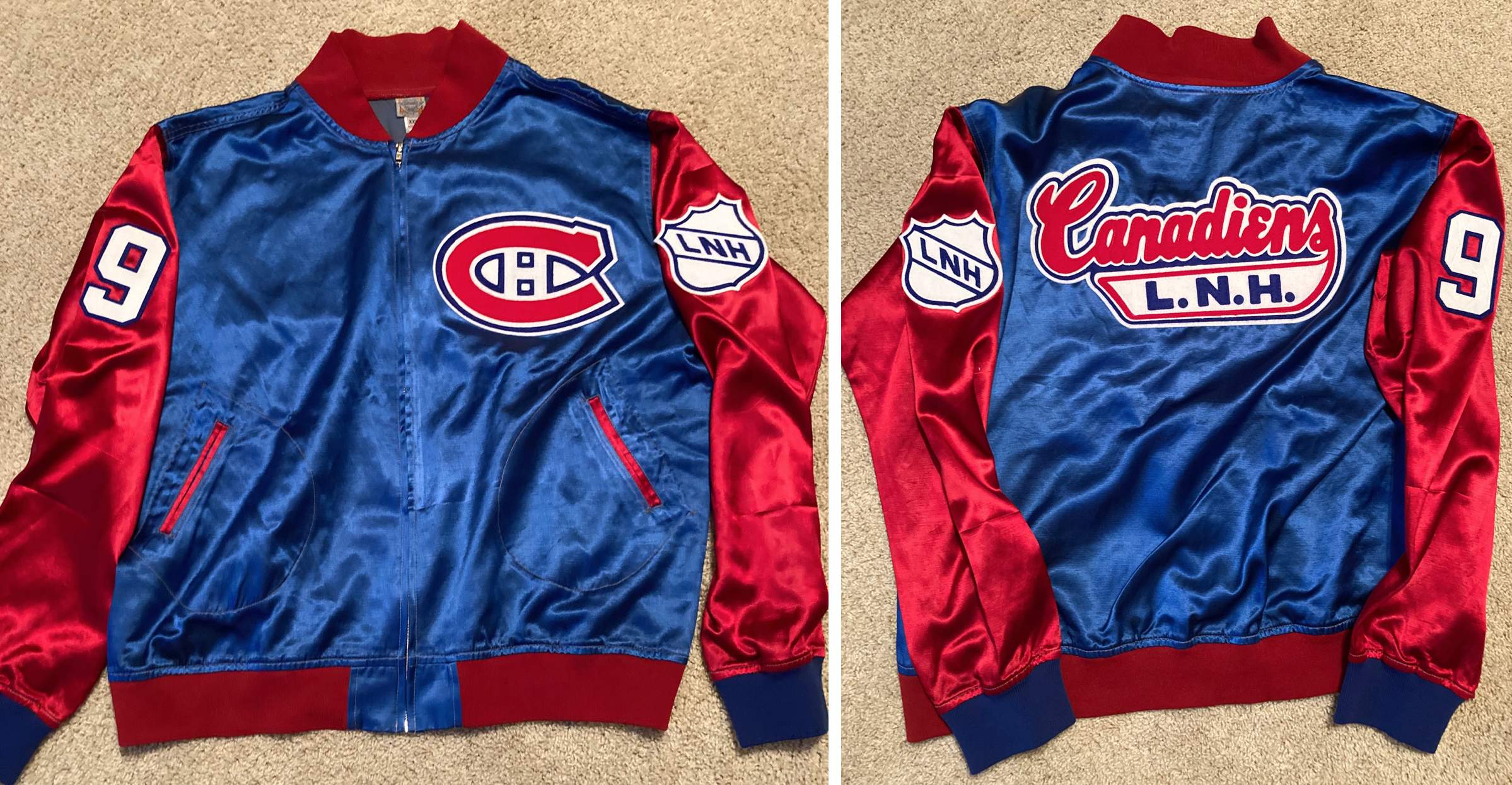
The Canadiens jacket shown above is pretty sweet, no? And here’s the beauty part: It’s not a retail item — Uni Watch reader Todd Morss DIY’d it himself. He’s a longtime uni restorer/customizer, similar to Bill Henderson. Here’s how he created this jacket, in his own words.
My DIY Canadiens Jacket
By Todd Morss
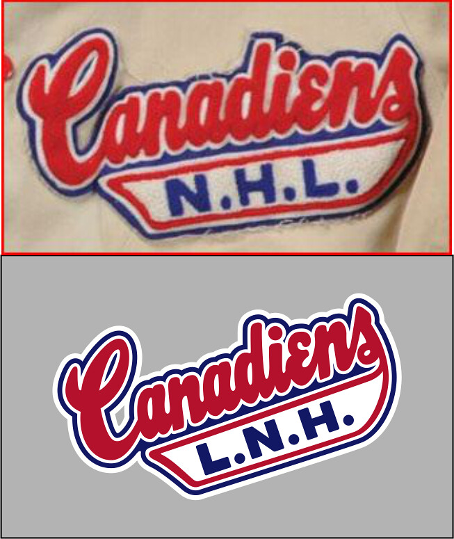
I always loved the old script that was used on Habs coaches’ jackets. For this project, I began by taking the script from a late-’50s jacket that belonged to a scout. I made a vector version of it after a friend and I nitpicked it as only uni-watchers can:
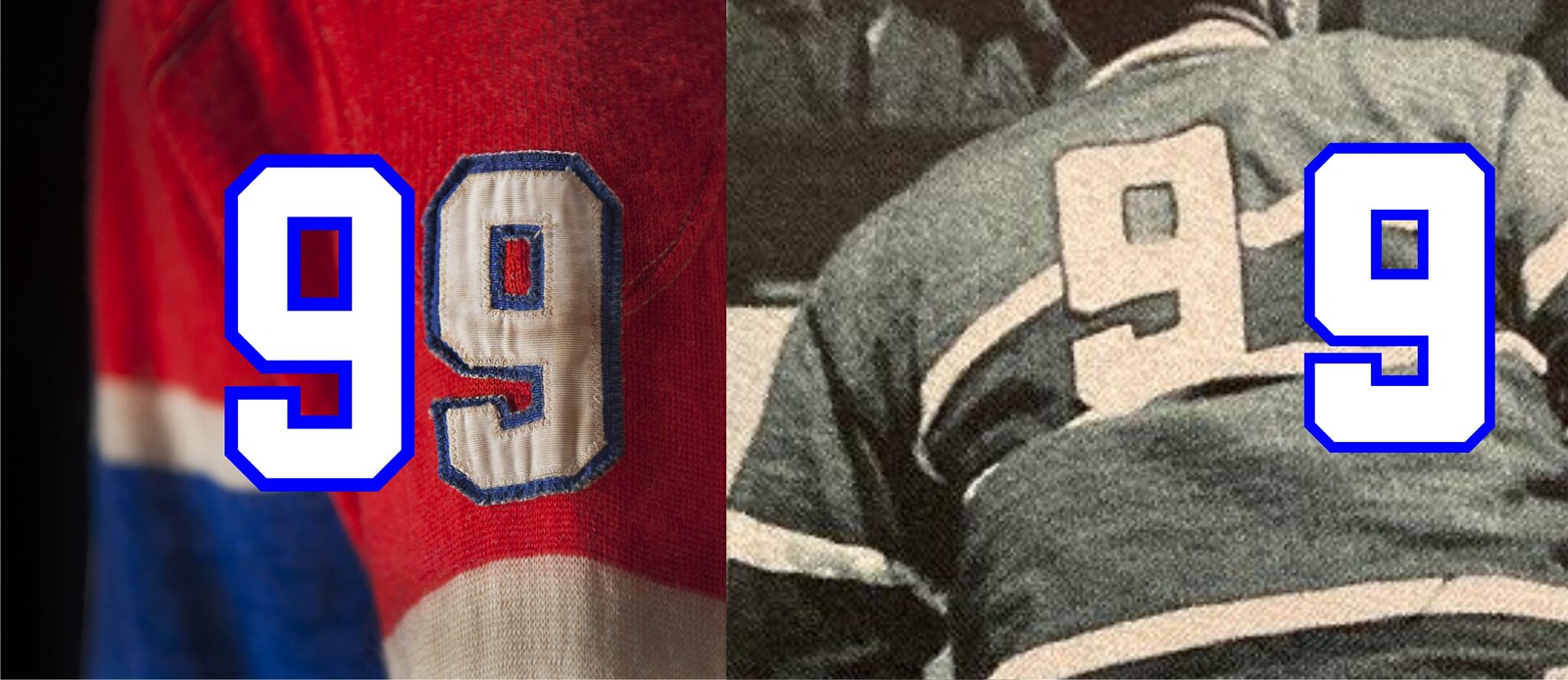
Growing up, the legend of Maurice Richard was huge to me because of what he meant to people, and to the game. I wanted this to be something comparable to a team-issued jacket that he would have worn. To that end, I used photos of his sweater — some from books, some from my own trip to the Hockey Hall of Fame in November 2019. Again, I made a vector version of the rear-sweater and sleeve digits. Logically, the folks at McNiece’s or L.J. Parent et Fils, who outfitted the Canadiens back then, would have used the same digits on jackets as on the team’s sweaters.
When Ebbets Field Flannels (good people, magnificent products!) ran a clearance sale on satin jackets some months ago, I jumped on a Montreal Royals one, which they were kind enough to send me without logos! Here’s the mockup I did once the jacket was ordered:

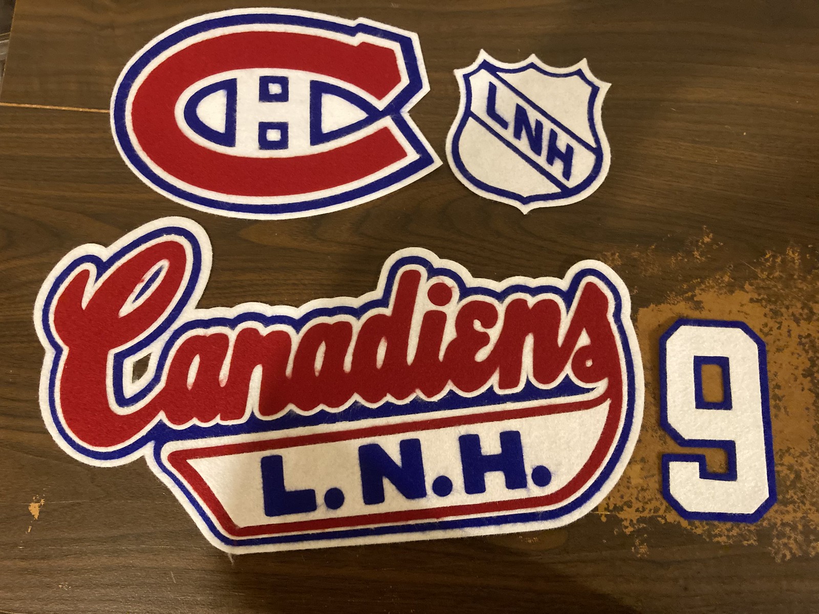
Now it was time to cut! I went with felt because most sewing machines weren’t capable of zig-zag stitches until about 1955, so that ruled out twill. Plus twill was fairly new to the sports fabric landscape at that time. Also, personally, I just like the look and feel of felt on satin. I took the vector files I’d made, separated by color for cutting on my Roland vinyl cutter (don’t try cutting felt on a vinyl cutter at home, kids!), and got to work. In this next image, on the left you can see the full-color versions, and below them the image set for cutting in “wireframe” in layers; on the right is my approximate arrangement of the geometry by color as sent to the cutter and produced.

The felt layers were then arranged in position and heat-pressed together:



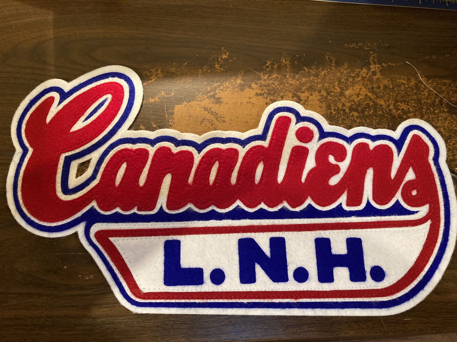
This is acrylic felt, so the layers being pressed together individually would hold permanently, but that’s not the way I want the Rocket’s jacket to have been, so I sewed the layers together. I trimmed much of the fuzz off of the edges of the pieces. Again, using a vinyl cutter is less than ideal, but I was happy to do it for a one-off personal project:



I’ve always loved the stitching patterns that were sewn into the felt numbers of old hockey sweaters. Richard had a star sewn into his “9,” so I went with that as well. It’s my favorite detail on the jacket — my own little tip of the hat to the people who sewed the originals:


At this point, the most difficult part of the project was over. Now it was time to sew the elements onto the jacket. The first thing I did was the 9, because it would require a stop and start; he other elements were all a continuous stitch.

In case you’ve been wondering: I used the French version of the NHL logo because to me that’s the only way it should appear on any Habs apparel. The NHL was already using the black/orange shield in the late ’50s, but I liked the way the shield looked on the 1949 All-Star sweaters, so I made a royal/white version of that.

Next up was the chest logo. At this point, I stopped being a professional who has sewn jerseys and jackets for years and became like a kid who’d just met his heroes again. Finally, I had the jacket I’d been dreaming of!

The home stretch — the back patch is big, heavy, stiff, and exactly what I was hoping it would be:

Finally, the finished product. I’m really proud of how this one turned out:
———
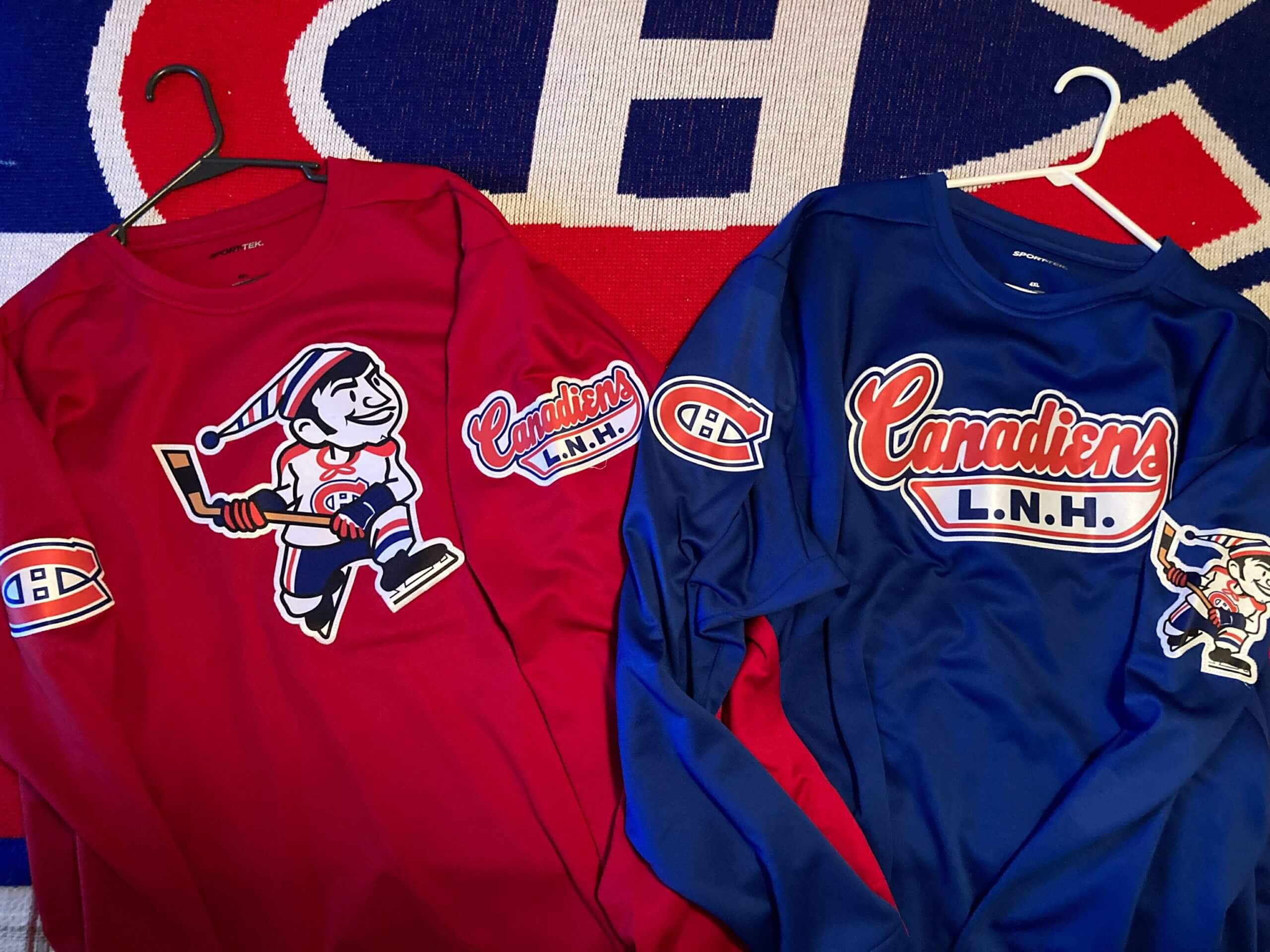
Paul here. Wow — what a project! As a bonus, Todd also sent along this photo of a couple of sweatshirts that were inspired by the jacket project:
Please join me in thanking Todd for sharing all of this eye candy with us. Nicely done!
Podcast reminder: In case you missed it yesterday, the new episode of Unified is now ready for your listening and viewing pleasure. With pitchers and catchers reporting to spring training this week, we talked about this year’s upcoming MLB uniform uni changes, plus we each listed some MLB changes we’d like to see, plus-plus there’s some chatter about the Golden Knights’ new gold helmets and, in the first installment of what we hope will be a regular feature, we answered a question submitted by a listener.
You can listen to this episode, and subscribe to future installments, on Apple, Google, Stitcher, TuneIn, and Spotify, or just use the player below:
Photos of things we discussed in this episode are available on the Unified website, and those photos also appear in the video version of the episode:
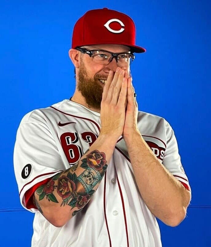
More MLB memorial patches: The Reds yesterday shared a photo of reliever Sean Doolittle, which gave us our first look at their memorial sleeve patch for Joe Morgan. To my knowledge, they never officially announced that there would be a Morgan patch, but it seemed like a no-brainer. I’m thinking the Astros will likely have a patch for Morgan as well.
Meanwhile, the Brewers have added a Henry Aaron memorial patch to their spring jersey sleeves. The design features the colors and number font that the team used during Aaron’s two seasons with the Brew Crew:
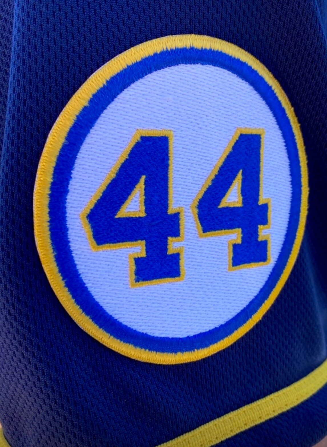
It’s hard to tell from that close-up photo, but a video screen shot from one of yesterday’s workouts suggests that the patch is rather enormous:
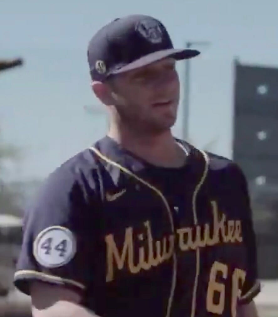
While nothing has yet been officially announced, I think it’s safe to assume that this patch will also appear on the team’s regular season jerseys. Meanwhile, no sign yet of Atlanta’s patch for Aaron (or for Phil Niekro, or for Don Sutton), but that will presumably follow at some point between now and Opening Day.
(Thanks to Steve Hamsath and Jim Hanke for spotting the Morgan and Aaron patches, respectively.)
My 10-yr-old spent his TN snowpocalypse day crafting an homage to the King and one of his greatest heroes. Meet LeSnow James, y’all. Sporting the Laker-themed Witness IVs that Cael asked for as his “big” Christmas present, and has worn every day since. 🐐
cc: @KingJames pic.twitter.com/Ylmv1bTMQE
— Corey Markum (@ProfMarkum) February 18, 2021
Small(er) forward: Have we ever seen a uni-clad snowman before? Eh, maybe, but I can’t remember any specific instances of it. Pretty cool!
(Thanks to Will Shull for pointing me toward this one.)
Click to enlarge
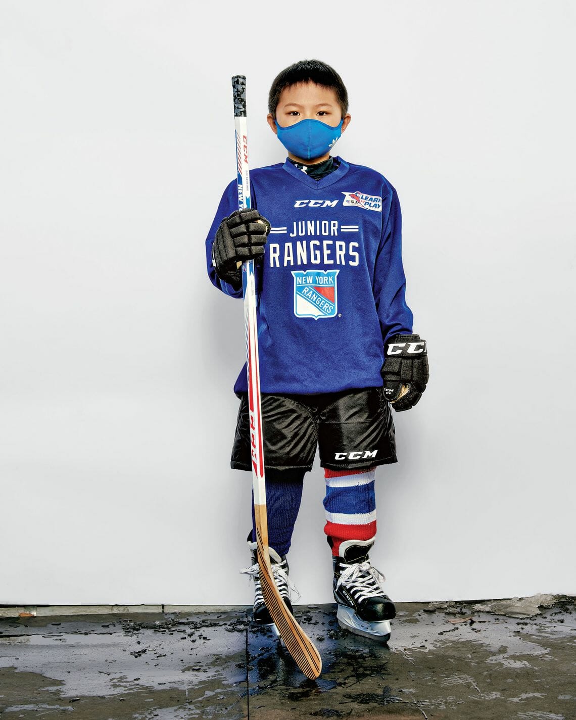
Too good for the Ticker: The kid shown above is a Brooklyn first-grader named Kenneth Chong. He’s one of a bunch of boys and girls who were recently photographed at a “Learn to Play” session in Brooklyn’s Prospect Park. I love his mismatched socks!
The photos are pretty damn adorable. You can see the full set here.
Click to enlarge
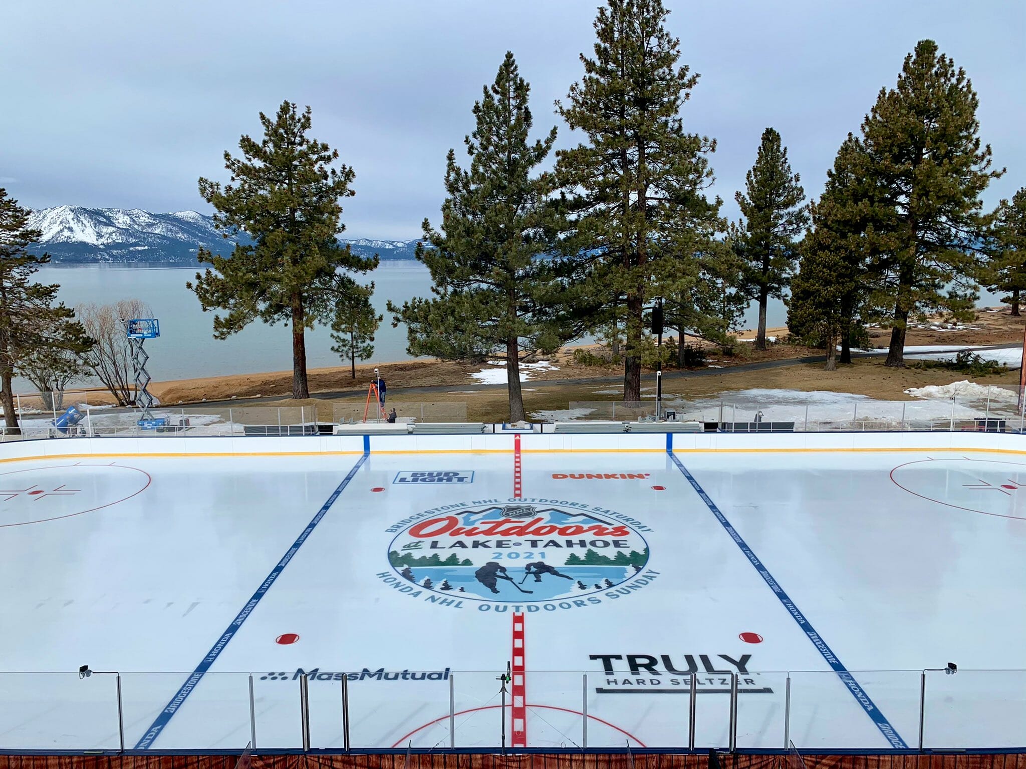
Oh for fuck’s sake: The good news is that the setting for this weekend’s NHL games at Lake Tahoe looks great. The bad news is they’ve put advertising in the blue lines. Sigh.
(Blame @TopherFlounder for pointing this out.)
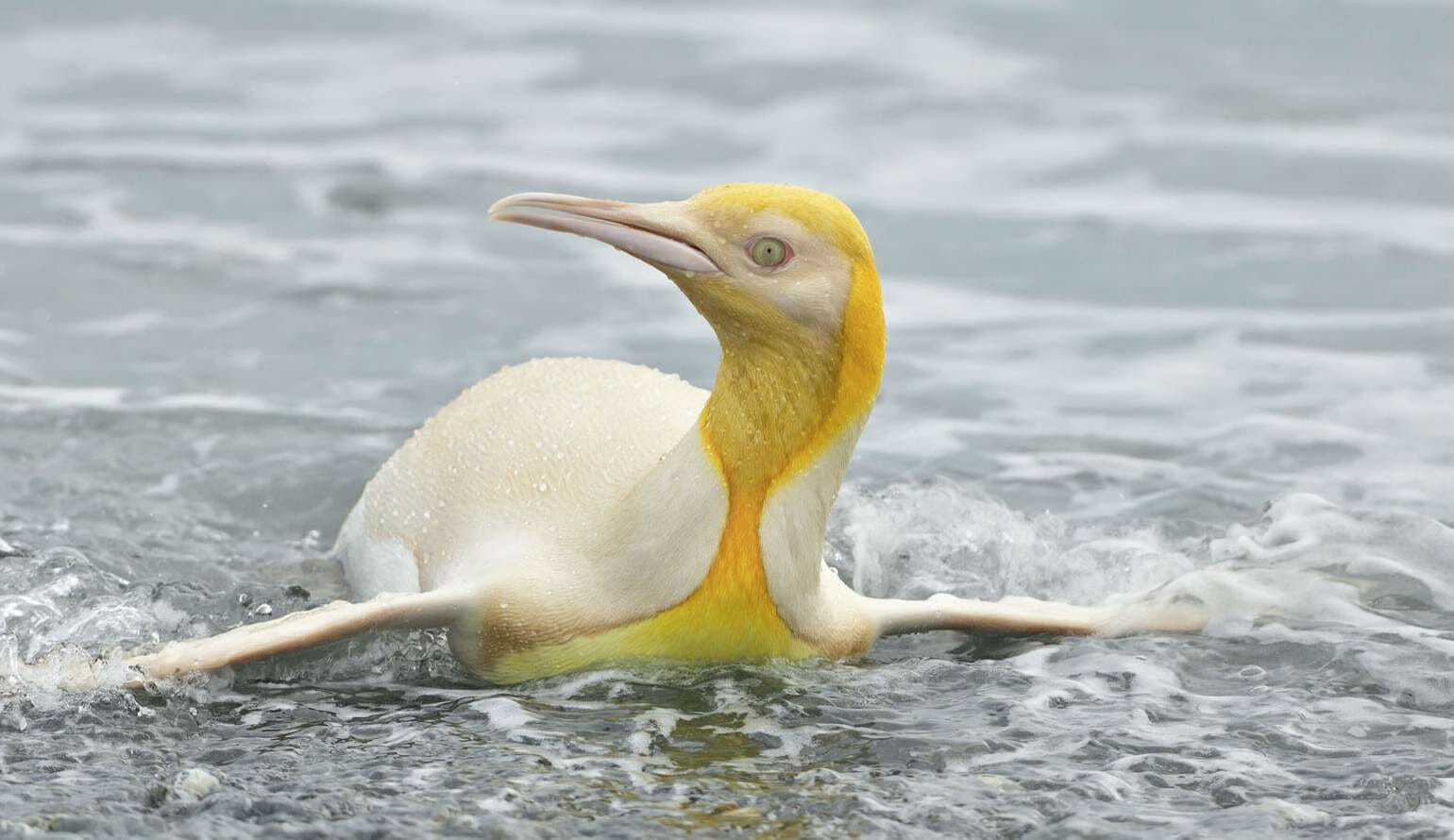
This reverse retro thing is getting out of hand: What you see above is not a Photoshop job. It’s a rare yellow penguin, sighted by a wildlife photographer on an island in the South Atlantic (full details here).
It’s like an alternate uniform! Dig:

(Big thanks to Rick Porter for this one.)

Membership update: A new batch of designs has been added to the membership card gallery. That includes Ray Pelanda’s card, shown at right, which is based on the mid-1980s Cavaliers — the rare NBA jersey that included nameplates.
Ordering a membership card is a good way to support Uni Watch (which, frankly, could use your support these days). And remember, as a gesture of comm-uni-ty solidarity, the price of a membership has been reduced from $25 to $20 until further notice, plus a Uni Watch membership card entitles you to a 15% discount on any of the merchandise in the Uni Watch, Uni Rock, and Naming Wrongs shops, and the discount also applies to our Uni Watch Classic Cap and Uni Watch toque. (If you’re an existing member and would like to have the discount code, email me and I’ll hook you up.)
As always, you can sign up for your own custom-designed card here, you can see all the cards we’ve designed so far here (now more than 3,000 of them!), and you can see how we produce the cards here.
The Ticker
By Anthony Emerson

Baseball News: Padres rookie P MacKenzie Gore is going with No. 1 (from David Norman). … The Cardinals have issued No. 57 for the first time since Darryl Kile died shortly before a game in 2002. Rookie Zack Thompson has received the number (from Erik Spoonmore). … MiLB.com has taken a look at the 11 oldest minor league ballparks (from Wade Heidt). … Here’s a really cool animation showing the birthplaces of every MLB player ever (from Joseph Young). … The “Miller Park” signage is finally coming down off of Milwaukee’s ballpark (from Scott Rogers). … Also from Scott: The Beloit Snappers, High-A affiliates of the Marlins, have a “farewell season” logo. The Snappers will have a new identity in 2022 (also from Kevin Troy and Ryan Wozniak). … The Somerset Patriots, the new Double-A affiliates of the Yankees, will have new Yankees-based unis (Athletic link), which will be revealed in March (from Michael Rich). … The Appalachian League’s team in Bluefield, W.Va., has unveiled its new name, the Bluefield Ridge Runners, and logos (from Kary Klismet). … The Coastal Plain League’s newest team is the Spartanburgers — just one word. One of their secondary logos features a bunch of bats doubling as an order of French fries (from Christopher Keese and Timmy Donahue). … The Northwoods League’s Green Bay Booyah will play as the Green Bay G.O.A.T.S. for four Sunday home games, as a way to honor the football team they consider to be the “greatest of all time,” the Packers (from Jeff Ash and Brian Kerhin). … Check out this early-’70s Dodgers photo: Most of the players are wearing the team’s then-current “Dodgers” road script, but the guy partially obscured by the batter is wearing “Los Angeles” (good spot by Joey Amarante).

Pro Football News: An Eagles fan had a creative way of repurposing his Carson Wentz jersey after Wentz was traded to Indianapolis (from Michael Rich). … The Montreal Alouettes and Olympic Stadium management have had discussions about the team returning for 2021 (from Wade Heidt).
College Football News: In 1997, Alabama had two running backs named Alexander on their roster — Curtis and Shaun. So why was Shaun Alexander’s NOB “SU. ALEXANDER“. Why not “SH”? Why not just “S”? (Good find by Douglas Ford.)

Hockey News: The Predators wore their ЯR unis on the road in Columbus last night, creating a color-vs-color matchup (from multiple readers). … The Rangers are wearing a social justice patch on their practice sweaters this month (from @tierknala). … The Penguins have posted a really cool video about the local small business that does some of their sweater sewing (from Matt B.) … A hockey blog has ranked all of the Dallas Stars’ sweaters since their relocation from Minneapolis (from Kary Klismet). … Here are the first arena drawings and plans for the Kraken’s as-yet-unnamed AHL affiliate, which will be in California’s Coachella Valley (from John Roach).

NBA News: Knicks great Dave DeBusschere appeared on the game show To Tell the Truth in 1963. The imposters appeared in full uniforms, while DeBusschere wore a suit. One imposter, Bob Goldsholl, became a local sports broadcaster in New York. … Tennis player Naomi Osaka is a huge Kobe Bryant fan, and after her most recent match she wore a Kobe/Shaq-era Lakers warm-up shirt during the press conference (from Mike Chamernik).

Soccer News: CF Montreal have revealed their first home jersey since their rebrand from the Impact (from Cory Sechret). Club President and CEO Kevin Gilmore said, “This jersey is a celebration of the uniqueness of our city, our province and our history,” which led to some eyerolls, as there are eight clubs with black home kits in MLS (from Alex Rubin and Edwin Garcia). … Scottish giants Rangers played a Europa League match away against Antwerp and had their jersey ad changed from 32Red to Unibet, as 32Red does not operate in Belgium. Unibet and 32Red are both owned by the same company. I’ve heard of teams dropping ads during European competition because of advertising regulations, but never changing them to a different arm of the same company, and I’ve never heard of a team dropping an ad for a match because the advertised company doesn’t operate in that country (from Germán Cabrejo). … Polish side Garbarnia Kraków have a 100th-anniversary logo (from Ed Żelaski). … Manchester United debutant Amad Diallo wore a wristband in the colors of the flag of his native Ivory Coast during the Europa League match against Real Sociedad. … NWSL expansion team Angel City FC has its first jersey ad. The team isn’t supposed to start play until 2022 but will have a uni reveal in the summer (from our own Jamie Rathjen).

Grab Bag: Remember Paul’s recent piece about Baltimore salt box art? Here’s another article about that (from David Cline). … The following are both from Kary Klismet: The University of Maine will update nearly all of its athletic facilities, including building a new on-campus basketball arena. … Quinnipiac University’s logo has been repeatedly confused with symbols used by QAnon adherents.

I’m trudging through the snow to the eye doctor today, because I’m pretty sure I need a new prescription for my glasses. That’s what passes for excitement around here these days.
Have a good weekend, enjoy Phil’s Saturday and Sunday content, stay safe, and I’ll see you back here on Monday. I have some really good content in the hopper that I think you’re gonna like next week! Peace. — Paul
Great work on the jacket Todd! Looks amazing!
Thank you! I’m very proud of it!
It is indeed a beaut! And not just aesthetically exquisite, but so thoughtfully conceived and designed as well. Thanks for sharing the story and pictures!
In the Aaron patch section, you mention Joe Niekro. I think you mean Joe’s brother Phil.
Correct. Fixed!
Looking through the ‘Learn to Play’ gallery, it appears as though Kenneth’s brother Kristian has the other blue and striped socks (on alternate legs too!) I guess when it comes to socks, brothers have to share the stripes!
I hope that is Kristian’s stick and not Kenneth’s due to the length. Regardless, it is still a bit too long for Kristian too.
That article about oldest minor league ballparks is absurd. By the logic its author uses, New Shea dates to 1964 and New Yankee dates to 1923. Just because the infield baselines and outfield grass are in roughly the same place doesn’t mean some of those parks are actually historic.
I don’t know that I’d call it “absurd,” but rather the premise raises an interesting question: What is the fundamental physical object that defines a ballpark? I tend to agree with you that the structure of the stands, particularly the infield stands, is the heart of a ballpark. But I think it’s also plausible, if maybe a bit romantic, to view the field on which the game is played as the heart of a ballpark. Before the 1970s, and especially before WWII, even big-league parks used to see fairly extensive renovations of their stands.
The Ballpark of Theseus. Theseus Field.
I once heard someone say the field itself is the historic part and should always be kept. The grandstands around the field is just a building to watch it from.
Agree. Jackie Robinson Stadium in Daytona was rebuilt in 1962, for example (as I understand it). It is fair to say that professional baseball has been played at that location since 1914, but the stadium itself is not from 1914. That distinction really needs to be made clear.
That is, agreeing with Scott 8:55am.
I know they referenced it in the article, but can’t help but thinking that the Spartanburgers name was even more inspired by the city’s claim to fame, the Beacon Drive-In (Seems like the kind of place Paul would enjoy trying if he ever makes it down this way link). Makes me want to take the hour drive this weekend just to get a Double Cheeseburger A-Plenty. Love the creativity behind the name.
Todd – incredible work on the patches and jacket. I think you nailed the look and feel of a jacket in that time period. And it is such a higher quality than any jacket available now. Hope to see more of your work in the future
Thank you! I’m sure I’ll be sharing more as I take some time to finally work on my own projects.
Paul, have you heard anything about the Mets continuing with a Seaver memorial patch of some kind this season? Given that we lost Tom in September, and his importance to the team, would be nice to see a season-long tribute. (And a better patch.)
I don’t love the blue line ads, but I noticed there were no ads on the boards — that’s a big plus!
I have not heard anything about carrying over the Seaver patch.
I believe the ads on the boards will be projected/digital/etc.
Thank you!
I didn’t know they were projecting ads on the boards. Kind of ruins that!
Hey, if the ads on the boards aren’t there in real life, that’s a huge motivator to go see sports live and in-person! (when it is safe to do so again)
Really nice jacket by Todd. Good attention to details.
Cool to see the Nashville Predators wear the yellow uniforms vs. a team in their dark uniforms. Throwback-like feel to when a few teams wore yellow uniforms as the light uniform instead of white.
Understand that the Predators are wearing navy helmets with the Reverse Retro, but I think it would have looked better with them in the yellow helmets last night.
This happens more in the juniors and college, but a game having both teams in the same color helmet spoils the aesthetics for me. In hockey *and* football.
I love everything about this decision by the Preds. First of all, their RR uni might be my favorite of all of them. (I didn’t feel this way when it was first revealed, but it just looks absolutely fine on the ice.) And, like Wade said, I’ve always felt that yellow jerseys should be worn as “whites”. There’s more contrast that way.
When Shaun Alexander (the running back) was a freshman in 1995, Alabama also had a freshman walk-on defensive lineman named Shawn Alexander. The two had “S.U. Alexander” and “S.W. Alexander” on their lockers (link); this probably carried over to their NOBs.
Nice!
With the way MLB handled minor league contraction (not well) I can’t help but cynically look at that “Oldest Stadium” list as a warning to those teams.
Great craftwork and creativity Todd. Did you need to remove a lining (and replace it afterwards) from the jacket? How many hours did you dedicate to this project?
Thank you, Dave! There was no lining. Those jackets are just a satin shell, so it’s very light and good for spring or fall. Most of the production was fairly simple stuff that I’ve done a lot of. I’d say that the script and the NHL patches inflated how long it took only because of how many layers. The actual cutting and seeing would probably be in the 3-4 hour range. Once I got started I was on a roll.
The time vampire was my own quest for perfection. I went back and forth on having the black blank and making the script front chest like it was on the originals, but I’m glad I stuck with the CH.
What great content today. That jacket is gorgeous. I’ve taken a stab at using a sewing machine myself, albeit without any training, and I’m thoroughly impressed with your stitching abilities. Also, thank you for including the details of your vector images. As Bruins fans my late godfather would disown me, but I’d totally rock that jacket.
Thank you- and even though I’m a Habs fan, the Bruins I’ve met have all been absolute class act gentleman. I have a very, very healthy respect for the Bruins.
Sewing is all about time spent. The more you do it, the better you get.
Amazing project by Todd today. Really clean, top quality work!
Todd, fantastic work on that jacket. It really is beautiful. Thanks for sharing with us!
Regarding salt boxes, I wanted to post this a few days ago and forgot. The City of Minneapolis does provide a free sand/salt mixture for residents to use on their sidewalks. It is available in only a few locations throughout the city and–unfortunately–is dispensed from large, rusty dumpsters.
link
As a Bruins fan, I find that jacket DISGUSTING……. ly awesome. Dammit.
That jacket is awesome…being from Atlanta I was actually able to attend a game there in what I guess is the old Forum now, circa 1993, while on a road trip.
On another note, I have to feel like someone at adidas (perhaps a soccer elitist) actually hates the idea and existence of MLS and is just doing all black and all white kits as a kind of inside joke. It’s shocking to see such a bland lineup of uniforms in a modern day league.
I’m always humbled by the artistry, initiative, and sweat the Uni-Watch DIY brigade bring to their projects! Todd, that’s a jacket anybody would love to wear.
Quinnipiac University’s logo has been repeatedly confused with symbols used by QAnon adherents.
Oh, for Pete’s sake. It was bad enough when the Nazis took the swastika: Do we honestly have to cede an actual letter of the alphabet to a neo-fascist organization?
There is nothing like a well designed, retro jacket with nice patches. All we get today are bland designs from league-wide templates. I wish someone would produce jackets like this for the masses.
Steve, I couldn’t agree with you more. I loved the era in MLB when the teams could choose their own jacket designs. Working in the industry for a while now, I would always see these things and think that the old ways are so often still the best. As a dealer, I have access to quite a few products that can be customized, and I always get responses like “if they would put that out instead of the gimmicks they do, they might sell more”. All that to say, I agree, I wish jackets like this were still available.for the masses. Hopefully one day the pendulum will swing back towards the tasteful version of retro.
Phenomenal job on that jacket, Todd! Impeccable work on the felt lettering and numbering and stitching.
Todd! The stitching looks so good!! Well done!!!
Thanks guys! I take incredible pride in my stitching.
The rink at Tahoe looks awesome, I can deal with the ads on the blue line. I know some folks around here hate the saying but it could be worse.
I don’t hate that saying; I just think it’s meaningless. I mean, sure things could be worse — that’s pretty much always the case about everything. They could also be better!
If the boards stay as clean as they are in that photo, then I can live with the blue line ads.
I’m guessing the Dodger player with the script “Los Angeles” instead of “Dodgers” like the rest of the players was a bat boy.
Yes, the patch for Henry Aaron is big. If there is anyone who deserves an oversized memorial patch it’s Hank Aaron. He earned it.
Yeah, there’s that.
The better news is that the Lake Tahoe series will look a bit like the Mystery, Alaska set. e.g., not something in a big gigantor stadium, but much more in the open. That area of LT is beautiful.
I just want to say thanks to Paul for featuring my jacket on the site today, it was a huge honour! Also big thanks to all who commented. It’s really a great feeling when people appreciate when you put so much into a project. Your compliments have been very kind. I take great pride in my work and it’s very affirming that it is seen as being good.