We’re all familiar with the different facemask styles that are common for various football positions. But now Vicis is releasing something new — not just a position-specific facemask, but a position-specific helmet, which may redefine the look of the sport.
You may be asking yourself, “Wait a minute — didn’t Vicis go bust a little over a year ago?” Yes, but then their assets were bought by venture capitalists aligned with rival helmet manufacturer Schutt, so Vicis is once again an ongoing concern, with many of the brand’s original designers and engineers still on board.
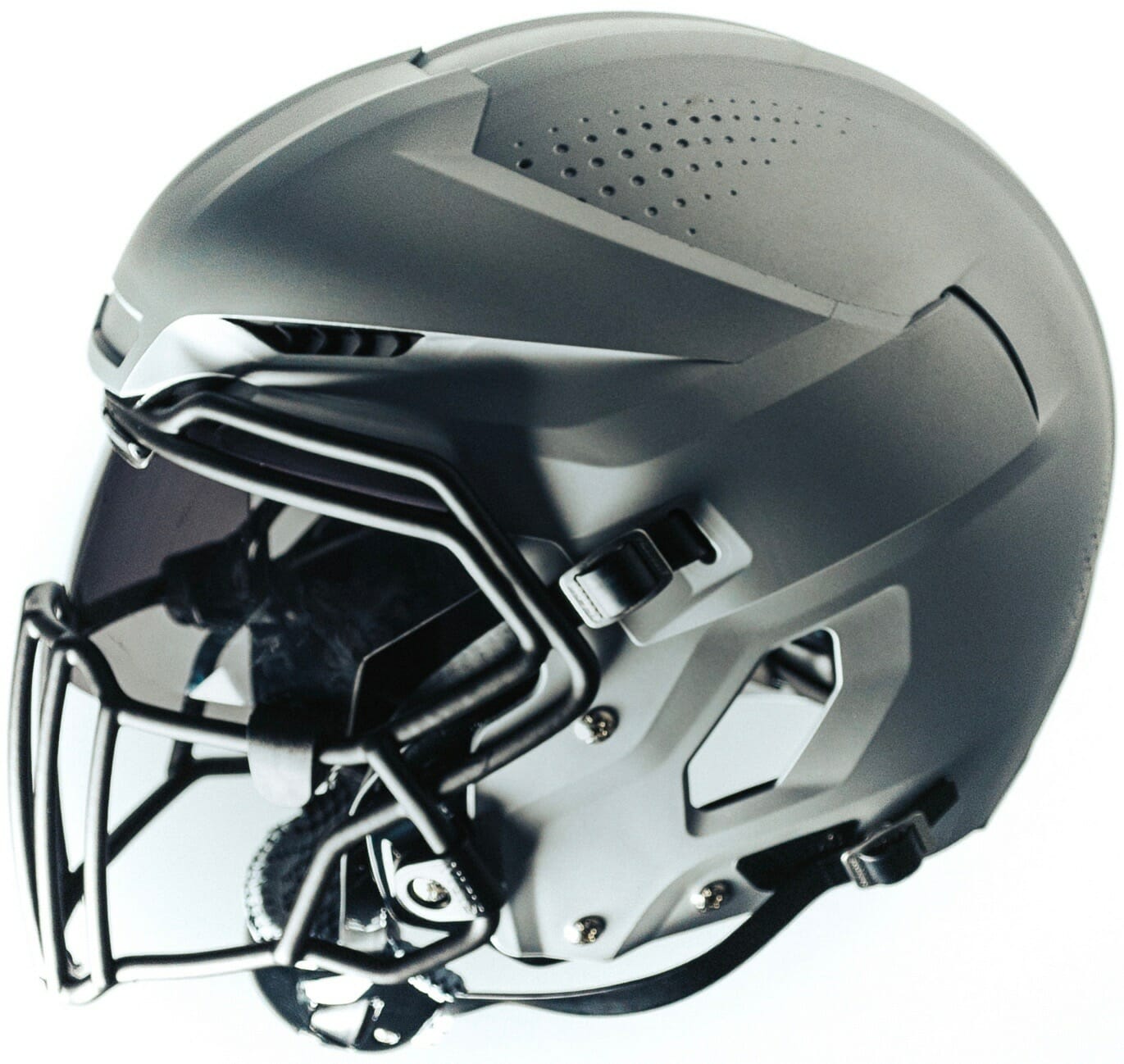
As you may recall, Vicis’s first helmet was the Zero1, which caused a stir when it was released and immediately became the top-ranked helmet in the NFL’s annual safety ratings in 2017, 2018, and 2019 (and also became the helmet of choice for NFL stars like Russell Wilson and Patrick Mahomes). The reincarnated version of the company recently released its new Zero2 helmet, and now it’s followed up with the Zero2 Trench — a helmet designed specifically for offensive and defensive linemen.
From the company’s press release:
From review of previous player impact data, Vicis found that linemen typically experience more than twice as many impacts as other players, the majority of which are low-velocity and to the front of the helmet. Based on this data, the Trench helmet was designed with additional offset in the frontal region, specifically tuned for low-velocity impacts. To complete this optimization, Vicis leveraged the combination of a deformable outer shell and engineered impact structure to create a truly game-changing helmet.
During development, Vicis engineers found that the current deformable outer shell of the Zero2 made a perfect exterior surface which allows the entire helmet system to deform and absorb lower-velocity impacts more effectively than a rigid surface. And since the RFLX impact structure inside the Zero2 was not optimized for the new Trench system, Vicis designed and developed a proprietary absorption system with a much lower initial stiffness to handle the repetitive impact associated with each snap. The result is an innovative new structure that can reduce the accelerations of even the smallest impacts.
Okay, so that had some decent info but also had a lot of marketing mumbo-jumbo, so let’s shift into FAQ mode:
What does this new helmet look like, and how does it compare to the other Vicis helmets?
Here are some comparisons (click to enlarge):
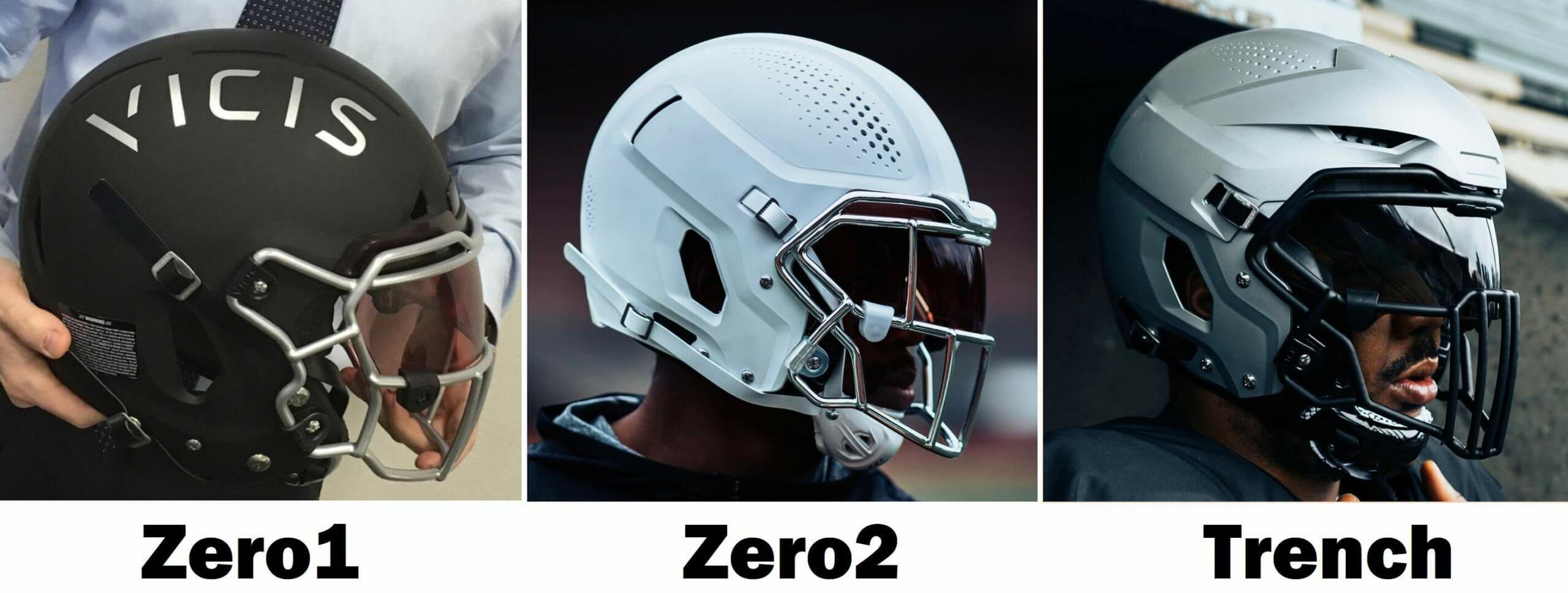
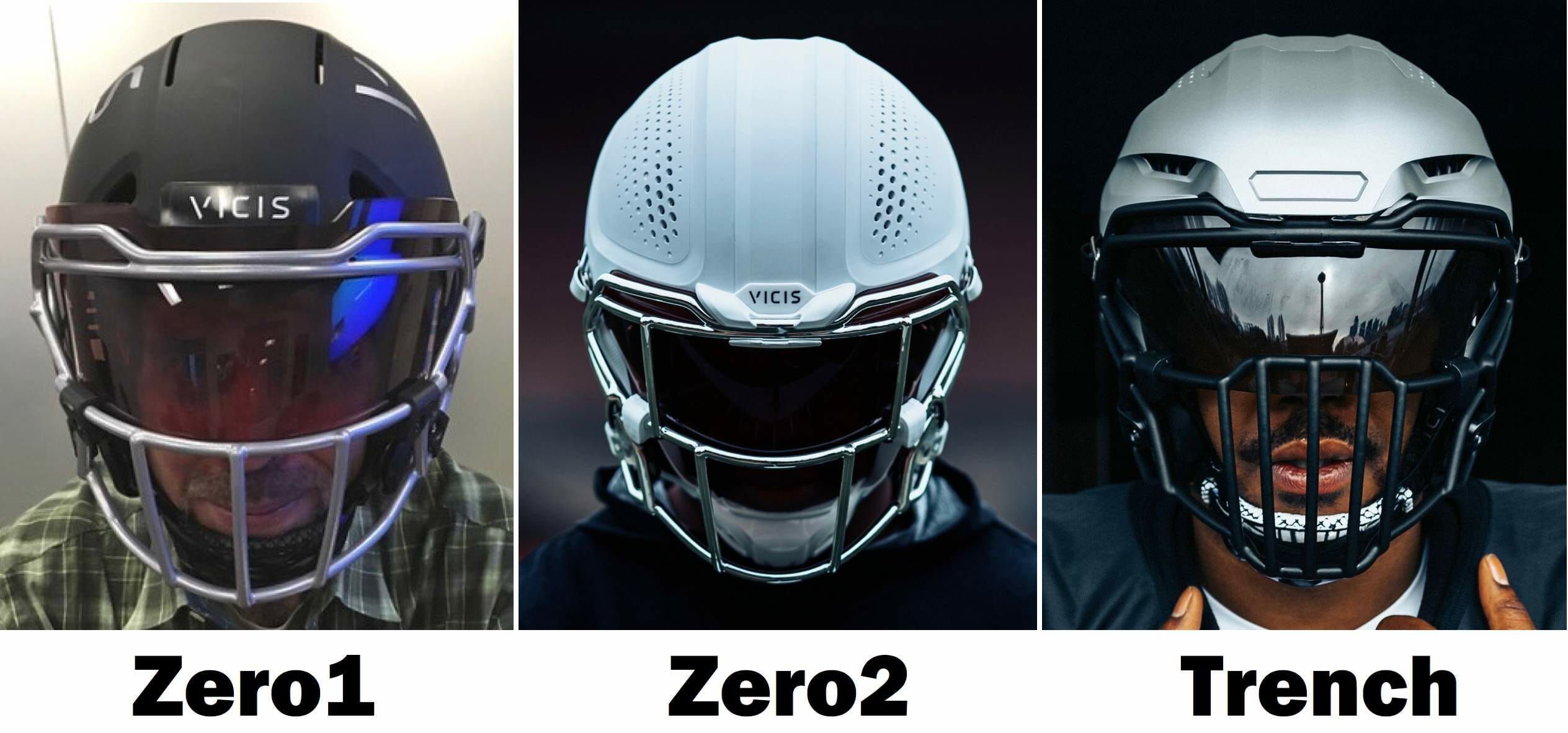
Wow, the Trench has a lot more ridges and vents. Isn’t it going to be hard to put team-logo decals on that shell?
It sure seems like that could be an issue, yes.
Can we see some mock-ups of how NFL helmet designs would look on this shell?
Unfortunately, Vicis doesn’t yet have licensing approval to show the new helmet wrapped in team branding. But if anyone out there wants to take a Photoshopped stab at it, please feel free!
If this helmet is safer for linemen, why wouldn’t every player want to wear it? Why not a running back, or a safety, or even a quarterback?
According to a publicist: “The Trench is tuned for low-velocity impacts — ones that happen on the line and almost every play. Running backs, linebackers, defensive backs and so on may have impacts in the same area [of the head], but they are high-velocity impacts.” So the Trench wouldn’t be as suitable for those positions.
How does the range of vision compare to other helmets?
It’s identical to the Zero2.
What about the weight?
It’s about six ounces heavier.
Has it been safety-rated yet?
Both the Zero2 and the Trench have received five out of five stars from Virginia Tech’s well-regarded helmet lab. Vicis expects both models to be included in this year’s edition of the annual NFL helmet ratings, which usually come out in April, so it’ll be interesting to see where they rank. The NFL ratings tend to carry a lot of weight with players as they make their helmet choices for the upcoming season.
What about the Zero1?
It’s no longer in production but is still covered by the company’s product liability, so players who prefer it over the newer models can still wear it.
This blog entry sure feels like a promo puff piece for Vicis.
I don’t mean it to. I have no stake in the helmet wars, and I’ve written extensively over the years about helmets by Riddell and Schutt as well as Vicis. I don’t review every new helmet model that hits the market (I didn’t say anything about the Zero2 when it came out, for example), but I tend to write about this stuff when there’s a genuinely new innovation. In this case, a position-specific helmet with a visibly distinct shell design definitely qualifies.
Bottom line: Will a lot of NFL players be wearing this helmet in 2021?
Too soon to say. If it ranks high in the safety ratings, history suggests that some players will wear it this year and an increasing number will shift to it over the next few years. Considering how distinctive the shell is, that could have a real effect on how the game looks on the field.
Will Riddell and Schutt come out with their own position-specific designs?
That seems like a plausible outcome, although I don’t know whether they have something similar in the works.
If we now have helmets designed just for linemen, what about helmets for quarterbacks, or wide receivers, or whatever?
That too seems potentially plausible. We’ll have to wait and see.
Isn’t this all just a bunch of hooey because football is inherently unsafe and players are going to get traumatic brain injuries no matter what helmet they wear?
Arguably. I’m not making any claims about the helmet’s safety (nor am I qualified to make any such claims), but the position-specific aspect and the unusual shell design are definitely uni-notable.
Podcast update: Chris and I recorded the next episode of Unified yesterday. Our producer, Chris Fraterrigo, is now editing the files, which should be available for your enjoyment tomorrow.
Our topic this week is MLB 2021. We went over all of the uni changes for the upcoming season — and since there aren’t many of those, we also made our picks for MLB uni changes we’d like to see (some large, some small). We also took a listener-submitted question, something we hope to make a regular feature.
Chris and I were both happy with the way the episode went. Hope you’ll check it out tomorrow! Meanwhile, if you haven’t checked out our first two episodes, they’re available on Apple, Google, Stitcher, TuneIn, and Spotify, and the video versions are on Chris’s YouTube channel.
The Ticker
By Lloyd Alaban

Baseball News: New unis for the University of Miami. … New uniforms for Louisville (from @SoLoPro). … President Joe Biden wore a tie with the Brewers’ colors at his town hall last night in Milwaukee (from @bendackiw). … Brief uni-number controversy in Boston, where some folks objected to P Martin Pérez being issued No. 33, which no Bosox player has worn since C Jason Varitek retired in 2011. Pérez now will stick with No. 54, which he wore last year. If 33 is really off-limits, they should just retire it and avoid situations like this, no?

Football News: Good news out of Jacksonville, where the Jaguars are redesignating their teal alternate jerseys as their primaries. Although there’s no specific mention of it, the black jerseys that have been their primaries would presumably be retained as alternates. … A jersey from the ’Skins first season, 1933 — something even the Pro Football Hall of Fame doesn’t have — was purchased from a storage locker for $5 and is now headed for a big-money auction (WaPo link) (thanks to all who shared). … Uniform blog Uniswag has released its nominees for college football uniform of the year (from Kenneth Traisman).

Hockey News: The Sharks wore Black History Month-themed warm-up tops last night (from @tierknala). … The Penguins changed their helmet ad color last night (from Kevin Kirwan). … A poll says Capitals fans like the team’s ЯR uniforms way better than their new alternates (from @KP8Design). … Alabama-Huntsville’s jerseys didn’t make it to their road game against Northern Michigan, so they had to wear practice jerseys from a local car dealership instead (from multiple readers). … The Golden Knights once again wore their gold helmets with their charcoal uniforms last night. Still waiting to see how the gold lids look with the team’s gold alternate uni. … NHL linesman Pierre Racicot, who was working last night’s Kings/Wild game, apparently had a different uni number than the one he usually wears.

Basketball News: The Celtics’ “Earned” design has leaked (from Heath Carignan). … Retired NBAer Baron Davis rated all the uniforms he wore during his career (from Phil Santos). … SG/SF André Robinson will wear No. 22 for the Nets. … The D League’s Austin Spurs, borrowing from their parent club in San Antonio, have come out with a Fiesta-trimmed uni (from Ian Lee).

College Hoops News: Color vs. color for Northwestern and Illinois men’s last night (from Karl Greenfield). … Is Adidas bringing ЯR to college hoops? Sure looks that way, based on this new Kansas design (from @ForFriedom). … Breast cancer-awareness uniforms for Oklahoma State (from @sam_kissel).

Soccer News: The NWSL’s Washington Spirit wore shirts supporting St. Jude’s Children’s Research Hospital at preseason training yesterday (from our own Jamie Rathjen). … Also from Jamie: New ball for the USL Championship.

Grab Bag: Here’s the story about how racial justice messaging got on UNC’s uniforms (from James Gilbert). … Golf pros have mixed feelings about the use of range-finders on the PGA Tour. … Country singer Luke Combs, who played in a concert before last weekend’s Daytona 500, has a guitar with the same paint scheme as Wood Brothers Racing (from Griffin Smith). … Brazilian volleyball player Leia played her 250th game for Minas over the weekend and was presented with a No. 250 warm-up to mark the occasion (from Jeremy Brahm). … An Ohio man shoveled Ohio State’s “O” and script logos into the snow (from Jason Hillyer). … New logos for Wake Tech (from Scott Turney). … Adidas is selling off its Reebok brand (from multiple readers). … New marching band uniforms for Abilene Christian (from multiple readers). … New logo for Trello (from Adam Woodrow). … Darlington Raceway has sold the naming rights to its season ticket program (from @ZestyTacoSauce). … The Cambridge, Mass., police department will no longer have camouflage uniforms, part of a larger move to de-militarize the department (from Timmy Donahue). … Also from Timmy: State troopers in Georgia are now permitted to have tattoos below the elbow as long as they wear long sleeves. … Donald Trump appears to be the first former president to use a personal logo based on the presidential seal. … Far-right social media app Parler, which is back online after a month-plus absence, has a new logo.

From the front the Trench somewhat reminds me of the newer CCM hockey helmets.
From a Uni Watch perspective, I think the biggest impact will be how logos look on the helmets, and how equipment managers maneuver around the large side bumps. I wonder if that will be harder for large logos like the Bucs, or for smaller logos like the Giants.
All of which is to say, I hope the NFL figures it out, so hockey can apply the concept to their helmets. It’s time for hockey helmet logos!
FBS Equipment Manager here who would prefer to remain anonymous.
The concept of the Vicis 02 Trench is hilarious to me. Schutt has long has issues with adoption and usage of their helmets by interior linemen at the FBS and NFL levels, particularly after the introduction of the SpeedFlex.
It’s going to be really hard to convince high school coaches and teams at/below the FCS level to buy a helmet that is specifically designed for a handful of players. The exorbitant cost of the 02 Trench relative to their competition (MSRP of $1,225 vs $360 for base-model F7) will make this helmet almost completely unaffordable for anyone below the FBS level. Couple that with Vicis’s already-strange interior padding sizing system where replacements pieces are more expensive and unintuitive and you’ve got yourself one hell of a package.
This is great chest-thumping for Schutt/Vicis. NFL Equipment Managers will be virtually obligated to buy them and they’ll find a home atop the heads of a decent number of NFL linemen, but I would be absolutely shocked if we see the 02 Trench being used heavily by anyone outside of the big-money blue-bloods.
Just my take.
Thanks for posting this. The issue of cost is obvious once you mention it, but wouldn’t have occurred to me.
Thanks for the insights.
If you have more thoughts to share on this matter (or others), feel free to email me. Anonymity assured, of course. link.
Thanks for your insight. Do you think the problem of the high cost might be offset by the need to buy fewer of them? Out of curiosity, how many helmets does an FBS team like yours keep in storage? I’m guessing, due to the number of the players and the various sizes, it’s around 400-500?
I like the general idea of a low-velocity helmet, at least. Differentiates between repetitive low-impact collisions vs. occasional catastrophic hits.
@John Powers
I think it has more to do with the amount of R&D required and a premium price being paid for “safety.”
Total shells depends on how many colors you have. Without giving away too much info of where I am, we outfit approximately 120 guys and have approx. 175 shells per color.
John –
I think the cost is related both to the amount of R&D the helmet required, as well as a premium being paid for “safety.”
Total shells depends on your level of funding and how many colors you have. We outfit about 120 guys and have approximately 175 shells per color.
Does know one remember Paul’s piece, at least, when Vicis went bankrupt? It was precisely because they couldn’t get contracts for their helmets with high school and community leagues. Maybe their new financial benefactor has a business plan that doesn’t involve those kinds of sales. We’ll see.
The South Alabama Mardi Gras uniforms weren’t real, but a Photoshopped image celebrating the holiday. South Alabama takes pride in celebrating the holiday each year as most from Mobile love to educate that Mardi Gras has roots originating in Alabama, not New Orleans.
Thanks, Clint. Now removed from Ticker.
Those new helmets are wild.
I’m no scientist, but I’m in the camp that thinks football would actually be safer *without* helmets. I don’t know about you, but I’d certainly be less likely to throw myself around like a missile, or lead into a tackle with my head, if I wasn’t wearing a helmet. Rugby players wear no helmets and very few pads, and injuries aren’y really any more prevalent than in our flavor of heavily padded football.
Funky new helmets or no helmets at all, it’ll be interesting to see how the football uni continues to evolve over the next decade or so.
Seconded. A no-helmet league would emphasize learning how to tackle. Today’s players are already wearing less padding.
Or maybe just the small leather-looking helmets you see players wear sometimes when practicing, with no face mask.
The no face mask or no helmet idea is not the way to go. Yes, the helmet has become a weapon at all levels of football, but we cannot forget the fact that it is a piece of protective gear. Learning to tackle “rugby” style without a helmet or face mask may reduce the concussions from direct hits to the head (like head targeting) but could possibly lead to an increase in other injures. I would guess that there would be an increase in oral and maxillofacial injuries and other types of injuries without the protection that a helmet provides. Frontal sinus fractures, nasal fractures, dislocated jaws, dental trauma (lost or broken teeth), auricular hematoma (when mismanaged leads to cauliflower ear) and other blunt force trauma to the head would be especially problematic as they could require medical attention and/or surgical intervention. There would be an increase in ocular injuries. There is also the risk of abrasions and infections to facial skin from “turf burns”. All of these injuries can be permanently disfiguring (I still have scars on my arms from turf burns) and the worse injuries would require medical care and follow up. Even without helmets or facemasks, there would not be a reduction of a certain class of concussions that happen WITH helmets—concussions from head contacting the ground, thighs and knees striking head of tacklers, other incidental contact to a player’s head, etc.
There already is football with no helmets. Is called rugby.
The Golden Knights’ AHL affiliate, the Henderson Silver Knights, have been wearing metallic helmets since February 6.
link
This has to be something the organization as a whole is doing.
In addition to their myriad of retired numbers, the Red Sox have for many years had numbers that were not retired but were not handed out either: #21 (Roger Clemens), #49 (Tim Wakefield), #33 (Jason Varitek). #15 (Dustin Pedroia) will likely join that group. Varitek will be in the dugout and in uniform as a coach this season, so it is surprising that they gave #33 to Perez, especially so if he says he didn’t ask for it.
Interesting note on Varitek: When he is in uniform in a ceremonial capacity, such as a celebration of past seasons, he wears a jersey with a catains’s C. When he is in uniform as a coach, he wears a jersey without the C.
Interesting note on Varitek: When he is in uniform in a ceremonial capacity, such as a celebration of past seasons, he wears a jersey with a catains’s C. When he is in uniform as a coach, he wears a jersey without the C.
Now *that* is fascinating! Thanks for sharing that.
Given that Pedroia is a potential Hall of Famer who won three rings in Boston, I could see the Sox retiring 15 officially.
RE: Jags reverting to teal as their primary.
I’ve long thought the Jags should go gold helmet and pants with teal jerseys as their look. However, I have really grown to like their current set using teal pants, paired either with the black or white jersey. Definitely unique, and to me has excellent balance.
In either case the lack of gold trim on the pants and jerseys is a problem they don’t seem inclined to solve ever since they ditched their original uniforms.
I’ve noticed that many helmets now, with their venting and contours, have become problematic for many logos, and with this new Trench design I just don’t see how logos are going to work. I know safety should be paramount for helmet design, but I’m surprised that the aesthetics of logo compatibility doesn’t come into play. For most teams the helmet logo is paramount to their identity, like the Dallas star or the Michigan winged helmet.
You mean the Princeton winged helmet? (They were first.)
Play at Ohio State, Penn State, or Notre Dame, and you won’t have that problem!
Or the Browns, since these helmets look like they accommodate center stripes nicely. I don’t see the back of the helmet, but I’m guessing that the “O” would also work when Oregon is wearing their helmet with the O on the back.
I’ll be interested to see whether any NFL team updates its helmet logo in a way DESIGNED to work with modern helmet contouring. In fact, if designs like the Trench should ever become common, I wonder if any team will migrate its helmet logo from the sides to the front.
Sadly we’ve seen what happens when they attempt to take into account the changes in other football equipment into uniform design. The removal of sleeves has lead to Nike essentially forgoing classic football jersey design with some absolutely brutal uniforms in recent years. I have no doubt that they will fail just as bad if/when they need to rethink the aesthetics of the helmet due to new shell shapes. They’ll probably make the Jags “gradient” design look quaint.
I wonder if the next step might actually be to have a purely cosmetic outer layer – a really thin “skullcap” structure that can just drop over top of the structural frames. It might be hard to figure out a way to build something that doesn’t break or tear, but it seems like the increasing prevalence of helmets with complex geometries might lead to a solution like that rather than trying to figure out how to fit graphics around the ridges and vents for any number of different helmet models.
I’m surprised that the manufacturers of these new helmets don’t design them to have a shell that accommodates the various logos. I wonder if the NFL will go to Vicis and tell them to do this before they approve these helmets.
I could definitely see the Seahawks going back to their plain silver helmet.
I hate the way that helmet manufacturers have warped the shape of the traditional footbal helmet’s outer shell almost beyond the point of recognition in the name of “increased safety and protection.” Call me a skeptic, but I am ucnonvinced that the new helmets NEED to have all those funky ridges and contours.
For example, the Vicis Zero1 had plenty of smooth contours along the side to accomodate helmet logos and was still consistently rated at the top of the charts for safety, which would indicate aesthetics and functionality are not mutually exclusive. All those other funky helmets, with their sharp angles and gimmicky shapes, actually strike me as having been designed for the aesthetics, too, but for the benefit of the manufacturers. It seems as if shapes are part of the marketing – “You know it’s high-tech of it’s shaped like that.”
I couldn’t agree more with the comments in the above few posts, especially BvK’s.
IMO, helmet manufacturers are simply adding ridges, wrinkles and dents just to make their helmets look different from other manufacturers — sort of a “maker’s mark.” Most of it seems unnecessary and not integral to the task of safety/protection.
I like Ben’s idea of a cosmetic outer shell that will accommodate logos more readily. Let’s face it – those logos are integral to most team’s identity, and those identities have a significant dollar value to those franchises. It’s worth their while to make this work.
I’m actually surprised this hasn’t happened yet. There are position-specific (or at least, lineman/non-lineman) cleats, shoulder pads, and gloves already. Different positions in other sports wear different helmets (goalies in hockey, catchers in baseball). Seems natural.
I vote for one position-specific facemask. Let the kickers wear the single bar facemasks again!
The Varitek # issue from the ticker is odd to me. The Red Sox have a very specific retirement protocol & they have unofficially retired #s before (ie pull a # out of rotation to save it for future retirement at Fenway)
The team policy on retiring #s at Fenway is a player must be a HOF first to get his number retired at Fenway. The number goes up the season after the player is elected to Cooperstown.
I love Varitek but I do not see him as HOF, so I am not sure what the sox plan is for #33? Unless he is still wearing it on the deeper staff (I do not think so) or they want him to be able to wear it in the future if/when he joins the MLB roster?
The team policy on retiring #s at Fenway is a player must be a HOF first to get his number retired at Fenway.
Actually, that policy is no longer in effect. They retired David Ortiz’s number as soon as he stopped playing. He isn’t even eligible for the HoF yet, much less an inductee.
Re: the Red Sox, for whatever reason, they just don’t put certain numbers back in circulation. #21 hasn’t been available since Clemens left. Wasn’t aware Tex’s number had been withheld. I figured Wake’s number wasn’t in circulation because it’s usually worn by knuckleballers.
I believe the requirement for number retirement also includes having played for the Sox for 10 seasons.
Regarding whether the other helmet manufacturers will be designing their own position-specific helmets, Riddell has came out and basically said their helmets would be designed based on specific player’s needs rather than for a specific position. They also have an app that allows for players to do head scans for uniquely designed helmets.
There’s a full writeup on the new Vicis helmet on The Athletic with some other notes regarding Riddell’s ideas going forward:
link
The washington capitals home jersey looks like a warm up jersey, their current third jersey is gorgeous and should be paired with a color swapped version of the stadium series as their standard set. all the winter classics are very nice. The RR is hot garbage from (in my opinion) the worst design era in franchise history, and one of the worst design eras in sports. It was among the designs that I consider quintessential 90’s overthinking and an unnecessary complete reimagining of the brand identity. But everything 90’s is new again so I guess that’s why people like it the best.
Beauty contests for hockey uniforms are best left up to the fans of said team. I don’t appreciate input from interlopers when they want to change the sweaters of my favorites. That said, the swooping eagle with the “W” on the wings is the Caps’ best insignia.
The Caps’ current primaries are piping-filled messes, but man, I couldn’t disagree more with your take on the alternates. To me, they’re sterile fauxbacks with no history attached to them. Generic old-timey hockey uniforms, if you will. They should have used cream instead of white to complete the unimaginative, cookie cutter fauxback approach.
I’ve got a soft spot for the 90’s uniforms and the RR’s, which is certainly nostalgia-tinged.
Honestly, I’m not sure I’ve ever really loved a Capitals uniform. Or logo, for that matter. They’re a team that could use a total makeover.
Where are we supposed to be asking questions for you and Chris to be covering on the podcast nowadays? You had originally asked in a tweet, but haven’t seen a normal place to ask you guys questions since. Thanks!
I will post another tweet shortly!
Intro would have been dead on if it read Behold: the Ugliest Facemask Ever!
I decided to make a prototype uniform for the new MLS team in Charlotte coming next year (Charlotte FC)
link
Nice! Very clean.
Celtics “earned” jersey looks like a cheap fashion jersey teams sometimes sell
Am I the only one who sees an eagle’s face or Ironman’s eyes when looking at the head-on angle of the Zero2 Trench?