By Phil Hecken, with Corey Buck
Follow @PhilHecken
Greetings and a good Saturday, Uni Watchers. I hope everyone is safe and well, and you had a good week.
As weekend readers know, during the College Football season, one of the highlights of Sunday Morning Uni Watch is the “5 & 1,” a subsection wherein the best five and worst one (“5 & 1”) looking games are featured. It’s quite popular, and also subjective — your “best” five looking games and my five best looking games may or — as is often the case — may not line jibe. Sometimes that’s part of the fun. Because it’s subjective, beauty is in the eye of the beholder, so to speak. The 5 & 1 has also been applied to other sports (NBA All Star game uniforms, for example).
Recently, reader Corey Buck approached UW with his proposal for a different kind of 5 & 1 — based on the “Greatest NFL Uniform Season” concept. His pitch went as follows:
Good afternoon! I know everybody has their thoughts on what the greatest NFL uniform is of all time (Oilers, Chargers, Packers, 80s Rams, etc), and while most people can come up with a rough consensus of which ones are top 10 worthy, the ordering usually differs. I know you love a good (colorful) NFL uni matchup (especially with the many playoff picks by uniform and the many 5 & 1s on the site throughout the years), so I tried my own research project combining the two.
Which team had the most matchups in a season with a top tier uni matchup? I just finished my research and wondered if you’d be interested in my findings. I don’t know if it’s anything worthy of posting on the site, but I’d be happy to go into further detail with you if you’re interested.
Thanks for your time to read this, hope y’all are still staying safe, and have a great day!
I was definitely interested and asked Corey to go further. After some back and forth, he shared his ideas with me, and which you’ll see below.
The reason I stressed above that the 5 & 1 is subjective is because it is. I’ll be the first to say I don’t necessarily agree with his choices but — and this is the key — he set forth in detail parameters for his research and drew his own conclusions from that research, which even led Corey to dismiss his predisposition. But he explains it all (and a lot better than I) below. Please read it through and then we’d love to hear your thoughts (and your own nominees) for …
The Greatest NFL Uniform Season
By Corey Buck
When most people think of “Greatest NFL Uniform”, opinions always differ. Most people would agree about which ones could be deserving, even if they disagree on the order. Generally, people or websites would include the 80s Patriots, Run ‘n Shoot Oilers, 80s Rams, powder blue Chargers, Kelly green Eagles, classic Packers or Steelers, and a few others as well.
Like many other regular readers, I’ve always enjoyed reading the 5 & 1 posts throughout the years, so sometime in late December of 2020, I thought what if someone did that with the NFL over the course of a season? Which of those iconic uniforms would have had the “greatest season” or the most games in one season with a great uniform matchup? All my research came from The Gridiron Uniform Database because that is a reliable and well trusted website when it comes to uniform matchups.
I gave myself a few rules/criteria to follow as I dug into this little project:
1. I stuck to the seasons between 1978-1996 as those years had 16 game seasons, there was a relatively consistent divisional alignment of the teams in the league, and most franchises seemed to have their best uniforms somewhere in that time frame (1982 for some reason is missing most matchups for all teams, so that year was omitted from my judging).
2. No teams wearing the same color pants (ex: Seahawks vs Raiders). Especially if they both have the same base helmet color too. Needs more contrast, so I’m not a fan.
3. Teams wearing white over white, don’t look great to me either. It’s not always a bad look, but I feel like its lacking in the eye test because there is less color involved.
4. I go one franchise at a time, one season at a time. I pick a franchise who is regarded as having an all-time classic uniform (ex: 49ers), start at their 1978 season, and count how many of those matchups would look great, as if I watched it in person. If it looks good, the colors go well together or have good contrast on the field, that team gets a point. Then I’d proceed to their 1979 season for that same franchise and do the same thing.
5. I only considered regular season matchups. I shouldn’t punish one great uniform for not having as many good matchups as another just because one made the playoffs and the other didn’t. It just didn’t seem right.
6. I didn’t check every single franchise. Some it was because they didn’t have what I (or most people) would consider a top tier uniform (ex: Giants), because their white jersey was exclusively paired with white pants (ex: Browns), thus breaking rule 3, or a combination of both (ex: Vikings).
7. As far as the Washington Football Team is concerned, I think they have a solid color combination, but I didn’t want to completely rule them out because of the controversy around their helmet logo that was only just recently removed. So, I made an exception for them and I treated the uniform as it was in that particular year but swapping out the helmet logo and replacing it with the uniform number, similar to how they had it this past season. This uniform with the number on the helmets were a solid contender initially (and I think would look good today), but would they make the top 5?
8. It’s all for fun, it’s my opinion, and my rules I’m choosing to abide by. If you have another opinion, or you disagree with my findings, that’s ok. We’re all adults (probably), but you’re more than welcome to disagree and tell me what you think the result would be in your eyes or what rules you’d change or add to judge them.
Think about which team you expect to have the most games of good, quality uniform matchups. Think you’ve got it? Great. You’re probably wrong like I was with my guess.
I started my research with franchises most people would agree would have the more iconic/best uniforms, and then added a few dark horse candidates (Falcons and Saints) afterwards to see if any other franchises would fare better than I’d expect. I was honestly a little surprised by my findings. Even with my bias to my favorite team, the Houston Oilers, they didn’t come out on top.
Thus, I present to you my official 5 & 1 Greatest NFL Uniform Season:
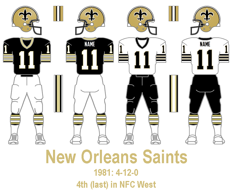
Downfall: Week 8 vs Bengals
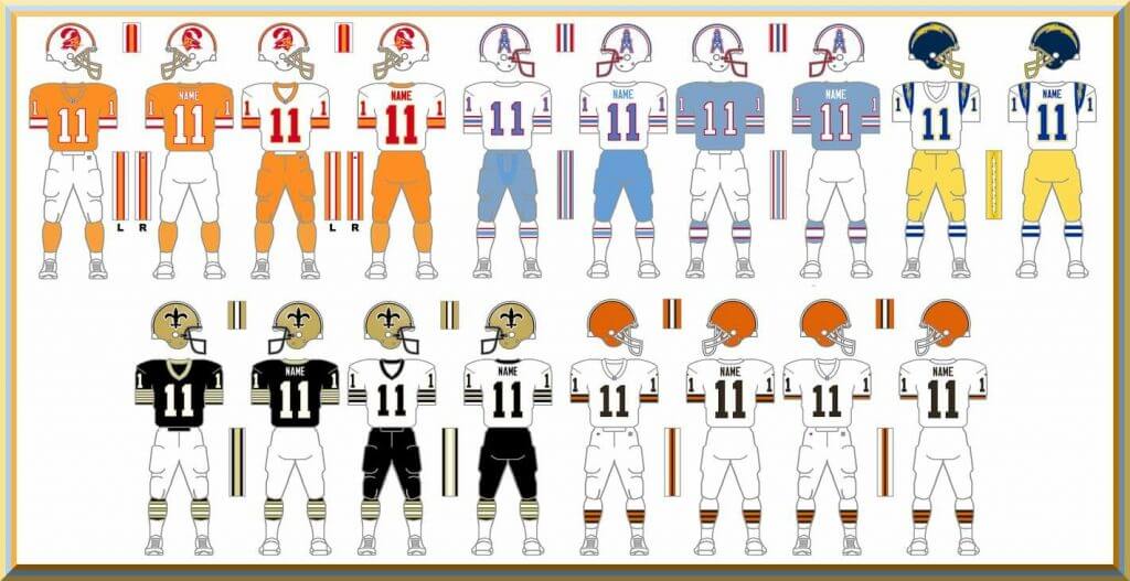
Not a fan of the black/white vs white/black. If the Saints wore gold pants instead of black, I’d enjoy this more. Also, how have the Bengals never had orange pants? I feel like they should have had those at some point. They would probably pair well with the white jersey.
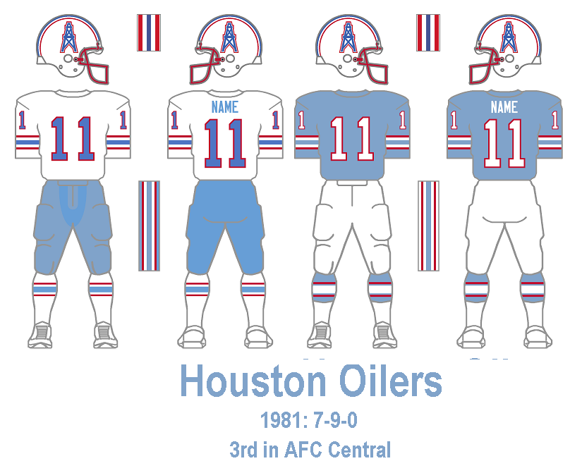
Downfall: Week 3 vs Dolphins
As much as I’ll always argue these Oilers (specifically 1981-1998 with the red facemask) are the best uniforms in history, and those Dolphin ones are solid in their own right, I just can’t quite get myself to completely convince myself the aqua/white vs white/light blue is a high quality matchup. I had a hard time debating if I liked this combo or not and finding pictures of this particular matchup in color wasn’t easy, but I did find this video to confirm that I am not a fan.
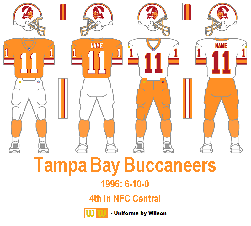
Downfall: Week 3 vs Broncos
The final season of the Creamsicles. Same problem as with the Saints above. White/orange vs orange/white just doesn’t quite work for me. I like the orange for both teams and wish they’d go back to and utilize these uniforms more, but it needs a little more contrast than just orange and white for this matchup. I’m not sure what the best solution would be to make it better. Blue socks for the Broncos? Idk, but it needs something.
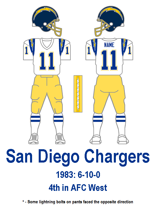
Downfall: Week 10 vs Steelers
I bet most people would’ve guessed if the Chargers were up this high, it would be in the light blue years. Nope. They stopped those in 1973, so those just missed out on my time frame. This was the only year they wore the same uniform the entire season. If the Chargers would’ve worn some blue pants for that one game, they’d likely take the top spot.
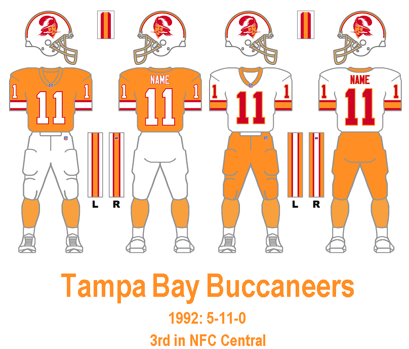
Downfall: none
Every matchup on here would easily be great in terms of variety of color and well as contrast. It’s truly a shame these aren’t a regular in the league anymore. As I looked at each weekly matchup in this season, I slowly grew more excited that there could be an entire season of one team having an excellent matchup.
I didn’t really look for an & 1, but after about 5-10 minutes of quick guessing/research, I’ll nominate this one.
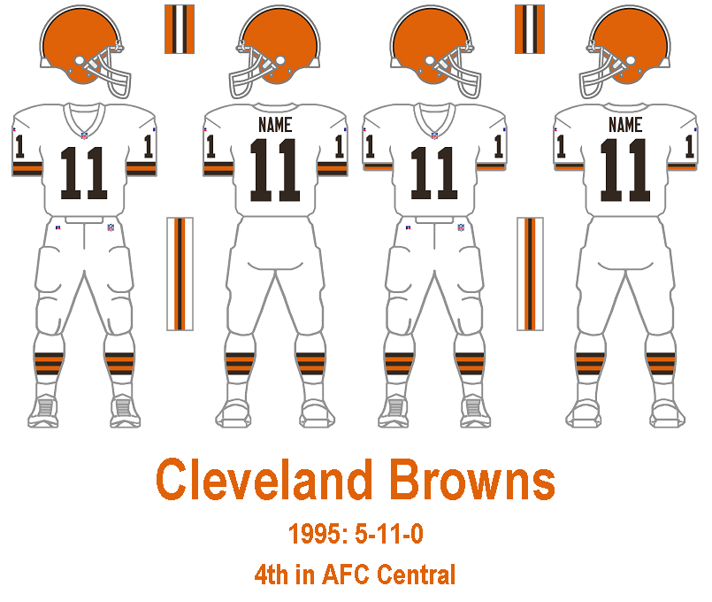
Downfall: Every Week
White over white for every game? That’s just boring. Apparently they did the same thing in 1986 and in 1973, but at least ’73 doesn’t count in this ranking because they played fewer games that season. It’s weird of all the years the Browns have been around, they’ve had orange pants for only 16 seasons, and brown ones for only 9 seasons. If they want to wear white/white once or twice a season, I can live with that a little, I guess. I’m not saying go full on Oregon Ducks or anything like they tried in 2016, but if you’re going to wear white for one part, just try to wear a little bit of color for the other.
Thanks, Corey! Great research and explanations — and wonderful food for thought and further discussion. Readers, please feel free to share your thoughts and views in the comments below.


Guess The Game…
from the scoreboard
Today’s scoreboard comes from ojai67.
The premise of the game (GTGFTS) is simple: I’ll post a scoreboard and you guys simply identify the game depicted. In the past, I don’t know if I’ve ever completely stumped you (some are easier than others).
Here’s the Scoreboard. In the comments below, try to identify the game (date & location, as well as final score). If anything noteworthy occurred during the game, please add that in (and if you were AT the game, well bonus points for you!):
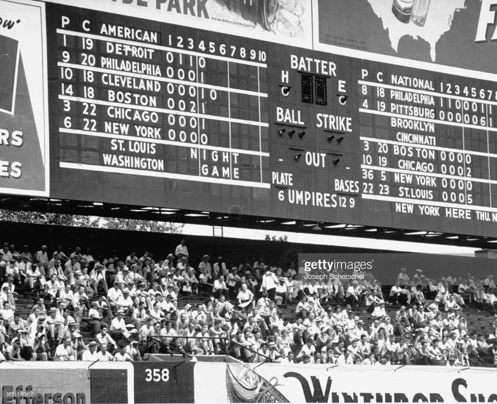
Please continue sending these in! You’re welcome to send me any scoreboard photos (with answers please), and I’ll keep running them.


Uni Concepts & Tweaks
Time for more Uni Tweaks from the UW readership.
I hope you guys like this feature and will want to continue to submit your concepts and tweaks to me. If you do, Shoot me an E-mail (Phil (dot) Hecken (at) gmail (dot) com).
Today’s set of concepts come from Andrew Velis, with a new take on the San Francisco Dons (and a little help from Seth Reese, whose designs have been featured on UW before):
Hi Phil,
Love the website. I wrote a post to contribute to Uni Watch. I believe this is the correct email. If not I apologize in advance.
I would like to share a redesign of the USF Dons jerseys. I was hungry to spark a little creative energy into the program after a pre-season win against Virginia. Jerseys apparel is a great way to wear & show some pride. I discovered a post about a designer (Seth Reese) who redesigned all the NBA jerseys. One of the designs became an inspiration for the new The SA Spurs jerseys. I contacted Seth to commission designs of the Dons Men’s Bball jerseys.
I asked Seth to go for full creativity with no restrictions and shared a little about USF Don’s team history. What he came back with was two-fold.
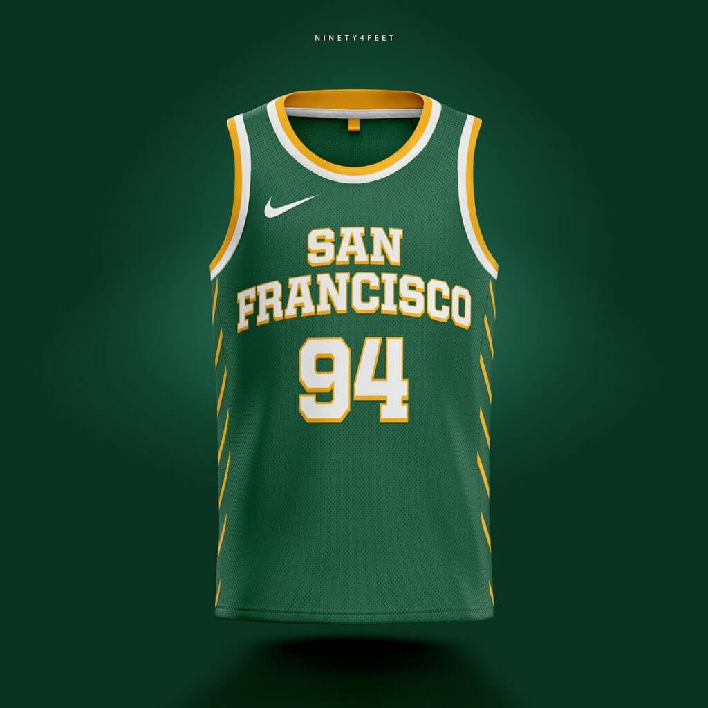
One design is retro-inspired from USF’s 1950s era. The bold lettering brings us back to when USF’s ball clubs had recently won national championships. The side panel component stripes are the suspension cables of the Golden Gate bridge. Inspiration for the side paneling was taken from footage of Georgia @ USF in 1981.
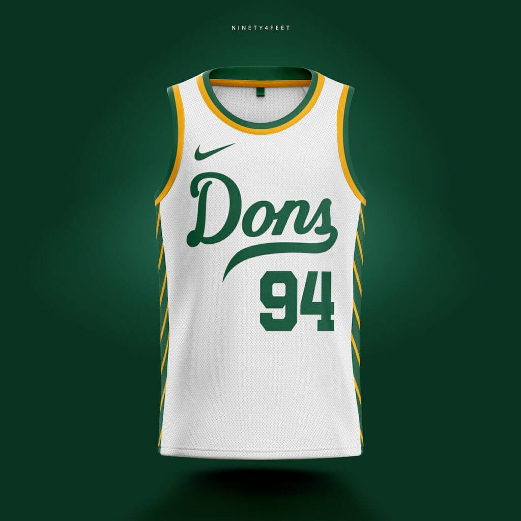
The second design followed that of a script logo mark. This design cue idea was for a timeless look that would follow the program for years to come. Coupled with the side paneling and minimalist design, you have a modernized jersey that looks rather exciting to look at and potentially wear. The front and center “Dons” script logo mark expresses that the team needs no other explanation. “We are The Dons.”
As a USF alum, wearing pride can be as simple as putting on a jersey and expressing support for your team. The jersey redesign was a dream birthed by Seth’s work. If only in concept form today, it is inspiring to see. Happy uni-watching!
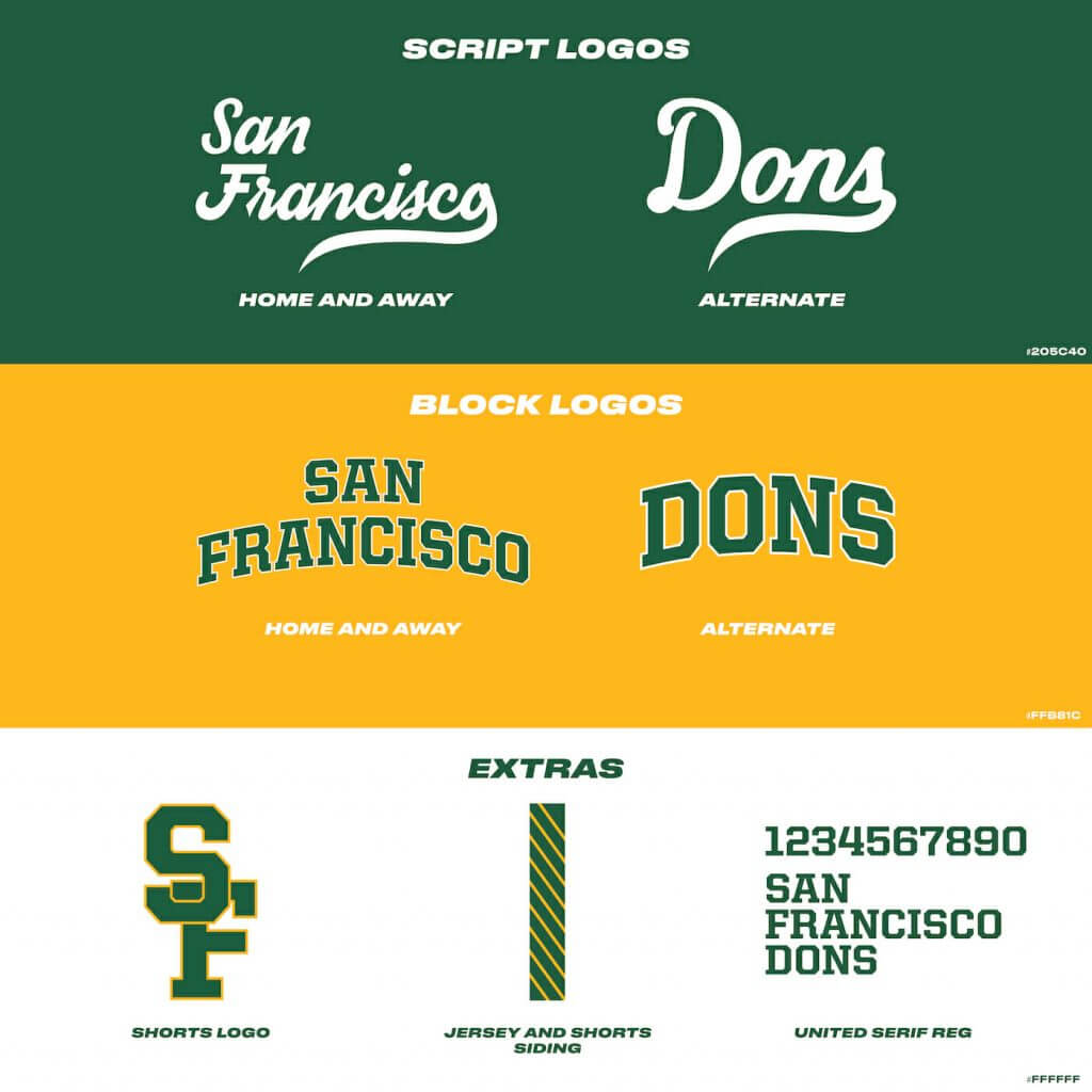
PS. Seth provided a plethora of designs including several alternates to the ones above that I provided if necessary. I also attached an infographic highlight the design language Seth used.
Best,
—
-Velis
Thanks Andrew (and Seth)!
OK readers (and concepters). If you have some tweaks or concepts, shoot ’em my way with a brief description of your creation and I’ll run ’em here.


Podcast reminder: Paul here. In case you missed it a few days ago, the second episode of Unified, my new podcast collaboration with SportsLogos.net founder Chris Creamer, is now available. This episode begins with a quick Super Bowl recap and then segues into a discussion of the Browns’ new 75th-anniversary logo, which evolves into a deeeeep discussion about the do’s and don’ts of anniversary patches. You can listen to it, and subscribe to future installments, on Apple, Google, Stitcher, TuneIn, and Spotify, or just use the player below:
The show notes, which include photos of most of the patches and other things we discussed, are available here.
You can also check out the video version of the episode here:
If you missed our first episode, it’s available here. Our next episode should be ready on Thursday. Thanks for checking out the podcast, and for all the great feedback we’ve gotten — Chris and I really appreciate it.
Okay, that’s it for me. Thanks for listening. Now back to Phil.


The Ticker
By Anthony Emerson

Baseball News: For some reason in 1991, Dodgers OF Darryl Strawberry wore P Orel Hershiser’s jersey before (and maybe during?) a game at Dodger Stadium (from Dave Sikula). … The first three commemorative baseballs have been revealed. … The Double-A Mississippi Braves used an odd Atlanta Braves roundel logo in a graphic posted to their Twitter page yesterday. Anyone ever seen that before? (from Jeremy Poursine). … Speaking of the Braves, their 150th anniversary patch is on their left sleeve, their All-Star Game patch is on their right sleeve, and they’re adding memorial patches for Hank Aaron and Phil Niekro (and maybe Don Sutton, too). Imagine if they make the playoffs, too! … The Minor League reform plan has seen the dissolution of classic league names, like the Pacific Coast League, International League, and Eastern League. Now MiLB teams will be divided into generic, geographically-named leagues like “Triple-A East” and “Double-A Central.” Here’s a breakdown of each Major League team’s farm system after the realignment. The realignment and dropping of 40 teams has not gone unnoticed in Washington, with Vermont Sen. Bernie Sanders excoriating MLB in a statement, and threatening to rescind tax breaks. Vermont’s only MiLB team, the Lake Monsters, were dissolved as part of the realignment. … The Low-A Columbia Fireflies, who were formerly affiliated with the Mets, posted a video announcing their new affiliation with the Royals by having a player remove a Mets cap and jersey and put on a Majestic Royals jersey and cap (from @willchitty4). … New unis — with vests — for the Sooners (from Sam McKinley). … Some gorgeous new unis for Texas A&M (from Timmy Donahue). … Also from Timmy: New alternate unis for Ohio softball. … What will teams do with the millions of unused promo items from 2020? (from John Cerone). … Here’s a great page on the history of Little League’s logo (from Christopher Pisciotti).

NFL News: When Tom Brady asked Chris Godwin for No. 12 after signing with the Bucs last year, Brady apparently promised Godwin he’d get a Super Bowl ring in return (from Ray Barrington).
.
College/High School Football News: The Tournament of Roses is suing the City of Pasadena over who has the rights to Rose Bowl Game — The Tournament believes they have sole rights, while the city believes the rights are shared between themselves and the Tournament (from Timmy Donahue).

Hockey News: New pads for Rangers G Igor Shesterkin (from @tierknala). … Here are two “Top 5” lists of the best NHL Reverse Retro jerseys.
.

Soccer News: Dynamo Kyiv has a new shirt advertiser (from Ed Żelaski). … DC United have launched their new away kit. If you buy it online, there’s an option to get “Statehood” and “51” on the back (from @artofscorebug our own Jamie Rathjen). … Formula One team Williams Racing has revealed its new team kit, worn beneath firesuits for drivers and the pit crew. Why is this in the soccer section? Because it’s virtually identical to Bundesliga team Schalke 04’s 2019-20 home kit. Both, of course, were manufactured by Umbro.

Grab Bag: Immigration officers in the small island nation of St. Kitts and Nevis have new uniforms (from Timmy Donahue and Kenneth Traisman).
.


And finally… big thanks to Corey Buck for his new twist on the 5 & 1 (and combo Greatest NFL Uni Season to boot) — this was a lot of fun, and a really good think piece. If you readers have any additional ideas for different 5 & 1 takes, I’d love to hear them! Let’s talk: (Shoot me an E-mail (Phil (dot) Hecken (at) gmail (dot) com).
Everyone have a good Saturday and I’ll catch you all back here tomorrow. Stay safe!
Peace,
PH
Not how I was expecting this, maybe do one based off of overall league years? An grab a couple of other part-time creators for the site for their versions and see the differences.
I know I’m in the minority, but I almost always prefer football uniforms that are white over white versus designs that are white over an alternate pants color like the Chiefs’ red or the Vikings’ purple. Like a lot of people, my uniform tastes were forged when I was a kid, and in my case, that meant the mid 1960s, just after the Vikings abandoned their purple pants and before teams like Kansas City revived the practice with their red pants on the road. I lingered over the 1967 Tudor electric-football catalog that showed all the NFL uniforms in white and dark jerseys, and there wasn’t a single team at that time that switched pant colors. And there WERE no less than 14 teams that wore white over white. So my eye finds that an easier combination to take than a switched-in dark color for the pants.
I was by then designing my own uniforms and discovering dark pants colors, but always with designs that worked with the same dark pants color for both jerseys. For me, the results were more innovative and interesting than if I just flipped jersey and pants color for the home and away designs. I relished the challenge of limiting myself to just the change in jersey and producing a good look for both the light and dark uniforms.
Of course, the approach I prefer hasn’t held sway for 50 years, but for what it’s worth, that’s what looks right to my eye.
Aug 26 1948, game one of what would be a doubleheader sweep for the Cards over the Giants at Sportsman’s Park.
I’m really not trying to be a jerk here, but I’m not sure what the point of the eight rules are if this is essentially boiled down to, “My Five Favorite Uniforms from 1978-1996 (and two are the exact same uniforms)”.
Also, the title is a bit misleading, I thought that this was going to include your favorite uniform years. For example, “I liked 1983 because the Pats wore their red, white and blue unis, the Bucs wore the creamsickles, the Oilers in their Love Ya’ Blues, etc”.
It was cool to see your favorite uniforms, I guess. But again, I’m not sure why the Byzantine rules.
Rereading this post, I sound like an asshole above and I really didn’t mean to.
I apologize.
No worries. Didn’t take it that way
They aren’t my favorite uniforms, just what I feel most people would consider some of the best uniforms of all time. I was trying to find which of those “classic” uniforms would’ve had the most games in one season where each game would’ve had a good looking matchup visually. I felt that year for the Bucs had every game where the matchup looks great visually. Hopefully that clears it up for you.
Yes. Thanks for the explanation, I get what you were going for now. Makes total sense.
Nice read. I’d have to say Browns fans probably would agree with you on the “& 1”, seeing that they had much bigger concerns in 1995. Something about Art Modell and a stadium deal in Baltimore.
Excellent eye. Of local note:
-The partially visible Falstaff beer ad in the upper right. The Busches did not buy the team until 1953.
-The partially visible Winthrop Shoes (an International Shoe Company brand) in the bottom right. Because in 1948, St. Louis was “first in shoes, first in booze and last in American League.”
Oops. Clearly this was meant to be a reply to TJB about GTGFTS. I think the pop up ad at the bottom misdirected it, as I kept on losing my cursor while typing it.
Thanks. I actually caught that Falstaff ad and was curious how that worked with the timeline of the Busch family owning the Cards.
I remember Harry Caray hawking Falstaff on White Sox broadcasts in the 70’s
“Falstaff … the choicest product … of the brewer’s art.”
I usually really like white over white when the team has white helmets. It’s a very clean look. One of my favorite uniforms is the white Colts. As a Cardinals fan, I’d love to see the Cardinals do something like the Colts uniforms. The one exception is the Dolphins. I do love their white uniform, but their aqua pants look great with the white helmet and jersey. I’m also probably the only one who equally likes the current all white Chargers uniform with their white over yellow.
Count me as another who really likes the current all-white Chargers uniform. I also used to love the Patriots all-white on the road, one of my all-time favorites. And I agree the Cardinals have looked great when they’ve worn all white. A Colts-inspired basic look for the Cards sounds like an excellent direction to pursue.
Technically, I’m not a fan of white over white. But the Vikings pull it off…so do the Bears.
One of my “rules” is that dark-helmeted teams should wear non-white pants. Like the Chiefs and Steelers.
Another “rule” is that white-helmeted teams should wear white pants. But, while the Cardinals look good in that scenario, I’d prefer to lump them in with the Nebraska Cornhuskers, who should always wear red pants with white jerseys.
“1982 for some reason is missing most matchups for all teams”
It’s missing the seven weeks where games were canceled because of a players strike.
Browns also went all white for all 16 regular season games in 2011.
I didn’t check every single franchise. Some it was because they didn’t have what I (or most people) would consider a top tier uniform (ex: Giants)
If you included 14-game seasons in your rules you would’ve had the ’75 Giants very high on your list!
link
The 16-game rule also deprives the Giants of their best look, when they went logo-less in the 50s.
He also missed the original Seahawks uniforms from 1976 by just two seasons, but I guess based on his criteria the plain silver helmet would not have affected his rankings.
*Sigh*…
You’re a real one-trick pony, aren’t you?
If even one person believes your incessant insistence on this tired old joke, my mission has failed.
#NoFakeNews
Supposedly, the “new” leagues for minor league baseball are going to get advertisers. Calling a league the Pacific Coast League just doesn’t bring any money to the MLB owners.
I feel badly for cities that were stripped of their franchises. Even though it happens often enough for other reasons.
I’m not feeling badly. I’m PEEVED (replace the second, third, and fourth letters liberally).
Many of the teams that were either downgraded or dropped the last few years are communities of color — Trenton, Fresno, New Orleans, amongst others.
Some “minority initiative” this is. Bamas.
I’ve always thought white over white only looks good with a white helmet. Something about a colored helmet with that configuration looks unbalanced to me (even if the socks aren’t white).
As much as I’ll always argue these Oilers (specifically 1981-1998 with the red facemask) are the best uniforms in history
Pffft…The Best Looking Oilers (and The Best Looking Unis EVER) belong to the ’72–’74 Oilers. And if it weren’t for your 16-game requirement, I’d propose the ’74 Oilers as your #1.
link
Those uniforms have but one flaw:
The gray facemasks.
With white ones-Outstanding.
With red-Perfection!
I’ll meet you halfway and suggest that white facemasks *might* improve the Best Helmet Ever.
DC United marble jersey: Is there a reason for the blue details on the jersey? As a fan of DC teams, I kind of want DCU to become a red and navy team, but in the context of their red and black history, the blue details seem kind of jarring to me, and on a jersey I otherwise really like.
It seems odd to me that F1 crews would wear polyester under their fire suits.
corey~
loved it! loved loved loved it. really came together for you, could tell you had fun with it. super idea.
i am sure phil asked for the &1 late(good idea phil), so you didn’t get to fully think out how you wanted to approach the &1, made a rash decision, and now i’ll wager more people are commenting on the browns and you are pissed. ha-ha, been there. allow me to pile on:)
i love your thought process on contrast, i was one of the people who hammered on about that here years and years ago to get people to recognize its importance. but the opposite of mixed and matched elements isn’t in itself bad just because contrast is good. i would argue that the 1986 blank-slate browns could be viewed as a great uniform because it allows the elements of their opponents to shine, and forces other white teams to change, and i f things lined up at the time, could have been groovy. these uniforms also were perfect for that stadium and city at the time, but that is only a visual tickle, and not what you tackled. so, just saying that they don’t fail to an &1 because they were white and boring.
unfortunately, having said that, obviously the browns would be playing the like-orange helmeted bengals twice, so no way this can go down as a top season from the jump, and they played two red helmeted teams, and the colts with grey pants on top of the lions, sooooo sit may be closer to &1 ten 5, but i just want to point out that even though phil probably rushed your decision, the browns all-white-all-year is not the opposite of the good you pointed out.
Actually, Wreck, I didn’t ask for the &1 (or a 5 & 1, for that matter); Corey came up with that on his own, and I’m glad he did. I thought his original idea would have been more along the lines of a “greatest uni season” (like I proposed for MLB and 1969 a few years back). But I like how this turned out!
Okay, I think I have a handle on this. Some of the constraints I didn’t fully understand. So I went ahead and whittled down a very big list to five lucky winners:
1. 1967 New Orleans Saints
2. 1992 New England Patriots
3. 1976 Tampa Bay Buccaneers
4. 1975 New York Giants
5. 1979 Seattle Seahawks
And 1: 1984 Philadelphia Eagles (Not an inherently bad design, but rendered in a tacky loose mesh which revealed the padding underneath, like the contemporary Bills and Buccaneers.)
Any positive list that includes the ’75 Giants gets my attention!
I’d also like to go way back and propose the ’57 Cardinals:
link
Simple, yes…almost no helmet graphics, yes…color palette specials, yes, yes, yes!
Do we see the Los Angeles/California/Anaheim/Los Angeles Angels 60th Anniversary patch previewed in the commemorative
baseballs…..
Nice work on your take on the 5&1, Corey!
As much as I admire the Bucs’ creamsicles, there’s no way I could rank their ’92 -’97 leggings look at or near the top of any ‘best of’ list. They should have stuck with the socks they were born in.
I’m a bit disappointed that the ’78 Redsk…err, Washington Football Team didn’t make the cut; they looked so great that year and then foolishly abandoned the yellow pants for many seasons thereafter.
The Falcons’ pre-Glanville red/silver period deserved strong consideration for “&1″… Pick any year- they were terribly mismatched the entire decade+.
The Falcons’
pre-Glanvillered/silverperiod deserved strong consideration for “&1″There you go…
The dirty birds needed a bath. Red lids were always better!
Hadn’t thought of it ’til now…aside from a throw/faux back game here and there, they haven’t looked right for over 40 years!
Not sure if it was mentioned but the Fireflies used a gold-trimmed jersey that was part of the Royals’ celebration of their World Series victory a few years back. Kansas City defeated the Mets in that fall classic…