As we’re all aware, Nike became MLB’s uniform outfitter in 2020. But here’s something you might not know or remember: Nike almost struck an MLB deal, in conjunction with Reebok, back in the late 1990s, but MLB turned its back on the proposed deal.
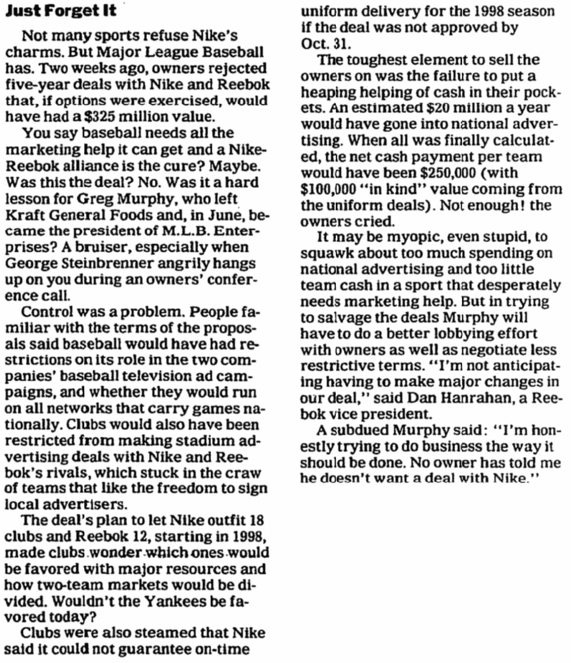
The story, which I have zero memory of — it was recently brought to my attention recently by uniform designer/historian Todd Radom — was spelled out in an article by New York Times sports business columnist Richard Sandomir on Nov. 19, 1996. At that time, most MLB teams were being outfitted by Russell Athletic, although a few clubs were cutting their own deals with other suppliers. (Only Russell’s logo could appear on jersey sleeves, however.) The proposed deal that was in the works would have kicked Russell to the curb in 1998 and established Nike and Reebook as co-outfitters, with Nike handling 18 MLB teams and Reebok taking the other 12. It’s not clear how that unequal split was arrived at, or which teams would have been handled by which company.
Here’s the story (click to enlarge):
Faaaascinating. Here are some thoughts:
• It’s very strange that the article doesn’t provide a even a shred of info about MLB’s then-current outfitters. You’d think that would be a fairly basic fact to include, no?
• It’s kind of amazing to think that Nike was trying to pencil itself into MLB’s starting lineup card as early as 1996 and didn’t finally seal the deal until last season (and even that was only because Under Armour spit the bit). Man, they must have felt like they had their nose pressed up against the glass for a loooooong time.
• Maybe it’s just me, but I don’t associate Reebok with baseball uniforms at all. Did they ever outfit any minor league teams? College teams?
• It’s interesting that the article contends in the second paragraph that “baseball needs all the marketing help it can get” and then, a few grafs later, says baseball is “a sport that desperately needs marketing help.” That’s pretty much what industry observers are saying now, nearly a quarter-century later (and is presumably part of the reason Under Armour Nike was brought on board to replace Majestic). But of course this article was written in 1996, when the the 1994 strike was still a lingering sore point and before the McGwire/Sosa/Bonds steroid boom transformed the game and, for a time, made baseball a hot property once again.
• Finally, it’s interesting to wonder how MLB uniforms might have played out if this deal had gone through. Would Nike have consolidated its grip on the contract and squeezed out Reebok? If so, would terms like “Color Rush” and “City Edition” (or even “Pro Combat” or “System of Dress,” for that matter) have debuted in MLB, instead of in other sports? Hmmmmmm.
(Big thanks to Todd Radom for finding this article in his archives and sharing it with me.)
Click to enlarge
Collector’s Corner
By Brinke Guthrie
Follow @brinkeguthrie
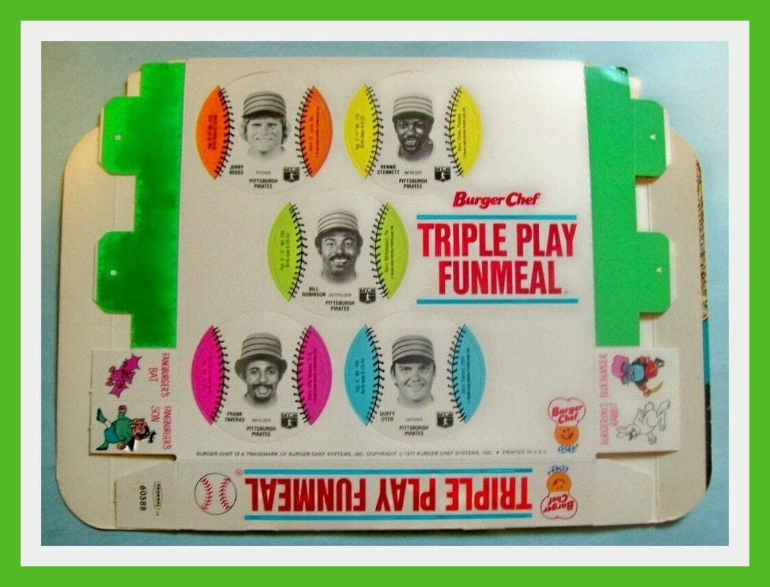
Leading off this week with a 1977 Burger Chef Pittsburgh Pirates “Funmeal” box. Even though the McDonald’s Happy Meal is the one everyone knows, the Funmeal actually came first! Here’s how they promoted it:
As for the eBay item, the seller says, “Nine Pirates players are pictured on perforated cardboard baseball ‘cards,’ which could be punched out of the box.” As you can see, one of those players is pitcher Jerry Reuss, who’s a longtime friend of Uni Watch, so I had Paul get in touch with Jerry to see if he had any recollections or thoughts about this item. Here’s his response:
This is the first time I’ve seen the entire box that houses the cards. I’m guessing the MLB Players Association licensed the images for this promotion, as the team logos on the hats were removed. The players had a licensing committee that approved these types of deals. The monies derived from the sales were placed in a fund that was used for some Association expenses, with any excess shared by all players based on their service time for that given year. Bet those boxes sold thousands of burgers and fries! I base that on the number of discs I’m still asked to sign.
How cool is that? Now for the rest of this week’s picks:
• I don’t know about you, but I’d say that the look on this 14” 1960s Houston Oilers doll is downright creepy. (I can imagine this guy’s eyes snapping open and him talking all of a sudden, like in an X-Files episode.)
• This 30″ x 72″ San Francisco 49ers area rug would look great in either Paul’s house or my house! (Both big Niners fans, y’see.)
• The highlight for this 1970s Avon Baltimore Colts Decanter (with “Sure Winner Bracing Lotion”!) isn’t the item itself but the team logos on the box. All fonts are exactly accurate, as opposed to lots of other items from this period (NFL bedspreads, for example) that used close approximations.
• Check out the artwork on this 1960s Wheaties box panel for a Pro Football Stamp Album. There’s also an offer for a seat cushion that has all “14 NFL team decals and team names printed on the vinyl cover.” Just 75 cents!
• “Mean” Joe Greene says, “Get the quarterback!” on the box lid of his Real Action Quarterback Football board game. They didn’t spend much on the package design, I’d say.
• How is it I’ve never seen one of these before? This is a 1993 NFL Team Runner die-cast helmet buggy for the Atlanta Falcons.
• In honor of the Super Bowl Champion Bucs, we present Bucco Bruce in all his orange/red glory in this 1970s helmet plaque.
• Late-1970s Denver Broncos backup QB Norris Weese had his own T-shirt back in the day. It had the team colors, but no team name or logo. (The artist did put one of the players in Pumas, though.)
• This Buffalo Sabres hockey stick bottle opener comes courtesy of your friends at Molson.
• Here’s a 1980 Montreal Expos/Toronto Blue Jays “Coupe Pearson” cap done up in Expos style, but featuring both team logos. More on the Pearson Cup here.
• And last but not least, an item contributed by reader Rob Yasinsac, check out this 1990 Winnipeg Jets prototype jersey! That’s a major find.
Got an item to include on Collector’s Corner? Tweet submissions to @brinkeguthrie
Click to enlarge
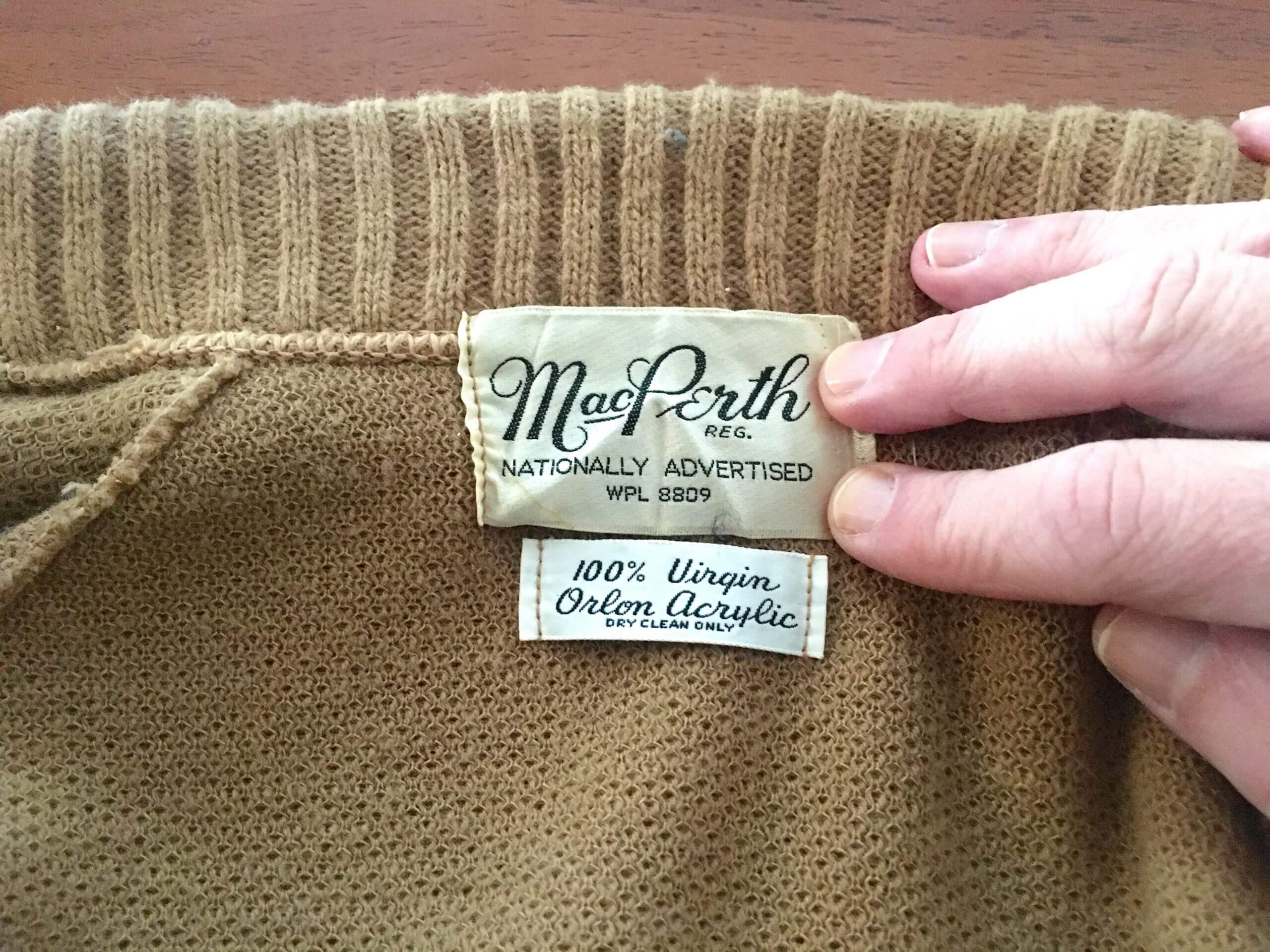
Noted with interest: As most of you know by now, I love vintage clothing labels. The one shown above is from a nice 1960s-ish sweater I recently scored. In several decades’ worth of vintage clothing shopping, I’m pretty sure this is the first time I’ve ever seen a tag boasting about the brand being “nationally advertised.”
Anyone else ever seen that before?
The Ticker
By Alex Hider

Baseball News: It appears MLB is sticking with last year’s terrible logo-in-logo template — but with a new patch on the back — for this year’s spring training caps. The exception is the Padres, who have a straightforward basic-logo design. As you may recall, their 2020 logo-in-logo mark vaguely resembled a swastika (from Noah Kastroll). … Check out the cap on Win Mercer, a 3B-OF-P for the Senators in the 1890s. I don’t think I’ve ever seen a cap that puffy before! (From Austin Gillis). … Los Angeles Lakers F Kyle Kuzma showed up at last night’s game wearing a jacket covered in Negro Leagues team logos (from Jakob Fox). … MLB is making changes to its official ball to cut down on home runs.

Football News: Cleveland Municipal Stadium had some unique end zone art in its time, but I don’t think I’ve seen this one before — a small, centered Browns helmet rendering (from Ryan Connelly). … Ottawa’s Public Health Department sparked a discussion about online misinformation by purposefully tweeting a blank Super Bowl winner graphic on Monday (from Andreas Papadopoulos). … Reader Samuel Lam set out to determine the best-looking uni matchup in Super Bowl history. … Virginia Tech fans are holding a bracket tournament to determine the best helmet design in school history (from Rob Bergeron). … Edmonton’s CFL team is down to seven finalists for its new team name: Elk, Evergreens, Evergolds, Eclipse, Elkhounds, Eagles, and Elements. Here’s some local perspective on the potential names — at least one sportswriter isn’t happy (thanks to all who shared). … Players from the NHL’s Tampa Bay Lightning supported the Bucs on Sunday by wearing Bucs jerseys and helmets for their trip to Nashville (from Mike Chamernik).

Hockey News: The Predators debuted their ЯR uniforms last night (from Taylor Crabtree). … The Sharks unveiled their alternate uniform schedules (see this thread), as well as dates when they’ll be wearing one-off warm-up jerseys (from Danny Pedroza and James Beattie). … This story about Wayne Gretzky’s time playing Major Junior Hockey in Sault Ste. Marie, Ontario, describes how the Great One came to wear his familiar No. 99 (from Ted Arnold). … Cross-listed from the football section: Lightning players supported the NFL’s Tampa Bay Buccaneers on Super Bowl Sunday by wearing Bucs jerseys and helmets for their trip to Nashville (from Mike Chamernik).

Basketball News: Newly acquired Knicks PG Derrick Rose will wear No. 4. Rose had worn No. 1 or 25 with all of his previous NBA teams (from Mike Chamernik and Etienne Catalan). … Cross-listed from the baseball section: Lakers F Kyle Kuzma showed up at last night’s game wearing a jacket covered in logos for Negro Leagues baseball teams (from Jakob Fox). … Interesting move last night by the Suns, who paired their “The Valley” alternate court with their primary white uniforms (from Moe Khan). … South Carolina women’s coach Dawn Staley, who previously coached at Temple, paid respect to former Temple men’s John Chaney, who died recently, by mimicking Chaney’s signature game-day look (from Mike Chamernik).

Soccer News: Atlanta United’s new primary jersey has reportedly leaked (from @FTCUTD). … We’ve got several submissions from our own soccer guru Jamie Rathjen: Tottenham striker Harry Kane was a Super Bowl cardboard cutout on Sunday. “He’s a big Tom Brady fan and wants to be an NFL kicker someday,” Jamie says. … D.C. United’s new white second shirt will officially be unveiled Feb. 12 (a reporter with The Athletic got a first look, thanks to all who shared). … Leeds United had a starting lineup’s worth of great players in the early ’70s, but they all played together only one time. One player, Paul Madeley, often filled in for them, meaning he was one of the few to wear every number from 2 to 11, as numbers were then assigned by position, not players. … New third kit for Chivas de Guadalajara of Liga MX (from Germán Cabrejo). … Designs for proposed soccer stadiums in Des Moines, Iowa, and Pawtucket, R.I., have been released (from Kary Klismet). … Liverpool’s jersey advertiser has changed its logo, meaning their jerseys could look a bit different next season (from Moe Khan). … C.D. Guastatoya clinched the Liga Nacional championship in Guatemala yesterday, and they celebrated in shirts the featured the team’s mascot, a bird called a Great kiskadee, holding the league trophy (from @bryant_rf). … The second section of this article indicates that Adidas is changing the way it works with MLS teams to create their uniforms (from Ben Traxel).

Grab Bag: Boxer Anthony Joshua was among the thousands of cardboard cutouts at the Super Bowl on Sunday (from our own Jamie Rathjen). … Pennsylvania Lt. Gov. John Fetterman announced yesterday that he’s running for a U.S. Senate seat. Should he win, he’d likely be America’s first prominently tattooed Senator. Sen. Kyrsten Sinema of Arizona has a small ankle tattoo, but it’s barely visible. … We’ve got several submissions from Kary Klismet: Iowa’s volleyball team has opened its season in a new 5,200-seat off-campus arena. … Givens Elementary School in suburban St. Louis has picked its first team name — the Gray Wolves. … The Tennessee Department of Education is investigating a civil rights complaint filed against Franklin County High School for its use of the team name “Rebels.” … New uniforms for the Berkeley County, S.C., sheriff’s Department. … Comedian John Oliver is known for his heavy use of mascot costumes on his show, Last Week Tonight. He talked a little about that in this interview (from Akul). … According to James Gilbert, paint brand Valspar has renamed a handful of its paint colors to remove potentially problematic names. Last year, they renamed several shades of pink that used feminine terms. … Banwol Island, off the coast of South Korea, sounds like Paul’s personal hell: For the last six years 400 buildings on the island have been painted purple, and the island has become a destination for Instagram influencers (from Dan Bodurtha).

Today is the Tugboat Captain’s birthday, so I’ll be busy with assorted special tasks and won’t be much of a presence in the comments. See you back here tomorrow! — Paul
Ticker Correction in hockey news: Soo Greyhounds play in Sault Ste Marie Canada, not MI. Easy to confuse as there are two cities by the same name.
Fixed!
Happy birthday Tugboat Captain!
Small typo in Hockey Ticker. “This story about Wayne Gretzky’s time playing Major Junior Hockey in Sault Ste. Marie, Mich.,”.
It is the other side of the border. The Greyhounds are from Sault Ste. Marie, ON.
Was this around the time Steinbrenner struck his own deal with Adidas? That was likely the reason he was against it, and usually if Steinbrenner was against something the rest of the owners were too.
Ah yes, I remember Yankee Stadium having lots of three-stripe signage. Much like when Jerrah went maverick with Nike after Apex took a dive, and they went one season with no logo marks anywhere. Plain coaches polos, jackets, unis,the works. Nothing.
And the commercials! “What’s an Ansky?” or “Hey Coney, why don’t you have a dance?”
I don’t like a lot of the spring training/batting practice caps. But I think some of them are excellent. I love what the Blue Jays and Tigers did — and those are two that pretty much passed on the logo-in-the-logo template.
I’m pretty sure that Browns field logo was only used during baseball season and only near the end of the Indians still playing there.
That could be, but that was not an uncommon look in the 80s.
I also love the fact that the goal post stanchion is straight and not curved like all of the other ones in the NFL. I always belived that it was used because it sat right on the pitcher’s mound.
Don’t know if this had been mentioned before; The story a couple of weeks ago about the Mets ushers uniforms…Was perusing through their 1964 highlight film on YouTube, and there are a couple of brief shots of them in action. Look around the 11:55 mark.
link
Good stuff, Joe — I’ve forwarded the link to Elaine Goldsmith’s family.
Dawn Staley nailed the John Chaney tribute. Very nice.
HBD TBC!
Best-looking uni matchup in Super Bowl history? link.
That’s my choice as well!
It may not have been a close game, but uni-and-field-wise, nothing has yet to beat SB4.
link
Thats my choice as well.
Now that I quickly scan the uniform matchups, there have been any out and out BAD uniform match ups.
Maybe
Super Bowl XXXIX: New England Patriots – Philadelphia Eagles
Super Bowl LI: New England Patriots – Atlanta Falcons
And Super Bowl XLIII featured the Cardinals, but at least it was balanced out a bit by the Steelers.
Lee
I think there is a solid top 10 of great uniform match ups, taking into consideration both the quality of individual uniforms, and the aesthetics of the matchups themselves (contrasting colors).
1 KC vs GB
2 OAK vs GB
8 MIA vs MIN
11 OAK vs MIN
17 MIA vs WSH
18 LA Raiders vs WSH
19 MIA vs SF
20 NE vs CHI
41 IND vs CHI
44 IND vs NO
I’d like to put the PIT vs DAL matchups in there, but the mismatch of blues and silvers Dallas has in its white uniform nixes it.
From your list, I’d vote for 8 or 20.
Had KC gone with red pants in the first game, it still would be the best matchup.
41 gets my vote, though it’s not without flaws (Indy with those gray face masks, both teams with incomplete jersey stripes and SB patches).
Given the close-game constriction, my vote is for SB 23.
Supe XLIX was a good game with ugly uniforms: Seahawks and Patriots. SB XVIII was a lousy game with great uniforms: Raiders and Washington. XXXIII was a bad game with bad uniforms: Broncos (white) and Falcons (black). I will never admit the dark blue Denver uniforms are ugly.
I will never admit the dark blue Denver uniforms are ugly.
I will…
32 could have been the best ever, if it wasn’t for the Broncos changing their uniforms. 33 is almost the worst, but both Pats/Eagles matchups narrowly take the no-prize as worst ever.
Each SB in which the Seahawks played qualifies for the worst-looking matchup, but if I had to pick one for the absolute bottom, it’s XLVIII:
link
If I didn’t go with the close-game qualifier, this would likely be the top choice.
Valspar pink article is paywalled. link is one of several on topic that are not.
Reebok did supply a number of college teams in the early ’90s including UVa (I have a couple of items deep in my closet). Google Reebok and UVa and you find a couple of examples of jerseys and team issued items.
The University of Texas was outfitted by Reebok in the late 90’s and very early aughts. I can’t find any team photos but I found this auction: link
You can see the Reebok mark on the back of the neck
UCLA in the late ’90s-early 2000’s :
link
link
Boston College baseball was Reeboking it as well.
Michigan State too.
Was going to reply about the Reebok note…I couldn’t find an example of a college team so thank you! They of course were also the official footwear supplier for the MLB for a while in the early 2000’s: link
And also was on-field for some equipment too, you can see this Red Sox catcher with a Reebok chest protector: link
Re: Edmonton Football Team.
Are those seven the best that they could come up with? Given the province of Alberta’s history with oil drilling, there should be only one answer:
Edmonton ENERGY.
As I mentioned in yesterday’s comments, I have a theory about team-naming polls. I’ve seen enough of these to guess that a team proposes its choice along with a bunch of lame choices, so Edmonton will be the Elk. Bank on it.
There’s a history behind the name Elk (Edmonton actually was called the Elks for a short time in the past).
If I’m wrong, make me a deliciously flavored hat and I’ll eat it.
I’m of two minds when a team name lacks an “s” at the end. I have a couple of favorites (Miami Heat, USFL Denver Gold, Phoenix Mercury) but more often it makes me cringe (Tulsa Golden Hurricane, Stanford Cardinal).
In the 90s, the NHL had multiple jersey suppliers at the same time too. There was Starter, Nike and CCM. And the quality between companies was massive. CCM was outstanding, Nike was great but Starter was just crap.
I have an old Yotes kachina replica from the Starter days. I like how thick the material is, but the logo on the front of the jersey straight up sucks.
link
Starter replicas were really iffy. They were doing replicas a couple years before they started outfitting teams, and sometimes they just didn’t get certain details right.
For example, c.1994, I had three Red Wings replica jerseys – a CCM 1991-92 throwback (which I still have), a red CCM jersey, and a white Starter jersey. The logo on the red jersey felt smallish, and the stripes were a little too wide, but the quality of the mesh knit and the logo felt better than the Starter one, which (despite more accurate stripes) had a massively oversized border on the logo.
Of course, when CCM rolled out the 550 series of “semi-pro” replicas, Starter was almost immediately outclassed. There were still imperfections (the 550s, for example, didn’t replicate the thicker collars of the Penguins and Blues at the time, for example, and shoulder patches could still be undersized), but generally, the 550s were where it was at.
The Nike jerseys of the late 90s were just made by Bauer and had the swoosh placed on them instead of Bauer’s logo. Bauer also made uniforms for the IHL at the time; I had a pair of Detroit Vipers jerseys, and the feel was identical to their NHL replicas. So it was kind of weird to see the Predators wear Bauer-branded jerseys for their inaugural season.
The Starter pro-weight jerseys were pretty cool, I thought. They had that shiny mesh similar to the Adidas national team jerseys of the 1980s. I liked that.
Worst-looking jersey was the 1984 CCM New Jersey Devils’ sweater. The insignia was stuck on at the wrong angle (the first and third strokes of the “N” were made vertical), and the white keyline was missing so all you could really see was the two halves of the white circle. Bogus.
D.C. United’s white kits are still … plain white. I’d have thought that they would do what Arsenal did this year and put the marble motif on the entire body of the jersey.
I’ve never seen a jersey tease done only for the sleeves of an upcoming kit — even for the changing of stripes (which are important to athletics aesthetes!).
Interesting article about Nike trying to take over before, and about how there is this view that Nike marketing can somehow save baseball. Ultimately I think shows how out of touch MLB is, or seems to be if they simply think the Nike marketing touch can save them.
Pace of the game (an easy fix), loss of youth participation to other sports (for may reasons) and thus lost interest in watching, and regional interest in local teams instead of interest in league wide action are the biggest problems MLB faces. No amount of uniform fads or marketing campaigns are going to change those things.
Mike Trout could finish his career as the best to ever play the game, and there doesn’t seem to be nearly as much attention for him as compared to lesser athletes in other sports, does being in Nike ads change that?
Baseball really doesn’t have any problems that need fixing. But articles have been written about the sport dying since the first professional pitch was thrown nearly 150 years ago.
Even though the McDonald’s Happy Meal is the one everyone knows, the Funmeal actually came first!
Only one thing I miss more than Burger Chef…and that’s Red Barn.
link
OMG when I was growing up, Red Barn was the bomb. I don’t even remember what my parents ate, but I always got the fried chicken.
I use ligatures in my handwriting, and the other day I noticed how much my “Fi” grouping resembles a swastika. But then, when I’m in the bathroom, I mentally trace all the swastika shapes made by certain groups of tiles, so one’s predilection for seeking out the shape has to be taken into account.
I vaguely remember something about Nike trying to take over the MLB uniform game back in the 90s, but can’t remember too much about it other than a few other writers at the time thinking either a) who cares it’s just uniforms or b) Ugh, f***ing Nike!
Happy Birthday, Captain!!
Happy Birthday, Cap’n!
When I think back to Reebok in baseball, I immediately think of Frank Thomas’ deal with them. Big Hurt.
HBD, Tug Boat Cap!
I was going to mention this as well! 90’s Reebok and baseball mean only one thing, The Big Hurt!
Happy birthday, Captain! Here’s hoping tonight’s Pandemic Porch Cocktails(TM) is extra celebratory!
Hi Paul! I worked in a team uniform shop in the 90s and Reebok was definitely pushing to capture some of the baseball uniform business at that time. We outfitted quite a few teams with their product.
Side note, that’s when I “go it.” Making countless jerseys for all sports, lettering and numbering them. I can still spot a crooked number or off-center player name at the ballpark or on TV. Drives my wife and kids crazy.
I remember Baylor baseball being outfitted by Reebok while I was in school there. The 2005 team who went to Omaha that year has it on the left sleeve above the Big XII logo.
link
If the player on the bottom row, third from the right resembles a certain quarterback for the New Orleans Saints, that would be because that is his brother, Reid. He played left field on that team and was a pretty good ballplayer. I’ll always remember his walk-up song during home games was “Call Me The Breeze” by Lynyrd Skynyrd.
Happy birthday Tugboat Captain!
Never mind the Nationally Advertised on the sweater . . . Virgin Orlon Acrylic??
Happy Birthday Tugboat Captain!! Make sure Paul cooks you something amazing!!
HBD TBC
Happy Birthday, Captain.
Happy Birthday TBC & many more.
I say we start a petition to get this gal promoted to Admiral already. She deserves it!
Wait, I’ve solved Edmonton’s team name issue…Edmonton Ehs. They already have the green and yellow colors. ;-)
I remember UVA Baseball was outfitted by Reebok back in the mid-90s.
Looks like it might have extended into early 2000s as well.
link