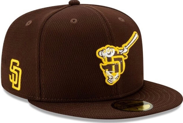
When MLB’s awful new spring/BP caps came out last week, with their brutal logo-within-a-logo designs, I singled out a few of them that were particularly bad. That included the Padres’ design, which I described like so: “I didn’t think it was possible to ruin the Swinging Friar, but it turns out I was wrong. Bulldozing all of the Friar’s charm is bad enough. But as many observers quickly pointed out, the partial ‘SD’ also has the unfortunate effect of looking a lot like a swastika. Good luck un-seeing that one, Padres fans.”
Well, now they won’t have to un-see it, because they won’t be seeing it to begin with — at least not very often. Padres beat writer Kevin Acee had the scoop yesterday that the team will wear its standard brown regular season game cap for most spring training activities, with the the new spring/BP cap limited to a day or two of workouts this week.
Acee’s article included this quote from Padres chief marketing officer Wayne Partello: “Following our offseason uniform rebrand and the overwhelmingly positive response from Padres fans, we’ve decided to wear our regular season brown caps with the gold ‘SD’ for the majority of spring training.”
Hmmm — no mention of the swastika issue. As you may recall, I interviewed Partello during the lead-up to last November’s uni unveiling in San Diego and then met him at the unveiling event, so I gave him a quick call yesterday afternoon and asked for a bit more background and context.
He was very gracious (he really is one of the nicer guys I’ve met in this biz) but declined to add anything to the statement he gave Acee.
Since Acee’s article only addressed spring training, I asked Partello if the new cap might still maintain its status as the team’s BP cap during the regular season. Again, he declined to add anything to his existing statement.
Obviously, this is all about the swastika. Just as obviously, nobody’s going to say that, just like nobody’s going to tell us who created the design, which people at New Era, MLB, and the Padres signed off on it, and what the repercussions were, if any, for those people.
And here’s another thing we won’t be hearing from the powers that be: These caps, with their logo-within-a-logo format, are just a mess. Swastika issues notwithstanding, the San Diego design was a disaster, and so were most of the others — everyone saw that, even if they didn’t see the Nazi symbol (which I didn’t immediately see myself until others pointed it out).
Obviously, nobody intended to hide a hate symbol in the cap logo. It was just happenstance and carelessness — an error of omission. But since the swastika tends to distort everything it touches, I’m a little worried that this controversy will overshadow the larger issue, which is that spring/BP caps feature ruinously bad design — not just this year but most years (although this year’s were unusually bad). That’s an error of commission, and that strikes me as the more pressing problem.
Or to put it another way, if you throw a bunch of shit against the wall to see what sticks, don’t be surprised if what sticks is, well, shit.
Meanwhile: This isn’t the first time a team has walked back a controversial BP cap design. In the winter of 2012, thanks to a leak from an industry source, I broke the news that the Braves planned to use their whooping Indian logo on their 2013 BP cap (another error of commission). The negative reaction was so strong that the team shelved the design (and falsely claimed that the design “hadn’t been official,” which was a poor attempt at damage control).
It’s not yet clear if the Padres will rush a backup BP cap into production — or if that’s even possible at this point. If they don’t, they could become the first MLB team in memory to not have a BP cap. Of course, no team needs a BP cap to begin with, so that outcome might be the best thing to happen as a result of this sorry affair.
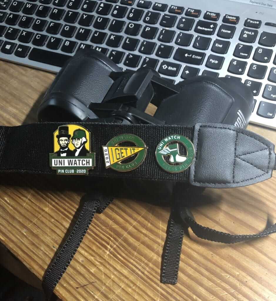
Pin Club update: Reader Bob Andrews is the latest to come up with a creative display option for his limited-edition Uni Watch pins. I think his binoculars strap may soon run out of room, but I’m sure he’ll come up with other display options as needed.
The February pin, featuring Abe and George, is available here. And if you need to get caught up, here’s the January pin (we’ll keep selling that one until it sells out) and our basic winged stirrup pin.
My thanks, as always, for your support of Uni Watch — much appreciated.

Click to enlarge
ITEM! Gumball helmet clearance sale: I have 13 of the green Uni Watch gumball helmets remaining (the white ones are sold out), and I’m cutting the price on them from $9.99 to $4.99, plus shipping. You can order them here. Thanks!
Brand-o-rama: The New York Times has a faaaaascinating article on how Amazon is changing the nature of branding, and warping the U.S. trademark process in the process. It’s a long read, but if you care about branding, intellectual property, marketing, or e-commerce, it’s essential stuff. Check it out here.
The Ticker
By Lloyd Alaban

Baseball News: The Brewers have proposed building sculpture-like structures shaped like their ball-in-glove logo around their ballpark. The full article is paywalled, but you can still see a rendering of one of the sculptures here (from Kary Klismet). … The San Antonio Missions will wear taco-themed uniforms May 22-24 as the San Antonio Puffy Tacos. … Here’s a time-lapse video on how the grounds crew at the Rangers’ old ballpark converted the field from baseball to football for the XFL’s Dallas Renegades (from our own Anthony Emerson). … OF Mookie Betts and P David Price will wear Nos. 50 and 33, respectively, for the Dodgers.

Football News: The Kansas City Public Library is celebrating the Chiefs’ Super Bowl victory with a cartoon image of coach Andy Reid with a book as his mustache (from Mike Stevens). … The Modell’s in NYC’s Times Square has a mannequin wearing a Raiders jersey and a Steelers helmet. Also, the Patriots sleeve logo is missing from the jersey on the mannequin next to that one (from @NYCKING). … Cross-listed from the baseball section: Here’s a time lapse video on how the grounds crew at at the Texas Rangers’ old ballpark converted the field from baseball to football for the XFL’s Dallas Renegades (from our own Anthony Emerson). … Target has apologized for making those “Minnesota Badgers” onesies (from many readers).

Hockey News: The Canucks unveiled new retired number banners with era-appropriate uni-based designs. Here’s what the banners looked like before (from multiple readers). … New Penguins F Jason Zucker received his jerseys this week. He will wear No. 16 with the club. Here’s a photo of his new locker, which shows that the Pens’ locker nameplates have GNC ads. Sigh (from @PenguinsEQ and @FreyDaddy4). … The Hurricanes have released the patch for their upcoming Mom’s Trip to Nashville when the team faces the Predators (from Mike Sundheim). … Northeastern won the Beanpot on Monday wearing these throwbacks (from Evan Landry). … Here’s a (paywalled) article documenting how goalies’ equipment gets to goalies so quickly after a trade (from Jonathan Fox).

NBA News: Michael Kidd-Gilchrist will wear No. 9 with the Mavericks (from Mike Chamernik and Etienne Catalan). … Also from Etienne: PF/C Noah Vonleh will wear No. 32 with the Nuggets. … For the latest NBA number-related news, be sure to check out Etienne‘s Twitter feed. … The Lakers have added a new Lexus ad on their sideline (from Andy Garms).

College Hoops News: UNC F Garrison Brooks, who’s been poked in the eye several times this season, wore goggles last night against Wake Forest (from James Gilbert). … UNC women’s went mono-pink on Monday, forcing Virginia Tech to go with white on the road (from Andrew Cosentino).

Soccer News: The Canadian Premier League officially announced that the new expansion club in Ottawa will be named Atletico Ottawa. The team is owned by La Liga’s Club Atletico de Madrid, which is reflected in the new club’s crest and colors (from Wade Heidt). … New kits for the Pittsburgh Riverhounds of the USL Championship (from multiple readers). … The new MLS kits were added to FIFA 20. Probably the one big surprise is that D.C. United’s shirt was paired with red shorts and white socks, which was a combo they wore in the inaugural 1996 season, including in the first-ever MLS game. We can take that as a reasonable sign that black/red/white will actually be worn this season. A real picture of it exists, but wasn’t included in the reveal last week (from our own Jamie Rathjen). … Also from Jamie: “At both the 1990 World Cup and Euro 92, Scotland’s non-goalie players received numbers based on (roughly) the number of national team appearances made, with the most senior players wearing Nos. 2, 3, etc., down to 19 and 20. The examples here are from Euro 92.” … Atlanta United has a dog mascot named Spike, and he has his own shirt and AUFC-themed harness (from Ross Drucker). … This video explores why Gazprom, Russia’s majority state-owned gas giant, bought ads on soccer shirts (from KC Cless).

Grab Bag: Major League Lacrosse introduced its newest franchise, the Connecticut Hammerheads (from Zeke Perez Jr). … New helmets for Syracuse lacrosse (from Michael Barkann). … Here’s how Nike’s Vaporfly line of shoes has changed running sports (WaPo link). … New logo for the online delivery sevice Shipt. … From Kary Klismet: Northwestern has released new uniforms for its women’s lacrosse and softball teams. … The city of Vienna, Austria, is holding a competition to design its new indoor sports arena. … Reader Matt Bisenius found this shirt depicting James Madison University in Wisconsin. JMU is actually in Virginia.
Raffle results: Our latest raffle winner is Paul Bailey, who’s won himself a complimentary Uni Watch membership card. Congrats to him, and my repeated thanks to reader Joal Kjarsgaard for sponsoring this one.
“GNC”ad on the nameplate not GMC. Still gross though.
Right. Fixed.
I like what the Canucks did. A retired jersey number connotes memories fans have of the player, and the number gets frozen in time. Other example to drive home my point, though the 76ers are red white and blue, how few people think of those colors on Allen Iverson? But check out how the font of the numbers is the same modern font. That’s how they match enough so it’s obviously the same franchise history, but in different colors. Anyway, well done, Vancouver!
Agree it was a good move by the Canucks and an unexpected surprise. Always looked especially strange seeing Smyl and Bure’s banners in the blue and green. Linden and Naslund both only wore blue and green as a full time uniform with the Canucks for 1 season.
It was announced some time ago that Monday was Legends Night with Smyl, Linden, and Naslund being in attendance. Bure had a video message. However, I had no idea that they would be updating the banners until it happened. They kept that under wraps well.
We will have to see what the 2 new ones look like tonight for Henrik and Daniel Sedin. Will be blue and green. Since the new banners appears to represent the home jerseys for the players, will the Sedin banners be blue?
I would predict that. Naslund’s banner is mostly navy, consistent with the flip to white on the road in deference to colors (and sometimes alternate jerseys) at home.
I also like what the Canucks did here as it looked awkward in all current colors.
However, the Canucks have never righted a wrong; In 1997 they un-retired #11 for Mark Messier. I thought it was a dick move by Messier to request the number and very poor judgement by the Canucks to allow it.
Maki was not a “star” like the four other players honored (he died young of a brain tumor), but his story shouldn’t be swept under the rug either. Maki’s family did not approve of the un-retiring but the team did it anyway to appease Messier. I lost a lot respect for both parties over that.
The Sixers wore red/white/blue even during the Iverson years, it’s just that black predominated with gold. And they had blue alts. Anyway, the Sixers have consistent banners, all white with red/blue trim and a consistent number font (which looks horrible IMO and was never worn on the court) but they have the appropriate logo at the bottom. The problem I have with what the Canucks did is that it’s a number font that they wear currently but haven’t always worn. For as much as I don’t like the Sixers’ banner number font, they can use it across all eras because they never wore it on the court.
The funny thing is it doesn’t even really look like a swastika.
It looks as much like a swastika as it does an “SD,” which is what it’s actually “supposed” to be.
Terrible design all around.
Love the Chiefs library display. So many great little details: The mentioned book mustache, Coach Read on the hat, and the double meaning of the #longoverdue
And I guess the book is like his play card.
As a Niners fan, I guess the only consolation to my team losing is that if they won, the SF Public Library wouldn’t have made as cool of a Shanahan display as the KC Public Library did with Reid’s lol.
A simple solution to the Pads cap situation: They could (and should) just wear their “Clubhouse” cap as their BP cap:
link
Leaving aside the silliness that these categories exist, the Clubhouse cap checks all the boxes of actual function of a BP cap: It’s different than a game cap (so the team can sell more merch), and the material is more breathable for players in the hot Arizona sun.
I’m not really sure why every team just didn’t go with their Clubhouse designs as their new BP designs, because virtually all of them are superior to the BP/ST caps.
As bad as some of the “Clubhouse” caps are, they look like works of art compared to those spring/BP caps.
Potentially hot take: I love the idea of caps with alternate logos on them, so I’ve usually been all about the BP cap existence, but I’ve always been a flexfit guy so I’ve really missed the older version from the 00s.
These new clubhouse caps, being flexfit AND having the MLB logo on the back and not a team script like flexfit hats these days usually have (and no unnecessary piping/weird color panels that some of the later flex BP caps had)…they’re some of my favorite hats to come out of MLB in at least a decade.
“We’re the only team in baseball that wears brown shirts, so how could anyone think this cross with crooked ends on our cap resembles a swastika?”
The Padres made a big deal about maintaining a simple aesthetic for their first year or two to firmly establish their new look with fans. Even if the BP cap didn’t include an accidental swastika – swaccident? – any cap other than a straightforward presentation of one of their new-for-2020 logos was a terrible, no good, very bad idea.
That just points to another problem with spring/BP caps: Every team is shoehorned into the same template/format/etc., regardless of whether that format makes sense for them.
That’s largely been the case with ST/BP duds for the last decade or so, but previously the templates haven’t been so uniformly distorting of each team’s indigenous branding. This is a bad idea taken to its logical extremity. It’s the sort of thing I expect from Nike, only now apparently everyone gets away with it: Sacrificing the client’s brand identity in order to promote the manufacturer’s brand identity. New Era should promote its weird aesthetics on its own time with whatever crappy fan designs it wants, and MLB and teams should insist that uniform elements intended to be worn by players look like part of the team’s uniform.
This is the reason that I like the era of where the local clubhouse guys did the ordering from the different manufacturers, Rawlings, Wilson, Russell, NewEra, KM Cap Co., etc.
It was just better.
Puffy Tacos, eh? I guess “Pink Tacos” was a little too on the nose?
I work for the company that designed the graphic for the Minnesota Badgers misprint. I’m not going to name anybody for privacy reasons but I will say this isn’t Target’s fault. They could proofed the design before putting it out on the floor but even some slip through.
So a graphic artist will use the a design & flip the names, logos for dozens, sometimes hundreds of schools changing colors & registration marks too at the time. Originally it was created as Minnesota Badgers, sent in for approval, denied, fixed, then approved with the correct Minnesota Gophers flip. Problem is that there’s 2 files of the artwork: 1 print for production & 1 PDF for license submission. The outdated print file was used. Product was printed in China then shipped to the U.S. straight to its final destination. Kind in mind that there’s thousands of new artworks created each year that have to be proofed & approved, sometimes some slip the cracks accidentally. For proof I’ve uploaded the image of the original incorrect design: link
Sid: Please email me. link
Probably a similar error with the JMU/Wisconsin mashup. Very interesting to learn how these happen!
SMH at those caps. I wonder what the approval process for a new design is? Who stood back, looked at those and said, “yes, those are perfect.”
Names! We need names!
Tease for new Buc unis?link
“Obviously, nobody intended to hide a hate symbol in the cap logo.”
It is sad that people see, and go looking for, evil and bad in everything.
Actually, I don’t think anyone has suggested that anyone did anything evil, nor do I think anyone “went looking for” anything. There’s been no outrage, no protests, no calls for boycotts (at least not that I’m aware of). Rather, some people noticed an unintentional aspect of the design, many other people also saw it once it was pointed out to them, and the reaction has been, “Whoa, that seems like a big mistake and someone should have caught it.” That’s all.
I didn’t see it until it was pointed out to me either.
When I did see it, I went, “rut roh, lots of people are not going to be happy with that”.
link
The brand name article caught my eye because I’ve thought about the silliness of the letter salad that these firms adopt as their brands. In fact, the article mentions a brand that I’ve purchased for cycling gear called spexcel, I actually tried to get shorts where the brand name wasn’t super legible because it is a meaningless name (and of course it doesn’t have the cachet of brands like Castelli). I certainly won’t get any products that have random letters emblazoned all over
Maybe the only time you’ll see David Price with a Dodger cap featuring a squatchee today.
4 NFL uniform launches in very quick succession, time for ESPN to bring you back at least on a part time basis. There is no one else close to claiming this niche.
That would be fun. But even if they wanted to, company policy would allow me to write for them until this fall at the earliest.
Four new uniforms and none of them are Cincinnati. That’s starting to be not dissimilar to a long suffering fan saying will they see their team win a championship before they die; will we see the Bungels out of their monstrositie before we kick the bucket?