Click to enlarge
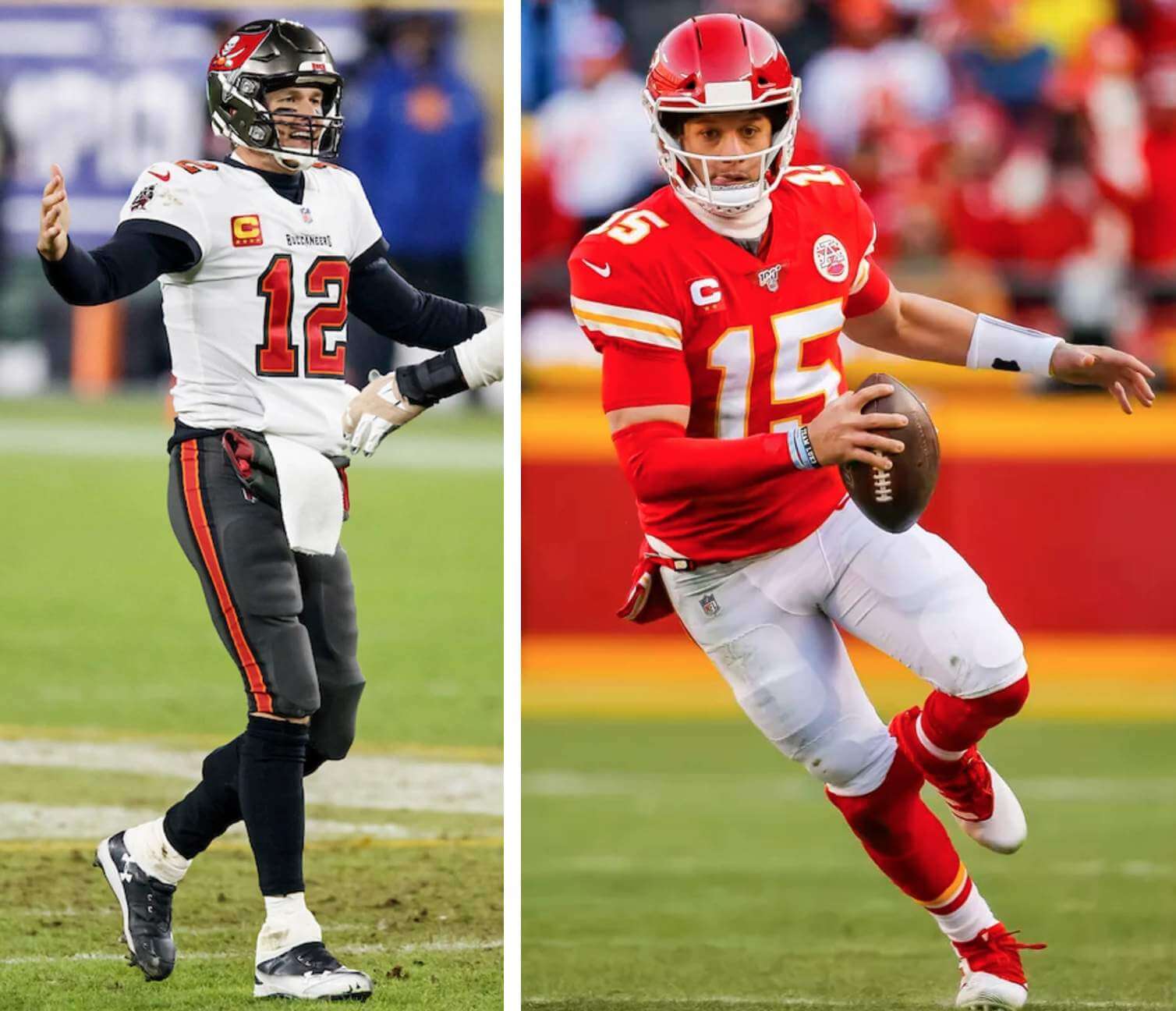
The Super Bowl uniform matchup finally came into focus last night, as the Buccaneers — the designated home team this year, because it’s the NFC’s turn to have that status — announced that they’ll be wearing their white jerseys and pewter pants. That means KC will be wearing red jerseys and (presumably) white pants.
Let’s shift into FAQ mode:
What do you think of this uni matchup?
I think it’s pretty good. The combo that the Bucs have chosen is by far their best look, and KC’s combo should provide a good level of contrast. I think this will likely rank as one of the better-looking Super Bowls.
If the Bucs are the home team, why aren’t they wearing their home uniform, especially when the game is taking place in their home stadium?
Remember, there are no home or road uniforms in the NFL — the home team can wear whatever it chooses. In the Bucs’ case, they wore white at home three times this season (and won all three of those games), so it’s not completely out of character for them to do so again for the Supe.
How often has the designated home team chosen to wear white?
According to Super Bowl uniform scholar Jay Braiman (whose singular genius was showcased on the site earlier this week), this is the seventh time it has happened (although two of the previous six instances involved the Cowboys, who routinely wear white at home, and a third instance involved Washington, which routinely wore white at home at the time). The six previous teams to do so have gone 4-2.
KC also wore red over white in last year’s Super Bowl. Has a team ever worn the same uni combo in two consecutive Supes?
Have they ever! In Supes XXVII and XVIII, the Cowboys and Bills both wore the same uni combos for two consecutive years — white over silver for Dallas and blue over white for Buffalo. Not only that, but the Bills had worn that same combo in Super Bowl XXVI, so they actually wore the same combo in three consecutive title games.
Only one other team has matched the Bills’ uniform uniformity by wearing the same combo in three consecutive Supes. That would be the Patriots, who wore their white/navy combo in Super Bowls LI, LII, and LIII.
Several other teams have worn identical attire two years in a row:
• The Cowboys in Super Bowls XII and XIII (so they’ve gone back-to-back on two separate occasions, making them the only team with that distinction).
• The Steelers in Super Bowls XIII and XIV.
• Washington in Super Bowls XVII and XVIII.
Do we have any photos showing how the jerseys will look with this year’s Super Bowl patch?
Glad you asked — here you go:
Oh my 😍 pic.twitter.com/JXIlhktipA
— Kansas City Chiefs (@Chiefs) January 28, 2021
To my knowledge, the Bucs have not yet released any similar photos. (I realize there are images of retail jerseys with the patch, but that’s not the same thing.)
When will we see the players wearing their Super Bowl jerseys for Media Day?
Good question. According to a report from last week, KC players won’t be in Tampa until the day before the game. And even if they arrived at the usual time, the standard media gathering would presumably be impossible during the pandemic. I imagine they’ll do something via video, but will the players bother to wear their jerseys or other gear under those circumstances? Remains to be seen.
Anything else worth noting?
This would be a good time to brush up on KC’s logo inconsistencies and Tom Brady’s record-setting number of jersey patches (a record he’ll extend by wearing this year’s Supe patch for the big game).
Also, expect a lot of uni-come-lately folks to make a big fuss about Bucs running back Leonard Fournette wearing his old purple/yellow LSU shoulder pads:
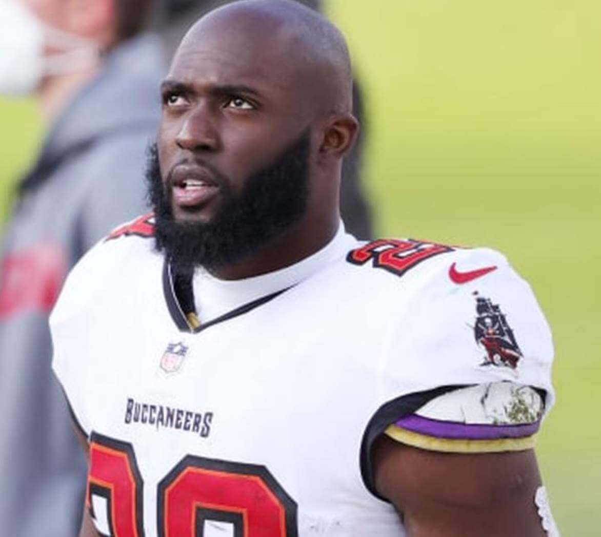
Fournette’s been doing this for his entire pro career (including the three seasons he spent with the Jaguars), but lots of people are going to see it for the first time in the big game and say, “Hey, he dusted off his old pads for the Super Bowl, how cool is that!”
Any other good Super Bowl uni tidbits that I’m overlooking? Feel free to post them in today’s comments.
(Big thanks to Jay Braiman for research assistance. If you haven’t already read his annual Super Bowl uni preview, you should definitely check it out here.)
Pretty cool color footage of the All-American Girls Professional Baseball League (AAGPBL), which existed from 1943-1954 pic.twitter.com/ch3UhyaVuI
— Ben Porter (@Ben13Porter) January 28, 2021
Sheer magnificence: Oh man, look at this spectacular AAGPBL color footage — with Uni Watch color matchup to boot! I could watch this all day.
Interesting that the third base coaches are wearing standard white or grey baseball unis, instead of their team colors.
(My thanks to @BallparkHunter and @munistadium for pointing me toward this one.)
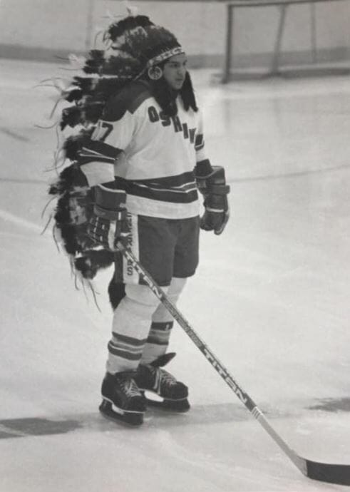
Use your head(dress): The photo above shows Oshawa Generals player Barry Tabobundong, who was Ojibwa, wearing a headdress on the ice prior to a game, circa 1980.
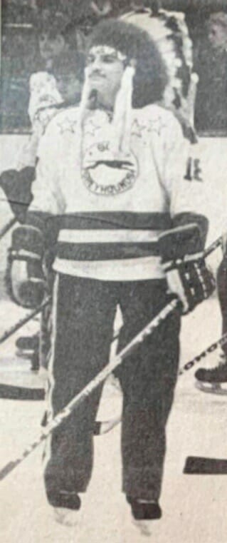
I’d never seen anything like that before, but it turns out it wasn’t unique. Here’s a similar show of Soo Greyhounds left wing Chris Brant wearing a headdress (and Cooperalls!) during an exhibition game during the early 1980s:
(Big thanks to Wade Heidt for pointing me toward these photos.)
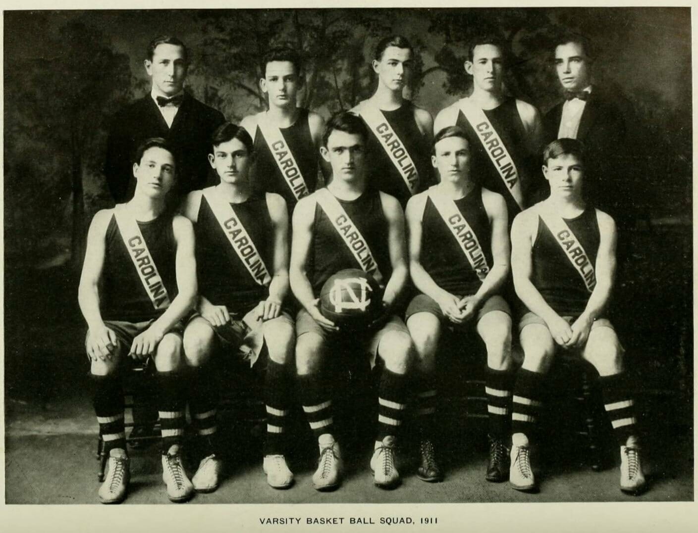
Click to enlarge
Too good for the Ticker: I’m totally digging the sash-based design of the 1911 UNC hoops uniforms. Let’s see them revive that as a throwback!!
(Big thanks to James Gilbert for this one.)
The Ticker
By Paul

’Skins Watch: Bellingham High School in Washington has formed a task force to replace its current “Red Raiders” team name (from Kary Klismet). … Also from Kary: Indian Hills Community College in Iowa has updated its logos and visual identity to remove Native American imagery but is keeping its “Warriors” team name. … Marion High School in Iowa will no longer call its teams the Indians (from @MetsFanVI). … A Wisconsin school district has narrowed down the choices for replacing its “Indians” team name (from Brian Kerhin). … Vancouver Canucks G Braden Holtby’s new mask has an Indigenous theme and was designed by an Indigenous artist (from David Cummings). … Here’s info and video on the “Land Acknowledgment” that the Chicago Blackhawks are presenting prior to each home game this season. … The school board in Shawnee Mission, Kan., has voted to remove Native-based mascots and imagery from the district’s schools, a move that will result in four schools having to make changes (from @spiders_six and @retrojayhawk). … Two Washington State wineries and a labeling company have agreen to stop using Native signifiers in their package designs after being sued by the Yakama Nation (from Andrew Schmidt). … Unionville (Penna.) High School, having previous dropped “Indians” as its team name, has chosen “Longhorns” as its new identity. … Watertown High in Connecticut will no longer call its teams the Indians. They’re the seventh school in the state to eliminate Native-themed team names and/or imagery since 2019 (from John Dankosky).

Baseball News: Check out these two cool trophies that were given to Henry Aaron — one for reaching 500 home runs, and another for being the first player ever with 500 homers and 3,000 hits. … Disney is now selling its own baseball jerseys. … Newly acquired Blue Jays OF George Springer will wear No. 4. … As expected, newly acquired Red Sox P Adam Ottavino will wear No. 0. He’s now worn that number for three teams — the Rockies, Yanks, and Bosox — but he has a ways to go before he matches all-time hero of zero Al Oliver, who wore No. 0 for six teams: the Rangers, Expos, Giants, Phillies, Dodgers, and Blue Jays. … Check it out: Robin Williams in an all-star softball uni (from @spiders_six). … The University of Nebraska-Omaha has a new ballpark, which will host its first game on March 5 (from Kary Klismet). … Why was Pedro Martinez such a good pitcher? He says it’s because of his bizarre-looking double-jointed fingers.

NFL News: Everyone wants the NFL to bring back custom Super Bowl logos, but the league doesn’t appear to be listening. … When Tom Brady joined the Bucs and was initially told that No. 12 was already taken by Chris Godwin, Brady said he’d take No. 7 because he was going for his seventh Super Bowl title. Godwin eventually gave up No. 12 for Brady, of course (thanks to all who shared). … Raiders TE Jason Witten is retiring, which will remove his Walter Payton Man of the Year patch from circulation.

Hockey News: The Sharks are now running their own pro shop and merch kiosks after terminating an agreement with Fanatics (from Nathan Fry). … The Bruins’ “Pooh Bear” alternates made their on-ice debut 25 years ago yesterday. For that game, the team wore white helmets — the only time white buckets were worn with that uniform, according to @WeberKing. … The Avs and Leafs are the latest teams to release their uniform schedules (from @milehighrukus and Gabriel Hurl, respectively). … The OHL’s Peterborough Petes are holding a fan vote to determine the best Petes player to wear each uni number (from Wade Heidt).

NBA/WNBA News: Good article about a Canadian shop that specializes in selling vintage T-shirts to NBA players (from Ted Arnold). … The WNBA’s Connecticut Sun have a new logo. “I guess I would call it a modernized version of the old one,” says our own Jamie Rathjen. … New 76ers G Raylon Tucker will wear No. 9. … Interesting article about whether NBA players should be subject to stricter mask regulations (WSJ link) (from Mike Chamernik). … 76ers C/PF Joel Embiid wore Kobe Bryant tribute sneakers last night (from Matt Rashford and Mike Chamernik). … Think NBA uni matchups are weird today? Check out the Warriors and Bullets going blue vs. blue in the mid-1960s! (Great find by David Holland.)

College Hoops News: New 1983 throwbacks for Rutgers (from Pete Stein). … Michigan State has revealed its Big 10 championship ring design (from Kary Klismet).

Soccer News: New “Legends jersey” for Austin FC (from Jim Howicz). … Lots of chatter about the new Inter logo, which will apparently look like this (thanks to all who shared). … Spanish side Athletic Bilbao is refusing to wear their new Copa del Rey winner’s patch, insisting that it lists the incorrect number of titles that they’ve won (from Trevor Williams).

Grab Bag: Did you know the White House has a logo? It does — and it’s just been redesigned. … New logo for Post-its. … New logo for the digital music standard MIDI. … In Europe, Coke cans have had the Coke logo replaced by inspirational messages. … New design for the Amazon app icon. … Here’s a ranking of WorldTour cycling kits (from @cutters79). … Here are the kits for this year’s Six Nations rugby union championship. “Of particular note is the England ‘150th anniversary of rugby’ throwback, which moves maker’s marks and ads to the shoulder, plus it’s white and has a rose,” notes Tim Dunn. … The U.S. Army has issued new wear guidelines for its basic green service uniform. … Meanwhile, the Marine Corps may have a new uniform in the works. … Following up on an item from yesterday, here’s more on that crummy new Anchor Steam package design. … The rest of these are from Kary Klismet: A wrestling outfitter is making a line of Marvel superhero-themed singlets. … New helmet design for rookie driver Will Brown of the Erebus Motorsport team in Australia’s Supercars Championship racing circuit. … Here’s an article that tracks the history of American firefighter helmet designs. … Several new NASCAR team helmet designs have been unveiled for the 2021 season. … New fire suit for Scott McLaughlin of IndyCar’s Team Penske. … South Garland High School in Texas, which previously dropped its “Colonels” team name because of its ties to Confederate imagery, has chosen “Titans” as its new identity.

Although it should be noted that Washington had its one-year “tucked feather” helmet decal in Super Bowl XVII, which reverted to the “hanging feather” the following year, the uniforms were otherwise the same. :)
Am I the only one that thinks this year’s SB logo looks like it says “LIV” because of the trophy in the middle???
No.
Agreed. When I first saw it, I thought “Wasn’t LIV last year?”
No.
Sometimes, when I’m just scrolling past it, I might think that, then I’ll end up doubling back to confirm that it’s not.
Not at all. There’s a display of SBLV stuff at our Publix, and every time I walk by I think it’s old stock from LIV.
Agreed. Total design fail.
I thought the same
My favorite part of “A League of Their Own” is the credits where former AAGPBL players are playing a game. They are having such a blast and still have skills. Add the Madonna song “This Used to Be My Playground” and I nearly get teary-eyed. It’s a great thing.
Plus, it’s Doubleday Field in Cooperstown, which only adds to the awesomeness.
Agreed all around.
My favorite part of “A League of Their Own” is also the credits… you know, when the movie ends and the acting comes to a stop?
I love that.
;)
The Steelers chose to wear white in Super Bowl XL. The Broncos wore white instead of their “cursed” orange jerseys in Super Bowl 50. The Patriots also chose white in Super Bowl LII.
Yes. Those are the three non-Dallas and non-Washington examples.
I feel like there’s something lost by not having custom logos for each Super Bowl. Each one made an impression on me that I still relate to that particular Super Bowl. For one thing, it helped me remember the details of that game. If you showed me a picture of any of the past few Super Bowl logos you would have to tell me who played in that game because I can’t picture it on any particular team.
All of this. Fully agree
Funny you say that, as for some reason I have a very easy time remember each Superbowl matchup, in order, from XXV up until XLIV. After that I could tell you what the matchups were, but can’t quite put them in order. I just looked at the logos, and yep, starting with XLV it is the standardized logos.
Now perhaps this is also because by XLV I reached my late 20s and had other priorities and responsibilities in my life, drawing attention from football fandom? But now I think the standardized logo has something to do with it.
Absolutely. I 100% agree with you.
I could look at the old SB logos and tell you something about that game. Ever since they went to the “stale, canned SB logo” I too have a hard time recalling what happened in the game.
Thanks for your continued increasing exposure of pro cycling kits. While most are NASCAR-style jumbles, others are pretty interesting, fun, and actually innovative. Team DSM features a fabric that is designed to protect the rider in the event of a crash…quite an invention and it does actually work. Please keep it up!
Dude.
Disney has been selling baseball jerseys for decades. I have a Nightmare Before Christmas themes baseball jersey from Disneyland in CA. I used to be an annual pass holder before I moved to TX. The jersey has Jack Skelington on it and the team name is Skellingtons. The number on the back is 93, the year the film came out. That’s pretty typical of Disney jerseys. My Pirates of the Caribbean football jersey has 67 for the number, the year the ride opened in Disneyland.
Yep. Baseball, football, hockey…. For years. Ebay has hundreds of them.
On a strictly uni-design note: if this were an actual mlb uniform, the logo and front number would be on opposite sides, I wonder why Disney chose to make a uniform that disregards that particular design standard. Perhaps it’s so the Disney logo reads first and most important but I still wonder. They could leave the number off the front entirely if that’s the case.
Is that a rule, or a custom?
I have a Grumpy 37 jersey. A silly caught up in the moment purchase that I’ve never worn.
Kudos to the Sharks for terminating their agreement with Fanatics and hoping more teams follow suit. The Patriots ran their own Pro Shop up until signing a 10 year contract with Fanatics. Their Pro Shop used to sell team issued items, used jerseys and other unique items including hats to fit my giant head (8 1/8). My biggest problem with Fanatics is the lack of uniqueness and a one-size-fits-most mentality.
I second this. Ever since Fanatics/Lids has taken over league and team’s sites, the variety of items has slipped drastically. It’s become much harder to find merchandise without using a site run by them and the more common sizes always seem to be out of stock.
Fanatics sucks.
Sounds like the Sharks will have a two-tiered setup that the Packers have – the link tied to the league, and link. The Brooklyn Nets also do this, maybe some others?
Devin White does the same thing with his pads from LSU as Fournette. Seems like it’s an LSU thing, more than a Fournette thing.
Interesting. I’ll have to look for that now on all LSU guys!
Thanks, Mike.
A couple of days ago, I noted in the comments that the Buccaneers were selling red jerseys with the patch but not white. Paul, like a good Uni-Father, replied and cautioned that the jerseys for sale might not be an indication of what they would actually wear in the Supe. He was correct.
Uni-Father Knows Best.
It’s because that sort of thing has been happening for years.
Scott McLaughlin drives for Penske’s IndyCar operation, not NASCAR.
Anyway, that’s a nice looking suit!
Thanks. Fixed.
Paul, the Six Nations rugby link doesn’t work.
Fixed. Here’s the proper link:
link
Paul, any chance you can share the link to the design project that recreated the recent standardized SB logos with non standardized designs? I can’t seem to recall what the name of that project / website was to find in via internet search.
I don’t have that at my fingertips, Greg — sorry!
I wonder if UNC just wore the sash for the team picture?
Also that lead from second base by the base runner is insane. Assuming that they knew if they threw her out at second, the base runner at third would score.
I’m no expert, but we have several Ojibwe tribal nations here is Minnesota, and I don’t think that feathered headdress can be called “traditional” to the Ojibwe culture. I’m pretty sure that item is associated with Plains Indian cultures, and the Ojibwe are a Woodland culture. Remove the word “traditional” and the sentence still works!
Done!
Oh man, look at this spectacular AAGPBL color footage — with Uni Watch color matchup to boot! I could watch this all day.
Interesting that the third base coaches are wearing standard white or grey baseball unis, instead of their team colors.
That seems to have been common throughout the league’s history. Even in the beginning, when each team had link in a link and link color, the male coaches (all old baseball men) wore link.
Still can’t wrap my head around how those gals played in skirts. Watching them slide was painful!
The shorts they were wearing underneath look to be a sliding pant, but having the low thigh to the calf exposed to sliding, I agree, looks painful.
The players called them “strawberries” – the injuries caused by sliding in their skirts. The link they wore didn’t cover much of the players’ legs, and they would get link.
Sorry, screwed up that last link.
link
I’m very happy Bucs chose this route — their white over pewter will lead to a pretty good contrast in the game. Their red/maroon jersey against the Chiefs red pants would have been way too much red. Contrast is so important in football.
This is probably an unpopular opinion here, but one of my favorite recent sartorial Super Bowl matchups was Seahawks-Broncos. The stark contrast between the Seahawks white over blue and the Broncos Orange over white really popped (the game itself was a different story, of course).
Yea, no. :)
I think the best-looking recent Super Bowls were Saints-Colts (XLIV) and Packers-Steelers (XLV). KC-49ers (LIV) and Giants-Patriots (XLII and XLVI) were good too, and if you want to go back a little further, Colts-Bears (XLI).
Ha, I get that. Saints-Colts was a beauty. However (another unpopular opinion here), I didn’t love Packers-Steelers. Both great unis by themselves (or against most other teams), but that was too much yellow in a matchup against each other.
Agree with that. Steelers and Packers both have great uniforms, but as you said, too much yellow. Would be the same had the 49ers worn red last year, two great uniforms, but too much red, not enough contrast.
My problem with your Broncos/Seahawks matchup is, aside from them both having awful uniforms, the contrast was not as great as you say. Both have navy helmets. Sure the orange popped against the navy/white that Seattle had, but helmets were to similar.
Same could be said for SB32 – Packers white v Broncos blue. I thought that game popped- especially in San Diego
That was one of the better-looking Super Bowls.
I’m almost positive that the Ticker item about the Bruins’ “Pooh Bear” alternates being worn with white helmets only once is incorrect. I’m pretty sure they were worn with white helmets the entire first season.
I didn’t have time to confirm it, which is why I included the “according to” qualifier. If you can disprove it with visual evidence, please do!
I tried with Google, but no luck! I have an old Bruins yearbook from 1995-96 at my parent’s house that I know has a ton of action photos of the Pooh Bear with a white helmet, though it’s possible that they were all taken on the same date. I doubt it, though.
Anyway… that yearbook is several states away… so this minor chapter of uni-history will have to wait for another day. Unless someone else chimes in.
The Bruins wore the white helmets in the first period only. The remainder of the game and the rest of the season, black helmets were worn with the 3rd jersey.
Nebraska football is running some sort of offseason training competition where the roster is split up into several “teams”.
On the social media images announcing the teams, the captains are shown with an NFL captaincy patch.
link
Those patches are significantly less stupid in college than in the NFL, since no player has a college career longer than the stars intended to count the years.
For teams changing mascots or nicknames from Native American theme to something else: be creative! It seems teams go with some variation of “RedXXXXX”, “WarXXXXX”, or “XXXXXHawks.” How did Hawk become the animal go to in these cases? This is a chance to come up with something creative, a name that represent you or town’s history or culture.
I couldn’t agree more, Pedro! If I see another team with a former Native American-themed team name itself “Red Hawks,” I’m going to… well, I don’t know what I’m going to do, but it would probably involve not rooting for them!
If it were up to me, I’d change to some occupational name which reflects some facet of Indian culture, along the line of “Pathfinders”, or “Riders”. “Arrows”, “Firebirds, and “Thunderbolts” refer to neutral objects which have Native American legacy, too.
Was looking through the SB matchups on the GUD. I noticed in the fields, back when the endzones featured the team wordmark, team helmet, and same team colored helmet but with a conference logo, the Bengals appearances basically had their helmet with the AFC logo painted on top of the tiger stripes. Why was this done?
The Eagles, Vikings, and Rams, who all, like the Bengals, don’t use their primary logo on the helmet, but rather have a helmet specific design, were treated like all other teams in the SB endzone designs. Very strange that the Bengals were done in a different format than all the other teams.
Any SB history or endzone design aficionados have insight on this?
Rugby in the Ticker® 2 days in a row. WOW! 2021 is starting to turn around. Thanks and cheers.
Omaha really loves their mid sized sports stadiums for such a small city.
Baseball has Werner Park on the outskirts of town, the new UNO stadium and TD Ameritrade; used two weeks a year for the CWS.
In hockey, there’s Ralston Arena(for USHL), Baxter Arena(for NCAA), CHI Health Center(where UNO used to play.)
I miss Rosenblatt. And Omaha Civic Auditorium. I mean, they were kind of dumpy because of their age, but they had character.
“Check it out: Robin Williams in an all-star softball uni…”
2-in-1’s? Shazbot!
That cap (or a reasonable facsimile) made an appearance in an episode of “The Facts of Life” some time later:
link
I don’t think this has been mentioned (and probably for good reason) but it’s the first time that the color “red” has been the primary color in “back to back” Super Bowls of the teams playing. Blue has had that honor a couple of times, primarily when Dallas/Buffalo played back to back Super Bowl.
RE: Too Good for the Ticker- I really like that “Carolina” starts in the middle of the chest rather than up near the collar bone and shoulder. Something about it feels right. Maybe because, by starting that low, it sort of helps to avoid the pageant-winner look.
Pretty sure that old AAGPBL footage is from a Rockford Peaches game at Beyer Stadium in Rockford, Illinois. They’re in the peach-colored uniforms. I think the team in the green uniforms is the Kenosha Comets, but not certain of that.
From the ticker: Unionville is in Pennsylvania — the new “Longhorns” name is in honor of the subsidiary King Ranch that was here from 1946 to 1974. But thanks for the link!
Thanks, Mike. Fixed!
Until I saw the posted video of AAGPBL, I never gave much thought to their rules. The video piqued my interest in the field size as it looks small. Sure enough, I looked up some info on them, and they mostly played on diamonds just a little larger than current Little League fields, never getting to the full 90′ bases in their history, and with pitching mounds initially closer than Little League. Also, during their wartime years, apparently pitching was underhand, not overhand as depicted in A League of Their Own. So, this clip must have been from post-war, 1950-ish?