By Phil Hecken
Follow @PhilHecken
Hey Uni Watchers. Hope everyone is doing OK, feeling well, and staying sane. Good thing we had another quiet week in the real world, eh?
I’m back again today with new NBA concepts, brought to you by Matthew Drake.
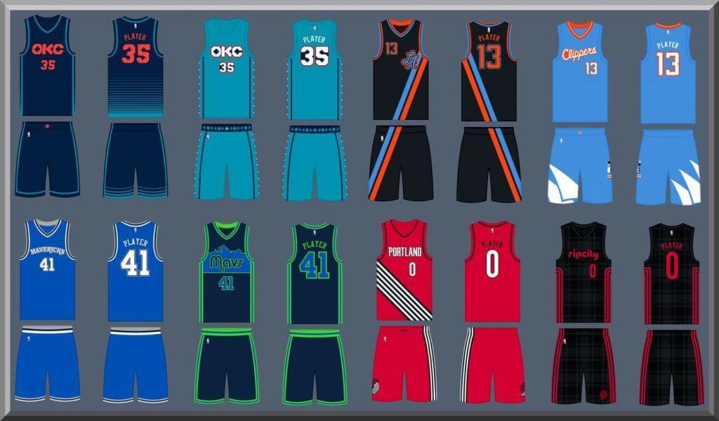
If you missed Volume I of Matthew’s concepts, please click here. As with other sports, Matthew has tweaked or redesigned every team, and since the NBA has so many uniforms per team, he has given each squad a set of four different unis.
Here’s Matthew!
NBA Redesigns, Volume II
By Matthew Drake
Now that the NBA season has started up again and we are beginning to embark on 2021, I figured I’d start sending you my concepts for each team, if you ever want to run them on the site.
I went with the same format that Nike does for the different designs (Association, Icon, Statement, and City), but Association Edition are intended to almost always be worn at home, and City Edition designs are intended to be more permanent parts of the set than they are currently under Nike.
Northwest Division
Denver Nuggets
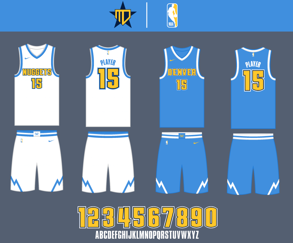
I went back to the powder, gold, and navy scheme, to differentiate from the Cavs. The uniform base and striping are mainly powder and white to give the uniforms an “icy” feel.
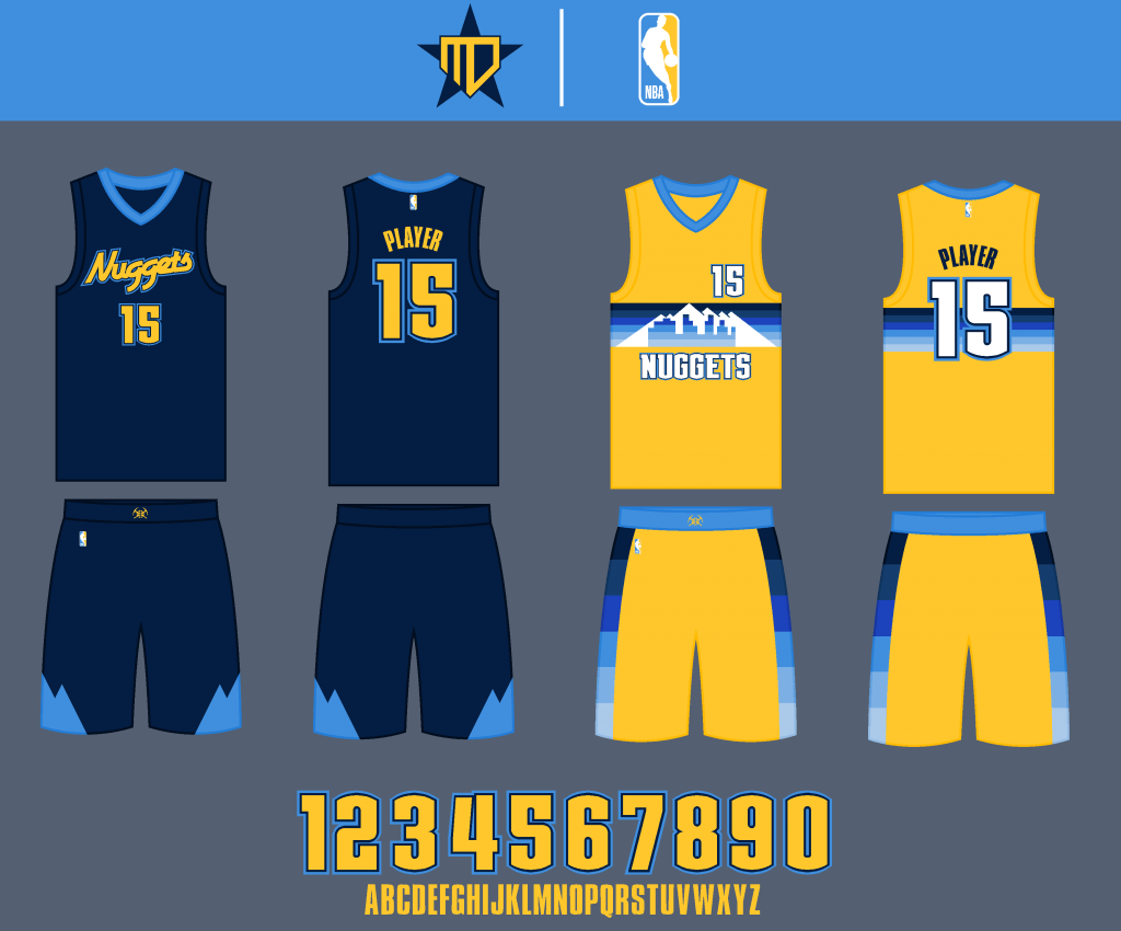
The Statement jersey is inspired by their 2000’s navy alternate. As much as I like the rainbow jerseys, I had to include a gold jersey in this set, so I went with a design inspired by past alternates, with a blue color block gradient.
Minnesota Timberwolves
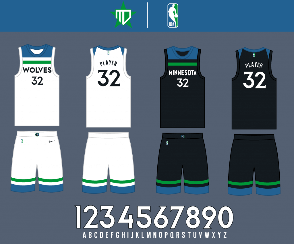
I tried to keep the main striping design of the uniform, but went back to the royal blue, kelly green, and black color scheme. This way, the blue is inspired by the 10,000 lakes, the green by the forest trees, and the black by the dark night sky, resulting in a truly Minnesota color scheme.
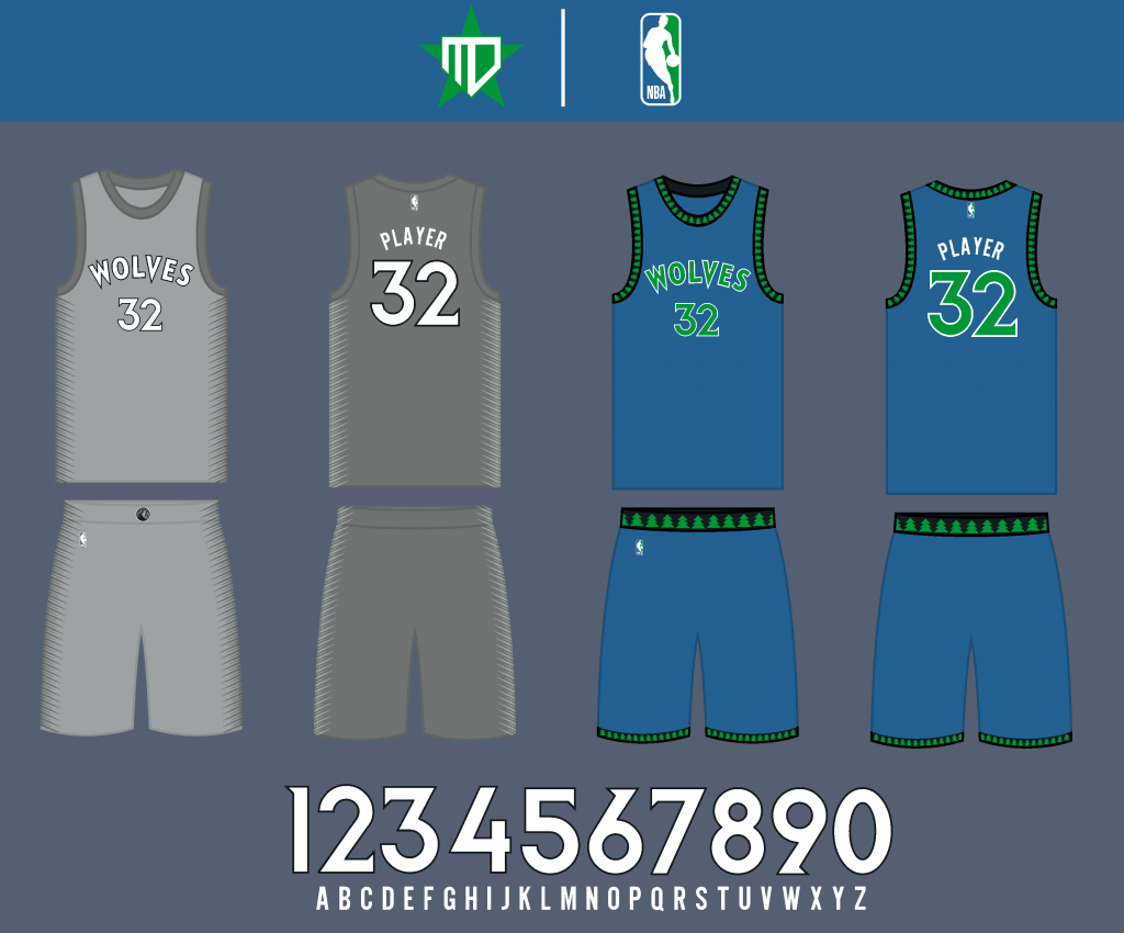
I brought back the original City Edition wolf’s fur design as the Statement Edition (where it honestly makes more sense to be). The City Edition brings back the tree pattern striping on a royal blue base, a combination of both the Wolves’ original and 90’s uniforms.
Oklahoma City Thunder
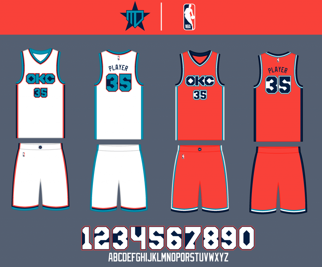
The wordmark and number font originate from the Thunder’s 2018-2019 City Edition uniform, adding more of a Native influence. I went with an orange base for the away jersey, as it is a fairly uncommon color among the NBA. Also, turquoise replaces their bright blue.
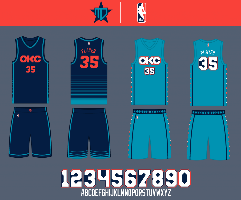
The Statement jersey is an update of their previous uniform to include the new font. The City is a simplified version of that same ‘18-‘19 uniform, adding to the Native influence.
Portland Trailblazers
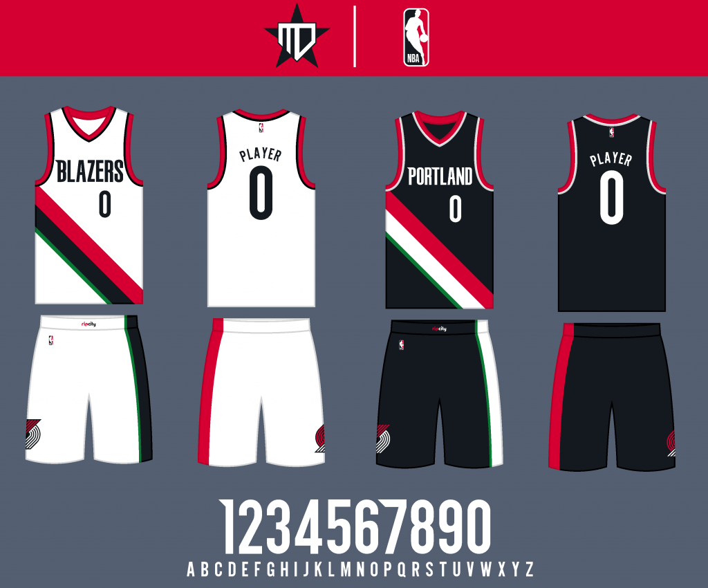
The primary uniforms remain essentially the same, besides a little bit of green replacing silver in the color palette for a more unique look.
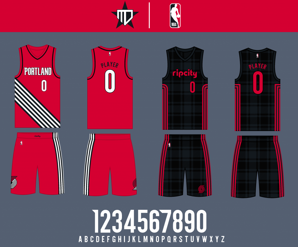
The Statement uniform makes the interior slash stripes white, and I went back to the sublimated flannel/lumberjack design for the City uniform.
Utah Jazz
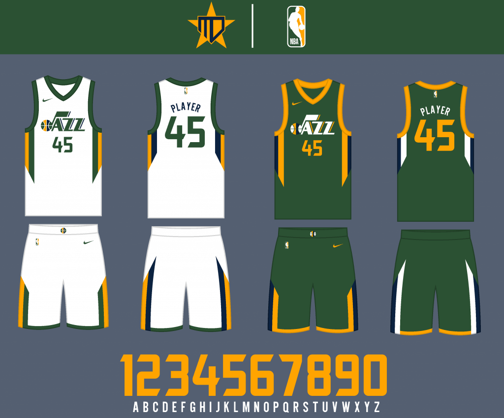
I emphasized dark green over navy in the color palette, otherwise the uniforms remain essentially the same.
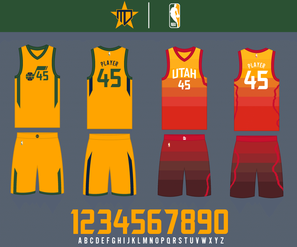
The gold Statement design remains, and the iconic red rock gradient uniform returns to its rightful place in the uniform set.
Pacific Division
Golden State Warriors
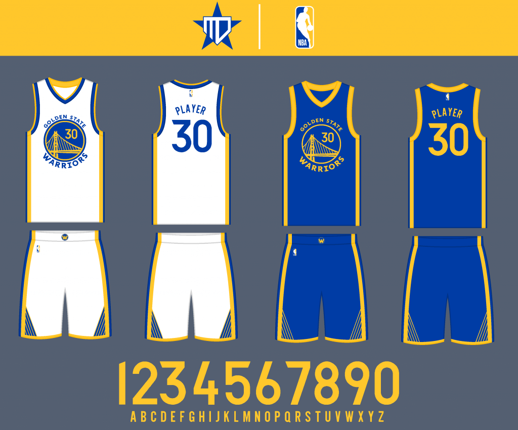
I tried simplifying the bridge design as much as I could. Since it doesn’t make much sense for the bridge to be white on the away jersey (it doesn’t match the logo), I went with only gold accents on the royal Icon jersey.

The black “The Town” Statement jersey adds some royal blue accents, and “The Bay” City jersey has striping elements inspired by the real-life Classic Edition uniforms.
Los Angeles Clippers
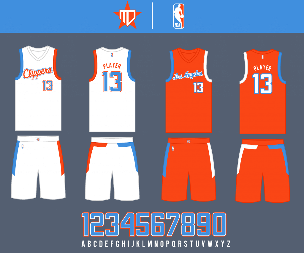
I went with the light blue and orange scheme from the San Diego days, as well as a dual striping design inspired by the real-life shorts, which carries over to the sleeve cuffs.
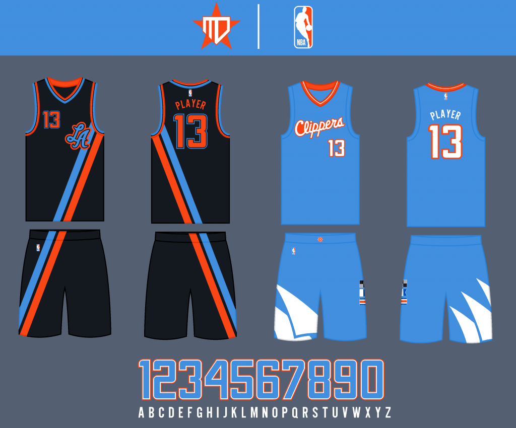
The Statement uniform is inspired by the Buffalo Braves. The City Edition is more directly inspired by the San Diego days and the original City uniform. I was graciously given permission to use the “LA” logo by @ConradBurry from sportslogos.net and Twitter.
Los Angeles Lakers
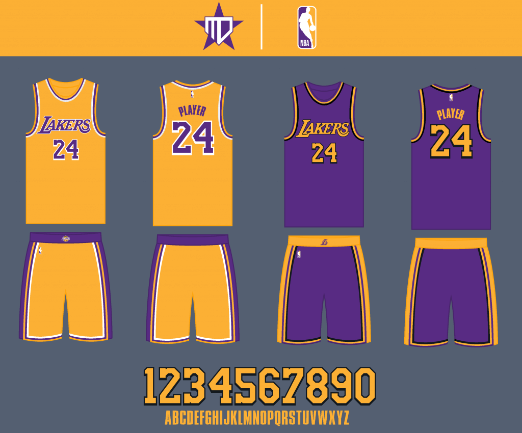
I love the Lakers new uniforms, so the Association Edition remains the same. This might be sacrilegious, but I added black accents to the purple Icon uniform to increase legibility for the wordmark and numbers.
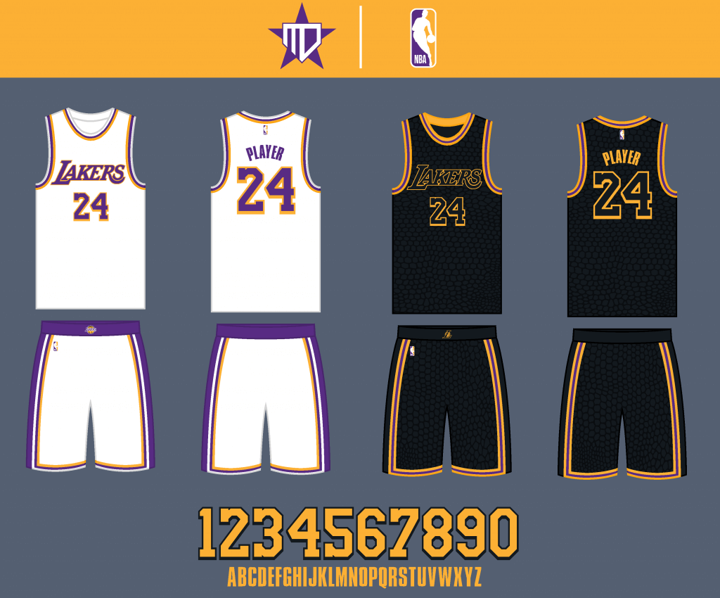
The home white Sunday uniforms remain, and of their “Lore Series” City uniforms, the “Mamba” uniform is by far my favorite, so I decided to keep it around.
Phoenix Suns
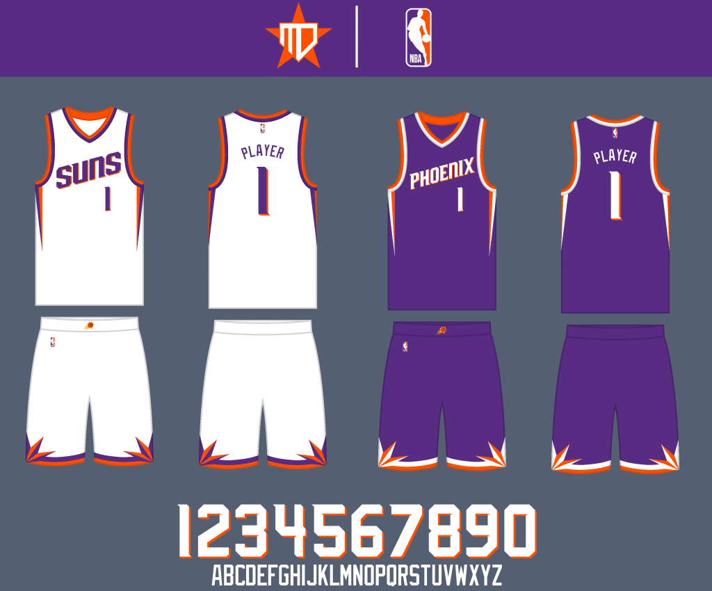
I tried to take the best of each era of Suns’ uniform history and combine them into one cohesive design.
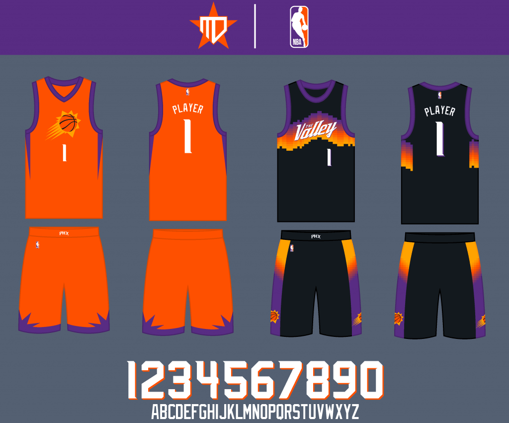
The orange Statement uniform remains largely intact, as does the new “The Valley” City uniform, easily my favorite they’ve released so far.
Sacramento Kings

The primary uniforms remain largely intact. The “Kings” wordmark is added to the away jersey.
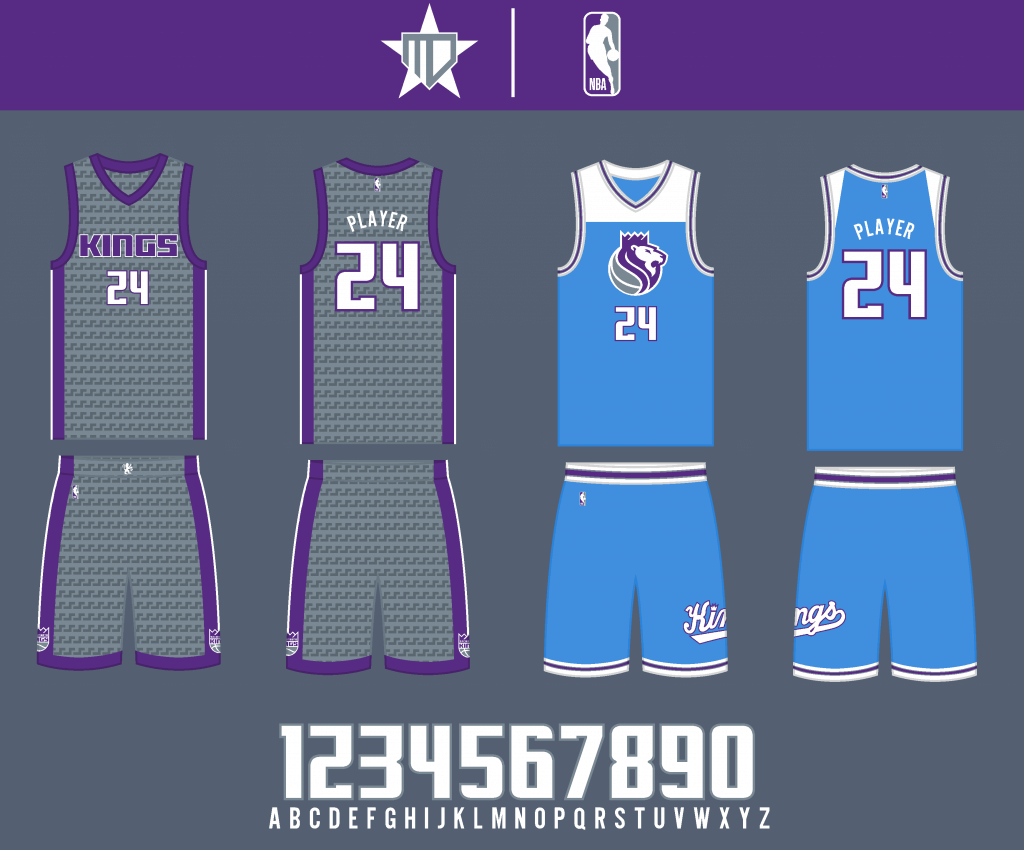
I replaced black on the Statement uniform with dark gray to better fit their color scheme, and I replaced red with purple on the City uniform to get an even more unique scheme.
Southwest Division
Dallas Mavericks
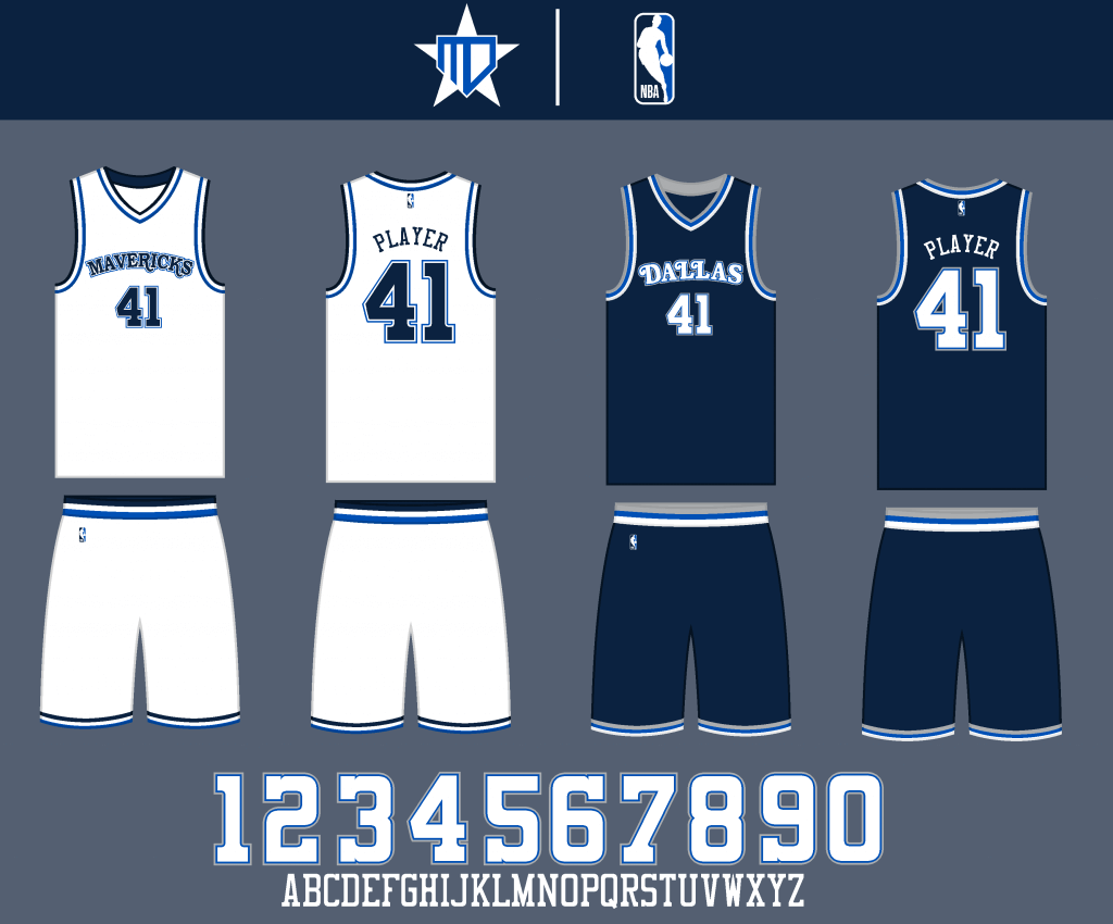
I went back to the original uniform for a simpler, classic design, but kept the double blue color scheme.
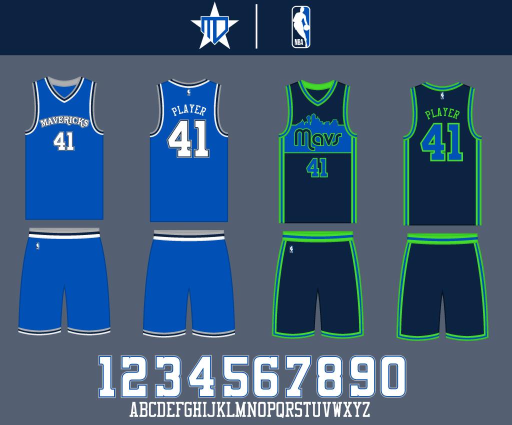
The Mavs get a royal blue jersey for the Statement, and incorporate neon green elements into the City design inspired by the Dallas skyline.
Houston Rockets
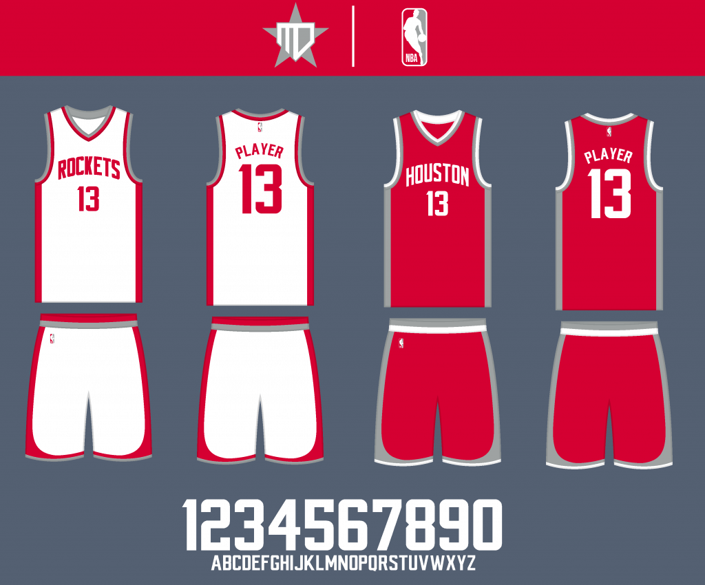
I originally brought back red and yellow, but I honestly think the Rockets are better as a red & silver team. Black is eliminated from the primary color scheme.
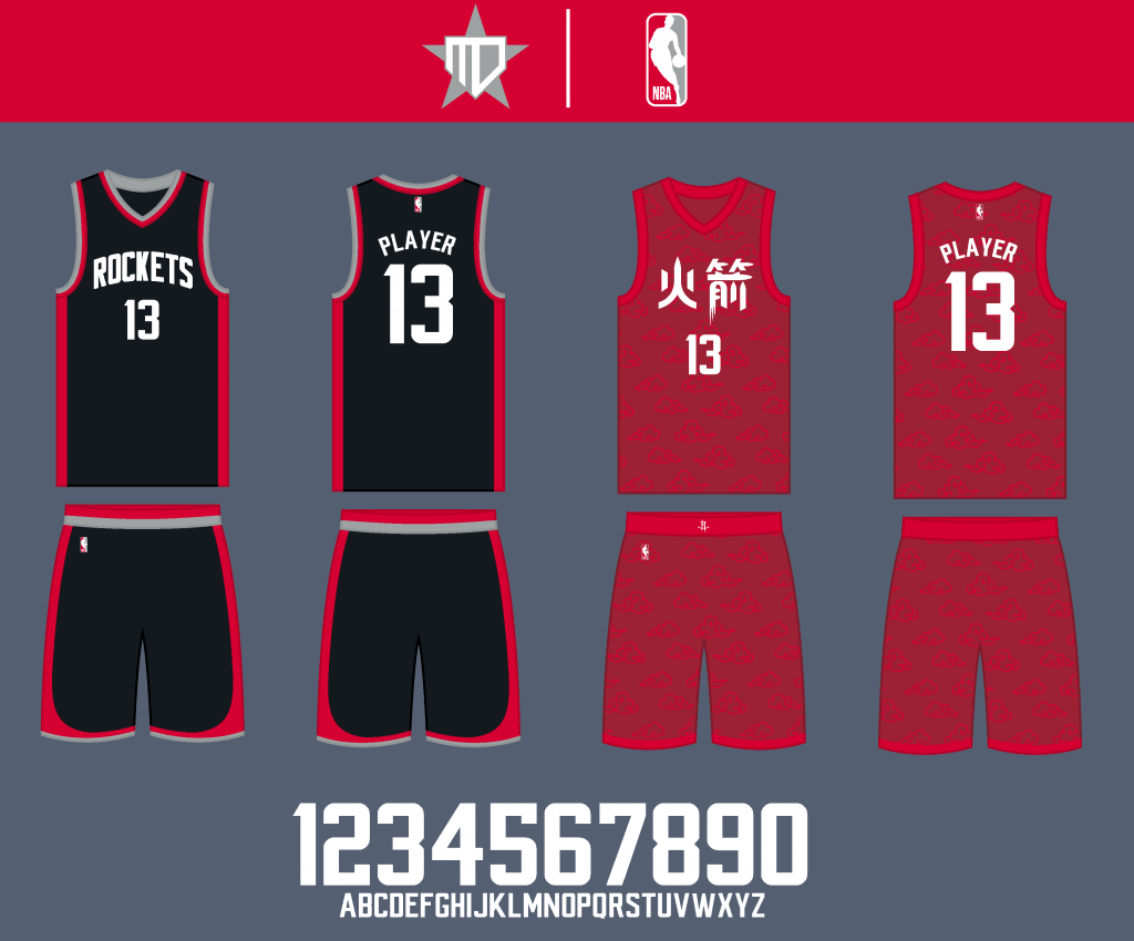
Black does remain for the Statement jersey, though. The City Edition uniform incorporates Chinese-inspired patterns and lettering, on a crimson red base with scarlet red accents.
Memphis Grizzlies
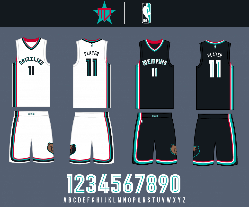
I went back to the Vancouver color scheme, to differentiate from Denver and give the Grizzlies a more unique color palette. I also reverted to the prior wordmarks and number font.

The Statement Edition more closely embraces the Classic Edition jersey, and the City Edition is essentially a fauxback to the Memphis Sounds.
New Orleans Pelicans
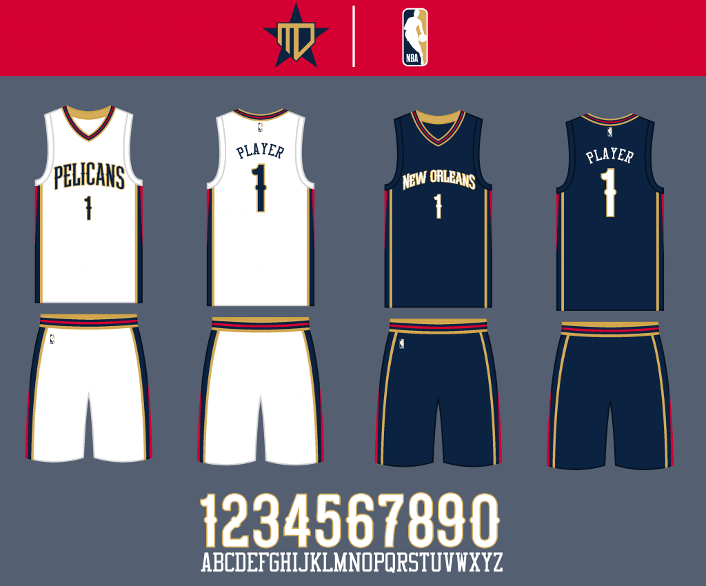
I utilized a striping design inspired by the original City Edition uniform.
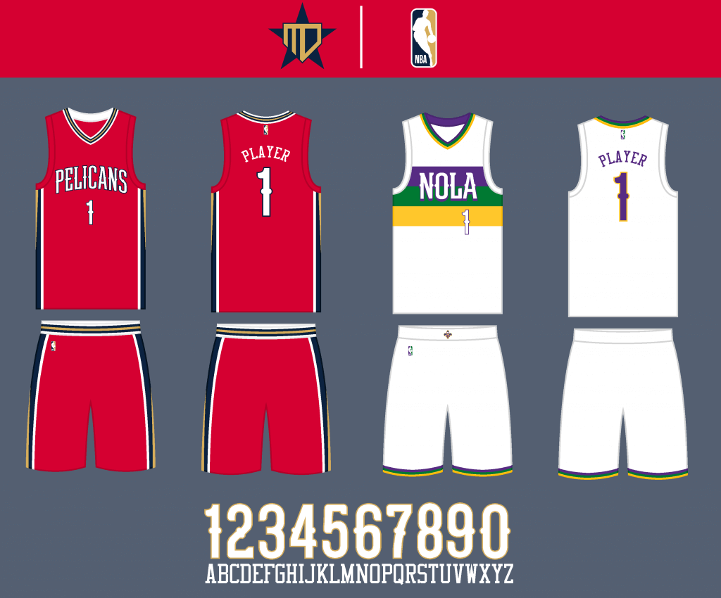
The Statement is essentially a color swap of the home uniform, and the City Edition uniform goes back to the Mardi Gras flag design.
San Antonio Spurs
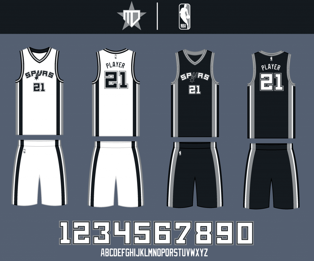
I updated the striping slightly to be more consistent, and went back to the old wordmark. I also boxed off the corners of the number font to better match the letters.
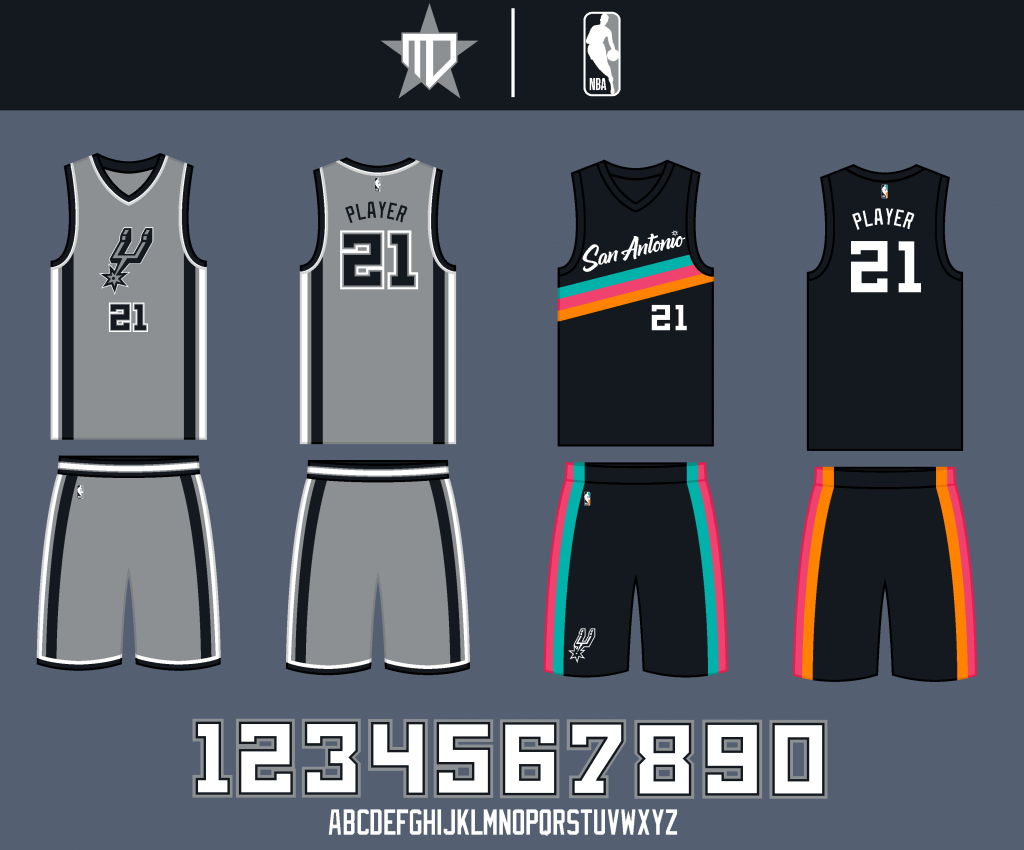
The Statement uniform remains largely the same, and the “Fiesta” City uniform is already perfect.
Thanks, Matthew! Hope you guys enjoyed the second half of his NBA redesigns. Readers? What do you think?

Picking the NFL Divisional Winners by Uni
I’m a glutton for punishment, it seems.
After going a horrendous 1-4-1 last weekend picking the NFL Wild Card game winners “by better uni,” I’m gonna try it again this weekend using the same formula. If you’re a bettor, at least based on last week’s results, you may wish to parlay the opposite picks this weekend.
Anyway…here we go:
SATURDAY’S GAMES

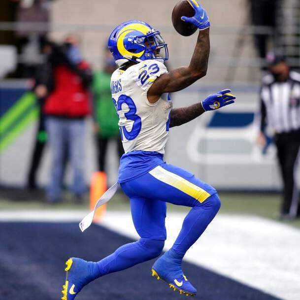
Los Angeles Rams @ Green Bay Packers
4:35 pm; FOX
Packers are a 6.5 point favorite
We’ll just get this out of the way right now: the Packers have my favorite NFL home uniform, so anytime they wear it (which will be this week, next week, and the Supe, should they reach it), I’m sticking with the Pack. The Rams won ugly last weekend (literally and figuratively) in Seattle, breaking out their never-before-worn combo of dishwater over royal, and they’re sticking with it today. Won’t matter. The green and gold shall cover.
The Pick: Packers -6.5

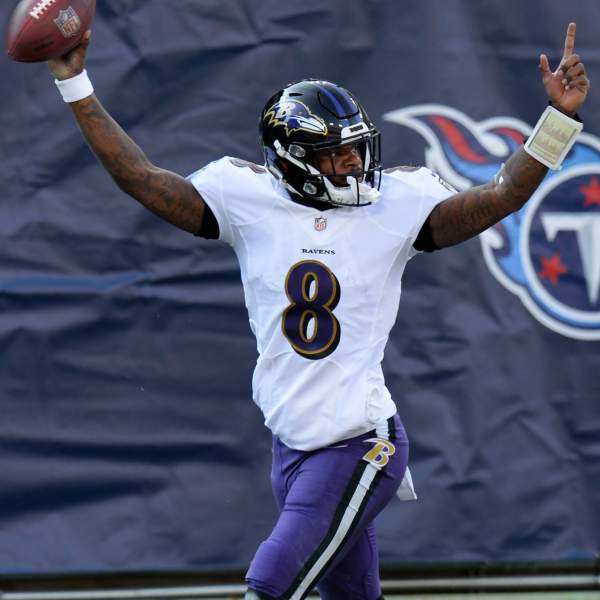
Baltimore Ravens @ Buffalo Bills
8:15 pm; CBS
Bills are a 3 point favorite
This one’s a little less of a slam-dunk than the previous game. And although the Ravens haven’t announced their choice of pants, it’s probably safe to say they’ll be wearing purple trou again (which they wore in last weekend’s win over Tennessee) today. It’s arguably their best road look (although I do like their white/white too). The Bills will again wear their traditional royal/white, which is easily their best home set. Unless the Ravens wear black leotards, it will be a good looking game. But either way, I gotta go with the Buffalonians.
The Pick: Bills -3
SUNDAY’S GAMES
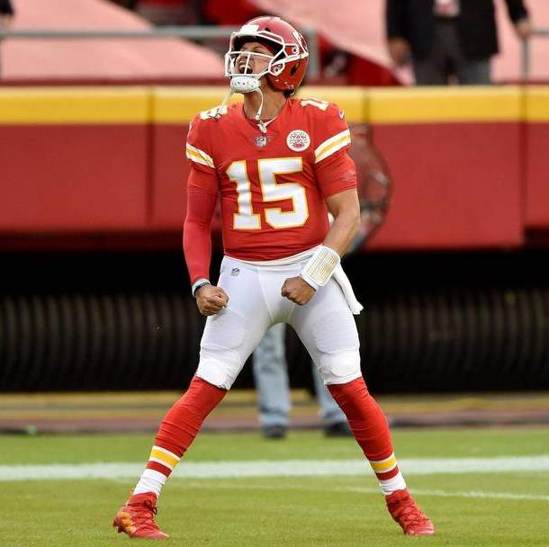

Cleveland Browns @ Kansas City Chiefs
3:05 pm; CBS
Chiefs are 10 point favorites
Like the Ravens, who as of Friday had not announced their pants of choice, I have to assume they’ll be back in their orange trou (having worn them last weekend in their demolition of the Stillers). And also, like the Ravens, their white over orange is arguably their best look. In fact, I like it better than their brown over orange home kit — and I like that a lot. The Chiefs are a bit tougher. Their red/white is a classic look, one they’ve sported, basically untouched, since they played as the Texans in 1960. But…I’ve honestly never loved red/gold as a uni combo (even though the Chiefs use relatively little gold), and unless the Browns foolishly wear brown pants, I am going to give them the slight nod here. It will be, in the words of Jimmer Vilk, a color palatte special. Tough call, but…
The Pick: Browns +10

Tampa Bay Buccaneers @ New Orleans Saints
6:40 pm; FOX
Saints are a 3 point favorite
After three games that should be mostly pleasing to the eyes, the Divisional Round ends with what will likely be the worst looking uni matchup of the weekend. The mono-black Saints are one of my least favorite looks, despite the team’s apparent love of the combo. If they’d just add some stripes (like they had in the Manning era; or at the very least, wear their gold pants), they’d have a respectable ensemble. But mono-black, in that dome…yecch. Unfortunately, the Buccaneers won’t look much better, since they’ve opted to go with their pewter pants. But even so, that is still a better look than the mono-black Saints. Under the dome lighting, this one has the potential to really look bad. In the lesser of two uni-evils, I gotta go with…
The Pick: Buccaneers +3
And there you have it. I can’t do much worse than last weekend — so I’m hoping the uni-gods will hear my pleas this time around.

Guess The Game…
from the scoreboard
Today’s scoreboard comes from Tiger Rose.
The premise of the game (GTGFTS) is simple: I’ll post a scoreboard and you guys simply identify the game depicted. In the past, I don’t know if I’ve ever completely stumped you (some are easier than others).
Here’s the Scoreboard. In the comments below, try to identify the game (date & location, as well as final score). If anything noteworthy occurred during the game, please add that in (and if you were AT the game, well bonus points for you!):
Please continue sending these in! You’re welcome to send me any scoreboard photos (with answers please), and I’ll keep running them.
The Ticker
By Anthony Emerson

Baseball News: Check out this Gigantes del Cibao player rounding third with his jersey completely unbuttoned in a Dominican Winter League matchup against Águilas Cibaeñas. … The Red Sox announced new internationals signing Miguel Bleis by giving him a Russell Athletic jersey. Russell hasn’t provided Red Sox unis since 2004 (from Bryan Redemske).

NFL News: Yesterday, we ticker-linked a couple of replica silver Pats jerseys manufactured by Adidas, which didn’t make much sense since the Pats started wearing the silver alternates in 2003 after Reebok took over production of NFL unis. Reader Caleb Gerbitz has now found an allegedly game-issued silver jersey from Terry Glenn’s time with the team for sale on WorthPoint. The story going along with the listing says that the seller got it from someone who claims they received it from Glenn himself. Making things even weirder, the jersey has a tag used only on the 1999 jerseys, and the Patriots didn’t even use that jersey template until 2000. Perhaps it’s a prototype? The mystery deepens.

Hockey News: Senators rookie centerman Tim Stützle is officially going UOB — umlaut-on-back. It had previously been announced that he was spelling his surname as “Stuetzle” and avoiding the umlaut; both are correct in German (from Brandon Weir). … The OHL’s Oshawa Generals have unveiled a new alternate uni, which they teased yesterday, and new two-colored helmets (from Wade Heidt and Darryl Knight). … The Coyotes have announced their uniform schedule (from Michael Burnett). … The AHL’s Tucson Roadrunners have a fifth anniversary logo at center ice (from Adam Vitcavage). … Okay, I need this Whalers button Dave Lewanda‘s parents found.

NBA News: The Clippers “Earned Edition” unis have been leaked (from Ian Lee). … Cavaliers C Jarrett Allen and F Taurean Prince, who moved from the Nets to the Cavs as part of the James Harden deal, will wear No. 31 and No. 12 respectively (from Etienne Catalan). … Yesterday’s Google Doodle honored James Naismith’s invention of basketball (from Kary Klismet). … The Hawks sent their Martin Luther King Jr. jersey to Pope Francis.

College/High School Hoops News: Hawai’i men have added a patch depicting the Hawaiian Island and reading “Black Lives Matter” and “‘Bows Together” to their unis.
.

Soccer News: Chicago Fire owner Joe Mansueto is taking personal responsibility for the Fire’s new logo debacle (from T.J. Zaremba). … Speaking of logo debacles, it appears Montreal’s soccer fans do not like the rebranding of the Impact to Club de Foot Montréal (from Moe Khan.

Grab Bag: New nickname for Roncali High in Indiana, changing from “Rebels” to “Royals” (from Derek Linn). … New logo for Drake’s Cakes. Old one here (from John Cerone). … Also from John: Facebook is asking employees not to wear Facebook gear in public after banning President Trump. … One more from John: here’s an article about how one Nike exec sees the future of medical scrubs.
And finally… big thanks, once again, to Matthew Drake for sharing his NBA designs! Please give him your feedback in the comments below.
Everyone enjoy your Saturday — including the NFL playoffs, the return of hockey, hoops and more. I’ll catch you guys tomorrow.
Peace,
PH
The Statement and City concepts for the Spurs show the Memphis designs.
Whoops — sorry about that. Now fixed.
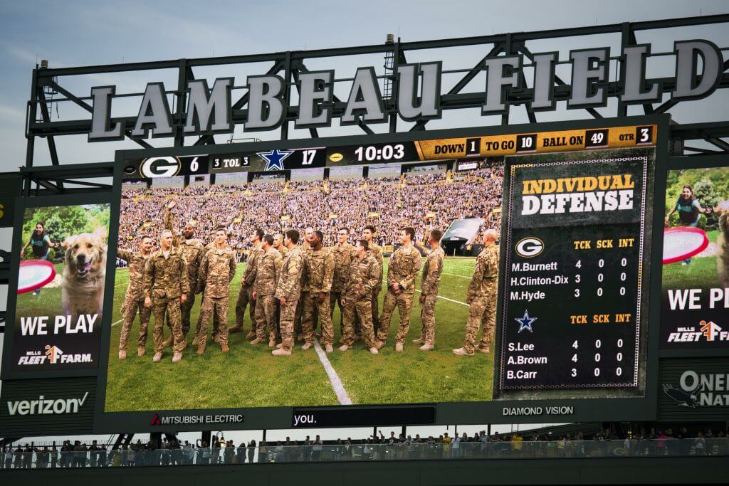
GTGFTS
10/16/16 at Lambeau Field final score 30-16 Dallas wins. Then rookie Dak Prescott’s NFL record streak for a quarterback at the start of his career without an interception ended at 176 pass attempts. He broke the mark of 162 previously held by New England’s Tom Brady earlier in the game.
Probably would’ve been slightly more challenging if the giant “LAMBEAU FIELD” at the top of the scoreboard had been cropped out.
I kinda wish that the Spurs would use the Fiesta in their normal designs
A little depressed the Gervin-era uniforms with their ghosted numbers and titles get no love. I think that was their signature look.
Eight different helmet shell colors for the NFL’s playoff games.
Yellow v Royal
White v Black
Red v Orange
Gold v Pewter
Considering that multiple teams wear white, silver or navy, I’m surprised there are no duplicates among the final 8.
The Blazers’ black Rip City jerseys were not ever inspired by either “flannel” nor “lumberjack.” The plaid pattern within the black jerseys honored Dr. Jack Ramsey’s crazy plaid leisure suits from the late 1970’s.
That young Red Sox int’l signing probably doesn’t realize that getting a vintage Russell Athletic jersey is way cooler than a current crap jersey with the Nike swoosh. Especially since 2004 was the year the Sox broke the curse.
And Club de Foot Montreal is a rather awkward, unfortunate rebranding. Did it not occur to anyone that clubfoot is a common type of birth defect?
This is my first time seeing the Montreal Impact/CF Montreal redesign. I’m fine with the name change and their previous crest was already pretty terrible. My biggest quibble with the redesign is that EVERY SNOWFLAKE FROM THE DAWN OF TIME HAS HAD SIX POINTS. There is not, nor has there ever been, nor could there ever be an eight-pointed snowflake. It is beyond amateurish for a professional identity to have an eight-pointed snowflake, no matter how well-executed. Absolute trash.
Yes, and no penguin has ever worn ice skates and hockey gloves and carried a hockey stick. The point is aesthetics, not strict realism. It’s a logo, not a meteorology guide.
If a team designed a Penguins logo with a third leg or second head, do you think people would have a problem with it?
Hoping for some uni-justice to be doled out in Green Bay today.
Go Pack Go!
The Saints uniforms used to be my favorite when they wore gold pants. Both the home black jerseys and road white looked great with the gold helmets and pants. Now they are down in the bottom tier except when they wear their white color rash with gold numbers. In fact I’d like to see them go with this jersey, either with the white pants, but especially if they wore these with gold pants.
Seconding this.
Correct.
Fourthed
I originally brought back red and yellow, but I honestly think the Rockets are better as a red & silver team.
I really don’t know how to process this…in the meantime all I can say is get off my lawn.
Speaking of red and yellow…Phil! Until the ’72-’74 Oilers uni makes a return appearance, you NEVER bet against the Chiefs!
The Calgary Flames have gone back to only red and yellow (no black trim). It looks great
Two of the Flames’ four unis this year contain black, so… not so fast ;-)
Here’s a highlight clip from ‘74:
link
Lots to enjoy/observe there…those uniforms, The Dome, a missing helmet decal and more in under 3 minutes!
Best. Looking. NFL. Game. Ever!
stop
Hit “Post Comment” too soon…
Anyway, you could make a case that the Flames actually have more black in their unis now than they did last season. In both seasons, they wore four unis – two with black and two without. But only this season do they have a jersey whose base color is black.
There’s a certain symmetry between the two AFC match ups
1. Blue (primary color) vs its more garish cousin purple, with that garish color being used for the pants, and the blue (primary color) wearing white pants
2. Red (primary color) vs its more garish cousin orange, with the garish color being used for the pants, and the red (primary) being matched up with white pants
The similarities in colors probably prevent either game from being truly a great looking game, although both are good.
I’d love to know the story of how the Hawks got their jersey into the hands of Pope Francis. Is this a normal practice for His Holiness?
I think I can solve the silver Patriots jersey mystery. In 2000 I worked at a store that footwear, hats, jerseys, etc. That year the NFL jersey manufacturers (Nike, Adidas, and Puma) created a third alternate color jersey for each team. We had a red Titans, silver Cowboys jersey, navy Dolphins jersey (which I still have), and a few others. I think the only one that was ever worn that season was the gold Saints jersey. I am pretty sure the silver Patriots jerseys are from that collection.
Yawn. Another 100 NBA concepts.
And that’s after the 500 concepts the NBA launched last month. It’s like the prolific Schmenges Brothers releasing 88 Polka records in a space of 18 months
The Suns uniform seems too basic. They should bring back the Barkley era uniform. Or better yet, the jersey of the Barkley era, and shorts similar to the earlier era with the half sunburst on the sides.
Goff is wearing the navy handwarmer again today.
Dallas’ City design is awesome. Well done. Perfectly captures what the whole City thing is supposed to be. It’s all cringe-worthy, but I honestly like the design. They’d sell well and no one is using that color green in the league. Great work.