By Phil Hecken
Follow @PhilHecken
Hey Uni Watchers. Hope everyone is doing OK, feeling well, and staying sane. It may be day two of the (now supersized) NFL Wild Card weekend, but today, we’ll turn to some new NBA concepts, brought to you by Matthew Drake.
If that name sounds familiar, it’s because I’ve featured many of Matthew’s concepts for other sports on Uni Watch before, and today he’s back to take on the NBA. As with other sports, Matthew has tweaked or redesigned every team, and since the NBA has so many uniforms per team, he has given each squad a set of four different unis.
Here’s Matthew!
NBA Redesigns, Volume I
By Matthew Drake
Now that the NBA season has started up again and we are beginning to embark on 2021, I figured I’d start sending you my concepts for each team, if you ever want to run them on the site.
I went with the same format that Nike does for the different designs (Association, Icon, Statement, and City), but Association Edition are intended to almost always be worn at home, and City Edition designs are intended to be more permanent parts of the set than they are currently under Nike.
Eastern Atlantic Division
Boston Celtics
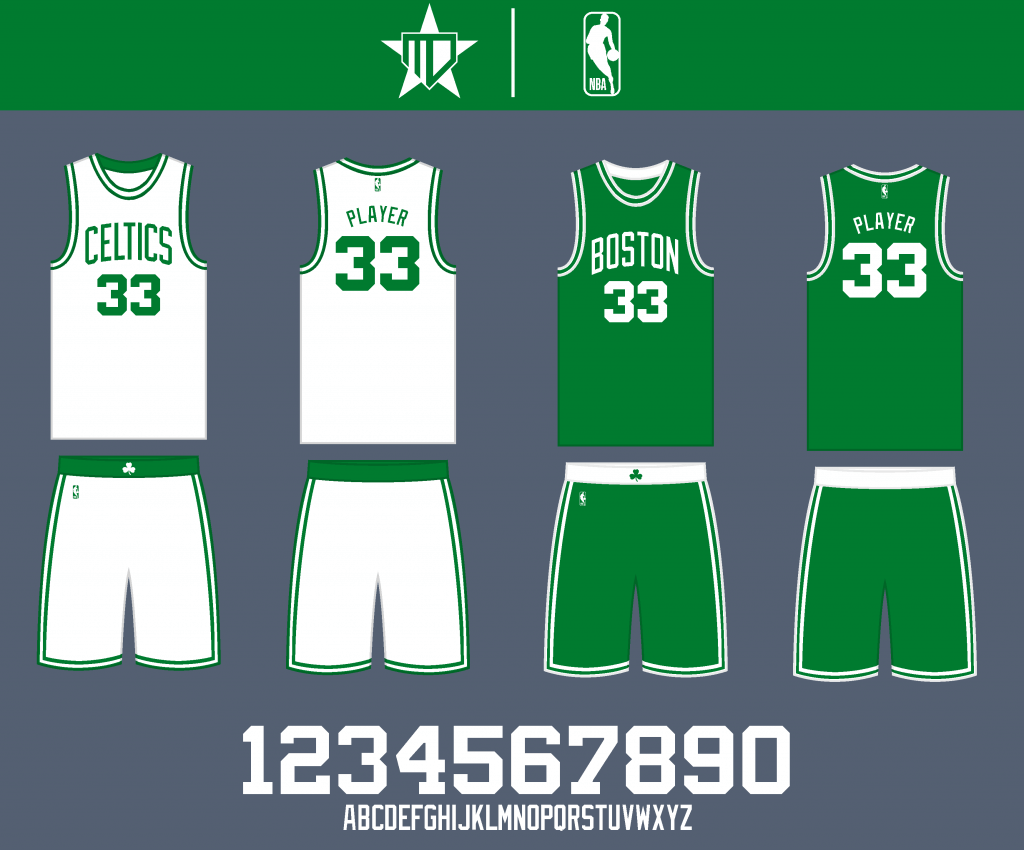
No need to mess with one of the most iconic primary looks in basketball.
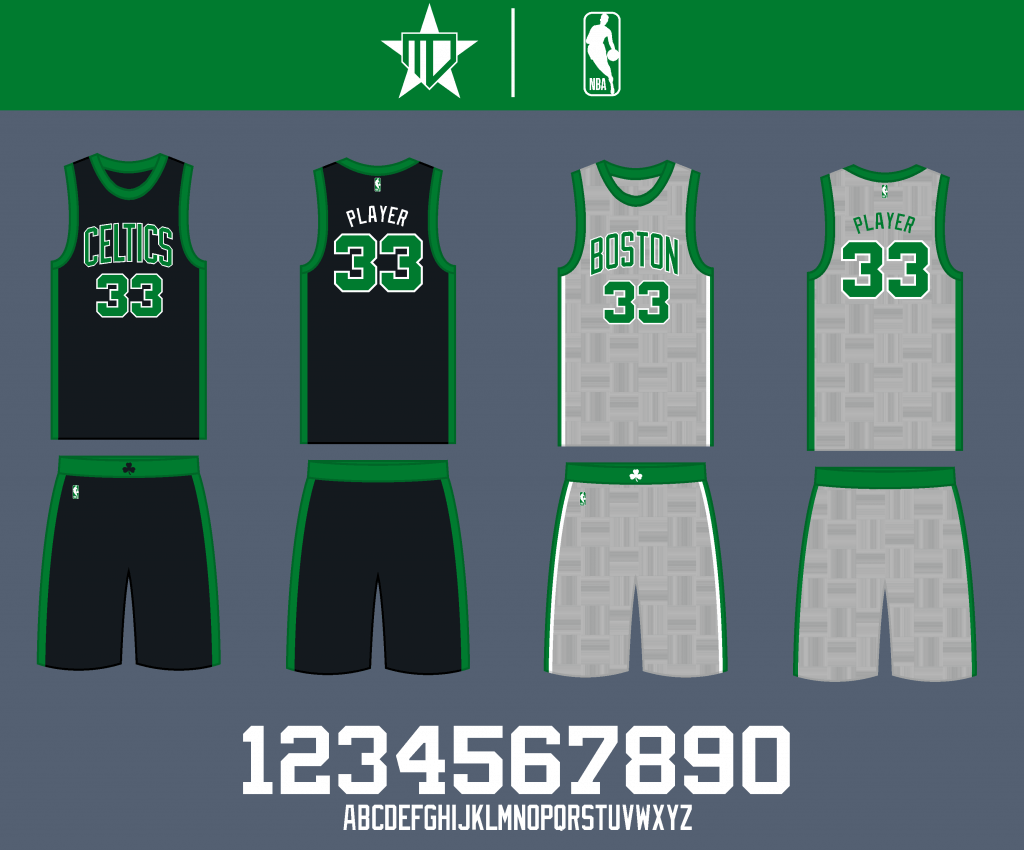
I actually hold the unpopular opinion of liking the Celtics’ black jersey, so I kept it around as the Statement. I went back to the first City Edition design with the gray parquet floor design of the TD Garden, as that’s my favorite City look Boston has had thus far.
Brooklyn Nets
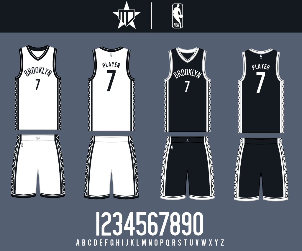
I kept the minimalistic black & white design, but brought back the argyle/net-style striping pattern used throughout the early 2000’s.
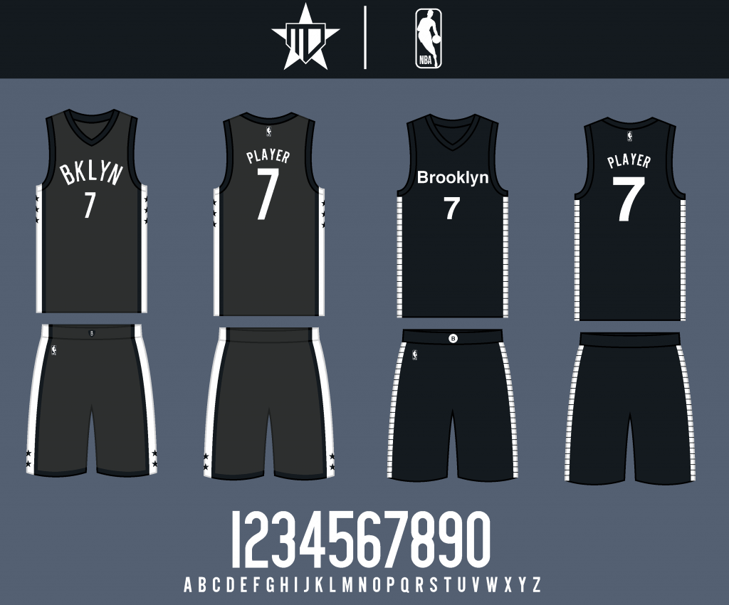
The Statement design goes back to the earlier charcoal design, and the City uniform is a simplified design inspired by subway insignia.
New York Knicks
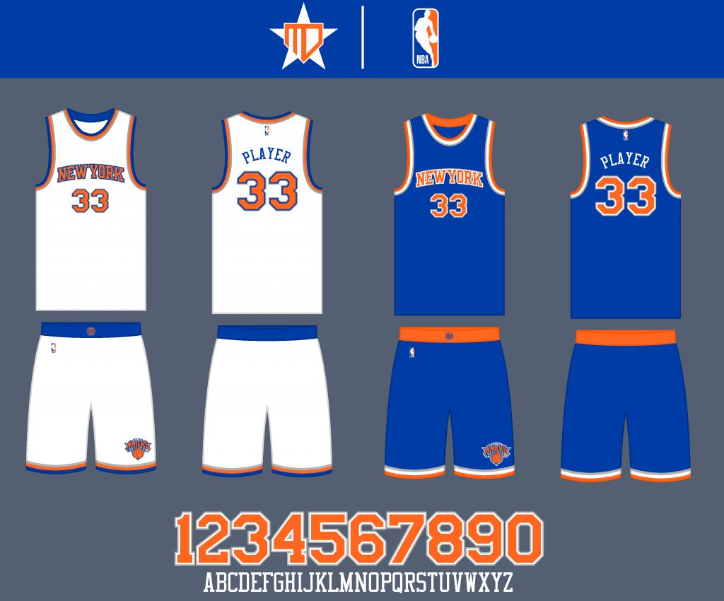
I actually really like the Knicks’ primary uniforms, so things remain pretty much identical to the real-life design.
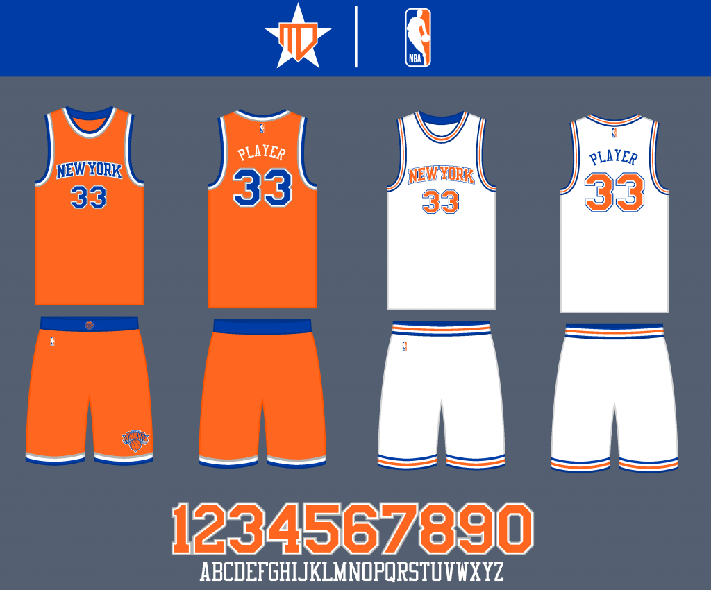
I brought back the orange uniform for the Statement (they might be bad luck, but they still look amazing in my opinion). I also couldn’t help but bring back the Knicks’ earlier Statement design, this time designating it as the City uniform (obviously, this uniform doesn’t have much significance to the city of New York, but then again, neither does the Knicks’ current City Edition).
Philadelphia 76ers
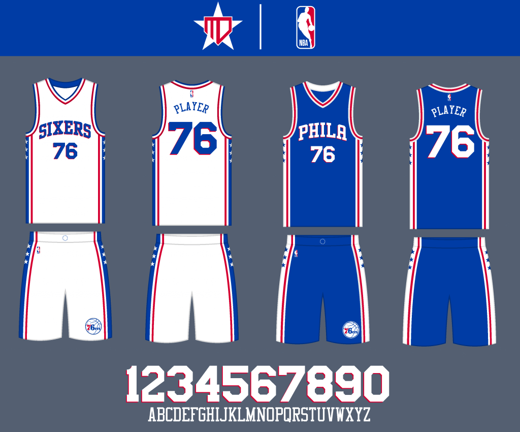
Some of my favorite primary uniforms in the NBA remain virtually the same. I placed the “Sixers” wordmark on the home as opposed to “Phila.”
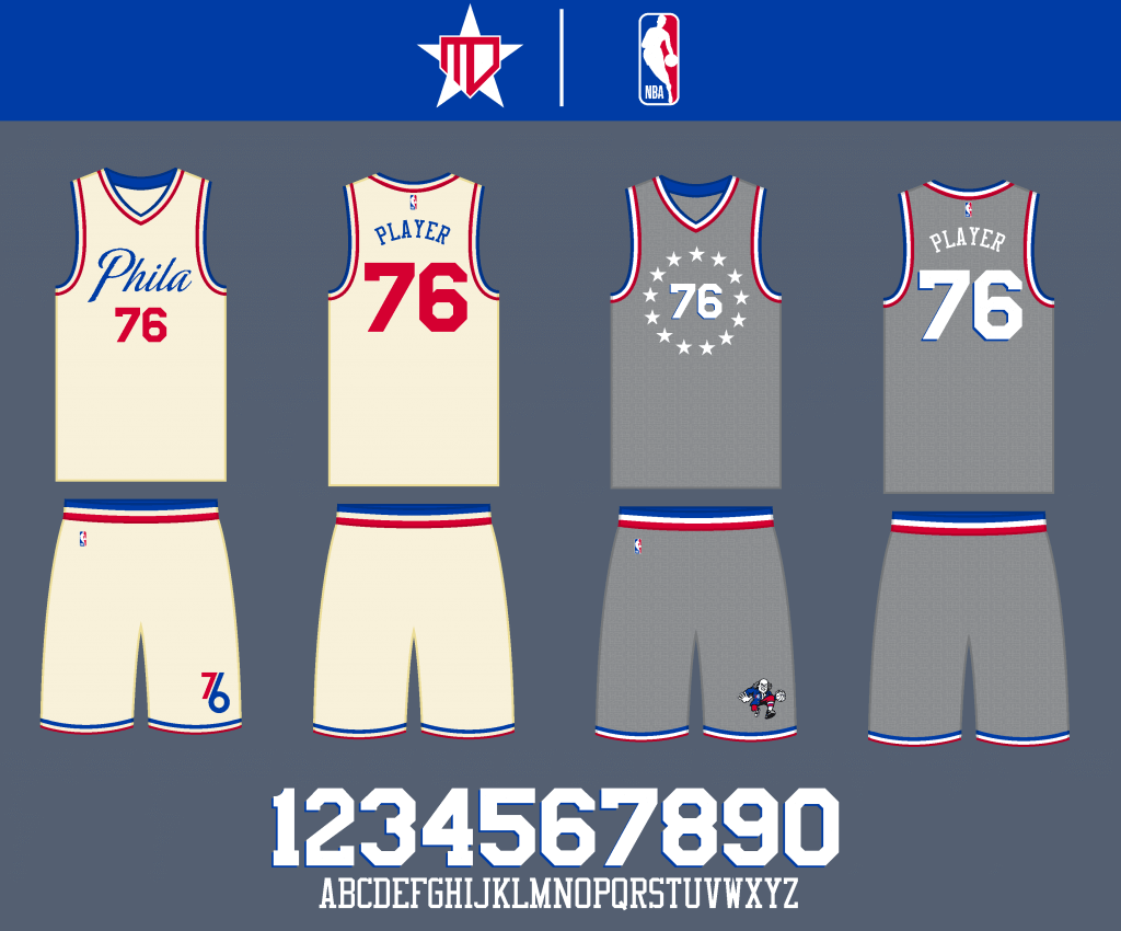
I kept the off-white/parchment design for the Statement, and the City Edition goes back to the Rocky sweatsuit pattern.
Toronto Raptors
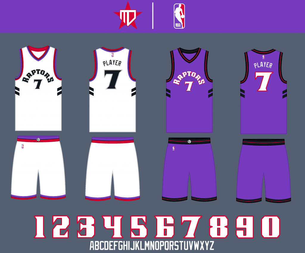
I had to go back to the classic purple and red. The design of the uniform itself is somewhat of a combination of the best of each era of Raptors’ history, with the font deriving from the original primary logo.
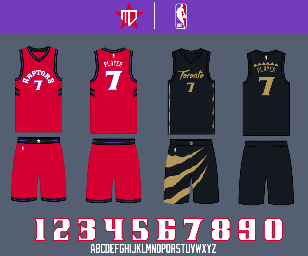
I went with a simple color swap to red for the Statement. I like each iteration the Raptors have done of their “OVO/Drake night” City Editions, but I tried to take the best of each design and combine them into one solidified uniform.
Eastern Central Division
Chicago Bulls
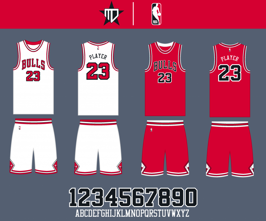
No changes here.
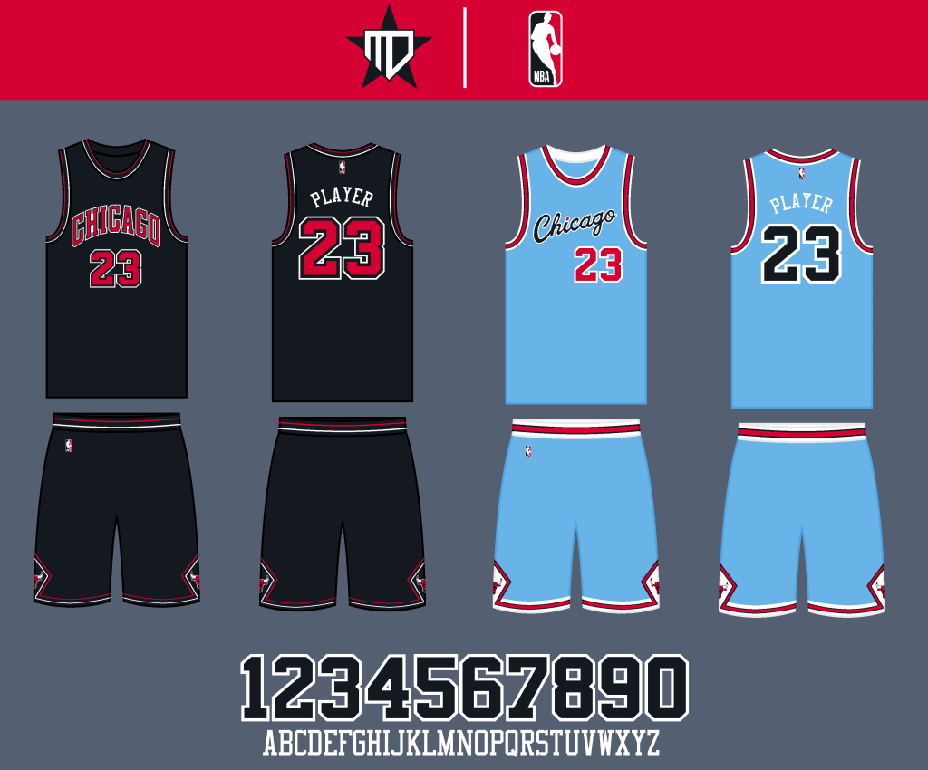
I went back to the old Statement design, and I added a little bit of black into the original City Edition design.
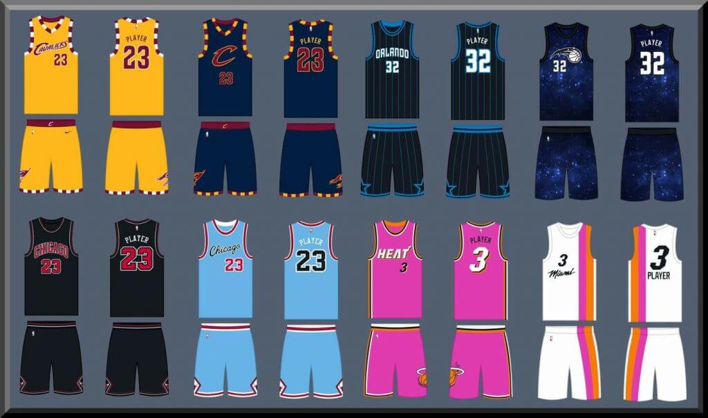
Cleveland Cavaliers
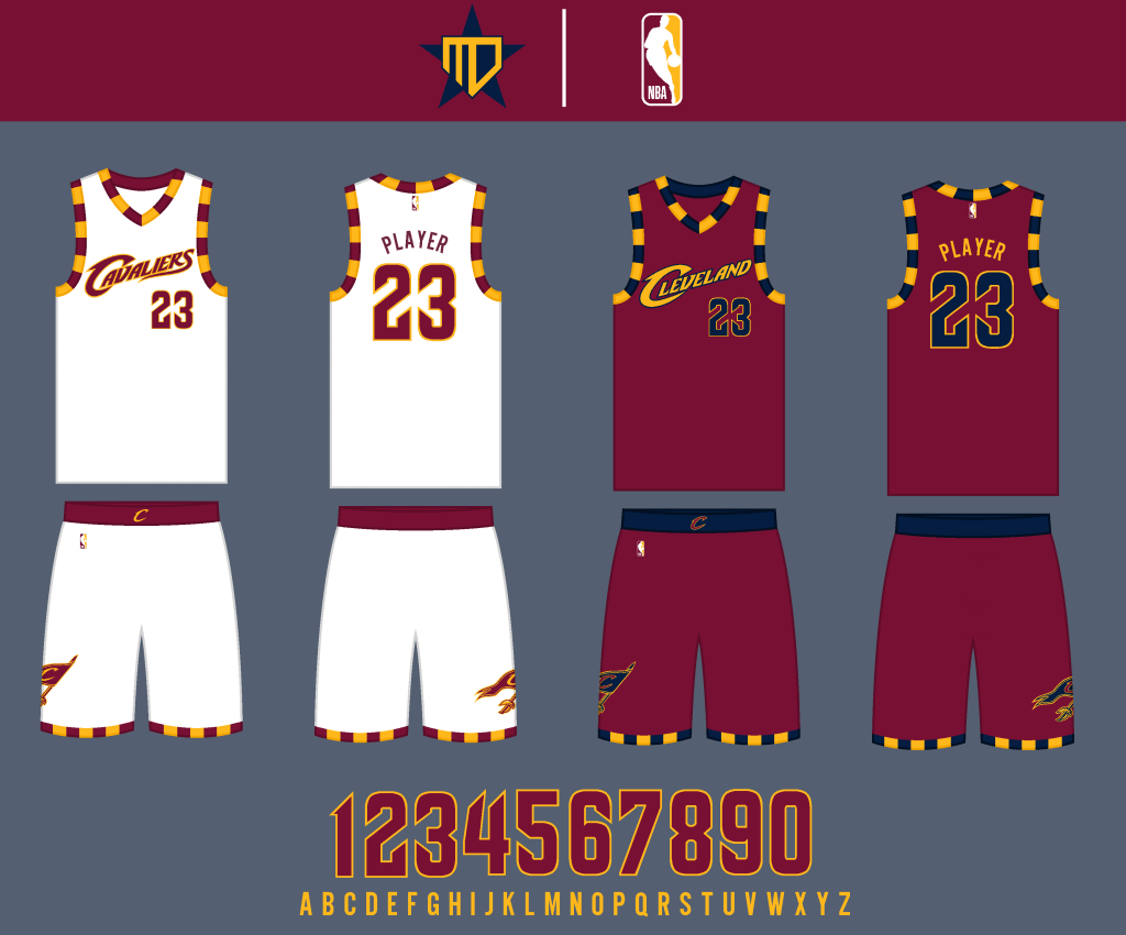
I combined some of my favorite elements from throughout the Cavs’ uniform history: I used the checkered stripe design from the late 70’s, the wordmarks from the early 2000’s, and the color scheme and number font from the 2010’s.
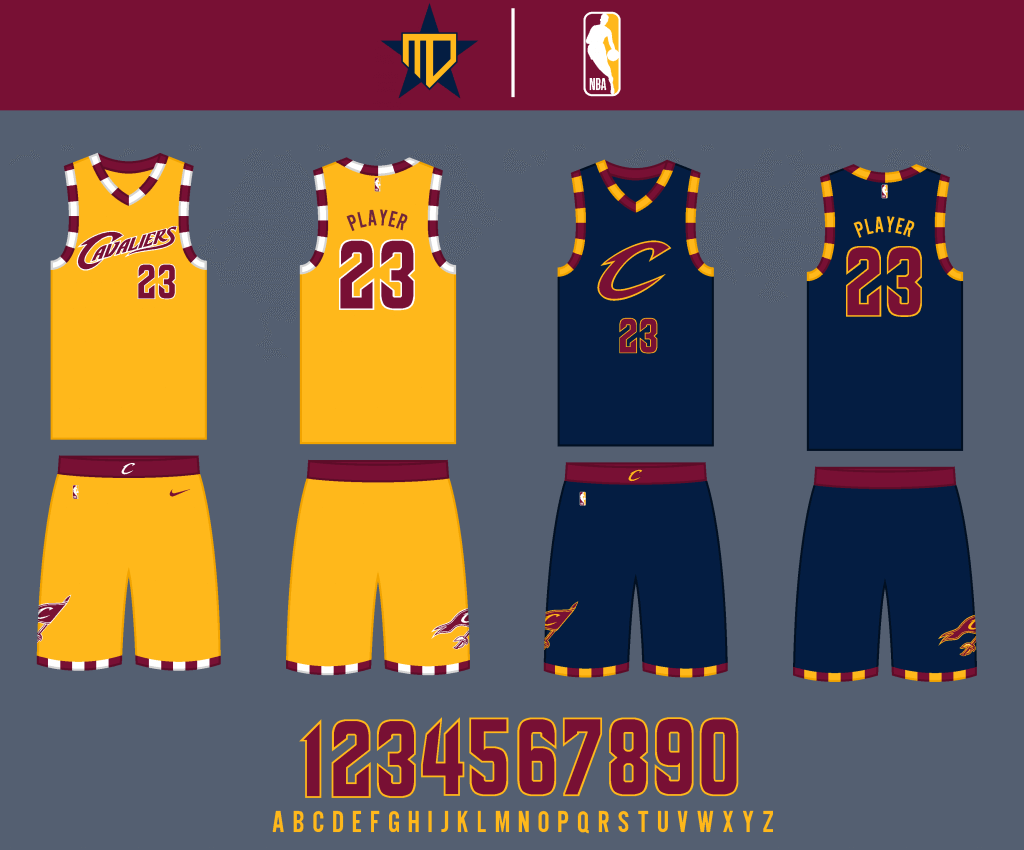
I couldn’t decide between gold and navy for the alternate jersey, so I went with both, and just designated one as the City Edition.
Detroit Pistons

No major changes for the primary jerseys, the most notable difference would be the round color as opposed to the wishbone.
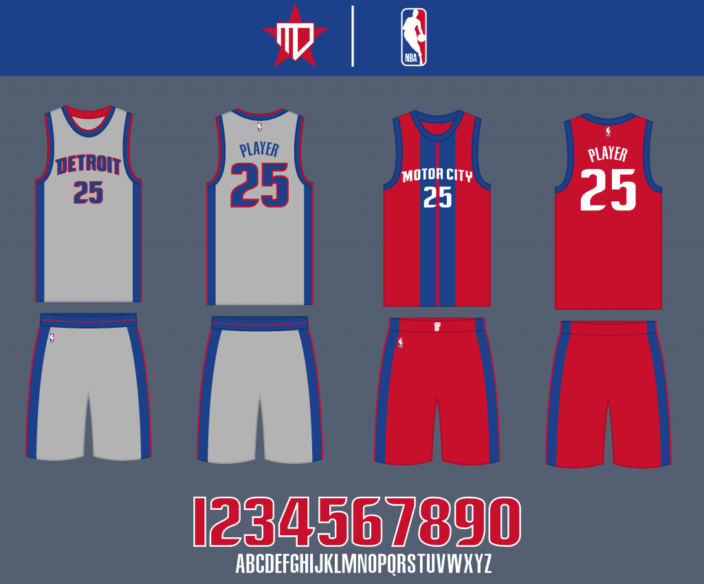
The gray alternate is inspired by the Bad Boys era, and the City Edition is similar to last year’s version.
Indiana Pacers
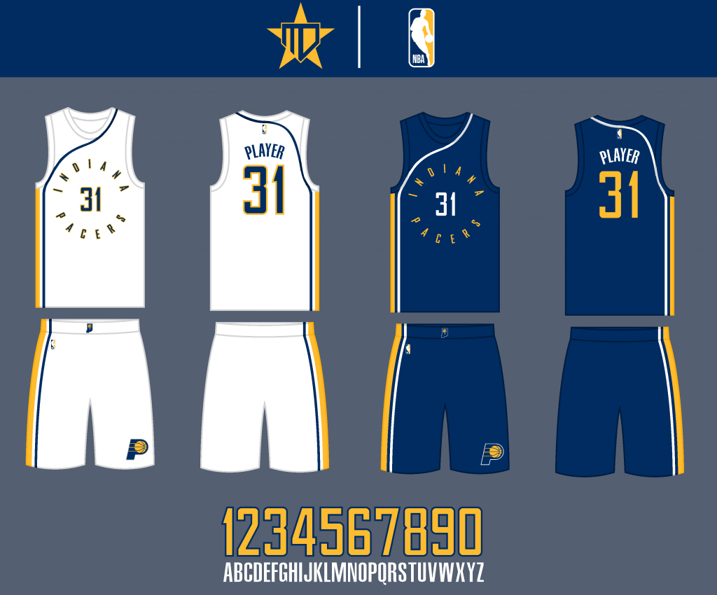
The main striping design is inspired by the early 70’s designs, with the roundel wordmark of the current uniforms. I felt the two designs flowed together well.
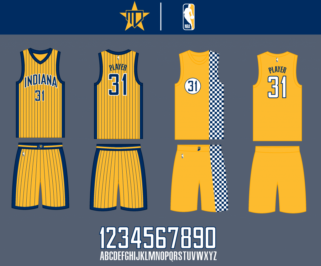
The Statement Edition is inspired by the 90’s gold uniform, and the City Edition is a gold version of the racecar design.
Milwaukee Bucks
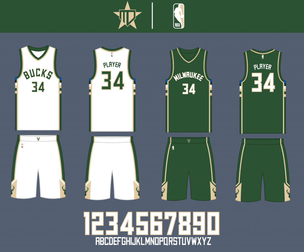
The primary uniforms remain pretty much the same, with the away uniform being slightly simplified.
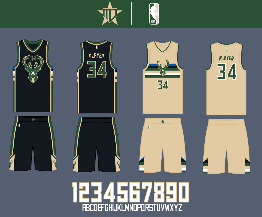
I went back to the original designs for both the Statement and City Edition uniforms.
Southeast Division
Atlanta Hawks
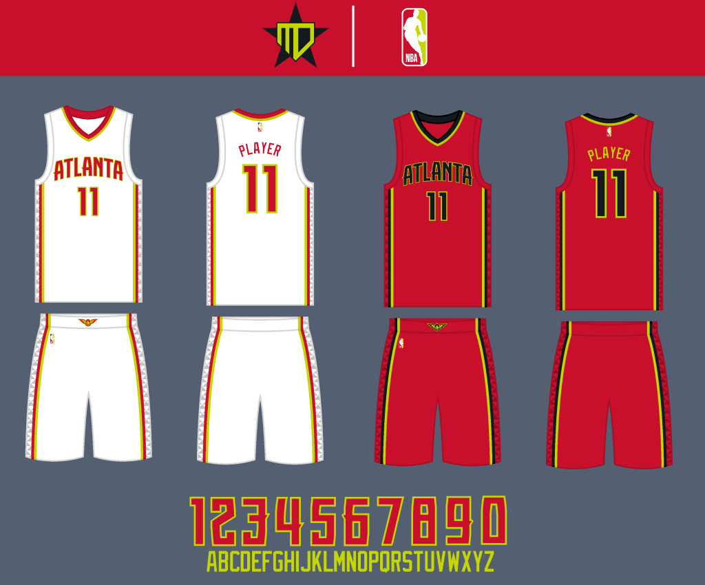
I actually liked the outgoing “volt” uniforms, so I went with a simplified version of them, with red becoming the primary away uniform color.
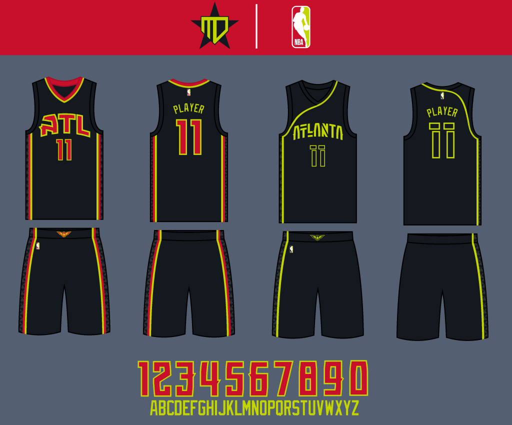
The Statement uniform is now black with the “ATL” wordmark, and I went back to the original City Edition design (as is a common theme in these concepts), inspired by Atlanta’s innovative music scene.
Charlotte Hornets
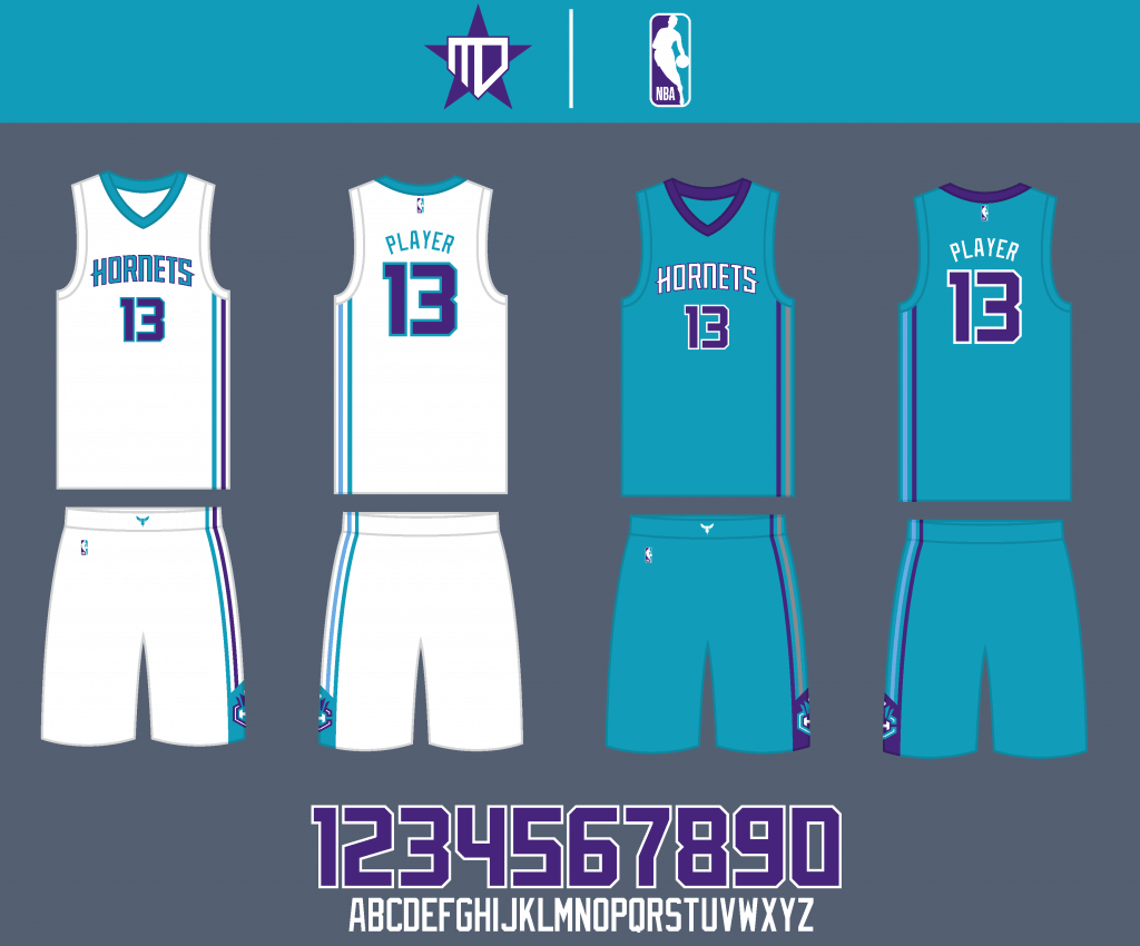
This is probably unpopular, but I actually liked Charlotte’s prior uniforms better as well, as they managed to include more purple, keeping the Hornets’ essence in a simpler design.
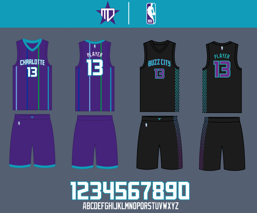
The Statement brings back the pinstripes in a simplified manner. For the City Edition, I infused some neon purple into the Hornets’ original “Buzz City” uniform, to pair with the brighter teal.
Miami Heat
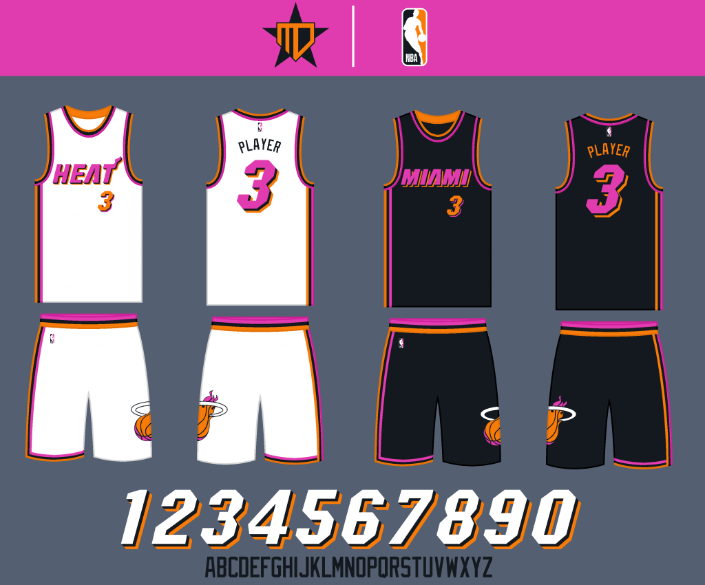
I love the “Vice” uniforms as much as anybody, but I’ve wanted to try this pink & orange scheme for years, inspired by the Miami Floridians. A lot of the striping elements from the Vice jerseys return, though, and the wordmarks come from the primary jerseys with updated shadowing.
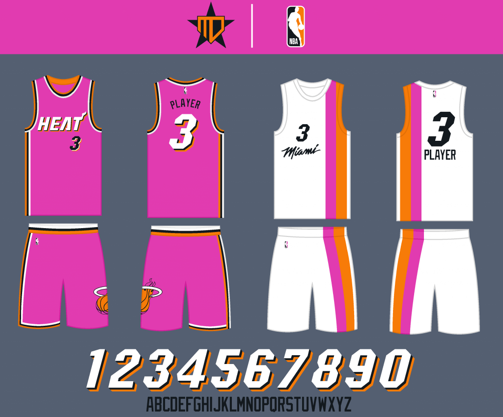
The Statement uniform is pink, and the City Edition goes all-in on the Miami Floridians inspiration, while retaining the Vice wordmark.
Orlando Magic

I went with a throwback-inspired pinstripe design, and updated the wordmarks to have more consistent line weights.
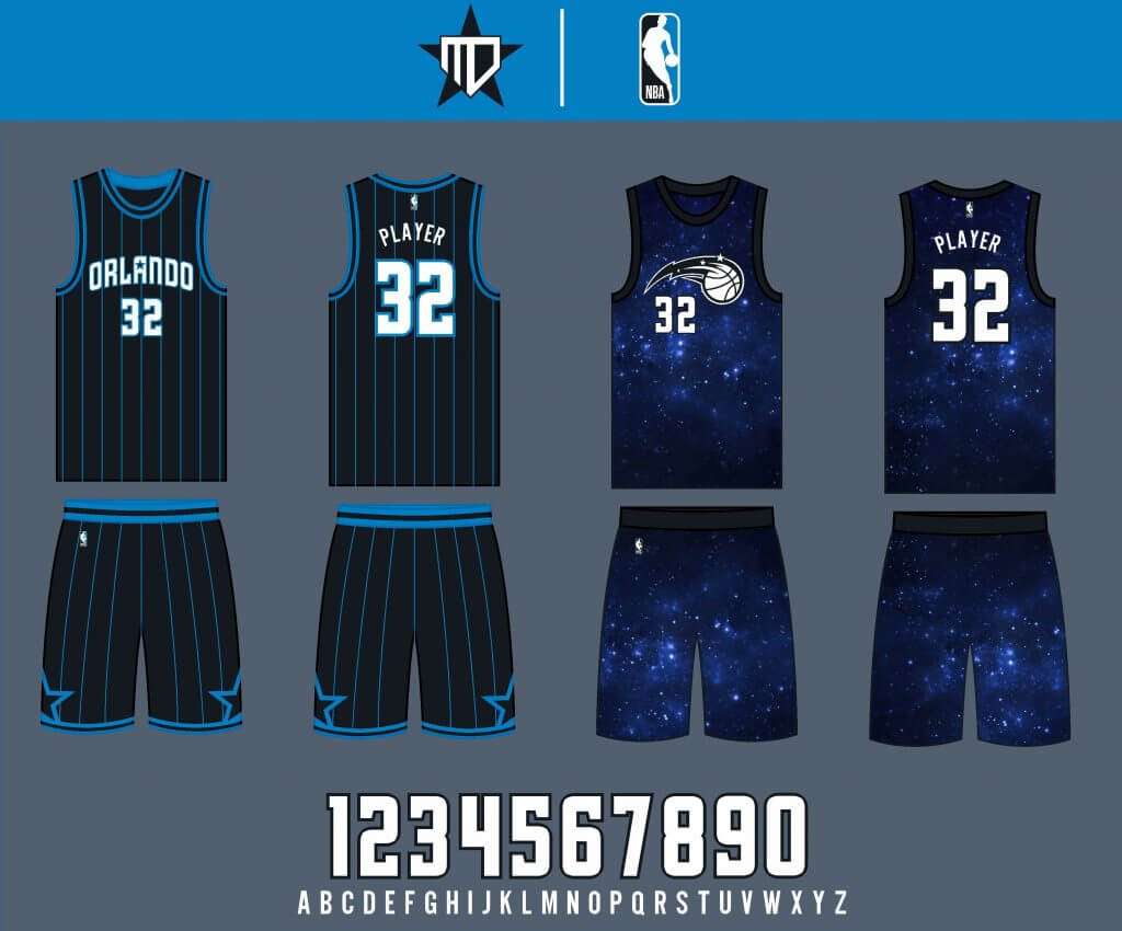
The Statement uniform is a black base with blue pinstripes, and the City Edition goes back to the original space design (one of my favorite City Editions to date).
Washington Wizards
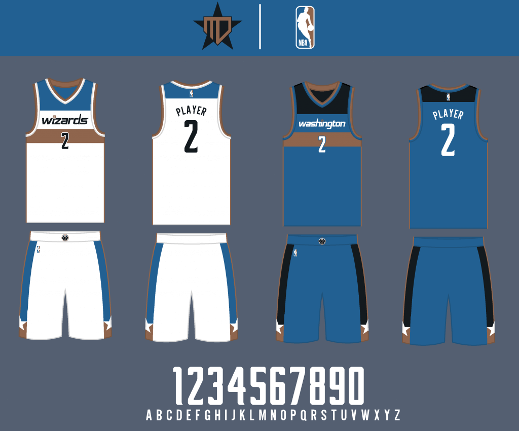
I went back to the royal blue and copper color scheme. Otherwise, the uniform remains mostly the same.
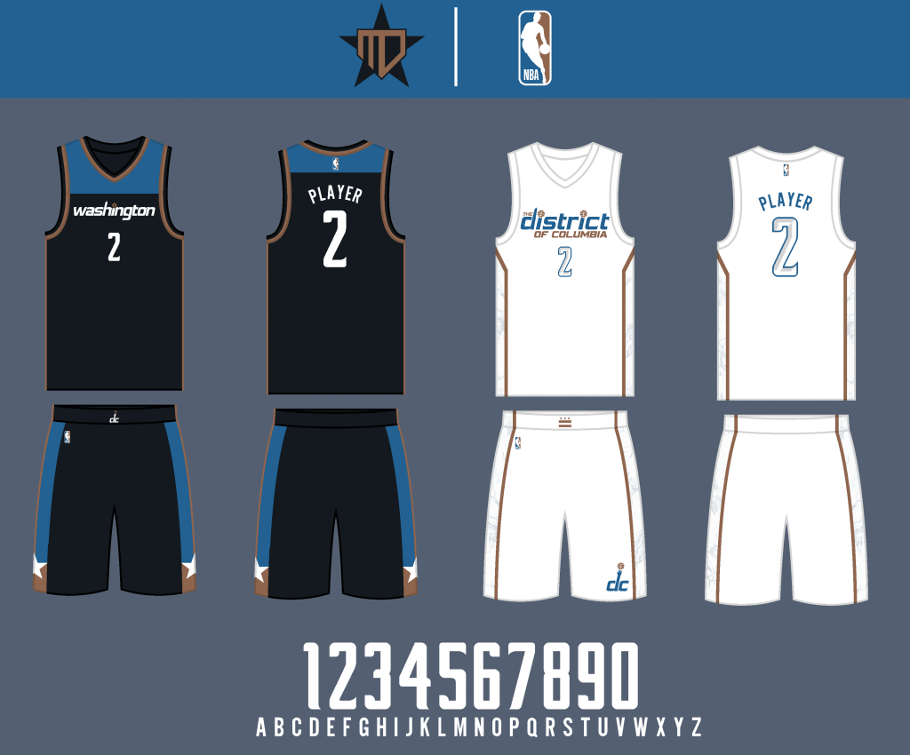
The Statement also remains essentially the same beyond the color change, and the City Edition goes back to the Washington Monument marble design, another one of my favorites.
Thanks, Matthew! We’ll be back with the second half of his NBA redesigns shortly. Readers? What do you think?


Guess The Game…
from the scoreboard
Today’s scoreboard comes from Stillers N’at.
The premise of the game (GTGFTS) is simple: I’ll post a scoreboard and you guys simply identify the game depicted. In the past, I don’t know if I’ve ever completely stumped you (some are easier than others).
Here’s the Scoreboard. In the comments below, try to identify the game (date & location, as well as final score). If anything noteworthy occurred during the game, please add that in (and if you were AT the game, well bonus points for you!):
Please continue sending these in! You’re welcome to send me any scoreboard photos (with answers please), and I’ll keep running them.
The “BEST OF” Kreindler’s Korner
Hey guys & gals. You’ve enjoyed Kreindler’s Korner for several years now, mostly on the weekends, on Uni Watch, but with the recent coronavirus outbreak, Graig’s time is just too precious and he needs to tend to other things besides coming up with a new writeup each weekend.
So, going forward, for as long as the COVID-19 situation is bad in New York, I’m going to run a few “Best of’s” until Graig returns.
Here’s today’s offering:
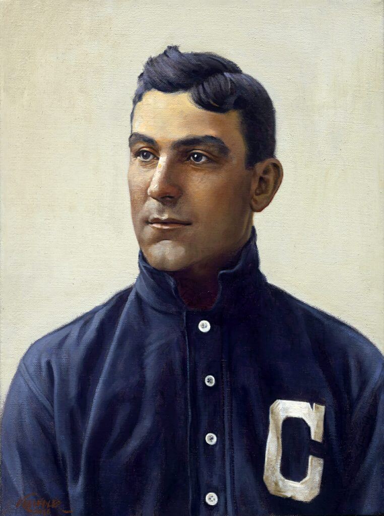
Title: “Nap”
Subject: Napoleon Lajoie, 1902
Medium: Oil on linen
Size: 12″ x 16″Another portrait based on the brilliant work of Carl Horner, “Nap” depicts the great Hall of Famer Napoleon Lajoie in 1902. As the rest of his Cleveland teammates were that year, the legendary second sacker is depicted in his navy road togs with a large “C” on the left side of his chest.
Like the Horner-based portraits of Honus Wagner and Ty Cobb, this particular image was used as the basis for one of his T-206 tobacco cards. The lithography process placed a pastel yellow background behind Nap’s head on the card, but I still found myself wanting to keep the idea of these heads being in front of simple muslin tarps, which is most likely what Horner’s setting was like inside his Boston studio. The light source seems to be some sort of window or skylight, which I always figured would be northern light. That exposure was very often chosen by portrait painters due to a sky plane that doesn’t usually change drastically through any given day due to the sun not passing through it. That sort of consistency is crucial when painting a figure over multiple sessions, which was pretty much the norm. The northern light usually leads to cooler lit planes with warmer shadows, something that’s most evident in Lajoie’s face.
As mentioned in previous entries, the hope is that I can create a large number of portraits of the Hall of Fame players who were both photographed by Horner and eventually had those images represent them in that T-206 set. Ideally, I’d love to see them all under a single roof in a gallery setting, maybe seeing the paintings paired with their cards. I’m happy to say that something might be in the works, though I can’t speak of any details yet. There are more of these paintings in progress, including those of Walter Johnson, Joe Tinker, Rube Waddell, Eddie Plank and Bill Dahlen (who I think will make it into Cooperstown before this whole project is done).
Thanks, Graig! You can (and should!) follow Graig on Twitter.
Uni Watch News Ticker
By Phil

Baseball News: You may or may not have known this, but back in 1976, the San Francisco Giants almost relocated to Toronto, and would have become the Toronto Giants. Here is an article on how the move was blocked, and a look at the Toronto Giants logo as it had been proposed (from Jeff Wilk).

Football News: FOX Sports Radio used a lot of old NFL logos in this graphic (from Andrew Cosentino). … “Proposed updated logo for the New York AFC Team” says David Kendrick. “You may find this amusing. Then again you may not.” … Gale Reed noticed two Colts players had their stripes merge into 1 stripe in back, during yesterday’s loss to the Bills. “Both defensive linemen,” he points out. … It was a gray vs. black game in the Texas HS champs (Cedar Hill vs. Denton Guyer). From Chris Mycoskie. … Powers North Central (the red team) is wearing a mix of white and dark numbers in a Michigan HS 8-man, Division 2 game (from Chad Hensley). … Doug Flutie “posted this amazing photo on his Instagram of all of the jerseys he wore in his brilliant career…Star-struck (Not sure if they are game worn/game issued or just replicas tho)…love the teams that do shoulder & sleeves well!” exclaims submitter Mike Malnicof. … Here’s a look at the “slow” evolution of South Alabama’s logo (from Ben Whitehead). … Looks like Jared Goff is wearing a navy hand warmer in yesterday’s game against the Seahawks. Perhaps it’s leftover from last season? (from Chris Hortness).

Hockey News: “Interesting scene at Colorado Avalanche camp,” says Wade Heidt. “They are on the ice with burgundy Reverse Retro equipment. Looks like the pants have the small Avalanche logo even though the rest of this uniform will feature the Nordiques logo.” … Nice article here on the Washington Capitals logo history (from Gary Chanko). … ICYMI, Carey Price will wear a new cyborg-themed Canadiens mask this season. … It’s always fun when two NOBs seated next to one another form fun phrases (from Uncle Drewski). … New Jersey Devils head coach Lindy Ruff supported the Bills by wearing a Buffalo Bills mask ahead of the AFC Wild Card (from James Beattie). … Jacob Fox notes there are both black and white versions of Jonathan Quick’s mask. Here’s a bit more on J-Quick’s cage. … Apologies if we’ve already seen this (there have been so many helmet advertiser announcements this week), but the Buffalo Sabres have a pair of helmet advertisers.


NBA/College/Basketball News: Check out this video of this Little Rock vs Louisiana college hoops game. Mike Chamernik notes, “Lights go out before the final shot of the Louisiana-Little Rock game. Refs didn’t stop play nor did they replay the final possession! Bizarre stuff.” … NC State Men’s Basketball got some new unis this year. Submitter Tristan Krumpler notes “the omission of the word “PACK” that, in the last decade at least, has been present on the bottom left leg of every main uni NC State has worn. It is of course a nod to the 1983 Championship team and the uniforms they wore.” … New uniforms for the Georgetown Hoyas (from bryanwdc). … ECU wore gray instead of the normal home whites at home against USF on Saturday (from Brian Weingartz). … Here’s a hi-res look at the Ty Jordan patch the Utah basketball team wore last night vs. Oregon (from Josh Claywell).

Soccer News: New shirts released for Independiente. The detail of the bridges in Avellaneda on the shoulders of the home shirt & a smart away number (from Ed Żelaski). … Also from Ed, Boca Juniors Oficial wore this special edition shirt that pays tribute to the 2000 Intercontinental Cup win over Real Madrid when they played Argentinos Juniors. … Matthew Olosunde played the 2nd half of his Emirates FA Cup match against Everton in a blank kit (from Josh Berger).

Grab Bag: The 1st Cavalry Division patch turned 99 this week. It was officially approved by the Army on Jan. 5, 1922. The patch could only be 2 colors & had to be an easily recognizable in battle (from Timmy Donahue). … There is officially a campaign to establish an official State tartan for Maryland (from R. Scott Rogers). … Here’s the fascinating story behind this Army paramedic’s distinct flight mask. Sgt. Abraham Boxx, an Australian-turned-U.S. Army flight paramedic, wears a face mask with the Australian flag painted on it (from Timmy Donahue).
And finally… big thanks to Matthew for sharing the eastern half of his NBA redesigns! Please let him know what you think in the comments below.
And BAH! I didn’t do so well with my “better uni” picks yesterday, going 0-2-1 (Bills won, but didn’t cover; Seahawks got flat out whupped; and the Football Team pushed). Hopefully I’ll do better today.
Everyone have a good Sunday — enjoy another NFL triple-header! — and hopefully this week won’t end in a giant ball of flames. If not, I’ll catch you guys back here next Saturday.
Peace,
PH
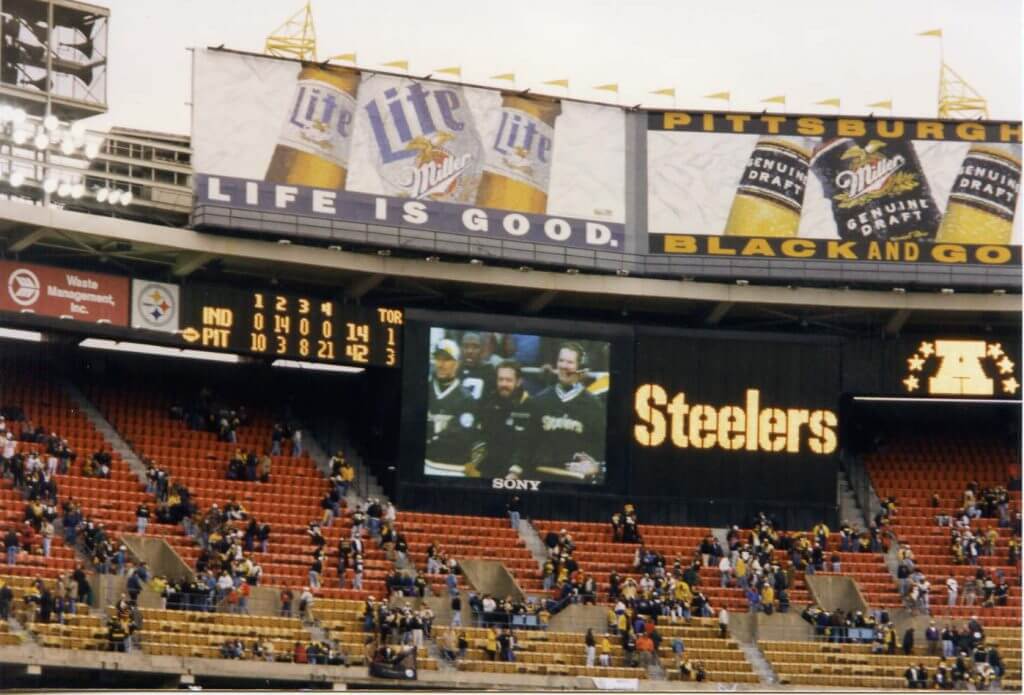
The scoreboard is from the wildcard game after the 1996 season between Steelers and Colts
Yes!!! I recognized it right away, because I was at the game! Might be the first time for me in the history of GTGFTS!
No Pistons Teal? I want that brought back!
I know most Pistons fans would vehemently disagree, but the only thing I want to see Detroit wearing is the Phil Hubbard/Paul Mokeski-era uniform.
link
As Paul would say, “Faaaaascinating!” The player in that photo is wearing a uni in the 40s but the logo on the shorts shows a 35. I’m guessing that’s a 35th anniversary logo since the Pistons moved to Detroit in 1957.
The uniforms look good, don’t get me wrong. It’s just…I don’t see the point in doing most of these if they are essentially the same as the original (celtics, bucks, sixers, etc.). I like the creativity of the Heat color way but overall would push for some more ingenuity. If we’re going to do hypotheticals, why not push the envelope a little more?
Most concepts always keep the celtics the same. I’d love to see someone really break out a completely unique look. Easier said than done I guess but for the purpose of this exercise, let’s see something a little different! Heck, how about a Lucky Charm set?!
Hey there Steve! I really appreciate the feedback – and I totally understand where you’re coming from.
Since this was really my first attempt at doing concepts for the entire NBA and sharing them, I did it with the frame of mind of how I would like the NBA to look if I had complete control. So the teams that I think look good (and admittedly, the NBA has quite a lot) remain mostly the same, while the teams that need updates get them.
I agree with your belief in pushing the envelope wholeheartedly, since this is all hypothetical like you said, it’s good to have a little fun with it. I hope to try out some different stuff for sure!
*different stuff in the future, I meant.
I was thinking the same thing…with all the talented designers on this site, it would be cool to see a uni redesign contest where the rules were that you could not use any of a team’s current colors or design elements, just to get the creative juices flowing…
One thing I think that is overdone overall in these NBA uniforms is the choice of black.
I get how certain teams are “legacy” teams and shouldn’t be tampered with. But I have a hard time believing you couldn’t improve on the Milwaukee Bucks, one of the most overrated uniforms going.
For the Flutie uniform picture I don’t know about all of them but the BC uniform (the second from the left) is one never worn by BC. That version of the Eagle was not introduced until the early 2000’s and they have never had striping like that on a jersey.
We know which jersey you are referring to. Sometimes there needs to be more specifics when referring to Flutie’s BC uniform when CFL fans are around. BC Lions jersey is the one to the right of his Patriots jersey.
The Calgary Stampeders jersey would represent 1992 and ’93 before a minor jersey change. He wore striping at the bottom of the sleeve during his time there in ’94 and ’95.
link
As a Canadian whenever I hear or see ‘BC’ I think British Columbia before Boston College; same with hearing UConn as Yukon. Plus my brain makes a closer connection with Huskies in the Yukon then Connecticut.
Doug Flutie seems like the kind of guy who would just have all those jerseys hanging in a closet instead of framed and mounted in a self-tribute home museum.
Doug Flutie the Testosterone Supplement hawker? That Doug Flutie?
One can’t hawk testosterone while being personally modest?
If only steroids made you taller. And worked on you 35 years before you took them.
It’s Jakob Fox not Jacob. Thanks!
Goff’s handwarmer cannot be from last season, it has the current logo. The Rams have been wearing some navy gear on the sidelines this year.
In regards to the ticker item on the Avalanche’s mismatched pants, I’m speculating, but I’d imagine that the pants aren’t going to be switched out during the year when they wear those jerseys. By rule, the one part of the uniform that _doesn’t_ have to be changed for the home and road uniforms are the “short pants”. Why that is, I don’t know, but it’s been on the books since at least 1996.