Click to enlarge
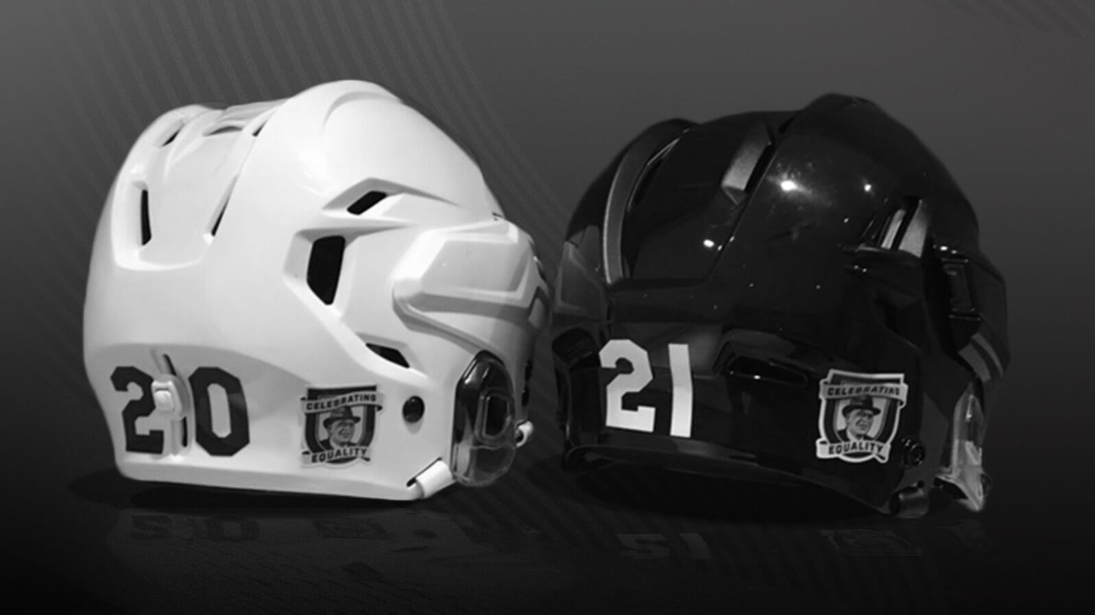
Next Monday, Jan. 18, is Martin Luther King Jr. Day. It’s also the 63rd anniversary of Bruins left wing Willie O’Ree becoming the first Black player in NHL history. To honor that dual significance, and to acknowledge our society-wide social uprising over the past year, the NHL yesterday announced that all players will wear a helmet decal honoring O’Ree from this Friday, Jan. 16 (the start of the MLK Day holiday weekend) through Feb. 28 (the end of Black History Month).
Here’s a closer look at the decal design:
In other NHL news yesterday, the league also announced the details for the two outdoor games that will be taking place at Lake Tahoe on Feb. 20 and 21, and also revealed the logo for the two-game promotion (click to enlarge):
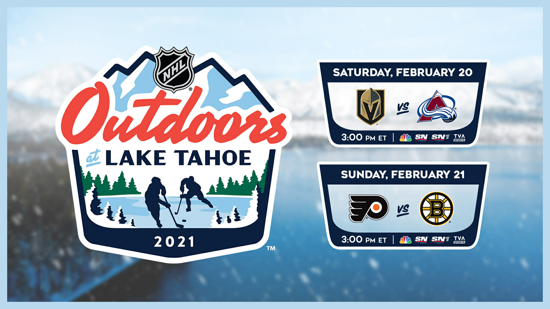
All four teams will wear their Reverse Retro uniforms for these games (which in the case of the Avs means a team from Colorado will be wearing the logo of a team from Quebec for a game in Nevada). I’ve asked the league if the “Outdoors at Lake Tahoe” logo — which is a pretty nice logo, right? — will be worn as a jersey patch and/or helmet decal but haven’t yet received a response.
The timing of these news bulletins was good, because they came out just as we were putting the finishing touches on the annual Uni Watch NHL Season Preview, which is available now on InsideHook. Enjoy!
Click to enlarge
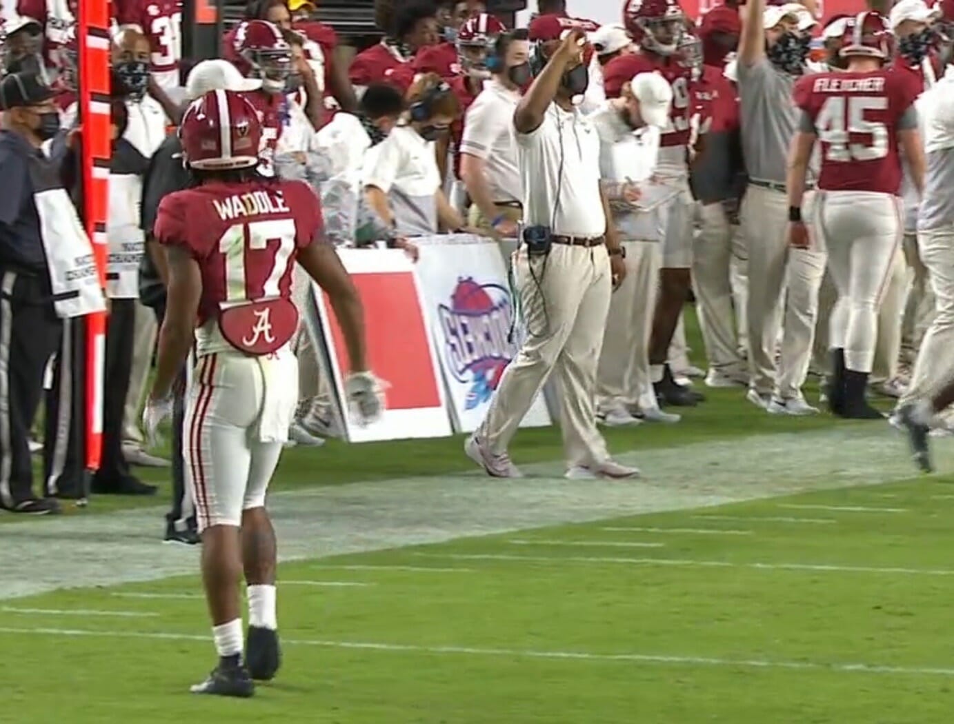
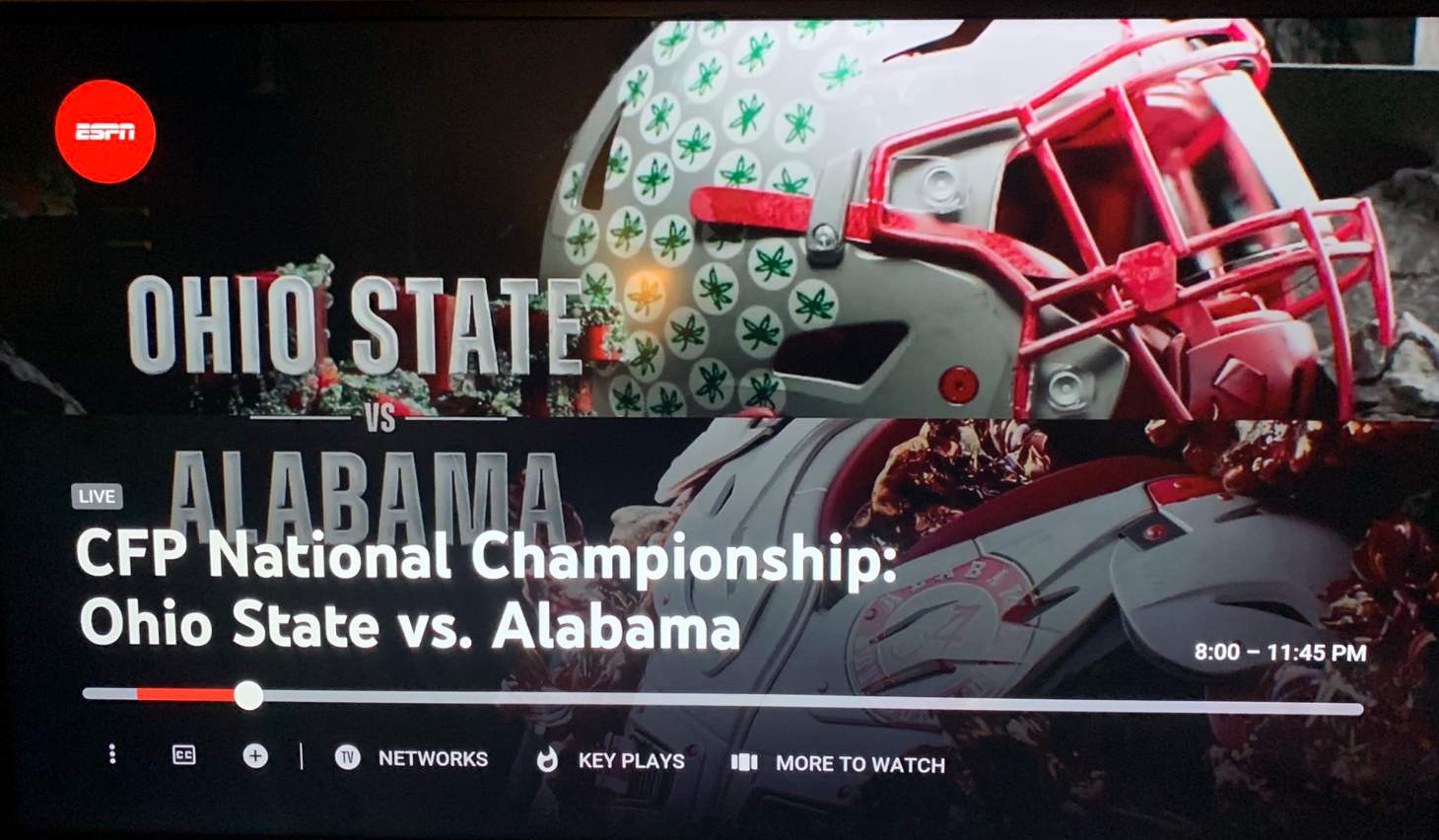
CFP wrap-up: Weird scene during last night’s college football national championship game, as there was a large placard featuring the Houston Rockets’ 1990s logo on the Alabama sideline. I realize this probably had to do with play-calling or some such, but does anyone have any specifics?
A few other notes from last night’s game:
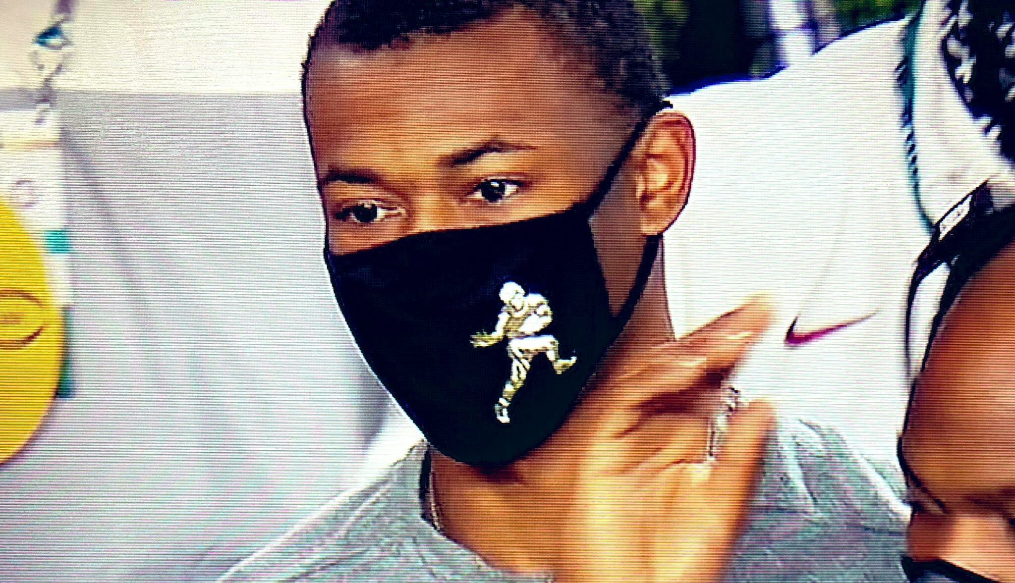
• Alabama wide receiver Devonta Smith, who won this season’s Heisman Trophy, was wearing a Heisman-themed Covid mask before and after the game:
• Speaking of Covid masks, both of last night’s head coaches — Alabama’s Nick Saban and Ohio State’s Ryan Day — wore the same kind of mask. That particular model has become popular with college football coaches.
• In a puzzling move, ESPN ran some graphics packages that inaccurately showed an Ohio State helmet with a red facemask:
(My thanks to Carlos Mejia, Mike Chamernik, and @SportsPSD for their contributions to this section.)
Click to enlarge
Collector’s Corner
By Brinke Guthrie
Follow @brinkeguthrie
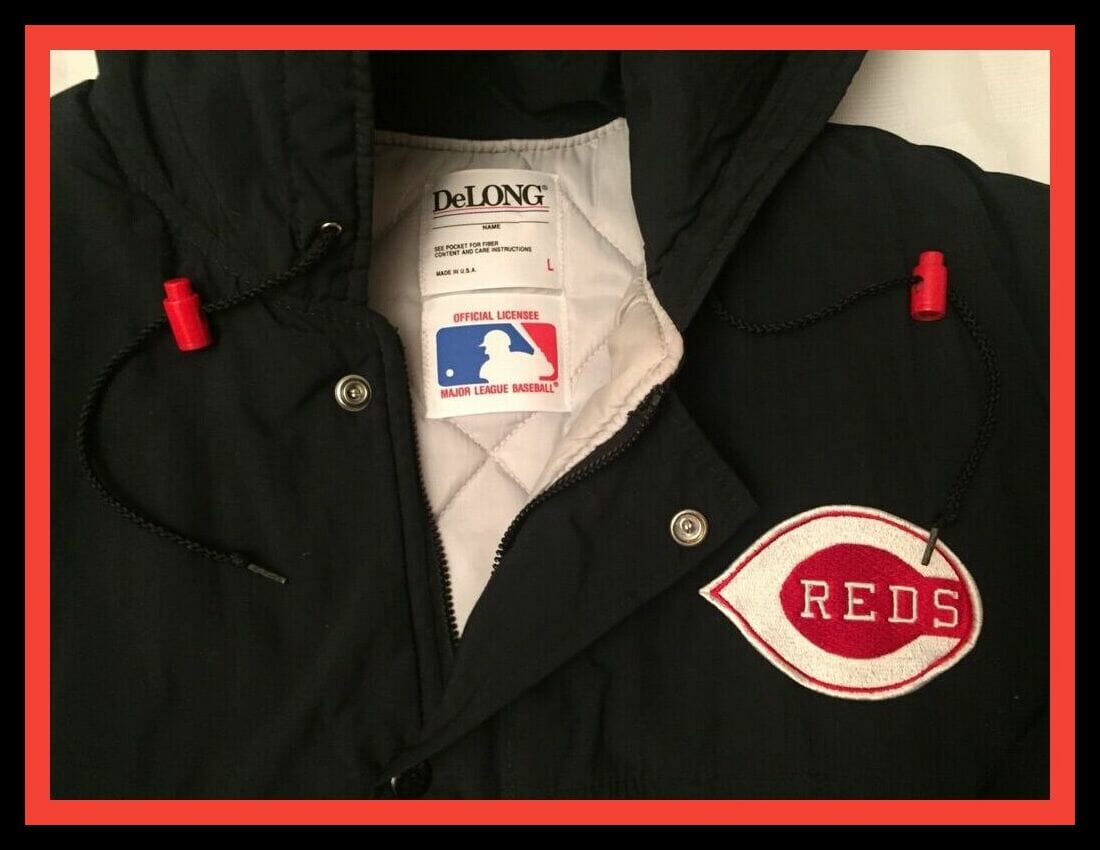
Starting off this week with an item I owned and wore at one time, this quilted DeLong Cincinnati Reds parka. The seller calls it a “1980s team-issued bomber jacket,” but I never saw them wear this. Then again, I bought mine in the 1990s at Cincinnati’s well-known Koch’s Sporting Goods, which at the time had a big connection to the Reds, so who knows. It was warm and incredibly comfortable — I do know that!
Now for the rest of this week’s picks:
• Another terrific DeLong item here: Take a look at this amazing looking Denver Broncos varsity jacket!
• Couple of Dodgers items here: The late, great Tommy Lasorda was featured on this 1979 album, Tommy Lasorda Talks to Kids About Baseball. And from that same year, here’s a working press pass for The Long Beach Independent Press Telegram. Don’t forget to park in Blue Lot 27!
• “We’re the 49ers” is the title of this 1984 45-rpm record made by team members. The late Dwight Clark (No. 87) is the only one I recognize. Judging from his absence, Joe Montana wanted no part of this.
• Nice cover art of Ozzie Smith turning two over a Montreal Expos runner on the menu for Ozzie’s restaurant and sports bar in St. Louis (now closed, alas).
• Groovy, man: “‘Turn On’ to the world’s fastest sport” is the tagline for this 1971 NHL brochure, sponsored by Tastykake snack foods.
• This is a 1981 New York City subway poster that encourages fans to “Catch the Yankees” on WABC, which was the team’s radio flagship at the time.
• Here’s a very cool ticket brochure for the 1974-75 NHL California Golden Seals. (Couldn’t the marketing folks come up with something more original than “The Future Is Now?”) This was their next-to-last season in Oakland before packing up their skates and moving to Cleveland in 1976.
• Kroger sponsored this 1989 Houston Astros credit card-sized AM radio. It comes in its original box but the earphone is missing, and the seller doesn’t know if it works.
• Always liked the logo for the old World Football League, as shown on this
pair of embroidered patches.
• Wrapping up this week with a pair of hockey items: This NHL Lamp has a light-up puck at its base, and here’s a 1978 iron-on T-shirt transfer for Peter Puck, the little fellow was featured on 1970s CBC and NBC NHL telecasts (and is also a daily presence on the hockey section of the Uni Watch Ticker!).

Membership update: Six new designs have been added to the membership card gallery. That includes Derek Hempel’s, which is based on the 1990s Milwaukee Admirals’ uniforms. He chose No. 798 because that’s his badge number as an Oklahoma State Trooper.
Derek was also the sponsor of yesterday’s membership raffle, which was won by Keith Wells. Congrats to Keith, and thanks again to Derek.
Ordering a membership card is a good way to support Uni Watch (which, frankly, could use your support these days). And remember, as a gesture of comm-uni-ty solidarity, the price of a membership has been reduced from $25 to $20 until further notice, plus a Uni Watch membership card entitles you to a 15% discount on any of the merchandise in the Uni Watch, Uni Rock, and Naming Wrongs shops, and the discount also applies to our Uni Watch Classic Cap and Uni Watch toque. (If you’re an existing member and would like to have the discount code, email me and I’ll hook you up.)
As always, you can sign up for your own custom-designed card here, you can see all the cards we’ve designed so far here (now more than 3,000 of them!), and you can see how we produce the cards here.
Click to enlarge
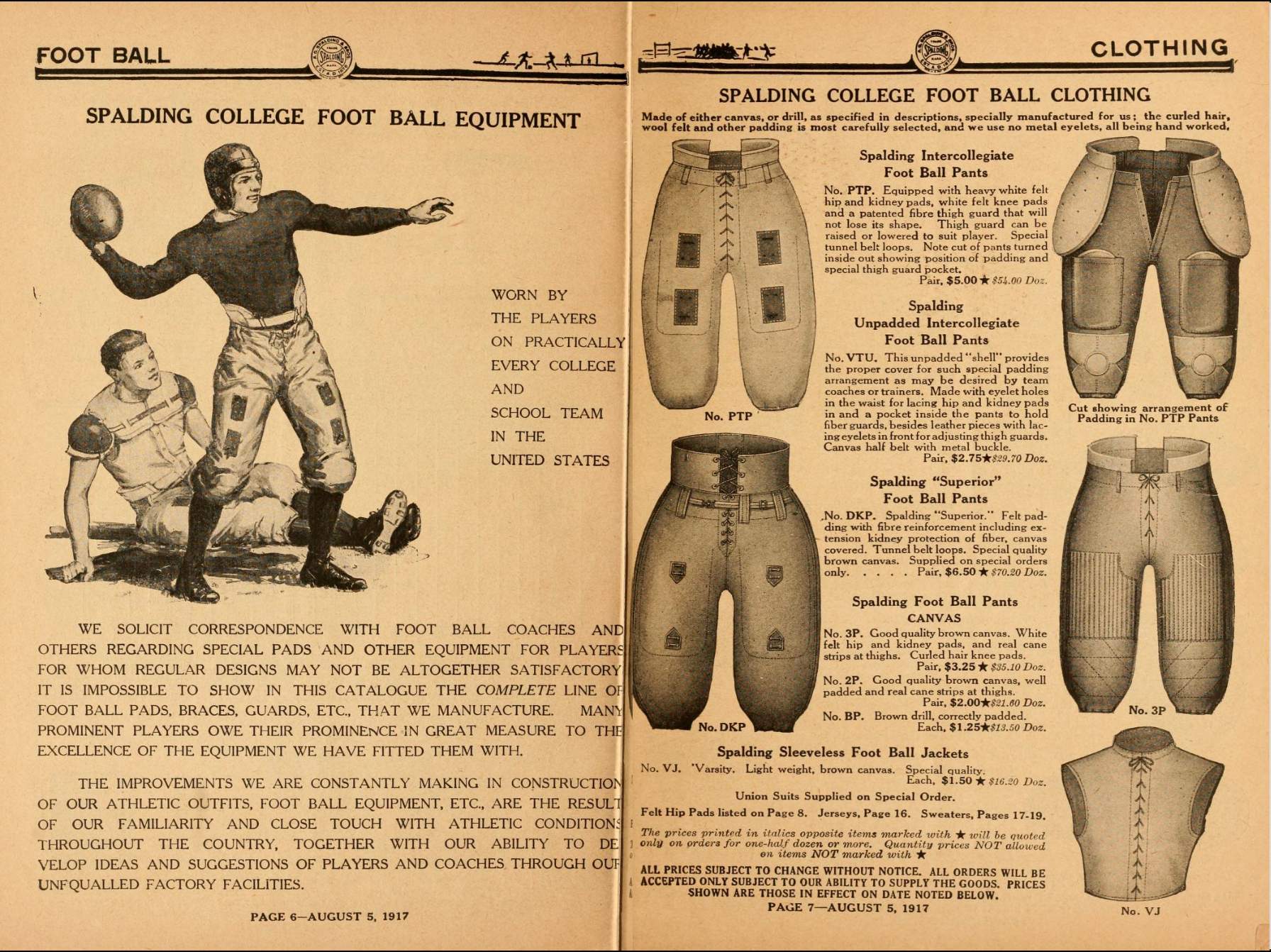
Too good for the Ticker: The two-page spread shown above is from a 1917 Spalding catalog, which is one of nine old sporting goods catalogs shown here. For each of them, you can click to page through the individual catalogs. Great stuff!
(Big thanks to James Gilbert for this one.)

Click to enlarge
What, no 22-pack?: Once upon a time, as I recall it, if you wanted to buy a multi-pack of beer, you had two options: a six-pack or a case of 24.
Then came the 12-pack, which made certain kind of intuitive sense — twice as much as a six-pack, half as much as a case.
Then came the 18-pack, which I always thought was silly. Like, just get a case already.
And now we’ve reached the point where — well, you can see for yourself in the photo shown above, which I took at my local supermarket today.
When I posted that photo on Facebook yesterday, longtime reader/pal R. Scott Rogers left a brilliant comment: “A 20-pack? I honestly understand the 18-pack, but cans/bottles are naturally a base-6 proposition. At its most fundamental level, a 20-pack is 3-1/3 6-packs. That’s like the Federal Reserve issuing a paper currency note worth $66.67.”
I love the idea of beverage packaging being “a base-6 proposition.” Brilliantly stated, Scott!
Native American mascot discussion video: Last night I was a panelist for a discussion of Native American mascots and imagery in sports, organized by the Wisconsin radio show Conversations in Color. It was a really good session — if you’re interested (or if you just want to see which green plaid shirt I wore), the full 90-minute video is embedded above.
The Ticker
By Alex Hider

Baseball News: The Spring Training facilities for the Astros and Nationals might be getting a new name. … A contestant on last night’s Jeopardy! episode — the first in the post-Alex Trebek era — was wearing a Mets tie (from Nick Vega).

NFL News: Sunday marked the Browns’ first win in Pittsburgh since 2003 — and was also the first time since 2003 that they wore orange pants in Pittsburgh (from D.J. Mitchell). … Several Saints players, including QB Drew Brees, wore T-shirts in support of the social media campaign #SayHerName before Sunday’s playoff game. The campaign started last summer following the police shooting of Breonna Taylor. Given the current political climate — and Brees’s initial comments in the days after the death of George Floyd — the Saints tweeted, and then later deleted a photo of Brees wearing one of the shirts (from Kary Klismet and Mike Chamernik). … Spotted in a listicle ranking of DC Comics movies: some sort of Rams/Patriots beach sculpture in the background of a shot from Supergirl (1984) (from Joseph A. Bailey).
College Football News: Navy’s former live goat mascot, Bill, died recently at the age of 14 (from Timmy Donahue). … Former North Carolina C Harris Barton was recently inducted into the College Football Hall of Fame. According to James Gilbert, this yearbook photo of Barton shows him in a “portrait jersey” — a jersey that was never worn in a game.

Hockey News: Kings G Troy Grosenick has a new mask that includes a few LA Easter eggs (from Jakob Fox). … The Flames played an intrasquad scrimmage last night and gave each team a logo, based on the numbers for former team greats Lanny McDonald and Jarome Iginla (from Antonio C.). … A few Minnesota Wild players will appear as cardboard cutouts during NWHL Minnesota Whitecaps games this year (from our own Jamie Rathjen). … Colorado Rockies G Michel Plasse is wearing the wrong style of pants in this photo from the late 1970s (from @imgarthvolbeck). … New uniforms for the hockey club of Resurrection Christian School in Loveland, Colorado. … Here’s a hockey uniform design concept based on Mississippi’s new state flag.

Basketball News: Check out the lettering on the jerseys for the 1977 Dannevirke Danes of New Zealand — super inconsistent, but in a good way (from @retro_70s). … New Cavs PG Yogi Ferrell will wear No. 5 (from Etienne Catalan). … In response to backlash from some fans, the University of Kentucky has expressed support for players and coaches who’ve been kneeling before games to protest social injustice. … Last night Trail Blazers had five players on the court wearing Nos. 0, 00, 2, 3, and 4.

Grab Bag: Canadian tennis player Genie Bouchard has signed an apparel deal with New Balance (thanks, Brinke). … Couple of railroad-themed entries from David Firestone: This YouTube video tracks the history for Amtrak’s logo and livery history, and this video notes the history of the Chessie the Railroad Kitten. … Marvel is facing calls to retire the logo of vigilante superhero the Punisher, as the logo has been co-opted by right-wing groups in recent years and was worn by many of the insurrectionists at last week’s Capitol riot (from Kary Klismet). … NSFW: A French rugby union player’s shorts were pulled down during a recent match (from Eric Bangeman).

“if you’re interested (or if you just want to which green plaid shirt I wore), the full 90-minute video is embedded above.”
*which should change to “watch”
—-
Thanks for all you do, Paul. I appreciate it.
Fixed. Thanks!
Anyone else notice the striking similarity between the Outdoors at Lake Tahoe logo and the Coors Light logo/can design?
I thought it looked awfully familiar, now that’s all I’ll see! Good catch.
RE: The NHL lamp. Notice that the bottom of the base is designed to look like the ice surface with a red line across it. Somebody put some serious thought into that design.
I could be wrong but I don’t think Mississippi RiverKings are ECHL. Their most recent league was SPHL.
You’re right — and they don’t exist anymore! But that concept was posted by @RiverKings — odd. I’ve adjusted the wording.
The Rams / Partiots sculpture was actually a weird bumper car type ride that Supergirl removed from an amusement park in the movie.
The NHL Preview is now up:
link
Glad that the NHL continues to honor Willie O’Ree….He resides here in San Diego and played numerous seasons for the San Diego Gulls in the 60s and early 70s in the old Western Hockey League and is a popular sports figure here….I have had the opportunity to meet and talk hockey with him on occasion and enjoyed that time….he is always happy to talk with anyone and is a great person…..thanks Willie for all you have done..!!
Randy, you’re in San Diego — and you’re awake so early? Hope you’re not suffering from insomnia!
Reading Uni Watch on the job..!
The NHL preview page repeatedly crashes on my iPhone. Tried it a bunch of different ways. Not sure if anyone else is having this problem.
Yep me too :(
I have a lot of trouble with Inside Hook on iOS devices. I’ve had to reboot my iPad due to constant crashing from that site before. Not the best, but happy to give Paul the page views!
On the beer thing.. I once saw a 26 pack of Coors Light. Just a head scratcher.
I’ve been curious how the Avalanche’s shoulder logo would be handled as part of their effort to remove black from their unis. I assumed the circle inside the “C” would just be recolored from black to blue, but those video game stills seem to be showing a burgundy circle. I don’t really get that at all. Seems like you’d want it to contrast with the “C”.
I don’t have a DVR or similar device, so I didn’t have a way to pause last night’s game to take a photo, but I noticed that Alabama quarterback Mac Jones had vertical slits cut into both sides of his jersey right below his underarms. Has he been doing that all season? Is it common among quarterbacks who wear the modern, tight-fitting sleeves? I suspect he wears his jersey like that to allow for more freedom of motion at the shoulder. Maybe I’m not paying enough attention the rest of the time, but I had never seen a jersey cut like that before.
I read on one of the weird history feeds I follow that the reason beer companies went with the 6 pack is because they thought that was how many beers a wife would be willing to pick up from the market for their husbands. Does the 20 pack mean wives/significant others are willing to carry home more???
I think I recall seeing 20 packs available in stores around Anchorage, Alaska when I was there five years ago, but I agree with the rule of 6!
I have seen 30 packs of certain “old dad beers.” I picked a Schaefer one when I saw it at State Line Liqours for about $12 because that was my dad’s beer when I was a kid.
As a 36 year old who every other week buys a 30 pack of Old Millwaukee for $11.00 I’m both horrified by the “old man beer” part of that statement and prove it to be true.
Miller Lite and Coors (maybe others too) have 9- and 15-packs of aluminum pint bottles.
A 30 rack still makes sense following the base 6 principle. The standard unit for beer is 6 so any increase needs to follow the increase pattern (6,12,18,24,30). 20 is just insanity
That photo of Alabama WR Jaylen Waddle was taken when he was shown courageously limping through injury to the sideline. Not meant to poke fun or make light of the injury, but he was actually “waddling” to the sideline with the appropriate NOB.
My thoughts exactly. I was waiting for one of the announcers to say it.
From the hockey preview: “let’s call it “ЯR” for short”
Was only way you could reverse the “R” was to use the Cyrillic “YA”? Minor, but in a sense slightly awkward for the (albeit) very few for those of us who read in a foreign language.
*Note: it always bothers me when a Cyrillic “Д” is used as an “A”
Honestly, I didn’t even realize it was a Cyrillic character. I googled “backwards R,” copy/pasted it into that paragraph (I forget the page that I took it from), and then kept copy/pasting it as I went along writing the piece. Thought it was truly, you know, a backwards R, not a Cyrillic character!
No worries, but I am sure if you look very closely at the text in the article, you will easily spot the differences, especially in the “loop” and the “leg”.
*For a site that has introduced us to many details and fonts, I am surprised this went unnoticed!
I do see!
It was less apparent in the font I was using in my Word document as I wrote the piece.
Peter, I started studying Russian when my high school offered it in 1990. Brilliant timing, that. And ever since, seeing Cyrillic letters used in place of similarly shaped but differently pronounced Latin letters to indicate Russian is almost headache-inducing when I see it. To me, the Д in place of A is not worse than Я for R. Both are grating. And pretty much anyone who can remember the Soviet Union knows that Cyrillic P is an R sound, thanks to the ubiquitous CCCP, or SSSR in English.
@RS: THANK YOU! Growing up and hearing people constantly say CCCP instead of SSSR drove and still drives me nuts.
The lack of basic understanding of another nation having a different alphabet, let alone culture, shows how people just understand (and I feel for Greeks even more as they have a hybrid).
Michel Plasse isn’t just wearing the wrong pants (1976-77 pants when the rest of the team has the pants from 77-82), his socks appear to have a different striping pattern as well. They appear to be similar to the stripe pattern of the Kansas City Scouts’ jerseys, but they’re not Scouts socks, since they had a red-yellow-red stripe pattern that the team simply reversed when they became the Rockies.
Different striping patterns are strangely common among goalies.
link
link
link
RSB
My theory on the Bud 20-pack is similar to the supposed reason Coca-Cola offers so many flavors of its soft drink…the idea is that larger companies will offer unnecessary varieties of their products basically in order to “hog” shelf space at stores, so smaller competitors will get pushed out. I can certainly see this as being the case with beer, as the popularity of microbrews have cut into the sales of the big boys.
Good point!
Absolutely correct. Getting in a quarterly grocery store shelf reset isn’t the easiest thing to do for smaller breweries. Also, the big boys have to do something with their millions of bbls of macro lager.
Collector’s Corner:
I sorta like the ‘artistic license’ taken on that Expos helmet on the Ozzie’s menu though the genuine-article pinwheel is superior, of course.
That Broncos varsity jacket would look more amazing if it was royal blue.
“Nobody bakes a cake a tasty as a Tastykake”…boy, I wish that was still true!
Tastykakes are still pretty tasty. But after Bimbo bought them, they’ve seemed just a little different.
Finally a topic I can weigh in on as an expert, beer.
So the reason there are so many incremental options available is due to takeout laws that vary from state to state. This isn’t exactly a new occurrence. In various states the 10 pack of beer has been customary since on Sundays the max amount of alcohol that could be purchased was 120 oz.
Budweiser, among other macro heavyweights, have been offering 6/8/10/12/etc packs of 7/8/10/12oz bottles or cans for years to accommodate state restrictions.
In Pennsylvania for example, going to a beer distributor, that is a vendor with a special license, one can purchase their hearts content of beer. Its where the traditional 24 and 30 racks are customary. However if purchasing from a Take Out vendor, this is another specific license most usually found in convenience and grocery stores, there is a limit of 216oz per transaction. This works out to eighteen 12 oz cans. This in theory allows someone to grab a 12 pack of beer, as well as a 6 pack without having to do two seperate transactions. Or you could go with a 15 pack of beer and a 750ml(25oz) bottle of wine in one transaction.
So its all in an effort by the beer manufacturers to make it as convenient as possible when buying take out.
I’m definitely gonna give that episode of “Conversations In Color” a listen — I know Joe from here in Eau Claire (his biography on Gus Dorais is quite thorough and informative), and this “Conversations In Color” series is solid. Glad you partook, and I’m looking forward to the content!
I have yet to see a 20-pack of beer in my stores…but that might be because I’m laser-focused on the 15-pack of Blatz at my favorite grocer, and at the other stores I kind of gloss over the beer selections. Pretty sure, though, that we only have 6, 12, 15, 24 and 30-packs.
“Outdoors at Lake Tahoe” logo — which is a pretty nice logo, right?
Indeed! It’s all the more nice because there is no advertiser attached to it.
AFAICT, that mask the NCAA coaches are wearing are a bunch of marketing speak, with numbers provided with no factual support or testing. There’s nothing there that shows that it is any better than a piece of broadcloth over your face. And that’s dangerous.
It’s not just the number of bottles/cans that are base 6 in the beer industry. A typical bottle/can is 12 oz. Not strange to see 18oz, 24oz, 30oz, and 36oz offerings. 40oz bottles and 64oz jugs are rule breakers.
Plenty of 16oz cans, and a few 16oz bottles floating around, along with 32oz “crowlers”.
But the real reason for adding a 20pack is to take up as much shelf space as possible. Budweiser doesn’t want retailers who carry their beer to have room for anything else.
A 22 pack would have to be 11×2, which would be awkward. However, I could totally see a 7×3 21 pack.
Ticker item error: Navy’s goat mascot died at age 14, not 33.
His name is/was Bill 33.
Source: the link in the Ticker, Navy Times/AP story
Actually, only 13: “The fuzzy Angora goat was affectionately known as “Blue Eyes” and would have been 14 years old next week.”
Thanks. Fixed!
Fun fact about Harris Barton: He owned an Applebee’s in suburban Atlanta that I went to a few times. I had never heard of him until I saw all of his memorabilia on the walls.
Now that I think about it, I guess it’s not that much of a fun fact. :P Oh well, sharing it anyway!
Does anyone have any definitive reason why craft brewers have tended to favor 16 oz 4 packs over 12 oz 6 packs?
Most local brewers in my neck of the woods opt for the 16 oz. Maybe because it’s 8 oz less beer than the six pack? Less aluminum means cheaper production costs? Replicating the tap room experience of drinking a pint?
It is up to each brewery really but yes most craft go with 16oz 4pks. Less ends, cans, and labels does add up but it is also less packaged beer that you have to worry about DO(Dissolved Oxygen) sneaking in and spoilage etc.
Aluminum is cheaper but also has been the trend for the past several years. It’s much more mobile – take it camping, golfing etc. During this pandemic the microbreweries are the ones struggling the most because a giant chunk of their sales comes from draft beer compared to larger breweries. Canned beer has especially done well vs bottled beer. The bars and restaurants that are open prefer to sell cans outside and for those drinking at home, canned beer always outsells bottled beer. All these distributors are just sitting on bottled beer right now. The big winners have been the 30-pack Busch Lights, Keystones Lights … (f/ Wisconsin)
I will never understand why an 18-pack of beer is cheaper per ounce when compared to a 24-pack at my local grocery store.
Sleeve-stripe obsessed here. I thought Ohio State’s template (and treatment of sleeve stripes) was really well executed, especially as compared to the Browns. The stripes stay high, above the elastic arm hole and therefore down downward bend (frown) like many of the Browns did. I’d rather see full(er) sleeves, but that ship sailed long ago. I think the NFL could learn from that execution if they go in the direction of more throwbacks (e.g., Browns, Dolphins, 49ers).
“…don’t downward bend” (sorry)
re: Supergirl
That’s not a beach sculpture it’s an NFL-themed bumper car. They came up in the ticker in this post back in 2008… link
Huh, I have no memory of the Browns wearing orange pants in 2003. As a longtime fan of the orange pants I feel like I should have remembered that.
At least in isolation, that OSU helmet with the red mask doesn’t look bad.
Not related to any of today’s content, but Paul, my wife and I finally got around to trying your long time standard of using English muffins as hamburger rolls, and I don’t think we will ever go back! First we used them for a pesto turkey burger recipe my wife found (I can send you the recipe if that sounds like something you would want to try), then a week later we used them for traditional beef cheeseburgers. Last night we had the pesto turkey burgers again, which is what made me think to share this. Now if someone would just make English muffins in the shape of a hot dog roll, it would take a lot of the mess out of chili cheese dogs!
Glad you’re a convert, Joe. EMFTW!
Pabst has ’em all beat: 99-can case:
link
OK – everybody now … “ 99 bottles of beer on the wall, 99 bottles of beer… “
(Even tho they look like cans)
I think the reason for all the options of beer (from at least the “Big 3” (Really “Big 2”)) is to take up shelf space from the craft/smaller breweries. It’s what cereal companies have done for years, just with having so many brands of cereal.
The Conversation from last night on native imagery in mascots/team names is worth a listen. I appreciated hearing about how the question of changing team names has played out at Wisconsin high schools – many of which are in towns which have names of Native origin.
As someone who buys a LOT of Budweiser, I appreciate the variety of options they offer. My kitchen fridge is pretty small and usually packed to the gills with groceries, we have a second mini beverage fridge between the kitchen and living room that’s usually stocked full of soda, seltzer, and juice boxes, and I have a third micro fridge in my basement workshop that I use almost exclusively for beer. When I buy beer, the amount of cold storage area it occupies is always concern, and I seek out packaging that fits neatly into a tight space.
The most radical aspect of the Wild Wing sweater is that the numerals are in Mistral, a strange typeface, and the player names are in *vertically arched* Mistral. If made from tackle twill, that’s a crazy amount of labor involved!
A good new name for the Blackhawks would be the Chicago Blackjacks. Like the current crest, the new emblem would use a lot of extra color; artistic and detailed.
Some may worry the Chicago Blackjacks use the same initials as the Columbus Blue Jackets, but I’ve always been of the mind the NHL squad should have been called the Columbus Discovery, anyway.
The beer case pack varieties have a lot to do with what was previously mentioned. Big brands dominating shelf space is absolutely a factor.
The other variant is the configuration of bottles/cans in the case itself. This is driven by 2 factors: space efficiency & shelf presentation (warm shelf, cold door & pallet or stacking)
Working in the non-alcoholic beverages for years a huge transition occurred with the introduction of the “fridge pack” a long narrow 12p. Very common now, but at the time we had to redesign pallets, displays, shelf layouts & shelf heights. The new package was consumer friendly (having cold cans on hand in a fridge at home led to increased consumption & quicker re-purchase). There was an issue because the visual space on the product was reduced drastically by reshaping it. We lost that billboard effect of 1 large side with a giant logo.
Also shelf space is calculated by linear foot and has a cost at every retailer. As a vendor you need to understand how your case size relates to maximize “pack out” and your average sales. Balance out the up front expense associated with getting product & space approved vs the ongoing cost of maintaining full shelves (driver/merchandiser/salesperson labor) and growing sales.
Bravo! I got chills!! I appreciate an in depth analysis of supply chain management!!!
PS: I hope that didn’t come across as sarcastic or condescending. I honestly enjoyed reading that.
Thanks Justin, glad you appreciated it. I tried to share some info w/o going on a crazy long rant. As I am sure is true with everyone, when you work in a specific industry for years there is a large amount of info to learn and great detail you need to deal in everyday. Never sure if people care at the same level I do or want to hear me talk about it in depth. Guess you were cool with it.
Something I found interesting yesterday. At the linked banner photo from an SI article regarding the Browns v. Steelers game, it is clear that #65 – Ogunjobi wears a different cut/material of Nike pants. They do not have he ventilation/perforated fabric panels on the belt-line or hamstring area that can be seen on other players in the same shot (and is part of Nike’s current templating.) It’s hard to notice but the Orange color is also just slightly different. Given that these are a first year resurrection of the retro-orange Browns’ pants, it stands to reason Nike has multiple pant templates and materials in circulation. Nothing earth shattering, just interesting/almost would never be seen without SI running such an enlarged photos.
link
Just finished listening to the Conversations In Color webcast. Lots to chew on; in the spirit of atonement, I’ve always thought Professional Sports could do more outreach to the aboriginal peoples of this country. Am I wrong to assume efforts by Cleveland MLB and Washington NFL are rebuffed as insincere ways to clean their conscience and a form of quickie-redemption? If so, maybe it makes more sense for teams not associated with this misappropriation (say, the Denver Broncos or the St. Louis Cardinals) to make such overtures. For the sake of not having any strings attached, I suppose.
Any word on if that Habs RR picture is accurate? The pants don’t match!
Thanks Justin. I tried to share some info w/o going on a crazy long rant. As I am sure is true with everyone, when you work in a specific industry for years there is a large amount of info to learn and great detail you need to deal in everyday. Never sure if people care at the same level I do or want to hear me talk about it in depth. Guess you were cool with it.