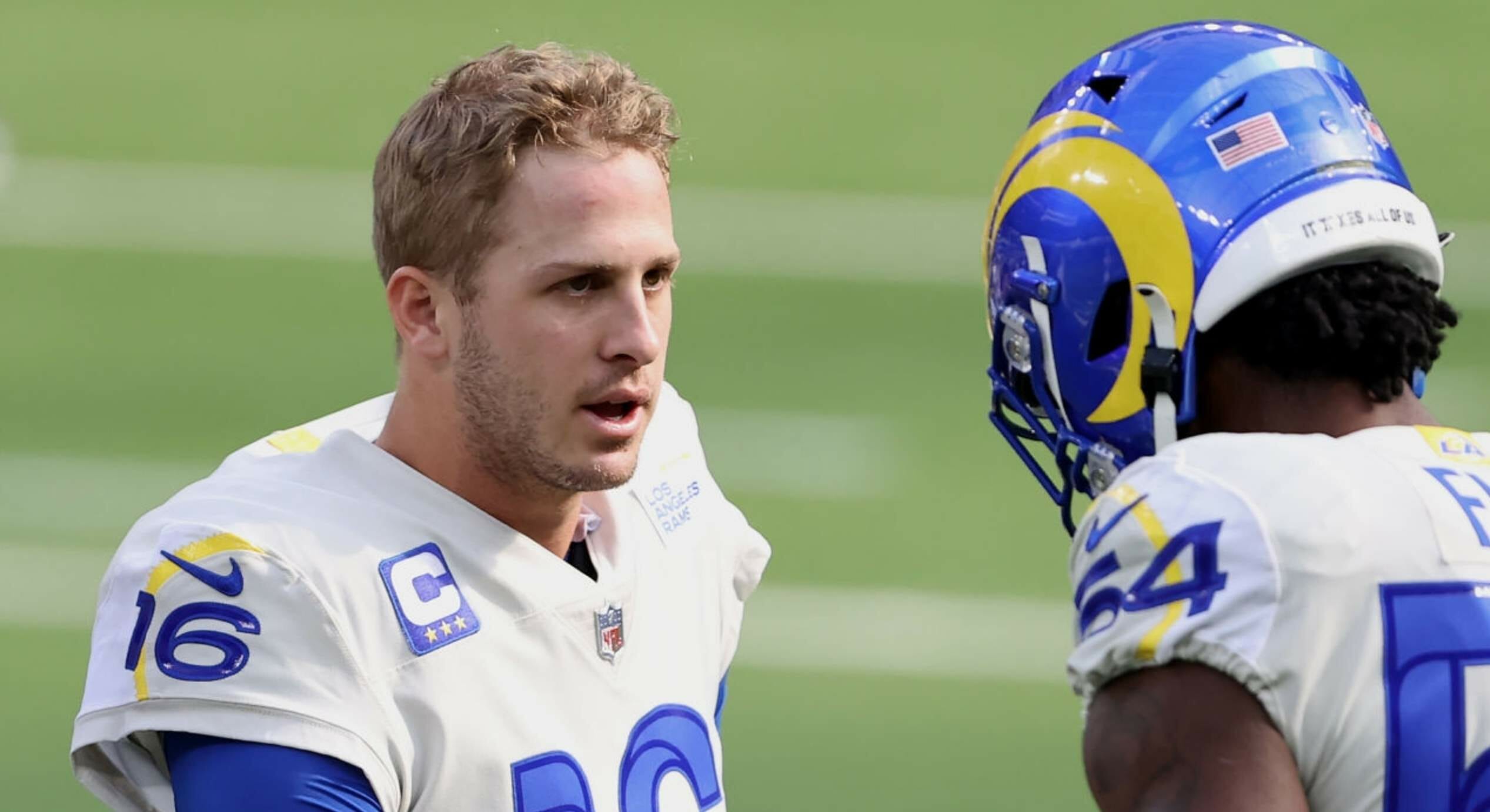
For all photos click to enlarge
The photo above shows Rams quarterback Jared Goff and linebacker Leonard Floyd wearing the team’s dishwater jerseys. But if you look closely, you can see that their sleeves are actually two-tone — they’re dishwater in front of the curved yellow sunburst line and white in back of it.
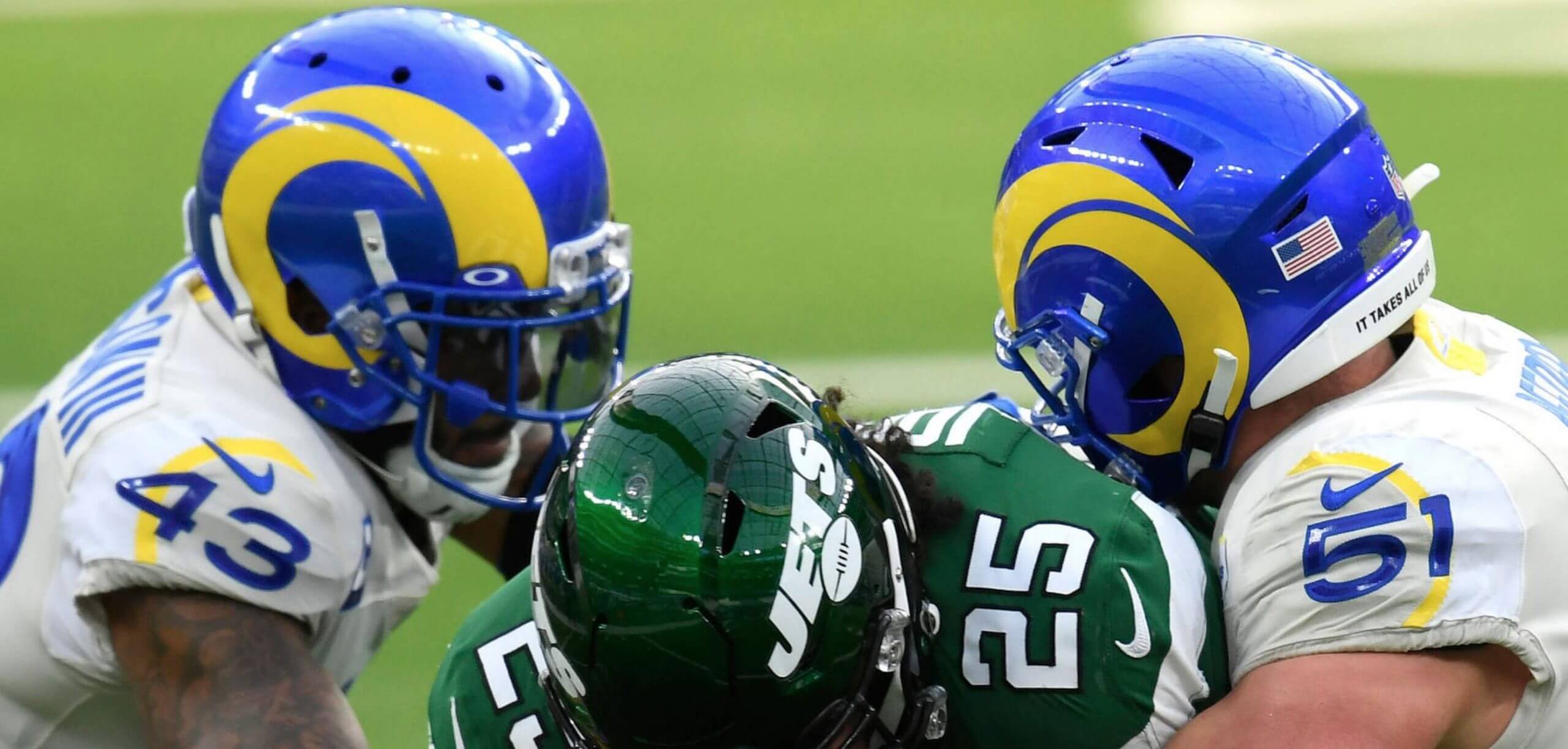
You can see the same thing in this photo of Rams safety John Johnson III and linebacker Troy Reeder — dishwater on the front portion of the sleeve, white on the back portion:
Did you realize that the dishwater sleeves included a white panel? I didn’t! Or at least I didn’t until Uni Watch reader Jonathan Dodd brought it to my attention yesterday. Once he pointed it out, I couldn’t stop fixating on it:
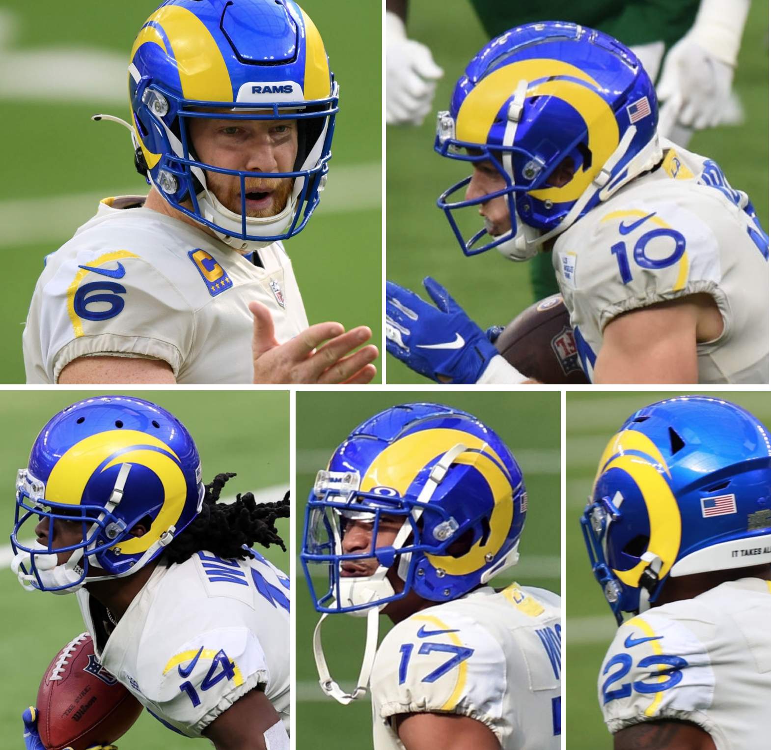
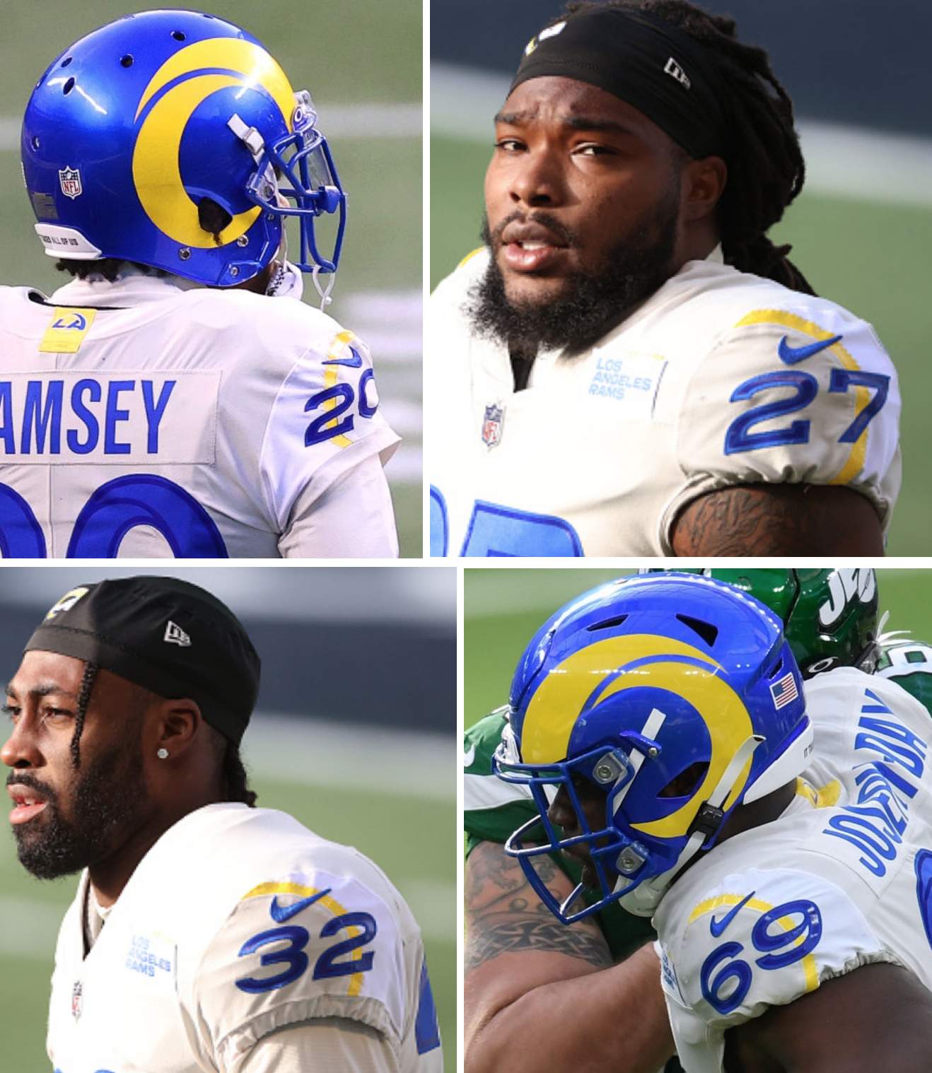
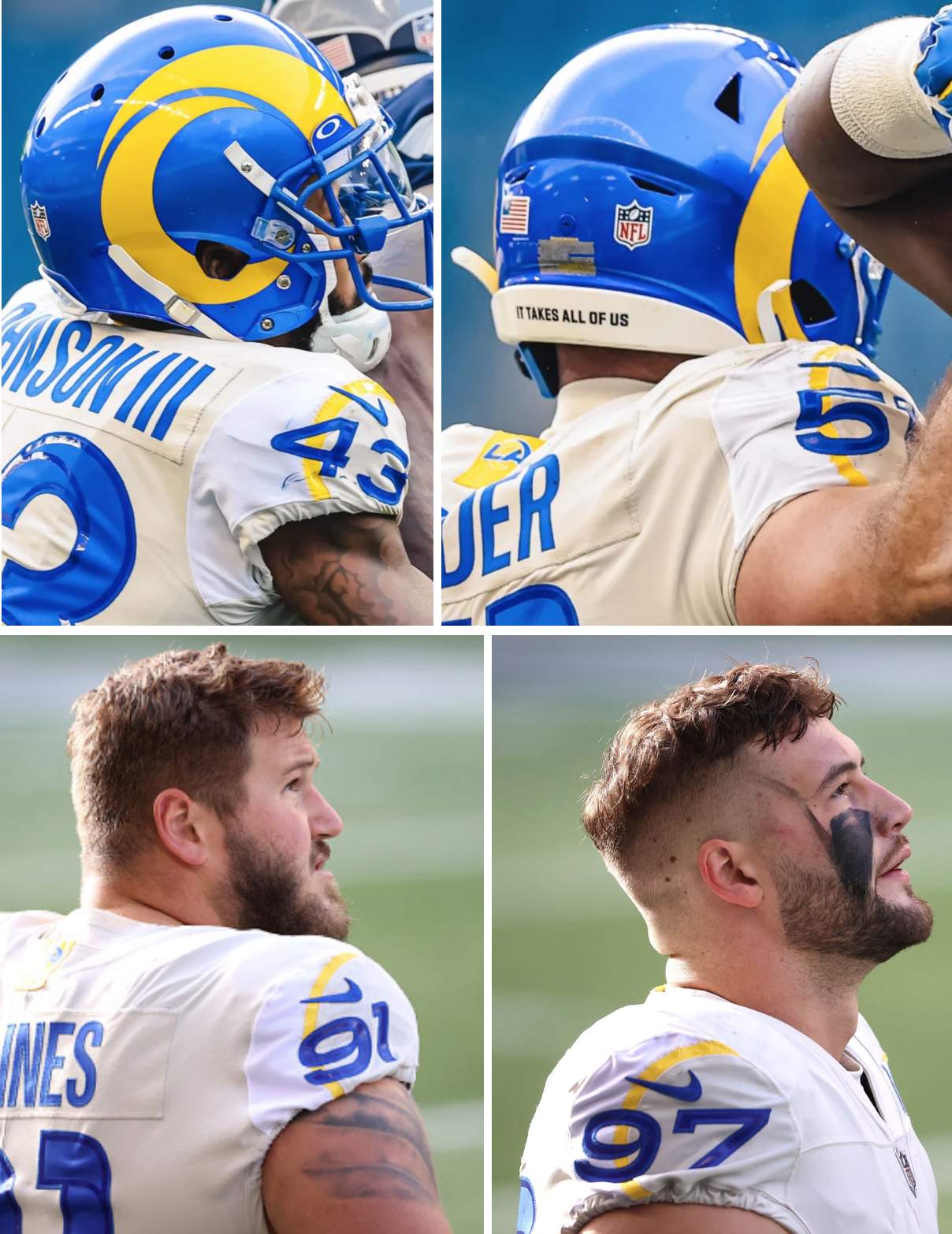
Now that I see it, it appears that they were trying to create another horn shape on the uniform, but it doesn’t work (in part because the horn is curling the wrong way, and in part because the two-tone sleeve just looks ridiculous). Instead, when I look at these pics, it’s almost like the uniform is molting — the dishwater is the old skin that the uniform is trying to shed and discard, revealing the fresh white skin underneath.
If you already knew about the two-tone sleeves, well, my apologies for devoting today’s blog entry to old news. But if, like myself, you hadn’t been aware of this until now, here are a few thoughts:
• I was surprised that I hadn’t noticed the two-tone sleeves earlier. Were they shown in the unveiling photos back in May? As it turns out, yes — but the distinction between the white and dishwater colors wasn’t very evident, apparently because of the lighting, as seen in these two unveiling pics:
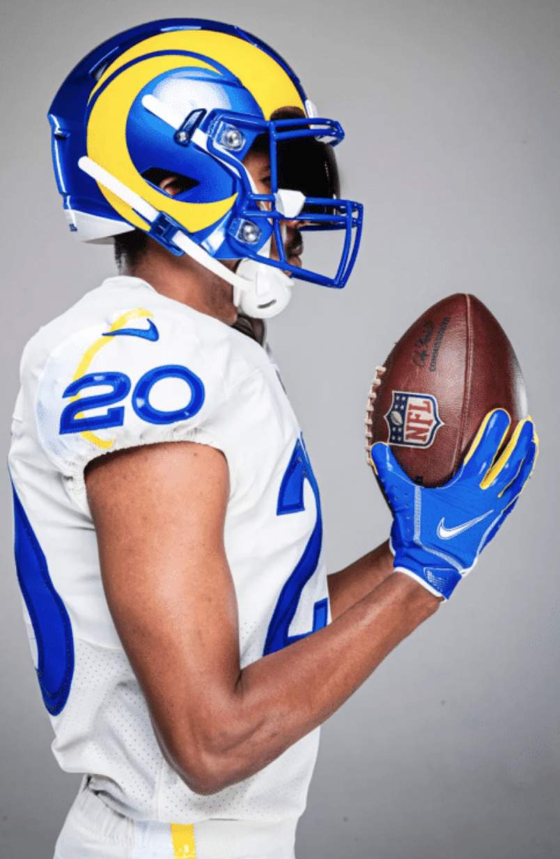
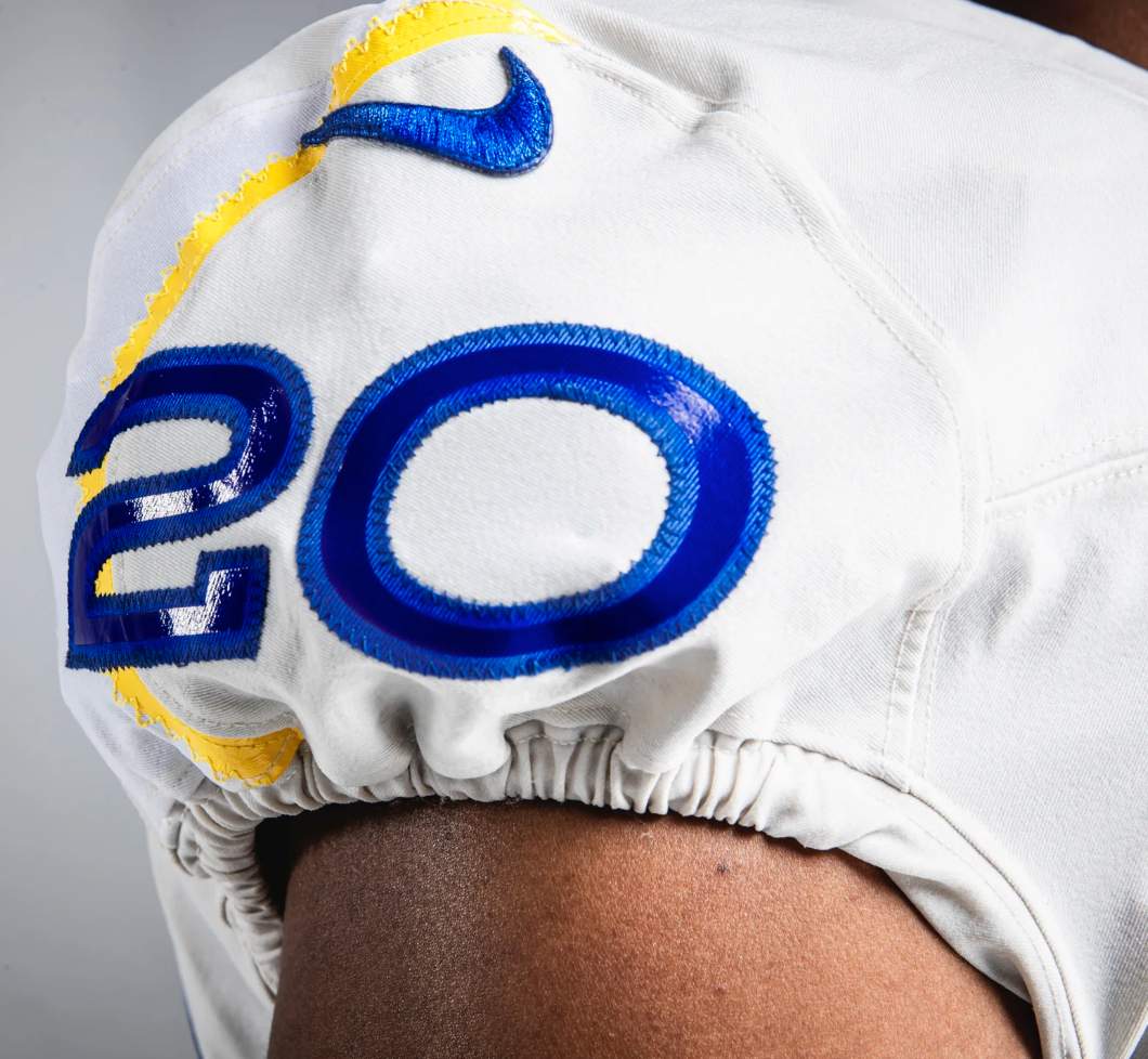
Now that we know about the white elements, you can see them in the unveiling photos. But if you didn’t already know they were supposed to be white, it would be easy to miss that, as I (and maybe you) apparently did.
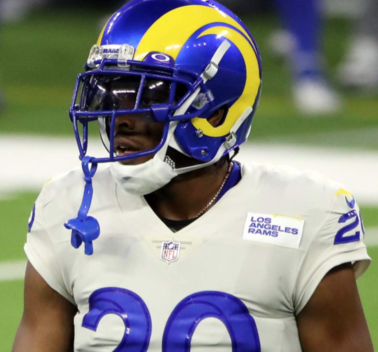
• Since the white panels are always positioned toward the back side of the sleeve, the two-tone effect isn’t visible in photos that show the players from the front or even from a three-quarter view, so that may be another reason that I (and maybe you) haven’t noticed the two-tone sleeves until now:

• In one way — and only one way, I’d say — the white panel on the sleeve makes a certain kind of sense, because the striping on the dishwater pants also includes white highlighting:
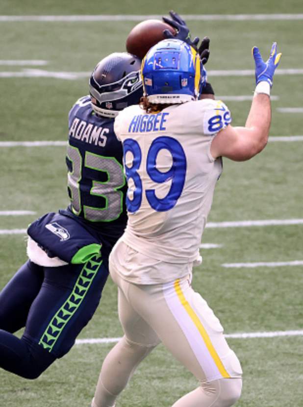
So I suppose you could argue that there’s a bit of consistency between the white panels on the sleeves and on the pants. But I don’t think the white elements work from a design standpoint — instead of enhancing the dishwater base color, which is what a trim color’s supposed to do, the flashes of white just make it clear how bad the base color is by comparison.
The net effect is like viewing the world through a dirty window and then wiping two small clean spots on glass — suddenly the world looks so much brighter and better in those two spots! That’s how those white elements on the dishwater uni look to me. Just make the whole thing white already.
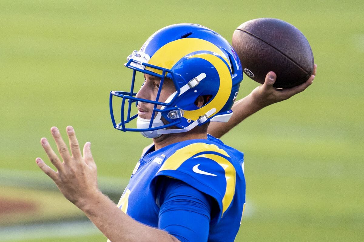
• Finally, speaking of consistency, wondering if there’s a similar two-tone situation on the sleeves of the team’s blue jerseys? Nope — because the sleeves on the blue jersey don’t have the sunburst line, or TV numbers, or anything else that shows any visual connection to the dishwater jerseys:
———
Again, my apologies to anyone who already knew about all of this, and my thanks to reader Jonathan Dodd for pointing it out so I could finally get up to speed.
Click to enlarge
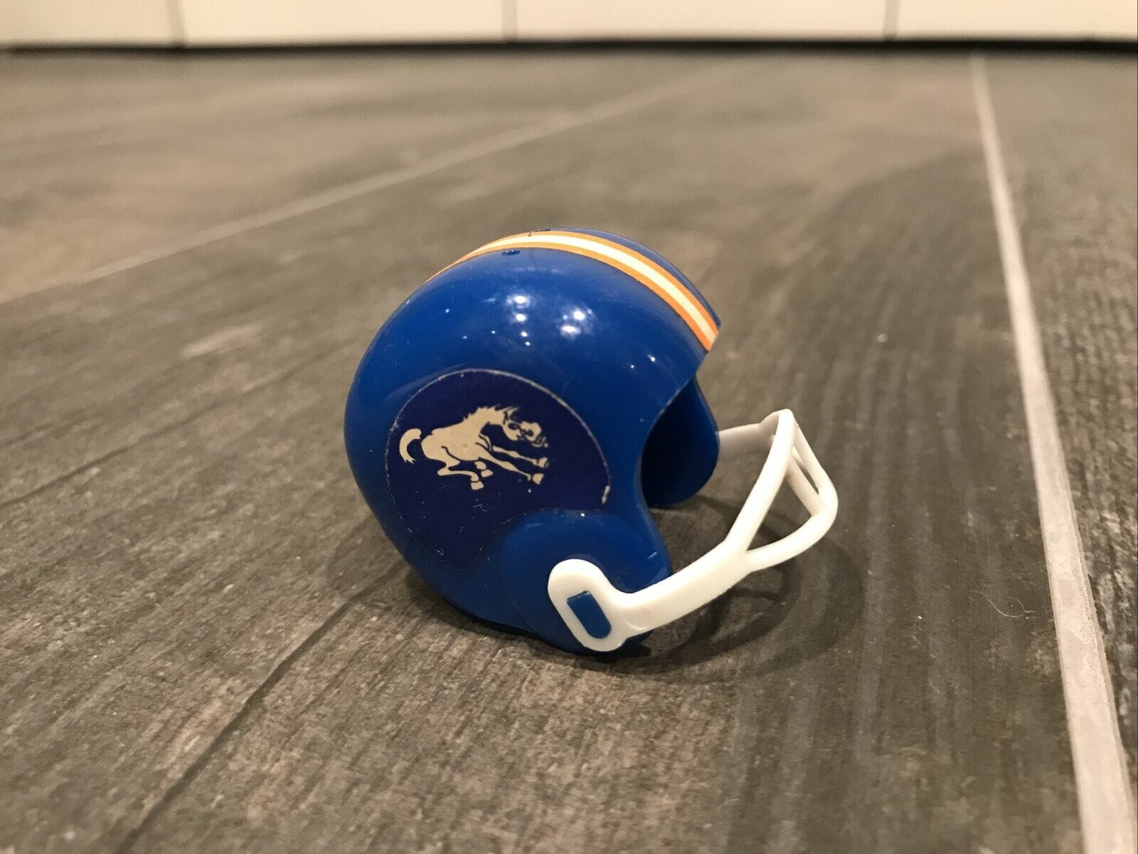
Costs a lot more than a quarter: Would you pay $670 for a gumball helmet? That’s how much someone on eBay is asking for this Broncos model. The seller says:
Considered to be a “Holy Grail” of bumball football helmets, this helmet manufactured in 1967 by Orange Products Inc. (OPI) features the bucking Bronco logo on a blue sticker and on a blue helmet. This logo and helmet combination never existed in reality. … There are several theories as to why OPI made this helmet. Few of these helmets are believed to be in existence. This helmet is in excellent condition, and very few of the ones [in] existence match the condition or exceed the condition of this helmet. The flaws I noted on this helmet are a white vertical crease on the left side sticker, some wear on the edges of both side stickers, and small tears and scuffs on the center stripe towards the rear of this helmet. The flaws can clearly be seen in the photos. Inside the helmet is stamped “2.” It’s believed OPI used these helmets in their pencil sharpener series; however, I don’t see any evidence whatsoever that this helmet had a pencil sharpener in it at one point.
Interesting — I didn’t even realize there was such a thing as a holy grail of gumball helmets! Shouldn’t have been surprised, though, since there’s a holy grail for just about every category of collectibles.
(Big thanks to Rick Porter for this one.)
Collector’s Corner
By Brinke Guthrie
Follow @brinkeguthrie
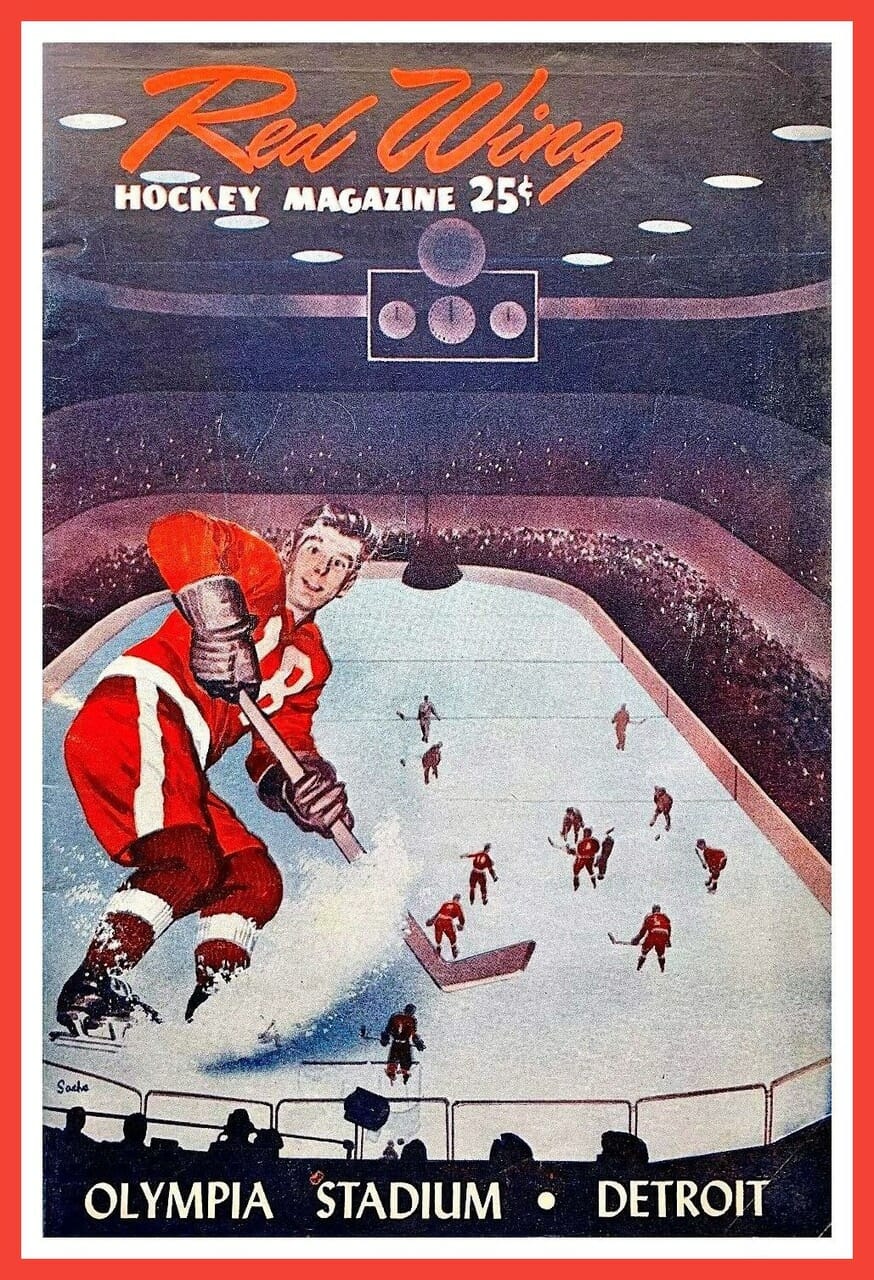
We’re back with one last Collector’s Corner to wrap up the year. Let’s start off with this terrific Detroit Red Wings program from 1956! I love these old designs — no hash tags or gimmicky slogans, just a simple image. The seller says “This colorful book has had one owner, personal family collection. It has been secured and preserved in plastic storage, since 1956.” And in case you’re wondering, defenseman Dale Anderson wore No. 18 that season.
Now for the rest of this week’s picks:
• That’s clearly Dan Fouts (despite the lack of Chargers colors) shown on this poster for the 1992 Seagram’s Golden Quarterback Challenge III. This Seagram’s promotion resulted in all sorts of merchandise, but it’s not clear what the Gold Quarterback Challenge III actually was. Does anyone know more?
• This one dates back 134 years! It’s an 1886 invoice for the purchase of baseball gloves from Peck & Snyder in New York City. Total price: $4.75!
• Broncos fans, keep warm with this 1970s Broncos stadium blanket from Pendelton.
• Fins fans! This 1970s Miami Dolphins bulletin board was straight from the Sears NFL Shop.
• Take a look at this 1970s San Diego Chargers Ron Mix jersey, in all its Sand-Knit glory.
• Although Paul’s not a soccer fan, he does like old uni catalogs, so he might want to look into this 1967 Rawlings soccer catalog. [Indeed! — PL]
• Johnny Bench used a terrific logo (shown here on a glass) for his 1970s
Home Plate restaurant. That one was northwest of Cincinnati; he also had the “Home Stretch” restaurant in Northern Kentucky. You can see the logo for that one on this glass.
• Tom “The Bomb” Tracy (great nickname!) was a CFL/NFL running back from 1955-64 and was of significant enough stature to warrant his own Franklin signature football helmet.
• In 1992, you could buy these Happy Baseball Birthday cassettes. This one was from Braves pitcher John Smoltz. Not sure to what degree they were “personalized,” but let me know if you find one where he says “Happy Birthday, Brinke!”
• Here’s a 1977 Detroit Tigers placemat from Barrelhead Root Beer. It’s an MLB Player’s Association item, so no logos, but I’d swear that pitcher in the center is Steve Carlton of the Phillies.
That’s it for Collector’s Corner in 2020. See you next year!
For all images in this section, click to enlarge
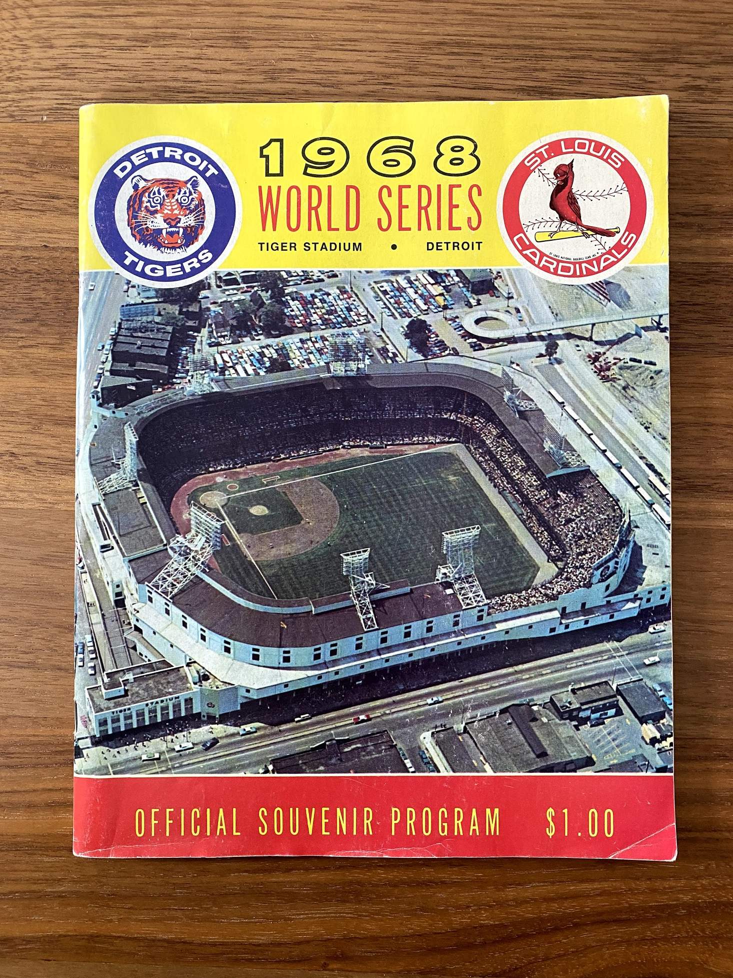
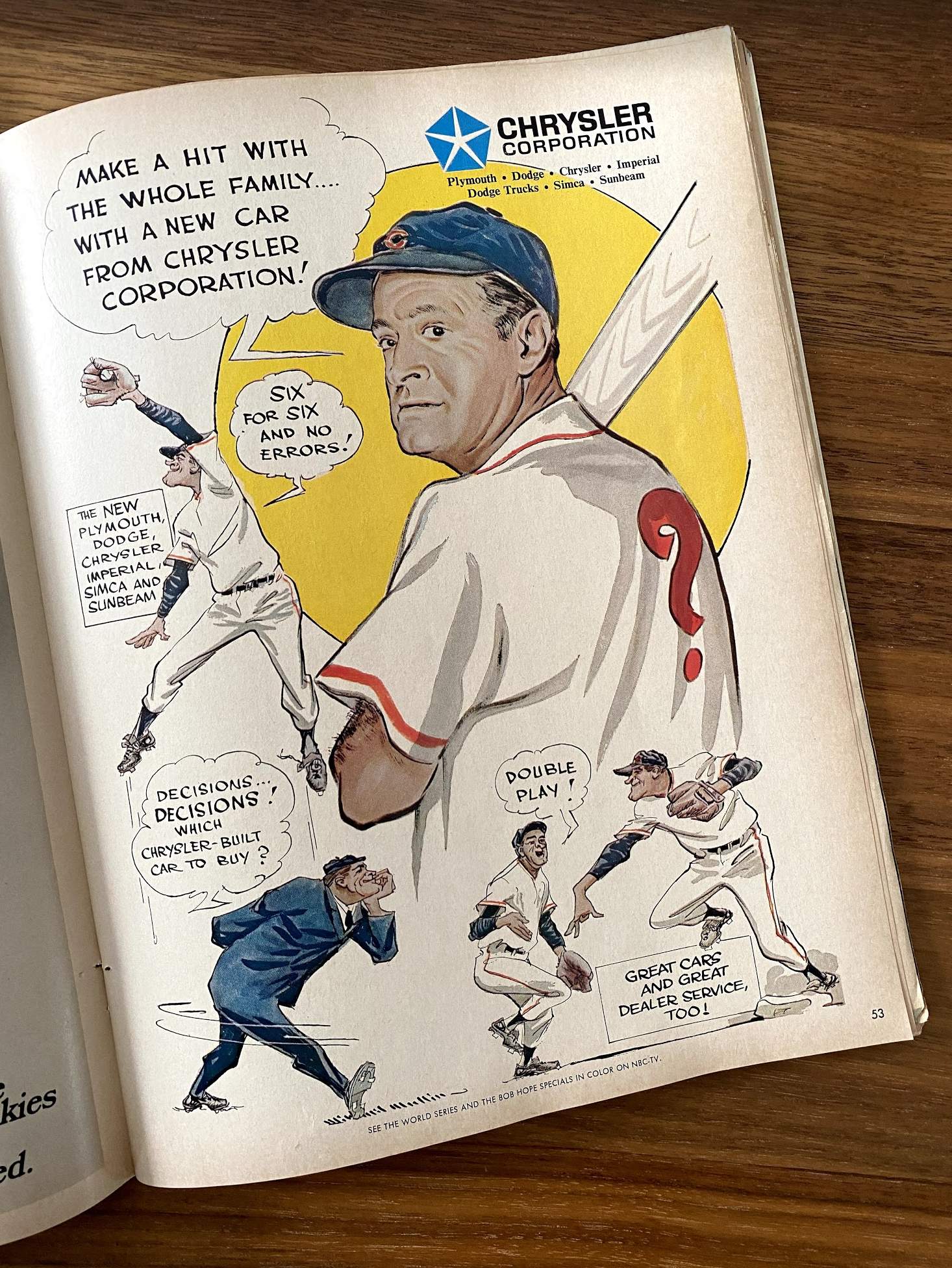
Too good for the Ticker: Reader Robbie Biederman (a very talented graphic designer who’s worked for the NHL and the Detroit Lions) recently found this 1968 Cardinals/Tigers World Series program at his parents’ house. “Sure, there’s some nice uniform-related imagery, but the real gems are the endless pages of local 1968 advertising,” he says. Check out, for example, this magnificent uni-centric Chrysler ad — featuring Bob Hope and illustrated by the great Willard Mullin:
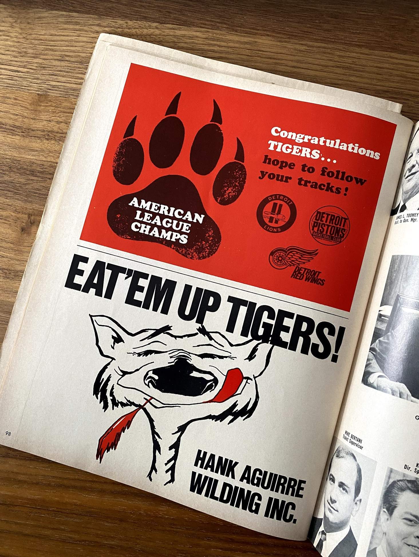
There’s also this page with two fun ads — one with Detroit’s other pro teams congratulating the Tigers on winning the 1968 pennant, and another showing a tiger licking his chops while a cardinal’s feather dangles from his mouth:
Great stuff. Thanks for sharing, Robbie!
The Ticker
By Alex Hider

Baseball News: Here’s one writer’s choice for the best White Sox player for each uniform number (from Chris Rhode). … Meisei High School in Japan uses the Marlins’ old logo on its basketball jerseys (from @bigmeechenergy).

Pro Football News: Patriots C David Andrews was once again wearing last season’s NOB and number fonts for last night’s game against the Bills. He’s been doing that all season long (from Tim Hayes). … Browns P Jamie Gillan was wearing the wrong socks on Sunday — the rest of the team was wearing socks that matched the jersey sleeve striping. … Packers LB Rashan Gary had some weird-looking stitching or lacing on his jersey collar on Sunday night. Maybe the remnants of some emergency repairs? (From Eric Starke.) … Cardinals QB Kyler Murray gave his offensive line painted portraits of themselves in game action as Christmas gifts (from Kary Klismet). … The city of Regina is turning Mosaic Stadium — home of the CFL’s Saskatchewan Roughriders — into a public skating rink during the offseason (from Wade Heidt).
College/High School Football News: Auburn Uniform Database guru Clint Richardson has published a history of the unis the Tigers have worn in their various appearances in the Citrus Bowl. … Here’s how the Alamo Bowl patches will look on Texas’s uniforms (from Damon Hirschensohn). … Speaking of Texas, QB Sam Ehlinger will wear a captain’s “C” during the Alamo Bowl, but it will be placed in a different spot than it was last season (from Timmy Donahue). … Lots of purple in this SportsCenter clip about a six-man high school football in Texas, including a dark grey and purple uniform worn by Moran High School (from Jorge Cruz).

Hockey News: New number assignments for the Canadiens. New RW Corey Perry will wear No. 94 for the first time in his NHL career. Fellow RW Michael Frolik will wear No. 67 (from Mike Engle). … Kings G Cal Petersen has a new purple/gold mask with throwback wordmarks and a tribute to Kobe Bryant (from Jakob Fox). … If you’ve ever wondered how your favorite NHL team’s logo would look like as a slug, your wish has been granted. Insert the obvious Sabres jokes here (from our own Brinke Guthrie). … Not a lot of contrast in yesterday’s game UConn and Providence (from @HurleyMania).

Basketball News: Spurs SG Dejounte Murray has new sneakers matching the team’s “fiesta” colors (from Kary Klismet). … Cross-listed from the baseball section: Meisei High School in Japan, the alma mater of Wizards F Rui Hachimura, is using a version of MLB’s Miami Marlins’ old “M” logo. Pretty wild to see that on a basketball jersey (from @bigmeechenergy). … Lots of notable uni quirks in this scene from the Cleveland Show — the Sixers-inspired jersey, the rec-specs and knee pads, former President Barack Obama wearing No. 44 and the presidential seal on the basketball (from @PhillyPartTwo).

Soccer News: .Greek club team A.C. PAOK has released renderings of its new stadium, which is slated to open in 2022 (from Kary Klismet).

Grab Bag: All of these are from Kary Klismet: New athletics logo for CCCAA school Los Angeles Southwest College. … Brighton High School in New York has changed its team name from Barons to Bruins, as the district said the old nickname represented “elitism” and had “ties to slavery.” … New band uniforms for Olmsted Falls High School in Ohio.

Hank Aguirre Wilding, the sponsor of the ad with the Cardinal feather, was a auto supplier company owned by the former Tiger pitcher of the same name. Aguirre just missed being on that championship club; he was traded in spring training that year to the Dodgers.
Actually Aguirre did not own Wilding, he just worked for them. He later owned his own auto supplier company.
I’ll never understand how anyone could like the new horns…They blow. They should’ve at least left them alone. They don’t curve upward enough at the tapered end. The separation, two moons look is just plain silly also. The numbers look cheap too, with the raised plastic. The one thing they did right, was get rid of those awful yellow collars… That was a big improvement. As for the Ram head logo, it looks awful…Such a terrible design. The Ram looks like it’s possessed by the devil!
The Rams uniforms have bothered me all year. I want to hate them, and I probably should, but instead I find from afar, they look decent, especially when they wear yellow pants. In fact, I kind of like them. Then I get a closer look and see the updated horn, the gradient numbers, the illogical striping patterns, and the dishwater color that at a glance passes as white. Any one of the details on their own is not so bad, but all together, it’s a mess. I can’t recall another uniform that had this “Good from afar but far from good” effect on me. At least not as strongly as this one does.
They look good from afar because the overall design is still based on one of the best in football. Blue and yellow are great colors together. The ram horn on the helmet is awesome (from a distance you can’t see the gimmick in this version) and the bright blue helmet shell is a great upgrade (perhaps the only one in this design) from their classic look.
It just has gimmick upon gimmick tacked on, none of them are good, and up close you see all the awfulness, where from afar it is just a great color scheme with an amazing helmet design.
A classic example of the bumper sticker effect.
The blue/yellow look is pretty much perfect at first glance. Of course, once you start to notice the details, it all falls apart. What a good idea with such terrible execution.
I had not noticed the two tone sleeve, probably I keep asking what is that yellow curve supposed to be. It sure doesn’t look like a ram horn.
My son made the best commenton Sunday- “Those Rams jerseys look like the same color of those old hand me down varsity white jerseys we wore in JV’s.”
I have dubbed them “dingy”.
That is the longest article about new band uniforms I have ever seen!
Caught a few minutes of the MNF game last night. What a contrast in uni revisions. Buffalo’s fauxbacks looking almost perfect except for the unnecessarily widened-at-the-back helmet stripe vs. the Pats’ terrible, wasted opportunity new unis. Justice prevailed and the better looking team won.
Is it me or not? I can’t even see the white in most of the photos. It just looks like all dishwater? I can tell the white stripes and the white patch on the front. I can’t see the white on the shoulders though.
Really? Even when you click to enlarge the photos?
I can’t unsee it now. That really bothers me!
I had a hard time seeing it too. This was the easiest one for me.
link
This might be due to your screen’s brightness or contrast settings.
I just tip my laptop at different angles until the contrast reaches the proper threshold. But, yes, it’s subtle.
Do the number fonts not match on those Rams jerseys, or are the TV numbers just stretched over the players’ shoulder pads?
They don’t match. Look at Goff in the photo at the top of the page, since his sleeve isn’t pad-stretched.
One of the many messed-up things about this uniform.
The more I see of the Rams Uni’s the more I detest them.
They’re the new pre-Brady Buccaneers for me. The blue is too shocking blue. The yellow is too pale yellow. The founts are horrible and don’t even get me started on the dirty dishwater whites! The 1980’s Rams had one of the best looks in the history of the league. These rags rank and one of the worst. Hopefully they’ll wise up a’la the Browns and fix the problem in 5 years.
It was an easy assumption for me, back when these uniforms were released, that the Rams would “get it right” in five years. But I’m starting to doubt it, the team seems to love the design. Plus, even here in the comments, a lot of people are starting to like them (which honestly shocks me), but it’s somehow happening. It’s even crazier to me that the people commenting that the like them aren’t Rams fans. The only thing that gives me hope is that here in LA I don’t think I’ve seen someone wearing either current jersey. A lot of classic Rams jerseys, many Raiders jerseys (of course), and some Chargers, but not one current Rams jerseys. I know things are different either pandemic, but to me that speaks volumes. So maybe people “like” the jerseys, but not enough to buy them, and they’ll redesign them because of that?
I’ve come to accept the helmet. The uniforms suck.
They don’t match. Look at Goff in the photo at the top of the page, since his sleeve isn’t pad-stretched.
That’s just sloppy.
I just played the slug game. Am I right to assume that Chicago was left out?
There are 31 slugs. Unless Seattle was included, Chicago is one of them. Darned if I can tell which one…
Seattle is off to the left. It’s that funky green squid. Perhaps the creator is a a Hawks fan and the slugs are some sort of dis.
Or maybe the creator doesn’t want anything to do with Native American imagery.
I think Paul is correct. I hope so.
One of the better art projects to grace this site.:)
I saw a fan wearing one of these “bone” jerseys in person about a month ago and the white back half of the sleeve was jarring it looked so bad.
I actually took a double take because I thought it might have been a mistake, but then I saw the other sleeve was identical.
Is it just me, or does it look like in some of these photos the jerseys are three-tone: white, very light bone or cream, and standard bone. It’s particularly evident in the upper left photo of this montage:
link
You can see it particularly along the seam of shoulder and chest panels of the jersey.
Not sure if this has been covered before, and I will admit this bugs me far too much, but I hate that Auburn’s pants have stripes that are not spaced out like those on their sleeves and helmets. If they put a little white between the center and outer stripes on the pants all three would be designed the same (Northwestern stripes all around). I realize they have done this for a long time (forever?) but does anyone know why? Assuming there is a “why”.
Two teams that *have* gone to the effort of putting Northwestern stripes on the britches in order to match the jersey are BYU and the Detroit Lions. The effect looks a little labored; to my eyes they are too labored. After years of conditioning, I want to see leg stripes that are simpler than the sleeves.
Hey Paul, how about the fact that the Rams’ TV numbers are compressed and look like a completely different font than the front and back of the jersey? I seriously don’t understand what they were thinking.
Yup. As I wrote link, “Meanwhile, the proportions of the TV numbers bear no resemblance to the front and back numbers. It all feels like something created in an web-based team-builder app.”
Re- Collector’s Corner:
“…it’s not clear what the Gold Quarterback Challenge III actually was. Does anyone know more?”
link
“The Seagrams Golden Quarterback Challenge features professional football’s all-time great quarterbacks in a one-of-a-kind sports competition. It’s a test of athletic skills and physical endurance – all in the spirit of fun”.
What a non-answer!
I’m guessing it was like the old “Superstars” TV program with athletes on a obstacle course, etc…
PS-I have a rocks glass from ‘SGQBCII’ with signatures from Sonny Jurgenson, Earl Morral and (I think) Ken Anderson.
The fact that you are just seeing the white on the sleeve now only emphasizes the lack of contrast the stripe colors offer. And as you suggested, contrast and highlight is the main focus of stripes in the first place. The bone color should be used as a highlight to the blue and yellow. Although, we all know the dishwater color(and the name itself) are ridiculous and should be eliminated altogether.
I have a small collection of old game programs and my favorite parts are the advertisements.
I was neutral on the Rams redesign back in the spring but now I really love the new helmet and primary LA logo.
The Rans uniforms definitely provokes a lot of discussion.
One of the more disappointing areas (other than the dishwasher look) is the mess they’ve made on the “Ram horn” shoulder stripe. It looks so poorly applied, it at times reminds me how I’ve been plagued by poor Christmas present wrapping technique my entire life, how the horn looks at times, as if it has an unintentional crease in it. It’s such a sharp contrast with their city neighbor, the Chargers, who nailed their shoulder stripe (like the way my wife can wrap Christmas presents perfectly in sharp contrast to the mess I make)
I remember writing about the white rear armpit panels in the same comment where I first called the color dishwater.
Indeed you did!
link
For whatever reason, the white panel didn’t stick with me. But even if you hadn’t called it out then, I should have noticed it once the season started. My bad all the way!
Nice , Justin! You won twice in one comment. Good eye.
I don’t get why they didnt just make the new uniforms the royal blue with the yellow of the Eric Dickerson era. I think they tried way too hard to make them unique but it just failed.
Holy moly! I had a Tom “the bomb” Tracy helmet as a kid up here in Canada. It was a red one but seeing one in today’s Collector’s Corner was fantastic!
Ron Mix never came close to wearing the navy Chargers jersey. They made the color change in 1974 and Mix’s last season with the team was 1969.
Finally, there are more and more reasons to hate the Rams unis. They are simply and absolutely gross.
That sale price of $4.45 for two gloves in 1886 is the equivalent of $126.00 today. Exclamation point, indeed! And the original $15 price on the more expensive glove would be $426 today.
Maybe they were killing the cow in the back of the store while you waited.
For a team from LA, the “bone” should have been called “smog.”
I second the motion to rename “dishwater,” “Smog.”
I saw the white on the sleeves in that game, but didn’t think anything of it- just another aberration. These are simply the worst looking uniforms the NFL has ever seen- so that’s something, I guess. If you’re going to be bad- be the WORST.
If they’d lose “smog” entirely and go to pure white, and then lose the plastic-y shiny numbers, and the “MY NAME IS” thing; just go with the blue, yellow, and white- I’d loathe them less.
I’d still loathe them, tho- just less.
“Smog” was suggested way back in May. But I chose — and am sticking with! — dishwater.
“These are simply the worst looking uniforms the NFL has ever seen”
I love ya Brinke, but you’re saying these are worse than either the old Bucs alarm clocks or the Browns with TNDL?
Ah yes, I remember the smog/dishwater choice now. No, these are the worse overall, ever. You could make a (tiny) argument that there were (tiny) elements of the Bucs or Browns that weren’t horrid; but these? Every single aspect is the worst. Dishwater- worst. Shiny plastic numbers? Worst. MY NAME IS- worst. Mucking up the helmet logo so they could call it some Italian design name? Worst.
Gonna disagree with ya, buddy. In no uni-verse are the Rams new unis worse than either the Bucs or Browns old duds. I’m not gonna say the Rams unis are growing on me, nor will I say they’re particularly good, but they ain’t the worst ever.
Grab bag typo: it’s Olmsted Falls, not Olmstead.
Also, Meisei HS using the Marlins logo has definitely been covered here before, but there’s no harm in revisiting it.
Typo fixed.
Oh the Rams, never noticed the two toned sleeves until today sheesh.
Also, with their split horn LA logo I say drop the L and part of the A and use the other half of the A as the ram head and the split horns can image two horns.
Their uniforms are so LA’ish.
The player on the 1956 Red Wings program cover looks like a young Ronald Reagan. I had no idea he was a three-sport athlete! (He played the Gipper in 1940 and Grover Cleveland Alexander in 1952.)
When I see an ‘ugly’ game now, i.e. two teams in mono-tards, Rams dishwater, etc., I just turn off the TV!
I watch games in which I have a rooting interest. It’s crazy.
Hey now, Nestor — a website devoted to aesthetics is the last place where anyone should be ridiculed for letting aesthetics dictate their viewing choices.
Intellectually, I think making rooting (or watching) choices based on uni design is utterly absurd, but emotionally I get it. I hated the Minnesota North Stars and Oakland Athletics for most of my childhood for no other reason than because I find green and yellow repulsive together. (No offense to this blog!)
My wife is not a uni-watcher but during the rams / seahawks game we talked about the dishwater color of the jerseys and how bad it looked when paired with white. Later in the 2nd quarter she said, “It isn’t just the bad off white, those are just a bad design all the way around.” Also kept asking who came up with the design. So much bad to talk about.
Hate to be the turd in the punchbowl, but the Rams’ uniforms are growing on me. Can they be improved? Easily: swap the “bone” and “white” colors, ratchet up the contrast on the bone color, move the yellow arc from the trailing edge of the sleeve to the leading edge, so the horn points in the right direction, make the team name patch in gold or blue, but I actually like the font choices the Bighorns made. The stretched font reinforces the elastic properties of the sleeve, and happens to fit within the space allocated for it. The Mobius striping rendered as a pattern inside the numerals is a neat detail, and resembles Gonzaga’s new wordmark. It’s not as bad a uniform as everyone makes it out to be, and I won’t to say “It’s so bad it’s good.” It’s a 2020’s design, made to fit today’s uniforms; not a 1970’s design stretched and truncated.
That sure is a lot of suggestions for improvement for a uniform you “like”.
Well, I’m changing details, not the design.:)
Brighton High School in New York has changed its team name from Barons to Bruins, as the district said the old nickname represented “elitism” and had “ties to slavery.”
Two other names which finished high in the results were “Bobcats” and “Bulldogs”. Am I right in assuming that overused mascots are considered a feature and not a bug?
Myles Bryant was also wearing the old number font during last night’s game, but weirdly enough had the normal NOB font. The conclusion for David Andrews could be made that he’s just wearing the old color rush jersey and that conclusion could be made for Myles Bryant too, except that ignores the fact that he’s a rookie.