For all photos, click to enlarge
Good morning! Greetings from Uni Watch HQ, where all three inhabitants continue to be safe and well. Hope the same is true at your home.
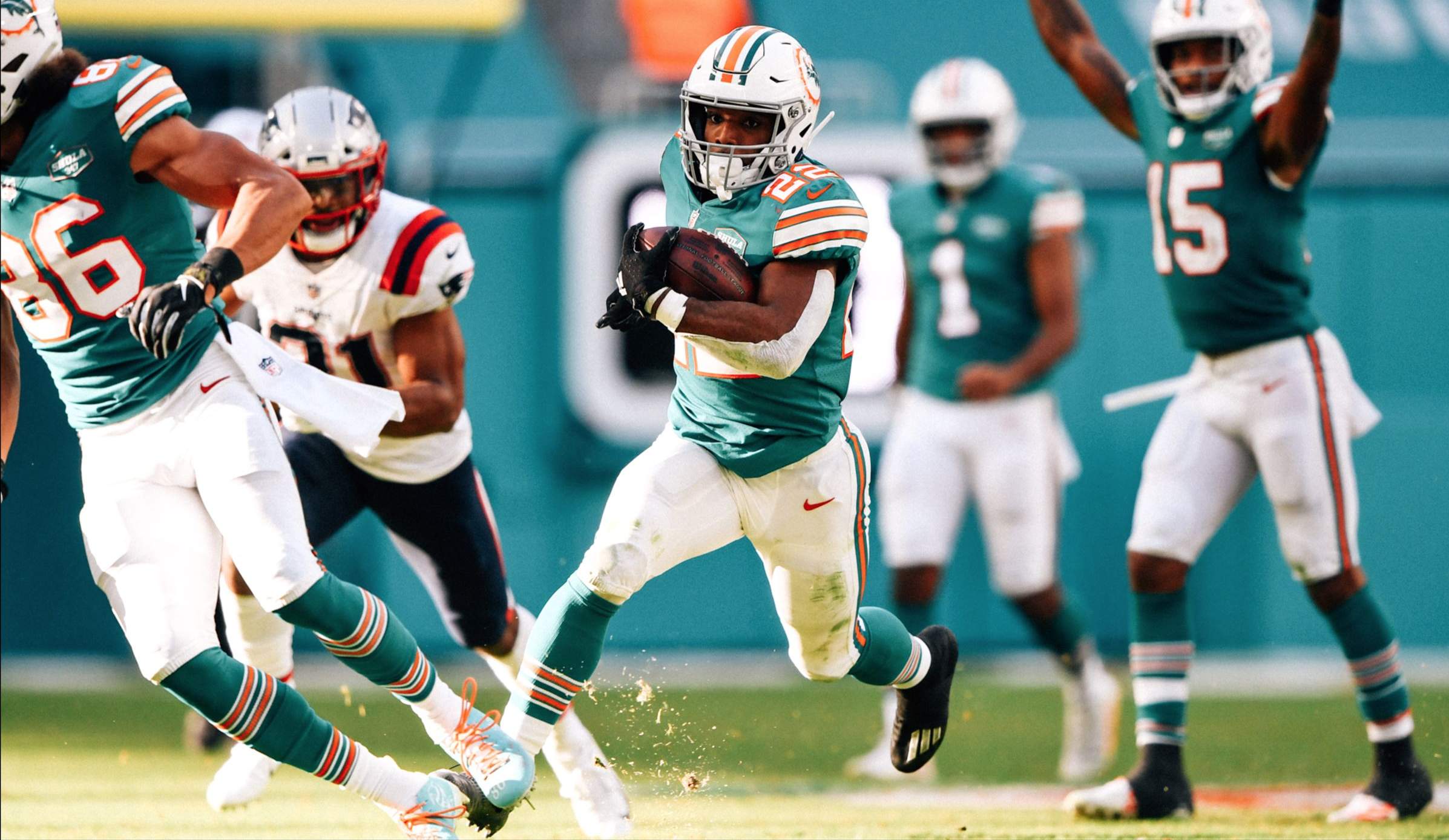
So here’s a weird one: A week ago, the Dolphins wore their awesome aqua throwbacks against Kansas City. As you can see above, they wore the throwbacks again yesterday, this time against the Patriots.
I asked Gridiron Uniform Database researcher Bill Schaefer if he could recall a previous instance of a team wearing its throwback alternate two weeks in a row. I specified that we shouldn’t count the 2018 or ’19 Rams (since their throwbacks essentially became their primaries) and that we also shouldn’t count the league’s 1994 75th-anniversary throwback program or the 2009 AFL 50th-season throwback program (since teams were supposed to wear their throwbacks a lot for those campaigns). He said the only previous example he could think of was in 2005, when the Bills wore their throwbacks for the first two games of the season. So what the Dolphins have done over these past two weeks is very, very rare.
(Update, 9:20am: Bill just let me know that he found a much more recent example. The Dolphins wore throwbacks on Weeks 13 and 14 of the 2018 season. So not only is there a fairly recent precedent for back-to-back throwbacks, but the Dolphins themselves have done it before!)
That Pats/Dolphins game also featured another pair of starting quarterbacks wearing No. 1 — Cam Newton and Tua Tagovailoa. Prior to this season, that had never happened before; now it’s happened three times in the past seven weeks.
In other news from around the league yesterday:
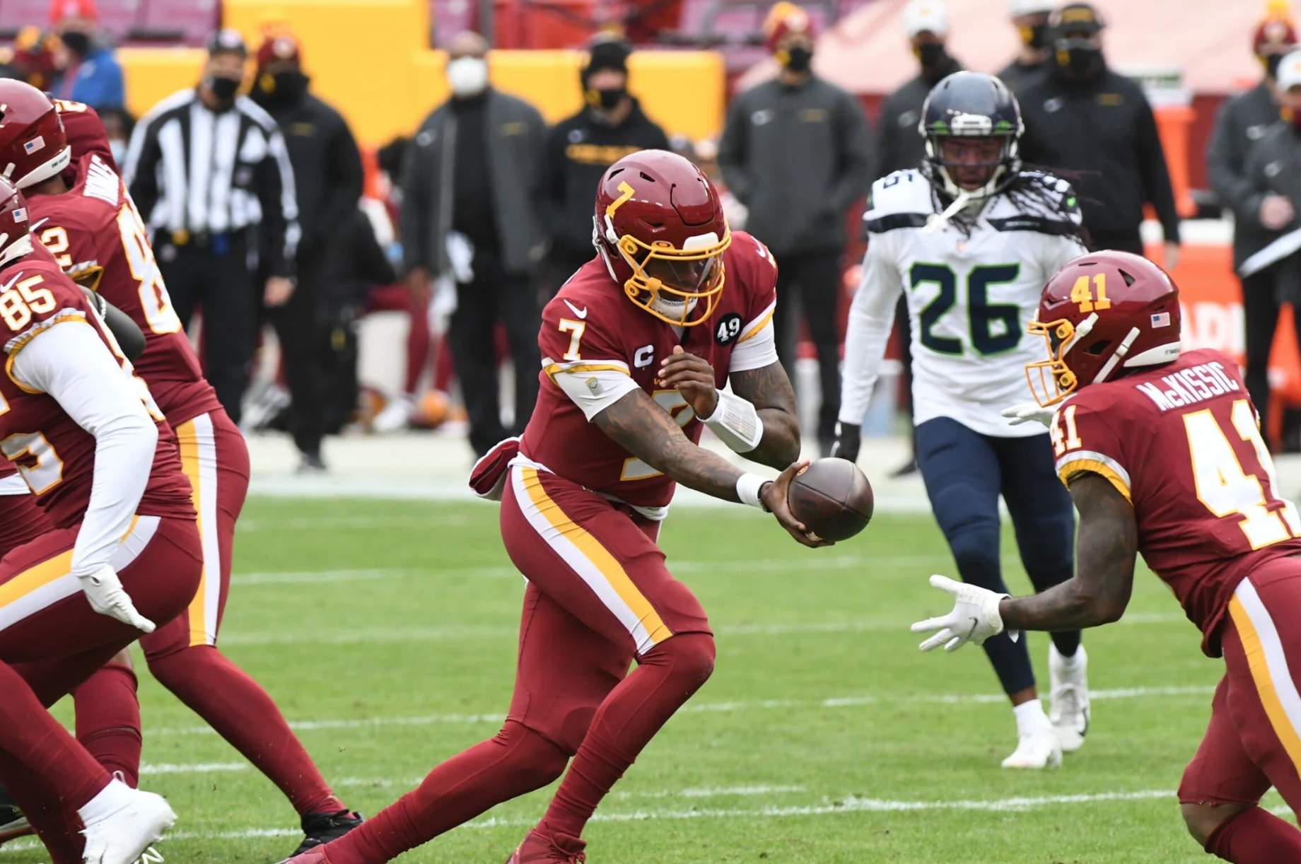
• For the first time since Week 13 of the 2017 season, and only the fifth time ever, Washington went mono-maroon (a fun thing to say out loud, although not a good look on the field):
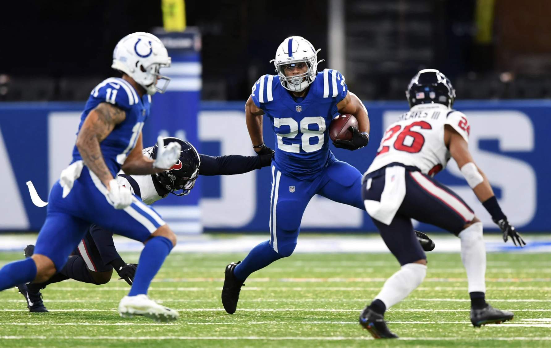
• For the first (and let’s hope last) time this season, the Colts went mono-blue:
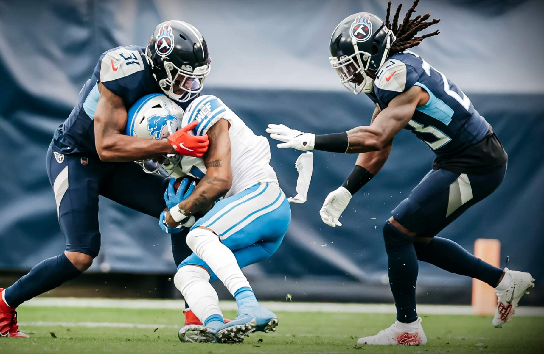
• The Titans went mono-navy:
• The Rams wore a color combo that, somewhat surprisingly, they hadn’t yet showcased until now — dishwater over yellow:
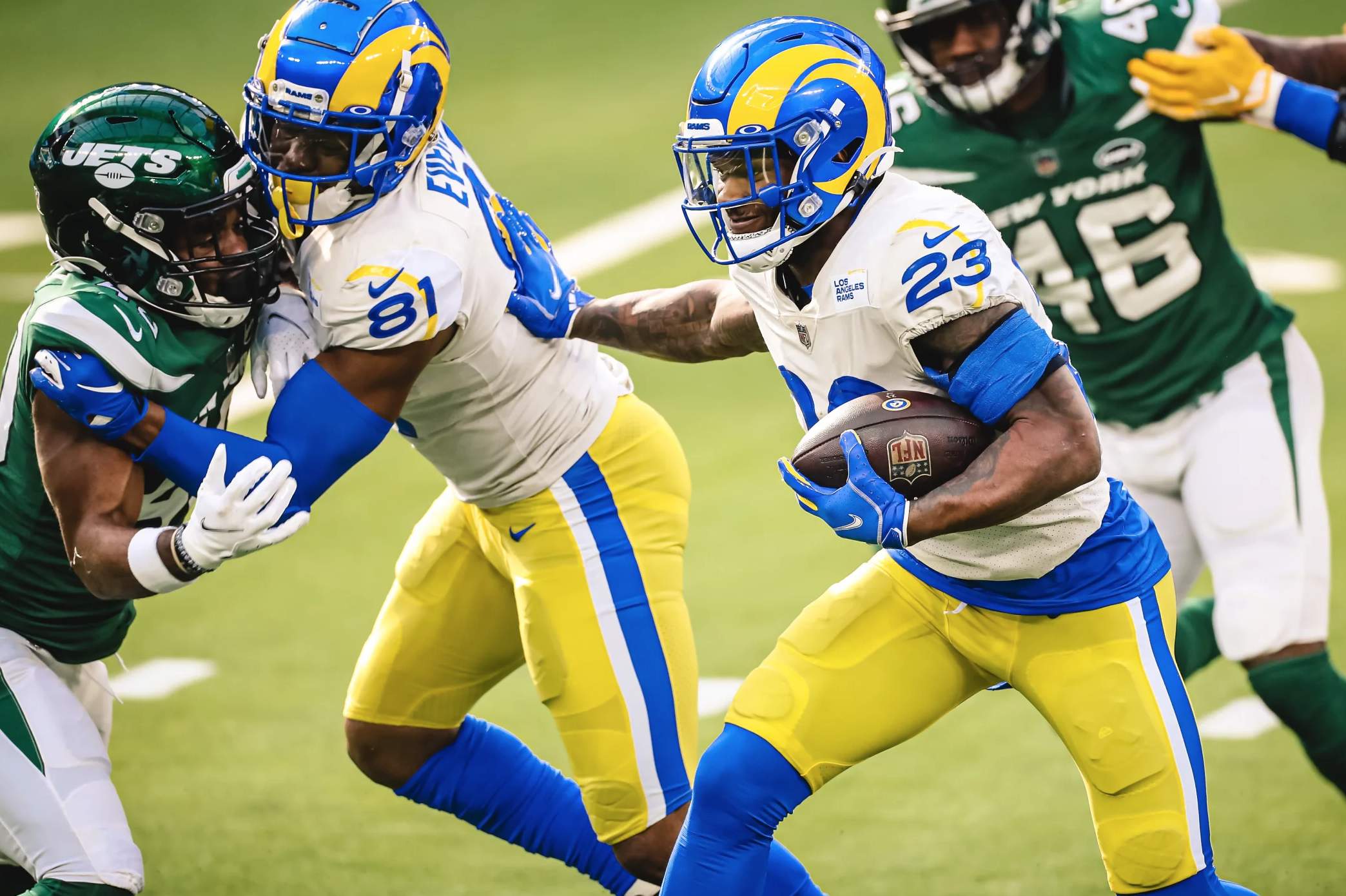
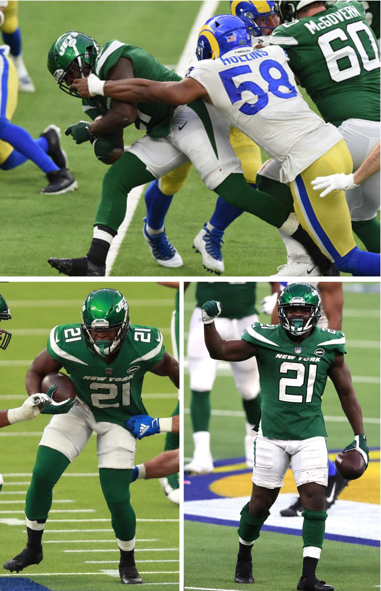
• From that same game: Longtime NFL running back Frank Gore, who’s now with the Jets, has been wearing super-short pants for many years and for a variety of teams. But even by his own impressive standards, he was in rare form yesterday:
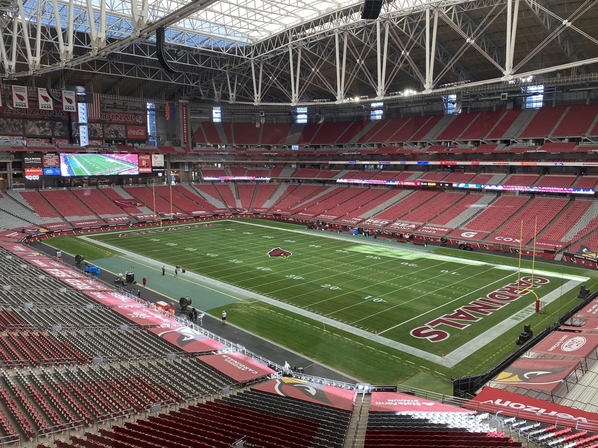
• For several weeks the Cardinals’ field had featured the NFL logo at midfield and “Arizona” in both end zones due to the 49ers sharing the stadium because of pandemic restrictions in California. But the Cards are currently in the midst of a two-week homestand, so their team logo was restored to midfield, and “Cardinals” was restored to one of the end zones:
• Washington doesn’t usually have their quarterbacks use a play-calling wristband, but they provided one yesterday for Dwayne Haskins, who made the start in place of the injured Alex Smith:
From @NFLGameDay: #WashingtonFootball Team OC Scott Turner and HC Ron Rivera want QB Dwayne Haskins as comfortable as possible today against the #Seahawks, so they're giving him a wristband with plays on it to help him with the verbiage in the huddle. pic.twitter.com/RZYjqpoHDq
— Mike Garafolo (@MikeGarafolo) December 20, 2020
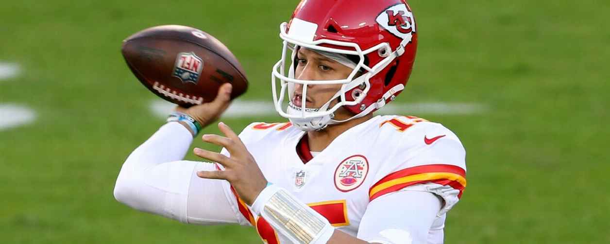
• I realize Kansas City quarterback Patrick Mahomes is unconventional in all sorts of ways (and I also realize that today’s quarterbacks don’t always feel the need to grip the ball along the laces), but man, this is one very odd-looking way to grip a football:
• Bears wide receiver Cordarrelle Patterson wore a Minnesota Twins Kirby Puckett jersey during pregame activities:
Game recognizes game.#CHIvsMIN | #DaBears pic.twitter.com/VQjcz0ojyh
— Chicago Bears (@ChicagoBears) December 20, 2020
• Two teams wore white at home: the aforementioned Rams (if dishwater counts as white) and, of course, the Cowboys.
(My thanks to Mike Chamernik, Josh Pearlman, and Griffin Smith for their contributions.)
Click to enlarge
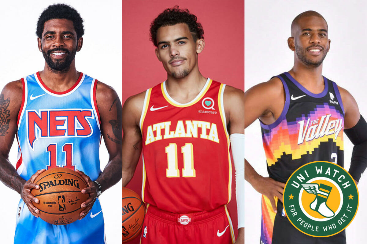
Time for the NBA Season Preview: The 2020-21 NBA season begins tomorrow, which means it’s time for the annual Uni Watch NBA Season Preview, with everything you need to know about this season’s new uniforms, logos, courts, and more (including the Nets’ new tie-dye throwback, the Hawks’ new uni set, and the Suns’ new City alternate, all shown above). It’s available now on InsideHook — enjoy.
NHL helmet ad update: David Pagnotta, editor-in-chief of the hockey website The Fourth Period, reported yesterday afternoon that NHL helmet ads are now a done deal for the upcoming season. Sigh.
I know some of you are probably thinking, “Well, they need to do that because of all the revenue they lost due to the pandemic.” But as I explained last Friday, lost revenue has nothing to do with this, because the helmet ads are actually make-goods. Moreover, the ads are likely to stick around after the pandemic is over. If you missed all of that on Friday, you can get caught up here.
I know I looked away from the needle
And yes, I know I need a tan
But I am so confident that the #Covid19 vaccine is safe & effective that I decided to take it myself pic.twitter.com/TQbog6fu7i
— Marco Rubio (@marcorubio) December 19, 2020
Florida man wears non-Florida shirt: Once and perhaps future presidential candidate Marco Rubio, one of the two U.S. Senators from Florida, tweeted this photo of himself receiving the coronavirus vaccine on Saturday. As many observers quickly noted, he was wearing a USF Cougars T-shirt — that’s the University of Sioux Falls, a Division II school in South Dakota, which is approximately 1,219 miles from the western tip of the Florida panhandle. As far as Google and I can tell, Rubio has no known ties to that school.
Obviously, this was supposed be a shirt for that other USF — the University of South Florida, whose teams are called the Bulls and whose colors are green and gold (mmmmm). So how did this T-shirt mix-up happen? Here’s one possible scenario:
Rubio [to staffer]: Get me a USF T-shirt for the vaccine photo-op.
Staffer [while googling “USF T-shirt”]: Got it, boss. It’ll be here tomorrow.
Of course, that would require Rubio and the staffer who ordered the shirt and any other staffers who were involved all being unaware of the differences between the two USFs. I suppose that’s possible, but is it plausible?
Another possibility: Rubio’s staff intentionally pranked him. I’m not sure that’s plausible either, but it’s certainly fun to think about. Whatever the real situation is, it’s clear that at least Rubio himself is completely clueless about a major educational institution in his state (and is also a poser trying to pass himself off as a big fan).
Since the vaccine involves two separate injections, Rubio will have another photo-op in a few weeks. Here’s hoping he asks his staff for a Miami T-shirt, and that they respond by getting him one for Miami of Ohio.

Input requested: I could use some ideas for an upcoming project, and some advice for another project. Here’s the deal:
• My next piece for InsideHook will be a listing of uniforms that are “so bad, they’re good.” Obviously, we could all define that concept in different ways, so I’m interested in getting input from sensibilities other than my own. If you’d like to offer some suggestions (current and past uniforms are all eligible), feel free to post them in today’s comments, or just email me.
• I have a podcast project in the works — it’ll be somewhat uni-related but not entirely — and would like some advice on (a) a good microphone to buy (I’m willing to spend up to $100 but am happy to spend less if I can get good sound at a lower price point) and (b) which platform I should use for uploading the sound files so people can listen to them. For these podcast questions, please don’t post in the comments section — just email me.
Big thanks in advance for your feedback and assistance!
Click to enlarge
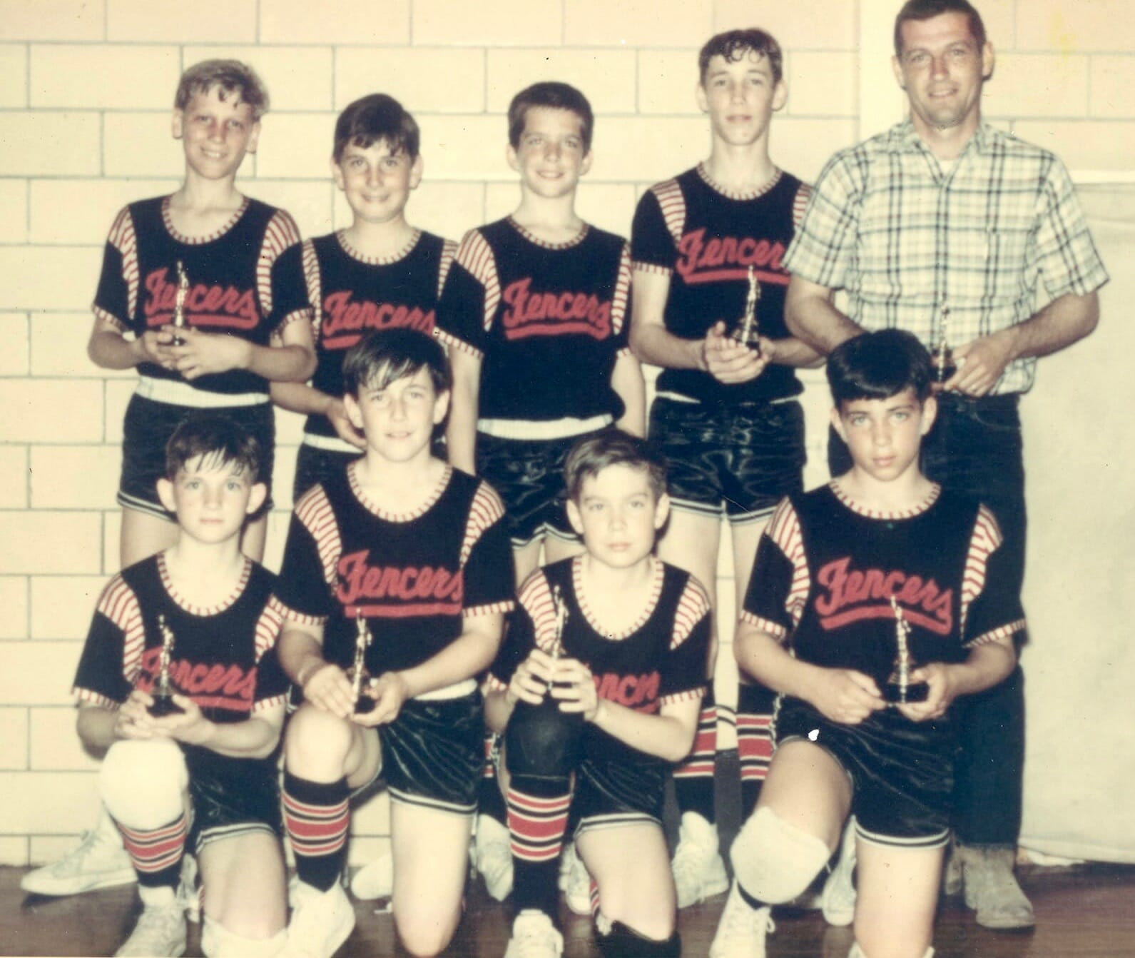
Too good for the Ticker: Oh man, so much uni-driven goodness in this 1967 photo. I’m assuming this was a basketball team, even though the team was called the Fencers. Great uniforms, plus the coach’s green plaid shirt would be a perfect fit for me!
(Big thanks to Kate Sutter for this one.)

Raffle reminder: In case you missed it on Friday, our annual Uni Watch Year-End Raffle, in which I give away all the freebies I’ve received over the course of the year, is now under way. Full details here.
Quite a yarn: This has nothing to do with uniforms or sports, but it’s too good not to share. Everyone loves pizza, right? So check out the video embedded above — it’ll be the best 58 seconds you spend today, trust me.
Obviously, the yarn/wool/etc. work is amazing. But don’t overlook the excellent sound design — so good! Enjoy.
(Big thanks to the Tugboat Captain for this one.)
The Ticker
By Jamie Rathjen

Baseball News: Canada Post has a postmark that refers to one of the earliest recorded baseball games, which was played in Beachville, Ont., in 1838 (from Cino Commisso). … A Redditor is starting a vintage base ball team and got his old-timey uniform (from Jacob Hicks). … Here is how the Yankees’ team name changed from Highlanders to Yankees (from Trevor Williams).

Football News: Left over from Saturday: At least one Utah player had a giant Schutt maker’s mark on the back of his helmet (from Jeffrey Moulden). … One of CFL.ca’s writers is doing what is theoretically a uniform history of each team. Here is the BC Lions edition. You may not know, though it can be seen there, that they wore British Columbia’s 1971 centennial logo as a helmet logo (from Wade Heidt and Dean McGee).

Hockey News: The Junior A British Columbia Hockey League’s Chilliwack Chiefs have a new alternate (from Wade Heidt).

Basketball News: Florida State’s men’s team wore their turquoise N7 alternates on Saturday, which created a color-vs.-color game against UCF (from @VictoryCB). … N.C. State’s women’s team debuted apparent new black alternates at home yesterday, which created color-vs.-color with Miami (Fla.) (from Gabe Cornwall). … Michigan State’s men’s team also debuted black alternates yesterday (from multiple readers). … George Mason’s men’s team is debuting white alternates today. … Two teams got their championship rings from last season: the Canadian Elite Basketball League’s Saskatchewan Rattlers (from Wade Heidt) and Oregon’s women’s team for the Pac-12 championship (from Kary Klismet).

Soccer News: New shirts for Japan’s Gamba Osaka and Brazil’s Bahia (both from Ed Żelaski). … Italian club Atalanta continued an annual tradition of wearing a fourth shirt in their last match before Christmas (also from Trevor Williams). … NWSL commissioner Lisa Baird said the league is planning on a new logo at the end of next year, as 2022 will be its 10th season.

Grab Bag: New jerseys for the cycling teams Bora-Hansgrohe and FDJ Nouvelle-Aquitaine Futuroscope. … England’s netball team has a new kit. … Australian Twenty20 cricket’s Sydney Sixers wear a “What’s your Plan B?” sleeve patch, which is a reference to New South Wales’s anti-drunken driving campaign. … AFL Women’s has been doing something that I’m not aware of any other league doing on its own: keeping track of the player numbers for every team, including changes, for next season.

Today is the winter solstice, so the days will start getting longer again. One of many things to look forward to in the weeks and months ahead, as we put this terrible year behind us and hope for better times in 2021. — Paul
So bad it’s good: this Australia soccer jersey from the early 90s
link
There are at least several dozen soccer shirts from that period that fit the bill.
For something really similar, the Norwich City “Bird poop” jersey- like many jerseys, it became a cult classic, not just because of its design, but because it was associated with a very successful era in the club’s history.
Dishwasher isn’t considered “white at home”? I’m OK with that, but then doesn’t it become a color on color game, or it just gets place in an overall unacceptable category. To be honest, I thought Jets/Rams was a pretty good looking game.
My bad — I was mistakenly thinking that the Jets were the home team in that game. Now fixed. Thanks for the correction!
The Browns looked good last night – but there should be a white stripe in the center of the orange stripes on their pants (or should it be white/orange/white on the pants?).
Presumably white-orange-white, as orange is the “interior” stripe on both their brown and white jerseys.
And I completely agree, it looks like they missed that element since it doesn’t match any of their other stripe designs.
I agree they looked good but disagree with putting the white stripe on the brown pants. The current striping on the brown pants match with the striping on the sleeve of the white jersey and with the socks.
When I mocked up browns jerseys, there just was not a way to put white stripes on the pants without it looking bad. Orange-white-orange and white-orange-white just looked odd. I think they went with the second best option. The best was simply not having them.
They have white/orange/white stripes on their jersey and it has worked for over half of a century. Why doesn’t it work on the pants?
The Dolphins have a similar look (at least the fins throwbacks) and their dark pants (aqua) use white-orange-white. I think it looks fine. Then again, the browns white pants are orange-brown-orange – so the center brown sort of connects to the socks and jersey. By that logic I’d say orange-white-orange on the brown pants with white jersey. Would love to see both mocked up – one would probably clearly be the winner. but I bet both are better on the eyes than orange-blank-orange on brown pants. Obviously it ends up being a personal (eye test) sort of thing but there ought to be some fairly typical design thinking behind it, I’d guess.
The orange-brown-orange stripe has plenty of history in Cleveland. They used it until 1975 — it’s what Lou Groza and Jim Brown wore — on their white pants before switching to what was becoming kind of a trendy look in the mid-70s, the fat stripe with a white middle bar and black outer stripes. Then they brought back the old look in 1985 after one year of a horrible new road set (google 1984 Browns road uniforms if you dare), and have kind of waffled back and forth ever since, but usually drifting back to the style currently on the both the brown and white pants. I guess the only real change is that the brown pants in the past didn’t have stripes (aside from the color rash monstrosities).
The only exception they make is for the orange pants, which go brown-white-brown (or black-white-black depending on who’s looking at it), largely as a salute to the Brian Sipe years, when they were most strongly identified with the orange pants and thick stripe.
The Jets current uni’s do have too much extraneous nonsense, but the color is so strong that their basic green over white they wore yesterday still looks pretty good.
It got me thinking about which teams have always had good sets even though they’ve changed over the years. If you take the Jets through the Namath era with the original white helmets, then to the green 80’s look, then back to the white helmets, through to now, they’ve all been pretty solid.
I feel like that’s a column Paul could have written at some point in the past, but if not it’s an interesting idea.
A small detail change to the current Jets uniform would make a huge improvement. Switching from the black mask to white mask. Getting rid of the minimal black trim on the numbers. These current uniforms should be strictly green and white.
In my opinion, the best change they could possibly make to their uniforms is to change that stupid looking helmet logo. Yes, the black outline is silly, but you can hardly see it. You also don’t need that big honking New York on the jerseys, but I think those are minor things. I would agree the shade of green is very nice. I just can’t get over what a huge missed opportunity it was to have that boring jets word mark on the helmet with a little football, when they could’ve done something evoking, you know, an actual jet, or movement, or almost anything else. I saw a version of the helmet with the new football shaped logo with “New York Jets “inside on the helmet itself, and although I don’t like the oval shaped logo as much as the prior one, it still looked better on the helmet then what they have now.
Also, I really don’t like the black jersey or pants, but if they wore the green pants with the black jerseys I think it would look pretty decent. To the original comment’s points, I agree that for the most part their unis have been pretty solid over the years, minor quibbles aside.
Now, get off my lawn.
^^^ this.
Agreed. The green color almost redeems the Jets’ uniforms. If they just ditched the ugly accoutrements on the jerseys and simplified the helmet logo, it would a handsome uniform — not unlike the classic style worn by the Celtics.
The Dolphins also have a white throwback that was worn Oct 25th against the Chargers.
Why would Marco even be repping Florida’s USF in the photo? Sure he reps the whole state, but he’s not in Tampa there, and he’s a Gator grad. I’m sure he had plenty of Florida related clothing around; maybe we are the ones putting too much thought into it.
So bad they’re good: Steelers’ bumblebees!
How about the only Steelers throwback jersey not to have appeared? The “Batman” jersey with the triangular yellow on the yokes or the diamonds on the sleeves?
In the so bad they’re good piece you’d have to say the creme de la creme, or is it the creamcicle de la creamcicle are the 1976-1995 Buccaneers. I realize many do like this jersey in sort of a ironic “look how garish this is” kinda way. There’s not much middle ground here. It’s a love/hate uniform(and slightly even more so with the orange pants)
See, to me, that uniform is so GOOD it’s good.
This.
The fringed soccer kits from the 1970’s Caribou of Colorado.
Y-E-S!
Thanks for that reminder.
“Caribous.” The team used the plural version ending in “s.”
So Bad They’re Good: For me the ultimate expression of that is the Astros Tequila Sunrise set. They were comically bizarre when they came out, but have now become fully ingrained into the uni-verse. You can outfit your Little League team in Tequila Sunrise using any color of the rainbow.
After that, the Islanders Fisherman set, which was a serious missed opportunity for the Reverse Retro program.
More:
Any MLB powder blue with elastic waistband and pullover jersey. I remember the relief I felt when they disappeared and were replaced by traditional road grays with belts and button-downs. Now I can’t get enough of them.
Pirates pillbox era mix-and-match era, particularly the triple pinstripe.
Bucco Bruce creamsicles.
Bucs creamsicles are objectively un-bad, so I don’t think they fit the ‘so bad they’re good’ bill. Maybe the logo, but certainly not the unis.
“So Bad It’s Good”
The Astros’ Tequila Sunrise jersey wasn’t retired after a short period (like the Phillies Saturday Night Specials or the Mavericks’ Hefty Bag), but has appeared on numerous baseball and softball teams over the years. I think the motif appeared on either nine or ten minor-league teams in 2019.
With the consolidation of the minor leagues under Major League Baseball in 2021, I wonder if minor-league front offices will have the freedom to introduce retro or food-based uniform changes.
see- for me, the fact that they’ve become ingrained in the design-verse is just evidence that they’re straight up good, not “so bad they’re good”. They’re non-traditional, sure, but that was the intent- and it’s one of the best executed deliberately iconoclastic uniforms in sports history.
for “so bad it’s good”, I think the badness has to be part of the appeal of the jersey – the Fisherman and Burger King NHL sweaters are probably the first two I think of.
That Yankees article makes no mention of WHY the Highlanders changed their name. In fact, it doesn’t even mention WHEN they changed their name. More like the NO Network…
I agree, I read it and felt like I learned nothing.
Any chance of there being an “I’m Still Calling Them The Highlanders” shirt?
That is genuinely hilarious.
SBTG:
Vancouver Canucks’ “Flying V” sweater.
Can’t understand why those were ever considered “bad”.
They remind me of the Seinfeld episode where one day his girlfriend looks attractive and the next day she looks ugly.
A couple Boston Bruins jerseys that are so bad they’re good: the 80s bear logo that fans affectionately now call “meth bear,” and the 90s Pooh Bear logo’d jersey that has a soft spot in my heart along with many fans. The Pooh Bear is my membership card!
Meth bear might be the worst NHL logo in history. I can’t bring myself to see that one as anything but bad.
Could not help but notice the double-sock/double stripe effect for the Dolphins number 86 in the top photo for the lede today.
So bad they’re good: just about every violently-90’s look in either the NBA or NHL, specifically for those of us who spent that decade in their formative childhood years haha. Pistons, Mighty Ducks, Suns, Hornets, Islanders, Raptors, Coyotes, etc etc
“But as I explained last Friday, lost revenue has nothing to do with this, because the helmet ads are actually make-goods.”
That is revenue based though…if you do not make good on the marketing funds from last year, you will not receive marketing funds this year.
I didn’t say it wasn’t about revenue. I said it wasn’t about *replacing lost revenue.*
There’s a difference.
But that would be lost revenue…I have personally had deals with pro sports teams this year cost “nothing” because of making good for last year. In essence that will hit them as lost revenue for this year (opportunity cost).
That being said, I get what you are saying.
Marquette could have a few of their uniforms from the Al McGuire era, but my favorite “so bad they’re good” is the Marquette 75/76 untucked uniforms, with Marquette name under the number. Royal and yellow combo.
Old-timey ,or Olde-timey?
Too much with the “e”?
Crazy that almost half (14) of the NBA City uniforms are black. And that’s with normal black teams Portland and Miami not using this color.
I feel dirty typing this, but…the Rams’ unis are starting to grow on me. Here’s the logic: It has been noted that the blue and yellow are almost TOO vibrant for football. I agree. BUT. The dishwater actually kinda balances out the vibrancy. It contrasts with the over-the-top pop of the yellow and blue, somewhat balancing it out. It even makes the minimal white details in the uni pop some. I really like the overall look of the dishwater over yellow. Still the worst lost opportunity with the new uni sets after the Pats, but it is growing on me. AND. ATL did not look bad yesterday either.
Yesterday’s combo looked good.
The whole set, however, has not grown on me.
Somehow the dull pants and dingy jersey worked for me.
Growing on me too, like a cancer.
Not that they are that oft putting but when you are trying to replace the first and one of the finest logo/brands the NFL ever produced that is a Fosbury high bar. From a marketing perspective it goes like this… are you going to spend $150 for a jersey with plastic lettering that oozes cheesy college gimmickery. If so, then you are gonna love this schlock.
Like so many bad branding guides that try to justify the “why we did this” by obfuscating the awful, a great logo does the talkin’ no verbage necessary. That said. I do like the blue they use, the tweet tweet old yeller, not so much.
Agree mostly. But another element that has grown on me – the new Ram’s head logo. The one with the 3/4 turned ram’s head. And I have even warmed a bit to the LA logo with the gradient horn.
OK. Gonna go take a shower now. I feel so dirty.
There are elements of them I like – I actually will always love simple, non-block numbers in football like the Bears and Steelers, and I actually think the use of gradient is probably the most successful “outre” part of the set.
The main problem is that the off-white just doesn’t work, especially as a mono look. It’s a bit weird because I usually love off-white, but it’s definitely a failed experiment on field.
The Rams have one of the Top 5-10 uniforms of all-time (’70’s-’90’s blue and yellow) and they shelf them, for the cheesy, gimmicky things they’re wearing now – – Shameful. You can say certain elements are “growing on you” but it doesn’t change the fact or forgive the sin that they abandoned those great uniforms.
Oh, and every coach and every player on that team should be ashamed of themselves for losing yesterday, at home, to an 0-13 team, with a terrible head coach and a depleted roster, that flew across the country and across 3 time zones for the 3rd week in four! (Just a Jet fan venting – I can’t be angry with the Jets players for wanting to win, but I can be frustrated that the Rams performed so poorly and likely handed the #1 pick to Jacksonville. It is torture being a Jets fan…)
Ugh, I thought the same thing yesterday. I actually liked the dishwater jersey with the yellow pants and blue socks. That said, I think it was just because it looked so much better than what they usually go with. When you have the dumbest uniforms in the league (dumb because with just a few small tweaks they could have been among the best) it’s sad that just not going mono and wearing what should be a basic uni combination stands out.
I could forgive everything about the Rams’ new set including the dishwater color and gradient numbers if they’d just get rid of those patches. The patches are the single worst element of any uniform I’ve ever seen next to BROWNS on the pants and Tampa’s old alarm clock numbers.
I’m glad I’m not alone…while I loathe the Rams uniform set, and vociferously malign it EVERYtime I see it, yesterday’s combo unexpectedly ‘worked’. Prompting me to christen them the ‘Least Objectionable” of the lot.
SBTG: USMNT 1994 denim jersey
“So bad they’re good” is cool and I’ll definitely read it, but “So bad they’re irredeemable” is probably a higher degree of difficulty given our comfort with ironic detachment.
Anyway, my so bad they’re good is the 1981-84 Seattle Mariners. link
So bad they’re irredeemable are the 1976-79 Atlanta Braves Home uniforms. link
The upside down helmet logo is a nice touch.
Shame to change the NWSL logo – link.
Washington went mono-maroon
I like Bugs Bunny’s term: ultra maroon.
link
Good one
So bad it’s awesome: the early 80s Tucson Toros, somehow managing to have an even more garish uni that their parent club, the Astros.
link
I’ll beg to differ and state that the Toros uni remains in the “so bad it’s bad” column.
It’s grotesque.
I refuse to call the Astros jerseys “So bad they’re good” – they’re just straight up good. Not a shred of tradition but that was the point, given the team’s whole image. They’re masterpieces of design work.
There’s also a few that I consider more “guilty pleasures” like the teal Pistons uniforms, and the original Devil Rays set – for me, I think I’d have to go with the “Burger King” LA Kings set as far as the badness being part of how entertaining the jersey is.
Was anyone else annoyed that Patterson wore a Kirby Puckett jersey that never existed?
Actually annoyed?
I do find the “so and so never wore this jersey” passages interesting, but to me it’s such a fringe element of the universe, with so many things in play to get it right.
So when we’re honoring a player before the game, yes I would expect them to get the period appropriate jersey, but even then not a big deal to put them in a current jersey, as that is what the team is currently wearing.
But to get annoyed that a random player decides to honor another random player and doesn’t get the jersey right? That would involve the honorer knowing the exact jersey the honoree wore, and then go in search of said jersey, etc. When it’s probably easier to talk to the equipment staff and say can you make me a so-and-so jersey and they grab a current jersey and make it.
So the door is officially open in the NHL. The jerseys are next. Bank on it.
So bad they’re good: Grizzlies ’90s throwbacks. Could also maybe include the Coyotes Kachina unis.
Phins don’t wear aqua at home during day games in the early part of the season because of the heat. Not surprising they went back to back games in throwback aqua because they have so few opportunities to wear aqua at home for the first 10-12 weeks of the season. Maybe that changes in the upcoming years since they will likely play on SNF/MNF when they usually wear aqua (if the home team).
Until recently, I really don’t remember them wearing anything but white jerseys for day games regardless of how late in the season (maybe for a 4p ET game).
Make the throwback permanent!
I’ve been hoping against hope for the throwback becoming permanent for years. We’ll see. It looks especially good with black shoes.
So bad it’s good? Mighty Ducks of Anaheim, Wild Wing thirds. I mean, the mascot wearing the normal jersey busting out of a frozen pond! Add the kooky font and you have the booby prize winner!
Slightly related Paul, can I pitch another topic? How about, worst design choices. Like the equivalent of seeing the dog shit on the ground, and actively stepping in it. Some nominees here might include fake undershirt sleeves of a contrasting color to make a jersey look sleeveless (I believe the Dodgers and Angels had one each), front numbers on the upper right chest of hockey jerseys (once front helmet number came along, they lost their purposes and just added clutter), jerseys that are so different on the front and back, you’d think there are multiple teams (looking at the Buffalo turd burgers and one NBA ASG in New Orleans), etc.
I believe South Dakota has high COVID numbers. Could he be wearing the shirt in solidarity/support?
Unlikely. One reason SD has high numbers is that their governor is a Covid denialist, while Rubio has been urging mask-wearing at least since June.
Moreover, even if he wanted to express solidarity with SD, why would he choose to do so with a T-shirt from a D2 school that most people have never heard of? Makes no sense.
Sometimes the obvious answer really is the right answer.
Another possibility: As a Republican who has both campaigned for president and who has continuing national ambitions, Rubio has travelled to probably all 50 states to make campaign appearances. When a politician is angling to maybe run for president, he doesn’t actually spend most of his time campaigning for himself; he travels around and does events and raises money for other members of his party. That builds networks of trust as well as favor-trading. And when you go to speak at state or local party events, you get given locally relevant gifts. Thanks to congressional gift limits, though, members of Congress can’t accept gifts worth more than about $20. So t-shirts and local food items are pretty common gifts to visiting politicians at party events. And you can’t very well refuse the gift of a local team t-shirt actually at the fundraising dinner; that would be rude. So you take it with you.
Long story short, there’s a pretty good chance that Rubio just owns a bunch of random t-shirts, and he might as well wear them as workout gear, which seems to be what he dressed for. Random but kind of boneheaded t-shirt choice seems likelier to me than anyone mistaking the wrong USF or punking their boss.
Pains me to say that, as I have personally pranked Marco Rubio and remain rather proud of having done so.
“Pains me to say that, as I have personally pranked Marco Rubio and remain rather proud of having done so.”
Can you share details? (Enquiring minds want to know!)
So Bad, They’re good – I think I am in the minority here, but the first iteration of the Denver Nuggets skyline uniforms (1982-1985) were, in my opinion, magnificent. Even the later years, with a lighter blue and different trim, they were still pretty great.
I would also nominate the Maryland football uniforms from Randy Edsall’s first season – all white with elements of the state flag. They were roundly criticized at the time, but as a Maryland native, I loved them.
As a (somewhat) still bitter former BALTIMORE Colts fan I should revel in anything that makes the current colts team look bad. But I still found myself cringing when I flipped that game on for a bit yesterday. I guess I shouldn’t be surprised though, as I’m certain the first glimpse I got of the hideous silver pants way back when took a year or more off my life.
The Washington Football Team wears burgundy there Jim Zorn
For so bad they’re good comes down to one word; fishsticks
So bad they’re good: I can think of two. The California Sun of the WFL and the brown Denver Broncos throwbacks. In both cases, very strange color combinations that work together.
I always love it when the Cowboys play the 49ers. The symmetry between their uniforms with the pant/helmet striping and red/gold vs. blue/silver always looks so appealing. My dream uni-matchup would be a color vs. color game with SF in their home reds and Dallas in their navy jerseys with silver pants.
Mid-90s Bucks alternate.
The trendy switch to purple. The big logo. Offset number.
link
Hockey helmet ads…I figured when they had put numbers on the front/top of helmets a few years ago, the natural progression would be they decided they didn’t actually need those numbers (because of numbers on the jersey, and what use does a number ofn the helmet really serve? and put an ad there, saying well, there was already something there, what’s the difference if it’s a number or a small dignified ad?
So bad they’re good: the Tennessee Titans’ current set. I initially thought the the pants “striping”, the numbers, and the two tone silvers sword were rough/bad but now I actually like them. I’ve enjoyed the mixing and matching of white, navy, and powder too. My only complaint is they should replace the flaming thumbtack logo on the helmet with the T sword logo.
These may not count because they’re not team uniforms, but two SBTG outfits from the tennis world are Anne White’s body suit from Wimbledon 1985 and Andre Agassi’s acid-washed short-shorts from the 1988 US Open.
Anyone else looking forward to watching The Yellow Rose Bowl of Texas on New Year’s Day?
The 90’s were a treasure trove of so bad it’s good, in my opinion. Here are a few:
Tottenham Hotspur Second Kit (94/95): link
Seattle Sonics (95-01): link
Cleveland Cavs (97-99): link
Seattle Mariners Turn Ahead the Clock (99): link
Arizona Diamondbacks (98): link
Tune Squad (96): link
That Jets game to me illustrates how kelly green can get washed out by the grass on a football field. Classic Celtics green unis on a tan basketball court look phenomenal. Even the Oakland A’s Kelly green unis look great since there’s some infield brown to break up all the green in the background. But football in particular I think gives Kelly green the least room to shine. Green in hockey looks amazing too against white ice. Stars. Whalers. The Packers’ green unis are of course great but they look darker than the grass and they have the gold to complete the look. Those Jets unis need a third color or something. They look too much like the grass.
Disagree that the Jets’ uniforms should include any color besides green and white.
In a related matter, I would like to see the Eagles steer clear of Kelly green- keep the (former) Mrs. Laurie midnight hue but re-emphasize silver (I.e. pants).
100% agree on Silver pants and midnight.
Re: BC Lions uniform history. The best they have will be open for debate. If I had to pick the best, I am going with 2012-15:
link
Appears the NFL teams need assistance getting dressed because a lot of the teams are picking the wrong set of pants. To the Colts, Washington, and the Rams. The pants you selected this weekend go with different jerseys than the ones you wore.
Somebody needs to tell the Rams what my dad told me one day before I marched off to 4th grade in my patchwork denim jeans with the unicorn appliqué . . .”You go to school looking like a clown, somebody’s gonna kick your ass.”
So bad it’s good: Flint Tropics
So bad they’re good: Iowa’s “banana peel” football uniforms from the mid-’90s:
link
So bad it’s good: Wizards gold & black alts.
link
And thanks for the Cooking With Wool video, Paul. So good it’s great!
Absolutely agree on this one Jim–hard to believe Washington wasn’t always a red white and blue team.
YES! I love that uniform
For the “So bad, they’re good” Project, I propose the St. Louis Blues 1995-98 set. I may be one of few that like it.
Here’s the other thing about the Rubio discussion:
Yes, Marco Rubio is a Miami guy, but I’m not sure that means the t-shirt was “obviously” supposed to be from the University of South Florida.
Miami is in South Florida. But, as many of you surely know, and oddly enough, the University of South Florida is NOT. It’s in Tampa (Temple Terrace, actually, more or less). Which, geographically, is West Central Florida, though no one calls it that.
At the time of USF’s creation in the late 1950s, it was the southernmost school in the state university system. (FIU, FAU and FGCU have since come along and are all located farther south.) Why the Board of Regents didn’t anticipate that they’d eventually put schools south of Tampa is beyond me.
Anyway, it’s always been a bit of a misnomer. I think it might very well be more plausible that he picked that up along the way in his years in politics, rather than he specifically asked for a USF t-shirt, when if he were going to be pandering to the locals, he might wear a t-shirt from a school in his neck of the woods, even UM (not a state school). (I don’t know if he got the vaccine in Florida or in Washington, I can’t tell.)
“So bad it’s good” suggests a uniform met with derision in all the public spaces, but to myself a guilty pleasure. In no particular order: 1995 Sacramento Kings split black/purple uniform with checker side panels. Ever notice it isn’t split down the middle, but offset to align with the “i” in “Kings”. 1996 Atlanta Hawks road jersey with red-to-black sublimated fade and huge bird. 2018 Rams solid yellow Color Rash. 2005 Detroit Lions BFBS jerseys. 1995 Toronto Argonauts uniform. 2015 Cleveland Browns uniform. I really like the contrasting stitching.
Why are politicians getting vaccines before health care workers or the elderly?
Not all of them are. I got mine last Friday (I work in an ER). I disagree with Trump/Pence receiving them early, but I understand national security concerns with loosing the top 2 people in power before the transition occurs in January. I understand maybe the top 3-5 in the House and Senate getting them. Everyone else? Screw ’em. They should be in the back of the line.