Click to enlarge
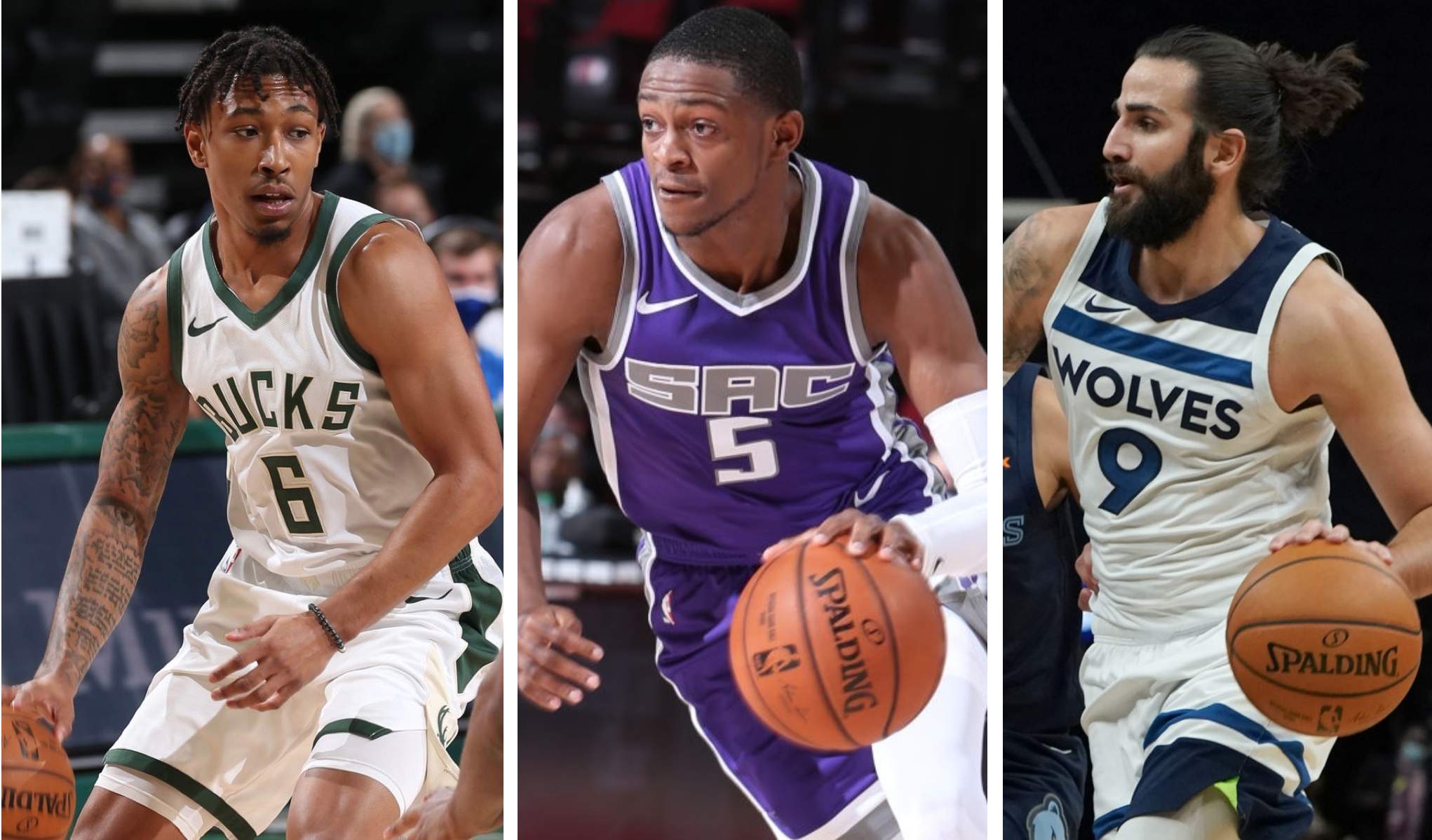
The 2020-21 NBA season tips off one week from today (I know, it’s crazy — feels like we were just crowning the Lakers), and preseason games have now begun. And lo and behold, those preseason contests have revealed something magnificent: Three teams — the Bucks, Kings, and Timberwolves — do not have advertisements on their uniforms!
I’m not sure how long it’s been since we last had three ad-free NBA teams. I do know the last time we had two such teams — that was almost exactly a year ago, on Dec. 17, 2019. The following day, the Pacers announced their ad deal with Motorola, which at the time left the Mavericks as the last ad-free team (a status they enjoyed for only one more month, as they struck their ad deal with Chime on Jan. 17).
These three teams — the Bucks, Kings, and Timberwolves — now have, by definition, the best uniforms in the NBA (yes, even though one of them wears purple). Let’s look at how they arrived at this blissfully ad-free state:
Bucks
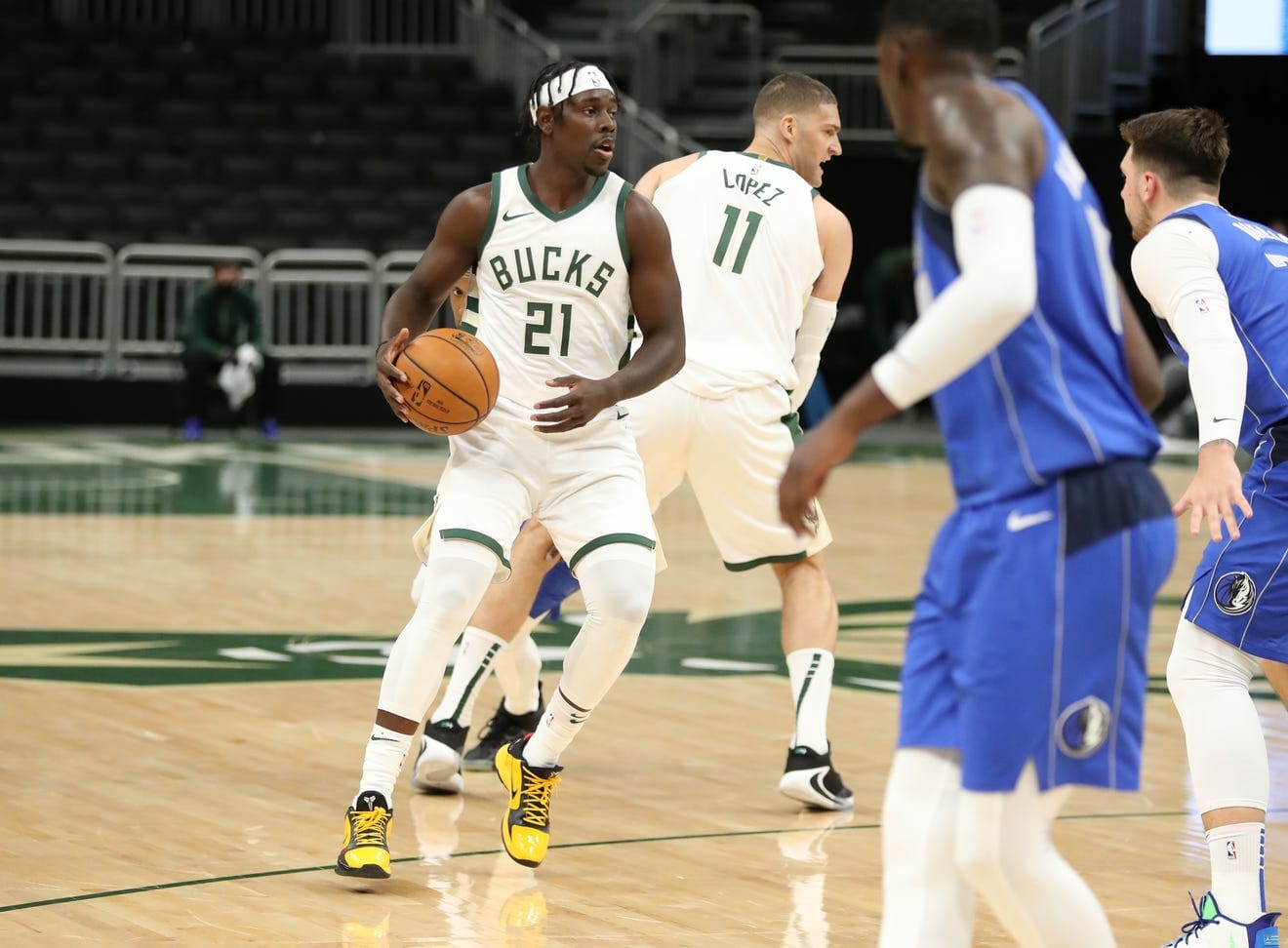
The Bucks agreed to sell space on their uniform to Harley-Davidson shortly before the start of the 2017-18 season (the first year ad patches were allowed) and have worn the motorcycle company’s logo for three seasons. I’ve heard many fans say that the deal was a “good fit” because Harley is headquartered in Milwaukee, but apparently the fit wasn’t good enough to maintain the ad deal.
Kings
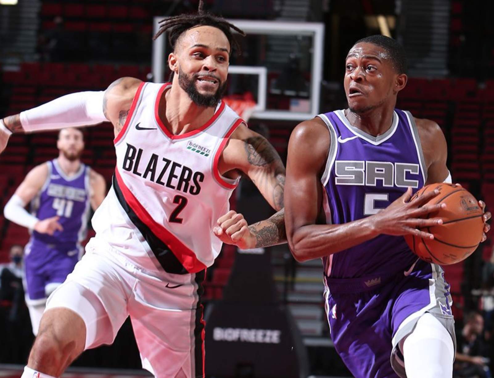
The Kings were the second NBA team to sell space on their uniform (following the 76ers). They were so eager to hop aboard the uni-advertising bandwagon that they announced their deal with Blue Diamond Almonds way back in October 2016 — a full year before they were permitted to wear the patch on the court! The patch deal, which ran for three seasons, has now expired and the team hasn’t yet found a replacement.
Timberwolves
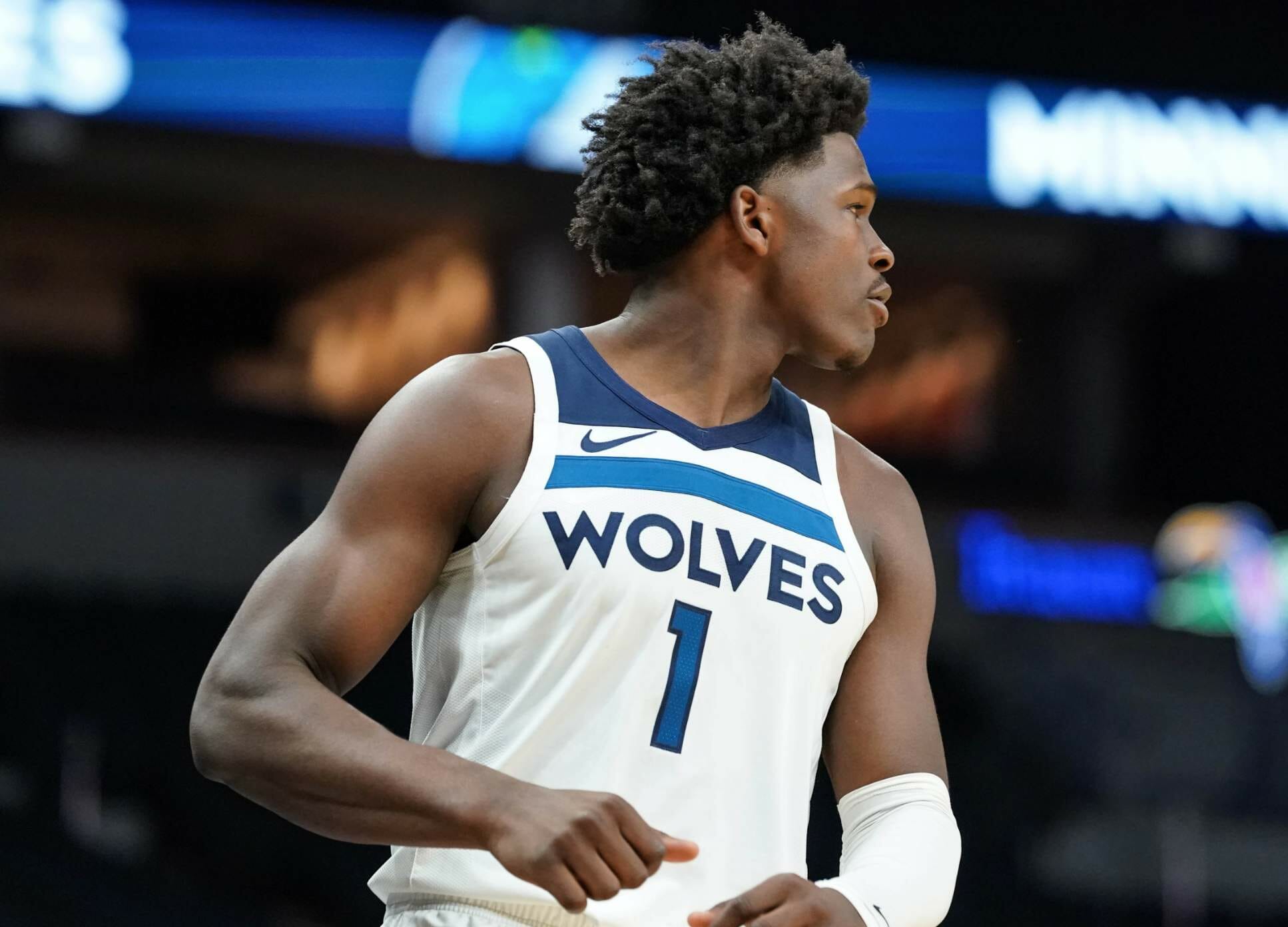
The T-Wolves have sold space on their uniform to Fitbit for three full seasons. Like all of the other NBA ad-patch deals, this one was touted as a natural partnership between two organizations that were perfectly suited for each other — so perfectly suited that the deal has now been allowed to expire three short years later. The team announced back in June that they’re seeking a new uni advertiser that will “be a champion for social advancement,” but apparently no such suitor has emerged.
The current Timberwolves uniform set was introduced at the same time the ad patch was added, so this is the first time these uniforms have been ad-free. It’s also worth noting that the Fitbit ad (as well as the Nike maker’s mark) fit rather neatly into Minnesota’s jersey design. If the team finds a new advertiser, will they insist on a horizontal patch, or will they just let any old shape be a splotch on their uniform?
———
So there you have it: the Ad-Free Three. Let’s enjoy them while we can, because they probably won’t stay ad-free for long.
One additional thought: I’m wondering if any of you out there looked at the photos in this entry and thought something like this: “It’s not that I like ad patches, exactly, but after seeing them on so many jerseys for a few years, I’ve gotten used to them, and now the ad-free jerseys look sort of empty, or even wrong, by comparison.” Anyone feeling that way?
To me, that’s part of why ad creep is so insidious. At first it seems like breach of boundaries, a violation of norms, but then you get inured to it, build up a resistance to it, until it seems like the new normal. That’s usually when the advertisers decide to push the boundaries a bit more.
———
Important update!: Reader/commenter Brian Hoss has reminded me of something I’d forgotten about, namely that the Rockets’ uni ad disappeared when last season transitioned to the Orlando bubble, and so far they haven’t replaced it:
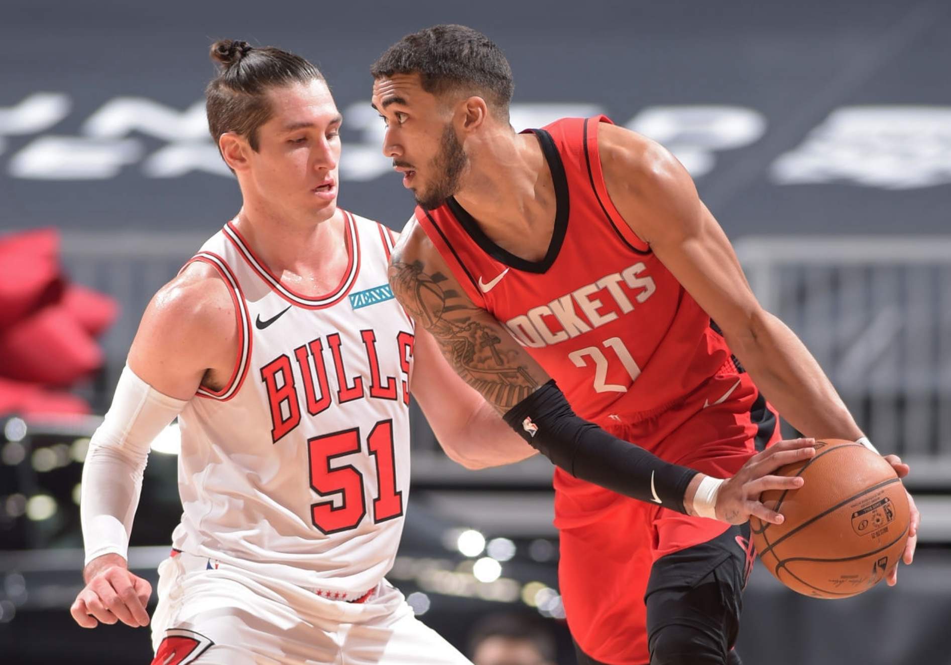
So the ad-free three are actually the ad-free four! Which doesn’t rhyme but is still better than three.
Cleveland update: The Cleveland MLB team yesterday confirmed that it will soon be changing its name. Yesterday’s announcement followed multiple reports on Sunday night that the decision to change the team’s identity had been made.
In a letter to the team’s fans, team president Paul Dolan said:
Our decision to change the current name is phase one of a multi-phased process. Future decisions, including the new name and brand development, are complex and will take time. … As we take the necessary time to determine a new name and brand, the team will continue using the Indians name and branding.
Although Dolan didn’t spell out a specific time frame, that passage seems to indicate that the team will still use the “Indians” name and uniforms in 2021, with a new identity likely to come in 2022.
A seam ripper can fix that: Odd situation last night for Browns running back Kareem Hunt, as the Nike maker’s mark on his pants was backwards (you can get a closer look here). I know we’ve occasionally seen this before on jersey sleeves, but I don’t recall a previous instance of it on the pants. Anyone..?
In that same game, I heard from several people who noticed that the Browns did not have a midfield logo:
LET'S
FREAKING
GOOOOOOOOOOOOOOOOOOO
Tune in: https://t.co/duomvuhT6t pic.twitter.com/fnjDgSOSlk
— Baltimore Ravens (@Ravens) December 15, 2020
I know the Browns have done this before (I mentioned it in a MMUW post back in 2017), but it’s not clear to me whether it’s their current default look for every game. Anyone..?
(My thanks to Danny Pedroza and Danny Kroll for spotting the backwards pants logo.)
Click to enlarge
Collector’s Corner
By Brinke Guthrie
Follow @brinkeguthrie
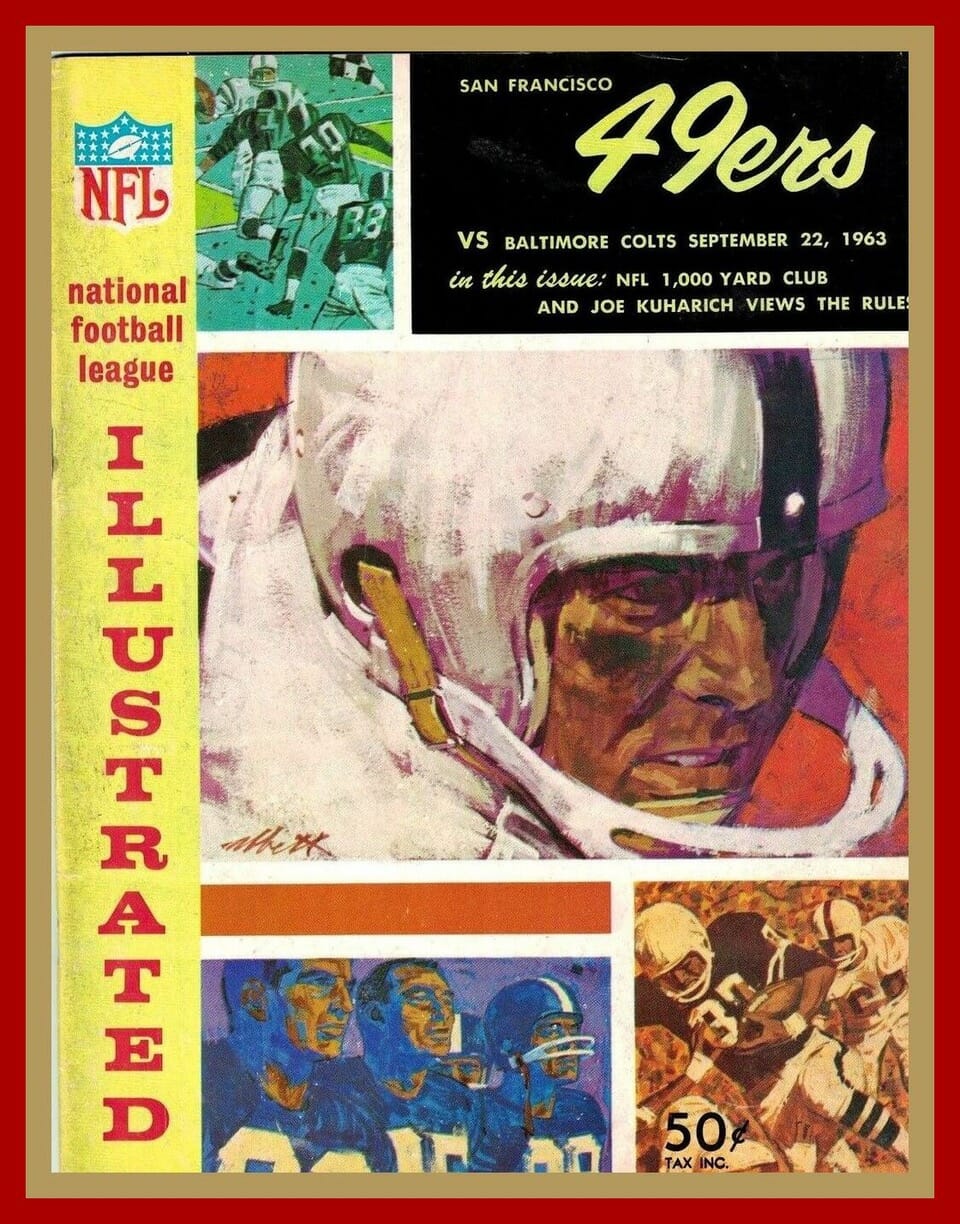
Leading off this week with this Colts/49ers game program from Sept. 22, 1963. No Niners or Colts artwork on the cover, just generic players. The Colts won that one, 20-14, with the game played at Kezar Stadium. And something I didn’t know — Kezar was the first home for the AFL Oakland Rayduhz. More on Kezar here. (And speaking of stadiums, check out this YouTube video showing paper versions of Kezar and Candlestick, along with the Niners’ current stadium.)
Now for the rest of this week’s picks:
• Here’s a 1970s Pittsburgh Penguins varsity jacket made by Holloway. The seller says there may be some glare on the photos, but if you look at the sleeves, I’m not sure if that’s glare or just discoloration.
• One more Pittsburgh item: This seller is selling three Pirates items — a comb, bike reflector, and pencil. The pencil package says “Root N Write.”
• Every tailgate party chef needs a chef’s hat. This one from the 1960s says “Family Circle/NFL Tailgate Party.” (Maybe next year we can finally have tailgate gatherings again.)
• This 1970s MLB Standings Board comes with 21 team magnets! I never had the board but those magnets were all over our family fridge.
• So what do you do if you’re putting a team helmet on a matchbook cover? You just leave off the facemask so it fits, as they did for this Miami Dolphins matchbook.
• This pair of 1969 New York Mets mugs would look truly amazin’ at Uni Watch HQ.
• This 1970s Seattle Mariners vinyl jacket was a stadium giveaway sponsored by Godfather’s Pizza.
• The seller of this 1970s Philadelphia Eagles sideline jacket made by Champion says it’s “game worn.” They don’t offer any proof of that, though.
• Here’s a poster celebrating the NBAs 35th Anniversary. It includes team logos and players/coaches from the league’s history up to that point.
Got an item to include on Collector’s Corner? Tweet submissions to @brinkeguthrie.
Click to enlarge
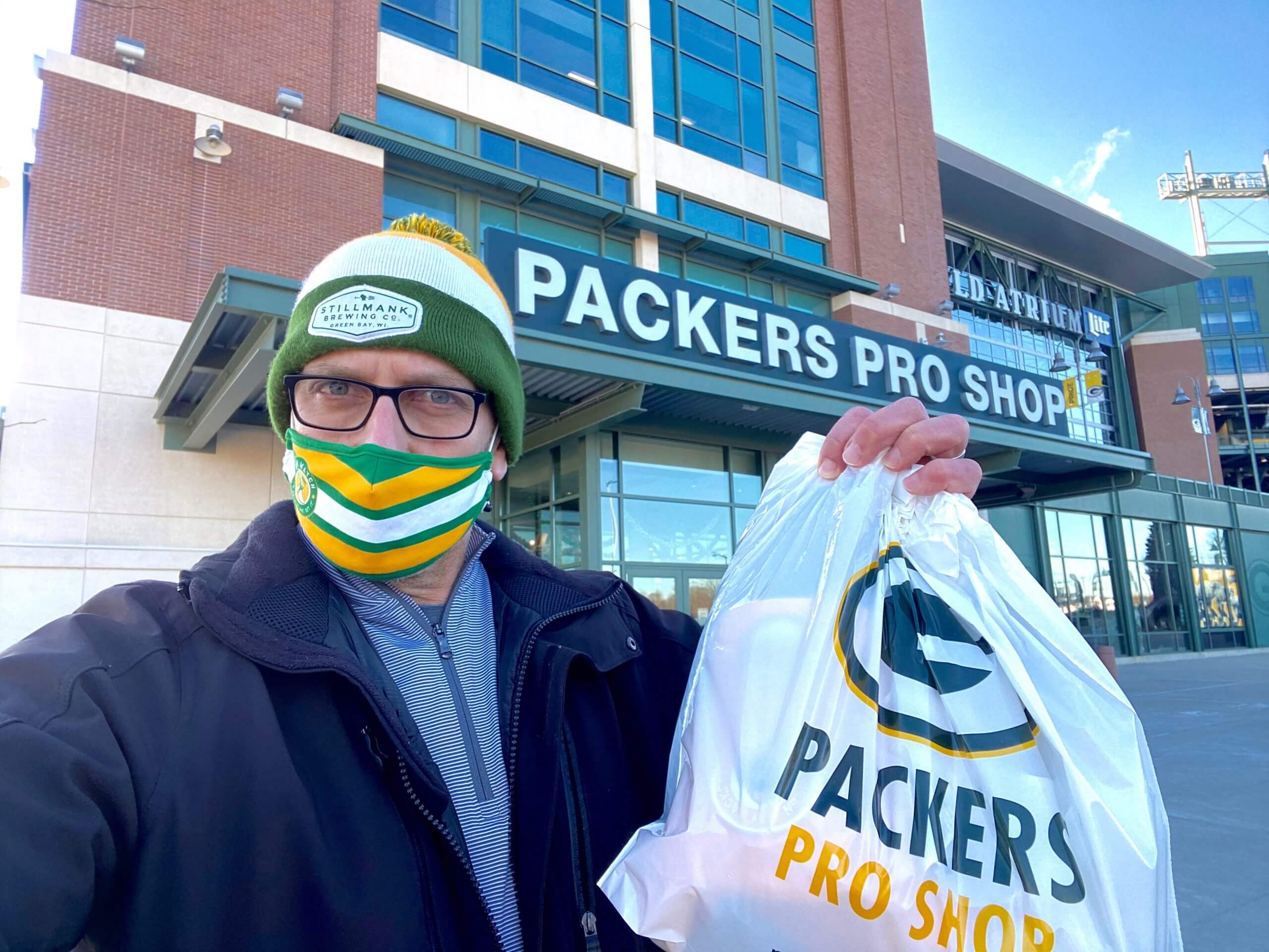
Matching colors: Who was that wearing a Uni Watch mask at the Packers Pro Shop at Lambeau Field yesterday? None other than longtime Uni Watch reader Kurt Rozek, who lives in Green Bay.
“I was in the shop for about 30 seconds before a woman asked me where I had purchased my mask,” he says. “I had to explain to her that it wasn’t a Packers mask.”

Click to enlarge
Collect ’em all: Over the past 10 days or so, I’ve been reminding everyone that if you collected all 12 of this year’s Uni Watch Pin Club releases, you’re eligible for a free Pin Club All-Star bonus pin. A whopping 110 of you sent documentation that you collected ’em all, so those people will be getting the bonus pin, which should mail out toward the end of January.
It was interesting to see all the photos of people’s pin collections. Some people just gathered their pins in a random pile and took a photo; others still kept the pins in their little zip-lock plastic baggies; and others had more elaborate displays (including Bill Hetrick, whose collection is shown above — perhaps he should change his surname from Hetrick to Hat Trick!).
Anyway: I thought it would be fun to share the photos of the more display-y presentations, so I gathered those photos into a Flickr set. You can see them here. (In some cases, there are only 11 pins in the photo because the person had ordered but not yet received the December pin.)
Big thanks to everyone who helped make the Pin Club such a success. Designer/collaborator Todd Radom and I are looking forward to continuing the project in 2021, and I think you’ll like the designs we have in store — stay tuned.
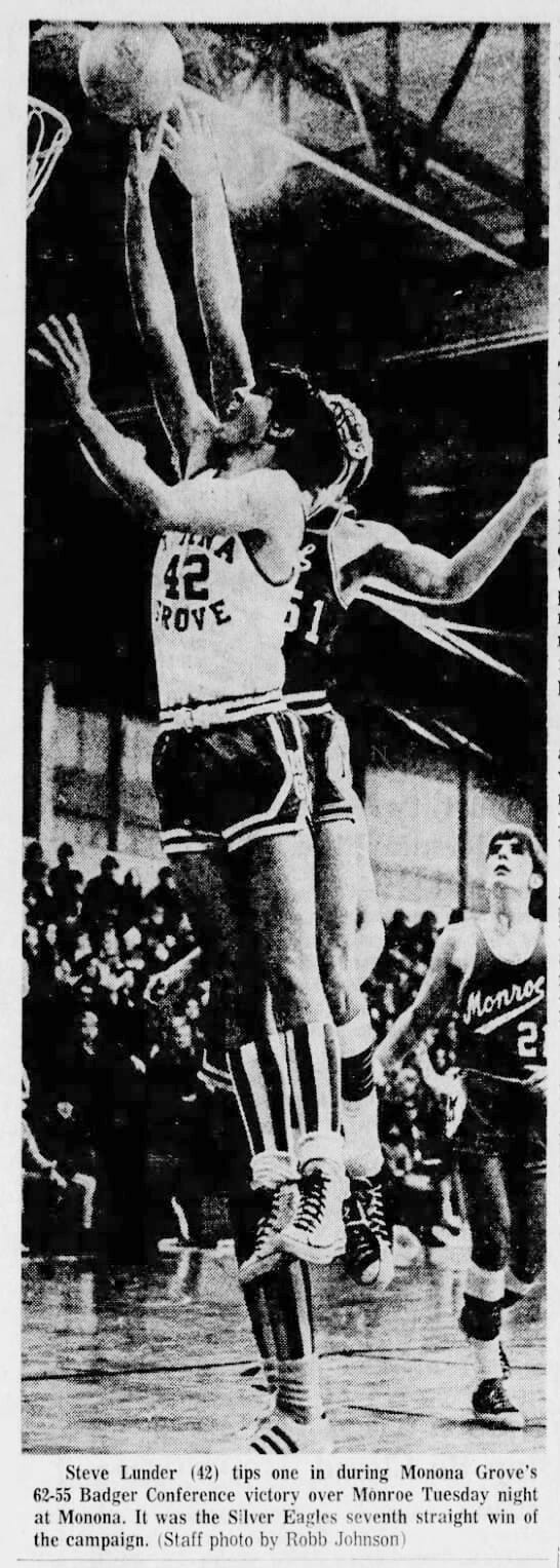
Too good for the Ticker: I do love me some vertically striped socks — and if they’re accompanied by contrasting jersey/shorts combo, even better! That’s Monona Grove High School in Wisconsin, from a game that took place exactly 50 years ago today — Dec. 15, 1970.
“Monona Grove’s colors were royal blue, grey, and white, so I’m guessing the socks were white and royal blue,” says Jeff Ash, who sent the photo. Now we just need to find some color pics from that era.
The Ticker
By Alex Hider

Baseball News: This baseball print, made by North Carolina artist William Meade Prince, is part of a collection at UNC’s art museum (from James Gilbert). … Alejandro Areces, the artist who reimagined the Orioles’ logo for every other MLB team, is holding a bracket-style tournament to determine the best version. … East Central College, a JuCo in Missouri, has sold the naming rights to its baseball stadium to a fast food chain (from Jerome Peirick).

Pro Football News: Titans WR A.J. Brown wore the jersey of his idol, Falcons WR Julio Jones, before Tennessee’s game against Jacksonville on Sunday (from Mike Chamernik). … Also from Mike: Browns Vice President J.W. Johnson told a local radio station that the team won’t be adding orange jerseys to their rotation “for a while.” … Aaron Pinto found a Super Bowl LIV toque on sale, but it didn’t have the logo for the Chiefs or 49ers — the spot for a team logo was left blank. … This graphic shows the uniform of every Winnipeg Blue Bombers QB since 1946 (from Andreas Papadopoulos).
College Football News: Here’s a look at the history of Troy’s football stadiums. … Ashland Blazer High School in Kentucky has a long history of poaching Arizona’s logo, but with their team headed to the state finals, the school commissioned these masks that appear to be inspired by Arkansas State’s logo (from M. Brinston Berry). … Minnesota’s football stadium will be getting a new name thanks to a corporate merger.

Hockey News: The Canadiens have published a step-by-step guide for building your own outdoor rink (from Mike Chamernik). … About 4,000 seats have been removed from the Palace of Auburn Hills and are being installed at the OHL’s Flint Firebirds’ arena (from Brian Weingartz).

NBA News: T-Wolves F Rondae Hollis-Jefferson has been wearing a mask — no, not a Covid mask, but plastic face guard — during preseason action. … Former NBA player Rex Chapman shared photos of the shorts he wore at Apollo High School in Kentucky in the early ’80s — and they included belted shorts! (thanks to all who shared).

College Hoops: The entirety of the NCAA women’s basketball tournament will take place in San Antonio this year. … New uniforms for the University of Northern British Columbia men’s and women’s teams (from Wade Heidt).

Soccer News: Scottish club Heart of Midlothian will wear shirts supporting the charity Tiny Changes for the second time before the final of last season’s Scottish Cup next weekend (from our own Jamie Rathjen). … At the 2006 World Cup, Spike Lee covered up the Adidas logo on his France jersey and replaced it with an oversized Nike logo (from Lucas Shanks). … New official ball design for the J-League.

Grab Bag: India’s army is getting new uniforms (from Kary Klismet). … FIVB released the logos for the 2022 Volleyball World Championships (from Jeremy Brahm). … The New York City Transit Museum is selling a clever Hanukkah card with a subway map-themed design (from @ohhhsourry). … Several Pennsylvania election officials were wearing masks with the state seal during the state’s Electoral College vote yesterday (from Max Mersinger). … Sporting News is being sold to a Hong Kong investment firm.

Those mascot logos are the best. His work is amazing.
I came here to say the same thing. I love the concept.
“This graphic shows the uniform of every Winnipeg Blue Bombers QB since the team’s inception in 1946.”
The graphic just shows every QB since 1946. The team’s inception was 1930.
Thanks, Wade. Now fixed.
Good edit. Thanks!
A little jolting to see CFL quarterback numbers in the 80s. Even more than seeing modern NFL wide receivers (in the post-Harold Carmichael era, naturally!) with numbers in the 10s, I guess.
Browns have used a stripe design at the 50 yd line this season in lieu of a midfield logo. It’s a nice clean look!
That flickr set of photos of everybody’s pin collection may be my favorite thing I’ve seen on UW.
Browns were logo free all of last year as well. I seem to recall it was a throwback to the 80s and Municipal Stadium, including the script “Browns” wordmark in the endzones.
Pretty sure the Houston Rockets don’t have an ad partner for their jerseys. It disappeared for the bubble and hasn’t returned this preseason or in the city jersey reveal. I’m sure they’ll get one ASAP, but might have to wait until next off-season.
You’re right! Forgot about them.
I’ll add that to the text.
Technical issue: the link to the video of the paper San Francisco stadiums in Collector’s Corner isn’t working.
Fixed. Here’s the proper link so you don’t have to scroll back up:
link
Pretty cool to see so many of you guys utilizing my template for the Pin Club!
The name’s “Blake” btw Paul.
Sorry for that typo, Blake. Now fixed!
No worries. Thanks!
I wondered where that came from when I was scrolling through and sorta figured it was a member that shared the template with the whole group. Nice work on that and a great idea.
It seems to me like Cleveland wants to avoid being the Cleveland Baseball Team in 2021, as if that’s somehow worse than their current nickname.
Related to that thought, I have no idea why announcers, during games and highlight packages, keep calling them the full Washington Football Team name instead of just Washington. I know it’s currently their official team “nickname” but we know darn well that they’re a football team. Why keep repeating it? I find it annoying as hell.
It is annoying. But since it’s the official name (this year, anyway) of Washington NFL Football, does it take on a proprietary quality? In other words, does it mean the other 31 clubs are *not* football teams? Also, if the Giants’ nickname is the “G-Men” and the Cowboys’ is the “Pokes”, does Washington have a similar nickname that they can get some use out of?
Because it doesn’t fit the pattern for North American sports, which is, “The [CITY/STATE/REGIONAL IDENTIFIER][NICKNAME].” The cadence is disrupted when a team doesn’t have a nickname. And so that’s how they’re known this year.
Not that I agree with any of the following reasons, but my guess would be:
1. They already have a ton of Indians merchandise to sell;
1a. They don’t want to spend the money to design, manufacture and sell a similar amount of merchandise with a transitional name/”CLEVELAND BASEBALL ORGANIZATION” design;
2. It hurts brand awareness to have to make 2 changes. They’ve been the Indians for over 100 years, they will change after 2021 to a new nickname. One change is easier (in their minds) than an intermediate step;
3. It makes it less of an ongoing issue. They are the Indians until they aren’t. The alternative would be repeatedly having to discuss the minutiae of the nickname change for months or even years if a placeholder name is used;
3a. It hurts brand awareness (ugh)(yuk) when your name changes multiple times in a short period of time;
4. It gives them a chance to send the name out with some degree of whatever fanfare they feel they must;
5. The name has been unpopular for at least a decade or 2. They’ve acknowledged it is past time for a change. One more season isn’t going to change either of the first 2 sentences in this paragraph.
Wow, pretty awesome to see all those pins from all those offices, dens, man-caves (or is the plural men-cave or mans-cave?) I only bought one for my first Uni-Watch purchase and feel like such a quitter! Next year…
Keep up the community building work!
I have enjoyed seeing some of the NBA preseason on the tube this year. Due to teams wearing their “normal” uniforms during this preseason. Rather than all the crazy alternates that do not look like they belong as a team’s uniform.
Breath of fresh air seeing the Bucks without that HD patch.
But then Giannis signs supermax and his posts are all with the HD logo – free advertising!
As a long-time employee of General Electric, I always found it jarring to see the GE monogram on the Celtics uniform. It’s arguably more recognizable than any element of the uniform itself, certainly globally. Now the advertiser is Vistaprint, so now just another bit of clutter. But more to your point, clutter creep is noticeable. Otherwise traditional Notre Dame will have four patches (five for captains) for the ACC championship game this weekend. You would have aesthetically numb not to find that unpleasant.
I just don’t get the logic of “we know our nickname is bad, but we’re gonna use it for one more year”. Doesn’t make sense…
Makes a bit of sense to me.
Perhaps, aside from all the legal filings and design considerations, they realize it takes time to manufacture (then switch out) things like large-scale stadium signage and to sell-through Indians-branded clothing inventory.
In a related matter…I wonder how well/poorly Washington Football Team merchandise is selling as compared to their former identity’s position in the marketplace.
This way they can switch seamlessly from making money off their current identity to making money off their old one, without any WFT-style interruption.
Based on the limited knowledge I have from DC (listening to the Tony Kornheiser Podcast), the people of DC like being the Football Team. It’s quirky, but they like the “W” logo and the name is unique.
Good for them. I think the “W” is ridiculous and hasty.
Here’s a poster celebrating the NBAs 35th Anniversary. It includes team logos and players/coaches from the league’s history up to that point.
I have that poster (Lord only knows how many my brother has at his place…).
Mine is less than mint condition. I’ll sell for half what the eBay guy is asking.
While I admittedly don’t watch much NBA, I was surprised to come to the realization that I don’t know who the advertisers are for most NBA teams. Meaning that the advertiser hasn’t become synonymous with the team in most cases. I know the Lakers have Wish (which might only be because of the feature about the LeBron Time cover last week on this site), and that the Clippers have Bumble. I didn’t even remember that the Celtics had GE until reading these comments.
All of which goes to support why we may be seeing a decrease in uniform advertising. We all remember the stadium naming wrongs, but these patches don’t seem to have had the same long-term impact on our consciousness.
I would love to believe that’s true, because if the NBA ad patch program is seen as a failure it might stop this experiment before it spreads to baseball.
But in Harley’s case, the decision not to renew is probably less about this specific deal that it is about link.
I’m wondering if any of you out there looked at the photos in this entry and thought something like this: “It’s not that I like ad patches, exactly, but after seeing them on so many jerseys for a few years, I’ve gotten used to them, and now the ad-free jerseys look sort of empty, or even wrong, by comparison.” Anyone feeling that way?
Nope.
Not. At. All.
Ads are still jarring to me…yes, even on European soccer jerseys. When I see a team without them it feels as if there’s still hope for the uni-verse.
This! Couldn’t agree more! Even on soccer jerseys! I can’t get over how much better national teams’ soccer uniforms look without the advertising on them when compared to their club counterparts. I will never get used to ads on any uniform – in the NBA, in soccer, on baseball uniforms – anywhere! They will always look out of place to me.
European club soccer jerseys are now basically advertising sandwich boards. I am an Arsenal fan, and their jersey is beyond hope. It has the small club crest on the left breast, the adidas mark on the right breast, Emirates airlines as the main chest ad and Visit Rwanda on the left sleeve. Also, some alternates incorporate the adidas three stripes. It looks like a subway car. But nothing beats Minnesota United (with what?) of the MLS who literally wear a target on their chest. That’s generally not advisable.
Completely agree. I find the uniforms without ads to be refreshing, not awkward or empty.
I enjoy Alejandro’s reimagined logos. I’d like to see Cleveland go with a similar cartoon logo to that of the Orioles/Chief Wahoo (w/out the Native American imagery of course). I don’t want MLB looking like the minors but there’s room for one more.
The Blue Jays logo would look even better if the hat said BJ’s!
I’m not at all sorry to see the Bucks’ ad patch go, but it’s part of a concerning trend from Harley-Davidson, which is link.
Always bad when crucial local companies start scaling back. I would instead hope that they’d put the ad patch money into something else in town.
Re: Too good for the ticker.
Think y’all would enjoy this…the team Monona Grove is playing in that picture is Monroe. Their mascot?
The Cheesemakers
Very cool! And their costumed mascot appears to be a mouse, which is a cute idea:
link
Also, the uniforms they’re wearing in the photo from the Too Good for the Ticker item are not too shabby themselves, with the diagonally oriented script lettering across the front, the diamond panels on the sides of the shorts, and what look like color-blocked socks.
Blessed are the Cheesemakers
Better keep listening, there may be a bit about “blessed are the Big-Noses.”
I love that movie!
Really enjoyed the pin collection pics! Thanks Paul
Some vintage corporate logos are works of art, but that doesn’t mean I want to see them on a sports uniform. The two occupy separate and discrete worlds.
That being said, if a gun were put to my head, I’d opt to put the Sinclair Brontosaurus on my NBA team’s jersey
If you were to offer some of the pins as golf ballmarkers, without the post I would be interested in buying a few.
It’s really striking how bad the ad patches look when juxtaposed with an ad-free opponent as in the Blazers-Kings and Bulls-Rockets photos.
Yeah, I tried to find photos that showed precisely that.
Paul,
I still notice the ad patches. Keep in mind, I absolutely hate them, even the “natural matches” of companies that are in the same area or companies that I use their products. I especially hate the patches that are a logo on a patch that is then ironed on (or pressed) onto the jersey. If you’re spending millions of dollars, have it sewn on directly or screen printed directly so it looks better than Chico’s Bail Bonds.
I’ve also come to hate that every team has a giant ad to the side of the key on the court. This stands out even more than the patches, because I only see the patches on close ups, but that giant ad on the court is obnoxious.
People like to make the soccer comparison, “They have ads on their jerseys” but when I turn on the Premier League, the pitch is solid green. There may be ad boards along the perimeter, but the field itself is clean. When I see a soccer league with ads on the field of play, it looks low rent, like this obviously is not the highest level of play, they NEED to have ads on the field.
When the NBA court is starting to become a billboard, it feels like it is becoming a low rent league, where they need the money.
Re: Your note about Kurt Rozek’s Uni Watch mask while in Green Bay. When I’m wearing my Uni Watch mask I’ve had friends and co-workers mistake it for a Packers mask too. (I’m a passionate Broncos fan)
So, I look it as an opportunity to educate them on what “Uni Watch” is all about!
Spreading the Uni Watch gospel! Love it!
Well, apparently not having an ad patch has kept the Bucks from keeping Giannis.
Cleveland Football Team
In case anyone’s noticed, yes the border colors around today’s CC feature photo are indeed the correct HTML code colors for the 49ers.
Nice touch! B^)
Pretty funny to see that Dolphins matchbook schedule with 6 pre-season and 14 regular season games. That, and the breakdown of the schedule – 8 division, 3 conference, and 3 non conference games.
It’s crazy that they used to play that many preseason games. I think the teams that went to Canton for the HOF game actually played seven.
I can’t wait to see tomorrow’s Pandemic Porch photo, what with a Nor’easter blowing in.