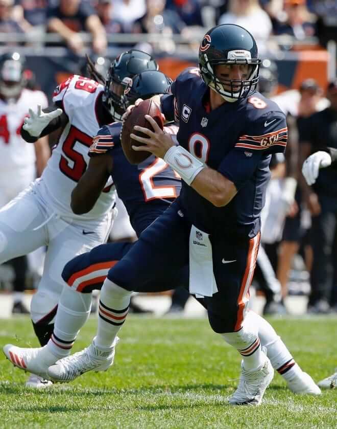
The NFL season kicked off in earnest yesterday, which means it’s time for our first Monday Morning Uni Watch report of the season. As you can see above, the big surprise of the day was in Chicago, where the Bears came out in mono-navy. Contrary to what some observers said, this was not the same as their Thursday-night uniform, because that uni has dark socks. Prior to yesterday, they had gone mono-navy with white socks only twice: in 2006 and 2002 (both times against the Packers). Additional photos from yesterday’s game here.
In other news from around the league yesterday:
• In a move that was widely expected, the Texans added a helmet decal for Hurricane Harvey relief:
The #texans will wear this decal on their helmets for the duration of the season. #NFL #HoustonStrong pic.twitter.com/SapJYwLSti
— James Palmer (@JamesPalmerTV) September 10, 2017
• The Steelers wore their Dan Rooney memorial patch for the first time. The design had been unveiled back in July, but the team didn’t wear the patch during the preseason (click to enlarge):
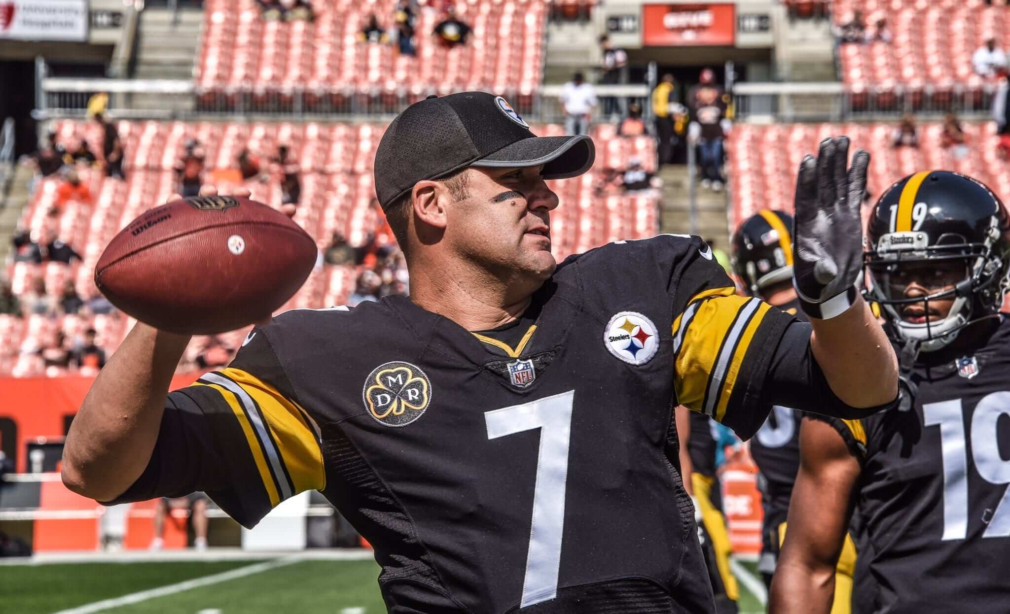
• If you look again at that photo, it appears that Ben Roethlisberger was wearing the odd hybrid jersey. The collar looks like the new template, but the jersey has seams like the ones from the old template. Weird.
• In a related development, three Bills offensive linemen — guard Richie Incognito, center Eric Wood, and tackle Cordy Glenn — wore old jerseys with the full collar striping (click first photo to enlarge):
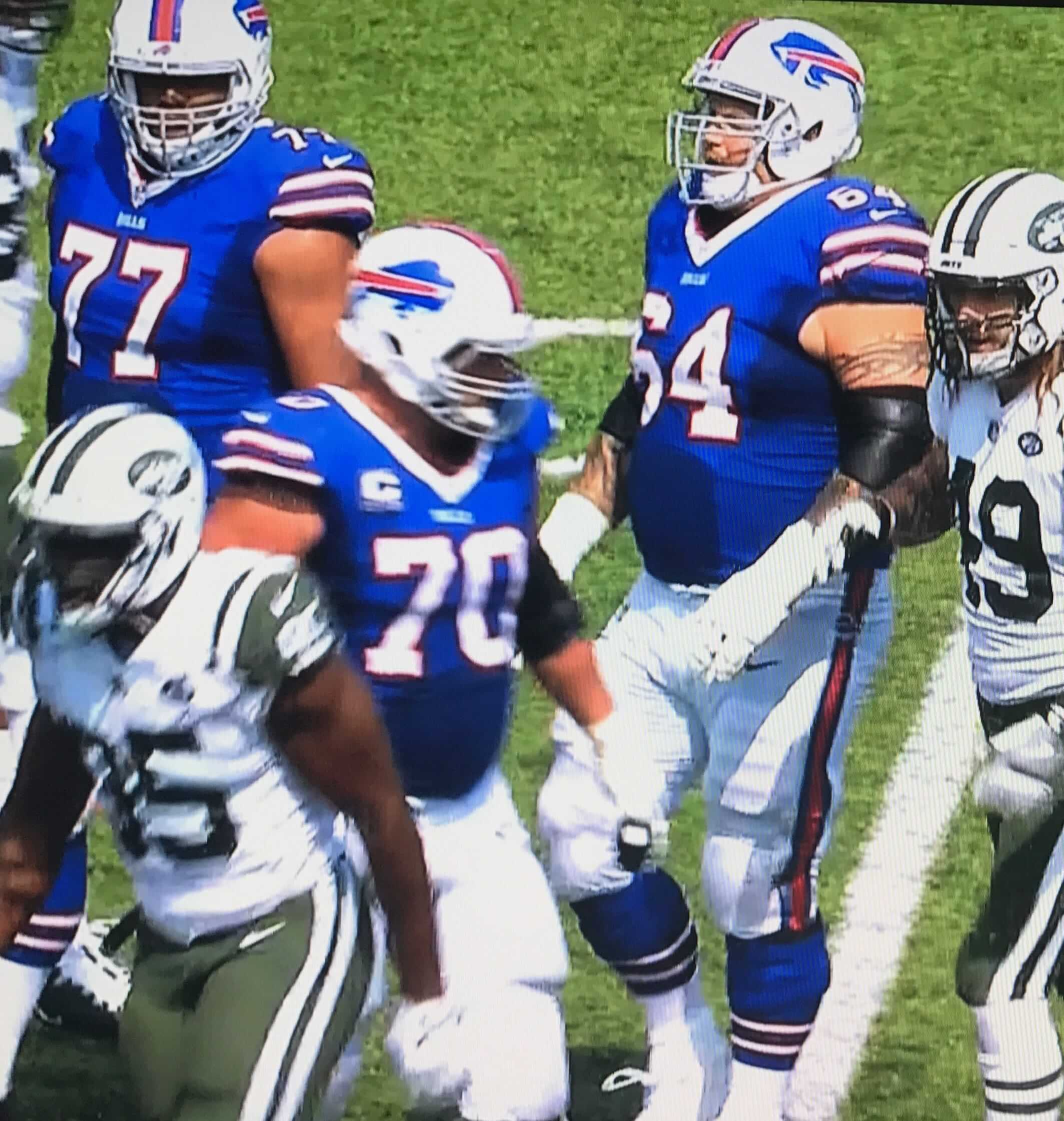
At least one of those players — Incognito — also appeared to have some aftermarket modifications made to his sleeves, with some sort of laces inserted into the sleeve cuffs (click to enlarge):

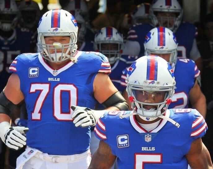
• As you can see from some of those earlier photos, the Bills wore captaincy patches. First time in a while they’ve done that — they had stopped wearing them during the Rex Ryan coaching era.
• And speaking of captaincy patches, the Eagles wore them too, I’m pretty sure for the first time ever.
• The Browns unveiled a new field design, with really nice retro-styled end zone scripts and, surprisingly, no midfield logo (here’s how it looked last year; click to enlarge):
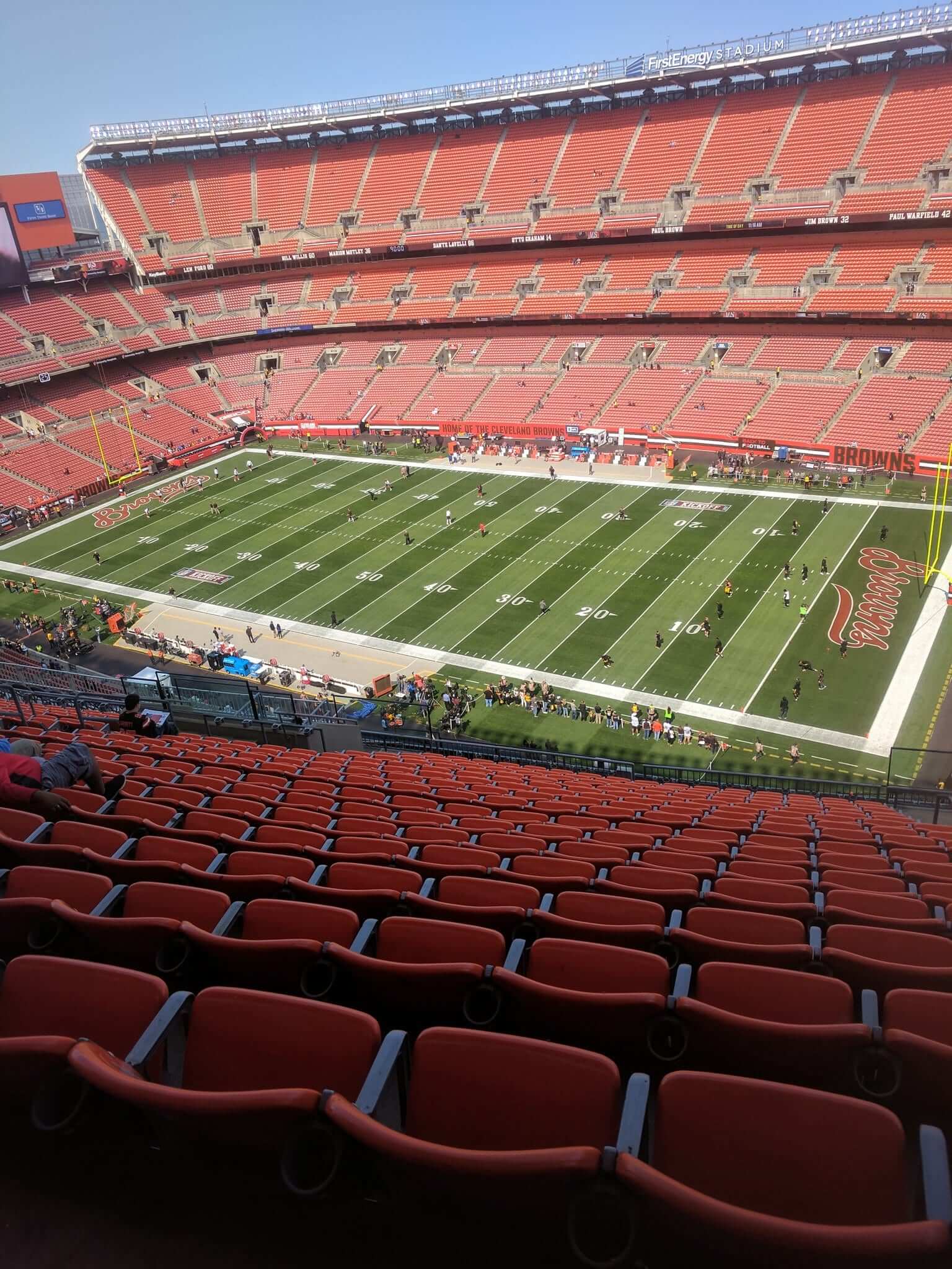
• The Browns also have a new signature for the Dawg Pound.
• Speaking of fields, the Colts/Rams game looked like it was being played on a hybrid NFL/NCAA gridiron. Obviously, USC plays there as well, but it’s surprising to see the college graphics still so visible:
TRUUUUUUUU #INDvsLA pic.twitter.com/0TiJbQmMzQ
— Los Angeles Rams (@RamsNFL) September 10, 2017
• Colts tight end Jack Doyle appeared to be missing the maker’s mark on his left jersey sleeve.
• The Packers had some serious color-inconsistency issues with their socks.
• Not sure if this was already noted at some point during the preseason, but Seahawks wideout Paul Richardson is going with JrOB this year. He didn’t have it last season.
• Halle-freakin’-lujah: The Cowboys are finally cutting the striping tape on their SpeedFlex helmets.
The Cowboys equipment guys finally caught up w other NFL, NCAA & Pop Warner teams by cutting the stripe around the impact flex pad! #victory pic.twitter.com/YfxWuUL3aX
— Craig Miller (@junior_miller) September 11, 2017
The funny thing about that is that they were still running the stripe across the flex-panel gap throughout the preseason. Odd that they changed now.
• Six teams wore white at home: the Texans (they always wear white for their home opener), Bengals, Titans, Browns, Rams, and, of course, the Cowboys.
• Here’s a list of players who protested during the national anthem. Additional info here.
• I’ve decided not to list postgame jersey swaps this season. So many players are now doing it, it got to be overwhelming, and I got the impression that not many readers cared one way or the other. Thanks for understanding.
And that wraps us up for Week 1. It’s like riding a bike, right?
(My thanks to all contributors, including Mike Chamernik, Kyle Good, Rok Grilec, James Gilbert, Jared Grubbs, Robert Hayes, Steve Lega, Pat Quinn, James Riley, Spencer Seaner, and Justin Zayid.)
Raffle reminder: I’m currently raffling off some cool Hartford Whalers memorabilia. Full details here.
The Ticker
By Alex Hider

Baseball News: Today is Sept. 11, but only 16 of the 30 MLB teams are playing today, so teams wore American flag cap patches yesterday (with the New Era maker’s mark moved over to the other side). The teams that are playing today will wear the caps again today. … The Blue Jays’ caps had the Canadian flag alongside the American flag. … The Mets have been wearing first responder caps during pregame warm-ups for the past couple of days. … USA Baseball’s 18U team has some spiffy-looking stirrups (from Nick Lineback).

Pro Football News: The Bengals released their jersey schedule just before kickoff yesterday. … Panthers LB Luke Kuechly reportedly has been wearing a “Q Collar” on the field. It’s a device that helps detect concussions (from James Gilbert). … Marc-Louis Paprzyca made some modifications to his Jay Cutler jersey. Kevin Butler was a member of the 1985 Super Bowl champion Bears. … Anyone in the market for a Cowboys/Vikings frankenjersey? (From Rick Glover). … Erik Gamborg found this shirt with a white Chiefs helmet, that includes one random red facemask bar. … Good story on the issues that CFL equipment managers deal with week in and week out (from Ted Arnold).
College/High School Football News: College football name of the year goes to Eastern Michigan DL Lion King. Yes, that’s really his name. Even better? He goes FNOB (from Michael Lipinski). … Latheron “LA” Rogers-Anderson of Western Kentucky wears “LA” on his NOB, which also includes a hyphen (from Bryan Fyalkowski). … Colorado has been wearing a pair of helmet decals this season. One commemorates the 50th anniversary of the running of Ralphie, the live buffalo that stampedes into the stadium each game. The other is a memorial decal for Rahsaan Salaam, whose number will be retired later this year (from Ron Ruelle). … Youngstown State will wear camo jerseys on Nov. 18 on (from Robert Hayes). … New Hampshire has been wearing ’80s/’90s-era logos on their helmets this uear (from David Bailey). … Reader John Michael Williams designed a pair of memorial decals for his alma mater, Mayfield High School in Kentucky. … Someone whipped up a BFBS West Virginia concept (from Mamba Gunna).

Soccer News: Club Universidad Nacional of Liga MX went “big logo” yesterday against Tijuana (from Ed Zelaski). … New kits for San Diego State (from Maximiliano). … New third kit for Roma (from Matthew Klimberg).

Grab Bag: Reader David Firestone is talking US Open tennis balls and toss coins over on his blog. … Ray Hund sent along this collection of “Celebrate the Century” stamps. Released in 1998, they include iconic moments from the 20th Century. … Wade Heidt took these photos from the 2017 Mann Cup — the senior men’s lacrosse championship of Canada. The teams — the New Westminster Salmonbellies and the Peterborough Lakers — both use similar shades of red and blue, making the game look like an inter-squad scrimmage. … Girls in Western Australia have gained the right to wear pants or shorts to school.
I know lots of folks are going to rag on the Bears’ all-navy look, but I didn’t mind it at all…as an occasional variation.
It’s not horrible, but to me, it just doesn’t look “right”.
Agree completely. And that Cutler-to-Butler tape job looks flawless, even with close scrutiny.
It’s a mishmash. Part of the glory of the Bears two classic uniforms is that sleeve stripes match sock stripes. So the road socks with the home jersey doesn’t quite seem right. I sort of works when the team originally went all white but it seems off here a bit.
Also the white cleats are the worst.
Thank you!! I utterly despise the Bears white cleats. With their dark uniforms iltney look like crap.
Thank you!! I utterly despise the Bears white cleats. With their dark uniforms they look like crap.
It’s completely wrong, I’m a GB fan, but can respect the Bears uniforms when they wear them the “normal” way. The blue over white rates high in my opinion of NFL uniforms.
If memory serves, the Bears used to have an orange sock with an inverse pattern of the home sleeve stripes. That would pair well with the blue pants.
Actually, based on the GUD, the Bears have never worn orange socks.
link
Proofreading:
“the issues that CFL equipment managers week in and week out”
Fixed.
UNAM Pumas have been going “big logo” since 1973…
Except in the 00-01 season when they went small logo and had a lot of backlash because of that.
link
Forgot to add a link to that season’s jersey
“Club Universitad Nacional” is an interesting way to list the club as well…
The Lions silver numbers are almost impossible to read on their jerseys. The numbers are too small, they should go to the 1970’s sized silver numbers
It amused me that the Cardinals had a funky uniform design but traditional block numbers, while the Lions had a (largely) traditional uni design but with funky numbers.
I wasn’t necessarily paying attention to the numbers much, but I didn’t seem to have any issue reading them when I did. Still, I just don’t find them appealing to look at.
Agreed. I too found the numbers legible enough, but I think they look strange. Not sure if it’s the font or the silver.
Another change re: Cleveland Browns is that they included advertising logos on the ring of honor for hall of fame players. I think that’s kind of crappy, but that’s just me.
It’s not just you.
but guys, this helps the owner keeps ticket prices affordable!
The Rams sharing LA Memorial Coliseum with USC is much easier on the eyes now; at least the gridiron is in the same place for both teams. I’ve seen old photos and old highlight films that would show one team playing, and you could see the field markings for the other team. I think this was to allow for the differences in goalpost placements for college and pro teams, or to accommodate larger crowds for one team over the other.
100% AGREE….Plus the thing I love about LA Coliseum, is that there’s so much sunlight, the old stadiums have it, Oakland is the same way.
However, the bleed through of the SC colors, different hash marks made that game difficult on the eyes.
Yeah, but that’s what you get with SC on saturday night, then Rams on Sunday afternoon
Exactly. Didn’t the Paul realize that the USC game ended around 8:30 pm, which meant that the field wasn’t cleared probably until 9:30 pm, which didn’t leave the field crew that much time to convert a college field to a pro field. That’s what you get with a natural field.
Those USA Baseball stirrups have the logo stitched on the upper calf region, while this picture has them stitched in the traditional “side ankle” location (which I prefer!). I’ve already asked…they are not available for retail sale.
link
Re: Mann Cup Grab Bag item I submitted. Wanted to clarify I did not take the photos myself. The photo of the game with the Lakers wearing their blue jerseys is from the Peterborough Examiner. The photo of the game with the Salmonbellies wearing their red jerseys is from their team website.
Considering the USC game was Saturday night, and the turnaround for the Coliseum was less than 24 hours, I’m not surprised all of the college markings were so visible.
Here’s a bit of a research question that I’ve been wondering about but don’t even know where to begin: how many top division teams in European soccer don’t have a jersey advertisement these days? Every once in a while, I see a team without one, but they’re few and far between. I know AS Roma doesn’t have one. Anyone know of any others?
I know they’re not European, but Chivas de Guadalajara of Liga MX went no chest advertisement this season. I don’t know off the top of my head if they are the only ones, but I know that it is very rare in Mexico as well for the top division teams to not have chest advertisements.
One other bit about the Bears in all blue, it’s also the first time the Bears have worn that look in the day. The other three times they’d gone mono-navy were night games against the Packers. I suppose it makes for better color balance.
With the Rams in white horns and white uniforms at home, yesterday’s game had vintage 1968 feel alongside Colts traditional uniforms.
Surprised Michael Bennett tucking sleeves into his shoulders to extreme not mentioned. How much longer before NFL jerseys begin to resemble Aussie football?
Surprised Michael Bennett tucking sleeves into his shoulders to extreme not mentioned.
Not new. He’s been doing it for years.
OK – first time I really noticed.
Two other interesting items on Bennett
1. His Shoulder Pads look like either rugby protective pads or the pads one would wear for a shoulder injury under a set of pads.
2. He wears the flag on the back of his helmet, even though he protests the flag prior to the game.
He wears the flag on the back of his helmet, even though he protests the flag prior to the game.
Actually, no: He protests the singing of the national anthem, not the flag.
In any case: He wears his uniform because he is required to. And he expresses himself because he is permitted to. Neither of these things is remarkable. Let’s please move on. Thanks.
Well said, although I would clarify – during the singing of the anthem, he protests the issue of police brutality; I don’t think he takes issue with the anthem itself.
I could definitely see that happening if more (most?) players switched to the tiny shoulder pads Bennett wears.
I’m curious if the NFL would ever take the advice of some old timers and gives the players less protection on the field so they focus more on proper form and less on turning themselves into human projectiles.
Just in recent years, they’ve actually had to mandate knee pads, given some were basically wearing shorts. And now, the knee pads are there, but fairly nominal.
Browns in mono white. Retro field design. Sign of where ownership might be going once the current uniforms expire?
100%… there are some in town who think they’ll add “battleship gray” or some nonsense, but my bet is they’ll tweak the design they just moved on from and go with that – maybe take the sleeve stripes from 5 to 3, and otherwise leave it alone.
Though I know they could get by without it, I really like the way two-color numbers look on the Browns, just because brown and orange are such a natural pairing. Apart from that, the ones they used to have are for sure the best uniforms.
I imagine I’m in the minority on this, but I always thought the Browns looked best in the Cardiac Kids era.
Will give USC and Rams credit for using separate number markings instead of just using the NFL location and having two giant hashes where NCAA location should be.
I also consider USC primary tenant so the PAC-12 logo will be there and no way to remove it completely in less than 24 hours. Impressed on how they were able to change the end zone colors from cardinal to blue.
They share the stadium, they should share the field. The Saints and Tulane used to do it.
You would think that at least for the couple of seasons where the two teams were sharing the field they could just agree to go with a retro “neutral” look, like Notre Dame’s?
It would actually be a breath of fresh air compared to all the over-colorized fields these days.
Typo on the lacrosse piece – the team is the New Westminster Salmonbellies, not the Bellies.
Fixed.
Yup – Bellies is just the shortened version used to refer to the team. Like asking a friend if he got his Bellies ticket for tonight’s game. Used also by the team to refer to itself:
link
Lacrosse is similar to basketball in that the shorts got longer. Basketball had their short-shorts in the 1980s. So did lacrosse. Won’t see any player in the Mann Cup wearing short-shorts like Canadian Lacrosse Hall of Famer Geordie Dean did for the Salmonbellies back in the day:
link
Looking it up, look like the team was founded way back in 1888 (started playing in 1889). Here’s a few older pics.
Here’s the team as the 1908 Minto Cup champions:
link
Representing Canada at the 1928 Olympics:
link
1937 when they won the Mann cup:
link
1940’s pic:
link
Anyone have any insights on what goes into determining logo/patch placement for jerseys/caps/etc.? Aside from league requirements, I assume a lot of it is just organizational preference.
However, one would imagine manufacturing logistics plays a role as well. Which makes it seem odd that they would move the New Era logo for the flag patch rather than just putting the flag patch on the other side and leaving the New Era logo where it normally resides. What am I missing?
I’m fairly certain they wanted the flag patch on the left side so that it would be facing “the right way.”
If they put it on the other side, they’d have the choice of (a) orienting it the way people are familiar with, which would technically be incorrect because the union should be facing forward, or (b) orienting it properly and having lots of people mistakenly saying, “Hey, that’s backwards!”
So they avoided that choice altogether by putting it on the left side. Which forced them to move the maker’s mark.
Of course, they could have just *skipped* the maker’s mark. But we all know corporate partnerships are even more important than flag orientations.
The q-collar device is not to detect concussion, but to prevent them in the first place. Quite an interesting bit of technology that hopefully makes football safer for players of all ages.
Came to say the same thing. It sounds hokey and like it can’t possibly work (based on woodpeckers, puts pressure on jugular vein to increase fluid in head), but I am not in the medical field so what do I know.
No matter how many times I see it this season, the Rams wearing white/blue helmets and pants with those gold-trimmed jerseys will always look jarring. What a big misstep by the powers that be. Just wait a year until the overhaul can be completed.
Two years, actually. New unis in 2019, to coincide with the opening of the new stadium.
I agree. Looks horrible. I really wish they’d brought back the yellow/blue (no gold). No one is going to confuse you for the Dodgers, folks. Keep your look. The blue/white just feels incomplete to me.
I feel the same way about WVU removing yellow from their logo. Looks like cheap knockoff stuff you’d find at Walmart, where they didn’t bother to fill in the second color.
I think you guys are overstating things a little…sure, the gold trim looks a bit out of place, but “jarring” and “horrible”?
From a distance, you can’t really even tell.
It’s Uni Watch. Overstating things about uniforms is what we do. :)
Detroit Lions’ uniforms went from below average to great solely by eliminating the gratuitous, cluttering, and clearly expendable black trim.
Same goes for shadow-font numbers, which rarely look good. Compare even Notre Dame’s relatively small shadow effect with USC’s simple un-shadowed numbers.
Additionally, huge USC numbers are still beautiful; so clean especially with NNOB. USC-Stanford arguably the best uni pairing of the weekend. Stanford’s simple, elegant all-white executes a different but nearly as great look nearly as well as USC brings off its.
Notre Dame doesn’t use a drop-shadow; they have simple gold trim on their numbers.
The Blue Jays putting the Canadian flag on their hats for 9/11 is weird. I mean, I get it (I guess), but still.
Reason for black marked laces on game ball?
link
Canada did quite a bit on the day of 9/11 to help out as planes were grounded.
Really like the all white look of the Chargers. Wish they would wear this full time for away and power blue for home.
I’m with you Jim & was thinking the same when watching tonight’s game. In my humble 52 year-old opinion, the Chargers “white on white” topped with matching white helmets has (so far) been the best NFL uniform change or “tweak” since Buffalo returned to thair “classic” pre early 1980’s uniform a few seasons ago.
The Colts/Rams game looked like it was being played on a hybrid NFL/NCAA gridiron