By Phil Hecken
Follow @PhilHecken
Hey Uni Watchers — hoping all is well with you and yours. I’ve been a bit under the weather this week (not COVID thankfully), but definitely not at my level-best. Below, a great piece from one of our younger readers, Luke Godlewski, ledes things off. Luke sent these concepts to me a while back, but with the NBA dumping numerous (ridiculously-named) alternates, I think Luke’s designs are a refreshing break from all that nonsense storytelling gibberish, and many of these either are a return to, or harken back to, some solid classics. Did I mention Luke is a teenager???
As far as our new 5 & 1 picker(s), I received more than 25 inquiries, and many of the responses I received were excellent. So, beginning tomorrow, I’m going to have two new guest pickers and the following weekend another two guest pickers (so there will be two 5 & 1’s in successive Sundays) so you can get the full flavor of the best respondents. I’m still not sure about Memal’s possible return next season, so one of these fine UWers may become next year’s main 5 & 1 guy. Since the NCAAFB season is running a bit awkwardly, to say the least, there were some finalists who may get a shot a guest picking as we hit the “post-season” (champ games and bowl games) although there are far fewer of those — so we’ll see. Right now it’s all kind of in flux, but the enthusiasm to be a “5 & 1” picker is great, so we’ll be in good hands for the remainder of the season and going forward.
I’m also pleased to announce that after a couple month hiatus, Logan Patterson has returned with his “WTSHW” segment (“WTSHW” is an acronym for “What They Should Have Worn”). If you’re not familiar with this, Logan takes two teams who played a game — lets just say, not in their Saturday best unis — and he tweaks those unis to come up with a more aesthetically pleasing matchup (at least in his opinion).
Anyhoo, with that setup, here’s how Luke approached me with the genesis for this column:
My name is Luke Godlewski. You may remember that I sent you NFL/NBA crossover uniforms that ran back in June of this year. I’m a highschooler living just outside of Cleveland. I’m a regular Uni Watch reader that had some free time, so I thought I would try my hand at some NBA full uniform set concepts. Please enjoy!
Indeed, please enjoy! Here’s Luke…
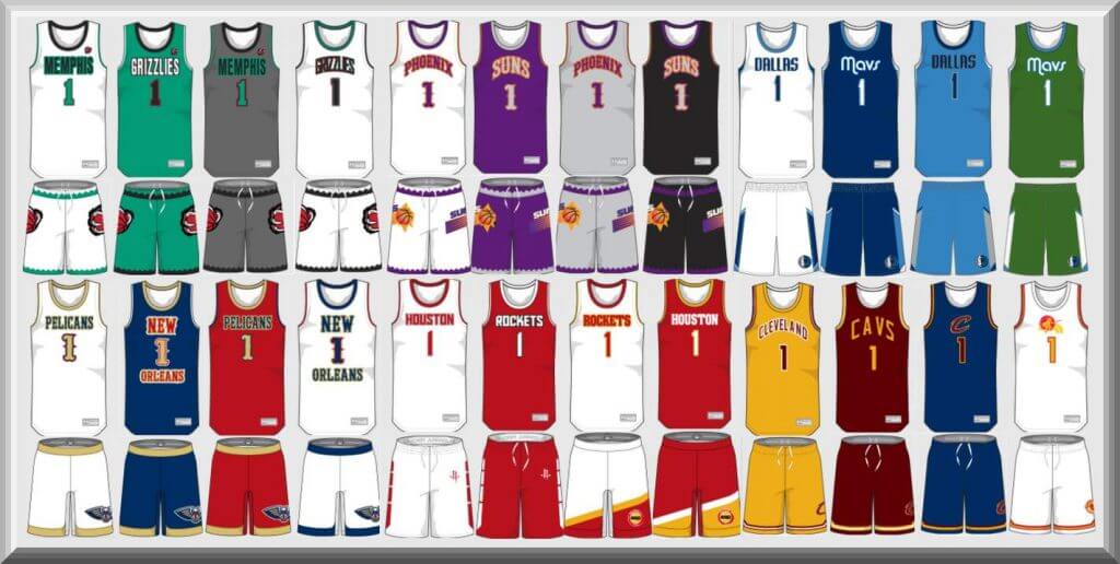
NBA Concept Uniforms
By Luke Godlewski
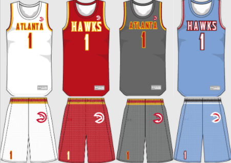
Atlanta Hawks
I’m so glad the Hawks got rid of volt green as an accent color. I wanted to give my take on the baby blue city jerseys. I believe this is a timeless look that would work in any era.
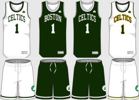
Boston Celtics
A darker shade of green is the only major change here. The Celtics are a team with no need for an overhaul in their team identity. A gold-outlined reminiscent of the 1980’s shooting shirts is a subtle touch for an alternative look.
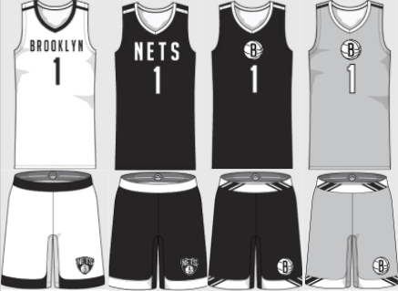
Brooklyn Nets
A new “Nets” wordmark adds a little bit of contrast between the home and away looks. Overall, a clean look that receives minimal changes.
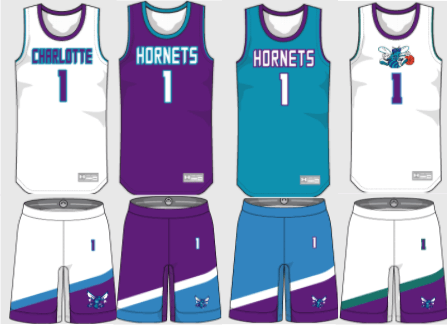
Charlotte Hornets
The Hornets are a 90’s team, so I gave them 90’s-esque uniforms. Darker teal is used on the throwback white alternate as an accent.
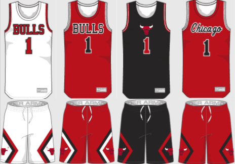
Chicago Bulls
The block “Bulls” and script “Chicago” wordmarks are straightened out in these renditions of the Classic bulls looks. A black alternate is a welcome addition to the uniform lineup.
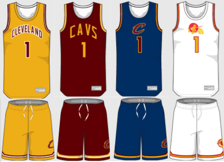
Cleveland Cavaliers
The Cavs have had a very confusing identity for the better part of the 21st century. A removal of black and a return to navy helps to potentially straighten out these issues. A fauxback white uniform utilizes the retro 1970’s Cavs logo and colors.
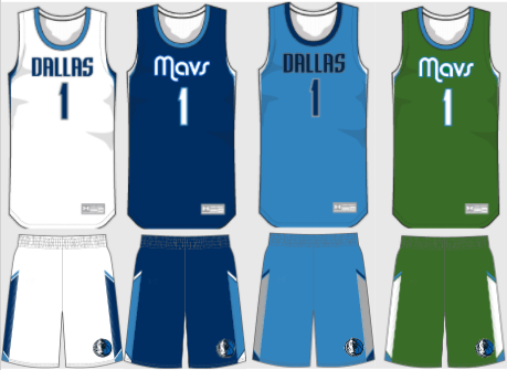
Dallas Mavericks
Another messy identity is straightened up with the use of only two different wordmarks. A kelly green alternate brings memories of the one used in the 2000’s.
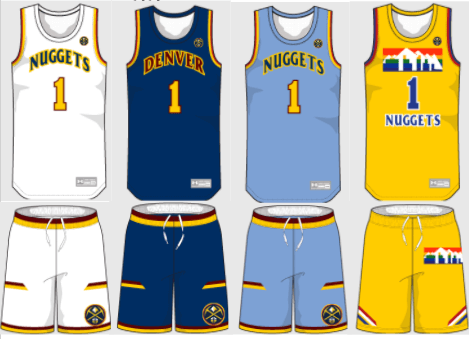
Denver Nuggets
Powder blue makes a return to the Nuggets repertoire, and another fauxback presents itself through the rainbow alternate.
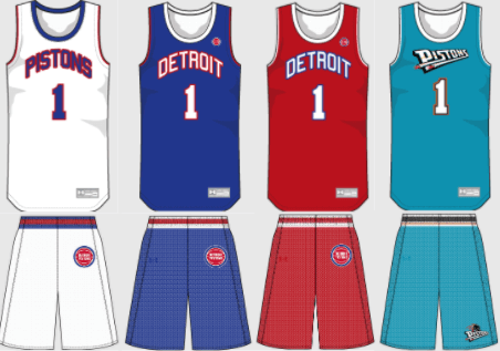
Detroit Pistons
The 80’s uniforms become the full time attire for Detroit, while the turquoise 90’s alternate becomes a throwback option.
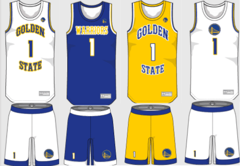
Golden State Warriors
A western font was mixed with the Run TMC uniforms to create this look. The Warrior’s logo is too good not to be put on both the jersey and the shorts.
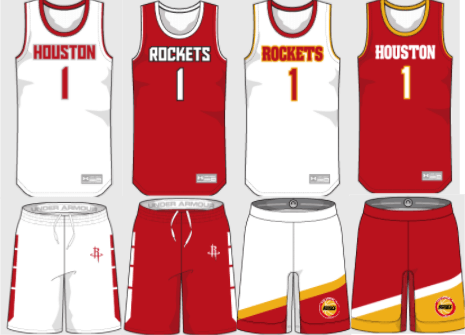
Houston Rockets
The panels on the home and away shorts offer a solar feel and the two alternate uniforms are, get this, more fauxbacks.
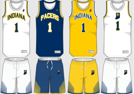
Indiana Pacers
Elements like shorts stripes and the Indiana logo were taken from the Pacer’s current look while the wordmark and number font resemble past looks from Indiana.
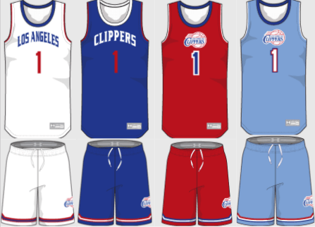
Los Angeles Clippers
A rendition of the Clippers current wordmark is combined with their previous logo to create a uniform that is BFBS free.
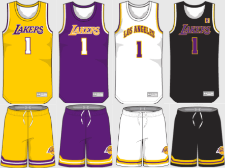
Los Angeles Lakers
Not a whole lot of changes to see here. The black alternate pays tribute to Kobe Bryant.
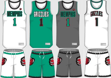
Memphis Grizzlies
The Vancouver color scheme returns, however the wordmark is extremely simplified from the 90’s uniform.
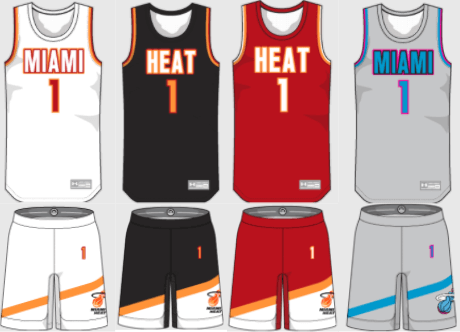
Miami Heat
Bright red and orange symbolize the city of Miami much better than their current color scheme. The Vice alternate matches the rest of the uniforms much better in this redesign.
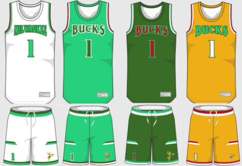
Milwaukee Bucks
A bright green returns along with the use of red as an accent color. The 4th uniform is a tribute to the Mecca, and its unique floor.
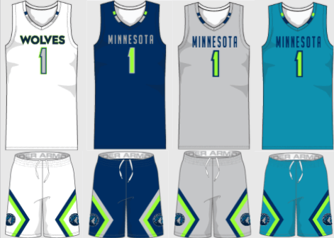
Minnesota Timberwolves
Neon green’s role is reduced to just an accent color, and for good reason.
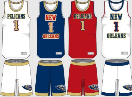
New Orleans Pelicans
A “New Orleans”wordmark becomes a bold aspect of the identity, while reds takes on a stronger role in the color scheme.
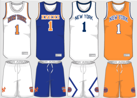
New York Knicks
Another classic look gets minor updates. A brand new white and navy alternate takes some inspiration from the Yankees unmistakable look.
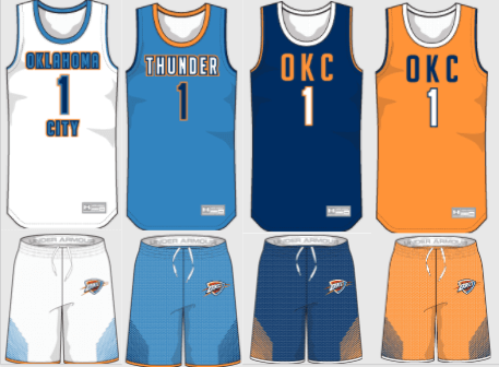
Oklahoma City Thunder
Navy takes on a more prominent role in this new modern look for the Thunder.
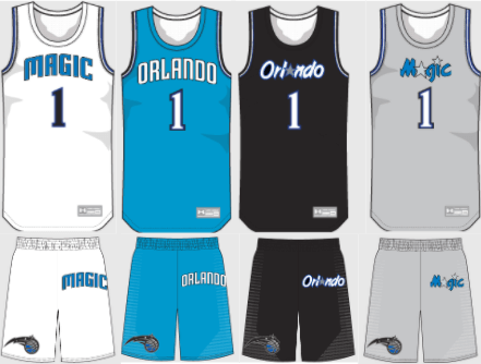
Orlando Magic
Multiple eras of Magic basketball appear in this uniform set that features a lighter shade of blue and a gray alternate.
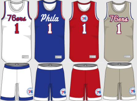
Philadelphia 76ers
Script wordmarks are on the forefront of these designs, along with the simplification of featuring only one logo.
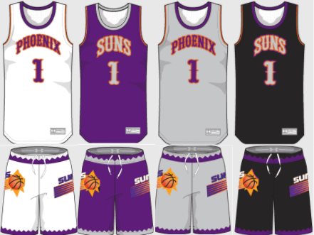
Phoenix Suns
A blend between the 1970’s and 90’s uniforms produces a look that features gray as a heavy accent color.
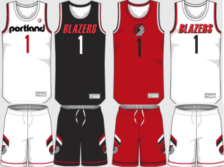
Portland Trailblazers
This design offers a more clean, sleek approach to Portland’s identity. Gray is eliminated entirely from the set.
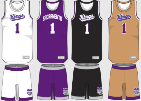
Sacramento Kings
The script “Kings” font returns while black and gold alternates reminiscent of th 90’s also appear.
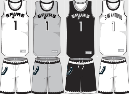
San Antonio Spurs
A very solid NBA uniform receives minor tweaks. Gray is more prominently used as a main color.
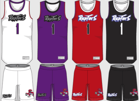
Toronto Raptors
The cartoon dino, along with purple return to bring back the classic 90’s look.
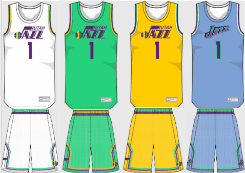
Utah Jazz
Purple replaces navy, and a green uniform brings a Mardi Gras feel that connects with the “Jazz” name.
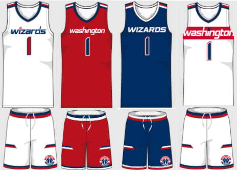
Washington Wizards
Minimal changes to an underrated NBA uniform set. The white alternate is reminiscent of the “Bullets” days.
Thanks, Luke! Great stuff again. Even more impressive for someone who is still in High School! I hope you’ll continue your interest in uniforms and design as you more forward in life — these are some excellent design concepts!
Readers, what do you think?


By Logan Patterson
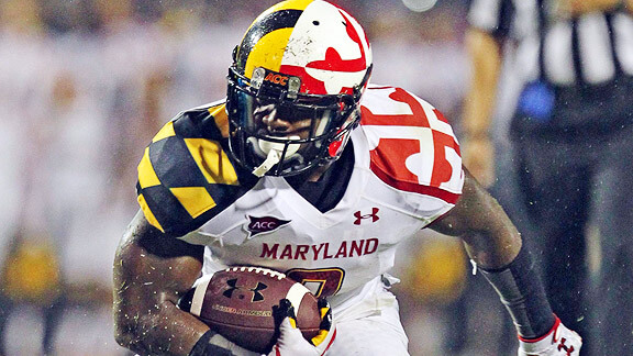
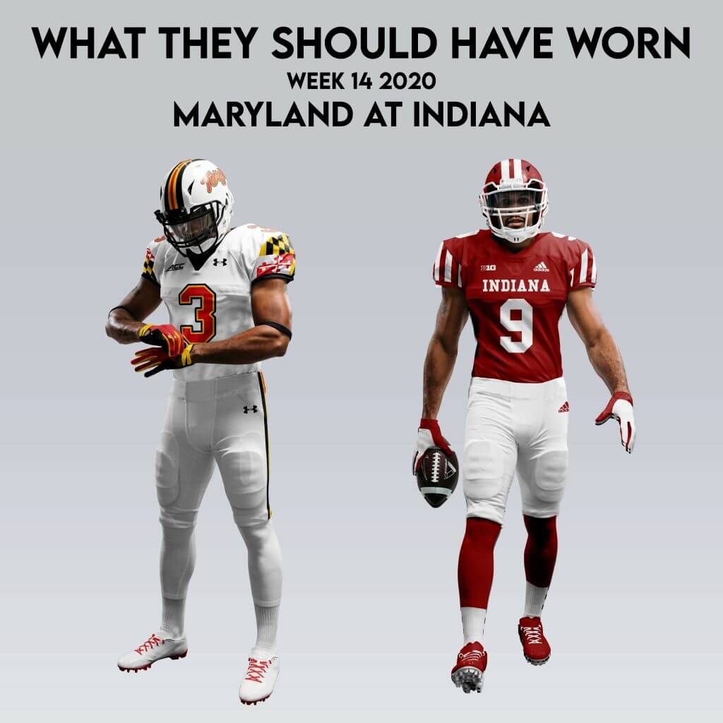
After a bit of a hiatus (new jobs, moving, etc.) What They Should Have Worn Is Back! Time constraint won’t allow me to address uni-related folly from today, but I’m able to take care of the week prior. Memal named Maryland at Indiana as his +1 last week, and was the most definitely among the ugliest games from last week.
Like a lot of uni-watchers, I’m not a fan of military appreciation sets. That’s not a dig on appreciating the military, I just think slapping a bunch of camo on a football uniform is a crumby way to do it. It’s especially bad when the home team is in light neutral tones!
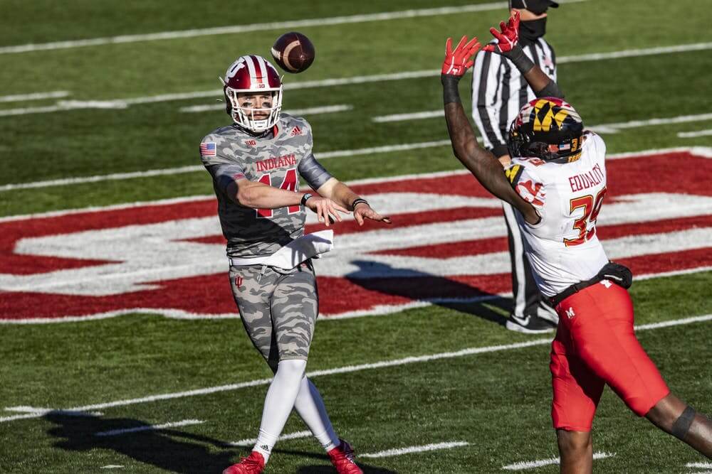
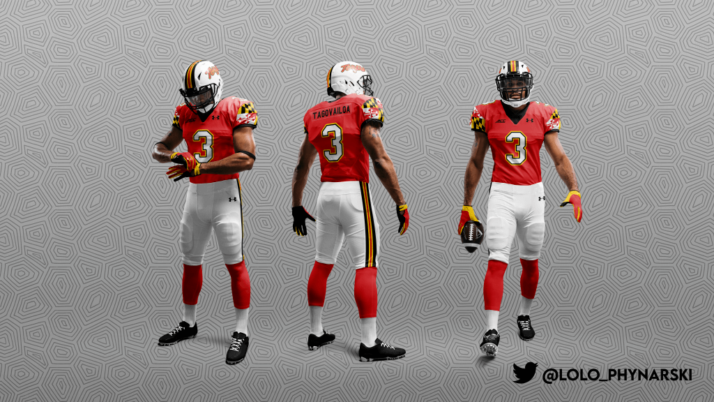
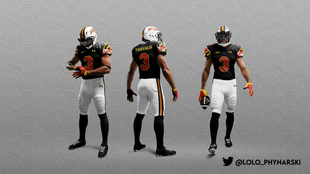
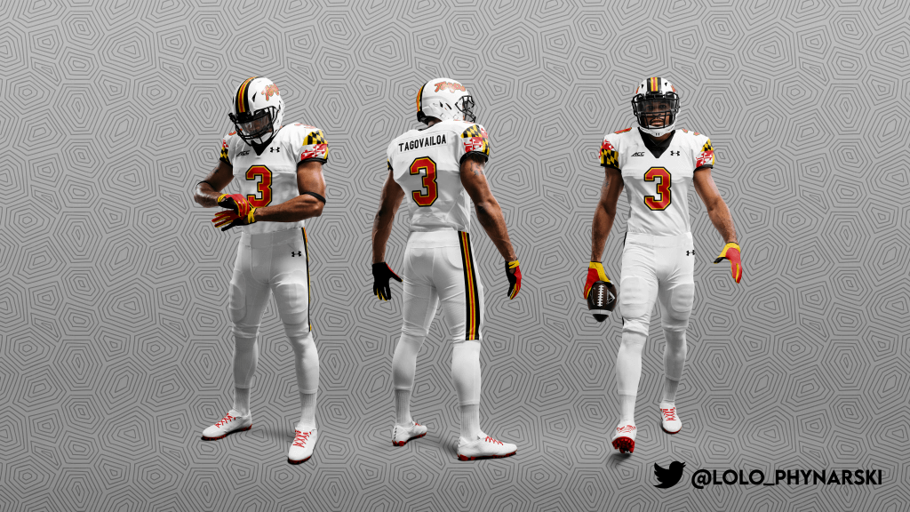
But let’s fix with the visiting Terps, first. I’m guessing if I say “21st century Maryland football” no one has an iconic set pop in their mind. Maybe these?
With their close ties to Under Armor, they’ve become something akin to Oregon, a testing ground for new looks and a visual brand notable for innovation and creativity, changing quite a bit week-to-week with various tops and bottoms. My eye tends to prefer more timeless looks, so I merged some newer design elements with some more classic ones. I tried to keep the flag incorporation as simple as possible, as well as updating the stroke on the classic “Script Terps”. In this version, I’ve also fixed the issues with the conference patch (wink wink).
For the Hoosiers, I simply merged the basketball warmup inspired “candy stripe” shoulder caps with their current look. I dig the subdued version they use now, but I really liked this element they debuted back in 2016.
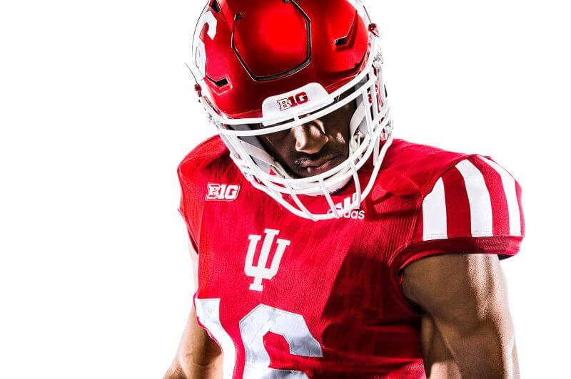
I also used Indiana’s official crimson shade (HEX #990000). As a lifelong Indiana resident, I’ve seen Hoosier uniforms bounce between maroon and scarlet. It’s tended to look a bit too brilliant in recent years, and a slightly darker shade would help give them a better visual identity, setting them apart from Ohio State, Wisconsin Maryland, and Nebraska without reminding anyone of Minnesota.
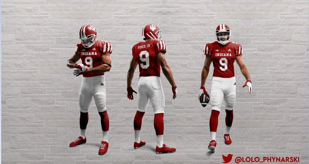
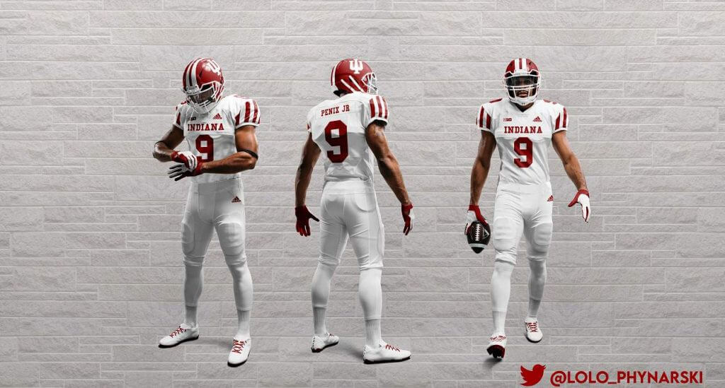
Put those two tune-ups together, and here’s what they should have worn.

Guess The Game…
from the scoreboard
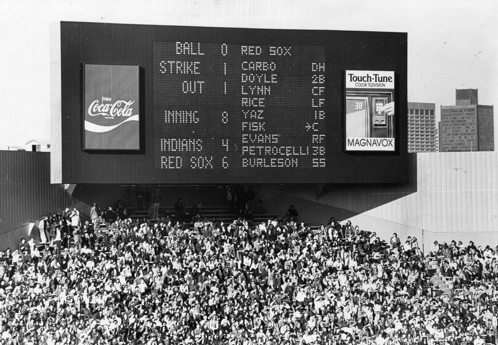
Today’s scoreboard comes from Howard Corday.
The premise of the game (GTGFTS) is simple: I’ll post a scoreboard and you guys simply identify the game depicted. In the past, I don’t know if I’ve ever completely stumped you (some are easier than others).
Here’s the Scoreboard. In the comments below, try to identify the game (date & location, as well as final score). If anything noteworthy occurred during the game, please add that in (and if you were AT the game, well bonus points for you!):
Please continue sending these in! You’re welcome to send me any scoreboard photos (with answers please), and I’ll keep running them.
Because of course they can
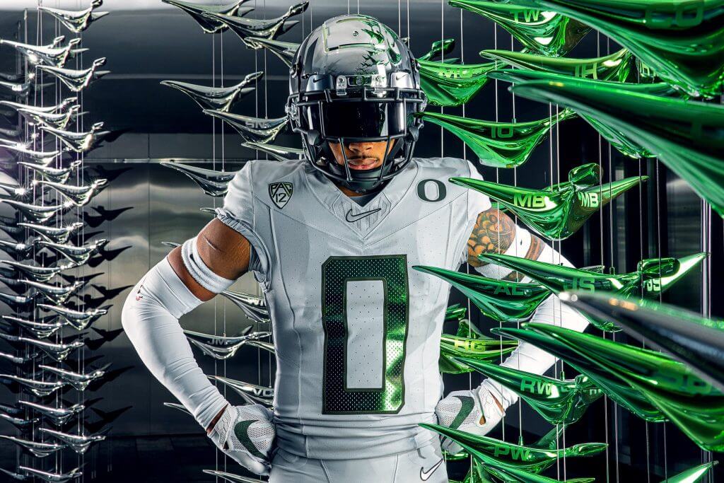
Brace yourselves: Oregon is trotting out a new uniform set for today’s game against Cal.
As you can see, it’s dishwater another GFGS uni — and Nikegon is calling this color “Wolf Gray.” (If that name sounds familiar, it’s because another bird-named-Northwest-USA-located team also wears a wolf gray alternate uniform.) That two teams named for birds wear a color denoted as “wolf” might be considered ironic, but this is Nike we’re talking about.
Oregon has a history of wearing gray (in fact, I believe they introduced the first ever GFGS uni, about a decade ago), and they haven’t always been successful while wearing it.
My Sunday “Duck Tracker” Dennis Bolt has taken a fairly deep dive into the wins (and losses) when Oregon wears gray. It’s a nice little read if you’re into the Duck uni-machinations as I am. Or even if you’re not.
Click to enlarge
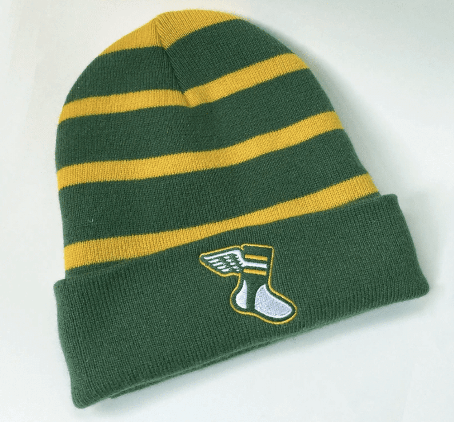
And now a few words from Paul
Hello! In case you missed it on Thursday, we’re now offering a Uni Watch toque! It’s available here. We’ll sell it throughout the winter, but if you want it to arrive by Christmas, you must order it by today, Saturday, Dec. 5.
In addition, we have a bunch of new Uni Watch Color Remix caps available in a variety of autumn and Christmas color combos (click to enlarge):
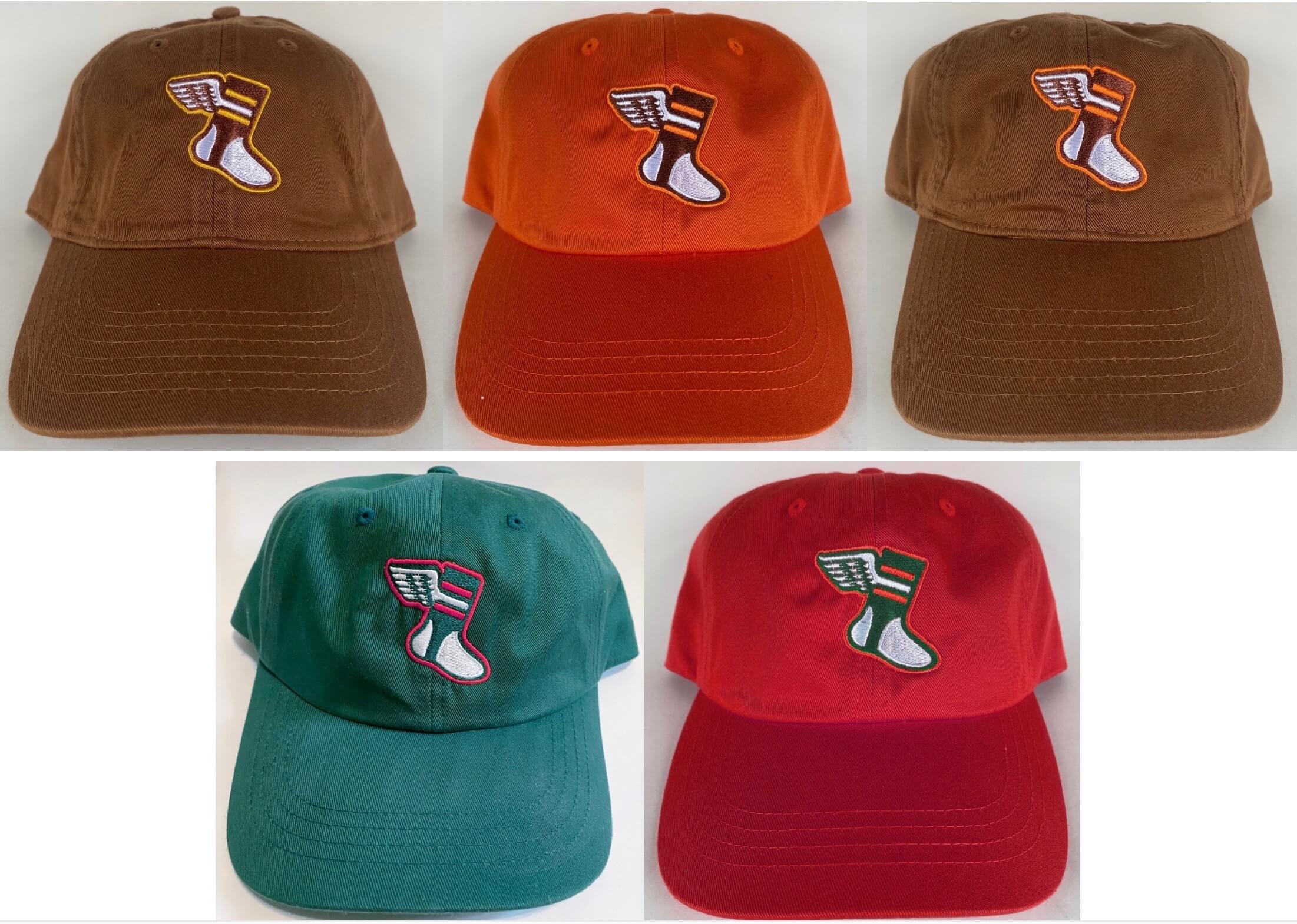
Plus we’ve brought back most of the previous Color Remix caps. All of them are available here. Again, to ensure Christmas delivery, you must order by today, Saturday, Dec. 5.
While we’re at it:
• We’re also taking pre-orders for Uni Watch hockey and cycling jerseys, all with your choice of number of NOB:
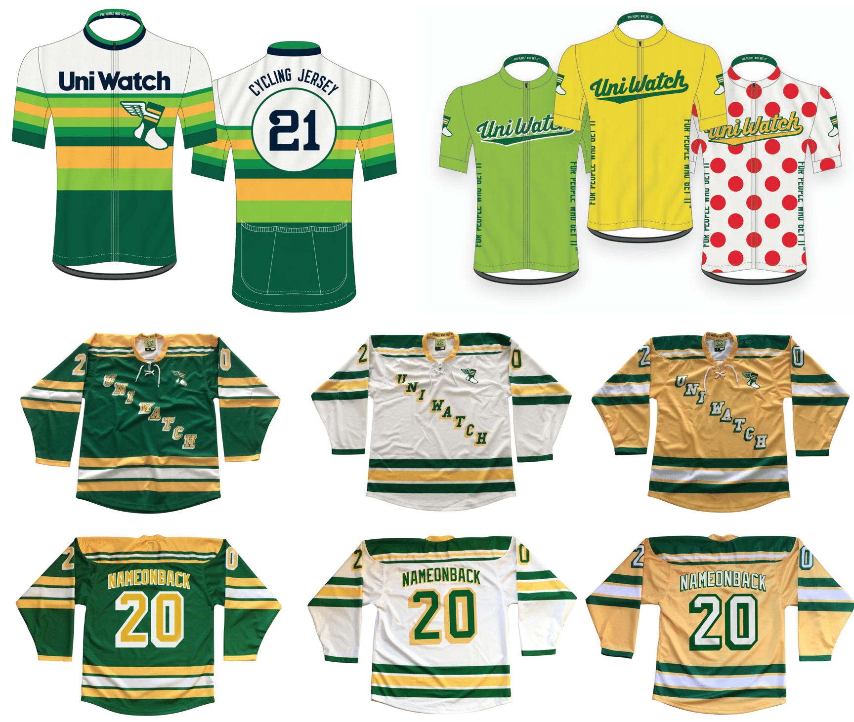
You can order these items here. Get your order in by next Friday, Dec. 11; the jerseys should ship by Jan. 11. (Sorry, no holiday delivery for these.)
• I have a handful of Uni Watch Winged Stirrup Magnets remaining (but not the round ones, sorry; click to enlarge):
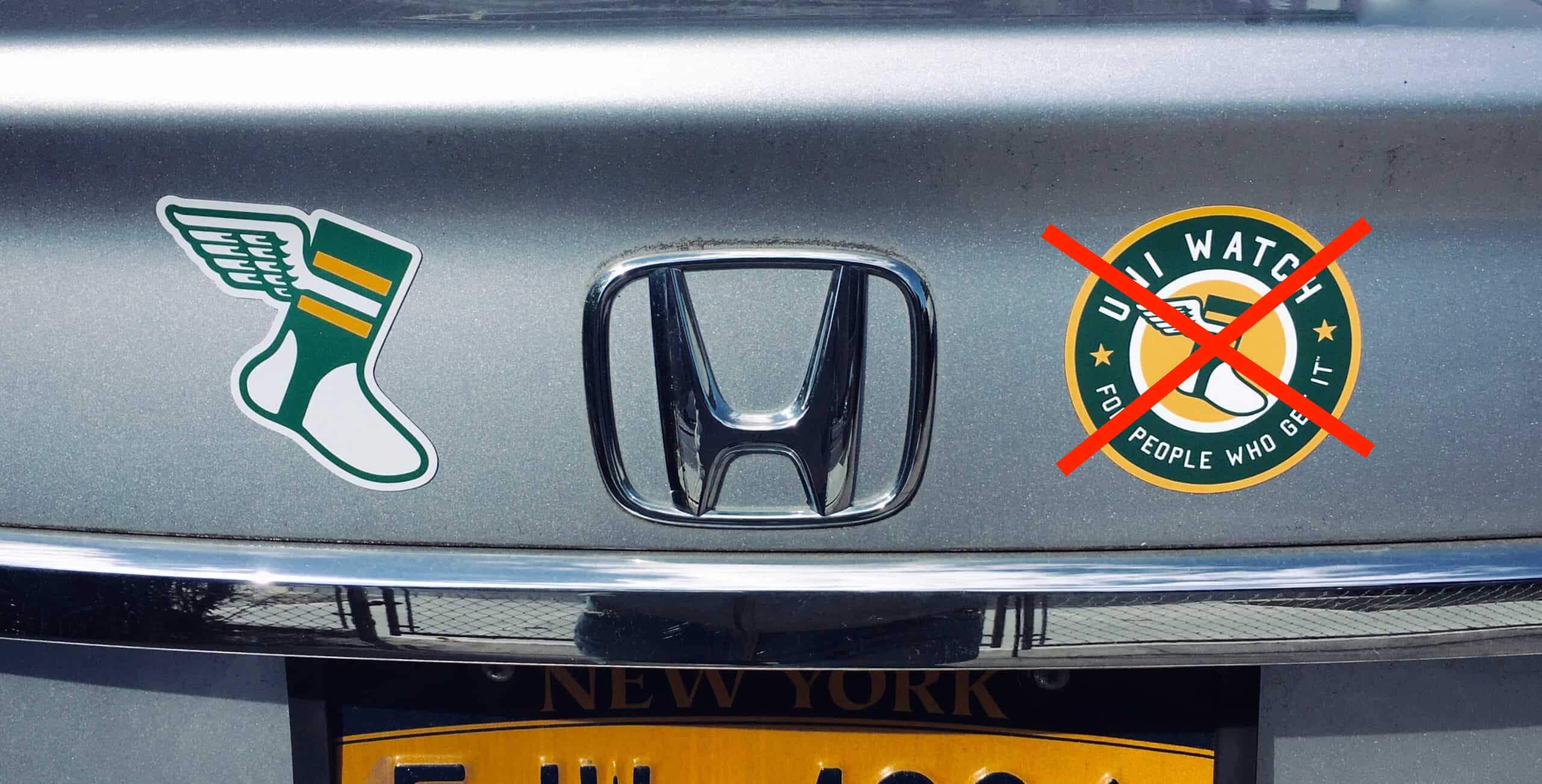
Click to enlarge
These will likely sell out in another day or two. If you want one, full info is available here.
• In case you missed it earlier this week, the Uni Watch Pin Club’s design for December is here, and it’s a beauty, with our winged stirrup logo repurposed as a holiday stocking brimming with gifts (click to enlarge):

This is a numbered edition of 200, and there are about 40 remaining There are now ab available here while supplies last.
Also, important: People who’ve collected all 12 monthly pins are eligible to get our Uni Watch Pin Club 2020 All-Star pin as a free bonus. If you qualify, you can claim your prize by emailing me with (a) your mailing address and (b) some combination of photographic evidence and/or receipts. For example, if you order the December pin today, you could send me a photo of the 11 pins you’ve already received plus your email from Teespring confirming that you ordered the December pin. Or you could wait until the December pin arrives and take a photo of all 12 pins. Or you can simply go to “My Purchases” in your Teespring account and take a screen shot of that. As long as you can prove that you collected ’em all, that’s what I’m looking for, okay? Okay!
• The Uni Watch Classic Cap is currently selling at 10% off its usual price. We have all fitted sizes in stock, as well as the adjustable strapback version. Available here.
• The rest of our Uni Watch merchandise is listed here.
Okay, end of sales pitch. Thanks for listening! Now back to Phil.
And finally… that’s all for today. Sorry there’s no ticker, but Paul gave Anthony the day off for his birthday which was earlier this week. Hope you had a good one, buddy! I’ll be back with a full ticker tomorrow (including anything that was sent into UWing yesterday and today).
Big thanks to Luke (once again) for sharing his NBA concepts. That’s pretty impressive work for someone who isn’t even legally able to drink or vote! Hope you readers let him know what you think of the concepts in the comments section below. Thanks also to Logan for returning with the WTSHW, and to Dennis for a preview of today’s Duck costume, and the history behind their going GFGS.
Everyone have a good Saturday, and I’ll catch you back here with the SMUW crew tomorrow.
Peace,
PH
Great work with the designs Luke!
Not much to go by, is this 4/13/76 Red Sox home opener?
Luke, I’m liking a lot of the colour scheme decisions for the primary uniforms. I am a proponent of seeing the Jazz back in purple with green and yellow trim. All for the Heat going back to original colour scheme of black with red and orange trim.
Most of these uniforms are great. However it makes no sense for a Celtic (Irish) team to not have Kelly Green. Also it looks like the Suns put on the wrong pants, with the jerseys and pants coming from different uniform eras.
I like some of the redesigns, but I don’t like how the stripes repeat a bunch on the unis. Also why is the vice one for the heat grey?
Will we see ‘A Very Merry Vilkmas’ this year?
Yes.
Nice job, Luke. Keep ’em simple, keep ’em classic.
GTGFTS: April 13, 1976. BOS 7, CLE 4. 1976 opening day in Boston.
Some future advice. Don’t put the date of the game in the file name. This was way too easy.
That scoreboard was a new feature for ‘76…and is not the scoreboard I would associate with Fenway.
The important info to GTS is the Fenway “Jumbotron” made it’s debut and Rico Petrocelli’s last year were both 1976.
I was in awe of the Jumbotron. And Rico.
Interesting detail on the Scoreboard is that the TV is tuned to Channel 38. If you are not from Boston/New England, that number might seem to odd to you, but WSBK, channel 38 broadcast Red Sox games for many years.
I was at this game. The other major change to the park that day was paddling around the outfield walls.
The left field wall was also re-skinned.
Great work on the concepts, Luke. It would be nice to see you develop these further – there are a lot of common elements repeatedly used here, and at times, it feels almost like there are 2 or 3 templates applied across all 30 teams. And specific to the 76ers, I am fairly certain that the wordmark can’t say “76ers”, as it would put 2 numbers on the front of the jersey (wordmark and player number). They’ve always gone with “SIXERS” when they didn’t use the city name.
I agree – a nice effort all around!
As for the Sixers concept, it was so pleasing not to see a BFBS uniform (or one paying tribute to the Iverson era).
I was impressed with Luke’s creativity, but the gray version is just one uniform one too many.
I’ve always liked the MD flag as an accent but, think title so prominent on the helmet is overkill. The script “Terps” is such a great helmets logo and really pops with the flag colors. Nicely done.
The Terps script has to return. I know UMD has centralized all logos across the Ath. Dep. but that logo is the best. The flag helmets get lost.
Thanks! I’m glad they’ve done something interesting, just needs honed in.
great work, luke. a lot of really good stuff there, especially taking into the account you are doing the whole league.
special mention to the memphis design. you freaking knocked that one out of the park!
The Mardi Gras design for the Jazz concept makes zero sense. The team has no connection to New Orleans culture anymore besides its nickname. If anything, the Pelicans are the only team that has the right to Mardi Gras colors.
To go off of what MJ said,the uniforms all have the same design template like a startup league. There’s no uniqueness among the teams
“Wolf Gray” has been a color in the Nike palette for a long while now. Lots of Nike shoes, apparel, and jerseys have used it.
One thing that I’ve noticed more this year in general (not sure why this year) is the difference in size of jersey numbers – Oregon (and some others) seem to be pushing the envelope of what will actually fit on one side of a jersey (esp. with 2-digit numbers that don’t include 1). On the other end of the spectrum is Notre Dame, which seems to be *almost* too small. If I had to pick one extreme, it would be ND. But I think there’s probably some sort of happy medium. Thoughts? Perspectives?
Glad I’m not the only one who notices that! Notre Dame is a classic uniform but it bugs me how scrunched up the numbers look and how they look as if they have no room to breathe.
Notre Dame numbers are too small – especially with NNOB. Back in the Lou Holtz era when Champion nomads their unis they had perfect numerals.
Why do 2 teams associated with a bird (Ducks/Seahawks) have a “Wolf Gray” Uniform? The senselessness of Nike strikes again.
As a big-time Yankee fan, I despise all things Red Sox. But I do love that mid ’70s Fenway scoreboard because it could only completely spell out names of 10 characters or fewer. Hence, you see “Yaz” instead of Yastrzemski. Would they have referred to Jarrod Saltalamacchia as “Salty?”
It probably couldn’t even get to 10 characters in some cases. Petrocelli has 10, but whereas most of the characters are four lights wide, the ‘I’ is only one. If his name had been Petrocelly, given the ‘Y’ was five-lights wide in Yaz, it wouldn’t have fit, or it would have run into his position. As is, I wonder what happened with the arrow, shown next to Fisk, when it got to Petrocelli.
I’m a little surprised they didn’t go the newspaper box score route, eliminating non-emphasis vowels from right to left until it fit. Y’str’mski or Ystrmski would have done the trick.
I made 36 new teams nba with like 2 logos, a court, and 3 unis. It was made on NBA2k which allows you to make uniforms so they arent able to be as great as I want. I think it would be a cool idea for an article.
Fantastic job with the NBA concepts Luke! The future is bright!!!
WTSHW: As mentioned, a brighter red on Indiana puts it close to Wisconsin and Nebraska, but the problem with a darker red has always been that it looks almost exactly like Oklahoma, especially with the crimson helmet.