For all photos, click to enlarge
Good morning! Greetings from Uni Watch HQ, where all three inhabitants continue to be safe and well (and where two inhabitants are super-stuffed on Thanksgiving leftovers). Hope your long holiday weekend was a good one.
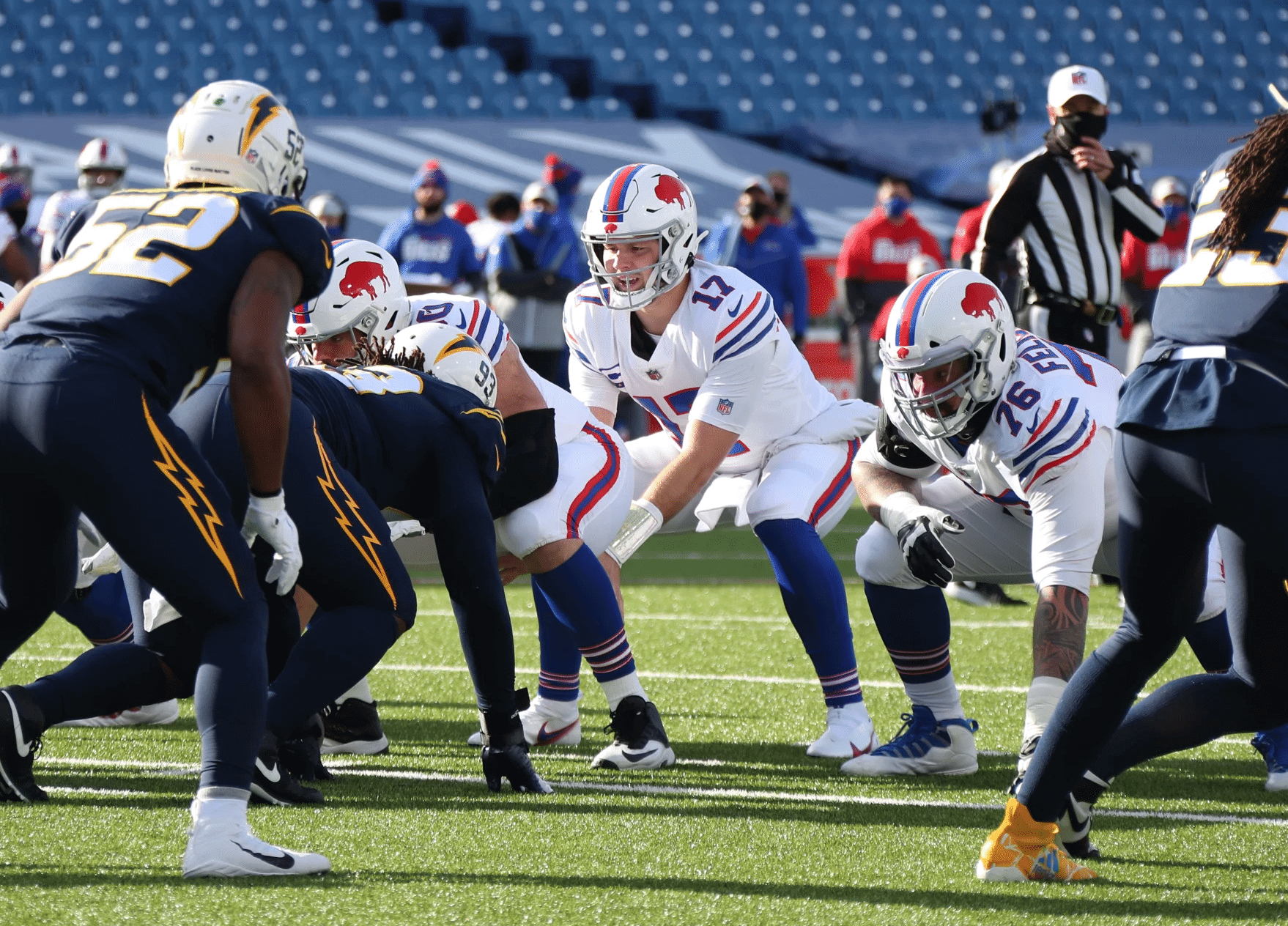
Now then: Major missed opportunity yesterday in Buffalo, as the Bills wore their white throwbacks, setting up what would have been a very visually pleasing AFL-style uni matchup against the Chargers — who, as you can see above, inexplicably opted to wear their mono-navy alternates instead.
This is essentially the same thing that happened in Vegas three weeks earlier, when the Raiders wore their silver-numbered white throwback jerseys while the Chargers inexplicably went mono-navy. Obviously, the Bolts get high marks for their new primary uniforms this season, but they’ve also scuttled what would have been some great de facto AFL throwback games. Disappointing.
In other news from around the league yesterday:
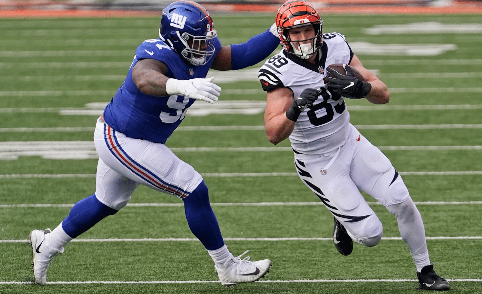
• The Bengals wore their mono-white alternates:
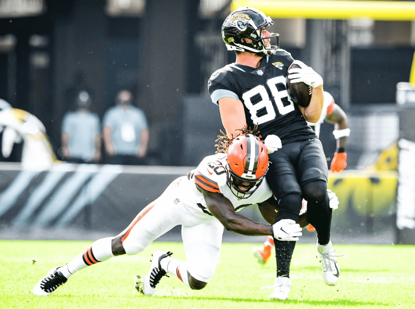
• The Browns went mono-white for the first time with their new uni set, while the Jags countered with mono-black:
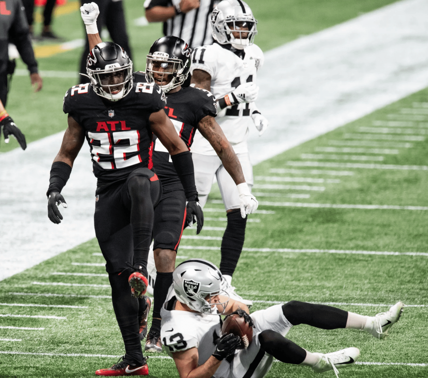
• The Falcons went mono-black as well:
• Here we are in Week 12 and Patriots center David Andrews is still wearing last year’s number and NOB fonts:
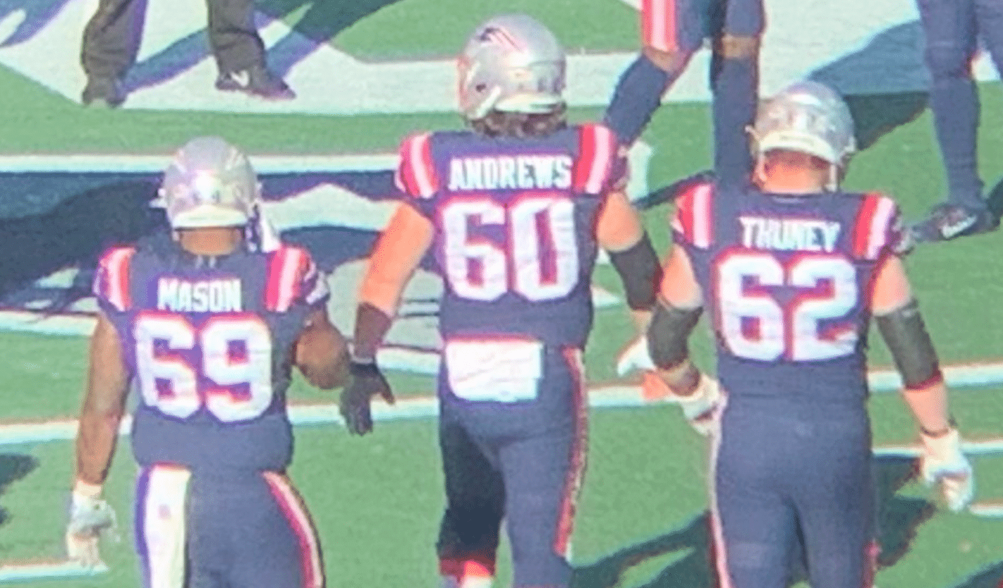
If nothing else, I guess this means nobody has arranged a jersey swap with Andrews this season, because he’s still wearing the same jersey he started the season with.
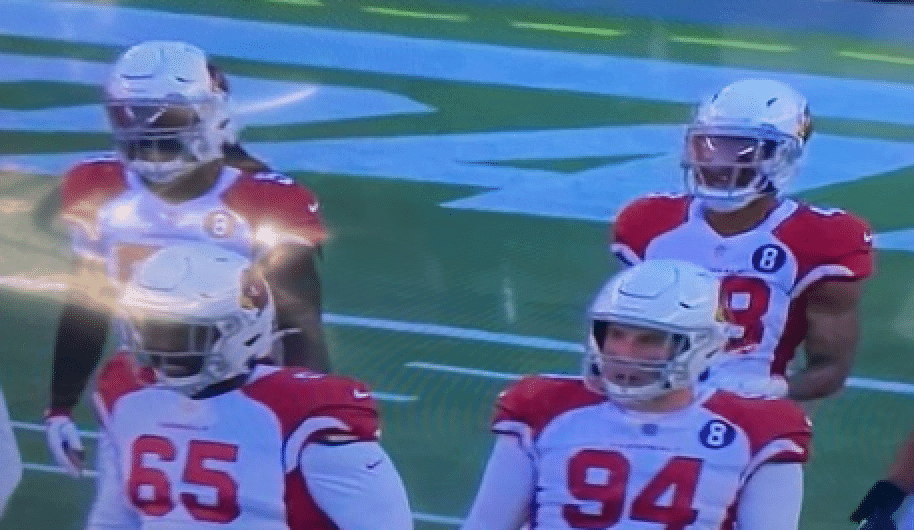
• Cardinals defensive lineman Stacy McGee wasn’t wearing the team’s “8” memorial patch for Larry Wilson:
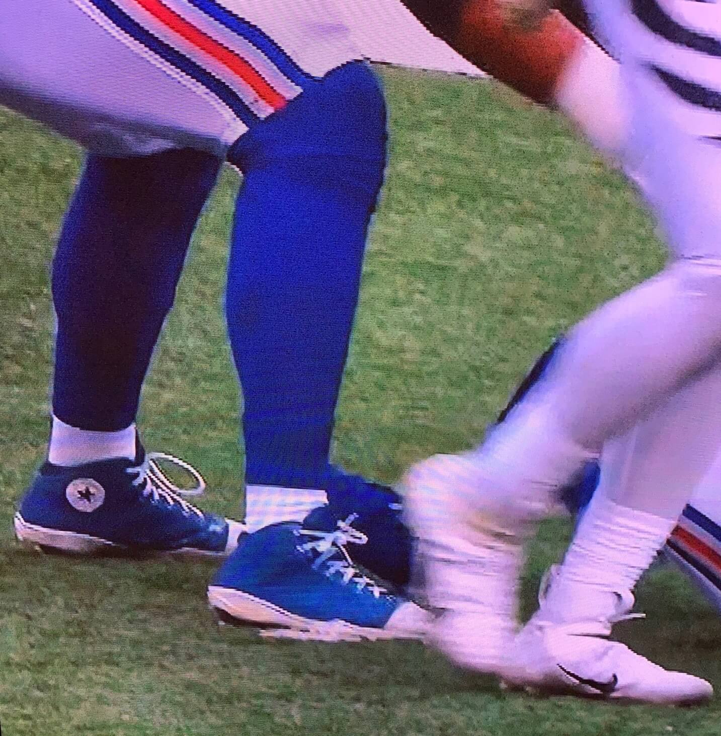
• Someone on the Giants — possibly tight end Levine Toilolo — had his cleats custom-painted to look like Converse high-tops:
• The aforementioned Bills and Bengals were the only two teams wearing white at home.
And in a final note, G.I. Joevember ends tonight, so this was the last Sunday of the season featuring camouflage accessories.
(My thanks to Jake Martin, Mark Palczewski, and Andrew Walsh for their contributions.)

Argentina Leads Maradona Tributes
By Jamie Rathjen
Soccer clubs in Argentina and elsewhere had plenty of uni-related tributes to Diego Maradona, the Argentine playmaker who passed away last week. His status as an all-time great and the time he spent playing in Europe led to widespread displays beyond the places to which he was connected — even moments of silence, if nothing else, in games as diverse as English FA Cup second-round matches and women’s international matches.
For example:
• In Argentina, the cup competition being contested by the Liga Profesional de Fútbol as a transition between the last pandemic-affected season and next season was renamed after Maradona.
• Gimnasia y Esgrima La Plata, the club Maradona managed at the time of his death, wore black shirts.
• Gimnasia and some others in Argentina also wore national team-themed warm-up shirts.
• Boca Juniors, one of Maradona’s former clubs, wore “Maradona” as their team-wide NOB yesterday.
• Even Argentine officials got involved by wearing “Gracias Diego” on their backs.
• Napoli, the Italian club for which Maradona made more apperances than any other, wore an Argentina-style fourth shirt (shown at the top of this section) that had been in the works for a year with the hope that Maradona would get to see it, and its debut happened to be scheduled for yesterday.
• Other Italian clubs that had their own tributes included Bologna, Atalanta, Lazio, and Udinese.
• Elsewhere, there were many instances of black armbands, and those I saw ranged from Barcelona striker Lionel Messi wearing one over his captain’s armband to several Premier League teams to Erzgebirge Aue and SV Sandhausen in Germany’s 2. Bundesliga.
• Messi celebrated a goal yesterday by revealing an apparently game-worn Maradona shirt from Argentina’s Newell’s Old Boys under his shirt. Messi played for Newell’s as a kid and Maradona did briefly in his later career, and they at least came close to overlapping there in 1994.
• New England Revolution midfielder Gustavo Bou, who is also from Argentina, also celebrated a goal yesterday by laying out and kneeling before an Argentine flag. The Revs were one of many non-Argentine teams that added Maradona’s NOB and No. 10 to their warm-up shirts, at least for Bou.
• The Argentine Football Association collected even more tributes from around the country.
(Thanks to Germán Cabrejo, Tom Gronek, and Moe Khan for their contributions to this section.)
Click to enlarge
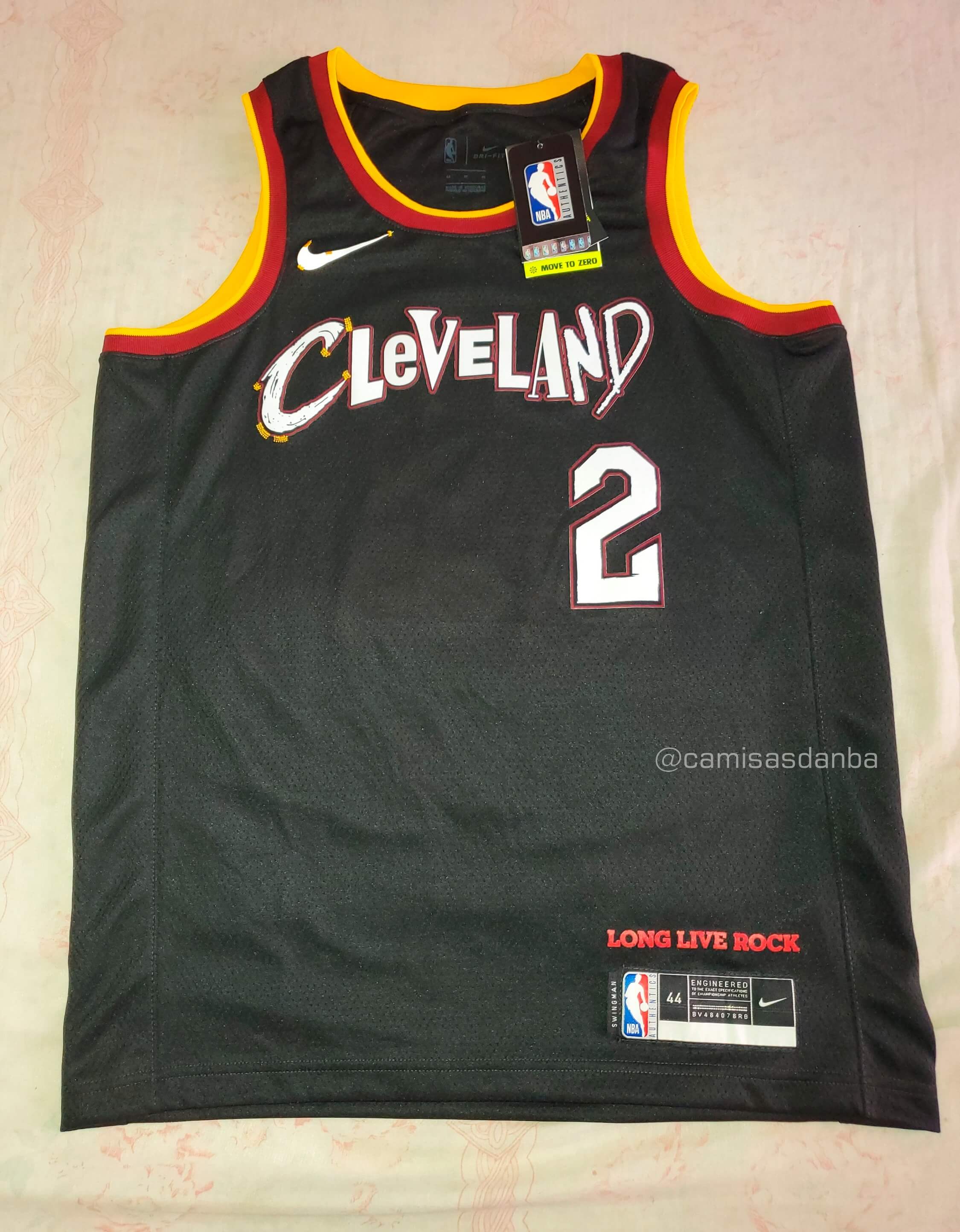
nBa UpDatE: The latest revelation from Brazilian leakmeister @camisasdanba (aka Igor Coelho) is the Cavs’ new City alternate, which is destined to become known as the ransom note jersey.
The “Long Live Rock” slogan above the jock tag matches the typeface of a sculpture/sign outside the Rock and Roll Hall of Fame in Cleveland, and the chest lettering is drawn from a hodgepodge of band wordmarks. Whatever — looks just as bad as that hybrid LeBron jersey that was circulating a few days ago. What a mess.
Click to enlarge
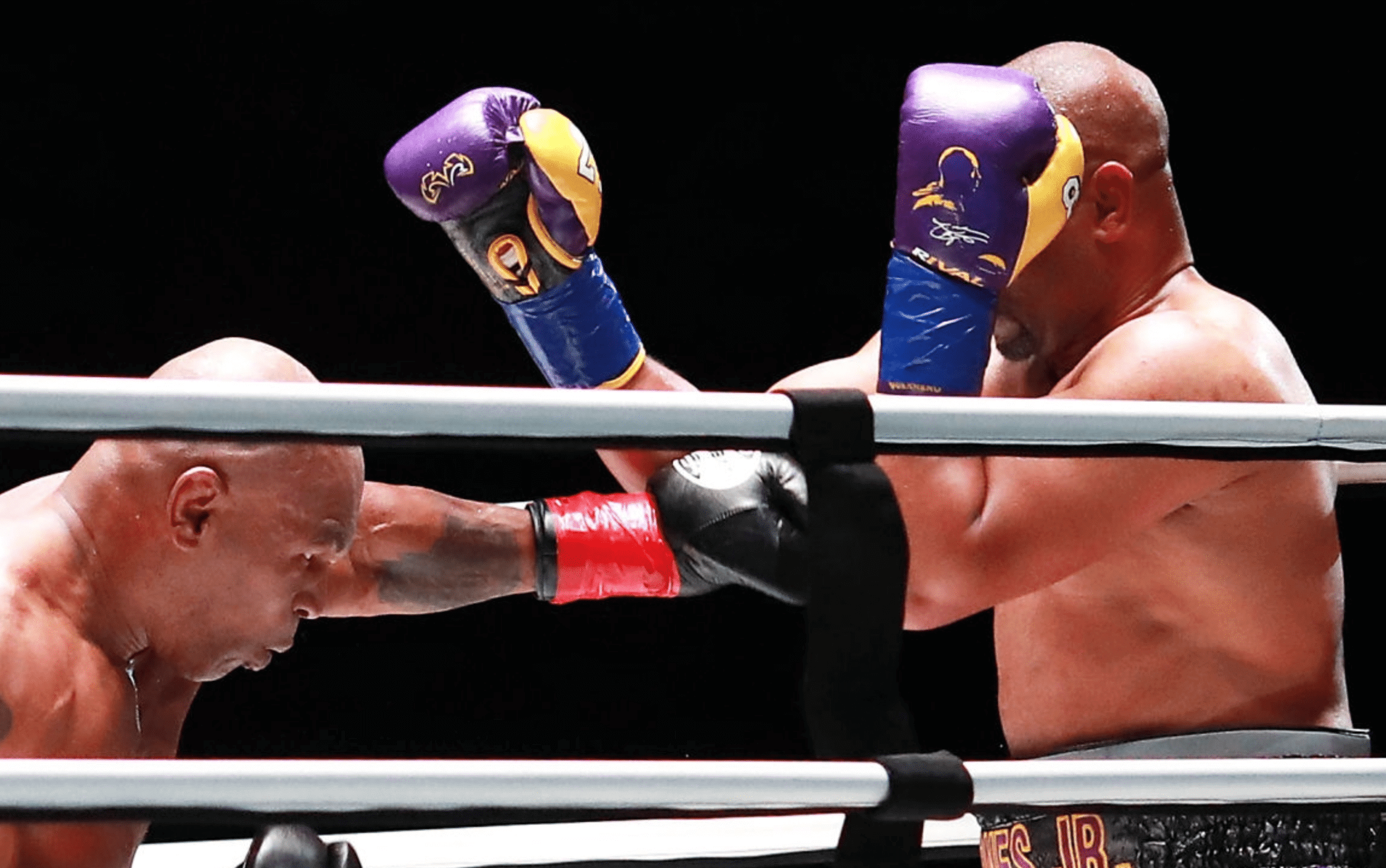
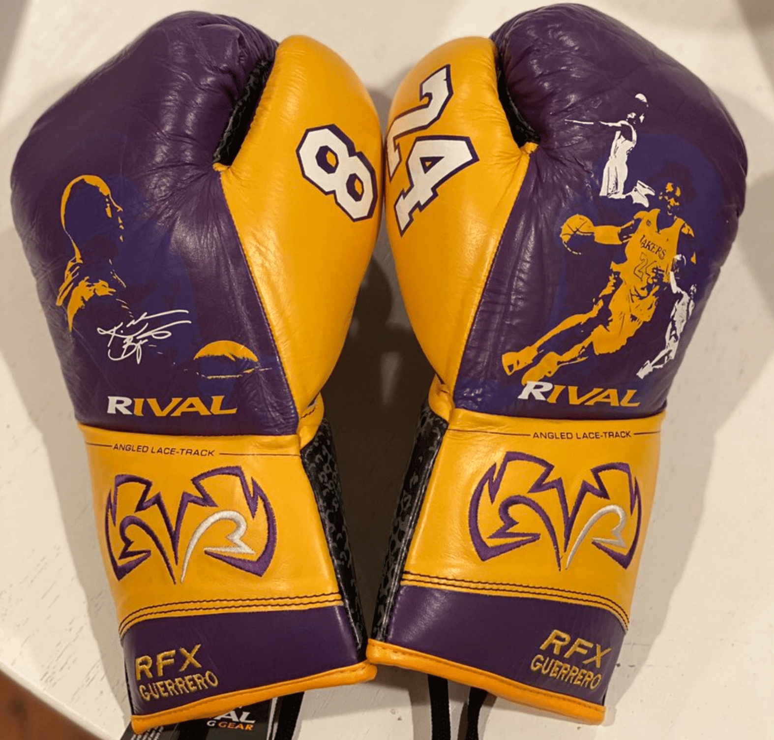
One last Kobe tribute: Interesting move by boxer Roy Jones Jr. in Saturday night’s exhibition bout against Mike Tyson, as he saluted Kobe Bryant by wearing gloves rendered in Lakers colors, with No. 8 on one thumb, No. 24 on the other, and images of Bryant as well. Here’s a close-up of the designs — as you can see, they even included a Black Mamba-style snakeskin pattern on the wrist areas (click to enlarge):

ITEM! Insane membership raffle: Longtime reader Bert Ayers already has eight membership cards of his own (so far) and has just purchased a whopping 10 additional cards for me to raffle off! That’s too many to do in one day, so we’ll do five today and another five tomorrow.
No entry restrictions on today’s five prizes. To enter, send an email to the raffle address by 8pm Eastern tonight. One entry per person. I’ll announce the five winners tomorrow. Please join me in thanking Bert for doing this!
Meanwhile, our latest raffle winners are Jeff Worth and Andy Moeschberger, each of whom has won a Uni Watch membership card (courtesy of reader Carlos Jalife), and Lincoln Arneal, who’s won a Uni Watch Classic Cap (courtesy of Chris Hickey). Congrats, guys!
Click to enlarge
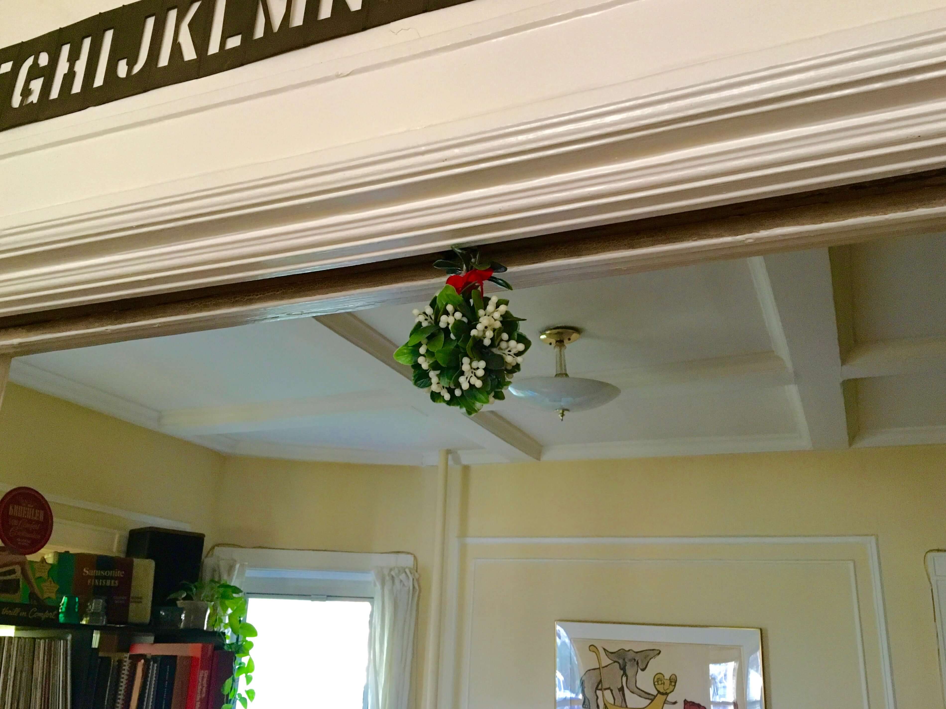
Holiday ritual: For the 28th consecutive year, the plastic mistletoe that I bought for $2.99 at the now-defunct Woolworth’s in Herald Square in 1993 has been hung to work its magic. Per longstanding Uni Watch HQ protocol, the faux ’toe goes up after Thanksgiving and remains in place through the 12th day of Christmas. Let the Yuletide necking commence!
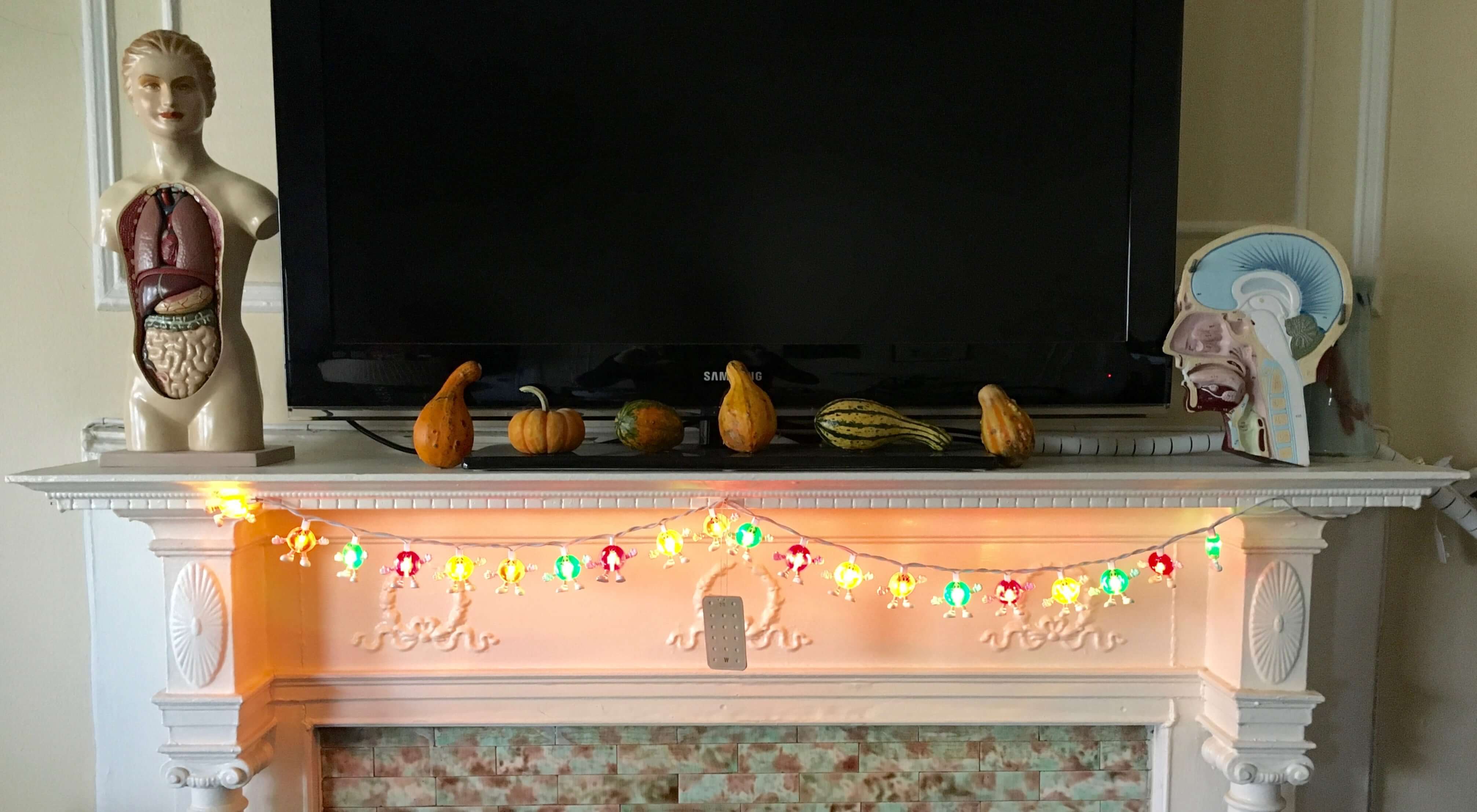
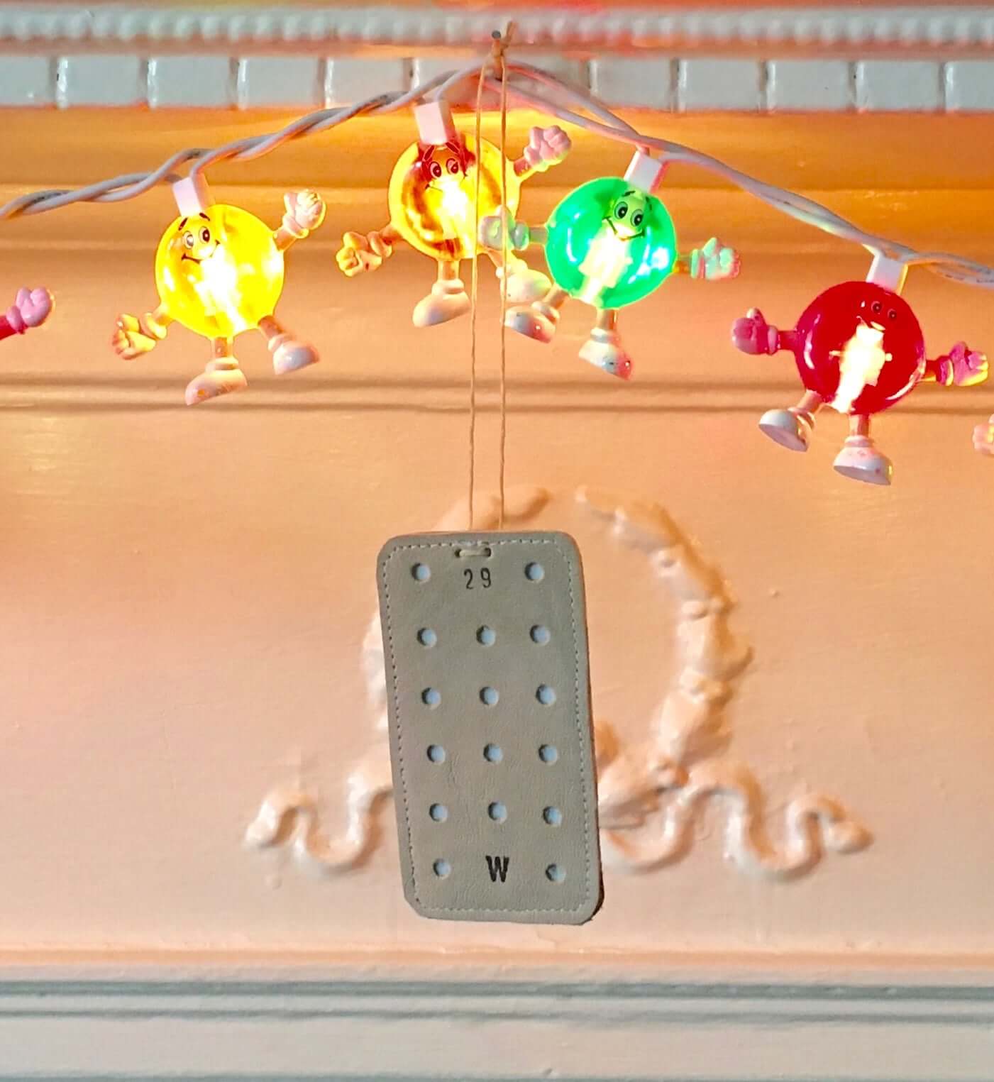
And as long as we’re talking about holiday accessories, the great DIYer Wafflebored was nice enough to send us a homemade goalie blocker tree ornament! We don’t plan to have a tree this year, so we hung the ornament in a place of honor from our mantel, right at the center of our M&M’s lights:
The Ticker
By Jamie Rathjen

Football News: Army revealed their uniform for this year’s Army/Navy game (from Nick Allen). … Left over from Thanksgiving weekend: Iowa broke out the stars-and-stripes helmet decals. … Vanderbilt K Sarah Fuller carried over her No. 32 from Vanderbilt’s soccer team.

Hockey News: Michigan added cardboard cutouts of 20 alumni playing in the NHL, all in their pro uniforms, to their empty stands (from Wade Heidt). … Spectacular visuals in this photo essay about a group of NHL players who recently played hockey on a frozen lake in the British Columbia mountains.

Basketball News: NBA numerologist Etienne Catalan has more new and changed player numbers. … Stanford’s teams added social justice patches.

Soccer News: Arsenal goalie Bernd Leno wore a mono-white kit featuring the outfield players’ second shirt, which is also listed as the fourth goalie shirt, yesterday. The blog Museum of Jerseys points out that it’s the eighth time they’ve used four goalie shirts in a season (from multiple readers). … Goalie cap sighting: AS Monaco’s Vito Mannone wore one yesterday (from Brock Wilson). … Leeds United plan to rename the only Elland Road stand not already named after somebody in memory of center-back Jack Charlton. … Germany right-back Leonie Maier wore a patch for her 75th cap on Friday. … Brazil’s women’s team removed the stars representing the men’s team’s World Cups from their crest starting last week. … Are too many teams going with black/gold shirts? Perhaps (from Trevor Williams). … Arsenal center back David Luiz suffered a gash on his forehead during yesterday’s match against Wolves, resulting in a bloody bandage wrap that looked a lot like Arsenal’s away kit (from our own Anthony Emerson).

Grab Bag: In the Australian Football League, Adelaide’s new guernseys have a form of cap number whereby the design includes the name of each player for the team, with each numbered in order. … South Africa’s men’s cricket team wore black armbands in memory of Covid-19 victims. … Cycling now has men’s and women’s esports world championships, which have their own version of the rainbow jersey for the winners. … Twelve items of Cleveland-centric sports memorabilia are up for auction (from Jason Hillyer).

Yep, it was a busy weekend, work busy, the normal pre-holidays extra chores around the house. I was greatly looking forward to taking a break and watching a bit of the Bills/Chargers game, knew the Bills would be in their throwbacks, knew it would be likely a sunny day, was all set for a spectacular looking game…….. and then the let down. In the words of Nancy Kerrigan…..Whhhhy???
The Cleveland jersey reminds me of the old ESPN2 font from the 90’s
I wanted to thank you everybody for the well wishes yesterday and supportive comments!
This Kobe tribute thing is out of control. I hope when Jerry West, Kareem and Magic did there are equal tributes to what Kobe has gotten.
Tributes often get out of hand when the decedent is young and their death seen as untimely. It’s even worse when it’s someone who is still playing.
Here is the link
That one isn’t a new design – link.
I thought the idea was to create a custom design unveiled after each win. (Insert joke about them not expecting eight wins this season.)
More & more I feel the Bills are the best looking team in football…
however the NFL is rapidly becoming a bush league joke….
A game with no competitive balance at all, to quote Gary Bettman….???
Teams rife with Covid-19, coaches & players ignoring mask protocols…time to shut ‘er down!
In the year of COVID-19, New England’s not give a flying fadoo, mis-matching number font, seems an appropriate tribute to this bleak year.
I see a Nirvana “A” on the Cavs jersey.I’m trying to figure out some of band fonts.
Second “L” might be Metallica?
First L looks like link.
Don’t know – the link has sans-serif “l”s.
The V appears to be from link, with the rightmost serif chopped off.
That D is driving me crazy. I know I know it.
Fun game.
I think the first E is the Who.
The D looks like the one used by Pink Floyd on “The Wall.”
The Wall was my first thought too, but it’s not right – that one has a knob at the end of its line.
link
If only we could convince the Cavs to put a Devo tupperware hat patch somewhere.
The score bug for the Chargers Bills game started out with light blue for the Chargers and royal blue for the Bills. After a break the bug was altered to have the Chargers in dark blue and the Bills with red, providing just a little more contrast (and accuracy) in colors. Meanwhile the bug used for the Titans and Colts game had a light blue for Tennessee and a royal blue for Indianapolis, and I don’t think this was ever changed during the game.
The link titled “Inter Milan” should be titled “Atalanta” instead. It shows a pic of Papu Gomez, an Atalanta player.
Fixed.
San Diego should at least be fined for blowing such a great uniform opportunity. How can they even have mono-navy as an option? Disgusting.
I prefer the new/regular options, but if the Chargers’ navy set had white pants with navy striping/bolts it would be much better looking. I don’t recall that being an option, though; it appears to be meant as a stupid mono thing, which I despise.
Haha, San Diego. Wearing those navy uniforms I can see why they would still be mistaken for SD.
A little late from this weekend, but here’s an additional look at Ohio’s uniforms from this weekend. They had a patch on the back. I also think that the thick stripe was supposed to mimic a strip of padding that was worn by a couple teams around that time, most notably Ohio State.
link
Well, so that happened – saw the initial post about the CHARGERS unis, and thought, “that Navy with the bolt on the leg doesn’t look so bad” (although I think they should break it up with some contrasting color socks), “I wonder what everybody was thinking earlier in the year during the reveal”…scrolled through for about 2 minutes before realizing “oh yeah…that was the RAMS.” Laughed all over again at the embedded tweet that put them side-by-side realizing I fell right into that…
Does it make sense to call Cleveland mono-white, especially with the striped socks? This is essentially their standard away uniform, which nobody has had a problem with prior to the mono craze. Only in more recent years had they gotten into excessive mix and match combos with various colored pants. The Browns are an orange helmet, and white pants team, either with brown or white jerseys. Do we regard the Colts away uniforms as mono white also?
The only teams I would consider mono-white are ones who traditionally have the same colored pants home or road, and wear white pants as an alternate design, like the Packers, Raiders, Niners, or Saints.
I would agree.
White over white is a classic look, when paired with contrasting socks. It doesn’t deserve to be tarred with the epithet.
I didn’t mean it as an epithet — just meant it to be descriptive. On this website, an NFL team going “mono-[whatever]” is wearing jerseys and pants of the same color. That’s it.
Got it. Understood it wasn’t a knock. Wasn’t sure what the official designation for mono is, or should be here.
As white on white (and even with a white helmet) has long been a standard look in the NFL, just seems like it doesn’t necessarily belong in the mono category, which has come about in describing the bodysuit trend that as a more recent thing. And if applying mono to white in the NFL would make more sense in the case of WFWS teams who only wear white pants as part of specialty design. Just my two cents on it. This probably falls into the general discussion of white as common uniform element, treated differently than color, that you have examined in the past.
Paul, I know you love colored pants, but I just love that all white Browns look. It’s classic, and the matching sleeve and sock stripes REALLY make it.
Orange pants, Cleveland, ALLWAYS orange pants (understanding not everyone agrees…)!
The mono navy Chargers are AFL throwbacks. Throwbacks to the 1960 LA Chargers who wore blue bolts on the helmet, jersey, and pants.
The David Luiz incident in yesterday’s Arsenal-Wolves game was horrific. The fact that Luiz was allowed to keep playing shows us sport still has a long way to go when it comes to taking head injuries seriously. Not only did Luiz continue to play, he was allowed to drive himself home after the match.
The player he clashed heads with, Mexican national team star star Raul Jimenez, is in the hospital with a fractured skull that needed surgery.
Just wanted to say that those Giants uniforms look fantastic, especially with faux Chucks.
Giants uniform is good but there is a minor irritant I have with it. The 2 grey stripes along the side of the white pants. Would be better if those 2 grey stripes were white.
Agreed. “Irritant” is exactly the right term for it.
I like those gray stripes since they (sadly) no longer go blue-over gray…without those, the gray facemasks look out of place.
The Cavaliers don’t reckon with the fact that rock has more than one look. A uniform with Led Zeppelin overtones won’t match one with Beatles themes. Mind you, there are a lot of acts in the R&RHOF and favoring any one of them might make the others feel left out.
Absolute best looks of yesterday were the Bills and the Browns. Hands down.
Another item from yesterday. Sarah Thomas looks to have changed from wearing her hair tucked into her hat to wearing a ponytail.
2019
link
2020
link
Way ahead of ya, Tim — I had the Sarah Thomas item several MMUWs ago!:
link
The Chargers should’ve gone navy rash against the Bucs in week four and the Jets (who don’t currently have an AFL-era throwback) in week eleven.
At least we got powder blues vs. Miami’s throwbacks in week ten.
Well, that Cavs jersey sure is awful. As a Clevelander, I don’t feel it represents the city at all. At least it’s not another guitar design, though.
Another matchup of QB’s wearing #1 yesterday. Kyler vs Cam.
[Slaps forehead.] Oh, right! Was so worked up about the first time it happened that I forgot all about the second time!
This rash trend (in all levels of football) of players/teams wearing socks that are the same color as the pants can not go away fast enough. It used to just be mostly with dark pants, but now you see a lot of plain white socks paired with plain white pants too – like the Bengals yesterday (how much better would they have looked with black socks).
Paul – Now that we have seen them on the field for awhile, are the new Falcons uniforms worse than their previous set?
Yup.
Bengals, just add orange with what you wore this past Sunday. Bam!
Missed that…just noticed it yesterday watching the games on MFL Redzone.
Looks like she might be the only official wearing a snapback hat versus a fitted one. Or did they cut a hole into a fitted hat?