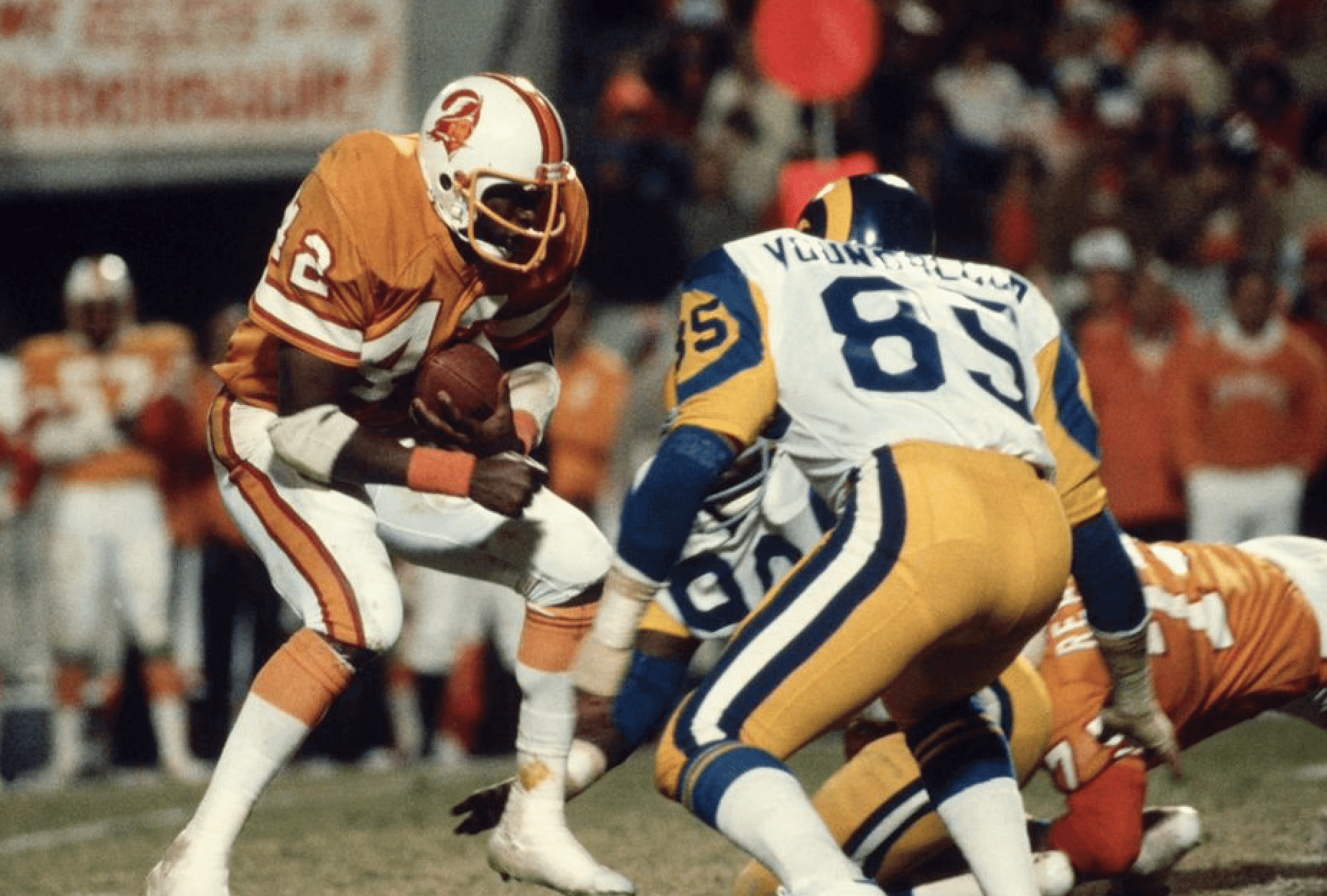
The video shown above has the entire 1979 NFC Championship game between the Buccaneers and Rams. (The Rams won and went on to lose Super Bowl XIV to the Steelers.) I put it there just to show how good these two teams can look when facing each other.
If you want a close-up, this should do nicely:
Now compare that to how these same two teams looked when facing each other last night:
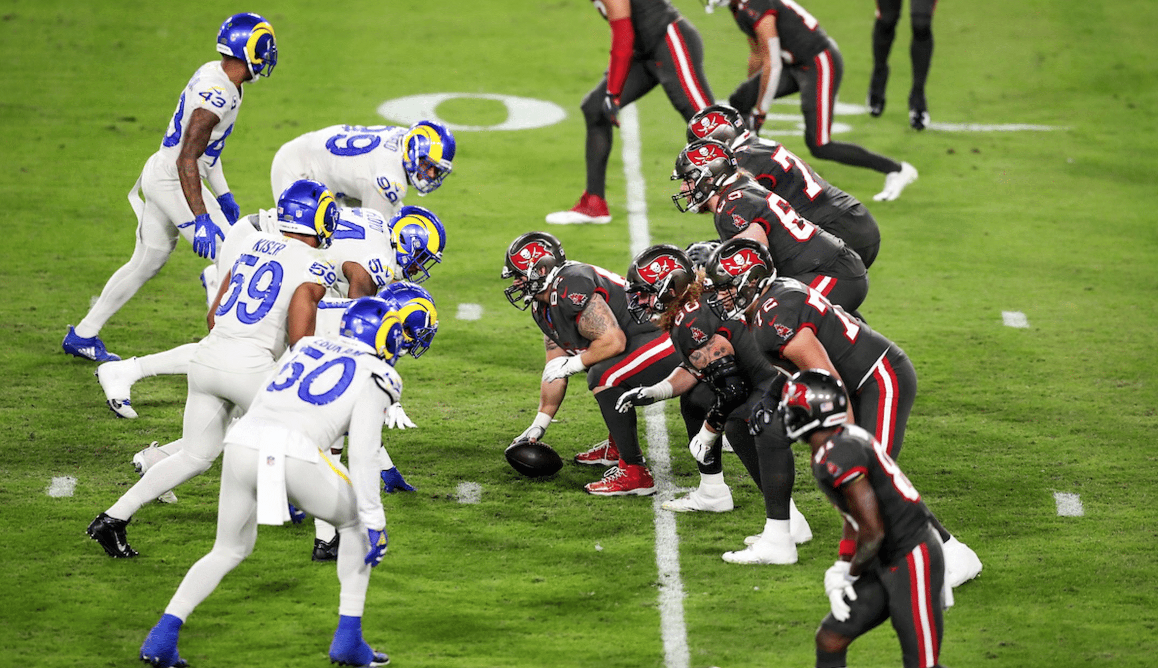
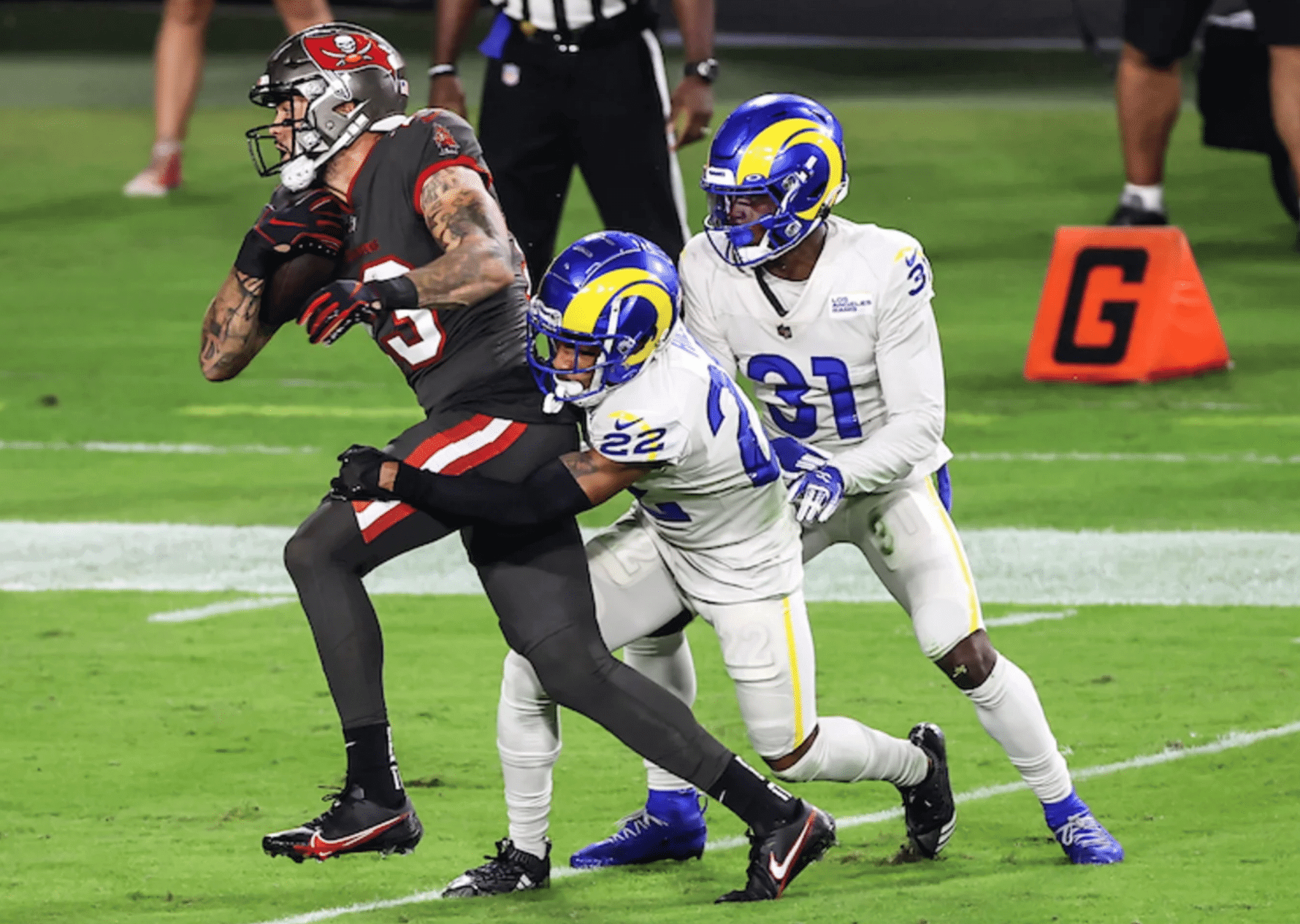
Dishwater vs. dogshit — what a disaster.
Naturally, there were lots of laundry jokes circulating during the game. Peter Macaluso said, “It looks like the Rams accidentally threw [their] white unis in the laundry with the Bucs’ brown ones.” And Zack Fowler said, “[I]t looks like [the Rams] meant to wear all-white but forgot to do laundry, and [the Bucs] meant to wear all-black but did too much laundry.” Nice one.
Now, this was obviously a very, very bad-looking game. But was it the worst-looking Bucs/Rams game ever? Before you answer that, consider what these two teams wore when facing each other in 2015:
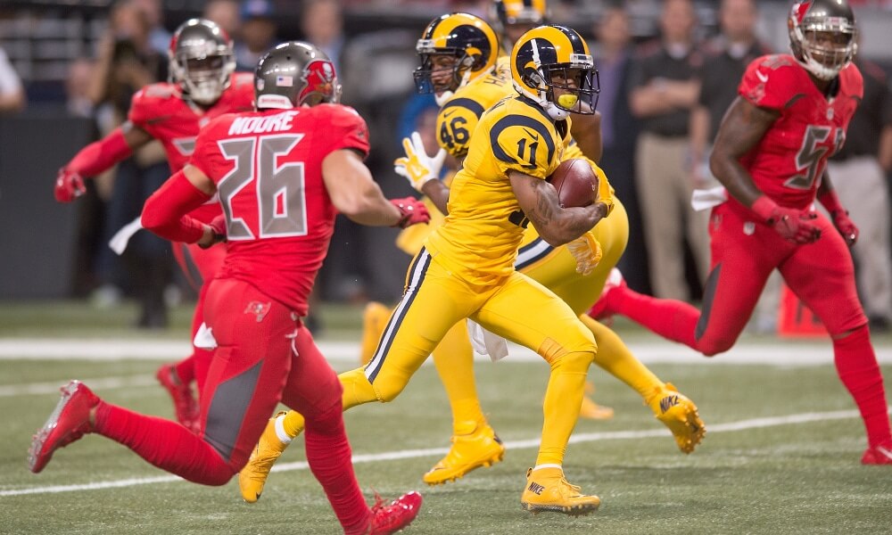
Ah, the infamous ketchup vs. mustard game, with the Bucs’ alarm clock numbers thrown in for good measure. If forced to choose, which would you opt for? If you want to study for the test before responding, you can see more pics from last night’s game here, here, and here, and you can see more pics of the Condiment Bowl here.
If forced to choose between those two football games, I think I’d rather watch baseball, or maybe go for a walk.
Two other notes from last night’s game: First, as you may recall from earlier in the season, lots of Rams players were wearing untucked blue undershirts with the dishwater uniforms:
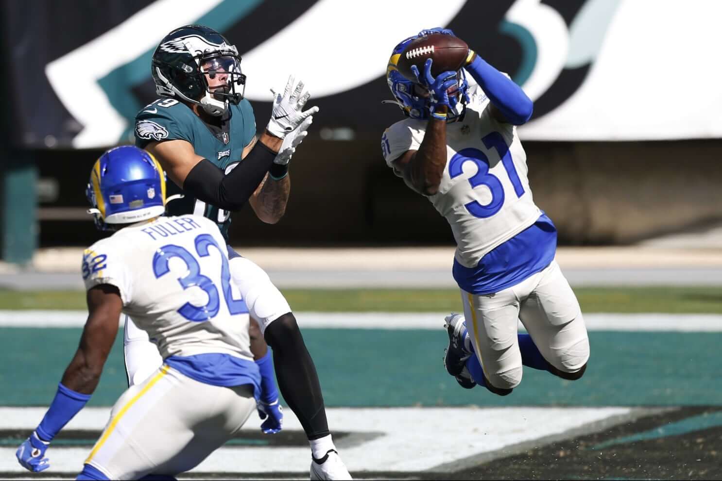
Last night they were wearing untucked dishwater undershirts, which still looked sloppy but at least didn’t create that miserable cummerbund effect. So this is the rare dishwater uni component that actually improves the uni’s overall look!
The other notable thing about this game is that it featured the first all-black officiating crew in NFL history (additional info here):
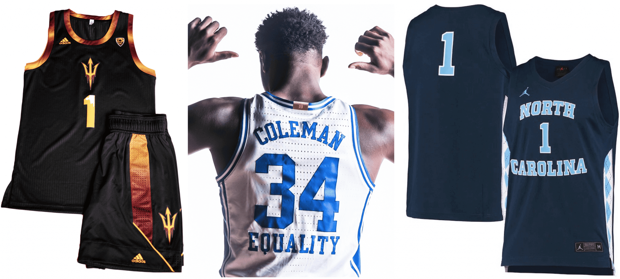
College Hoops Preview reminder: In case you missed it on Monday, the annual Uni Watch College Hoops Season Preview, with all the news on this year’s new uniforms, logos, court designs, and related issues (including Arizona State’s new black alternates, Duke’s new “Equality” slogan underneath the back numbers, and UNC’s new navy alternates, all shown above). is now available for your enjoyment on InsideHook.
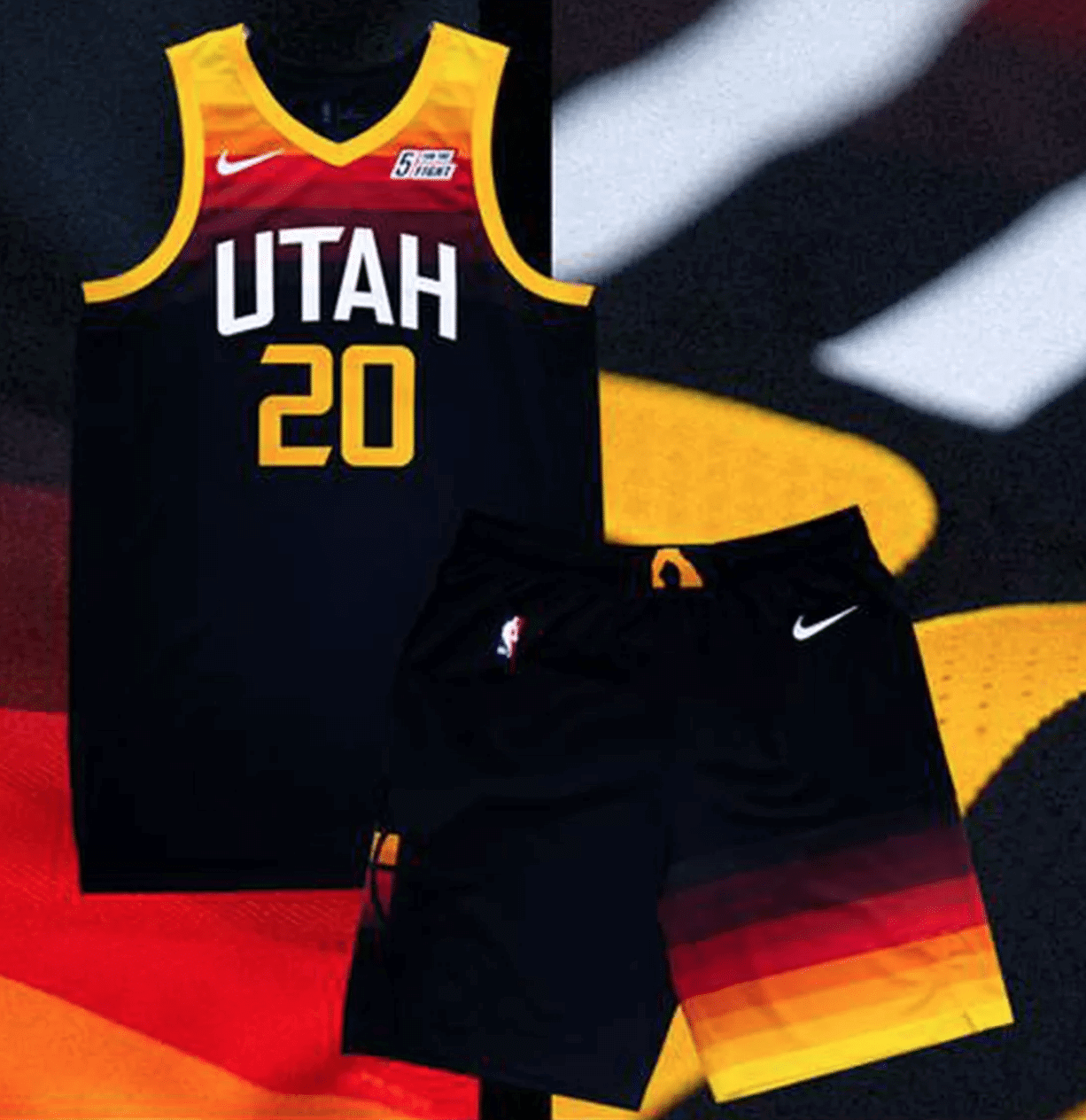
NBA hits keep coming: Let’s give credit to the Jazz, who’ve managed to combine two major uni tropes — BFBS and tequila sunrise — into their new City alternates. Additional photos and info here, here, and here.
As is the case with so many NBA alternates these days, this one comes with its own court design:
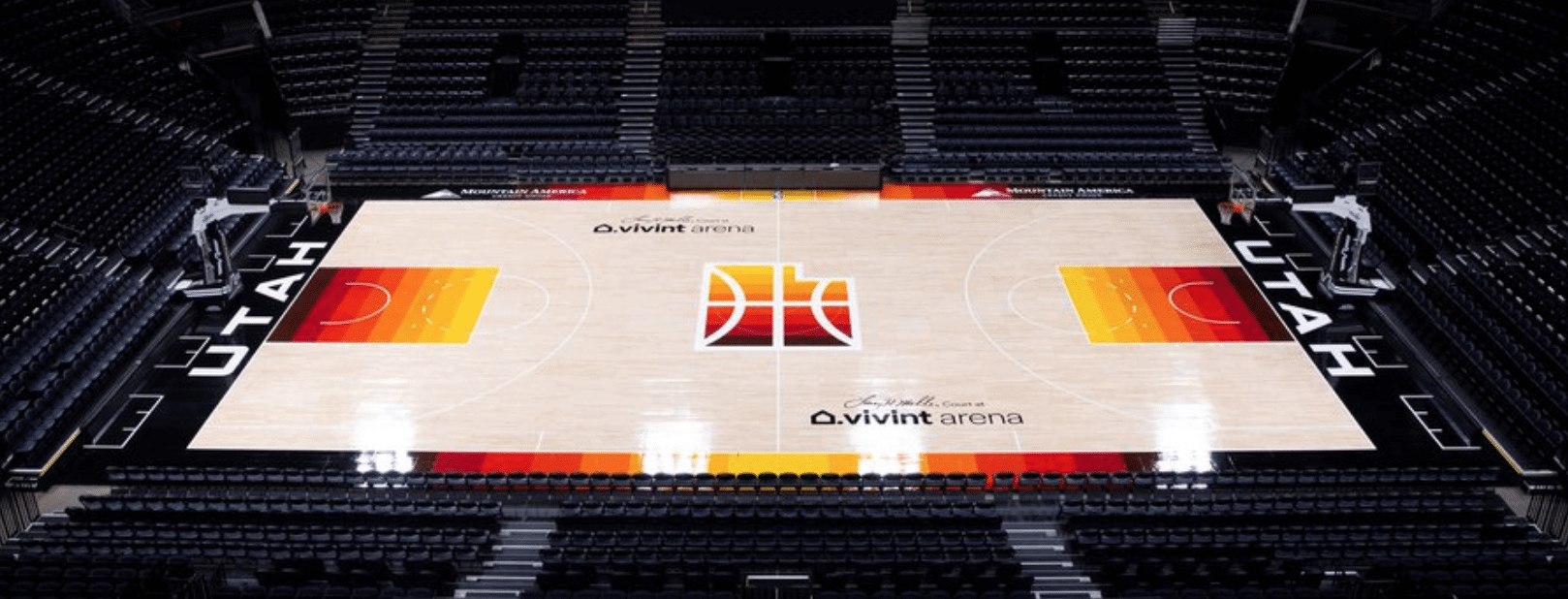
I think all of this may look pretty good in game action. As several people suggested yesterday, maybe it’s time to rename the team as the Utah Red Rocks.
Click to enlarge
Collector’s Corner
By Brinke Guthrie
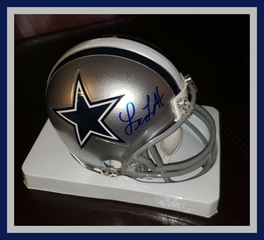
I was quite the Dallas Cowboys fan from the early 1970s through the late 1990s. So with Thanksgiving being two days away, now is the right time to feature this Leon Lett autographed mini-helmet. Lett won three Super Bowls as a Cowboys defensive lineman, but he’s most famous for two particular plays. One was in Super Bowl XXVII, when he was returning a fumble for an apparent touchdown and started celebrating a bit early:
Ouch. The following season, the Dolphins were lining up for a game winning field goal to beat Dallas (snowing in Texas Stadium!) and it was blocked! However, the ball was still live, and Leon zoomed over to scoop up the ball. This was an unfortunate decision — unless you were a Dolphins fan, of course:
Leon, you are forgiven. It’s Thanksgiving.
Now for the rest of this week’s picks:
• Another great Cowboys item here, dating back to 1970: It’s called a
Texaco Flip-Chart, and the local Dallas Texaco stations would have them every week. You fold them up so that the offense of one team lines up against the defense of another. They were great — I remember getting the new one every week!
• Paul would probably like this Reach, Wright & Ditson athletic equipment catalog from 1929. [Yes indeed! — PL]
• Here’s a set of 1960s Kansas City A’s scorecard pencils, “compliments of” the team. The seller notes, “Some wear.” Well, sure — they’re pencils!
• Speaking of “compliments of,” the American League graciously gave away these 1966 pocket schedules.
• Here’s a nifty two-in-one item for the New York Football Giants — a 1950s/1960s combination stadium seat cushion and poncho. (The poncho is contained in the seat cushion and there’s a zipper to pull it out. So, if it rains, you won’t get wet, but you won’t have anything to sit on, either.) The cushion includes the Giants’ old stadium-based logo, the pinstriped NFL shield, and “Football Country USA.”
• It doesn’t get much love, but I’ve always liked the World Hockey Association logo, available here on a sticker.
• Here’s a set of four St. Louis Baseball Cardinals stackable team coasters.
• This proves that companies will license anything: a 1980s Jim McMahon puppet and can cooler. Someone in marketing thought, “There is a need for this product.”
• How about this (guessing 1950s or ’60s) Green Bay Packers floaty pen! Now, this one has no ink, but the point here is that the football player would float across the field to catch the winning score!
• And here we have a 1969 Black Label beer can, celebrating the Boston Bruins’ 1969-70 Stanley Cup championship. (No beer, though!)
Got an item to include on Collector’s Corner? Tweet submissions to @brinkeguthrie
And be sure to check out the Uni Watch Facebook page starting Friday for a month of fun retro holiday content — an annual tradition curated by yours truly.
Click to enlarge
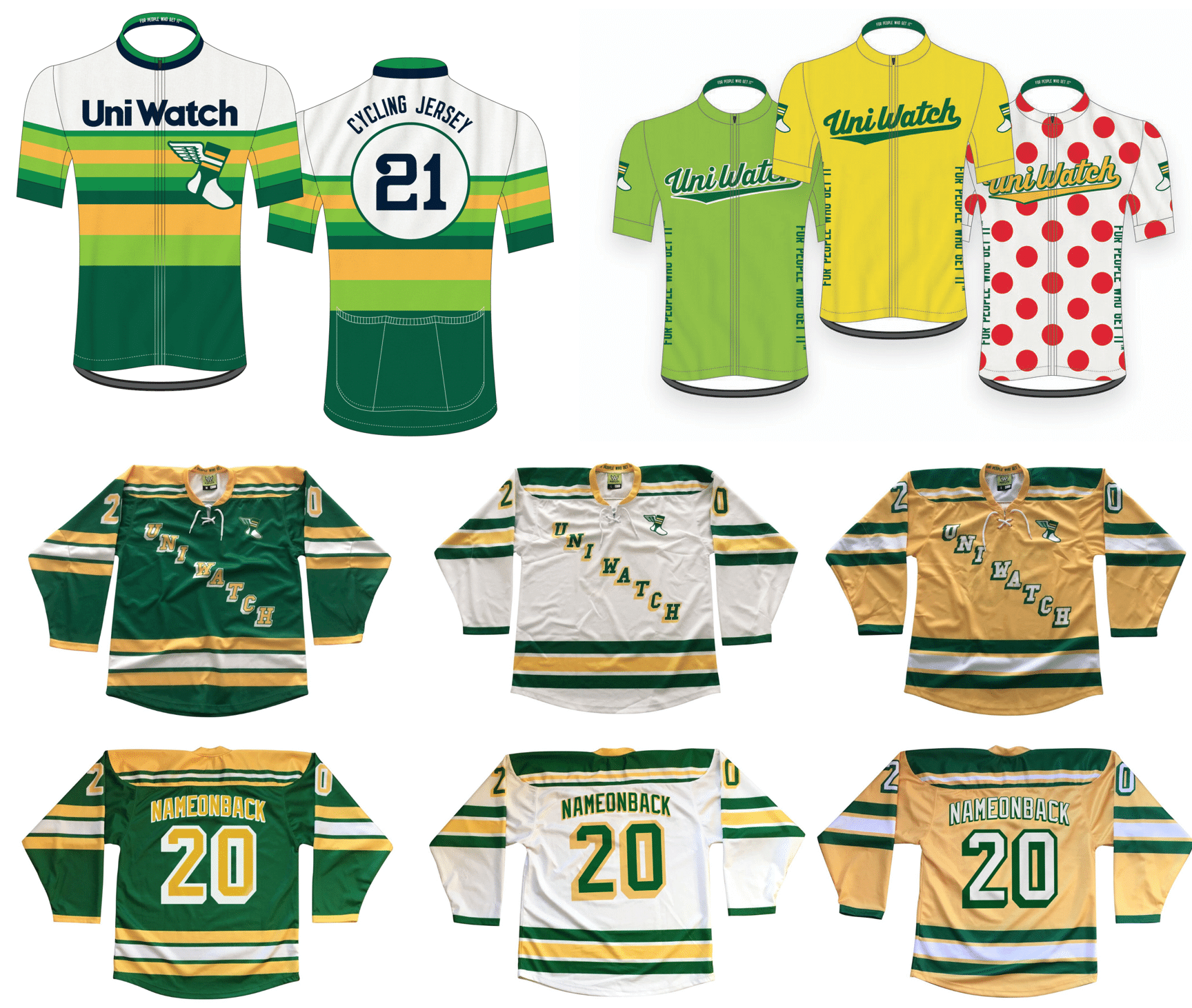
ITEM! Hockey, cycling jerseys available again: I’m happy to report that we’re taking pre-orders for another round of Uni Watch hockey jerseys, tequila sunrise cycling jerseys, and Tour de Uni cycling jersey — all available with your choice of number and NOB.
You’ll need to get your order in by Dec. 11, and they should arrive by mid-January. (Sorry, too late for Christmas delivery — mea culpa on that.) Full details here.
And as long as we’re talking merchandise, keep the following points in mind:
• The Uni Watch Classic Cap, which normally costs $39.99, is now only $35.99 — a 10% break. All fitted sizes are currently in stock, along with the adjustable strapbacks.
• I’ve also reduced the price of Uni Watch trading cards. Full details here.
• Today and tomorrow are the last days to get in on Teespring’s free shipping deal for all orders of $50 or more. You can combine items Uni Watch, Uni Rock, and Naming Wrongs shops (or any other Teespring items) to hit that $50 threshold. Use the checkout code FREEOVER50 to get in on the deal, which is good from now through the end of tomorrow.
My thanks, as always, for your consideration.
The Ticker
By Alex Hider

Baseball News: This 1972 photo shows Red Sox LF Carl Yastrzemski wearing a prototype of the sansabelt unis the team eventually switched to later that year — with a few notable differences, including pants striping (from AJ).

Pro Football News: The NFL is instituting new pandemic protocols that will require players to wear masks on the sidelines. … The Steelers will wear Color Rash uniforms on Thanksgiving (from Andrew Cosentino). … Following Sunday’s pregame skirmish between the Titans and Ravens, here’s a brief history of road teams disrespecting an opponent’s midfield logo (from Josh Tretakoff). … Jon Solomonson found one of those old Riddell soft-shell helmet toppers at a Florida antiques store, except the shell was outfitted as a throwback Falcons helmet. … Barry Sanders threatened legal action to prevent a Detroit brewery from using his image — in 8-bit form — on one of their beer can designs (from Mike Chamernik). … According to Wade Heidt, this graphic features a player in a uniform he will never wear. Toronto Argonauts QB Matt Nichols (No. 20) was signed by the team in February 2020 and was promptly photoshopped into the Argos’ 2019 set. Of course, the 2020 season was not played, and Toronto just debuted a new helmet logo for the upcoming season. … Matt Knobbe has built a page that allows you to send a custom-uniformed Tecmo Bowl Thanksgiving message to the recipient of your choice.
College Football News: Check out the cover of this 1966 Rose Bowl program, which features cartoon versions of the Big Ten and Pac-8 logos. They were designed by Disney Studios to celebrate Walt Disney’s selection as the grand marshal of the Tournament of Roses Parade that year (from Kary Klismet).

Hockey News: Several items today from Wade Heidt: NHL.com caught up with Terry Smith, the man who designed the original Sharks logo, to get his thoughts on the team’s new Reverse Retro jersey (also from Kary Klismet). … Charles-Edward Gravel, a goalie for the QMJHL’s Blainville-Boisbriand Armada, was called up last night and played the entire game in the mask he wore with the Mississauga Senators of the Greater Toronto Hockey League. … Luke McGeough, the son of deceased NHL ref Mick McGeough, wore one of his dad’s old jerseys while reffing a Saskatchewan Junior Hockey League game on Saturday. … A Wisconsin goalie took a shot to the head that dented his facemask in practice the other day (from Garrett Van Auken). … New BFBS uniforms for Holy Cross women’s hockey (from @OlegKvasha). … The NWHL’s Buffalo Beauts have new uniforms (from our own Jamie Rathjen).

Basketball News: For the latest in NBA number assignments, head to Etienne Catalan’s Twitter page. … Interesting photoshop treatment by ESPN for free agent PG Isaiah Thomas (from Cody Reeder). … Miami is the latest college program to put a social justice message underneath the back uni numbers (from Jason Lefkowitz).

Soccer News: New logo for the Egyptian Premier League (from Kary Klismet). … Here’s an interesting thread that imagines soccer jersey concepts for several UK-based supermarket chains (from Steve Kriske).

Grab Bag: Several items from Kary Klismet: Caledonia High School (Mississippi) is dropping its “Confederates” team name and opting instead for Cavaliers … X-Men writer Chris Claremont explains why characters tend to change uniforms and costumes intermittently. … New logos for the University of Pikeville, an NAIA school in Kentucky. … We have another NASCAR/football jersey crossover concept from Luis Fernando — this time it’s Dale Earnhardt’s silver and red paint scheme. … Here’s an in-depth look at the U.S. Army uniform from World War I (from Timmy Donahue). … Another one from Timmy: South Korea is now permitting people with tattoos to become police officers. … Disneyland security guards have their own challenge coin — a commemorative coin often carried by military members or law enforcement (from Nick Allen). … New uniforms for French volleyball club ASPTT Mulhouse (from Jeremy Brahm). … New jerseys for Indiana University field hockey (from our own Jamie Rathjen). … Here’s a video about the hidden history of Star Trek uniforms (from Steve Tilders).

Our latest raffle winners are Dan Netser, Casey Lute, Mike Engle, Bob Novotny, and Kraig Bishop, each of whom has won a Uni Watch Trading Card. Congrats to them, and my repeated thanks to Gordon Blau for sponsoring this one.
Dishwater vs Dogshit – classic, I love it!
Watching that game, all I could think was, “what is Paul going to say?”
“Dishwater vs. dogshit” did NOT disappoint. That had to have been the worst-looking game of the year. Yikes.
Unfortunately, this game has some earlier competition for worst this year.
-Detroit vs. Atlanta
link
-Seattle vs. Arizona
link
Yes, those were both TERRIBLE-looking games. I hate when the Cardinals wear all-black, especially when covlmbined with their increasingly-outdated current uniforms.
However, while both of those games were brutal (really, almost any game featuring “ATL” is awful), I think last night was still the worst.
I looked at my wife and said, “I’m glad this game was made for a color TV.”
Never forget that the mustard-ketchup matchup was also the final home game for the franchise in St. Louis. A friend, who is native to the STL area, always considered those uniforms the “final” insult to fans from Stan Kroenke before moving.
Correction in the college football section of The Ticker: the reference should be to the Pac-8, not Pac-10. Arizona and Arizona State didn’t join to make it a 10-team league until the late ’70s.
Got it.
I won! That never happens. Thanks Paul(and Gordon)!
“…maybe it’s time to rename the team as the Utah Red Rocks.”
I’d be fine with this. Give the “Jazz” back to New Orleans, which could then dump the Pelicans and go back to Mardi Gras colors.
The Louisiana brown pelican is a badass bird. It’s a good and locally specific name that’s not overly cliche New Orleans.
Agree. Pelicans is an underrated name for the team.
A bit more on the graphic featuring Toronto Argonauts QB Matt Nichols. He is wearing no. 20 in the graphic, but he is no. 16 on the roster for the Argos. So he will not be wearing no. 20 as well.
This graphic was released for the Facebook program to be seen on Nov 20. The Argonauts unveiled their updated Boat logo as their new primary logo on Nov 16.
We are not sure the uniform will look any different when the Argos are scheduled to take the field in June 2021, but this will be the logo on the helmet, The updated Boat logo replacing the Shield logo:
link
Thank you for showing that Red zsox prototype. You never cease to bring up great stuff. Looked like Angels pants.
Because of the similarity between the pullover/sansabelt Red Sox and Angels uniforms, I thought the Angels got the better of the deal. They had more detail and navy blue, making them look more “grown up”. The Red Sox lack of detail and extra red gave them an unfortunate resemblance to the Reds, who they ended up facing in the 1975 Series. I was never a fan of Cincinnati’s Big Red Machine look: They REQUIRE belts and buttons.
Couldn’t agree more with your take on the Rams and Bucs uniforms, Paul. They should go back to these immediately. You don’t have to reinvent the wheel. Have Nike streamline them like they did with the Cleveland Browns after their failed experiment. Same for the Miami Dolphins and Atlanta Falcons.
I prefer the Rams’ untucked Blue shirts with the dishwater. At least it gives the unis some zing! Albeit horrible zing.
I also prefer the Condiment colors to the grey/brown matchup.
I don’t know…maybe it’s just me, but…
I kind of like the Bucs’ all-pewter look? I thought it would be terrible. My personal taste is that I don’t like: 1) Matching jersey-pants combos, and 2) Dislike the “mono” look (jersey-pants-socks all the same color) even more.
But I thought they really were kind of nice looking.
The Rams’ “bone” set is garbage, but in a vacuum, I didn’t hate the Bucs’ look last night.
It’s not just you. I was surprised that I didn’t hate the look either. The Rams, OTOH, look like the freshman squad at practice wearing hand-me-downs. What a waste of such a nice color palette.
I’m with you Brian. I think the wide pants stripes saves the Bucs’ all-pewter set by giving it a great burst of color.
Yeah, I don’t hate the all-pewters. The Bucs’ current uni set is pretty good, IMO. Matches their best era.
The Rams, on the other hand, are a mess. There’s no reason for them not to be going pure white alongside their blue & yellow, and generally getting rid of all the gradients and odd design touches. Their classic set is top-tier. (To say something positive, the new primary logo has grown on me.)
But either way I’d take last night’s combo 100 times out of 100 vs. ketchup/mustard. Photos of that game should be buried deep in a mountain.
Wait, have I been using “mono” wrong? I thought that WAS the jersey/pants matching. I didn’t think it took into account the helmet for our discussion purposes.
For example, this past Saturday, Pitt wore royal pants at home and in the comments on Sunday I referred to that as “mono-royal” but they wore their standard gold helmet.
Kek, you are using it right. It does refer to the jersey and pants combo. The helmet is separate from that discussion.
For example, I do not like when the Buffalo Bills wear mono-blue. It is understood the Bills wear a white helmet. Mono-blue is blue jersey over blue pants. Bills wearing mono-blue just an example for how NFL teams do not want to honour the integrity of their uniforms anymore and will make a decision to dress like a college team.
My favorite tale of a team disrespecting a midfield logo was Auburn dancing on the eye of the tiger in Baton Rouge against LSU in 2001.
link
Don’t know if you saw/reported this yet but noticed in your college preview you mentioned Marquette having powder, white, teal uniforms. They wore them in scrimmages within the past few days, so only one we haven’t seen is the black one. They even mixed up jerseys and shorts for a mismatch, which hopefully isn’t something they do during the season. Check their Twitter for pictures.
NASCAR/football jersey concept is Dale Earnhardt…not Jr.
This community seems to care more that the 1979 NFC championship looked good, but was an actual awful game to watch from a pure football standpoint (an absolute bore / terrible play).
Last nights regular season game “looked awful” but was 100x more exciting with so much less on the line.
You (all) almost remind of “you’d rather look good and lose rather look bad and win”
A good-looking game and a well-played game are not mutually exclusive. But this website is about how the game looks, not now it’s played. That’s why “this community seems to care more” about that.
That was the 9-0 game right? I often wonder what kind of game the Super Bowl would have been that year if the Bucs and Steelers played!
Imagine if the Oilers beat the Steelers in the AFC title game then played the Bucs…
link
THE CONTRAST!!!
The Oilers would be the home team, meaning they’d be wearing blue over white…fantastic (save those gray face masks!) but we’d get the Bucs in their all-white roadies…meh.
I prefer the matchup we got (save those gray Rams face masks!)
You realize what the whole premise of this website is, right?
• How about this (guessing 1950s or ’60s) link! Now, this one has no ink, but the point here is that the football player would float across the field to catch the winning score!
I’m going to say 1980s on that one. The player seems to be a pretty clear reference to link, a statue that used to stand outside the link, before they moved it inside Lambeau Field. I mean, the link is link. The statue was installed in 1985, which would indicate the pen came after that.
Pretty sure I had one of those floaty pens myself. What a beauty. But I never noticed the little player had a set of Braisher stripes link….
Thanks, Chance! I love learning little tidbits like that from this community!
another ‘look’ that’s driving me nuts:
all these players with undershirts sticking out the bottom of the jersey…..
just looks slovenly…..
Since the city uniforms dilute the brand/identify/tradition of the teams, i can get behind a “series,” for better or worse. Miami, Denver, now Utah… probably forgetting a few.
The thing I love most about the San Jose Sharks logos is that the same artist who created the first link.
Of course, he still didn’t know all that much about hockey, even after all that time. Which is the thing I love second-most about that logo.
At least in the previous game the Rams wore some blue socks, that made the dishwasher slightly more palatable.
Also…..I REALLY want the Barry Sanders beer can.
Agreed that the 79 Rams and Bucs uniforms looked great. However in that game the light orange and yellow contrast isn’t so great. This would have actually looked great as a color vs color matchup, with the Rams wearing their royal blue jerseys.
Before I could even register that the uniforms were a mess, my gut reaction was that something was wrong with my television. Had one of the kids gotten into the settings and turned down the saturation!?! Nope, just stupid washed out uniforms from both teams!
I actually didn’t think the Bucs all pewter didn’t look that bad, although I would prefer it with orange trim. The Rams on the other hand, need to just scrap it all.
In a vacuum, the Bucs’ pewter jerseys are okay.
But not when they’re worn with pewter pants and socks.
Re: Reach Wright Ditson catalog. in conjunction with Spaulding, Wright Ditson made golf clubs. They were the cheaper (store) brands, typically for beginners. Reach was the official American League baseball in the 50s and 60s.
Probably got absorbed in corporate mergers along the way.
Those horrible Ram dirty dishwater uni’s look like practice uniforms that never get washed.
“Check out the cover of this 1966 Rose Bowl program, which features cartoon versions of the Big Ten and Pac-8 logos. They were designed by Disney Studios to celebrate Walt Disney’s selection as the grand marshal of the Tournament of Roses Parade that year”
This article has more information about that Rose Bowl program and Walt Disney’s stint as Rose Parade Grand Marshal:
link
It includes a cool Donald Duck-themed illustration from the interior of the program, too.
Not only Donald, but Huey, Dewey, and Louie!
Another gem is the cover of the game program, with its Disnified versions of the Big 10 and Pac 8 mascots.
link
“Except for the native mascots, any one of these would be an instant improvement over what the various universities use now.”
Agreed! I’m a particularly big fan of Disney’s take on Indiana’s mascot, although Hoosier fans apparently feel differently:
link
I dunno, that’s a pretty positive reaction by Twitter standards.
Rams are 5-0 wearing the dishwater “bone” pants.
Ketchup vs mustard is, by far, the worst of them. It’s actually jarring to look at the pic. Besides, I don’t really understand the hate for having a grey away uniform.
Those Rams photos are a perfect showcase for how lame plain white socks look. Colors and stripes please! The all-white socks look presents as practice attire. Games look like scrimmages. Paul’s photos make a great case above.
I have to say this about the Rams new uniforms for 2020, for as bas as they look up close with all the silliness, on TV from a distance they look good. The gray, err, “bone” is just not a good idea but the royal blue of the helmet with the yellow horns really pops and by extension to me makes the set look a lot better on TV than I thought they would.
I agree, I love the Rams current royal blue and yellow. If they would use these two with the concept from the 1979 photo Paul put up it would be near perfect.
Surprised no mention of the 1999 NFC Championship game of the Bucs and Rams as the Rams wore their royal blue / yellow combo vs the white / pewter of TB.
Would this be considered almost acceptable in the colorful and very varied uniform maychups of these 2 teams?
I know I’m late to the game here, and I am completely the dissenting opinion here… but I loved the Rams/Bucs uni-matchup last night.
I like the bone color a lot. And I love the pewter.
Was it a classic? No, far from it. But in terms of a modern uniform look, I found myself quite enjoying both sides of the game.
Rams uniform set should be called “longjohns”
I like the Rams’ new helmets. The rest? Not so much. They should have kept the blue jerseys and gold pants (the 70’s, 80s and 90s version) and just added the new helmet. The blues from the helmet and jersey would match and they would be looking good. Ah well.
I don’t recall that ketchup/mustard game- just as well. As far as I’m concerned, the Rams new set is the worst ever rolled out. Dishwater/rubbery shiny numbers, stupid horn redo- the worst. Just no redeeming qualities. Go back to last years throwbacks, the GSOT look; that’s your primary. Have the navy/white as an alt. Done, and then LEAVE IT.
Now get off my lawn.