Two more NBA City alternates were unveiled yesterday. And in a change from recent events, neither of these had previously been leaked!
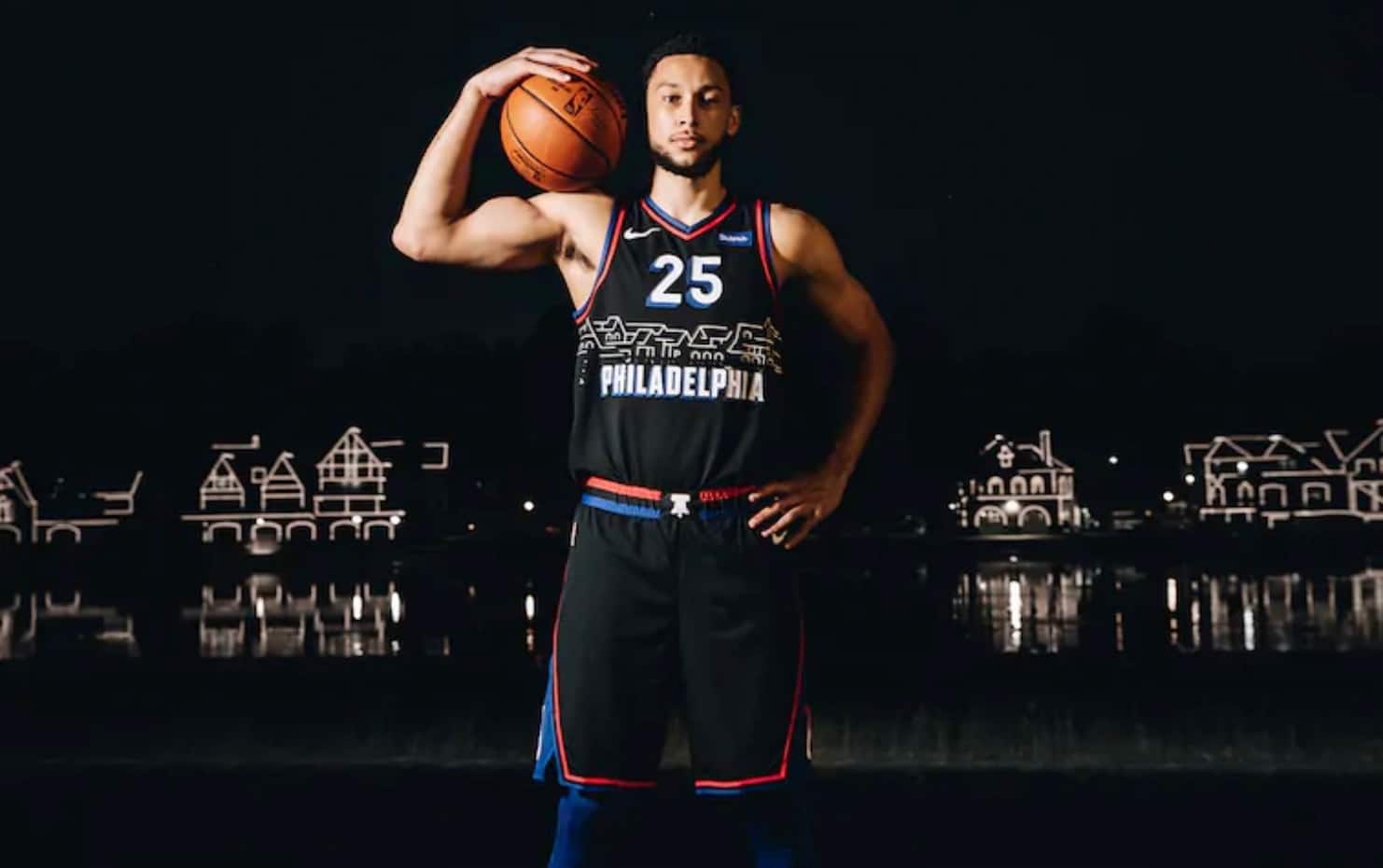
Let’s start in Philly, where the 76ers are going with the black design shown above. According to the press release:
[T]he uniform showcases Boathouse Row, an iconic U.S. Historic National Landmark that runs along the Schuylkill River, just west of the Philadelphia Museum of Art.
With black as the uniform’s primary color, the design is inspired by the one-of-a-kind Philadelphia view Boathouse Row provides at night. In the wake of the country’s bicentennial, each boathouse was lined with lights in the late 1970s, which reflect each evening on the river, creating the visual mimicked on the uniform.
But wait, I thought Philadelphia was a “blue collar city,” not some hoity-toity elitist haven full of art museums and fancy-shmancy riverside mansions. I wish the sports world could make up its mind on this stuff, because it’s all very confusing!
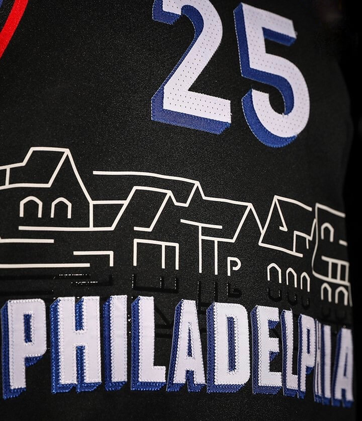
Here’s a closer look at the front of the jersey. If you look right at the center, you can see that they hid a little “TTP” in there, for the team’s “Trust the Process” catch-phrase (click to enlarge):
This is clearly one of the worst City uniforms. Bad design, fairly inscrutable inspiration, and no discernible connection to the rest of the team’s visual program — a lose-lose-lose. The funny thing is that Sixers prexy Chris Heck loves to refer to things being “on brand,” a phrase that’s almost the antithesis of this design. (As an aside, this unveiling, combined with a few others, prompted an amusing piece about how it’s enough with all the BFBS NBA uniforms already. ESPN’s Zach Lowe also has a piece about the story behind the uniform’s development, but Lowe is now behind the ESPN+ paywall, so you may not be able to see it.)
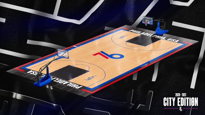
This uniform will have its own court design, which isn’t bad (click to slightly enlarge):
———
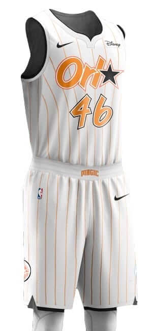
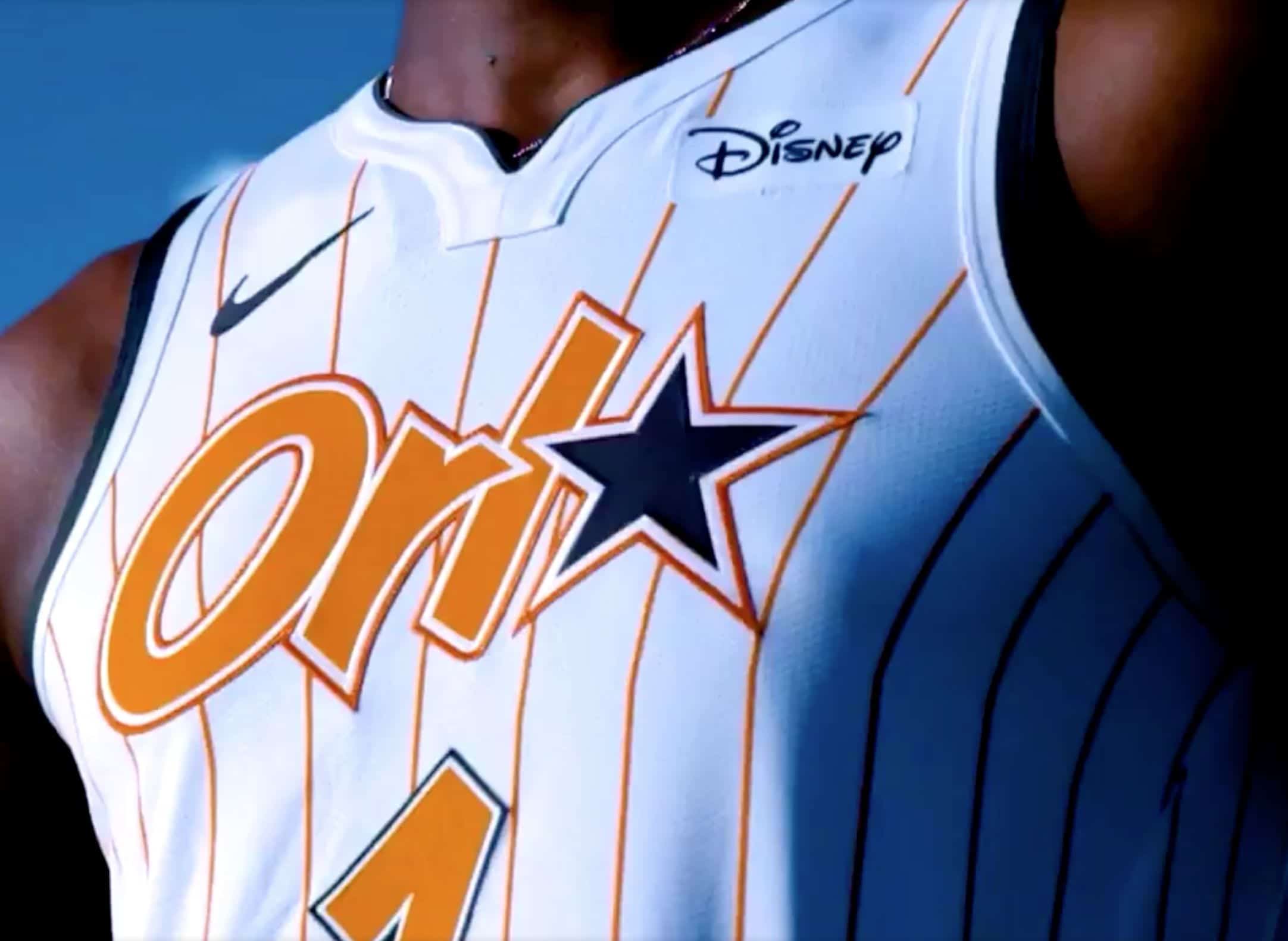
Now let’s turn to Orlando, where the Magic have unveiled a new orange-pinstriped design (click second image to enlarge):
There are some additional close-up photos (and some embarrassingly amateurish marketing verbiage) here.
I kinda like this one. I’ve always liked orange as an accent color on uniforms, and the typography is a fun throwback to the team’s early days. Yeah, the whole “Orl★” thing is silly, but I can live with it, and the overall feel is certainly way better than the team’s previous orange/”ORL” design, right? Overall, I’ll certainly take this one over the Sixers design.
Meanwhile, we have a new leak. A retail shirsey suggests that the Celtics’ new alternate will be based on the team’s championship banners:
O @sigD foi certeiro na inspiração para o layout: os incontáveis banners dos títulos dos Celtics.
Particularmente, adoro camisas que tem o nome completo da franquia. Já deixo aqui o meu joinha. 👍 pic.twitter.com/OfS2ZLvf7M
— Camisas da NBA (@camisasdanba) November 11, 2020
#ReverseRetro @adidashockey pic.twitter.com/B9nhVAyK0b
— NHL (@NHL) November 10, 2020
NHL update: Fun times yesterday, as the NHL and Adidas promoted the upcoming “reverse retro” uniform program (let’s just call it “RR” for short) by posting the video shown above. The various teams then tweeted their own versions. Here, for example, are the ones for the Devils and Islanders, which seem to indicate that their reverse retro jerseys will be green and navy, respectively:
#ReverseRetro @adidashockey pic.twitter.com/38ZiQP16fc
— New Jersey Devils (@NJDevils) November 10, 2020
#ReverseRetro @adidashockey pic.twitter.com/qhj1MSPt6h
— New York Islanders (@NYIslanders) November 10, 2020
That prompted Icethetics honcho Chris Smith to create this helpful gallery showing screen shots of each design:
Here are all 31 jerseys from the #ReverseRetro preview video released by @adidashockey today. Looks like the numbers sync with the retro year.
I've labeled each one with my prediction for what team is represented. Some are a bit tricky. pic.twitter.com/ZoPxPkhHYq
— icethetics (@icethetics) November 10, 2020
And that in turn prompted Twitter-er Ricky Adams to predict which uniform in each’s team’s history would be the basis for the RR designs, which you can see in this Twitter thread.
Fun stuff! Lots of tea leaves to read, so have at it! The full program will launch next Monday, Nov. 16.
Click to enlarge
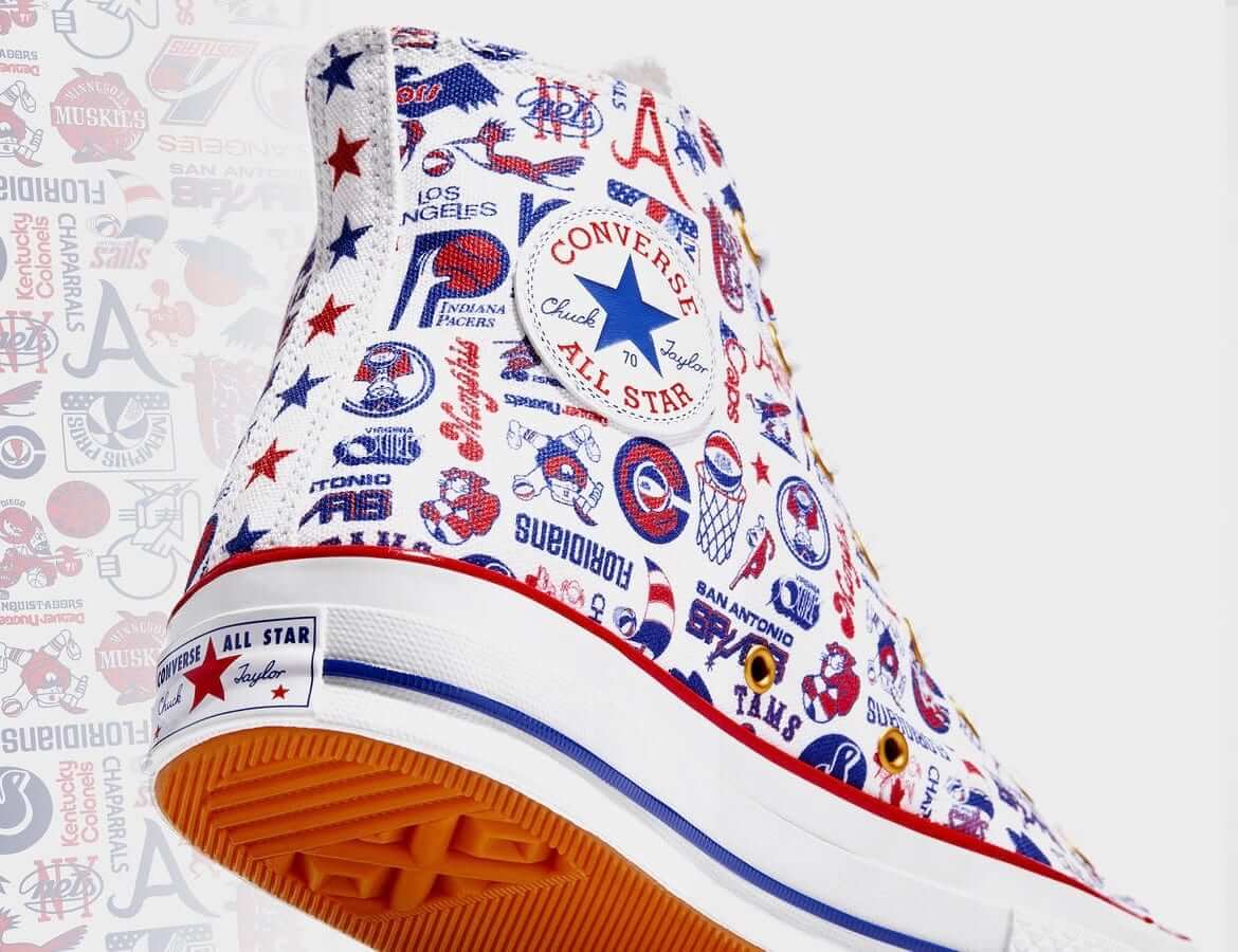
Too good for the Ticker: I don’t usually get too excited about sneakers, but I do often get excited about old ABA logos, so I’m pretty stoked about these new ABA team-logo Chucks that Converse has just released. Additional info here.
(My thanks to our own Brinke Guthrie for letting me know about this one.)

Membership update: It’s rare that we do a membership card based on the front of a jersey, but I was willing to bend our usual rules for Bennett Ford, who wanted a card based on Iowa State’s Jack Trice-themed throwback because those jerseys looked like normal jerseys on the back. Nice choice, Bennett!
Bennett’s card is one of several that have been added to the membership card gallery. As you can see at the top of that page, we are now just two cards shy of our 3,000th design in the card gallery. Amazing!
Ordering a membership card is a good way to support Uni Watch (which, frankly, could use your support these days). And remember, as a gesture of comm-uni-ty solidarity, the price of a membership has been reduced from $25 to $20 until further notice, plus a Uni Watch membership card entitles you to a 15% discount on any of the merchandise in the Uni Watch, Uni Rock, and Naming Wrongs shops. (If you’re an existing member and would like to have the discount code, email me and I’ll hook you up.)
As always, you can sign up for your own custom-designed card here, you can see all the cards we’ve designed so far here (now more than 2,900 of them!), and you can see how we produce the cards here.
The Ticker
By Lloyd Alaban

Baseball News: Free agent P Trevor Bauer has signed an endorsement deal with Lids. In the announcement photo, he wore nine caps from nine different teams. The Nationals, who have supposedly been gunning for Bauer, did not make an appearance among the nine caps. … Kansas State players have been issued a workout T-shirt that displays the university’s wordmark when wet (from Griffin Smith).

Football News: Flag desecration helmets this week for UAB (from Clint, who didn’t give his last name). … Boston College will wear their bandana alternates this week against Notre Dame (from Bill Abley). … The Iron Bowl has a new advertiser (from Timmy Donahue). … The Clemson Uniform Tracker has been updated.

Hockey News: New mask for Penguins G Tristan Jarry. … Posters of the newest inductees to the Hockey Hall of Fame in Toronto have been hung up (from James Beattie). … New unis for Michigan Tech (from Shane Brown).

Basketball News: It looks like the NBA’s “Earned” uniforms, which debuted two seasons ago and then were scrapped last season, are coming back (from @BradyTheMan17). … New uniforms this season for Cal State Northridge. … New home whites for SIU-Edwardsville. … TCU will be wearing a patch this season featuring a program that wants to help bring the student body closer together. … New court for Kentucky men’s. … Duke announced it will not have fans in attendance this season due to the pandemic.

Soccer News: The photo gallery accompanying this article shows that players from Maine high schools Scarborough and Kennebunk all wore masks on the pitch last night, although many of the masks were falling down below the players’ noses and, in some cases, their mouths (from our own Anthony Emerson). … New Karneval-themed shirts for German side Köln (from Ed Zelaski).

Grab Bag: Golfer Bryson DeChambeau will wear the DraftKings logo at the Masters (from Mike Chamernik). … Saturday Night Live had less than three hours to recreate Vice President-elect Kamala Harris’s white pantsuit look for the show’s cold open on Saturday (from David Dahl). … New Indigenous-themed uniform for the Perth Scorchers of the Australian Twenty20 cricket league (from Shawn Hairston). … In a related item, and also from Shawn, the Australian men’s cricket team will wear this Indigenous design for the Dettol T20 series against India. … UPS is lifting its ban on beards, braids, and piercings. Tattoos, however, must still be covered. … New uniforms for Italian women’s volleyball club Volleyball Bergamo (from Jeremy Brahm).

Click to enlarge

What Paul did last night: On Seinfeld, one of the occasionally recurring themes was the “pop-in,” which is when someone just spontaneously pops in (or drops by, or shows up, or whatever). I was always puzzled by that, because I never knew anyone in my adult life who just popped in, nor did I ever pop in on someone myself. Social interactions at people’s homes were rarely if ever spontaneous — they were planned in advance.
One of the nicest things about our porch ritual is that we occasionally get pop-ins. Since our friends and neighbors have learned by now that we’re out on the porch at more or less the same time each day, they’ll sometimes swing by to say hi. Sometimes they ask in advance, but more often they just show up. That’s what our friend Virginia did yesterday — she was on her way home from some errands and made a detour to our block to see if we were porching. Which we were! She had a bottle of wine in her backpack (one of her errands had been to stop at the liquor store), so we got her a glass and she joined us — at a safe distance, of course — for a bit.
This element of spontaneity is nice, especially during a period when so many days are so mind-numbingly similar to each other.
As always, you can see the full set of daily Pandemic Porch Cocktails™ photos — now almost 240 of them — here.
Today is Veterans Day. If you’ve served in the military, please accept my sincere thanks for your service. — Paul
That ABA shoe is cool, but ABA merch like that is a sore point with guys who played in the ABA. Former ABA player Bob Netolicky: “This is bullshit! The NBA making more money off the ABA and still refusing to give us our promised pension rights!” ABA players contend the NBA is underfunding their pensions.
Interesting — didn’t know about that. Thanks for the info, Jeff.
Much less importantly, shoehorning all the logos into red, white and blue loses something.
I used to look forward to NBA uniform unveilings growing up. Now, I am thoroughly exhausted by the year after year turnover. New uniforms that take some vague theme from a city or team and use whatever colors they want. It is clear that the idea to create new things is driving this program more than design. I am worn out and we have yet to even get through the majority of the new stuff for this season.
A lot of us feel the same way. It compromises the respectability of a uniform that should exist for teams in a league of this caliber. City edition uniforms look more like travel brochures than a good uniform for the team for some.
The release of the uniforms now lacks importance compared to how it was. It has gone too far to feed the interest to sell new jerseys. I see one of these NBA releases, usually don’t like the uniform or take it seriously. It will be replaced anyway in a couple of seasons right? Completely muddles a team’s identity. Remind me again what is the colour scheme of the Denver Nuggets? I should not have to think too much about it to know.
Concern now is the NHL is stepping atop that slippery slope when we see what is released on Monday.
I rowed in college in Philadelphia and worked a job on Boathouse Row, so Boathouse Row is extra iconic in my mind – I even have a framed photo of it in my house. I had ZERO idea that this uniform was supposed to be Boathouse Row. What a fail.
Really? That jumped right out to me. It’s definitely unusual, but I think it works. I’m generally a traditionalist with uniforms, but it’s nice to see the Sixers try something other than “Constitution” or “Liberty Bell.” There’s a lot of other awesome things in Philly!
There’s a lot of other awesome things in Philly!
Indeed. Still waiting for that Mütter Museum-themed uniform!
Nice! That would be a sight!
Wondering: Does formaldehyde have a color? -C.
Maybe a Scrapple or Cheese Steak themed uni?
Strongly agree about how iconic Boathouse Row is for this city. I’d put it just behind the Liberty Bell and above the art museum steps in terms of Philly landmarks.
I thought it was very obvious that it was what’s depicted on the jersey. The ESPN piece mentions that Ben Simmons got to weigh in quite a bit on the jersey’s design. The black was his doing, which for me is the weakest element. He wanted to “throw back” to the Iverson era, though the final product doesn’t make that too obvious.
As a brief Philadelphian in childhood, Boathouse Row feels like it’s a locally iconic symbol of the city. Every city has a thing or two that if anybody knows anything about the city, they know that thing, as well as a thing or two that locals might have first in mind when they think of their own city. The two lists aren’t always the same. So like if I know somebody has never been to Philly, they’ll recognize the Liberty Bell and the cheesesteak. Boathouse Row seems more like a thing that will be front-of-mind for locals.
Still, while I immediately understood what the new Sixers uniform was intending to say, I don’t think it’s a particularly good execution of what is otherwise a fine idea.
Paul,
I’m about 99% certain the Sixers #OnBrand hashtag is a direct reference to current GM Elton Brand. It’s a much lamer version of #TrustTheProcess which was ex-GM Sam Hinkie’s motto.
link
I say it’s “lame” because while Brand has accelerated the team’s success, he’s arguably stalled it with some horrible moves in free agency.
There’s a lot of significance and history around Boathouse Row to Philadelphia. They’re not actually elitist mansions, but club houses where rowing teams keep their crew rowing boats and sculling equipment. Mostly college teams, but I think some private clubs. Boathouse Row hosts one of the country’s top crew regattas each year, and that stretch of the Schuylkill River is known in the area to be particularly scenic when rowers are out practicing on the water. The street that follows the Row is named Kelly Drive, after Jack Kelly, a former Olympic medalist in the early half of the 20th century (and Grace Kelly’s brother). So…still elitist, but not just random mansions — ha.
My first reaction to the uniform is it’s too modern, especially since I love the Sixers’ current traditional style. I think, for Philadelphians, it’s a cool idea that doesn’t just retread another “Constitution” or “Liberty Bell” design. I actually like the mirrored lights in the “water” of the jersey. Of course, it’ll probably all look muddled on the court. It’s an interesting idea, though!
I’m glad someone set Paul straight on his complete misunderstanding of Boathouse Row. If he had done ANY research on it, he would have known something before he typed.
I don’t know about Paul, but personally I don’t want to research novelty uniforms of teams I don’t care about.
Lee
Embarrassing that nobody in the Sixers press office bothered to proofread and catch the “U.S. Historic National Landmark” reference.
Saw This pop up on my feed. This is Jace Whittaker, a rookie for Arizona. It is weird to see a DB without anything on their arms/hands.
link
On popping in – when I was a kid my great uncle used to pop by in his green Dodge Dart. If we were not home when he came by he would call us up later and complain. Good times.
At first, I thought the Philly uni was a memorial for the MOVE bombing in 1985. I’m glad they set me straight.
The Orl⭐ jersey is just dumb. All these uniforms with 3-letter city nicknames have to go. Does anyone call Orlando the Orl? It’s not like that is their airport code. Just makes me dislike the NBA more and more.
It doesn’t even read as an airport code to me. It scans as ORLA to me.
Honestly, so did I. -C.
What the hell do the Dallas Cowboys have to do with Orlando?
The star dates back to the Magic’s original branding: link
*Sigh*Another airport code jersey…
ORL Orlando Executive Airport
Boathouse Row. Why I come to Uni Watch.
I agree with Paul, the Orlando jerseys are not a bad look, but through my eyes, changing a minor detail or two could improve their overall appeal. I think changing the secondary color from black to the usual ‘Magic blue,’ the team utilizes would take these from being serviceable to a decent look. IMO, too often it seems orange is paired with black pertaining to uniforms, too the extent of being close to by default. Which is a shame BC orange gracefully compliments many colors and when designers manage to not default to black it can result in a winning look like the FL Gators, TB Creamsicles,HOU Tequila Sunrise, etc.
I think that new Michigan Tech hockey jersey is just great. What day you Paul and team? Miss the old WCHA, but Big Ten hockey starts of Friday the 13th!
Looks good, I agree!
Wow. I totally missed that in the ticker today. Glad I read these comments. Those uniforms (not just the jerseys) are fantastic.
Imo the sixers jersey is a knock off 80s nuggets jersey but a lot worse. Also if you need an idea for a blog post i redesigned the entire nba with 36 new teams on 2k, so there are a lot of caps on what i can do
When looking for more photos of it, I found that the Ryan O’Malley apostrophe-less jersey from yesterday (link) was also mentioned in a *very* early Uni Watch column!
link
Oh, wow — we’ve reached the point where I’ve forgotten having written about certain things in the blog’s early days!
Interesting observations about pop-ins. When I was a kid, we had a half-dozen people who would drop in all the time. It was just routine. Most never even knocked, or at most knocked and let themselves in. We rarely ate dinner without somebody dropping in. It seems strange now, but way back then, it felt completely normal.
What time period was this, Mike?
Paul, I’m with you on the ridiculousness of well-paid athletes calling themselves “blue-collar,” but boathouses ain’t mansions and Philly (and plenty of other urban areas) still has every right call itself blue-collar. I don’t get what your point is with this odd comment – the Sixers aren’t in any way claiming that their players are blue-collar.
I never said the Sixers were saying that.
I’m just making fun of how people can describe as place a certain way (blue collar!, gritty!, etc.) when it suits their silly marketing purposes, and then other people will describe it a completely different way (art museums!, historic landmarks!, etc) when it suits a different set of silly marketing purposes. That’s all.
That makes sense. I appreciate your response.
Thanks, Steve — back atcha.