For all photos, click to enlarge
In yesterday’s Uni Watch World Series Preview, I mentioned how joyless and brutalist this year’s World Series sleeve patch is. There’s nothing the Rays and Dodgers can do about that, but one team did take a more thoughtful approach about how to wear it.
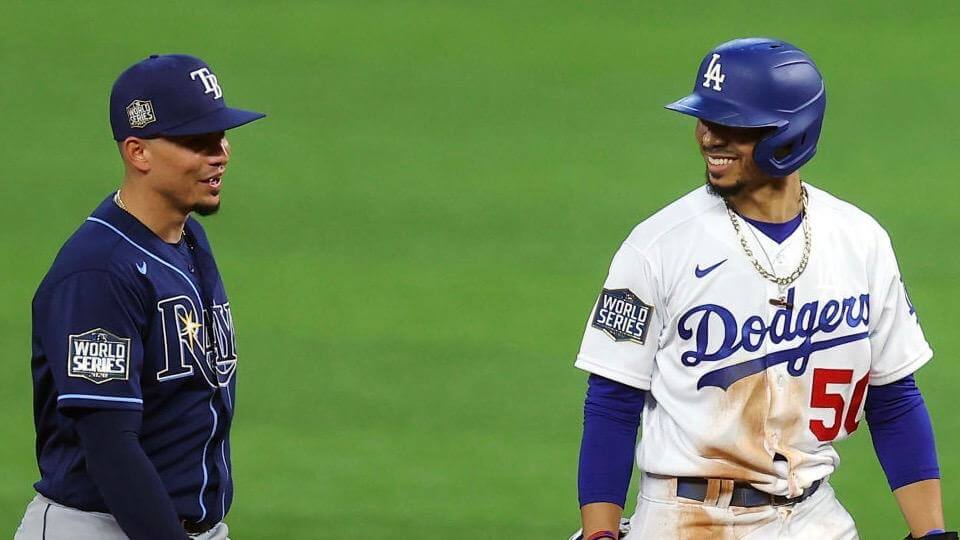
Take a look at the photo above, which shows Rays infielder Willy Adames and Dodgers outfielder Mookie Betts chatting during last night’s Game One. If you look closely, you can see that Betts’s sleeve patch is riding a bit higher on his sleeve. (Yes, I realize the Rays have the contrast-colored piping, which at first glance might make it harder to compare the two patches, but the Dodgers have a seam in that same spot, so it’s easy to see that Betts’s patch is clearly higher than Adames’s.)
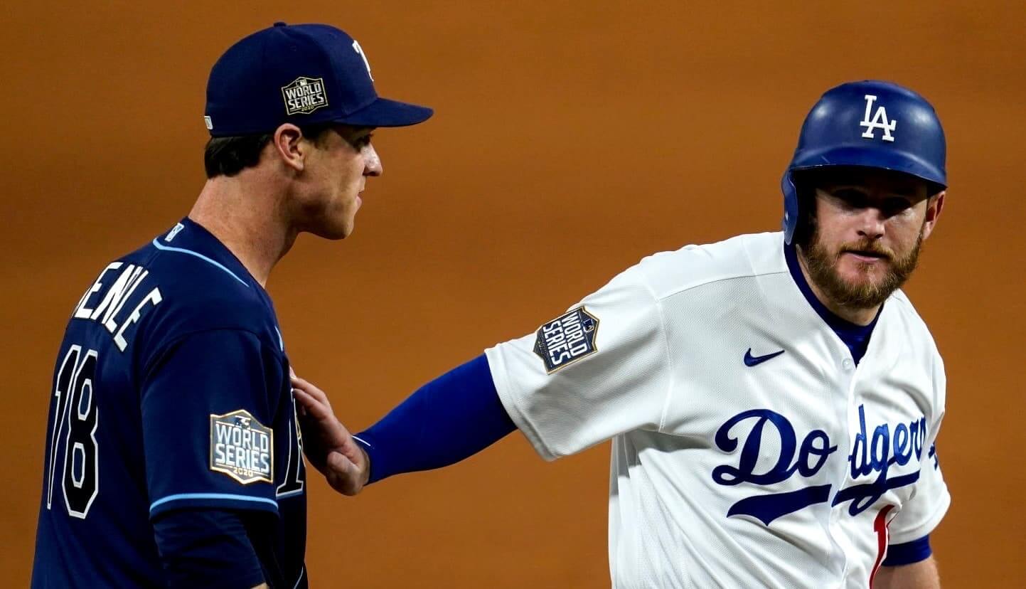
Here’s another photo from last night, this time of Rays third baseman Joey Wendle and Dodgers first baseman Max Muncy. Again, Muncy’s patch is clearly a bit higher than Wendle’s:
That patch positioning is no accident. During the last night’s game, Dodgers design director Ross Yoshida (who, as you may recall, is very skilled with sidewalk chalk) tweeted the following:
Notice how the Dodgers World Series patch is placed closer to the middle of the right sleeve. That’s to match the placement of the “LA” patch on our left sleeve.
We elected to keep the [“LA”] patch where it was previously, even though MLB offered to move the patch lower with the [Majestic] manufacturer logo on the sleeve going away. Most clubs chose to move their patches closer to the end of the sleeve.
Faaaaascinating. Sure enough, you can see that the Dodgers’ two sleeve patches are nicely aligned on their respective sleeves:

Ross’s tweet brings up an interesting point that’s been bugging me for most of this season (although I don’t think I ever wrote about it except maybe in passing), namely that so many MLB sleeve patches this year seemed too low — especially on the left sleeve, where the Majestic logo used to be. In fact, the Rays are a good example of that phenomenon. Here’s a side-by-side comparison:
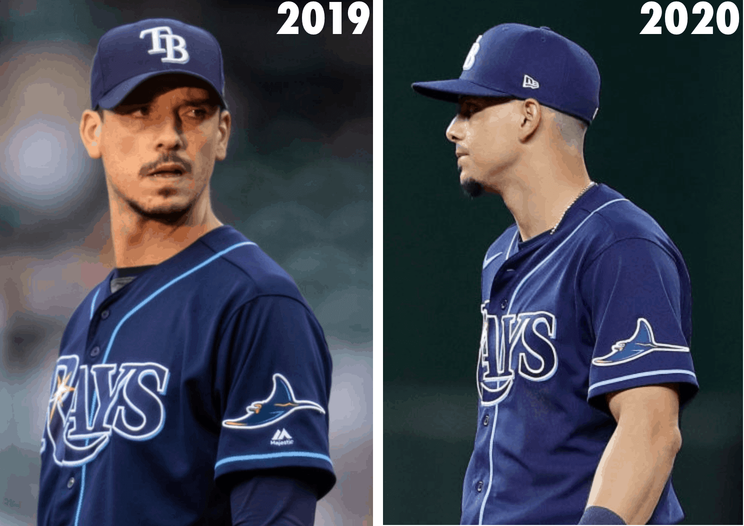
I realize the difference is very small, but sometimes a small difference can make a big difference. That’s the case here, at least to my eye. Like they always say, baseball is a game of inches!
On the plus side, this means the Rays’ right-sleeve World Series patch is aligned with their left-sleeve team logo patch (just like the two Dodgers patches are aligned). The down side, at least to me, is that they’re both too low.
I realize some of you may prefer the Rays’ patch positioning to the Dodgers’ version. No problem there — reasonable people can disagree on that point. The more intriguing issue, and the point of this blog post, is that I had assumed this year’s MLB patches were lower because someone at the factory thought, “Okay, no more maker’s mark this year, so we’ll move everything down.” It hadn’t occurred to me that MLB would actually ask the teams about this, and that different teams would make different choices. So interesting!
Also interesting, but not surprising, is that the Dodgers and Ross Yoshida pay big attention to small details, and that’s one reason why they’ve continued to look so good over the years. Kudos to them!

ITEM! New membership raffle: Reader Nicholas Bartell has generously donated a Uni Watch membership for me to raffle off, so that’s what we’re going to do today.
This will be a one-day raffle. No entry restrictions. To enter, send an email to the raffle address by 8pm Eastern tonight. I’ll announce the winner tomorrow. Big thanks to Nicholas for sponsoring this one!
Click to enlarge
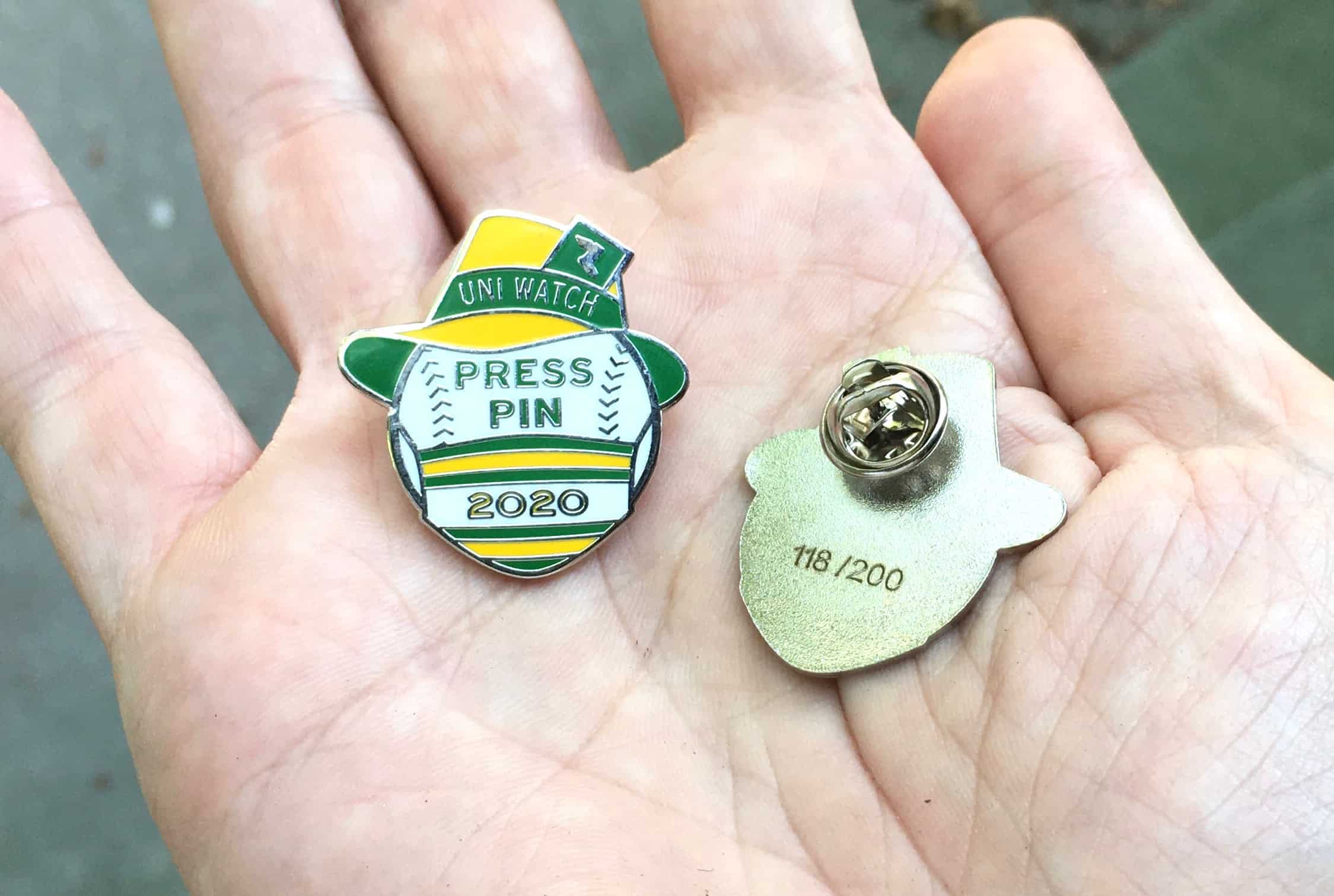
Press Pin update: As of this morning, there are 27 Uni Watch 2020 Press Pins remaining. They’re available here while supplies last.
Meanwhile, reader Tom Jacobsen, whose prodigious Broncos memorabilia collection has been a past topic of Uni Watch admiration, ended up with pin No. 1. “Have to say, as someone who likes to collect things, seeing the No. 1 on the back was pretty exciting!” he says. Congrats, Tom!
Click to enlarge

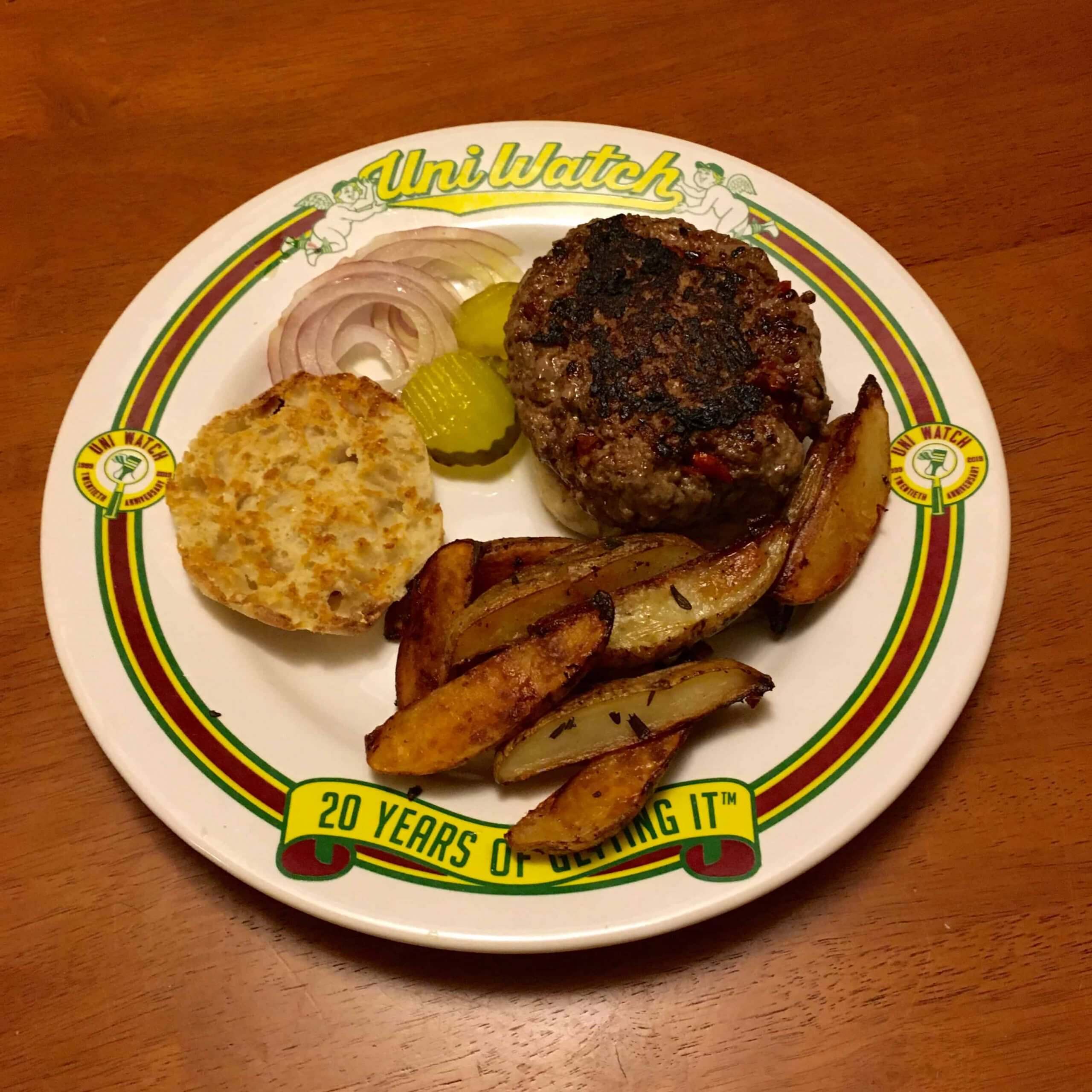
Culinary Corner: I wanted something a little special for the start of the World Series, so I chopped up a few sun-dried tomatoes, sprinkled them into half a pound of ground beef, added some salt, pepper, and a bit of Worcestershire sauce, cooked the resulting patty in a smoking-hot cast iron skillet, and then put it on a toasted English muffin (which, as you know, is the only proper bun for a hamburger).
Since we didn’t feel like making our own French fries (so messy, all that leftover oil, etc.), the Tugboat Captain sliced up a few spuds, tossed them in duck fat and rosemary, and baked them in another cast iron skillet. Perfect.
The Ticker
By Lloyd Alaban

Baseball News: Dodgers P Victor Gonzalez is apparently using the same cap that he used in the playoffs, as you can see the outline of the Postseason patch under his World Series patch. Other players do this as well, including Dodgers P Clayton Kershaw, who superstitiously keeps the same sweat-stained cap all season long, but this is Gonzalez’s first World Series, so it’s the first time we’ve seen this from him. … Reader Neal Dorfman has created two spreadsheets with result-by-uniform breakdowns for the MLB postseason thus far. One is broken down by series, while the other is for uniform totals. … MLB.com has ranked what it considers the greatest bat flips in Major League history (from Kary Klismet). … Golfer Tiger Woods wore a Dodgers gaiter at a press conference yesterday (from Andy Garms).

NFL News: A team exec says the Washington Football Team’s placeholder name will likely carry over to next season (from many readers). … Color Rash for the Texans this Sunday (from Ignacio Salazar). … Dolphins QB Tua Tagovailoa appeared in an ESPN graphic wearing a double-digit jersey, despite the fact that he wears No. 1 (from Austin Martin). … Bills K Tyler Bass has been applying eye black only under his left eye for the past two games now (from Mike Chamernik). … Here’s a documentary about the history of every NFL stadium ever (from Kary Klismet).
College/High School Football News: Texas will wear white at home this week for the first time since 1950 (from Mike Barnes). … Penn State, whose season begins this weekend, will wear a social justice logo as a jersey patch and rear-helmet decal this season (thanks to all who shared). … The Gasparilla Bowl, which already had a ridiculous advertised name, now has a ridiculous new advertised name. … James Gilbert has compiled UNC’s record by uniform. … Lamar Consolidated School District in Texas has released renderings of its planned new football stadium (from Kary Klismet). … Also from Kary: A photographer is suing the owners and handlers of the Texas Longhorns’ live mascot, Bevo XV, for injuries he suffered in a scuffle between the steer and Uga X, Georgia’s bulldog mascot, at the 2019 Sugar Bowl. … Reader Nate Mueller has released some renderings on a 3D-printed Cotton Bowl trophy he’s been working on. … Nate has also recreated Alabama’s 2009 Coaches’ Trophy.

Hockey News: An apparently accurate mockup of a Capitals “reverse retro” alternate has leaked. An earlier version of this program would have had teams get new alternates at New Year’s every year, so they would have two per season (from our own Jamie Rathjen).

Basketball News: According to this Reddit post, the Kings are getting a new uniform advertiser. … Louisville’s new uniforms may have leaked (from Caleb Jenkins). … Here are some of the new number assignments for UNC women’s. Only two Tar Heels will take the floor this season wearing the same numbers they wore last season (from James Gilbert). … Speaking of the Tar Heels, UNC women’s G Petra Holešínská’s jersey has diacritical marks on the NOB (also from James Gilbert). … Bob Barker, the former host of The Price Is Right, used to play basketball for Drury University. Here he is in uniform (from Max Weintraub).

Soccer News: Dynamo Kyiv gave out masks with their crest on them at their match last night (from Ed Zelaski). … Here are some crest updates for the 2020-21 season (from Kary Klismet). … The first images of the newly completed Al-Bayt Stadium have been released. It’s one of the eight stadiums being built by Qatar for the 2022 World Cup (also from Kary Klismet). … New uniforms for Spanish side Espanyol (from multiple readers). … Mexican side C.F. Pachuca has a Dia de los Muertos shirt, inspired by the cempasúchil flower, commonly used in Mexican Dia de los Muertos altars. Here are some more looks (from Alberto Sanchez).

Grab Bag: Here are some shirt reveals ahead of the World Tens Series rugby tournament in Bermuda (from Sy Hart). … Here’s a video revealing the history behind every Formula 1 logo (from Kary Klismet). … New logo for golf’s Phoenix Open (from Josh Pearlman). … Cross-listed from the baseball section: Golfer Tiger Woods wore a L.A. Dodgers gaiter at a press conference yesterday (from Andy Garms). … Bed Bath & Beyond is selling a Syracuse sign that confusingly mashes up the states of New York and New Jersey (from Michael Hochman). … New uniforms for the Lalitpur Metropolitan City police in Nepal (from Timmy Donahue). … Also from Timmy: Fort Sill, Okla., trainees are the first to get the Army’s new service uniform. … One more from Timmy: The Miami Police Department has issued a statement regarding a photo allegedly showing one of its officers wearing a political mask while in uniform, which is a violation of departmental policy. … Australia’s national rugby union men’s team, the Wallabies, have revealed an updated First Nations jersey (from Sy Hart). … Competitors in the recent Russian Higher League Championship chess tournaments played their games while wearing masks, and with plastic shields around the boards (from Graham Clayton).

I enjoy burgers on Thomas’s English Muffins, but have to get the large size. The regular size (and the shrinkage thereof in the past decade or so) demands the burgers have to be slider sized. Good choice!
I too prefer the sandwich size, but our supermarket doesn’t always carry them! So I sometimes have to settle for the regular size.
Australia’s rugby Union team is called the Wallabies, not New Zealand’s. New Zealand are the All Blacks. Quite the typo.
Fixed. And that’s on me, not on Lloyd (I added it at the last minute before publishing today’s post.)
Now looking at Phillies from this season, they moved their numbers down which look weird now that I notice it, I prefer the sleeve numbers being in the middle of the sleeve.
Concurring with the above comment that the Wallabies are Australia, not New Zeeland. Also, the Miami officer with the political face mask is not only against department policy, it actually breaks federal election laws.
Staining the badge. Again.
Just realizing again that I hate cap logos on sleeves. White Sox had an interesting diamond logo on the sleeve of their roadies…..replaced it with the cap logo.
The league seems to feel that fans need more information on their souvenir jerseys. Dodgers alone doesn’t tell you where they’re from, and Chicago alone doesn’t tell you which team you support (even though the diamond patch actually had a white sock on it).
And the only thing stupider is a patch identical to the chest wordmark on the same shirt. That’s you, Giants.
Totally agree with this. What is the LA on the sleeve adding? Zero. Arguably the best home uniform ever because of it’s timelessness and simplicity. Then….LA. White Sox one is also stupid. I can only assume it’s merchandising related – fans aren’t often in full uniform so it’s a way of getting the whole brand on one piece of cloth.
(Re)tail wagging the dog. I agree. -C.
The Angels “A” is really bad.
The number of uniforms improved by sleeve patches can be counted on the fingers of one hand.
Count me as one of the folks who prefers the lower positioning of sleeve patches haha
Bud-
Late last night (early this morning, depending on your time zone), I responded to your message with a link I found in response to your request for a flat, 2-D PNG file of the Detroit Lions’ current helmet. Here it is again, just to make sure I put it in a place you’re likely to see it:
link
Lee, another longtime reader and frequent Comments contributor, also responded, saying he an email you a PNG file, too. Just thought I’d do what I can to close the loop on your request with some hopefully useful input!
Hey BvK, thanks so much for the response. I hadn’t checked my comment from yesterday, but Paul did ping me and let me know that there were some results from it. I was also able to get it from a guy Paul put me in touch with last week. I was looking for it for a guest article I’m in the middle of putting together, so being able to find this last piece to the puzzle was satisfying! I hope to share my thoughts with everyone on here soon!
Thanks BvK!
Lee
Thanks for the kind words, Bud and Lee! Glad I could help! Looking forward to seeing your article when you get a chance to share it!
Do you ever cook with an air fryer? Life changing!
Intrigued by them but haven’t gotten one (yet). Like many New Yorkers, we have a small kitchen with limited counter and storage space, so we’re reluctant to get new appliances. But we’ll see!
Second this about the air fryer. Finally an easier way to get a nice crispy fry (nuggets, tenders, tots, etc.).
Love the food that appears on Uni-Watch. Thank you.
Yes, on the air fryer!!
someone makes an all-in-one Fryer, slow cooker, pressure cooker. The Trifecta!!
Check that…. it’s 9-in 1 !!
link
I thought football was considered “a game of inches”
Just about *every* sport has been described as a game of inches!
Adding English muffins to my shopping list…
In regards to the sleeve patch placements, it IS the little things that matter. Attention to detail is always appreciated no matter what you’re doing. I think I prefer the sleeve patches lower because it just looks better. Who wants a patch (and this year’s version is huge) in the middle of their sleeve? It would seem uncomfortable to me.
That Syracuse S looks green, like Michigan State would be.
That NFL stadium movie… Insanely good! It’s a must watch.
Whyyyyyyyyy?! Why can’t the Caps just slap the Weagle on the chest of a sweater and call it a day with alts?
Seeing it rendered in blue and red makes me realize that I loved the old jersey for its colors, not its shapes.
Couldn’t agree more! I lived in DC when the Caps changed to the blue, bronze, and blue look. It was a real jolt when it happened. It took me a while to get used to the idea that a team in the nation’s capital called the Capitals wouldn’t be dressed in red, white, and blue. But it quickly grew on me and remains one of my favorite NHL uniforms.
In the sea of teal and purple that was the ’90s, the Caps’ choice of that particular shade of blue (a bit lighter and greyer than royal blue) and bronze was both contemporary to the era and refreshingly unique. I still think it could have stood the test of time and become a classic if they hadn’t effectively ruined it with all the BFBS BS they injected into their visual program with their later alternate designs.
blue, bronze, and *black (not blue, bronze, and blue)
Remind me why they went bronze and blue — Abe Pollin’s yacht or something?
Meef, I would say RS Rogers’ answer below provides a good explanation below as to why the Caps chose the color scheme they did. Blue and bronze, with the black accents, conveyed a feeling of “official-ness” or “importance,” commensurate with the team’s location in the seat of national government.
But maybe you’re on to something with that yacht theory, since Abe Pollin changed the colors of his other team, the Washington Bullets (along with the name) to the same blue, bronze and black scheme just a couple of years later. For the record, it always looked better on the Capitals.
As to the reason behind the change in color schemes in the first place? To bolster flagging merch sales, natch.
BvK, to be clear I have no idea why Abe chose the colors he chose. That they happened to have fit with the aesthetic of official Washington may be a lucky coincidence! Worth noting that the change back to red, white & navy for both teams came after the Nationals moved to town with those colors and made a big cultural/merchandising splash.
RS Rogers, I should have been clearer myself. I should have said that your response provided compelling rationale for why the color scheme worked so well, not necessarily why Abe Pollin chose it.
In any event, I’m quite certain we’re both right that the reasons behind the mid-’90s color scheme change and the adoption of red, white, and navy in the late aughts (not really a reversion, since the Caps’ original shade of blue was much closer to royal) was revenue-related.
There’s nothing wrong with a team from the DC area wearing red, white, and some shade of blue, of course! It was just cool how well the Capitals were able to pull off another color scheme for so many years and still feel true to their name.
100% agree with you on the Screaming Eagle era colors. They got those uniforms right at first, and slowly degraded a beautiful, unique set into just another generic me-too black look. But the color scheme seemed perfect for Washington to me. The American flag is all about bright red and navy, but most federal government institutions lean much more into blue and gold. With black as an accent color, the Caps made their “federal” blue and metallic really pop. It was a stately look, much more reflective of Washington’s self-image than of the rest of the country’s impression of Washington.
The Swooping Eagle is my favorite Capitals’ insignia. But I wasn’t having that very abstract, Art Deco numeral font.
That numeral font was the most ’90s of all their design elements! Even so, I thought it worked well with their white sweaters. It wasn’t quite as good with the blue sweaters. And with the black sweaters, it was an absolute mess!
Paul, I love ya but this continued misuse of “brutalist” is going to give me a nosebleed
Creative license!
;)
Maybe the ray is positioned low because rays swim near the ocean floor… (probably not)
Ha! The Dodgers patches look too high to me, whereas the Rays look too low. The pre-2020 Rays left sleeve patch looks just right: Lower than vertically centered, but with a nice 1″ or so between the bottom of the patch and the seam/stripe.
Also, that oatmeal is too hot, and this oatmeal is too cold …
Those patches look so large and, perhaps so stiff, that I wonder at what point they start interfering with performance?
Somebody should be thinking through the size of the playoff hat patches so that the prior series’ isn’t showing when covered by the WS. I saw that on TV and thought that was adhesive from the last round. Didn’t know it was the actual patch still on there.
Re: Kershaw’s hat, John Wetteland (Yankees closer then set up man in 90s) did the same thing – and I think it was during that era where they started putting patches on hats in the WS. His was super dirty when everyone else had a new hat for the WS.
I saw that on TV and thought that was adhesive from the last round. Didn’t know it was the actual patch still on there.
Just to clarify, it *is* adhesive from the previous patch (not the actual previous patch).
Got it. So what you meant was he wanted to keep his hat from the prior series. Seems like the patches should just get bigger each round. (Obviously, of course, in a superior parallel universe – that I’d like to live in – there wouldn’t be hat patches or makers marks on hats.)
Agreed!
Fascinating to learn it was MLB letting teams know they had the option to place their sleeve patches lower now that there’s no Majestic logo on the sleeve. The Mets seemed to keep their roundel in the same spot this year as last year, so they and the Dodgers seem to be the two teams I can think of that kept the sleeve patches in the same location.
If Washington plans on going with “Football Team” again next year, I hope they stick the gold and white striping back on the helmets and go with that stylized “W” as opposed to the gold numbers. It looks way too college right now.
Looking at their record, college would be a an improvement.
Joking aside, I wonder whether there’s any risk that by going without an official name for so long that an informal name might become standard. Like how the old Washington Nationals spent 50 years fighting to persuade fans to call them that instead of the public’s nickname of Senators before first giving up and then moving to Minnesota.
Like, if the team announces in late winter 2022 that they’ll henceforth call themselves the Washington Monuments or whatever, but the press and public already refer to them as the Nobodys, will it be too late?
The name “Washington Football Team” begs several questions: Did trademark squatters scoop up all the team’s potential names? Would they contemplate a name they hadn’t already set aside? Is an NFL cop present to ensure the media don’t slip in an unauthorized nickname (like, say, “NFL Squad”, “Burgundy & Gold”, or “Redshirts”)? Does the team and league have a vested interest in the name “Football Club”, a phrase which would seem to have very little equity? Are they hoping sportswriters simply coin a name of their own? I remember an enterprising fan issued t-shirts in the team colors which said “Washington NFL Football”, so I’m rather attached to that phrase.
I remember back in the early 90’s the CFL ventured into the U.S. and put a team in Baltimore calling them the “Colts”. They didn’t own rights to the name and had to drop it. They went by the “Baltimore CFL’ers” before changing to the “Baltimore Stallions”.
Good catch on the placement of the ray being too low. I agree the Majestic placement was much better.
Speaking of sleeves, I have 2 thoughts:
Baseball uniforms have been overdoing permanent sleeve patches. I miss clean, empty sleeves. The LA patch for the Dodgers is especially unnecessary.
The Niners wore three stripes this week on their sleeves and looked great, proving that the switch to 2 stripes for their primaries wasn’t necessary and downgraded a classic look. SF should return to the 3-stripe look permanently.
I would love to abolish the World Series patch.
Short of that, I would love to abolish the patch on the sleeve AND the hat.
Pick one.
Over-branding is eye-rollingly ugly…and smells of desperation.
It can only be that game used WS merchandise with these patches increases the value of it (and/or provides retailers current product with a short shelf life at a time when price sensitivity is low for many fans swept up in it all). Likely a healthy dose of both.
“Washington Football Team” should be permanent!
The Cleveland Indians should go this route also. “Cleveland Baseball Team.”
I liked that announcers were having fun last weekend with Football Team playing Football Giants. I agree, the name is good and should remain for Washington.
The S logo in the Syracuse sign from Bed, Bath and Beyond is green, making it an error. Michigan State is not located in New York or New Jersey.
The NY/NJ map also has Long Island attached to New Jersey. It looks like a penis.
The Dodgers do look great consistently, but I take major umbrage with the thickness of their back numbers. They are way too thin. Compare to what they wore say in 1974, when the numbers may have been a bit too thick:
link
I would err on the thicker side. I also kind of liked when they used white outlines on their white uniforms. Sounds superfluous, but it seemed to work. The current front red numbers look right to me.
I think this is a fair critique. NOB lettering could be a smidge thicker as well.
I looked at the photo of Jimmy Wynn again and just figured out what Al Campanis was holding…a toy cannon.
I totally agree with the white outline on white jerseys – that was a great look (the last version of Padres homes (before brown) had this same feature and it was a great detail).
The other numbering issue with the Dodgers is the narrowness of the placement of the number 1 in their jerseys – look at how close the “1s” are together in jersey #11 or in #10 – the “1” is too close. This makes the thickness issue standout even more.
Hilarious really that these home whites are considered among the absolute best jerseys out there but we’ve just found several faults (ahem…improvement opportunities).
OMG, we are long lost brothers! In 2012, I wrote an email to the Mets’ stitcher and one thing I mentioned was that the 1s were too close. I just found the old email. He agreed, but said it was the preference of the equipment manager who told him to do it that way.
Doesn’t this look much better?
link
Wow. Yes. The spacing of the 1s in jersey # 11 (football, baseball in particular) is oddly inconsistent. Wider looks better to my eye, if not the Mets equipment manager!