For most of today’s photos, click to enlarge
Hockey is the one major North American sport that doesn’t have an active game schedule at the moment, but the NHL continues to dominate this week’s uni news, as teams have been releasing new designs to coincide with the NHL draft, which began last night.
So: Yesterday’s blog post reported on an NHL team getting back to its uniform roots and another team unveiling an anniversary patch. Today we have more of the same on both of those fronts. Let’s go one team at a time, starting with…
The Senators
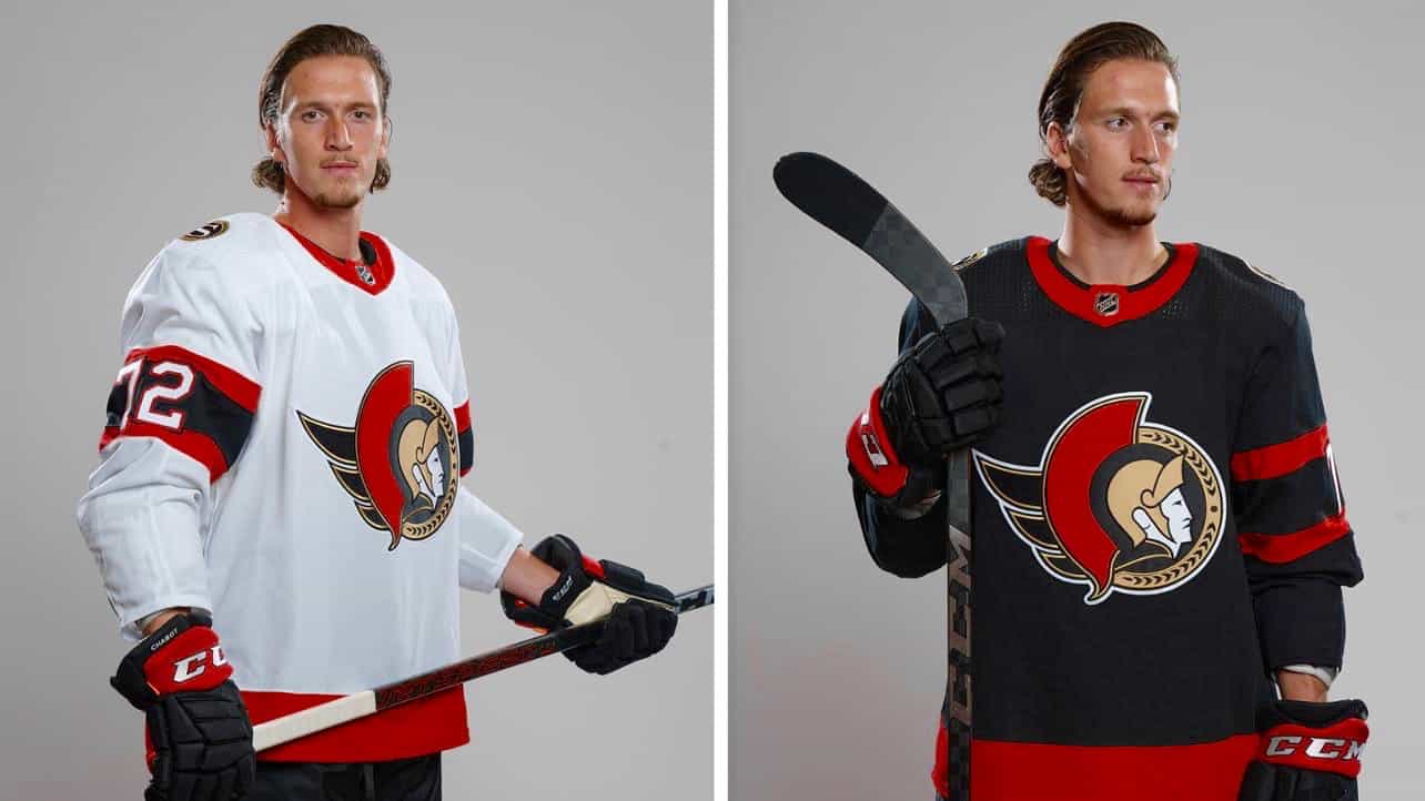
As you can see in the photo at the top of this post, the Sens have finally confirmed the league’s worst-kept secret by unveiling a new primary uni set that almost-but-not quite duplicates the team’s original early-’90s set. Here’s a side-by-side comparison of the black jersey — original 1990s version on the left, new version on the right (click to enlarge):

The obvious difference is the belly striping. The more subtle differences are the outlining on the sleeve numbers and the trim on the far-left edges of the crest and just below the centurion’s ear (both of which are red on the original version and gold on the new version). Overall, though, it’s very close to the original look.
I know a lot of fans love this old design, but I am not among them. Always thought this uniform had a minor league feel. I would’ve much preferred an “O”-based design.
———
The Wild
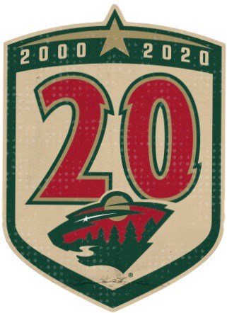
The Wild released a new 20th-anniversary logo yesterday. The design, which will be worn as a jersey patch, is solid work — I particularly like how they used the North Star, which also appears as the primary logo’s eye, both as a topper for the shield and as a way of conveying the franchise’s 20-year span.
The numerals are based on the jersey numbers from the team’s inaugural uni set. That font hasn’t appeared on a Wild jersey since the 2012-13 season, so it’s a nice visual reference to the team’s history.
Speaking of numbers, here’s something interesting: All of the team’s previous anniversary or ordinal logos (not all of which have been used as patches) have used Roman numerals, so the new design represents a break from that theme. Definitely wouldn’t have known that if I hadn’t looked it up. Here’s the progression, including the new design:
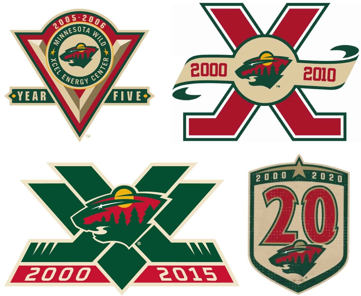
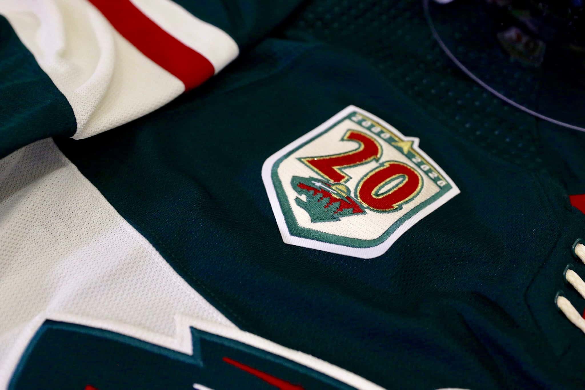
I like the new design better than any of the previous ones. Here’s how it looks as a patch on the team’s home jersey:
———
The Coyotes
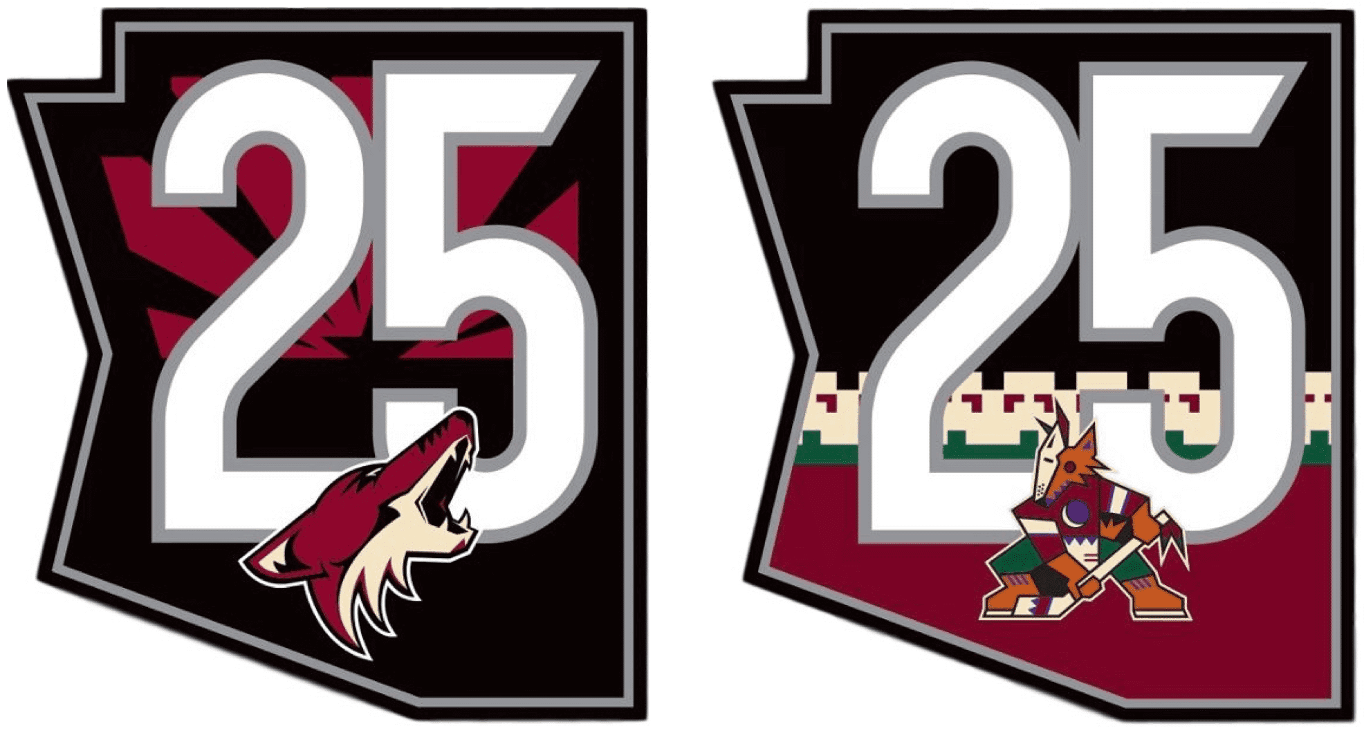
The Coyotes yesterday unveiled two patches to celebrate their 25th season since moving from Winnipeg to Arizona. The two designs are both Arizona-shaped and feature the crest of the jerseys on which they’ll be worn — the coyote’s head for the patch on the home and road jerseys, and the Kachina coyote for the throwback alternate (which the team says will be worn 25 times next season!).
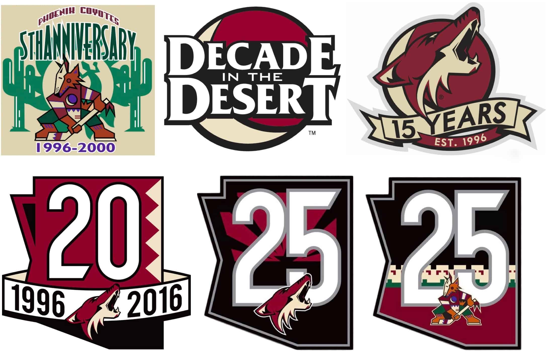
Both of these look fine, if somewhat unremarkable. Here’s how they fit into the team’s anniversary/ordinal logo history:
In addition, the Coyotes announced that they’re reviving their crescent moon center-ice logo:
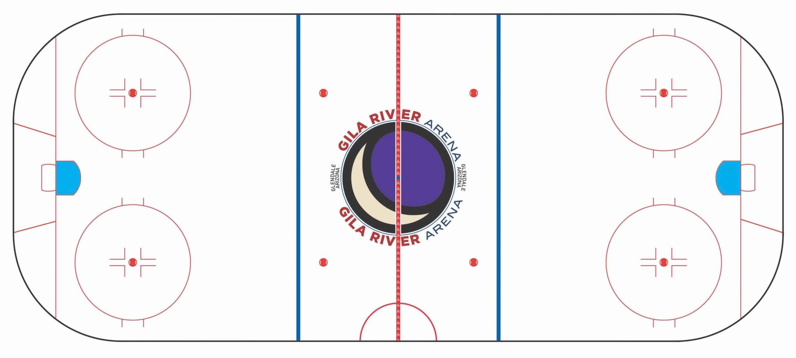
According to TheFaceoff.net’s database, the last time the ’Yotes used the crescent moon logo at center ice was in the 1998-99 season. Of course, in those days it was blissfully unadorned, instead of cluttered up with all the text it will be saddled with this time around.
———
The Jets
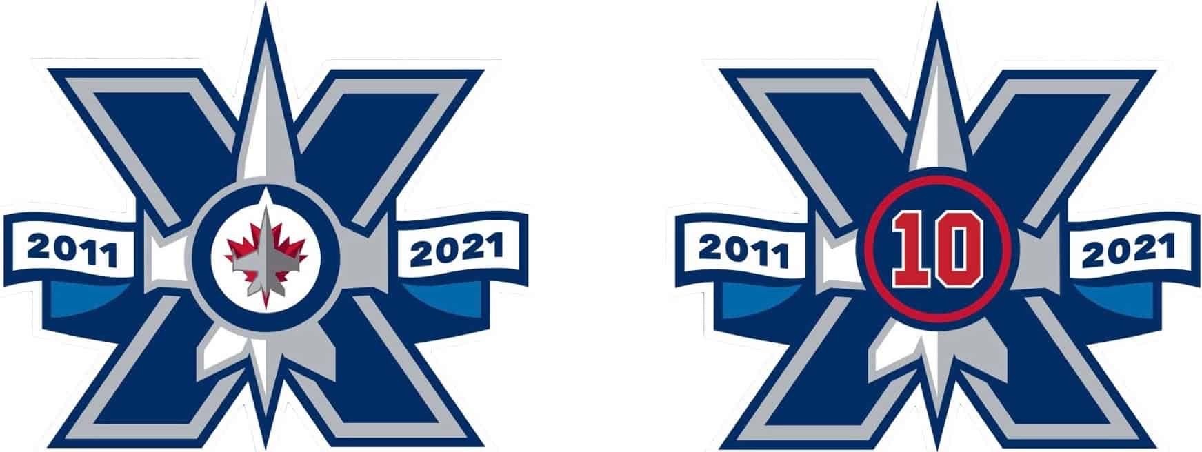
In still more patch-related news, the Jets announced that their 10th-season patch, which began circulating way back in January, has been modified so it can do double duty as a memorial patch for Dale Hawerchuk, who wore No. 10 (and who died earlier this year). Here’s a comparison of the original and revised versions of the design — original on left, revised on right:
———
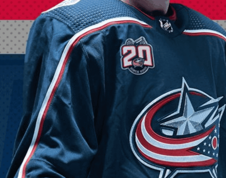
Meanwhile, remember the Blue Jackets’ 20th-anniversary logo that we talked about in yesterday’s post? We’ve now gotten our first look at it as a patch on the team’s home jersey:
And there you have it — a mother lode of NHL uni news!
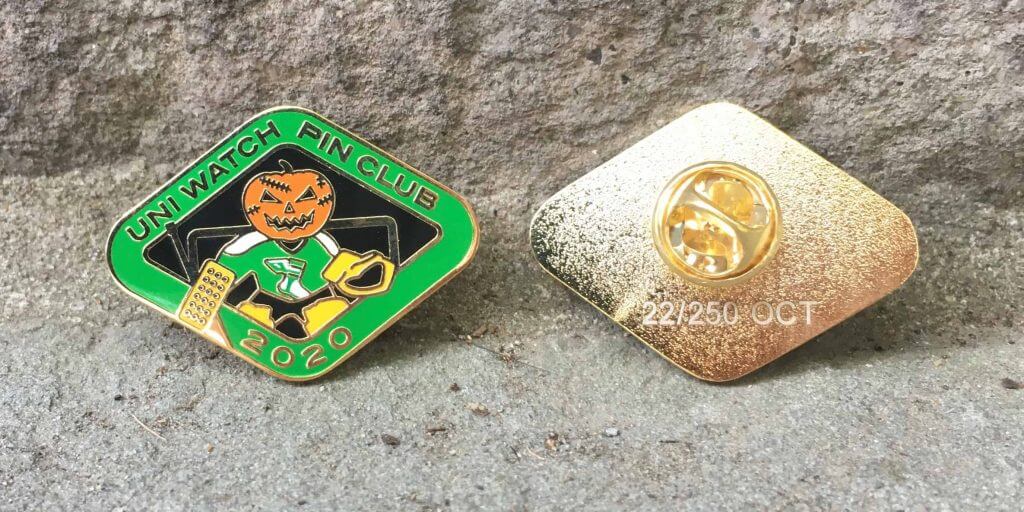
October pin update: In less than a week, we’ve already sold more than 180 of the Uni Watch Pin Club’s October edition, meaning we now have fewer than 70 remaining. They’re available here while supplies last.
Meanwhile, the 2020 Uni Watch Press Pin will launch next week — trust me, you’re gonna like it!
The Ticker
By Lloyd Alaban

Baseball News: The Astros and A’s went Kelly green vs. orange for yesterday’s playoff game (from Ignacio Salazar). … A reader who prefers to remain anonymous notes that plate umpire C.B. Bucknor wore a light-blue shirt for last night’s Yanks/Rays playoff game, while all the other umps in that game wore black. … Several teams are experimenting with digital bobbleheads.

NFL News: Check out this super-detailed bust of Chiefs QB Patrick Mahomes, created by reader Nate Mueller. … Packers LB Za’Darius Smith revealed a Breonna Taylor-related message on his base-layer shirt Monday night (from Mike Chamernik). … Eddie Van Halen, founder and guitarist for rock band Van Halen, died yesterday at 65. Here’s a photo of him in a Mark Gastineau Jets jersey (from our own Brinke Guthrie).
College and High School Football News: Cincinnati’s punter goes by James Smith but has “Jim Smith” as his NOB. The team’s roster also includes Jaxon Smith, Cole Smith, and Blue Smith (from @p8onryb). … Alabama has gone all-digital with its tickets, but you can still purchase commemorative physical tickets (from Griffin Smith). … Central Michigan has a new number font (from @AVKingJames). … Reader Nate Mueller created a 3D-printed model of Alabama’s 2009 national championship trophy.

Hockey News: The NHL announced yesterday that it’s looking to start its next season on New Year’s Day. That means the “2020-21” season would take place completely in 2021. … The NWHL has a new sweater supplier, K1 (from our own Jamie Rathjen).

Basketball News: New uniforms for Hawaii men’s (from Rob DeMello).
.

Soccer News: Queensboro FC has released its colors and badge (from Jakob Fox). … New shirts for Ghana (from Damon, who didn’t give his last name).

Grab Bag: An American cycling team has been fined 4,000 Euros for an “outrageous” jersey design (from David Petroff). … New logos for Gmail (which was also in yesterday’s Ticker) and GSuite (from our own Brinke Guthrie).

I’ll be away from Uni Watch HQ from about 11:30am Eastern until sometime tonight. Play nice while I’m away, okay? Thanks. — Paul
Actually the Senators new jerseys are based on the 1993-95 design, particularly the black jersey that had red-black-red stripes and red-trimmed white numerals.
Thanks, Ralph. Give me a sec to swap in a new photo and adjust the text!
The new version of the white jersey also removes black from the ends of the sleeves and the bottom. See here for the 1993-95 design: link
I’m also disappointed that they didn’t keep the “O” shoulder patches. Would have loved to see an updated version, perhaps even incorporating the barber pole stripes.
Also, note that the logo on the new set is based on the 1997 logo, not the original 1992 version. Note the olive leaves around the right perimeter and nothing on the helmet visor.
Here is a shot showing the pants for the Ottawa Senators with the jersey. Can see the logo and maker’s mark treatment on the pants for the new unis.
link:format(webp)/cdn.vox-cdn.com/uploads/chorus_image/image/67591835/New_Era.0.jpeg
That link isn’t working, Wade (at least not for me).
Here we go:
link
Is anyone else ticked off and saddened about the continuing demise of real tickets? Screen captures and printouts just aren’t the same, and being fleeced by teams and schools to buy a physical remembrance of a moment in time is in poor taste. -C.
I agree 100%.
Yes! I have a collection of old tickets going back to Mosport Park in the 80’s, Blue Jays at Ex Stadium, Sens first year, etc….
I even have signed tickets from AJ Foyt @ the Molson Indy
For the price you pay to go to games these days, at least give me a nice momento!
Jeepurs how much money do they need!
I have adjusted pretty well to this change to be honest, and I think what’s allowed me to adjust is that as the presence of physical tickets has declined, the availability of cameras, specifically cell phone cameras, has concurrently expanded. Back in the day when physical tickets were everywhere, if you HAD a camera, you certainly didn’t take it everywhere with you, or to every single ballgame. So the ticket was the thing to keep and look at to jog your memory of that particular afternoon/evening. Now, either printed photos or scrolling thru saved photos on my phone is the memory-jogger.
It’s less artful, I suppose, but the functionality of keeping a physical ticket, to me, has just been transferred to another medium.
Yeah.
On the other hand, I don’t mind electronic transfers of tickets. Used to be, if you had tickets you couldn’t use they were hard to get rid of, hard to exchange, you had to drive and meet a guy somewhere. Sometimes at the venue.
Same if you’re buying tickets. Not sure you’re going to have them until they’re in your hands.
I miss physical tickets, but electronic tickets (along with electronic funds transfer) are so convenient I’m not going to get needlessly nostalgic.
Absolutely miss the real tickets, especially ones with a distinctive design. My collection dates back to the mid ’70s.
For the last few years the Yankees have continued to issue real tickets (at least to season ticket holders), while also providing the ability to transfer tickets electronically – the best of both worlds.
I know it won’t last much longer, too fan-friendly!
Re: Sens ‘new’ logo & jersey…
What a joke….this ‘new’/old jersey should have been a 3rd jersey throwback/retro…
But the Sens are ownership is cheap, lazy, and apparently in financial difficulty.
Clearly these were cost saving manouvers: no need to pay big bucks for a proper redesign, and a 2D logo means you don’t need the added expense of 3D raised helmet logos.
Phhhhh! More trash from the trashiest team in pro sports!
ROFL!!!!!
At least you can laugh about it. Some people might be upset by this.
It has been a great week for NHL in the uniforms department and I celebrate that. Two of the uniforms that needed fixing so bad for so ling have now been done with the Flames and Senators. Making me feel younger as the new uniforms are basically the same designs they wore when I was in high school.
Another notable difference on the Senators’ white jersey is the lack of black on the lower part of the arm. I do like the new template for the white jersey. I have never been a fan of the “S” shoulder patch. It does match style-wise with the main logo, but keeping the vintage “O” logo on the shoulders may have work well.
Related to yesterday’s entry: Ellis Valentine of the Expos had a half two-bar style face mask on his batting helmet in 1981 (or around there). I had his baseball card and remember it. Link to the card below.
link
Yes, Valentine, link, and link all had football-style facemasks well before Slaught did. But as noted in yesterday’s entry, to my knowledge only Charlie Hayes ever wore a *clear* mask somewhat like the one Slaught wore.
Any plans for a Van Halen Uni Rock shirt?
Will consider it!
In regard to Senators new jersey, has there ever been more similar uniforms that are actively worn in the same year as the Hurricanes and the Senators black unis?
Penguins’ and Bruins’ home unis are pretty similar now, especially with the Bruins wearing black socks. Also, the striping pattern of Tampa’s home jerseys is basically identical to Detroit’s, just different colors.
I mean, I feel like the Florida Panthers, Columbus Blue Jackets, and Pittsburgh Penguins all had double-blue and white alternate looks at once.
Maybe not in NHL. If you remember early 1990s OHL there were definitely more similar uniforms worn at same time. North Bay Centennials and Kingston Frontenacs almost looking identical, and it was only a 16-team league.
link
link
Re: C.B. Bucknor in Light Blue with the other umpires in black, it’s become not uncommon for the home plate umpire to wear what is most comfortable (long sleeves or a sport coat in cold weather, for example) while the base umpires all match each other. Bucknor prefers light blue and, in this case, the base umps are all wearing short sleeve jackets. It’s probably the only odd or notable combo that can occur since they only have a few options for uniform tops and all but one is black.
Good info. Thank you!
If all the umpires go with shirts, then they must all match. Here, as noted, the other umpires are wearing jackets, which the only color choice is black. Pretty much the same thing the other commentor said, but acknowledging if they all went with the polo style shirt they all have to be the same.
There was no way you couldn’t notice Bucknor in yesterday’s game. I’m still trying to figure out where his strike zone was…he needs to be on the Angel Hernandez/Joe West list of awful umpires. But I digress.
Personally, I think the Senators’ original/prior logo, with the face in 2-D profile, is light-years better than its subsequent 3-D revisions.
The Sens new/old unis are much better than what they’re replacing but I agree with Paul, and probably many others, that they missed the boat by not going with something along the lines of the O design. Even my wife, who cares nothing about sports and even less about uniforns, once commented that she liked the O alternate that she saw the Sens wearing while passing by the TV.
Agreed – to me the “O” gives off an Original Six vibe.
RIP the KING, Eddie Van Halen!
I’m not so sure EF was fined for the outrageous design (although they should have been lol), it’s just that they made a kit change without the UCI’s permission (to be fair to EF, the UCI seems to have some misplaced priorities like regulating sock height). I’m surprised more uni folks aren’t all over this story, the kit is truly atrocious!
Ottawa Senators. Loved the barber poles. But this reversion to the late-90’s is unimpeachable. It’s…a safe return to a safe look. On the other hand, I’ve never liked that shoulder patch. I call it “the Sheraton patch,” and I think that’s an accepted mocking name in the canon–not just a witticism I made up. Getting rid of the Sheraton patch in favor of the “O logo over barber pole strips” logo as was debuted in 2007 could have been great. Throwback with a crumb of something else.
Maybe they didn’t/don’t use XX is the symbolism of Beer via the XX connection with Dos Equis? Just spitballin’…
I have a hard time looking at the Sens 2D uniform objectively. I am a Habs fan that grew up in Montreal. Absolutely hated the 3D look. I definitely liked the O look, but that team existed a long time ago.
The only problem I have with the Senators return to their original look is that they’ve spent the last bunch of years leaning heavily into being a “red” team.
link
Their tailgate area is the “red zone”. Their fan documentary is “united in red”. When they went to the finals a few years back their street party was red themed (I can’t remember exactly what, it was something close to Calgary’s Red Mile).
Are they still a red team?
— The NHL announced yesterday that it’s looking to start its next season on New Year’s Day. That means the “2020-21” season would -take place completely in 2021.
The NHL season was only played from January to June in 1995, due to the lockout, but they still called it the “1994-95” season.
In case people missed it:
Lakers wearing Kobe tribute “Black Mamba” jersey for Game 5.
link