For all photos, click to enlarge
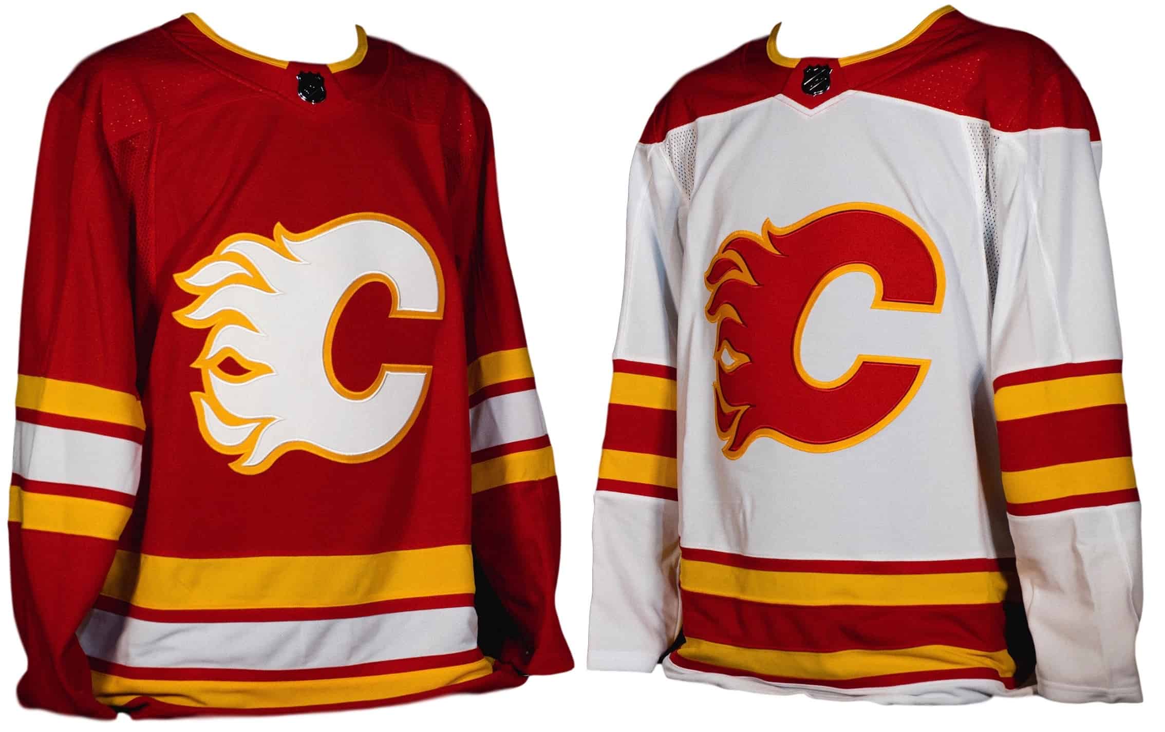
Good news out of Calgary yesterday, as the Flames unveiled their new uniform set, which is basically a throwback to their original 1980 Calgary uniforms.
The new home and road designs, aside from hearkening back to the team’s inaugural Calgary set, also have more recent connections to the team’s history. The new home red jersey has been used as a throwback alternate for the past two seasons, while the new white road design was worn 11 months ago in the Heritage Classic.
Kudos to the Flames for providing photos of more than just just the jerseys. Here’s a shot that shows the pants and socks (well, at least some of the socks), along with a rear-view shot:
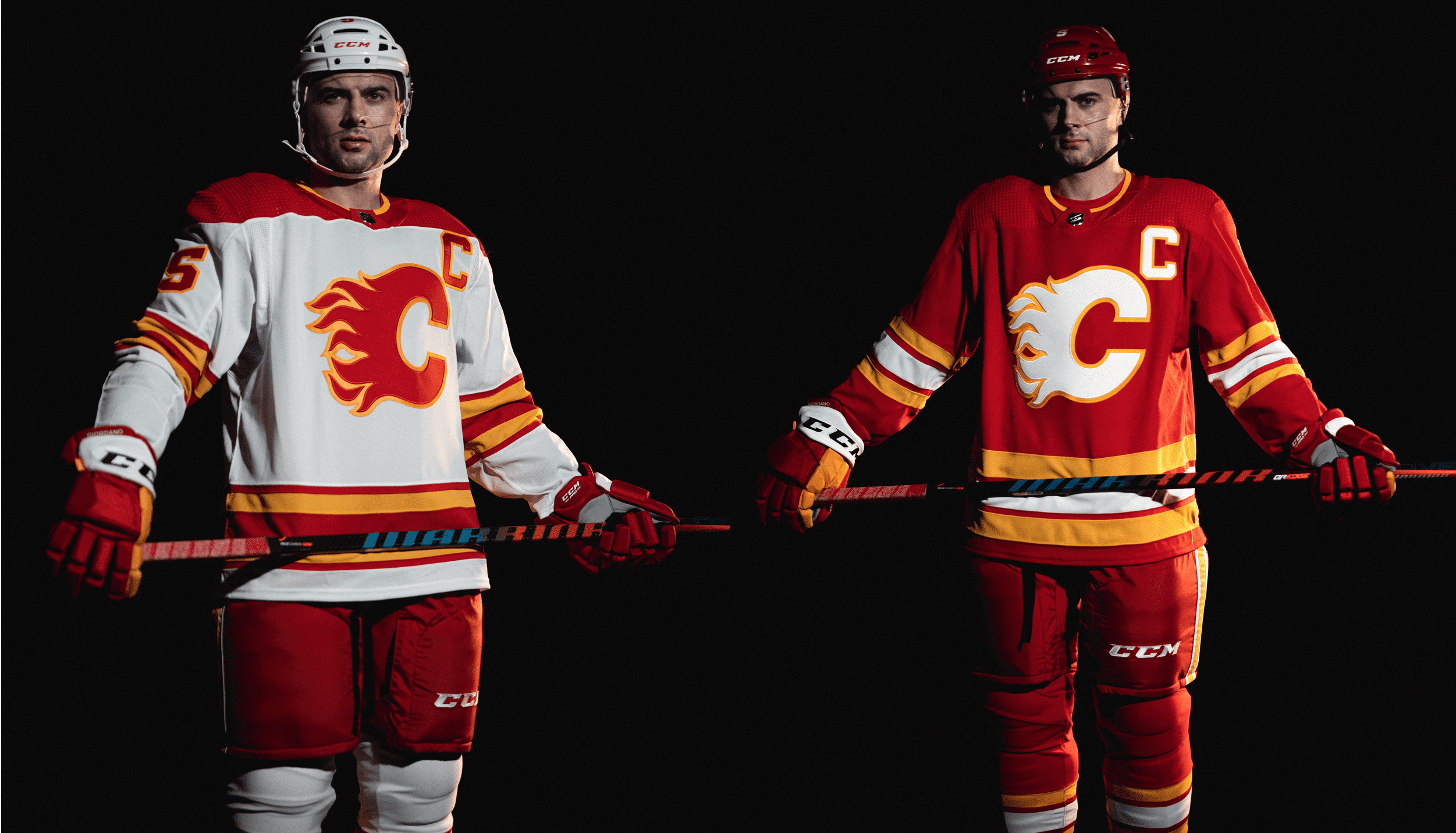
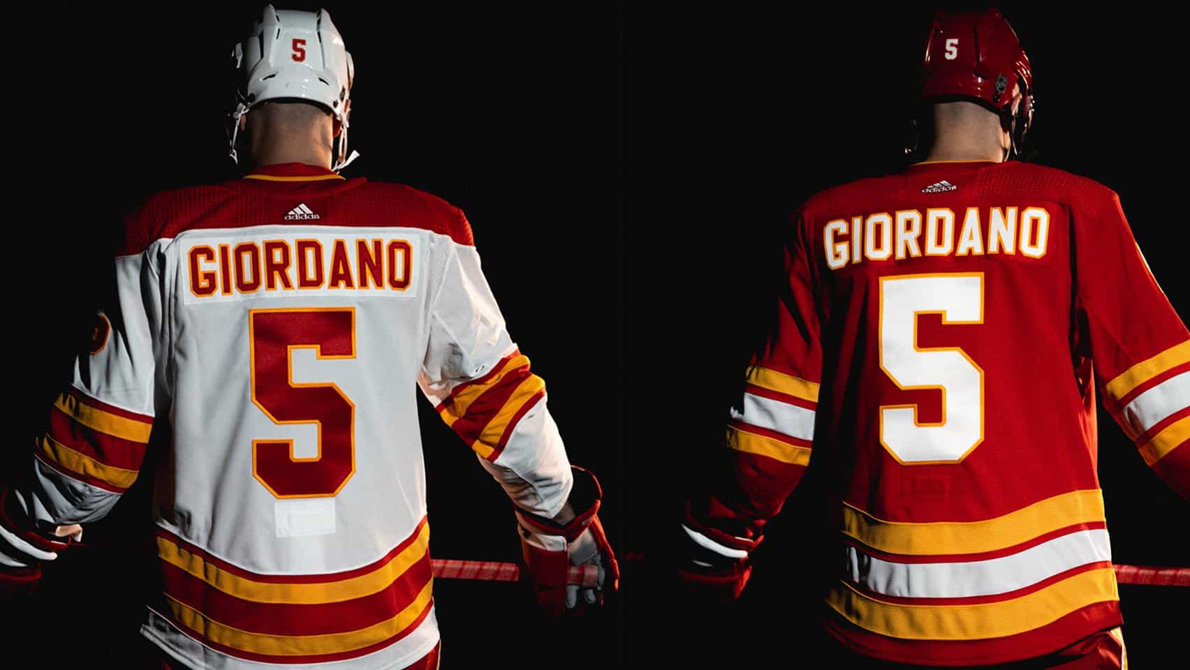
Best of all: no black! Well, except that the old home uniform — the one with the black flaming C — has been redesignated as an alternate. Here’s hoping they wear it very sparingly. Aside from that, this is a big win. Even the collar designs are simple and straightforward!
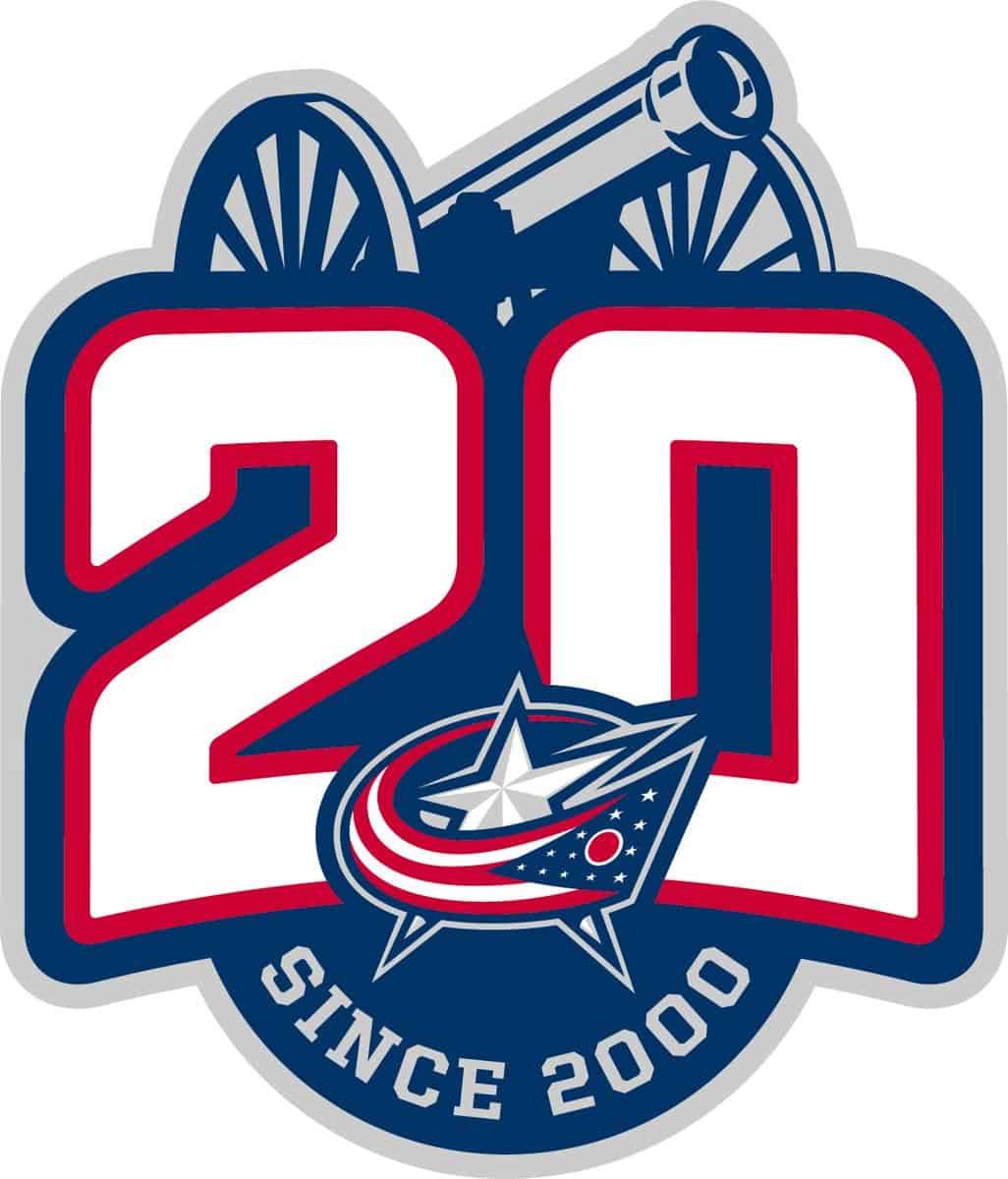
And that wasn’t yesterday’s only NHL uni news, as the Blue Jackets unveiled a new 20th-anniversary logo. The team says it will be worn as a patch “on the upper right chest of home and road jerseys throughout the 2020-21 NHL season,” with a color-modified version added for the alternate jersey.
Overall, I don’t much care for the design. But just the other day I was talking about how the NFL’s Dallas Cowboys appeared to be the first Big Four pro team to use the “Est. [year]” format for an anniversary logo (instead of the more common date-range approach), and now we see the Blue Jackets using the “Since [year]” format, which is almost the same thing. As the saying goes, two times is a coincidence — three times would be a trend.
And we may not have long to wait in that regard, because the Wild — who came into existence in the same NHL expansion that brought us the Blue Jackets — are reportedly going to reveal their own 20th-anniversary logo today. Looks like the Coyotes have something in store today as well, so this will likely be another big NHL uni day. Full coverage tomorrow!
(My thanks to Jeff Brown for the Wild item.)
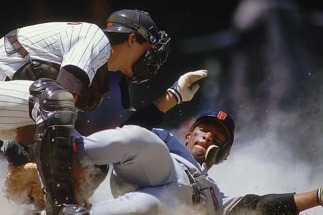
A new C-Flap challenger? Back in 2018, I wrote an ESPN piece about the history of the C-Flap, the protective face guard that attaches to a batting helmet. Then I had a follow-up item here on the blog in which we collectively determined that the earliest player known to have worn the flap was Giants infielder Chris Brown in 1987 (shown above).
Brown’s status as MLB’s first flapper had gone unchallenged until a few days ago, when Uni Watch proofreader Jerry Wolper alerted me to a recent interview with former MLB catcher Don Slaught. At one point the interviewer asked Slaught about how he came back from being beaned in the face in 1986, to which Slaught responded like so:
You know, it wasn’t hard at all. … [S]even weeks later I came back wearing one of those extended face guards on the helmets. I think I was the first one to wear that, and a lot of guys are wearing them today.
So was Slaught actually the first player to go C-Flapped, one season prior to Chris Brown? It took me a few days, but I eventually found this photo from July 4, 1987 — Slaught’s first game back after his injury:
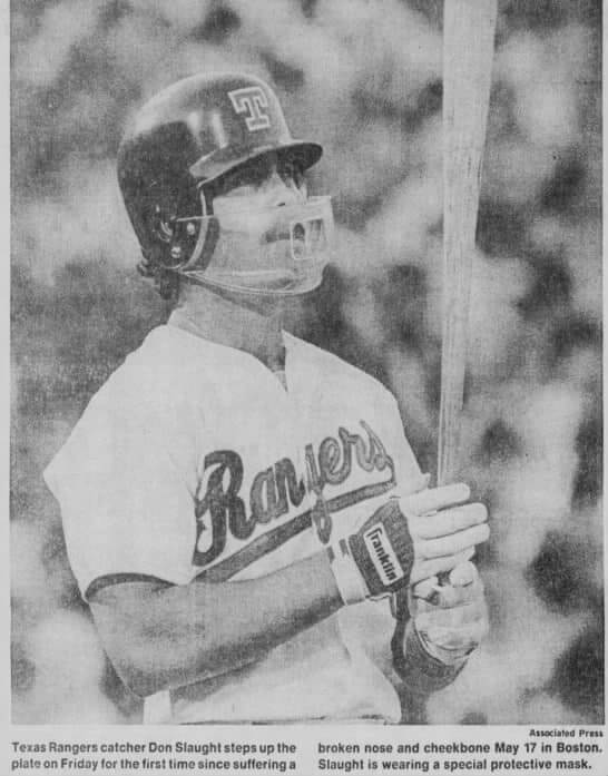
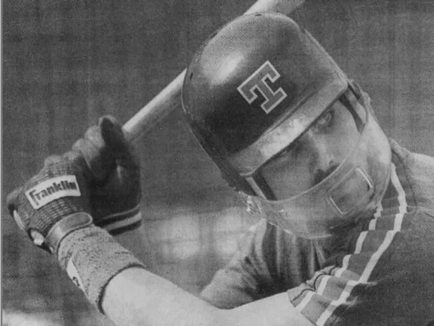
Obviously, that’s not a C-Flap. It’s more like a clear football-style facemask on a double-flapped helmet. Kinda looks like his brim might have been a bit truncated as well, no? Here’s another shot — this one showing Slaught taking BP a few days prior to his return to the active roster. It definitely seems to confirm the shorter brim (click to enlarge):
But those pics are from right when Slaught returned to action. Could he have switched to a C-Flap later in the season? I couldn’t find any other photos of him from later in the 1986 season (anyone..?), but I did find this clipping from Aug. 26 of that year — nearly seven weeks later (click to enlarge):
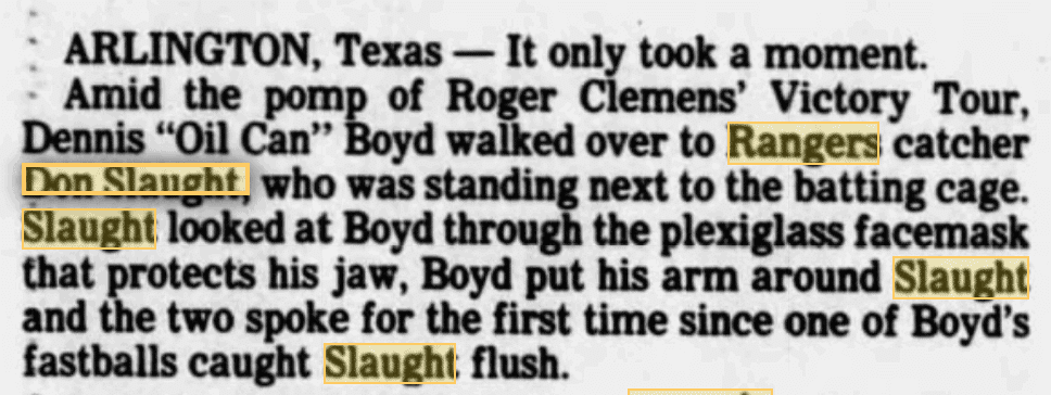
Note that the writer referred to Slaught’s “plexiglass facemask.” That suggests to me that Slaught was still wearing the clear, football-style attachment, not a C-Flap.
Okay, but there was still a month of the season remaining at that point. Could Slaught have switched to a C-Flap at some point in September? Doesn’t look like it. By Aug. 28, he’d chosen to get rid of the mask, and this Aug. 31 clipping helps explain why (click to enlarge):

That report makes it pretty clear that Slaught had worn the same mask all along, and that he stopped wearing it by the end of August. So despite Slaught’s self-proclaimed status, it appears that he was not MLB’s first C-Flapper. For now, that distinction remains with Chris Brown.
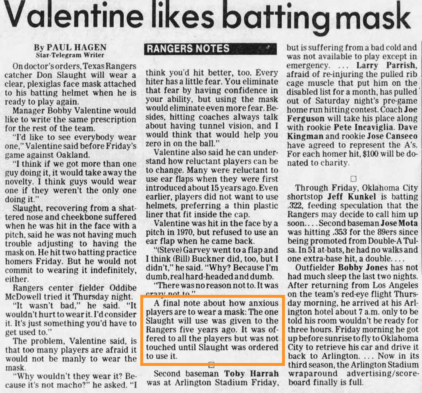
One the other hand, I hadn’t realized that Slaught wore any kind of mask at all, so this has still been a worthwhile investigation that’s added to our uni knowledge. Interestingly, I also found an article from June 21, when the Rangers’ medical staff decided that Slaught would need to wear a mask when he returned. The article states that the mask they ended up using had been given to the team five years earlier, but nobody ever wanted to wear it just for protection (see higlighted area; click to enlarge):
I’m not sure I’ve ever seen another MLBer wear a mask quite like Slaught’s. The closest thing I can think of is the one Rockies third baseman Charlie Hayes wore in 1994 (click to enlarge):
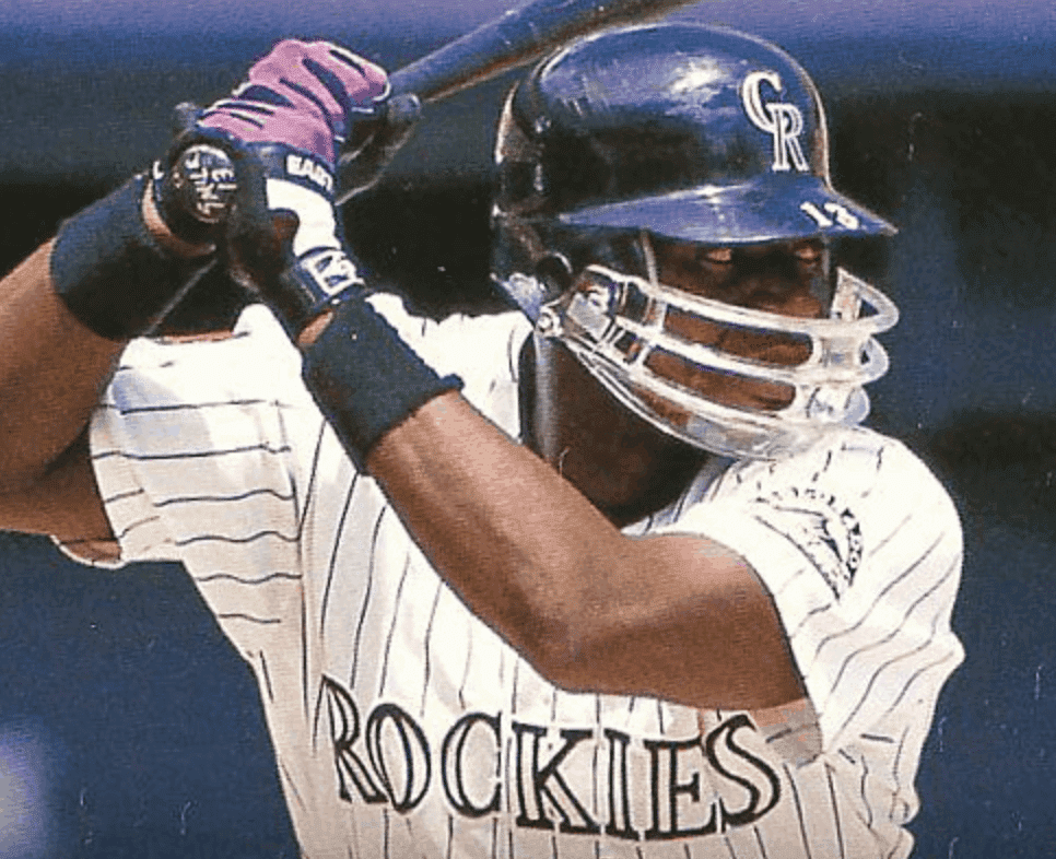
That mask is similar to Slaught’s, at least in the sense that it’s clear and has a football-style full-wraparound format. But it’s obviously not the same design. (In addition to never seeing one quite like Slaught’s, I don’t think I’ve ever seen another one quite like Hayes’s!)
All in all, a very enjoyable rabbit hole, even if it didn’t end up changing our understanding of C-Flap history.
(Big thanks to Jerry Wolper for spotting that passage in the recent Slaught interview.)
Collector’s Corner
By Brinke Guthrie
Follow @brinkeguthrie
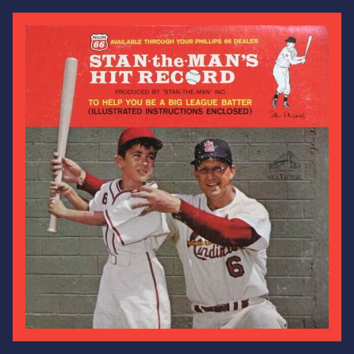
Baseball Hall of Famer Stan Musial is featured today on Collector’s Corner. Leading off, I present Stan in his pristine Cards uniform for Stan the Man’s Hit Record, designed to “Help You Become a Big League Batter.” Illustrated instructions enclosed!
Next, here’s a hand fan for Stan Musial and Biggies restaurant — “Famous for Charcoal Broiled Steaks, Italian Foods, and a Complete Line of Sea Foods.” Want to make a reservation? Call SWeetbriar 2626.
Batting third, we’ve got a 1964 Official Stan the Man Rack-Um-Up, which is a bat rack that’s been personally autographed by The Man himself!
And hitting cleanup today, here’s one more Cards item not specific to Stan: “Big League Emblems of Your Favorite Team;” a 1950s felt press-on Cardinals script and St.L logo kit. Here’s more on those emblems.
Now for the rest of this week’s picks:
• Someone decided to make a DIY helmet buggy for the New Orleans Saints’ short-lived 1969 black helmet.
• Speaking of black helmets; I’ve never seen a 1960s-70s Steelers helmet bank before. Did anyone stop to think there was only supposed to be a decal on one side?
• This vintage Seattle Seahawks Thermos is in good shape. The helmet looks white, doesn’t it?
• This looks like someone cut an ad panel off a milk carton. This is for “Philadelphia Hockey Star” Flyer — Bobby Clarke. (With all his teeth, it seems.) Reminder; “Mighty Milk is served in the Flyers dressing room; watch Flyer’s [sic] hockey on Channel 29.”
• This 1996 J.C. Penney ad shows all the various NFL and NCAA apparel makers of the era. I don’t recall Fila ever being part of that bunch, though!
• Sears sold this 1970s NFL bedspread with all the correct team name fonts, but the players are decidedly generic.
• Got a 1980s Miami Dolphins sweatshirt here, featuring the standard helmet logo depiction of the period.
• This 1970s Chicago Bears polo shirt in fact has no team identifiers, but it comes with team colors and a football player silhouette.
• AFC and NFC Pro Bowl players were featured on this 1960s-70s NFL Beach Tote Bag.
• Here’s a 1970s Denver Nuggets bicycle plate with the multi-colored skyline design.
That’s it for today. Next week: The annual Collector’s Corner Halloween Pumpkin stencil edition!
Click to enlarge
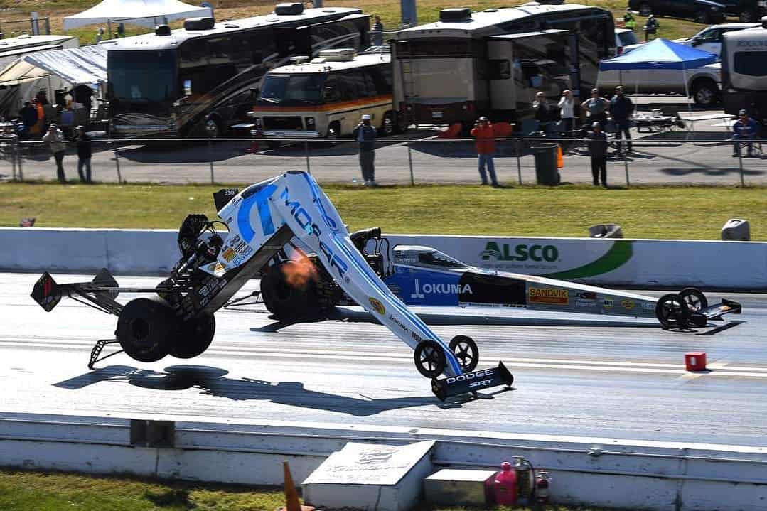
Too good for the Ticker: Holy moly, what’s going on here? The car in the near lane was being driven by Leah Pruett, a drag racer who was competing Sunday in the Mopar Express Lane Midwest Nationals near St. Louis. Fortunately, she walked away unharmed.
Here’s video of the mishap:
Yikes!
(My thanks to David Firestone for this one.)
The Ticker
By Paul, pinch-hitting today for Alex Hider

’Skins Watch: The WHL’s Moose Jaw Warriors are reviewing their Indigenous-themed primary logo. “The logical step would be to transition to a version of their secondary moose head logo,” says Wade Heidt. … The Saanich Braves, a junior “B” hockey team in British Columbia, are now the Saanich Predators (from Jim Wooley). … Eskimo Pie ice cream treats will be renamed as Edy’s Pies in 2021 (from Timmy Donahue). … Uni Watch alum Vince Grzegorek, who’s currently the editor-in-chief at the alt-weekly Cleveland Scene, has written a good piece on the Cleveland Indians’ search for a new team name.

Working Class Wannabes™: In a classically absurd bit of blue collar cosplay, coaches for the Octorara High School football team in Pennsylvania wore auto mechanic-style shirts, complete with name tags, on the sidelines last Friday. Bonus points for the Native-themed logo. … An article about a high school football team in Louisiana says the team has a “tough, blue-collar work ethic” and also quotes the team’s coach saying, “We live by a blue-collar approach.” … An article on the University of Utah football team says the program has a “blue-collar workmanlike mentality.” … South Carolina football coach Will Muschamp, speaking to reporters last week, said, “I thought we had a good workmanlike, blue collar practice today.” … A recent article about an Iowa high school football team refers to one player as “blue-collar Cade Sheedy” and also includes the phrases “ready to go to work” and “the only thing missing was a lunch bucket.” Bingo! … A sports columnist in California says he’s always liked the Chiefs/Raiders rivalry because it matches ” Midwestern, wholesome K.C. against gritty, blue-collar Oakland.” … An article about the Colorado State football teams says coach Steve Addazio “is looking to bring that blue collar work ethic back” to the team. … West Virginia football coach Neal Brown says, “We need to be a blue-collar football team that plays the game with grit.”

Baseball News: I didn’t hear this myself, but Moe Khan says Marlins skipper Don Mattingly said on the radio that “he and the players like the uniform, but maybe a change is needed to the name and number because you can’t really see it on the black uniform.” … Here’s a fairly extensive guide to the “bubble ballparks” that will be used for the rest of the MLB postseason. … The World Series sleeve patch will apparently look like this. Not very inspiring. … Wrigley Field’s famous “W” flag is white — but it used to be blue. … With the Astros and A’s currently facing each other in the ALDS, you might think it’s the first time those two teams have met in the postseason — which is true if you don’t count the 1977 TV movie Murder at the World Series. Note the A’s player’s NNOB jersey in that clip! (From Trevor Williams.) … A digital ad being projected behind home plate during last night’s Yanks/Rays game interacted oddly with the Rays’ jerseys, making them look Mother’s Day pink.

NFL News: An item that I didn’t get in time for yesterday’s MMUW report: Panthers RB Mike Davis suffered some torn helmet stripes on Sunday (from Alex Benezra). … The Falcons went mono-white last night for the first time since debuting their new uni set. Additional pics here.
College and High School Football News: Houston is adding an “Equality, Justice, Peace” helmet decal this week (from Ignacio Salazar). … New turf and new midfield logo for Maryland (from Wes Brown). … “The University of Minnesota, Crookston shuttered their football program last year, says Will Belbye. “They are the Eagles. The Crookston High School team is known as the Pirates. Well this past weekend when CHS opened their season, they were wearing pants that have the UMC eagle’s head logo on the upper right thigh, as you can see in this photo gallery.” So the college team’s pants were apparently given to the local high school team. … Here’s one website’s picks for the best stadiums in D2 football (from Kary Klismet). … BYU will be going white-navy-white this Saturday against UTSA. It’s their fourth different uni combo in as many games this season.

Basketball News: New uniforms, with some very interesting inline-detailed chest lettering, for Gonzaga (thanks to all who shared).
.

Soccer News: Arsenal is getting rid of its “Gunnersaurus” costumed mascot as a pandemic-related cost-cutting measure (from Kary Klismet). … New uniforms for Syracuse (from Jakob Fox). … New Manchester United signing Edinson Cavani will wear No. 7, which is a storied number in ManU history. … If you scroll through the Puma soccer Twitter feed, you can see that they’ve released shirts for five African national teams — Côte d’Ivoire, Egypt, Ghana, Morocco, and Senegal — and also one for Paraguay yesterday (thanks, Jamie).

Grab Bag: Here’s a good assortment of famous brand logos — some of them sports-related — adjusted with the word “Vote.” … The Fairborn (Ohio) Music Club is raising money by making tote bags and pillowcases out of old band uniforms (from Timmy Donahue). … New 30th-anniversary logo for Tex Mex restaurant chain Baja Fresh (from John Cerone). … The French Open has released renderings of the winning bid to design the tournament’s new Suzanne Lenglen Tennis Court (from Kary Klismet). … Also from Kary: Indiana University’s student newspaper has a story about the enduring popularity of the Hoosiers’ long-obsolete bison mascot, and the ongoing movement among some fans to bring it back. … Karate tournaments in Japan are adding innovative headgear to reduce the chance of spreading the coronavirus (from Jeremy Brahm). … New visual identity for the Working Families Party (from @EJL1984). … New logo for the search engine Bing (thanks, Brinke). … New logo for Gmail. … The police department in Waterloo, Iowa, is getting a new logo after people pointed out that the old one resembled a white supremacist image.
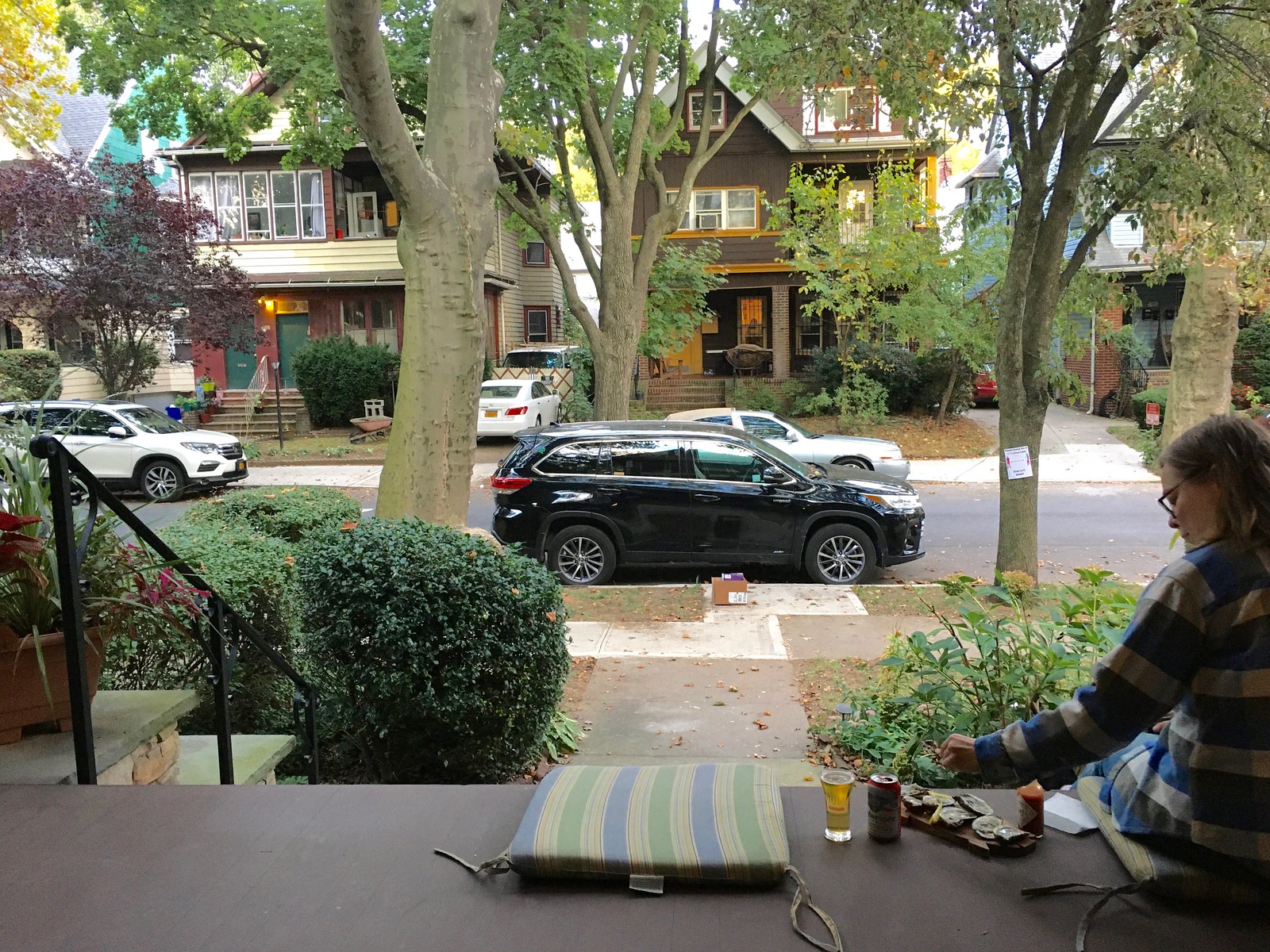
Click to enlarge
Our latest raffle winner is Ryan Farrar, who’s won himself a Uni Watch membership card. Congrats to him, and thanks to Mike Engle for sponsoring this one. — Paul
Love the oysters on the porch…and Karen Valentine in that Murder at the World Series clip…outstanding!
Yeah, I was shopping for something else yesterday afternoon, saw the oysters at the seafood counter, and thought, “Why not?” An impulse buy that provided a bit of extra festiveness on the porch yesterday evening.
In various youth baseball contexts in the late ’80s and early ’90s, I saw those clear masks with the square hole.
I am fine with this “Est 2000” trend for anniversary logo’s if it means teams get the correct years now for anniversaries. Also the Blue Jackets do still have a nice big 20 as well.
In the Flames write up, looks like a word is missing here:
Here’s shot that shows the pants and socks
Fixed.
Why the cannon on the Blue Jackets patch?
They are named after the Union Army of the Civil War, who wore Blue Jackets.
Taken from their alternate jersey crest:
link
I’m a CBJ season ticket holder. (Mainly to have cheap Penguins tickets, but the other games are good, too. They actually have a replica Civil War-era cannon that they fire off at the arena for goals & victories. Its actually pretty cool.
How many of the re-branded sumbissions Grand Rapid Griffins had similar art work that of the police department?
In the Murder at the World Series clip, looks like the Astros pitcher is also NNOB.
I know this has nothing to do with batting helmets, but wasn’t LA Dodger catcher Steve Yeager the first to wear a “throat protector” which hung down from his mask? Didn’t he invent this after getting struck by a foul ball?
Yes.
Interesting that the article about the Moose Jaw Warriors indicates their have been using a version of the current primary logo since 1988. Chris Creamer’s site indicates that too.
However, I do not recall seeing it really used until the mid-1990s and it did not appear on the uniforms until then.
The Warriors were still using a more offensive version that was their older logo into the 1990s.
link
A more modernized version of that logo on their 1991-92 schedule:
link
That older logo a shoulder patch on the Warriors’ uniforms in early 1990s when they did not wear their crest on the front of their jerseys. Back in the days when Mike Babcock was their coach:
link
Isn’t Ottawa supposed to come out with their new (old) uni’s today too?
Ottawa today and maybe Arizona.
Wait, there are UniWatch parties?
link
Happy the Flames have made this uniform change. Finally, the Reebok Edge hangover has been cured! No more wide pant stripes and flags on the shoulders. Though we will need to still see it sometimes when they wear it as an alternate.
I would rather see the Flames create a brand new alternate which can include black.
It became pretty obvious when the Flames wore that white uniform at the Heritage Classic in Regina that we needed to see more of that beauty rather than just a one time event.
Finally the city of Calgary has an uniform that isn’t a complete mess. Now if the Stampeders can get their act together.
Gotta say, I think the Flames downgraded. The white C on the red jersey looks too pale/washed out. Plus, the convergence around this pared-down template means that too many NHL teams are just palette-swapped versions of each other.
I totally disagree. I always hated the black logo. For a team names the Flames it always was too cold. White symbolizes heat.
Yeah, this is an amazing upgrade. Black wasn’t needed.
Agreed!
I always thought the black was stupid because black, to me, indicates something that’s been burned by flame, rather than flame itself. In short, I saw the black C as detritus, compared to the other flame colors, which I see as “red hot” and “white hot”.
I’m a Flames fan, and I HATE the retro red jerseys/uniforms – always hated when they wore them as an alternate in recent years. I much prefer the black C. I do love those white retro though.
That Top Fuel dragster picture is insane at first glance, but if you’ve ever been to an NHRA event you’d undertand the power of these vehicles.
0-300 mph in under 4 seconds.
Even if you’re not into Motorsports I think it’s an incredible time one should treat themselves to. Go (take EAR PROTECTION) and sit near the starting line. You can feel the power course through your body. I’m not exaggerating when I say it’s “Earthquake-esque” (yes I’ve lived through an Earthquake)
Did I mention TAKE EAR PROTECTION?? LOL
What happened here is the torque being applied at the rear wheels is trying to lift up the front end, and air over the front wing is pushing it back down. Hard enough to break the car in half.
This is clearly not an isolated problem, as it looks like the car in the other lane had been patched up in the same spot.
Though I beg to differ on the earthquake comparison. I’ve experienced a couple of those too, but the only thing that came close to being near a top fuel car was the time I was almost struck by lightning.
Flames look good now.
Finally.
Question about the Flames new (old) unis: will they still use the Atlanta Flames “Flaming A” logo for alternate captains? I’ve always thought that was a nice touch to recognize their days in Atlanta, seeing that every other NHL team that relocates except for the Stars (and to a lesser extent the Hurricanes) pretends like they’ve never played in another market before.
I have no reason to think they won’t.
They were using the “Flaming A” logo for alternate captains on their primary uniforms with the black. However, this was not done on the throwback uniforms that are now their primaries and was not done back in the days when the Flames strictly wore red and yellow.
link
Would bet you will see “Flaming A” stay on the new alternate (old primary) but not the red and yellow new primary uniforms.
If they just go back to the original block A this season, then I hope that they at least consider bringing back the flaming A for the 2021-22 season. It would be nice symmetry, as the franchise’s 50th anniversary is 2022, and they initially brought the flaming A back for the 1996-97 season (the franchise’s 25th season overall).
Not sure if it’s just me, but no images are loading on the page at all today (never had that problem before). ‘Click to Enlarge’ links work, though.
Also, there is a coding error in the Ticker between the last link in ‘Soccer News’ and the first link in ‘Grab Bag’.
Not just you – images aren’t loading for me either. I’ve tried multiple browsers on multiple computers and my phone, so I’m assuming it’s a site issue.
I’ve heard this from a few people — but other people I checked with tell me the site is fine for them.
Investigating!
it’s happening to me on both my laptop (firefox) and phone (safari).
I don’t see the pictures either. But if I click on the blank space where the picture should be it comes up in a separate window. Using my iPhone.
No images for me either. I use Chrome with AdBlock & Ghostery, but even with those off & in Chrome Incognito mode there are no images.
Same.
Add me to the list of sporadic image loaders, for whatever purpose my reporting it might serve.
Same issue, yesterday and today.
Works on mobile, but not Chrome.
Images not loading? Same for me the past two days. Won’t load on a couple browsers, won’t even load on mobile.
The Flames have just gone from one of the worst dressed teams in the league to one of the best.
It’s not explained how a truncated helmet brim would be helpful with Don Slaught’s safety shield setup. I would think that a normal-sized brim affords one a bit of eye protection which would be lessened in his case.
If Finley wasn’t a cheapskate SOB, we would’ve beat the Astros in ‘77.
Blue Collar:
From Bleacher Report in 2013
link
From this past weekend, I guess Blue Collar = Grit:
link
Even in Nascar, I guess Matt DiBenedetto is considered “Blue Collar favorite”.
link
Re High school band uniform bags and pillows:
That’s actually a somewhat common fundraiser for marching bands when they retire a uniform set. Sometimes they’re passed down to a local middle school or sold to another school, but many times they aren’t in good enough condition to pass on. I hadn’t heard of tote bags being done before, but throw pillows and such are nothing new. In fact, my mom has a pillow at her house with the marching band uniform I wore in HS. (Or at least the same design. There’s no reason to believe it’s made from the exact uniform I wore.)
Paul,
A suggestion, which may have been made and addressed in comments previously, so I apologize for any redundancy. Now that the Washington Football Team has been forced to retire the racist logo it swore it wouldn’t retire, I’m wondering if you should do the same at the top of ‘Skins Watch in The Ticker? It’d be nice to purge any instances of it, still existing on the internet. Just a thought.
Hi, John! Yes, several people have suggested changing the icon and/or name of that section. But there are still high school teams out there using the name “Redskins” (one of them was mentioned in ’Skins Watch just last week, in fact), and the larger problem clearly still exists. For now, I have no plans to change the name or icon for that section, but everything is always subject to change, of course. Thanks for your feedback!
Thanks for the reply! Keep up the great work.
I know there’s a lot of love for this look for the Flames, but (IMO) their 2000s look, pre-Reebok, was their best look.
link
I know BFBS is a popular complaint anytime anyone adds black, but this was a really good look. I’m surprised they didn’t add this one as the throwback third jersey (instead of keeping the current, deeply unpopular jersey)
That is a solid idea I would have loved to see. This uniform you mentioned would be a great addition as the third uni rather than keeping the recent red jersey around. Good memories surrounding this uniform with their run to the Cup Final in 2004.
The Don Mattingly interview was with Dan Patrick yesterday. Here is the clip link
Another cool thing is during commercial breaks of the TV portion of the DP Show they play archived things. Late last week they showed one of Paul’s old interviews on the DP Show talking about uniforms.
Great looking Uni matchup last night between the Chiefs and Patriots, unfortunately Atlanta ruined the evening with their Uni embarrassment.
Does anyone else notice the irony in Uni-Watch still using the Washington Redskins helmet logo after it’s been ‘retired’ by the NFL and the team itself? It’s not hypocritical, but it is odd. Maybe it’s time to find another symbol to represent that element of the site?
Someone didn’t read today’s comments!
A note on Don Salught’s batting helmet I didn’t see in the post or comments, that’s his catcher’s helmet that got altered.I don’t know if he used the same helmet before hand, but the brim wasn’t altered for the mask.
It’s an alteration so that he could wear a batting helmet facing forward under his catchers mask. The brim was shaved to fit under the top pad and inside the cage. I wore one in HS back in 93-97.
Nope — his catcher’s helmet wouldn’t have double earflaps!
I know this has nothing to do with batting helmets, but wasn’t LA Dodger catcher Steve Yeager the first to wear a “throat protector” which hung down from his mask? Didn’t he invent this after getting struck by a foul ball?
No…he was in the on deck circle and was struck in the throat by a broken bat shard and was lucky to be alive.
link
Ah, thanks for the correction, Steve. But he did indeed pioneer that accessory!
When I was 15, I was a catcher. Had a pitch hit the front edge of the plate and it hit me square in the throat. After I got my throat looked at, I stayed in the game. After the inning, another coach from the league I was playing in walked over and handed me one of those protectors. He said,” Sorry, it’s mandatory in the league for all catchers and your the last to get one” A little late. My throat hurt for a couple days but I never caught without one again
Why are the Flames using an upside down 2 as a 5? Is that what they did on the inaugural set? Otherwise, seems cheap looking to me.
Apparently it wasn’t like that in the early 80s (with the bottom of the upper-left vertical stroke squared off), but by the time of the 1989 Cup win it was (with the corner cut off).
For the Flames set, why a red shoulder treatment on the white jersey but not something similar (say yellow or white) on the red jersey? Would seem a little more consistent, no?
Canadiens since 1941 (except 1944-47)
Rangers since 1951 (except 1976-78)
Sabres since 1970 (except 2006-10 [the Slug years])
BLues 1967-79
Stars 1967-68, 1988-91, 2013-present
Predators 2017-present
Coyotes 2007-15
Hurricanes 2011-2019
Maple Leafs 1958-70
Wild 2007-present
It’s actually a somewhat common design choice.
I’m really glad to see the Flames back in their classic unis, but…
… aside from the abominable Adidas collar designs, anyway…
… it is a bit annoying that the stripes on the red jersey don’t go all the way down to the bottom of the jersey like they did on the classic 1973-94 design (the 1972-73 Atlanta Flames had a slightly different, simpler stripe pattern).
If they’re not going to push the stripes on the red jersey all the way down, they might as well make the stripes the same width as their counterparts on the white jersey (so the white stripe would be the same width as the center red stripe on the white jersey, the gold stripes are the same width on both, and the thin red stripes are the same width as well).
Or, y’know… just go back to having straight-cut waistlines instead of this scooped crap we’ve had since Edge.
Flames look like they used to which is great. Same with the Browns which is also great, but a bit of a yawner for both.
A+ to the Rams, Chargers and Patriots.
They took something old time worn, refurbished into newly enhanced that look great on television. Great job!
Dallas Cowboys, it’s time to refresh & refurbish your tired look.. tik tok.
> So despite Slaught’s self-proclaimed status, it appears that he was not MLB’s first C-Flapper.
To be fair, he never claimed to be the first wear a C-flap. He claimed to be the first to wear “an extended face guard”, which seems like a reasonable description of what he wore. The next question is, was he in fact the first to wear that football-style face mask?
Maybe Dave Parker of the Pirates, circa 1978?
Actually, Joey, what he said was, “I think I was the first one to wear that, and a lot of guys are wearing them today.” The thing that a lot of guys are wearing today is the C-Flap, so that is indeed what he was claiming.
And no, he wasn’t the first to wear a football-style mask. link all beat him to that distinction.
Oh, Paul you made my day!!I had one of those 1970s NFL blankets and let me tell you, it was cherished. The best part is that my Dad is a pack rat and he still has it somewhere in his basement as a cover for other odds and ends. When I go see them in Knoxville at Thanksgiving, I’ll send a picture.
We live 3 Blocks from Biggie’s Restaurant in St Louis. Eat there all the time