There was a live event last night in Cleveland that I was looking forward to. Unfortunately, it started going off the rails almost immediately and soon became a total train wreck that I found difficult to watch. I eventually turned off the TV in disgust and figured I could catch up on any pertinent details afterward. I later learned that it got even worse after I stopped watching.
I am of course referring to the Yankees’ 12-3 win in their playoff opener against the Indians, a nauseating shitshow for any committed Yankees-hater like myself. I’m still depressed about it, so today I want to go off-uni and cheer myself up by telling you about something really cool that I recently acquired: a 1969 Everglide ballpoint pen salesman sample kit.
If that sounds familiar, it’s probably because I wrote about a 1961 Everglide catalog back in June. That catalog featured beautiful illustrations and great page design, but this sample kit features actual pens! Like so many sample kits, this one pushes all of my uni-related buttons (and I hope yours, too), so let’s take a look.
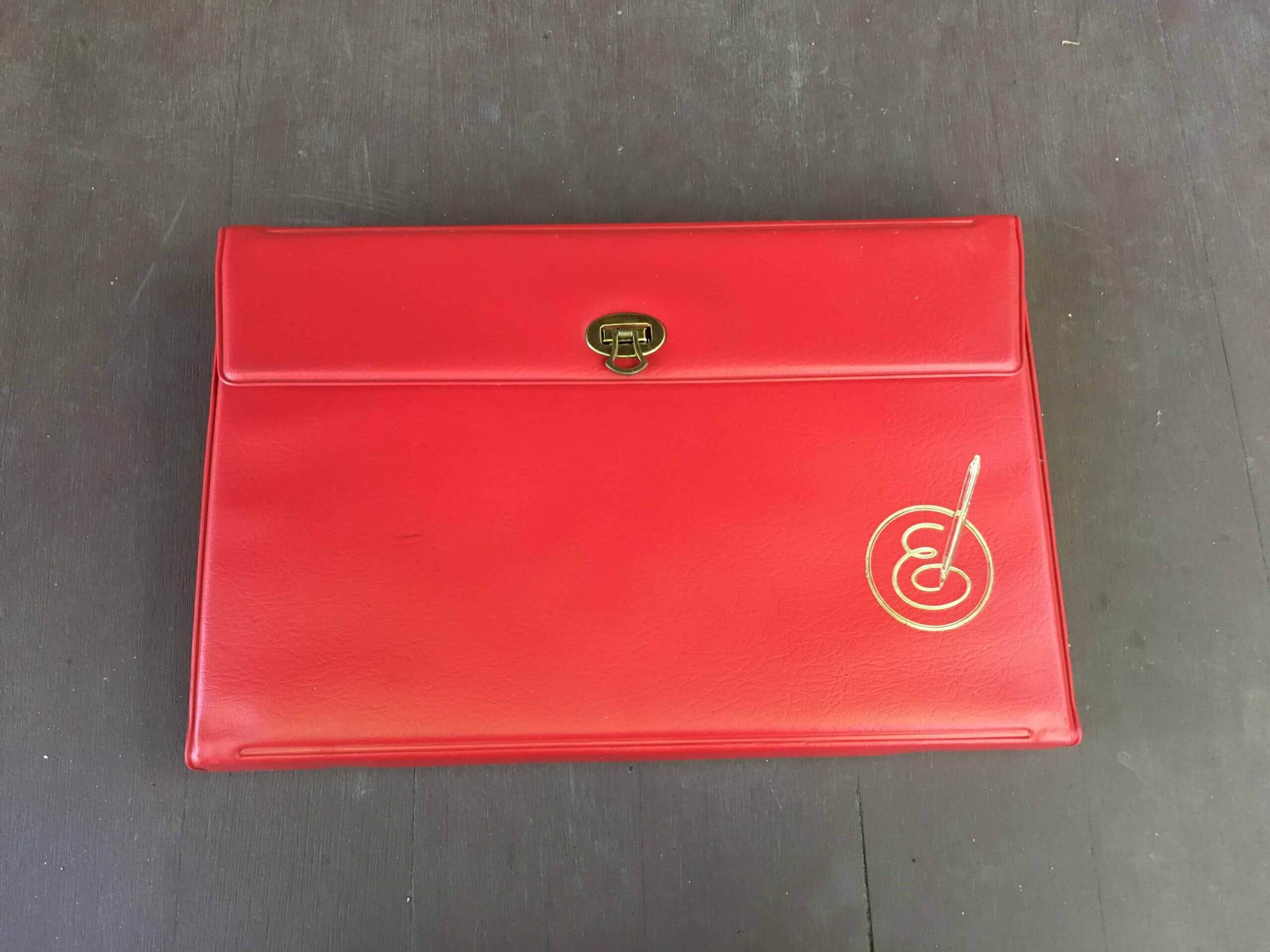
As you can see above, the kit starts out looking sort of like a vinyl purse with a gold-tone latch. It measures 12 inches wide, eight inches high, and about an inch and a half thick, and has the awesome Everglide logo stamped in gold.
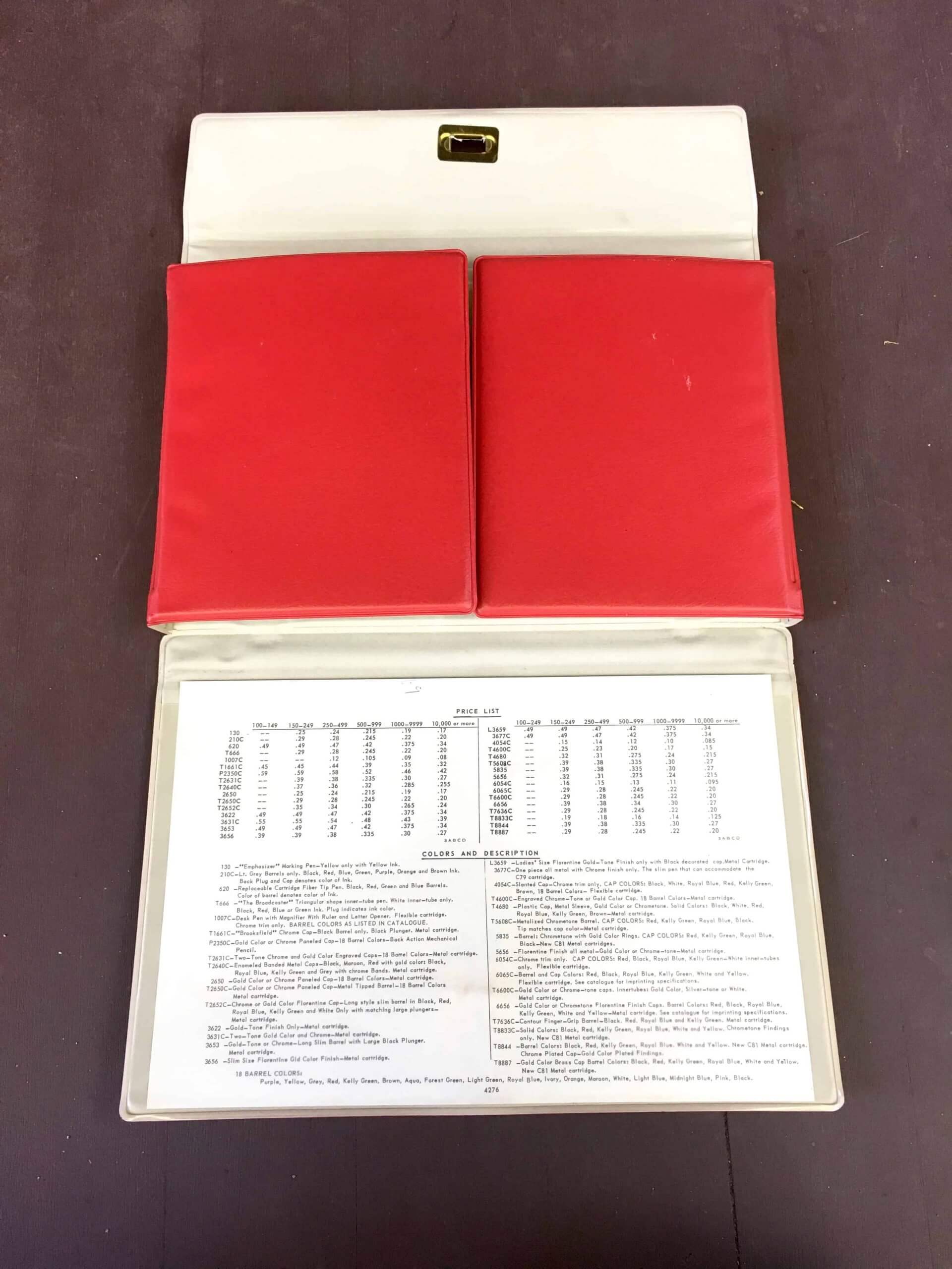
If you open the latch, the top and bottom flaps fold down, with the bottom flap featuring a pocket that includes a price list:
You can then open the left and right flaps, resulting in the spectacular money shot:
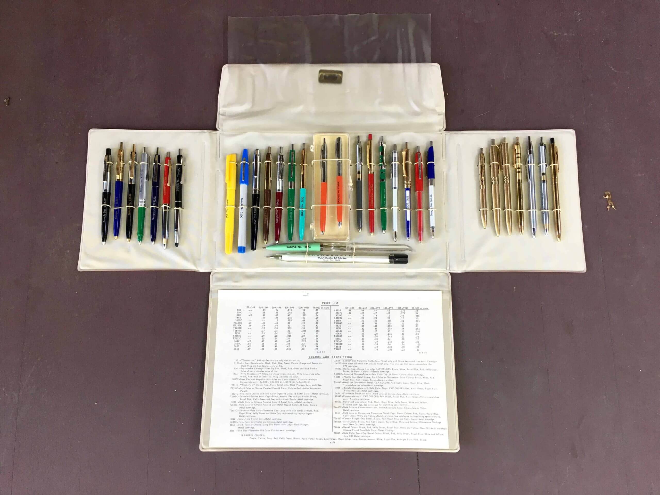
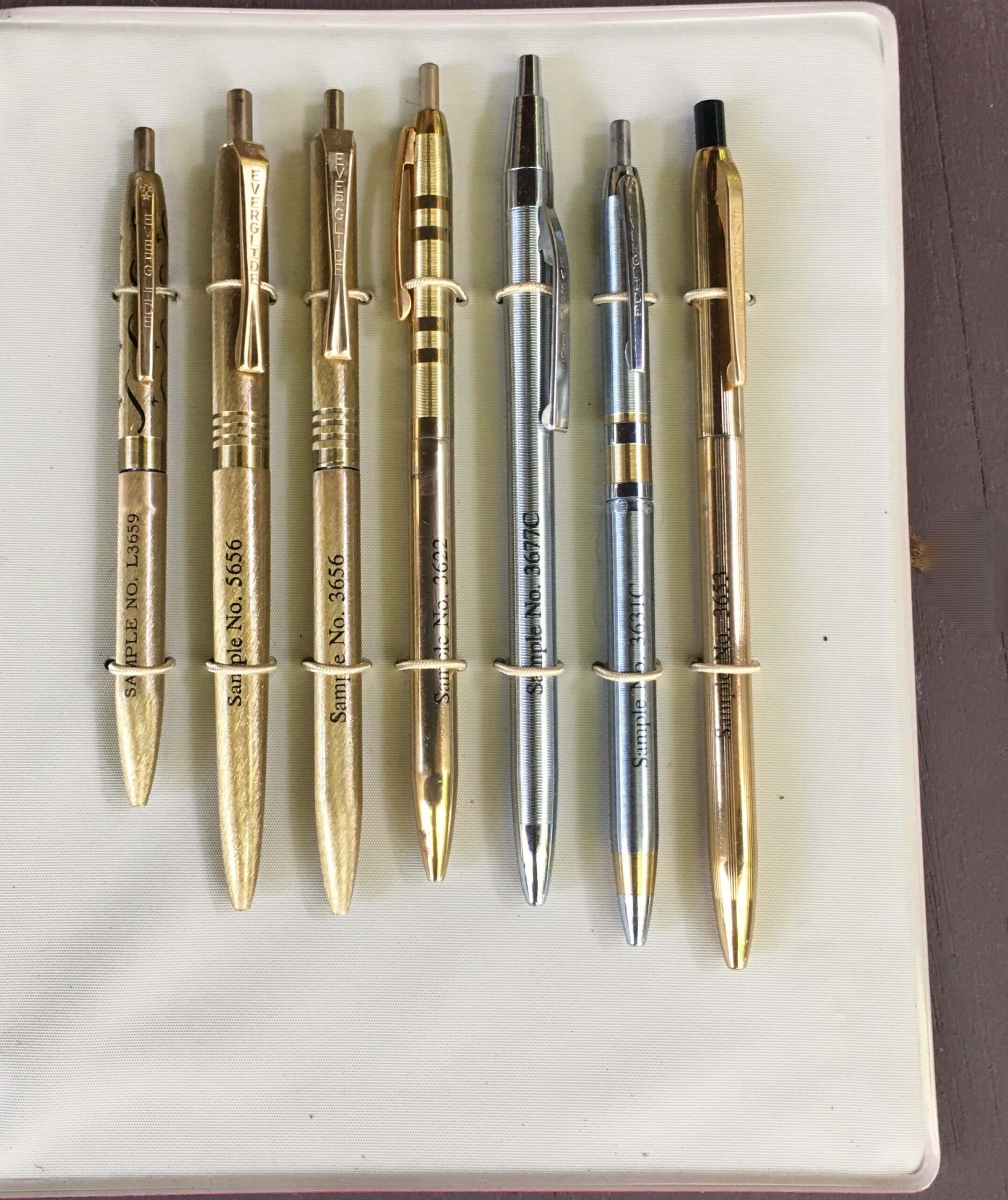
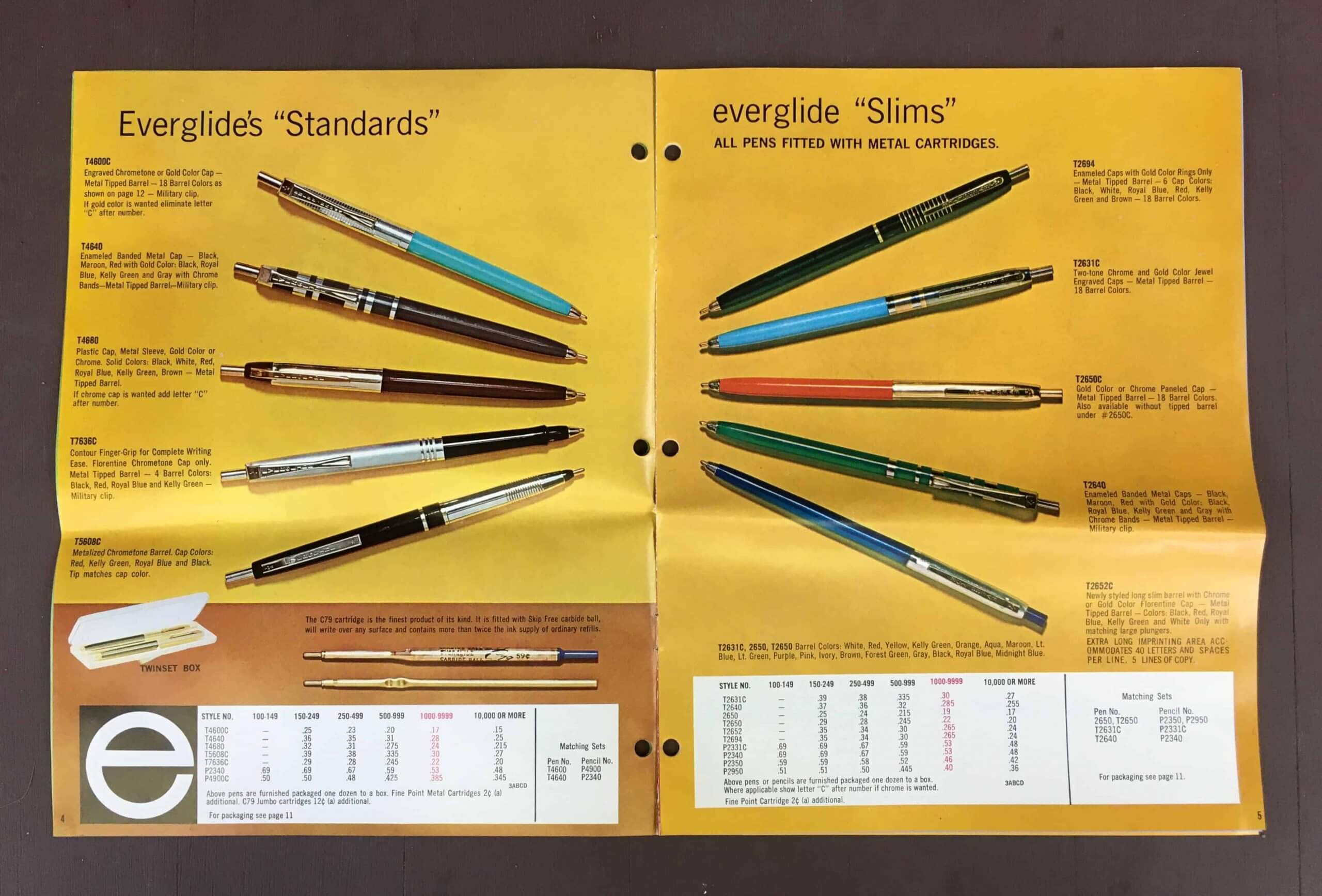
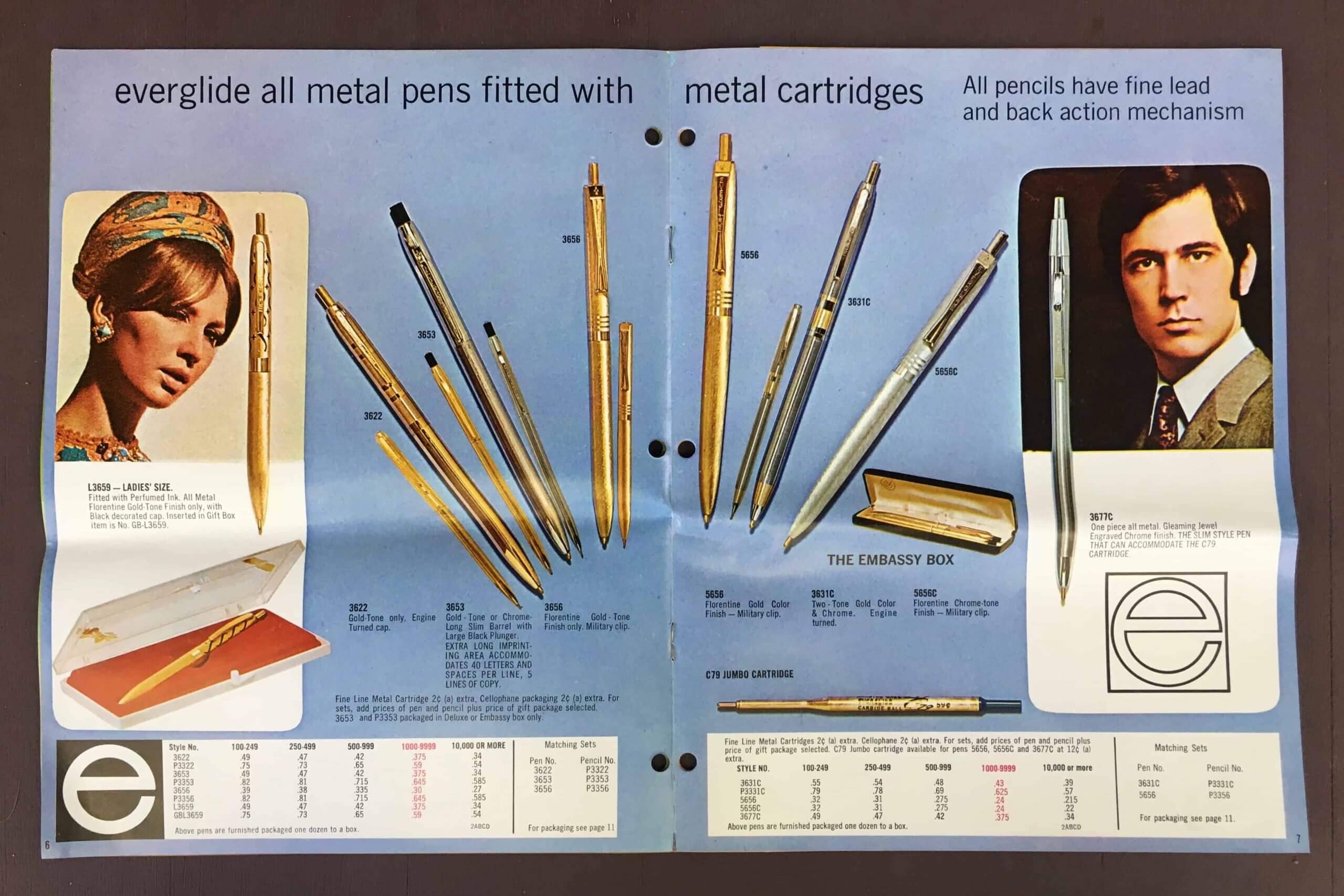
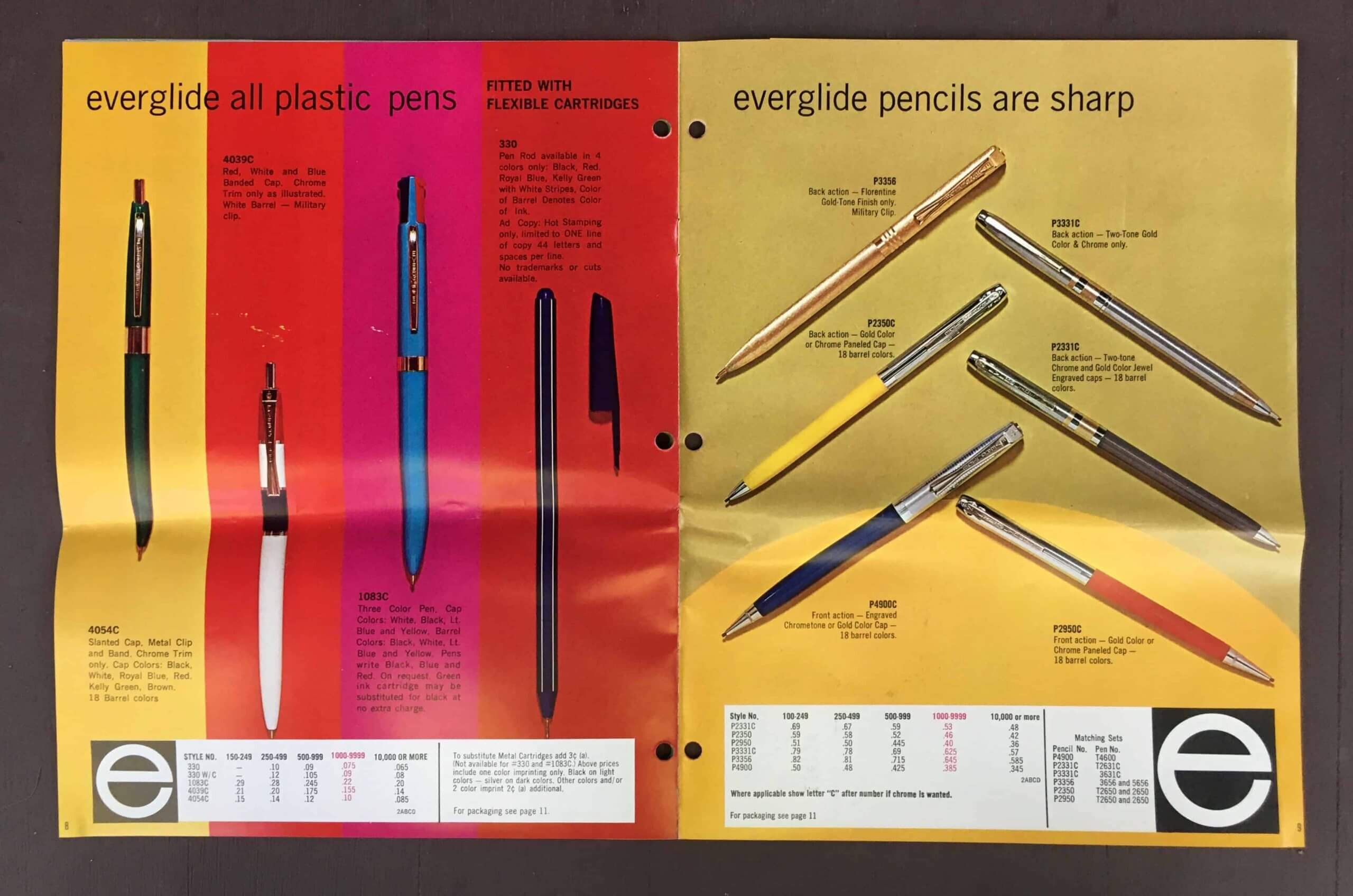
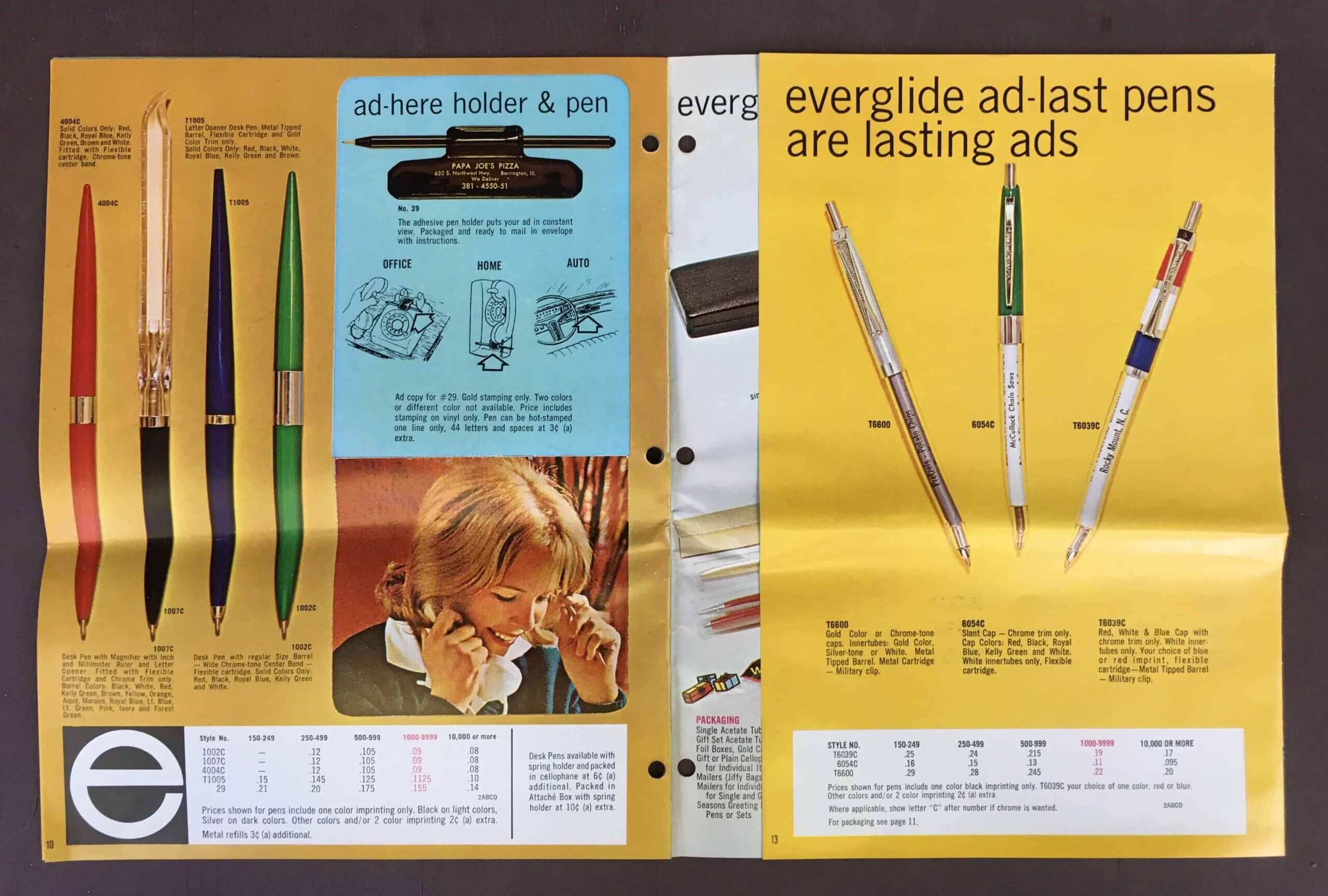
How awesome is that?! As you can see, there are three separate groupings of pens. Let’s look at them one at a time, beginning with the one on the left:
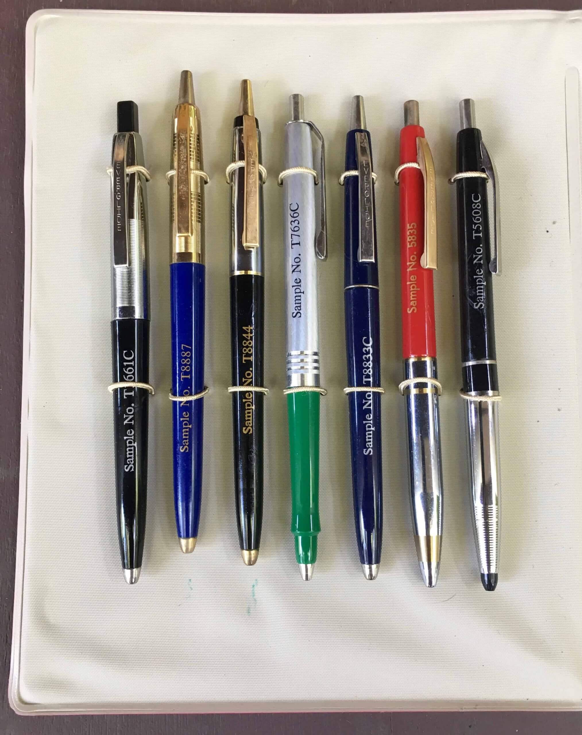
Beautiful, right? Naturally, I like the silver/green one the best — “Sample No. T7636C.” Speaking of which, I lovelovelove that each sample is marked with the word “Sample” (although it’s mildly irksome that they don’t all align at the same spot). I also like that each pen’s pocket clip is stamped with “Everglide.”
Now let’s look at the far-right pen grouping:
Nice set of designs there. I especially like the silver one with gold accents (second from the right), and also the one in the center with the two sets of stripes.
Now let’s look at the batch in the center:
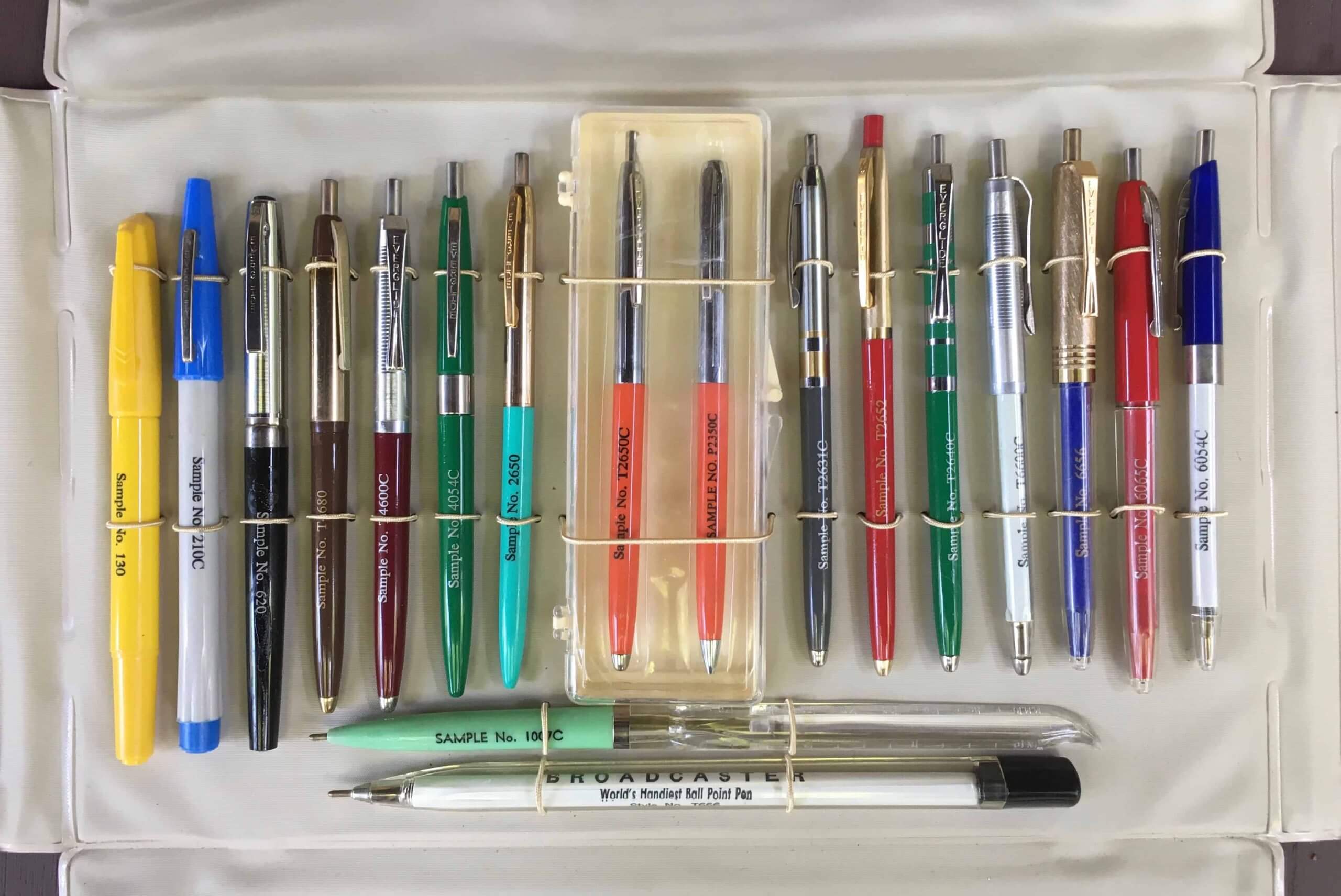
A few things about this grouping:
• The three at the left are actually markers, not ballpoints. Part of me thinks they belong in a different catalog. It also bugs me that they’re positioned with their writing tips pointing up while all the others are pointing down, which in turn means the text showing their sample numbers is oriented differently. That’s my one major gripe with the kit — ruins the uniformity!
• The two orange-barreled pens in their own plastic case are a pen/pencil set. The one on the right has a twist-handle to expose the lead tip.
• A few of the pens (it’s most apparent on the burgundy one on the left and the green and blue ones on the right) have interesting clips that are shaped sort of like elongated bow ties. A catalog that accompanied the sample kits describes this style as a “military clip.” I wasn’t familiar with that term, so I Googled it and found myself on a discussion board for pen collectors, where someone had posted the following:
[Military clips were] to meet dress codes. The codes stated that the clip must not show below the bottom of the flap and that the pen must not cause a bulge of the flap at the top.
Interesting! But based on that explanation and some additional research, it appears that military clips are very short, while the bow tie-shaped clips that Everglide is referring to as military clips are pretty much the same length as the normal Everglide clips — just a different shape. So it appears to be a misnomer when applied to these pens.
• See the mint green pen toward the bottom, with the odd-looking clear plastic handle? That’s a pen with a built-in letter opener! A different version of this appeared in the 1961 Everglide catalog (the one I wrote about back in June), where it was called the Mailmaster.
———
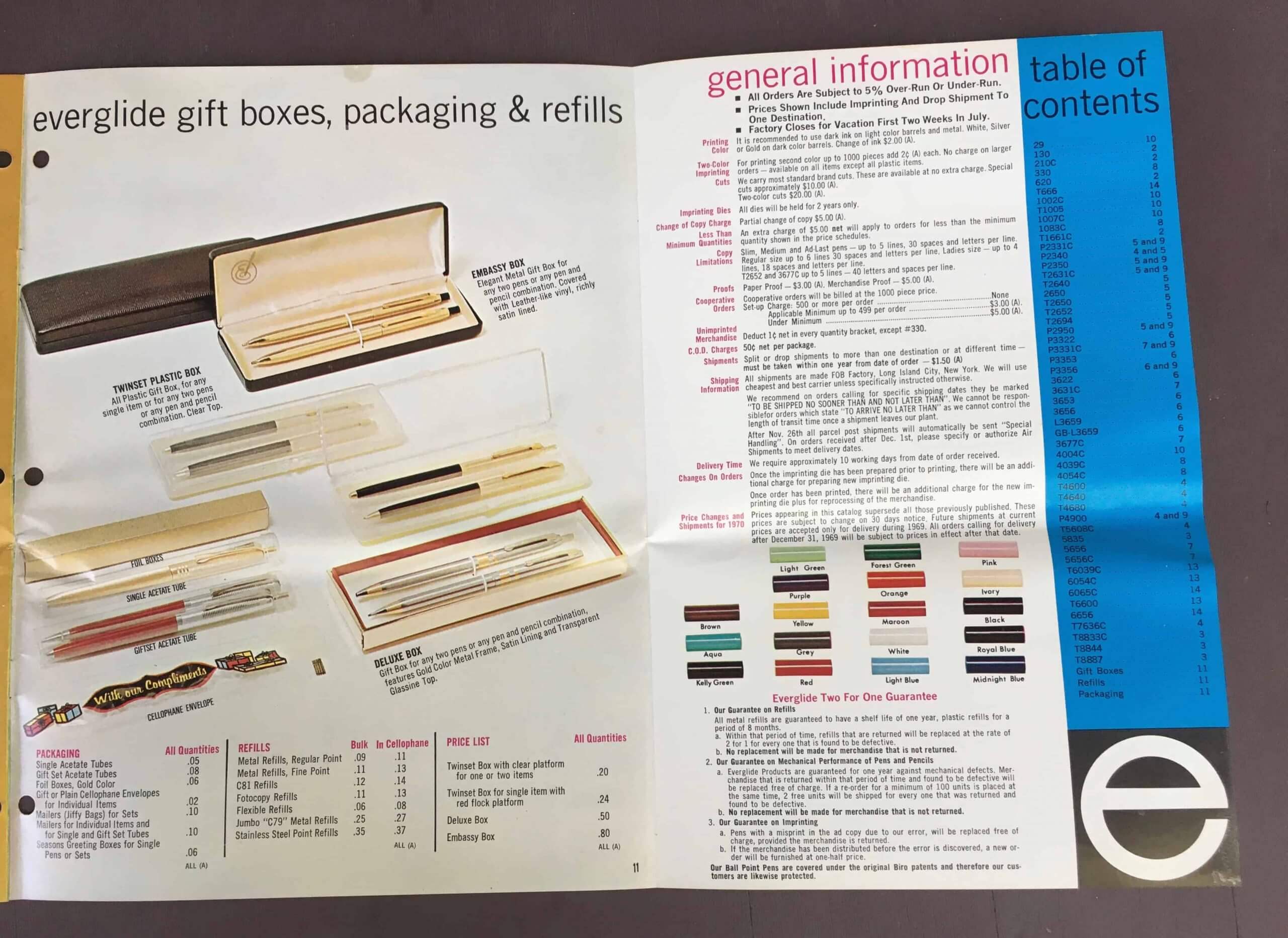
So those are the pens. But wait — there’s more! The kit also came with a catalog. It would be fair to say that Everglide’s approach to visual marketing had changed quite a bit between 1961 and 1969:
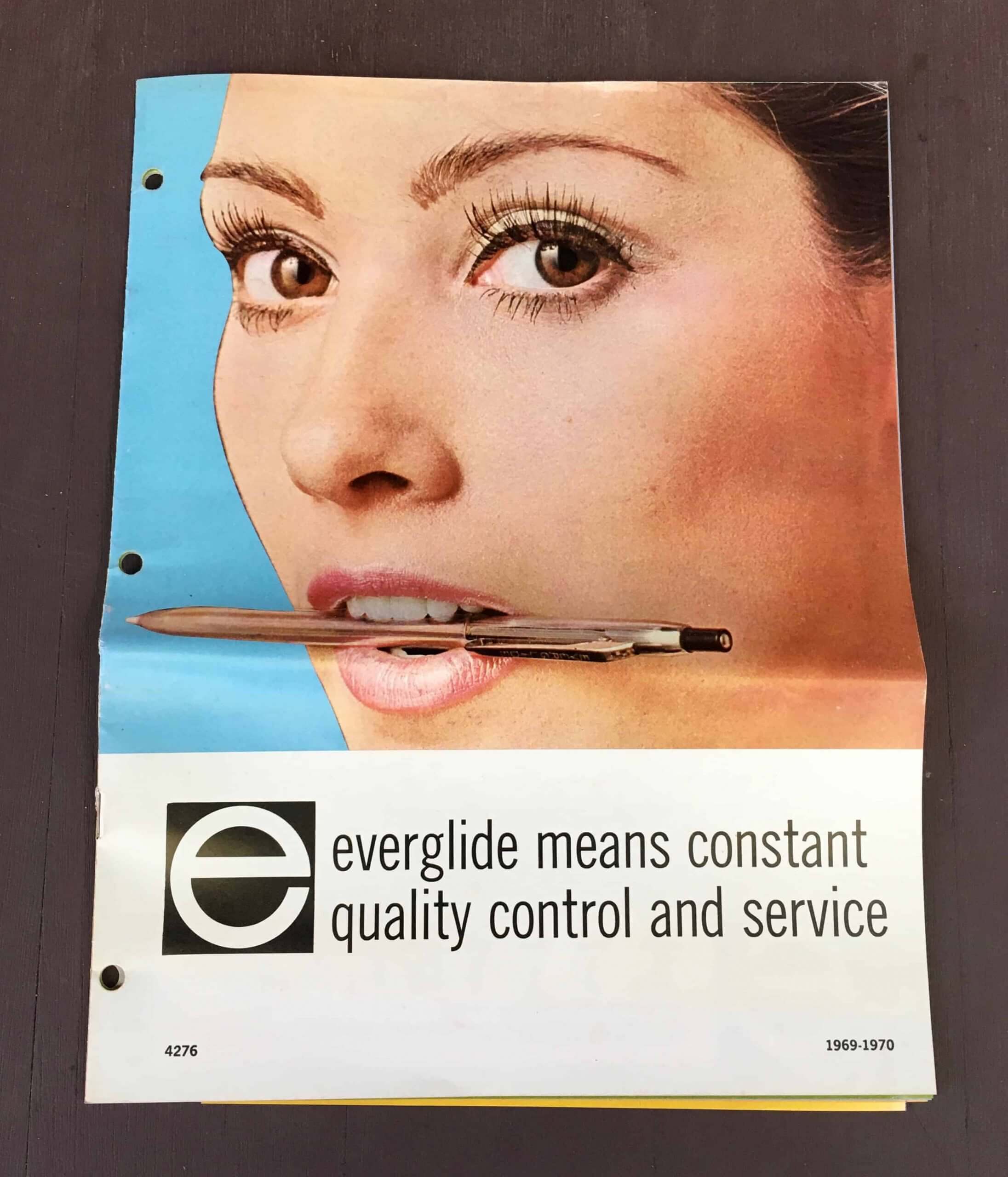
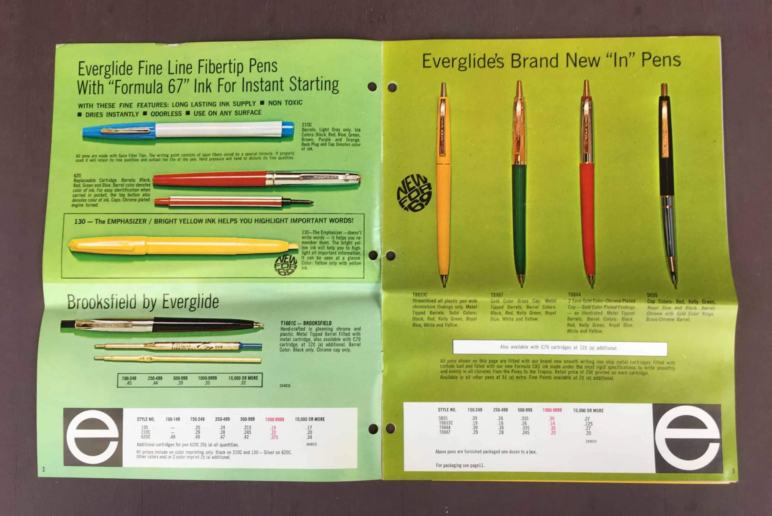
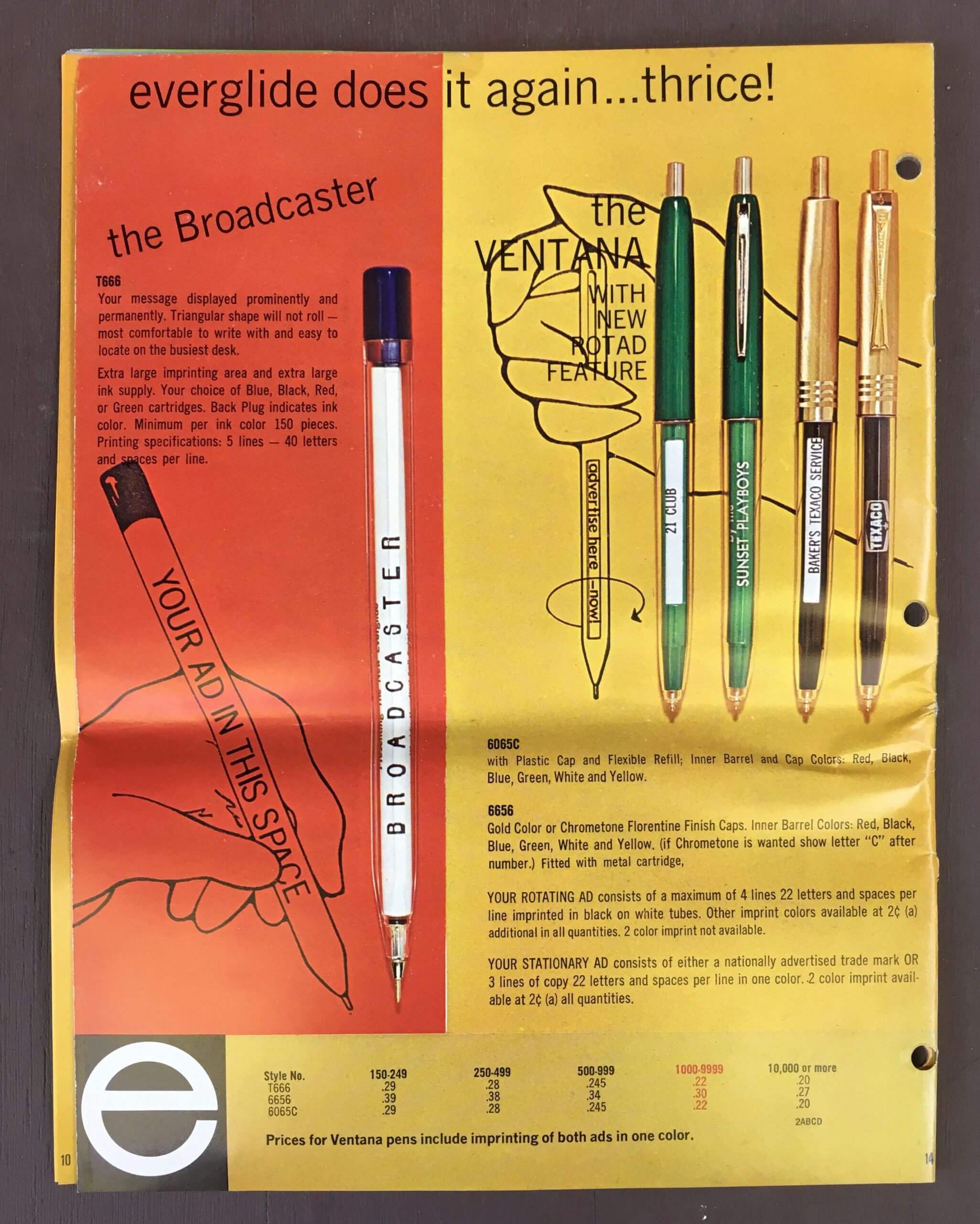
Yeah, nothing says “Come hither” like ballpoint pens. Ugh. Here’s the rest of the catalog, which mostly lacks the charm of the 1961 edition (although the “New for ’69” graphic on this next spread has an endearing late-’60s feel):
———
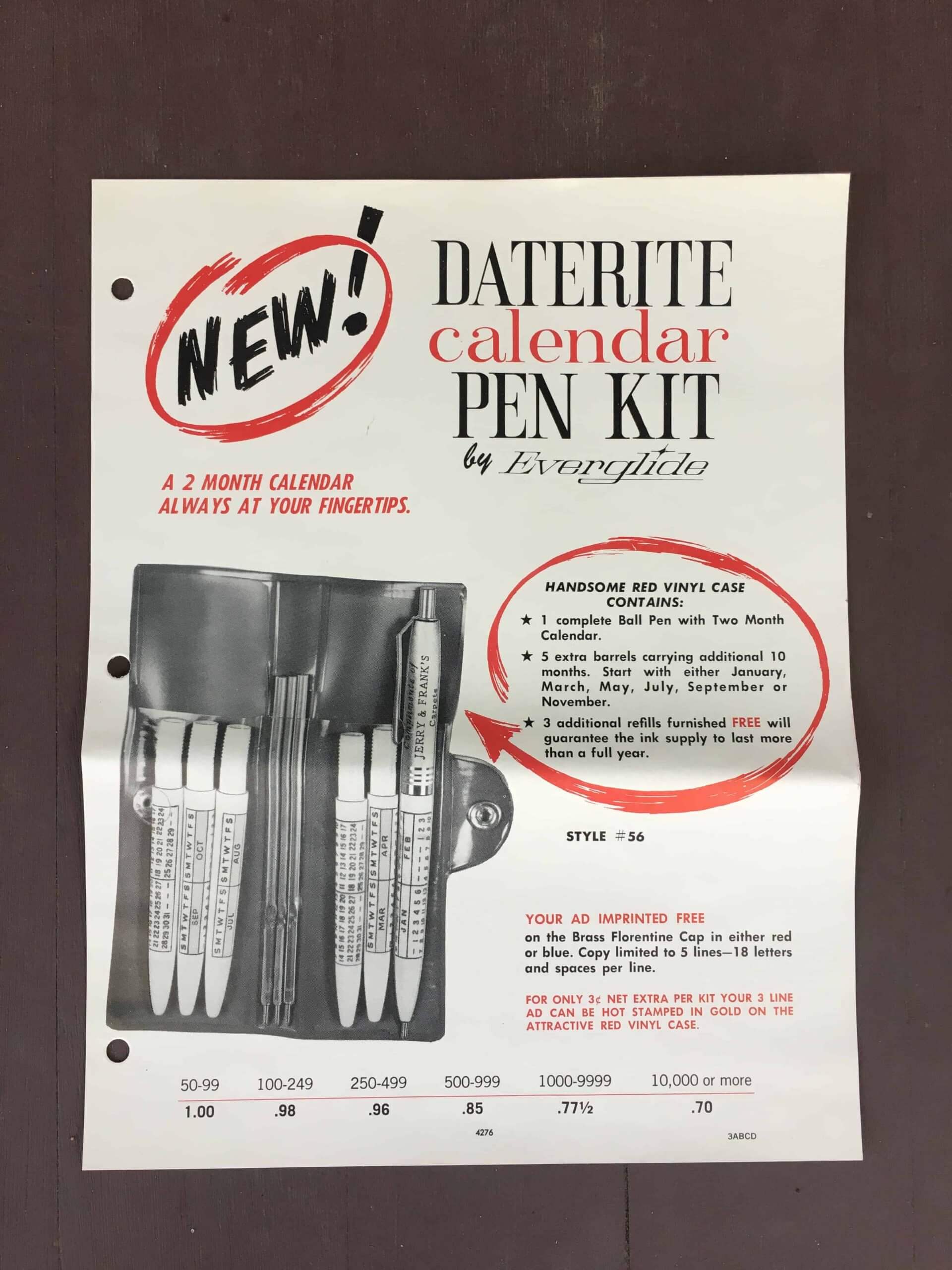
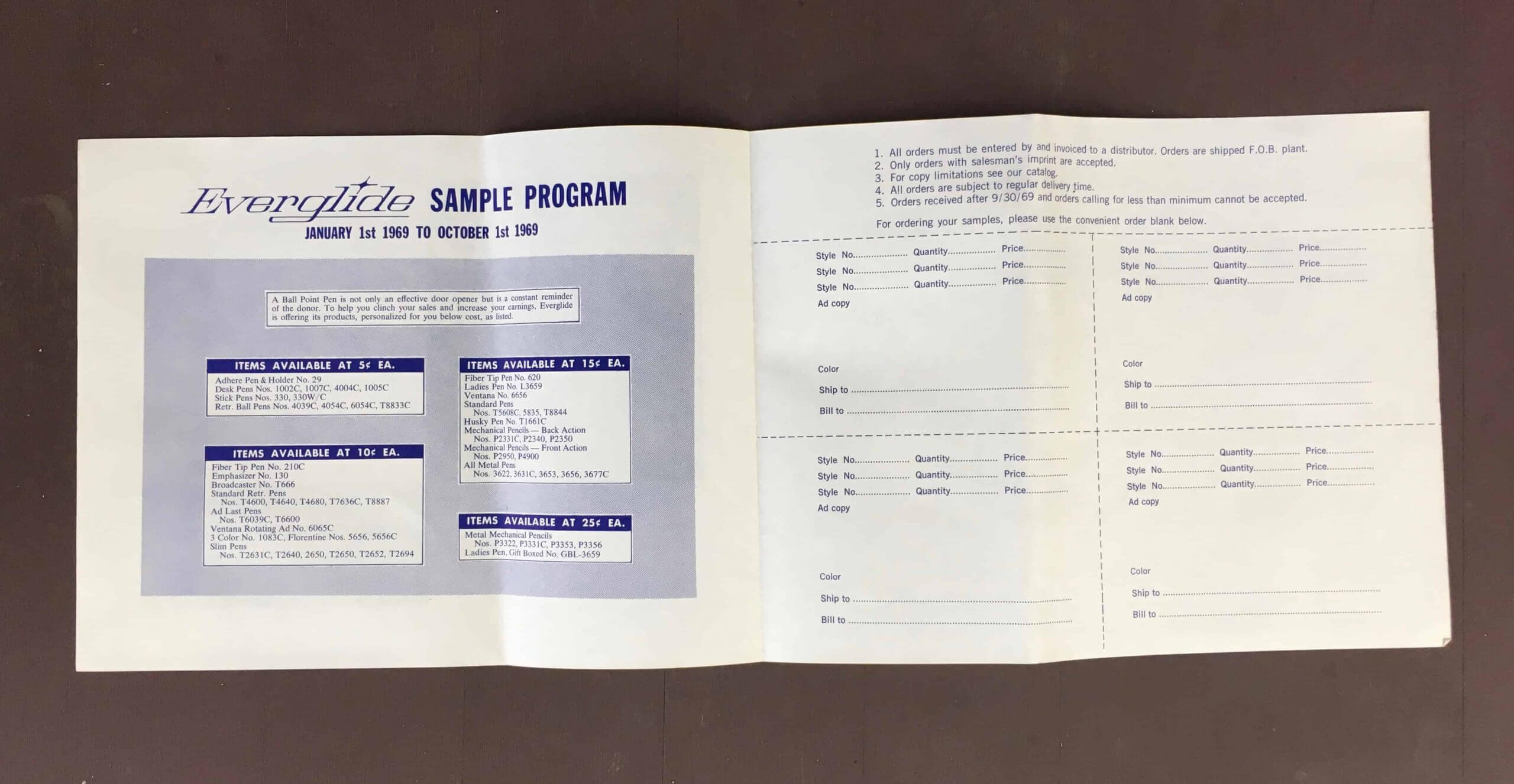
So that’s the catalog. But wait — there’s even more! The kit also included a flier about a pen with a built-in calendar function:
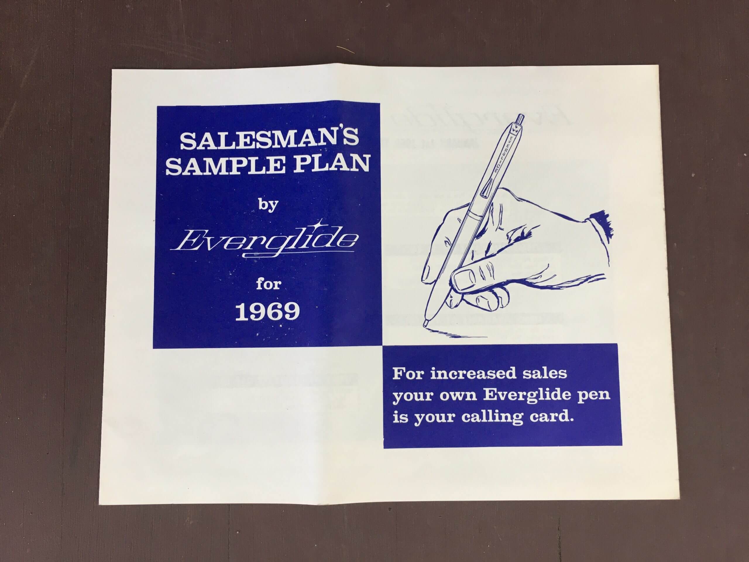
And finally, there’s this “Salesman’s Sample Plan” (including an illustration showing a hand holding a pen with one of the misnamed military clips!):
———
And what did all this vintage goodness cost me? A mere 25 bucks — with free shipping! Now that, my friends, is a bargain.
But there’s one thing I haven’t mentioned that you’re probably wondering about: Do the pens still work?
Alas, the ballpoints have all run dry. I suppose I could put new ink cartridges in them, but I’m in no hurry to do that, at least for now.
The blue-capped marker, however, still writes faintly. And the yellow marker seems practically good as new — if I needed to mark something up with a highlighter, this marker would definitely be up to the task. And of course the pencil still writes.
That concludes today’s show and tell. Thanks for indulging me — we’ll get back to more traditional Uni Watch content tomorrow.
Click to enlarge
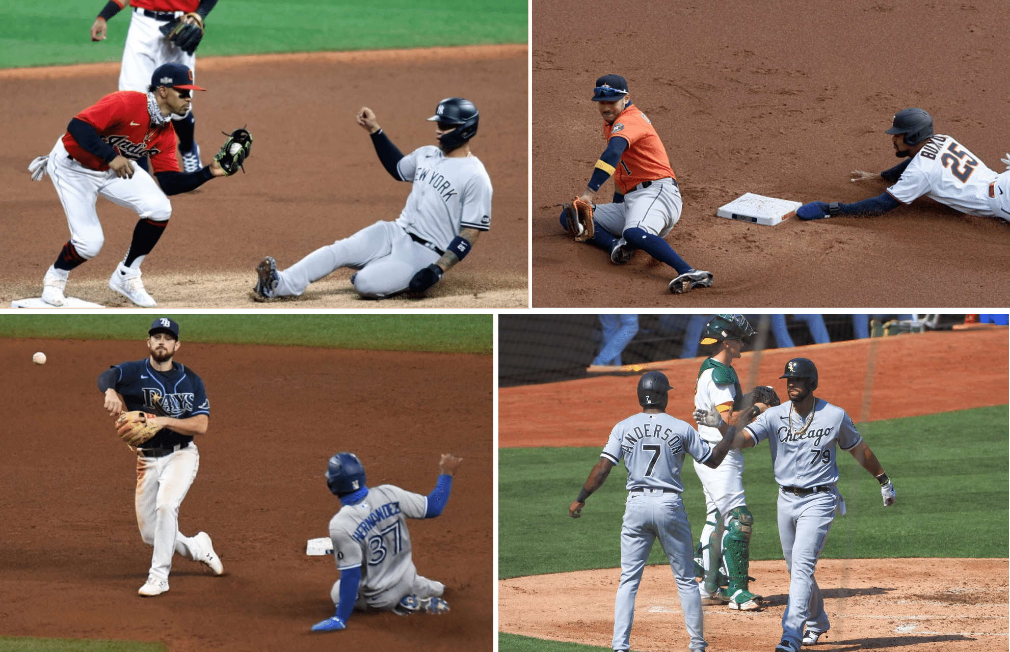
MLB playoff opener roundup: The MLB postseason began yesterday, with the four American League playoff series all holding their opening games. As you can see above, three teams (including two home teams) chose to wear their solid-colored alternate jerseys, with only the A’s/Chisox game featuring home whites vs. road greys.
Some other quick notes:
• From what I could see, all players wore the MLB Postseason patch on the side of their caps — except for Astros starting pitcher Zack Greinke, whose cap was patch-free.
• The A’s had the Black Lives Matter version of the MLB logo on the back of their mound. I’m not 100% sure of this, but I think they kept it there throughout the regular season, and that they were the only MLB team to do so. They were also the only team to have it there yesterday.
The four National League playoff series will begin today.
Click to enlarge
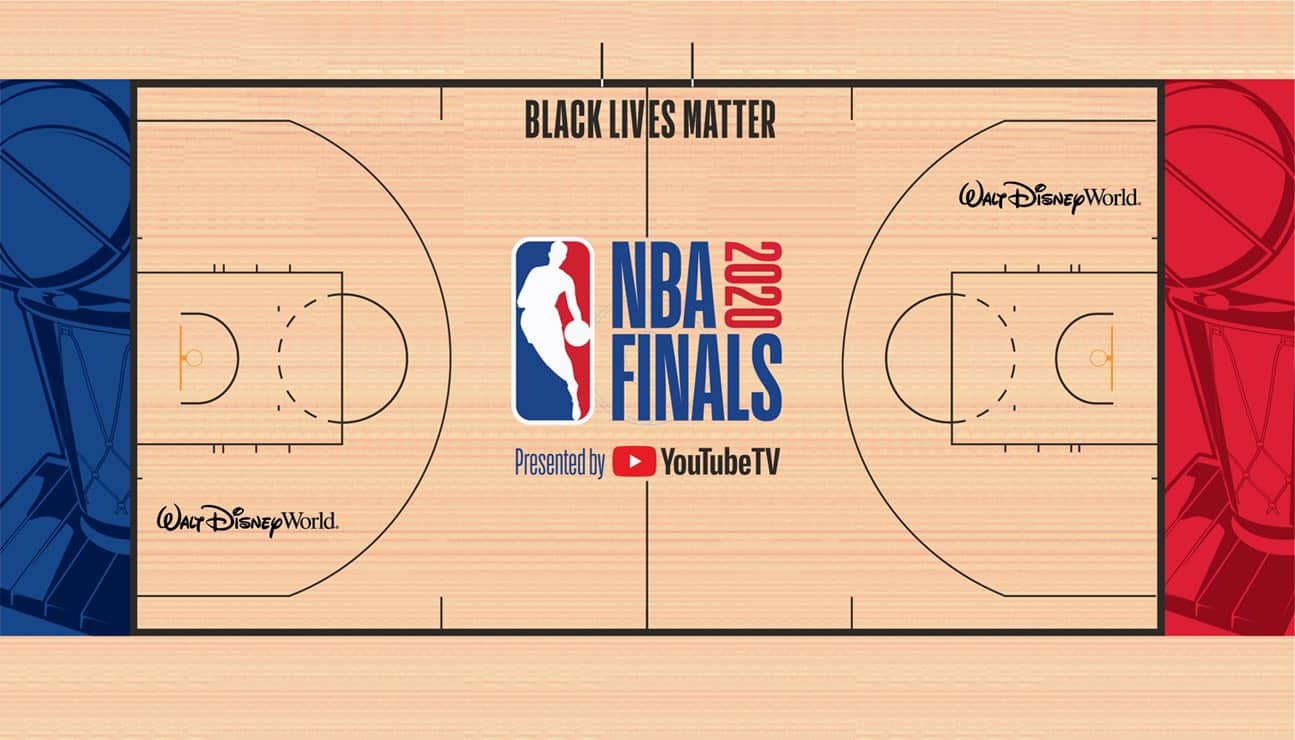
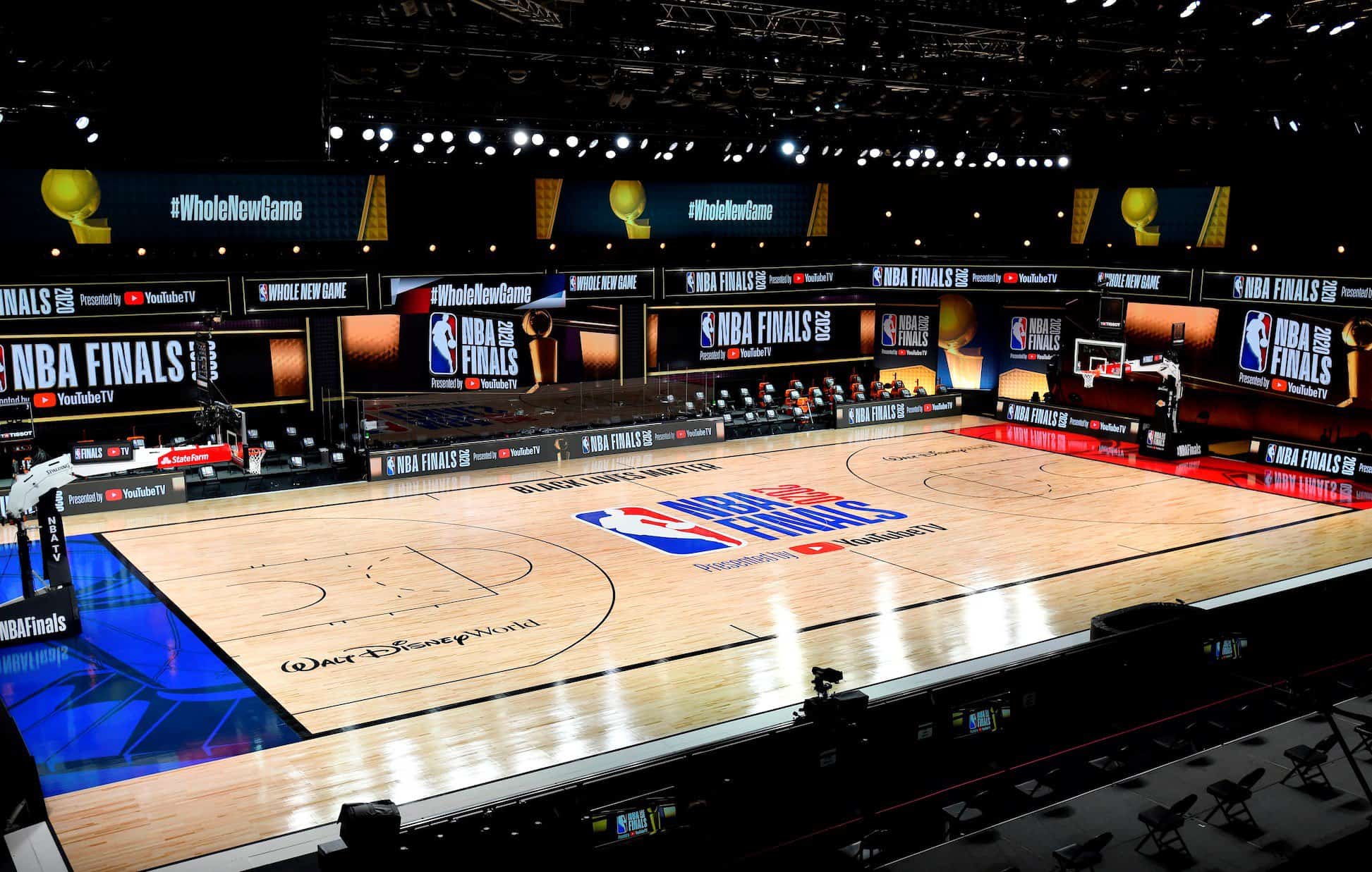
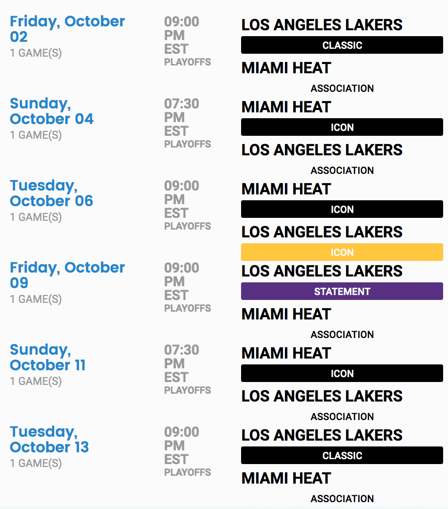
NBA Finals preview: The NBA Finals — Lakers vs. Heat — begin tonight. The court design is shown above. Just in case that YouTube TV ad wasn’t prominent enough, they’ve added just a few more around the facility:
For tonight’s game, the Lakers will wear yellow and the Heat will wear black. The uniform scripting for the rest of the series is shown here:
The Ticker
By Lloyd Alaban

Baseball News: MLB released a graphic featuring players from all the teams that made the postseason. The Yankees are represented in the graphic by 1B Luke Voit, who doesn’t have a swoosh on his jersey (from Iain McHugh). … NYC Health and New York hospitals will give out Yankees merch to New Yorkers who take a Covid-19 test (from John Cerone). … Hamtramck Stadium, the former home of Negro League team the Detroit Stars, held a ceremony yesterday to celebrate the stadium’s renovation. Hamtramck is one of only six Negro League stadiums still in existence (from Jerry Nitzh). … The Ironworkers Local union in Nashville, of all places, has a very Nationals-esque logo (from Josh Mendelson). … MLB and USA Baseball announced a format change for the Appalachian League yesterday, which among other things means that all of the league’s teams will be changing their names and logos (from multiple readers). … Current Toronto Argonauts GM and CFL legend Mike “Pinball” Clemens wore an old Blue Jays jersey to wish the team luck in the MLB playoffs (from Andreas Papadopoulos).

NFL News: The Rams will wear their yellow pants for the first time on Sunday against the Giants (from many readers). … ESPN used a photo of the Titans’ old helmet in a story about the team’s Covid-19 outbreak. They later updated it to a photo of the current helmet (from multiple readers). … Here’s a great write-up of how the 49ers rigged up an on-field speaker system in 1980 for QB Steve DeBerg, who was suffering from laryngitis and was having trouble barking out signals. Uni Watch has also written about this, back in 2011 (from Ellen Haller).
College Football News: Here’s the Nebraska equipment staff getting the team’s helmets ready (from Brett Baker). … New practice jersey for Temple (from Sam Cohn). … Clemson coach Dabo Swinney, who’s always been a uniform traditionalist (no camouflage, no blackout, etc.), says he’s uncomfortable with social justice messages spreading on uniforms. … Hawaii practiced with white helmets yesterday (from Charles George).

Hockey News: Lightning F Steven Stamkos suited up for Game Six of the Stanley Cup Finals and got to enjoy a postgame skate with the Cup even though he was listed as inactive for the game (from Ted Taylor). … Pittsburgh native Fred Rogers was once a “celebrity captain” of the Penguins and even had his own trading card (from @DoubleA_Ron_Yo). … Two 10-year anniversary decals for the Verizon Center are still stuck to the ground at the McPherson Square train station in Washington, D.C. The arena is now named called Capital One Arena, and the building’s 10th anniversary was in 2007 (from Dell Michaels). … The Hurricanes’ longtime equipment manager, who’s been with the franchise since its New England Whalers days in the WHA, is retiring. … A media company has executed a rather awkward repurposing of the Hartford Whalers’ logo (from Joe Giza). … G Ville Kolppanen’s new mask honors healthcare workers. Kolppanen plays for Rogle BK of the Swedish Hockey League (from Wade Heidt).

Basketball News: New Statement alternates for the Suns. Basically the same as before, but with the Jordan logo (from @unimockups). … Here is Temple men’s team’s new basketball practice jersey (from Sam Cohn).

Soccer News: Tottenham Hotspur MF Erik Lamela has worn mismatched cleats his last three matches for the team because of a foot problem (from David Tra).

Grab Bag: Tennis player Mikael Ymer wore Novak Djokovic’s former signature Adidas shoe during a first-round match at the French Open yesterday. Djokovic switched to Asics several years ago (from Mark Brieve). … Here’s what goes into a mid-major athletic apparel deal (from Evan Cavey). … Reader Nate Mueller has 3D-printed several major trophies. … The U.S. Navy has updated its SEAL ethos and creed with gender-neutral language (from Timmy Donahue). … Also from Timmy: Buffalo Police officers are no longer required to display their names on badges. They can wear their badge number instead. … One more from Timmy: Alabama’s new “I voted” stickers honor Alabama’s veterans. … There might be a reason why all senators dress the same (from Tom Turner). … The Canberra Raiders of the National Rugby League have gone back to a jersey advertiser from their glory days of the early/mid-’90s and have also shown what next season’s jerseys will look like (from Allan Jennings). … Also from Allan: A lost piece of Aussie rules football history was found and bought on eBay: the “Batmobile” that was used for the 1991 AFL grand final.

Our latest raffle winner is Ted Bloss, who’s won himself a Brooklyn Branches T-shirt. He chose the green alternate design. Congrats, Ted!
Uni Watch Koozies are now sold out! Thanks for the enthusiastic response. I’ll probably order more, maybe with a different design, soon.
Tomorrow: The Uni Watch Pin Club’s October design. You’re gonna like it — trust me. — Paul
Just saw this today, looks like the owner of Koz’s Mini Bowl in Milwaukee (a favorite stop of Paul when he is in town in Milwaukee) was hurt in an accident last month.
Here is the article from the Milwaukee Journal Sentinel.
Like a lot of people, the pandemic has been hard on his business and family.
link
Thanks for letting me know, Ben. Very sorry to see in that article that Carol died earlier this year — she was a lovely presence at the bar.
Ugh — what a year.
Paul, not a problem. This website is one of the few things that has remained normal in my routine this year. Stay safe and healthy!
You too!
Cool catalog look-see! But are you sure the orange pair in the middle are both pens? It has the look of a pen-and-pencil set, and there’s even a picture of an orange pen-and-pencil set in the print catalog.
Ah — you’re right! One of them has a twist handle (instead of a clicker), and I initially thought it was just a twist-handled pen. But yes, it’s a pencil! My bad for not investigating it more thoroughly.
Will update the text accordingly!!
The press release for the new Appalachian League specifies that all ten teams will be coming up with unique identities.
Fixed.
Here’s the release: link
The link in the ticker is only focused on the two Virginia teams.
Thanks, Alan. New link now swapped in.
Overall, last night wasn’t a great night in Cleveland all around.
Pascal Dupuis, who had to stop playing due to blood clots, and a few other injured Penguins dressed and took the ice to skate with the Cup in 2016 too.
link
Re: Nate Mueller
Excellent work!!! Are you on Twitter? Did you document the process? Looks like you paid a fantastic amount of attention to detail!
Yes, Nate is on Twitter:
link
“But there’s one thing I haven’t mentioned that you’re probably wondering about: Do the pens still work?
Also the ballpoints have all run dry.”
Is that “also” supposed to be “alas”?
Yes. Fixed.
Steven Stamkos getting dressed for the Cup despite being inactive for the game. Happens all the time every year. Even the “Black Aces” (minor leaguers who are on the expanded roster) get dressed for the Cup processional.
So if the Finals go five games, the Lakers will wear four different colors. (And I know it’s just a ridiculous name, but there’s no way the Lakers in black is “Classic”.)
In the description of the set you say “It measures 12 inches high, eight inches high” It’s probably supposed to state 12 inches wide.
Right. Fixed.
RE: MCI…uh, Verizon…um, Capital One Arena
Last I was there in January of this year, there were still seats with the old USPS Caps logo and MJ-era Wizard logo. They really only updated the building’s exterior with the name changes.
I was hoping the NBA would go with more of a “super bowl” style court, with each team represented in the baseline area, like the super bowl endzones. Would have made it much less generic.
I love this idea
Looks like a return to form on the postseason patches as, from every picture I could find, they appear to be sewn patches instead of those awful shiny, plastic appliques.
There also is a distinct lack of patches on the sleeves, opting only for the hats this year. Not sure if one or both of these are COVID-related.
What was the deal with the socks the white sox were wearing? Never saw those before, have you talked about it earlier in the season?
I assume you’re referring the vaguely faux-stirrups-ish socks some of the players were wearing..?
That’s a Stance design that assorted teams have been using over the past few years.
Thanks for the reply-they are awful
Not only did Mr Rogers have a trading card as “Celebrity Captain”, the commemorative sweater with the Captain’s C that the Penguins gave to him was a cardigan!
link
That’s an amazing video! Why am I surprised that Fred Rogers was such a good skater? Or that arena organ would create the greatest cover of his theme music?
One more from Timmy: Alabama’s new “I voted” stickers honor Alabama’s veterans.
Ugh. Sometimes it really feels like we’re only a half-step away from a Robert A. Heinlein fever dream.
I had the same feeling about the Navy SEALS rewording. Sure, it’s great to make the language not gendered, but by substituting “warrior” for “men” the Navy is institutionalizing a disturbing rhetorical shift in our military. A free republic doesn’t have “warriors,” it has citizen soldiers and sailors. Visigoths were warriors; the Americans who crossed the Delaware or liberated Vicksburg or stormed the beaches of Iwo Jima and Normandy were not warriors. They were soldiers, sailors, and marines.
That’s a good catch. I hadn’t read that link, but it is disturbing.
I can’t decide if our society’s unhealthy relationship with the military is a symptom or cause of our biggest problems. But it is certainly related.
I vote to honor my beliefs. A military is only as good as the government they work for. Voting represents all Americans not just military.
lovelovelove lol
Yes, the Blsck Lives Matter logo has been on the mound in Oakland all season. I know this because in my pandemic-adjusted life I have watched every A’s game this season.
Ever since Mad Men had it’s run as my favorite show I can’t look at 60s advertising without putting it in context of the show. I can totally see Don Draper in a presentation telling the girl to put the pen in her mouth and smoking Lucky Strikes while pouring drinks for the Everglide execs out of crystal decanters.
Seriously Nike is giving us two color on color game? And that’s really a stretch, I can’t stand the black vs white contrasting games. So boring.
Nike does not make the uniform choices.
My dad’s company gave out thousands of promotional pens to its customers in the 1960s and 1970s.
He was in charge of buying pens, which means he got literally hundreds of samples from salesmen. All shapes and sizes of pens. He brought them all home.
The thing I always remember is the SMELL. They all had this weird vinyl smell to them. They were made from this weird rubbery plastic, and they smelled. And they left a smell on your hands.
Thanks for the post today. Just looking at those pens reminded me of my dad, and the smell of the junk drawer in our kitchen where he stored all the pens.
Interesting that in that MLB playoff graphic, Sixto Sanchez of the Marlins is shown wearing the blue BP jersey. The Marlins have had that in their uni portfolio for the past two years, yet have never worn it in a regular season game. Wonder why they chose to feature that one?
Because the designer at MLB.com obviously has better taste than the Marlins do.
On the A’s BLM photo … I wonder if that’s hot dog vendor Hal among the cutouts behind home plate? Tough to tell because of the TOR/TB score graphic plastered over his face.
The hot dog vendor cutout is Tom Hanks. He grew up in the Bay Area and worked as a vendor in his teens. He even recorded some vendor calls that appear in the broadcast background noise.
I’m a person who prefers clicky ballpoint pens instead of ones with a cap. When I was about 11 years old, I had a pen that had the clicking mechanism in the barrel of the pen rather than the end. I don’t recall the brand name but it obviously made an impression on me almost 40 years later.
When you state that part of you thinks that the 3 markers belong in a different catalog…I can’t tell if you’re wishfully thinking or if you don’t truly believe that they are a part of this set. However, the first 3 line items in both the price list and descriptions are for those very items so they do, indeed, belong in this catalog (however misplaced they might seem to be).
Wishfully thinking.
I’m all for the Bic ballpoint pen in either blue or red with a visual of the ink remaining.
Paul, your Show & Tell post was very well written!
Just thought I’d mention it.
Lee
Thanks, Lee!
The scoreboard was from Sept. 10, 1964 at Connie Mack Stadium, Phillies hosting the Cardinals. 5-1 was the final score, with Chris Short beating Ray Sadecki. This was just before the epic Phillie collapse, losing a 6.5 game lead with 12 to play.