For all photos, click to enlarge
There were significant developments on both the pro and college football uniform fronts yesterday — a rare pigskin daily double!
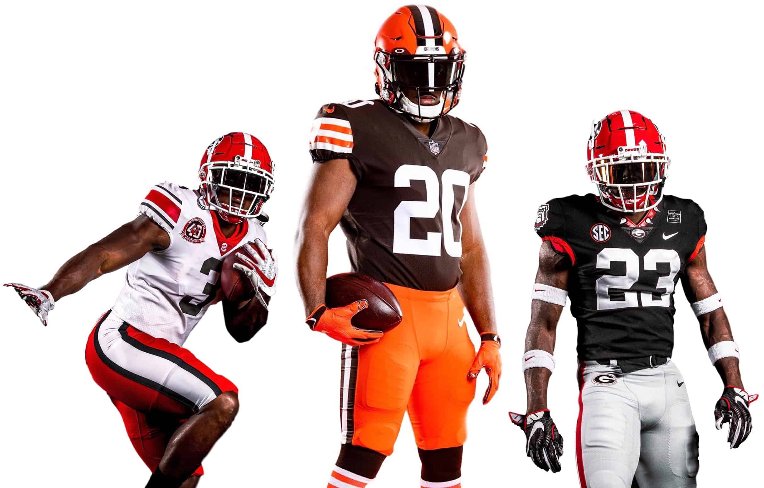
Let’s start with the college news: With the SEC season set to begin in eight days, the University of Georgia unveiled two new alternate uniforms yesterday — one featuring a black jersey and the other a throwback design to celebrate the 40th anniversary of the team’s 1980 national championship.
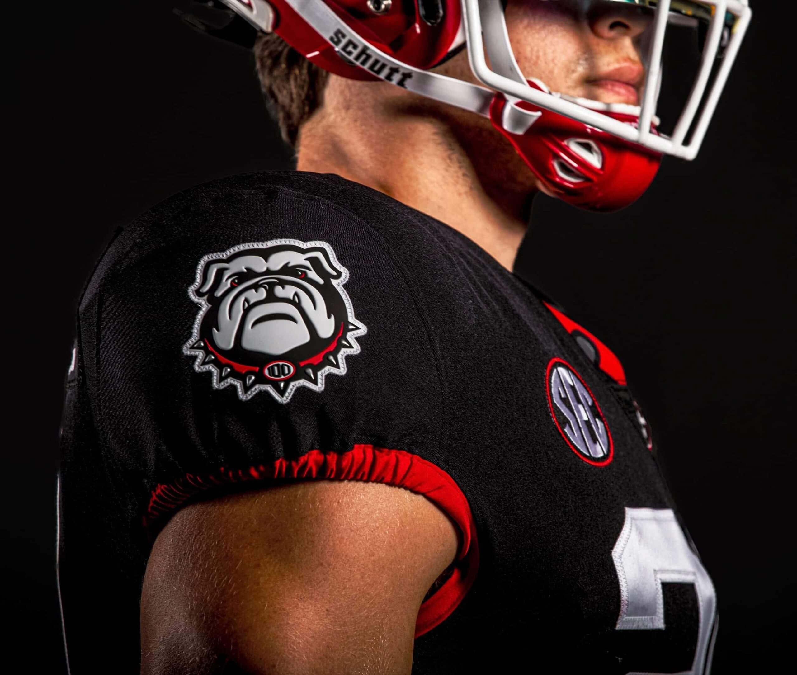
Let’s start with the black alternate. The jersey features a spiked dog collar motif and a Georgia-themed “Together Equality” patch. The spiked dog collar also appears on a new sleeve patch:
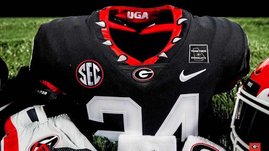
Note that there are no TV numbers.
The plan is for this jersey to be worn with the team’s standard grey pants:
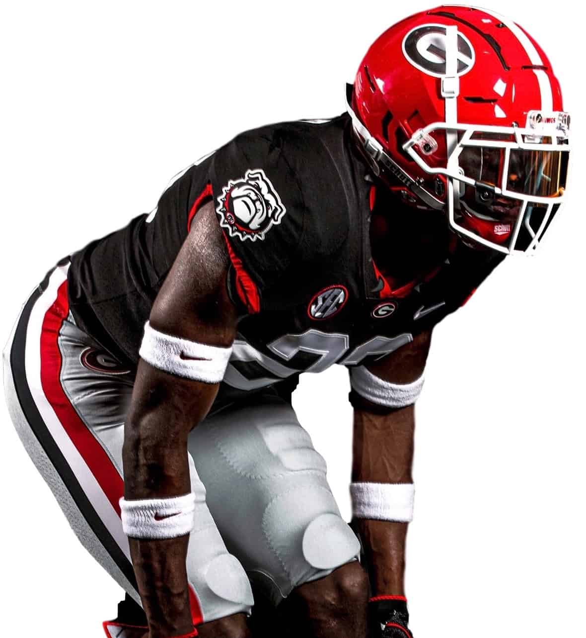
I’m fine with UGA wearing a black alternate — it’s not a bad look for them — but I find that spiked collar repellant. I suppose some fans think it’s intimidating or something like that, but to me it’s just macho nonsense. I always hate when I see a real dog wearing one of those (making a pet seem like a weapon, ugh), and putting that design on a uniform feels disgusting, at least to me.
As for the white throwback, it features the same “Together Equality” patch as the black jersey (I’m assuming all UGA jerseys will have that patch this season, not just these two alternates), along with an anniversary patch commemorating the 1980 national title:
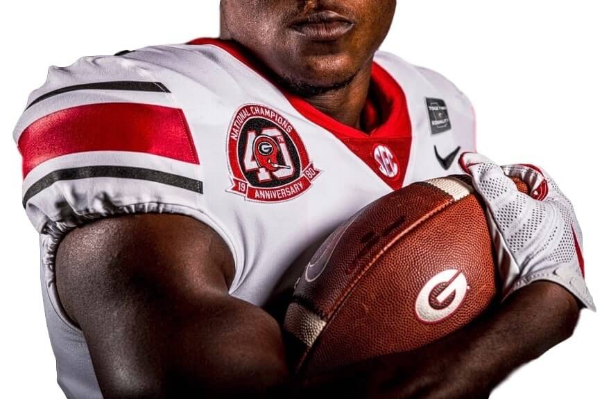
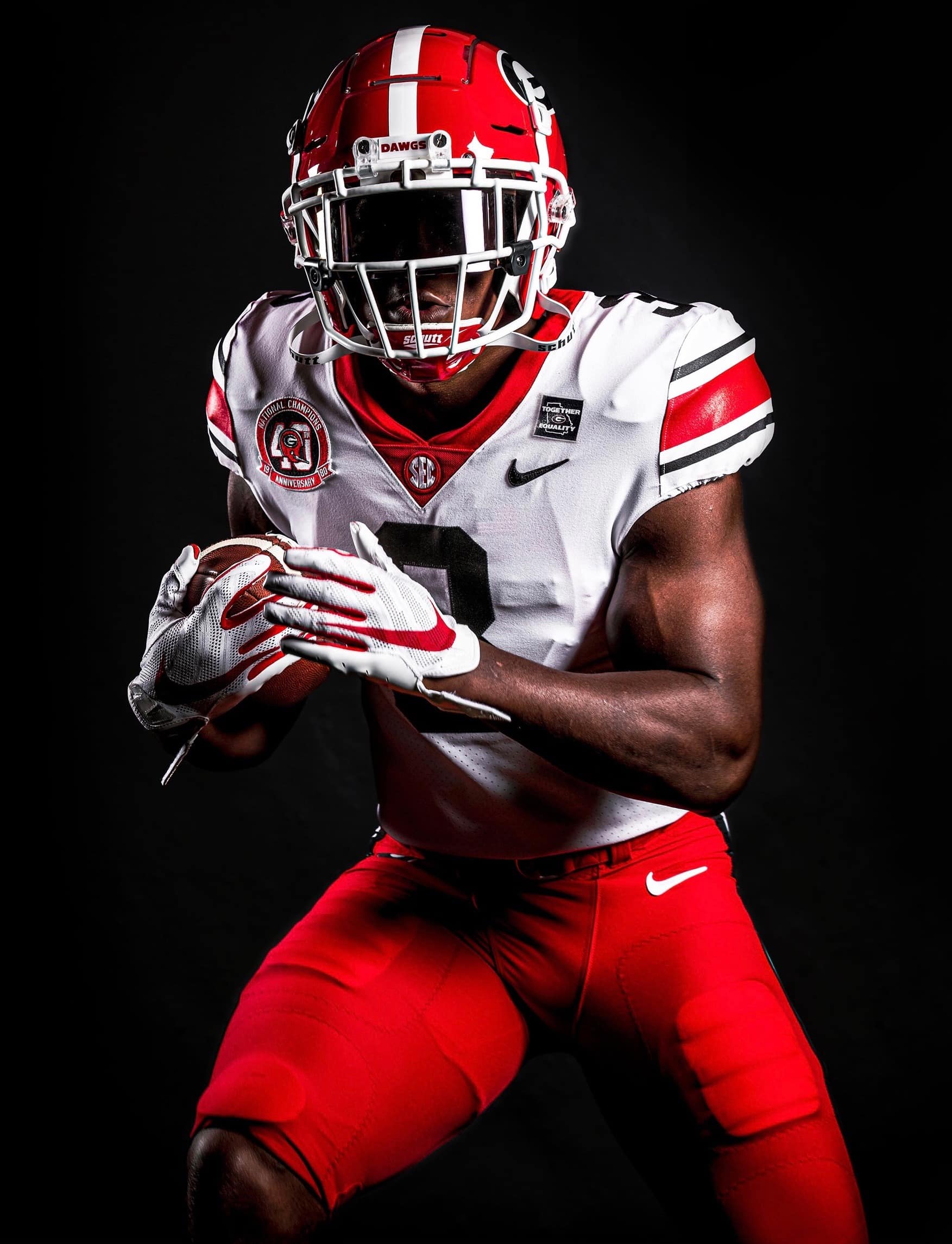
The eye-opener here is the width of the pants striping, which is of Montana-era 49ers proportions:
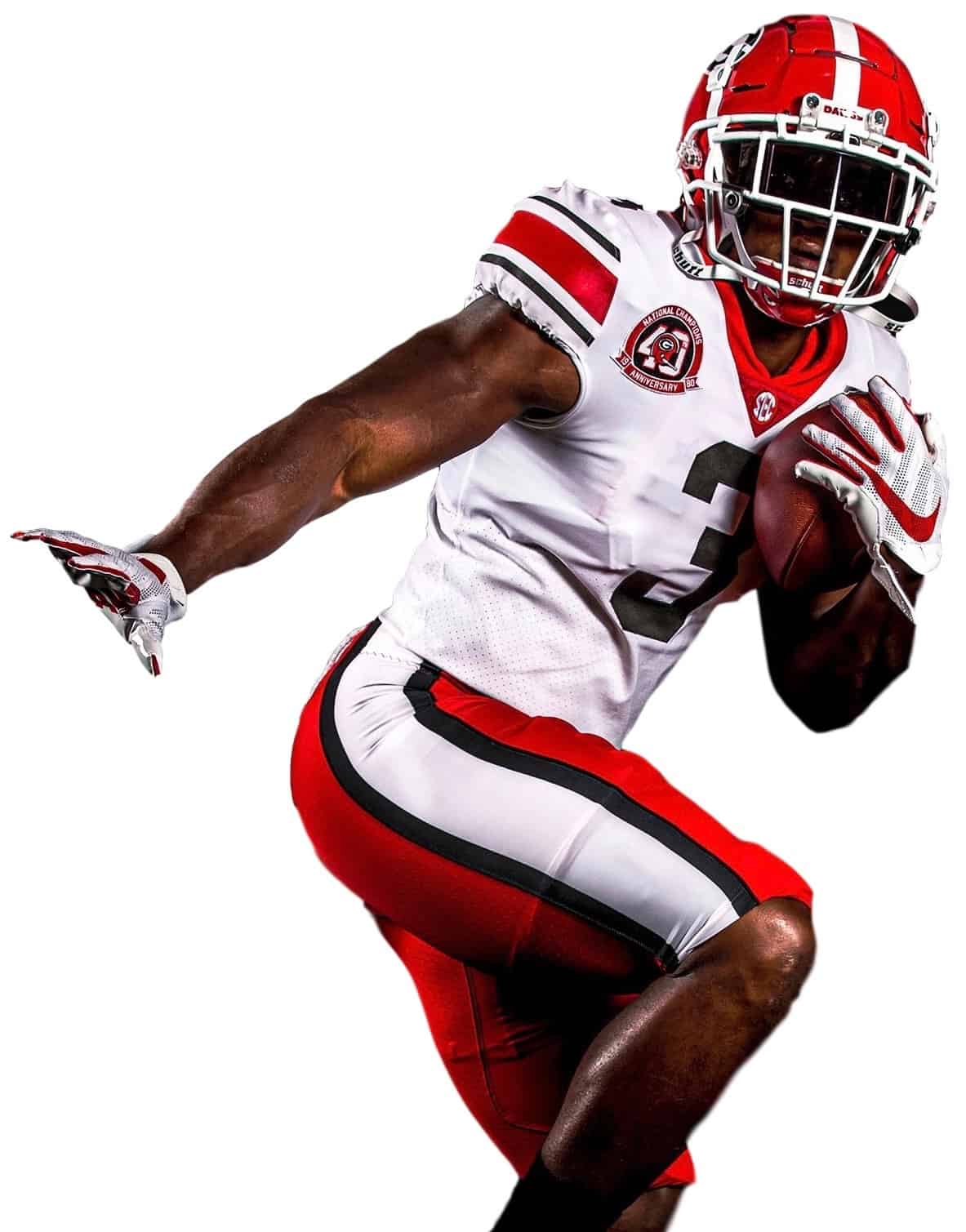
Does that match the original 1980 pants? I’d say no — the original striping was wide, but not that wide, as you can see from this 1980 Georgia/Tennessee footage:
Odd that they wouldn’t match the original design, but whatever — it’s still a nice uniform. They’ll wear this for their season opener at Arkansas on Sept. 26.
One other thing about the throwback: As you probably know by now, I don’t care about inner-collar slogans (because we can’t see them on the field and they’re just cynical marketing gimmicks to help sell retail merch), but it’s worth noting that the throwback jersey has an inner collar slogan with an apostrophe catastrophe:
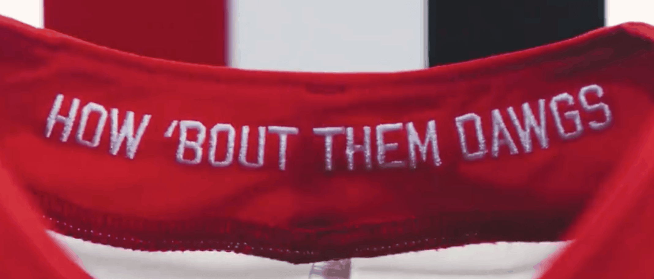
It’s not as visually blatant as some other examples (that’s because the quote marks and apostrophes in this font aren’t curly), but if you look closely you can see that the apostrophe is wider at the bottom than at the top — which means it’s actually an open-quote, not an apostrophe. It should be like this:
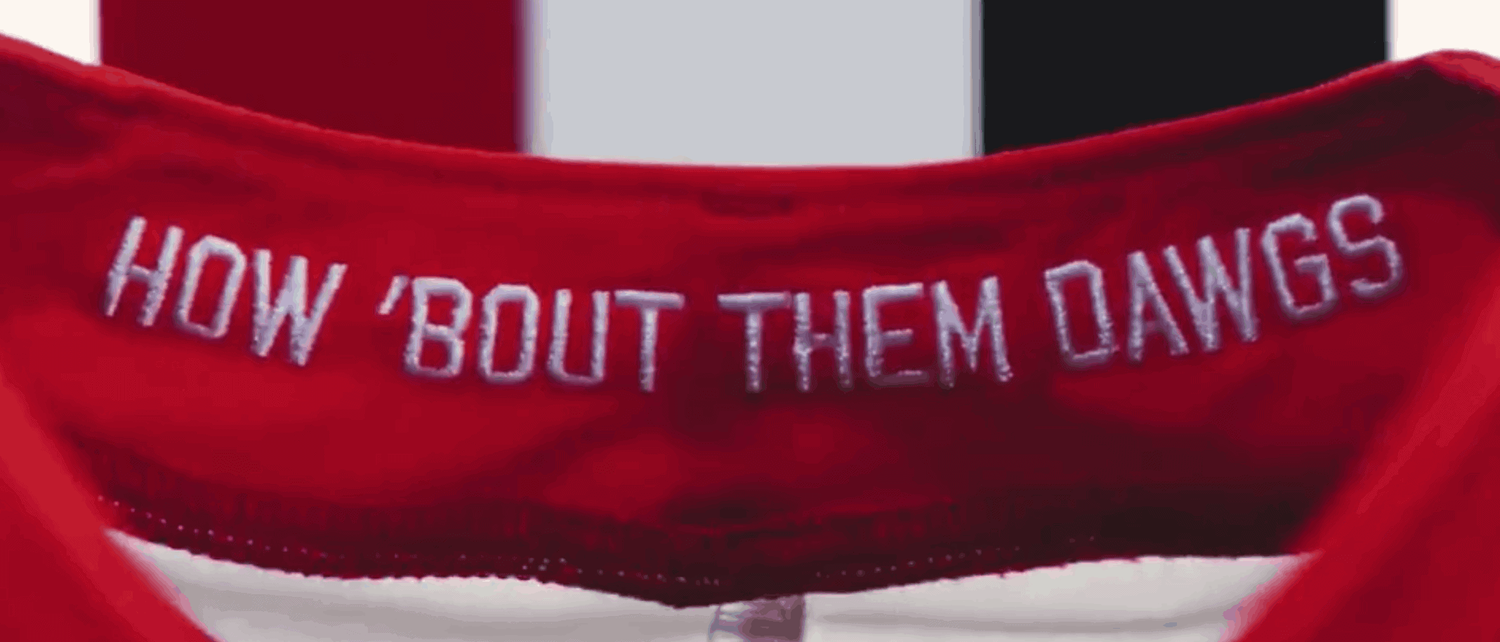
I know, I know — who really cares, right? But that error drives me nuts, and I especially hate to see it on a uniform (even if it’s only part of a cynical inner-collar marketing gimmick). Grrrrr.
(Special thanks to Nic Schultz for apostrophic Photoshopping.)
Click to enlarge
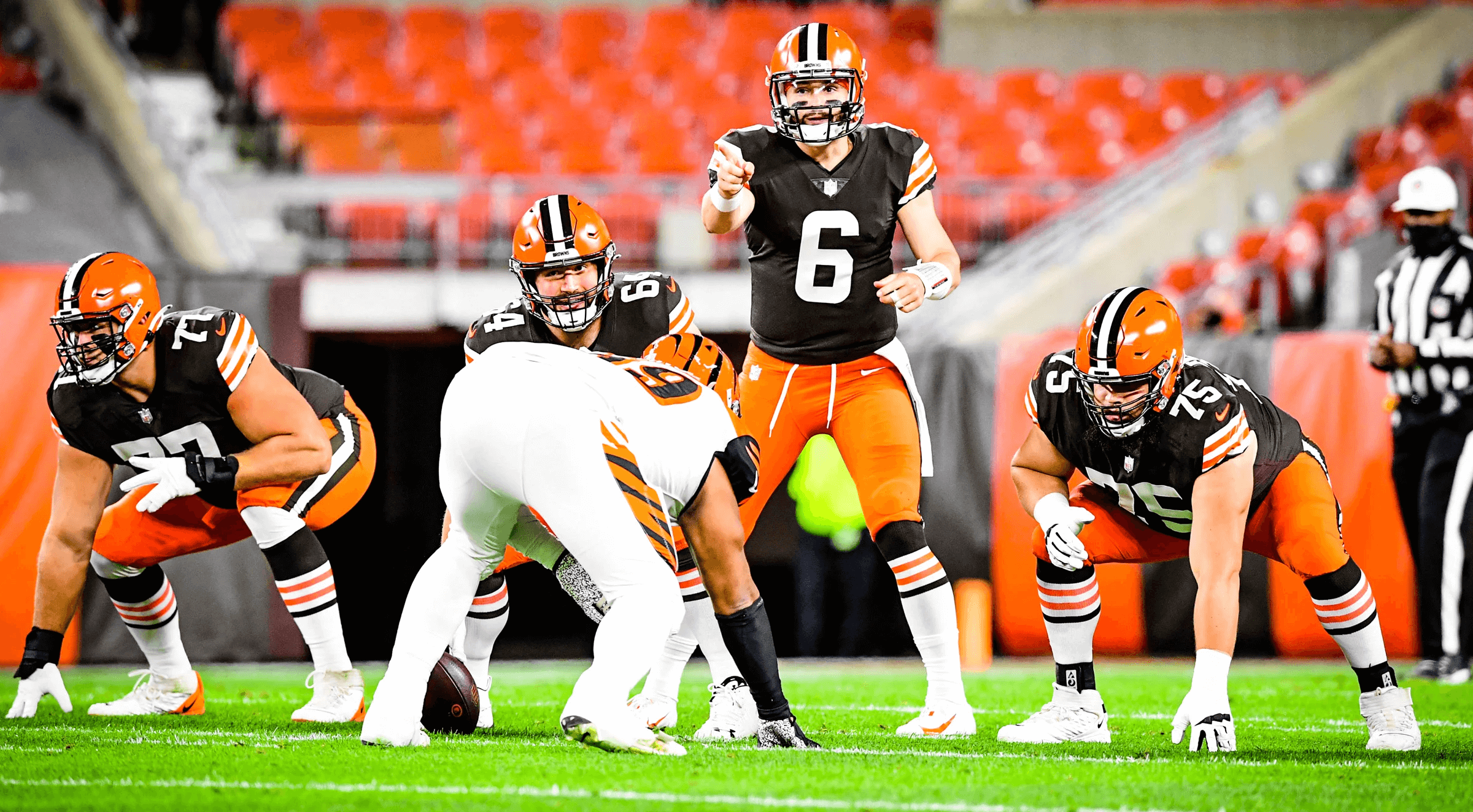
Meanwhile, over in Cleveland…: When the Browns unveiled their new uniforms back in April, the one complaint that many people had was that they should have included a set of orange pants. They addressed that issue in last night’s home opener, as they unveiled a new set of orange knickers.
And holy shit did they look great. The striped sleeves, the striped socks, the new pants — spectacular! Somewhere, Brian Sipe is smiling (or at least he should be). You can see more game photos here and here.
In another newly revealed detail, the Browns have become the latest NFL team to match the yard marker font on their field to their jersey number font (click to enlarge):
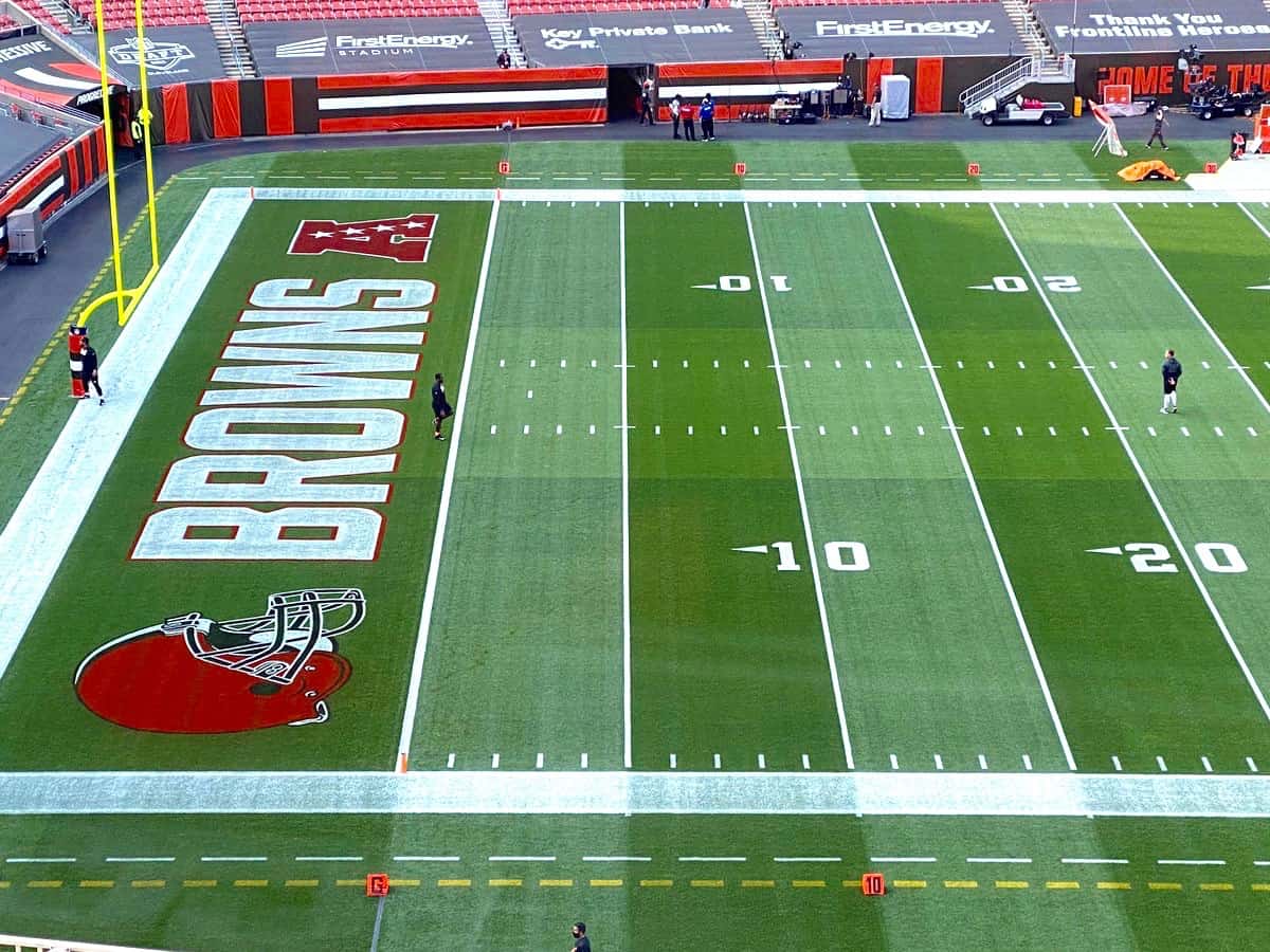
The end zone design is also new, but we knew about that already (it was in the Ticker two days ago).
(My thanks to @RustyFlynn and @wtfbrowns for the bit about the field numbers.)
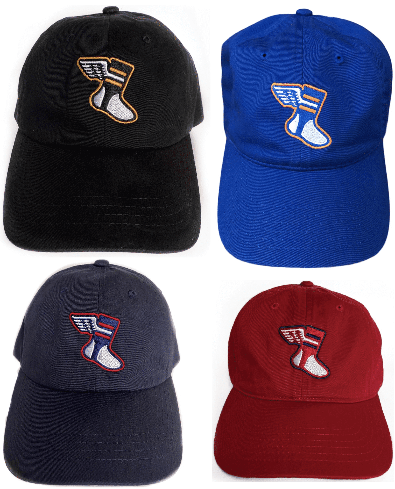
Color Remix cap reminder: In case you missed it on Wednesday, the first monthly round of Uni Watch Color Remix caps is now ready to go. The four designs, which I teased a few weeks ago, are shown above and are available here through mid-October, when we’ll launch a new batch with new color combos.
The Ticker
By Anthony Emerson

NFL News: Following up on an item from yesterday’s post, Steelers C Maurkice Pouncey will join teammate Al Vilanueva by no longer wearing East Pittsburgh police shooting victim Antwon Rose Jr.’s name on his helmet. Pouncey claims that he was given “limited information on the situation.” DB Minkah Fitzpatrick said the initial team-wide decision to wear Rose’s name was made by unspecified “people upstairs and everything like that,” not by a team vote (from Timmy Donahue and Mike Chamernik). … CenturyLink is rebranding as Lumen Technologies, but Seattle’s football stadium is still going to be called “CenturyLink Field” (from Tim Dunn). … Here’s an updated list of which NFL teams are allowing live fans in their stadiums.
College/High School Football News: NC State’s uniforms will feature a chest patch depicting a raised fist and “the three pillars of Pack United,” (from @ACC_Tracker). … Bemidji State posted a Twitter thread of all their uniform combos (from David Brown). … Troy is going red-white-red this weekend. … Miami is going mono-white against Louisville (from Jason Lefkowitz). … North Texas State is throwing it back to the mid-’70s against SMU on Saturday. More shots here (from many readers). … Ole Miss unveiled new light blue jerseys but were obsessive about not showing us anything else about their unis (from Moe Khan and @TheBigJamesG). … Tulane is going white-green-white (from Brian Stelmack). … Deion Sanders is apparently next in line to become Jackson State head coach, but the deal is being held up because Sanders is a spokesman for Under Armour and Jackson State is outfitted by Nike. That sound you just heard was me sighing really loudly (from Chris Mycoskie).

Hockey News: Reader Nick Gratton noticed some uni leaks in the latest video from the upcoming video game NHL 21, including a mix of the Sabres’ new royal blue unis and their old navy blue unis and a new number font for the Flames.

NBA News: Jayson Tatum’s son Deuce was in full uniform to cheer on his dad last night. Maybe if the Celtics had worn their green unis instead of their BFBS monstrosities they’d have played better (from @bryanwdc).

Soccer News: Tottenham’s third shirt has a bit of a tequila sunrise thing going on, no? (from Peter Geiger). … New kits for El Salvador. The design is basically a throwback to 1970, when El Salvador qualified for their first World Cup (from Germán Cabrejo). … New home kit for Scottish side Queen’s Park (from Ed Zelaski). … Also from Ed: The keeper’s shirt for Austrian side TSV Hartberg has a “Sperm Booster” ad. … EPL club Wolves have a new Portugal-themed third kit (from David Hanson).

Grab Bag: New (worse) logo for Dollar Shave Club (from Eric Fisk). … Four schools in Newport News, Va., will get new names due to the current names’ associations with segregationists (from Max Weintraub). … Sega has revealed Sonic the Hedgehog’s 30th-anniversary logo (from John Cerone). … The Rockaway neighborhood of Queens now has its own flag. … New rugby union kits for Edinburgh Rugby (from Ed Zelaski).

Click to enlarge
What Paul did last night: Six months ago last night — March 17 — I took the first Pandemic Porch Cocktails™ photo. (We had started the daily cocktail ritual a few days earlier, but it took a few days before I started documenting it with daily photos.) So last night’s session marked half a year for this project. Unfortunately, I suspect we’re still closer to the beginning than we are to the end.
As always, you can see the full set of Pandemic Porch Cocktails™ photos — a full six months’ worth — here.
Happy Rosh Hashanah to all who are celebrating tonight. Everyone have a great weekend, enjoy Phil’s Saturday and Sunday content, and I’ll see you back here on Monday. Stay well! — Paul
The Celtics had won all four of the games in the Toronto series wearing the black alternates (and the Raptors were wearing black in the games they won).
NBA can have all their multiple uniforms if they have too during the regular season (urgh). I am a proponent for sticking with just 1 home and 1 away uniform when it comes playoff time. Leave the gimmicky alternates in the closet during this important time of their season.
In other words, I’m for the Celtics wearing their primary green uniforms only as the dark jersey in the playoffs.
“Ole Miss will be wearing their light blue jerseys on Saturday but were obsessive about not showing us anything else about their unis”
Ole Miss isn’t playing Saturday. SEC teams don’t begin their schedules until Sept. 26.
Right. Fixed.
There’s an easy fix to the prime time to Jackson state deal, they become and UA school
We Browns fans have had so few things to be happy about in the expansion era but orange pants and a win? What a great night and look. Hopefully the orange pants (and winning) become a fixture at home games.
I love the idea of the orange pants as a rivalry uniform. Break them out for divisional games to give the team a little extra juice.
They look glorious.
I think the orange pants look so much better than the whites; both for home and road combos. Orange pants should be standard!
Yes!…what Tim said!
Didn’t think I’d see a Brian Sipe mention when I woke up this morning!
The Tottenham gradient (tequila sunrise) is way more pronounced in the video in the ticker and on field than it was in the announcement photos. I still really, really like it, but I think I’d like it more if it were solid yellow. (Sp’yellow?)
Now all that’s left is for me to decide between a Gareth Bale jersey or an Alex Morgan jersey purchase this year.
Bale or Morgan for sure! Waiting on the Bale number announcement to make the final decision but my orders going in right after yours!
I’m thinking Morgan because I think it’s important to normalize men supporting women’s sports. Either way, can’t go wrong!
All I know about Rockaway is that there is a beach that is not hard to reach.
Kinda love the spiked dog collar on the Georgia jerseys. Clever way to integrate the logo into the jersey.
I like the collar also. It is a gimmick for sure, and I know it’s a school color but I am not sure about UGA in anything but red over silver. That said, I think the collar is a neat idea in this context.
Love the Browns’ new uniforms, love the orange pants. Still can’t figure out why they took the notch off the bottom of the 7 in the new font. A totally unnecessary quirk for the sake of being quirky. Just go Block Varsity and leave it there.
Agreed regarding the 7. Good thing that on-field yard markers only go up to 50!
Dumb question: Anybody know who invented the famous varsity block font?
Classic and timeless.
-C.
Not dumb at all — on the contrary, *great* question! And I have no idea about the answer. I’ll see what I can find out.
“I’m fine with UGA wearing a black alternate — it’s not a bad look for them — but I find that spiked collar repellant.”
UGA fan here, its an abomination
Also UGA fan, also hate the collar. Could also do without the secondary logo on the sleeves.
Big fan of the 40th anniversary look though.
Spiked collar reminds me of the Black Panther and the late Chadwick Boseman, an Howard alumnus hails from Anderson, SC not too far from Athens, GA.
Speaking of SC, Georgia’s throwbacks look similar to the SCar Heritage jerseys from last year (especially the shoulder stripes). Still awaiting the unveiling for South Carolina’s 2020 unis which will include garnet and white versions of last year’s black jersey.
I read Paul’s comments in an interview just now. He noted the 40th anniversary patch included a single bar UGA helmet (a frequently used UGA logo back in the day). Paul wondered if any UGA players back in 1980 wore a single bar mask. As best I can remember, none did. Kicker Rex Robinson wore a mask similar to QB Buck Belue. The punter (Jim Broadway?) wore the same mask. But the year before QB Jeff Pyburn wore a white double bar mask – which shows up in the UGA promotional video for the throwbacks. In 83 & 84 (& maybe 82) All-America UGA kicker Kevin Butler wore a single bar. To my recollection, Butler was the last UGA player to wear a single bar.
The way the Cleveland Browns handled their uniform change this year is the way to do it. They did not play their whole hand all at once. They unveiled a new uniform which many people like, and then left the cherry on top (orange pants) a secret until the Thursday night game. Kudos to the Browns!
Yes, I like the orange pants. However, brown over white > brown over orange.
Longtime CLE fan here. Agree 100%, but I’d add that white over orange > white over white
Hate all things Ohio and the Browns. But I gotta say, the uni’s look great. Symmetrical, traditional, no gimmicks and classy. Browns are leading the way for once. Rams, Atl, Seattle, my Lions, take notice, this is how it’s done. Cut the crap.
So glad the Browns won in the orange pants. I was worried they’d mothball them if they took a loss to the lowly Bengals.
UGA’s throwbacks: seems like the inner collar slogan is also there to fire up the players. Hopefully the spiked collar won’t be very visible when the players are wearing their helmets. For the most part UGA’s bulldog logos have have spiked collars going back to the 60’s or earlier. I agree perhaps this isn’t the best time to make a big deal out of that spiked collar.
Nice to see the block numbers. A few years ago UGA football switched from block to the current rounded numbers in an effort to have the same look across all sports. UGA men’s and women’s basketball had been wearing the rounded numbers for years before football switched.
We’ll see if UGA actually wears the black jerseys in a game. Head coach Kirby Smart is not a fan of the black jerseys. The past years UGA has kept a black set on hand, mostly for recruits to take pictures wearing, or perhaps to wear in the spring game. But 2020 might be the year to break them out, but most probably against a lesser opponent.
The trees in the pandemic porch cocktail photos have gone from no leaves to leaves sprouting to full green and now to turning fall colors. The passage of time.
I always thought dog collars were for protection from neck bites, not to be used as a weapon (not sure how a dog would use it as a weapon anyway). I think it’s a fun concept because dogs are frequently depicted with spiked collars in cartoons/media. It’s a smaller detail that isn’t overbearing or garish.
I always thought dog collars were for protection from neck bites…
Yes, for dogs that are guarding livestock — it protects them from wolf bites.
But I’m pretty sure the guy in a tank top who’s taking his spike-collared dog for a walk on a city street is not worried about his dog getting bitten by wolves. He’s just trying to make his dog look more badass and weaponized.
I mean, think about it: Did they add the collar spikes to the UGA jersey to metaphorically protect the players from neck bites? Or to make them seem more threatening and weaponized?
I thought the dog collar treatment on the UGA black jersey looked cartoonish and even a little whimsical, not intimidating.
Agreed! Whimsical was my first thought too. I immediately pictured a little dog bouncing around saying, “What are we going to do today, Uga? What are we going to do today?” I like it – it made me smile. Looney Tunes FTW.
Different perspectives and all. To me it just comes off more playful/cartoonish. The designers could easily make them appear more threatening and weaponized (or more realistic if you will) than that and then I would be in agreement with you. I get where the spiked-collar idea was born, but it is useful for domestic dogs as well. We put spiked collars on our small dogs when we take them for walks in our neighborhood because of the prevalence of coyotes (and sometimes other loose dogs). They can serve a legitimate purpose, but they can also be used like you say, to look more badass and weaponized. I just happen to think it was executed more towards a playful/fun concept than anything else.
Fair enough!
Great week for UniWatch content. I love when Paul writes about punctuation. I begin the section with a crooked grin and finish the last sentence in an ear to ear.
If you haven’t read yesterday’s How Uni Watch Readers First Got It™, Vol. 3…it’s a must read. Interesting how many Uni bugs were rooted to gumball helmets and electric football.
“As you probably know by now, I don’t care about inner-collar slogans (because we can’t see them on the field and they’re just cynical marketing gimmicks to help sell retail merch)”
Not trying to play “gotcha,” but doesn’t one of your merch items have a slogan inside the collar? I can’t remember which one, but I recall thinking “I thought he couldn’t stand those” when I saw it.
Yes, but my jerseys are *only* merch. There are no Uni Watch “game jerseys.” Putting an inner collar slogan (or a shirttail slogan) on a game jersey is nonsense, because it has nothing to do with the game or the players on the field. It’s just bullshit to sell the retail version, and a textbook case of the retail tail wagging the on-field dog.
If teams/manufacturers want to load up retail-only products with sales gimmicks, be my guest.
Dawg fan here. I’ve been an everyday reader for years and I was anxious to see what you thought of the new alt unis. I love the old red pants and actually think the strip pretty accurate with the 1980 version. Funny, but back then I always wanted them to narrow the white one and have an even black/white/black. You’ve said this for years and I agree that the tightness of modern jerseys distorts the sleeve stripes as is apparent again on the white jerseys. The jerseys for sale are full cut and look more like the old versions. I’m not crazy about the new Dawg logo or the spikes but they’ll sell plenty to the younger crowd and after this 100th year of the Bulldogs we’ll be back to the basic black..if we ever wear them. Thanks….I always enjoy this website.
Oh Tulane, looking terrific…
I’ll be fascinated to see how those lime green accents on the North Texas unis look out on the field, especially against SMU’s uni colors.
I think the addition of the dog collar cheapens an otherwise top notch alternate uniform for Georgia. It definitely looks hokey and cartoonish.
And just like that, the Browns go from being one of the worst unis to among the top 2 or 3. Love the orange pants!
100%
When I saw that collar on the UGA jersey, it reminded me of two things:
Black Panther’s “collar”. link
And pro wrestler, the late Junkyard Dog (whose collar and chains seem extraordinarily racist in hindsight).
link
Question-it’s my understanding the orange pants were not part of the original roll out for the new Browns uniform set. We’re they “held back” or was the addition of the orange pants done on the fly?
Good question. Personally, I don’t know the answer (although I have my suspicions). But pants are pretty easy to make quickly. And unlike jerseys, you don’t have to tell your opponent about your pants color in advance. So they certainly *could* have done them on the fly.
Pants would seem to have the least stringent review process as well. They don’t have safety elements (helmets) and aren’t sold as merchandise (jerseys).
Being from Northeast Ohio, I was listening to a Browns beat reporter on the radio yesterday. When one of the show’s hosts asked about the orange pants, the beat reporter said he knew about them when the Browns unveiled their new jerseys months ago but had been sworn to secrecy.
Ah, well there we go — thanks!
Now we are hoping the New England Patriots roll out some silver pants sometime this year.
I think just about everyone would agree on that!
“closer to the beginning than we are to the end”? Please, no.
Hi Paul,
Good morning! Also not a fan of the collar on the Georgia black alternates, but not for the reason you are. It’s just more Nike ridiculousness. As for something else you said:
Silver britches. SILVER BRITCHES. Not “grey pants.”
Yes, I know they appear grey because Nike refuses to add a metallic sheen to the pro combat fabric used to make them (whereas the Cowboys and Raiders use the older fabric to keep their silver sheen), and our AD is too much of a wimp to do anything about it.
Still, even that, we don’t wear “grey pants.” tOSU wears grey pants.
Georgia wears silver britches.
I feel like Ohio State’s pants were shiny back when Georgia’s pants were actually shiny too, no?
link
link
They both are outfitted by Nike (and have been for awhile) and both slowly transitioned from silver to gray kind of in parallel with each other
I get it. Fabrics change.
BUT… tOSU even given having shiny pants, are known for wearing grey pants.
The Dawgs are known for wearing silver britches.
It’s a difference where the distinction is actually important.
I’m not so interested in what they’re “known for” — that’s essentially branding, which is of no concern to me.
I’m interested in, you know, what they’re *actually wearing.* And what they’re actually wearing is grey pants, so that’s what I called them.
The Cleveland football team should put an ersatz pitchers mound under one if the goal posts.
Maybe it’s just me, but as horrific as the Bengals uni set is, the all white (not even the color rush all white which I think looks great) looked pretty sharp last night. It just goes to show that simply not having side panels on the jersey makes a pretty significant difference.
I agree. I don’t know why teams can’t make small modifications to their uniforms. Would it be so difficult for the Bengals to just get rid of the white side panels on their black jerseys? It would improve their black uniforms so much.
The spiked collar is dumb, but at least it’s actually on the collar, and not on the leg like that high school team the other day.
Touché.
What if……
The Chargers in road white over gold/yellow…..the Browns with brown over orange…on a snowy football Sunday? WOW!!!! (OK, even a clear sunny day will do!)
Browns should wear white-over-white at home, white-over-orange on the road. That would be ideal.
funny to see Wolves embrace the Portuguese-ness of the team, I’ll admit I’ve leaned in their direction because of the depth of Portuguese folks on the team.Still wouldn’t buy the kit though lol
Yep the spiked collar looks cartoonish and promotes animal cruelty.
2020 has really brought us some uni lows.
Rams dishwater—worst uniform I’ve ever seen.
ATL Falcons——a close second.
And now this dog collar monstrosity. That’s easily the worst thing I’ve ever seen on a college uniform. I know WHY they did it, but just because you CAN doesn’t mean you SHOULD.
Early candidate for the &1 on Sunday…Campbell (white helmet, mono orange uni) at Coastal Carolina (black helmet, teal jersey, black pants) being played on a teal field. Interesting visuals but at least it’s a color vs color game! Actually, if it weren’t for that AstroTeal surface this matchup would look ok.
Those orange pants looked great. Imagine how they’ll pop against a contrasting team like their other divisional opponents or really any other team that doesn’t use orange. Browns nailed it!
I agree with Paul—spiked collar is horrendous.
The collar comes off as playful and cartoonish in my opinion also. Just a fun design that would likely appeal to many athletes of college age. Now, if a real wolf collar was incorporated into the jersey design (which looks much different then the purely cosmetic one actually used) I would agree that too much was being done in an effort to appear tough, but I dont think that is the point nor the case here.