[Editor’s Note: Paul is on his annual August break from site. Deputy editor Phil Hecken is in charge from now through the end of the month, although Paul may be popping up here occasionally.]
By Phil Hecken, with Mike Styczen
Follow @PhilHecken
Hey everyone — a good Tuesday morning to ya. Hope everyone is well, and our Gulf Coasters are safe when Laura comes calling (looks like liddle Marco petered out, and that’s a good thing). Laura isn’t predicted to be “big” but I know from past years how storms can really ramp up in the bathtub that is the Gulf. So everyone be on guard down there! And everyone out west who’s been (or could be) affected by the wildfires, our thoughts are with you too.
Now then, I’m back again today with my buddy Mike Styczen. In case you missed it, a couple weeks ago Mike brought us Part one of a two part series, Gone But Not Forgotten: NHL Defunct Teams. Today we’ll get to part two — and while none of the teams you’re about to see below currently resides in their city (and most have changed names), they’re not really “defunct” per se. If you’re of a certain vintage, you will remember some or all of these teams — even though many of us have long forgotten some of them. So without further ado, here’s Mike …
Reviewing the NHL’s Defunct Teams, Part II
By Mike Styczen
Last time, we reviewed and ranked the nine NHL teams that went defunct (ceasing operations or relocating) in the League’s early years.
The folding of the Brooklyn Americans ushered a sustained period of stability in the league. The 25 year period between 1942 and 1967 is what is referred to as the Original Six era – the league consisted of the same six teams for that entire period, by far the longest period of stability in league history.
In 1967, the league doubled in size to 12 teams. Since then the league has added 20 more teams through expansion and through merger with the WHA. Many of the new teams were undercapitalized, in poor locations, and/or badly managed, and as a result there have been ten teams fold or move since the early 1970s.
One note – the NHL doesn’t usually recognize the pre-1979 history of the teams that joined in 1979 from the WHA. My own view is that they form part of the team’s visual history and are worth at least having a look at.
DEFUNCT TEAMS 1967-2020
10. Kansas City Scouts (1974-1976)
Ranked last because of the logo and nickname and indigenous imagery (yes, I know the logo is based on a statue in KC). The colours are bright, everything was well put together, but that logo and nickname put the Scouts in last place on this list.
The team relocated to Denver in 1976, where they kept the colour scheme largely intact.
9. Atlanta Thrashers (1999-2011)
What a disaster. Twelve years, a hodgepodge of inconsistent colours and looks. Light blue, dark blue, three or four shades of red/orange/copper. Completely different logos on the home and road jerseys. A jersey with the city name down the arm, a jersey with just the number and team name on the chest. Bumper stickers everywhere. How does one team try so many innovations and fail every single time? It’s hard to critically review a team like this when they presented so many different looks, but in the absence of a definitive look of any kind for the team, its easy to rank them near the bottom.
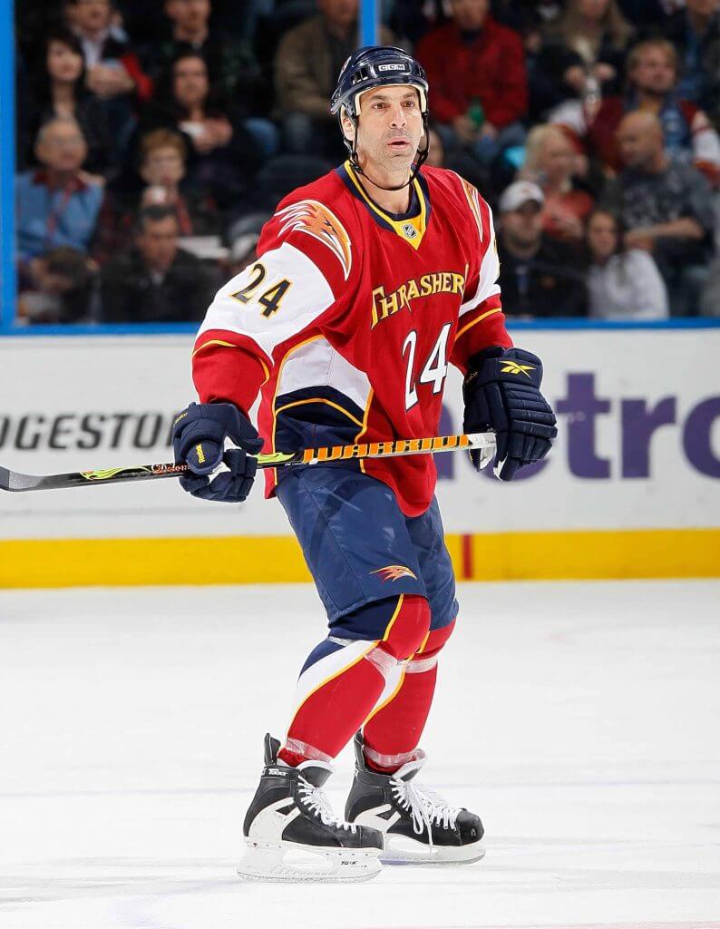
Ok, seriously, look at all this. Goofy sock stripes, weird side panels, white sleeves, angry bird on the shoulder, no logo, a giant number on the front, yellow neck, and a wordmark. The only thing that confuses me is the plain pants – did they forget about the pants when they were overdesigning these uniforms? Bonus points for you if you remembered that Chris Chelios played for the Thrashers. You can have your Buffaslug and your Mooterus, this is the worst uniform in NHL history.
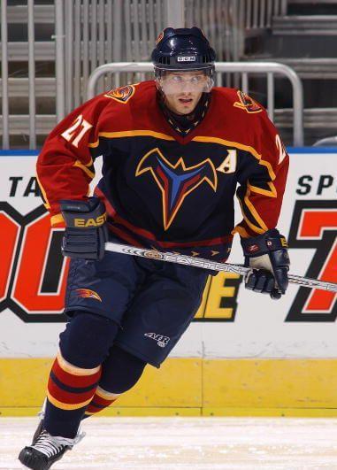
I think that logo is supposed to be a bird, but I can’t say for sure.
The Thrashers moved to Winnipeg in 2011 to become the Jets.
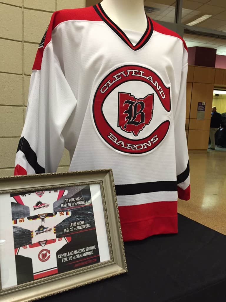
8. Cleveland Barons (1976-1978)
Appropriately unmemorable logo and uniform set for an unmemorable team. When the most interesting thing you can say about a team is that they put their shoulder numbers inside a state map (giving three maps of Ohio on their jersey!), they’re going to be near the bottom of any list.
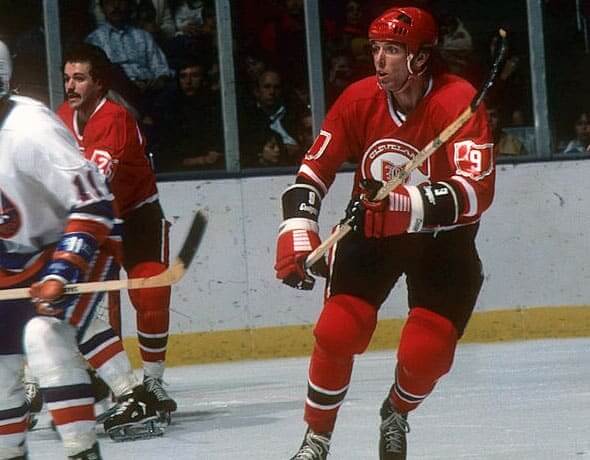
The Barons are most notable for being the last major pro sports team in North America to actually cease operations, when they merged with the Minnesota North Stars in 1978. The Cleveland Monsters AHL team has thrown back to the Barons.
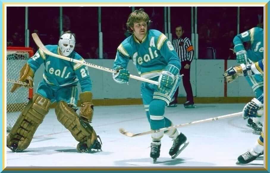
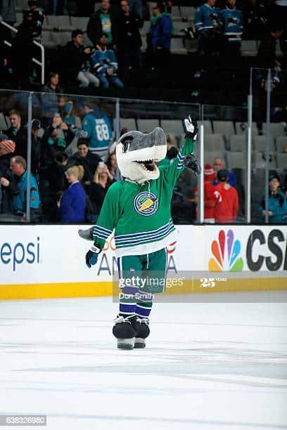
7. Oakland – California Seals / Golden Seals (1967-1976)
In only nine seasons, they had three very different uniforms. They started with a dark green and blue look. The first logo had a large “C” for “California”, however early in their first season they rebranded as the Oakland Seals and changed the “C” to an “O”.
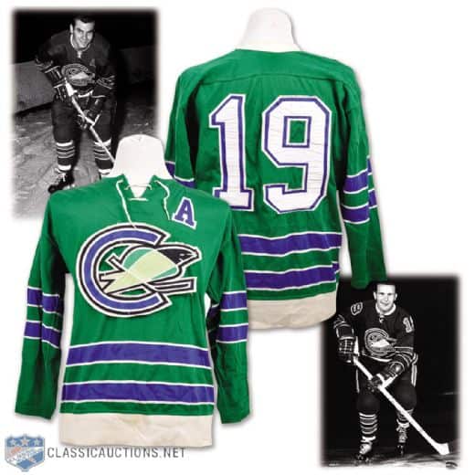
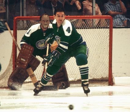
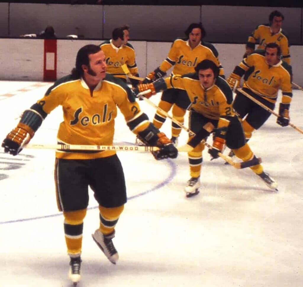
In 1970 the team was purchased by A’s owner Charlie O. Finley, who rebranded them as the Golden Seals and switched the uniforms to kelly green and gold to match the Oakland A’s. This uniform included gold home jerseys and white skates. This is the uniform they are best remembered for.
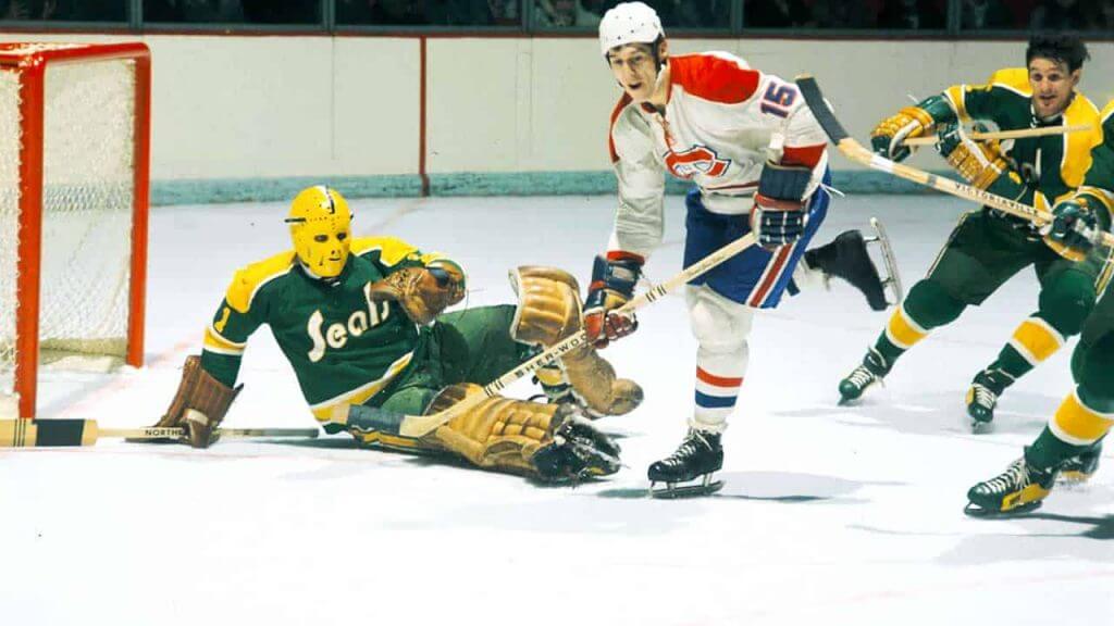
And finally after being sold by Finley, they switched to a strange teal and yellow look with football-style shoulder stripes (a first and last for the NHL).
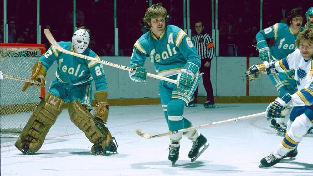
The team relocated to Cleveland in 1976. The San Jose Sharks held a Seals appreciation night in 2017, in which the mascot (but nobody else) wore an original Oakland Seals uniform.
Either of the first two uniforms would rank higher on the list if that were their only uniform, but lack of a consistent uniform drops them in the ranking, as does their final teal uniform.
6. Winnipeg Jets (1972-1996)
The original WHA Jets uniforms were good, not great. There are so many things you can do with a “Jet” theme, and their logos were mostly wordmarks.
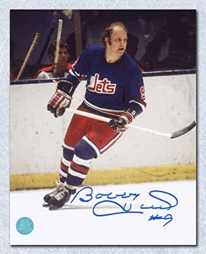
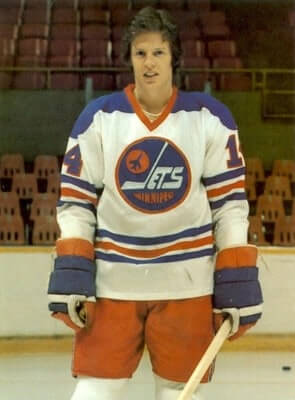
They brightened their look a bit on entering the NHL in 1979.
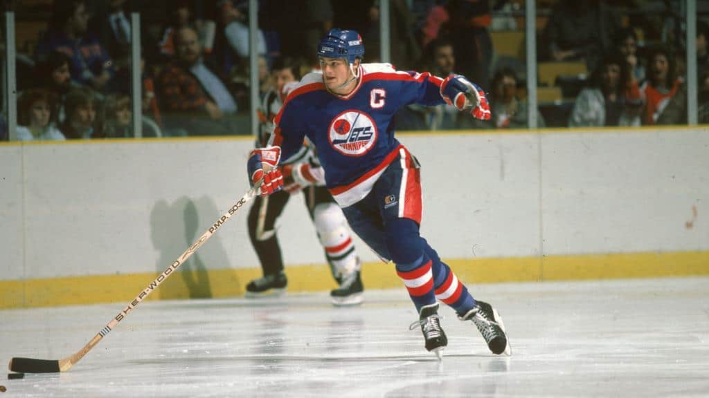
And then completely overhauled their uniforms in 1990. The final uniform was clean and bright, and the return to red pants was a welcome addition.
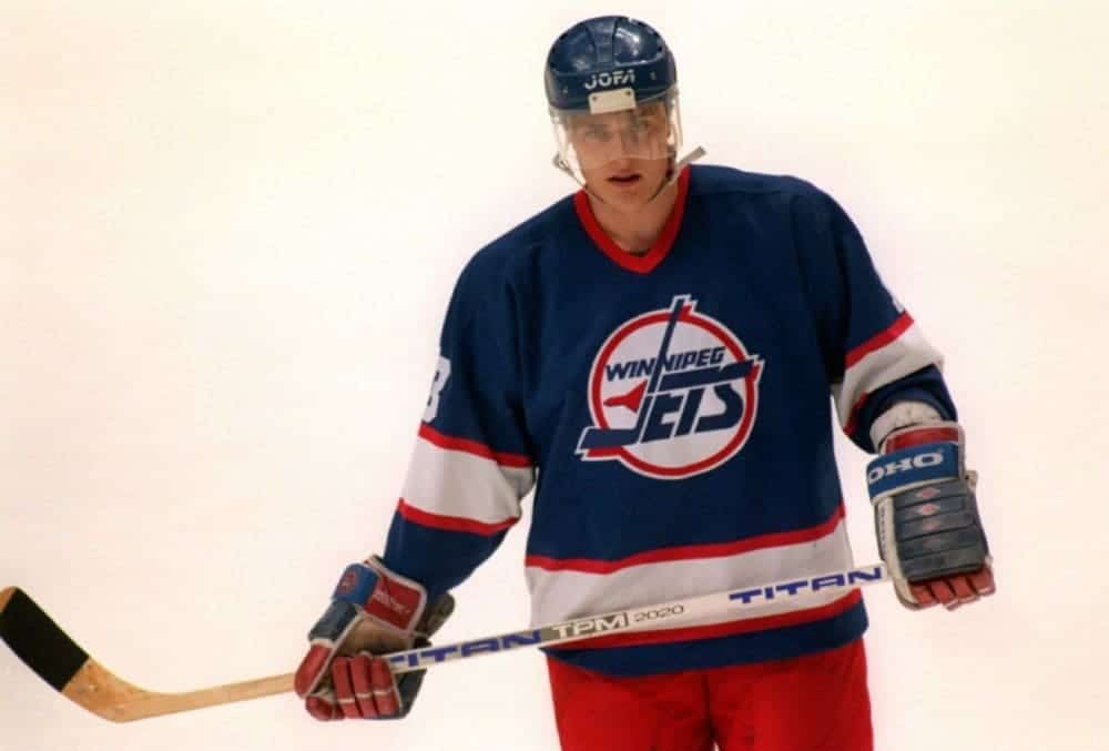
The Jets moved to Phoenix in 1996. The revived Jets have thrown back to the WHA look on occasion at their outdoor games.
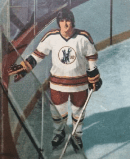
5. Colorado Rockies (1976-1982)
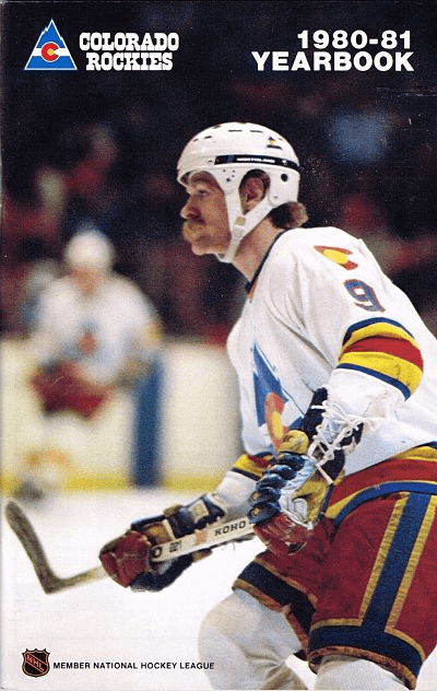
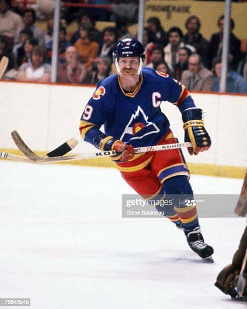
The Rockies kept their colours on relocating from Kansas City, and added a great logo incorporating a portion of the Colorado state flag. This was a great uniform (seriously, look at those pants!) which sadly hasn’t been thrown back to by anyone.
The Rockies relocated to New Jersey in 1982.
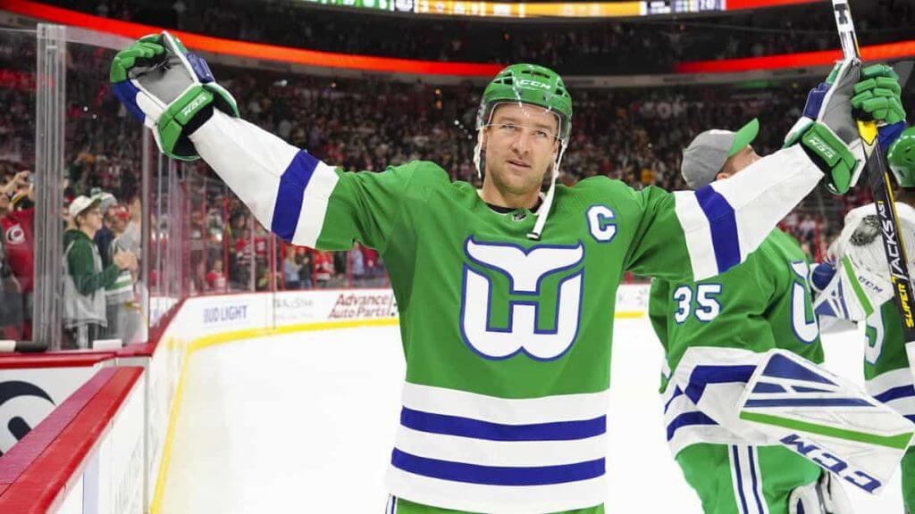
4. Hartford Whalers (1972-1997)
One of the most beloved “defunct” uniforms, primarily because of their clever negative space logo. The team started off in the WHA with a couple of harpoon-based logos.
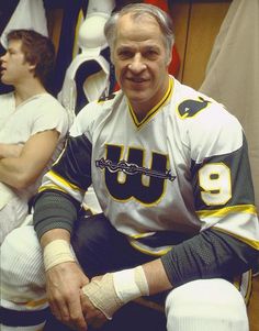
The Whalers switched to their more famous logo upon joining the NHL in 1979.
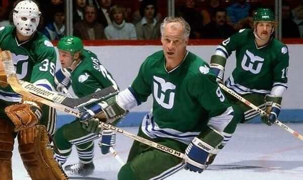
Bonus points for striped Cooperalls.
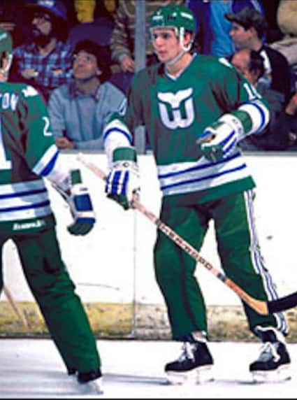
Points off for abandoning their longtime green set in their last few seasons for a bland navy blue uniform with gray trim.
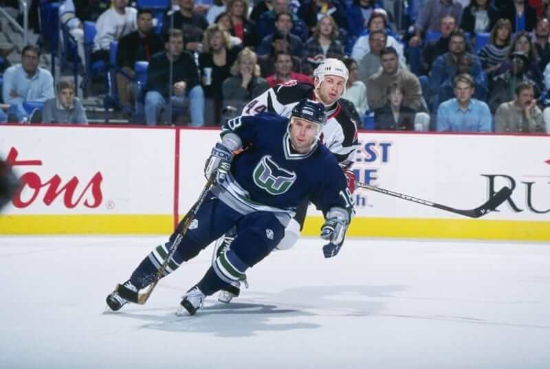
The Whalers relocated to Carolina in 1997. The Hurricanes have thrown back to the Whalers NHL look on occasion, and several minor league teams (including the Connecticut Whale) have used uniforms based on the Hartford Whalers uniforms.
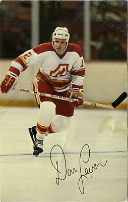
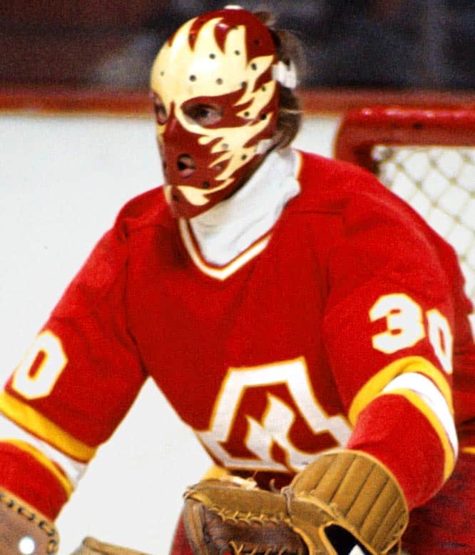
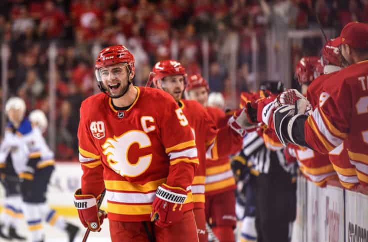
3. Atlanta Flames (1972-1981)
One of the few “defunct” teams to keep their identity upon relocation. The orange and yellow look was bright and eye-catching when it was introduced in 1972, and is still worn nearly 50 years later as a throwback (with the revised logo) by the Calgary Flames.
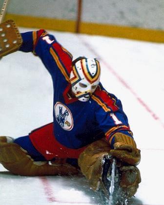
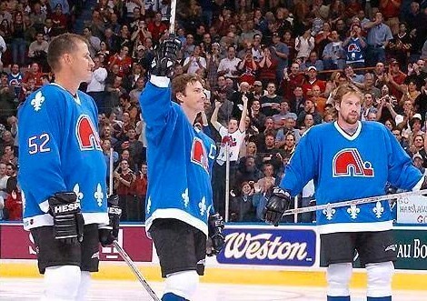
2. Quebec Nordiques (1972-1995)
The early WHA Quebec Nordiques uniforms were a bit of a red and blue mess.
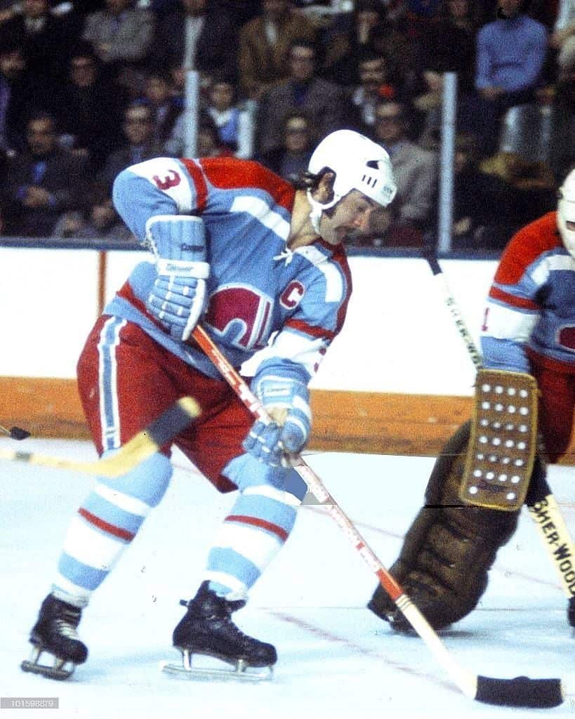
When they finally settled in on their light-blue and white jerseys, they created a look that lasted for 20+ years with minor tweaks. Everything about this is just right – the fleur de lis trim on the waist, the right amount of red, the bright shade of blue.
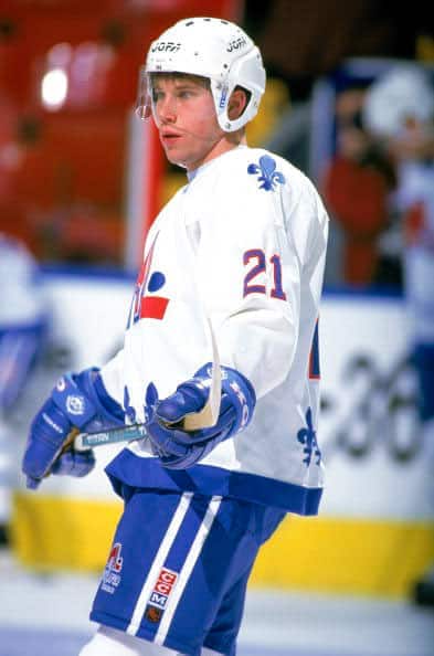
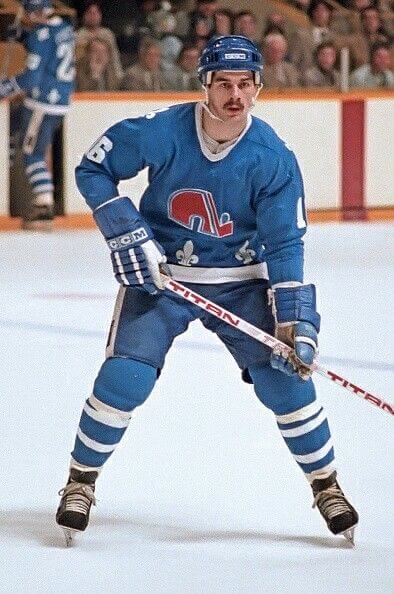
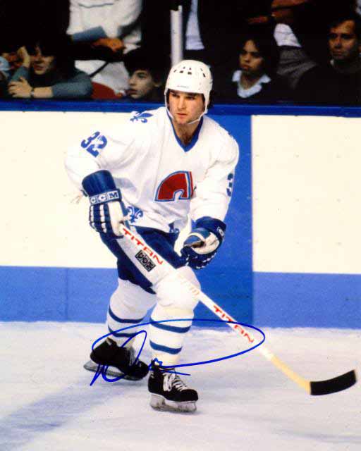
For a long time, the Nordiques and the Canadiens were the only teams to use blue dashers. I know its not part of the rink and not the uniform, but seeing the Nordiques against the blue is definitely a big part of the “look” we associate with the Nordiques.
The Nordiques moved to Denver in 1995. The Avalanche have worn the Nordiques NHL jerseys on occasion in warmups when visiting Montreal.
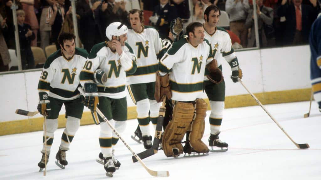
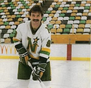
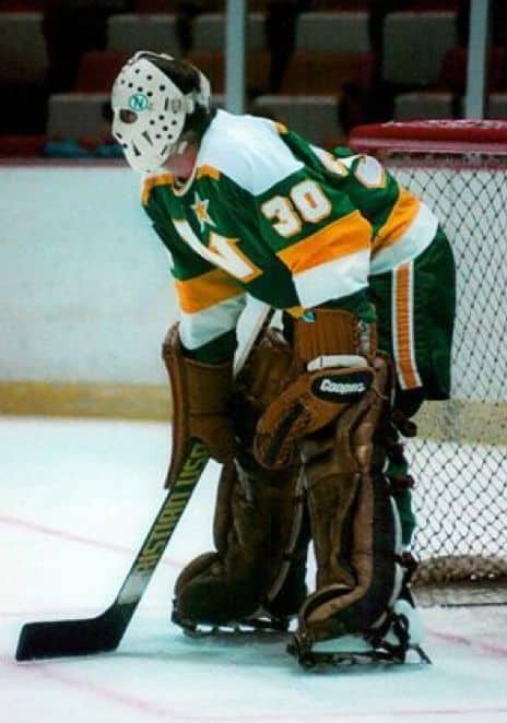
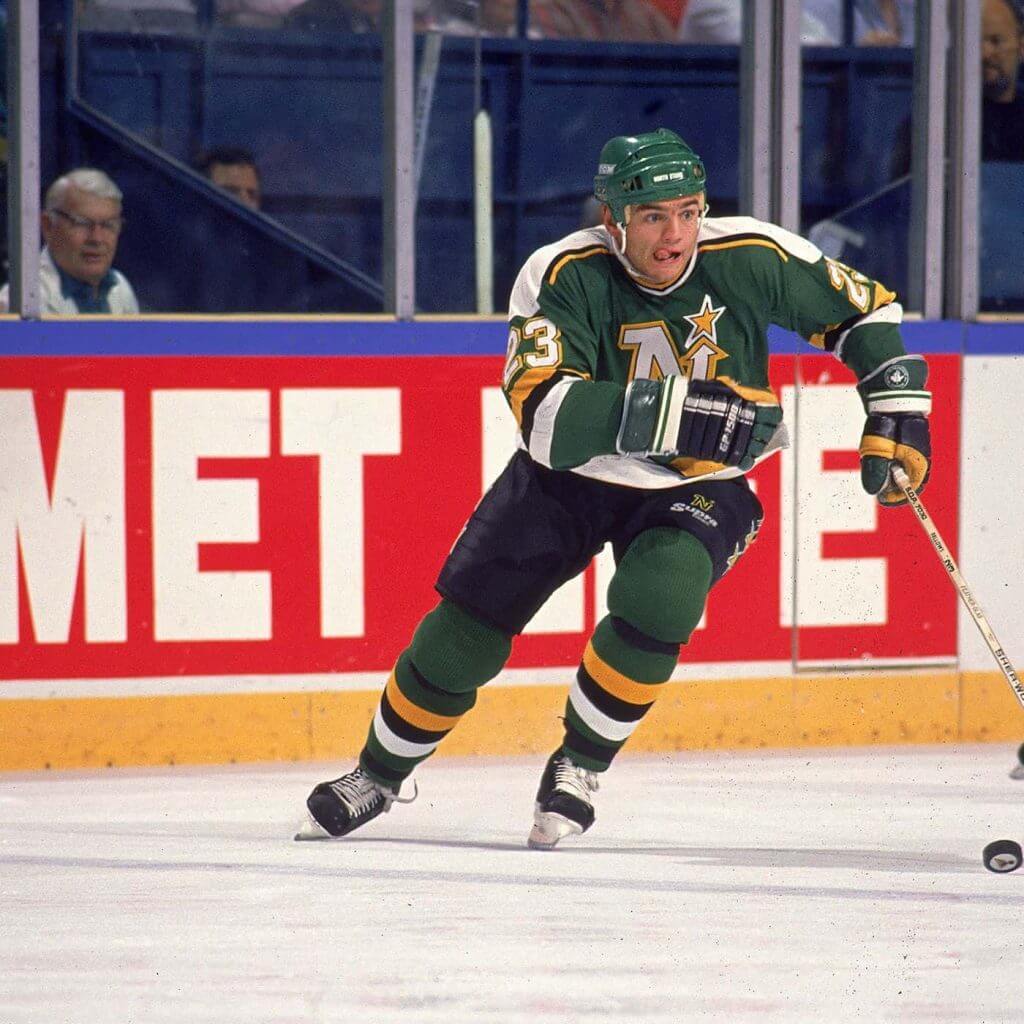
1. Minnesota North Stars (1967-1993)
The North Stars tinkered with their look a lot in their first 25 years. Their first uniforms didn’t make it out of the preseason. They added and removed stripes, emphasized the yellow, added black trim and pants. But their uniforms were always bright and clean, their logo was distinctive and easily recognizable.
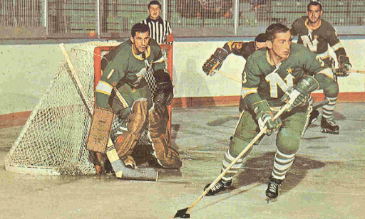
Was there a more iconic combination than the green-yellow-white of the North Stars and the green-yellow-white-black crazy quilt of the Met Center seats?
Keep going. You didn’t see that.
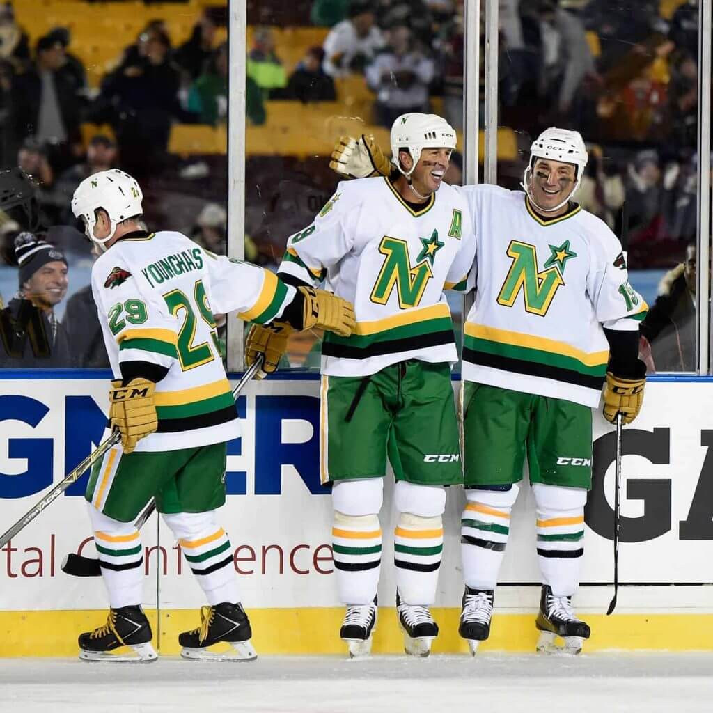
The Wild have thrown back to the North Stars uniforms on occasion, most memorably at the Alumni game as part of the 2016 Stadium Series.
Thanks, Mike! Great stuff. The Whalers negative space logo was the greatest NHL logo of all time, and probably top 3 of all logos for all sports. Do not argue, you know I’m right.
Well readers, what say you?
Collector’s Corner
By Brinke Guthrie
Follow @brinkeguthrie
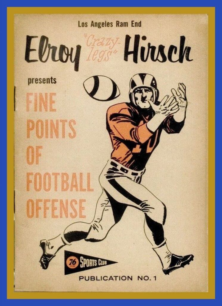
Today we lead off with a booklet sponsored by Union 76 called “The Fine Points of Football Offense,” with their star receiver Elroy “Crazy-Legs” Hirsch on the cover.
The seller notes “These SCARCE 12-page instructional booklets (3-7/8″ x 5-1/2″) were given away by Union 76 gas stations from 1957-1959 in conjunction with its Sports Club ABC television program.”
Now for the rest of the week:
• How about the artwork on this album titled “Sports Highlights of the 60’s.” Narrated by the legendary Curt Gowdy.
• This collection of New York Mets memorabilia (includes a 1986 World Series VHS!) should find a home at Uni Watch HQ.
• Here’s a 1969 Cincinnati Reds glass commemorating 100 years of Major League Baseball.
• Boston Celtics fans will love these 1960s shamrock-themed Boston Celtics glasses.
• Staying in Boston; Red Sox fans- did you ever have a Red Sox Cabbage Patch doll? If not, this is your lucky day.
• This 1970s Miami Dolphins bumper sticker shows that very cool font they used back then.
• Speaking of cool fonts, you cannot beat the San Diego Padres logo shown on these Western Division ’84 Champions bumper stickers.
• One more sticker for you- the guys in marketing didn’t spend a lot on the design for this 1960s Baltimore Bullets sticker.
• This 1960s “National League Of Professional Baseball Clubs” mini-pennant was a Post cereal premium.
• Here’s a set of, gonna say late 1970s NFL sheets featuring a player wearing an “NFL league uniform,” maybe modeled after the Giants or Bills of the period? Nice Pumas, too.

Guess The Game…
from the scoreboard
Today’s scoreboard comes from Robert Andrews.
The premise of the game (GTGFTS) is simple: I’ll post a scoreboard and you guys simply identify the game depicted. In the past, I don’t know if I’ve ever completely stumped you (some are easier than others).
Here’s the Scoreboard. In the comments below, try to identify the game (date & location, as well as final score). If anything noteworthy occurred during the game, please add that in (and if you were AT the game, well bonus points for you!):
Please continue sending these in! You’re welcome to send me any scoreboard photos (with answers please), and I’ll keep running them.
When the Name On the Front…
…is as important as the Name On Back. Or something like that.
Got an e-mail a couple weeks back from Dave Holland that’s too long (and too good) for the ticker. So I’m reprinting it in its entirety below.
Phil-
I came across a photo of a Jerry West trading card from 1970-71. His jersey had “West” on the front. At first glance, I thought it was his All-Star jersey that has been mentioned often on UW, having “West” on both the front and the back. Upon further review, it turns out to be his Lakers’ jersey worn backwards. Topps didn’t have the rights to use team names back then.
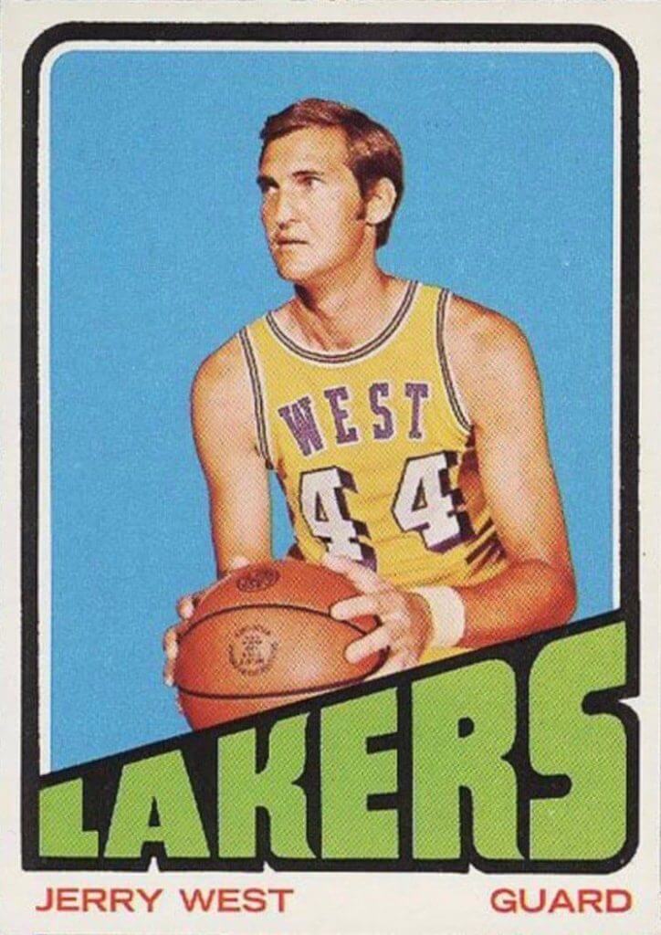
Since childhood, I’ve been afflicted with the Uni Watch disease. Things like those ridiculous backwards jerseys and poorly airbrushed pictures of athletes who’ve been traded always bothered the hell out of me.
I also came across this article, which offers more details:
Sorry, I’m not able to do an article for you. Hopefully, this provides a topic for you or a UW staffer to write about.
UW has been a welcome respite during these troubling times. Thank you and keep up the good work!
Cheers,
Dave Holland
Thanks Dave — and thanks for sharing that bit of trading card wisdom, especially for those who weren’t aware of the weird licensing back then!
The Ticker
By Alex Hider

Baseball News: The Pirates have been trying IF Cole Tucker in the outfield recently, but he’s had trouble tracking down an outfielders’ glove of his own. He’s been using one that manager Derek Shelton received as a gift in 2017 (from Jerry). … @29_sunset has the backstory on the unique mask worn by many Giants players and coaches — a mask that straps around the head and neck instead of the ears. … The Rockies have been keeping track of their favorite cardboard cutout fans they’ve come across amid their NL and AL West travels in a giant Twitter thread (from Kary Klismet). … There was a Negro Leagues reference in Thursday’s Zits comic strip: One of the characters was wearing a Cool Papa Bell T-shirt (from Paul O. Dillon). … ojai67 sent along this 1970 photo that shows the Tigers’ equipment manager adding NOBs to players jerseys for the first time — in Red Wings-style vertically-arched lettering. … @jpscott11 noticed some issues with Barry Larkin’s pants in a Reds Abbey Road-inspired T-shirt he got as a gift. … A 12-year-old boy from Mount Vernon, Iowa, made his friend a baseball bat from a tree damaged in the derecho that hit the state earlier this month. Someone should buy that young man a Brooklyn Branches shirt! (from Kary Klismet). [I’m totally bummed he didn’t name the bat “Wonderboy,” even if it was from a derecho and not lightning. — PH]

Football News: Marshall has unveiled new home and away uniforms (from Kary Klismet). … The pandemic has taken a toll on the CFL, so the struggling league is raising funds by adding a large base to the Grey Cup. They’ll engrave fans’ names on the trophy base in exchange for $350 (Canadian) from now until Aug. 30, after that, spots will cost $400 (Canadian) (from Johnny Garfield and Wade Heidt).

NFL News: Stirrups on the gridiron! Seattle kick returner Jeff Moore wore stirrups during a 1979 Monday Night Football game against the Falcons — or they could have been two-in-ones? (From Chris Hickey). … I never knew this — after the Dallas Texans skipped town in 1962, the Cowboys immediately took over the team’s old facility and renovated the team’s iconic road sign (from @Wilds_Lee).

Basketball News: A portion of Figueroa Street in downtown Los Angeles has been renamed in honor of the late Kobe Bryant (from Mike Chamernik and Kary Klismet). … Speaking of Kobe, the Lakers’ “Mamba” jerseys made their 2020 playoff debut last night. They’ll reportedly make many more appearances as long as the Lakers keep playing (thanks to all who shared). … Phoenix Mercury G Diana Taurasi usually wears No. 3. But on Sunday, she wore No. 8 and a “Bryant” NOB in honor of Kobe on his birthday (from our own Jamie Rathjen and Wade Heidt). … A rec center in Provo installed three Jazz-inspired basketball courts: One based on their current court design, another based on their “City” jerseys and a third inspired by the Jazz of the ’90s (from Preston Darger). … An investment group that is aiming to bring back the Sonics is asking for fan input on the greatest uniform era in team history (from Bridger Deschamps).

College Hoops: Wow, check out the uniforms by the University of Cincinnati women’s basketball team in 1898 — not only long sleeves and skirts, but ties! (From Kary Klismet). … New blue uniforms for D-II Newman College women’s basketball (from Blake Cripps).

Soccer News: New third kits for Premier League club West Bromwich Albion F.C. (from our own Jamie Rathjen). … Ugandan Premier League side Kampala Capital City Authority FC has released renderings of its planned stadium renovations (from Kary Klismet). … New uniforms for Andorra (from Germán Cabrejo). … Chile has unveiled their national team jerseys for 2020-2021 (from @ChileSuns)

Grab Bag: We’ve got several submissions from Kary Klismet today: In a sign of the times, a party supply company is selling fan cardboard cutouts so every sports team can fill their stadium the way the MLB has done; Brownstown Central High School in Indiana has new band and drill team uniforms; and the city of Mission, Kansas, has a new logo. … Haikyu, a Japanese anime series about volleyball, collected the uniforms of school teams from around the country whose seasons were cut short by the pandemic and paid tribute to them in a tweet (from Jeremy Brahm). … The Michigan Intercollegiate Athletic Association, a NCAA D-III conference, will unveil a new logo on Aug. 31 (from Evan Gehlert). … Boyle County High School in Kentucky is keeping the team name “Rebels,” but will change its logo (from Timmy Donahue).
And finally… a(nother) big thanks to Mike Styczen for today’s main article and everyone who contributed to today’s post. Great stuff everyone.
An unspectacular sunset greeted me last evening, so today I’m going to share a photo I took on my afternoon 4 mile walk. I pass by this pond (both sides) on most walks, and think I’ve only photographed it maybe once or twice, even though it’s rather famous (it’s called the “Goose Pond” or “Town Pond” and people have been photographing and sketching/painting it forever). It’s generally at the south-western terminus of my walk, so when I round the end of the pond, I’ve passed the halfway point. This is a photo looking northeast.

That’ll do it for today. Paul will be handling tomorrow’s lede (the Uni Watch College Football Season Preview will run over on Inside Hook) and I’ll have the remainder of the post, so I’ll catch you guys tomorrow!
Peace,
PH
I actually really, really love that Thrasher’s alternate jersey (the stylized bird logo). Reminds me of the DC Comics character Nightwing.
Agreed. Nothing about that uniforms said Thrashers or Atlanta to me, but it’s such a sharp and distinctive mark, and the colors of the uniform were strong. By the end, the Thrashers had basically good uniforms, but I also think Mike is correct in his overall assessment of the team’s uniform history.
Oh, no doubt, that red logo-less uniform is BRUTAL.
“Ok, seriously, look at all this. Goofy sock stripes, weird side panels, white sleeves, angry bird on the shoulder, no logo, a giant number on the front, yellow neck, and a wordmark…this is one of the
worstbest uniforms in NHL history.”I’d put that right up there with the Barons, classic Nordiques, Whalers and Canadiens for my Top Five NHL unis.
Re- MIAA Rebrand in the Grab Bag portion of the Ticker
As someone who goes to an MIAA school (Albion College), this rebrand has needed to happen for a while, so I’m glad to see that it’s coming.
“The orange and yellow look” for the Flames is actually red and yellow. They don’t promote a “C of orange.”
BurghFan is correct. Both the Atlanta Hawks and Atlanta Flames were owned by Tom Cousins. Cousins also developed and owned the Omni arena in downtown Atlanta. In 1972, when the Omni was completed, the Flames began play and the Hawks moved into the Omni (they had been playing at Georgia Tech’s Alexander Memorial Coliseum). Tom Cousins switched the Hawks to the same red and yellow as the expansion Flames so his teams would have the same color scheme.
New third kits for English Championship club West Bromwich Albion F.C.
West Brom are a Premier League club again, having finished second in last year’s Championship.
Quick correction: “New third kits for English Championship club West Bromwich Albion F.C.”
West Brom finished second in the Championship last season, earning a promotion to the Premier League for 2020/21.
I was beaten to the punch on this one, so I’ll add: Those third kits are going to be a complete eyesore on the field!
The Atlanta Flames logo rocks! And the jersey it sits on is unimpeachable, and you know it because Calgary always goes back to it. Bonus points should also be awarded because the Atlanta A is used as an alternate captain designation!
Personally I cannot stand it when a team relocates but keeps the colors/name from the community they left behind (I think it should not be allowed and all relocated teams should be treated as expansion teams including nullifying all player contracts and leaving all history behind). But Calgary using the Atlanta “A” as the alternate caption patch *almost* makes it acceptable.
I’m normally on Dereck’s team on this question, but there are rare exceptions for me. This is a case where 1) The Flames identity was pretty generic in Atlanta; and 2) The Flames name makes specifically local sense in Calgary.
Like, if the Philadelphia Flyers moved to Seattle, I’d be fine with them keeping the name. The name isn’t particularly relevant to Philadelphia, but it would be highly relevant to Seattle. Or there are plenty of cases where a locally relevant name would also make locally relevant sense elsewhere. So if the Minneapolis Lakers had moved to Salt Lake City, or if the Brooklyn Dodgers had moved to San Francisco. In both cases, the old name would have been worth keeping in the new location.
“The Flames identity was pretty generic in Atlanta”?
The name refers specifically and historically to the famous burning of Atlanta by Sherman during the Civil War.
Very similar to team name of “Chicago Fire” in the WFL and MLS.
“The Flames identity was pretty generic in Atlanta”?
The name specifically and historically refers to the burning of Atlanta by General Sherman during the Civil War.
Very similar to “Chicago Fire” in the WFL and MLS referring to the Great Chicago Fire of 1871.
Thanks for correcting me, Bruce! I’m even kind of a huge Army of the Tennessee fan, and that connection never occurred to me. So the Flames moving to Calgary is more like the Lakers moving to Salt Lake or the Dodgers moving to San Francisco.
I’m generally on the other side of Derek’s relocation argument, so when Mike Styczen wrote, regarding the Colorado Rockies, “This was a great uniform…which sadly hasn’t been thrown back to by anyone”, I instantly thought that if that were to happen, the Devils are the only team that should do it…the same would hold true with respect to the KC Scouts.
The Avalanche have an alternate that could rightly be considered a Rockies faux/harken-back, right?
2024 is the Scouts/Rockies/Devils 50th Anniversary. It would be a good history lesson if the team wore Scouts’ uniforms when playing the Blues, and Rockies’ suits when opposing the Avalanche. Hell, they could wear the green-trimmed sweaters when playing the Capitals, their expansion twins.
Love the hockey piece – most of the fotos have me thinking: “HANRAHAN!”
GTGFTS: Tuesday June 14, 2016
KC beat Cleveland 3-2
Didn’t see this in the ticker, but are the Charlotte Hornets getting new uniforms? They seemed to make a hint on twitter.
link
Open for debate, but best Winnipeg Jets uniform IMO is 1978-79. Last WHA champions. Blue pants. White shoulder yokes on blue jerseys.
link
link
Sorry, Wade, but this Winnipegger doesn’t agree. The white shoulder yoke looked extraneous to me…an unnecessary add on which cluttered up the sweater. I have always felt the same about the Capitals’ original red sweaters. It would have looked so much better without the white shoulder yoke and the stars going over the shoulders rather than across the front over the crest.
I don’t feel as strongly about the pants but I preferred the red ones.
Think it is my Regina born-and-raised past which makes me like the 78-79 Jets uni. Looks a lot like my favourite Regina Pats look.
Speaking of white shoulder yokes vs. stars on the shoulders. I remember a jersey that awesomely had both! 1980s Sault Ste Marie Greyhounds, as worn here by Mr. Bob Probert.
link
Re: The CFL piece,
the Grey Cup is huge as is. The fan-engraved stand isn’t going to be added to the trophy as a base, it’s just gonna’ be a display stand in the HoF; at least, that’s how I read it.
Right. It is a display stand. To be used at public events where the Grey Cup will be on display. There is no change to the trophy itself and no way that a fan’s name is getting engraved on the trophy.
I love the Scouts logo and uniforms. Ranking them last because of native imagery is a joke. #ManifestDestiny
I tend to agree in the case of the Scouts. The logo is based on an actual statue in KC, not something stolen or appropriated (unless you think the statue itself is so). Also, the name “Scouts” is just fine. This is one case where ranking them low, just because a Native American is on the logo, is not merited in my opinion.
Also, the North Stars and Whaler are #1 and #2 in some order without question. Nordiques/Flames ahead of Hartford my ass.
100% agreed.
If “Topps didn’t have the rights to use team names back then“, why did the card say “LAKERS”? All the other cards shown here have the city name, but West’s card says Lakers. And of all the colors to use, green is obviously the worst color.
I just wrote the exact same thing, but looks like my comment got eaten by the website somehow. The last card also says “Celtics”…
This. I think I’ve read about this before about it being popular for players to wear it backwards to show their name or something but not about the trading cards company not being able to use the team name. Unless they meant then team logo or font. The name thing doesn’t quite work out for teams without NOBs, though, so maybe even that is wrong. Anyone?
NFL cards in the 70’s were the same. They would use the team name, but in the photo any sleeve or helmet logos were airbrushed out
A reminder to all you fake-news-ers trying to convince someone that the Seahawks played a season without a helmet logo…
Don’t kill the messenger.
Just passing along what was in the linked article:
“Team names are legally considered “distinctive” and can be trademarked, whereas city names are “generic” and can’t be trademarked as the property of a team. Topps had an agreement with the players’ association in 1969, but not the league, which allowed them to show players and team uniforms to the extent the uniforms didn’t show any trademarked property.”
link
“Topps didn’t have the rights to use team names back then.”
Then…why does it say “LAKERS” right underneath Jerry West’s photo? I get it on the two below that, where they just say the city name, but the bottom card also has the team name listed (“Celtics”).
Who made the decision to call the NWHL a minor league?
Typo: Charlie O. Finley, not Finlay.
Thanks, fixed.
I think of the North Star logo (along with Atlanta’s and the Whalers’ HW) as iconic.
North Stars had a great combination of colors – green, yellow, and white – which was ruined by the introduction of black.
I sketched a Wild logo which adds one stroke the North Stars’ “N” to make a “W”. Put that on the 1968 Minnesota sweater and you’ll automatically have the best Wild uniform, ever.
I’m pretty sure the North Stars goalie pictured is Jim Craig of the 1980 “Miracle on Ice” Olympic team.
Glad to see some of my favorite teams represented in today’s column. But I don’t agree with some of the rankings. The Quebec Nordiques were always a hot mess with uniforms resembling provincial flags, and then a futuristic logo crash-landing on the sweater. Atlanta Thrashers had one good uniform: The very first home jersey, then the trajectory went steeply downhill. The Barons should be higher on the list. It’s hard to screw up red sweaters and black breezers, and the Ohio maps are a feature, not a bug. I place the Atlanta Flames logo higher than the Whalers, but I admit the preference is not quantifiable. Who should wear NHL Rockies’ uniforms? The Avalanche, or the Devils when they play the Avalanche? Did you see how many green+yellow teams are on this list? And how many green+yellow teams are there now?
Boyle County High School in Kentucky is keeping the team name “Rebels,” but will change its logo (from Timmy Donahue).
It appears there is a slow shift away from Rebels-named teams, not as urgent as the trend to rename Indigenous American-themed programs, but it is gaining momentum. I point this out because Columbine High School, in Littleton CO, uses a Rebel mascot. The way the school rallied around the name after the 1999 mass shooting was inspiring, and something of value will be lost if they are swept along in the change, don’t you agree?
Mind you, I disapprove of a Rebel mascot with the huge moustache and Confederate uniform. I am, however, okay with the Rebel in the form of a Minuteman.
Or as the Rebel Alliance in Star Wars.
I have three of those masks that the SF Giants wear, as mentioned in the ticker. I’ve been wearing them for cycling and my visits to my local climbing gym and like them a lot. They provide good, secure coverage, they stay in place, they don’t get sucked into my mouth when I’m breathing heavily, and they’re easy to lift up from the bottom when I need a drink of water. I biked 20 miles last weekend wearing one of these masks and it worked really well the whole ride.
Thanks for the review. I wonder how they work with glasses. Having a strap go all the way around seems potentially problematic in that regard. I’ve only been wearing the masks that loop around my ears, and even then I manage to sometimes pull my glasses off when removing my mask. Still, it looks good and I am tempted to give it a try.
Ranking the Scouts below even the Thrashers because of the “indigenous imagery” is the stupidest shite I’ve ever seen on this site.
KC’s logo was — and is — the embodiment of dignified cool. -C.
There’s a National Film Board short from 1972 about the Nordiques’ origins, and it includes an interview with the logo and uniform designer. It appears he wanted to go with two shades of blue instead of red, white, and light blue, but the team didn’t agree. His concept art for the original uniforms and logo look much better in double blue, IMO (jump to 13:07 for the discussion of uniforms if my link doesn’t take you there directly):
link
I wonder if the Cleveland baseball team has considered adopting Barons as their new name, I think that’d be terrific!
link! That’s a great idea. Anyone out there want to tackle a uniform for the Cleveland Baseball Baron’s?
It’s not like the Spiders were more successful than the Barons. Or the Crusaders, for that matter. Cleveland doesn’t lack for star-crossed teams conceived with the best of intentions. Yes, I would love to see the American League Cleveland Barons. If the Colorado Baseball Rockies can be happy with an old NHL name, why shouldn’t Ohio?
Don’t get your hopes up. I’m sure someone somewhere (and by that I mean Twitter) will be aghast that a professional baseball team would name themselves after a rank of nobility. And to hedge their bets, the cancel culture mob would also claim that the name could also refer to the robber barons (unscrupulously rich old white guys) of the past.
RE: Scoreboard
I don’t know the game but questions:
How many scoreboards still have 10 innings listed (not 9, as this one does)? I get that electronically, it is easier to write 10, 11, 12 and not need fans to do weird math to follow.
Also, I wonder how many have extra spacing between the 3/4 and 6/7?
I have always loved that teal Seals uniform, with the USC shoulder inserts. It’s a beautiful, beautiful thing.
The Whalers (and Flyers) did not wear Cooperalls…. they wore CCM ProGaurd pants.
Whatever they were called, wearing them should earn you a referral, not bonus points.
As a newly transplanted New Yorker to Denver, it is infuriating to see how often the popular state flag here is incorrect.
The Colorado “C” is supposed to go two-thirds around the circle , and goes in further than the blue bars. The hockey Rockies have it wrong — their C only goes to the edge of the blue bars.
And any decent whalers throwback must have Puclky.
“For a long time, the Nordiques and the Canadiens were the only teams to use blue dashers.”
May not have been for as long, but notable that the Devils and the Jets had blue kickplates on their boards too.
link
Saddest of all may be the Cleveland Barons.The original AHL team had a 36 year history and a classic logo on the jersey,
(link)
he NHL version essentially ignored that rich history with their rather soulless creation. The Monsters shoild throwback to jaunty baron with his top hat and monocle.
Calling BS on the Seahawks stirrup allegation!
Terrible quality photo that may have (probably) or may not have been altered.
Stirrups or two in ones in 1979, in either case seems like fake uni news : )
Thankfully Paul will be back soon as these august isolations are brutal.
Questionable photo quality…I’ll agree.
Here’s the source video (10:24 mark):
link
Thanks for the link but still think something looks off about the stirrup or two in now allegation.
Everyone has their opinions, but when I look at the Cleveland Baron’s logo, all I see is a very sharp logo.
One of my favorites, really.
Is “Mike Styczen” a pseudonym for Paul? No way those North Stars unis are better than Quebec and Hartford! I think the Thrashers really should be dead last as well. Although I will admit I own one of their weird light blue jerseys with ATLANTA down the sleeve.
I also own a mooterus jersey, so I don’t know what that says about me..
I know they were WHA not NHL, but the Stingers logo was terrific. And the Winnipeg Jets are totally cool with that logo.
And yes, the Atlanta Flames were red/yellow, not orange.
If the Whalers were still an active team, do you think they would have been forced to changer their name being how negatively whaling is looked upon now. Do you think they would just drop the R and gone Whales?
“The early WHA Quebec Nordiques uniforms were a bit of a red and blue mess.”
Disagree on that one. Over the years that look has only grown on me and now I even like it more than the one of the Nordiques in their final years in the NHL.
I just came inside a hooker
I think the Scouts logo is fantastic, one of the best ever, and is very respectful. And the Barons logo is also one of my all-time favorites. In fact, almost every one of these logos is superior to most of the current logos today. The one I don’t care for is the Thrashers.