[Editor’s Note: Paul is on his annual August break from site. Deputy editor Phil Hecken is in charge from now through the end of the month, although Paul may be popping up here occasionally.]
By Phil Hecken, with Logan Patterson
Follow @PhilHecken
Happy Friday (has anyone ever said it’s “Fri-YAY” to you? — yeah, let’s not) fellow watchers of unis. I’d say we almost made it to the weekend, but with this COVID-19, time has kinda been warped, at least for me. Hope everyone had a good week and you’re all staying safe!
I’m bringing to you today what is the first installment (not sure how many there will be or how long it will run) of what today’s guest writer, Logan Patterson, has called “What They Should Have Worn.” Like the title implies, Logan will look at a specific college football game and the uniforms worn by both teams, and then offer up alternative looks for one or both teams so that the game would have been, at least in his opinion, much more aesthetically pleasing. It’s kind of a brilliant idea — so much so that I may run with it during college football season*.
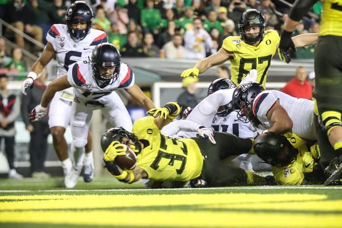
Today we’re going to take a look at a game played between the Oregon Ducks (and you know I love me some Ducks) and the Arizona Wildcats. I’m going to let Logan take it from here.
*Especially if there is no college football season.
What They Should Have Worn: Arizona at Oregon
By Logan Patterson
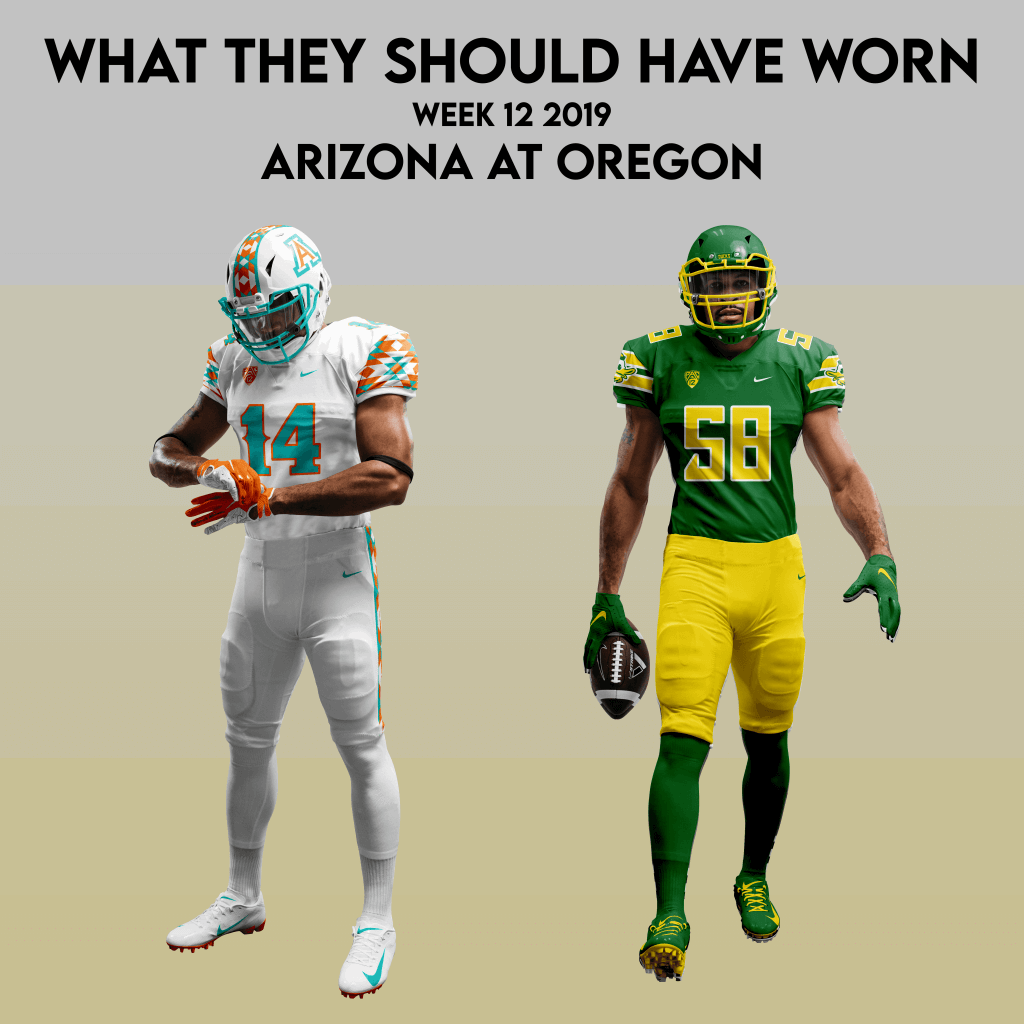
For our installment this week, I’m bringing to the table a couple of redesigns for cross-division PAC-12 foes: Oregon and Arizona.
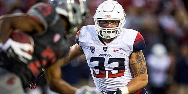
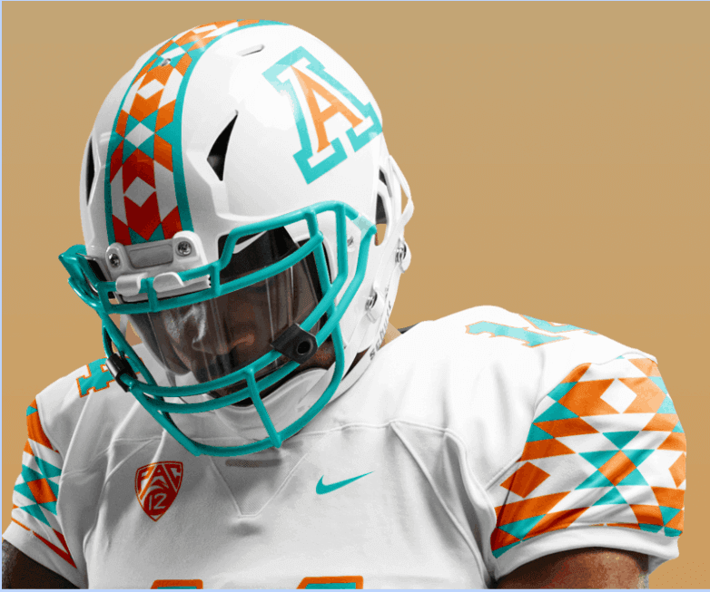
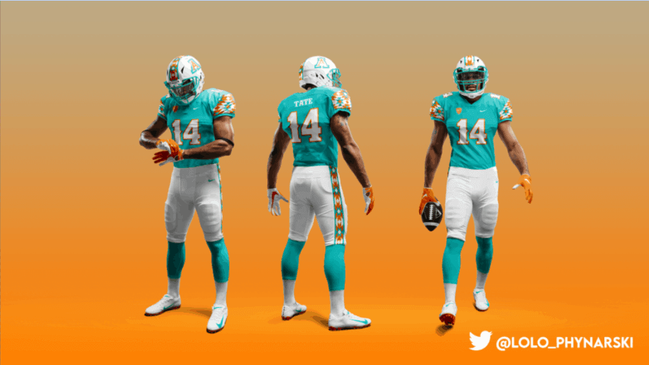
Let’s start with the visiting Wildcats. Arizona’s navy and red have never really done much for me. Originally donning sage green and silver, they adopted their current colors in 1900. It’s a high-floor low, low-ceiling combo for me – safe, but rarely thrilling. Their current threads feel like a downgrade to their last set, which featured one of the few solid uses of a gradient that I can remember.
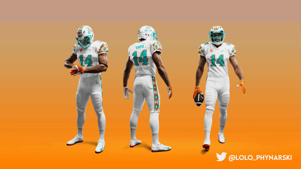
I’m giving the boys down in Tuscon a total makeover. You may have heard the story about how Hayden Fry, in an attempt to pump some energy into his Iowa program back in the late 1970’s copied the then-dynastic Steelers uniforms to help make the Hawkeyes “look like winners.” Let’s pretend Arizona – fresh off four straight losing seasons – beat them to the punch and took on the Miami Dolphins look when new coach Jim Young took over the team in 1973? Teal and orange bring a strong southwestern energy. Here’s what I imagine that could have evolved into today, featuring southwestern inspired patterns and a western typeface.
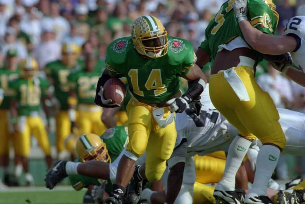
For the Ducks, there’s a ton to play around with. Over the last decade they’ve developed a visual identity that usually has a uniform with shade of green or yellow, or maybe it doesn’t! It’s difficult to think of just one iconic look for them. For much of the latter half of the 1900s they wore something like this:
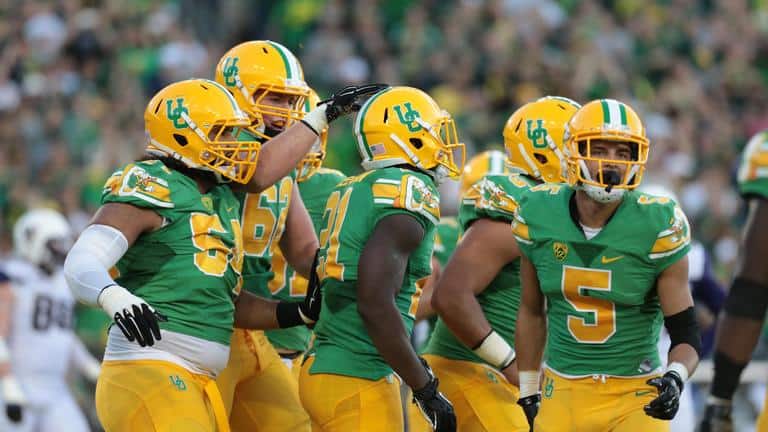
To which they paid homage with these 2014 throwbacks:
Not wanting to be totally beholden to tradition, I came up with a concept that uses a classic layout, one of Oregon’s modern typefaces and their new mascot logo. There were lots of green and yellows to choose from neons to nightmares. I ended up using their academic colors, as they seem to really hit those classic hues.
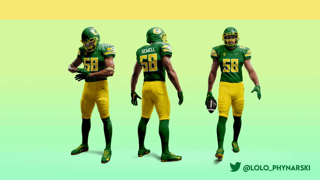
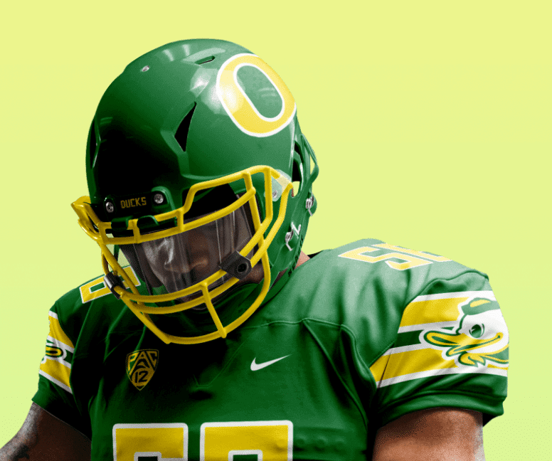
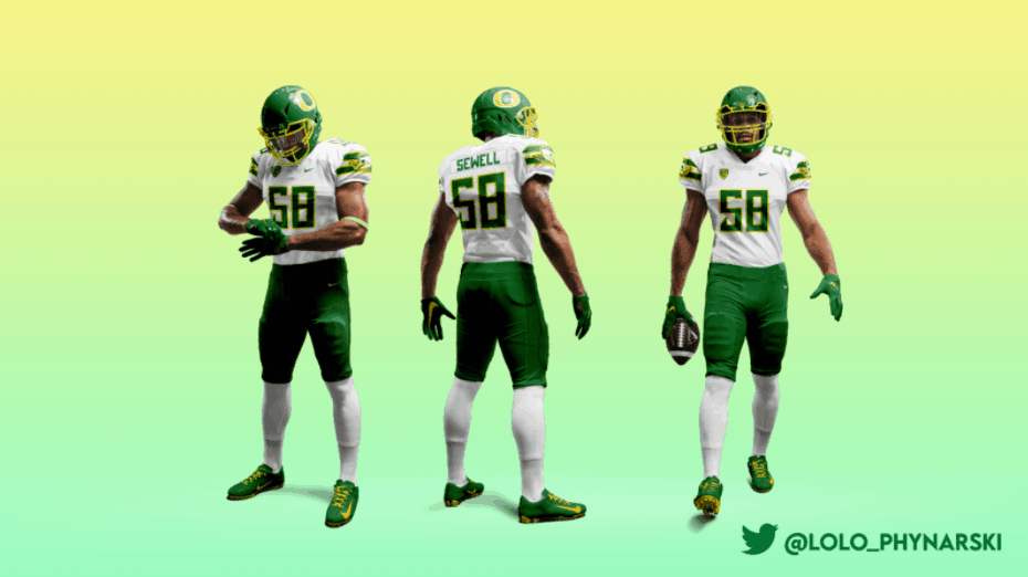
Here’s what they should have been wearing last week (if you ask me).
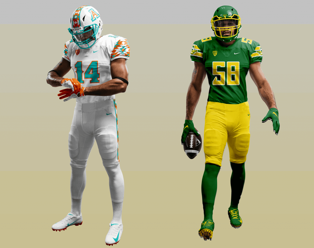
Wow — that’s quite a difference. Love the look for Arizona (copper and turquoise are sorely lacking in sports — even though Logan used orange, it definitely has a bit of a copper feel, at least to me) and that Ducks “throwback” was awesome (although I’m not a big fan of that number font). Great looking matchup you’ve created, and certainly better than what we saw last season!
What do you think readers?
I’ll have another installment of “WTSHW” in the near future!
Baseball In A Bubble
Got an e-mail earlier this week from reader Robert Brashear who recently attended a Minor League game being played during the COVID-19 pandemic, and it’s really interesting to see how different leagues are handling social distancing and safe spaces during the coronavirus. MLB stadia may be empty, but there are some teams playing games with (relatively few) fans and spectators in attendance. Here’s Robert:
Baseball In A Bubble
By Robert Brashear
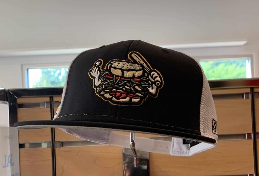
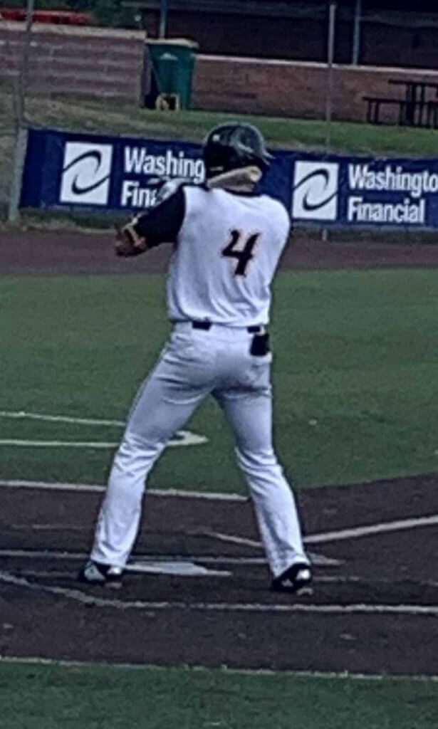
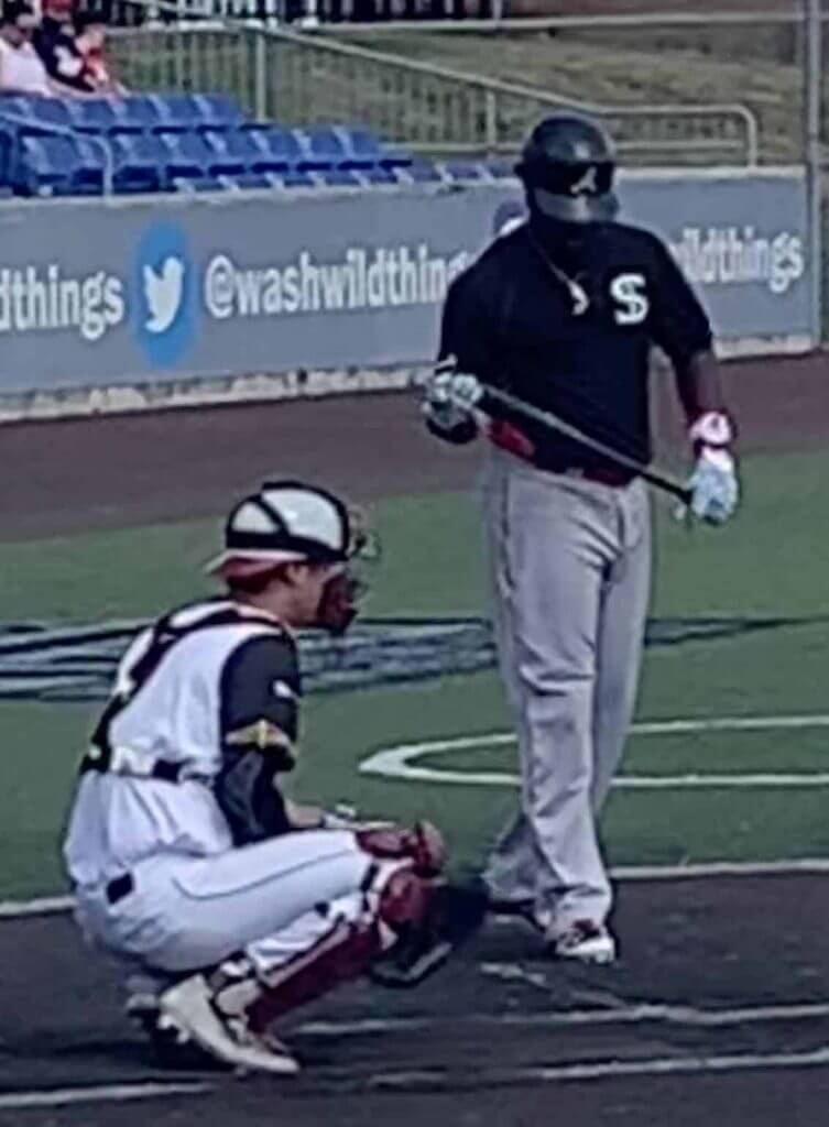
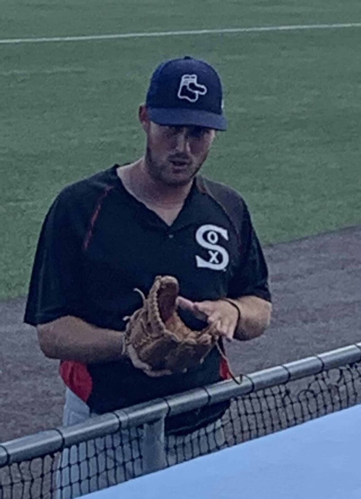
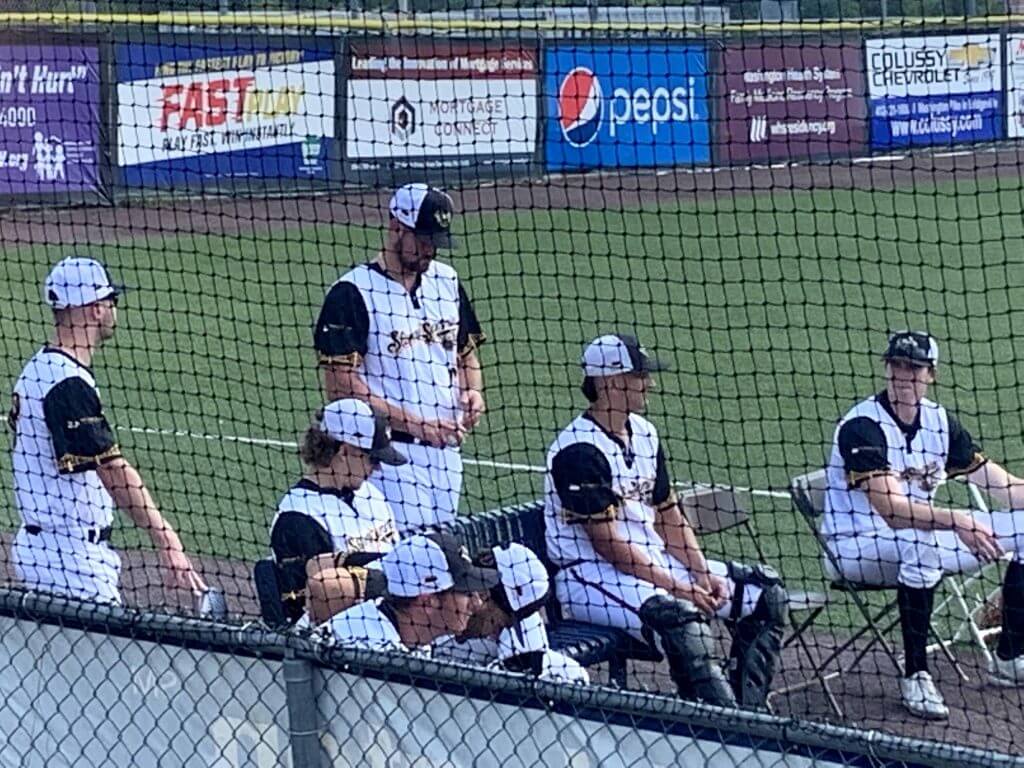
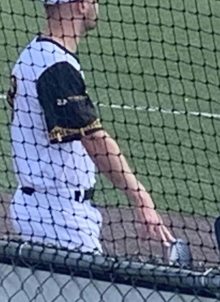
Major league baseball may be playing in empty stadiums and minor league baseball may be shut down but several unaffiliated independent teams have created their own summer “bubbles.” I found one near my hometown of Pittsburgh last weekend where the Washington Wildthings of the Frontier League are running their summer series. They created a second team, “the Steel City Slammin Sammies” and partnered with Joe Torre’s “Baseball Brilliance” who provided the ‘Black Sox”and ‘Road Warriors.” Tickets have to be bought online and printed at home. Your temperature is taken as you enter. There’s only one concession stand open and no draft beer. (Still haven’t figured that one out.) There’s a special seating section for people “over 50,” like me.
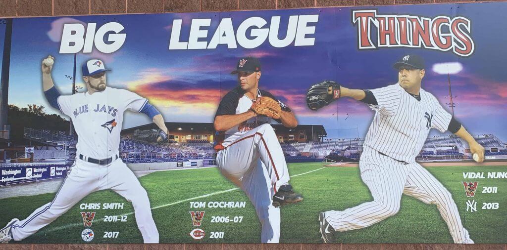
A photo display shows “‘Things” who made it to the majors. Ironically, in a typical summer, the Frontier League is (maybe) an “A” level league but a quick look at the rosters shows many who played last year at AA or even AAA level in organized ball who with nowhereelse to go, csme here. And at least two former major leaguers including former allstar Brandon Phillips. So this is the highest level of players to perform in this park in front of an Arizona Fall League crowd, mosty up in the shade on a sunny hot day.
Uninoteworthy:
• The Steel City team has Pittsburgh bridges on their sleeves.
• I wanted to want to buy the hat, but the logo was beyond Brandiose.
• The Sox poached heavily from both White Sox (jersey) and Red Sox (hat)
• And best of all, Brandon Phillips wore an Atlanta Braves batting helmet, a team he last played for in 2017. (Watching Phillips reminded me of seeing 45 year old Rickey Henderson playing out the string with the late lamented Newark Bears.)
On Monday, the State police raided the stadium and shut the season down for reasons that are still unclear. Life in coronavirusworld.

Guess The Game…
from the scoreboard
Today’s scoreboard comes from Christopher Hickey.
As you’ll see, it’s not baseball or football — so that might make it a bit tricky. But I have faith one of you scoreboard sleuths will be able to figure it out.
The premise of the game (GTGFTS) is simple: I’ll post a scoreboard and you guys simply identify the game depicted. In the past, I don’t know if I’ve ever completely stumped you (some are easier than others).
Here’s the Scoreboard. In the comments below, try to identify the game (date & location, as well as final score). If anything noteworthy occurred during the game, please add that in (and if you were AT the game, well bonus points for you!):
Please continue sending these in! You’re welcome to send me any scoreboard photos (with answers please), and I’ll keep running them.

Uni Concepts & Tweaks
After being dormant for a while, the Uni Tweaks/Concepts have returned!
I hope you guys like this feature and will want to continue to submit your concepts and tweaks to me. If you do, Shoot me an E-mail (Phil (dot) Hecken (at) gmail (dot) com).
Today’s concept is another rebrand for the Washington Football Team, and it comes from Hunter Mills:
Hello Phil,
My name is Hunter Mills and I live in Missouri. I heard that the Washington Football Team was considering Sentinels as a possible new team name and I wanted to see what that might look like. The word Sentinel is defined as someone who keeps watch. Being that Washington D.C is our capital and therefore has a rich military history I thought of how that would translate. I decided to focus on Military Police or MP’s as the basis for the team’s Identity. I decided to keep the familiar circular logo but have a soldier in place of the native american man. In place of the feathers is a pair of dog tags with the team’s name on them. The number on the helmet refers to the area code of where the team’s stadium is located. Thank you for your time and I hope you and other readers enjoy this concept.
Hunter Mills
Thanks. OK readers, tweeters (and concepters). If you have some tweaks or concepts, shoot ’em my way with a brief description of your creation and I’ll run ’em here.
Click to enlarge
And now a few words from Paul
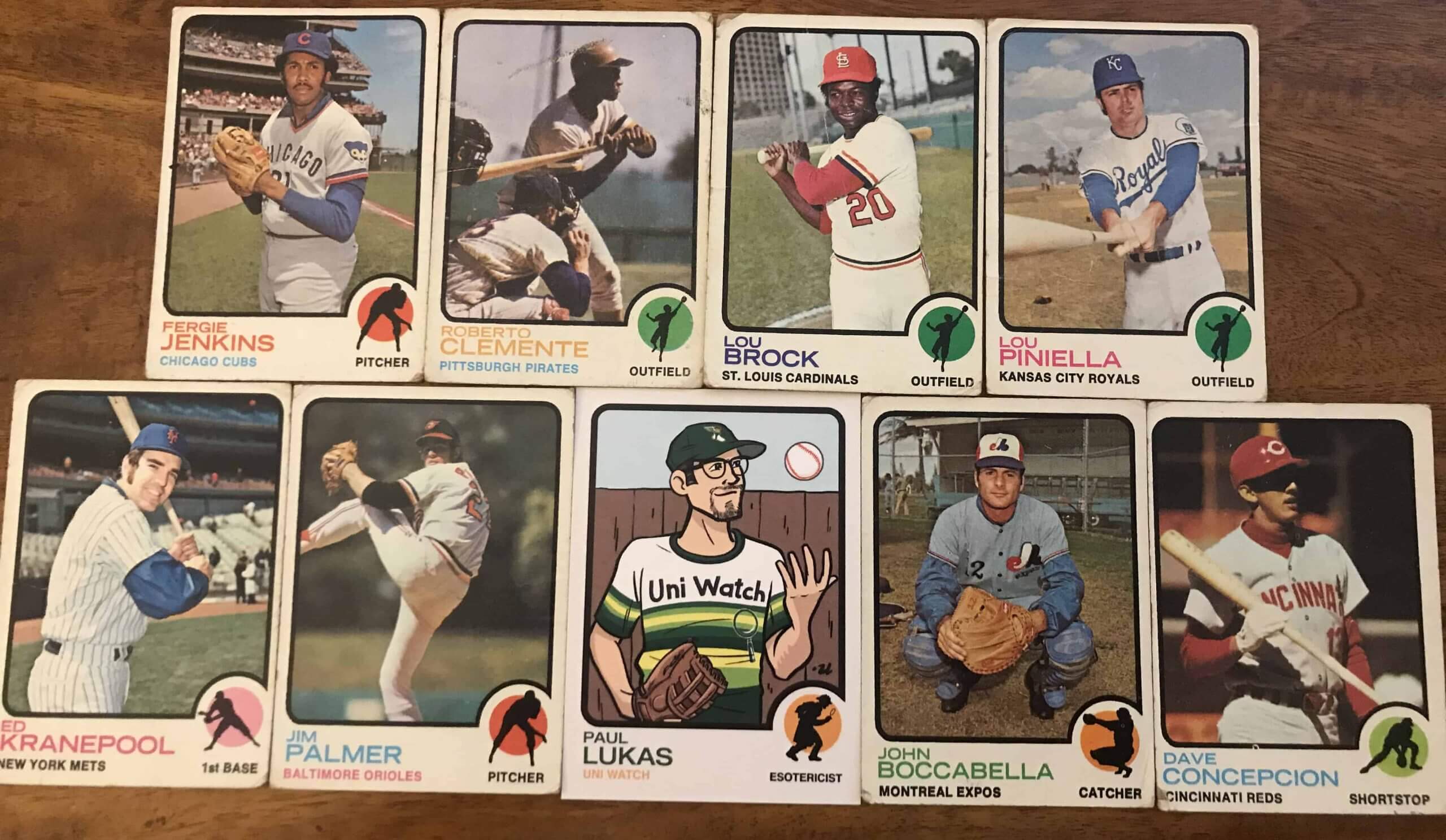
Hello! I received a note yesterday from reader Sam Dolson, who did something very cool: He put his new Uni Watch trading card, which had just arrived in the mail, alongside a bunch of his vintage 1973 Topps cards. Fits in rather nicely, don’t you think?
Speaking of the Uni Watch card, two of the signed versions surfaced on social media yesterday:
Limited edition, people! @UniWatch pic.twitter.com/BE5oSfSimo
— Sparky McKnuckles (@sparkymcknuckle) August 13, 2020
@UniWatch woo-hoo! Autographed! #uniwatch pic.twitter.com/Qrlkqax7zr
— Al N Kreit (@tierknala) August 13, 2020
If you want to order a card, you can do so here.
One other note: After a slight delay, the new Uni Watch tequila sunrise mask should be available either later today or on Monday. Just like our previous masks, these were made for us at no cost by the generous folks at ProLook Sports, and we’ll once again be donating all Uni Watch proceeds to charity. For our previous two batches of masks, we donated to Doctors Without Borders and Feeding America, and this time we’re going with the National Alliance to End Homelessness.
Everyone have a great weekend! Now back to Phil.
Flash Back Friday
Check out the photo below. See if you can guess which UW member that is:
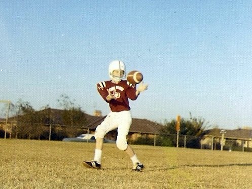
Give up?
.
.
.
.
.
If you guessed “Brinke Guthrie,” well, you’re a better man (or lady) than I.
Brinke sent me that photo, so I asked him what is/was the story behind it.
Here’s what he had to say…
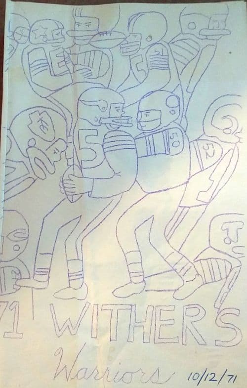
Fall of 71, “Town North YMCA” (for North Dallas) football. Now, this was a school team, Wither’s Elementary, and we were, predictably, the Longhorns. I drew the “game program cover,” above. “15” for the Vikes was absolutely Gary Cuozzo.
I am not sure why there was the YMCA connection- the same thing happened for spring 72 soccer. Maybe the school and the local Y ran the team jointly, I don’t know. Note several things:
• Helmet from Sears with the most common face mask. The stripe down the middle was a Dymo label. There’s a small red start to the right of that stripe, that was spray painted on by our coach for our one and maybe only win.
• Shoulder pads from Sears- way too big. Probably got those the year before in Louisville, also a YMCA team/elementary school deal.
• Pants probably from Sears too. Cleats as well- I didn’t know about Adidas or Puma…yet.
• There’s a small “17” (for the recently retired Don Meredith; I didn’t know any other players yet); that was a felt number and letter kit, also from Sears. (Sense a trend?) I believe I had my LNOB as well. I would soon meet Staubach at a department store (Sanger-Harris; had a great NFL shop, rivaled Sears) and Dave Manders appeared at our awards dinner.
• I recall not liking that color at all, it was sort of a maroon/purple. Not exactly Longhorn-y. More photos below.
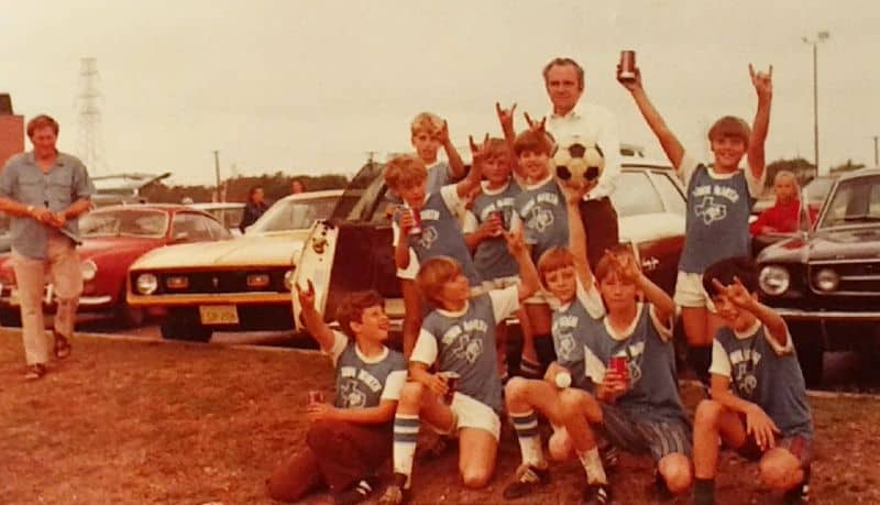
Dallas soccer. [I’m pretty sure Brinke is in the front row, holding up the soccer ball. — PH]
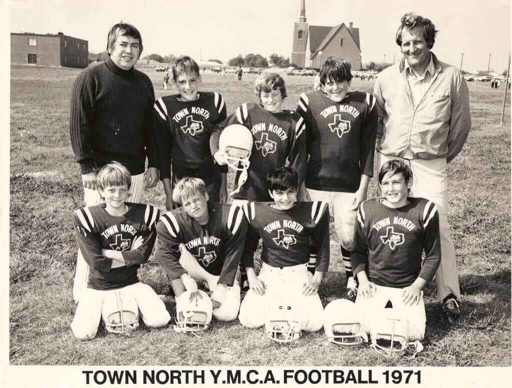
Dallas YMCA, 1971 [And I think Brinke is at the bottom left in this one — PH]
The Ticker
By Anthony Emerson

Baseball News: All MLB teams will wear patches honoring the Negro Leagues on Sunday. Some teams will also be wearing Negro Leagues uniforms — the Marlins have already unveiled theirs. Phil will have more on Monday. … Here’s another article confirming the Twins are undergoing a review of “all team branding” (from Steven Lobejko). … Benjamin Dallman noticed Royals P Trevor Rosenthal doesn’t have a tiddle over the “i” on his road jersey. … Dick Allen’s No. 15 will be retired by the Phillies. “[O]nly the second number 15 retired by any team in MLB. The only other one is Thurman Munson with the Yankees,” says Michael Stoudt, while @PhillyPartTwo has some more stats for you. … Barry Larkin is associated with the No. 11, but when he first made his debut, he wore No. 15 because No. 11 was taken by fellow SS Kurt Stilwell. After Stilwell was traded, Larkin snatched 11, and the rest was history. … The Mets have installed a bubble gum dispenser in each dugout, probably to avoid having players touch multiple pieces while reaching into a bucket (from Max Weintraub). … Because it’s 2020, the Long Island Ducks had a virtual ceremony for their 2019 Atlantic League championship rings (from Kary Klismet).

NFL News: The Dolphins have unveiled the patch they will be wearing in honor of HC Don Shula, who passed away a few months ago. Another look at the patch here, and an application video here (from multiple readers). … The Patriots’ website shows two different fonts for the “1” numeral on their new home unis. The numerals on Cam Newton’s and Julian Edelman’s jerseys are identical to the numerals used from 2000-2019. However, NFLShop.com shows Newton and Edelman’s “1” numerals in the font worn by Deatrich Wise Jr. and Matthew Slater. So I wonder if Edelman is wearing last season’s Color Rush jersey in the pictures, and someone screwed up on Cam’s. … Speaking of the Pats, twin brothers Devin and Jason McCourty wore matching T-shirts reading “I’m with the birthday boy” to camp. … Someone sent former NFL CB Adam ‘Pacman’ Jones a box of Steelers Joe Haden jerseys, and he burnt them live on Instagram (from Mike Chamernik). … One more from Mike: Back in the ’70s, the NFL had a special football for lefty quarterbacks — the left-handed football had stripes on the opposite panels so the QB’s thumbs wouldn’t slip on the paint (also from @texastrevor). … New Packers wideout Malik Turner will wear No. 82. That article also has a list of every Packer to ever wear No. 82 (from David Dahl). … Some uni related shenanigans took place with a female visitor wearing Seahawks gear trying to sneak into the team’s hotel (from Mike Chamernik).
College/High School Football News: Virginia Tech has added face shields to their helmets (from Andrew Cosentino). … Unicoi County (Tenn.) High showed off its recently renovated football stadium (from Kary Klismet).

NBA News: The Sixers have unveiled their shooting shirt for the playoffs (from John Cerone).
.

Soccer News: The St. Louis MLS team has a name and a crest — St. Louis City SC. Announcement video here. On another note, this is the third “City” club in the MLS after Orlando City and New York City (from multiple readers). … The following are all from our own Jamie Rathjen: Liverpool have finally unveiled their long-rumored and oft-leaked change kit. … Watford, who were relegated from the Premier League to the Championship a few weeks ago, have unveiled their new home kit. … At the other end of the table, newly-promoted Championship side Wycombe Wanderers have a new home kit. The change kit is identical to last season’s except for a new ad. … The following are all from Ed Żelaski: New home and away kits for Polish club Górnik Zabrze, and three new kits and plus a new keeper kit for fellow Ekstraklasa side Wisła Płock. … New home shirt for SC Freiburg.

Grab Bag: New logo for North Allegheny High School in Wexford, Pa. (from Kary Klismet). … While watching Top Gun, Michael Cooperman noticed that Goose and Maverick were having helmet sticker issues. I wonder if this was intentional from the filmmakers. … The commission choosing Mississippi’s new flag have narrowed submissions down to a final 147. It will further narrow the field down to 5 in the coming weeks (from Timmy Donahue). … Paul, avert your eyes — Jimmie Johnson’s new paint scheme is purple and white (from Jakob Fox).
And finally… big thanks to Logan for the “What They Should” series, as well as to Robert for sharing the Bubble Baseball bit and everyone else who contributed to today’s post. You guys are all ACES!
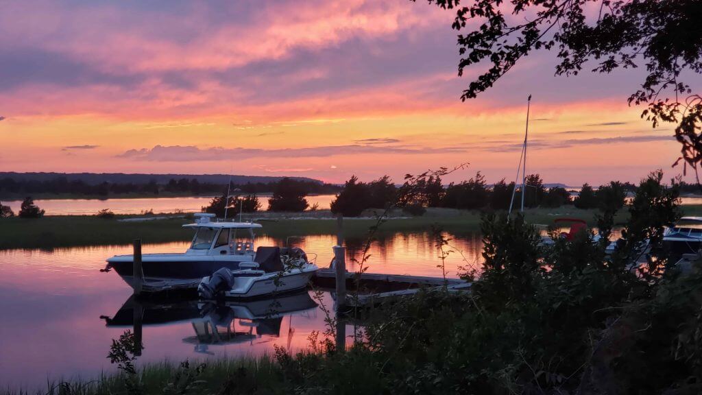
As some of you know, I spend a good amount of time in the summer at my family place on the east end of Long Island. The house is located near the end of a road that ends at a harbor, which, oddly for the east coast, faces west, and as such I’m treated to some glorious sunsets (I literally have about 100 or more captured on my phone). I had thought of sharing a sunset photo-a-day, much like Paul has been doing with his Pandemic Porch-tails, but while each one is slightly different, they’re still pretty much all sunsets. Still, every so often we’ll get a really spectacular one. Yesterday was one of those days — I actually snapped the photo below just after sunset, when the colors seem to be even more vibrant. If you guys want me to post a couple more of the better ones as a post-script, just let me know in the comments below and I’ll do so. Anyway, here’s what greeted me last night:
.
Like Anthony noted in the ticker, MLB teams will be wearing Negro League Baseball throwbacks this Sunday, and I’ll have coverage of that on Monday. Be sure to watch those games this weekend, if you can. NLB unis are as good or better than almost all the unis worn in the bigs today, and well worth checking out if only for the aesthetic appeal.
Everyone have a great weekend. Unfortunately the blog is on vacation for the weekend, but I’ll be back Monday. Stay safe!
Peace,
PH
WHAT THEY SHOULD…: awesome, hope this is a return feature. Well-done, nicely explained.
SCOREBOARD: I don’t know the race, but that scoreboard is phenomenal.
SENTINELS: game effort, but just not working. Numbers are too disjointed, the ZIP code (not area code) is too vague, and a team of 53 sergeants seems odd. Love the name, though.
I’m from the D.C. area (but the opposite side) and I didn’t recognize what the ZIP code would refer to at first, before reading the description, without looking it up.
From looking it up, the stadium is in the next one over, though (20785).
Link for Packers #82 jersey goes to the Long Island Ducks video.
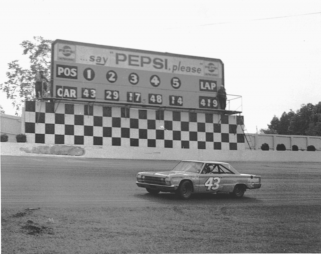
The scoreboard is from Martinsville Speedway in Ridgeway, VA. 1967?
Love the NASCAR content today – “Guess The Game…” and then Jimmie Jam in the ticker. Keep it up, folks!
Re Soccer: MLS started off with some bad nicknames (Wizards, Mutiny) but the pendulum has swung too far now to City’s, United’s, FC, SC…surely there are some original nicknames out there…
Also Watford: How is it that so many kit sponsors are gambling companies? Don’t more mainstream companies realize that virtually the whole world watches English soccer (premier league or championship)?
surely there are some original nicknames out there…
Sure there are. Pigeons, Herons, Toros, Loons, those are all fantastic names!
How is it that so many kit sponsors are gambling companies? Don’t more mainstream companies realize that virtually the whole world watches English soccer (premier league or championship)?
Of course they know that. So do the gambling companies, which is why they pay a ton of money for an ad on the shirt. In Watford’s case, the deal is worth $3.6M per year. For a team that has spent the last twenty years failing to hold on to a place at the bottom of the first division.
Pigeons? Dude, seriously?
Only if link is the logo…
Glad to hear that the Twins are looking into changing their leftover hot dish of a team identity. If I had my druthers, they’d return to 1987 and modernize from there: Add the updated S in the current script; Design a new TC logo that starts with the shape of the T in the script and adds a matching C; Incorporate the mustard as an accent across the uniforms so that it makes sense as an outline on the TC cap logo; Create a new road script that speaks the same design language as the home script; Set a firm rule against red alternates. For occasional Sunday home alts, alternate between 1961 home throwbacks and 1981 road throwbacks.
For the record: The Wild Things weren’t raided. From link:
They say they put together a comprehensive plan for limited attendance that was approved by Pennsylvania Department of Health, but Pennsylvania State Police says it received anonymous complaints regarding non-compliance to COVID-19 guidelines at Wild Things Park in late July. On Monday, police informed the Wild Things of those complaints via a phone call, and that prompted the team to shut down for the rest of their season.
Trooper Forrest Allison, Washington County public information officer with the state police, told the Pittsburgh Post-Gazette the call was to simply inform the organization of a warning and relay that further complaints could lead to possible punishment down the line. It was not to ask the Wild Things to stop playing.
Robert Brashear (sorry if I misspelled that) provided photographic evidence of why the Wild Things were shut down – its obvious simply from his images that they didn’t (or couldn’t) properly enforce social distancing guidelines.
Thankfully I’ve not lived there for 26 years but I still have deep ties to Pennsylvania. The state is Philadelphia at one end, Pittsburgh at the other, and North Alabama in between. Chock full of bull headed people who don’t listen to anything, pretend to respect authority of all sorts but never actually heed it, and with remarkable consistency do stupid things that wind up biting themselves in the ***, either individually or collectively.
It’s unfortunate that the Wild Things, or anyone else in MiLB, has to suffer the economic ramifications of what amounts to stupidity on the part of a stunningly large percentage of the American people.
Huntsville, Alabama (which is at the north end, for anyone who doesn’t feel like taking the time to look at a map) is one of the most educated and civilized places I’ve ever spent time in. I’m not as familiar with Harrisburg, PA (only been there once as an adult), but the impression I got there was absolutely nothing like you describe. Your description of central PA (and by extension, Alabama) strikes me as perhaps informed a bit more by emotion than by the facts.
I guess PacMan couldn’t have donated those $200 jerseys to a charity and not ignited a toxin-spewing fire on his driveway? Nah, he’s too gangsta’!
Who’s the ‘punk’?
Don’t mind the name Sentinels and have always liked the colors, but the imagery is a bad attempt at keeping what was there before. Thumbs down.
“Sentinels” to me is stodgy and static, like a statue. It cries out for a minuteman graphic to make it exciting.
A lot of team names feel “stodgy and static” to me, but can work anyway if the rest of the identity is well-thought and well-executed. Oilers, Nationals, Capitals, North Stars – each is a fairly static, impersonal name, yet each with varying degrees of success was a dynamic team identity. Sentinels could be as blah as, say, the Texans, but that won’t be mainly the fault of the name. Washington Sentinels is far from my favorite potential name, but of the names that are most likely under consideration, it’s the one that would satisfy me most.
I hope that Mississippi doesn’t go with flag K1107. The last thing we need is another state whose flag is just the state seal on a blue background. Nearly half of the US state flags are already like that.
link
link
Agreed. Nothing more uninspired than a seal. The states that have great flags really stand out!
The state also has an excellent coat of arms, but none of the current designs use it. I’d like to see a bright blue flag with the shield on it:
link
There’s no way to make a seal-on-a-sheet state flag good, but it’s possible to make it at least not suck. See Iowa. If Mississippi must go with a seal-on-a-sheet flag, just don’t put it on blue. Not light blue, not royal blue, not navy blue. Red, or on top of 13 red-and-white stripes, or on white between two vertical red stripes, or something, anything other than seal on a blue sheet.
I vote for more sunset photos! Always nice to get a glimpse of someplace else these days! Thanks for all you do, Phil!
Love the redesign for the Arizona Wildcats. Long time UofA fan (there aren’t many of us; and it’s painful being a football fan at a basketball school) who grew up in Arizona. Their uniforms have been a mess since they ditched the Desert Swarm era duds. Was so happy they brought them back this year for a one-off. I never would’ve thought to adopt the Dolphins colors but it works quite well. Navy and blue is so trite in every sport. Always comes off uninspired; especially when you’ve already chosen Wildcats as your mascot. The unique red/white/blue helmet stripe back in the 90s always did give them a unique look. But I love this look. They played with copper helmets years back and and it was a bit of an eye sore paired with navy and cardinal. I actually wouldn’t mind seeing these on the field.
What Oregon does is what Oregon does but I’ve always enjoyed their more classic and simple designs.
Great work!
Those Arizona uniforms are spectacular. But I worry they might fall afoul of the Zeitgeist of protecting the intellectual property of American Indians. I can happily imagine they were in fact designed by an Indian artist, whether or not that was the case. But they look great.
Thanks so much! Was curious what actual UA fans would think of them.
Great photo of Richard Petty at Martinsville Speedway. I had three heroes growing up and got to meet two of them: Richard Petty, Bart Starr, and Walt Disney (did not meet). As veteran sportswriter Vic Ketchman says, “Memories make us rich.”
Keep the sunset photos coming.
Seeing Petty in the vintage Plymouth Belvedere made my day!
Love the sunset photos! Do you have a friend in your hood who can do “sunrise” photos also?
That is cool about MLB instituting the Negro Leagues’ 100th anniversary patch for all the MLB teams. I remember when the Seattle Mariners were only team back in 1995 to wear the 75th anniversary patch. They wore it the whole season, I believe.
It’s cool to see MLB added the Negro Leagues’ 100th anniversary patch to the uniforms. The Seattle Mariners were the only team to wear the 75th anniversary patch back in 1995. I believe they wore it all season long.
Took road trip last week and sampled Northwoods League and American Association independent ball for five days. Milwaukee, Wausau, St. Cloud, Willmar. Also checked out Sioux Falls earlier in the summer.
Tickets bought online (actually convenient), employees in masks but not most of the fans and also hardly any of the players or even coaches. Some dugouts have been cramped (no social distancing) as they usually would.
Attendance was modest, although pretty good in Willmar on a Sunday. No stupid temperature checks (got word they have been performed at La Crosse NWL venue and St. Paul Saints).
It has gone reasonably well, some teams opted not to play this season, the Rochester NWL team paused its season for one week due to one positive test – but other than that it has been smooth.
The AZ Wildcat design is out of this world! Great looking and very identifiable.
Thanks!
Beautiful sunset photo. Would love to see more!
Anybody know the significance of the font on the Shula Patch? I’m thinking it is the NBC Sports logo from the early 1970s and that would be clever if it is.
link
Holy crap Logan Patterson, those Oregon Unis are fantastic. Much better than anything they’ve worn since switching to the Nike designs. Well, with the exception of the “The Pick” throwbacks. Nice work, thank you for that.
oh and Go Ducks!
Fantastic look for an Arizona team. School should immediately change to those colors and graphics.
According to baseball reference, 23 players have worn #15 since Dick Allen left the Phillies. Not much of a “retirement” if you ask me…
I was thinking the same thing.
Surely there is a better way to honor a player than to permanently deprive every future player of wearing his number while not worrying too much about the nearly two dozen who wore it in between him leaving the team and the decision being made.
I like some concepts, I dislike some concepts. In almost all cases they shouldn’t be more than a ticker item though. Never the lede.
Lee
That Oregon look? Yes! The Arizona, not so much.
Interesting stuff about the WildThings. I heard the state police story but I didn’t know it was some offshoot, barnstorming type thing. I just assumed it was the Frontier League business as usual.
I have to get that Sammies cap!
Always fun to see & read other’s creative ideas. My preferences:
Washington Sentinels -name ok, but helmet is a BIG nope because too much like departing design. They actually need a TOTALLY new identity.
Arizona -design YES! Color scheme, not quite. Agree with other reader that COPPER and TEAL would feel more Arizona.
Oregon -yes. I like that they go crazy with designs, but this is a great “basic” uniform (I mean that in a good way).
Nice sunset!
-JF
The scoreboard may be the Old Dominion 500, Sunday, September 24, 1967 at Martinsville Speedway. At least, the positions with 81 laps to go are the same as the final score. King Richard cruising to his ninth consecutive win.
Ding Ding Ding. We have a winner.
Here’s the writeup Chris sent me for that scoreboard:
Nice sleuthing.
Winning by FOUR laps, those days are LONG gone!
I’m glad that there were a number of UWers who enjoyed that scoreboard photo!
I’m disappointed that I wasn’t able to ‘stump the band’ ; )
Where’s the best place to send scoreboards? Your contact details appear not to be in the article.
That one, by the way, is beautiful.
link
More sunsets, please!
And the gallery of flag commission selections is expired. Anyone know where we can still see the selections?
HISTORY IN CHICAGO! According to baseball-reference.com , Cardinals P Genesis Cabrera becomes the first player EVER in MLB history to appear in a game wearing uniform #92!
Very unpleasant news for us traditionalists: link
These days, with the quality and sophistication of TV computer graphics, NOBs are less necessary than ever. If anything, they should be making the numbers a little taller so that people in the stadium can read them more easily.
Is it me, or does this site lack when Paul is missing
Oregon football makeover: very well done. My only nitpick would be to drop the white outlining around the “O” on the helmet.