[Editor’s Note: Paul is on his annual August break from site. Deputy editor Phil Hecken is in charge from now through the end of the month, although Paul may be popping up here occasionally.]
By Phil Hecken
Follow @PhilHecken
The Buffalo Sabres unveiled two new uniforms and a new logo yesterday, and you’d be forgiven if you got a sense of déjà vu all over again. For all intents and purposes, these “new” uniforms are a return to the look the team wore from its inception in 1970 through the 1995-96 season — but with a few minor differences.
The fans have been clamoring for a return to the royal and gold color scheme basically since the team abandoned it (and suffered through a series of bad-to-awful uniform sets in the years since). Before we look at the new get-ups, let’s first see what the inspiration for the new uniforms was (for all images you can click to enlarge):
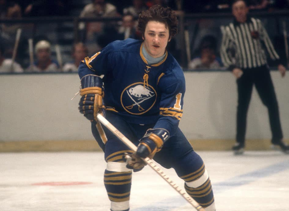
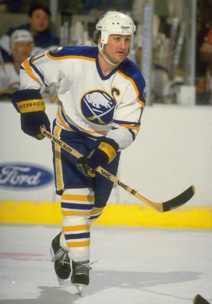
That is essentially the uniform the team wore from 1970 thru 1996. The new uniforms attempt to replicate that overall look, but as mentioned, there are a few slight differences between the two.
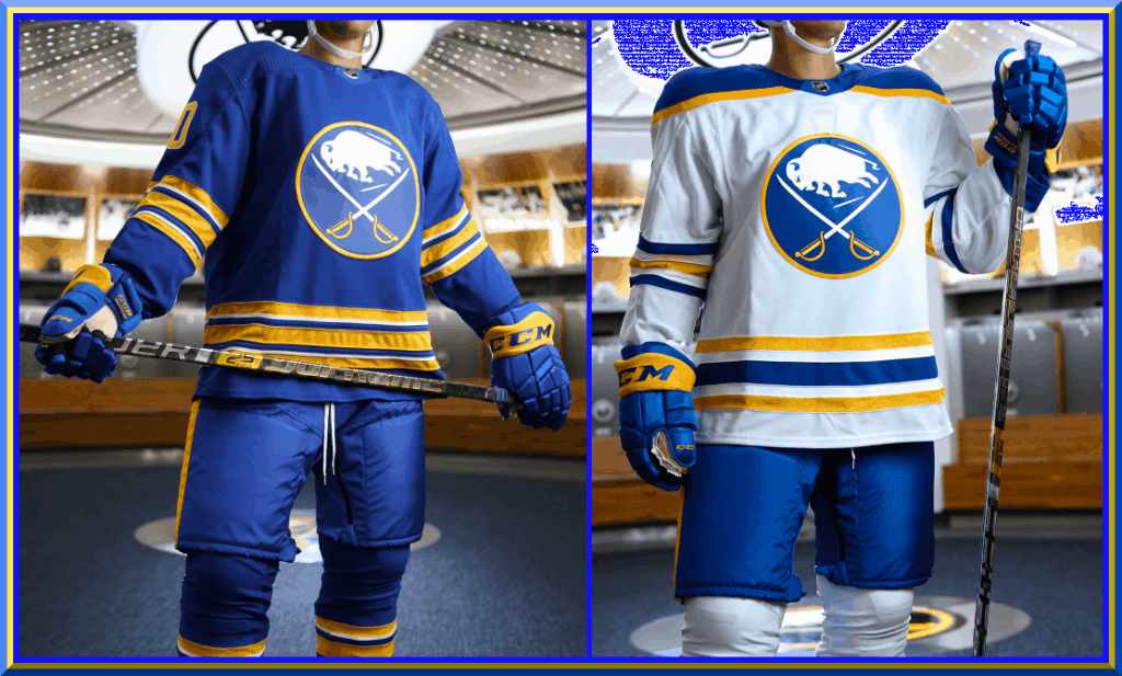
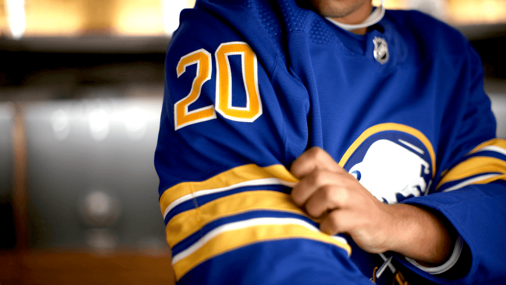
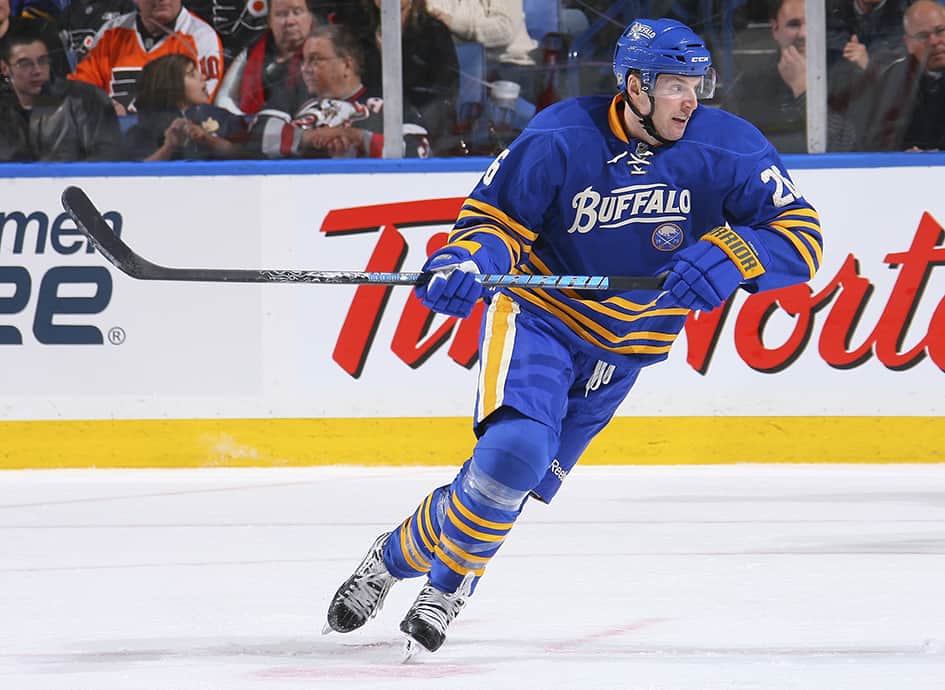
Let’s look at the home (dark) uniform first.
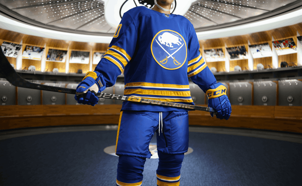
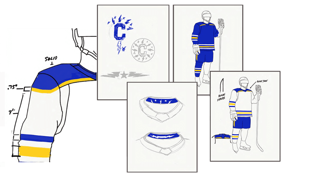
As you can see, the team has returned to the royal shade of blue that made up the first quarter-century of their existence. The jersey features a slightly larger crest than the original (more on that in a second) which is slightly different than its predecessor, and the sleeves and hem feature three gold stripes, separated by a thin white stripe of the bottom of the top stripe, and on the top of the bottom stripe. That pattern is repeated on the sleeves. The white stripes are new — those were not a part of the original jersey, which had three solid gold stripes.
The new jersey features gold numbers outlined in white:
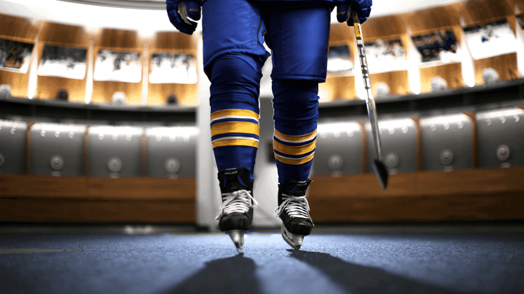
That feature mimics the original. The pants have a gold stripe down the sides. The socks that will be worn with the home jersey also mimic the striping pattern found on the jersey:
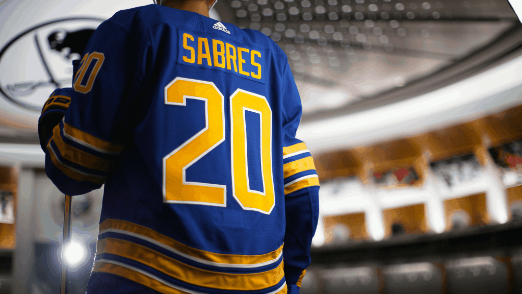
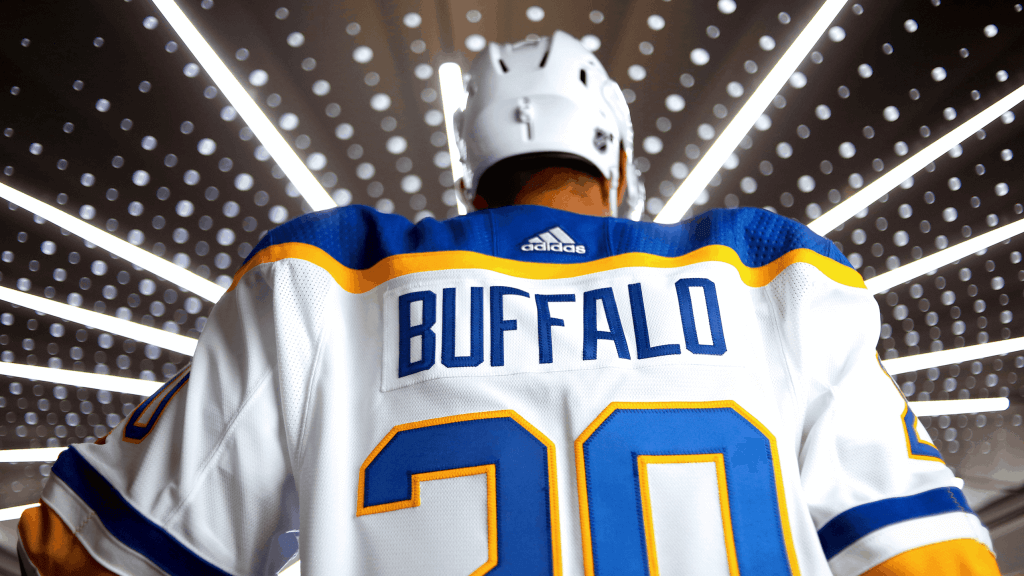
In what is seemingly becoming a rarity these days with jersey reveals, the team also showed a look at the back. The numbers will be gold with a white outline (same as on the shoulders), and the NOB will be solid gold in a basic block font:
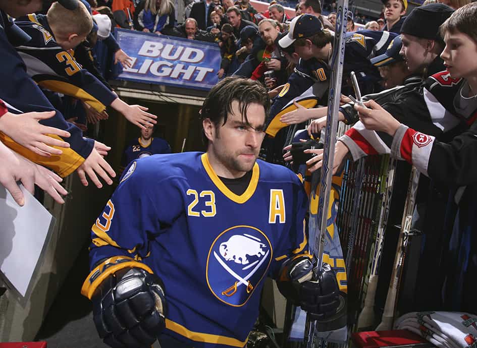
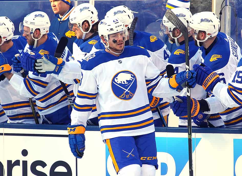
The new away (white) jersey also bears many similarities to the original.
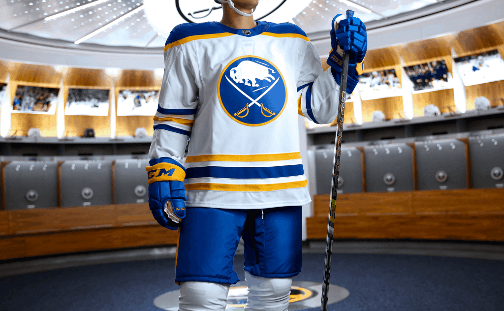
That jersey had an interesting quirk: the striping pattern on the sleeves was blue/white/gold/white blue, but on the hem it was the opposite: gold/white/blue/white/gold. In an attempt to recreate that look, the new white jersey also features the mismatched striping patterns. The shoulder yoke, like the original, is royal with a gold stripe wrapping around it.
The socks which will be worn with the white jersey have the same striping pattern as on the sleeves:
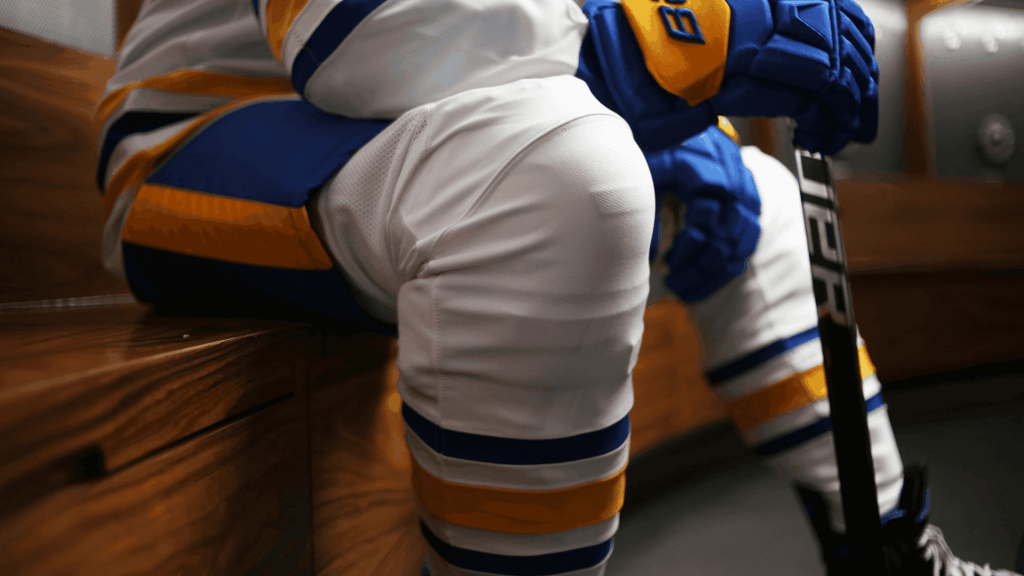
Interestingly, in the original uniforms, the team wore multiple sets of stripes on their socks (both home and road) — with the new set, the socks have just one set of stripes (mimicking the sleeves on the white, and the sleeves and hem on the royal).
Numbers on the sleeves and back of the jersey are blue outlined in gold. NOB is solid blue, in the same basic block font as the home jersey (and on a nameplate):
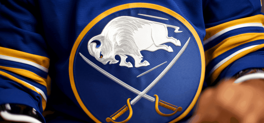
I mentioned above the crest, aside from being larger than the original, is slightly different. How different? The differences are almost negligible, and only uni watchers will probably notice (or care), but our pal Chris Creamer over at SportsLogos has detailed the discrepancies.
It’s a good looking crest (and always has been):
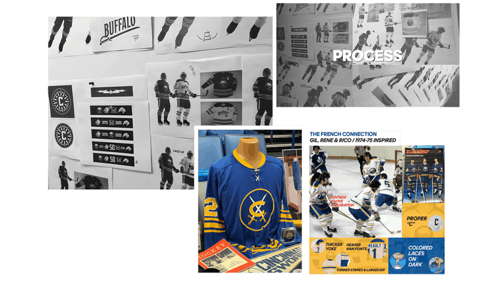
The team also provided surprising details on the new jersey/uni design, starting with this nice graphic:

They also provided several graphics to give more detail into the design process.
Design Goals
Our goal throughout this process has been to create a timeless uniform system that respects team heritage and looks boldly towards the future as well. Returning to our beloved royal blue was just the start – we wanted to create something truly unique. To do that, we needed to identify key elements that harken back to what’s made this franchise so special through the years.
Old Meets New
Neck Detail – The inner neck collar is our way of paying homage to our hometown, touching upon the City of Buffalo’s official crest. This team enjoys an unparalleled bond with the community at large, so it felt appropriate to honor that within the jersey itself.
Striping – We wanted to pay tribute to the striping patterns of the past but also introduce some nuanced detail. We layered some simple white piping on top of the gold stripes to accomplish this. In conjunction with Adidas, we also developed the white uniform shoulder striping.
The Final Design
Crest & Main Logo – The crest has been slightly simplified from the original, with silver accents removed to create a sleek modern appeal. Also, details first seen in the 50th season jersey crest have been carried over to this uniform system, most notably the stitching pattern in the buffalo.
All in all a very nice job! Even though the fans have been clamoring for a return to the full-time royal and gold unis since forever, the team has teased this look a few times over the years.
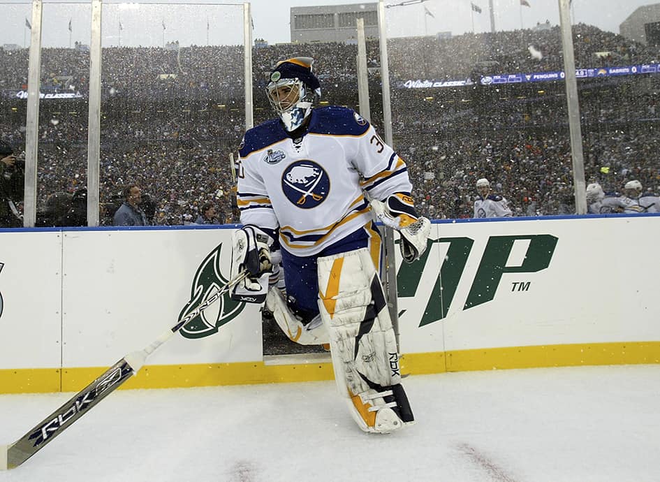
The team basically returned to this look for the 2008 Winter Classic:
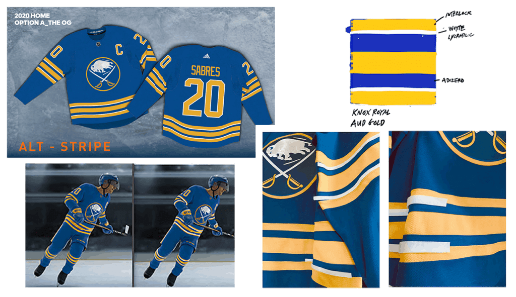
In 2006-07, the team wore a royal alternate:
In 2010, for the 40th Anniversary, the team broke out a royal blue alternate (which they wore several more times into the 2012 season):
And for the 2018 Winter Classic, the team again sported a royal-based uniform with many elements from the original, but with some striping differences:
As I like to say, there are some teams that “got it right the first time” in terms of their uniforms, and the Sabres were definitely one of those clubs. They will look great (again) in time for the 2020-21 season (if there is one — it’s expected to begin in December of this year, assuming the coronavirus is under control by then). But no matter when they break it out, it will be spectacular! My one complaint is the addition of the new white piping on the royal jersey/socks. I know designers think it makes them “pop” more, but I think the original, with just the gold stripes, was better. And as much as we all like striped socks, keeping the new sets to a single set of stripes is a marked improvement. The rest (including the very very minor changes to the crest) is basically a throwback to the original set, which was awesome.
Wanna see a bit more? Here’s the hype video:
Readers? What say you?

Guess The Game…
from the scoreboard
Today’s scoreboard comes from Cey Hey Kid.
The premise of the game (GTGFTS) is simple: I’ll post a scoreboard and you guys simply identify the game depicted. In the past, I don’t know if I’ve ever completely stumped you (some are easier than others).
Here’s the Scoreboard. In the comments below, try to identify the game (date & location, as well as final score). If anything noteworthy occurred during the game, please add that in (and if you were AT the game, well bonus points for you!):
Please continue sending these in! You’re welcome to send me any scoreboard photos (with answers please), and I’ll keep running them.
The “BEST OF” Kreindler’s Korner
Hey guys & gals. You’ve enjoyed Kreindler’s Korner for several years now, mostly on the weekends, on Uni Watch, but with the recent coronavirus outbreak, Graig’s time is just too precious and he needs to tend to other things besides coming up with a new writeup each weekend.
So, going forward, for as long as the COVID-19 situation is bad in New York, I’m going to run a few “Best of’s” until Graig returns.
Here’s today’s offering:
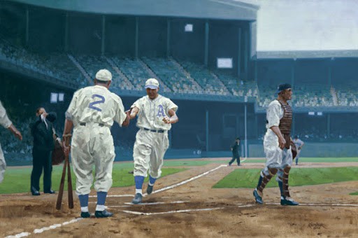
Title: “The Beast Bangs Gomez, Yanks”
Subject: Jimmie Foxx, 1933
Medium: Oil on linen
Size: 50″ x 38″In the late 1920s and 1930s, the general consensus around baseball was that Jimmie Foxx of the Philadelphia A’s was the right-handed Babe Ruth. With his bulging biceps and broad body, Foxx drove fear into the hearts of opposing American League pitchers with his savage swing. It was he who posed the biggest threat to the Babe’s single season homerun mark by slugging an incredible 58 during the 1932 season, a total that was not eclipsed until Roger Maris’ magical 1961 season
‘The Beast’ was no slouch the year after, winning his second consecutive MVP award, as well as the coveted Triple Crown, leading the league with a .356 batting average, 163 RBIs, and 48 homeruns.
The Hall of Famer’s dominance in 1933 was evident during this sparsely attended June 8 game against the New York Yankees. Here he is shown crossing home plate in the fifth inning of the contest, greeted by teammate, catcher Mickey Cochrane. The slugger pounced on Yankee pitching all day, as we see him triumphant after his third round tripper off of hurler Lefty Gomez. The Yankee left-hander never faired well against the slugger, and when approached by catcher Bill Dickey to decide how Foxx was to be pitched to, Gomez replied, “I’d rather not throw the ball at all”. Jimmie’s slug-fest resulted in a 14-10 win for Connie Mack’s A’s during this swelteringly hot and hazy summer afternoon.
Thanks, Graig! You can (and should!) follow Graig on Twitter.
And now a few words from Paul
Hi. In case you missed the earlier announcements, I’ll be participating today in a Zoom panel discussion about the use of Native American imagery in sports. The event, organized by Baruch College, will run today from 12:30-2pm Eastern and is a follow-up to a similar discussion I took part in back in 2016 (you can see video of that one here).
Registration for the discussion is free and can be done here. (If the page asks you which part of the “Baruch community” you belong to, just say you’re an alum, even if you’re not — it’s fine.)
Also:
• In case you missed it on Monday, Bill Henderson has just released the latest edition of his guide to post-flannel MLB jerseys — and for the next day or two you can get this new edition at a significant discount. I cannot stress enough how wonderful Bill’s guide is — I refer to it literally almost every single day, and I’m sure most of you will find it just as essential as I do (even though you don’t write about uniforms for a living). Full details here.
• I’m fully caught up on Uni Watch trading card orders — all orders have shipped. If you don’t yet have a card, you can get one here.
• Some inventory updates: We’re down to about 55 of the August pin, about 35 of the July bobble-pin, and about 35 of the key ring.
• In case you missed it last week, Brooklyn Branches T-shirts are now available in home white, road grey, and green and brown alternates.
• If you haven’t already check out the Uni Rock Shop, there’s no time like the present.
Okay — now on to the ticker.
The Ticker
By Lloyd Alaban

Baseball News: MLB Network was caught using the Marlins’ old logo, which the club hasn’t used since 2018 (from multiple readers). … Blue Jays 1B Vladimir Guerrero Jr wore a bucket cap during warmups last night against the Marlins (from @EJL1984). … The Tennessee Smokies, the Chicago Cubs’ affiliate in the Double-A Southern League, have unveiled rendering of their proposed new stadium (from Kary Klismet). … Reader Kevin Cearfoss made a 3-D wall art rendition of the Astros logo.

Football News: The Patriots released photos of players in the team’s new uniforms, and there are a few number font inconsistencies (from many readers). … Reader Nicklaus Wallmeyer found a Steelers figurine with a Packers nose bumper. … Before the Bengals, a group of people formed Cincinnati Romans, Inc. in hopes of landing an NFL franchise in the city. Here’s what they could have looked like (from Timothy Jenkins). … Virginia Tech announced their new numbers (from Andrew Cosentino). … New turf for Big Cat Stadium in Morris, Minn., which serves as the home field for the University of Minnesota-Morris Cougars and the Morris Area High School Tigers (from Kary Klismet).

Hockey News: Here are the logos for the Motor City Rockers, the newest team in the FPHL (from Christian Gardecki).
.
.

Soccer News: German club 1. FC Köln publicly called out a fan who canceled their club membership because the skyline on the club’s new second shirt includes the city’s mosque (from our own Jamie Rathjen). … New away shirt for the New York Cosmos (from Ed Zelaski). … Also from Ed: New home shirt and kit manufacturer for Pogoń Szczecin. … One more from Ed: New shirt for Zagłębie Lubin.

Grab Bag: New home shirt for Newhampton Saints (from Sy Hart). … Here’s a helmet made of trophy plates you might see at this year’s Indianapolis 500 (from Omar Jalife). … New uniforms for the Lenawee County (Mich.) Sheriff’s Office (from Kary Klismet). … Also from Kary: Team Canada unveiled its uniforms for the rescheduled 2021 Olympics and Paralympics in Tokyo. … Disney has renamed its three TV studio divisions — 20th Century Fox TV, Fox 21 TV Studios, and ABC Studios — to 20th TV, Touchstone TV, and ABC Signature. All three have been given new logos. When Disney bought Fox, the deal required the Fox name to be removed from all branding (from @PhillyPartTwo). … New logo for the Biden campaign, which includes his recently-announced running mate, Senator Kamala Harris of California (from Anthony Emerson).
And finally… that’s all for today. Love to hear what you think about the Sabres new unis!
Catch everyone tomorrow.
Peace,
PH
Sabres should have gone back to the Black & Red uniforms
Bite your tongue. They were fad-driven monstrosities. Ugly buffalo, overwrought fonts. Bad, bad, bad.
The buffalo logo was horrible, but I don’t think that era of Sabres unis was a total loss. The red third jersey was nice. Classic-looking logo, and I liked the “BUFFALO” across the bottom.
Black & red is what Sabres were successful wearing. Associate with the era with the most success. You could take the black and red jerseys, modernize the font And striping and it would still look great.
Blue and gold is associated with sabres mediocrity.
BTW, Bills should go back to red helmets too
I mean, the blue and gold went to a Stanley Cup final and won a Presidents Trophy, but sure, that’s just mediocre I suppose.
Yeah, Matt – quit having an opinion on uniforms! You will like what others like.
I enjoyed the black/white/red era. It had its place.
Not sure Drew is even commenting on the uniforms, Luke. It seems to me he’s just pointing out the “French Connection” might object to the black and red era being the “most successful”.
And I agree with him.
While I do like the uniqueness of the black and red era, I’d be fine with them trotting it out as a heritage jersey once in a while, as a nod to the late 1990s-early 2000s. But the original royal blue and gold design is elegant in its simplicity, and the lore behind it does stand for something.
As a Sabres fan, I really love the uniforms. They should have never changed them in the first place. I’m also not sure about the white. Doesn’t quite look right, although, it probably won’t be all the noticeable on TV or from the stands. Buffalo radio was saying yesterday that the white part of the stripe was a direct request from team owner, Terry Pegula. Overall, it is very exciting to be able to ger royal blue Sabres stuff again. Hopefully never again with the Navy.
The crest detailing is definitely the best part of the Sabres new uni IMO. It gives the Buffalo a sort of lifelikeness, and I love that about it.
Agreed. When I first saw it in close-up photos, I thought it was beautiful but probably pointless. But the full-body shots above show that although it is subtle, the mane stitching is visible. As is the more linear texture of the blades. A vast improvement over the original, flat white logo, and that was already an exceptionally beautiful logo.
As for the white stripes on the blue uniform, although it struck me as a little odd, I also feel that they work nicely with the textured white of the crest.
Between Seattle, Ottawa, and now Buffalo, has any league had a run of three consecutive new uniforms of such quality? Although I guess Ottawa isn’t official yet.
No disrespect to Phil, but I really wish we could get a full review from Paul on the Sabres new uniforms. Does he normally come back around with his standard review of new unis that are revealed when he is on break?
I’m doing tomorrow’s Ticker (pinch-Ticker for Alex), so I’ll also include a few thoughts about the Sabres. Meanwhile, let’s hear it for Phil for his coverage today!
Agreed! Phil’s review and analysis are very well done. As a fan of the team though, I’d love the new unis to receive the “gold standard” review with the same level of analysis and scrutiny that you provide for other new uniforms!
Yup, Phil hit this one out of the park.
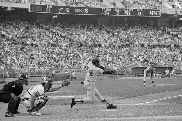
GTGFTS: Oct. 14, 1973 – World Series Game 2
link
Of some note in re that game. At the time it was the longest World Series game to date at four hours 13 minutes. A 42 year old Willie Mays had two RBI.
Mays popped up in this at-bat but would single in the tie-breaking run in the 12th–his last hit in the major leagues.
Northampton Saints Rugby Club, not Newhampton.
Proofreading: “Souther League” in the Baseball section
Fixed. Thanks.
Mildly interesting: Max Chilton’s Indy 500 helmet spells Dario Franchitti’s last name as “Franchiti.”
The Borg-Warner trophy has it spelled correctly with two t’s.
link
While I like the Sabers uniforms a lot on an island, they just look too similar to the Blues now. I’m generally of the opinion that teams should not adopt the exact same colors as others, or else they look to similar, especially if they are applied so similarly in uniform design. And yeah I know there is a lot of that already, especially with blue and red. I prefer my Blues in royal blue and yellow, and Sabers in navy and yellow. You can make the argument that the Sabers started out with royal blue, but I’d just say the Blues were blue and yellow before them so from the beginning they’ve been too similar.
The Blues have quite a bit of navy blue in their set.
True. Though I’m assuming at some point they’ll wise up and make their all royal throwback the primary, since it is far superior.
I certainly hope not. I love that they have multiple shades of blue on the same uniform. Just a really nice look IMO. I wish more teams (like Seattle) would try that approach, with different colors.
Besides the navy, their primary blue is a bit lighter shade as well. Plenty enough difference.
Flames, Blackhawks, Devils, and Senators pose a much greater threat.
I know, and it is unnecessary too. The Flames shouldn’t have black to begin with, just red and yellow. And while I don’t think it looks as good as red and black, the Devils should go back to their original red and green.
Flames may not have black much longer. We will need to wait and see.
If you were commish and in charge of such things, who would you allow to keep black/gold between the Pens and Bruins? Do the Pens keep so Pgh can continue to be sartorially matching, or do the Bruins keep it because they were first?
If I was commish I would fund a program for fans who falsely believe the Bruins and Penguins are black and gold and educate them that it is called yellow.
Please see Vegas Golden Knights/New Orleans Saints for gold,..this is a recording.
I actually like that the Blues have multiple blues. Just so long as they don’t ever do anything like the 2007-14 Edge unis with that awful piping and those clownishly huge shoulder panels ever again!
I never minded the Sabres in navy, but the royal just pops. Well done in returning to such a classic look.
Seeing how my membership card is the original white Sabres jersey, you’ll never hear me complain about these coming back. That said, I’ve never been in the camp that loathed the shift to red and black (well, except for that awful red third jersey). That was the look throughout my formative fandom years, and was what took them into the Cup finals (still not a good goal!), so there’s historical significance to that look as well as the original.
As long as we never have to see the Buffaslug again, everything will be all right.
I was a fan of the slug uniforms only because it was a return to the blue and gold and it marked a really great season. That said, the logo was actually crazy. I’m not sure why they didn’t keep the buffalo head logo from the red and black uniforms and change the colors, but what do I know.
That said, I love the original crest SO much better, and I’m thrilled with these uniforms.
Yeah, I thought at the time that the Buffaslug was almost hilariously bad, but the whole black-and-red era had sort of gone by without me noticing (the North Stars relocation turned me completely off the NHL for a few years). Compared to the black-and-red era, the Buffaslug was a breath of fresh air and a tasteful, classy uniform set.
Don’t forget that the original uniforms also took them to the Finals in 1975.
The overall design of the original slug unis was a bit weird, with all the swooshy stripes. Really not a great design overall IMO. But I never had a problem with the slug itself. I always thought it was kind of a cool logo, especially the way they had the sword integrated into it.
I’ve always loved how teams from Buffalo have two big elements to play with in their logo and uniform design – both the city name and the team name. The Bills and Sabres have made good use of both. Is there another team that uses both the city name and team name in a logo/uniform?
Do the Philly Phillies count?
Reaching here, but the St Louis Browns used to have a patch of King Louis IX (aka St Louis) on their sleeve.
“Is there another team that uses both the city name and team name in a logo/uniform?”
New York Jets (city name on jersey, team name on helmet, both on primary logo)?
The White Sox used to on their road uniforms from 1967-1975.
Don’t forget the Buffalo Bisons. That has stood the test of time. (as well as being the only one incorporating the actual name of the animal)
I appreciate how the Sabres’ crest is a rebus. The Red Wings’ insignia is close, if you read the tire as standing for Detroit.
Anyone else cringe when the guy used a box cutter to open the box of jerseys in the release video?
Yes
The link for the home white Brooklyn Branches shirt isn’t working for me. Can you repost the link?
I probably don’t comment enough around here for anyone to notice, but I am a huge fan of white. I think it’s almost always necessary for proper color balance in a uniform. And even as a kid, I remember thinking that the Sabres’ blue jerseys needed some white stripes here and there. So I’m super happy that they did exactly that.
I do miss the shoulder logos. I know it’s kinda silly to have the same logo in three different places on a jersey, but I always liked the look.
October 14, 1973. World Series Game 2. Mets beat A’s 10-7 in 12 innings.
FINALLY a scoreboard I can not only identify, but get bonus points for being there.
Game 2 of the 1973 World Series – AKA The Andrews Game.
Oct. 14, 1973
Looks like the blank space in the logo between the two front hooves has gone from a dolphin to something akin to Jar Jar Binks.
Overall a great look. I’m a big fan of blue/yellow.
Sabres new uniforms are an A+, only wish there was a photo of the awesome helmet logo.
Is it just me, or is the Buffalo crest on the 2018 winter classic uni the same as the “new” crest.
It’s not the best picture, but comparing them they look the same to me.
I’m just going to call them the “Cincinnati Romans” now, even if the team doesn’t use it.
I love that the mock-up for the Cincinnati Romans included a sideline cape! And that helmet looks pretty cool too. Would love to see a full-sized version of that.
Arizona Coyotes not wearing the kachina jerseys tonight. Was that only for the first round?
Coyotes are the designated road team. Look for the kachinas in Game 3.
and game 4 (and 6 if necessary)
In the bottom of the fourth of tonight’s SNY broadcast of the Mets game, they tried to pass some cookies back and forth between the two broadcast booths. They have a clothesline between the booths and on the clothesline are some Mets stirrups. There is a lot of back and forth between the announcers, mostly calling them “socks.”
Game 2 1973 World series Oct 14 1973 Oakland California
NY Mets 10-Oakland A’s 7 12 innings
When I was a kid the hockey teams colours in our town switched from old LA Kings colours (Purple and Gold) to Buffalo Sabres colours. We were issued Sabres socks to match our new sweaters. They had all those extra stripes like the sabres had. I much prefer these with the matching sleeve stripes.