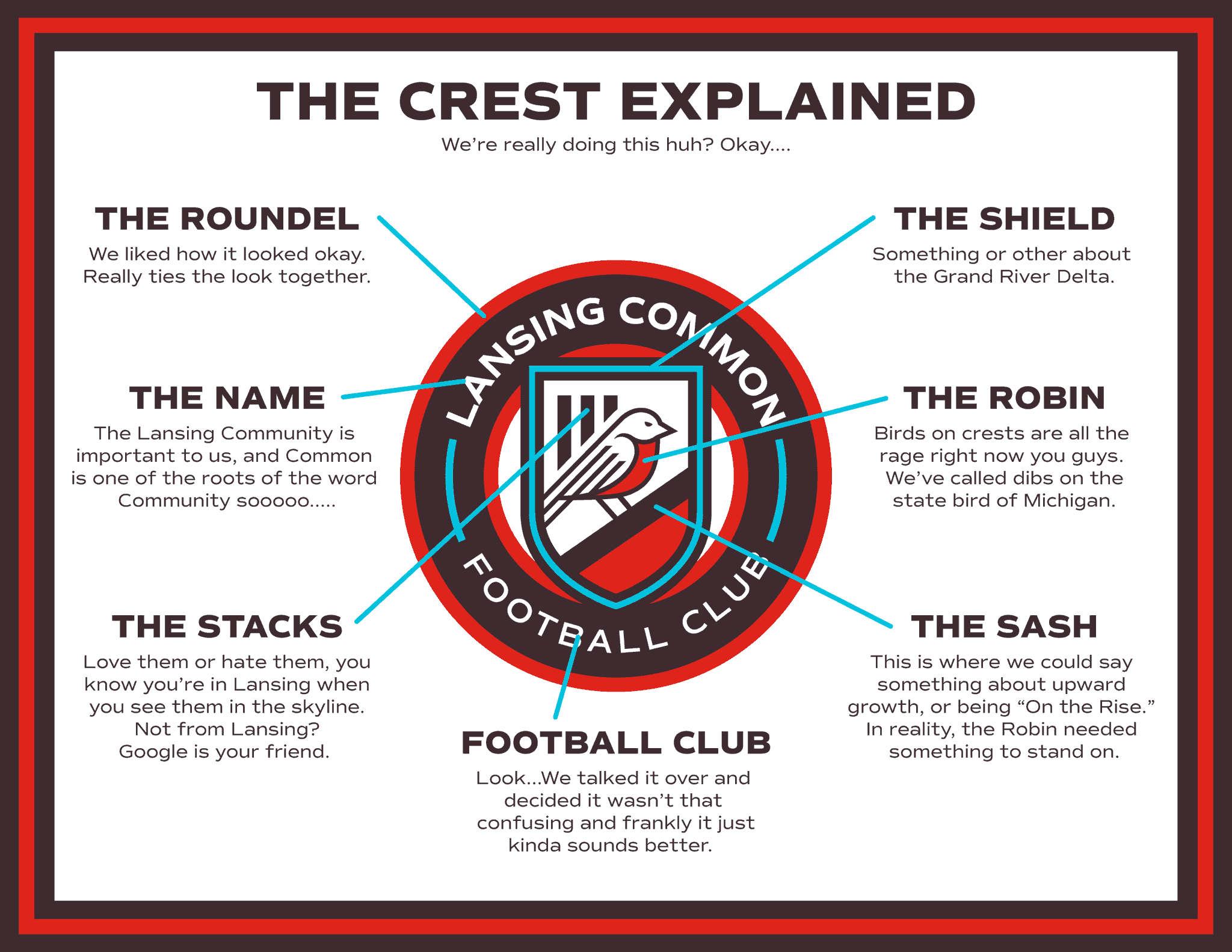
Click to enlarge
Lansing Common FC is a new community-owned soccer team in Lansing, Mich. I’d never heard of them until yesterday afternoon, when one of my Twitter followers, @29_Sunset, pointed me toward the team’s very entertaining breakdown of their new crest (shown above). So I retweeted it, along with the comment “Best logo/crest explanation ever.”
Within 20 minutes, my tweet had garnered nearly 200 likes (that’s a lot for me) and dozens of retweets (ditto), and it kept going from there. The team’s original tweet racked up even bigger numbers — pretty amazing for a new, low-level team most people have never heard of.
Granted, Twitter isn’t a valid measure of anything besides Twitter. And also granted, my Twitter followers might be more predisposed to the logo breakdown’s tone than the average sports fan would be. Still, it was clear to me that Lansing Common’s deadpan approach really struck a nerve with people, and with good reason. It’s not just no-bullshit — it’s anti-bullshit. (It probably doesn’t hurt that it’s also a very nice piece of design, irrespective of the explainer.)
I got in touch with the team’s designer, Geoff Sykes, and asked if he could tell me a bit more about the logo explainer. Was it his idea? The team’s? Here’s what he told me:
Lansing Common FC was founded by a large group of fans of the now-defunct Lansing Ignite FC of the USL and Lansing United men’s side that played in the PDL. After getting burned, soccer fans in Lansing wanted a team where our community would be at the heart of every decision we made, including branding. So we had workshops where people could come and give us thoughts and feedback on the brand. (More details can be found here.)
So about a week and a half before our launch, one of my friends who’s working on our social media side sent me a message that we needed some sort of explainer graphic. My initial response to him wasn’t really fit for print, but I reluctantly agreed. He laughed (he knew how much I hate logo explainers) and told me that I had free rein to word it and design it as I saw fit. So that’s how the idea of a joke explainer came about.
In terms of humor, it wasn’t hard to determine what approach to take. Lansing is a smaller city that was hit hard by the recession, and residents have sort of developed a snarky, self-deprecating attitude as a result. We have a joke around here that goes, “Lansing: a decent place to end up.” So I just sort of leaned into that by telling the truth in a funny way.
To me, the reason the explainer works is that it’s honest. As a designer tasked with including the important symbols of the club into one logo, sometimes you do just have to make decisions because it makes it look good. My personal favorite bit is about the sash in the shield — the bird really did just need something to stand on!
I feel that what puts people off about logo explainer graphics in general is the lack of authenticity. Not everything has to mean something for the sake of meaning something. That generally distracts people from the actual meaningful elements, possibly even minimizing their importance. People connect with honesty and authenticity, so I hope more brands take that into account in the future.
Nicely stated, Geoff. Couldn’t agree more.
Obviously, the financial stakes for a team like Lansing Common are low. But imagine if a top-level team — a Nike-outfitted team — decided to go this route. Would they be ridiculed? Or would they be hailed as geniuses for telling it like it is, embracing straightforward authenticity, and bursting the balloon of “storytelling”-driven branding that’s become the insufferable norm throughout most of the uni-verse?
It would be nice if one team — just one — would be brave enough to find out.
Until then (and even afterward), let’s all root for Lansing Common! Here’s their website.
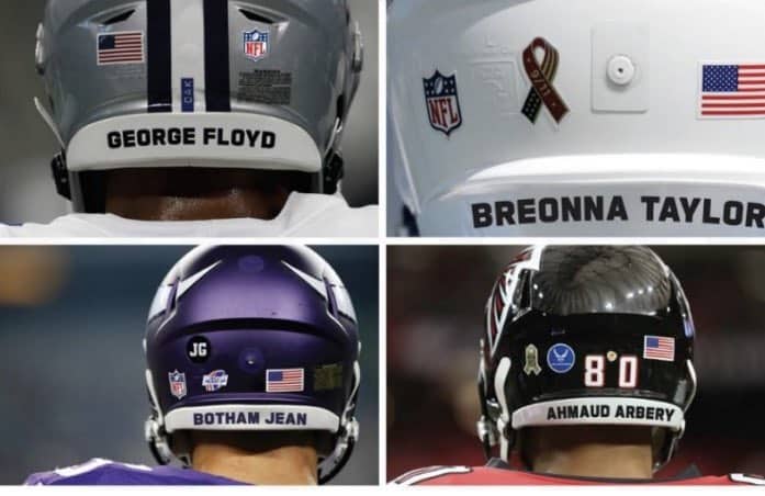
NFL update: It had previously been reported that the NFL would likely allow players to wear helmet decals honoring victims of police brutality or systemic racism. Yesterday we got our first peek at how that will look, and it turns out that they’re actually going with messaging on the neck bumpers, not on the helmet shells. Pretty sure that’s the first time we’ve seen the neck bumper used for any kind of commemorative messaging in the NFL. (Also, according to an analysis by Uni Watch reader Omar Jalife that I published last year, six NFL teams — the Browns, Chiefs, Giants, Saints, Steelers, and Washington — go with blank neck bumpers, so it will be new for them to have any sort of graphics or messaging in that spot.)
According to the NFL Network’s Tom Pelissero, “[T]he helmet decals are optional. Players will be offered a list of names, but ‘they can also select a victim of systemic racism who is not represented on this list.’ Can wear Week 1 or all season. Coaches have option to wear hat patch.”
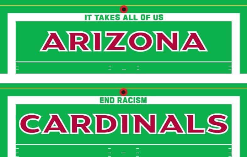
In addition, two new messages — “It Takes All of Us” and “End Racism” — will be added to the end lines of the end zones for home openers:
Also, according to ESPN, “[O]n each club’s seat covering between the 30-yard lines, there will be messaging thanking frontline [pandemic] workers.”
The latest in pandemicwear: Pirates third base coach Joey Cora has been wearing a cap with a clear plastic face shield under his helmet. He started doing it during summer camp scrimmages, at least as far back as July 15, but I wasn’t aware of it until reader Geoff Poole brought it to my attention last night. Have any other coaches been doing this?
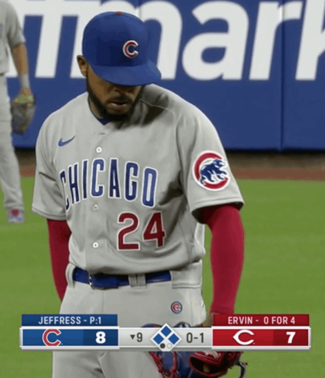
Red alert: Disturbing sight last night in Cincy, as Cubs reliever Jeremy Jeffress took the mound wearing red sleeves, instead of the Cubbies’ usual blue. Close inspection reveals that Jeffress did appear to be wearing a blue undershirt, so the red armwear was probably a pair of compression sleeves.
Someone needs to nip this in the bud, pronto. We’ve already seen MLB socks and belts become free-for-alls — the last thing we need is for base-layer sleeves to go that route.
(My thanks to @MMBSports for bringing this one to my attention.)
Click to enlarge
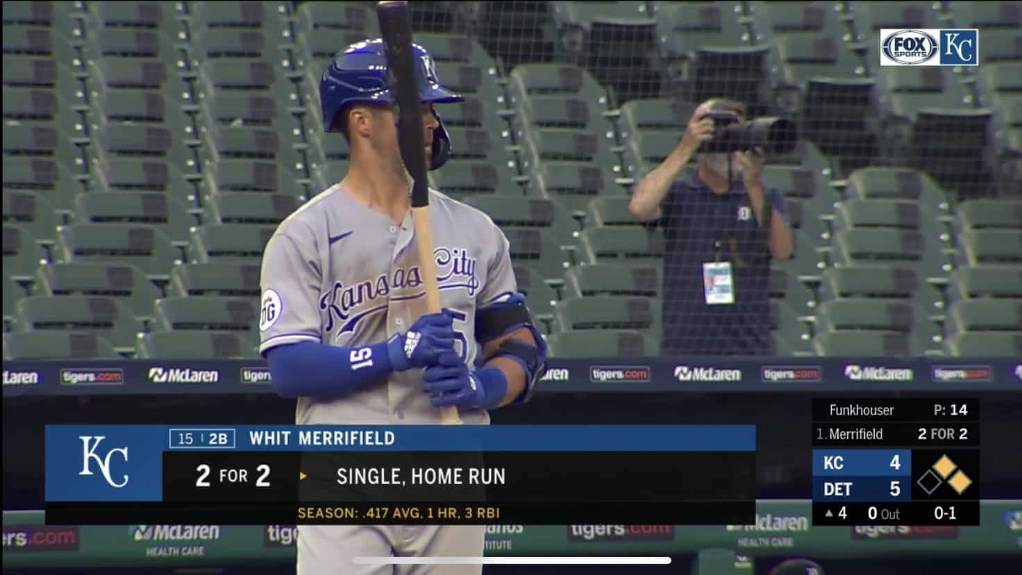
Law of unintended consequences: See how the seat numbers at the Tigers’ ballpark have been covered with black tape? What’s that about?
Turns out they did that two weeks ago because the glare from the metal number tags was distracting the players. Under normal circumstances, of course, the numbers would be covered up by fans sitting in the seats. But without fans in attendance, the number tags suddenly became a problem.
Who’da thunk?
(My thanks to Seth Kincaid for this one.)
Key ring reminder: In case you missed it on Monday, Uni Watch key rings are now available. The response to their launch yesterday was tremendous (thank you!), so move fast if you want one. Full details here.
Click to enlarge
Collector’s Corner
By Brinke Guthrie
Follow @brinkeguthrie
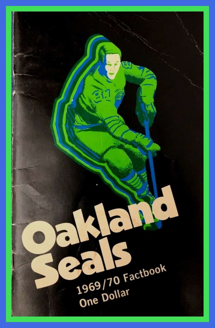
This 1969-70 Oakland Seals Factbook is a classic example of late-1960s sports art. Not familiar with the team name? Wikipedia says, “Initially named the California Seals, the team was renamed the Oakland Seals partway through the 1967–68 season (on December 8, 1967) and then the California Golden Seals in 1970, after two games as the Bay Area Seals.” Talk about an identity crisis!
Now for the rest of this week’s picks:
• Some more great sports art here, this time on the 1978 MLB board game
Steve Garvey’s Super*Star Baseball. It’s New! Fun! Challenging! With Breathtaking Action! It’s also, “an authentic quality game for kids from eight to eighty. Your friend, Steve Garvey.”
• Speaking of baseball board games, this one is called Leslie’s Base-Ball Game. It’s also known as “Perfection Base Ball” and dates back 111 years! From the Perfection Novelty & Advertising Co. of Cleveland, Ohio.
• This Cleveland Browns sweater is quintessential 1970s Sears. Dig the pull ring and bold striping. Made of 100% Orlon® Acrylic!
• These 1960s Cincinnati Reds glasses featuring Mr. Redlegs were sponsored by a local gas station chain, Tresler Comet. For some reason, I’ve never forgotten their 1970s commercials about their car washes. A guy pulls out in a Datsun (!) 240-60-80Z, and the voiceover says, “My friends think I’m crazy, but I think a clean car drives better.”
• One more Reds item: Charlie Hustle would put his name on anything! In the last few months we’ve featured his chocolate drink and candy bar, and now we have an unpopped bag of Pete Rose (Butter Flavor) microwave popcorn. No team logo on the cap, but the Mizuno logo is on the bat.
• Check out this NFL pigskin leather folder. A friend of mine at the Bengals gave me one years ago and I still use it!
• I’ve never seen the particular NFL player graphic shown on this 1970s St. Louis football Cardinals bumper sticker. Kinda reminds me of the art used on Fleer NFL Big Signs, like this one for the Houston Oilers.
• Staying in St. Louis for this one: I’ve always loved snow globes, except when they get that little bubble on the top. And that little bubble is present on this otherwise cool little St. Louis Blues 50th-anniversary snow globe from a few seasons back.
• A cartoony Joe Cool is depicted on this 1991 Joe Montana tackling dummy. He’s “Totally Durable & Hugable [sic].”
• This Yankees top hat logo pin was given out to team scouts in the 1950s.

Click to enlarge
KRC update: The latest installment of Key Ring Chronicles is about a pocket screwdriver. Check it out here.
The Ticker
By Alex Hider

Baseball News: Cubs LF Kris Bryant wore a mask during last night’s game in Cincinnati. According to Wes Muniz, he did not wear one during the first three games of the season. … Staying in Cincinnati, there was a lot of on-field ad creep at Great American Ball Park last night, including a mound ad and ads up the baselines. … Jakob Fox notes that at one point yesterday, there were three rosin bags on the mound during the A’s/Angels game. … Mariners P Taijuan Walker was wearing his “Black Lives Matter” and “United Through Change” patches on the back of his cap on Sunday, instead of on his sleeve (from Michael J. Miller). … Blue Jays LF Lourdes Gurriel Jr. was spotted wearing a mask with Vlad Guerrero Jr.’s number yesterday (from Pat Cahill). … Ryan Bower was watching the Mets and noticed a local ad that took a very direct route to obscure team names and logos they weren’t allowed to use. … Topps says its new baseball card featuring Dr. Anthony Fauci’s infamous first pitch sold more than 50,000 copies in the first 24 hours — an all-time record (from Jason Tierney and Paul Friedmann). … David A. Arnott wrote about the dimensions of the Rangers’ Globe Life Park and the trend of asymmetry for asymmetry’s sake. … Eagle-eyed reader Dwayne White spotted Reds coach Stan Williams smoking a heater in the bullpen during the 1991 All-Star Game. … Over the weekend, the Field of Dreams movie site in Iowa held a “First Responder Game” (hard paywall) featuring police and fire personnel from New York and Chicago. The New York team wore Brewers-inspired unis, while the Chicago team wore White Sox-style threads (from Jesse Gavin). … Hiroshima Toyo Carp will be having a Peace Night game on Aug. 7 — the 75th anniversary of the atomic bombing of the city. They will wear a patch with an origami crane and the Atomic Dome building (from Jeremy Brahm). … Elsewhere in Asia, the Samsung Lions of the KBO wear faux-sansabelt pants with a large yellow belt tunnel (from Jason Sonnabaum). … Mets DH Dom Smith became the latest MLBer to hike up his pants above the knee last night. He homered, so he’ll probably stick with that look for a bit.

Football News: Reader David Aycock found a nearly complete set of ’80s NFL helmet push pins in storage and went the extra mile to group them into proper conferences and divisions. … North Carolina has released the new number assignments for freshman defenders. S Ja’Quirous Conley will wear No. 0, the first player in program history to wear the number (from James Gilbert).

Hockey News: Architectural Digest has a piece about Seattle’s new arena and its goals to revolutionize green stadium/arena design (from Kary Klismet). … Here’s a series of really nice Seattle Kraken concepts (from @Z89Design). … Doug Adams notes that the logo for the Baltimore Blades of the WHA is strikingly similar to the logo for Royal Farms Arena in Baltimore.

Basketball News: It appears TV networks are adding virtual graphics on the court to help distinguish home and road teams during NBA scrimmages. Here’s how it looks with the Kings logo and Jazz logo (from @nomuskles and Darren Morey). … From this video shared on Twitter, it appears the at least some Blazers players were practicing on one of Orlando’s courts (from Paul Panganiban). … Reprinted from yesterday’s comments: The Rockets haven’t made any announcement about ending their ad patch deal, but their red uniforms were ad-free for recent scrimmages against the Raptors and Grizzlies (from Richard Hochroth).

Soccer News: Couple of stadium notes from Kary Klismet: FC Cincinnati has published a virtual tour of its new stadium, which is on track to open next season, and third-tier Spanish club Marbella F.C. has unveiled renderings of its proposed new stadium. … Two unveiling notes from Ed Żelaski: New away jerseys for Hungarian club Ferencvárosi TC, and three new jerseys for Russian club FC Dynamo Moscow. Check out more jersey unveilings on his Twitter account. … We’ve got a few jersey leaks from Josh Hinton: Arsenal’s new away kit, Real Madrid’s new home kit and, possibly, Southampton FC’s new away kit. … St. Louis’s MLS franchise designed logos for several fan-submitted team names that didn’t make the cut (from Matt Fitzpatrick).

Grab Bag: More legal/regulatory woes for Under Armour, which is having a brutal year (from Tom Turner and @walbergLines). … Check out the No. 6 on this Polish beach volleyball uniform. Don’t think I’ve ever seen a font quite like that (from Jeremy Brahm). … Who knew McDonald’s handed out gold service rings to guys who played Ronald McDonald for more than 10 years? (From Scott Gurrola.) … A bunch of former Deadspin staffers are starting their own website (NYT link).

Click to enlarge

What Paul did last night: A long time ago — early 2000s, I’d say — my friend David gave me a really nice gift: four small-ish beverage glasses, about seven or eight ounces apiece, each one having something to do with a Pennsylvania fire department. He found them at a flea market and thought (correctly) that I’d get a kick out of them. The four glasses were four slightly different heights and diameters, but they still felt like a set.
Over the years, I broke two of the glasses. Each time I felt terribly guilty about ruining such a lovely gift. I had that feeling again yesterday after a butterfingers move on the porch:

Dang.
Only one left. Need to be careful with it.
As always, you can see the full set of daily Pandemic Porch Cocktails™ photos here.
Our latest raffle winner is Scott Adams, who’s won himself $30 to spend on Uni Watch merchandise. Congrats to him, and big thanks to Pedro Naranjo for sponsoring this one. We’ll have another raffle tomorrow, and it’s gonna be a very interesting one! See you then. — Paul
That’s not the only irreverent description of a soccer team’s crest. Forward Madison FC in Wisconsin did something much the same a couple of years ago. link
You beat me to it. Forward Madison explainer from two years ago was the first thing I though of.
Even so, the Lansing Common logo is nice.
Lansing did a great job!
In terms of not-taking-yourself-too-seriously logo explainers, there’s also two other amateur teams who’ve gone that route – Minneapolis City SC’s original logo (link) and (shameless self-plug) Himmarshee FC from Fort Lauderdale (link)
The lower divisions are always way more fun (and in the US, even without promotion and relegation, soccer is the only sport where the lower teams can play in games that count vs the major league guys and theoretically become champions of the world).
Came here to say the same thing.
The Rangers park is asymmetrical because the numbers in the distances honors Ranger greats. I know right field is 326 because Johnny Oates wore 26. Pudge is in there somewhere with 307. Michael Young and Nolan Ryan are in there too. I thought we talked about that here? I think that’s cool. But how much credence can you give the writer when he laments about the Dallas skyline when the team isn’t in Dallas anyway? A major league pitch has never been thrown in Dallas. Those of us that live on the west side of the metroplex don’t like being lumped in with Dallas. Seems like the writer could have done a little more research.
The satirical logo-explainer genre depends on the logo being explained actually being good. In this case, I’m not all that impressed by Lansing Common’s explanatory text; it’s a little flat for me. (Except the line about the bird needing something to stand on.) But the joke works because the logo itself is so very very good.
And what a great use of an unusual color scheme! It’s more than a bit St. Pauli FC-ish, but the red is a bit bolder and, to my eye, better balanced with the brown. Once the symbol of a robin is chosen, it’s easy to see how that could have driven the colors toward a navy and red color scheme. The pop of bright blue is great, but honestly I think the logo would be at least 95% as good without the blue.
Maybe this has already been noticed, but the Washington Feetbawl Team has the same (veeerrrry similar) font shown above the Cardinals are using.
link
The NBA wouldn’t need virtual team names on the courts if they didn’t change the uniform designations. White for home, color for road! That instantly tells us rather than have to look at the court. The fact the uniforms are so maddeningly inconsistent like that drives me nuts.
Totally agree with this. Just fearing what the NHL is going to look like tonight. Biggest fear is that they will use the revolving virtual rink board advertising they used at the 2016 WC and this year’s all-star weekend. Maybe it is just me, but I find that the constant changes distract from the action.
Ticket edit: Taijuan Walker is a Mariner, not a Brewer
Fixed.
“Brewers P Taijuan Walker…” he’s on the Mariners
Yup, got it.
Given Walker’s first start, I think M’s fans might be willing to let him be a Brewer…
Speaking of the WHA Baltimore Blades, I really liked that uniform. Especially the black one. Team only existed for half a season.
Notable on their home whites was how large the logo was on the front of the jersey.
link
It had to be in order to cover up the AHL Baltimore Clippers logo as the uniforms were second hand.
link
Re: taped up seat numbers at Comerica Park
Another one of those odd things I’ve noticed with no fans in the stands is that with no one to catch the home runs, they sure to bounce back onto the field quickly when smacking empty seats! I’ve never come close to catching a homer and after seeing them smash into those seats I’m not sure I want to.
Something on the Tigers’ seat numbers: Comerica Park is the only MLB park that faces Southeast (due to the winds from the Detroit River and Lake St. Clair). Since summer camp was held in the morning, my guess is that the sun’s angle (basically straight from center field to home plate mid morning) made the glare on the seats a more unique problem there than anywhere else.
The White Sox ballpark (don’t make me say it’s name) also faces SE. It never made sense to me, if they oriented it the same as the old park you’d be able to see the city in the distance because there is no upper deck in the outfield.
That’s a little different: It faces more ESE than SSE (the third base line goes slightly north of due east), plus it’s a closed in park; Comerica is totally open between left center and right center, so there’s much less obstruction for the mid-morning sun.
link
Facing New Comiskey towards downtown would have made for an incredible backdrop.
Good to see the former deadspin team reforming. I of course stopped going to deadspin when it became a shell of itself but lately it seems to be regaining some steam with new writers. The thing that puzzles me is that there’s still the left leaning stuff, especially in light of the intersection of current events and sports, which makes me wonder what the point of the whole stick to sports edict was.
makes me wonder what the point of the whole stick to sports edict was
Maybe they’re now recognizing it was ill-conceived.
I’m happy to hear that the new writers at Deadspin have retained some of the spirit of the old staff, but I don’t see myself ever going back to that site on principle.
I’m very excited about the new site!
The new Deadspin seems to be going in a good direction, but their effort feels too forced. Reading it is the journalism version of watching a cover band.
Looking forward to Defector.
I’m looking forward to it as well. I think its something that was more or less bound to happen. They had created the UnDeadspin Twitter feed to let readers know what the writers were up to. They also had been periodically running the “Unnamed Temporary Sports Blog,” which was always great. I hope Defector succeeds.
Belts have become a free-for-all too, noticed a Pirate last night (Dyson I think) going gold when the traditional team color is black. I think these should be uniform. I think undersleeves too. Socks a different matter since a lot of guys go long pants and you can’t see them anyway.
Will a player write Colin Kaepernick on his back bumper? Would be interesting if one does.
Wasn’t David Wright known for wearing an orange undershirt when the rest of his team wore blue? Hasn’t Yoenis Cespedes been known for wearing a neon green compression sleeve? I think it may be a little late to nip this in the bud, which implies that it is a new phenomenon.
Wright’s orange undershirt was never *long-sleeved,* so you only saw the orange collar, not the sleeves.
Céspedes has worn a single
neonfirefly compression sleeve, never two.In other words, neither of those players has ever worn (or mimicked the look of) a long-sleeved wrong-colored base-layer shirt.
Red sleeves on the Cubs reminds me of the red sleeves on the Red Sox, who would look a million times better with blue sleeves like they used to wear.
Red Sox outfielder Alex Verdugo has been wearing a blue undershirt this season and it really does look a million times better than the team issued red undershirts.
I’ve seen several Cubs wearing red this year. Willson Contreras has used a red compression sleeve, and Jason Heyward had red shoes and batting gloves for at least one game. As a Cubs fan I don’t get it.
As a Cub fan who is beyond sick of seeing Craig Kimbrel attempt to pitch, I don’t care if Jeremy Jeffress wears purple sleeves with pink polka dots if it means he can keep the closer role.
I think Jeffress’ BAC and future urine tests will determine if he retains the closer role, not his sleeve color.
OK, that Lansing logo description was really funny.
Had Joey Cora worn that plastic face shield back in 1998, maybe he would have felt healthy enough to help the Indians during the playoffs instead of succumbing to his “injuries.” It’s 22 years later and Cleveland fans haven’t forgotten, Joey.
baseball players will/do complain about everything….but little seat number tags? c’mon, they really did it because all those visible seat numbers make it painfully obvious that the house is empty….lol
1- soccer crest explainers: minneapolis city did a jokey explainer for their new crest a few years ago, too. apparently the minor league soccer owners all have a good sense of humor.
2- the cubs catcher, wilson contreres, had a red arm sleeve last night, too. at one point, you could see the grey jersey sleeve, the blue base later sleeve, and the red arm sleeve all within about an inch and a half. it was a very odd site.
Re: Collector’s Corner-
While the striping used on those Sears NFL sweaters was common across all teams, Cleveland adopted the pattern for their 1984 brown jerseys:
link
Surely a coincidence(?).
Oh yes, I remember that. But as far as Sears goes, the early to mid 70s NFL Shops of theirs were hard to be. The Promised Land for NFL stuff.
I seem to recall a joke Cubs logo explainer, that was very literal. Certainly not made by the club! Does anyone remember what I’m referring to, and better yet, know where I can find it? I do love the Lansing explainer as I find them generally excruciating to read.
My $.02.
I’m not a Cubs fan, so can’t say as I pay that much attention. But if it weren’t pointed out as unusual, I wouldn’t have noticed. It matches the color scheme (It’s not like it was green) and doesn’t look bad.
Kinda thinking the same thing, if the whole team were to wear red sleeves, red caps, and red belts, it would be a nice occasional change of pace, say, for Sunday road games. That would be a uniform, though, not some sort of random individual thing.
I’d argue that base layers are already on their way to being a free for all. Take a look at Marcell Ozuna. He’s worn that highlighter neon sleeve with the Marlins, Cardinals, and Braves despite not matching with any of those teams’ color schemes.
I think that is sad that the logo patch for the 75th Anniversary game in Hiroshima includes the stadium sponsor name prominently featured. I would hope that such a solemn occasion wouldn’t be subject to logo creep. I hope that when the Yankees play the Mets on 9/11/21 that there won’t be a corporate sponsor attached to that logo.
I’m in full agreement with David Arnott’s perspective of asymmetrical fields. Notches like those at PNC, Citi Field, Petco Park, Citizen’s Bank Park, etc., are contrived. It “tricks up” the field unnecessarily, and in some cases creates a safety hazard in my opinion. Very stupid.
Love the glasses — especially the one from my hometown of Reading, PA (yes, like Monopoly … and … no, not like Rainbow). Keep up the great work and enjoy the drinks.
Found a single on ebay after seeing Paul’s picture, fyi: link
I have an idea to tell the difference between the home and away team. It’s an ingenious idea. Have the home team wear white and the away team wear color!
The Lansing soccer team crest should have used a Kirtland’s warbler instead of a robin. They can be found only in Michigan during the spring and summer and were nearly extinct 50 years ago. link
So the Oakland/California Seals played two games as the Bay Area Seals? I suppose the uniforms didn’t change though. It would be interesting to see any news articles about that but might be tough to find.
Wait, are those NBA graphics really for home teams? Isn’t the home team always on the right or bottom in the score graphic? What a bad misstep for whoever came up with that idea. Granted, it doesn’t really matter, but you’d still just think it’s common knowledge. In that Kings pic for example, shouldn’t it be the Clippers’ graphics if they’re the “home” team?
Oh, that Lansing logo makes me proud to have lived there for 5 years. The Stacks are what makes the city great…relic from long ago that reminds us of the good times when Oldsmobile Ruled! So, if you ever get there, go next door to the Michigan State Dairy Store and try any flavor that makes fun of the Michigan and Ohio State. Go Green, Go White!!
I may have missed a lot in the Ticker regarding this but can anyone explain the hideous socks that some (not all) of the White Sox are trotting out this year. Black with elongated white diamond shapes on the front and back. Can we start referring to them as the Why Sox, Why?!
Hopefully someone has some balls and places DAVE DORN on their bumper
Not a fan of the current NBA, but Houston without the ad patch looks soooo much better, now, if only we could get the swoosh off the jersey, or even shorts, like it used to be. I could live with the swoosh on the shorts, but jerseys are awful.