[Editor’s Note: Today I’m re-running — with some light edits and updates — a post that originally appeared on April 26, 2011. It involves a metaphor that I’ve found myself invoking quite a bit lately when I’ve been interviewed by writers radio/podcast hosts, so this seemed like a good time to revisit it. Enjoy. — PL]
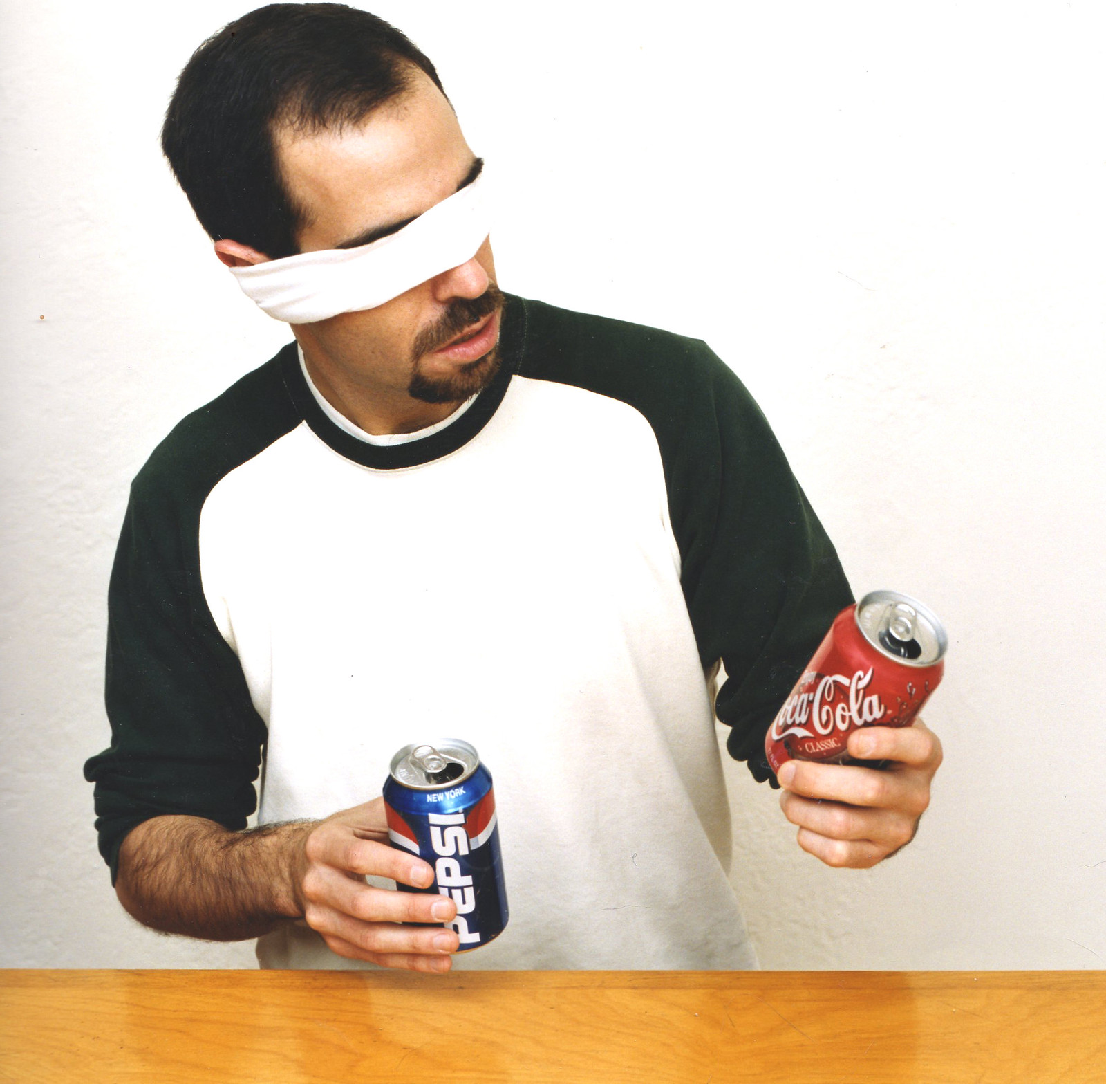
Yes, that’s me in the photo shown above. It was taken at the old Uni Watch HQ in the autumn of 2000 (I’ll explain why later on). I’m using it for today’s entry because the cola wars serve as a handy lens through which to view the uni-verse.
First, some quick history (and bear with me here — I promise this will lead back to uniforms): For roughly the past 60 years, Pepsi’s marketing campaigns have emphasized youth and generational themes. Here are some of the company’s slogans during that time:
• “For Those Who Think Young”
• “You’re in the Pepsi Generation”
• “The Choice of a New Generation”
• “The Taste That’s Generations Ahead”
• “Be Young, Have Fun, Drink Pepsi”
• “Generation Next”
• “Taste the One That’s Forever Young”
• “Every Generation Refreshes the World”
You might think youth appeal is basic soda marketing, but Coke has never gone this route. The company’s slogans over the past century have tended to emphasize timeless, universal messages with no generational pitch:
• “Enjoy Coca-Cola”
• “Coke Is It”
• “It’s the Real Thing”
• “Coke Adds Life”
• “Things Go Better with Coke”
The closest they’ve come to a generational slogan is “For People on the Go” (and maybe “Catch the Wave,” which was paired with the supposedly youth-directed Max Headroom character and was also widely perceived by mid-1980s ad critics as an attempt to align the brand with new wave music, although I always thought that was a bit of a stretch).
The thing about constantly pitching yourself as the hip new thing, as Pepsi tends to do, is that you constantly have to reinvent your image to keep up with current trends and fashions. That’s why Pepsi’s logo has changed so much over the years:
By comparison, Coke’s familiar script has remained largely unchanged over the years:
For a while now, I’ve been thinking of sports franchises as either Coke teams or Pepsi teams. This has nothing to do with which soda is sold at which stadium or arena. It’s about whether the team’s approach to marketing — including, but not limited to, its logo and uniforms — reflects Coke values (stability, universality, timelessness) or Pepsi values (youth, change, generational themes). The Yankees, for example, are the ultimate Coke team; Oregon football is probably the ultimate Pepsi team.
Obviously, I’ve made some generalizations here, and not every team fits neatly into a tidy little Coke box or Pepsi box. Some teams even change from one to the other: For much of the 20th century, for example, the White Sox were about as Pepsi as a baseball team could be (tons of uni changes, logo changes, team color changes, first MLB team to wear NOBs, the leisure suits, the shorts, the numbers on the pant legs, etc.), but over the past 30 years they’ve become paragons of Coke-ism.
Here in New York, the Coke/Pepsi dichotomy is easy to see. The Yankees, obviously, have always been a Coke team (which is why it made such perfect sense when they developed a player named Phil Coke — too bad they traded him to Detroit). And for a long time the Mets were fairly Coke-ish, too — they wore pinstripes, stayed NNOB until the late 1970s, were one of the handful of teams that never wore sansabelt pants, held Old Timers’ Days (a Pepsi team would never do that), and generally adhered to a set of relatively traditionalist baseball values.
But in the late ’90s the Mets began to change. Remember, this was when the Yankees were re-establishing themselves as a dominant force on the field and at the box office, and it’s almost like the Mets said to themselves, “Okay, we’re never gonna out-Coke the Yankees, so we may as well embrace the Pepsi approach.” That’s how the Mets ended up adding black throughout their design program; it’s how they introduced a new alternate cap design for three consecutive years; it’s how they almost completely stopped wearing their primary home cap and listed their black alternates as their “preferred” uniforms in the MLB Style Guide; it’s how they were the first team to go with those embarrassing two-tone Cool-Flo batting helmets; it’s how they took the 1999 TATC promotion a step further by becoming the Mercury Mets; and so on. These days the Mets have largely abandoned that approach and are back to being a Coke team.
Coke and Pepsi approaches go beyond uniform choices, of course. A team’s cola protocol can be evident in everything from the style of its P.A. announcer (the NBA is pretty much a Pepsi league in this regard) to the music it plays at its stadium or arena (there’s nothing more Coke than a live organist) to its commercials and other advertising.
Again, I realize this paradigm doesn’t work for every team, but it’s good food (or drink) for thought.
Meanwhile, here’s another odd intersection of the cola wars and sports: When I attended Game 5 of the 2000 World Series (the Yankees beat the Mets to win the championship that night), a Pepsi Challenge booth had been set up in the Shea Stadium parking lot. I not only took the challenge but wrote a small item about it for Fortune (the fee for which conveniently covered what I’d paid for the Series tix). For reasons I still don’t understand, the story’s editor insisted on using me, instead of a model, for the photo accompanying the story — which is how we got the photo shown at the top of today’s entry. It is, of course, not the least bit representative of how the Pepsi Challenge actually works, but the editor had his mind made up about it.
Not mentioned in the story: My then-girlfriend, a lifelong Coke partisan from the South, chose Pepsi and was mortified. It really challenged all her assumptions about herself, like discovering she was adopted or something, and she was pretty inconsolable. Ah well — within a few hours, that seemed like the least of our worries.
———
Hi again. I wrote that nearly a decade ago, and I find that the Coke/Pepsi paradigm can still be a very useful way of framing things, although it sometimes needs to be tweaked slightly. For example, after the Chargers recently unveiled their new uni set, a reader asked me if I considered it a Coke update or a Pepsi update. “Cherry Coke,” I responded. (By contrast, the Falcons’ new uniform unveiling was pure Pepsi — ironic, given that Coca-Cola is headquartered in Atlanta.)
We could also say that the NBA, with its freewheeling approach to uniforms, has essentially become a Pepsi league.
Again, this framing doesn’t work for every team or league, but it definitely has its uses.
I made a model of Kauffman Stadium almost completely out of Royals baseball cards. from r/baseball
Oh. My. God.: Great project by a Redditor who created a model of Kaufman Stadium by using old Royals trading cards. Spectacular!
(Big thanks to Mike Chamernik for this one.)
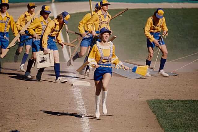
Too good for the Ticker: The original Astrodome groundskeeping crew often gets a lot of love, and deservedly so. But check out how the Brewers were dressing their groundskeepers in 1976 — wow!
(My thanks to @TexasTrevor for this one.)

Click to enlarge
ITEM! New Uni Watch masks: Dan Mullins, COO of a Utah-based company called ProLook Sports, recently got in touch with me and asked if I’d like to have 100 masks like the one shown above, gratis. Uh, sure!
The box arrived yesterday. The masks look great, and I’d love to make them available to you — ideally via our Teespring shop (with all profits donated, natch). Give me a day or three to get some things set up and then I’ll let you know all the details.
Click to enlarge
Collector’s Corner
By Brinke Guthrie
Follow @brinkeguthrie
We’re gonna go with two lead items today, because I loved the artwork on both of these and didn’t want to ditch either of them.
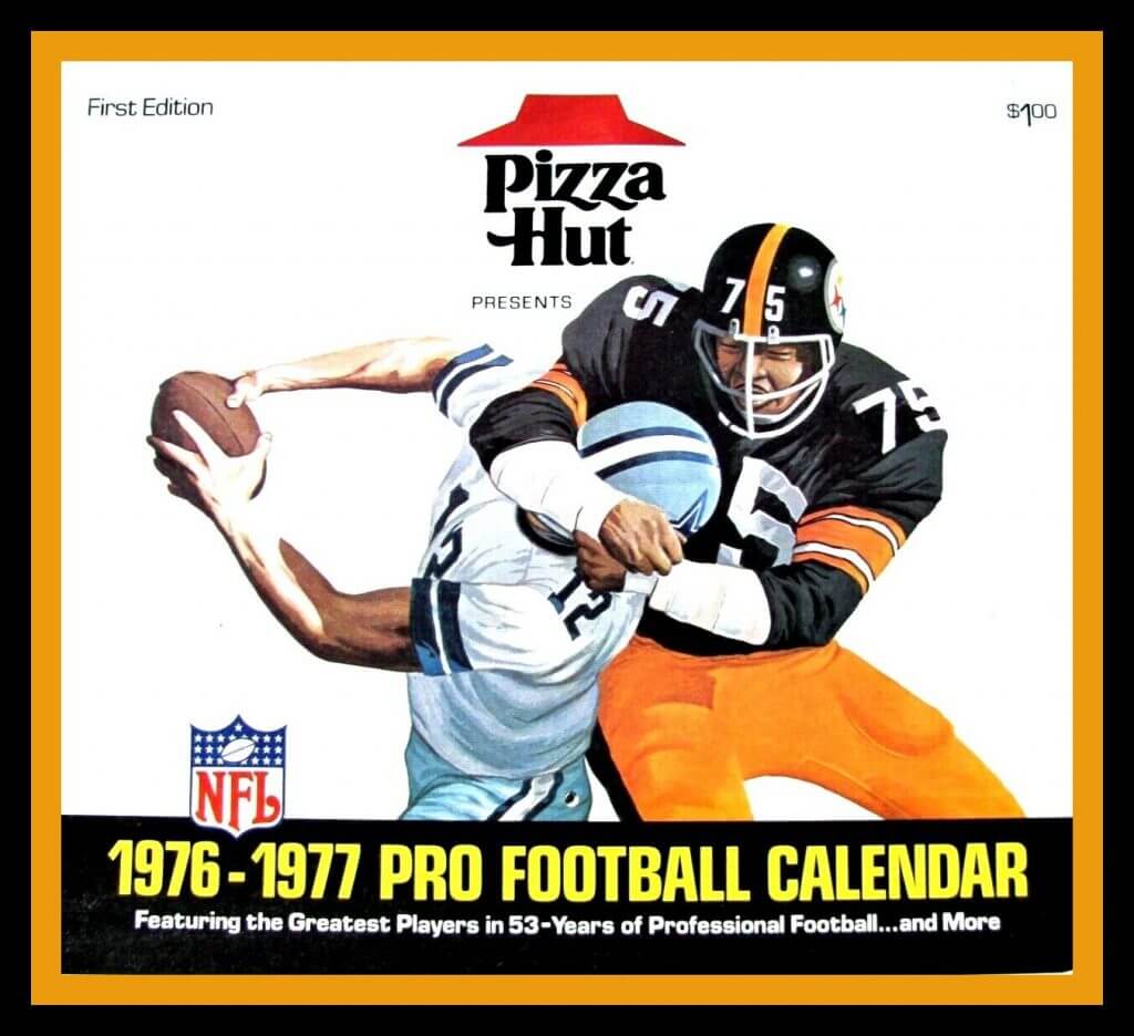
Let’s start with this 1976-1977 season Pizza Hut NFL Calendar. Based on the artwork, It seems that Mean Joe Greene is attempting to unscrew Roger Staubach’s head from his body, like a cap off of a pop bottle. But notice that the Steelers decal is on the wrong side of the helmet, and is missing the word “Steelers.” That image, of course, was based on this famous photo featuring the late Mike “Mad Dog” Curtis of the Colts and the unfortunate Roman Gabriel of the Rams. (The Cowboys and Steelers played in the 1976 Supe, which might explain why those two teams were chosen for the calendar artwork.)
Next up:
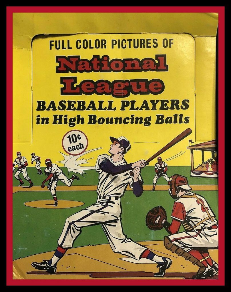
Great artwork on this display box for “National League Baseball Players in High Bouncing Balls.” These transparent rubber balls were made by Chemtoy in 1970 and had little photos of MLB players inside. Ten cents each!
Now for the rest of this week’s picks:
• Look at this — the “Wheel of Champions” from 1953. It’s a “Quick-Reference Index of ‘Big League’ Team and Player Champions since 1900.” You’d rotate this thing to get the leaders for a particular year (unless it was marked “NORK,” for “No Official Record Kept,” of course). This looks like a sample to show potential advertisers.
• Interesting-looking New York Mets press pin from the 1969 World Series. I like the globe theme — it is the World Series, after all!
• Here’s another Mets item from that same era: six drink coasters and a serving tray depicting Manager Gil Hodges wearing “Famous Number 14.”
• McDonald’s and their Ronald McDonald House charity were the sponsors of this 1980 Philadelphia Eagles Super Bowl XV jacket.
• One more for the Iggles: This decal says “Philadelphia Eagles,” but of course there’s no way this was ever used — the colors are all wrong! Wonder what this was for? Maybe someone just made ’em up..?
• I like the simple looks of these 1970s NFL Record Books. Notice how they used the same basic design from year to year.
• Cartoonist Jim Dobbins created this 1971 poster of Boston Bruins star Bobby Orr.
• This vintage ABC Sports corduroy snap-back cap just screams “Wide World of Sports,” no?
• Jets fans will love these NFL helmet stereo headphones. But look at the size of those — they look pretty darn heavy to me! A far cry from the ear buds of today!
• And from reader Will Scheibler: Here’s a great catalog for the NHL’s 1990s “Heritage” uniforms.

Membership update: Reader Ryan Houdayer recently purchased a membership for me to raffle off, so that’s what we’re going to do today.
This will be a one-day raffle, open to all. To enter, send an email to the raffle address by 8pm Eastern tonight. One entry per person. I’ll announce the winner tomorrow.
Speaking of which, the winner of yesterday’s membership raffle for essential workers is Patrick Raven, who works at a Trader Joe’s in Seattle. Congrats to him, and big thanks to reader Pete Garofalo for sponsoring that one.
The Ticker
By Alex Hider

Baseball News: Prior to the pandemic, the Florence Freedom of the independent Frontier League announced they had rebranded as the Florence Y’alls. While they haven’t yet taken the field this season, they’ve gone ahead and unveiled their new uniforms (thanks to all who shared). … Across the Ohio River, a University of Cincinnati player is calling on the team to rename its ballpark, which is currently named after former Reds owner Marge Schott — a notorious racist. Fellow Bearcats alum and former MLBer Kevin Youkilis has joined the chorus of those calling for the change. … It appears Blue Jays CF Devon White used safety pins on his jersey during the 1993 World Series (from Matt Wilcott). … Speaking of the Jays, the inlining on the “E” of P Jack Kucek’s jersey in this photo is inconsistent with the rest of the team’s (from @Minor_Leaguer). … Bob “Sodfather” Christofferson, the Mariners’ longtime head groundskeeper, has retired (from Timmy Donahue). … The University of Florida’s new baseball stadium, Florida Ballpark, will house Alfred A. McKethan Field. Florida’s old field, which was set to close after this season, was named McKethan Stadium (from Timmy Donahue). … Kansas State will wear purple beach blanket-style jerseys as part of their 2021 set (from @nategar11).

NFL News: The Jets and Giants will have new end zone designs this fall (from @GoatJerseys and Steven). … Speaking of end zones, the Browns used at least three different styles of end zone art during the 1971 season — large brown lettering on an orange end zone, small orange lettering on a truncated white background and small white letters in the end zone corners (from Bill Kellick). … Steelers OT Zach Banner is calling on the league to add Black Lives Matter decals to every player’s helmet this season (from Phil). … Cardinals WR DeAndre Hopkins and Texans QB DeShaun Watson — both Clemson alums — are calling on Clemson to remove John Calhoun’s name from Clemson’s honors college. Hopkins says this is why he does not use the university’s name when he’s introduced before NFL games.
College Football News: An Iowa State design student has come up with a football uniform concept to honor Jack Trice, the school’s first African-American player (from Kary Klismet). … FAU is outfitting their entire team with custom masks with player numbers and team logos (from Ayden Pierce Maher).

Basketball News: John Stockton’s short shorts certainly made an impression on the women from Friends in this mid-’90s NBA commercial (from Mike Chamernik). … An artist has redesigned several NBA logos as characters from Disney movies (from Eric Farrell). … Michael Jordan’s boat, “Catch 23,” is wrapped in a Carolina blue pattern (from James Gilbert). … New uniforms for John Hardin High School in Elizabethtown, Ky. (from Josh Claywell).

Soccer News: In 2017, the U.S. Soccer Federation adopted a policy that required national team players to stand during national anthems after USWNT MF Megan Rapinoe began kneeling during the U.S. anthem. Now, the Federation is considering ending that policy. In addition, Washington Spirit CB Kaiya McCullough plans to kneel during the anthem when the NWSL’s Utah tournament starts (from our own Jamie Rathjen). … Also from Jamie: The Orlando Pride of the NWSL will unveil new uniforms today. … Man City’s 2020-21 third shirts have reportedly leaked (from Josh Hinton). … Also from Josh: Everton has struck a shirt ad deal with used-car startup company Cazoo. … The period on Liverpool G Alisson Becker’s NOB is riding a bit high in this photo (from Michael Blake Raymer). … As teams prepare creative ways to hold games in stadiums without fans, they can take a warning from Arsenal. With part of its stadium under construction in 1992, the team commissioned a mural of fans to hide the construction mess — a mural that originally included only white fans (NYT link). Arsenal was able to redesign the banner before it debuted for games. … More EPL: Brighton is filling its stadium with cardboard cutouts, and will use the photo of any fan who pays $25. … Another English club, Northampton Town of EFL League Two, is doing a similar promotion with its cardboard cutouts (from @KevPKing). … Mexican club Mazatlán F.C., which recently relocated from Morelia, has unveiled its new purple and black crest (thanks to all who shared).

Grab Bag: Reader Raafi Rivero has a long-running project called Unarmed, in which he designs — and in some cases produces real-world versions of — sports jerseys in honor of unarmed people of color who’ve been killed. The jersey number refers to the person’s age at the time of death, and some of the jerseys have stars indicating the number of bullets involved. You can scroll through the entire project here. … In yesterday’s post, Paul mentioned that he hasn’t been missing sports during the pandemic. According to this post from The Guardian, he’s far from alone (from Ted Arnold). … NASCAR driver Corey LaJoie’s paint scheme includes a photo of a person in a mask on the hood. … Speaking of NASCAR, there were no fans at last weekend’s event at Atlanta Motor Speedway — but the parking lot was full. The Speedway has allowed car dealerships and rental companies to park their inventory there while pandemic-related shutdowns slow demand (from Chris H.). … The New Jersey State Seal that appears behind Gov. Phil Murphy at his daily press briefing has a few inconsistencies with the official state seal — notably, the color of one woman’s clothes and the stroke outlines on some objects (from Brian DeViteri). … JT Marvelous, a women’s volleyball team in Japan, and its affiliated men’s club, JT Thunders Hiroshima, added a mask to their logos. They’ve also unveiled their 2019-20 championship banner (from Jeremy Brahm). … Howell High School in New Jersey has announced that it’s keeping its “Rebels” nickname but scrapping the accompanying mascot and is asking students to pick a new mascot (from Ron). … The Army is said to be open to changing the names of bases currently named for Confederate military leaders (from Timmy Donahue).

Click to enlarge

What Paul did last night: A long time ago — I’m guessing around 1990, give or take a year — I acquired a set of four plastic tumblers, each of which was emblazoned with the logo of a different candy bar. I don’t remember exactly how I got them, which is unusual for me — I usually retain info like that — but it was probably at a yard sale.
Anyway: The tumblers are fun and summery, or at least I associate them with summer. So I’ve decided to use a different one each day for this week’s Pandemic Porch Cocktails™. Here’s the one I used yesterday:

Meanwhile: Someone stole the traffic cone that our landlords put out there to mark the edge of their driveway. That seems about right — that shit doesn’t fly here in NYC, and I was surprised they tried it.
The branch is still there.
As always, you can see the full set of Pandemic Porch Cocktails™ photos here.
That is very interesting. I guess I will make a stab at it for Philly area teams.
Phillies are definitely a Coke team, yea they had the maroon look but when they did they had it for 21 years.
Sixers are Pepsi, while you think they now have settled into a uniforms they like, they are always probably thinking about changing their uniforms yet again.
Flyers are Coke, same logo the whole time. They only dabbled a little with modern touched (black jersey, reebok edge set) but thats more akin to coke’s late 90s – mid 00s label with the bursting cap and then alot of gradients.
Eagles are Coke, again yes they changed their look in the 90s but have kept it pretty much the same with only minor touch ups since, plus the helmet is pretty much still the eagle wings.
And this brings me to a good point, Pepsi has had the same look since 2008, isn’t it about time Pepsi shakes things up again?
Nailed it, 4-4.
Hey Paul, I’m pretty sure the boat wrap has the concrete Jordan pattern on it, (popularized on the Jordan 3).
Pepsi has had the same look since 2008, isn’t it about time Pepsi shakes things up again?
That was exactly the biggest thing that struck me from the article, the logo graphic. I still think of Pepsi’s current logo as that terrible new logo Pepsi just unveiled. But it’s old enough to be in 7th grade? Part of the reason Coke’s barely-changing logo works is that it was good to begin with. The advantage of constant branding change is that you can afford to experiment and wind up with an occasional dud, since you won’t be saddled with a bad logo forever. Unless you’re Pepsi, in which case you roll out a terrible brand and then marinate in it for a couple of decades.
One of our writers has published Part I of his Top 20 Multi-Sport Uniform Power Rankings:
link
“I’m using it for today’s entry because I the cola wars serve as a handy lens through which to view the uni-verse.”
Maybe the “I” isn’t supposed to be there???
The Alison Becker jersey in the ticker is correct. Last year in the cup font the periods were in the middle of the names. Same happened for Mo salah.
Correct. Fixed.
That baseball card stadium model is amazing.
Looking at the Brewers grounds crew all I could think was that the boy scouts put on their oktoberfest gear.
Can not wait until the masks come available.
Making stadiums out of old baseball cards seems like the perfect use for duplicates…
That was me that asked about the Chargers unis!
link
I think the New York Rangers uni history stacks up very well with the Coke timeline. They had a few logo tweaks early on, had a long run, had a small blip on the radar of the New Coke-esque, then got back on track, but experimented in the 90’s with Lady Liberty.
Should have used a parking chair!!! … I know, I know, someone would hit it with their car to make a point.
Nah — someone would just take the chair!
Yep, the Chicago tradition of “I shoveled out this damn parking spot, and this is my chair, don’t you dare take it.”
I think the point of the cone is different than various cities’ parking chair customs. The cone was just to mark off the driveway, which shouldn’t be blocked to begin with and is illegal to do. From my experiences when I lived in Philly, chair, cones or whatever in spots, be it snow days or otherwise, were just people who thought they owned a public parking spot either because it was close to their house or because they had shoveled it.
Paul’s landlord is in the right, the other instances are just entitlement.
The Jets and Giants will have new end zone designs this fall
I don’t think the designs will be new, but they have installed a new artificial surface at the stadium.
I once dated someone in Pepsi’s marketing department. As a trademark lawyer, I know that my clients hold their brands dear.
But I had never seen anything like that.
She’d ask the Maitre D’ if the restaurant was a Coke or Pepsi restaurant. We would leave if it were a Pepsi restaurant.
At the time, the Mets served Pepsi, so Citi Field was fine, but Yankee Stadium was right out.
It . . . was. . . exhausting to go out with her.
(Yes, this comment was apropos of nothing.)
Wait she purposely sought out her competitor?
It’s very possible that she was contractually forbidden from going to those places. I remember a news story a while back where a coca cola delivery driver was seen eating doritos (owned by the same parent brand as pepsi) and was fired.
My uncle was a sales rep for a beer distributor and there were certain brands he was not allowed to drink.
Know a guy who had this happen to him too. Worked at a Pepsi packaging plant in college and one day came to work with an old Powerade bottle as a water jug. Had the wrappers ripped off and everything. But since Powerade bottles have a very distinct shape he was pulled aside and sternly told never to do it again.
The person on LaJoie’s car is actually him, it’s a callback to his Old Spice sponsored scheme from last year link
I like the new Green Uni Watch mask idea. I have been using my Purp Walk mask alot (School colors of HS I teach at), but when I rode around Eugene with my green Ducks hoodie on, it felt weird. I might have to get a green one too, as long as it can go over the head, not just the ears.
I like the Coke/Pepsi analogy. In Cleveland I’d say the Browns are the ultimate Coke team (their now banished uni set being their “New Coke” disaster), the Cavs, like most NBA teams, is Pepsi while the Indians, who are now a sartorial mess, are clearly RC. Down I-71 the Reds are clearly Coke while the Bengals are a store brand knockoff of Mountain Dew or Dr. Pepper.
I’d say the Browns are the ultimate Coke team (their now banished uni set being their “New Coke” disaster)
Good one — I like!
It’s hard to really say the Browns are a Coke team when they have only been around for about 20 years.
I gotta get one of those Uni-Watch masks…..
“For those who get it, but don’t want to get it!”
Noice!
(Key and Peele reference lol)
Great tag!
You can’t get those masks up for sale quick enough, my man. In the Immortal words of Phillip J Fry from Futurama, “Shut up and take my money!”
As a Pepsi thrall I miss the 1973 logo, while I love the old school 1940’s script. Guess I’m not the younger generation anymore…..
Definitely prefer Coke, but I always LOVED that 1973 Pepsi logo as well. I still think they should use that one!!
The Kansas City Royals have to be a Royal Crown cola team, right?
Ha! Alas, the Royals are Coke all the way.
But a look at RC’s logo history:
link
Shows that RC really does represent a bit of a middle ground. RC sort of alternates between playing up heritage and independence, and while it does engage in radical logo changes, it does so rarely with long periods of stability. Sort of the Punctuated Equilibruim approach to cola marketing evolution.
In that light, I’d propose the Twins as an RC team. Willing to make big changes, but rarely.
Hahaha. I think it was a joke about the words “Royal” and “Crown”.
And the Los Angeles Kings.
When I was soda drinking, I preferred Coke to Pepsi, but wasn’t a Coke SNOB as I also liked the taste of Pepsi too. I also liked RC too… Real sugar Double Cola just about beats them all though, but it’s regional and hard to find. Though I think you can get it in bottles at the Cracker Barrel general store.
Couple international teams were sponsored by Pepsi, both the West Indies and Pakistan cricket teams. Pepsi had a really catchy Soca ad campaign in the late 90s in the Caribbean
link
Multiple images of Pepsi’s long relationship with the Pakistan Cricket team are readily available on the interwebs
Are you kidding me with that 1898 Pepsi logo script? Did they have crystal meth in 1898?
All the Arizona teams are Pepsi, except the Cardinals are a bit of a mix. They are conservative with the Bidwell’s running the team, and they like to mention that they are one of the original NFL teams. However their awful uniforms are definitely Pepsi. Actually I’d put their uniforms with RC Cola.
The guy behind the baseball card Kaufman (I still call it Royals) Stadium is also building a paper replica of Shea.
For those of you on Twitter, he’s a good follow: @PaperStadiums
Wasn’t the Pepsi Challenge “rigged” because Pepsi was slightly sweeter, which meant it was typically preferable for a sip or two? And if you did the same challenge with a full can of soda, people would actually chose the Coke more often than Pepsi?
I put “rigged” in quotes because that word implies some sort of intentional subterfuge, and I don’t know if that was really the case. It’s more that the parameters of the Pepsi Challenge were such that the sweeter Pepsi had a natural advantage.
I believe Nate is referring to this:
link
The John Stockton/Friends YouTube link in the ticker starts the video 27 seconds in (so, pretty much at the end). This link starts the video at the beginning.
link
Curious if and how the English Premier League fits into the Coke/Pepsi dichotomy. Teams tend to have the same basic home kits year over year, while the second and third shirts vary wildly.
Arguments for Coke: Tottenham, Liverpool, Manchester United, (Shudders) Arsenal have the same basic home unis every year, and if there are changes on a given year–black shorts for United and the blue gradient for Tottenham in 18/19 spring to mind, fans are none too pleased. Many teams have had the same uni elements on their first kit for 50 or 60 years.
Arguments for Pepsi: Teams get uniform upgrades every year, so one year Tottenham will have a stripe across their chest, the next it’s shoulder yolks. One year United will have a coller, the next it’s a henley. One year Liverpool will have gold accents, the next white. (Etc…) Plus teams will have very different second and third kids every year: in the last few years, Tottenham has had gold, navy, navy with electric blue accents, teal, purple, etc….
Given all this, I think it might be a case of Vanilla Coke, but I’m willing to be convinced otherwise!
I’d say most historically well-established soccer teams are both Coke and Pepsi for the reasons you’ve outlined. The dichotomy breaks down because of how first kits are traditional, regardless of accents or other details, but second/third kits are usually room to experiment, so it’s hard to say somebody is one or the other.
cokeman here though i love mtn dew
i hope watson and hopkins stay consistent with their renaming as Clemson was named for a slaveowner. So dont stop at Hopkins – do the WHOLE school
link
My taste in soda has evolved over time. I used to be a Coke person (I liked the bubbliness of it) then I transitioned to diet vanilla sodas (didn’t really like the regular diet variants at first), and now I prefer diet pepsi, but I tolerate diet coke and coke zero just fine. I don’t young and hip with my diet pepsi lol
Anybody else notice all three of the Browns end zone photos have the Steelers in them? That means that either they used multiple zone patterns at home for their one game against Pittsburgh, or one of those designs came from the game in Pittsburgh.
Steelers had artificial turf in 1971.
I found game film and it shows all three shots of from the game at Cleveland that year. One end zone was orange with brown letters while the other one had the small white square with orange letters in the middle of the end zone and the slanted, white BROWNS in the corner.
Probably an earlier-season game where they were dealing with the baseball infield. Football field was aligned from home plate out to centerfield, so the orange end zone would have been the outfield end, the white box on the infield grass, and the white Browns in chalk on the dirt near first & third bases.
Re. the name of Clemson’s honors college: The largest lake in Minneapolis used to be named after John C. Calhoun as well. After a few years of debate and legal wrangling, it’s now officially known as Bde Maka Ska (“Be-DAY Mah-KAH-Ska”), meaning “Lake White Earth” in Dakota/Lakota.
Except they stupidly call it Lake Bde Maka Ska, or “Lake Lake White Earth.”
Dallas Teams: The Cowboys are clearly Coca-Cola Classic. The Mavericks are Pepsi (never quite getting respect). The Texas Rangers are Dr. Pepper, a Texas brand.
Pirates: Coke or Pepsi? given the first team to wear the double-knits in 1970, and of course the 1970s mix and match bumblebees, the Bucs would seem to be clearly a Pepsi. But since they ditched the mix and match in the 80s? Pretty much Coke since then. Considering the vest Maz look of the 1960s, i vote Coke in a close call.
I’m a Coke guy (drinker and Uni preference), but the 1973 Pepsi logo is a classic.
I’m late to the party here, so no one will probably ever see this. But, as a Pittsburgh sports fan, I was thinking about this in the shower this morning. I go with Coke also, for pretty much the same reasons as you cited, but also because since they switched to black and gold, all of their uniforms have had a fairly consistent look with “Pirates” across the front rendered in the same script, and the cap simply having the “P” on the front. Even the pillbox caps and the mix & match uniforms retained some of these elements.
Evolution of my favorite teams have mirrored my evolving maturity. I used to love the Padres, Astros, Canucks, Nuggets, Suns, Clippers, NY Jets, all Pepsi teams chasing a moving target. Their uniforms were in a perpetual state of flux. The Padres famously never wore the same uniform for two consecutive seasons, barring a brief term of normalcy in the 1980s. Now, though, my two favorite teams are the Chicago NHL squad, and the Cleveland baseballers, who are the epitome of Coke consistency. Obviously, the fact they’ve chosen Native American iconography complicates the issue. Not wanting to be lectured about what is “fair” makes them dig in, and the concern is if they get cornered into making a change they don’t want, they could end up being “the new Coke”.
As a life long Royals fan, I’d pay big $$$ for that stadium, that is amazing!!!
I started reading today’s entry and thought it sounded familiar. Then I scrolled back up and saw the editor’s note. Good think piece! I’d say all Detroit teams are Faygo. ;-) I drive by a Pepsi distribution center on my way to work and they have a logo timeline on the building. Will try to get a photo this weekend.
As long as I can remember (45+ years) I have always, emphatically, adamantly 100% been a Coca-Cola drinker, supporter and fan. I can count on one hand the times I have consumed a Pepsi. To me, it is one of the most important life code I live by. Basically, I do NOT understand why any human being on this planet would purposely choose to drink a Pepsi when a far superior and more culturally relevant product is available. When I see someone making a conscious choice to drink Pepsi, I know I could never be their friend (I would always be judging them)… It should come as no surprise that my favorite sports teams are the Yankees, Fighting Irish, Hoosiers and Dodgers. All of them are as Classically Coke as you can get. I seriously wonder if people who drink Pepsi “get it”?
Thanks for re-sharing this post Paul! It put a huge smile on my face today. Keep up the amazing work.
The Pepsi logo indicated as the 1973 version is actually the updated one from around 1987. Similar logo but with a more modern font.
Where I live, Cheerwine is usually available regardless of whether it is a Coke or Pepsi establishment.