Click to enlarge
[Editor’s Note: Today we have a guest entry from reader Tom Gronek, who’s uncovered a fascinating uni-related situation in the world of Polish soccer. Enjoy. — PL]
By Tom Gronek
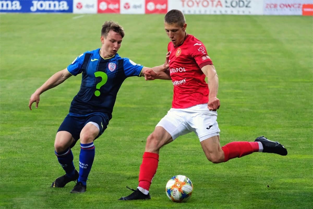
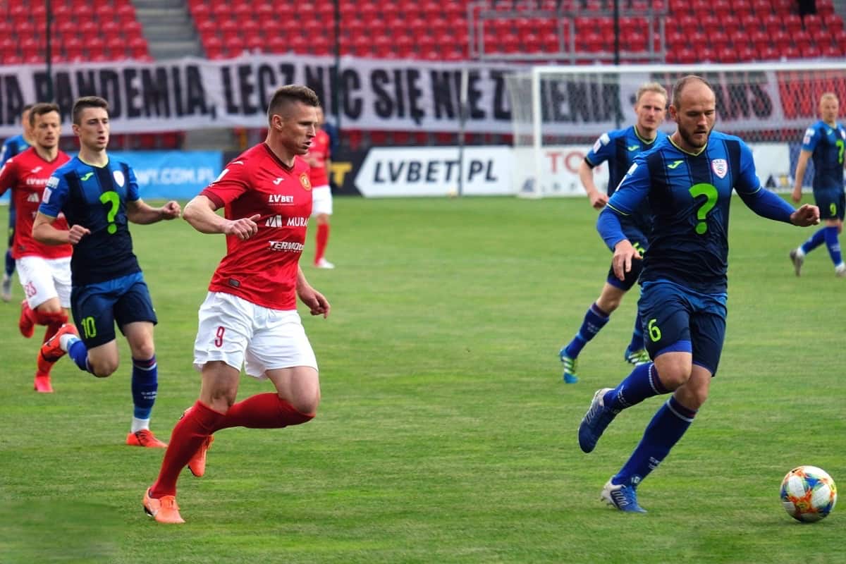
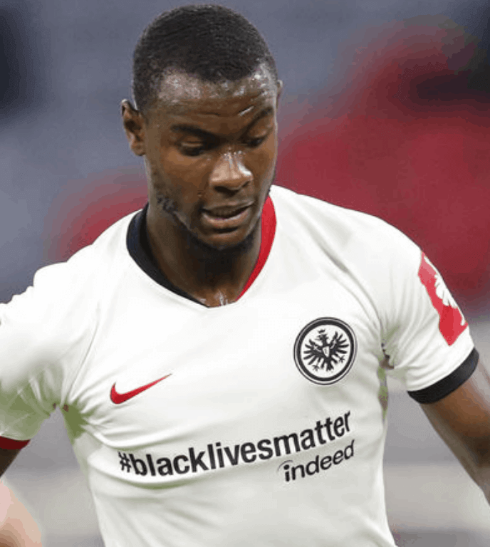
For the first time in ages, I recently found myself watching a soccer game from Poland’s third-tier II Liga, between local Stal Stalowa Wola and visiting Skra Częstochowa.
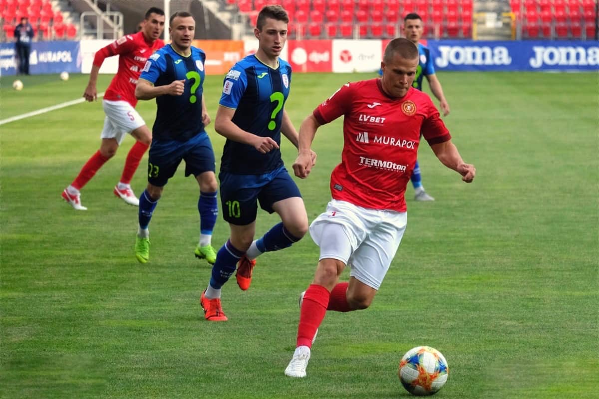
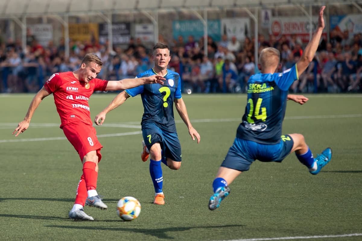
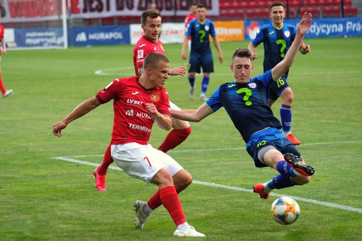
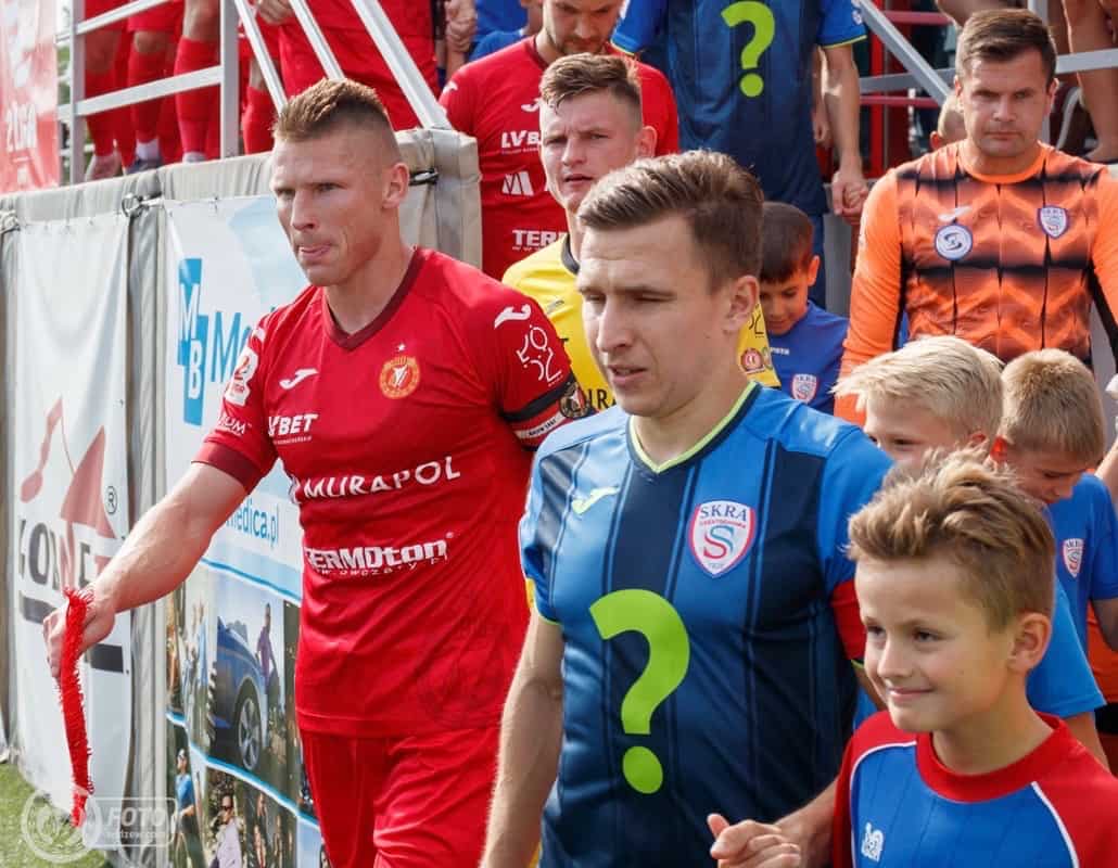
I was immediately drawn to the visiting team’s shirt, which featured a question mark on the front [see above] instead of an ad.
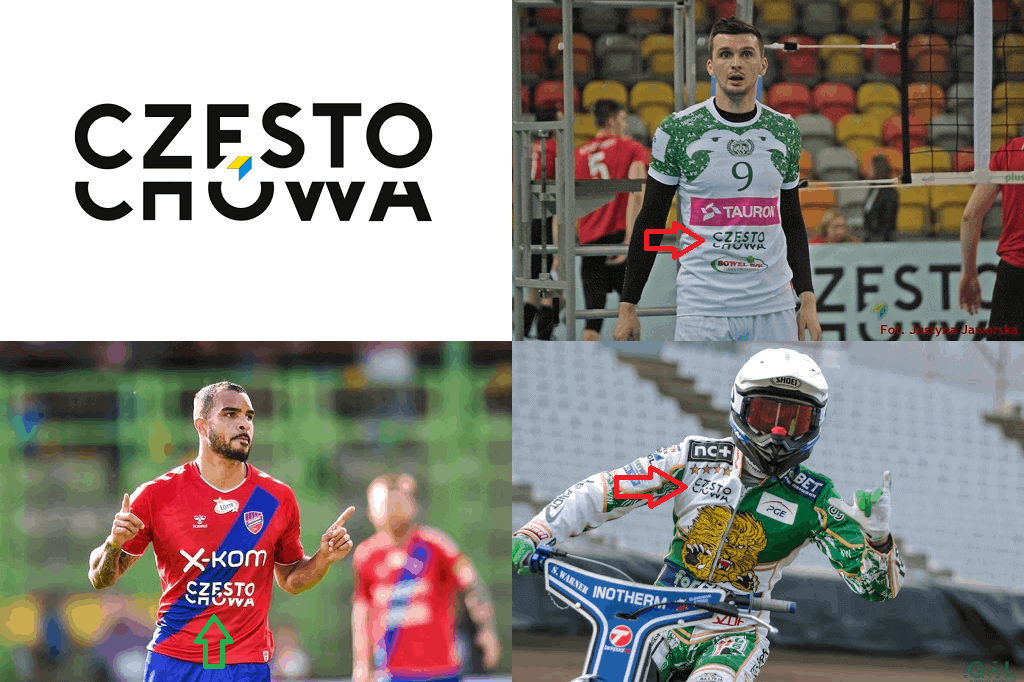
I was born in Poland and lived there until I was 13, so I was able to look up some Polish-language websites and get the full story, which is this: For around the past 10 years, the city of Częstochowa has provided grants to its sports teams in exchange for advertising space on the teams’ uniforms. One of the conditions was that the team had to be playing at the national level of competition. The teams benefitting from the grant were Raków (soccer), AZS (volleyball), and Włókniarz (speedway), as seen here [click to enlarge]:
Skra — the soccer team — never made the cut because for the past 60 or so years they’ve been playing in Poland’s fourth tier or lower. Only the top three tiers are nationwide competition; everything below is split into regional competitions.
That all changed in 2018, when Skra won promotion to II Liga, which seemingly made them eligible for the city’s grant. But somewhere along the way, the city changed the criterion from “Competing at the national level” to “Competing at the highest national level.”
That has left the club feeling a little bitter and victimized because they felt the city was probably changing the rules to exclude them. The question mark on the jerseys is their way of raising awareness of their situation. From what I can tell, the team has played with a question mark for about the last two seasons.
Yes, it might seem a little petty, but the amount of the grant is somewhere in the neighborhood of 1,200,000 zl, or about $300,000 in American dollars, while the club’s entire annual budget hovers around 1,000,000 zl ($250,000), so it would make a big difference.
I later found found another Polish-language link featuring an interview with the club’s president from last August. He basically made it sound like the city made the decision to change the guidelines in a behind-closed-doors, bureaucratic kind of way. He also mentioned that the city could have made more grant money available, or could have kept the same amount of total grant money but divided it up among four teams instead of three — but instead they chose to maintain the status quo, which left Skra on the outside looking in.
———
Paul here. Interesting story! But the most interesting aspect of it, at least for me, is how weird that big, quivering question mark looks on the players’ chests. It almost looks like it’s been Photoshopped onto the jerseys! We’re so conditioned to view a freestanding question mark as a symbol of something (confusion, ignorance, doubt, uncertainty, etc.) that it’s hard to look at these players without thinking the question mark is sending some sort of message of befuddlement:
What a bizarre story. Are there any other teams that have worn question marks?
(Major thanks to Tom Gronek for sharing this one with us.)

Click to enlarge
Blast from the MLB past: Got a note the other day from a reader who prefers to go by “JP in Philadelphia,” as follows:
I recently found a bunch of old photos that I took in the summer of 2003, when I was a college intern at Major League Baseball, working for their then-CFO. The commissioner’s office was at 245 Park Avenue in those days. The pics definitely feel like a corporate HQ from a different, non-digital world. And from a baseball standpoint, you definitely get the feel that the office was created in the sport’s 1980s heyday — it has the sorta cheesy, lovable baseball vibe going on. I imagine that’s long gone now and that everything is more slick, glossy, and digital.
I was an early digital camera adopter, and it shows. These pics were shot with a 2.1 megapixel Canon — terrible with indoor light, and pretty junky overall, but at the time it was magical. Anyway, that’s why some of the pics are a little blurry.
The highlight of the summer was getting to go into a secret “merchandise room” with a bunch of authentics and being able to pick out any jersey I wanted, in any size. They also had some cool templates for jerseys that never made it into existence. I distinctly remember seeing Blue Jays and Rangers designs with crazy logos that never went into full production.
Interesting! Unfortunately, JP didn’t get any pics of those prototype designs, but he did get some good shots of the MLB offices. You can see them in the slideshow below; if you also want to see his short description/caption for each photo, go to this photo set, click on the first thumbnail, and then use your right-arrow key to click through the entire set.

Click to enlarge
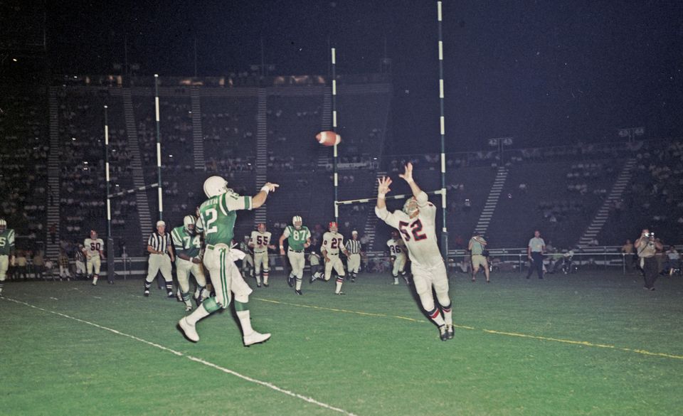
Too good for the Ticker: Check out this great photo from a 1968 Jets/Falcons preseason game at Legion Field in Birmingham (this was pre-merger, but NFL and AFL teams faced each other in preseason games at the time). Note the two sets of goalposts — college rules had them at the back end line, of course, but the AFL and NFL still had them on the goal line. The NFL eventually moved them to the end line in 1974. And man, how awesome is that goalpost striping?
Also of note:
• They were using the AFL’s white-striped ball, at least for this play. Maybe they switched to an NFL ball when the Falcons had possession..?
• No helmet logo for the Jets, as was standard for them for preseason games throughout most of the 1960s.
(Big thanks to Bill Kellick for this one.)
ITEM! New design contest: As we’ve discussed here a few times, it seems like a near-certainty that when lives sports eventually resume in North America, at least some teams and leagues will wear a jersey patch (or helmet decal, or other uniform adornment) to show support and solidarity with the current racial justice protests. We don’t yet know what any of those patches or logos will look like, so my next piece for InsideHook is going to be a design contest to create such a logo.
Obviously, past Uni Watch design contests have been geared around redesigning a particular team, so this is a different type of approach, but I think it’ll be very interesting. The official call for entries will go out shortly on InsideHook, but anyone reading this can get a jump on things by starting now. Here are the guidelines:
• Your logo can be as simple as a baseball cap with “BLM” on the crown, as elaborate as a bunch of silhouetted players kneeling, Colin Kaepernick-style, or anything in between. But it should make some connection between sports and the current protest movement.
• Your logo can be themed for a specific team, a specific league, a specific sport, or sports in general.
• We’re mainly interested in logos here, but if you want to create a full team uniform design that fits our theme, feel free to submit it.
• Your designs can be created in any digital or analog medium (Illustrator, Photoshop, crayon, whatever) and submitted in any standard digital format (JPG, PDF, TIFF, etc.). You can also create a video presentation, upload it to YouTube, and submit the YouTube link as your entry.
• The files you submit should be named after yourself (JohnDoe.jpg, for example). If you’re submitting multiple files, please either number them (JohnDoe1.jpg, JohnDoe2.jpg) or use some other designation to make it clear that they’re multiple designs from the same person. Entries that don’t follow this format will not be considered.
• Email your entry to Uni Watch HQ. If you have more than one design concept, feel free to enter as many times as you like.
• Deadline: Submit all entries by Friday, June 26. We’ll showcase the best entries on InsideHook shortly thereafter. Good luck!
Meanwhile, in a related item…: An old topic that’s recently resurfaced in media circles these days is whether it should become standard practice to capitalize “Black” when referring to Black people, as a way of recognizing that Blacks are a self-identified ethno-racial group, just like Asians, Jews, etc. The Associated Press, whose style guide is followed by most newspapers and magazines, hasn’t yet decided whether to go with the capitalization, but a bunch of media outlets have started doing it anyway on their own (and in some cases have explained why). I’ve been wondering if we should start doing it here at Uni Watch as well.
From a style/grammar standpoint, the thorniest question of black vs. Black involves the potential ripple effect: If you go with Black, do you also go with White and/or Brown? Some media outlets have begun to capitalize all these terms; others are only capitalizing Black. (You can learn more about this issue, which has a deep history, here, here, here, among many other places.)
I’d be interested in what our Black and Brown readers think about all of this. If you’re a Uni Watch reader of color, please feel free to post about this in today’s comments (or, if you prefer, email me privately).
And to my fellow White uni-watchers, let’s stand down, listen, and learn today, at least on this topic. Thanks.

Membership update: I hate nameplates on pinstriped jerseys. Actually, I hate nameplates on baseball jerseys period, but I especially hate them on pinstripes, because the ’plates interrupt the flow of the pins. But for some reason I always enjoy seeing that look on a membership card, as we’ve done for Jim Tischler’s Minnesota Twins-themed design. Maybe it’s just the satisfaction in seeing how we can replicate that look, even if it makes no sense in real life.
Jim’s card is part of a new (purple-free!) batch that’s been added to the membership card gallery.
This is the part where I say ordering a membership card is a good way to support Uni Watch (which, frankly, could use your support these days) — but seriously, Uni Watch could really use your support these days. The pandemic has done a number on internet ad revenue, including ours. If you have the means and haven’t yet purchased a card, this would be a very good time for it. And remember, as a gesture of comm-uni-ty solidarity, the price of a membership has been reduced from $25 to $20 until further notice.
As always, you can sign up for your own custom-designed card here, you can see all the cards we’ve designed so far here (now more than 2,800 of them!), and you can see how we produce the cards here.

Father’s Day reminder from Phil: Phil here. Sunday is Father’s Day, and I’ll once again be posting photos of Uni Watch readers’ “Dads In Uniform,” a tradition that began in 2013 (and has continued in 2014, 2015, 2016, 2017, 2018, and last year). This is always a very special day, and I’d love for as many readers as possible to participate — especially those of you who haven’t done so before.
To take part in this annual tradition, select one photo of your father (or grandfather or uncle) in uniform (it can be sports, military, work — as long as it’s a uniform) along with a short description of 100 words or fewer (refer to our prior years’ entries to get a feel for the style of the descriptions). Then email the photo — again, only one, please — and text to phil.hecken@gmail.com with the subject line “Uni Watch Father’s Day 2020” by this Thursday, June 18, midnight Eastern. I’ll run all of the submissions this Sunday. Thanks!

ITEM! Public service membership raffle: Reader, Ticker contributor, and military uniform expert Timmy Donahue recently purchased two memberships for me to give away, with the stipulation that they should only go to people working in a public service capacity during the pandemic, or who have a spouse or parent doing so. That means military, law enforcement, firefighters, teachers, sanitation, transit, healthcare, grocery workers, and so on.
Obviously, we’ll be doing this on the honor system. If you’re not sure if you qualify, just ask yourself: Do I work in public service? If you think you do, that’s good enough for us.
This will be a one-day raffle. To enter, send an email with your name and occupation to the raffle address by 8pm Eastern tonight. One entry per person. I’ll announce the two winners tomorrow.
Big thanks to Timmy for sponsoring this one. Good luck!
The Ticker
By Lloyd Alaban

Baseball News: Nationals P Sean Doolittle showed off a new tie-dye glove yesterday (from multiple readers). … Here’s a photo of the Giants’ scouting report for a then-teenaged P Jim Palmer. Look at that letterhead! (From David Cline.)

Pro Football News: Here are the three different covers for the upcoming video game Madden NFL 21. Ravens QB Lamar Jackson is the cover athlete for this year’s edition (from multiple readers). … Here are the first official team photos of Buccaneers QB Tom Brady in his new uniform (from multiple readers). … Here’s a video that ranks the Broncos’ uniforms throughout the team’s history (from Kevin Clark). … Here’s the logo for the 2021 Pro Bowl, which is slated to take place in Las Vegas. … A company in Manitoba is donating Winnipeg Blue Bombers gear to municipal governments across rural Saskatchewan, presumably to be made into PPE and other protective gear. The Blue Bombers and Saskatchewan’s CFL team, the Roughriders, have a long and storied rivalry (from Wade Heidt).
College Football News: Here’s a weird one: During a 1953 game against USC, Notre Dame players on the sidelines were wearing pith helmets! (From @EGOT4Life). … Following up on a Ticker item from yesterday, Oklahoma State coach Mike Gundy issued an apology for wearing a T-shirt promoting a conspiracy-heavy TV network that referred disparagingly to the Black Lives Matter movement.

Hockey News: The Kansas City Mavericks, the ECHL affiliate of the Flames, have a new logo.
.
.

Basketball News: The Ringer ranked the top five current NBA court designs (from Mike Chamernik).
.

Soccer News: One of the most successful German women’s teams, 1. FFC Frankfurt, merged with the Bundesliga’s Eintracht Frankfurt, so they’ll have a new identity as Eintracht’s women’s team starting next season (from our own Jamie Rathjen). … Also from Josh and Jamie: Sheffield United released photos showing how the Black Lives Matter patch and NOB and the National Health Service patch will look on their shirts. Premier League clubs voted in favor of having Black Lives Matter NOBs for the first round of the league, as well as an NHS patch and a Black Lives Matter patch on shirts. … In addition the Premier League’s match ball will include a “We Are One Team” logo. … Also from just Josh: The 2020-21 Borussia Mönchengladbach first and second shirts have leaked. … Manchester United’s 2020-21 goalkeeper shirt has leaked (from our own Anthony Emerson). … Also from Anthony: Manchester United will have a mosaic of over 40,000 fans at their home opener, since fans are still not allowed at matches. United will also have banners that will include the club badge, colors, and messages to frontline workers around the stadium. … FIFA elebrated the 50th anniversary of the 1970 World Cup by re-imagining modern players as if they played in that tournament (from John Flory). … SC Paderborn D Klaus Gjasula is wearing a helmet in this photo (from Michael Raymer). … Two new shirts for Scottish Championship team Ayr United (from Jamie again).

Grab Bag: UNLV removed the “Hey Reb!” statue from their campus last night, and the university president hinted that changes to the school’s mascot may be forthcoming. … Here’s an article about what people are wearing (NYT link) at protests across the country (from Tom Turner). … If you look at the ads for Uni Watch pins, Uni Watch stickers, and Naming Wrongs shirts here on the site, you’ll see that Paul uses the Cooper Black font. Here’s a video on why that font is so popular. … Paper Stadiums, the maker of scale-model sports venues completely out of paper, is raffling off a free custom stadium with the proceeds from raffle tickets going to the charity 100 Black Men of Omaha.

Click to enlarge

What Paul did last night: Just as I was taking this photo, the Tugboat Captain looked skyward and then kept staring at something. When I asked what she saw, she said it was some sort of little little object, reflecting high in the sky.
After I took the photo, I sat down next to her and she pointed at a little clearing between the tree branches. And sure enough, there was something up there — very high, very small, hovering and glinting in the early-evening light.
A drone? Maybe. A UFO? Maybe. I mean, the way this year has gone, would anyone be surprised?
The branch is still there.
As always, you can see the full set of Pandemic Porch Cocktails™ photos here.
In 2006-07, Borussia Dortmund had an exclamation mark on their shirts. The reason was that the sponsor (German company RAG) was restructuring into several entities, but the new name wasn’t known yet. It became Evonik, which has been their shirt sponsor ever since.
link
Hmm. I’m guessing that Doolittle’s glove won’t pass MLB rule 3.07. I’m sure opposing managers will try to get it booted.
3.07 Pitcher’s Glove
(a) The pitcher’s glove may not, exclusive of piping, be white, gray, nor, in the judgment of an umpire, distracting in any manner. No fielder, regardless of position, may use a fielding glove that falls within a PANTONE® color set lighter than the current 14-series.
(b) No pitcher shall attach to his glove any foreign material of a color different from the glove.
(c) The umpire-in-chief shall cause a glove that violates Rules 3.07(a) or (b) (Rules 1.15(a) or 1.15(b)) to be removed from the game, either on his own initiative, at the recommendation of another umpire or upon complaint of the opposing manager that the umpire-in-chief agrees has merit.
Yup. But I’m pretty sure he was showing it just for fun, not for actual game use.
This is the only team that I can think of that has worn question marks:
link
How thoughtful of Winnipeg-based All-Net to donate the Blue Bombers shirts to their Saskatchewan neighbours? It will definitely help with social distancing. Put on the shirt in rural Saskatchewan and people will stay away from you.
Blue Bombers fans have becoming very boastful recently. I guess that is what happens when you finally win a Grey Cup and it takes 30 years in a league with much parity and only 8 or 9 teams most of the time.
To the municipalities of Saskatchewan that received the shirts, a little bit of Tide always helps :) :
link
Let’s hope they sent extra shirts. Saskatchewan has had trouble in the past keeping track.
EFF did merch a while back based on a little-documented Chicago softball team, the Clearing Question Marks.
link
I’m thinking maybe the Notre Dame pith helmets were for shade, since the game was in Los Angeles. Both teams were wearing their colored jerseys, which was common back then. Outside of their contrasting helmets, this would have been brutal to watch on black and white TV, if the game was even televised back then.
Probably. I did a quick search on Weather Underground and learned that the temperature on the day in question was low 70s-high 60s. It might well have been the strongest sun the Notre Dane team has seen in some time.
The way to tell the teams apart were the helmets; Notre Dame appears to have gold-colored leather; USC cardinal-colored plastic.
Arsenal posted their kits for today’s match.
link
This is why there’s income inequality in this world. Rules get changed. Lobbyists ask for more money/perks/power granted for a person, county, country, state, group or company. I got mine, so I don’t want anybody else to get theirs, leading to classes and even further inequality as the gap widens.
Sorry for the rant, but this is why there are rich teams and poor teams in every sport, and small market teams (in the pros) and mid-majors and Div 2 or 3 (in American college system) schools usually can’t afford to compete with the big leagues or Big 5, respectively. (Appalachian State beating Michigan comes to mind, but poll voters almost always ranks Boise State, Nevada, et al. lower, even if they go undefeated, than Alabama or an SEC team with one or two losses.
Rant over.
“Black” vs “black”
I’m 42, born, raised, and live in Baltimore (except for a brief few years in the Air Force). During my lifetime, the terms “black” and “African-American” have been used to refer to me. Either one is fine. A majuscule or minuscule letter “b” is fine with me. What problem I DO have is how any term is used. If there is a pejorative tone in the use of a term (i.e. “those blacks”) or a sense of possession (some people in politics have said “he’s my African-American” or “that’s my African-American over there), then there is an issue
Never heard the word majuscule before. Love it. Also love that it gets the red underline and spell check is telling me I messed up spelling minuscule.
That Jets/Falcons game almost looks like only the field is highly lit. the stands look dark. Maybe it was (probably) a flash photo and the flash just washed it out.
I don’t like soccer (futbol) but I would definetly buy a Skra jersey. So much better then some random ugly advertismet.
Cooper black is great. For whatever reason, Georgia is my favorite font. Elegant without being too showy.
“Cooper black” or “Cooper Black”?
It’ll always be the Pet Sounds font to me.
I shared my black vs “Black” opinion via email, Paul. Do with it as you wish.
I think Black should be capitalized, in my lifetime it has always seemed like an official term along with African-American. Brown, even though I use the term and proudly accept it, has always seemed unofficial to me. I wouldn’t use that term in any kind of official capacity, for that I would say Latino, Hispanic, or Mexican-American (I don’t use Chicano). Therefore in my opinion brown shouldn’t be capitalized.
Asian guy that works in epidemiology/research. I have always capitalized the first letter of all racial and ethnic groups. So when describing the racial breakdown of a study population it is Black, White, Asian, Hispanic, etc. And that’s within the text of the paper in addition to the tables and figures. The copyeditors of the journals that have published my studies have never changed that to my knowledge so I don’t know if it’s just an oversight or a policy on their end. Also, I’ve never used “Brown” in a professional setting.
link
Re: UFO Sighting. (Sufjan Stevens)
Makes sense Namath playing an exhibition game in Alabama.
While the use of a capital letter to denote a race is an important topic, I’m always disappointed when I read or hear someone refer to Jews as an ethnicity or a race as if no one can choose to be Jewish or not Jewish since it is a religion just as with Christians, Muslims, Buddhists, etc. Everyone chooses a religion or no religion in their lives, sometimes choosing different religions at different times. Just because most Shinto followers come from Japan doesn’t make Shinto a race or a separate ethnicity and because (one example) Sammy Davis Jr. made his choice, doesn’t make him having been any less Jewish while not being a member of any race other than Black.
Good point, Tom — thank you for that.
@Tom–Um, no. Judaism is a religion. Being a Jew does not necessarily mean a person who practices Judaism, it means being part of the Jewish PEOPLE, which a person can join be converting and practicing Judaism. Being a Jew has never, in the history of the Jewish people, been exclusively about practicing Judaism.
Jua
As a Jewish person, I have used the term “Jewish” to refer both to either someone who practices the religion or someone who has Jewish ethnic heritage. I agree that being Jewish is not exclusively about practicing Judaism. I still identify as Jewish even though I have not actively practiced in many years. Either way, I capitalize it.
So being Jewish is almost the culture involved in practicing Judaism? That is to say, the non-religious aspects of the culture?
I’ve always considered it:
Jewish – religion
Hebrew – the ethnicity / ancestry that can be traced back to the Middle East / Mediterranean region
Israeli- nationality, regardless of race or creed for a citizen of Israel
Copied from Wikipedia:
“Judaism shares some of the characteristics of a nation, an ethnicity, a religion, and a culture, making the definition of who is a Jew vary slightly depending on whether a religious or national approach to identity is used. Generally, in modern secular usage Jews include three groups: people who were born to a Jewish family regardless of whether or not they follow the religion, those who have some Jewish ancestral background or lineage (sometimes including those who do not have strictly matrilineal descent), and people without any Jewish ancestral background or lineage who have formally converted to Judaism and therefore are followers of the religion.”
As a Jewish person, it is my experience that people with either Jewish heritage or people who practice Judaism may refer to themselves as Jewish.
It is possible to be of Jewish ethnicity and not be a follower of the religion (I know someone who is from a Jewish family but converted to Christianity). And it is possible to convert to Judaism and follow the religion without being of Jewish descent (for example, the aforementioned Sammy Davis, Jr.)
In a sense, both of those people could be said to be Jewish or not Jewish, depending on what you’re talking about.
Third tier Polish soccer…it’s fantastic!
I think so, too!
Ummm dude! Can we please see the pic of the UFO!!???
Yeah. You just took a picture of the street (which I enjoy, by the way). Did you run out of film?
That Las Vegas pro bowl logo is lame. THIS old secondary Vegas XFL logo definitely is not. Cool design there.
shorturl.at/jryI1
Thanks for sharing, Paul. This giant question mark would look great on a phone case and I’m this close to getting one from Nostalgia Cases.
Not really what you’re looking for but The Three Stooges ‘Three Little Pigskins’ has Curly with a ? for a football uniform number.
link