
By Phil Hecken
Follow @PhilHecken
Hey guys! Well, we made it through another week! Hope everyone is doing OK and wherever you live, you’re maintaining your social distancing while everything begins to “open up.”
You’ll recall over a couple weekends a short while back, I featured the “NBA/MLB crossover concepts” of reader Eric Steplitus (if you missed it, you can click here or here). In those posts, Eric asked, “what if teams in the NBA actually played baseball? What would their uniforms look like? All looks, fonts, color scheme from a franchise’s history was on the table.” He then put NBA designs and logos onto MLB uniform (jersey & cap) templates.
Eric is back again, today, only this time, he’s working from the reverse angle? How would MLB teams’ uniforms look if they were rendered onto hoops unis?
Here’s Eric:
MLB/NBA Crossover Project
By Eric Steplitus
Unlike my first project, I tried to have the alternate jerseys be inspired by anything, as that seems to be the current trend with NBA alternates (the Timberwolves purple Prince inspired alts immediately come to mind). So some of these ideas are way out of left field (pun intended). I’ll do my best to explain.
Arizona Diamondbacks:

Their original look of purple and teal made too much sense for the home and away. Alt is a black and teal version of their current word mark.
Atlanta Braves:

The yellow pattern on the piping of the home and away jerseys mimic the knot pattern of the rope on the tomahawk. Alt kicks it back to the Henry Aaron days, complete with shoulder feather sleeve up the side panel.
Baltimore Orioles:

Number falls inside a cutout circle of the Maryland flag. Alt is based off the St. Louis Browns, paying homage to where the franchise was before moving to BMore.
Boston Red Sox:

Home and away are straight forward. The green alternate is of course in reference to the green monster.
Chicago Cubs:

Home and Away uses a word mark from the 30’s. As does the alternate, mixed with Chicago stars, the navy pier ferris wheel as a shorts logo and ivy running up the side panels for Wrigley Field.
Chicago White Sox:

I of course had to replicate the infamous A-Bar template on a basketball uni. Alternate in a nod to Michael Jordan, as the he played for the Sox’s AA affiliate, and also filmed Space Jam. Hence the Tunesquad inspired alt jerseys.
Cincinnati Reds:

The number circle on the black alternates is based off Mr. Redlegs, complete with pillbox hat and mustache.
Cleveland Indians:

Inspired by my favorite baseball movie of all time, Major League. Hence the Wild Things nickname on the alternate and Jobu on the shorts!
Colorado Rockies:

Used a mountain top type jersey template for the home and away. I attempted a layered mountain range for the alternate.
Detroit Tigers:

My hometown team gets 4 jerseys. Home and away are based around their cursive scripts. The orange alternate uses the block lettering that was used on the away jerseys in the 70s and 80s. The 2nd alternate is a take on the Detroit Stars Negro League jerseys the team wears every year.
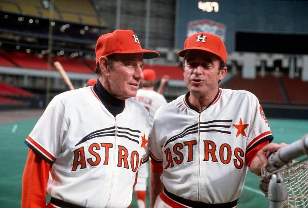
Houston Astros:

There was no other option but to try Tequila sunrise on a basketball uni. Alt is of the Houston Colt .45s, the team name before becoming the Astros.
Kansas City:

I used the crown from their primary logo and put it over the numbers to give the other wise clean look a kick.
LA Angels:

Home and away fonts are based off the Golden State Warriors jerseys in the early 70s. Alt is the font from the 90s over some clouds to really hammer the “Angels in the Outfield” vibe.
LA Dodgers:

I used the red striping in the primary logo underneath the script to lead toward the number circle. Alt is of course in reference to the Brooklyn Dodgers.
Miami Marlins:

I created the wave look surrounding the numbers to use the blue and red colors the Marlins are too afraid to push for some reason. The alternate was an easy decision, going back to the teal and black Florida Marlins days.
Thanks, Eric! We’ll be back with the second half of your concepts shortly!
OK readers? What do you think?


Guess The Game…
from the scoreboard
Today’s scoreboard comes from Derek Reese. Two of them, in fact. Derek was at this particular game (and I think Paul may have been as well), and he snapped these pics.
The premise of the game (GTGFTS) is simple: I’ll post a scoreboard and you guys simply identify the game depicted. In the past, I don’t know if I’ve ever completely stumped you (some are easier than others).
Here’s the Scoreboard. In the comments below, try to identify the game (date & location, as well as final score). If anything noteworthy occurred during the game, please add that in (and if you were AT the game, well bonus points for you!):


If you really zoom in on the first picture, see if you can spot Gumby in the audience.
Please continue sending these in! You’re welcome to send me any scoreboard photos (with answers please), and I’ll keep running them.

Uni Concepts & Tweaks
Time for more Uni Tweaks from the UW readership.
I hope you guys like this feature and will want to continue to submit your concepts and tweaks to me. If you do, Shoot me an E-mail (Phil (dot) Hecken (at) gmail (dot) com).
Today’s tweak comes from Scott Russell, who has some tweaks for the Miami Dolphins.
Here’s a Dolphins refresh concept, made in isolation! I’m a lifetime Dolphins fan and hate what they did to their logo and uniforms in 2013. I would be perfectly happy if they went back to their throwback uni’s full-time, but why not try to update the logo as a natural progression from the previous set? Treat 2013 as non-canon and get back to the Dolphins looking like the Dolphins! I took a stab at refreshing the dolphin while remaining faithful to the iconic logo’s past composition, brought back and slightly refined the classic sunburst, went back to the lighter and more original orange and darker aqua tones (much like the throwbacks), and updated the uni’s and helmet to lean heavily on what made their past look iconic. I would love to see the team move forward with something like this, similar to how the Browns and Chargers leaned heavily on their iconic pasts, the Miami Dolphins should do the same


Thanks Scott!
OK readers (and concepters). If you have some tweaks or concepts, shoot ’em my way with a brief description of your creation and I’ll run ’em here.
And now a few words from Paul
Hi there. In case you missed it on Friday, my latest piece for InsideHook features my list of 20 uniforms that should be revived as throwbacks (and have never gotten the throwback treatment before). Check it out here.
Also:
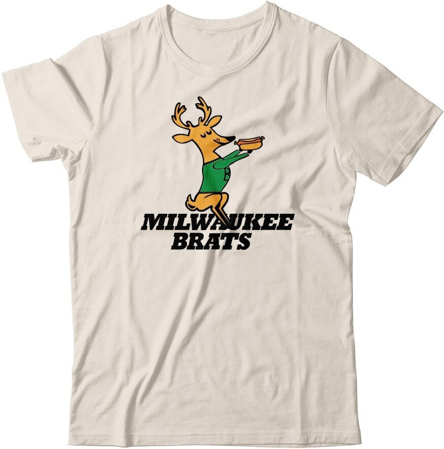
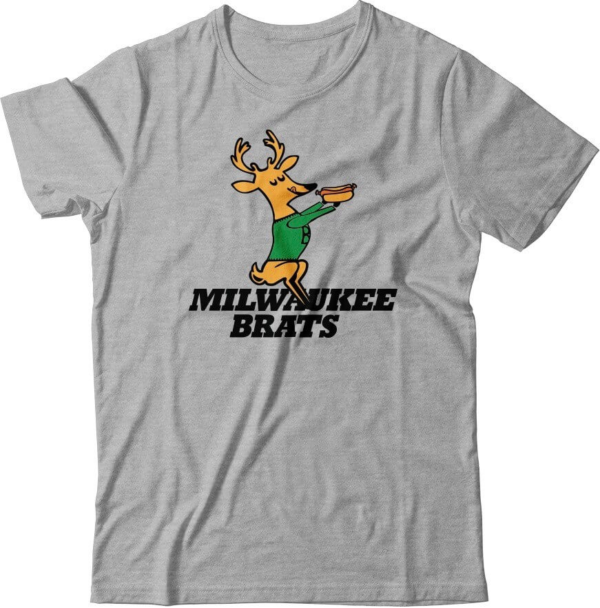
• Don’t these cream and grey Brats mockups look nice? Wouldn’t it be fun, just theoretically, if they existed for real? If you agree, let me know.
• The Uni Watch Pin Club’s design for June will launch on Monday. I think you’ll really like it! Meanwhile, we still have some of the May pins left, along with the March, February, and January pins. (Sorry, April is sold out.)
Speaking of which: If you order multiple pins and find yourself getting hit with multiple shipping charges on the one order, go ahead and place the order and then email me — I can arrange for the extra shipping charges to be refunded.
• Remember that you can save a 15% on all of the pins, and on everything else in the Uni Watch Shop and the Naming Wrongs Shop, by using the checkout code COMMUNITY.
• In case you missed it last week, Uni Watch cufflinks, which usually sell for $26.99, are now just $16.99. Perfect for all those formal events on your busy shelter-in-place social calendar!
• I was about to run out of green seam rippers, but I just got another big shipment from the factory, so I’m well-stocked on all colors.
• Don’t forget about the awesome Uni Watch chain-stitched patches, hand-made for us by the great Amy Bengtson!
As always, thanks for listening, and for your consideration.

Too Good…
for the Ticker
Once again, beautiful artwork on the Twitter from Bowen Hobbs. It’s simply Too Good…
…for the ticker
Here’s more beautiful artwork from Bown, who recently did a fantastic Gary “Kid” Carter homage (and previously a gorgeous Reggie Jackson).
Earlier this week, he added an incredible Bo (Knows) Jackson, in his KC Royals finest:
o knows football. Bo knows baseball. This illustration shows Bo warming up to bat as a member of the Kansas City Royals.

You can follow Bowen and check out more of his work @bowenhobbs.
OK. Now, on to the ticker…
The Ticker
By Anthony Emerson

Baseball News: Last week the Mets’ YouTube page posted six minutes of their 1999 Turn Ahead the Clock game (from Shannon Shark). … Lotte Giants IF Dixon Machado evidently forgot his road jersey and was forced to wear the jersey of coach Hyon Choi (from Kirk Anderson). … Kiwoom Heroes C Lee Ji-young wears No. 56, and the 5 on his home white jersey looks pretty weird. Could it be a reappropriated two, or just weirdness with the font itself? (from Jorge Cruz). … MiLB is having fans vote to decide which Copa de la Diversión cap is the best (from @hvhtim). … Boston Celtic punk band the Dropkick Murphys wore Majestic Red Sox jerseys while performing a live-streamed charity concert in Fenway Park (from multiple readers). … Speaking of the Red Sox, @BSmile posted some great footage of the team retiring its first two numbers, No. 9 for Ted Williams and No. 4 for Joe Cronin, in 1984. Though no one had worn 9 since Williams retired 24 years prior to his number retirement, the No. 4 had been worn as recently as 1982. … Jersey City brewery Departed Soles has created a new beer, “Trash Can Banger,” and its can features the tequila sunrise motif (from Mike Chamernik).

NFL News: Robert Bacon has reviewed the uniforms of all 32 NFL teams on YouTube.
.
.

Hockey News: The Coyotes will wear the Kachina jerseys at every home game for their entire playoff run when the NHL gets going again (from multiple readers). … NBC Sports Boston has a good little video on why the Bruins wear black and gold (from @MyPintOfView). … The latest episode of NHL.com’s Who Wore it Best tries to determine who was the best player to ever wear 25 in the league.

NBA News: In this clip from a Rockets/Pistons game in February, the Pistons score bug logo is the team’s old red-and-blue horse logo, which was only used from 2001 through 2005 (from @kip4sox). … Mark Price posted a picture on Twitter of seven of his Cavs jerseys, worn over the course of nine years. This just reinforces how frequently the Cavs have changed the unis (from @PunCMD). … A designer has made a University of Vermont Catamounts uni for each NBA team (from @jtharpe41).

Soccer News: A young woman survived COVID-19 and has now pivoted her fashion house into making masks from NYCFC jerseys. … Scottish fourth-tier team Stranraer has revealed its 150th anniversary kit. “it’s more of a throwback to the 1970s than the 1870s. Historical Football Kits tells us that the crest on this shirt was worn from 1961 to 1985, and the whole kit resembles what they wore for most of this period,” says our own Jamie Rathjen. … Macron has revealed the new home shirt of Welsh side Barry Town United (from Ed Żelaski). … Danish side AGF Aarhus used Zoom to create a virtual crowd for their match against Randers FC (from Wade Heidt). … Graham Clayton sends along this gallery of all the kits worn in 1984-85 Serie A. … New unis coming for the Houston Dash? (from Ignacio Salazar).

Grab Bag: Popeyes is getting a new brand identity, dropping the more goofy designs for something more staid (from Dylan Landon).
.
And finally… Big thanks (again) to Eric for the MLB/NBA crossovers, and we’ll get to the rest in a future post. Please let him know what you think in the comments below!
Lots and lots of things going down in many American cities the past several days, with even more last night. Everyone, please be safe!
Peace,
PH
GTGFTS
September 28, 2008
Marlins at Mets, Final game at Shea
I was there too!
I was there too.
New unis coming for the Houston Dash?
Only one, the other one came out a few months ago. What is shown in that picture looks more or less the same as the one it would be replacing.
My item is link.
Speaking of Ticker links. Where do we send ticker suggestions?
1. Mark Price didn’t wear at least 2 of those designs – top left and top right.
2. As much as I loved Eric’s NBA-as-MLB crossovers, going in reverse did not translate nearly as well. Too many illegible front numbers (Orioles, Dodgers, Rockies), ghosted numbers, awkward color combos, overwrought designs and small front numbers. Full marks for trying and very creative, but the first priority of a player’s uniform is to identify the team and the player. You can’t make out the number on a lot of them. It’s tricky coming from a sport where the base uniform is usually white or gray to a sport where a lot of darker team colors are used.
Price wore the top left one: April 22, 1994.
link
99.999999999% sure he never wore the top right one.
The Robert Bacon YouTube video is great, but it only reviews the bottom 7. Looking forward to the rest of it, though.
All in all, very well done Eric! I have written my assessments (with some tweaks here and there) below, but for the most part, very well done.
Marlins are amazing. The wave pattern is a fun touch.
Dodgers are as well, with a nice use of the GSW principle (number in logo).
Angels home and alt look really cool, away just looks a bit too cluttered with LOS ANGELES arched over the small circle. Also good use of GSW principle.
Royals are nice. Nice addition of the crown over the numbers!
Astros are my favorite. Tequila sunrise is always a win, and amazing use of GSW principle!
Detroit is good. I like the Negro Leagues alternate, that’s a nice touch.
Rockies have a good use of the mountain motif. It is hard to read such small numbers on all of the jerseys though—maybe make them bigger or make them straight silver.
Indians are good. I love the “Major League” themed alternate, that was fantastic!
Reds are nice. The GSW principle kinda works for the Mr. Redlegs black alt.
Chicago White Sox are pretty good, but I think that it’s an NBA rule that you have to have numbers on both the front and the back of the jerseys. I like the “Space Jam” themed alt, though it took me a little while to figure out the reasoning behind it.
Cubs are amazing—that light blue alt *chefs kiss*. I’d outline the W logo on the dark blue away with something like white or red because I had to zoom in pretty far to see what it was supposed to be.
Red Sox are very nice. Love the Green Monster themed alt.
Orioles. Oh man the Orioles. I love what you’re going for here, but there is one glaring problem that is hard to gloss over. The GSW principle does not work here! If you’re using the Maryland flag pattern like that, use it, just maybe relegate it to the side panels so that you can read the numbering.
Atlanta is very well done as well. Especially love the throwback alt.
And finally the D-Backs. Purple and teal has always been a color combination that works surprisingly well for me, so I’m glad that that was what you leaned in to with this particular concept. The black alt, though fun in theory, is a little hard to read in execution.
Amazing how much better the baseball graphics look on a basketball uniform than vice versa. It goes to show how much more enduring the designs of MLB are than the use-once-and-throw-away stylings of most NBA teams.
One more throwback uniform I’d like to see: The 1977 San Francisco Giants. The team wasn’t very good but it was a solid look, particularly the orange road jerseys with vertically arched Fancy Block lettering.
Really good job Scott Russell on the Dolphins logo. This is exactly what I would want to see (and many others I imagine) to replace the current logo and works well for a plan for them to bring back throwback design fulltime.
Scott Russell’s design would be at least as good as any Dolphins uniform (I’d say better). I wonder how his Dolphin would look wearing a helmet. I don’t like how the old dolphins look like home cut rubber stamps and I don’t like how the 97-12 dolphin looks like an angry cartoon (the black number shadow of that time is a travesty). Russell’s looks a little grumpy but not like a caricature. I’d like to see the current stylized logo in a jumping position (with or without the helmet). I love the 1980s era helmet and unis, and think the 2013 re-design was a slight downgrade (the unis/helmet stripes are worse than the logo). The old Miami uniforms are a classic, but they have never gotten the Dolphin just right.
Just a note, the new font for the Popeye’s logo is called “Chicken Sans.” Really.
Really appreciate the effort and talent it took to do the MLB-NBA crossover but something about them just feels off.
Of all the major sports I think MLB-NBA is the worst crossover aesthetically. Part of it might be the jersey style used was more of the sleeveless t-shirt instead of tank top. The sleeveless t-shirt style comes off as a “fashion jersey” a casual fan would buy at Wal-Mart.
With that being said there are some great design elements that would carry over to a tank top style.
The “Dirty Laundry” Colts jersey would be a favorite of mine with different base colors. The Rams may have ruined that color for me.
Absolutely love the Dolphins concept, they could wear that this season and it would be an upgrade.
Scott Russell did a fantastic job on the Dolphins. I’m not a Dolphins fan; but I’ve always wondered why a storied franchise would make such a drastic change. Even the minor tweaks over the years have seemed unnecessary. Their look didn’t start suffering until right before Marino retired and they went to the drop shadow look. It just didn’t suit them. Prior to that era the Fins always looked great.
I think would be a tremendous step in the right direction. As much as I dislike the white face masks on their current set it looks really nice with your version of the updated logo. Great work!
Total agree on the Scott Russell tweaks – only thing I would add or curious about – isn’t the helmet on the dolphin a quirky touch that ppl liked?
Not a dolphins fan, but love their classic unis. This set would be a giant improvement over the current set. If I had to make one change it would be to put the helmet on the dolphin in the helmet logo. Otherwise, well done!
Great MLB/NBA crossovers. Love the argyle look for Arizona. I believe the NBA requires numbers on the front, so the White Sox wouldn’t work. And I’d love for the Dodgers “Brooklyn” uniforms to be the old school satin in royal blue.
I’ve also noticed how weird the 5 that the Kiwoom Heroes usees. Park Byung-ho (#52) is super strange looking to me–it looks like two S’s.
link
As a Miami fan, I love the Dolphins uni tweaks, especially the socks on white/aqua set. (I hate when Miami wears their aqua pants with all aqua socks.) Not sure how I feel about the logo though
Was the old Pistons logo used on the Blazers broadcast because the team was celebrating ’90s night, perhaps?