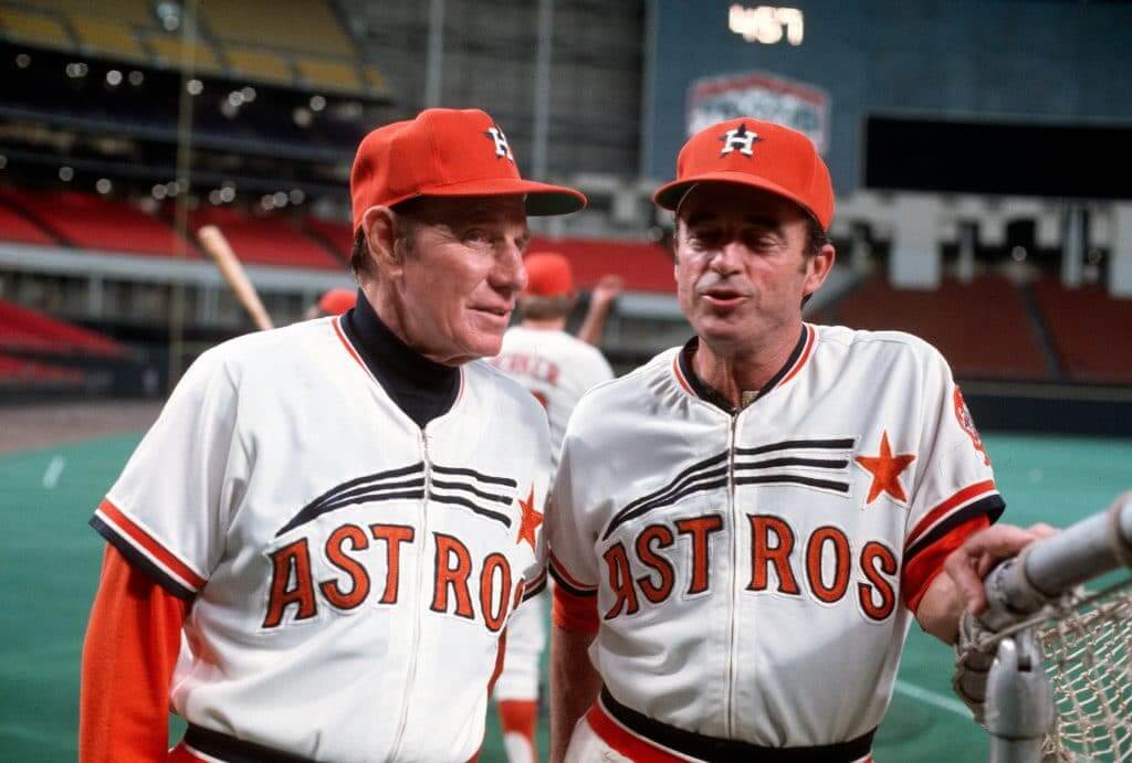
Good morning! My latest piece for InsideHook is about 20 throwback uniforms that I’d like to see on the field, court, and ice. As I mentioned last week when asking for suggestions, my rule for this piece was that I would only include designs that had never previously gotten the throwback treatment (so Pat Patriot and Bucco Bruce are not on the list, but the Astros’ orange-lettered shooting star design, shown above, is). Check it out here.
As an aside: Have two legendary baseball figures ever looked more out of place than Leo Durocher (above) and Yogi Berra in Astros uniforms? I suppose we could add Joe D. in an A’s uni. But the ’Stros really had a way of making the oldsters truly look like they were visiting from another era, or even another dimension, no?
Click all photos to enlarge
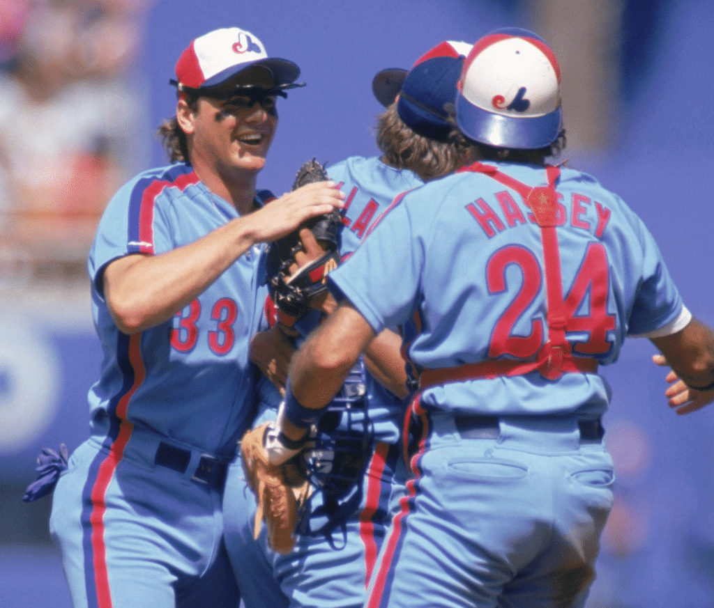
An Expo changes his stripes: The photo shown above was taken at Dodger Stadium on July 28, 1991, at the conclusion of Expos pitcher Dennis Martinez’s perfect game. All you can see of Martinez himself is the underbrim of his cap; the other players in the photo are, from left, outfielder Larry Walker, third baseman Tim Wallach, and catcher Ron Hassey.
Notice anything weird going on?
It’s easy to miss, but the stripes on Wallach’s pants are oriented backwards. The red stripe should be facing forward, as it is on Hassey’s and Walker’s pants. But on Wallach’s pants, the blue stripe is facing forward!
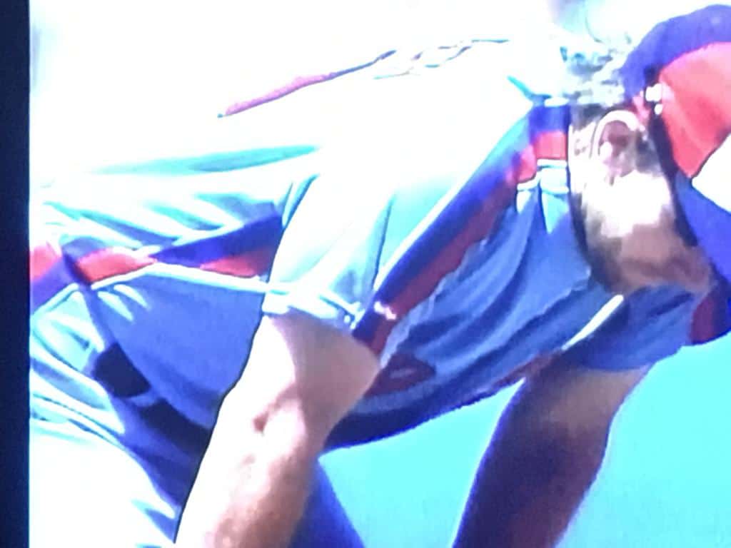
The glitch is much more obvious in this next shot (which is from that same game), because it interrupts the flow of the uniforms racing stripes:
Here are two more shots of Wallach from that same season (although I don’t know the exact dates), both showing the incorrect pants striping:
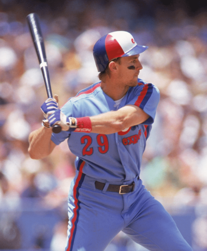
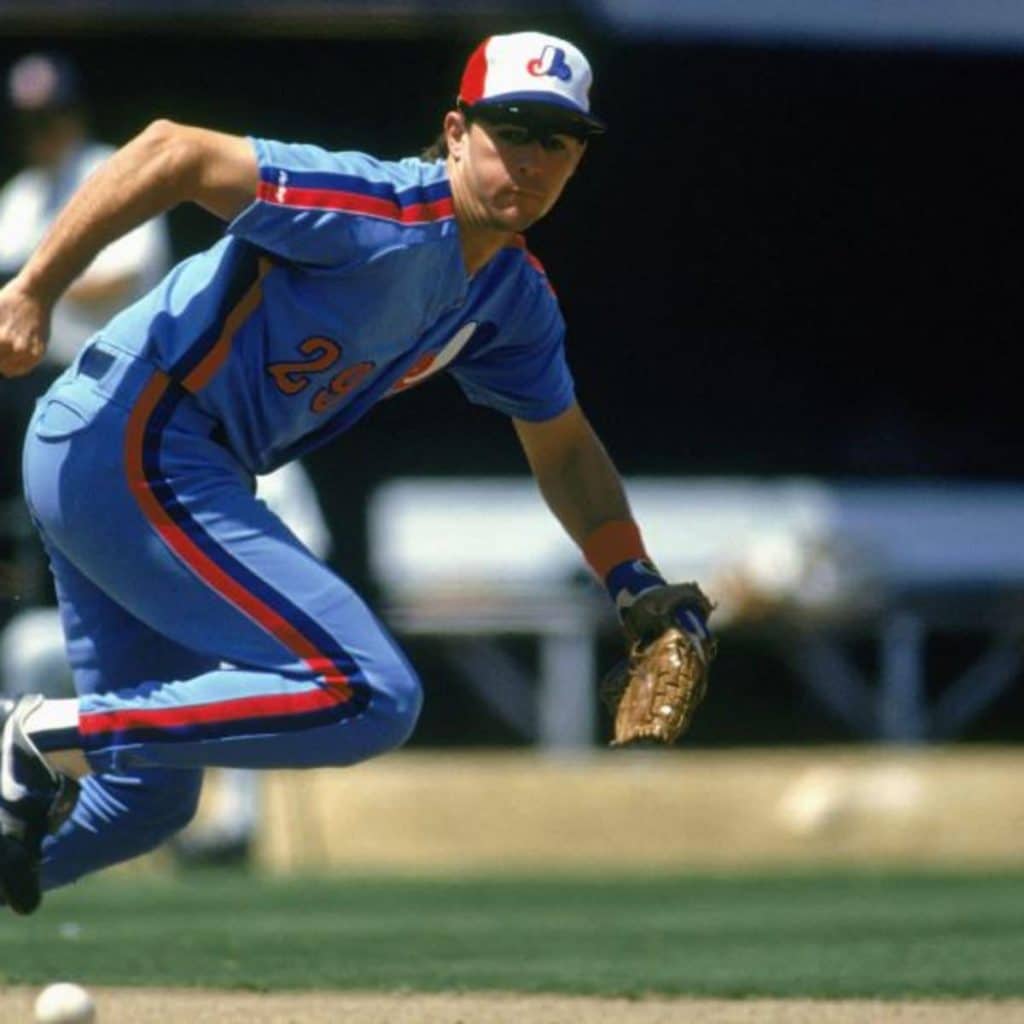
This definitely wasn’t a season-long thing, because most 1991 photos of Wallach show him with the correct striping. It was apparently just a short-term glitch that was corrected with a subsequent pair of pants. Still, the error was immortalized on two of Wallach’s 1992 baseball cards:
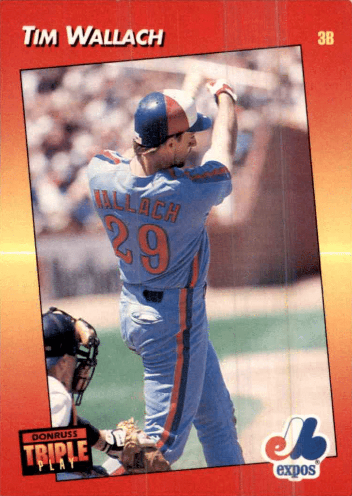
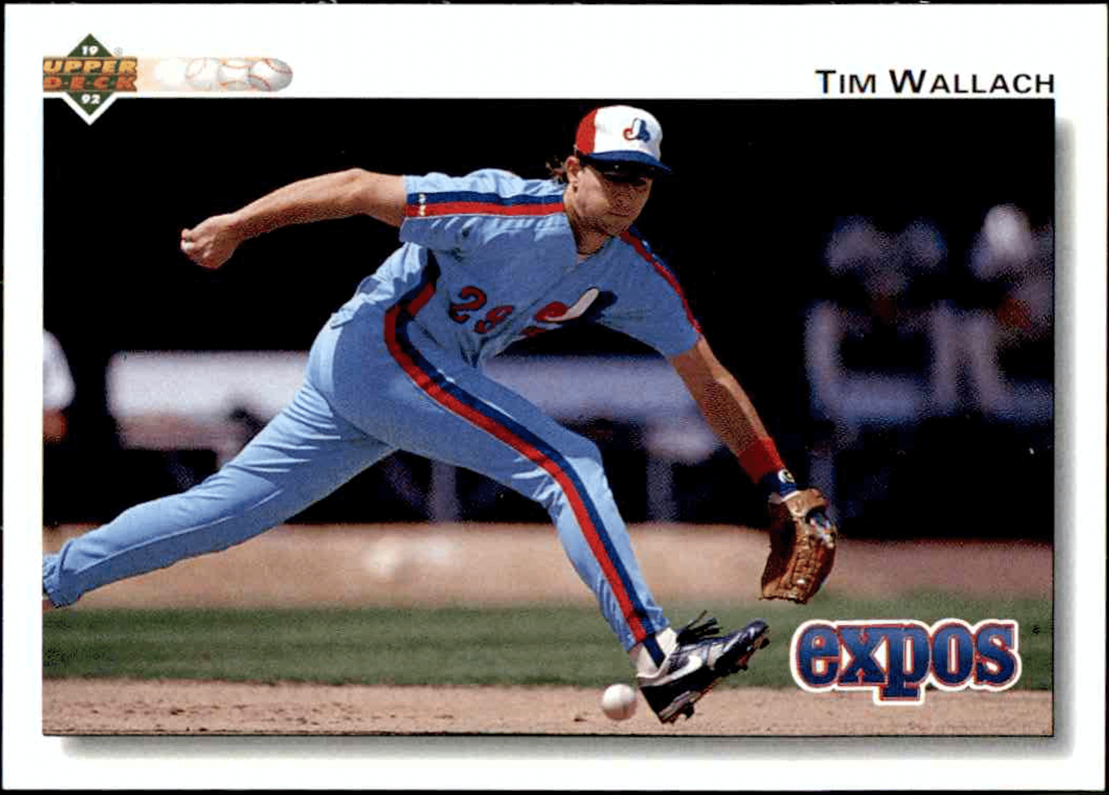
One side note: This would have been much more difficult to research if it involved a glitch with Wallach’s (or any Expo’s) home uniform. Wire services and card companies rarely sent photographers to Montreal — instead, they’d just wait until the Expos passed through one of the more convenient National League cities. As a result, there’s a much better photographic record of the team’s road uniforms than there is of the home whites.
(Big, big thanks to eagle-eyed reader Josh Oubadia and his friend Skip Sherman, who spotted Wallach’s wayward striping and brought it to my attention.)
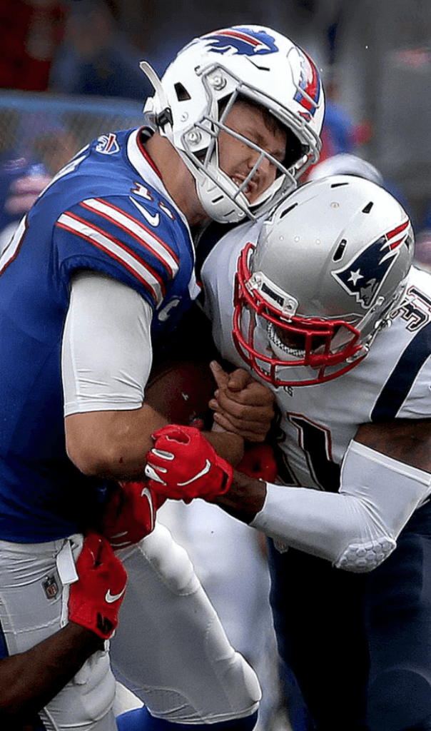
Oh for fuck’s sake: ESPN.com’s Bills beat reporter, Marcel Louis-Jacques, took blue collar bullshit to a disgusting new low yesterday. At the 18:18 mark of this podcast episode, host Mina Kimes and Louis-Jacques had this exchange regarding Bills quarterback Josh Allen:
Mina Kimes: One of the areas where I don’t think Josh Allen needs to improve at all is athleticism. His rushing ability is incredibly impressive. However, it can also be scary — the fact that, you know, he puts his body on the line and takes hits. How aware is he of the risks sort of associated with him exposing himself to those types of hits, and do you think that’s something he’s going to modulate going forward?
Marcel Louis-Jacques: Yeah, Mina, it’s like the most Buffalo quarterback thing you’ll ever hear. [Kimes laughs.] He said that coaches call designed runs for him early in the game so that he can get hit, because he likes that contact and he wants to get used to it. And that’s about as blue-collar as you can be.
Yeah, wanting to get hit is “about as blue collar as you can be.” Because as everyone knows, the working class seeks out and even craves physical punishment. I mean, that’s common knowledge, right? That’s why the working class is so admirable — because they gladly sacrifice their bodies!
The reality, of course, is that lots of blue-collar work leaves people with badly broken bodies. But nobody wants that, and the real blue-collar workers who end up that way aren’t paid $5,295,760 per year for their labor like Allen is.
What an idiotic thing for Louis-Jacques to have said. I’ve been saying all along that blue collar bullshit reduces real working people to patronizing caricatures, and you’d be hard-pressed to find a better example of it than this. The sports world really needs to find a new metaphor, and fast.
(My thanks to reader Andrew Cosentino for bringing this one to my attention.)
ITEM! Wallpapers update: Reader Mike Slesinski has made five phone-sized Uni Watch wallpapers, which I’ve added to our wallpaper gallery. If you want to download any of them, click on the thumbnail; then, on the resulting Flickr image page, click on the download arrow and choose “Original” from the popup menu. Enjoy!
(My repeated thanks to Brinke Guthrie and Tom Maynor for creating the first batch of wallpapers, and to Mike Slesinski for the five new additions.)

ITEM! International membership raffle: Reader AJ Santiago, who lives in Canada, recently donated a membership for me to raffle off, with an interesting stipulation: He wants this membership to go to one of our non-USA readers. So that’s what we’re going to do today.
This will be a one-day raffle. In keeping with AJ’s request, this raffle will only be open to readers outside the United States. To enter, send an email to the raffle address by midnight Eastern tonight. One entry per person. I’ll announce the winner on Monday.
Speaking of raffles, the two winners of yesterday’s membership raffle are Kevin Brown and Josh Bradford. Congrats to them, and big thanks to reader Frank Seitz for sponsoring that one.

Pin Club update: The Uni Watch Pin Club’s design for June will launch on Monday. I think you’ll really like it — stay tuned.
Meanwhile, we still have some of the May pins left, along with the March, February, and January pins. (Sorry, April is sold out.)
Speaking of which: If you order multiple pins and find yourself getting hit with multiple shipping charges on the one order, go ahead and place the order and then email me — I can arrange for the extra shipping charges to be refunded.
Also: Remember that you can save a 15% on all of the pins, and on everything else in the Uni Watch Shop and the Naming Wrongs Shop, by using the checkout code COMMUNITY.
While we’re at it:
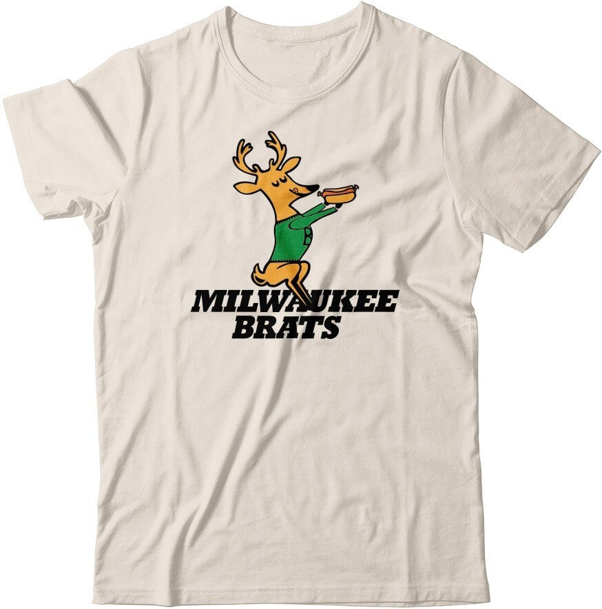
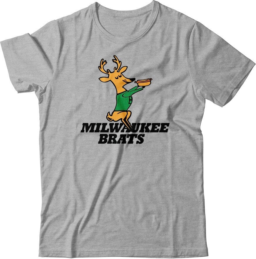
• Don’t these cream and grey Brats mockups look nice? Wouldn’t it be fun, just theoretically, if they existed for real? If you agree, let me know.
• In case you missed it last week, Uni Watch cufflinks, which usually sell for $26.99, are now just $16.99. Perfect for all those formal events on your busy shelter-in-place social calendar!
• I was about to run out of green seam rippers, but then I got another big shipment yesterday from the factory, so I’m well-stocked on all colors.
• Don’t forget about the awesome Uni Watch chain-stitched patches, hand-made for us by the great Amy Bengtson!
• Still sold out of all Uni Watch cap sizes except for 7 and 7-7/8. More coming soon (or at least soon-ish), I’m told. If you want to be notified when the other fitted sizes and/or adjustables are back in stock, shoot me a note.
• And finally, don’t forget about all the cool stickers and magnets available from our friends at StickerYou.
As always, thanks for listening, and for your consideration.
The Ticker
By Anthony Emerson

Baseball News: This 1967 check from the Reds features Mr. Redlegs running from left to right. “First time I’ve ever seen that!” says Paul (from David Sonny). … Mike Schmidt was wearing a bedazzled Phillies jersey on the MLB Network last week (from Dan Cichalski). … Here’s a YouTube compilation of MLB uni mishaps (from Mike Chamernik). … The Pirates’ social media crew gave the team’s uniforms the Animal Crossing treatment (from Paul Simpson). … White Sox OF Harold Baines was missing his batting helmet logo in the 1989 All-Star Game (from @IwatchVHS). … The Kalamazoo Growlers of the Northwoods League will rebrand themselves as the Kalamazoo Mac Daddies on June 21, to “honor fathers and mac and cheese lovers.” That’s if the Northwoods League actually plays (from Will Scheibler). … Mets mascot Mr. Met apparently had gigantic “Mr. MET” NOB lettering on his jersey back in the 1970s. And yes, it’s also cool to see Willie, Mickey, the Duke, and Joe D. in that photo (from Dwayne White).

Football News: Everyone knows Ohio State has sans-serif NOB lettering. So why did a couple players on the 2002 squad have serifed NOBs? (From Mike Knapp.) … Here’s an unopened bottle of Dr. Pepper from 1981, celebrating Baylor’s Southwestern Conference championship that season. Check the whole thread, too, for lots of other unopened commemorative soda and beer bottles. … New Mexico State football unveiled a new secondary logo yesterday (from Matt Rashford). …The NFL and EA Sports have agreed to extend the Madden video game’s license through 2026.

Hockey News: Canucks F Jake Virtanen recently posted footage of himself driving while in full practice gear, including practice uniforms (from Wade Heidt). … The Vegas Golden Knights’ AHL team in Henderson, Nev., will be known as the Henderson Silver Knights (get it?) when they take the ice in the fall. Here’s a breakdown of the logo (from multiple readers).

NBA News: Here’s a really great story about how Michael Jordan switched from 45 to 23 during his first comeback season (from Mike Chamernik).

Soccer News: Arsenal’s new away shirt has leaked, and while that design is probably supposed to evoke marble or something, it’s really going to look like the players ax-murdered someone right before taking the pitch (from Josh Hinton). … Scottish second tier side Raith Rovers revealed their new primary kit yesterday. “I would guess that the numbers included in the video represent the new SPFL number font,” says our own Jamie Rathjen. … Canadian Premier League side Atlético Ottawa have unveiled some really nice home kits for the 2020 season (from Moe Khan).

Grab Bag: The logo and name for Major League Rugby’s new expansion team, the LA Giltinis, were released yesterday. This makes LA the second MLR team to be named after a cocktail, and both cocktails were invented by the same dude (from Sy Hart and Andrew M.). … The Smithsonian has a huge, free, online library, and among their vast collection, they have a full 1955 catalog from Champion Knitwear Company (from Max Weintraub). … Stephen F. Austin athletics is planning a reveal on June 1 (from Prentice C. James). … Bumble Bee Seafoods has removed the Bumble Bee mascot from its packaging (from Timmy Donahue). … The Boston Marathon, which had initially been postponed until later in the year, has now been cancelled.

Click to enlarge
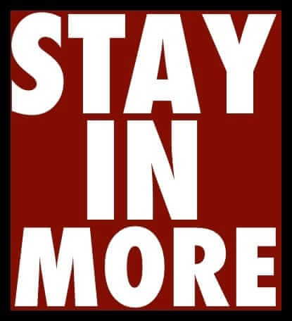
What Paul did last night: Our landlords got so pissed off at the succession of cars partially blocking their driveway that they came out yesterday with a traffic cone (which I guess was floating around in the basement or something, although I don’t recall seeing it here) and used it to mark the driveway’s edge. That, plus a rare parking vacancy across the street, gave us an unprecedentedly unobstructed view yesterday.
Just as I was taking this photo, the red car that you see in the background pulled into the spot across the street. But as the driver got out, a passing pedestrian pointed out that he had parked right underneath the hanging branch (which is still there). The driver looked conflicted — you could almost feel the gears clicking in his head as he calculated the risk of the branch falling on his car versus the annoyance of having to look for another spot. I shouted, “Don’t worry, it’s been there for months!” but I don’t think he heard me (or maybe just didn’t realize what I was referring to). He ultimately got back into his car and drove off.
As always, you can see the full set of Pandemic Porch Cocktails™ photos here.
1. NM STATE has a new wordmark, not UNM.
2. That Tim Wallace glitch only underscores how beautifully awesome those Expos uniforms were. Of their 3 main eras, those were the best. The initial sets were plain, except for the caps. The last set wasn’t them; they were not a pinstripe team.
3. Can we have a link to your Inside Hook story?
NM State item fixed.
As noted in the first graf, InsideHook link coming later this morning.
Nah, the Expos first look was tasteful (well, from the neck down). They took a turn toward the garish with racing stripes and red numbers.
The racing stripes were not garish, they were sleek. I agree that the red numbers were an error.
marcus rashford
To underscore your point about the lack of photos of Expos players, it appears that the photo of Tim Wallach fielding was taken right before the Upper Deck card. The bench behind him appears to be the same, and has the same pile of clothing.
Not sure why I remember that card so vividly either. Weird how a baseball card from nearly 30 years ago can still be kicking around in my brain.
The Astros were supposed to wear the throwbacks pictured in your lead tonight at home against the Red Sox. I don’t think they’ve ever worn either the 1971 uniform (buttons and no stripes) or the 1972-74 uniform (zipper and stripes) as throwbacks.
link
Correct. They’ve worn the navy-lettered shooting star design as a throwback, but never either of the orange-lettered ones.
The InsideHook piece is now up:
link
Really liked the piece Paul but I loathe the idea of OKC wearing Seattle Super Sonics unis. Each league should require teams that are relocating to rebrand and leave the name, colors and history behind.
I disagree about the required rebranding for relocating franchises. It’s one thing for a team to willingly leave their history behind/up for grabs (like what the Thunder are doing by not resisting the naming of Seattle’s expansion franchise?) and another for owners to surrender bought-and-paid-for property by mandate of the league.
Also, it’s a good history lesson for casual and even non-fans to see, say, the Nationals dress as the Expos or the Avalanche to throw back to and their Nordiques’ identity since it’s likely that Montreal and Quebec City will not get another team to fill the void and no one sees these uniforms in action again; either they get to celebrate their legacies or the legacies won’t get celebrated at all. And it’s not ‘trolling’…it’s truth-telling.
In hockey, the lost history of the Cleveland Barons and California/Oakland (Golden) Seals is probably not ‘worth’ remembering…still, I’d like to see the Dallas Stars pay tribute to them both maybe once just for grins…but imagine a professional football world without the Raiders and their signature Silver-and-Black or the lightning bolts and blues of the Chargers…the NFL won’t be placing teams there probably ever.
Only thing there I have a bit of a disagreement with is when you said the Minnesota North Stars never “had a bad uni”.
Share your opinion for all the green sets but the 1991-93 set is at the very least not good.
I had a branch piece like that hanging on a tree in my backyard for over 10 years.
The tree in my neighbors yard has had two branches stuck way up there for 12 years. I should send in pix to Paul. Branch Watch!
On a completely unrelated note, I received my purple cap today. It looks great in person and it actually matches my shirt today.
I have a similar one in my backyard as well. I’ve only been in this house around 2 years, but it’s been there the whole time. We’ve had a couple nasty storms with major gusts of wind where I’ve expected it to come down, but it’s holding strong.
I think I like Tim Wallach’s striping as much as the regular Expos unis!
…will rebrand themselves as the Kalamazoo Mac Daddies on June 21, to “honor fathers and mac and cheese lovers.”
…the LA Giltinis, were released yesterday. This makes LA the second MLR team to be named after a cocktail,
The next team to rebrand should call themselves the Shark Jumpers, because we’ve reached that point. Just stop already.
Yeah, surprisingly it doesn’t look awful mismatched.
The next team to rebrand should call themselves the Shark Jumpers, because we’ve reached that point. Just stop already.
I’ve never rooted for baseball not to be played, but I might make an exception in this case.
I’m sure that the Arsenal press kit will say that the kit is supposed to invoke the marble halls of Highbury, but nothing can excuse how bad those are. Besides the fact that Arsenal should never wear white. Leave that color for Spurs.
Buffalo looooooves itself some blue collar fetishism. Even as the blue collar jobs have all but disappeared from the region. Sure, Buffalo has a GM plant. But that doesn’t employ the entire population of the region, nor does it define them.
Paul’s InsideHook list divides into 3 categories for me:
1) Quirky but terrible uniforms that should never again see the field of play (looking at you, Cooperalls, baseball shorts, and Mighty Ducks);
2) Great uniforms that the team in question should adopt as its primary uniform right now (ahem, Astros, Seahawks, Steelers, Patriots);
3) Teams that don’t exist any more but should, and if they did, they should wear that uniform (thumbs up, Sonics, Nordiques, North Stars).
On Turn-Ahead-the-Clock uniforms, the ones baseball wore in the late 1990s should never be worn again. Instead, next season would be a fun time to revisit the idea and design a whole new set of one-game uniforms on the idea of predicting the shape of the game in 2050. (The original 1998 uniforms were meant to depict 2027, so for 2021 2050 would be the corresponding forward view.)
Those three categories really do seem to cover the whole gamut, don’t they? (Although I do think, under Category 1, that kitschy “so bad they’re still bad” designs can be fun for one-off occasions.)
The Islanders’ “fish sticks” uniforms? Definitely Category 1!
The Milwaukee Bucks’ “Irish Rainbows”? Category 2. (Although I have a slight preference for the red-trimmed versions worn from link to link. If the all-green version is the “Irish Rainbow,” should we call this the “Christmas Rainbow”?)
The Jacksonville Jaguars? Also Category 2. (Although I think they could keep their updated jaguar head logo and still look fine.)
Baseball sweaters are kind of their own thing, but I suppose you could fit them in Category 2. Every team should</i? bring them back (especially those in classically-styled uniforms like the Red Sox, Yankees, and Tigers).
I agree with category 2 for the Bucks. However, prefer double green “Irish Rainbows” rather than the red-trimmed version. Not a big fan of red and lime green being together in a colour scheme.
I feel like an idiot…I cannot see the branch in question! I’ve watched that video like 3x in a row and still don’t notice it. What is wrong with me???
It’s a little hard to see, but it’s here:
link
Look at that area of the video and you can see it swaying back and forth.
Yes! Traffic cone! Close enough to the ol’ Parking Chair!
Oh, man…those Astros unis look better every time I see them.
The North Stars and Nordiques unis were also glorious. I miss them both.
We can still get a taste today of a uniform similar to the old North Stars if one follows junior hockey. Thank you to the OHL’s London Knights.
link
Mild correction on your InsideHook post regarding the Patriots’ uniforms.
They did not wear those in 1994. The stripey ones were 1995.
This was 1994: link
Good point! Will try to get my editor to fix it.
You stated this in your throwback article concerning the Seahawks uniforms…“football uniforms should have some contrast between the jersey and pants!” I’m curious how you feel about all white uniforms? I’m a big fan of all white when the team has white helmets like the Colts. I’d like this for the Cardinals, but the red shoulder yoke ruins this look. However with teams like the Chiefs, I usually prefer the pants matching the helmet when paired with a white jersey.
I’m OK with mono-white, but I prefer white jerseys with colored pants.
Paul, I was going to ask about your landlords and whether your relationship with them has improved or not ever since they got very nervous about your friends getting too close to the porch previously. I was also going to mention the use of traffic cones to “reserve” spaces but it’s something I’ve only seen in my part of Queens sparingly. (The house I’ve seen doing this has a family member who is handicapped so the household wants to ensure their front parking space by their wheelchair access ramp is unobstructed)
Paul, I was going to ask about your landlords and whether your relationship with them has improved or not ever since they got very nervous about your friends getting too close to the porch previously.
We have a great relationship with them — they’re wonderful people and great landlords. They just made that particular request of us, so we complied, even though we thought it was a bit much.
Some of the irony in the blue-collar trope is that in the early days of football in England, blue-collar types played association football rather than rugby to *avoid* getting injured and losing work, while it was the upper class that played rugby as they could afford to be injured.
As the old saying goes, “[Association] Football is a gentleman’s game played by ruffians; rugby is a ruffian’s game played by gentlemen.”
Paul – have you spoken with any reporters/writers who go back to the blue-collar metaphors a lot? I wonder if the issue is something they think about at all, or if it is more a crime of ignorance where writers are so used to the metaphors that they don’t consider it to be belittling of actual blue collar workers. Could make for an interesting piece.
Thanks for the suggestion. Will consider it!
I still can’t understand why the Astros only went half way when they changed uniforms in 2013. It was like they saw how great the old shooting star design was, but then took out the shooting star element which made it great. Make orange hats the primary, and put the shooting star on both the home Astros and road Houston set and they would have some of the best uniforms in baseball. (Assuming they properly center the lettering as well)
At the time, I assumed those unis were transitional by design. I figured the team didn’t want a returned shooting-star uni to be tarnished by the ignominy of the 2013-era rebuild, and that they’d reintroduce it once the rebuild was bearing fruit. Glad I didn’t bet money on that … but I too would like to know what they WERE thinking.
When was the last time an MLB team was that long-thinking and strategic about a uniform rollout? I think it’s most likely that the Astros suits were thinking, “These are some fine looking uniforms, and the fans will love them.” Which was an accurate thought! The Astros have some of the best uniforms in baseball, even if some of us have strong opinions about how they could be even better. (Shooting star on the chest, orange primary home cap.)
I really like all the uni-watch merch you normally make – I have some pins and a hat – but slightly altering an NBA franchise’s logo seems like a cheap way to make a BUCK (pun intended). I know I know, these probably *could* fall under the parody category, but to me, it just feels lazy and ripping off someone’s creative design and trademark. I feel like you should stick with original designs but that’s just my 2 cents.
Taking a well known logo, tweaking it and making it something else is a time honored and noble thing to do. Paul is hardly the first or only person to do such a thing (I know you didn’t say that nor was your point).
In punk rock, it’s almost a requirement.
Here is a punk rock example from a band I like called Jawbreaker:
link
Read what it actually says in the lower left corner.
Jawbreaker was hardly the first either.
I’d actually love to find pre-1970 or 80s examples. Hmmm…
Lee
One 1970s example I just thought of was Wacky Packs.
link
Lee
Paul has been designing shirts like that for years across all teams and leagues.
They’re funny.
if the tables were turned I bet Paul would NOT be ecstatic that someone was ripping his logo and making a profit off of it.
Deeeeeeeeefinitely not speaking for Paul, but while agree he may not be “ecstatic”, I am also not sure he would be pissed or annoyed (or whatever negative emotion you think he might have) either.
After all, if someone is going to effectively nick your logo (the term I have used for this scenario), it needs some general public recognition.
But I don’t know how Paul might feel.
Lee
Never really understood the explanation about Cooperalls being dangerous because you were more prone to slipping along the ice. Maybe it depends on who was making them. I wore Cooperalls for a couple of years as a minor hockey player when they were a thing. If you had the Cooper version, the texture of the material was not really slick (except side stripes). Did not feel like it was any more dangerous than wearing short pants and socks.
I know roller derby doesn’t appear here often, but yesterday Texas (Austin) superstar Freight Train modeled all the jerseys she’s collected from leagues she’s taught at/run clinics for: link
Very cool — thanks for sharing!
First bike ride with Uni-Watch Tequila Sunrise kit. Weather finally decent in Chicago. Jersey performs well and got a few compliments. Thanks to Paul from a satisfied customer.
My biggest agreement on which throwback uniform we need to see is the Nordiques. I gave myself a replica jersey for Christmas and have probably worn it 30 times since (though it’s been upstaged in recent weeks by the arrival of a yellow Uni Watch hockey jersey). Much as I love the Nordiques design, though, I have to confess, I never figured out the odd logo was modeled on an igloo.
Throwback that should’ve been worn: Mets Henleys from the late 70s. Loved those.
Whoa! That was joltin’ to see Joe decked out in mono yellow (with green sleeves and white cap)… but there’s a feel-good story behind it.. here’s a paragraph from Lodinews site:
But when DiMaggio retired in 1951, he lacked two years to qualify for the league’s maximum pension allowance. The A’s maverick owner, Charles O. Finley, had just moved his chronically last place Kansas City franchise to Oakland and was looking to make a public relations splash. Using all of his persuasive selling skills that he honed in his insurance salesman career, Finley eventually convinced DiMaggio to sign a two-year contract as the A’s Executive Vice President and Consultant.
The beauty of a zipper on a baseball jersey is it allows you to split the graphic exactly in half: AST-ROS. But the road jerseys said HOU-STON, so buttons would have made more sense. It’s the problem the team has now, only in reverse!
Tim Wallach’s uniform is only shown from the right side; did they get the left leg right? The Expos flouted an unwritten rule when they applied the trim to their uni with the red leading the blue. The usual custom (in all sports) is to lead with the darker/cooler color, white goes in the center (when applicable), and the trailing edge is the lighter/warmer color. Think of most of the sansabelt teams of the 1970. The logic governing the rule seems to be inspired by the flag code; think of the cool color as the staff, and the bright color as the banner. It was another cool way for the Expos to stand out from the pack.
Great detail about the photographers not making the trip to MTL b/c of logistical issues. I’ve never paid much attention to the overall look of ‘spos baseball cards, but I just love this tidbit.
Also, just reading through the Inside Hook article and caught a typo,
“Here’s the deal: In 1991, the 49ers helmet a press conference to unveil a new helmet design.”
Thanks, now fixed!
Worth mentioning that the jersey sponsor for Raith Rovers (or at least in that video) is well-known crime writer Val McDermid.
I loathe shirt advertising, but, if it’s going to happe, better a novelist than a betting company.
Mac Daddies uni tops look good but should have used cavatappi. That’s the money pasta for mac & cheese!
The Reds payroll checks from 1967 are kind of a hoot! Poor Johnny L. Bench could only hope to tag along with the likes of Peter E. Rose after games and watch him buy stuff. Bench was 19 and paid $5,500 as a rookie, according to Baseball Almanac. Rose, 25, was paid $46,000. His $2641.72 check (from Fifth Third!) comes out to roughly 17 payments – one every other week from early February to early October. By 1972, both players salaries had passed a hundred thousand dollars.
I would guess photos of the Expos home uniforms are prevalent in team programs and yearbooks of the era, even if the bubblegum card photos are usually from road games. Wasn’t Baines just wearing a repurposed Angels helmet in the ’89 ASG?
Joe D. in a Couple of nice looking SF Seals uniforms (B/W) and a signed one (color)
link
link
link
Kudos to the Dropkick Murphy’s!
Great show and they wore the Majestic jersey’s!
The entire NFL schedule was released Thursday night and the opening game to the 2020 NFL season was announced. The defending Super Bowl champion Kansas City Chiefs will host Kickoff 2020 inside Arrowhead Stadium as they welcome the Houston Texans. These two teams faced off in the 2019 playoffs, a game that saw the Chiefs storm back after being down 24-0 to eventually win 51-31.
The Kansas City Chiefs have officially revealed that they’ll open the 2020 NFL season facing the Houston Texans on “Thursday Night Football” at Arrowhead Stadium on Sept. 10. link The Texans will look to rain on the Chiefs’ Super Bowl banner ceremony and exact some revenge after their previous meeting. These teams last faced each other in the AFC playoff divisional round, where the Chiefs came storming back from a 24-point deficit to win 51-31. The game would be the first of multiple comeback victories by Kansas City on the way to winning Super Bowl LIV.
Texans’ key contributors during that game, such as WR DeAndre Hopkins and RB Carlos Hyde, are no longer with the team. This will be a very different team the Chiefs are facing to start the 2020 season, which should certainly signal an exciting opening game for the Super Bowl champions.