Good morning! I’m happy to report that I have a surprise for you today. Remember how I would periodically do the Uni Watch Power Rankings over on ESPN? That project is now back for your pandemic reading pleasure.
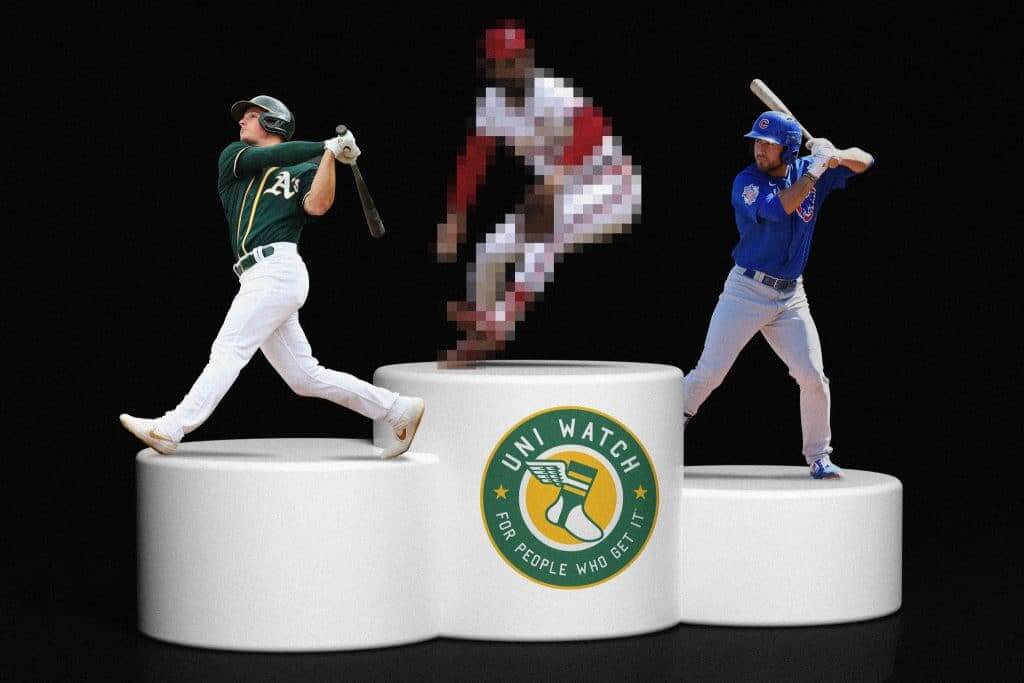
We kick off today with the Uni Watch MLB Power Rankings, which you can check out over at InsideHook. Enjoy!
Uni Watch Haiku: Today’s dispatch from the Uni Watch haiku studios is self-referential:
Uni Watch haiku
It’s athletics aesthetics
Set to three-line verse
As I’ve mentioned before, I’ve been writing these in my head during my daily exercise bike rides. And lately my head has been thinking about other things, so the haiku series may be nearing its end. But we’ll see.
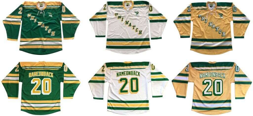
Hockey jersey reminder: Just a few days left to get in on the next batch of Uni Watch hockey jerseys. Available in three color options, two tailoring options, and with your choice of number and NOB. Ordering deadline is this Friday — full details here.
While we’re at it:
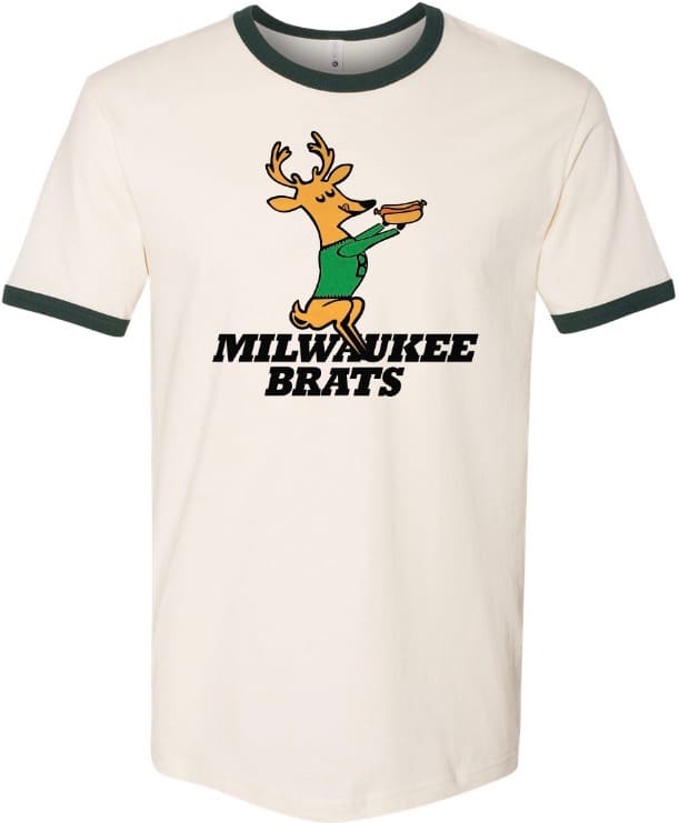
• Hankering for a nice, tasty brat? Let’s discuss.
• Pinheads and melonheads rejoice! I still have Uni Watch caps available in sizes 7 and 7-7/8 (all other sizes and adjustables currently out of stock while our factory is closed), and the price has been reduced to a pandemic-friendly $35.99.
• You can get 15% off of everything in the Uni Watch Shop and the Naming Wrongs Shop by using the checkout code COMMUNITY.
• Our latest Uni Watch Pin Club edition will launch on Friday. If you want to get caught up, here are the January, February, and March pins. (Sorry, April is sold out.) These qualify for the 15% COMMUNITY checkout discount.
• I don’t often mention this, but you can get lots of cool Uni Watch stickers from our friends at StickerYou.
• It’s also been a while since I’ve mentioned our pennants and chain-stitched patches.
Okay, end of sales pitch. My thanks, as always, for your consideration.


ITEM! Another membership raffle: Reader Sam Marcheschi recently ordered a membership card for himself and also donated one for me to raffle off, so that’s what we’re going to do today.
This will be a one-day raffle. To enter, send an email to the raffle address by 8pm Eastern tonight. One entry per person. I’ll announce the winner tomorrow. Big thanks to Sam for sponsoring this one!
If you’d like to support Uni Watch by ordering or donating a membership, you can do that here.
The Ticker
By Lloyd Alaban

Baseball News: Paul is quoted in this article about MLB’s best expansion team uniforms (paywalled) (from multiple readers). … Here’s an assessment of the best uniform in Mets history (paywalled) (from Kary Klismet).

NFL News: A bunch of Clemson alums got their NFL uni number assignments this week. … Some Cowboys rookies got their numbers too (from Mike Chamernik). … And so did the Panthers (from Steven Fidrych). … Speaking of the Panthers, here’s a video the team released of the equipment staff sewing nameplates onto team jerseys. Reader @AlecPastrami noted that the video showed jerseys with both the older and new templates. … Reader Matthew Blinco found this NFL uniform regulations poster at a Pool Hall in Madison, Tenn., in 2016. … Interesting retro Eagles shirt seen on a character from the TV series I Am Not Okay with This (from @GoinRounds).

Hockey News: The NHL will be selling team-branded face masks, with proceeds going to charities helping out with the coronavirus crisis (from Jeff Czuba). … The following items are from Kary Klismet: A Calgary Flames blog has waded into the debate about whether hockey players wear “jerseys” or “sweaters”. … Take a look at some of the Blues’ best unworn jerseys.

NBA News: Reader Jorge Cruz gave us a look inside the Adidas suite at the Blazers’ arena. There’s lots of Adidas-branded uni stuff framed on the walls. … Here’s the “untold story” behind the Dennis Rodman tattoo T-shirt (from Ryan Tullock). … Speaking of Rodman, he wanted to wear No. 69 for the Mavs in 2000, but NBA commish David Stern nixed it, so he wore No. 70 instead. Mavs owner Mark Cuban has some of the No. 69 jerseys that were made at the time, however.

College Hoops News: Yesterday we ran an item about the best Syracuse football uniforms in school history. Here’s a ranking of their best men’s basketball unis (from Kary Klismet). … Also from Kary: The Athletic has ranked what it considers the best (paywalled) and worst (paywalled) college basketball uniforms of all time. … Rhode Island men’s sent out this cryptic Instagram post, hinting that new uniforms might be on the horizon (from @fitzy955).

Soccer News: It looks like the Seattle Sounders’ white kit from 2015-16 was cursed (from Kary Klismet).
.

Grab Bag: Here’s the logo for the 2021 Women’s Rugby League World Cup, to be held in Brazil. … SB Nation is running a week-long segment on the best sports jerseys across sports (from Kary Klismet). … With so many TV news reporters working from home, this was bound to happen: ABC correspondent Will Reeve appeared on Good Morning America yesterday while not wearing pants.

Click to enlarge

What Paul did last night: Yesterday was the warmest, nicest day in ages. I don’t remember what we talked about; I just remember that it was super-pleasant (and that we didn’t meet any new dogs, dang).
For dinner: We’ve been sitting on a can of Gold Star chili that Uni Watch reader Frank Bitzer sent us more than a year ago after our visit to Cincinnati and had decided that it was finally time to enjoy it. But instead of having it over spaghetti, Cincy-style, we had it over rice, and our other “ways” were grated cheddar (which I opted not to have on mine), onions, sliced jalapeños (the Captain’s idea), and toasted panko breadcrumbs (my idea):
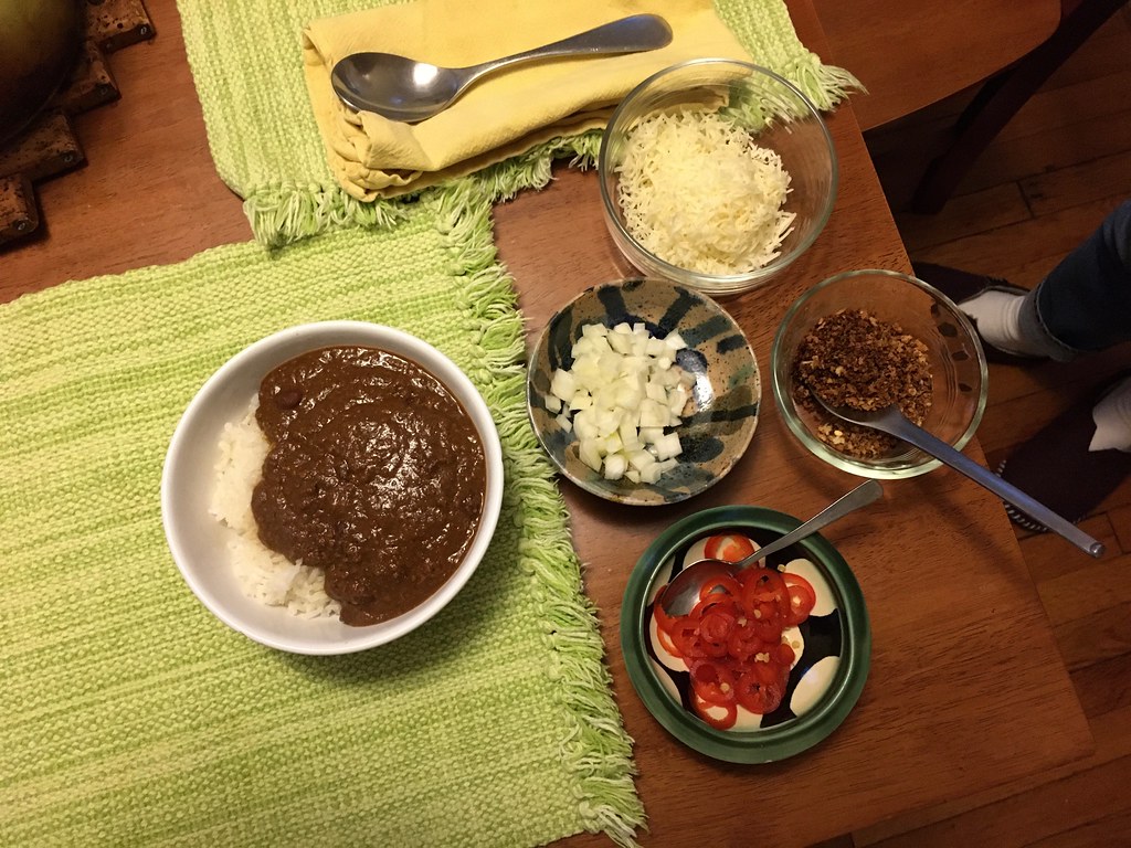

Heretical, I know. But so good!
I have another cooking project planned for today. Hope to have more to say about that tomorrow or Friday.
Meanwhile, let’s check in on Uni Watch girl mascot President Caitlin — li’l sun worshiper:

I’ll have more to say about her tomorrow as well. See you then. — Paul
It’s neat to see you quoted in several articles at The Athletic, Paul, and to see you referenced in the comments section for several more, generally in the context “this is bad; hire Paul Lukas instead”.
Note: Your power rankings section on the Red Sox features blue piping on the red alternate, though it’s unfortunately been a few years since they’ve worn such piping on that jersey. Have I missed an announcement that it’s returning, or is that an old image? I see it also doesn’t feature the abominable swoosh.
Full disclosure: I like the red top, though I wish the team would go back to using it strictly on Friday nights.
Paul would have written the MLB expansion uniforms article much, much better.
I stopped reading it yesterday after seeing how low the Colt .45s uniforms were ranked (13 out of 14). The Diamondbacks, Rockies, Marlins and Rays were ALL ranked higher than Houston. The writer in question (I refuse to name him) has been hypercritical of the Astros since the cheating came out. So I suspect some serious bias with the writer. If not, there is a lot of bad taste, which is obvious in his rankings.
But after seeing here Paul was quoted in it, I gave the story another try this morning, and it was just as bad as I thought it would be. Too bad Paul didn’t write it.
Your Power Rankings go from 8 to 10. Missing team appears to be Baltimore.
Yup. Getting them to fix it now.
And now fixed.
How ’bout dem O’s, hon?
Not sure if MLB has the best uniforms or not, but I didn’t consider anything awful compared to other sports bottom 5.
I’d generally agree, although the NHL’s bottom five isn’t too awful at the moment either.
Always look forward to these rankings, thanks Paul!
Yes, with a couple exceptions, I think the NHL looks really nice right now. As a hockey fan, I appreciate it tremendously.
Some MLB teams have too many jerseys. I think baseball is suited to having more than one alternate jersey. Better suited compared to other sports. However, teams should have a max of 4 in the rotation. Home and road and 2 regular alternates. Some MLB teams with 6 regular jerseys too much for me.
I could endorse one home alternate and one road alternate (each to be worn literally once per adversary per regular season series, if the team has one). Carve out a loophole for a league-wide special edition (like the Mother’s Day pink-out), suspend all rules in the postseason to let teams be as superstitious as they have to be, and voila. Alternates can be alternates without being overused.
Hey Paul! I probably would have swapped the 12. White Sox and the 13. Giants, but overall, I agree with your list!
I do wonder tho, why did you choose to go 1 to 30, and not 30 to 1????
I prefer the first-to-worst sequence, not the other way around.
I prefer worst-to-first myself, but no big deal. Just read the article backwards ;-)
Consider the you have the Marlins ranked 30th. Now consider that their current uniforms are lightyears better than what they were wearing from 2012-2018. It was such a vast improvement that after refusing to acknowledge the existence of the “Rainbow Orioles” identity as I call it (and even the team itself during that period), I went out and bought one of the new 2019 caps immediately.
Some simple tweaks and I feel they could shoot right up that list. #1 is to PUT THE TEAM NAME AND NOT THE CITY ON THE HOME UNIFORMS. They haven’t had a regularly-worn uniform that reads “Marlins” since 2011 (when they were doing the opposite and not wearing “Florida” on any uniforms). The “M” cap logo is actually quite nice. It just needs contrast. The “M” should be white on the black caps, and a blue cap option (like the early 90s road caps that were teal with a black brim) would be great. Then do a blue alternate top with “Marlins” across the front (or at minimum promote their BP/Spring top to a regular alternate) and ditch the black-on-black. And a readjustment of the primary logo to include the actual team name and enclose the baseball (similar to how it appears on the sleeve patches) would be very welcome.
I’d say they would just have to do one thing to improve from terrible to mediocre. Eliminate all the black (or at the very least move it to tertiary accent colour).
The ‘black washing’ of their uniforms looks terrible; inject some bright colour(s).
The Rockies ranked higher than I was expecting from you, Paul! Which makes me wonder where they might rank if they switched the purple to something else but otherwise kept everything intact. Possible column idea during the sportspocalypse… which purple-clad teams in any sport would rank the highest if you only substituted a different color… and what color would you choose in each case?
If you look close enough on the Astros uniform set image on the Power Rankings article, the illustration with the blue jersey looks as if the mannequin is wearing a blue cap with an orange front panel. That cap is supposed to be solid orange with a blue bill. The back side of it is not blue.
link
The Phillies are #4, really glad to see that, they have a really great set of uniformss. (Road gray and cream alt being my 2 favs)
I’ve never liked the pinstripes, even during the maroon days.
The cream alternates are their best set.
I had a sadistic professor in college who returned graded tests from the highest grade to the lowest. So the longer you sat there, the worse you knew you did. I haven’t had that feeling since then until today while I was looking to see where the Orioles ranked on the list (prior to the article being updated). :)
I wish the Braves would bring back the screaming Brave logo. Now that was classic.
Troll or racist? It’s so hard to tell one’s tone on the internet.
Or sarcastic or ignorant?
Julie –
link
Or possibly someone whose bedroom wall, like mine, once sported a pennant with the screaming Brave. Long may he holler!
You stated your objection to the new script tops for Pittsburgh and Milwaukee. I don’t like them because the crests cross the placket mid-letter. It looks terrible.
as a Mets fan, its weird that i really like both the Braves (Native American iconography aside) and the Phillies uniforms.
also, my mother in law always puts chili over rice. i think its excellent, but for some reason when i make it, i just have the chili…maybe throw some tortilla chips with it. i’ll have to try the spaghetti thing.
Let’s not forget, the Cubs are the only MLB team with either an AL or NL logo on their jersey! Right sleeve of the Blue Alternate has the NL logo. I’ve got an authentic Blue Jersey and the patch is pretty neat!
Indeed. And that’s the lesser of the two league logos.
It’s a shame nobody in the AL ever wears their logo, even on a jacket sleeve. link
Disagree. Always thought the National League logo was better; has a more old-fashioned vibe, and the eagle is holding a glove and a bat, along with the baseball shield.
Paul, in your estimation, which middling to poor MLB uniforms would have to make the fewest changes in order to be a great uniform?
Reds.
I thought you might say that, and I completely agree. The series of throwback unis they wore last season really highlighted what the Reds should be wearing!
I assume that all of the images for the Uni ranking came from the Style Guide? I love that it has the Red Sox still using the dangling Sox alternate hat with them, but they have not worn that on the field in years at this point.
Completely out of curiosity, did Cleveland rank lower solely based on the team name?
As a fan, I am glad they got rid of the Wahoo logo and would love to see a rebranding as the Spiders. It would be a totally unique name in all of pro sports and has great logo possibilities.
I spelled out all the reasons right there in the piece: team name, road uni, primary logo.
Paul, what about the Braves? I didn’t see/read much reason for them to be ranked so low except for their Native American iconography.
Yes, that’s the main reason. Team name + tomahawk + garish red alternate = low on the list.
I guess I didn’t think you were explicitly stating the name as one of the reasons, just that it was outdated.
Either way, it needs to change.
“Spiders” is no good. Arachnid appropriation.
I can’t believe they can’t come up with a better logo than the “Block C”. They’ve had so many good looking “C” logos. It’s almost like they are protesting the loss of Wahoo by slapping a generic placeholder in its place.
As a long time Cubs season Ticket Holder, I personally really hate the walking bear logo(But I also know I am in the minority). The bullseye Cubs logo is so clean and classic, they should just use that like they did in the 80’s.
(I mean they should just use the Bullseye logo on the alternate blues like they did in the 80’s)
I think it’s pretty cool there’s no lettering – except for the ‘C’ – and no numbers on the front of the blues. I love the basic simplicity of that Cubs jersey; no stripes, collar trim, sleeve trim, no headspoon…just a gorgeous shade of blue.
And it’s a wonderful nod to the past, considering the Cubs wore some version of the “bear-in-C” from 1908 through 1936.
As a self-hating Mariners fan, it blows my mind that people find the Mariners’ set respectable. The teal (“Northwest Green”) is so dated and feels like an expansion team. We’ve never won anything in this set (or any set), and there’s a great alternative right there with the cream, royal, and yellow set. We really need Paul to start ranking these atrocities lower in hopes of forcing a change.
The Mariners went from a great looking set with the royal blue and gold trident to the bland Royal Blue and gold “S”. It’s been downhill ever since. The original design and the tweaks that followed were some of my favorites. They could’ve updated that look with button ups when MLB saw the “traditional” look come back and still have maintained a unique visual identity. They oversimplified and then went all in on the teal craze. They look dated now and are among my bottom 5 uniforms.
I actually think I like the current logo better than the trident, although I do like both logos quite a bit. I think the team is hesitant to return the trident due to it being associated with bad luck. But there is no excuse for not returning to royal and gold/yellow.
Not a Mariners fan, but I’ve always loved the teal. It’s very Pacific Northwest, and the S with compass is one of the more underrated logos in sports.
Also, with respect, I recoil a bit from the “we’ve never won anything in this uni” argument. There’s no correlation between aesthetic and athletic accomplishment, winning precedent has permanently saddled some teams with looks that are downright bad, and it’s just a recipe for mischief.
And then there’s the Cubs, who found their untouchable, permanent look in an era of unprecedented futility. Sports are funny.
No offense taken, and I actually agree with you. It’s faulty reasoning, but it would make more sense if they stuck with the dated navy and teal if they had won anything significant in this set.
I also like the logo, but I don’t find your “it’s very Pacific Northwest” argument all that compelling because there isn’t an instance of teal occurring anywhere in nature in the Pacific Northwest that I can think of. In fact, blue and yellow are more Northwest to me (water of Puget Sound, sun in the summer as limited as it may be). But we can certainly agree to disagree.
I love the Mariners set as well–in fact, I own almost as many Mariners hats as I do Red Sox hats. Something about that teal really works for me, and I love the S + compass logo.
I haven’t thought about it before but I didn’t like the look of the Mariners cream set with nothing else changed. It seems like the cream needs a more classic script or something. Just changing the colors makes it seem off.
While a lot of the list is debatable, the Marlins pretty much have a lock on last. That set is horrible. They look like something designed for a TV show or movie that doesn’t want to pay for the rights to use actual MLB logos or designs. They would be right at home on Brockmire or Eastbound and Down. Clipart all the way. I know I was in the minority, but I really didn’t mind the previous set. If there was a team that could pull off a “modern” look, it was the Marlins. They had fixed the oversized “M” on the hat and had started to use the orange a little more. Their current set is a HUGE downgrade.
Giants. At. Number………….13? (And don’t they have a Los Gigantes set?)
You could draw that top 13 out of hat in any random order and have a strong case for any of them being where they end up. I will agree with Paul that the loss of the interlocking SF road jersey hurt their overall look.
I agree. I love their overall look, but the interlocking SF was their best uniform. I’ve never liked the San Francisco one. It’s too crowded.
Los Gigantes is not an official alternate. It’s just a one-off.
As a league, you’d have to say the MLB really nails its uniforms. Even modern experimentation is largely done within the bounds of a traditional aesthetic. I got pretty far down the list (Camo jerseys notwithstanding) before I got to an overall uniform set (the Reds) that really needs to go. That seems pretty good!
MLB definitely looks good. I could easily rank the Dodgers number one, yet have little argument with the picks above them. I would put the Orioles at number six myself. Pirates with a little work could be much higher. I do happen to really like Texas’ look and would rank them higher. Fun piece!
My meal tonight is slow cooker Brown Sugar/Mustard/Apple brisket
oh that sounds GOOOOOD!!!
I can’t claim to be really familiar with Inside Hook other than Paul’s pieces so maybe it’s a style guide thing, but I really appreciate that the MLB rankings are a single scrollable list rather than a slideshow one has to clock through.
Also, seeing the apostrophe in the correct place in “li’l sun worshiper” was a breath of fresh air. I cringe every time I see “lil'”, but it seems to have become the norm.
Apologies if this has already been said, but the Marlins image linked from the power rankings article shows mismatched stripes on the sleeves of all three jerseys (i.e., the stripes on the left sleeve are different than the ones on the right sleeve). Very strange.
link
I believe the right sleeves (from the player’s perspective) are correct.
My only real quibble is with the Uni Watch Power Rankings is the Angels – I pretty much hate the set. It’s bland and forgettable, the “Angels” roadmark on all three jerseys is lame, the repeating Halo-A logo is objectively dumb, and the red-on-red script and numbers on the alternate is an eyesore.
I’d have them below the Mariners, Pirates, Royals, and Astros without a doubt. They’d probably end up in the mid-20’s flotsam and jetsam.
I dislike the Angels’ set as well and all their problems seem to spring from their lack of a definitive geographic locator. My sentimental favorite is “California” because it would reintroduce the classic “Red map with a halo” insignia. That being said, many teams would be improved by ridding their sleeves of patches.
Were I to rank them, I’d only grade three MLB uniform sets as bad. Like, sub-C-plus-grade bad. Only one F. Though a lot of teams that have excellent home and road uniforms would earn a failing grade for one or more alternate uniforms. A lot of teams could add by subtraction, but even the teams whose basic home/road uniforms could stand improvement (Rockies, for example) are good.
NHL unis would score a bit higher on average, but just because there are fewer alternate uniforms at this point, and the NHL’s special-event uniforms have been consistently excellent. Whereas I’d give failing grades to maybe one-third of NFL uniform sets and easily half of NBA uniform sets.
Great power rankings, as always, Paul! I have my quibbles on the order, of course, but I can’t argue with the well-considered reasoning behind them.
Based on your descriptions, can I infer that you consider most teams’ uniforms to be no worse than “decent” or “respectable”? It seems like the cutoff between “okay” and “bad” might be around 27. I’m guessing Major League Baseball teams would skew pretty high in your Big Four league power rankings, if you were ever to do that again.
The proliferation of alternate uniforms caused the single biggest crime in sports: The discontinuing of vertical arching of the player names. Admittedly a labor-intensive project, it was hard enough to put them on two sets of jerseys. Trying to letter a gratuitous batch of alternate jerseys would result in seamstress PTSD. Quite possibly the best-looking back of a uniform was the 1978 Philadelphia Phillies home and road. If I were an owner, I’d sacrifice all the superfluous uniforms just to get that beautiful detailing on my team!
Yankees #7 … behind the #2 A’s !?!?!? I know you love green, Paul, and we love you, but … subjective I guess.
Luckily for the St. Louis Blues, all their best-looking uniforms made it to the ice.
I’ll admit Indian-branded teams are going the way of cigarette commercials. But in my opinion, one city should draw an exemption: A team from Omaha HAS to be called the “Tomahawks”!
link
Any specific reason that Bruce Sutter is pixelated in the splash photo?
I had nothing to do with that header image. I think the idea is that it’s a ghosted reveal of the Cards in the top spot.
As a Cubs fan, I would say that #3 on the list is way better than than deserve. Their uniforms are good but far from top-5 material.
And the “fix” is frustratingly easy. The numbers & letters on the road uniforms need to be blue with red trim, just like the home unis.
That goes for the front of the jersey as well. No more half-assed Dodgers ripoff blue wordmark with red number, please. Just give us a blue wordmark with red trim. Ideally, they get rid of the front number but I’d be mroe than happy if it was a blue number with red trim.
Basically, an updated version of link would be spot-on.
Beautiful! Never mind the update, just go with it!
yeah, that would be even better.
I know that this community notices a stitch or button out of place and strives to represent every uniform as accurately as possible from its respective era.
By leaving off the Nike logo of the images is doing a disservice to accuracy. Whether one likes them or not, it is part of uniform and must be represented.
If one was looking back for authenticity some years from now and reviewed your best of list they would see a countdown not wholly correct.
Those images are from the Official MLB Style Guide. Perhaps you should take that up with them.
Setting aside the issue of Native American iconography, let me just state my opinion that changing the name of Atlanta’s baseball team to “Bravest” is one of the worst ideas I’ve ever heard. Using adjectives as team names is pretty horrid in its own right, but an adjective that’s clearly ripped off the team’s original name is downright cringeworthy.
How about an appellation that has occasionally been used by announcers over the years: “Bravos”.
Oakland has the best MLB uniforms… so you were close.
I’m really glad to see that my Oakland A’s are at No. 2 on your Power Rankings. If I’m not mistaken, haven’t they moved up from the last time you did them? It would have been interesting to see how teams moved up or down.
Also, although the Oakland graphic showed the yellow jersey, I don’t believe the team wore them at all in 2019, which is too bad, in my opinion.
Wish the Pirates were still using their early-’70s throwbacks. That was a good-looking set. Their current look is fine, but uninspired. They should go back to the vests IMO.
I hate the swoosh on the front of the uniforms like that…wish they would voluntarily move to the sleeve where the old Majestic logo was.
Paul,
Don’t you still have a freezer full of homemade goetta too?
Used it all up! Might be time to make more.
i also love the A’s uni set, but have just one minor quibble. Does it bug anyone else that the “A” is an old English font, but the apostrophe “s” is plain and doesn’t match? I know that the club added the “s” on caps and unis in 1970.
As for my team, wish B’more would ditch the alt O’s script cap…
doesn’t enhance the uni at all… it’s clearly inferior to the two cartoon bird caps, which both look fine with the alt black jersey whether it’s worn at home or on the road.
Paul,
There is something seriously wrong with putting the Cardinals at #1 on your list, and I write this as a St. Louis Cardinals fan: their home Saturday alt is flawed.
The cream color is fine, but what sort of home uniform replaces the team name with the city name?
Seriously, if I could fix one thing in their set, I’d put “St. Louis” on both road uniforms and “Cardinals” on both home uniforms.
If you’d allow for a second fix, the. I’d go back to the navy road caps full-time (not a fan of them changing from red to blue caps as they currently do, depending on the opponent’s colors).
But that flaw in the home alt should be bumping them a bit lower down your list.
Right? Cardinals at home, St. Louis on the road – the way God intended it.
As for the caps…
If you are talking about navy caps with red brims and white StL logos, I will sign your petition right here and now but the solid navy with red logos just don’t sit right with me.
I was referencing the all-navy cap. And I really have no defense for preferring it over the red cap; it’s just that I happen to like that difference in look on the road.
Back to those home alt jerseys with “St. Louis” on the chest. Whenever I watch a Saturday home game with my father, he will says, “I see the Cards are wearing their home road jerseys!”
Asking what an earlier person asked. Where would you put the Rockies if they had used something other than purple in the color scheme? I think it is actually pretty good, with a few qualms as a fan of the team. Seems like a pretty much derived version of the Yankee pinstripes to me. The interlocking CR has always bothered me as another copied thing as the letters are a forced relationship (Colorado State and Rocky Mountains, just doesn’t make sense). Given that, it is a solid set and the CR has individuality that has remained pretty much unchanged in the years since creation in 1993. Most impressive in this later expansion era. The Colorado Rockies of The NHL (76-80) did the whole package better in what I consider one of the best logo packages ever.
Rockies home/road would obviously be better in any other color. Impossible to say *how much* better without knowing what the other color would be.
Vest with non-contrasting sleeves would still suck.