For all photos, click to enlarge
[Editor’s Note: Today we have a guest entry from Mark Gillingham, who’s going to tell us about a museum exhibit about soccer kits that he recently checked out. Enjoy. — PL]
By Mark Gillingham
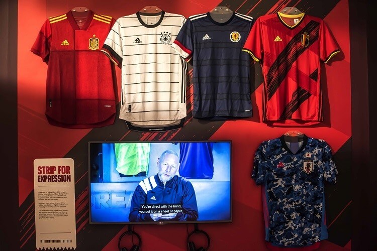
I recently visited the National Football Museum in Manchester, England. As you’d expect, the museum has a few permanent displays involving shirts and kits (including an England shirt from the first ever international match in 1872), but they currently have an exhibit called Strip! How Football Got Shirty, which is essentially a history of football kits. It touches on all aspects of design and manufacture, but I thought there were a few parts that Uni Watch readers might be particularly interested in.
On the manufacturing side of things, there was an example of one of the first synthetic-fiber shirts to be used in an English football match, worn by Bolton Wanderers in the 1953 FA Cup Final:
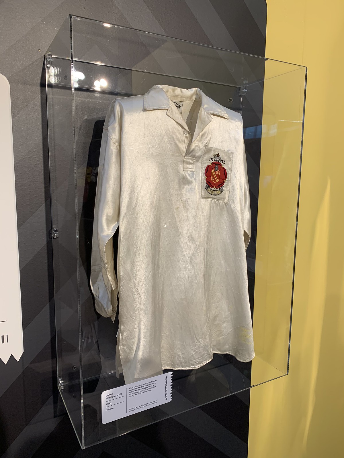
It was described as being made of “man-made silk.” And instead of the standard explanations we get today for materials being stronger/lighter/cooler, it was apparently beneficial because of the shimmer coming from the material, which made it easier for Bolton’s players to pick each other out on the pitch. This doesn’t appear to have been too successful, though — they lost the game, 4-3, to Blackpool FC.
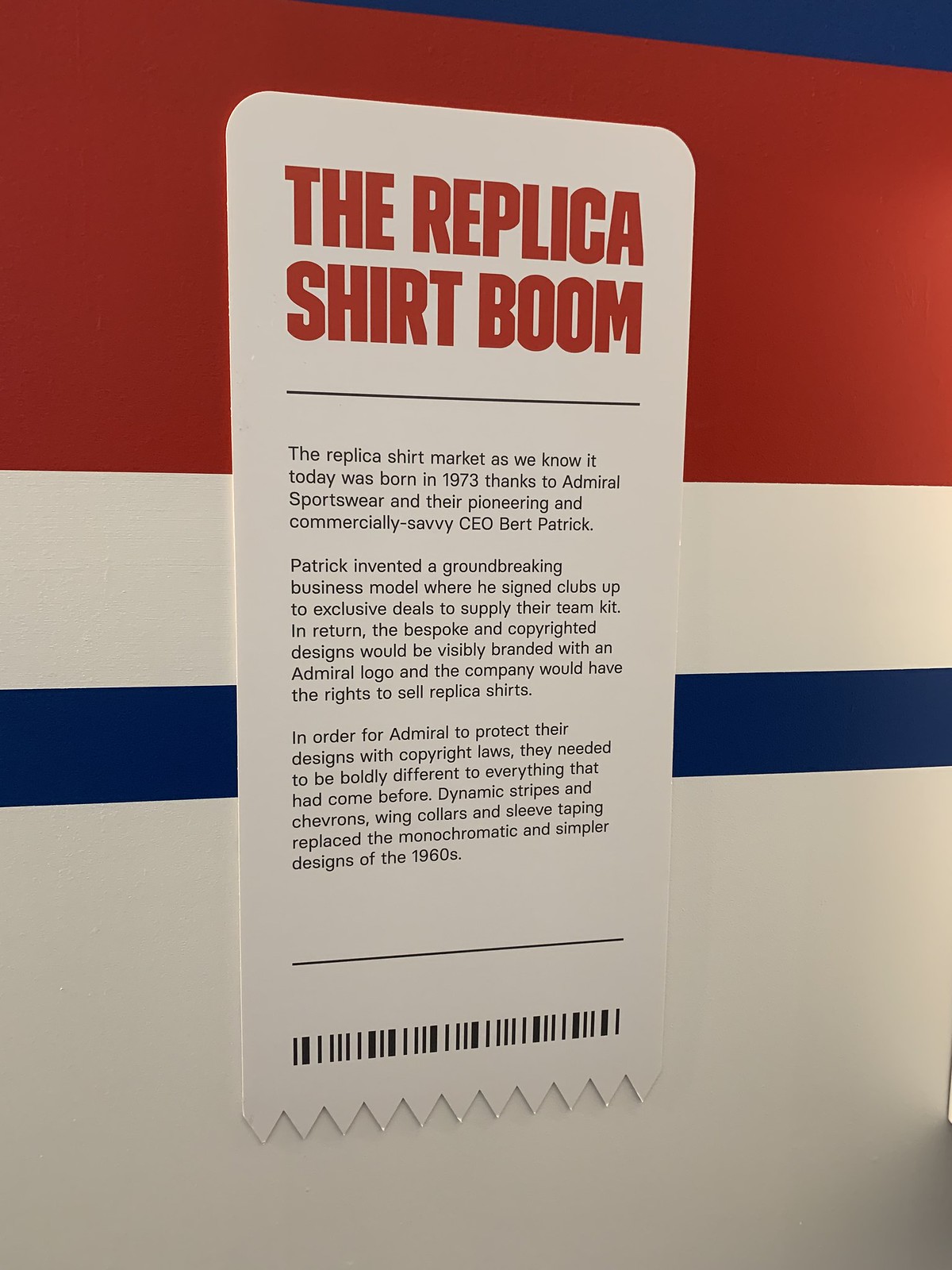
There is also quite a lot about the commercialization of the football kit. Replica shirts are touched upon — apparently Admiral Sportswear CEO Bert Patrick gets the credit (or blame) for them:
The display also used a Manchester City shirt to note that, initially, replica kits were almost exclusively manufactured for children, but those kids then wanted adult versions when they grew up
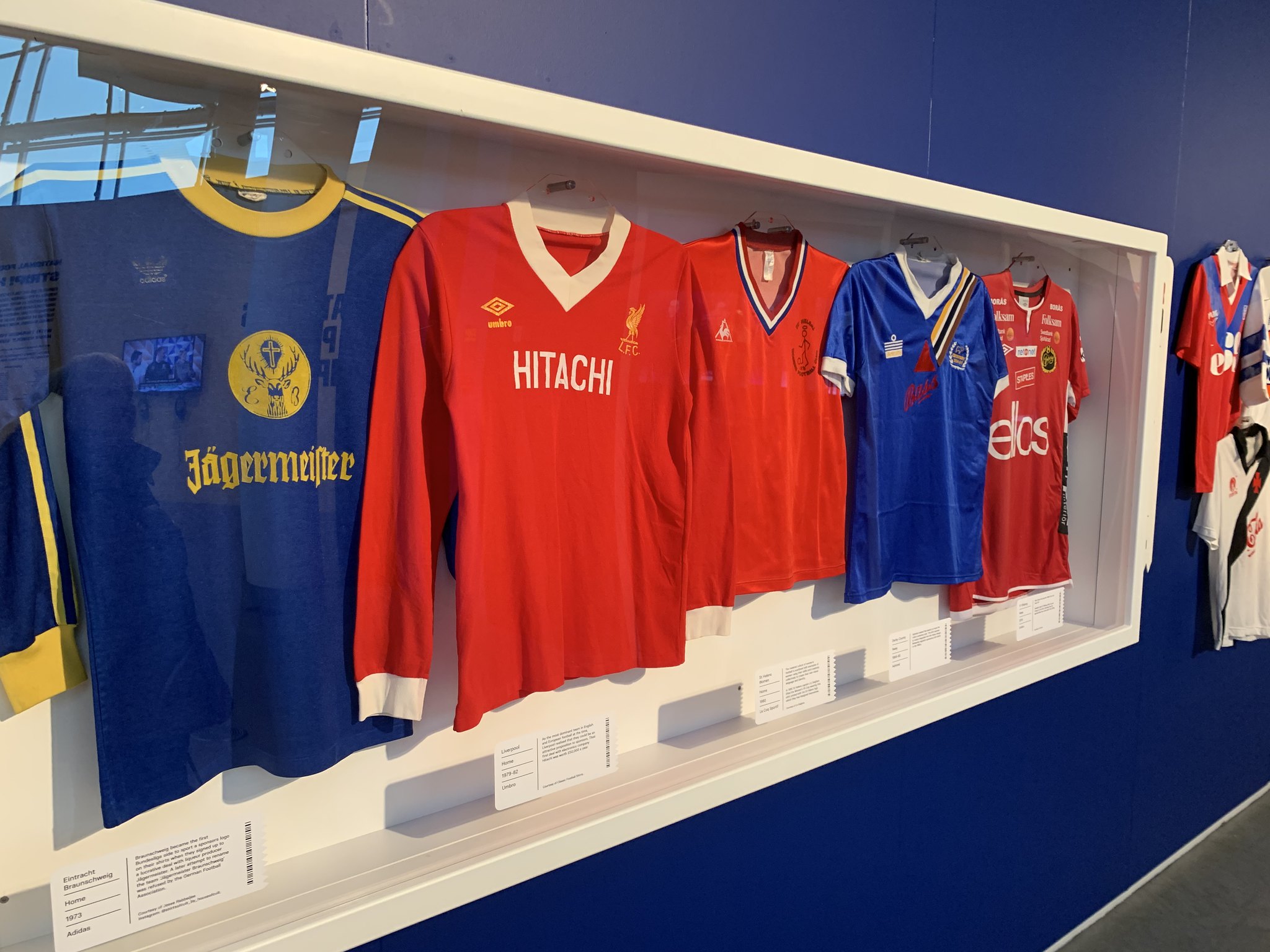
There is also a considerable amount about shirt “sponsorship.” Interestingly, this exhibit is the first time I’ve ever seen such companies referred to as “advertisers” in the UK, and the point of view seemed quite explicitly opposed to the idea of excessive branding on kits — maybe the curators include some Uni Watch readers!


In addition, there were numerous examples of early branded/advertised shirts on display:
I didn’t take photographs of every part of the exhibit, but other sections included a collection of the 20 greatest football shirts of all time (as chosen by the curators, obviously) and a shirt Hall of Shame, which included not only perceived “bad designs” but also shirts that had been produced or designed with poor intentions, or shirts that had been breaks from tradition with negative impacts on the clubs (such as Cardiff City’s ill-fated shift from blue to red as their primary color).
For any Uni Watch readers who happen to be in the area between now and June, I’d certainly recommend a visit. The exhibit has clearly been put together by people who have their finger on the pulse when it comes to issues around football kits today, and it’s an interesting way of killing an hour or two (and the rest of the museum is worth a look as well).
To finish, I here’s an image of my favorite aesthetic part of the exhibit — an extensive collection of some very ’90s shirts that’s an absolute feast for the eyes:

———
Paul here. Thanks for that, Mark. In addition, the museum is currently running an interactive display that allows visitors to design their own soccer shirts. Good stuff!
Also: As noted in yesterday’s Ticker, the museum has been in the news lately because they had a match-worn 1991-92 Celtic shirt stolen. I’m assuming Mark didn’t have anything to do with that — right, Mark?
Click to enlarge
Pats contest results reminder: In case you missed it on Thursday, the results of our Patriots-redesign contest are now available over on InsideHook. Enjoy!

Membership update: Eight new designs have been added to the membership card gallery (including Joe McGrath’s New York Rangers treatment, shown at right). I expect the printed/laminated versions of these cards to ship out by next Tuesday or Wednesday.
Ordering a membership card is a good way to support Uni Watch (which, frankly, could use your support these days). And remember, a Uni Watch membership card entitles you to a 15% discount on any of the merchandise in our Teespring shop and our Naming Wrongs shop. (If you’re an existing member and would like to have the discount code, email me and I’ll hook you up.)
As always, you can sign up for your own custom-designed card here, you can see all the cards we’ve designed so far here (now more than 2,400 of them!), and you can see how we produce the cards here.
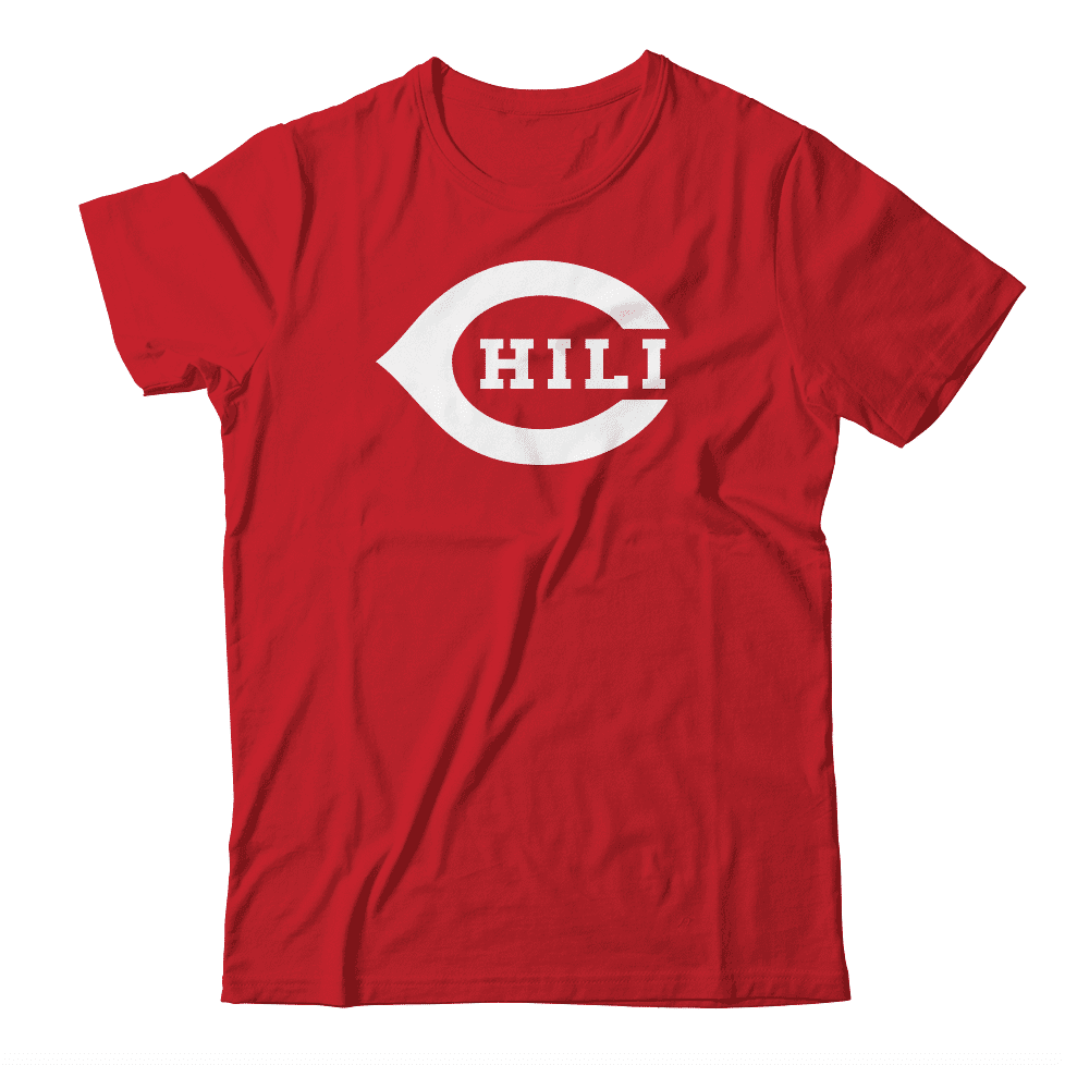
The day after: It is no longer National Chili Day (that was yesterday), but any day would be a good day for the shirt design shown above, at least hypothetically. If you agree, shoot me a note. Thanks.
The Ticker
By Anthony Emerson

Baseball News: At least one Indians player was in an old Majestic jersey during their Cactus League game yesterday (from @BraysWorld). … The Rockies have an interesting logo celebrating 25 years at Coors Field. It likely won’t be worn as a patch, though (from Bryan Stelmak). … The Washington Post has a really great article on how Nats OF Michael A. Taylor breaks in a new glove. Highly recommended (from Tommy Turner and Mike Rosenberg). … Red Sox IF Chad De La Guerra has a Garciaparra-esque NOB arch (from @MopUpReliver). … The Altoona Curve, Double-A affiliates of the Pirates, will run a weekend promotion as the “Altoona Brookies” on June 19-21 (from Matthew Loudreau). … Also posted in the hoops section: Kansas City men are wearing unis inspired by the Negro Leagues’ Kansas City Monarchs tonight in honor of Black History Month (from @TwinsFan54321). … Gorgeous new away jerseys for Wartburg College (from Romelle Slaughter II).

NFL News: Packers blog The Packers Wire is having a contest to design the Pack’s new alternate uni. … I don’t think I’ll ever get used to seeing the “Las Vegas Raiders” on a wordmark (from Austin Meo). … A bunch of people were upset when country singer Garth Brooks posted a picture of himself in a Lions Barry Sanders jersey, because they thought the “SANDERS 20” jersey was an endorsement of Presidential candidate Bernie Sanders. Maybe if Garth hadn’t picked up the ugly gray jersey that Barry Sanders never wore they might’ve gotten it (from multiple readers). … The last time the Bucs redesigned their uniforms, the “unveiling” was simply an internet announcement. This time they’ll have a proper live event.

Hockey News: Golden Knights G Robin Lehner very subtly changed his pad design following his trade from the Blackhawks to Vegas earlier this week (from @illisconsin). … The AHL’s Ontario Reign wore these sweaters for First Responders Night yesterday (from Jakob Fox).

Hoops News: Reader Ian Brekke noticed that the Pelicans seemed to have lowered the striping on their Mardi Gras jerseys, apparently so that players’ NOBs no longer overlapped with the stripes. … Cross-posted from the baseball section: Kansas City men are wearing unis inspired by the Negro Leagues’ Kansas City Monarchs tonight in honor of Black History Month (from @TwinsFan54321). … Good article about the new wave of college basketball court designs (from Timmy Donahue).

Soccer News: After Manchester United ST Odion Ighalo scored a goal during United’s match against Club Brugge, he lifted up his jersey to reveal his undershirt, which had a photo of his sister who recently passed away (from Josh Hinton). … Also from Josh: Wolves wore their charity’s logo instead of their betting advertisement during their Europa League match against Espanyol in Spain. … In honor of their 10th season, the Portland Timbers tweeted an extremely cool animation of every kit in their history (from @bryant_rf and @GDH415). … USL Championship side North Carolina FC have unveiled their new kits. Note the club’s badge was changed to match the color scheme of their advertiser (from John Flory). … The Columbus Crew are getting a new jersey advertiser. I doubt any Uni Watch readers will partake in this, but the Crew are offering fans who purchased the new jersey without the ad the ability to add the advertisement for free (from multiple readers). … A whole bunch of Canadian Premier League kits were revealed yesterday: Hamilton Forge, York 9 FC, Winnipeg Valour, Pacific FC, Halifax Wanderers, Cavalry FC, and FC Edmonton. I really wish the CPL threaded those tweets together! (from Wade Heidt). … New York Cosmos, now playing in the National Independent Soccer Association, have unveiled their new home kit (from Ed Żelaski). … NWSL side Washington Spirit have teased their new shirt (thanks, Jamie). … Here’s a ranking of the new MLS jerseys.

Grab Bag: A carnival float in Spain featured people dressed in Nazi uniforms. … New logo for Giant supermarkets. … Auto maker Kia will have a new logo soon. … Can you identify these original car logos?

Emancipation Day: Tomorrow, Feb. 29 (Leap Day!), is the 24th anniversary of the day I walked out of my office at Billboard Books for the final time and began life as a full-time freelance writer. I’d been freelancing on the side for a little over two years and decided it was time to take the plunge. Giving up a stable job was a bit scary, but I had to give it a try, because I wasn’t happy with my life or career up to that point and knew I needed to make changes or else I wouldn’t be able to keep facing myself in the mirror each morning.
The flip side to the flexibility I’ve enjoyed since then, of course, is a lack of security — a point that was driven home rather forcefully last year. But despite all that tumult, I have no regrets about the path I’ve chosen. Despite a few rocky moments, in the big picture it’s worked out better than I ever could have imagined, in part because of of the wonderful and supportive comm-uni-ty that’s formed around this website. On a nearly daily basis, you folks make it clear to me that I made the right choice two dozen years ago.
As I like to remind people each year on this date — and also remind myself — the moral of the story is this: If you want to change your life or reinvent yourself, don’t just sit around fantasizing about it — make it happen. Even if it doesn’t work out, at least you won’t spend the rest of your life wondering about what might have been.
When I’ve run this item in past years, some of you have gotten in touch and said something like, “That’s really inspiring. I’d like to reinvent myself too, but where do I start?” The biggest thing, I’d say, is to have a sense of direction. It’s one thing to know that you want to make changes to your life; it’s another to know what you want those changes to be. In my case, I had come to realize that I needed to live a creative life in general and be a writer in particular. I wasn’t sure I could be successful at it, but I at least needed to try.
Of course, maybe you already like your life just fine the way it is, in which case more power to you! Either way, thanks for listening, and have a great weekend. — Paul
Seems like an interesting museum.
The shirt all the way on the left of the “early branded/advertised shirts” picture is German team Eintracht Braunschweig. I believe that would have been the first-ever shirt with an ad (in the early ’70s).
Blame them.
Also, for the Spirit shirt teaser I submitted in the soccer section, I’m fairly sure the picture is color-inverted, so the shirt would be white, not black.
It really is a wonderful museum. They have loads of football shirts and memorabilia in the permanent exhibit as well. The museum is right in the heart of the city and easy to visit if you’re on a weekend football trip to see City or United.
Robin Lehner took some Pads Skinz to alter colors on his Chicago pads. Green and yellow gone, add some silver and gold. His truly bespoke Vegas pads are in production, and you can see them on Instagram.
I’ll be adding the Crew sponsor for my jersey simply because it’s Nationwide Children’s Hospital and they really are a world class organization doing great things. I could live without it next year when it switches to simply Nationwide Insurance.
Chicken parm, you taste so good.
Small correction for the Soccer Ticker, the Cavalry FC uniform is attached to the Edmonton FC link.
Here are the Edmonton FC new home uniforms for the link:
link
Also, here is a link showing the 7 new home kits together:
link
The CPL really did the uniform unveiling strangely. Rather than just presenting them all at once, they released the 7 uniforms individually at different time intervals last night.
Hilarious on the Garth Brooks/Barry Sanders misunderstanding.
Would have even thrown off the keyboard warriors with a first initial on the nameplate!
The yellow shirt in the back row of the ‘90s display is Norwich City’s “birdcage” design, a regular on worst-uniform-ever lists.
Some of the others are goalkeeper shirts; there was a theory back then that such wild patterns would be “distracting” for the shooter.
That Rockies 25th anniversary patch is a thing of beauty. The green works so much better as a third color for the team’s too-dark purple and silver than black. The Rox desperately need a bright color in their palette, and they’re kind of thematically stuck with the purple, so they need a good bright accent. That green would be terrific, as would a bright light blue. It’s rare that a team breaks from its own official color palette like this in a way that demonstrates a superior scheme.
On a related note, I picked up my first bit of merchandise with the new Brewers colors, and I’m impressed. They’ve maintained their light navy, but when paired with their new yellow it looks much more blue than it used to paired with metallic gold. With the yellow, the navy appears almost bright and saturated as their old royal. It’s a terrific look, much more vibrant and engaging than their previous color scheme.
Geez, if they’re upset about the Sanders Jersey, they must have missed when Garth was wearing his Clinton-Dix jersey. And don’t get me started when he had that full Starlin Castro uniform on.
So no comments about the updated site design? Am I the only one seeing it? Am I the One? Am I Neo?
I had it too. No ads! It reverted to normal when I clicked to comment.
Same here. No ads was great! lol
You may be seeing a slight change on mobile. But nothing major — right?
No nothing major. It did feel nicer then the current site. A lot more white space and breathing room. Not as many ads cluttering the interface. It was nice. It has since reverted and wont’t show itself to me anymore. I guess I’m not Neo after all…
For the past couple days, I’ve gotten the mobile site on my desktop computer. That’s what you’re seeing.
Interestingly, today I got the full, non-mobile site.
I’m getting it on a Surface tablet in desktop mode and it can’t seem to make up its mind. It flips back and forth as I check back into the site throughout the day.
Would this technically be the 6th anniversary of the beginning of your full-time freelance career, as February 29th only occurs every 4 years? ;)
You could say it’s the 6th quadrennial. An anniversary happens every year (by definition), not every four years.
For the reminder of the Pats design results you used the pic of the set I liked very much and commented as such yesterday, however looking at it today it hit me how similar it is to the current Bills unis. Still a great set though.
If I’m the Pelicans, I’m going with just Zion for the NOB. If it’s legal, of course.
If I’m the Pelicans, I’m removing that stupid NBA logo below the collar that is the cause of this problem and putting the NOB higher up.
But Zion would be a good compromise.
Congratulations on 24 years of “Emancipation Day”. Better healthcare would help all who would like the option of being self-employed. I’m no expert at this, but it seems crazy that I get my healthcare from my employer.
Paul, again today from my iPad and iPhone I don’t see all the comments unless I select to leave a message. From my phone or iPad it says there are 16 comments though it’s only showing 14, and then when I select “leave a message” it takes me to a page that appears to be the old desktop format where it says there are 18 comments and shows all 18.
Sigh. Sorry, Rick. FWIW, the entire site is getting a makeover in about a month (I hope), so everything will be fresh, fast, and improved! Thanks for your patience.
My screen looks different as well. Fonts are different and everything appears wider and less graphic. But, as the one commenter noted, it reverted to its normal appearance once I hit the comment button. Regardless, the info is legible, which is the most important thing. -C.
No worries, just wanted to let you know. Except for this issue, I do like the new mobile format.
If you ever wondered if people into uniform minutiae bring that level of scrutiny to their entire life, look no further than how easily a site glitch can irritate us. Good luck dealing with that and also with getting the new version of the site up and running; it’s still easy to read regardless. And congrats on the anniversary of your life changing moment!
Look at these crazy Cooperall-esc striping from Burnsville High School in MN. I was watching the stream online and thought they were actually wearing Cooperalls.
link
Joe McGrath’s card is a total missed opportunity for a Slap Shot reference.
I was coaching in Omaha in 1948…….
Paul, I can confirm that the theft of the Celtic shirt was nothing to do with me – green is not my colour!
The funny thing about that Giant logo is that there are now two different Giant supermarket chains in Maryland. One is the PA based version, which the ticker item references. They are mainly in the northern part of the state. The other version is more Baltimore/DC based. I think I have store loyalty cards for both (plus prob another 5 or 6 in the area).
The Sydney Swans of the Australian Rules football premierships is wearing a special LBGTQQIA uniform. It has with a rainbow replacing one of its red stripes across the front of the guernsey.
Talk about Rainbow Guts!