Click to enlarge
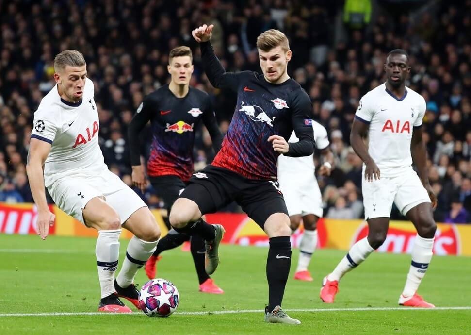
To all of the problems with uniform ads, we can now add this: Sometimes the ads don’t match!
That was the case yesterday for German soccer team RB Leipzig in their UEFA Champions League match against Tottenham Hotspur. As you can see in the photo above, some players had a white Red Bull chest ad and others had yellow/red. You can see a good breakdown of who was wearing which version in this pregame video clip:
The RB Leipzig kits don't…match? pic.twitter.com/wlI8Cfdvxq
— Bleacher Report Live (@brlive) February 19, 2020
As you all know, I’m not a soccer guy. But the situation appears to have been this: The ad on this jersey is usually white, but the team decided to go with a flashier red/yellow version for this game. Unfortunately, a box of jerseys was lost during transit, so a few players had to wear the usual white-ad version instead of the new version. At least one player apparently changed to the new version at halftime.
I was a bit surprised by how big a deal this was on social media yesterday — people were going bonkers over it. I guess that makes sense, since the shirt ad is basically the visual equivalent, if not the emotional equivalent, of an MLB chest script or an NHL crest, but it still caught me off-guard. (Have I mentioned that I’m not a soccer guy?) So I asked our own Jamie Rathjen, who’s very soccer-knowledgeable, for some perspective:
Me: How (in)frequently does this type of thing happen, and how big a deal is it typically considered to be? To put it in context, how would you compare it to, say, an MLB player with the team or city name misspelled on his jersey?
Jamie: This really wouldn’t happen that often. There is a pretty famous example of a mix-up for Tottenham Hotspur (who, coincidentally, were the team playing against RB Leipzig today) in the 1987 FA Cup Final, where some players had ads on their shirt and some didn’t, which is the only other time I can think of something like this ever happening.
If I had to compare it to, say, “Natinals,” it’s probably as big a deal as that was on the day it happened, but I don’t know if this will be as memorable in five or 10 years as that has turned out to be, because it’s not really an embarrassing screw-up.
Me: How big a deal is RB Leipzig? To me, they’re just “one of those soccer teams I’ve occasionally heard of,” but I have no idea how popular they are, how “important” they’re considered to be, etc.
Jamie: This was in the knockout stages of the UEFA Champions League, which is the most prominent club competition in the world, so it automatically puts them in the spotlight. If this was a normal Bundesliga game, I don’t think nearly as many people would have freaked out. The team itself has rapidly ascended to the top of the game in Germany because they’re backed by Red Bull, but they’ve only existed as RBL for 10 years and played in the Bundesliga for four years, so they’re not as immediately recognizable as some of their peers. I wouldn’t call them popular, because of their short existence and because they don’t play in a big city, though they do attract a lot of negative attention in Germany from fans of other teams because of their corporate background.
———
So there you go. Please join me in thanking Jamie for providing that context.
Meanwhile, in another UEFA Champions League situation involving soccer shirt ads, Valencia went ad-free yesterday against Italian side Atalanta, because Valencia’s advertiser, Bwin, is a betting site, which would have run afoul of Italy’s ban on betting ads (click second photo to enlarge):
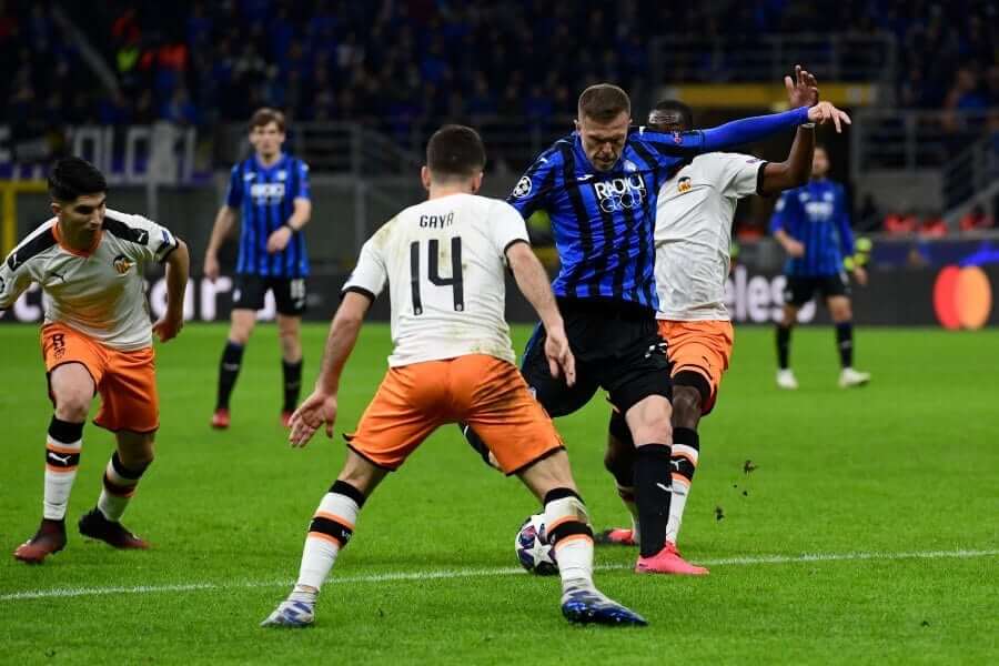
I’ll tell you what: I may not know much about soccer, but I know what I like, and I really like that Valencia kit. The shoulder stripes, the collar, the shorts, the striped socks — spectacular! And hey, they didn’t have to worry about whether their chest ads were a consistent color because they didn’t have any chest ad to begin with. Nice!
Click to enlarge
ITEM! Coasters redux: I was able to get another 50 of these great-looking Uni Watch coasters at a decent price. I’m going to sell them in groups of three coasters for $9 with free shipping. Get ’em while they last!
The Ticker
By Paul

’Skins Watch: Roddy Ross of the Western Hockey League’s Seattle Thunderbirds has feathers painted onto his mask to honor his Cree heritage. Additional photos here (from Greg Franklin).
.

Working Class Wannabes™: According to this article, there’s no secret about how the Alisal High School girls’ hoops team in Monterey, Calif., has become so successful: The team “just goes out and plays blue collar basketball.” … The hockey team at Georgetown Prep in Maryland uses the hashtag #bluecollarhockey. “This is especially remarkable in light of the school’s tuition rates, which are higher than many American workers’ salaries,” notes Timmy Donahue. … Also from Timmy: This This astonishing video from the Duke baseball team begins with the words, “Blue collar is not a socioeconomic descriptor” and then explains how the term applies to this team. Of course, “blue collar” actually is a socioeconomic descriptor — unless you’ve turned it into a patronizing lifestyle hashtag. And as Timmy notes, “The average cost of attendance without financial aid at Duke is $78,608. I don’t think it’s fair to stereotype the players, but in looking at their roster, I see names of high schools I am familiar with and that I know have high tuition rates. Clearly the players could have received aid or scholarships, but Duke and ‘blue collar’ appear to be antonyms.” … Paul DeJong of MLB’s St. Louis Cardinals says St. Louis is a “working class city” and that the Cards “give people hope” because “we’re out there every day trying to grind and push and win.” The funniest/saddest thing about this is that the caption on that video says DeJong used the term “blue collar,” which he actually didn’t use — he said “working class.” But “blue collar” has now become such a reflexive default cliché that I guess they put it in there out of habit (from Alex Dewitt). … The NHL’s Colorado Avalanche and the Colorado Amateur Hockey Association have partnered for a “Hard Hat Heroes” program. “Essentially, they seem to be saying that those everyday, hard-working hockey fans out there who give selflessly to support the sport deserve recognition because they are like the grinders on a hockey team who do the small, thankless tasks to help the team win,” says Kary Klismet. “I’m not sure who exactly is supposed to be wearing the hard hats in this situation, but maybe the Avs could come up with a way to honor committed hockey fans without the strained analogy.” As a bonus, the program is sponsored advertised by a Japanese car company whose U.S. plants are non-unionized.

Baseball News: Here’s a great shot of 1920s film star Clara Bow in a Hollywood Stars uni. That shot comes from an excellent article about Gilmore Field in L.A. (from Jon Solomonson). … New blue alternate jerseys for Penn State (from Jake Wallace). … New black alternates for Bryant & Stratton College (from Timmy Donahue). … It’s a little hard to see, but Braves INF Charlie Culbertson, who took a pitch in the face last September, is now going double-C-flapped. As you may recall, Phillies OF Rhys Hoskins became MLB’s first double-C-flapped player back in 2018. I can’t recall anyone else doing it since then — anyone..? (From David Murphy.) … Reds 1B Joey Votto honored former MLBer Tony Fernández, who died earlier this week, by writing “RIP Tony — My Dad & I loved you” on his cap yesterday (from Jakob Fox and our own Alex Hider). … OF Justin Meekins, who plays for DIII school Salisbury, has had a hilarious progression of roster photos during his collegiate career (from Paul Friedmann). … Wright State has something I’m not sure I’ve ever seen before on a baseball diamond: sweatbacks (from Timmy Donahue). … Hmmm, looks like the Nats are moving to matte batting helmets. … New orange alternates for Florida (from Ryan Bohannon). … Tigers OF Daz Cameron wore cleats that mimic the pant-cuffs-over-the-shoes look yesterday (from Beau Parsons). … Utility man Brock Holt, who signed a free agent deal with the Brewers earlier this week after a seven-year stint in Boston, says, “I honestly never expected to wear any other uniform but a Red Sox uniform.”

Football News: The Browns have given their practice fieldhouse a makeover (from Cory Robert). … Here’s a nice look back at Wisconsin media guide covers (from David Petroff). … Did you know that Iowa used to have a squad of clowns who entertained fans on the sidelines? It’s true! (From Kary Klismet.)

Hockey News: Hmmm, did the Hershey Bears really call themselves the Hershey Bars at one point? “They were originally the Bars (or B’ars), but that was deemed too commercial, so they became the Bears in 1936,” explains Jerry Wolper. … A junior team called the Thunder Bay Fighting Walleye has changed its logo after a complaint from the ECHL’s Toledo Walleye (from @The_Real_Kub). … Here’s more info on the Syracuse Crunch’s rainbow-themed Pride Night uniforms, which will be worn on Saturday. … Speaking of the Crunch, they will play the Utica Comets next winter in an outdoor matchup of upstate New York teams (from Wade Heidt). … “Dakota College at Bottineau recently announced the formation of a women’s hockey team that will start competing in the 2020-21 school year,” says Timmy Donahue. “Here are the first two signees in their new Ladyjacks uniforms.” … The Maple Leafs will wear their St. Pats throwbacks on March 14 and 17 (from Gabriel Hurl). … Chipotle is offering a two-for-one deal on Friday for customers wearing hockey jerseys.

College Hoops News: Wichita State will wear very bright pink uniforms tonight (from Black Cripps). … Georgia Tech wore sneakers honoring the Tuskegee Airmen last night (from Jason Scherer). … Brutal matchup last night between South Dakota and North Dakota State, who went grey vs. black. … Georgia wore red at home last night, with Auburn wearing white on the road (from Josh Hinton). … Reprinted from last night’s comments: In yesterday’s lede, I said the 1970 Jacksonville squad was the only team I’d ever seen that wore its school name negatively arched underneath the chest number. But the 1971 Harvard team wore something similar but even more radical. Amazing! … Utah State G Sam Merrill was presented with a commemorative ball last night in honor of his 2,000th point (from Benji King). … Gorgeous color vs. color game last night between SMU and Tulane (from @Corneal_Univ).

Soccer News: New uniforms for Belarusian side Dinamo Minsk. “They wore Nike during the 2019 season, but the new uniforms appear to be made by Saller,” says Ed Zelaski. … The Houston Dash, which was the only NWSL team not to have a shirt ad, no longer has that distinction. Additional photos here (from Ignacio Salazar and our own Jamie Rathjen). … Brazilian side Cruzeiro held a press conference to announce the re-signing of ST Marcelo Moreno and painted a jersey onto him instead of giving him a jersey (from Tim Abel). … Nashville’s new MLS expansion franchise has agreed to terms with the city on a new stadium (from Kary Klismet).

Grab Bag: The high school in Boardman, Ohio, is raising money for new marching band uniforms. … Lots of bizarre outfits in this article about female arm wrestlers. … Toy maker Mattel has released five new Barbie dolls for the upcoming Summer Olympics (from James Gilbert). … New logo for condom maker Durex. … One observer thinks rugby needs to rethink its system of shirt advertising (from @stumpy7780). … A Swiss court has ruled that Jägermeister’s logo isn’t offensive to Christians. … The new episode of the great design podcast 99% Invisible is about the typeface Fraktur — colloquially known as the Nazi font. … New lacrosse uniforms for Transylvania (from Kyle Sutton). … Some very detailed photo analysis reveals that Britain’s Prince Charles has been wearing the same two overcoats for over 30 years (from Kary Klismet). … A New Hampshire police chief took off his uniform and walked home in his underwear Tuesday night after his position was eliminated by the town board.
Hey Paul, I was scrolling through the listings for Turner Classic Movies yesterday and, lo and behold, 1944’s “Experiment Perilous”, featuring none other than Paul Lukas, is on at 12:15 PM today. I thought that was quite a coincidence after Monday’s blog entry.
He had a long career. Lots of movies! I once sat in a theater and watched his/my name appear in the credits — surreal.
Hopefully this is just a spring training look but the usually high cuffed Stephen Strasburg is going with long pants (and compression sleeved):
link
Edit: For the Georgetown Prep working class, you have an @ instead of a # symbol, when referencing a hashtag.
Thanks. Fixed.
Another shirt related gaff happened to Leipzig’s sister club RB Salzberg. A Salzberg player wore a Leipzig top during a Champions League match as well back in 2016
link
I think when a club/team is backed by infernally rich people, ridicule follows when there’s a uniform gaffe. Red Bull AG, which backs Leipzig, Salzburg, and New York affiliate teams, is worth somewhere in the billions of dollars, and can’t seem to get its uniform correct.
Similarly, there was a broadcast of a World Cup qualifier (sometime around 2001) when U.S. defender David Regis somehow took to the field with a No. 9 on the front and his correct No. 6 on the back. The Spanish-language commentator said, “You mean to tell me the most technologically advanced country in the world can’t get the correct number on a football shirt?”
In the Skins Watch, we often see signs of progress, the problem getting less bad, or even just people grappling with the problem even if they choose not to make a change. Whereas the Working Class Wannabees feature so far is mainly a catalog of a bad situation getting worse, and nobody involved showing any sign of thinking about what they’re saying and doing. It’s like, don’t any of these upper class professionals ever ask a working class neighbor what they think about being used as a marketing prop? [Looks at the current state of America’s economy and society] Oh, right. The “working class” and “blue collar” that these rich professionals refer to is basically a figment of the past, like the space age or the Wild West. It’s not that far off from a team calling itself the Vikings or the Spartans. Which is an even more depressing thing to be reminded of than the already depressing phenomenon of some of the wealthiest people in America playing dress-up as a poor.
At a minimum, every team official who uses “working class” or “blue collar” in this way should be asked, every time either term is uttered, what percentage of the team’s employees and contractors are paid less than $11 per hour, which is the minimum hourly wage to keep a small family just barely out of poverty. Every team and college has some real actual working class, blue collar employees, but they’re not the coaches or the players. What are the real actual working class, blue collar employees paid? What benefits are they offered? What percentage of them qualify to receive public benefits like food stamps, free school lunch, WIC, and so forth? Questions about the institution’s treatment of its real actual working class, blue collar workers should be asked Every. Single. Time. that a team’s representatives invoke the concepts.
Very well said. The fetishising of the working poor is beyond disgusting.
I was wondering why a Native american desiring to adorn his goalie mask with Native American imagery is news in the ‘Skins Watch section. Typically that’s for those who are using the imagery somehow improperly.
Actually, Noel, that section is for any news regarding Native imagery in sports.
Typo: Tony Frernández
Fixed.
For those who didn’t click on the link for the condom maker logo, it should be noted that the logo’s font is called One Night Sans.
lol
A Detroit Red Wings fan blog (Winging It In Motown) has posted an interesting look back at the Wings’ sweater history: link
Just an FYI, but the site is not loading the mobile version on my iPhone running Safari this morning. It seems like the desktop is the only version this AM.
I still have the option to request the desktop version, but am already seeing the desktop version!
Funny! On desktop right now I was given the mobile site, and when I went to reply to your comment I was given the desktop site. (This didn’t happen yesterday.)
Same. The same thing happened a couple of days ago.
Same here with Android. I’m stuck with the desktop and can’t get the mobile.
Happening to me too. Hmmm.
…and as soon as I posted, it went to the mobile version. Double hmmm…
Happening to me too. On tablet, it initially loaded the mobile site, although I choose the desktop version and the site usually remembers my preference. Then when I hit “post comment,” it reloaded into the desktop site. Just now, I opened the site on my desktop and it showed the desktop version. When I clicked the title of today’s entry, it reloaded the page as the mobile version. Then when I hit “comment” to type this comment, it reloaded back into the desktop version.
I’m having the same problem (mobile site loads on my desktop, despite what I tell it to do). I thought it had to do with my IT department clearing my cache, browsing history, etc (I’m using my work machine at lunchtime), but this looks like the problem is much more widespread.
Oddly enough, I posted a comment, and now I’m in desktop mode (I think someone else reported the same thing happening to them).
Same here. On a MacBook using Firefox and I’m getting the mobile site instead of desktop. However, when I clicked to add this comment it took me to the desktop site. Very funky.
Paul, this whole blue collar thing, I’m really enjoying it. The worst part for me is it’s just pandering in an attempt to sell merch and tickets.
I actually think the current obsession with “blue collar”/”working class” has more to do with a subconscious feeling of guilt that sports is such an economic power while in a real way offering little of true value.
I mean yeah its fun and cool to play, and often fun to watch, but when the game is over, the rest/some/many of us have to go back to struggling to pay rent/mortgage, buy healthy groceries, make sure the car doesn’t break down again, etc…
They (pretend) they “feel our pain”, that they are “with us”.
The harder they push it, the farther they push me away frankly.
Lee
Another fave of mine is “lunch pail kinda guy.” They said that about Troy Aikman when he lunched with his offensive linemen. A major peeve of mine is male politicians trying to ingratiate themselves with the commoners by rolling up their shirt sleeves at a rally. Did their wrists suddenly get hot? It’s right up there with multi-millionaires dropping by a bowling alley or pub to grovel for votes. Just be yourselves, assholes.
If I ever own a sports team I’m going to insist on fostering an aristocratic image, and encourage all my coaches & players to talk like Bill Buckley. Our nickname will be “the Aristocrats,” of course.
One thought that hasn’t been expressed on this topic to my knowledge is that it seems a bit insulting that “white collar” workers don’t work hard or have a “good work ethic” because they do a different sort of work or (often) get paid more.
“White collar” work may be more of the mental variety than the physical, but plenty of office workers put in long hours, subject themselves to high levels of stress and sometimes even exhaustion, etc.
It’s difficult to really measure how “hard” one group of people works than another, and the term “white collar work ethic” sound a bit goofy, but at the end of the day we’re making pretty generalized assumptions about different groups of people whose contributions to society are both important.
The link to the story about the “Nazi font” is pretty fascinating. I probably should resist pointing out that Duke uses it on their new alternative jerseys this year.
Not that surprising for Duke
I enjoyed it too, and I particularly appreciated the author mentioning that this font is really anti-Nazi because it was Hitler who didn’t like it, falsely claimed it was Jewish, and promoted Roman type in Germany.
When I was in high school, in German class we read some books in Fraktur, which wasn’t hard, and they wanted us to learn to read the “Sutterlin” cursive style that has almost completely died out and is impossible to read without training.
After the war, the greater availability of Roman letter press equipment meant that Fraktur wasn’t making a comeback, but I wish it would. It’s distinctive and not that hard to read (except for the “long s” and weird-looking lowercase k). There are plenty of other fonts that say “Germany”, like Futura and Bauhaus, but I’d love to see more Fraktur, even in other languages.
Another thing to like about Valencia’s kit: their crest features a bat! link
One of my favorite crests! Legend has it (although probably untrue) that when James I the Conqueror came to conquer the Moors in Valencia, a bat landed on his flag, so he added the bat to the city’s coat of arms.
Is it safe to say the Browns new uniforms will be having brown face-masks? Guess no retro gray ones?
I am going out on a limb here and saying they probably will have the brown mask. The Browns would have to go through the trouble and work involved with changing their logo again if they switched from the brown mask.
I am hoping for traditional looking unis but I do like the brown mask. I think it will work well.
The brown mask was the only thing they got right, I hope it sticks around.
Lee
I’m OK with the brown mask, but would like to see them go back to the original shade of orange.
I am hoping with all the new uni-reviles, that “Swoosh” will have learned from their failures and go a little more conservative. The ONLY one they have done and will stick for a while is the Seahawks. The Titans were ok. Just don’t like the crazy leg stripe on the pants. Looks good up close. Looks horrible on TV.
Teams provide input and give final approval of the designs Nike comes up with (assuming it’s Nike that does the designing), right?
If the Browns do keep the brown facemasks (which I like), I’m hoping they put forth a throwback that will allow for a white facemask switch-out.
Spring Training has started and I’ve had a chance to see many MLB players in their respective swooshified uniforms. I’ve come to the realization that in addition to the aesthetic disappointment of seeing the new, larger maker’s mark in a more prominent position of the uniform, I have an issue with it on a visceral level as well as a philosophical level.
Here’s how I see it philosophically. (This is my opinion, and others way and will surely disagree). The Majestic and previous MLB uniform manufacturers not only had their marks on the sleeve, but the marks were smaller than the swoosh. I think the combination of the smaller size and the fact that the previous manufacturers were far less prominent (maybe even niche, especially Majestic) in size compared to MLB’s new uniform partner, the maker’s mark appeared on the sleeve almost as an afterthought—sort of a way of saying “we made this uniform for the best baseball players on earth and we just wanted you to know that.” The fact that the Yankees never donned a logo on the sleeves of their on-field uniforms seems a testament to that. Since the Majestic logo appeared on all of the other teams’ uniforms, it kind of didn’t matter to them if one team went logo-free. In comparison, the swoosh is much larger, both literally and figuratively. Did the new partner really need more visibility? After all, their mark was already on the undershirts most MLB players were wearing, and as Paul pointed out many times, because of that many uni “agnostic” people thought that the new partner already made the MLB jerseys.
But, after seeing some of my favorite players on my favorite team wearing the new uniforms, I’ve had what feels like a visceral response to seeing the new chest logo. I think all MLB players are proud to wear a major league uniform, and that most of them (sorry—Astros) are proud to wear their team’s uniform. Seeing, say Aaron Judge, Mike Trout or Pete Alonso in uniform conveys (at least to me) a sense of pride that unfortunately now includes a prominent blemish right on the front of their jersey. For me, it’s hard to separate those two things. Now, I recognize that the players are sponsored by various manufacturers (including MLB’s new partner), but somehow that seems different since there are several manufacturers and many different types of shoes, gloves, etc. worn in the game. It’s not the uniform itself. Also, I think this goes unnoticed, but, not only is the new logo placed in a more prominent position on the uniform itself, it’s much closer to the player’s face—again, for me, making it harder to separate the player from the logo.
Just my two cents. If you had the patience to read through all that, I appreciate it!
The ticker items about players wearing double C-flaps has me wondering… Are there still any full-time major leaguers that wear a double ear flap helmet (without the C-flaps)? I seem to remember in the 80s this was somewhat common with switch hitters, as opposed to guys having two single flap helmets (one for each side of the plate).
My brain isn’t fully in MLB mode, but yes, there are a few players who do this — I just can’t recall most of them. Jed Lowrie is one, assuming he actually plays this year:
link
Shin Soo Choo did it for much of his career but recently switched to a single-flapped helmet with a C-flap.
The Working Class Wannabes section reminds me of the “Hardest Working Team in Hockey” era in the 90s for the Buffalo Sabres. They were effectively a team of grinders rallying behind the ascendant Dominik Hasek. The Buffalo fans, themselves largely blue collar, really got behind this team. There was even a section of the Aud for a group called the “Mad Hatters” who would wear hard hats to games.
i could write you a book about the significance of rasen ball sport Leipzig an if want. but let’s keep it brief, there would be a ton of schadenfreude among german fans over this because this plastic club has blatantly pissed all over the beloved 50+1(the greatest fan rule in sport). german fans will root for bayern munchen over red bull, and that is saying something. let’s not forget too that red bull was very close to buying fc st pauli and 1860 munchen as well, and that would have been a disaster. so yeah, fans protest them all the time. anything that embarrasses the plastic club is greeted with overwhelming joy. as for minor city, that is absurd. had there been no wall, leipzig would still be the most important city in german football, as it stands now, they are only extremely important. reunification is complicated, and going poorly for the east as they too are rejecting liberal democracy, but in general german fans wanted an east german team in the top flight, and then they get RB instead, it’s a fiasco. i could literally write about this subject all day since german domestic fußball is literally the only sport i watch anymore, but i have to get back to an animation i am working on about german fußball.
I believe that Valencia has their ad as all black on their road kit, so it would have looked okay either way.
I’m not sure the comparison with the Natinals is apt. The Natinals was pure comedic farce. Red Bull getting its branding mixed up as a result of how overly complex they’ve made it is just groan inducingly predictable. It’s really far more like the numerous instances we have in baseball when a player/players go out in the wrong set of pants or an alternate cap because they have multiple very similar versions.
Wonder if the Walleye logo situation came to light on social media or if someone from the Toledo Walleye reads the Uni Watch ticker on Monday ;)
Paul, thanks so much for Tweeting about that Vulture article on garbage language. The article is hysterical, and for those of us who work in corporate America, a little sad in that it hits very close to home.
link
Look up Corporate Cringe videos on YouTube.
Hey Paul, site is all messed up bad. Looks like it defaulted to a standard design or something. I’m sure you know, but just echoing from here on desktop, Windows 10, Chrome
Always disappointed when a site, not Paul in this case, makes a claim and then provides evidence they are wrong. You can see in the pictures of Prince Charles (yes, I bothered to look through them) that the camel hair coat they show for 2018 and 2019 is significantly different than the camel hair coat prior to that. It’s as simple as the older coat being double breasted and the newer coat being single with covered buttons. This is not to mention that he very well could have replaced an older coat with a new one of the same classic cut and style. In the end, who cares. But I still believe truth and accuracy, from a site, still matter.
Hmm, I’m only seeing the single-breasted camel coat after 2017. Up to 2017, it’s quite plausibly the same camel coat. Which raises a different question for me: Is Charles switching to single-breasted coats generally, or just with his replacement camel coat? Dude has been a very loyal double-breasted suit wearer his whole adult life so far. But as men age, we tend to develop a little extra volume around the midsection, and that can be a bad look with a double-breasted jacket.
The site seems back to normal now on my end except the comment box is delayed when typing.
The Hershey Bears junior hockey team was originally named the Hershey Squirts.
lol
That police chief could have been arrested for indecent exposure-if the town still had a police force :)
The praise for the Jacksonville University and Harvard basketball jerseys reminds me of an underappreciated uniform; the 1979-80 New York Knicks’ dark blue and brick red suits. Of course, the “New York” lettering doesn’t “smile” like the JU Dolphins’ tackle-twill, but the Knicks introduced a snazzy numeral font and a formal-looking V-neck. Subsequent seasons dumbed the design down but those first-year unis were sharp.
I think the Detroit Tigers and Chicago White Sox would be surprised if their fans referred to their typeface as “Nazi lettering”.