For all photos, click to enlarge
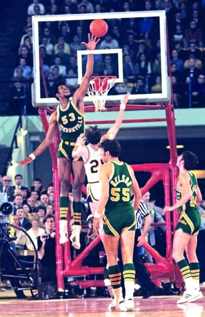
In the 1970 NCAA basketball tournament final — 50 years ago next month — unheralded Jacksonville University went up against the John Wooden-coached powerhouse UCLA. Although the Dolphins lost that game, their unlikely March Madness run resulted in a photographic record that has preserved one of the most interesting uniform designs in basketball history. Their jersey featured a distinctive negatively arched wordmark that created a smiley face effect.
I’m not aware of any other hoops uni that has ever used this design format (although I imagine it must have been done at some point by other colleges and/or high schools). People ask me about it now and then, usually after they’ve come across this old Sports Illustrated cover design:
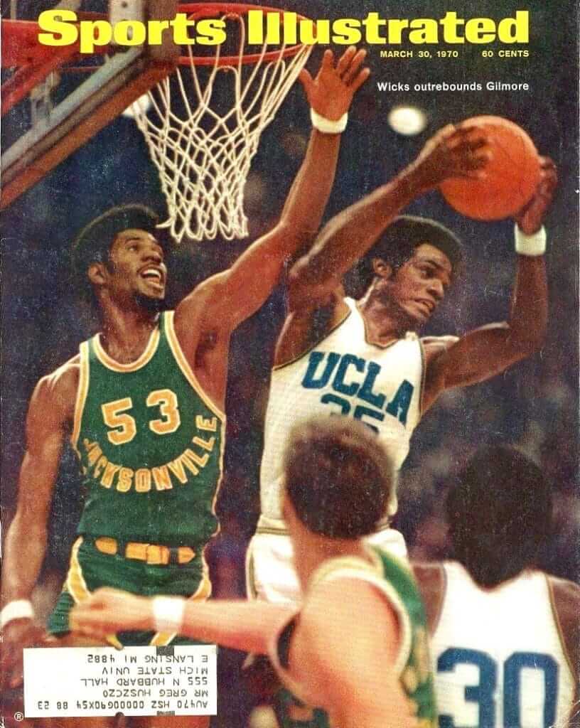
The Jacksonville player in that shot is center Artis Gilmore (who’d go on to have a Hall of Fame career in the ABA and NBA). Just about all the photos of the 1970 Jacksonville team — or at least the ones that have survived in digital archives 50 years later — are of him:

Similarly, almost all of the surviving 1970 photos show Jacksonville’s road green uniform from the championship game against UCLA. Photos of the home whites are rare, and color photos of them are rarer still. This is the only one I’m aware of — again, showing Gilmore:
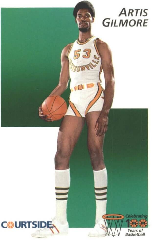
I’ve always loved this uniform set. Obviously, the negative arching on the jersey is interesting, but so is the striping on the shorts. And of course I’m a big fan of the color combo.
Why am I telling you all of this? Because tomorrow night Jacksonville will honor the 50th anniversary of its 1970 team team by wearing throwbacks — or, rather, modified throwbacks:

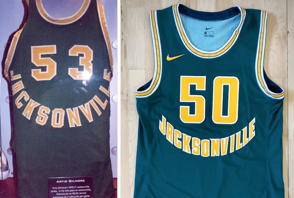
As you can see, they’ve taken a bunch of liberties with the shade of green, the typography, the shorts design, and more. Most notably, they’ve changed the negative arching from radial to vertical, which robs it of some its original charm and makes it look even more smiley face-y. Here’s a side-by-side comparison, followed by a video clip that gives a better idea of the full effect:
Storied Past… Bright Future…
A blend of old and new brings the past to the present and pays homage to the greatest team in @JAX_Dolphins history…
The 1969-70 National Finalist @JAX_1970MBB
See these LIVE:
🗓 2/20
🕖 7 p.m.
🚩 Swisher Gym#DareToBeBold pic.twitter.com/npFYMN2FXN— Jacksonville MBB 🏀 (@JAX_MBB) February 18, 2020
One counterintuitive detail from that video: As you can see in the photo at the top of this entry, the 1970 Jacksonville team used NOBs (a fairly uncommon move for that era), but the current JU team goes NNOB, so the throwbacks are NOB-free. A rare instance of a throwback being more old-school than the original on which it’s based!
Jacksonville will wear these throwbacks for tomorrow’s home game against fellow Atlantic Sun Conference school Lipscomb (which means they’ll be wearing color at home). I’m very curious to see how they look on the court. As I’ve always said, throwbacks are history lessons, so I’m hoping this game will help more people learn about those awesome 1970s uniforms.
Meanwhile: I’m not the only one who loves that original 1970 uni. For years now, the retro company 19Nine has offered a retail version of the original Jacksonville shorts design, along with a T-shirt that references the original jersey — very cool.
Click to enlarge
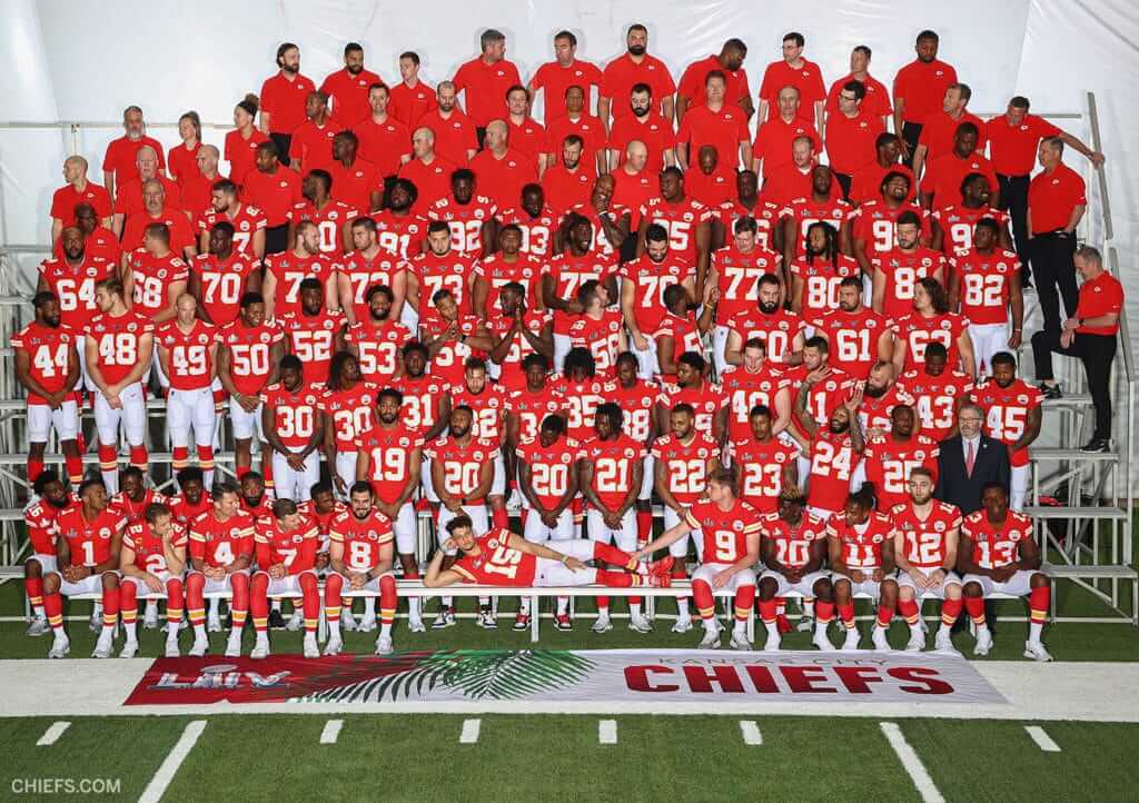
20/20 vision (and 30/30 too): The Chiefs posted this team portrait on their Twitter feed yesterday afternoon. As you can see, the players are positioned in uni-numerical order — which makes it easy to see that there are two players wearing No. 20, and another two wearing No. 30!
Same-numbered players are fairly common in college football, because of the huge roster sizes, but I’ve never seen it happen in the NFL.
Unsurprisingly, the Chiefs’ official online roster shows only one No. 20 (defensive back Morris Claiborne) and only one No. 30 (defensive back Alex Brown), so it’s not clear who the “extra” guys are — taxi squadders? Pranksters? If anyone has any insights, feel free to post them in today’s comments.
(My thanks to sharp-eyed @TravisJames4U2C for bringing this one to my attention.)
Collector’s Corner
By Brinke Guthrie
Follow @brinkeguthrie
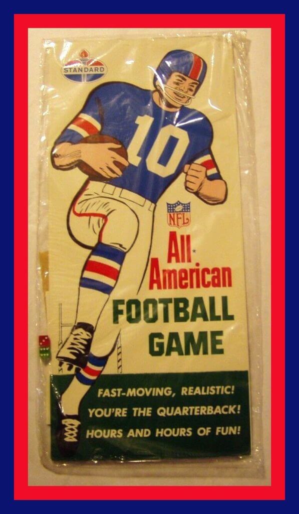
I love finding stuff I’ve never seen before, and this qualifies! Here we have a 1960s NFL All-American Football Game from Standard gas stations. It’s “Fast Moving! Realistic! You’re The Quarterback! Hours and Hours of Fun!”
It’s a curious name — NFL stands for the pros, but All-American is a standard reference for the college game. The seller says, “This is a NFL All=American Football Game that is unopened. It is the Minnesota Vikings set. The set includes the main cardboard game board, two dice, another little brochure, a couple other game pieces, a Go-Go Vikings decal (I think), and an autographed photo of Fran Tarkenton, Tom Mason, and Rip Hawkins.” Now, the player shown looks more like a New York Giant, but why quibble? This is a fantastic vintage piece.
Now for the rest of this week’s picks:
• Look at this hockey book from 1950! Turk Broda of the Leafs. He looks like he should be named Turk Broda, am I right? It’s sub-titled “The Story of a Great Net Minder.” And he was! Mr. Broda played his entire 1935-1951 NHL career for the Leafs, and also served in WWII! In 2017, he was chosen as one of the NHL’s 100 greatest players.
(About that name: Wikipedia notes, “Broda acquired the nickname of ‘Turkey Egg’ during his school days in Brandon (Manitoba) because of his many freckles. ‘Turkey Egg’ soon became ‘Turk,’ and the name followed him.”)
• The seller says, “This (1961) pocket baseball schedule for the Milwaukee Braves National League Baseball Club is in excellent condition. It is sponsored by Miller High Life Beer in Milwaukee.” (The same seller also offers this Braves “Timberland” jacket tag from Brill Bros., Inc., of Milwaukee.)
• How about this NFL stadium blanket? The happy couple seems to be more suited for a college game, waving a pennant that just says “State” on it. The guy should be wearing his old varsity sweater, too. And note in the photos, the packaging used two versions of the NFL shield — one with the stripes and one without. After consulting SportsLogos.net, that means this should be a 1968-1969 era item.
• This 1960s Los Angeles Rams pennant caught my eye for two reasons. One, the horns are yellow and stand out from the rest of the white ram design. And two, why did they say “The Los Angeles Rams,” complete with the definite article?
• Here’s a 1988 New York Rangers puzzle that includes the slogan “Share the Pride.”
• I’m including these early-1970s Chicago White Sox stickers because, well, I like the spelling of the product name: Baseball Stiks from the folks at the Meyercord Co. of Wheaton, Ill.
• This 1970s Buffalo Sabres promo puck was sponsored by WBEN Radio 930 and something/someone/something called “Heidie’s.”
• I guess that’s kinda-sorta Jack Ham, the old Steelers linebacker, on this Iron City Beer promo patch.
• One more from the Stillers; this 1970s package of four team pencils.
• This is a complete set of Toronto Blue Jays Sports Heads” from 2004. They’re plastic tubes filled with candy, with a ballplayer’s noggin on top. They also come with the display stand. The late Hall of Famer Roy Halladay is included here.
Oh. My. God. It’s now become fairly common for people performing logo-ectomies on their caps to provide a little “money shot” showing the threads that used to form the logo. Reader Wes Muniz took that to a new level yesterday when he shared these before/after shots showing how he performed surgery on a dozen caps! There’s something tremendously satisfying about all those little piles of contrast-colored thread next to the caps (you can see a larger version of that photo here). Nicely done, Wes.
As I’ve been saying lately, this phenomenon has now reached the level of a movement. A small niche movement, to be sure, but a movement nonetheless. And another reader, Robert Chavez, has come up with a good name for it: No Era. That’s pretty good — the No Era movement. I like it! #NoEra
Thank you: Yesterday’s lede — a think piece about the role of shame, and lack thereof, in our current historical moment, including, but not limited to, the Astros scandal — prompted an unusual amount of thoughtful and positive reaction, both here on the site and on social media.
I don’t mind saying that I was really happy with how this piece turned out, and I was very, very gratified by the response to it. Thanks to everyone who weighed in. If you haven’t already read the piece, I hope you’ll check it out here.
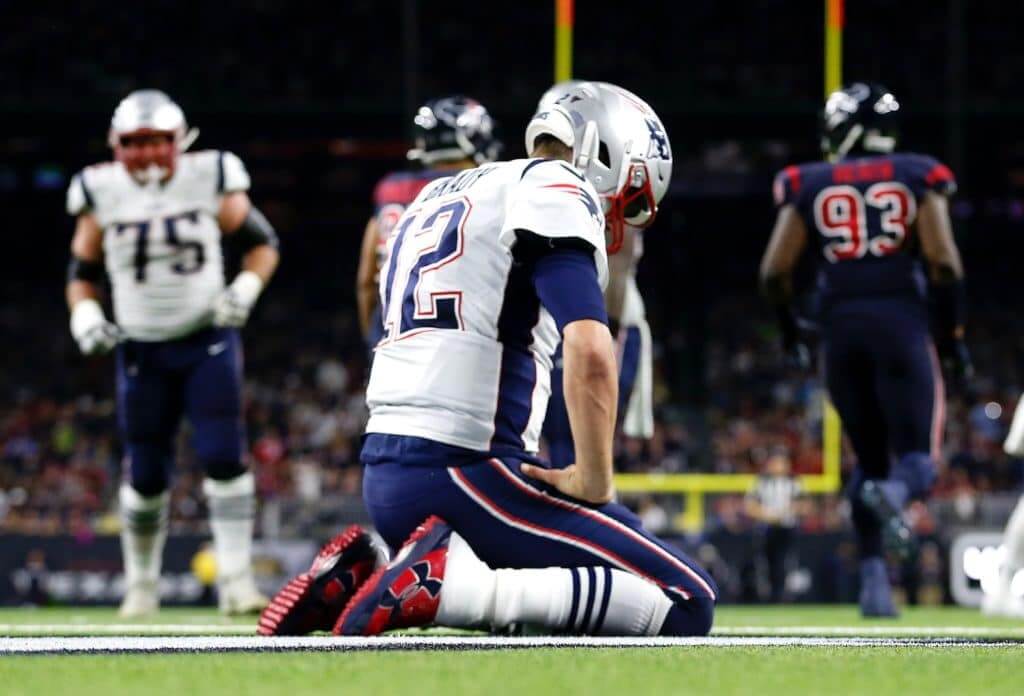
LAST CALL for the Patriots contest: Today is the final day to submit your entry for my latest Uni Watch design challenge, which is to redesign the New England Patriots. Full details here.
The Ticker
By Lloyd Alaban

Baseball News: The Oklahoma City Dodgers, Triple-A affiliate of the Dodgers, are retiring No. 168 to mark the 25th anniversary of the Oklahoma City Bombing, which killed 168 people. A 25th-anniversary memorial patch will also be worn at all home games (from @ChancePlett). … New home unis for George Washington (from Matt Eliot). … Mono-yellow with green pinstripes for Southeastern yesterday. … The plumbing at the Rangers’ new ballpark underwent a stress test yesterday — a mass flushing of its 1,100 toilets. They had a logo for the occasion. Longtime readers may recall that Paul participated in a similar mass flush when the Mets were preparing to open their ballpark in 2009. … Giants RF Hunter Pence has released his baseball academy’s uniforms. But shouldn’t the pants be above the knee? (From Ignacio Salazar.) … Several Korean pro teams have spring training in Florida. Here’s the Kia Tigers’ spring training cap (from Benjamin Hochman). … Japan’s high school baseball federation has introduced a new metal bat with less pop. The hope is that this will cut down on home runs and pitchers’ injuries (from Jeremy Brahm).

Football News: Rams COO Kevin Demoff continues to give hints and insights on the team’s upcoming uniform unveiling (from Munich Suchland). … Pop Warner has launched its own uniform brand (from Timmy Donahue). … A Texas resident has made an archive of Texas high school helmets.

Hockey News: The Senators retired Chris Phillips’s No. 4 prior to last night’s game against the Sabres. Sens players all wore his number for pregame activities and wore a commemorative jersey patch during the game. Phillips’s number was also painted on the ice behind the nets (from Jakob Fox). … Canucks F Tyler Toffoli will keep his No. 73 with his new club (from Jakob Fox). … Why does Devils G Louis Domingue paint the portions of his red hockey stick black? “I like the red sticks with the red pads,” Domingue said. However, he said he doesn’t like “looking down at red when I have the puck” (from Goalie Gear Nerd). … The Madison Capitols and the Green Bay Gamblers of the United States Hockey League will wear Lake Placid Olympics throwbacks on Saturday (from Todd Milewski). … The Penguins in-arena blimp controller crew has its own logo (from Andrew Abt).

NBA News: Two leftover notes from the NBA’s All-Star weekend from reader Max Weintraub: ESPN analyst Michael Wilbon wore four different Chicago team jerseys while coaching the celebrity all-star game. He started with a Michael Jordan Bulls jersey, then wore a Walter Payton Bears jersey, then a Bobby Hull (whom he referred to as Robert Marvin Hull) Blackhawks sweater, and finished in an Ernie Banks Cubs jersey (which, as he noted in an interview, included the 1968 Illinois sesquicentennial patch). … Chef Jose Andres played on Team Wilbon in the game and wore No. 51 — to honor Washington, DC’s bid for statehood — and wore a Wizards warmup jacket pregame. … A Kobe Bryant fan is auctioning off his Kobe-themed lawn mower and donating the proceeds to Bryant’s charity (from @AlexMShirley). … Timberwolves SG Jarrett Culver’s number was retired by his high school (from Timmy Donahue).

College Hoops News: Color vs. color for Pitt and Florida State last night. The Seminoles’ blue unis are for Native American Heritage Month (from multiple readers). … New throwbacks for Wisconsin (from Tyler Mason). … Houston women’s went mono-pink last night with inspirational slogans as NOBs (from Ignacio Salazar). … Wichita State men’s will do the same against South Florida tonight (from Timmy Donahue).

Soccer News: From Josh Hinton: The 2020-21 Tottenham Hotspur fourth shirt has leaked, based on this Nike shoe. … Barcelona’s second kit has leaked. … For the latest on kit-related news, check out Josh’s Twitter feed. … New advertised name for the Philadelphia Union’s stadium (from multiple readers).

Grab Bag: Major League Lacrosse has struck an exclusive helmet deal with equipment manufacturer Cascade (from Michael Barkann). … The Sturgis Journal’s latest installment about Michigan high school mascots covers the Three Rivers Wildcats (from Kary Klismet). … The firefighters of Shawnee, Kan., have learned how to repair their own bunker gear, saving both time and money (from Timmy Donahue). … The following items are also from Timmy: Here’s why Pennsylvania State Troopers don’t wear badges. … The United States Army is still making changes to its new Army green service uniforms. … New uniforms for the Deputies and canines of the Cleveland County, Okla., Sheriff’s Office. … Computer science professors have invented a “bracelet of silence” (NYT link) that jams any eavesdropping microphones in the vicinity (from Jason Hillyer). … Scranton, Penn., is soliciting ideas for a new city flag (from Adam Vitcavage). … Alfa Romeo F1 drivers have new suits with the drivers’ names printed down the pant legs, à la the Cleveland Browns. … Lots of new F1 liveries are being revealed as well. … The University of California, Santa Cruz Banana Slugs — my alma mater! — has been seeking input for a new logo. Voting ended yesterday, with results to follow. Details here.
Due to some tech maintenance, comments on the site will be closed from 10pm-midnight Eastern. Thanks for understanding. — Paul
The extra Chiefs players appear to be practice squad players. You can see them listed at the bottom of this page. Elijah Moore is the extra No. 30. There is not an extra No. 20 listed, but running back Mike Weber is listed without a number. The number would fit the position.
link
Jacksonville uniforms- is that a BELT?
Belted basketball shorts were not unusual during that era.
The Jacksonville team included one of the all-time great names: Pembrook Burrows III.
I have to say I am a bit stunned that the mega-flush at I’m Calling it the New Ballpark in Arlington didn’t have a corporate sponsorship. Seems an obvious place for a plumbing company, or maybe a toilet paper brand, to put their name on the “event.” I suppose I should be pleased at what passes for restraint in this regard.
Considering a snack company sponsored the Texas Stadium implosion, it really is surprising they couldn’t get someone to sponsor a flush.
Corporate advertiser. ;)
The initial photo of Gilmore shows his left white wrist band matching up perfectly with the white border/shooter’s square on the glass backboard. I had to do a double-take thinking it might be photo-shopped.
Demoff’s comments regarding the Rams uniforms just demonstrate how out of touch franchises are with what the fans like (such that they ignore overwhelming feedback as he even notes) or that they know it is just an opportunity to sell more merchandise. In this case I have to believe it is 100% the latter. The Rams know they can wear the blue and yellow as a throwback / alternate once or twice a year, and sell lots of them, but also have their new dark and white jerseys to sell. I get the feeling the new uniforms will be very very similar to the classic blue and yellow throwback, but with some slight tweaks and using navy instead of royal blue, so it is just different enough.
Greg, I agree with you 100 % on the upcoming new unis ,being an old longtime Rams fan, since when has a new look improved the fan favorite (Dolphins,Bucs,Browns,Vikings,come to mind)hate to be an old negative guy but I gotta feeling these are not gonna be good
I really don’t understand the way Nike does the leg piping on their modern shorts, with the uncentered notch in the leg. Those Jacksonville shorts are a perfect example. Celtics and Knicks are two more.
What’s weird is that they do have a different template that would eliminate the problem. Michigan states Magic Johnson throwbacks look fine. I think Ohio States gray ones are ok too.
Which makes it even stranger that someone (or a group of someones) would intentionally decide to go with such poor design. I mean, piping of that style never would have been a design element in the first place if it didn’t match up and go all around the leg.
Very disappointing effort by Jacksonville. Why not get as close as possible to the original uniform. I get it if the belt would have been too hard to reproduce, but I don’t get that they couldn’t get the negative arch and pant stripes correct.
Clearly, they didn’t *want* it to be a true/accurate throwback; they wanted it to be a modernized version of the old design.
That’s not the route I would have gone, but it was clearly a conscious choice on their part, not a lazy default or lack of effort.
The difficult thing to figure out is why they changed what they did? It would make sense to maybe update the pant stripes, belts, or other design elements but some of the updates seem so small as to not bear changing (ie. the number font.) it reminds me of watching a movie that is based on a book. Some things have to change because of the format change (for length, clarity, etc.) but often times there are things changed that didn’t need to be, other than the writer/director or in this case designers preference. Seems an odd place to place a unique designers perspective when you are replicating a previous designers work. I wish they would have kept the font and arching from the original.
I think it’s possible that a school like Jacksonville doesn’t have the cachet and/or budget to have Nike design and make them a throwback uniform from scratch (so to speak), and so you end up with the “these were the options available in the catalog” version.
It is always possible to mimic an old school belt for basketball shorts. Recent Toronto Huskies uniforms did this. You could also put a patch on the front of the waistband that looks like a belt buckle.
link
I miss the little graphic dolphin between the stripes on the shorts.Always thought that was a nice touch. Sort of wish more unis had small, subtle mascot images tucked in.
It’s not a patriotic or nationalistic thing, but why would anyone want to wear the Soviet Union style jerseys in a game celebrating the Miracle On Ice? I wouldn’t want to be the team wearing what the losers of any game wore during a celebration.
“You can come by my house to play basketball but I’m the Bulls and you’re the Jazz. Wear this.”
I’d wear em just because those CCCP sweaters are hot, especially those 80s ones with the diamond trim.
Does the Gamblers goalie know he is going to be pulled?
I’ve known people who do battle reenactments and portray “enemy” soldiers – like War of Independence Brits and Hessians – not out of sympathy for that side of the conflict but because somebody’s got to play the other side to have a battle reenactment at all.
Yeah, and battle reenactments don’t really make much sense to me either. I’m not saying anything is wrong with any of the uniforms or reenactments but I personally wouldn’t want to play the role of the loser unless I was being paid to do it in a Hollywood movie.
Heidie’s was a tuxedo rental shop in Buffalo. I think it closed some time in the ’90s. The puck was probably a promo from the Sabers’ annual New Years Eve “Tux and Pucks” event.
Thank-you! I couldn’t find a thing on that!
The vast preponderance of photos of Jacksonville in their road uniforms is likely because most of the photos that still exist were taken during the Dolphins’ NCAA tournament run. If they were the lower seed in the game, they would be considered the road team, and wearing their road uniforms.
On New Era, I’m a little more sympathetic to them since they are made by a small operation in NY state. I don’t have many caps but I haven’t taken the logo off them.
Actually, they’re a large company and have shut down most of their NY operation, leaving lots of union workers unemployed and outsourcing the work to non-union shops in Florida and overseas.
link
I’m not saying that’s the best reason to remove the logo from their product, or that you should remove the logo at all — all of that is up to you. I’m just saying that your conception of the company seems to be a bit misguided.
Alternative thought: don’t buy the hats. There are companies that make accurate throwback MLB hats. I stopped buying hats when the
Price rose from $20 to $35 and every team decided that they needed 3 and 4 hats to get through a season of games.
Oh, for sure. I’m on record as saying we’d all be better off if retail jerseys and caps had never been made available to begin with. But if people are going to buy them (or have already bought them and have a bunch of them), and if they don’t like the maker’s mark, removing the mark is a good and empowering option.
On MLBShop, a Fitted hat is $40 this year.
I kind of chuckled when I read that Artis Gilmore had a successful career. He’s in the Hall of Fame.
Yeah, that was probably not the best wording on my part. Will update now!
Formerly of the Kentucky Colonels!
There’s a documentary about that JU team currently on Amazon Prime titled “Jacksonville Who?”
link
Due to technical maintenance on the site, comments will be closed from 10pm-midnight Eastern. Thanks for your understanding.
Even though the execution of the Jacksonville uniforms is pretty poor, it is truly a shame they don’t have someone wearing double zero.
Another team that wore their name under the number was Harvard in 1971. They had a guard from DeMatha High School named James Brown (the guy who is now on the NFL on CBS).
link
Wow — never seen that before!
About that Sabres puck…Heide’s was a tux rental chain in the Buffalo area.