Click to enlarge
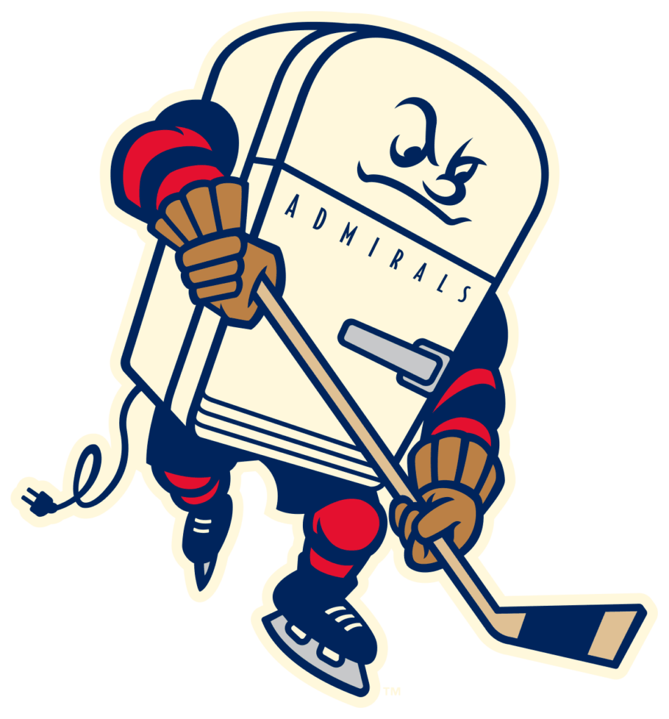
It’s not often that I have occasion to write about minor league hockey. But the AHL’s Milwaukee Admirals — that’s the top affiliate of the Nashville Predators — yesterday released a new 50th-season logo that’s definitely worth discussing. I love it, but I’m also conflicted about it.
Why do I love it? Because it’s completely awesome, obviously. I didn’t realize until now that I needed an anthropomorphized old-fashioned refrigerator in my life, but I suddenly can’t comprehend how I lived this long without one. The cord trailing behind — with a two-prong plug, natch — is a particularly nice touch.
So why am I also conflicted about it? Because of this explanation from the Admirals’ website:
[B]ack in 1970 the team was purchased by local businessman Erwin Merar. He owned an appliance store and his best-selling line, especially refrigerators, was the Admiral. He figured if he was going to buy a hockey team, at least he could get some publicity for it, and thus, the Milwaukee Admirals were born.
A similar story appears in this 2011 obituary for Merar:
“He actually re-named them the ‘Admirals’ because he owned the Admiral Appliance distributorship in the state of Wisconsin,” said [former Admirals player and coach Phil] Wittliff. “A lot of people think it’s because of the nautical theme, but in reality it’s because Erv Merar had the Admiral Appliance distributorship.”
In other words, the Admirals’ team name was essentially an ad for an appliance brand. I had no idea. The team has always used nautically themed visuals, so it never occurred to me that that the team name might have stood for something else.
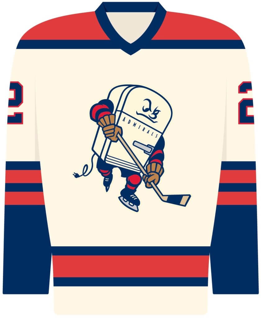
So that’s why the team commissioned the refrigerator mascot logo — as a nod to the origin of the team’s name. They’re jokingly referring to it as the “historically accurate” logo, since it’s a more accurate portrayal of the original meaning behind the team name. They plan to use it as their jersey crest on April 4 (and I sure hope they give out fridge magnets of the logo character that night!).
I confess that I find it a little disappointing to learn that this awesome logo basically glorifies an early example of team branding commingling with advertising. Still, 1970 was a more innocent time, and the logo captures the spirit of that era nicely. I still love it, although the backstory is a bit of a downer.
After the logo came out yesterday, I had a quick email exchange with Admirals communications VP Charlie Larson, as follows:
Uni Watch: Who created the logo design?
Charlie Larson: The mark and jersey design were created by Dan Simon, owner of Studio Simon. He created our current logo as well. We’ve been throwing this idea around for a few years and figured since we were celebrating our 50th season, it was the perfect time.
UW: Since Admiral is still an active brand (now owned by Whirlpool and sold exclusively at Home Depot), did you have to work with them in any way for clearances, permission, etc.? Are you doing any promotions with them?
CL: We didn’t consult with them on this project, but we would definitely be up for collaboration if they were interested.
UW: Does the fridge mascot character have a name?
CL: Not yet. We’re going to start a naming contest on social media next week.
Meanwhile, here’s something interesting: The Admirals, like many minor league hockey teams, wear ad patches on their jerseys. Because the Admirals are owned by a group connected to the Milwaukee Brewers, for many years they’ve worn the Brewers’ ball-in-glove logo as their jersey ad patch (creating a rare cross-sport situation), and this year they’ve also added a 50th-season patch:
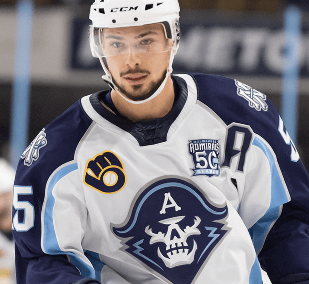
But! Larson tells me that this weekend the Admirals will replace the BiG patch with the Brewers’ newly released 50th-anniversary logo. “So we’ll have two 50th-year patches, which has got to be a first in pro sports,” says Larson. Okay, so one of them is for an anniversary and the other is for an ordinal (if you need to brush up on the distinction between those two things, look here), but it’s still a pretty nifty trick.
(Big thanks to Andrew Wagner for hooking me up with Charlie Larson.)
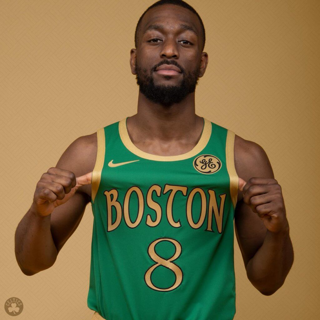
More NBA alternates: Yesterday was another busy day in the NBA uni-verse. Here’s a quick rundown:
• The Celtics released their Gaelic-style uniform, confirming earlier leaks (additional photos here):
• The Hornets will apparently have a GFGS version of their “cha-cha” alternate:
Gray CHAs for EVERYONE 😂!
Miles just leaked the City jerseys on his IG story. pic.twitter.com/vhEyMbmUwT
— Bring Back the Buzz (@BringBackTheBuz) November 21, 2019
• We knew the Nets were going to do a white version of last year’s Biggie Smalls-themed design. We didn’t know, however, that it would have “Bed-Stuy” on the chest (which I guess means this is a Neighborhood design, not a City design):
– ℎ | ℎ
Introducing our 2019-20 City Edition threads pic.twitter.com/9UTp9IMgb4
— Brooklyn Nets (@BrooklynNets) November 22, 2019
Of course, the Nets don’t actually play in Bed-Stuy, but why let facts get in the way of a uniform design merch dump?
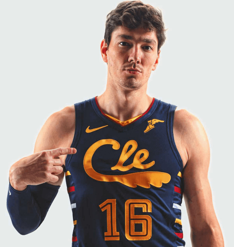
• The Cavs released a strange hybrid/mash-up design, similar to the old CavFanatic series. This one’s so goofy, I actually like it quite a bit (here are some additional photos and the matching court design):
• Remember the Pacers’ racing-themed blue alternate from last season? They’re doing a white version of it this time around (additional info and uni schedule here):
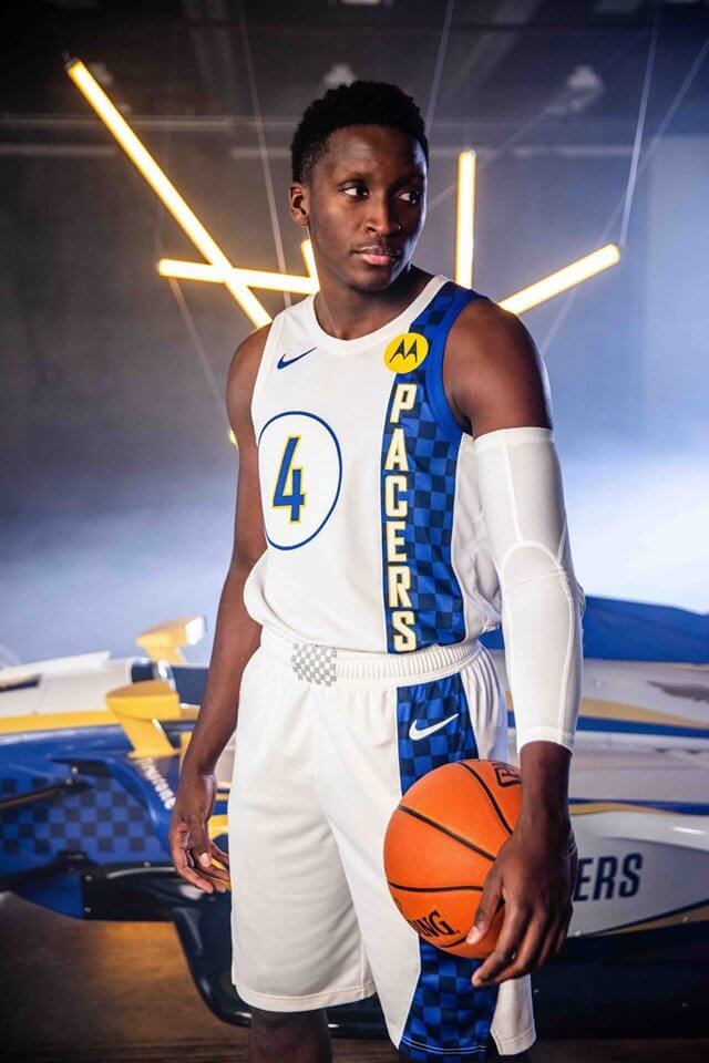
If we could have a Cavs/Pacers game with those last two uniforms facing off against each other, I might actually watch that!
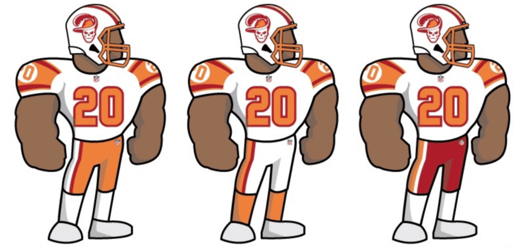
Contest results reminder: In case you missed it on Thursday, the results of our “Redesign the Buccaneers” contest are now available on InsideHook. The response has been very, very positive, so check it out — I think you’ll like what you see.
Click to enlarge
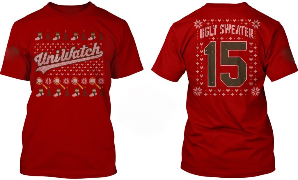
’Tis the season: With the winter holidays fast approaching, it might be time to break out the ol’ Uni Watch ugly sweater shirt. If you don’t already have one, it’s available in long-sleeved and sweatshirt versions, too. Details here.
The Ticker
By Anthony Matthew Emerson

Baseball News: Here’s a great piece on the designer of the Brewers’ original ball-in-glove logo (from Don Schauf). … The Auckland Tuatara, the only Kiwi team on the Australian Baseball League, have added an “RC” memorial patch for former Twins prospect Ryan Costello, who was due to play for the Tuatara before suddenly passing away earlier this week (from Samuel C. Williams). … Robert Edward Auctions currently is currently taking bids on a c. 1870 carte-de-viste of the Grecian Base Ball Club. What’s notable is that the uniforms have each player’s position on the front, right below the “GB” abbreviation. The pitcher also has a sash reading “CAPTAIИ” (from David Brown).

NFL News: The Ravens will wear their Color Rash unis on Sunday (from Andrew Cosentino). … The Bears posted a neat video on Twitter showing the equipment team converting the team’s orange wishbone-C helmt logo to white for this weekend’s throwback game. They also added a “GSH” memorial decal (from Jamie Uthe). … Steelers LB Robert Spillane wears No. 41 in honor of his grandfather (from Jerry Wolper). … The Los Angeles Times has an article about the Rams’ equipment managers (from Matt Shevin). … Former Vikings K Fred Cox, who invented the Nerf football, has died. … In a real profile in cowardice, Nike and Washington both declined to explain why the team’s controversial name didn’t appear on any of its G.I. Joevember sideline gear, even though the answer is fairly obvious (from Anthony Nuccio).
College Football News: Following years of court delays and construction, a house in Iowa designed to look like Kinnick Stadium has now been completed (from Kary Klismet, who took some pics of it during a visit). … Virginia is going blue-blue-white against Liberty tomorrow (thanks, Jamie). … Louisville is going mono-red tomorrow, their 11th different combo this season (from M. Brinston Berry).

Hockey News: Awesome new pads for Blue Jackets G Elvis Merzlikins (from Kevin Pedigo). … The AHL’s Rockford IceHogs are wearing purple “Hockey Fights Cancer” sweaters on Nov. 29 (from Ethan McDougall).

College Hoops News: ESPN has an interesting article about how different college basketball teams use different brands of balls, what difference that makes, and whether it should change (thanks, Jamie). … St. Bonaventure is going with throwbacks against Canisius. … Marshall men’s wore purple socks and wristbands in honor of F Mike Beyers’s stepbrother Peyton, who died last week (from M. Brinston Berry).

Soccer News: The Chicago Fire officially launched their long-rumored new crest was unveiled yesterday, and their new kits have leaked as well (from many readers). … Bundesliga side Eintracht Frankfurt are wearing diversity kits this weekend, featuring the flags of the 14 different nations represented in their squad (from @ajzthisisdumbjr). … Taylor Fritz of Team USA at the Davis Cup wore a USMNT jersey during a match (from Josh Hinton).

Grab Bag: The city of Dayton, Ohio, is accepting submissions for a new flag (from Patrick O’Neill). … Speaking of municipal flags, Salt Lake City’s new mayor is inheriting something of a longstanding flag problem (from Brice Wallace).
By the time most of you read this, I’ll be on my way to Virginia — my annual visit to that oyster roast I attend each year. Have a great weekend and I’ll see you back here next week. — Paul
No mention of the Rodgers’ coincidental zero-zero? Twitter seemed to love that! I thought it was at least worth a ticker item.
When do NBA alternates no longer matter? It’s like having pie every meal, soon you are just going to dump the next piece into the trash.
The Admirals commercial tie-in name is quite common for teams of and before that era. It predates contemporary consumer culture, and so shouldn’t be judged by today’s standards.
Yes, I explicitly stated that 1970 was “a more innocent time.” And I’m not judging it “by today’s standards” — I didn’t say it was an outrage or evil or any of the things I might say about, say, the D League selling its name to Gatorade. Instead, I said it’s “a little disappointing” and “a bit of a downer.”
The connection between the Admirals’ name and today’s ad-driven sports uni-verse is explicitly pointed out in the article on the team’s website that I linked to. Quote from the Admirals team president: “Irv was a pioneer in the sports marketing world. Back before any team even thought to put a[n advertising] patch on their jerseys, he was advertising on the whole darn thing [via the team name].”
One need not find this evil to feel that it taints the new logo just a bit.
Thumbs up for the Admiral fridge logo. I want more.
Atwater Kent or Philco in Philadelphia. The Zeniths, nearby to the Chicago Dogs, Schaumberg Boomers, or Windy City Thunderbolts, anybody?
Or, Fort Wayne Zollner Pistons.
I find it kind of charming. It would still work today if the corporate company was local, homegrown and the name wasn’t techie, or something like wework, target or whatnot. Only if it offers a decidedly local flavor.
Isn’t the Red Wings name attributed to the shoe brand?
And the Hershey Bears were the B’ars at one time.
The B’ars were deemed *too* blatant of an advertising stunt, oddly enough, leading to the name change
From some interweb research:
In 1932, millionaire James Norris bought the team. In his youth, he had played on the MAAA Winged Wheelers team that won that first Cup in 1893. The MAAA was a sporting club that sponsored many types of sports, including cycling, which was the origin of the winged wheel logo worn by all MAAA athletes.
Norris thought the winged wheel was a perfect logo for the Motor City, so a version of that logo in red was adopted and the club was renamed the Red Wings.
Here in Rochester, NY we had a basketball team named the Zeniths, with a similar naming origin as the Admirals. The team owner, Dick Hill, owned an appliance store that sold, among other brands, Zenith televisions, Hence the name. What other examples are out there of teams who got their nicknames in a similar manner?
link
When in comes to pro baseball in my city, there is a relationship with beer and team names.
The Vancouver Capilanos, from the 1930s to 1950s, were owned by Seattle brewer Emil Sick and named after his Vancouver brewery.
Then I think about the PCL Triple-A Vancouver Canadians. Sure, technically there were no ads on the uniforms, but the uniform itself looked like a walking beer label for Molson Canadian brand beer.
link
link
Speaking of the PCL, Mr. Sick, and beer, the Seattle Rainiers were a tie-in with Rainier Beer. The Tacoma Rainiers indirectly tie in to this legacy today.
Not a nickname, but the original colors of the Boston Bruins, brown and gold, were those of the original owner’s grocery store.
American sports has teams named after the Acme Packing Company of Green Bay, WI and the Zollner Piston Company of Fort Wayne, IN.
Back to hockey, legendary junior team St Catharines Teepees got tis name from the initials of its owner, Thompson Products.
You beat me to it Joe. I was the Head Statistician for the Rochester Zeniths from 1979 through 1982, and as I’ve told Paul before, for three years I sat at the scorer’s table next to the late, great Terry Proctor, the long time Uni-Watch contributor! Believe it or not, even 40 years ago we’d aften talk about uniforms and logos! Rest in Peace, Terry!
I feel bad that I stole your thunder, as I’ve only lived in Rochester since 1995, and I was still in diapers when you started with the Zeniths!!! I have friends in Livonia who knew Mr. Proctor very well, I’m sad that I never got to meet him. The contributions that he wrote here were pretty awesome, I can only imagine what he was like in person. Do you still live in Rochester? I saw someone in here the other day that looked to be from Rochester, maybe there are enough of us to do a Uni-Watch meet-up sometime.
The Chicago Bears were originally the Decatur Staleys named after the owner but his company was called the A.E. Staley Manufacturing Company so also after the company!
link
Is that picture from the War Memorial, or is that the infamous carpet they played on at the Dome?
This picture here is definitely from the Dome Arena, and thus the carpeted floor. Also of Uni Note, the Zeniths player in this picture is wearing a helmet or some other type of headgear. Looks almost like a hockey helmet.
link
In the NFL, the Oorang Indians was a novelty team starring Jim Thorpe that was put together to market owner Walter Lingo’s Oorang dog kennels(1922-1923).
The Duluth Eskimo started out and spent three seasons (1923-1925) as the Kelley Duluths, named after the Kelley-Duluth Hardware Store. The Bears were originally the Decatur Staleys(and very briefly, Chicago Staleys) after the Staley Starch Company.
The Packers got their name from the Indian Packing Company, Curly Lambeau’s employer who paid for team uniforms and equipment.
Locally the closest I can think of is a hockey team that made it to the Memorial Cup finals: Port Arthur Marrs (named after a local trucking company – W.H. Marr Ltd.) :
link
link
I remember in the late ’70s, the Lipton company gained ownership of a North American Soccer League team in Massachusetts and named it the New England Tea Men.
The Bears are also switching to a gray facemask per that video clip.
It seems that the Pistons are following different rules than the rest of the league. The recent quote about throwbacks said they can’t use elements of their classic jerseys for an alternate, and that they can only wear throwbacks for anniversaries, but we’ve now seen several city edition uniforms inspired by classics, and multiple teams with throwback jerseys that aren’t celebrating an anniversary
Is the Bulls “ORD” jersey next? The NBA has jumped the shark.
Teams named after products are interesting, but what about products named after ballplayers?
Right away I thought of Al Kaline Batteries.
Reggie Bar: The candy bar that tells you how great it is.
link
Chuck Taylor’s.
Air Jordan anyone?
Flutie Flakes!
link
Brewers’ 50th link in the lede goes to their new primary logo, I think he means they’re gonna be wearing this: link
Fred Cox invented the NERF! (Say like Johnny Carson:)
“I did not know that.”
“That is some weird wild stuff”
I introduce to you…the Toledo Jeeps of the National Basketball League, a forerunner of today’s NBA.
link
link
link
link
Love their uniforms!
Houston Colt .45s anyone??
Difference there is that Colt firearms had nothing to do with the team.
In fact, they filed a lawsuit, which led the change to Astros.
If that mascot’s name isn’t Admiral Fridgey, we riot.
Patrick, you should have saved that for the contest.
This is fantastic!
Or instead of Admiral Byrd, “Admiral Brrrr.”
Or, perhaps Fridgedy? ;)
Except the three stripes at the bottom of his door mark him as a Commander. Admiral appears to be his name, not his rank.
Kidding aside, “Admiral Fridgey” is amazing!
I’m not sure which I prefer, Barrelman or Fridgeman. Might have to see them compete head-to-head in a sausage race to decide.
So obviously the Naming Wrongs shirts are great, what about a Logo Wrongs shirt with the old Chicago Fire logo over this new abomination?
Riiinnnng! Riiinnnng!
Old man: Hello?
Dumb kid: Is your refrigerator skating?
Old man: Huh?
Dumb kid: You better go catch it!!
Old man: Huh?
Dumb kid: (laughs hysterically)
*click*
Not only is the skating fridge a plug, it has one. And it’s an old model without an ice maker so it can’t be called for icing.
I’m here all week, try the veal.
This comment made my morning. Hysterical!
My uncle played minor league hockey for the Albany Choppers, owned by he owners of the grocery store Price Chopper back in the 90s.
link
Typo: Ravens play on Monday, not on Sunday
That Cavs uniform is great. I’ll watch a game to see if my excitement holds up, but that may be top 5 active unis for me.
Never thought I’d say this, but good for Nike. Too bad they don’t have the cherries to admit WHY they left the name off.
Looks more like an “ice box” than a fridge.
An icebox doesn’t have a cord though.
the fort wayne/zeller pistons were basically an ad for the owners car parts company…
the green bay packers…
i guess we as uni-watch readers are surprised how taken aback you were at this concept considering how many early franchises in all professional sports have very similar origins,
i guess we thought it was all common knowledge to you, being a uniform historian.i dunno.
also, Bed-Stuy is were Biggie Smalls hails from.
not that hard to make the connection, regardless of merchandise opinions
I’m sure Paul has mentioned both of these before, but…
Detroit Pistons began as the Fort Wayne Zollner Pistons (google “Zollner Pistons logo”).
ABA’s Denver Rockets were named after the team owner’s Rocket Trucking. No truck in the logo, though, lol.
Did some poking around on the Admirals site, they have an old skating sailor logo that is fantastic!
I think that’s the difference between them and more modern ad creep is they didn’t just use the logo from the fridge for the team.
Yes, yes it is. It should have never changed.
Signed,
A Milwaukee native
The Kansas City Royals were named in an homage to American Royal, which is a livestock/horse show/barbecue event that happens every year in Kansas City (link). I guess it’s really not crass consumerism since it’s a non-profit event, but still a good bit of useless trivia.
Speaking of anthropomorphized refrigerators AND William Perry, here’s the album artwork for a 1985-era record called “Frig-o-Rator” that was recorded at the height of William Perry mania. Was it awful? Yes it was.
link
Thumbs up to the Cavaliers, nice!
For that Bears video showing them changing logo I for some reason thought it was a lot more complicated didn’t realize they are just plain old stickers and someone is actually just changing the stickers logo. Seems pretty basic. I mean isn’t there some sort of measuring making sure it is in the centre of the helmet and in the exact same spot as the other side?
One detail seems to off on the Admirals logo…..
Every Admiral model with that type of latching handle had the handle on the other side.
Good time to mention the soccer teams that have companies in their names (no, not the Red Bull teams) because they were founded as a company team: Bayer Leverkusen, PSV (Philips SV), FC Carl Zeiss Jena, Vauxhall Motors in lower-league England, etc., and even more than don’t have a company name anymore, such as VfL Wolfsburg.
This seems like a good time to remember the time about five years when the Admirals (wearing their BiG patch) played against the Charlotte Checkers who were wearing a Charlotte Hornets patch. One minor league hockey team wearing an MLB patch squared off against another in an MLB patch. That was mildly weird.
link
Also glad I found that page so I could read some comments from the glory days of “The Jeff.”
link
Good find! Both for the peculiar convergence of sports logos at a minor league hockey game, and for the nostalgic trip down Uni Watch Comments Section Memory Lane.
There are lots of former regulars in there whose contributions I miss, including The Jeff, terriblehuman, scottrj, and Connie. It’s also good to see some the of the stalwarts who are still active in the comments section, including DenverGregg, Dumb Guy, arrscott (under whatever internet handle he’s currently using) Mike Engle, Graf Zeppelin, and you, AlMaFi!
(Cue Springsteen’s “Glory Days”…)
*Sorry for typos.
“five years ago”
“MLB patch vs. NBA patch”
Since we’re discussing corporate/product-derived team names, Cedar Rapids, Iowa, had a CBA team in the late ’80s and early ’90s known as the Silver Bullets. The name was a reference to the team’s
sponsormain advertiser, Coors Light, which was widely marketed at the time as “the Silver Bullet” because of its silver cans. More info here:link
Their uniforms featured a fairly distinctive stacked wordmark across the chest:
link
Fridgey McFridgeFace!
Love-love-love the Admirals fridge logo. I agree with Paul that it’s a bit unfortunate that there’s an advertising tie-in but that, yes, 1970 was a pretty different time. It’s interesting to note that 1970 is very close to the halfway point between 1919, when Curly Lambeau named his team the Packers to advertiser the company that paid for his uniforms, and the current day, when ads on uniforms have become a major blight on the sports landscape. Also worth noting, the regular current-day Admirals logo is for me the epitome of modern-day logos that I really dislike. Kudos to the team for being willing to swing so far in the other direction with this 50th anniversary logo.
The Ravens/Rams game is Monday night, not Sunday night (Packers/49ers).
Back in the 70s, the owner of a local chain of TV stores owned a minor league basketball team. They were called the ‘Zeniths’ after his main brand. They had an awesome logo. There was also briefly a pro slo pitch softball team by the same name.
Forgot to say in Rochester, NY