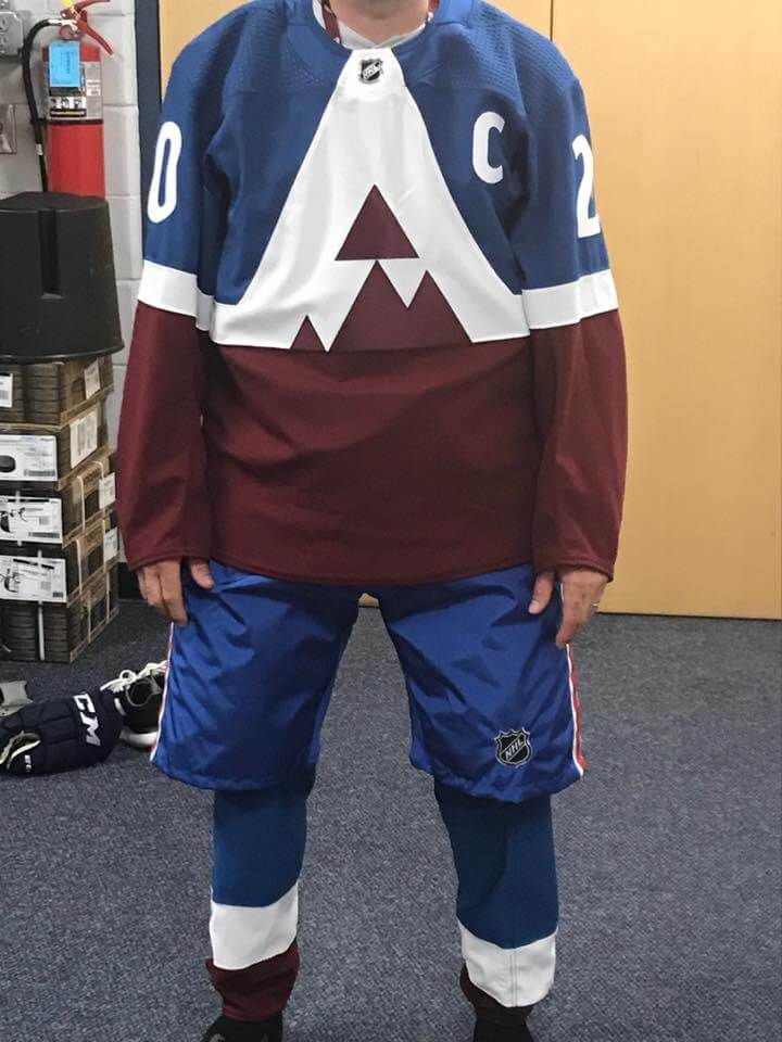
Photo source: Colin Martel of PHEW on Facebook; click to enlarge
Photos purporting to show the Avalanche’s new Stadium Series uniform began circulating on Tuesday. On Wednesday, the very reputable Icethetics site confirmed their legitimacy (well, technically on Tuesday night, but most of the world, myself included, learned about it on Wednesday), so this is what the Avs will be wearing when they face the Kings on Feb. 15 at the Air Force Academy in Colorado Springs.
Full disclosure: I’ve known about this one for a couple of weeks but was sworn to secrecy. So when the leaked images began circulating, I couldn’t comment on them. But now that Icethetics has confirmed them and lots of other outlets are writing about them, I can’t ignore them any longer.
So, the design: As lots of people on social media have already observed, the stylized “A” looks a lot like a bib emanating from the jersey collar (or maybe an upside-down version of the Canucks’ famous flying V) — not ideal. But unlike most other Stadium Series jerseys, this one seems to have been designed with the stadium fan in mind. The oversized graphic may not look so great up close, but it might look just right for the fan in the upper deck, right? Or at least I think that’s the idea. I’m willing to reserve judgment until we see how it looks on the ice.
It’ll be interesting to see whether the Kings’ jersey takes a similarly bold approach.
Buck you: A lot of you folks out there are very creative. Teams and coaches recognize that, which is why I’m semi-regularly asked to conduct design contests to create a team’s new logo and/or uniform. Whether the team is a small high school or a professional minor league club, my response is always the same: “I’m happy to do it, under one condition: If the design is actually going to be used in the real world as part of your branding, you must provide a fair fee for the winning designer. You don’t have to pay me anything for running the contest, but you have to pay the designer.”
I do this because it’s important to reinforce the point that creative work has value and that creative people whose work is going to be used in the real world deserve to be compensated for that work. Some teams say, “Well, we don’t have a budget for that,” which basically ends the conversation. Others happily agree to compensate the winning designer (they usually ask me what I think is fair, and I come up with a number based on what sort of team it is and what they want designed), which is how Uni Watch readers have ended up creating new uniforms for the Portland Pickles, Leigh High School, and the Grand Rapids Griffins, among others.
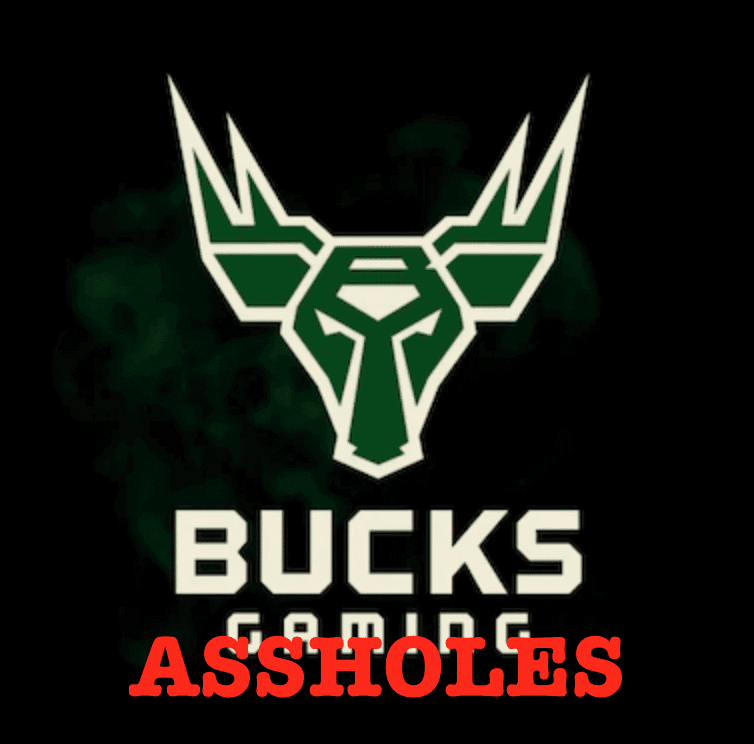
With all that in mind, let’s consider the case of Bucks Gaming, which is the e-sports affiliate of the NBA’s Milwaukee Bucks. On Monday they invited people to create a new header design for their Twitter page. In exchange, they offered team merch. In other words, the designer’s “prize” for the winning designer would actually be advertising for the client.
Designers were not amused, and there was a significant online backlash. The full story, which is worth reading, can be found here.
Now, the depressing and completely unacceptable fact is that Bucks Gaming is hardly the only professional team to run a design contest with no compensation. So why have I chosen to single them out with this post? Because when one designer told them, “Bills can’t be paid with merch. Select and pay a designer the proper way,” Bucks Gaming responded like so:
Bucks really respect your work man 🙄🙄 pic.twitter.com/jjXKcR5PlU
— Darkmilitia419 (@darkmilitia419) November 13, 2019
What an asshole.
Yeah, I know, it’s probably just an intern, or some kid, or some low-level employee, or someone who didn’t know better, or someone who got caught up in the heat of the moment, or, or, or….
Fuck these people. Pay designers fairly, and fire whoever sent that tweet. Now.
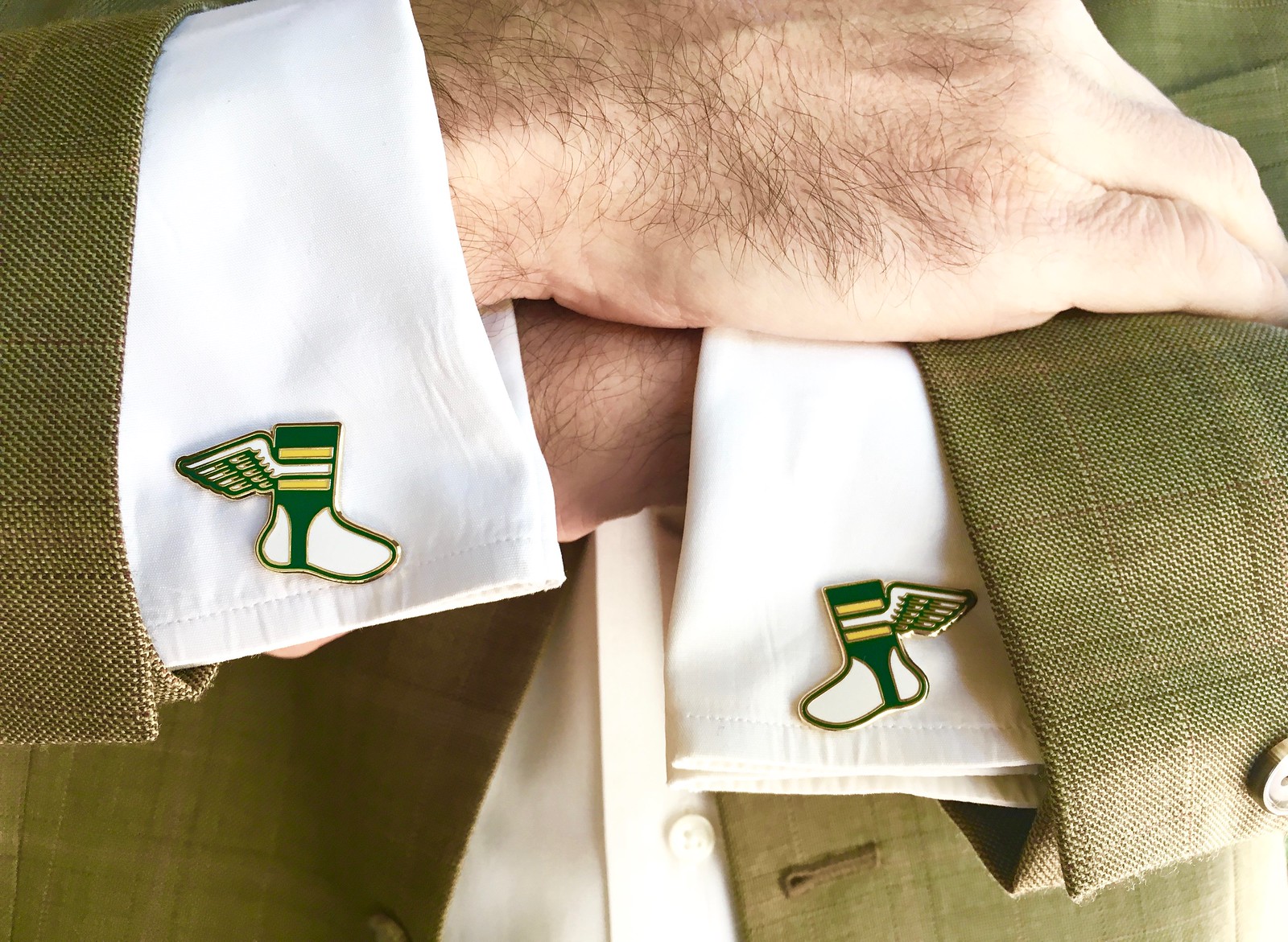
Click to enlarge
ITEM! Cufflinks now available: I’m happy to report that Uni Watch Cufflinks, which I’ve previously shown you teaser photos of, are now ready for ordering in our Teespring shop.
I don’t mind saying that they look really, really good. I don’t usually wear Uni Watch merch (sort of like the band wearing its own T-shirt, right?), but I’ll definitely be wearing these. A Uni Watch reader who works as Senior Litigation Counsel at the U.S. Justice Department says he plans to wear them for his argument in federal court next month, which means Uni Watch cufflinks will literally be representing the United States of America — how about that! You can get yours here.
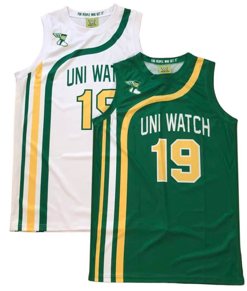
Click to enlarge
SIX DAYS LEFT for hoops gear pre-orders: In case you missed it on Sunday, we’re now taking pre-orders on Uni Watch basketball jerseys. You can choose your own number and NOB, and you don’t have to have the winged stirrup on the shoulder if you don’t want it there.
We also have matching shorts:
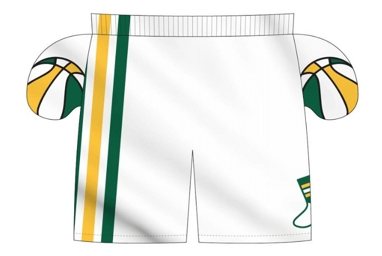
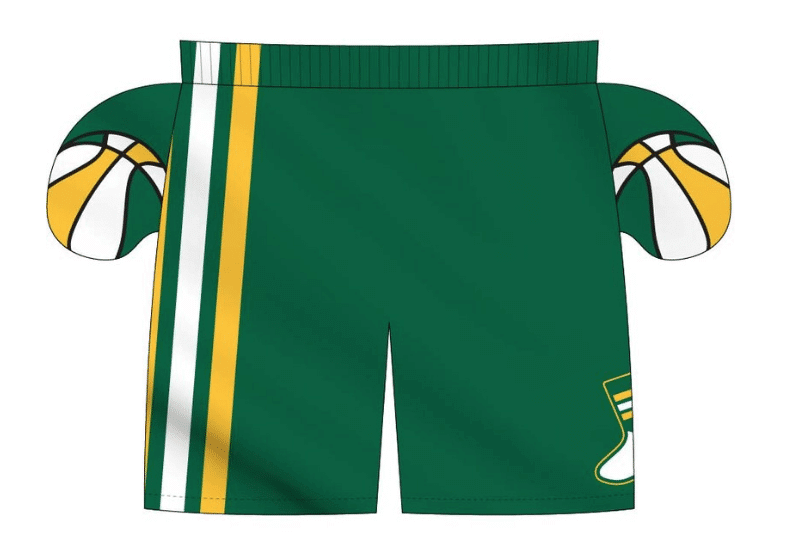
The ABA-style basketball-themed inner pockets are a nice touch, right? I can’t take credit for that detail, though — that was Adelph Wear honcho Nathan Haas’s idea. He’s my partner/collaborator on this project, just as he was with our recent cycling jerseys.
We’re taking pre-orders on these through next Wednesday, Nov. 20, for Christmas delivery. It’s possible that we’ll offer these again in 2020, but for now it’s a holiday offering, so move fast if you want to get in on it! Full details here.
Also: The pre-order page doesn’t offer an option for international shipping. But if you want that, email Nathan and he should be able to help you out.

IMPORTANT seam ripper update: The good news is that the Uni Watch Seam Rippers have been much more popular than I expected. The bad news is that this means I’m already sold out. I’ve already ordered new inventory, although it may take several weeks for it to arrive. (The green and blue colors are surprisingly hard to find, especially in America, so I’ve had to order them from Asia, which takes a while.)
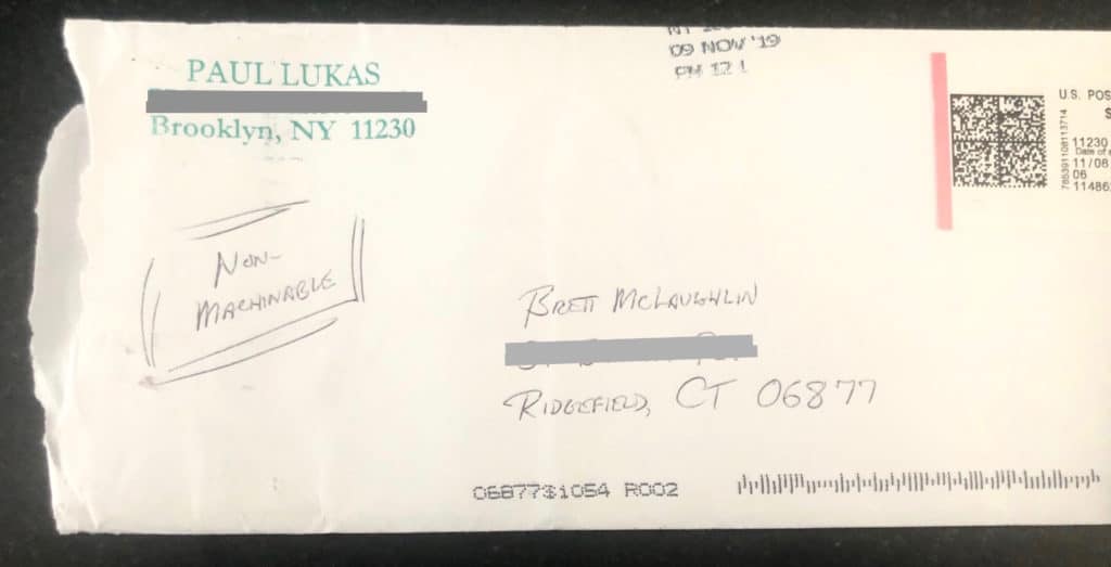
The worst news, though, is that two customers have gotten in touch to tell me that the envelopes with their rippers have arrived looking beat-up, damaged, and with the seam ripper missing, like this (click to enlarge):
Ugh.
Some quick background: My goal with the rippers was to keep the shipping costs as low as possible. Who wants to buy a small, inexpensive item with a big shipping cost? So I went down to my local post office, where the clerks assured me that I could pack the rippers in a conventional envelope. They suggested that I tape the rippers to a tri-folded letter, so the rippers wouldn’t be rattling around. Since the ripper is a rigid object, the letter would be classified as “non-machineable” (i.e., it would have to be handled by hand, not by the postal service’s automated machinery), which costs a bit more — 70¢ instead of the usual 55¢. So that’s what I did.
But now it appears that at least two of the envelopes were machined — and basically destroyed.
Here’s the deal:
1. If you ordered a seam ripper from me, please let me know if you’ve received it, not received it, or received the envelope in a damaged state. Basically, I need to determine if these two damaged envelopes were aberrations or a chronic problem.
2. If your ripper was lost or damaged, I’ll send you a new one (no need for you to pay a second time) once I get the new rippers in stock. That will likely take several more weeks. Sorry about the hassle, and thanks for your patience.
3. If it turns out that the machined envelopes are a chronic problem and not just two isolated incidents, I’ll have to start packaging the rippers in little bubble mailers. That means the Postal Service will classify them as packages, not letters, which in turn means that I’ll have to start charging $5 for shipping. I’d really like to avoid that, because it will turn a $5.99 ripper into a $10.99 total purchase — but it may be unavoidable.
I think that’s it. Man, never a dull moment!
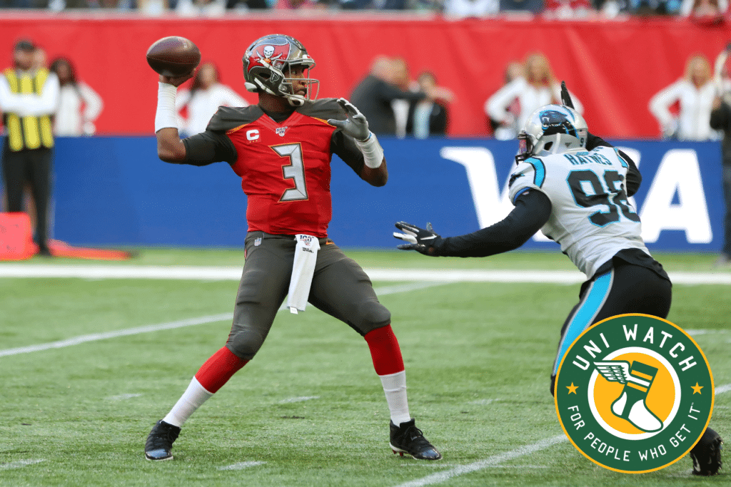
NEXT-TO-LAST DAY for the Bucs-redesign contest: My latest Uni Watch design contest, conducted in conjunction with InsideHook, is to redesign the Tampa Bay Bucs. The deadline for entries is tomorrow, so get crackin’! Full details here.

Click to enlarge

Culinary Corner: My old buddy Sam Sifton, who’s currently the food editor of The New York Times but got his start, just like I did, as a columnist at the alt-weekly NYPress back in the 1990s, had an article the other day about a pork chop recipe he’s been enjoying. I tried it last night and can confirm that it’s really, really good, thanks mainly to a spectacular roux-thickened pan sauce that includes butter, lemon, capers, and more.
Since some of you may have already used up all your NYT clicks for this month, here’s a screen shot of the recipe. Enjoy.
The Ticker
By Paul

’Skins Watch: Miami of Ohio wore Myaamia Heritage Center helmets for last night’s game against Bowling Green. “The helmets are honoring the Miami Tribe of Oklahoma, which was relocated from their original lands in Ohio, Indiana, and Michigan,” explains Timmy Donahue. There’s more info about the helmet logo here.

Baseball News: After Cleveland replaced the Chief Wahoo sleeve patch with the 2019 All-Star Game patch last season, the widespread assumption had been that a new logo patch would debut in 2020. But instead they’re leaving the sleeve blank, at least for next season (rare non-soccer contribution from Ed Zelaski). … The new minor league team in Wichita is called the Wichita Wind Surge. Here are their inaugural uniforms, which were created by longtime Uni Watch pal/ally Todd Radom. Additional images and info, including lots of quotes from Todd, here and here. … The Erie Otters — that’s a hockey team — will wear uniforms with an Erie SeaWolves theme — that’s a baseball team — this Saturday (from @_ThatBrentGuy). … Spectacularly well-done article about a New Jersey high school baseball coach who was sued for telling a kid to slide into third base. Great reporting, great writing, great journalism — highly recommended (big thanks to Jason Hillyer).

Pro Football News: Here’s a Twitter thread with a good rundown of Titans jersey patches. … The Jags have been using camouflage numbers on their practice jerseys (from @MadeByTim). … The Rams also had camo practice numbers, along with fallen service members’ names replacing the usual practice jersey NOBs (from Jakob Fox). … A Winnipeg Blue Bombers (CFL) fan vowed 18 years ago to stop wearing long pants until the team won the Grey Cup. With the Bombers currently advancing through the playoffs, he’s hoping they win so he can stop wearing shorts (from Sara Klein).
College Football News: Iowa State is going BFBS this week (from Chad Lehman). … Rough Riders alts this weekend for Oklahoma (from Sam McKinley). … Get this: The snowplow vehicles at Michigan’s stadium have a winged helmet design (from Brandon Weir). … Homecoming uni this week for Houston (from Ignacio Salazar). … Blaise D’Sylva’s latest helmet collection is for Buffalo. … Retro helmet this week for Kansas State (from Nicklaus Wallmeyer). … The player wearing No. 25 for Virginia Tech this week is DB Khalil Ladler (from Andrew Cosentino). … “My wife’s hosting a rivalry week potluck at work,” says Ray DeBoer, “so we made Michigan State veggie pizza and Michigan fruit pizza. We’re both from Illinois, so go Northwestern!”

Hockey News: The Blues wore pregame jerseys with the names of military members as NOBs two nights ago. … New throwback uniforms for NC State’s club team (from @PackManSJP). … Cross-listed from the baseball section: The Erie Otters — that’s a hockey team — will wear uniforms with an Erie SeaWolves theme — that’s a baseball team — this Saturday (from @_ThatBrentGuy). … Devils G Mackenzie Blackwood has been using HC Dinamo Minsk G Jhonas Enroth’s glove (from @OlegKvasha).

NBA News: Following up on our recent discussion on the number of dashes in NBA free throw circles, Shawn Sweeney reports that the 76ers are selling a T-shirt that shows a lane with five dashes, even though their actual court design has six. … The Wizards’ esports affiliate has a new jersey sponsor advertiser (from Eric Abneri).

College Hoops News: Indiana State had some pretty wild striped uniforms back in 1932-33 (from Marc Viquez). … Iowa and DePaul went color vs. color a few nights ago, with Iowa debuting their new gold alternates (from Kary Klismet). … You probably know that Marquette had great bumblebee uniforms in 1969-70, but did you know they also had bumblebee warmup tops? (From @bullyday.) … Color vs. color is also becoming more common for women’s hoops, as seen in last night’s LaTech/Memphis game (from Chris Mycoskie). … Syracuse coach Jim Boeheim’s suit jacket lining features the number 35. “That’s the number he wore when he played, and the number his son Buddy currently wears for the team,” notes Jakob Fox.

Soccer News: Russia will not wear its new shirts in upcoming Euro-2020 qualifiers because the sleeve trim has the colors of the Russian flag in the wrong order (from @bryant_rf). … Northern Ireland’s 2020 away kit has leaked.

Grab Bag: The town of Newark, Ohio, has a new logo, although for some reason the writer of that article says they’re “rocking a new brand.” Hard to imagine how an editor was okay with that wording. … New logo for Beavercreek, Ohio, too. … New logo and magazine design for The Atlantic. … The great design podcast 99% Invisible has a new episode about the stories behind ubiquitous symbols like the peace symbol, the smiley face, the “power button” symbol, and more. Highly, highly recommended — check it out here. .. .Subtly updated logo for Warner Bros. (from Judy Adams). … New uniforms for Italian volleyball referees (from Jeremy Brahm).
Avs Sweater reminds me of the City of Denver flag.
Yes! It also has a ski-sweater vibe.
It looks like the city of Newark, Ohio only has four dashes on their free throw circle.
COTD!
The secrecy of special jerseys as well as leaks are getting really old (not you reporting on it, just the whole idea of it). Also, does anyone believe that these leaks aren’t known about by the team beforehand and aren’t encouraged in order to get them action on social media?
Of course the teams know about the leaks, they organize all of that stuff. Keeps the secretaries from sitting around flipping through Vogue all day.
I’m also tired of the ‘reveal/hype’ videos for alt uniforms by college teams. You can take the hundreds of thousands you spend making those vids and pay the players.
Of course the teams know about the leaks, they organize all of that stuff.
That is false.
Has it *ever* happened that way? Yes. Does it *routinely* happen that way? No, it doesn’t. Please don’t spread conspiracy theories on Uni Watch. Thanks.
(Totally with you re: hype videos.)
The Kings jersey will probably the same as the Avs, except a crown in place of the mountain/A
I do find it kind of funny to follow up a tirade about paying designers fairly with a sale of merchandise bearing copyrighted logos.
Trademarked, not copyrighted. The point of trademark law is to avoid consumer confusion. Hard to imagine that happening here.
Pretty sure all the designers were paid, unless you have info to the contrary.
That article in NJ.com about the coach sued for telling a kid to slide was FANTASTIC. Everyone should read that if they have 5 mins.
Good job including that in the ticker!
I live in New Jersey and I hadn’t heard about the story at all. Good work by the jury for having some good common sense. And great reporting – thanks for the heads-up.
On face value it seemed ridiculous, but I did see an argument that hiring an unqualified coach could be reckless. But what is a qualified coach? Let’s say your daughter is a gymnast, and the coach isn’t qualified and your daughter breaks her neck due to the coach? Or if your son is playing football and isn’t instructed properly on how to tackle, and becomes a quadriplegic?
Also, at what level does it begin to apply? Can a dad volunteering to coach his son’s or daughter’s soccer team, because no one else would, be sued because he’s not “qualified?” It’s a dangerous precedent at virtually any level.
You can ‘instruct’ players and teenagers and kids all you want on the proper way to slide or the proper way to do a slide tackle or the proper way to tackle in football but that in no way means they will properly execute those maneuvers EVERY goddamn time during a game. How is that the fault of the coach?
I kind of love that Avalanche jersey for one special game! Reminds me of a Czech Olympic ice hockey jersey that was literally their flag. Not the flag on the jersey. The jersey was the flag. Fun, out of the box design. My other thought is that whereas most of the time, that top-of-the-sternum box that holds the NHL logo breaks up an otherwise traditional design, this Avalanche jersey does a nice job of working with the template to do something neat.
My bad critique is actually with the socks. It’s gonna look like blue flood pants with short burgundy socks, with the blue thigh parts of the socks bleeding into the breezers. I would have flipped the socks. Then you’d have blue shoulders, red bellies, blue breezers, red thighs, and blue shins. Boom!
One other uni-notable tidbit in the leaked Avs picture – the person modeling the uniform is wearing the pants shell backwards. The NHL logo is pretty much always on the back of the right leg.
Great catch!!
Based on the colour of the blue and red on the pants shell, it looks like a Montreal Canadiens shell worn backwards. Likely that is why they have it backwards.
I can think of another Newark that could stand to “rock a new brand.”
I also count not incorporating “Licking County” into the logo as a missed opportunity.
I was once at an Ohio bar that was located at the corner of Front and Licking Streets. They had T-shirts that made good use of that fact.
At least we got the pants and socks with this leak. Though I wonder what color the helmets will be. Anyway, it’s not the craziest thing I’ve seen… it’s not even the craziest-looking reveal for something for 2020 that I’ve seen in the last 24 hours (though the other item is not uni-related). Though, hey, someone finally found a way to use that stupid collar panel in a creative way that doesn’t look like a hot mess!
How is $150 (Pickles), $375 (Lehigh) or a free jersey and tickets (Grand Rapids…basically the same compensation Milwaukee Bucks are getting attacked for) a “fair fee”? Ask Todd Radom what he charges for something like this. I know it isn’t apples to apples, but those contests are ridiculously low.
Are the Griffins really only giving a free jersey and tickets to the winner? Phil runs that contest every year, and I haven’t been as close to it as I probably should have been. If that’s really the case, that’s wrong, and I’ll address it moving forward.
Yes, from the Griffins post you linked: “In addition to the custom jersey based upon his design, as winner, Casey will also receive tickets to the game in which the jersey will be worn, and recognition that evening (past winners have been invited into the locker room and on-ice among other nice perks).”
Just confirmed all of this with Phil. We will change that going forward. Thank you for bringing it to my attention!
This is the Twitter-era version of Muphry’s Law in action.
Can confirm that those lemon-caper pork chops are spectacular — they were last night’s dinner (and today’s leftover lunch) here.
I just ordered the “Secret” t-shirt. Can’t wait for it’s arrival!
To be perfectly honest, I think a lot of Uni Watch merchandise is cool (and I have several Uni Watch items currently), but most of the items don’t make feel inspired to make a purchase. Today’s item (if it is what I think it is) made me say “That’s really cool” as soon as I saw it. When there was a tiny hint of the “Secret” shirt today, I immediately put my order in.
Well done Paul!
The Avs stadium uni–really like it. Especially enjoy how it doesn’t have black breezers.
Hey Bucks, “exposure” is not payment! These are artists, don’t expect to reward them with merch as if it was a contest for schoolkids.
The Blue Bombers fan who hasn’t worn long pants for 18 years is the kind of thing a CFL fan like me should have heard of already. Still rooting for the Roughriders, though.
Anybody know what the circles on the shoulders of the Rams practice jersey are? I’ve never seen that before.
Fitbit-ish monitoring thingies.
That’s kind of what I figured. Thank you!
I hate it when team Twitter accounts get snarky, even if it’s an e-sports team. But that’s what Twitter is for I guess
As well made the pork chops with lemon-caper sauce two nights ago. Everyone loved the sauce but the kids didn’t like the pork chops. I think the sauce would work with pasta so I’m not ditching the entire recipe simply because the pork element didn’t fly with the kids.
Love the Avalanche Stadium Series uniform. More teams should take risks with their special event uniforms.
Disappointing news about the Cleveland Indians uniforms. The block C logo is so boring (at least add a white trim to it like the late 70’s, early 80’s) and it doesn’t look right with the script Indians home jerseys. Why not a patch to mark the 100th anniversary of their first World Series win in 1920? Quite possibly the worst uniforms in baseball now that the D-backs have cleaned up theirs.
The Indians were the first team to wear uniform numbers (on the left sleeve)…if they ‘have’ to put something there, why not revive the practice?
Sleeve patches. Superfluous, unnecessary things. Never needed them, never will.
Small technical error in the lede — Icethetics confirmed those Avs jerseys on Tuesday, not Wednesday.
True. It was actually late Tues night, and most people, myself included, didn’t see that post until Weds. Text now updated to reflect that. Thank you!
I have no idea who actually handles the Twitter accounts for professional sports teams and other businesses, but the idea that they allow interns or low-level staffers handle what is maybe today’s single most public-facing communication tool seems incredibly foolish on their part.
I wonder if Avs jersey is also a nod to the Air Force Academy chapel. Will be interesting to hear explanation/inspirations from official release.
Or they just say lt looks kinda cool and retro and don’t try to assign extra meaning to every facet of the design. Sometimes things look good because they just look good.
I agree, but I doubt they leave it at that.
I spent some of my early years living in Buena Park Californy, (or Boner Park as we called it- we thought that kind of shizz was cool back then) used to live one block from the corner of…
Holder and Ball
(p.s. I forgot to mention that my wife JC went as Stephen Strasburg for Halloween)
Now if the Avs would just make their current alternate jerseys their main ones, and make this their alternate, and then ditch the cartoony A logo they’ve worn since their inception, they would look fantastic.
I second that. current alt is top notch. I do like the yeti foot print as secondary logo though
Cartoony A logo won two Stanley Cups. As an Avs fan, I like the logo that won the cups. Would like to see a return to the original uniform design worn by Sakic, Forsberg, Roy, Foote and even Borque to get him a Cup. The uniforms have been downgraded since then.
The current primary uniforms really aren’t that much different from the originals. The socks and pants are the same design. Differences on the jerseys but not a major overhaul.
In fact, I think I prefer the current primary version better. The silver trim on the arms and waist stripes of the dark jersey better matches with the socks compared to the originals, which had the black and white trim in the same places on the jersey.
link
link
People, never, ever send small objects in a regular envelope. Many pens, flash drives and other small objects have gotten damaged or lost in those machines.
I hear ya. Like I said, I was going with what my local P.O. told me. But that appears to have been bad advice.
Yeah they really don’t know any more than the average citizen what happens to the letter after it leaves the local post office. Very few postal workers know the complete process.
Based on the leak of the Avs stadium jerseys, love them. Clever.
The name for the new AAA team in Wichita is not going over well.
link
Quite the ironic tweet from the Bucks Gaming person. I’m sure there’s no shortage of people out there who have similar feelings toward people who get paid to play video games, or who get paid to post on social media, for a living.
Because I had scrolled a little to far, as I was reading about the Uni Watch reader who works as Senior Litigation Counsel at the U.S. Justice Department saying he plans to wear them for his argument in federal court next month, I thought at first he meant the Uni Watch basketball jerseys.
Opportunity lost.
Lee
I have excellent taste in sports uniforms – just ask me – and I think the Avs uni is awful. I think the sweater looks goofy. Also, the way it’s presented in the photo with the model standing there like a mannequin with his pants on backwards and with no pads under the socks is a terrible look. I hope it looks a heckuva lot better on the ice.
Thanks for sharing the story on the baseball lawsuit. The comment in the story that the U.S. is a litigious society is the understatement of the year.
Last Week Tonight with John Oliver had an interesting feature on SLAPP lawsuits this past Sunday. I don’t think this qualifies as a SLAPP lawsuit but it’s still ridiculous.
Lets just fire everyone. “I demand that person gets fired… Now!!!” They don’t do things I like… Boo Hoo…… Id say “Man up” but with the “woke culture” we live in I’d hate to be “unwoke”
I love the fact that the ’69-’70 Marquette bumblebee warmups have NASA’s Apollo 11 patch on them! The moon’s surface is in Marquette gold.
No doubt these Avs jerseys will have giant numbers that can be seen from outer space, or top level of stadium. It becomes more like a football jersey in that regard.
After attending the Avs game at Coors Field a few years ago, you get in there and think–wow I’m here at a hockey game in an outdoor stadium. How novel. Then you sit down and realize, I can’t really see what’s going on inside the rink down there.
Paul is going to kill me for this take, and I wish I had logged on earlier to see the story about the Bucks Gaming offering merchandise instead of money to design their logo, but here goes…
I hate to be the one who says it, but if people are willing to design a logo for somebody else for free, and the design meets the standards of the “client” (for lack of a better term), then it’s hard to see the crime here.
Basically, if you’re a graphic designer, and you feel your work has value, then don’t do it for free. And if somebody else is willing to do it for free, and the quality of their work is comparable to your’s, then, well, your work simply doesn’t have much if any value.
Here’s a similar situation: I’ve written, for free, several guest columns for this site. I volunteered to do them, didn’t ask Paul for money, and didn’t expect him to offer any to me. I wrote the columns, however:
1. Because I am trying to become a professional writer and wanted some examples of my writing published by somebody else out there.
2. Wanted to contribute to the site, since Paul is kind enough to provide us with great content for free.
3. It was fun to research and write the columns.
So is Paul an “asshole” for accepting my work without compensation? Of course not. So I’m not sure why the Bucks are,either. In both cases, it is a mutually beneficial and voluntary transaction.
I think your take reflects the nuances here. It’s not quite as clear cut as Paul made it out to be, though the assholic Twitter response from the team makes it entirely understandable. Where I find the irony is that Paul, whom I admire and revere, then screencaps a NYT story to get around the pay wall. What, the people who work creating the NYT content, including your friend from the old days, don’t deserve to get paid? Not so cut and dried.
It seems to me that the Avalanche jersey for the Stadium Series game has two shades of burgundy and a seam encircling mid-torso. Not a good look. I had hoped for better.