Click to enlarge
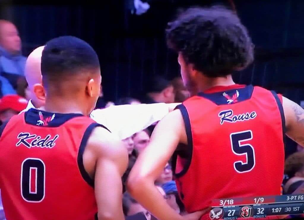
Reader Bryan Beban tipped me off yesterday to something interesting: The road uniforms for Eastern Washington — a school that plays in the Big Sky Conference — have script NOBs!
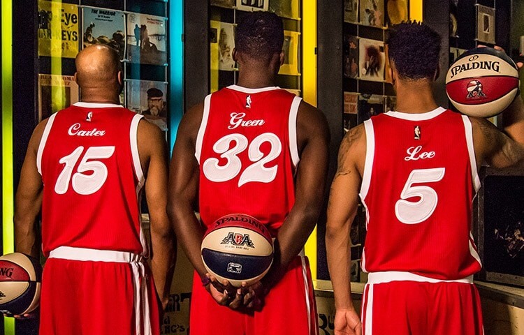
That’s a pretty rare thing. Off the top of my head, I can think of only one example — the Memphis Sounds of the old ABA:
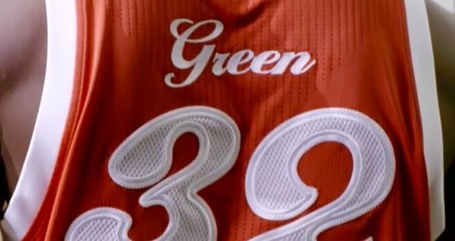
The Grizzlies revived that design as a throwback in 2015, although the NOBs weren’t as endearingly thick and loopy as the original ABA versions (click to enlarge):
When I put out a call on social media to see if anyone could come up with other examples, David Lundborg said the 1977 Cincinnati hoops team had script NOBs beneath the uni number:
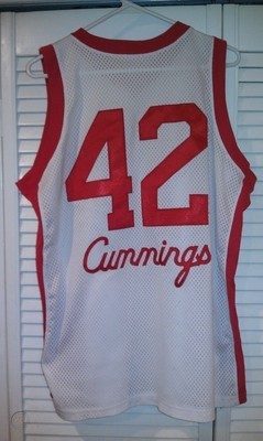
That’s from a replica jersey. I couldn’t find any game photos to confirm the NOB style, but I did find a shot indicating that the front of the replica is apparently accurate, which means there’s a good chance that the back — including the script NOB — is solid as well.
I feel like there have been other script NOBs in college hoops, but I can’t recall any specific examples. Anyone..?
Script NOBs, including all of the ones I’ve just presented, also fall into another rare category: cap/lowercase NOBs. Most NOBs, of course, are all-caps, but cursive lettering isn’t well suited to the all-caps format. So if you decide to go the script route with your NOBs, you’re probably committing yourself to cap/lowercase as well.
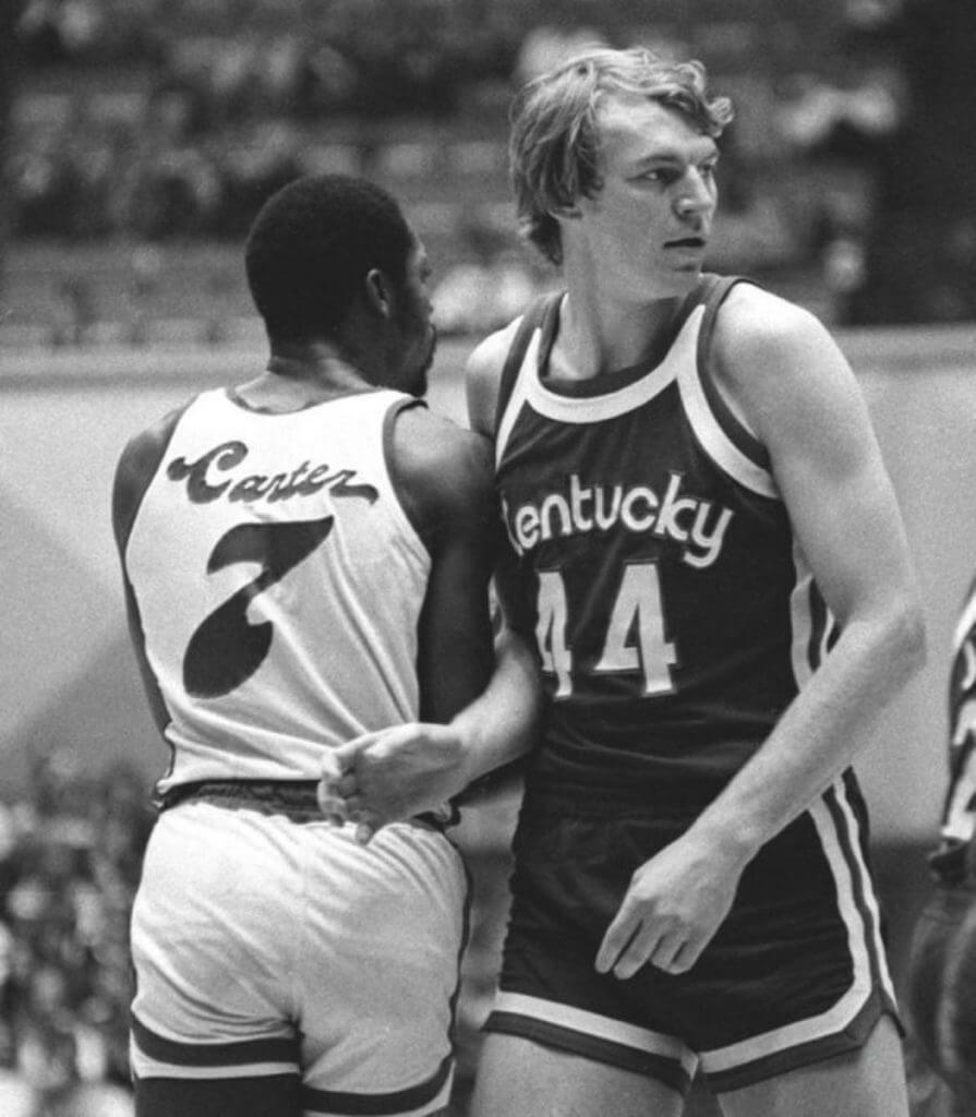
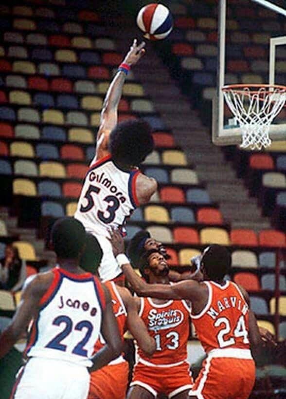
When it comes to non-script cap/lowercase NOBs, the first example that comes to mind is the ABA’s Kentucky Colonels (and in a nice bonus, this photo also shows Marvin Barnes’s FiNOB):
I’m 100% certain that I’ve seen more basketball jerseys with cap/lowercase NOBs — all from the NCAA ranks, I’m pretty sure — but again, I can’t think of any specific examples. Anyone..?
Getting back to Eastern Washington — the school that started us down this rabbit hole — their home uniform appears to have conventional all-caps NOBs, so the script is apparently just for the road reds. As an aside, they also have a spectacular center court logo, as you can see in this highlight clip:
👀 the highlights from tonight's season-opening victory!
The Eags are back in action this Saturday at Seattle U!#GoEags #LetItFly pic.twitter.com/xbqrdIcASH
— EWU MBB (@EWUMBB) November 6, 2019
(My thanks to Bryan Beban for tipping me off to the Eastern Washington script NOBs.)
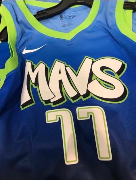
Drip … drip … drip: The Mavs have become the latest NBA team to be victimized by a retail leak, as a photo of their new City alternate began circulating yesterday. The graffiti-themed design looks a lot like the latest Nets alternate, except for the brutal color scheme. At least we can stop saying that the Mavs’ uniforms are all boring and characterless. This one’s more likely to have so much character that it’ll be unwatchable.
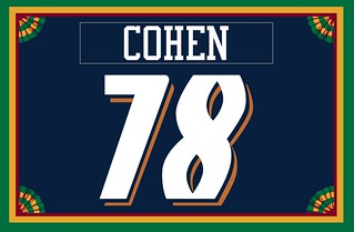
Membership update: Can you identify the team that served as the design motif for Christopher Cohen’s new membership card? Give yourself a few bonus points if you recognized it as the Colorado Crush, a now-defunct Arena League team that folded in 2008. That’s a pretty obscure request — and, thanks to the unusual number font, a very cool-looking membership card!
Christopher’s card is part of a new batch of designs that’s been added to the membership card gallery. I expect the printed/laminated versions of these cards to ship out in a week or so.
Ordering a membership card is a good way to support Uni Watch (which, frankly, could use your support these days). And remember, a Uni Watch membership card entitles you to a 15% discount on any of the merchandise in our Teespring shop and our Naming Wrongs shop. (If you’re an existing member and would like to have the discount code, email me and I’ll hook you up.) As always, you can sign up for your own custom-designed card here, you can see all the cards we’ve designed so far here (more than 2,300 of them!), and you can see how we produce the cards here.
Click to enlarge
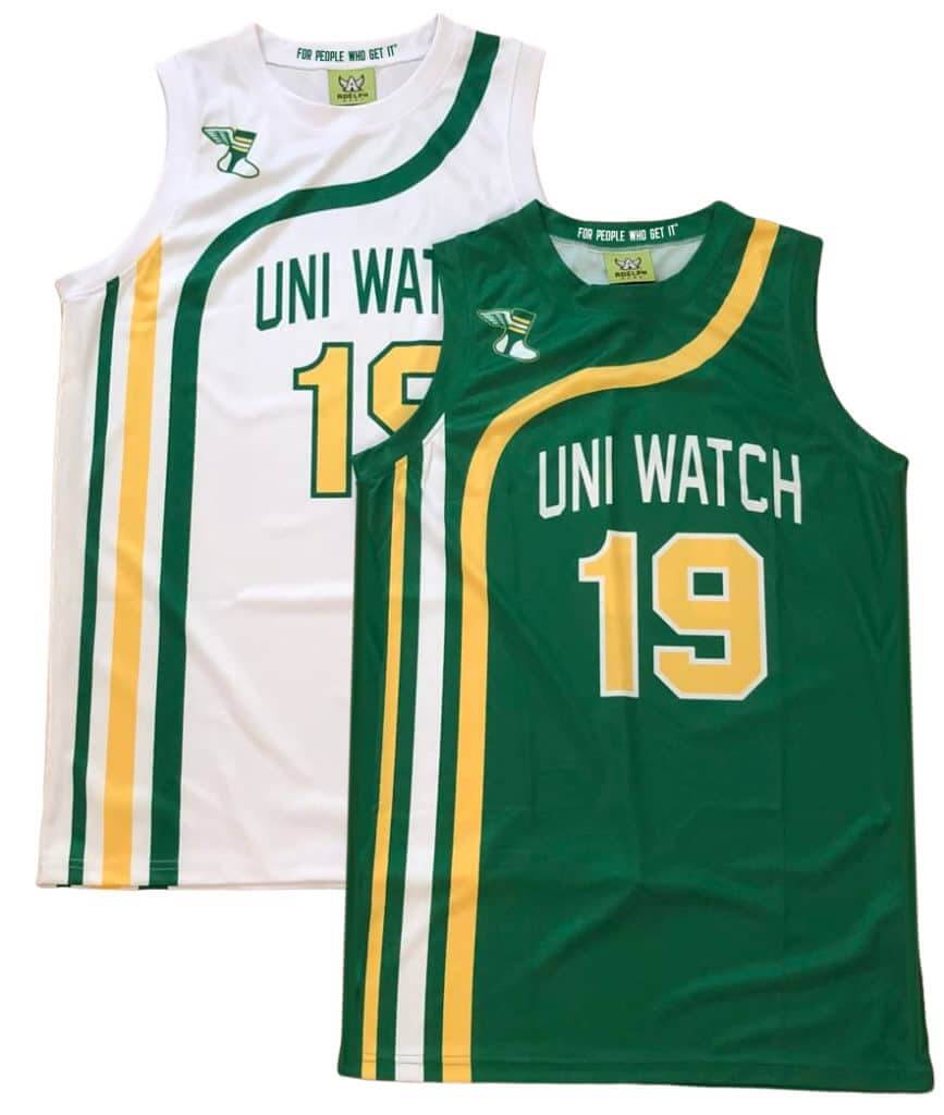
Uni Watch hoops gear reminder: In case you missed it on Sunday, we’re now taking pre-orders on Uni Watch basketball jerseys. You can choose your own number and NOB, and you don’t have to have the winged stirrup on the shoulder if you don’t want it there.
We also have matching shorts:
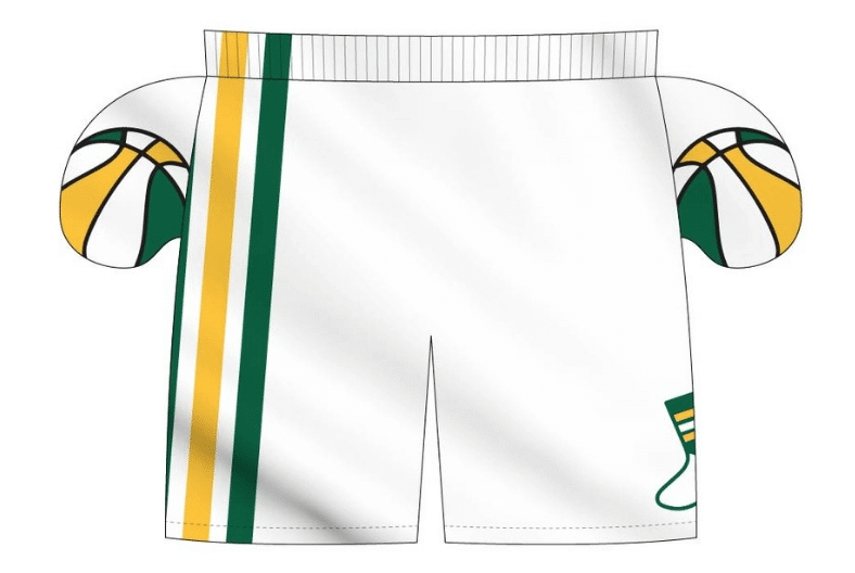
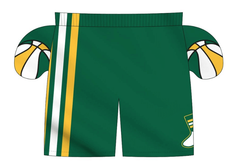
The ABA-style basketball-themed inner pockets are a nice touch, right? I can’t take credit for that detail, though — that was Adelph Wear honcho Nathan Haas’s idea. He’s my partner/collaborator on this project, just as he was with our recent cycling jerseys.
We’re taking pre-orders on these through next Wednesday, Nov. 20, for Christmas delivery. It’s possible that we’ll offer these again in 2020, but for now it’s a holiday offering, so move fast if you want to get in on it! Full details here.
Also: The pre-order page doesn’t offer an option for international shipping. But if you want that, email Nathan and he should be able to help you out.
Bucs-redesign contest reminder: My latest Uni Watch design contest, conducted in conjunction with InsideHook, is to redesign the Tampa Bay Bucs. The deadline for entries is this Friday, so get crackin’! Full details here.
The Ticker
By Lloyd Alaban

Baseball News: The Mariners announced a schedule of retro uniform days, including a day where the club will presumably wear throwbacks of the Seattle Steelheads, the city’s Negro League club. The M’s have also scheduled a Retro Jersey Night, featuring a version of the club’s logo from 1981-86 (from Ed Kendrick and Chris Richards). … U. of Minnesota college hoops player Payton Willis has a big tattoo of the Nationals’ logo (from Chris Lather).

Football News: Here’s the Panthers Uni Tracker through week 10. … Ohio went BFBS last night. According to Blaise D’Sylva, Ohio has worn a black helmet at least once each season since 2011. Tuesday was the school’s fifth black helmet version (from Taylor Jedrzejek). … Speaking of Blaise, his latest helmet collection is for Bowling Green … Throwbacks this week for Cal, Temple (confirmation from the university here), and Utah (from multiple readers). … The grounds crew at Marshall’s stadium carved out “GO HERDS 75” in the snow ahead of the Marshall-Louisiana Tech game this weekend. The “GO HERDS” comes from a fan’s sign at a game last month, while the “75” honors the 75 people who died when Marshall’s team plane crashed in 1970 (from Brice Wallace). … Here’s a look at the pork-centric culinary traditions (paywalled link) surrounding the annual Iowa/Minnesota rivalry game, in which the victor is awarded the “Floyd of Rosedale,” a statue of a pig (from Kary Klismet). … Kevin Tiessen’s wife made a little Michigan State jersey for a Curious George figurine that Kevin likes to take to Spartans games. … If you look at the start of this 1971 video clip, you can see that the Steelers once had a midfield logo that didn’t have the familiar white background (good find by Jerry Wolper).

Hockey News: The Huntsville Havoc of the Southern Professional Hockey League will wear Star Wars-themed sweaters on Friday, designed by reader Tyler Earles. … Here’s the jersey the New Jersey Warriors are wearing for their upcoming games. The Warriors are a nonprofit hockey team affiliated with the Devils for veterans who have a 10 percent minimum disability. A bit more info about the team here and here (from Kevin Clark). … The Kings had military-themed pregame jerseys last night and also added American flag decals to their helmets. … It’s always fun when UCLA and USC go color vs. color on the football field. But last night their club hockey teams went color vs. color on the ice! (From Jack Harris.)

NBA News: Throwbacks last night for the Kings and Blazers (from @mikegganimal). … The Blazers are asking fans to submit photos for a virtual mosaic in conjunction with the reveal of their new City edition uniform (from Etienne Catalan).

College Hoops News: Color vs. color for last night’s Creighton/Michigan game (from Josh Hinton). … Ditto for Oregon and Memphis (also from Josh). … Memphis G Lester Quinones wore his shorts ridiculously high last night. Or if you’re a bit more old-school, he wore them just right (from Ben Teaford). … Here’s the Veterans Day-themed warmup UNLV men’s will wear this weekend (from @MaxMetalFriar). … Texas’s new arena will be called the Moody Center (from James Gilbert). … Looks like Washington forwards Jaden McDaniels and Nate Roberts exchanged shoes in this practice photo (from Anthony Edwards). … Cross-listed from the baseball section: Minnesota G Payton Willis has a big tattoo of the Washington Nationals’ logo (from Chris Lather). … Cal G Joel Brown has mismatched 1s on the front and back of his home jersey. … Yet another color/color game from last night: Iowa State and Northern Illinois (from Kary Klismet).

Soccer News: From our own Jamie Rathjen and Cort McMurray: The Guardian’s soccer cartoonist, David Squires, is back again with a cartoon that pokes fun at the intersection of soccer and Remembrance Day poppies. … From Josh Hinton: New Catalan flag-inspired shirts for Barcelona. … The new USL franchise in Queens, NY, will be called Queensboro FC. … The new NWSL club in Louisville, Ky., has filed a copyright for Proof Louisville FC, and someone has already made an unofficial crest. It’s worth noting that new franchises almost always file multiple names before settling on a permanent one. … As always, you can stay up to date with the latest kit info by following Josh‘s Twitter page. … New uniforms for Switzerland (from Chris Corbaz). … New 120th anniversary uniforms for Uruguayan side Nacional (from Ed Zelaski). … Argentinian team Estudiantes de La Plata celebrated returning to its newly-renovated home stadium after a 14-year hiatus with a hologram of giant lion (the club’s mascot), but there’s some controversy over whether the display can truly be called a hologram or was just some elaborate computer graphics. An image of the renovated stadium can be found here (from Kary Klismet). … Also from Kary: Jacksonville Armada FC of the National Premier Soccer League (on the fourth tier on the US soccer pyramid) have released renderings of their new proposed stadium. … New Club World Cup kit for Mexican side Monterrey).

Grab Bag: Morgan State athletics will wear an “EC” patch on team jerseys to honor the late Rep. Elijah Cummings who died last month. Morgan State lies within Cummings’s district, and he served on the school’s board of regents (from Brian Simpkins). … Reebok is the latest brand to unveil a “new” retro look, reverting back to a variation of their previous logo (from James Gilbert). … The Netherlands (the country, not a sports team representing the country) has unveiled a new logo, prompting the author of this Forbes article to wonder, does a country need a logo? (From Kary Klismet.) … A DIY project from reader Kevin Tiessen: “Recently, my wife converted one of my old Michigan State Spartans sweatshirts into leg warmers for our seven-year old daughter.” … New uniforms for the New Zealand rugby league team Vodafone Warriors (from EP Conrad). … New logo for the Maadi Mummies of the Cairo American Softball League.
I always appreciate your insight on journalism in general and the state of journalism in the 21st century specifically. Do you have any thoughts on the controversial Daily Northwestern editorial? Or are you planning to address it in a future post with a write-up similar to your thoughts on the demise of Deadspin?
Honestly, I was unaware of this storyline and had to google it just now (that’s what happens when you’re traveling for several days and then you’re all discombobulated from a red-eye flight). I’d have to take a closer look. Generally speaking, though, student newspapers are obviously very different animals than non-student. That’s not to say that they aren’t “real” papers or that they don’t do “real” journalism (they can and do!), but they’re subject to different forces.
Anyway, I’ll take a closer look. If it seems relevant to the types of things I like to discuss, I’ll bring it up tomorrow.
“New logo for …”
Again, I say there should be a law that whenever someone says “New logo for _____”, they MUST show the old logo as well.
.
.
.
Who’s with me? Let’s go, come on, heeeyyy!
FYI their center court logo is just their regular school logo :-)
I know. But it looks particularly good at center court!
The Bullets did the cap/lowercase thing in at least 1987-88.
link
link
Ah, yes — good one!
They were forced to change them to a more legible font after a couple of seasons, as the NoB was impossible to read at distance, especially on the home unis!
Washington Bullets did the upper/lower case NOBs in the 80s I believe.
-Watched a bit of the King and Blazers game last night. Court looked great. Was thinking the whole time that court paint job would look good as the Clippers primary court, rather than the Clippers insisting on going with the black.
-Fun item from the CFL. Playoffs are on and the Edmonton Eskimos have the worst record of the teams in it. So you might as well embrace the underdog status right? Here is Eskimos QB Trevor Harris in walk around practice sporting a t-shirt the Eskimos players are wearing with their playoff slogan, “Why not us?”
link
On the Kings / Blazers pic, the Kings player, Bogdan Bogdanovich, has a knee brace with an NBA logo. Never seen the logo on a knee brace before.
Good move for Reebok going back to what used to work fine. I was just thinking how bland and uninspiring that current thing was.
I distinctly remember the University of Toledo men’s basketball team wearing script NOB in the mid-to late 80s. Unfortunately, I haven’t been able to find any visual evidence of that.
I think you missed it on the grab bag article about the naming rights agreements for mass transit stations. The Washington Metro is mentioned, but in the context of what happens when a governmental authority tries to write rules concerning advertising and runs afoul of the first amendment. The story says nothing about the Washington Metro selling naming rights to their stations. Now San Diego and Philly on the other hand…
Thanks. Now removed from Ticker.
From the grab bag, aren’t those leg warmers made from the re-purposed hoodie, and not leggings?
Good call. Text now adjusted.
I hate picking at things like that, but years of my wife correcting me for calling my daughters tight/leggings/leg warmers/yoga pants the wrong name….it’s given me mild PTSD.
I can never get enough of those ABA jerseys, they’re so “period” and “of the times.” But I had never seen those Memphis Sounds numbers and cursive names — in the category of so over-the-top that it’s GOOD!
But yuck, those Eastern Washington names…ain’t doin’ it for me.
I like that the UniWatch hoops jersey has an ABA look to it. Really a beautiful piece of work, but an old man with scrawny arms like me ain’t gonna be rockin’ that in public.
-Jet
J-E-T, jet jet jet.
Maybe, just maybe the Uni Style of kit you are jonesing for might be a stylish kind of SHOOTING SHIRT (think warmups).
For our scrawny armed followers (and us spare tire possessing Middle Aged Menz). It can be done if the demand is there. Just a thought
Icethetics has confirmed these are the jerseys the Avs will be wearing at their Stadium Series game this season. They are…something.
link
Something…. to be avoided… ugh…
The A stands for amazing. Or greatness. Or maybe both.
I recall that the late 90s Georgia Tech football team had a very odd NOB font, which included upper case and lower case letters (or at least lower case “m”s and “n”s. You can see some examples here: link
Looks like the weird NOB was actually from the year 2000.
Cant believe my EWU Eagles made the top slot of uni-watch today, especially since I hate their road and home basketball jerseys!
link
Something is off about the Memphis (NCAA) basketball jerseys. Only the first letter in Tigers is capitalized on their chest logo. Is there any other school that does this?
link
It looks like a cut-and-paste job that made it to production.
It’s just how one of their wordmarks look: shorturl.at/awKUY
Could it be that the Steelers’ midfield logo was ‘incomplete’ since the Pirates were still using Three Rivers Stadium for the 1971 World Series?
The white background was present later in the season:
link
I’d forgotten that the Steelers wore white pants for several road games that year.
I should point out that my memory of Cincinnati’s cursive NOBs comes from attending a Bearcat vs. Tulane game in a very sparsely-populated Superdome while on vacation with my parents. My junior high self recognized the uni-oddity. Explains a lot…
Check out the Utah throwback helmet in that link – they painted a round earhole
My first thought on seeing the Mac’s jersey was not graffiti but rather Space Jam:
link
A rather predictable corporate tie-in would fit the Mavericks’ aesthetic M.O. better than a tribute to 90’s urban counter-culture.