For all photos in this section, click to enlarge
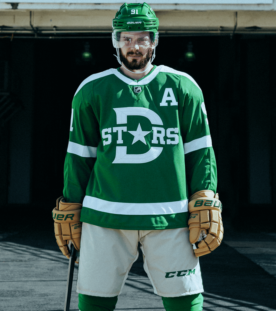
Last weekend the Predators unveiled their 2020 Winter Classic jersey, and now the Stars have revealed their look for the New Year’s Day game, which will be played at the Cotton Bowl in Texas.
Before we go any further: Big, big ups to the Stars for showing the entire fucking uniform, including the gloves and helmet, instead of just the jersey (although the URL for their web page showcasing the new uni includes the word “jersey” — sigh). I’m not sure why they chose to show Tyler Seguin walking and standing just outside a hockey rink, instead of showing him on the ice — a seemingly inexplicable choice — but whatever. Here’s the full-body shot:
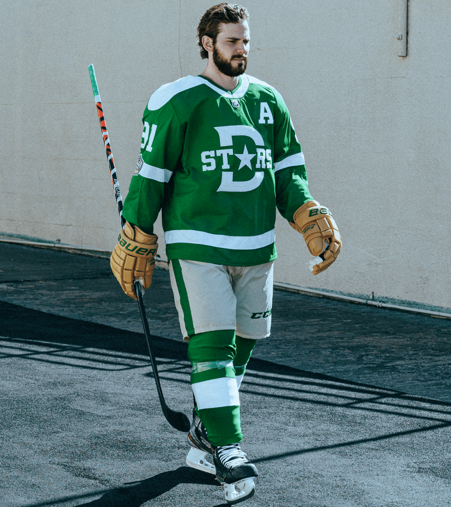
Hot-cha-cha! I’m sure some people will hate the canvas-toned pants, but I love the whole package. I like the Preds’ Winter Classic jersey too (so far they’ve only revealed the jersey, not the full uni, but I have high hopes for the full package), so this should be a very good-looking game.
Let’s take a closer look at the Dallas uniform:
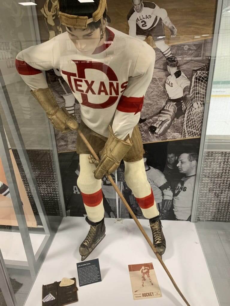
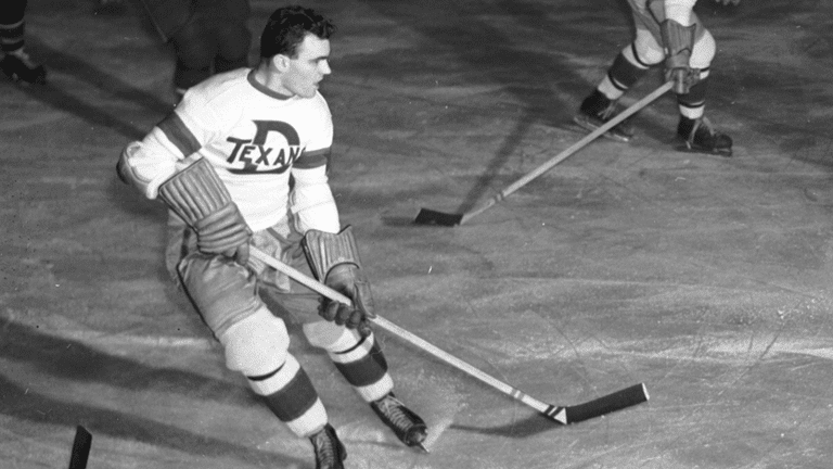
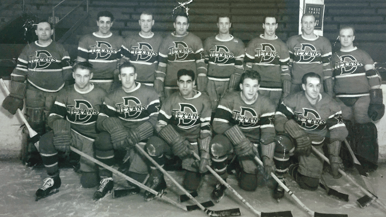
• The design was inspired by the old Dallas Texans, who played in the late 1940s. Here are some photos of their uniforms:
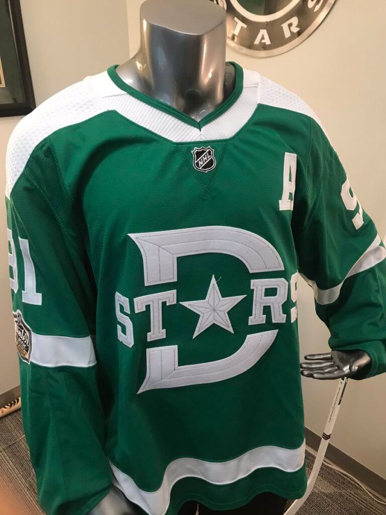
• Same as with the Preds’ jersey, all of the jersey graphics here are rendered in felt. You can get a slightly better sense of that in these pics:

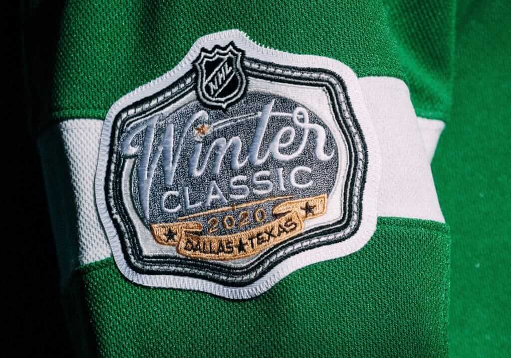
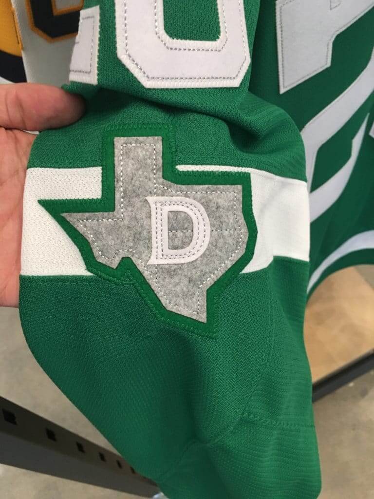
• There’s a Winter Classic patch on one sleeve and a Texas patch on the other (in grey, oddly — maybe the only thing about this uniform that makes no sense to me):
• As you know, Texas state law mandates that any Texas teams launching new uniforms must include the state flag in some manner. In this case, it’s on the inner collar:
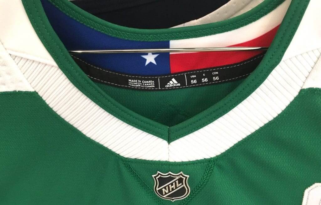
All in all: Very nice!
Now then: Some social media chuckleheads have said that the jersey insignia presents as “STDs” (or maybe “stDs,” or whatever). Honestly, that hadn’t occurred to me, and I think it’s a bit of a stretch, but I agree it’s kinda funny.
(My thanks to Kevin Jerpi for the color photo of the Dallas Texans uni.)
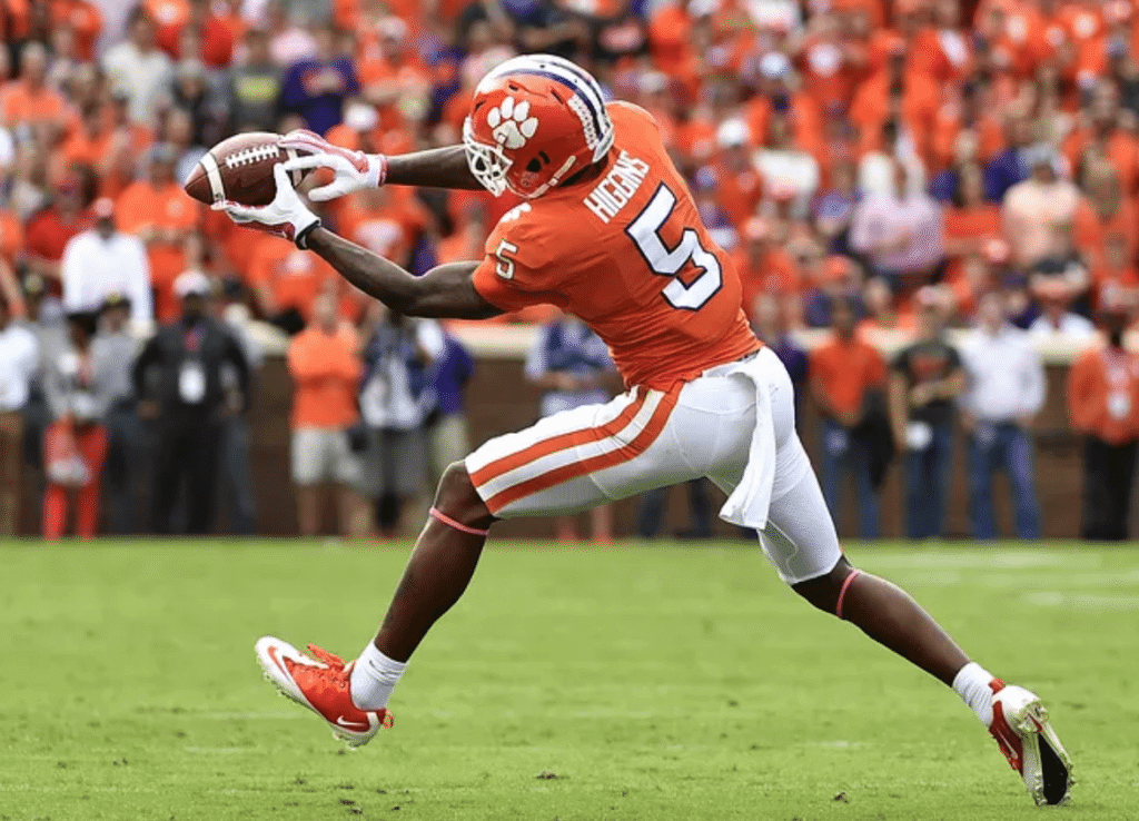
White-hot situation: I received an intriguing note yesterday from longtime reader Benji Boyter, as follows:
For the past few years under head coach Dabo Swinney, Clemson’s football team has stuck with the white pants for home and road games, unless the team is “playing for a championship” (in which case they wear orange). Under Dabo’s terms, this means the following games:
• A game to clinch the Atlantic Division championship
• The ACC championship game
• The “state championship” game against archrival South Carolina
• Any bowl/playoff game
This presents an interesting situation this Saturday. Wake Forest and Virginia Tech play at 3:30pm, and Clemson plays at NC State at 7:30pm. If Wake loses, that would make Clemson’s game against NC State a potential clinching game for the Atlantic Division title. So Clemson fans are waiting with bated breath to see if the equipment managers will be packing both orange and white pants for the game this Saturday.
Faaaascinating. Now, if Wake wins, that would mean that next week’s Clemson/Wake game would decide the Atlantic Division title, so Clemson would definitely wear orange pants for that.
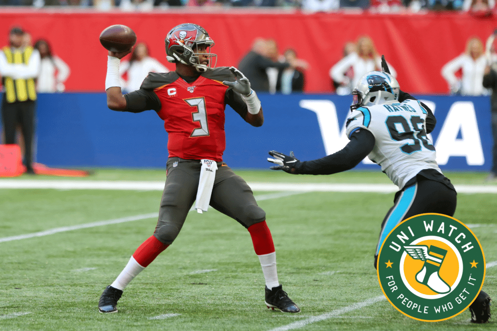
Bucs-redesign contest reminder: My latest Uni Watch design contest, conducted in conjunction with InsideHook, is to redesign the Tampa Bay Bucs. Full details here.

Gift Guide reminder: I’m currently working on my annual Uni Watch Holiday Gift Guide, which will be running on InsideHook. If you know of any interesting or unusual uni/logo-related items — or if you produce such an item yourself — please get in touch.
As usual, no need to tell me about the standard caps and jerseys that everyone already knows about. I’m looking for things a bit more unique. Can do? Thanks!

Click to enlarge
Cufflink update: Yesterday I showed you the new Uni Watch cufflinks. Today I’m showing you how they look on an actual French cuff shirt. Pretty swank!
These should be available in our Teespring shop by early next week.
The Ticker
By Paul

Baseball News: A bunch of Dodgers bloggers discussed whether the team should add an alternate jersey now that Nike is taking over the MLB uniform contract. It’s worth noting that next season’s uniforms will still have the same Majestic fabric and tailoring, so don’t expect a Nike-fied sea change, whether for the Dodgers or for anyone else. … More info about the Brewers’ new look keeps emerging. Scroll through the responses to that tweet for lots of analysis — mostly negative — of what appears to be the new primary logo.

NFL News: The Raiders will wear their white throwback alternates at home against the Chargers tonight. … The Packers will reportedly have a new throwback uni next season. … I was so busy writing about the college logo helmet decals in Monday night’s Cowboys/Giants game that I neglected to mention that Dallas QB Dak Prescott had pockets sewn into his jersey (from Yogi Combs). … Browns QB Baker Mayfield says he shaved off his horseshoe mustache after Sunday’s game because he didn’t deserve to wear it. … Giants RB Saquon Barkley has a new personal logo. … With the Chiefs and Chargers playing each other in Mexico City a week from this Sunday, U.S. Secretary of Agriculture Sonny Perdue wore a USDA football jersey at a promotional event in Mexico (from Spencer Chase).
College Football News: Ticket stub maven Russ Havens has put together a nice assortment of college football rivalry game stubs. … This is odd: Fans at this weekend’s Oklahoma game will receive a giveaway cap with a Velcro American flag patch that can be removed to reveal an OU logo (from Kevin Burns). … Blaise D’Sylva’s latest helmet collection is for Princeton. … Here’s this week’s uni combo for Iowa State. … Baylor head coach Matt Rhule got a lot of attention yesterday for wearing what appeared to be a vintage Starter jacket (from several readers). … Our own Jamie Rathjen, a proud UVA grad, always passes along his alma mater’s uni combo each week. Here’s the latest. … New helmet in the works for Fresno State (from Jared Buccola). … New script helmets for Miami of Ohio.

Hockey News: The Canucks wore their original stick-in-rink design as a throwback for Tuesday night’s pregame skate. In a period-appropriate move, the jerseys were NNOB (from Wade Heidt). … The AHL’s Colorado Eagles went a little bonkers with the stars/stripes on Tuesday night (from Derek May). … You know what really makes a good blackout jersey? If you’re the Lehigh Valley Phantoms, your answer to that question is a big, honking blue ad patch (from Darian Somers). … Whoa, check out these throwbacks that Canisius is wearing to mark the school’s 150th anniversary (from Joseph Pitirri). … G Erik Portillo, who plays for the Dubuque Fighting Saints, has pads/gear designed to look like a suit of armor (from several readers).

College Hoops News: Minor uni changes this season for Wisconsin. … Ohio State added a John Havlicek memorial patch last night (from @WesAndHammy). … UNC PG Cole Anthony wore glasses during last night’s pregame shootaround. Additional info here (from James Gilbert). … Also from James: UNC women’s C Janelle Bailey is is changing from No. 44 to No. 30 in support of injured teammate Jaelynn Murray. … With Syracuse women’s player Tiana Mangakahia undergoing breast cancer treatment, the men’s team wore T-shirts in support of her. … No photo, but Virginia G Tomas Woldetensae has “B. Woldetensae” as his NOB. “It’s apparently because he has ‘two last names,’ but I’m not sure what the other last name is,” says our own Jamie Rathjen.

Soccer News: Scotland’s new kit has leaked. … The new Wales home kit is now available at retail, confirming previous leaks (from Josh Hinton). … FC Cincinnati has opened its new training center. “Inexplicably, the the building contains a misdesigned version of the team’s secondary logo,” says Will Hughes. “The crown should be over the second C, not the first C. Even worse, this logo has only been utilized since last November, and we already have our first case of inconsistency.” … The English sixth-tier team AFC Telford United will support the LGBT+ community by wearing a rainbow-accented shirt on Nov. 16 (from our own Jamie Rathjen). … New home kit for Japan (from Sean Flynn). … And here’s Japan’s keeper’s shirt. … Manchester City had to put defender Kyle Walker in goal last night because their regular keeper was injured and his backup was sent off. Walker wore the backup’s keeper jersey but his regular shorts and socks (from Josh Hinton).

Grab Bag: The U. of Washington’s women’s volleyball jerseys have little cutouts on the rear shoulders. Not sure if that’s for ventilation, freedom of motion, or both (from Scott Kaplan). … New logo and slogan for Kroger supermarkets. … With Under Armour undergoing executive turmoil and a federal investigation, people at the U. of Maryland’s athletic department — which has basically hitched its wagon to the company — are getting antsy (WaPo link) (from Tom Turner). … Here’s a video showing the history of F1 racing’s on-screen graphics (from Jeremy Brahm). … Female athletes say they’re pushed to lose dangerous amounts of weight when they join Nike’s training program (NYT link).
Our latest raffle winner is Gil Nuemann, who won himself an item of his choice from Vintage Brand and has chosen this 1978 Nebraska/Oklahoma ticket stub canvas. Congrats to him, and thanks to VB for sponsoring this raffle. — Paul
The Winter Classic uniforms have jumped the shark, much like the Winter Classic itself. Those uniforms are hideous.
Gotta disagree.
Dallas hit a home run with these!! Way better then their current set!
I like ’em! Simple green and white.
-Jet
One the one hand, I’m not a huge fan of either 2020 Winter Classic uniform. One the other hand, both are far superior to each team’s regular uniforms, so the longtime trend of relative-to-the-teams’ great Winter Classic uniforms continues. It’s really impressive how the NHL keeps producing such well-designed and distinctive special-event uniforms for its various outdoor games.
The new Ball-in-Glove logo: It’s a downgrade overall in my eyes, but it’s not terrible. Used to be an A, now it’s a B-plus. If the new one had been the original, it would still be regarded as a timeless classic today. The new one is worse! But it’s still good, just less good. One element of improvement – eliminating the gap inside the webbing between the stem of the b and the m – and all other tweaks are slight downgrades. The shape of the glove, the appearance of the ball, and the shape of the letter B are now all more literal, and in no case is “more literal” a design improvement to the element in question. The changes are significant to uni watchers, but I suspect they’ll go largely unnoticed by most Brewers fans. I wonder how strict the team will be in replacing the old logo with the similar new – will Milwaukee wind up like the Nationals, who officially adopted a tweaked (and hugely improved) curly W in 2011 but continue to wear the old curly W on some uniform elements up to the present day?
The UW volleyball tops don’t look like cutouts – they have UW gold/yellow on a layer below the rest of the shirt. Probably an adidas design element, and if you asked them, you’d probably get an answer rich in corporate speak, about the golden peaks of the Olympic Mountains, or some nonsense.
The shoulder elements are definitely cutouts. It’s called the Quick Set Jersey and it has a non filled cutout so that as the description says your arms can move. They have another jersey called the HiLow which is filled with a more mesh like fabric.
link
Did anyone else notice that on the FC Cincinnati style guide it has the name of the color orange as “red” even though they have “The orange and blue” as a nickname?
They call it “red” in the Color Information section, but call it “orange” in the Diamond Pattern Color Variations section.
Did anyone else notice they misspelled “Cincinatti” in the PDF file name (shown in the browser tab)?
Regarding showing Seguin walking and not on the ice, my thought is that they wanted pictures of him in the Cotton Bowl (that’s not readily apparent in the walking shot, but it is in some of the others), which doesn’t have the rink installed yet.
Exactly, they would want to get shots of him outside but I am safely guessing not a lot of outdoor ice available in the Dallas area these days.
I give the Dallas classic uniforms a B-.
Like most of what I see.
Above most winter classic uniforms but juuust a bit of a miss.
I would match the gloves with the pants.
Embroider a solo green star in the cap of each shoulder.
They were unable to match the gloves and pants and knew that was a possibility during the design process.
SWC Susan – not challenging you, genuinely curious how you got that information. Thanks.
Anyone that sees “std”s in that jersey or finds it funny needs to grow up and stop being so juvenile.
Ok boo-
Nah, too easy.
Maybe, but no reason to be crabby about it.
I think there’s some kids on your lawn!
Cole Anthony actually wore the prescription glasses (not red specs, glasses) for part of the first half because he doesn’t like wearing contacts. He shed them after starting the game 2-6 from the field and finished with a Carolina (and ACC) freshman debut record of 34 points.
link
Good look at the Packers uniform history in that video. Too bad they couldn’t find anyone other than Justin from accounting to suit up.
Justin in Accounting could whup your ass
-Liking this Stars uniform. Thinking that if they matched it with green pants and gloves, and made minor tweaks, this would be a really traditional-style uniform that could work as their primary.
Go with regular style rounded shoulder yokes. Maybe a couple of simple stars on each shoulder like we had seen on hockey jerseys around rinks when we were growing up. Would even work if they used their present logo as the crest with some modifications.
-A more realistic request. Stars please sub the green helmet in with your regular green uniforms at some time this year. Like around St. Patrick’s Day?
Interesting uni choice for Tottenham Hotspur yesterday. They wore their (beautiful) navy/purple kits on the road at Red Star Belgrade for their Champions League match up, after intimating that they would wear their (also beautiful) light blue kits as in the Champions League. As you can see here, the light blue wouldn’t have clashed:
link
That said, the navy kits are definitely more of a contrast, so maybe that’s the reason why. My other theory is that the last time Spurs wore the light blue third kits they lost 3-0 and Hugo Lloris, the team’s captain and starting goalkeeper went down with a pretty serious injury.
Spurs looked fantastic yesterday. I’m a big fan of the throwback thirds, too, but the all navy is strong.
Interesting stitch pattern on the Texas/D patch. Seems like there are 3 extraneous stitches from the edge of the state to the D.
???
It’s to divide it up similar to the state flag.
I like the Stars’ Winter Classics Uni’s, and I especially liked the shoulder crest on the Preds. The Stars has a kind of western feel to it that I like.
And I can’t emphasize enough how much I’m looking forward to the Bucs redesign contest results. I fondly remember the Bucs of the Williams/Selmon/Giles/Wilder era, and these current uniforms just…man, they’re bad.
At first glance I wasn’t too excited, but they are simple and clean, in a good way, nice Texas sleeve patch too. I really like the historical nod to the Texas teams from the 1940’s.
Regarding two ticker items:
I hope the Dodgers do not incorporate an alternate, especially a solid colored top for home games, as mentioned in that blog post. Their home white uniform is perfect. However, a solid blue alternate would be a huge seller in LA, so I worry that will be a motivating factor.
The Raiders should ALWAYS wear black at home. Always.
Dodgers should not give into a softball top for either home or away games. Like the Yankees, the Dodgers were one of the few teams that survived the 1970s with their uniforms intact.
But the Dodgers already use an alternate jersey
The discussion on the blog that posted i the ticker was related to something far bolder than the Los Angeles/Dodgers road combo.
The Stars will also be wearing the Winter Classic unis at home on 1/29 vs Toronto and 2/21 vs. St. Louis (with a Jamie Benn bobblehead giveaway in the same uniform).
Please Packers brass, for the love of God, just wear Lombardi ear throwbacks. That is what the fans want. Five stripes on the sleeves, tiny pants striping, and striped socks. Stop going for the most obscure looks from the 30s-50s.
What we want:
link
What we’ll get:
link
Agreed!
-Jet
What sleeves??
I disagree – the Lombardi-era uniforms should not be Packers throwbacks. They should be Packers regular uniforms, both the home and away versions. Best the team has ever looked with green. If a team has a uniform that good, it should never wear it as a throwback. Throwbacks are exactly the right games to wear quirky, little known uniforms from the past. Regular games, wear your best look, even if – especially if – that means restoring a historically great uniform from the past.
This is totally reasonable.
Also I think it would be amazing to see one of the shoe manufacturers to make all black or brown cleats to make the old school that much better. And while we’re at it, assuming the ridiculous one-shell rule stays, vinyl wraps are everywhere now, some enterprising team with a bye week before hand should be able to find a company to help make a faux-leather helmet wrap to apply to the helmets. And yes, I do spend too much time thinking about these things.
Oh, man, great idea on the cleats. Why is it that Nike et al seem perfectly willing to “ghost” the clients’ identities with black-on-black or gray-on-grey designs, but somehow no modern shoe manufacturer has ever thought to render its giant logo in a ghosted, color-on-color look?
“A faux-leather helmet wrap to apply to the helmets” is the definition of hokey.
Lee
Two more items on the Stars unis: Winter Classic logo is gray because cowboy belt buckles are silver. And Texans are very proud of our state…
I kind of figured it was Grey because the Stars fourth color is silver and they were trying to incorporate the silver from the logo into the jersey somehow. But the belt buckle makes sense too
Ticker link for the Oklahoma hat is broken.
Fixed. Here’s the proper link:
link
Are the numerals used by the Stars on the Winter Classic sweater the same/similar to the ones used by the Cowboys on their jerseys?
“Texas state law mandates that any Texas teams launching new uniforms must include the state flag in some manner”
Is this an outdated April fools joke? Sarcasm?
Or is this a real thing???
It’s one of those three.
;)
It’s not a law but it should be. We like our flag.
Any chance of having the cuff links in purple during the purp walk next year?
Oooh, or a purple UW tie to accompany the (regular green) cufflinks?
Princeton!
Ugh. Fixed.
The design was inspired by the old Dallas Texans, who played in the late 1940s.
OK, we have these Texans, the Houston Texans, the AFL Dallas Texans (now the KC Chiefs), the NFL Dallas Texans (now the
BaltimoreIndianapolis Colts), the Arena Football League Dallas Texans, the CFL San Antonio Texans… am I missing any??I get it, you love your state, but c’mon…enough already.
You mean the NFL Houston Texans, not the WFL Houston Texans, right?
Aw, man… I was just looking them up last week. Can’t believe I forgot them.
Are the cuff links actually different left and right? I would have thought it was just two of the same
Distinct left and right designs!
I can tell you why Seguin is not standing on the ice – because he’s being photographed where the game will take place, at the Cotton Bowl…which does not obviously have ice currently.
The TNF game should be a visual feast tonight with the Raiders white throwbacks and Chargers powders on the field at the same time. I was already looking forward to this game as a Chargers fan but the uni matchup makes it all the better.
I really like the Stars’ WC unis. I particularly like the modified Adizero template, and I think there are some teams whose jerseys would be improved a little bit going with this template instead of the standard Adizero template. Particularly, teams that have contrasting sleeves with the rounded shoulder cutout – Detroit, Pittsburgh, and Vegas – would look better in particular, since the curve on the current template is a bit lopsided.
I got to see the “Krojis” in person last night when I went to my local Kroger, and they are hideous!
I started reading through that Brewers logo thread, and it just seemed like nit-picking for nitpicking’s sake, so I quit reading it.
Question for you, Paul: is there a rule in MLB that says a team can’t recycle an old logo verbatim, similar to the NBA rule?
I personally think it’s a fine reboot. My only wish is that they had gone back toward royal instead of navy. But, whatcha gonna do?
“the Stars have revealed their look for the New Year’s Day game, which will be played at the Cotton Bowl in Texas.”
I know it’ll never happen again in this day and age, but the fact that the Cotton Bowl won’t be played at the Cotton Bowl on New Year’s Day is depressing.