For all photos in this section, click to enlarge
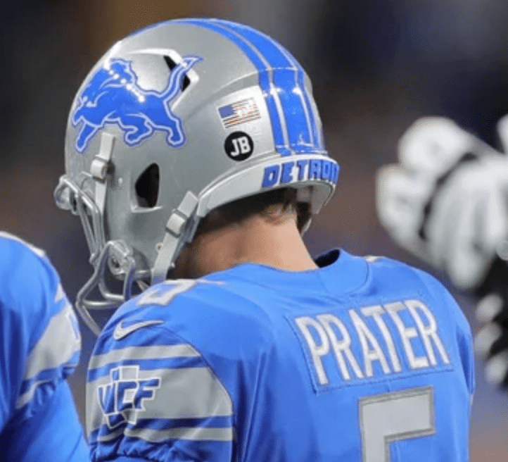
Good morning! While watching yesterday’s Giants/Lions game, I noticed that some Detroit players — but not all of them — had memorial-style black decals on their helmets. One of them, as you can see above, was kicker Matt Prater, but I noticed at least four or five other players wearing them. Cornerback Rashaan Melvin had two of them:

I hadn’t heard anything about this, so I got in touch with a team spokesman, who informed me that players were saluting family members and loved ones who’d been affected by cancer, as part of the “Crucial Catch” initiative. (I also asked for a full list of participating players, but he said that wasn’t available.) Every team designates one home game as a “Crucial Catch” game, but I don’t remember other teams putting a player-specific spin on it like this. Can anyone recall any previous examples of this, or is it truly a new thing?
Good thing I don’t play for the Lions, or else I’d have four decals on my helmet — one each for a brother, two sisters-in-law, and a grandmother. Fuck cancer!
In other news from around the league yesterday:
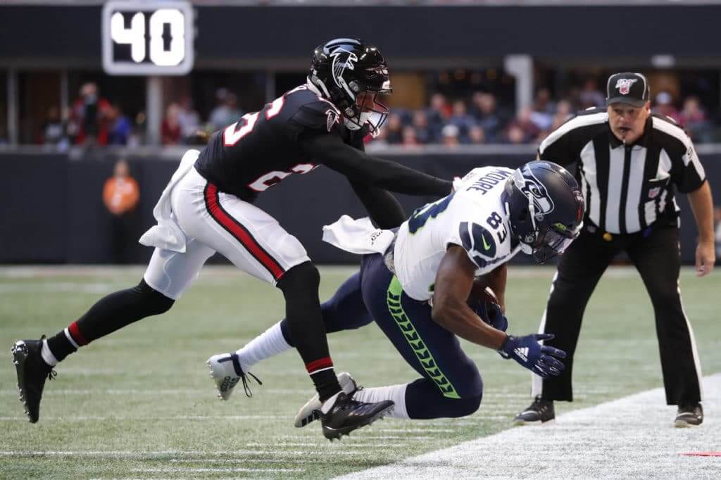
• Good-looking game in Atlanta, as the Falcons wore their throwbacks and the Seahawks wore their best uni combo — white over navy:
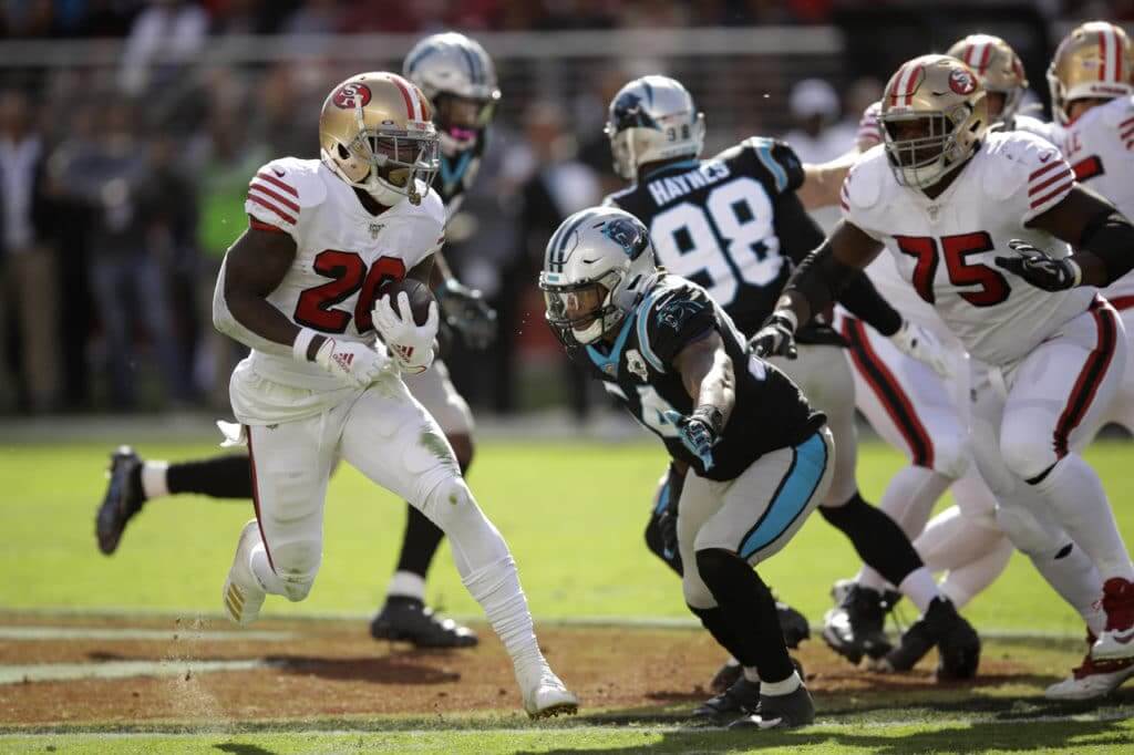
• Speaking of throwbacks, the 49ers wore theirs, while the Panthers wore their silver pants for the first time since 2017 (although they look more grey than silver now that the team is no longer using the old Reebok fabric):
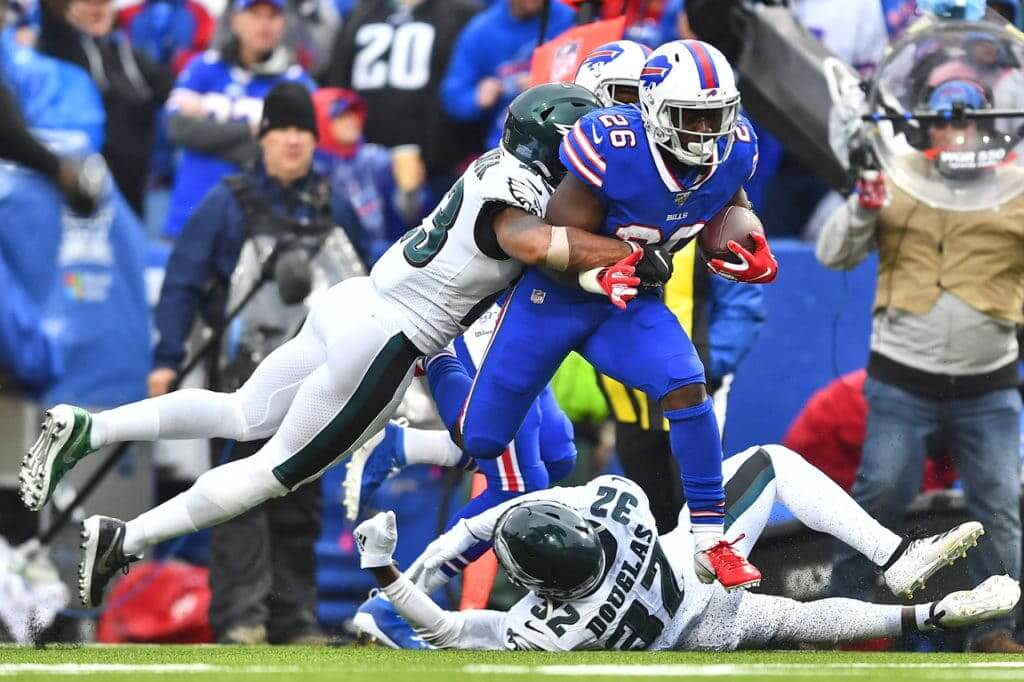
• A slew of teams went mono-blue. Let’s begin in Buffalo, where the Bills, one week after going mono-red, went full-Smurf:
• The Colts also went mono-blue:
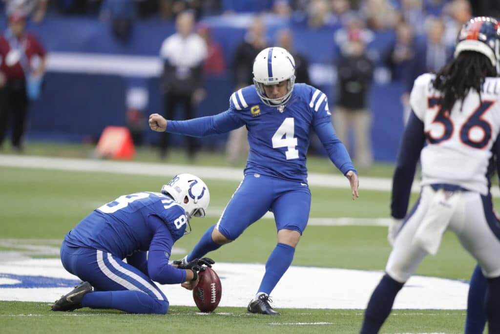
There’s also a very odd sub-plot to yesterday’s Colts uniforms, which I’ll get to after today’s lede.
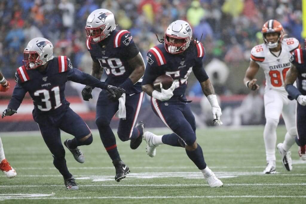
• You say you like mono-blue but you’d prefer to see it in a darker shade? The Patriots had you covered:
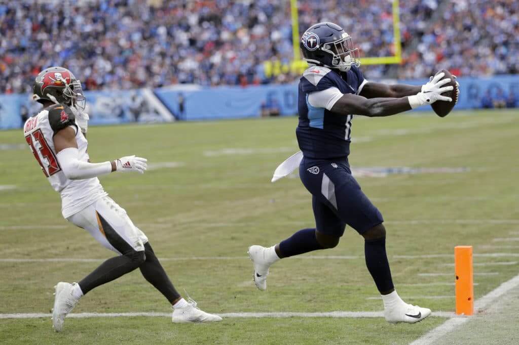
• And so did the Titans:
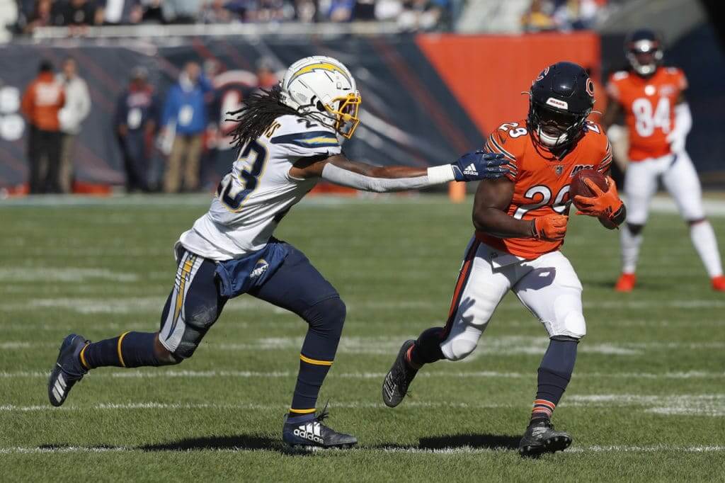
• The Bears wore their orange alternates:
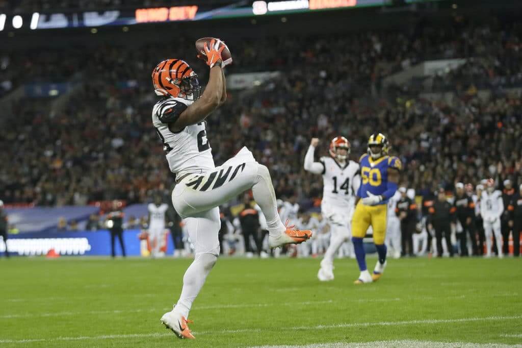
• The Bengals wore their mono-white alternates:
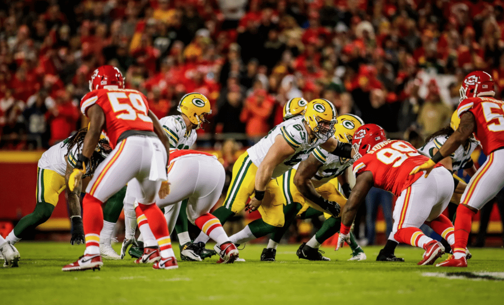
• One week after playing a uni-inverted version of Super Bowl II, the Packers played a uni-inverted version of Super Bowl I by wearing white while the Chiefs wore red:
• Only one team wore white at home: the aforementioned 49ers.
Now then, about those Colts: The jerseys for Indy’s mono-blue alternate uniforms (i.e., the Color Rash set, but I’m trying to dial back my use of that term) are nearly identical to their blue primary jerseys. The two differences are (a) the primaries are rendered in the old Nike template, complete with annoying Flywire collar and the sweatbox panel, while the alternates are rendered in the new template, and (b) the alternates have a slightly different number font.
You can see the differences in these two photos of linebacker Darius Leonard. The photo on the left, from earlier this month, shows the primary jersey; the photo on the right, from last year, is the alternate (click to enlarge):
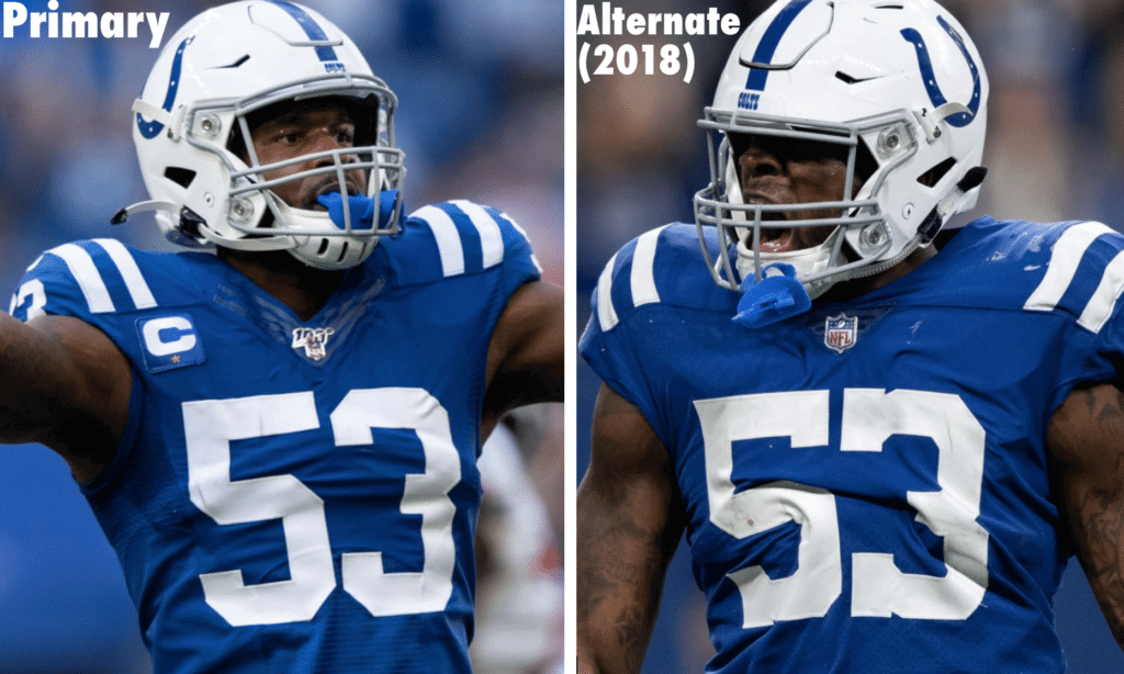
You can see the difference in the collars, the number fonts, and so on, right?
Yesterday I noticed that the Colts were wearing the old Nike template with the Flywire collar. I thought to myself, “Hmmm, they’re wearing their primary jerseys with the alternate blue pants. That’s a new combo.” But no — that wasn’t the case! Let’s look again at Leonard: last year’s alternate jersey on the left (the same photo we just saw) and yesterday’s alternate on the right (click to enlarge):
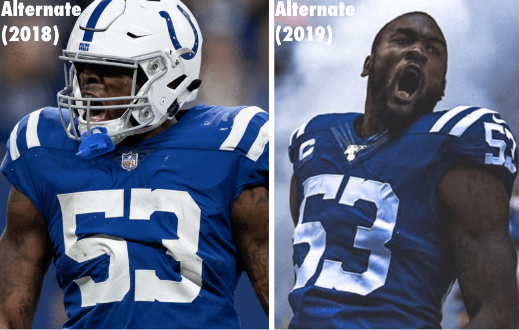
As you can see, yesterday Leonard had the old tailoring template, but with the alternate number font. And it wasn’t just him — all the Colts dressed that way yesterday.
In other words, they apparently made a whole new set of Color Rash jerseys (sorry) in the old jersey template. I guess they had to get a new set made regardless, if only to have the NFL 100 patch added to the collars. But why have the new set made in the old template? Bizarre! (There’s also the question of why the Colts haven’t upgraded their primary jerseys to the new template, but that’s another topic for another day.)
I’ve asked the Colts about this, but I’m not optimistic about getting a good response. I’ve learned over the years that certain uni-related questions, however obvious they might seem to those of us who obsess over these things, are just too nuanced for people who don’t spend all their time thinking about uniforms. Maybe the Colts’ spokesguy is a closet uni geek, but it seems like a long shot. Will advise.
(Big thanks to Jeremy Edom for spotting yesterday’s Colts number font before I did!)
Click to enlarge
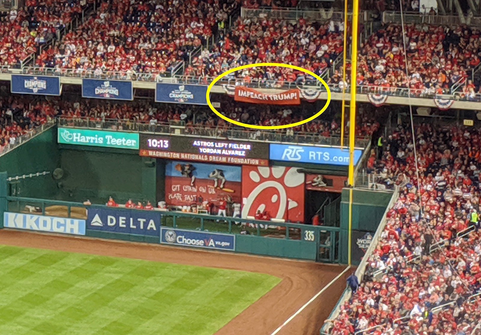
Signs of the times: President Trump came to the World Series last night, and so did the controversy surrounding him. Political signs aren’t permitted at MLB games, but some people managed to sneak in an “Impeach Trump” banner and displayed it in the right field stands for a few pitches during the top of the seventh inning before it was removed by security. Uni Watch reader Mike Rosenberg, who was attending the game, took the photo of it that you see above.
A similar banner appeared in left field:
Left field too pic.twitter.com/nkmjXtdCsZ
— Mathew Brown (@mathewbrown) October 28, 2019
And a different sign, but with a similar message, was briefly visible on camera behind home plate during the top of the fifth:
“Veterans for Impeachment” sign behind home plate tonight pic.twitter.com/trBa9Irx3H
— Andrew Beaujon (@abeaujon) October 28, 2019
Of course, booing and otherwise reacting negatively to politicians at the ballpark is a longtime American tradition (I was at a few Opening Day games at Shea Stadium where Mayors Ed Koch and David Dinkins were received so poorly that I wondered why they kept bothering to come every year), but this might be the first time impeachment signage has appeared at the World Series.
For a second I thought there was also a pro-Trump gesture, in the form of the “45” inscription on Astros pitcher Joe Smith’s cap (click to enlarge):
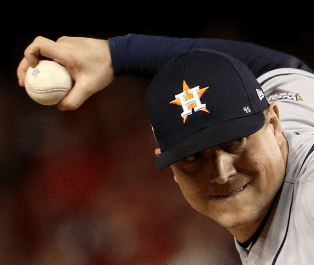
But as several people quickly pointed out, that’s actually for recently deceased MLB pitcher Tyler Skaggs, who was Smith’s teammate on the Angels a few years back. Smith has been wearing the “45” throughout the postseason.
Speaking of 45, Trump’s appearance also created a rare situation regarding Astros pitcher Gerrit Cole’s uniform number — get this:
Okay, I went here.
Gerrit Cole (45): Third player to wear uniform number X in a World Series game where US President number X was in attendance.
Others:
PIT Dave Parker, 1979 G7 (39=Carter)
PHI John Denny, 1983 G1 (40=Reagan)— Doug Kern (@dakern74) October 28, 2019
That is a seriously great bit of trivia!
And speaking of World Series trivia: With the ’Stros winning last night, this Series has now tied the record for the most consecutive games — five — won by the visiting teams to start the Fall Classic. The last time it happened was 1996 (Yankees/Braves). If the Nationals win Game Six in Houston, that would break the record. And if they go on to win Game Seven, we’d have the first World Series in history in which the home fans went home unhappy at the conclusion of every game.
One more tidbit from last night: Chef José Andres, who threw out the first pitch, wore a Nats jersey with FNOB:
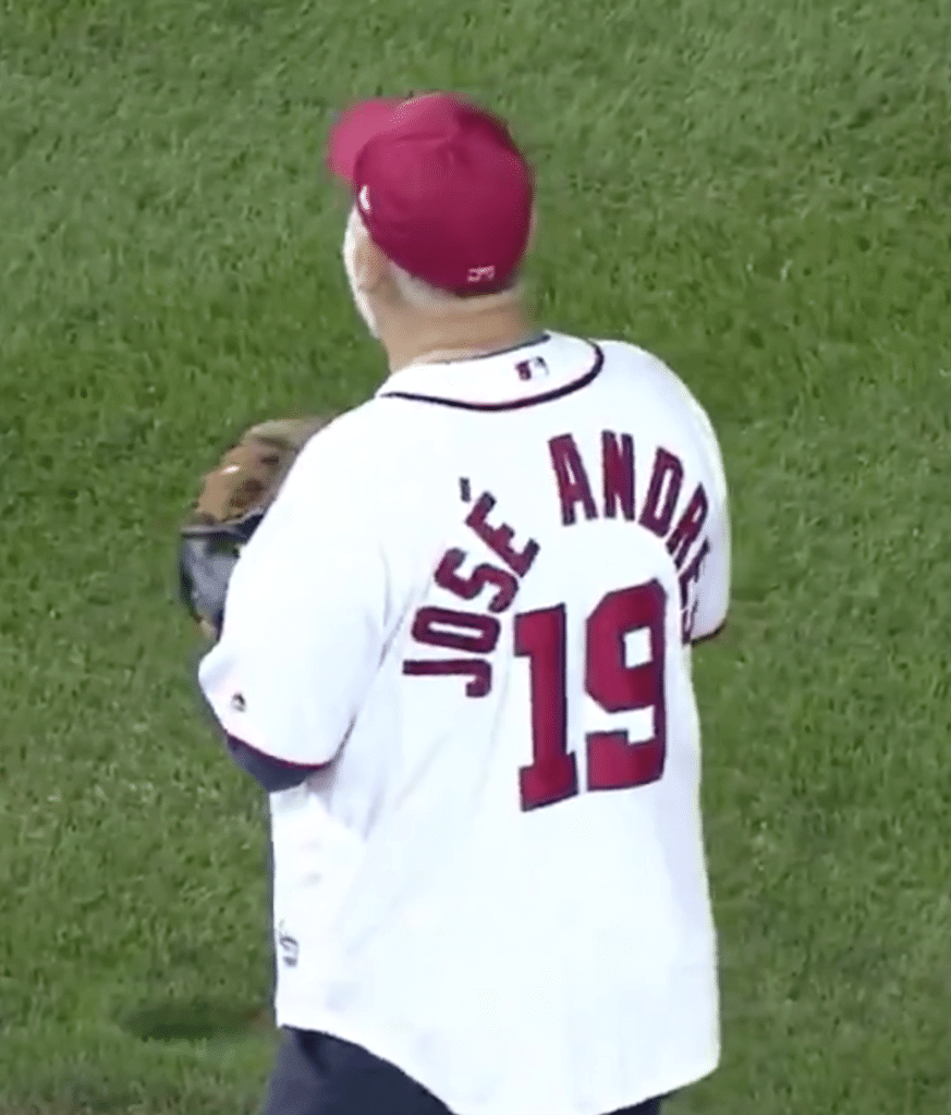
Anyone know if the Nats’ other first-pitchers also went FNOB?
Before we move on: I know anything involving Trump tends to make people on both sides of the political spectrum lose their minds. Let’s please not have that here today. I’m simply reporting on some notable signs that appeared at the game, which is the kind of thing we cover here at Uni Watch, and was also going to report on Joe Smith’s cap inscription if it had actually been in support of the president. Let’s not have any partisan chatter, from either side, in today’s comments. Thanks.
(Big thanks to @makatski for bringing the Cole/Trump uni-numerical tweet to my attention, and to Nick Leimbach for spotting Andres’s FNOB.)

Plus-one raffle results: I received 60 entries for the raffle to be my plus-one at the Padres’ upcoming uniform unveiling. Some of the entries included impassioned pleas for why I should choose them (even though it was a random drawing). One person — reader Marc Myers — even included a pretty adorable photo to prove that he’s a big Padres fan from way back.
In the end, the name that came up in the drawing was Mike Ortman. He’ll be my plus-one on Nov. 9, and he sounds like a perfect fit:
I am the face of long-suffering Padre fandom (49 years old and still waiting for our first World Series title), so I think I have some perspective on their uniform history and each respective era. But along with my Padres fandom, I am also a longtime Uni Watch reader, going back to the Kenny Rogers pine tar story. I’m a card-carrying member from fairly early on in the program. But having said all this, I promise I won’t go fanboy on you, or the team.
As for everyone else who entered: I wish I could bring all of you, honest. But I hope I’ll still get to meet you the next day, Nov. 10, at the the Uni Watch party at the Wonderland Ocean Pub. We’ll convene there at 4pm and hang out until at least 7pm. This bar supposedly has great ocean views, but sunset on Nov. 10 will be at 4:51pm, so plan accordingly!
Speaking of the San Diego party, the deluxe sublimated version of our brown shirt is now available and features a custom sleeve patch commemorating the party (along with multicolored collar and sleeve-cuff trim; click to enlarge):
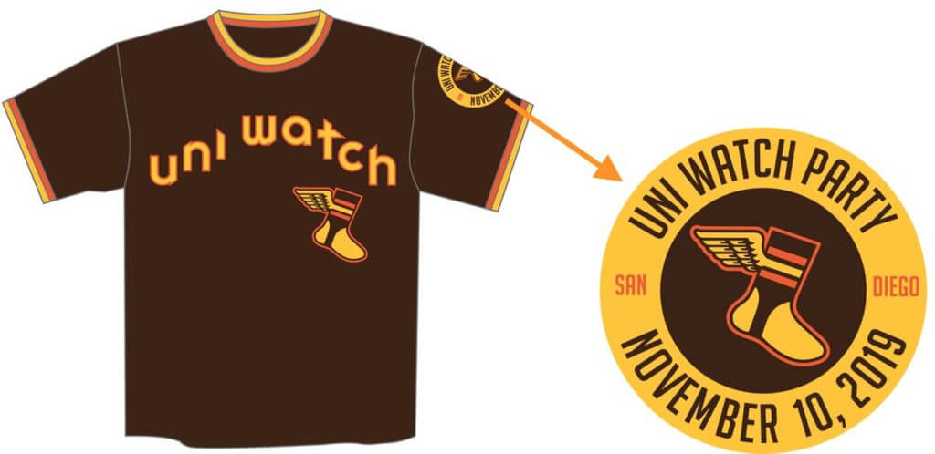
That shirt is available here. Meanwhile, the conventional brown T-shirts (cotton, no sleeve patch, no contrasting collar or sleeve cuffs) are also available in white-wing and yellow-wing versions.
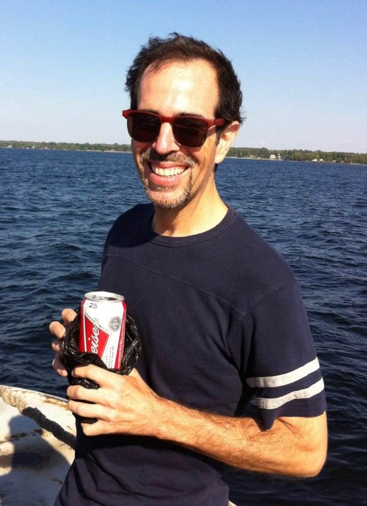
Does beer make you smarter? You may have noticed over the years that I often drink Budweiser (like in this photo of me, taken by my friend Aimee, on the Lake Champlain Ferry in 2015). My friend Tom, who’s an editor at the alt-weekly Pacific Sun in California, recently asked if I could write something about why I like Bud. The idea is that it would run in one of their special beer-centric sections, which are usually all about local microbreweries, craft beers, and so on.
I got my start writing in an alt-weekly (the now-defunct NYPress [R.I.P.], where my “Inconspicuous Consumption” column ran from 1993–1995), so it was fun getting to write for that kind of platform again. I wrote the piece, sent it to Tom, and then mostly forgot about it.
Turns out it was published more than a month ago. Oddly, the byline says, “By Pacific Sun,” even though it’s by me. And then there’s a little bio line at the end that says I’m a staff writer at Sports Illustrated (which was true at the time, but, well, you know). Anyway, if you’re curious, the piece is available here.

Click to enlarge
Last few days for the cycling jersey: We’re taking orders for another round of Uni Watch cycling jerseys. Just like last time, you can customize your number and NOB. You have to get your order in by the end of the month, so move fast. Full details here.
Meanwhile, speaking of reminders, If you have a Uni Watch Press Pin, don’t forget to enter it on our Press Pin Registry. Thanks!
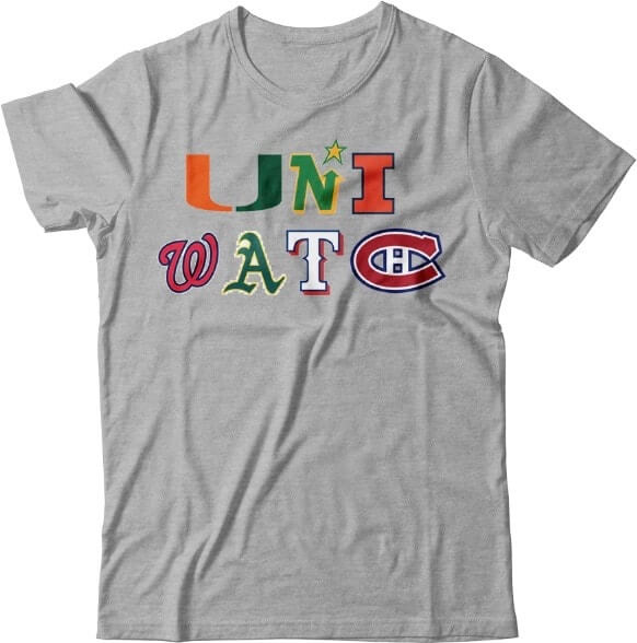
Just speaking theoretically here: When I posted that Uni Watch ransom note last week, a bunch of you said you’d love to see it on a T-shirt. That sounded fun, so I decided to have it mocked up. Grey or white are really the only colors that would work (anything else would require white keylines around at least some of the logos), and we already know what the design looks like on a white background, so I had the mock-up done in grey. Not bad!
Of course, these are all trademarked logos, so this mock-up is just for “What if?” illustrative purposes. I probably can’t produce the actual shirt. Still, it would be fun to know how many people would have been interested — you know, just hypothetically — if such a shirt were possible in real life.
So: If you would have been hypothetically interested in this shirt, shoot me a note. Thanks.
Click to enlarge
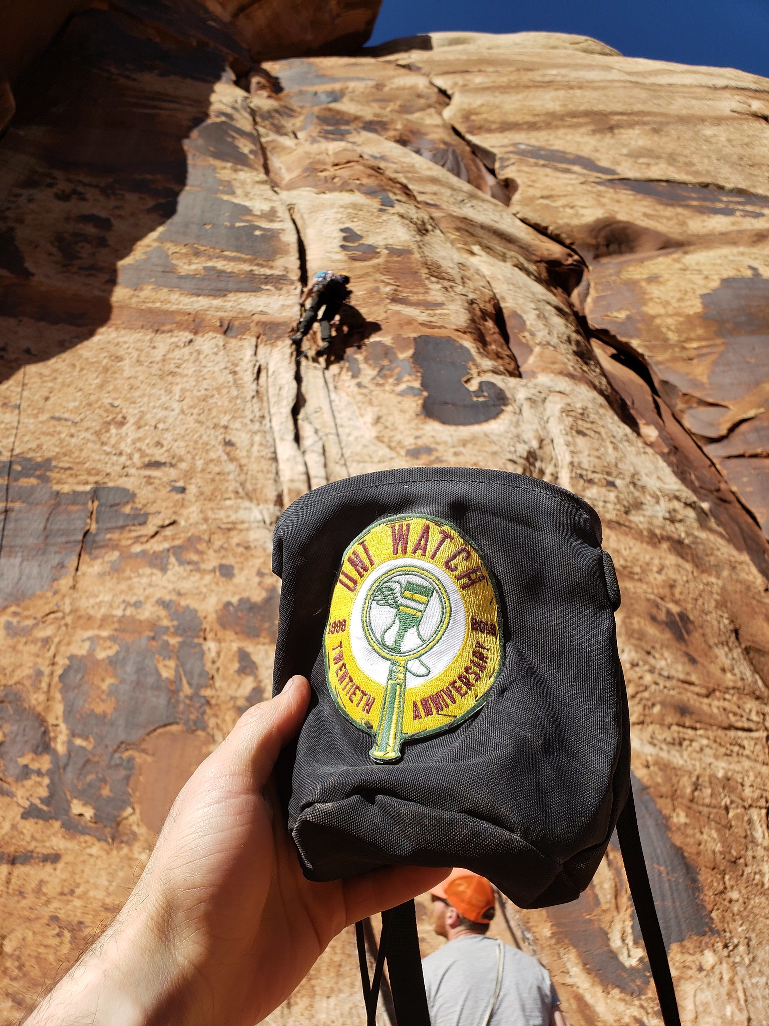
Uni Watch patch makes the rock climbing scene: “Rock climbing chalk bags come in all sorts of colors and designs,” says Uni Watch reader Taylor Workman. “When I purchased my chalk bag, I went for basic black . Unfortunately, I could not find any that didn’t have a maker’s mark. I decided the best way to make my bag easily identifiable at the gym or crag was to remove the maker’s mark and add a patch. That’s where the Uni Watch 20th-anniversary patch came in. I realized that the size of the patch would be perfect for the chalk bag, so I ripped the seams and tried my hand at stitching the patch (not my best work).”
The photo shown is from a recent climb Taylor had at Indian Creek, Utah. Here an action shot — see that round shape on Taylor’s bag? That’s the patch, although the design isn’t apparent in the photo:

Very cool. Thanks so much for sharing, Taylor.

Membership update: Our membership cards are usually horizontally oriented. But every now and then there’s a design request that makes more sense to orient in a vertically. That was the case with Matthieu Bouchard’s new card, which is based on France’s 2018 World Cup jersey. (No matter how we oriented it, it was a tricky design because of that sunburst/fringe pattern at the top, and the hexagonal pattern on the numerals. Three cheers to card designer Scott M.X. Turner for doing such a great job with it, and with several other challenging requests that have recently come through the pipeline.)
Adam’s card is one of 15 new additions to the membership card gallery. I expect the printed/laminated versions of these new cards to mail out by Wednesday or Thursday of this week. If you ordered a card but don’t yet see it in the gallery, don’t worry — we’re getting to it! We’ve had a big spike in orders since the latest unpleasantness, so there’s still a bit of a backlog, but we’re working our way through it.
Ordering a membership card is a good way to support Uni Watch (which, frankly, could use your support these days). And remember, a Uni Watch membership card entitles you to a 15% discount on any of the merchandise in our Teespring shop and our Naming Wrongs shop. (If you’re an existing member and would like to have the discount code, email me and I’ll hook you up.) As always, you can sign up for your own custom-designed card here, you can see all the cards we’ve designed so far here (more than 2,300 of them!), and you can see how we produce the cards here.
The Ticker
By Jamie Rathjen

Baseball News: Chilean pro golfer Hugo Leon wore a Tigers spring training cap at the European Tour’s Portugal Masters (from Michael Hayden).
.

Football News: The school of the day from Blaise D’Sylva‘s helmet collections was Army. … Daniel Tarrant points out that on North Carolina’s helmets from Saturday, the earhole on the side of the helmet also served as the spot in the foot logo. … You can see Canadian college uni tracking from Wade Heidt in yesterday’s comments. … SportsCenter used era-appropriate team logos in a graphic about unbeaten NFL teams. “Someone there Gets It™,” says Jeff Perilman.

Hockey News: The Islanders are using an old JOFA helmet as their “player of the game” trophy (from @ChiaEstevez). … The Junior A British Columbia Hockey League’s Victoria Grizzlies dressed up as their former incarnation, the Victoria Salsa, for their 25th anniversary. Wade Heidt tells us that the name comes from the then-owners of the team also owning a taco restaurant chain. However, “these are not the original jerseys and that is close to what the original logo looked like but not exactly,” he says. … The next two are also from Wade: The BCHL’s Chilliwack Chiefs wore alternates that were auctioned with the proceeds going to the local soccer program, Chilliwack FC. … The QMJHL’s Moncton Wildcats and Chicoutimi Saguenéens both wore pink. … During a Rangers/Bruins alumni game yesterday, Bruins G Andrew Raycroft was wearing a different jersey than his teammates. … The WHL’s Prairie Classic in Regina between the Regina Pats and the Calgary Hitmen was color vs. color (from Nelson Hackewitch and Wade again). … The Southern Professional Hockey League’s Quad City Storm wore Peanuts-themed jerseys (from Adam Badger).

Basketball News: The NCAA officials’ jersey was changed this year to add black raglan sleeves (from multiple readers). … Other uni-related NCAA rule changes are that arched NOBs were apparently not allowed until now (even though, obviously, some teams wore them anyway) and tights must be worn on both legs and be the same length. … Zachary Loesl tells us that former NBA center Primož Brezec had Velcro strips on his uniform. We have Ticked that one other time, almost exactly 12 years ago, and the explanation given then was that it was to keep his jersey tucked in. … Adidas is reportedly in talks to buy out Wizards PG John Wall’s endorsement deal. Wall has been injured and thus unable to showcase the company’s products.

Soccer News: Newcastle United winger Allan Saint-Maximin wears a sweatband with the manufacturer’s logo blacked out. From how I’m reading the English advertising regulations, maker’s marks cannot appear on accessories (not including boots) unless it’s the company that makes the team’s kit (from Josh Hinton). … You can see more on Josh’s Twitter feed. … New first shirt for League of Ireland First Division team Drogheda United (from Ed Żelaski). … Officials in Scotland wore black armbands after the Scottish Football Association’s head of referee operations, John Fleming, passed away last week. … Scottish team Rangers and English Championship teams Fulham, Middlesbrough, and West Bromwich Albion were the first to break out the poppy patches for Remembrance Sunday — two weeks early, because all teams involved except Fulham don’t have any more home games before then. … Wake Forest’s women’s team wore pink shirts and socks. … Budweiser recently became a big NWSL advertiser but had mostly refrained from putting its logo on anything until yesterday’s championship game. Look carefully at the North Carolina Courage celebration and you can see its logo on the plastic locker room sheeting and on the red covers for the champagne bottles. Gross (from James Gilbert). … Manchester City have won the Premier League four times wearing four different primary color combinations, but this season’s sky blue-white-white is a repeat of 2013-14’s combo, which could be an ill omen.

Grab Bag: Women’s college teams outside of soccer that wore pink included Penn, Duke, and Liberty field hockey and Gonzaga and Utah volleyball. … UCLA volleyball didn’t wear pink, but did have new uniforms. … Cross-listed from the baseball section: Chilean golfer Hugo Leon wore a Tigers spring training cap at the European Tour’s Portugal Masters (from Michael Hayden). … F1 driver Sebastian Vettel does not care for the F1 race trophies, in part because they include Heineken advertising (from @dmoon).

What Paul did last night on Saturday: The last Saturday of October is usually the time for one of my favorite events of the year: Bike Kill, a semi-secret event in which dozens of art-punk cyclists bring tons of bizarre bike creations to a dead-end block somewhere in Brooklyn and allow anyone and everyone to ride them. As you can see in the video clip above, many of the participants dress up in Halloween costumes, which makes the whole scene even more fun. It’s one of the most creative and most generous-spirited events I know of. Everyone shares the bikes, people rush to help anyone who falls or wipes out, some people bring their dogs and/or kids. Kinda renews my faith in humanity.
I took a bunch of photos, about two dozen of which you can see here. And here’s another short video clip:
On a serious note, my thoughts today are with our readers (and everyone else) in northern California — including our own Brinke Guthrie. Be careful, be safe, and hang in there. — Paul
When a crowd of people waving red hats (as instructed by the Jumbotron) booed the President last night, I couldn’t help but think of your piece about red sports hat wearing in the MAGA hat era, Paul.
Politics aside, that it was a crowd of people in red hats booing the President was a surreal moment. His chant. His color. His preferred piece of clothing. Totally different moment.
You apparently weren’t the only one who thought that:
link
Falcons’ throwback uniforms looked great, but the midfield logo (the current one) was a giant turd in the punchbowl
Looks like the NCAA ref jerseys are designed to have the appearance of raglan sleeves but the actual construction is a normal set-in sleeve. The manufacturer describes them as “raglan style shoulders and sleeves”. Very strange
Saints also wore mono-black.
Yeah, I’ve decided to stop calling that out because it’s basically become their default home look, like the Seahawks’ scuba look.
Have the Jaguars officially made teal their primary home jersey? They’ve already worn them 3 times which I think is more than is allowed for an alternate jersey.
I enjoyed your article extolling Bud. Made me think of a local craft brewer that might appeal to you more – link. There are some items in their Fan Shop that might be good additions to your holiday gift list.
Can’t drink Bud. Gives me a headache 100% of the time.
Does me too. Heard it is because it is brewed with rice which increases sulfite levels in the beer which can cause some people a headache.
There’s a Fuck Cancer website, letsfcancer.com, with a logo that cleverly uses the ubiquitous ribbon, link
That is genius.
Please stay off politics. We get way too much of that from all other forms of media. Stick with the subject at hand.
The subject at hand is that there were notable signs and banners at a World Series game, which is the kind of thing we cover here. The signs and banners happened to be political in nature. It happens. I reported on the signs’ existence but offered no partisan commentary on them and asked everyone else to do likewise. Simple.
You took your coverage farther than just the signs, when you included the crowds reaction to the president. Keep it uniform related please.
Actually, Kate, if you go back and re-read today’s entry, you’ll find I didn’t mention anything about the crowd’s reaction. Perhaps you’re thinking of some other website.
You kinda did…..
“Of course, booing and otherwise reacting negatively to politicians at the ballpark is a longtime American tradition (I was at a few Opening Day games at Shea Stadium where Mayors Ed Koch and David Dinkins were received so poorly that I wondered why they kept bothering to come every year), but this might be the first time impeachment signage has appeared at the World Series.”
I’ll back Paul on this one, there was no political bias on display in the way he covered the event in question, and I have a Journalism degree.
One way you can tell is that if somebody who didn’t know anything about Paul read that text, he or she would have no way of knowing if he was a Trump supporter or not.
He clearly only mentioned the reaction to draw more attention to the fact that, it’s the first time fans have resorted to banners. I didn’t take it as personal commentary.
You kinda did…..
Actually, Kate, no, I didn’t.
I mentioned previous booing and other negative reactions to *other* politicians to provide historical context of the negative reaction expressed by the signs/banners.
But I didn’t mention that Trump himself was booed. If you didn’t know he’d been booed, there’d be no way for you to tell from what I wrote. You’d also never know that fans directed a certain chant at him.
-I miss when football pants were silver rather than just looking grey. I believe the Raiders are the only ones left with the britches using the material that makes them look silver.
-Here are some shots of the WHL Prairie Classic outdoor game with the teams in action. Both the Pats and the Hitmen shook hands after the game and gathered together to pose for a group photo. A bit unconventional after a regular season game. Largest home crowd in the Regina Pats’ 102-year history.
link
-We can all be thankful the Victoria Salsa changed their name in 2006. The pepper in the original logo was often mistaken for being a pickle, likely the reason the Salsa went with a more muscular pepper for their logo in the later years.
link
– As a Buckeye fan, I totally agree on the silver pants! These looked so much better than the gray they wear today. Notrte Dame’s gold pants look better too.
link
– Also, 5 uncles and 1 aunt. Fuck Cancer.
Totally forgot the Cowboys.
Don’t have the issue with grey instead of silver pants in pro football in Canada. Due to there being no teams now that wear silver or grey pants!
Which is quite different to even just 15 years ago. Back as early as 2004, 1/3 of the teams in the league at least wore silver pants at home (Lions, Roughriders, and Alouettes). Now none of these teams due as a result of changes made to their uniforms since then.
The Dallas Cowboys also still wear their greenish silver pants made of the shiny fabric. My mom once asked me if their pants were actually green.
Love the Tar Heels/ear hole thing. Not sure if it’s SO genius or So obvious.
I’m a big Peanuts fan and such, LOVE those sweaters on the QSC.
When I was in high school I started writing my 7s with a bar (French or European 7s). Do these ever show up in uni numbers? The severe slant of the 7 on that membership card makes it look naked.
I’m sure others may have noticed but I couldn’t help but think of the Colt 45’s every time Houston pitcher Gerrit Cole was shown from the back revealing “Cole 45” in last night’s game. For some reason I never made the connection before
MC,
All I could think of was “Cold Liquor Drinks”… as a way to come to terms with Mr C’s outstanding pitching performance he put on the Nats last night.
There is one other way to differentiate the Colts regular jerseys from their color rush jerseys – the NOB font. The Colts have a unique NOB font on their regular blues:
link
The color rush jerseys have a generic block font:
link
Ah, didn’t know that. Thank you!!
What is that path running parallel to the 3rd base line ending with a box near home plate in the Forbes Field 1960 World Series photo from yesterday? I’ve seen similar paths in other World Series from the 60’s.
I’m thinking it’s the back goal line for one of the end zones for Steelers games.
That is the infield tarp. It came out of the ground just as it did at Three Rivers.
Shirt looks good, but I wouldn’t buy it even if you could make it because of the Nats logo. I wonder how many people would have the same issue (rival team logo).
not a particular rival, but i wouldn’t wear anything with thug u logo
I made those “ransom note” things when I first started getting into logos in high school. I remember I made one for my boyfriend at the time as a “gift,” he didn’t appreciate it :P
Islanders should have gone with a more “iconic” helmet for their player of the game:
link
At the 1983 World Series, in addition to Phillies pitcher John Denny wearing #40, Orioles coach Jimmy Williams also wore #40. I know he wasn’t a player but he was in uniform.
The British commentators on Sky also started wearing their poppies this weekend.
Re: Trump: Why bring up the sign issues, booing, etc. at all? But you say, let’s not be political?! Note: this is not partisan chatter, and I have not lost my mind (what’s left of it).
Signs are among the things we cover here. It seemed notable, especially given the tight security usually in place for the World Series. Simply reporting on the existence of the signs is not “be[ing] political.” The people with the signs were being political, for sure, but I offered no commentary on them one way or the other. Similarly, if Joe Smith’s cap inscription had truly been a pro-Trump gesture, as I initially thought it was, I would simply have reported it as such.
I didn’t mention Trump being booed at all (nor did I mention the other way the crowd responded to him). I mentioned *other* politicians being booed, as a way of providing historical perspective for negative reactions to politicians at the ballpark.
I liked how the Panthers brought out the silver pants, making their uniforms look a little more period appropriate for the mid-90sb against the 49ers. A shame they’re now made of the newer fabric that just makes every color look matte.
Paul, fabric issue with the silver pants aside, what’s your thought on the tweaked Panthers uniforms now, after several weeks? Do you find them more aesthetically pleasing now that the shoulder loops actually go around for everyone or are there negative things that bring down the look (microscopic TV numbers in particular)?
I definitely prefer the new jerseys with the updated shoulder loops.
I’ve never liked their pants, and I like them even less now with the truncated piping. It feels like a bad variation on something that was bad to begin with. They need to start over with new pants.
Budweiser piece is really well-written!
I have the same Islanders-style Jofa helmet but in a bright green which would be the perfect player of the Game lid on the Uni Watch hockey team.
Watching many of my preferred press pin numbers being taken, while I excruciatingly wait for mine, reminds me of something, but I can’t quite put my finger on it. Maybe signing up for classes in school and seeing some of them already taken? On the plus side I haven’t had this much anticipation for anything for quite some time.
You don’t have yours yet? I know you’re in Canada, but do things usually take this long?
The shipping notification said it migt take until Oct 30th, so we aren’t late yet. Having said that, I see some people in Europe already got theirs. I’m sure it will arrive in the next day or two.
If it doesn’t show by the end of the week, let me know.
Paul, “what if” you printed the Uni Watch ransom note on an 11″ x 8.5 ” white rectanglular “note?” Number of T-shirt color offerings instantly expanded!
Have the Jaguars officially made teal their primary home jersey? They’ve already worn them 3 times which I think is more than is allowed for an alternate jersey.
great seeing you at bike kill! best day of the year
I got to see the Colts game in bonus coverage yesterday. That’s my favorite number font. I wish the Cowboys would go back to that. That’s what they were wearing when I became football aware. I had a poster with Randy White and Tony Dorsett among others with that number font. Does anyone know the name of that font?
Thought same – the Colts had that back in the 60s too (though with an extra stroke on top of the 4). link
Great story re: Bud. I certainly agree with a lot of the premise. I have a friend that drinks nothing but Miller Lite and can’t fault him for it at all. Though I’ve always found Bud the least appealing of the mass produced beers.
And totally agree with your point regarding naming and packaging of craft beers. I find the overly cartoony cans or pun filled names to be a turn off, sort of the “trying too hard” thing. Though I presume it is a chicken and egg thing, they have those names because the data says the demographic who buys those beers would like that marketing, as opposed to the marketing starting on its own the attracting only a specific demographic as a result.
Regarding last-names on the same horizontal plane in basketball.
This is discriminatory against people with divorced parents, many persons of central and south Asian origin (especially those of Thai origin), and certain central Europeans with confabulated surnames (Johannes “Jan” Vennegoor of Hesselink).
You wouldn’t be able to put “Abdul-Jabbar” on the back of most current jerseys. Heck, “Alcindor” is a stretch for most jersey manufacturers!
Thanks again Paul for the plus one raffle! Looking forward to seeing these unis as we #bringbackthebrown, and looking forward to meeting the local comm-uni-ty the following day. Go Pads!
Let the Tingler era begin…?
I never will understand why people get so frustrated that people like the macro-brewed beer. I enjoy trying craft stuff, but when it’s the weekend and I’m kicking back and watching football I like my big American beer.
Excellent piece on why you like Bud. I really liked how you call out the stupid names used on craft beers. Seems silly for an adult to tell a bartender I’d like some goofy named beer. I have my beer guilty pleasure too and love it. Miller High Life. Reason is when I was young around 16, drinking age was 18 still, we could always find an 18 year old high school senior teammate to buy beer. Miller had the little 7 ounce pony bottles then 8 to a pack. It was cheap and I developed a fondness for it. Still drink it to this day as my everyday beer. Probably clinging to some level of nostalgia too drinking it but I actually do like it.
I really liked the article too, and the reasoning behind it. I can’t drink IPAs. Tried once and couldn’t finish the bottle. I also can’t stand the explosion of dumb names and bad art on today’s trendy labels.
My go-to brews used to be bottles of dependable Iron City and Miller Lite (loved the old Less Filling! Tastes Great! commercials), but this summer I found that I can easily get Stroh’s and Blatz (in throwback/fauxback cans!). Takes me back to the days of classier beer commercials from the 70s and 80s. I’m not just taken in by appearances and nostalgia … I also enjoy the taste.
My city stopped recycling glass, so that’s another reason to get the cans. I just pour one into a vintage schooner glass and enjoy.
You just wanted to say “schooner”! (And I don’t blame you.)
Seriously: Glad you liked the article, Jim.
IMO the Seahawks best possible look with their current sets is white over wolf grey. The white over blue creates the DLE (dreaded leotard effect).
There is no such thing as wolf grey. There is only grey.
Yes, shame on me for repeating the marketing language. Still think it’s their best look unless they have some throwbacks hidden in their inventory.
Completely false. Theres dark grey, light grey – heck, even medium grey.
Yup. But not wolf grey.
There’s “gray” too.
I’ll see myself out.
bud piece is good. when it comes to beverages, i’m promiscuous. i like microbrews and macrobrews each in their place. the latter work a lot better for cooking chili con carne or green chile that’s for sure. i made both this weekend.
Really only the Titans were mono-blue. The helmet is part of the uniform after all…
Here at Uni Watch, “mono-[whatever]” has long referred to the jersey and pants being the same color.
You’re free to define the term however you like, but that’s how this website defines it.
Didn’t the Falcons screw up their throwbacks yesterday? I assume those are their Deon era unis in which they wore silver pants.
It’s a hybrid, combining elements of the 1960s and 1990s uniforms.
That is correct.
The Falcons’ throwback mashup consists of 1966 jersey/pants/socks & 1990-’03 era helmet.
An accurate ’66 throwback would feature a red helmet, but alas the NFL’ s ridiculous “One Shell” rule prevents that.
Paul you should do a Buccaneers-Seahawks matchup “uniform history through the years” piece leading up to their game next week…kinda to tie in with the 100th anniversary, those two teams were the 1976 expansion franchises, and they both have had several eras of uniforms to cover….
Not a bad idea! If I have time, I’ll do it!