For all photos, click to enlarge
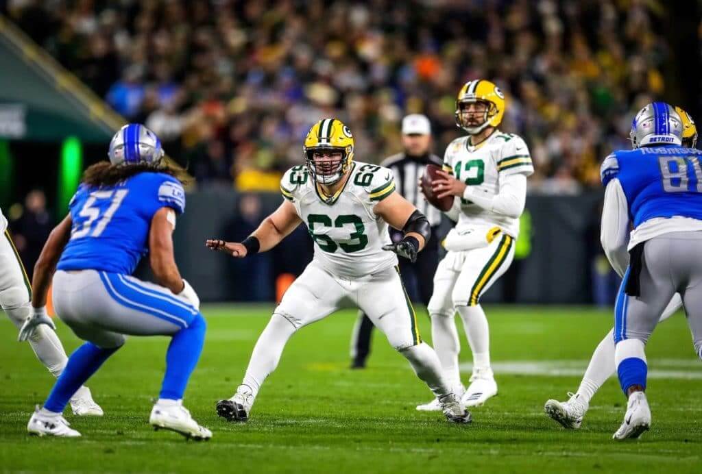
The Packers wore their Color Rash mono-whites last night. That made them the fourth NFL team to wear white jerseys, pants, and socks in Week Six (the others were the Eagles, Jets, and Saints). An additional team, the Jaguars, wore white pants with white socks:
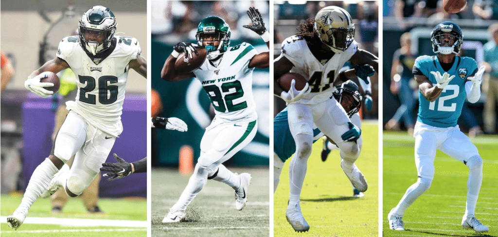
There’s nothing new about NFL teams pairing white jerseys with white pants, of course. The new wrinkle here is the use of white socks. For many decades up until this season, NFL socks were required to be white from the shoe to mid-shin, and then either team-colored or team-patterned from mid-shin to the point where the sock met the pant cuff. But this year, the league changed the rule to allow for solid-colored socks (or “stockings,” as the league has always preferred to say). Not every team wearing white pants is going with solid-white hose — the Ravens, for example, wore white pants on Sunday but paired them with traditional black-topped hose — but many teams, including the Packers last night and those other four clubs on Sunday, are using white socks to take their mono-white look to another level.
I think this trend raises two important questions. First, what do we think of white pants with solid-white socks?
I’ve spent a good chunk of my career inveighing against the dreaded leotard effect. (I’m pretty sure I’m the one who came up with that term, in fact.) But I have to say, a white leotard/unitard doesn’t bother me nearly as much as, say, a red leotard or a navy leotard. Part of it, I think, is that a solid-white uniform doesn’t strike me so much as a superhero costume like a solid-colored uni does. I mean, how many superheroes wear all-white? I’m sure there are some, but I’m also pretty sure they’re in the minority.
To be clear, I’d much rather see white pants paired with contrasting socks. Personally, though — I realize many of you may feel differently — I don’t mind the lack of contrast nearly as much when it’s white on white. (Also, so far NFL teams haven’t started referring to their mono-white uniforms as “icy whites” or “stormtrooper,” or any of the other cringe-inducing terms that college teams tend to use. So there’s that.)
The second question I’d like to explore is this: What led to this trend of socks matching the pants (whether in white or any other color)? As I see it, there are several factors. One at a time:
1. Most players don’t wear traditional socks anymore. The sock rules have always been based on the premise of a one-piece over-the-calf sock that’s white toward the bottom and colored or striped/patterned on top. But more and more players have been wearing some combination of socks, tights, leg warmers, white athletic tape, and more. Take, for example, this photo of two 49ers players:
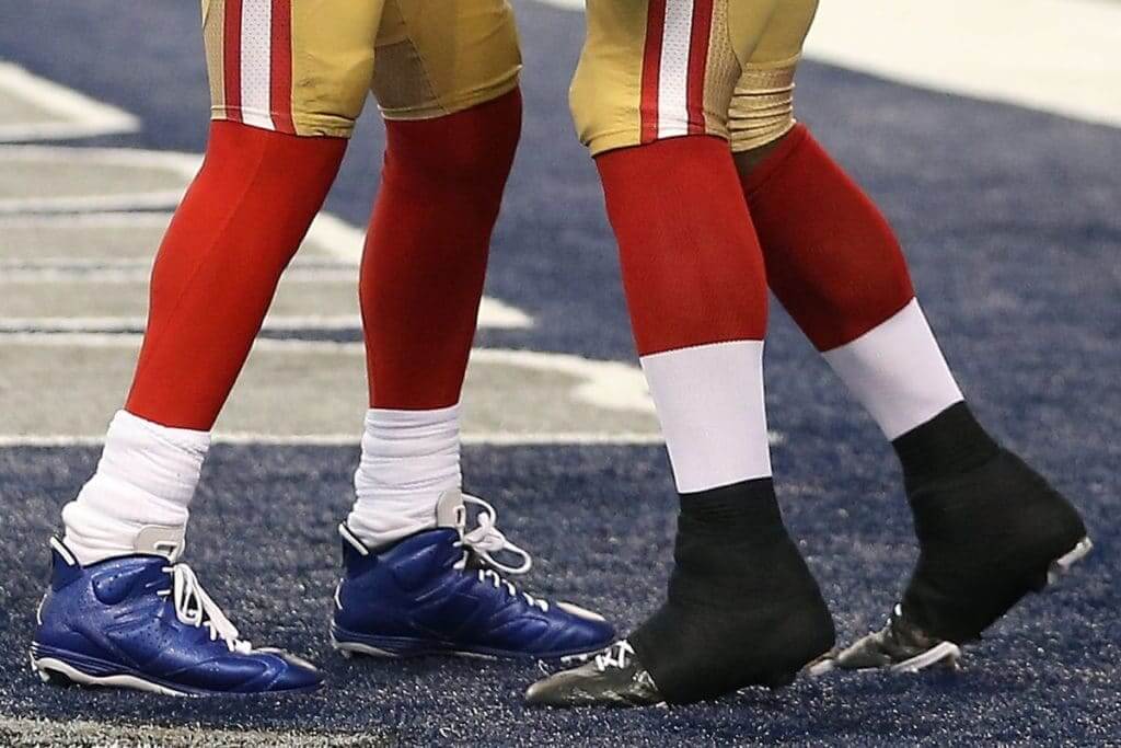
From a distance, it might look like they’re both wearing one-piece socks that are white on the bottom and colored on top. But as you can see, that description only applies to the player on the right. The guy on the left is wearing bunched-up white socks over red leggings. If you look again at this week’s mono-white players, you can see that some of them are simply wearing white leggings with low white socks.
Why do players do this? I think it has more to do with function than style. For starters, many athletes like the compression feel of tights and leggings (we see more and more of that in the NBA). And while socks can droop down or sag, you don’t have to worry about that with leggings, so leggings are lower-maintenance. Now that the NFL has changed the rules to allow solid-colored hosiery, that really opens to the door to leggings, of whatever color.
2. Many players don’t wear traditional pants, either. The old sock rules were based on the notion of the player wearing pants that were essentially like knickers — coming down a little below the knee — with the socks providing contrast to the pants. But as we’ve been seeing for years now — and again, you can see it in a lot of those photos I showed you earlier from Sunday’s action — more and more players are wearing their pants well above the knee. That means their socks have to extend above the knee as well. And while contrasting socks look great when they meet the pant cuff just over the calf, they look ridiculous when they extend above the knee. So the dreaded leotard look actually makes more sense if you’re going with super-short pants.
3. The Rash has spread. The use of solid-colored socks that match the color of the pants (white or otherwise) began with the Color Rash program in 2015. I’m sure that helped prime the pump for what we’re now seeing.
4. Players love sox-ual expression. The most “look at me” uni element is probably shoes. But socks are a close second, with players adding stripes, wearing stripes low instead of high, wearing non-team colors, and so on.
The combined effect of all this is that the old sock rules had become outdated, which helps explain why they changed the rules this season. The bigger question, given the basic truism that form follows function, is whether the basic pant/sock format itself has outlived its usefulness and needs to be replaced. For example, should NFL players be allowed to go bare-legged, like college players? Is it time for long pants that basically combine the pant and sock? Something else?
I’m not saying I want any of those things to happen (I like the traditional pant-with-contrasting-sock format). But it seems increasingly clear that the old format doesn’t meet the needs of today’s players. Perhaps something new is called for.
One final note about last night’s game: according to the Lions’ PR staff, last night was the first time ever — ever! — that the Lions wore blue at Lambeau Field.
Click to enlarge
Collector’s Corner
By Brinke Guthrie
Follow @brinkeguthrie
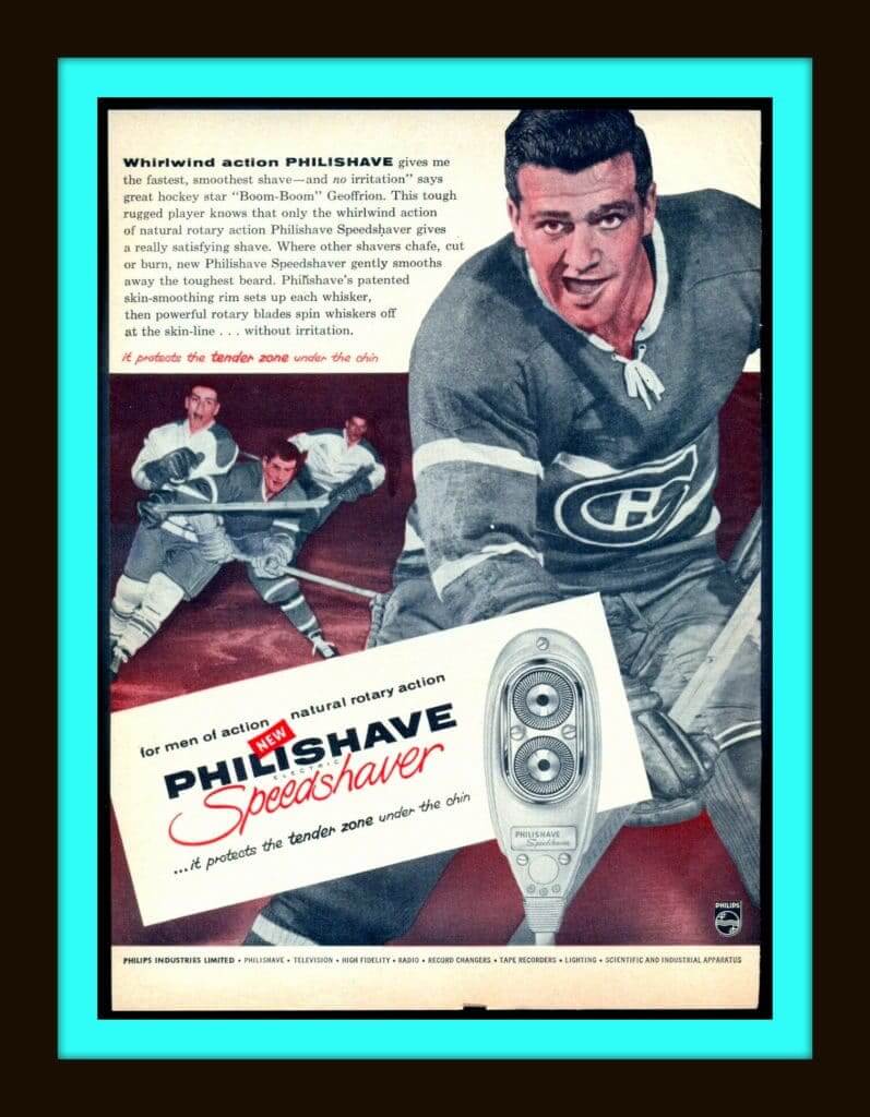
Starting off this week with this 1960s ad for the New Philishave Electric Speedshaver. (For men of action.) Hockey star “Boom Boom” Geoffrion of the Montreal Canadiens says it “gives me the fastest, smoothest shave…with no irritation.” Well, if BB says so, that’s good enough for me! Except for the fact I was not quite at shaving age when this ad was printed.
Now for the rest of this week’s picks:
• This is an “Official (kids) Baseball Jacket” for the St. Louis Cardinals, made back in the 1950s by a company called Richline.
• A classic 1970s Sears NFL Shop item here: this Dallas Cowboys bulletin board with a set of 24 helmet pushpins. I swear I never saw these, not once. Here’s the original 1975 Sears ad, when the cost was $4.66. The eBay seller wants considerably more than that!
• These binoculars from Tasco are called “NFL Team Sports Glass.” If I saw that product name, I’d think it was one of these beverage glasses.
• Speaking of glasses: This pair of 1970s Philadelphia Phillies glasses include a illustration of the then-new Veterans Stadium.
• Take a look at this 1960s New York Yankees poster. Terrific artwork, to be sure, but the blue used is more suited for the crosstown rival Mets, not the Yanks’ midnight navy.
• Here’s a 1970s Minnesota Vikings “Gift Bank” helmet. The helmet looks to be in perfect shape and comes in the original box. An officially licensed product, this one was from Pro Sports Marketing of Concord, Cal. Judging from the zip code on the box, their offices were just a few blocks from where I am now sitting.
• Another one for the Vikes: Never seen this before — a 1970s Vikings nightgown, in bright yellow with white sleeve stripes, and a helmet logo on the chest with accompanying “Vikings” text in their classic font.
• Unique-looking “ram’s horn” treatment on this 1970s L.A. Rams ski cap.
• We’ve got another Rams item here: This figure is called “Paint-A Li’l Pro .” You get paint (non-toxic), decals, brushes, and instructions. Bet you can’t paint just one!
• Nice throwback artwork on this late-1960s/early-1970s Miami Dolphins poster.
Got an item to include on Collector’s Corner? Send any submissions to uniwatchcollectorscorner@gmail.com.

Click to enlarge

LAST CALL for the NHL/Carhartt raffle: In case you missed it yesterday, we’re raffling off NHL/Carhartt hats to three lucky readers. To enter, send an email with your shipping address and your choice of any hat from this page (be sure to keep scrolling down to see all of the options — the page will keep filling as you keep scrolling) to the raffle address by 8pm Eastern today. I’ll announce the winner tomorrow.
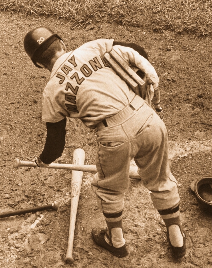

Very cool membership update: Reader Jay Mazzone has no relation to the hook-handed Jay Mazzone who famously served as a batboy for the Orioles back in the 1960s (you can learn more about that Jay Mazzone here), but he decided he wanted his membership card to be based on his namesake’s batboy jersey. It’s one of the best card requests we’ve ever had — love it!
Jay’s card is one of several that have been added to the membership card gallery. Lots more designs will be added soon, as we’ve had a nice spike in enrollments since the latest unpleasantness.
Ordering a membership card is a good way to support Uni Watch (which, frankly, could use your support these days). And remember, a Uni Watch membership card entitles you to a 15% discount on any of the merchandise in our Teespring shop and our Naming Wrongs shop. (If you’re an existing member and would like to have the discount code, email me and I’ll hook you up.) As always, you can sign up for your own custom-designed card here, you can see all the cards we’ve designed so far here (more than 2,300 of them!), and you can see how we produce the cards here.
The Ticker
By Alex Hider

Baseball News: The Arizona Fall League held its annual Fall Stars Game on Saturday. Greg Franklin notes that players usually wear the uniform of their MLB team along with their Fall League cap. But this year, the teams wore red- and sand-colored jerseys.

NFL News: Reader Mike Driscoll was served this Instagram ad for a Vikings jersey hoodie. But he notes that the numbers on the sweatshirt aren’t “nesting” like they are on the Vikes’ on-field jerseys. “The mistake in the ad is an improvement over the real-life object it is referencing,” Mike says. … From Sunday: Pope Francis used the hashtag #Saints in a tweet, bringing up a New Orleans Saints logo. No wonder the Saints wore all-white later that day (from Aaron Pinto).
College Football News: NCAA D-III school Linfield College went BFBS on Saturday — the first time they’ve ever worn an alternate jersey (from Travis McGuire). … The ACC Tracker has been updated through week 7. … The proposed tweak to Auburn’s “AU” logo isn’t happening after all (from many readers).

Hockey News: The Sens wore their alts — previously their Centennial uniforms — for the first time this season yesterday (from Nick Gratton). … North Dakota’s new Adidas sweaters look a bit different than last year’s set (from Ryan Qualley). … Couple of junior hockey notes from Wade Heidt: The OHL’s Hamilton Bulldogs wore crossover jerseys honoring the local Canadian football team, the Tiger-Cats, on Saturday, and the Battlefords North Stars of the SJHL unveiled new third jerseys over the weekend. … @DRustyCabbage spotted a Maple Leafs/Caps logo mashup. … The Devils had a Kids Day promotion yesterday. During pregame intros, the scoreboard featured kid-drawn pictures of the players (from our own Anthony Emerson). … The Blue Jackets put a photo of each player above the player’s locker nameplate (from Jerry Wolper).

College Hoops News: We have our first look at what St. Mary’s will be wearing this upcoming season (from @MJ_GoGaels). … The Wisconsin-River Falls women’s team got their team-issued shoes yesterday, which include player initials on the tongue and jersey number on the back (from @Starkman55). … New uniforms for Colorado State (from Benjamin Brune).

Soccer News: Cristiano Ronaldo has scored 370 goals while wearing a white jersey — nearly 200 more than while wearing any other jersey color (from Orson McFeathers). … New shirt advertiser for Hajduk Split’s second team (from Ed Zelaski).
Signal flare: Attention reader Raymond Bergman — I received your membership payment yesterday (thank you!) but didn’t receive a follow-up note with the details of what you want for your card. When you get a chance, let me know. Thanks! — Paul
Oregon probably isn’t wearing pink, Cristobal has been retweeting players and recruits’ pics in Oregon unis edited to be or contain pink. scroll through link
I could be wrong, but the Pink Oregon uniforms are just recruiting tools. All the tweets featuring them that I’ve seen are from recruits and they’re all wearing the template from last year. I believe they’re just photo shopped recruiting photos, because I’ve been a “pink” version with black numbers/details and vice versa. Maybe they will wear pink this month, but I don’t think we’ve seen the actual uniform they plan on wearing, if so.
Got it. I’ll remove that item from the Ticker.
Mark me as not OK with the all-white look. With the one-shell rule, the helmets now look out of place but are essentially the only source of color (save numbers/letters). While all-white may be better than all-team color, that’s another way of saying “bad is better than crappy”. That’s not the bar to set.
Plus, certain teams look great in britches that match neither their main 2 jerseys (Steelers, Raiders, Packers; old Eagles silver, Rams gold/yellow, Saints gold, Redskins yellow). The Packers in white britches looks “wrong”, for lack of a better word.
Exactly. Well said. All-white only works if your helmet is white. Chargers and Colts look great in all-white b/c white helmets. Add Giants and Niners as well for teams with contrasting pants for all jerseys.
Overall, I’d argue white pants are highly overrated. Outside of the Bears, most timeless NFL looks have a consistent, 3rd color pant that contrasts with both the white and home color jerseys.
Same with all-black. Ravens and Steelers (Rash) pull that look off because their helmets are black. All the other BFBS attempts miss the mark because the helmet looks weird.
WFWS?
Packers wore white for first two home games of 1989, so Tampa wore orange and Saints wore black.
Bears wore blue for Color Rush in 2016 and 2017.
That’s the history of Packers white at home.
Tampa Bay, not Tampa.
Another notable tidbit about the Hamilton Bulldogs jersey paying homage to the Tiger-Cats. There appears to have been an inconsistency with the logo placement on the sleeves. #34 has the Tiger-Cats logo on the left arm with the Bulldogs logo on the right. His teammates’ jerseys have it the opposite way:
link
Bulldogs wore Tiger-Cats logo on the helmet.
The negative effect of the leotard look is the same whether with white or color uniforms. Color-over-color uniforms so much more terrible to begin with that color leotards look way worse than white leotards. Maybe the matching socks make the uniform 10% worse. Your average white-over-white look is probably a 7 out of 10, but a black-over-black high school look is 2 out of 10. You add in matching socks, and the white leotard is a 6 and the black one is a 1.
That said, the Packers uni was far below a 6 and made the game unwatchable for me. (It helped that there was hockey on one other channel and a pretty great-looking NLCS game on another.) Those white pants were made specifically to be worn with the white jersey, which has great matching striping on the sleeves and color. Yet the pants striping doesn’t match. It’s just an inversion of the normal yellow pants, which is the usual lazy, nonsensical way that NFL teams do their color rash pants. It’s one thing (though still a bad thing) if you happen to pair an existing white jersey design with an existing white pant design and they don’t match, but the only explanation for designing non-matching pants is that the whole point of the exercise (color rash) is selling jerseys and you can’t be bothered to give the on-field look even five minutes of thought. And in this case, you don’t even get the benefit of selling a new jersey design!
*not 10% worse, 10% off your max score
Their white pants have the same stripes as the jersey so how dont they match?
Not quite. White jersey has thin whites in between the green and gold sleeve stripes. White pants have, for lack of a better term, the Paul Lukas-coined term “NFL stripe” which is three equal stripes, not unlike the helmet. No negative spacing in those pants stripes.
Their regular pants dont have the small stipe either correct? You can barely see the white in between the green and yellow on the sleeves vs the green jerseys. It’s not that big of a difference in this case.
Wow. I really liked the Packers look; and the Saints throwback white with gold numerals. Down, tiger.
Metro Maple Leafs I believe are a DC-area children’s hockey program
Lightning announce their third-jersey schedule:
link
Arizona Fall League teams have also been wearing AFL-specific jerseys and caps this year with their MLB teams’ logo on one sleeve. In recent years, they had worn their MLB teams’ uniforms and an AFL team-specific hat. Now each team has its own home and road uniforms.
I am told that years ago they did the same thing and people didn’t like it. (No one grows up as a Scottsdale Scorpions fan.) But they are pushing merch and that feels like what is behind it.
Thank you for the added information on how the AzFL teams are jerseyed this year, KT. As a proud owner of a Solar Sox hat, I hadn’t realized team home and road jerseys were now standard.
The most idiotic part of the all-star game uniform isn’t the color scheme, but the NNOB. MLB wants to promote these guys as future MLB stars, but without a player name on the back, how are fans supposed to follow them? I had the game on a second stream while watching Yankees/Astros on the main TV, and the players were unidentifiable. A missed opportunity.
You are correct
During last night’s NLCS game, the Cardinals wore their blue interlocking “STL” caps and undershirts, which they usually wear on the road only against teams that wear red caps. Since the Nationals normally wear red caps at home, it made sense. But the Nationals were wearing their blue alternate jerseys and blue caps (with a red brim). My guess is the Nats were sticking with that combination since they have been quite successful this postseason wearing their blue jerseys. I didn’t see much of the game, but I found it an odd choice for St. Louis. Maybe they only packed the blue caps and undershirts, expecting Washington to wear red?
I believe they were wearing that combo last night due to the success they’ve had, however it’s also for Tuesdays. That being said, they should (according to their “program” be wearing the red crown hat, not the blue crown : link
Off the top of my head, the only superheroes I can think of that wear all-white are Moon Knight and the various White Tigers, although several X-Men have worn all-white with black accents, and Storm had an outfit that was depicted as all-white depending on the colourist (there’s actually quite a bit of consternation about that on various forums).
Also the current incarnation of Dream, or Morpheus, from “Sandman.” Also also sort of Powergirl, though her mostly white uniform features blue accessories and a red cape.
I can think of more mostly-white costumed villains. Almost all mad-scientist-type villains have been depicted in mono-white at some point, sort of a lab-coat trope.
The Tick’s sidekick Arthur. who wears an enhanced ability moth suit which is all-white.
If you haven’t heard of The Tick!, that should be fixed now, go forth and learn more-
link
I HATE this look, whether it’s mono white or mono color. I honestly think the socks are the most cringe-worthy part of the rash/leotard look. While I usually prefer football jerseys and pants to have contrast, I can stomach it if the socks have contrast. (See Baylor this past weekend). Unfortunately, I don’t see this getting fixed any time soon, and will probably only get worse.
What’s really new here is the white pants/white socks look with DARK jerseys.
The Jags have worn it twice this year and the Bengals have done it once.
That’s a look that hasn’t been seen since the 1992 New England Patriots.
I can stomach white over white with a white jersey but paired with a dark jersey just looks all kinds of wrong.
I think I can tell a guys age just by how they react to mono-color/white uniforms lmao. Guys over 40 hate them, guys under 30 love them and 30-39 have mixed reactions. A lot people also seem to either hate the idea or love it regardless of team, look, colors, etc without really looking at each teams uniforms design elements. Why is mono color uniforms ok in say hockey or baseball but not football? People love all grey baseball uniforms but hate grey football uniforms? Hate mono unis but then say the helmet doesnt match. Why do you want more of what you claim to not like?
Why is mono color uniforms ok in say hockey or baseball but not football?
Why does sugar taste good in your coffee but bad on a steak? Why is it OK to go barefoot in your house but not in a retail store? Why is wearing white appropriate for a wedding dress but not for a funeral?
In short: Different situations have different contexts, histories, protocols, etc. Comparing a baseball uniform to a football uniform makes about as much sense as comparing a sailboat to a motorboat. They may be tangentially related, but they’re two completely different things.
As for your assertion about generational tastes (which I think is a bit overbroad, but let’s assume it’s accurate for the sake of argument): OK, so people in a certain age range may have different tastes than people in another age range. And your point is..?
*Wearing white IS appropriate at a Hindu funeral. Just saying…
Didn’t know that. Thanks for the knowledge!
I assume the point was just an interesting uni-related observation. Being in the 30-39 bracket myself, it made me laugh because I really am in the middle ground where my uniform tastes are wildly inconsistent. Sometimes I like super traditional, sometimes I like wild and garish. Just kinda depends on my mood that day. But when I was in my 20s, I was all about wild and garish. Now I wonder if I’ll become more of a traditionalist post-40. Stay tuned…
Pretty much..I think these get overlooked ..I’m 34, so im your age range and it’s like music. A lot of people our age like 90s and 2000 music mostly but also like old school and some new stuff too.. meanwhile the old guys hate everything new and the young guys hate everything old lol..we grew up in the wild uniforms era of the 90s, are old enough to remember “classics” and appreciate some new stuff. He mustve skipped his coffee today lmao.
All white uni look makes it appear these boys are in a fencing match. Instead of foil, épée, and sabre, it’s punt, pass and kick.
I like that fencing reference. I kept thinking they looked like generic 1950’s prison or government issue.
Did somebody already mention Space Ghost?
There’s also Moon Knight. Odd color choice for a guy who prowls around at night.
Although I don’t hate the packers mono white look, it’s a serious downgrade from the normal white jersey, yellow pants, green/white sock combo in every way. Long story very short, contrast is good. If they somehow worked a new striped sock pattern(matching the pants and sleeves) into the look, it’d be much better; still worse than the usual away look, but better than mono white.
The all-white look is the equivalent of shaving your head as opposed to getting a bad haircut. Sure it’s better, but not the best.
Even though a white leotard effect is slightly less offensive than a non-white leotard effect, it’s still a leotard effect. That said, there is an positive side effect I haven’t seen noted. It “tricks” players into wearing their uniforms uniformly. There’s no more “high whites”, “low whites” contrast with every player expressing their own style, just delightful uniformity. No doubt they’ll eventually rebel and figure a way to establish their own looks, but for now there’s no need to alert them to the trap they’ve fallen into.
I liked the look of last night’s football game those colours looked great under the lights, as for best looking uni match over the weekend I will disagree. The Chargers uniforms are horrid. They got the colour right but they need to fix their number font and bulky lighting rod on their shoulders.
The true (only?) leotard effect is when a team’s pants and socks have no stripe(s). Back when the Ravens had no stripe on their black pants and no stripes on their black socks, it actually looked like a leotard. I think there have been other teams, but that’s the one that made me notice.
So, if the pants have stripes, can it really look like a leotard? Or is it just that it’s less appealing than when there’s no contrast?
I like the bare legged look of CFB except for the lack of uniformity when some players wear high socks, usually in cold weather. Seems like the answer is for the players to wear tights, preferably contrasting colors from the pants.
The question I have is why is the 49er player wearing blue shoes?
The 49er in blue cleats is Michael Crabtree:
link
I had those NFL helmet bulletin board pins for my Miami Dolphins bulletin board. Then I broke the pins out of the helmets and would place them in the end zones for opposing teams playing in my Paydirt football board game. Still have those pins and the Paydirt game, 40-plus years later!
Seems like I’m in the minority here but I love the white on white look. While I prefer contrast in the socks and shoes too, I’m happy to see teams like the giants, saints, packers, and redskins introduce white pants into their current wardrobe. I think Michigan’s away uniforms look sharp with their white pants and white jersey. This is why among all of the color rash uniforms, I actually liked the giants, saints, and cowboys because I felt all of these teams needed white pants. Additionally, the 49ers all white throwback uni is another example that looks good
Just got my uni watch press pin. Looks great. I got #34/200.
New Clippers “city???” uniform, designed by LA tattoo artist Mister Cartoon.
link
Texas Football is wearing a throwback to celebrate its 1969 national championship. Will wear against Kansas.
link
And the only franchise to not have gone to a World Series is….
The Seattle Mariners.
So proud.
Nationals are National League champs and headed to the World Series! Bring on the champagne party! And you party-poopin’ champagne party-hating grumpikins can s*ck it!
My comment keeps getting deleted, but I was surprised to see the Carhartt/NHL hat raffle after Paul decried the fetishization of blue collar work ethic associated with the hat. It seems a bit disingenuous, and the repeated deletion of my comment seems to confirm that, or Paul is exempt from criticism.
Actually, Pat, your comment from yesterday — and my response to it, which I posted just a few minutes after you posted the comment — are very much alive and active on the site.
I deleted the second instance of the comment because it was redundant.
Perhaps you should pay closer attention instead of trying to play gotcha.