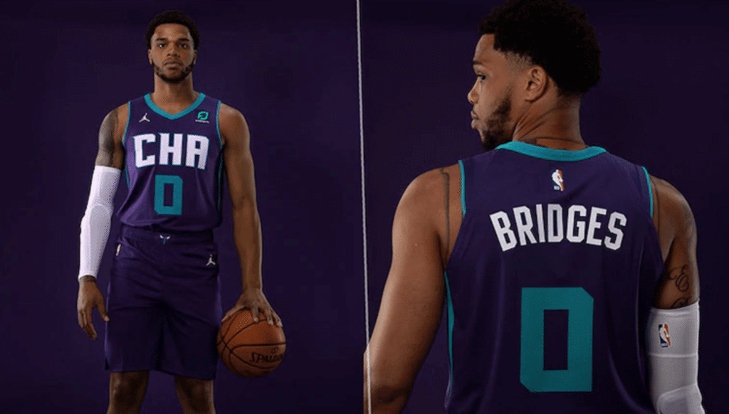
Click to enlarge
Happy October! NBA teams are holding their preseason Media Day events, and several of them have used those events to unveil their new “Statement” alternates. I had photos of the Magic’s new alternate yesterday, and today we have two more teams to consider.
Let’s start with the Hornets, whose new alternate is shown above. In this case, I’d say the “statement” is something along the lines of, “We’re pretty damn lazy,” since the design is just a slight variation on the team’s existing purple uniform.
The use of “CHA” on the chest feels tired and rote. CHA isn’t even Charlotte’s official airport code — it’s Chattanooga’s! (Charlotte’s is CLT.) The team’s party line is that the three letters are “the league’s official designation for Charlotte.”
On the plus side, there’s this:
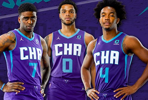
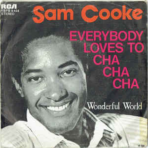
I’ll say this much: If this uniform results in the Hornets playing a lot of Sam Cooke at their arena, that will justify the uni’s existence right there.
There’s some additional info here.
Next up are the Mavericks, who’ve chosen to release their new alternate via an embarrassing video that attempts to compare the new design to a bespoke suit ordered at a tailor’s shop. Try not to laugh too hard:
As with most of the Mavs’ attire, this is nothing to complain about and nothing to get excited about. What is it about this franchise that keeps resulting in such boring, characterless designs? They’re like the Padres of the NBA.
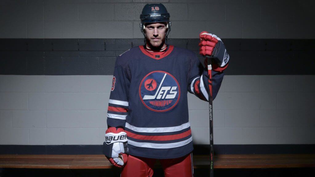
NHL Season Preview reminder: In case you missed it on Monday, the annual Uni Watch NHL Season Preview, with all of the new uniforms, logos, and center ice designs for 2019-20 (including the Jets’ Heritage Classic throwback, shown above), is now available for your enjoyment.
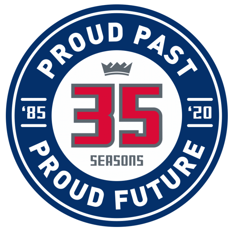
Annals of Illiteracy, continued: What’s worse than an apostrophe catastrophe? How about the Sacramento Kings’ new 35th-season logo (which you can click to enlarge, by the way), which has two apostrophe catastrophes!
It doesn’t help that the logo is utterly uninspired. “Proud Past, Proud Future” — did they have the intern write that or what? It’s not yet clear whether this will be worn as a patch. NBA uni/logo hawk Conrad Burry spotted it on this page.
As bad as this is, it doesn’t approach the NBA record for apostrophe futility, which was set by the Lakers back around 2012 (click to enlarge):
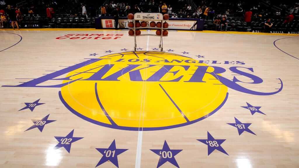
Fortunately, they later fixed it. That seems unlikely to happen with the Kings’ logo, since it’s only going to be used for one season. Sigh.
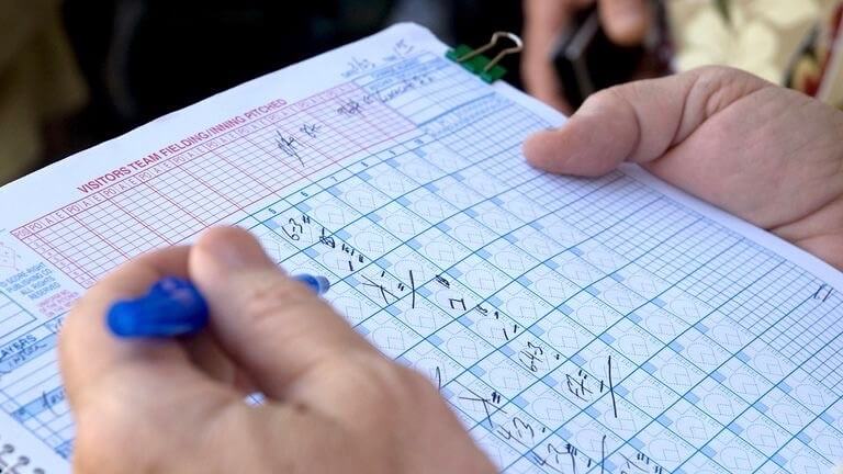
Official scorer update: In scoring decision reversals for this season.
Reader Aaron Wiens was particularly intrigued by that page. ” I spent a whole afternoon looking over it,” he says. “I ran a spreadsheet to see which teams’ scorekeepers had the most changes made (home team) and which team had the most changes made during the season (both home and away). I started to see if I could tell which team ‘complained’ the most, but as you stated, it was difficult sometimes to say who benefited from a scoring change (i.e., changing hit to error would hurt the fielder and the batter but help the pitcher, and vice versa).”
Intriguing! If you want to see Aaron’s spreadsheet, I’ve uploaded it here.
Collector’s Corner
By Brinke Guthrie
Follow @brinkeguthrie
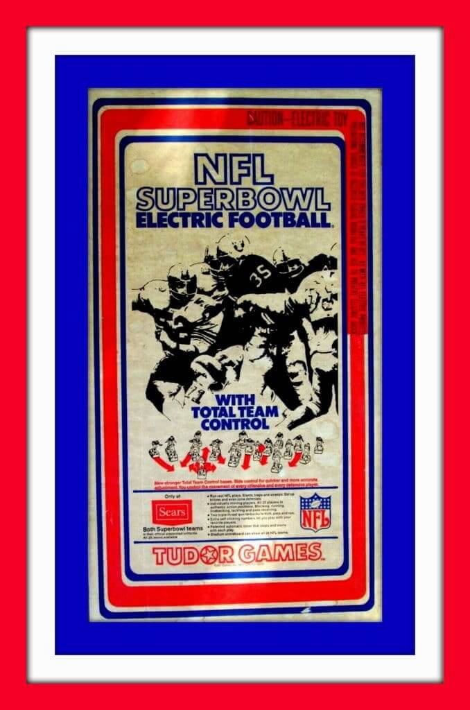
No doubt that’s the late Oakland Rayduhz running back Hewritt Dixon on the cover of this NFL Superbowl Electric Football game (with Total Team Control!). I love the breathless ad copy on the box. “Run real NFL plays. Slants, traps, and sweeps. Set up blitzes and even zone defenses!” Who were they trying to kid? Every time you’d turn on the game, all 22 guys would immediately head to one corner of the end zone and crash into one another! I never turned the thing on because the buzz was deafening; I’d just move the players around manually — worked for me! (Of course, here is the definitive website for such things; Earl Shore’s The Unforgettable Buzz.)
Now for the rest of this week’s picks:
• Speaking of the Super Bowl (two words, despite what Tudor printed on their box), Len Dawson led the Chiefs to a huge win in Super Bowl IV, and while I don’t think he went to Disneyland to celebrate, I do know he ended up as a puzzle in a can. With the indignity of a blank helmet, no less!
• Twenty-six teams (not 25, as the seller states) are shown on this 1970s MLB beach towel.
• Some terrific photos in this 1940s MLB scrapbook. [Love this one. One of the most intriguing CC items in ages! — PL]
• A few scratches toward the top of the buffalo’s head on this vintage red Buffalo Bills helmet plaque, but otherwise it’s in nice shape.
• Ever seen one of these? This is a scale-model kit of Wrigley Field, made of “pre-cut paper parts.” It’s a “precise replica of America’s favorite ballpark.”
• Here’s an entire set of 28 NFL ice cream cup helmets. (Seller says it’ll cost ya extra if you want the display board.)
• You could also get NFL cups from Slurpee. Here’s a set of 24, including the Giants’ “disco” logo.
• Has to be a New York Met as the featured player on this 1980s kids’ sleeping bag, complete with all then-current MLB team logos.
• The seller of this Vikings T shirt says it’s 1970s, but the hang tag suggests it’s more recent (that’s the mass market “Team NFL” tag, I believe). Always liked that Vikings font. I had some Sears (natch) pajamas with those logos.
• This jacket was created for a former member of the Steelers. Naturally, it’s black and yellow with “NFL Alumni — Pittsburgh Steelers” on the front. And here’s another Steelers jacket, this one a yellow youth size rain jacket.
• Mobil Gas was your sponsor for this 1970s NFL Pat Patriot glass.
Got an item to include on Collector’s Corner? Send any submissions to uniwatchcollectorscorner@gmail.com.
Show and tell: One of the nice things about getting rid of your old stuff, as I did with a lot of my collectibles when I moved last summer, is that it makes room for new stuff.
Case in point: I’ve always loved mid-century retail sales displays, and I used to have a ton of them scattered around the old Uni Watch HQ, but I sold off most of them when moving to the new digs. But I just scored this great door latch display on eBay, and I love everything about it. The lettering, the very satisfying action on the handle, the even more satisfying action on the latch — all first-rate. And only 15 bucks! An excellent acquisition.
And get this: They still make it!
The Ticker
By Paul

Baseball News: The Mets are being sued by a fan who claims to have been nearly blinded by a T-shirt cannon (from Shannon Shark). … After Sunday’s season finale, Red Sox INF/OF Brock Holt gave away all of his bats to fans outside Fenway Park (from ,@ohhhsourry). … With the regular season now completed, here’s a list of MLB teams that assigned the same uni number to three different players in 2019. … The Rangers wore blue jerseys on Sunday, but SS Elvis Andrus and OF Shin-Soo Choo changed to white jerseys after the game for a ceremony saluting the Ballpark at Arlington’s all-time greatest players. As you can see there, the players all wore period-appropriate white jerseys (from Chris Mycoskie). … There’s a guy in Philadelphia who got a Phillie Phanatic tattoo on his belly, and the tattoo artist made creative if somewhat disturbing use of his navel (from Jeffrey Jacobs).

NFL News: A couple got married the other day while wearing Eagles jerseys. … Saints LB Demario Davis was fined $7K for wearing a “Man of God” headband on the field two Sundays ago — a violation of the league’s policy against wearing personal messages. … Here’s a video showing how the 49ers made the Terrell Owens statue for the Niners Hall of Fame (from Logan Irons). … Pearl Jam’s Eddie Vedder reportedly used this Steelers-themed guitar pick. The problem, of course, is that it should be blank on one side.
College and High School Football News: Blackout game this Saturday for Ohio State (thanks, Phil). … Newport Harbor High in California has really small TV numbers. … Kansas State going with a new look this week: white helmets and white pants. “Not Snyder’s program anymore,” says RD Cramer.

Hockey News: Get ready to hear a lot of Green Day this hockey season. Boooo — the NHL should’ve inked a deal with the Zambonis instead! … The new AHL franchise in Palm Springs has a very basic placeholder logo (from many readers). … New white unis for the Ottawa 67s. Here are the old ones for comparison (from Wade Heidt). … The Blues have released photos and info for their championship rings (from Alan Kreit). … Speaking of the Blues: St. Louis police officers who worked during the Blues’ Stanley Cup run will wear Blues/Cup-themed badges throughout the 2019-20 season, which seems like a very inappropriate use of a private business’s logo. On the plus side, at least there’s no Enterprise logo (from many readers). … Lots of specialty uniforms on tap this season for the AHL’s Milwaukee Admirals (from Dylan Dooley). … New jerseys uniforms for the NWHL’s Connecticut Whale. … More hints that the Seattle NHL team’s colors may be red and black (from Ted Taylor).

Basketball News: One of Magic Johnson’s Dream Team jerseys is up for auction. … As usual, you can keep up with the latest news in NBA uni numbers by following Etienne Catalan’s Twitter feed. … Here is the Jazz’s 2019-20 jersey schedule uniform schedule (thanks, Phil). … Ditto for the Thunder. … And here are the throwback uni dates for each team that has throwbacks in its wardrobe. … Looks like the Spurs are back to using the Spur logo on their shorts. They had been using the circular “SA” logo (good spot by Roger Barajas). … New uniforms for UMass.

Soccer News: Toulouse has a blackout shirt to honor the 10th anniversary of the death of Brice Taton. “Brice was mudered by Partizan Belgrade fans while supporting Toulouse in a Europa League match,” explains Ed Zelaski. … As usual, you can keep up with lots of other news by following Josh Hinton’s Twitter feed.

Grab Bag: As of today, the U.S. Navy’s “blueberry” camouflage uniform is being mothballed. … Seattle fans have voted on the greatest sports uniform in the city’s history, and I have to say that I agree with their choice (thanks, Phil). … Oooh, check out some of the great posters at the Sports Museum in Gothenburg, Sweden. … This weekend will mark the launch of the new International Swim League, the first professional swimming league. Here are the teams and their logos (from Steve Hartsock). … Here’s rugby union player Ardie Savea explaining why he wears goggles on the field.

Click to enlarge

What Paul did last night: The Tugboat Captain has grad school on Monday nights, there are no more Mets games, and PBS’s country music series is finished, so last night I went to Manhattan to see Anthropocene: The Human Epoch, an awkwardly titled but visually stunning documentary about how humans have reshaped the surface of the Earth.
There’s incredible footage of coal mines, lithium evaporation ponds, marble quarries, rail tunnels, landfills, and a lot more — jaw-dropping stuff.
Whether you view all of this as a disturbingly unsustainable assault on the planet, a proper use of the resources God put here for us to use, or something in between, it’s a super-powerful movie. Recommended! Here’s the trailer:
re NHL music, a repeat from twitter: should just haul out “Brass Bonanza”, use the original some times and throw together some covers. I’d love to hear an Antrhax or Guns ‘n Roses take on it, for instance.
I would never in a million years have figured Gregg for an Anthrax fan!
I, of course, prefer to refer to them by their alternate band name:
link
Can we get “I Still Call them Basket of Puppies” shirts? ;)
what can i say? i like a broad range of music. besides metal and hockey go together like gin and tonic. would be pretty weird to play ska or blues at a hockey game
I hear the Dropkick Murphys in my mind now that you mention it
for NHL music, “Brass Bonanza” is already there. use the original some of the time and commission some covers. i’d love to hear Anthrax or Guns ‘n Roses take it on
I count 26 teams on the towel. I feel like I am missing something … like one of the teams listed twice?
Doh, nevermind. After the 20th re-read I now see that this is exactly what was written. There are 26 teams, not 25. That was 20 minutes I will never get back.
The towel looks way more 90’s than 70’s. That White Sox wordmark is from after they ditched the navy and red for black and white in 1991. And since the Phillies changed in 1992, that places the towel from exactly 1991.
Don’t know if we can make it to the 90s but no way it’s 70s given the Padres wordmark.
That Twins wordmark wasn’t introduced until 1987.
No, it’s the wordmark that was printed under the “batterman” logo used when Bill Veeck bought the team in the late 70s. You can tell because it’s printed in red.
Had to check my calendar to make sure it was Oct 1 and not Apr 1. Really Hornets? “CHA” on the jersey?
Looks like CHR
The “CHA” on the Hornets is pointless, the whole use of the abbreviation word mark is over done. BFBS…GFGS…how about Abbreviation for Abbreviations Sake.
At least it’s an abbreviation of the city and not some faux-insider garbage like an area code or airport code.
When the Sixers write “PHILA” on their jerseys, people like it.
That said, it’s a little pointless and I’d rather see the city name spelled out in full.
Looking at the Ottawa 67’s, the second thing I notice on both uniforms in the pictures is the vertical stripes on the pants – and not in a good way.
The first thing I noticed is, with the cut of these jersey, the bottom hem strip looks like it is some kind of pull tab on the new jerseys.
Besides the pull tab back, do consider the minor changes an upgrade with regards to the arm striping. It is strange that there is still the black border along the arm stripes on the front and not the back.
Also pleased on the barber pole uniforms that they have gone back to full barber pole socks.
link
Seeing that Ottawa-Kingston game in person would have been a little rough on the old eyeballs.
Re: “the NHL should’ve inked a deal with the Zambonis instead!” — or with Gear Daddies (link)!!!!
Giving the same number to three or more players this year? (A practice I wholeheartedly approve of, since it keeps numbers from getting too high.)
If Baseball Reference is correct, there are a lot more than just those listed.
The Yankees seem to have assigned 36 four times (Jake Barrett, Mike Ford, Kendrys Morales, and Breyvic Valera), 73 to three players (Ryan Dull [he loves these silly high numbers], Mike King, and Adonis Rosa), and 74 to four (Mike Ford, Joe Harvey, Joe Mantiply, and Breyvic Valera).
I was looking at that list a few days ago and wondering if 74 is the highest number ever issued to four players in the same season. It has to be. About the only thing higher than the home run totals in baseball in 2019 is the numbers on the players’ backs.
I can’t find the original picture, but I feel like that sleeping bag has to be a 1983 shot of Dave Kingman.
100% yes!!!
Charlotte’s airport code is CLT. You simply cannot use that as an abbreviation or even pronounce it without immature giggling. Better to just avoid the whole 3-letter code thing in general, but especially with Charlotte.
Current Texas license plates are in the AAA-1111 format I was surprised when they actually issued the CNT plates.
i’m happy to see “BFD” and hoping to get that next time i need new plates
I remember being mildly pleased when New Jersey, hip to today’s internet abbreviations, stopped issuing “WTF”.
Does anybody know if any US states issue 666 for the numerical part? I don’t think I’ve ever seen a 666 plate in the US, and have seen several overseas where this number has no Satanic connections.
But New Jersey still produced GFY plates.
With all due respect to RD Cramer, the new K-State alternative uniform looks quite fine. The notion the program no longer is Snyder’s is pure poppycock. Snyder’s stamp remains and always will. The alternative simply swaps the silver/gray and white. The helmet shell was silver/gray with a purple/white/purple NFL stripe. The new shell is white with what appears to be a purple/silver/purple NFL stripe. It still features the Powercat and is still only an alternative. (The school fight song goes “Glory in the combat/For the purple and the white/Faithful to our colors/We will always be …” Vince Gibson introduced the silver back in the ’60s. I, for one, am fine with its sometimes disappearance. #EMAW
The Charlotte, Dallas, and Orlando uniforms, added to the change in Houston, makes it seems like every new uniform is headed toward the same style. The fonts are similar, and similarly uninspiring.
Yet, still not as bad as the gold face-masks on UCLA. Those make their helmets look like something I used to get out of a gumball machine.
Finally read the NHL preview. Great stuff! I’m glad to see Florida bring back the crossed tree-and-stick logo; it’s among my favorite in the NHL.
NHL: I caught The Zambonis playing a block party before our AHL team’s home opener one year. I just wonder if “Hockey Monkey” is on every rink’s PA, the way I think it deserves to be.
As a lifelong Nutmegger I have missed the expansion of Brass Bonanza from Hartford to everywhere else. When did so many other NHL teams glom onto it?
I will at least give the Hornets credit for having the players modeling the new jerseys to be wearing 7, 0, and 4, forming the city’s area code.
Disliking the “three letter abbreviation” format for NBA jerseys is understandable enough, but suggesting there is a lack of logic to using something other than a city’s airport code for it, is a bizarre take to me. It seems rather clear that using the abbreviation that is always used in the context of the NBA itself makes the most sense, to the extent that the concept makes sense at all.
And yes, that’s all to say nothing of the obvious issues that would arise with putting “CLT” on a jersey.
I think the same way. No idea how airport codes got mixed up in this. Normal city abbreviations, while sometimes looking a little gimmicky on a uniform instead of a scoreboard, aren’t that hard to understand.
This is making me think though, Paul: Aren’t those three-letter abbreviations an example of the kind of inconspicuous sports minutiae with some surprising nuance when you look at it closely that you like to think and write about? Most of them are self-evident but there are a few interesting situations.
For instance, I’ve noticed for the Jacksonville Jaguars some places use “JAX,” which is effectively a way to incorporate the phonetic information of five letters into three. But then others use “JAC,” presumably because it seems a bit gauche to incorporate a letter into it that isn’t actually in the real name at all (especially since X is clearly the tackiest of letters). Another one: how for the Chicago White Sox some sources use CWS and some use CHW. The first one is alliterative and intuitive in that sense; the second one maintains consistency with the Chicago team format established by the Cubs who are always CHC. Which takes precedence? Clearly we haven’t all agreed. I’m sure there are more examples of this kind of thing other than the ones I thought of off the top of my head.
For the out of town scoreboard, Lambeau has used HST instead of HOU for the Texans, and it always takes me a beat to figure it out
Martina and Brian, I’ve always liked how those abbreviations aren’t 100% standardized. The Mets’ schedules in the ’80s used to use MON and PIT for Montreal and Pittsburgh, focusing on the first letters, whereas those of the Cubs used MTL and PGH, going for the beginning and ending.
Both valid, both understandable.
Somehow I don’t like abbreviations that incorporate the team nickname. I’d rather see CHI (N) and CHI (A) for the Chicago teams, but if you’ve only got three spaces to work with, and there are going to be interleague games, I supposed that’s impossible.
Cleveland can be CLE or CLV.
Washington can be WAS or WSH.
Baltimore can be BAL or BLT.
Back to the NHL Season Preview. After seeing it on TV during games, I really like the updated Stick-in-Rink shoulder patch on the blue jerseys. Looks better than I expected and is a shout out to back in the 1970s when they would go white rink and blue stick with the logo on a blue jersey.
However, they should have kept the white stick and blue rink for the shoulder patch on the white jersey.
There’s no way the Mavs release a uniform that doesn’t have Cuban’s seal of approval. If they’re consistently underwhelming—and they are—it’s because that’s what he wants.
They had to spend more time on that video unveil than they spent on the actual design.
Looking at the Milwaukee Admirals link, I couldn’t help but notice that they indicated their red 2000s throwbacks and their blue 1980s-90s throwbacks both as “Calder Cup Champs” throwbacks. However, the blue throwbacks are from when they were in the IHL. They didn’t join the AHL until the “I” folded in 2001.