Click to enlarge
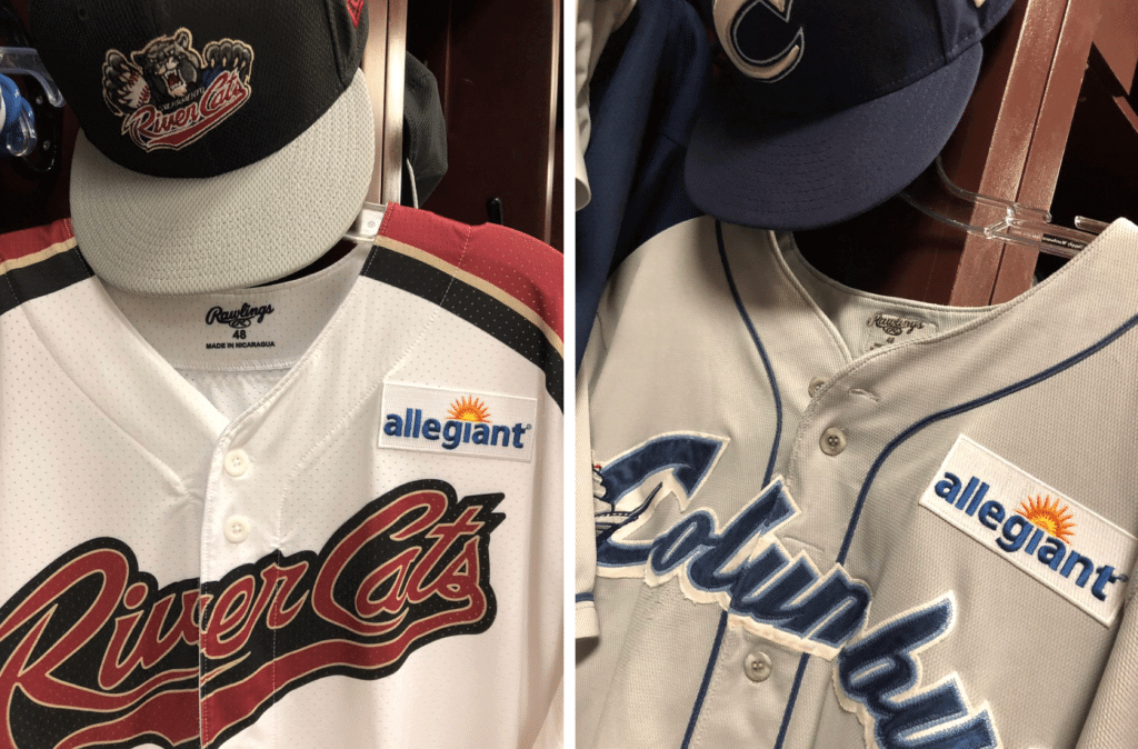
Distressing news yesterday from Minor League Baseball, which announced that the two teams competing in tonight’s Triple-A Championship Game — the Columbus Clippers and the Sacramento River Cats — will be wearing advertising patches on their jerseys.
Man, does that look like shit or what? I considered giving it the Mr. Yuk treatment, but I decided it was worthwhile to show just how awful the ad really looks.
To put this in some perspective, it was only last year that I wrote about how the Triple-A Syracuse Chiefs saluted the Brannock Device by becoming the Syracuse Devices for one game. As I wrote at the time, they had wanted to be the Syracuse Brannock Devices but weren’t allowed to do that because “that’s a commercial trademark and would violate MiLB’s rules against advertising on a uniform.”
I guess those rules have been revised just a tad.
Of course, MiLB’s press release doesn’t refer to the ad patches as ad patches. In fact, the word “advertising” doesn’t appear in the release. Instead, the ad patches are described as a “Historic On-Field Jersey Partnership.” Here’s the money quote, from Pacific Coast League prexy Branch Rickey (grandson of that other Branch Rickey): “[W]e are interested in the possibility of this leading to future on-field jersey sponsorships.”
You don’t say.
As has been previously reported, MLB is considering the addition of uniform ads, with a potential 2022 start date. This appears to be the first blow to soften people up for that eventuality.
As you may recall, the NBA eased into the world of uniform advertising by using it in the All-Star Game for two seasons before instituting it in the regular season. I suspect MLB will take a similar route, with uni ads appearing in the 2020 or 2021 MLB All-Star Game. (Just to be clear, I have no inside info on that. Just thinking out loud about what seems like the next logical step.)
It’s amazing what people are capable of when their shame gland has been removed.
(My thanks to Bob Andrews, who was the first to let me know about this.)
Fortunately, I was watching the country music documentary on PBS: Tough game to watch last night in the Meadhowlands, in more ways than one. The less said about it the better, but there were a few uni-notable tidbits:
• The Jets went with ugly black end zones, to go along wtih their ugly black uniforms:
Black jerseys tonight for #Jets. Black end zones. pic.twitter.com/76IdRAyOZR
— Connor Hughes (@Connor_J_Hughes) September 16, 2019
• Lots of people pointed out that both teams wore their city names across their chests. When’s the last time that happened in an NFL game? Has it ever happened in an NFL game?
• The refs made Browns wideout Odell Beckham Jr. leave the game in the first quarter due to what was reported to be an illegal visor. but there seems to be some confusion regarding the specifics of the illegality. Many reports indicated that officials said the visor was tinted. Now, it’s true that Beckham wore a tinted visor (and a purple compression sleeve, and his treasured very expensive watch) during pregame activities. But he didn’t wear that in the game. In fact, he was definitely wearing a clear visor, not tinted, while making the one-handed catch just before the officials sent him off the field.
Here’s video of that play. Still looks clear to me (with some reflection from the stadium lights):
YOU KNEW OBJ WOULD DO THIS IN NEW YORK
(via @thecheckdown)pic.twitter.com/5ADCjlYZ2r
— Bleacher Report (@BleacherReport) September 17, 2019
People on social media speculated that he was sent off because that clear visor didn’t have Oakley maker’s marks. But when he returned with a new visor, that one didn’t have the logo creep either.
So the specifics of the illegality are unclear, at least to me. But whatever — enough OBJ. Let us never speak of him again (until, you know, his next soap opera).
Can’t un-see it (unless you already saw it): Phil tells me the whole world already knew about this, but I didn’t know about it, and the large number of people tweeting it at me suggests that lots of other people didn’t know either. So I’m just gonna leave this here:
If you turn the Chicago bulls logo upside down it’s a robot having sex with a crab pic.twitter.com/KGfsqyr3Ml
— Deniz Camp @ SDCC (@MDesaad) September 14, 2019
Click to enlarge
Collector’s Corner
By Brinke Guthrie
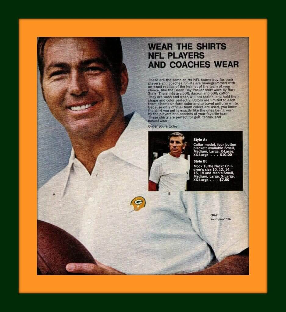
The Packers held a ceremony two days ago to honor their late, great quarterback Bart Starr, who passed away earlier this year. Bart was the, uh, star of this print ad for NFL polo shirts. “The same polo shirts NFL teams buy for their players and coaches!” Another salvo: “Because only official team colors are used, you know the shirt you get is exactly like the ones being worn by the players and coaches of your favorite team.” Well, that settles that.
Now for the rest of this week’s picks:
• Notice this late-1970s Rawlings Seahawks helmet for kids. They wrapped the decal striping around the back, something they didn’t initially do for the on-field helmets (which always bothered me).
• Ah, this sign brings back memories of Riverfront Coliseum in Cincinnati: With a 1970s interior done up in classic Brady Bunch brown and orange as I recall, it was the home for the WHA Cincinnati Stingers, as immortalized on this neon sign.
• This 1960s glass has a football player on it and says “Cowboys,” but no team logo or uniform detailing to suggest it’s a team item. The seller mentioned “Cornell Green” in the auction headline, and Mr. Green did indeed wear No. 34, but that’s a stretch.
• This 1970s baseball glove has the Cincinnati Reds “running man” logo on the wrist strap.
• Here’s a 1970s photo of Jarry Park in Montreal, original home of the Expos. Look how small that stadium was! When the Expos started play in 1969, capacity was 28,500.
• The “SF” decal on this 1970s Niners helmet plaque is a bit faded, but otherwise this is in good shape.
• Had this! A 1971-1972 Pro Football Hall of Fame appointment planner. Didn’t have too many appointments when I was 11, but I loved the cover art and the inside photos, and that’s all that mattered.
• Back in the day, cartoonist Jim Davis used to market the heck out of his Garfield cartoon cat. (I had a Garfield Bengals Christmas ornament from Big Lots.) Here Garfield shows up on this Vikings mug as a “fan-atic.”
• One more for the Vikes — this 1970s garbage can decorated with the Vikes helmet. One of the few I’ve seen on eBay that’s not consumed by rust.
• Tom Brady is deservedly The Man in New England, but once upon a time (1975-1990), that title belonged to Steve Grogan. His No. 14 is shown on this Sears Patriots jersey. Grogan performed the rare feat of playing in the NFL for 15 years, all with one team, the Pats.
Got an item to include on Collector’s Corner? Send any submissions to uniwatchcollectorscorner@gmail.com!
Click to slightly enlarge
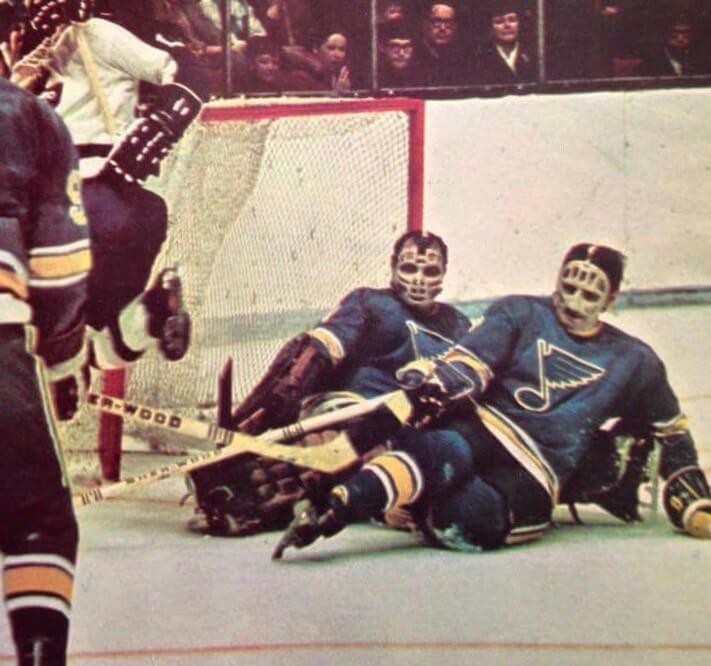
Who was that masked man were those masked men?: I have a feeling we may have seen this before, but once more won’t hurt: Check out the amazing double-mask action in this 1970 Blues photo!
Here’s another shot:
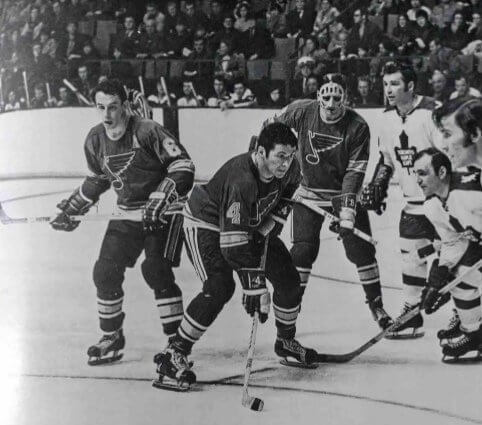
In the first photo, the masked non-goalie’s glove has No. 8, indicating that it would be defenseman Barclay Plager. But according to this newspaper article, it was actually his brother Bob, who was rehabbing a broken nose. Either way, it’s unusual to see an NHL player wearing a goalie-style mask!
(My thanks to Jerry Wolper for bringing the first photo to my attention, and to @Casual_Mats and Tom Hawthorn for the second photo and the newspaper article.)
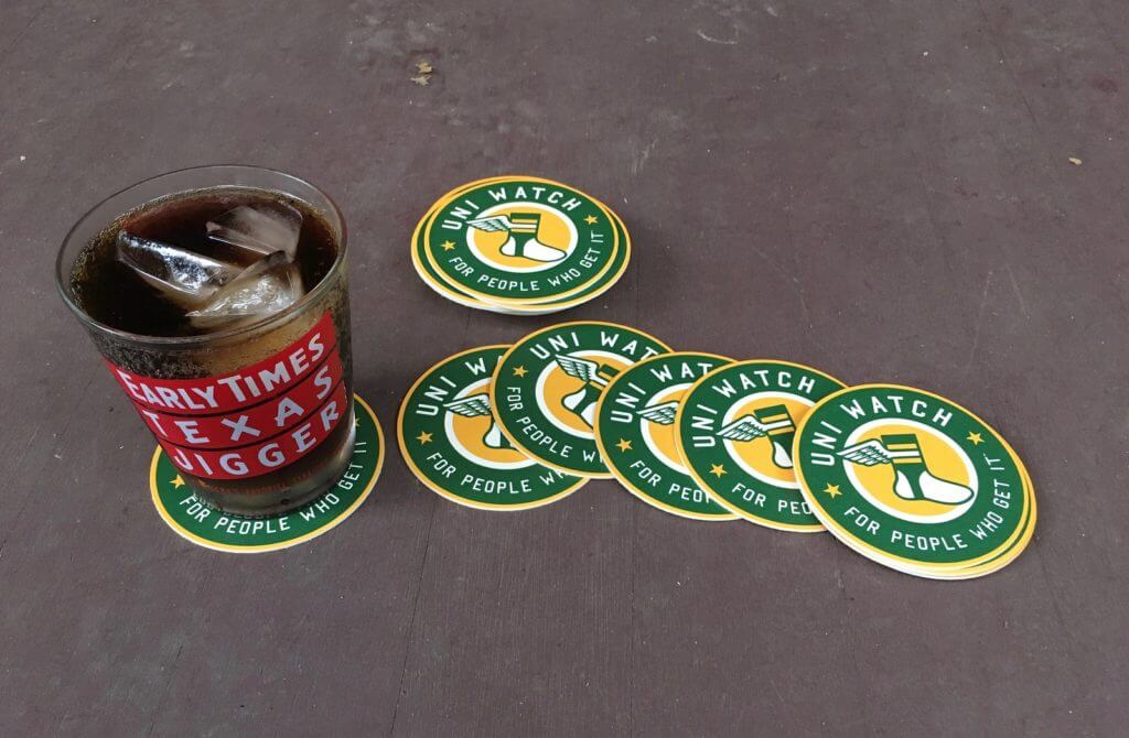
Click to enlarge
ITEM! Uni Watch coasters: A coaster manufacturer was offering an introductory deal, so I thought sure, why not? The UPS man brought them yesterday just as I was sitting down on the front porch with a Diet Coke. They look great!
I only have a few dozen of these. I’m going to sell them in groups of three — three coasters for 10 bucks, including shipping. For non-USA orders, it’ll be three coasters for 12 bucks. One order per person — no hoarding!
To order, send me the appropriate amount via Venmo (use @Paul-Lukas-2 as the payee) or Zelle (plukas64@gmail.com). If you want to use Apple Pay or a paper check or well-concealed cash, or if you’re not in the USA and can only use PayPal, get in touch and I’ll give you the appropriate info.
After paying, email me with your shipping info. Thanks.


ITEM! Stirrup raffle: An anonymous reader has 10 pairs of old stirrups and has generously offered to raffle them off to Uni Watch readers. You can see all 10 pairs here. Note that each pair is numbered.
To enter this raffle, Send an email to the raffle address by 10pm Eastern this Thursday, Sept. 19. In the body of the email, please indicate (a) your name and shipping address and (b) your preferred stirrup choices, in order of preference, by number. If you’re only interested in one pair, just list that pair’s number; if you want to list more than one, you can do that too, all the way up to 10 choices. I’ll do my best to accommodate all the winners’ preferences.
One email per person. I’ll announce the winners on Friday. Please join me in thanking our anonymous benefactor!
The Ticker
By Alex Hider

Baseball News: The A’s celebrated Mexican Independence Day by wearing Atléticos jerseys. Note that the Majestic maker’s mark was white on white. Also: No MLB 150 patches (from Jakob Fox and Samuel Lam). … That game also featured very visible evidence of Sunday’s Raiders game (from Ramon Meza). … Speaking of which, here’s a good article on what it takes to convert the stadium from football to baseball (from @brianspeaksnow). … Mets 1B Pete Alonso’s cap appeared to be squatchee-free last night. … Back in 1969, when the Japanese team now known as the Chiba Lotte Marines was called the Tokyo Orions, Pepsi wanted to name them the Pepsi Orions (from Jeremy Brahm). … Did you know that bluegrass music pioneer Bill Monroe once had a barnstorming baseball team? It’s true. Too bad the uniforms weren’t better, eh? Additional info here (from Max Weintraub).

NFL News: It appears the Chiefs may have an old-school field paint scheme at Arrowhead this weekend (from Ryan Smith). … Bojangles is using blue and black boxes as part of a Panthers tailgate special (from Joel). … Joseph Bailey was watching old Browns/Niners highlights on YouTube and noticed the end zones — in San Francisco — included the Browns nickname and Brownie the Elf. He says he thinks the game was in 1970. … A new Baltimore restaurant’s dress code bans all sports jerseys except Ravens and Orioles jerseys on game days (from Carrie Klein). … One on of the segments hosted by Randy Moss on Monday Night Countdown last night, the accompanying graphic showed him in a modern Vikings jersey that he never wore in his career (from Caleb Pardick).
College Football News: Oklahoma coach Lincoln Riley must have something against collared shirts. He hasn’t worn one yet this season (from Sam McKinley). … Weber State’s pants have a big ol’ logo on their butt (from Brice Wallace).

Hockey News: If this retail listing is to be believed, the Bruins will have a new alternate sweater this season — and it appears to be brown and gold (from Kenny Saidah). … The Estevan Bruins of the Saskatchewan Junior Hockey League are responding to criticism of their all-white (and I mean all-white) away jerseys (from @BootedBlog). … We have our first on-ice look at the Sabres’ 50th-season patch (from James Trexler). … An old Zamboni with Hartford Whalers graphics recently ended up in a Hartford scrap metal yard.

Basketball News: The Nets are having a jersey giveaway that will include not only the basic front-chest ad patch but an additional ad on the back (from Christophe Davy). … Speaking of the Nets — could these be their new “Statement” jerseys? (From Etienne Catalan) … Wizards new G/F C.J. Miles will wear No. 34 (also from Etienne Catalan). … New floor for Stony Brook (from Alex Peck).

Soccer News: Spurs F Harry Kane wears white tape on his ring finger during games (from Josh Hinton). … Also from Josh: Women’s club CD Tacon, who will be rebranded to become Real Madrid, removed the Real Madrid printing/numbers after their humiliating 1-9 loss against rivals Barcelona. … Scottish team Stranraer has a new third kit (from our own Jamie Rathjen). … USL League One’s Forward Madison FC and NPSL’s Milwaukee Torrent have a new rivalry logo for the “Astonishingly Shiny Cup Of All Cups” (from Scott Rogers). … One more from Josh Hinton: We’ve all seen the basketball floor to hockey rink time-lapse. But have you seen a baseball field to soccer field time-lapse?

Grab Bag: This piece offers great behind-the-scenes tennis insights from the US Open. Apparently Justin Gimelstob was one of the “sweatiest” players of all time (from Brinke). … Fun project from Hunter Hook: Collegiate logo mascots stripped of all their hair. … Harvard Business Review has a new study about which logos are most effective (from Mike Chamernik). … “I just read a new book called One Way Ticket: Nine Lives on Two Wheels, by former cyclist Jonathan Vaughters,” says Bernie Langer. “After he retired from cycling, he founded a new team, which has been known in various iterations as Slipstream, Garmin, Cannondale, and now EF Education First. Despite all the name changes, the team is known for the argyle motif on its kits, and the book has a very interesting backstory on that. It’s a bit to read, but it’s worth it.”
Until now, I always saw a robot reading a book when the Bulls logo is turned upside-down. Can’t unsee this. Like the old Red Dog beer logo and Batman…
I’ve always heard/seen the robot reading a book, as well. I have a feeling that will be changing in the future
1) Yes, the MILB ad patch looks horrible.
2) While there were many, many bad things about the Jets/Browns last night, I did think the Jets’ helmets looked good under the lights.
I thought the Jets looked like they were playing in all black most of the game.
The ad patch looks horrible, but it is differently horrible on each uniform. The Clippers’ placket piping – the headspoon – makes the patch appear larger and more obtrusive on their jersey. So if/when MLB adopts this kind of advertising patch, placket piping will go from my favorite jersey decoration to my least favorite.
More awful than the ad patch is the River Cats cap logo.
Just put the ad patch on the front of the hat.
Also of note, 60 Minutes did an entire piece about how Allegiant is the most dangerous airline in America and no one who works in the airline industry will step foot on their planes.
link
1.) I don’t see it
2,) You all are cases for failing a Rorschach test if that is what you see
3.) Did you ask permission to rotate it?
I guess that’s settled, then.
Very easy to see.
It looks like the Chiefs won’t go fully with the Municipal Stadium design by not marking the goal line with a G. That was fairly common around the league through the 1980s but might not be allowed now.
When it comes to marking end zones, I miss the unique way how the Edmonton Eskimos used to do it for so many years at Commonwealth Stadium. I mean, the goal line really is the 00-yard line right?
link
OBJ was told to change his visor because the tint was gold not the pink that is allowed. He also wore a different watch than the Titans game. This one was only $2.02 million
Look at the photo I linked to and the video in the embedded tweet. I see no gold there. Do you?
That video it looks ok. Other photos I’ve seen have shown some tint. I work in high school where NO tint is allowed and it’s kinda crazy how from some angles they look clear and others they seem opaque. Most likely the officials were warned to watch out for his visor this week after photos from Week 1 showed an illegal gold tint from a non-league sponsor provider.
I absolutely see gold/amber in the photo of the one-handed catch you linked to.
Look at your photo, at the forehead pad thing, it looks yellowish… Then look at your after the change photo… Looks white there. You can’t focus on the visor, you have to look through it to see what it affects.
The Uni Watch coasters are very nice, but I still call them beermats.
Mwah ha ha
While I appreciate the work that went into the pro-Jets black uniform piece from over the weekend, I’m glad that opinion doesn’t seem to be pervasive. A black jersey was simply added because the team wanted to be able to sell more jerseys.
That shade of green looks good with black, but the jersey is completely unnecessary, and therefore stupid.
I think the point that was missed on that piece was that it was BFBS when the Jets first added it. It’s not as though that was something invented in the 21st century. (Looking at you, Jerry Glanville)
That’s exactly right. It’s also an example of someone buying into the story invented by Nike/teams in order to attach symbolism to new uniform elements. Black was not added as a color to signify “grit.” Black was added because the Jets want to sell more jerseys.
The Falcons were born with black jerseys and it’s always been a team color…I’d give Glanville a pass.
I’ll never unsee the Bulls logo thing. Thanks Universe. :-(
The bruins jersey is black, not brown. The page states ” Boston Bruins Brad Marchand Black 2019-20 Third Jersey”
The Bruins sweater has already been marked down from a very low price of 99.99 to a ridiculously low price of 59.99. Pretty fishy if you ask me.
My opinion… the name of the city across the chest of an NFL jersey is one of the most amateur-hour things in professional sports. Looks like a high school team.
…well, we are talking about the Jets and Browns here…
Agree. The small wordmark logos with the nickname look fine. The large honking letters with the city name look too much like college football. I’m wondering if since Nike is so adverse to having things look “plain” and with the lack of sleeve space in modern jerseys to put things on, they figured the chest is the best place to vomit all of their nonsense onto? For my money the best looking teams are the Packers, Bears, Raiders, Chiefs, 49ers, and Colts. And you don’t see any of those uniforms using all of these gimmicks.
The Bruins jersey is black and this information has been out for about a month and a half.
link
The way I am reading the linked dress code pic, there are no jerseys except on Orioles/Ravens game days. Nothing actually says they have to be Orioles/Ravens jerseys. I think I would intentionally wear their opponent or some random team.
I don’t watch the NFL, but we have a “wear your football jersey to the office” day at work, and I wear a soccer jersey every year just to be contrarian.
That’s how I interpreted that policy, as well.
NHL jersey sponsorships by 2021, just thinking out loud. It will jump species fast.
Camping World or MGM resorts jersey partnership for 2020 postseason, who knows – maybe 2019.
Greasing the skids.
Kurt not wrong.
1970 was the last year the 49ers (celebrating their 25th season) played at Kezar Stadium.
After a quick look at week-in-review videos from 1970, it appears that all visiting teams were provided with team name/logo endzones.
A little reminder of a time when sportsmanship and respect underpinned our national love of sports.
Things weren’t so marketed and overblown (social media), and we kept our games in the proper perspective.
Imagine the outcry if an end zone was given to the opposing team today.
Odd story about that Zamboni with the Whalers marking. Said it was originally shipped to Bellmore, NY, which would have been Newbridge Road Park Ice Rink, where I played my youth hockey and beer league hockey!
-Jet
Why is there not more outrage about the baseball jersey ads?! Sound the alarm, people! This cannot happen to MLB!
Also they look SO last-minute and rushed. I really hope this rectangular, contrasting patch is not the result of careful thought and extended league-company negotiations.
What a woeful execution of a woeful idea.
the ad is a turd in the punchbowl, there shouldn’t be any effort to make it look like a garnish
a couple weeks ago i commented on twitter that i found an ad on a CFB goalpost to be a stupid eyesore. the overwhelming response was pro-ad.
A day late…
Yesterday in the Comments section someone wondered what were some of “the most famous games (Top 5 maybe) that were played with infield dirt.”
The first Monday Night Football game (Jets at the Browns) certainly qualifies and was certainly easier on the eyes than last evening’s matchup!
Proofreading (Baseball Ticker):
“One on of the segments hosted by Randy Moss…”
Extraneous ‘on’?
And by “Baseball Ticker”, I of course meant “NFL”. Ugh…
On the Baltimore restaurant dress code, the way I read it, jerseys are only allowed on Orioles/Ravens gamedays, but it doesn’t explicitly say they have to be Orioles or Ravens jerseys. Maybe I’m being pedantic, but that seems relevant. Unless I’m missing something.
As a Columbus area resident and a fan of the Cleveland Indians, I was looking forward to the Triple A championship tonight. Now? Not so much. That ad is ridiculous and ruins one of the more tasteful jerseys in MiLB.
I can’t wait until next year when the Browns change uniforms. The Jets looked even worse. Both teams should have stayed with their simple and classic uniforms they had been sporting.
Uni Watch beer/can coozies would pair nicely with those coasters Paul.
Just can’t see MLB putting ads on uniforms without outraging its fan base. Unlike the NBA, MLB has fans who will get upset at the smallest change. There are still people griping that Ruth ruined the game with all those dang home runs. There are now people staying away from the ballparks because of extended netting.
Yes, we have ads on Triple-A baseball uniforms and the Jets in black on Monday night. Though all is not is all bad in the uni-verse.
A beautiful moment occurred in the uni-verse when the Vancouver Canucks took to the ice last night in the blue uniforms in Victoria. I was so satisfied to see my team skate around with the “Vancouver” script finally off the jersey. Blue stick with white rink for the shoulder patch looking quite good on the blue uniform.
link
Other one I saw for bulls logo is it’s a robot pulling his butt cheeks apart ♀️
Re: Sears Patriots Jersey…these Rawlings youth NFL jerseys used to really frustrate me when I was a kid, because A.) The team nickname was plastered across the chest. Even at 8, I knew no NFL team had anything but numbers on the front of their jerseys. B.) the numbers were one color, no outline when applicable, such as Bears, Patriots, Oilers, etc. I would remedy this oversight with a magic marker. C.) Long sleeves. I realize some NFL jerseys would sometimes feature sleeves longer than 1/4 length (why does Jack Ham come to mind?), but I usually had these jerseys with a quarterback’s number. So I would promptly take scissors to the sleeve ends, snipping right at the end of the sleeve stripe. Of course, these were the only option back then. Certainly kids have much more accurate representations to choose from these days.