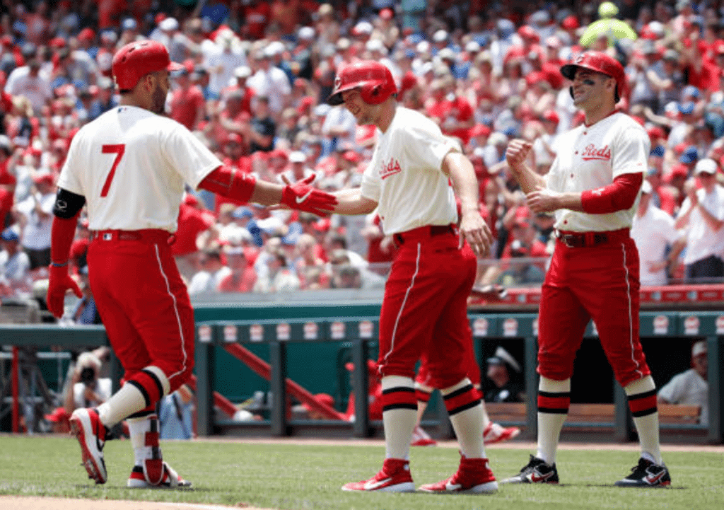
The Reds had their latest 150th-anniversary throwback game yesterday, and it was the one I was most excited about, as they turned back to the clock to 1936 and broke out the red pants. They did not disappoint — I love this look.
The team’s website provides the backstory on this unusual uni:
One of the most unique uniforms ever worn by the Reds was the style that was known as the “Palm Beach” by the uniform’s manufacturer, Cincinnati-based Goldsmith & Sons. This uniform was an attempt to offer players a lighter-weight alternative to the heavily flannel jerseys that were the norm at the time. The open-weave fabric construct of the Palm Beach was designed to make the uniforms more breathable during the hot Cincinnati summers.
And here’s some of the reaction that these uniforms generated back in 1936.
There were some interesting details that you wouldn’t have guessed from looking at the Okkonen mock-up, including red jersey buttons and cream stirrups worn over white sannies (for all of these, you can click to enlarge):
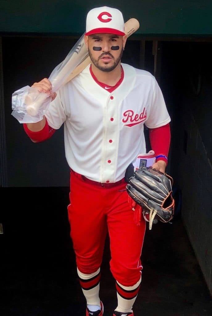
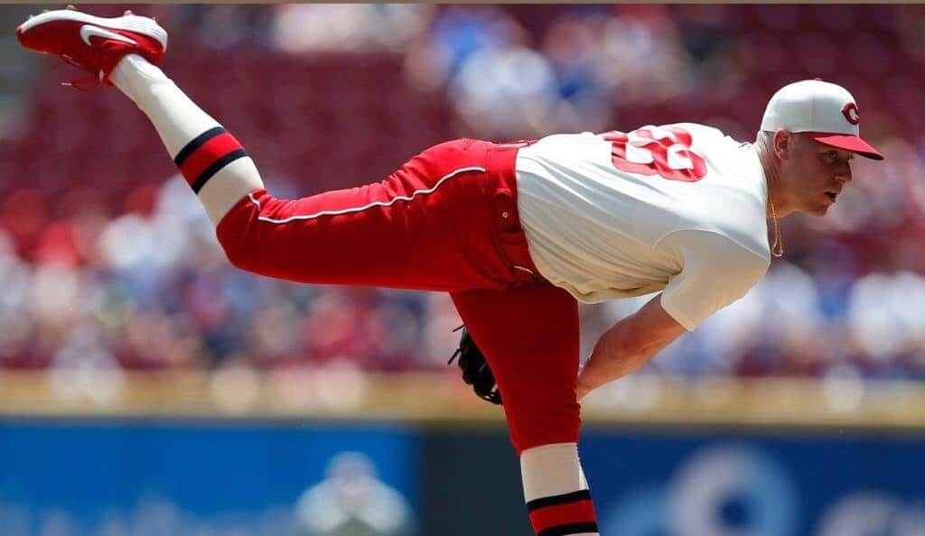
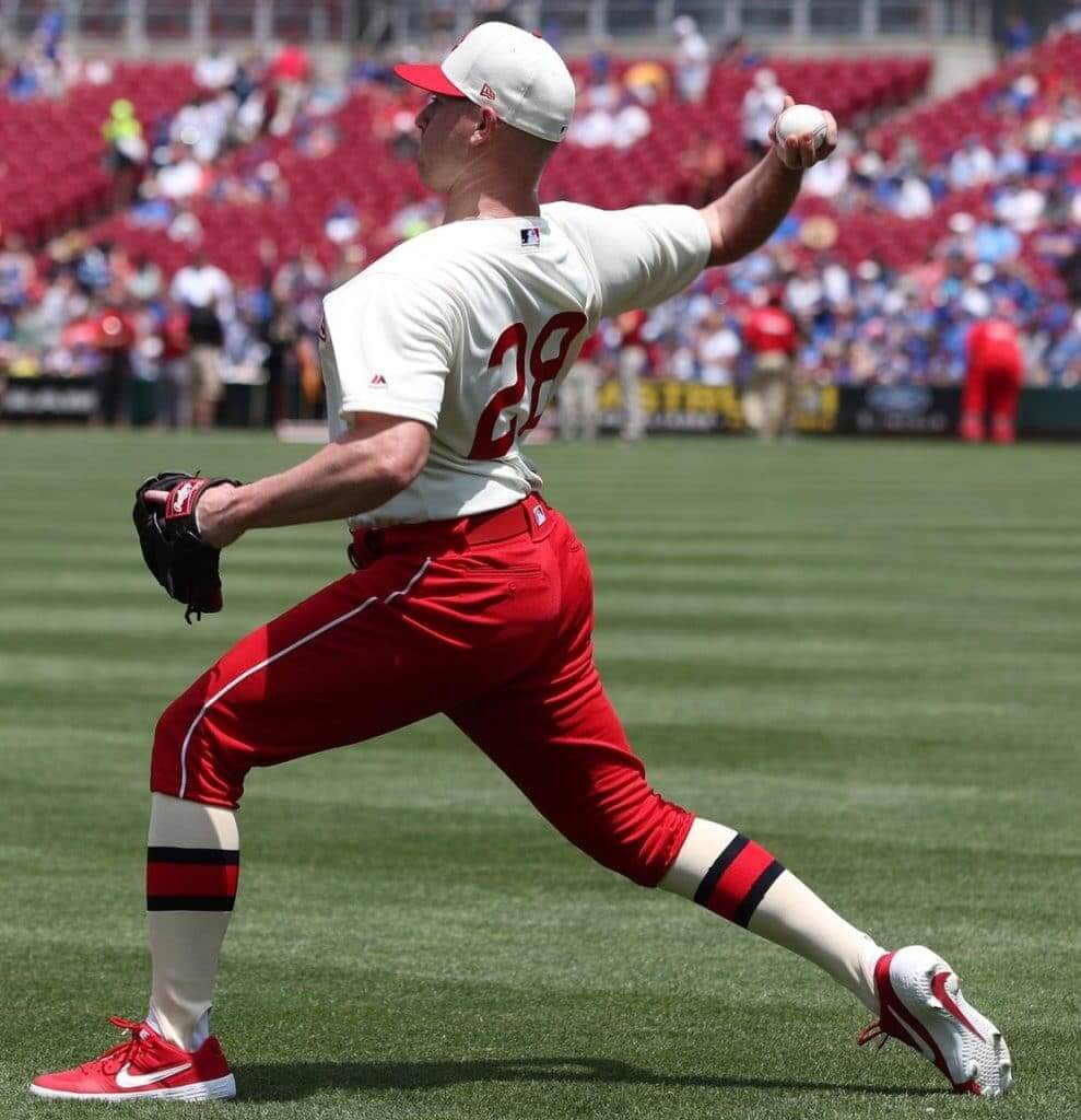
I suspect the stirrups and sannies were the same color back in the day, but they probably couldn’t get cream sannies for yesterday’s game — hence the slight hosiery mismatch. (The could have gone with true white stirrups, of course, but then the stirrups wouldn’t have matched the cream jerseys.)
Here are two short highlight clips showing how the uniforms looked in action:
Lookin' like Saint Nicholas.#BornToBaseball pic.twitter.com/Mm4JtOtBHB
— Cincinnati Reds (@Reds) June 30, 2019
Numbers on that Geno 💣:
🔴 457 feet
🔴 112.2 mph exit velocity
🔴 26º launch angle#BornToBaseball pic.twitter.com/T45Whn9SE5— Cincinnati Reds (@Reds) June 30, 2019
You can see lots of additional game photos here.
I wouldn’t want to see this look on the field every day, but it would make an awesome Sunday throwback. Of all the retro designs that the Reds are wearing this season, this is the one I hope they bring back as a full-fledged alternate, not just an anniversary one-off.
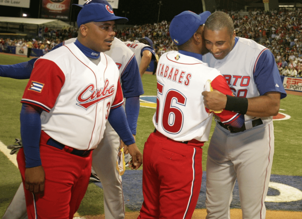
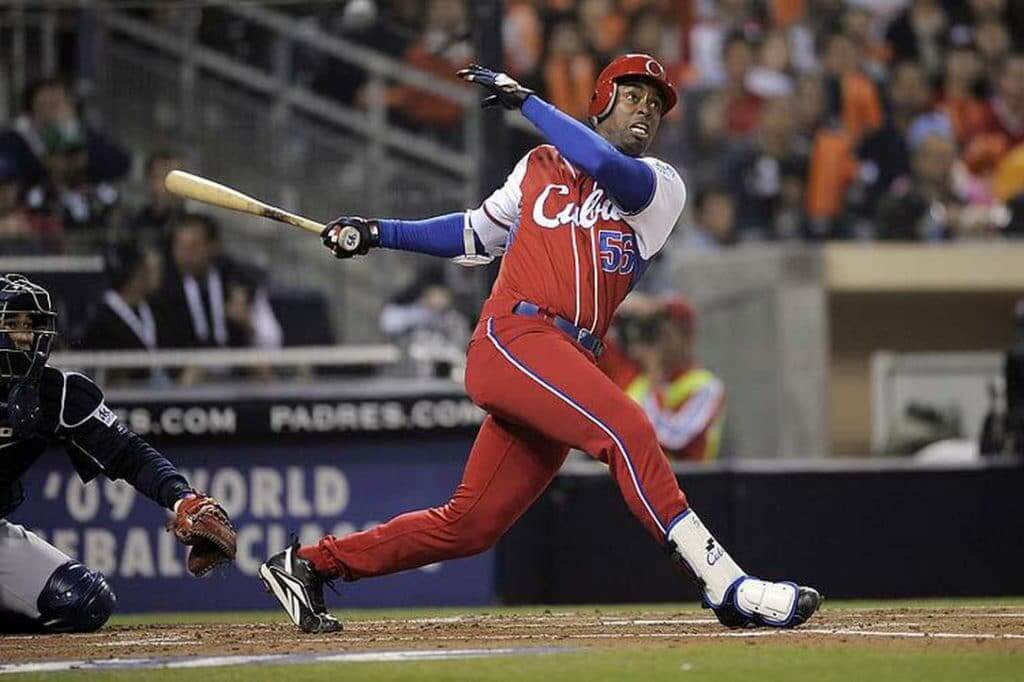
If you’re thinking you may have seen red baseball pants before but can’t quite remember where, you may be thinking of the World Baseball Classic, where Cuba has often worn red pants and even gone mono-red:
Next up on the Reds’ throwback carousel: this 1939 design, which they’ll wear this Saturday, July 6, against Cleveland. That’s the same day the Nationals and Royals will be wearing throwbacks, so it’ll be a very retro-styled day on the diamond.
(With thanks to Tyler Nees for the 1936 quotes.)
Click to enlarge
The most Mets thing ever: The Mets have been dealing with all sorts of dysfunction and disarray lately, but they really topped themselves when they held a 50th-anniversary reunion of their 1969 championship team prior to Saturday’s game.
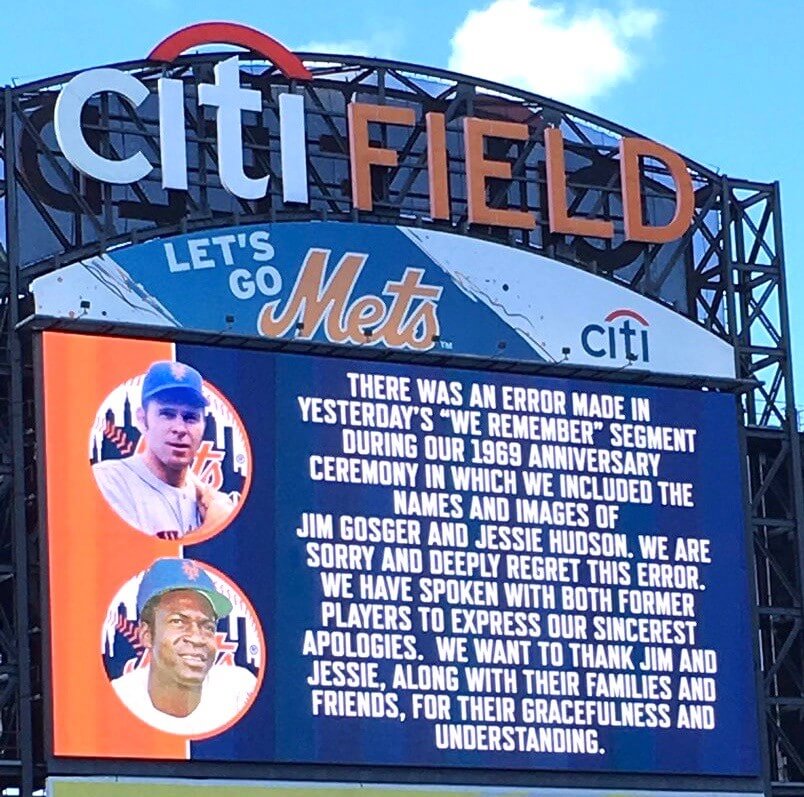
Most of the living members of the ’69 squad were on hand, and there was a nice scoreboard salute to the ’69ers who had since passed away. Just one problem: Two of the players who were listed as deceased — outfielder Jim Gosger and pitcher Jesse Hudson — are still very much alive.
It’s hard to imagine how anyone — even the Mets — could be this incompetent. Major League Baseball players have their birth and death dates tracked more closely than any other segment of the population I can think of. An eight-year-old with no knowledge of the ’69 Mets — or even no knowledge of baseball — would have been able to determine that Gosger and Hudson are still among the living.
But wait, it gets better: Prior to Sunday’s game, the Mets posted an apology on their scoreboard (shown above) — and misspelled Hudson’s first name. (Also, the operative word in the last sentence should not be “gracefulness” but “graciousness,” or even just “grace” — as in, “Gosger and Hudson showed grace despite the Mets’ disgrace.”)
You can’t make this shit up. If it were in a movie script, the studio would say, “You have to trim that back — it’s not believable.”
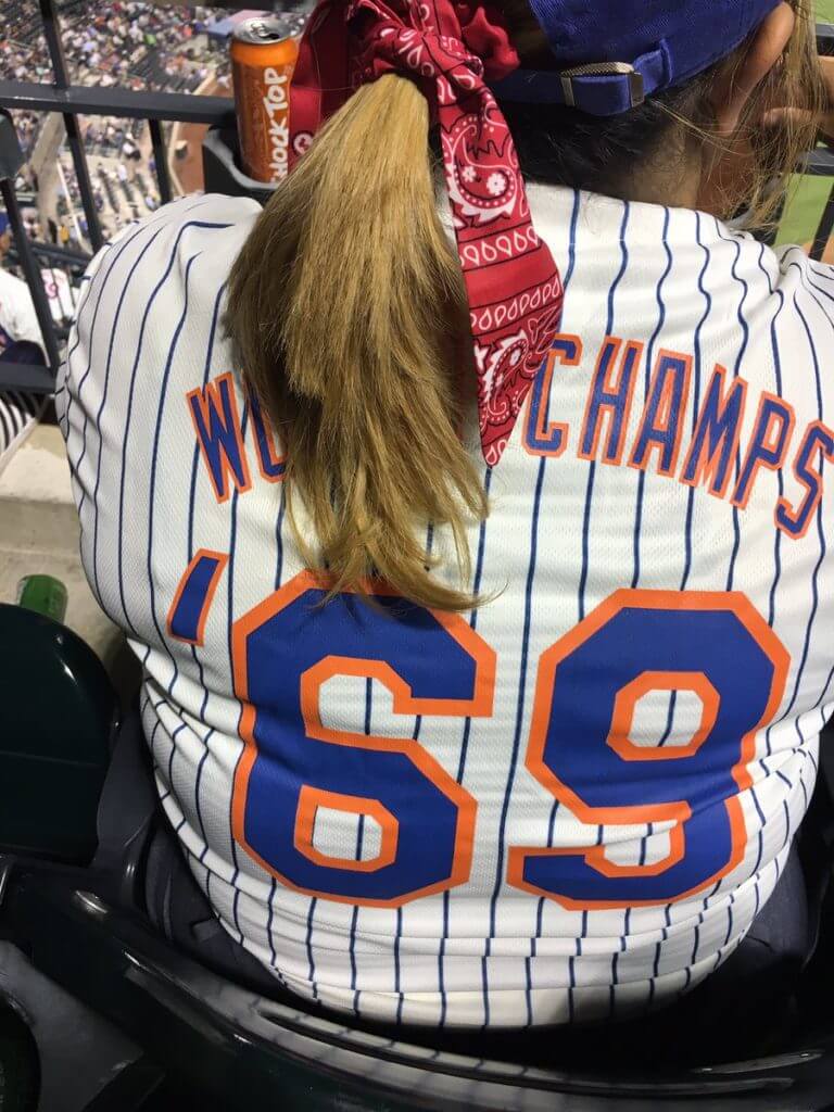
And for good measure, the replica jersey that the Mets gave away to fans on Saturday had an upside-down apostrophe (click to enlarge):
They’re still my team. But man, they make it really, really hard.
(My thanks to Alan Kreit for both of the photos in this section.)

Bengals contest reminder: In case you missed it last week, I’m teaming up with Sports Illustrated for a Bengals-redesign contest. Full details here.
Click to enlarge
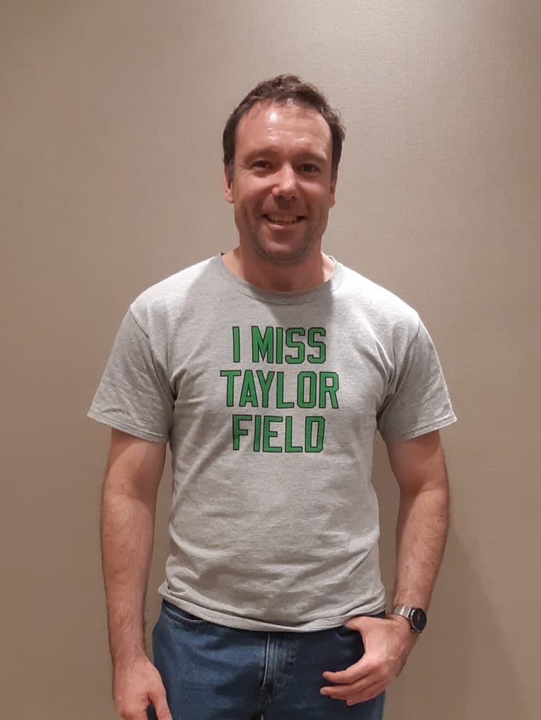
Meet the Contributors: Welcome to the latest installment of “Meet the Contributors,” as I continue to spotlight readers whose names may be familiar to you from their Ticker contributions.
Today we’re saluting reader/contributor Wade Heidt, who tends to specialize in Canada-related Ticker items — junior hockey, box lacrosse, curling, and, especially, the CFL. Naturally, he has a Canucks-themed membership card. I’ll pass the mic to him now:
I am 43 years old and live in Vancouver, British Columbia. I work as a home insurance agent.
I can’t exactly remember how I learned about Uni Watch. I discovered the website in the early part of this decade and have been pretty much a daily reader since then. The first few years I just followed as a reader. The first time I made a contribution was when I participated in in Power Ranking the Canadian Cities, organized by Mike Engle in August 2015, and I’ve been a regular Ticker contributor and frequent comment poster since 2016.
I can identify when uni watching really started for me: Growing up in Regina, Saskatchewan, I went to my first Canadian Football League game in 1984 at the age of eight. I became a huge fan of the league, and the Saskatchewan Roughriders were (and still are) my team. The next season, the Roughriders underwent a uniform redesign in time for their 75th anniversary. I was dazzled by the new set — the wraparound helmet logo done up in silver, the shiny new silver pants. I liked this exciting process of giving us a new visual identity yet still having the look of the team I loved. I was hooked at that point.
I fell into specializing in Canadian Ticker items because, well, I am Canadian! It is just what I know. I have a high level of uniform expertise based on the sports I have followed closely for many years, which other readers may not be as well-versed in. I enjoy being the go-to guy for this specialty — for me, it’s important to represent and spead the word regarding these Canadian uniform changes that might otherwise go unnoticed.
Thanks, Wade. Your contributions are very much appreciated — keep ’em coming. And happy Canada Day to you and your fellow Canadians!
Click to enlarge
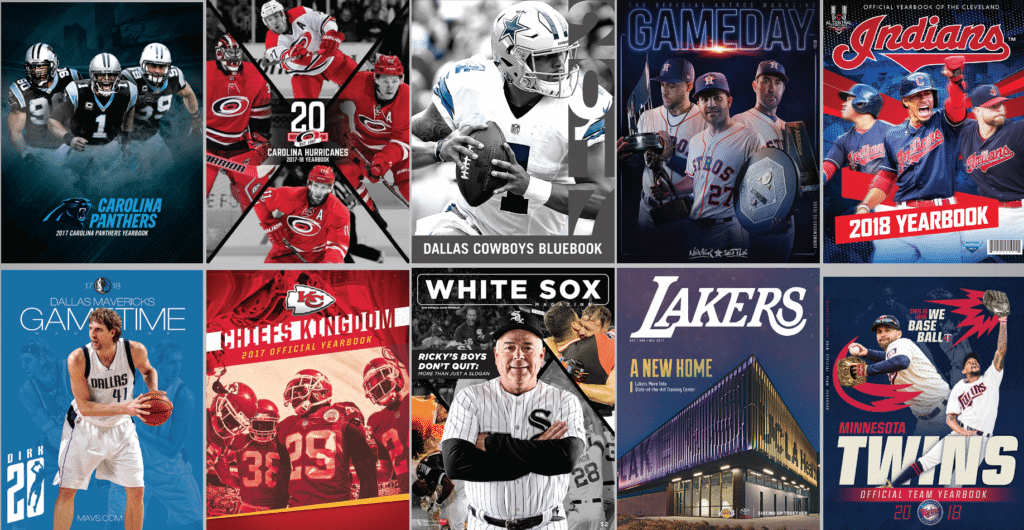
Job opportunity: Are you an New York-based editor with prepress and/or book publishing experience? If so, Professional Sports Publications, which produces game programs and yearbooks like the ones shown above, has a job opening that could be right for you. Good luck!
The Ticker
By Jamie Rathjen

Baseball News: The Marlins are wearing throwbacks July 26-28 (from Mike Chamernik). … Somebody at yesterday’s Yankees/Red Sox game at London Stadium was wearing a fusion of both teams’ hats. It is essentially a baseball version of the infamous half-and-half scarf seen at soccer games (from many readers).

Football News: The Chiefs posted a style guide for their 60th-anniversary logo (from DrSoup_MD). … The Seattle XFL franchise has trademarked five potential names. … A black Kentucky helmet has been floating around stores in the state. Note that the 2015 black helmet mentioned in the article does not appear to have ever surfaced (from Josh Hinton). … Reader Johnny Garfield sent us a picture of a double-striped Canadian football, held by Edmonton’s Rollie Miles in 1952. The CFL didn’t exist yet; in that year the current West Division minus the BC Lions formed the Western Interprovincial Football Union. … Steve Hoyle sent us his NFL standings board from 1972 — the teams are in order of division standings.

Basketball News: Reader Steve Hoyle sent us this picture of Bullets PG Kevin Porter — from the 1973-74 season, the team’s only one as the Capital Bullets — where he appears to be wearing the away jersey and the home shorts.

Soccer News: New shirts or kits for German teams Eintracht Frankfurt, 1. FC Magdeburg (both from Ed Żelaski), and FC Ingolstadt 04 (from Josh Hinton) as well as French teams Paris Saint-Germain and Auxerre (also from Josh) and Scottish Championship team Arbroath. … The next two are also from Josh: Manchester City striker Sergio Agüero posted a picture of himself in next season’s second kit, which hasn’t been released yet. … The NPSL’s Detroit City switched from maroon to white at home, reportedly because their opponents, Toledo Villa, only brought a black kit. … Multiple readers told us that Mexico’s shirts have two different number styles — the current Adidas font for goalies and a new one for everyone else — at the CONCACAF Gold Cup. Note that the new font is different from the one that Adidas recently gave to Argentina. … Teams that wore rainbow numbers this weekend included Vancouver and Seattle (from Wade Heidt). The NWSL’s Houston Dash and Orlando Pride did as well. … Mexican team Club América will also have rainbow numbers on Wednesday in a friendly against Argentine team Boca Juniors in Harrison, N.J. “It may seem like a small thing, but Club América is owned by Mexico’s biggest television network which doesn’t have a great history of respect towards the LGBTIQAP+ community,” says Sinuhé Guevara. … Preseason kit shenanigans from Scotland: Dundee United wore a white and black effort from Macron that they swear is not the first or second kit for next season, while Heart of Midlothian’s sky blue second shirt from 2017-18 also reappeared. … Two more from Ed Żelaski: New kits for Hertha Berlin and Köln.

Grab Bag: India’s controversial orange clash shirts worn yesterday at the Cricket World Cup ended up being dark blue on the front and orange on the back. The tournament is the first requiring all teams to have two shirts, except hosts England, which means India wore something other than their usual shade of blue for the first time in one-day cricket (from Moe Khan). … The field hockey Pro League finals in Amsterdam featured a double color change in the women’s third-place playoff, as Germany and Argentina — who normally look like their soccer counterparts — wore black and pink, respectively.
Saturday was a very special day, with uni-versary parties taking place around the country and around the world. Phil had some coverage in yesterday’s post, and I’ll have a lot more tomorrow. See you back here then. — Paul
the fiasco with Hudson and Gosger is among the most Mets things ever, and coming the day before Bobby Bonilla day is just icing on the cake
It’s a cornucopia of Mets Boobery!
Casey was right after all “Were Still Frauds!”
What day is Bobby Bonilla Day?
For me Bobby Bonilla Day is the day in late June 1992 when the Cubs put up seven runs against the Mets in the first inning and he called the official scorer from the dugout to complain about an error called against him. I was at that game; I wanted to see Maddux go all the way but the Cubs let Jim Bullinger finish up the easy victory.
Today is Bobby Bonilla day. IIRC around the time the Wilpons were looking to dump the Mets they bought out Bobby Bonilla by giving him a contract to receive $1.something million on July 1st until he’s 201 years old.
Typo/grammar
“(The could have gone…
Should be either:
“(The Reds could have gone
“(They could have gone
Yup. Both already fixed.
“The Mets have been dealing with all sorts of dysfunction and disarray lately, but they really topped themselves when they held a 50th-anniversary reunion of their 1969 championship team prior to Saturday’s game.”
Wondering if the extra meaning in the phrase “topped themselves” was intentional here.
No, not intentional.
Hi Paul,
Thanks for including me in Meet the Contributors! Today a fitting day being Canada Day.
Small edit on my excerpt. In the first sentence, we have it in there as “British Columbua”.
Yikes. Fixed.
-Saw a glimpse of the Vancouver at Seattle MLS game on TV yesterday. Noticed that you can see the rainbow numbers clearer on the Whitecaps jersey compared to the normal red numbers.
I like the Whitecaps jersey but the normal numbers are hard to make out from a distance in the stands.
link
-Re: Kentucky black helmet from 2015 that never appeared. We had similar situation just this past year in Canadian university football’s Canada West conference.
UBC Thunderbirds had a new shiny gold helmet that made appearances at team functions. Never seen on the field:
link
Regina Rams showed off both a white helmet and a gold helmet. Neither ever made the field. Only the usual green helmet was worn. Too bad because I think that gold one would be excellent:
link
Happy Canada Day, Wade, and also to all of our fellow Canucks.
Thanks! John, you live in Winnipeg right? Blue Bombers look like they will be a contender for the Grey Cup this year. Saw them in person in their season opener in Vancouver. They looked good, especially running the ball with Andrew Harris.
My goodness but that’s a great look for the Reds. Keep the pants and make them a full-time part of their current uniforms (or anyway on days when the Reds don’t wear their red softball top).
Happy Canada Day, Wade. Always good to hear from the CFL, And other happenings in our suburbs.
Thanks, Jerry!
I wouldn’t want to see this look on the field every day
I would! The Reds looked fantastic. Never better.
By the way, I hope Phil, Paul and all the other party goers around the world enjoyed themselves this weekend. Happy Uni-versary!
Reds signature look was yesterday. Amend the previous iteration.
Seattle Surge seems to speak to me.
So, the Mets didn’t invite these two, either? At least that’s what one story said.
So, you’re important enough to note if you are dead, but not important enough to invite while alive?
I think the non-invite is worse than the dead list!
I suspect they made two lists — “Alive” and “Dead.” The “Alive” list was invited. Gosger and Hudson weren’t invited because they were mistakenly listed as dead.
I must respectfully disagree with those who feel that the Reds looked “great” in those throwbacks.
There is only one time when a man should wear red pants, and that’s if he is working as a clown.
. . . or as Santa
What were the road uniforms for the 1936 Reds?
Here, you can look that up yourself on Dressed to the Nines!
link
Thanks. What was interesting when I looked this up is that they had 2 road and 2 home uniforms, with one of the road looking just like the one they wore yesterday, except for cream colored pants to match the jerseys. Socks were also different. Their other road uniforms were gray flannel. Was this unusual, or did other teams wear cream on the road?
You have to remember, there used to be no such thing as cream (at least in terms of uniforms). It was just white, but less bleached-out white than we’re used to seeing with synthetic fabrics.
As for what other teams wore: Poke around on Dressed to the Nines and see for yourself!
Today, of course, is the Canada Day game in Toronto. The Jays have their red jerseys and red maple-leaf logo caps; the visiting Royals have a Canadian flag on their chest.
Watching the game now. The Royals are wearing their blue shirts. As much as I hate the softball tops, I won’t lie, this is a very good looking game.
That’s the royal blue shirts, not the Smurf shirts.
“They’re still my team. But man, they make it really, really hard.”
Amen.
It was nice to read about Wade. I am a big fan of the CFL. My grandpa used to pull in games off a satellite back in the 80s and that was our thing. Football in the summer. I also pull for Saskatchewan. I’m in Texas by the way. But I always like the Canadian college football news and all the CFL news. Thanks Wade and keep it up.
Thanks, Brent! That is part of the fun of the CFL. Starting the season in the heat of the summer and ending it in the cold in November.
Looking forward to the Canadian university game kicking off in a couple of months.
Been a tough start for the Riders with the two losses out east to start the season and the loss of our starting quarterback with that late hit, but things looking pretty good so far in the home opener today against Toronto.
Speaking of the most Mets thing ever, happy Bobby Bonilla day!
“MEET THE METS,
MEET THE METS,
Step right up and greet the Mets!
Bring your kiddies,
bring your wife;
Guaranteed to have the time of your life”
…well, if the Mets think you’re still alive…
In honour of Wade, I post this youtube clip of the CFL equivalent of the Ice Bowl, from Taylor Field
link
Just in the first few minutes some interesting things to note
1. The divisional finals were not one game play-offs, they were series. Even more bizarre, the Eastern conference was a two game total points, the Western conference – a best of 3.
2. The opening credits refers to Saskatchewan as Regina (the city they play in)
3. It is mentioned the next week will be the Grey Cup, and it will be played on a Saturday (the CFL is actually thinking of moving the Grey Cup back to Saturday)
4. The quick start to the game (7:00 minutes into the clip) is quite funny
Best part in the first 7 minutes is the Chevrolet Vega commercial. “A family of Cars”. More like a family of junk. Sheesh!
The one known as The Ice Bowl was actually the 1977 Grey Cup
link
link
postage stamp here:
link
Just keep Metsing, Mets. Befuddled boobs since 1962. And made worse by the “leadership” of Jeff “Fredo” Wilpon, Roslyn (N.Y.) High School class of 1980.
India have worn Dark Blue before in the 1992 Cricket World Cup so it isn’t the first time that they have worn Dark Blue