For months now people have been wondering what MLB jerseys will look like with the Nike maker’s mark on the chest (instead of on the sleeve, where the Majestic logo has been positioned).
Some people have also been wondering if the Yankees would really wear the Nike logo or if they’d somehow escape that requirement, just as they’ve managed to avoid wearing the Majestic mark. I’ve been told all along that they would indeed wear the Nike mark, just as they’ve worn the New Era logo on their caps, but I know some of you out there have taken an “I’ll believe it when I see it” stance on this.
Get ready to believe it.
A source who I trust has provided me with some photos from a catalog for Nike’s 2020 retail line. They show what the Yankees’ jerseys are slated to look like in 2020. Without further ado (click to enlarge):

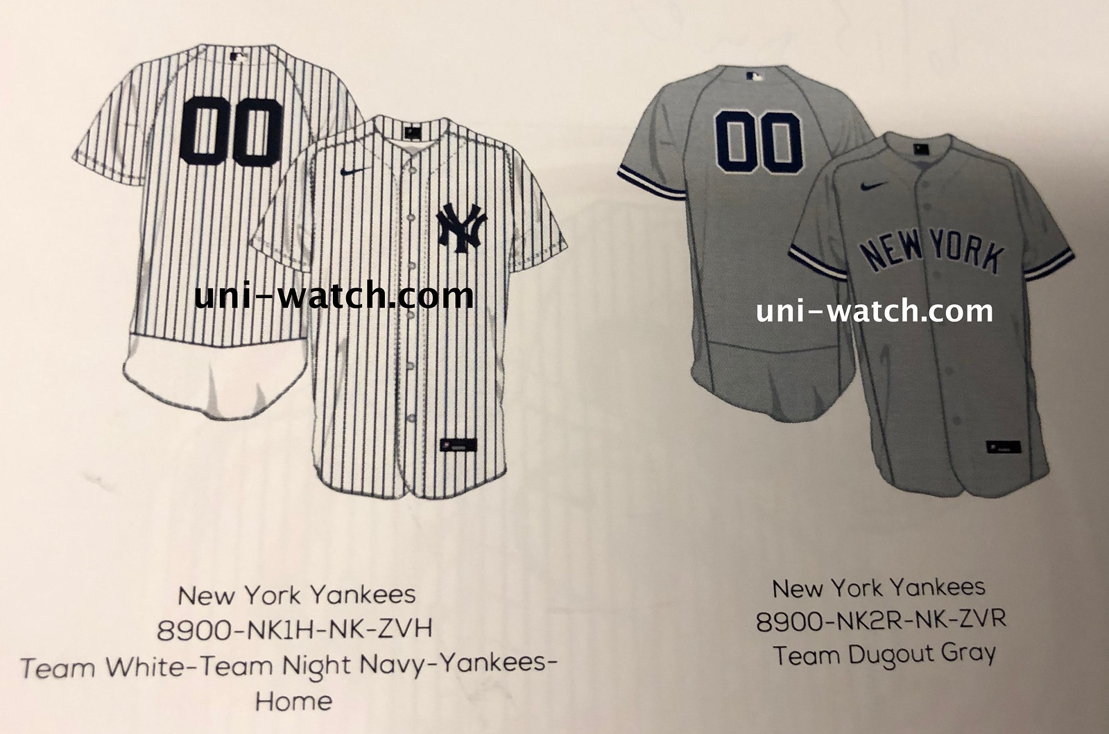
I did plenty of due diligence on these, on various fronts. I’m satisfied that the images are legitimate.
This being the Yankees, of course there are no design changes. Still, there are some items worth noting. One at a time:
• First and foremost, there’s the swoosh on the upper-right chest.
• I’m surprised that Nike is sticking with the mesh diaper panel on the shirttail, which Majestic introduced as part of its Flex Base system in 2016. Doesn’t matter one way or the other on the field, because the players wear their jerseys tucked in, but I know some of you folks don’t like that panel on your overpriced polyester shirts.
• The current Flex Base template for the other 29 teams also includes mesh side panels (which, I fully acknowledge, have not looked so bad on the field like I initially thought they would), but the Yankees haven’t been using those — it’s one of those things that they got a waiver on. So while the side panels aren’t shown in these catalog images, it’s not clear if that’s a new MLB-wide thing or just an ongoing Yankees thing.
• The Yankees will apparently be sticking with raglan sleeves. (Technically speaking, the pinstripes should be running horizontally across the shoulder yoke, but I’m pretty sure this was just an artistic liberty that they took in the mock-up. The seams, which are clearly shown on both the front and the back, clearly indicate a raglan design.)
• It also appears that the Yanks will be maintaining their current format of evenly spaced buttons at home and pro button spacing on the road.
I think that’s it. Did I miss anything?
One other item of note: Although I don’t care about retail merch, I was intrigued by this page, which apparently shows a pair of Cooperstown Collection jerseys (click to enlarge):

It’s hard to see, especially on the grey mock-up on the right, but both of those jerseys have a gold splotch or squiggle instead of the Nike logo. My source described it as, “just a bunch of crossing lines, sort like a signature.” So maybe the player whose name is on the back (which is ridiculous on a Yanks jersey, of course) will also have his signature on the front.
(Update: Reader/commenter Peter Fischbach says the gold mark is actually this retro Nike mark, which has appeared on some shoeboxes.)
That’s it for now. Obviously there are still lots of questions about what the fusion of MLB and Nike will look like. For example: Will the maker’s mark on the pants migrate from the back pocket to the front thigh, as is the case with Nike’s college baseball uniforms? (I’m assuming yes but hope I’m wrong.) Will Nike offer pullovers with faux-button plackets — again, a common thing in college ball — at least as an option for players? (I’m thinking yes, just based on the growing number of players who are currently having their jerseys custom-sewn shut.) Will terms like “Color Rush” and “Statement Edition” be finding their way to the baseball diamond? (I’m thinking probably not right away, but I bet by 2021 or ’22.)
Those questions, and many more, will be answered eventually. For now, this is a taste of what’s to come.
Finally, please join me in giving mega-thanks to Nic Schultz for the awesome Nike-fied MLB logo at the top of today’s entry. I asked him to do a different MLB/Nike mash-up, but he took it upon himself to do the version with the swoosh standing in for the bat, and it’s sooooo much better than my original concept. Thanks, Nic!
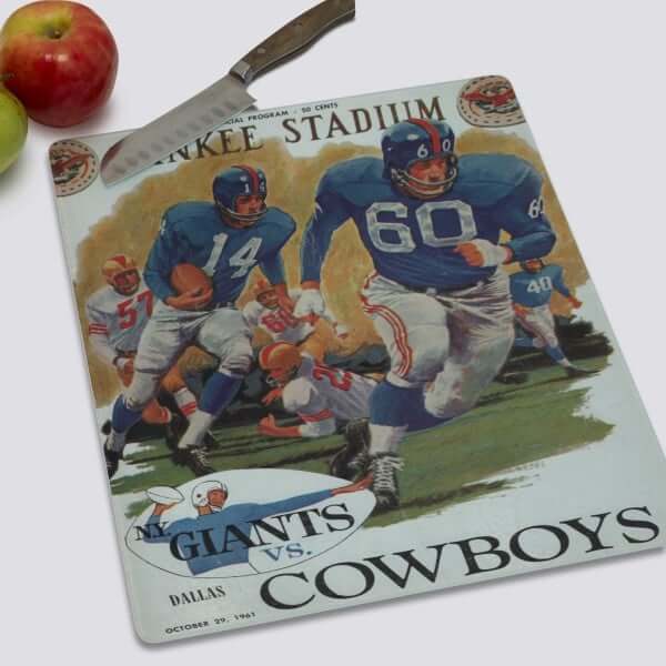

LAST CALL for the Vintage Brand raffle: In case you missed it earlier this week, our longtime advertiser Vintage Brand is running another raffle. The lucky winner will be able to choose any item from the Vintage Brand website (like the groovy Giants cutting board shown above).
To enter, send an email to the raffle address by this Thursday, June 6, 7pm Eastern. One entry per person. I’ll announce the winner on Friday.
In addition, Vintage Brand is currently running a site-wide 20% sale. No need to enter any discount code — when you get to the checkout page, you’ll automatically get 20% off. Not bad!
Click to enlarge
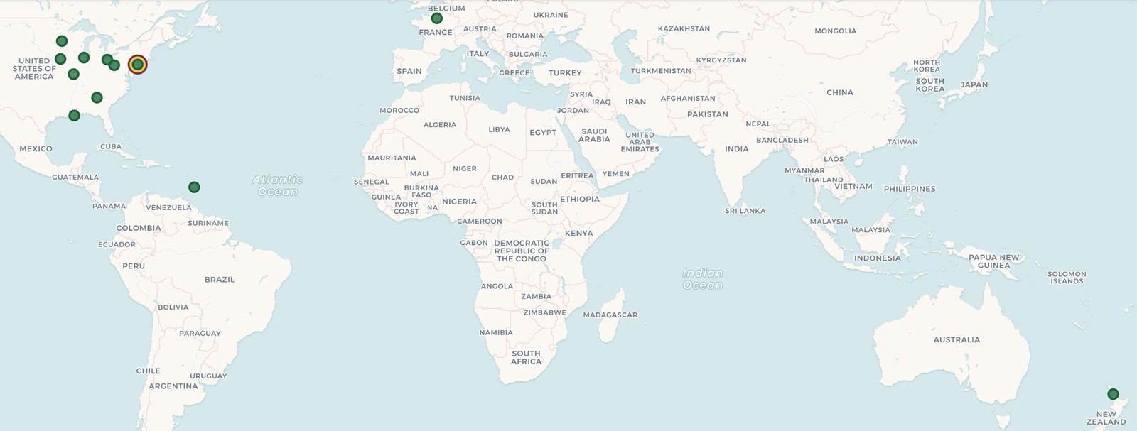
ITEM! Big uni-versary news: What you see above is a map, prepared by Uni Watch satellite party coordinator JohnMark Fisher, showing all of the late-June uni-versary parties that have been planned so far. I think we can legitimately say that Uni Watch parties will be taking place around the world, as we have gatherings planned for the northern, southern, eastern, and western hemispheres — not bad! I’m particularly pleased to see that there will be a shindig in New Zealand, a wonderful country that I’m proud to have visited twice (so far).
You can see the full map here, and the spreadsheet of various parties is here. Remember, if you want to organize or attend a gathering in your city, contact party coordinator JohnMark Fisher.
Meanwhile, I hope by now most of you are aware of our awesome “Turn Ahead the Clock Shirt,” which celebrates the dual 20th anniversaries of Uni Watch and MLB’s infamous 1999 TATC program. You can order it here.
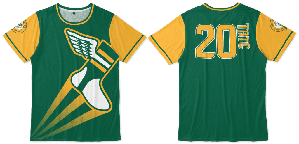
We have other anniversary items — and, of course, non-anniversary items — in the Uni Watch Teespring shop. My thanks, as always, for considering our products.
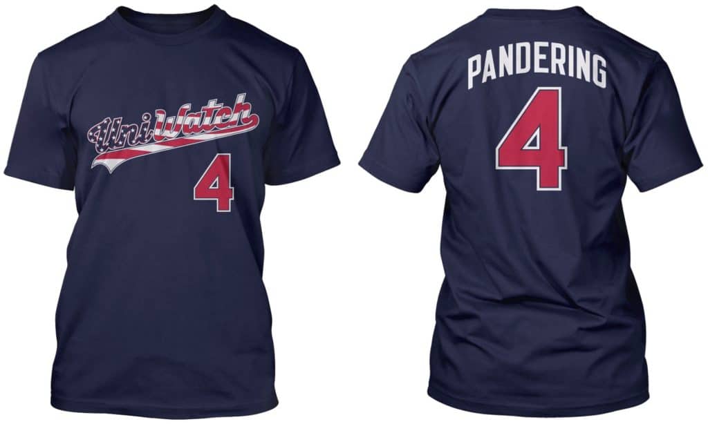
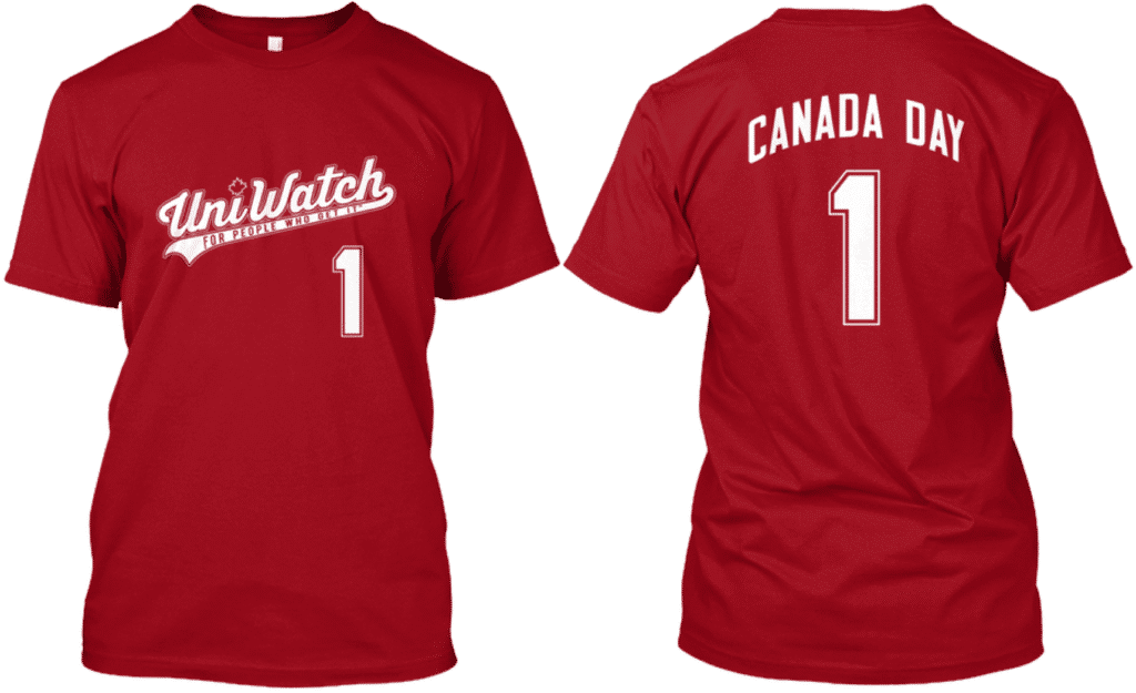
And while we’re at it, don’t forget that ’tis the season for our stars and stripes shirt and our Canada Day shirt. Thanks.
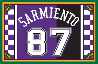
Membership update: The Sacramento Kings’ split black/purple uniform with checkerboard trim is arguably the worst uni ever worn by a Big Four team (I realize there are other strong contenders, but this one is at least in the conversation) — which of course means it makes for an awesome membership card. That’s what Jason Sarmiento wanted for his card, and it turned out great!
Jason’s card is one of several that have been added to the membership card gallery. We’ve now finished almost all of the Purple Amnesty Day orders (just one more to go, which will be part of the next batch) and can thankfully now turn our attention to non-purple orders!
Ordering a membership card is a good way to support Uni Watch (which, quite frankly, could use your support these days). And remember, a Uni Watch membership card entitles you to a 15% discount on any of the merchandise in our Teespring shop and our Naming Wrongs shop. (If you’re an existing member and would like to have the discount code, email me.) As always, you can sign up for your own custom-designed card here, you can see all the cards we’ve designed so far here, and you can see how we produce the cards here.
The Ticker
By Paul

Baseball News: Here’s an old photo of the Giants’ latest first-round draft pick — OF Hunter Bishop — wearing a Giants uni as a very young child. … Pirates broadcaster Steve Blass criticized Braves OF Ronald Acuña for wearing jewelry “and stuff” (from @bryant_rf). … Pretty cool new White Sox-themed cap for the Birmingham Barons. … Tyler Maun notes that the Single-A West Virginia Power are still wearing a Pirates-themed sleeve patch — note the bandana and eye patch — even though the team changed affiliations this year from the Pirates to the Mariners.

NFL News: Pats QB Tom Brady is once again wearing a Speed-Flex helmet. He experimented with that model for part of last season before going back to his old helmet. The old one is now banned for 2019, so he’ll need a new lid this year (from Dakota Chandler). … Check out this spectacular late-’60s AFL promotional piece that Bill Hetrick has. “It’s a Dodge advertising brochure/insert,” he explains. “Forget the magazine it was in, but bought it and had full piece taken apart and spray-mounted. You see the first two pages occasionally, but the full insert is more rare.” … An SI writer thinks NFL teams should stop retiring numbers. … Following up on an item from earlier this week, here are some idiot New York Mets fans trashing Tom Brady jerseys with beans (because Boston, get it?) as a way of “protesting” Brady’s attempt to trademark the heretofore Seaver-associated term “Tom Terrific.” As a Mets fan, I find this beyond embarrassing. … There’s a new line of NFL training camp caps (from Brian Kerhin). … Washington DB Josh Norman and Real Madrid soccer player Alvaro Arbeloa swapped jerseys the other day.
College and High School Football News: Here’s a poll that asked college football fans to rank ACC logos (from @VictoryCB). … Back in 1995, players who participated in the Sugar Bowl received a — wait for it — commemorative jockstrap (blame Jordan Daniels). … New helmet for Lipscomb Academy (from Phil McDaniel).

NBA News: Good article on how the Mavs ended up with their current look (paywalled) (from Scott Hennigan). … An upcoming sports biz conference has totally ripped off the 2000 NBA All-Star logo.

College Hoops News: The men’s three-point line is being moved back to match the distance used in international play. For teams whose men’s and women’s teams share the same arena, this means the court will have two different three-point lines (from James Gilbert). … Also from James: NCAA rule change Nos. 3, 4, and 6 on this list indicate that there will be new guidelines this season for arched NOBs and tights, plus refs will now have raglan-sleeved jerseys.

Soccer News: New shirt advertiser for Dulwich Hamlet (from Ed Zelaski). … New centennial uniform for Poland (from Ed Zelaski). … New shirt and 80th-anniversary patch for Rio Ave. … New uniforms for Paderborn (from Josh Hinton). … Cross-listed from the NFL section: Washington football player Josh Norman and Real Madrid’s Alvaro Arbeloa swapped jerseys the other day. … The Columbus Crew have what might be history’s worst souvenir cup (from John Flory). … You can see the Women’s World Cup teams broken down by uni manufacturer here. … Speaking of the WWC, Thom Gibbs has ranked all the kits. … This is pretty good: a U21 team roster listing presented as a South Park-style video (from Greg Franklin). … Fun fact: Liverpool are the first Champions League winners in 14 years not to be outfitted by Nike or Adidas (from @Matooooe).

Grab Bag: New alternate jerseys apparently in the works for the Overwatch League, which is an e-sports league. … Bit of a controversy in Mexico City over a plan for gender-neutral school uniforms. … Golf news: Here’s a piece on the “hidden meanings” in the U.S. Open logo. … Boeing is “donating” $10 million to help maintain a Virginia park, which in turn is being renamed for Boeing. Of course, if they’re getting a giant advertisement out of it, it’s not actually a donation (from @stevis23). … Looks like pro golfer Tiger Woods may have been using an Ohio State head cover. … An Oakland man wearing a police-style uniform was arrested for impersonating an officer. … Handmaid’s Tale-themed attire is being described as “the viral protest uniform” of the year. … New logo for the Firefox web browser. … Good essay on the endless militarization of sports.
last bullet point on the lede “evenly spaced buttons and home and pro spacing on the road”
Thanks, Gregg. Fixed.
Love that Bengals prototype in the AFL promo. Better than anything they actually did wear
I noticed that, too, never seen those. I’m not sure I love the black numbers on orange as much, but somewhat surprising (even with Paul Brown in charge) that they opted to look almost exactly like Cleveland rather than being distinctive. Maybe too similar to Denver at the time.
Came here to say the opposite. Those Bengal prototype/made-up uniforms look terrible!
Lee
Always LOVED the Bengal proto-type uniforms.
I have seen them in an number of illustrated color action shots, usually featuring original but short-lived Bengal starting QB John Stofa, who did not last long after coming over from the Dolphins.
Until today never saw an illustration with the proto-type calling for a Black/White center stripe on the helmet. Love the Orange jersey with Black numerals and YES, better than the Browns-copied uniforms worn for years.
Am I the only person here that would find it pretty cool for a team like the Bengals to wear it’s originally planned, but never-worn uniform as a Throwback?
Why not?
The new Firefox logo link in the ticker is the same link as the Handmaid’s Tale link.
Fixed. Here’s the proper Firefox logo link, so you don’t have to scroll back up:
link
Put me down as one of those Yankees fans who was holding out hope for a swoosh-less jersey. Disappointing.
Glad to see they will presumably continue to use raglan sleeves. It’s a better look, especially with pinstripes.
The photo of the Nike uniforms should’ve been NSFW’d or something. I’m seething with anger and a sense of vicarious shame.
Good points on the retired numbers piece. I like what Clemson and others have done. Keep the numbers in circulation, but maybe recognize the former player with a patch or some other device if the school feels they need to recognize him.
UNC women’s soccer (with 20+ national championships), like all UNC teams, retires Natonal POYs numbers, but since they’ve had so many they’ve put them back in circulation. The new jersey with the old number has a sleeve detail with the POY that wore that number. I haven’t found great pics or an article that describes this program very well.
Time to unretire all numbers in all sports. It’s not a sustainable practice.
It is interesting that the VW Power organization kept the kerchief and eyepatch on the Charleston Charlie logo. But wouldn’t some mariners wear the same thing?
Seems interesting to me that Nike appears to be making a Nike version of the current Majestic jersey. No apparent changes to the design of the garment. No fancy new materials or construction, no new design template. Nike is even keeping the butt-bib. Which suggests that MLB likes the Majestic product, and chose Nike on the basis of Nike paying more money, not Nike offering a better or different product. This is kind of a relief; Nike has a pattern of introducing changes to the construction of jerseys that make it difficult for teams to fit their existing uniform design into the new template. I’m glad to see that not happening with at least the first season of Nike MLB uniforms.
Or it could be due to time, since UA was originally set to handle this. They could just reproduce what Majestic has in place for the first season while working on new tech/designs for the following season.
I’ve always thought Majestic did great work with MLB unis. I was disappointed when Under Armour was announced as the new supplier but thought “ok, at least it’s not Nike.” If Nike’s MLB unis are anything like what they’ve done in the NBA, NCAA and NFL we’re going to have a lot to complain about the next several years.
Charleston, WV resident here. The WV Power affiliation switch came very late in the offseason, and almost out of the blue (at least, to the casual fan). It’s clear that the team didn’t have time to change course on uniforms, logos, planned promotions, etc.
Rumor is that a complete rebrand may be coming in 2020. With merch and an entire retro-promotional weekend later this month, the team seems to be leaning into the Charleston Wheelers name from the 1980s-1990s. Which would dovetail well with the Mariners — nautical theme, blue and green colors, etc.
While the Yankees don’t have the side panels on the home whites, the road greys do have them. The mockups look very similar to the flex base and I wonder if this is being done to ensure the jerseys are still made at Majestic’s Pennsylvania factory?
When Under Armour was originally going to outfit MLB, didn’t they purchase Majestic & their manufacturing facility in order to ensure the jerseys are still made in the USA and that those workers would still have jobs?
And by keeping the flex base template, or something very similar to it, I suppose it helps ensure some streamlined efficiency, especially if the jerseys are being made in the same place.
Just thinking out loud.
The jerseys will be made by Fanatics (which bought Majestic) and will be sold to retailers by Fanatics. The only thing Nike in all of this will be the swoosh on the jersey.
I never quite understood how and why the Yankees get a waiver on something that is required of all the other teams (ie, wearing the maker’s mark on their uniforms). There are teams that are just as old and established, if not older than the Yankees (Reds, Cubs, Tigers, Red Sox are a few that come to mind), and they don’t have such a waiver. Is this simply a matter of “money talks?”
My understanding is that George Steinbrenner was the only one who cared enough about the mark to keep it off his uniforms. Any other team could have done so, but wasn’t willing to spend the money on it.
The three point line in college basketball was already different in men’s and women’s basketball. The new rule will separate them even further.
Paul – Consider me skeptical…for now.
Currently, If one were to buy an authentic on-field Yankees Jersey, it would have the Majestic maker’s mark on the sleeve. It’s always been that way, going back to the Russell days. So, they were never really “official.” If these pages are from a retail source, that may still be the case. I’m a Mets fan, so I’m already resigned to having a swoosh on their jerseys, but it’s still hard to believe the Yankees will play along–although to be fair, they DO have the New Era logo on their caps, so they went along with that.
I was told months ago by a source I trust (and who you would trust as well, if I divulged the person’s identity) that the Yankees will have the maker’s mark on the chest. Also, think about it logically: Nike paid a lot of money for the right to put the logo on the chest. They didn’t pay all that money just to omit the logo from the sport’s marquee franchise.
It’s going to happen. If you prefer to believe otherwise, that’s your choice. But at some point it might be wise to ask yourself if you’re veering into flat-Earth territory.
“But at some point it might be wise to ask yourself if you’re veering into flat-Earth territory.”
Mic. Drop.
The New Era logo is enough to have convinced me the George Steinbrenner era is long over.
Some uni notable news for those that need a Lower Mainland BC box lacrosse fix. Relating to the goalies in last night’s WLA game.
Langley Thunder G Steve Fryer has been wearing the mask and pads of his NLL team, the Colorado Mammoth. Sporting them last night:
link
Though G Alexis Buque (#00) does play for the NLL New England Black Wolves, he does has his own equipment specific to the New Westminster Salmonbellies. However, what is notable is he is wearing an older version of the red jersey featuring the “NW” shoulder logo. His teammates not wearing any shoulder logo on their red jerseys. It has been a number of seasons since that was removed. The club’s 130th anniversary logo patch is the front:
link
Comment on the ticker item about the NCAA 3pt line. Courts have had two lines for about ten seasons since the first time they moved the men’s line back.
Pretty flimsy evidence that Tiger Woods was using an Ohio State headcover. I agree with one of the posts that said this is a essentials bag for carrying tees and ball markers. Also it looks like a “S” instead of an “O”, so maybe for Stanford.
You may be right. I just couldn’t make it out because that swoosh was so distracting.
A Nike swoosh on a Yankees shirt, man I’m old enough to remember when they signed that deal with Adidas, a deal that did not let Adidas make products bearing the Yankee name…
How far we’ve come
Paul, this may be beyond your scope, but I’m curious if you’ve been given any information about why MLB isn’t doing what the NFL did and forced Nike to put the mark on the sleeves and not mirror the college uniforms? We all know the Nike mark is on the upper right chest for college football and baseball unis, but the NFL got them to put it on the sleeve… why not the MLB?
The NFL did not “force” Nike to do anything. They simply decided that the costs of having the logo on the chest outweighed the extra revenue that such a move would command (or, alternately, they set a price on chest placement that Nike chose not to meet).
MLB apparently felt differently.
Dont you think having the 2 logos on the sleeves being much more visible from almost any angle also makes more sense, for Nike at least?
I honestly don’t care what makes sense for Nike. (But Nike apparently feels front-facing is better, as we can see from how they approach college football, a world where they get to call more of the shots.)
The Nike logo would look better on the sleeve..but at least its not huge like the NBA jerseys (makes them look more like college for some reason to me).
Hey Paul, I’ll tweet this at you, too, but the Nike logo on the “Cooperstown” style jerseys is this retro Nike logo/wordmark that has been on a few shoeboxes of “retro designs”.
link
Ah, interesting. Thanks! I’ll add that to the text.
The “overpriced polyester shirt” line and “Pandering” shirt gave me a thought. You should do a “Merch Cash Grab” Uni-Watch shirt with a dollar sign on the back. I just can’t decide what the theme should be. Pink? Camo? Pink camo?
I’ve never really liked the term “Cash Grab” and don’t ever use it in relation to merchandising, because nobody’s forcing anyone to buy a jersey. (If I did use it, I’d save it for things like $24 parking fees and PSLs — things that feel like outright profiteering.)
“Merch dump,” on the other hand…..
Re: Training camp hats
i posted this yesterday, but there’s a white and grey version of each hat.. the white hats have the 100 year logo on the back, but the grey hats have a grey version of the NFL logo
link
Full disclosure I work for Boeing and believe the donation/park naming probably came about a little more organically. Boeing gives tons of money without asking for anything in return. You give someone $10 mill and they say – hey, let’s name the park after you – not smart business to turn them down.
But either way… the sad thing with that post is that only 18% of the people responding to the poll at the bottom of the article think local parks should not be named after corporations. This is what sports greed has produced. It is commonplace for EVERYTHING to have an advertiser’s name on it.
not smart business to turn them down
No, not smart business — just the proper thing to do, that’s all.
Yea, that is of course a valid point.
As a die hard Yankees fan I’m definitely down in the dumps about the Nike logo. There was a glimmer of hope I guessm but logically thinking that should have been squashed since they put the new era logo on their hats and they go along with all the stupid holiday gimmicks. They even wore the pink jerseys on Derek Jeter’s retirement ceremony! And you think they weren’t going to put a damn swoosh on their chest? Hah! If George was still alive i’m pretty sure he wouldn’t have passed up the revenue and gone with the change but who knows? Either way it sucks, not just for the Yankees but really for all of baseball. Along with all the other in stadium ads, commercials, virtual (unnecessary) strike zone box, useless graphic and overlays, it’s just one more thing they are forcing us fans to look at. Unfortunately its one more step in the wrong direction. You actually think Nike isn’t going to try to do the same thing they are doing with the NBA? Just wait a few years..
That only happens if MLB thinks it should have the same fanbase as the NBA. Fortunately, MLB and the NFL cater to a more mature audience, and fans will largely be turned off by Nike nonsense. You only have to look to the minor leagues to see that things uniform-wise can get much, much worse.
Holy crap that 1982 US Open logo. It’s like they tried to shove everything America into that little circle.
“I know some of you folks don’t like that panel on your overpriced polyester shirts.”
I would guess an equal number of people like the obvious sign that they’re wearing the expensive version.
“To enter a professional football stadium, ballpark, or arena is to be confronted with a pageant of militarized patriotism that is omnipresent and unyielding.” (From the link to The Baffler article). Thanks for the link, and I couldn’t agree more with the author.
Love the 60’s Dodge ad…great artwork. Based on the Broncos helmet stripe pattern of orange/white/orange on Floyd Little and Dave Costa, this appears to be the 1967 season. Not 100% sure, but I think 1967 was the only season with the orange/white/orange helmet stripe.
I hit all the Yankees games when they come to Toronto. NOB vs NNOB jerseys in the crowd would conservatively be at 4 to 1. It looks like a bad movie set. Flex Base created a new monster with a NOB and the white ass-patch.
Also, Cool Base, while not perfect, is a better product than Flex IMO for a Yankees home.
The new Nike-fied MLB logo looks like it could be used for Jai alai.
The 2019 US Open logo…I was hoping there would be more hidden meanings in there, ala Masonic wink-and-nod. Alas, it’s just a logo.
The Lipscomb Academy helmet logo looks like a mash-up of the SMU (or Ford) Mustangs and the LA Lakers.
I was listening to my favorite podcast today (drewandmikepodcast.com) and they mentioned the Enterprise flag debacle in St. Louis. Totally called them out for it too.
Hopefully people post videos of removing the Nike logo from jerseys just like they do for removing the New Era logo from caps… There’s still hope for a clean jersey for all with a little effort!
One nice thing about the Nike logo moving off the left sleeve… Since their inception, the Colorado Rockies have worn the mountain crest patch on their left sleeve… on pinstripe jerseys (home whites and certain years gray) and the purple alts, it has been about one inch up from the sleeve hem. On non-pinstripe jerseys (original and current road grays) it has sat an inch above the extra piping on the sleve. That was until Majestic moved the logo to the left sleeve a few years ago and messed that all up, pushing the patch much higher. Now it shall return to its unblemished purple glory at the bottom of the sleeve.
Horrible horrible swoosh