A few months ago, a guy named Dave Volsky posted a two-hour video to YouTube (see above). The video, which is apparently a slightly adjusted/edited version of a video he originally posted in 2017, is a compilation of 1960s NFL and AFL highlight footage, all set to classic NFL Films-style music. There’s no Voice of God voiceover, just a music soundtrack (although a 13-minute segment toward the end of the video augments the music with lots of “sounds of the game” audio — grunting, yelling, etc.).
If you’re into this period of NFL mythmaking (looking at you, Brinke Guthrie!), the video is nothing short of a masterpiece. It perfectly captures the feel of the NFL during the first years of the Super Bowl era. Fans of a certain age will no doubt get a big, nostalgia-induced high from watching it.
But even if you don’t care about any of that, the video has all sorts of uni-notable moments. Many of those moments have been chronicled in recent weeks by Twitter-er @unavion, who’s become the video’s biggest online booster. Here are some of the bits he’s called out:
.@HelmetAddict linked 2 an NFL vid by Dave Volsky. It's a gold mine 4 logo/uni stuff. I'll be posting interesting shots w/time refs. Here's a midfield logo at 29:49 I've nvr seen & doesn't show on @sportslogosnet's Cowboys page. @UniWatch @PhilHecken https://t.co/tJcc46y18D pic.twitter.com/FjUndo3aZl
— Russell (@unavion) April 5, 2019
Apropos of the @nyjets release is this at 3:16 into Dave Volsky's fantastic vid. Note end zone logo treatment w/ the "NY" outside the oval, grn/wht candy-caned goalposts, and grn/wht boundary flags. Vid: https://t.co/tJcc46y18D @UniWatch @PhilHecken @HelmetAddict @addicted2helmet pic.twitter.com/CTD7erydRe
— Russell (@unavion) April 5, 2019
We discover at 13:19 into Dave Volsky's terrific video (https://t.co/tJcc46y18D) that their current pants isn't the only place the Browns' team name has ever seemed oddly out of position. @UniWatch @PhilHecken @HelmetAddict @addicted2helmet pic.twitter.com/9BNT0smqHz
— Russell (@unavion) April 5, 2019
Another shot from Dave Volsky's amazing 2-hour NFL montage (https://t.co/tJcc46y18D). Clearly this stadium's groundskeepers didn't have a stencil for the NFL 50 logo. @UniWatch @PhilHecken @HelmetAddict @addicted2helmet pic.twitter.com/fYNvu6z0To
— Russell (@unavion) April 8, 2019
Sir Saint field logos at old Tulane Stadium 18:11 into Dave Volsky's terrific NFL video (https://t.co/tJcc46y18D). @UniWatch @PhilHecken @HelmetAddict @addicted2helmet pic.twitter.com/eCraBQzVLY
— Russell (@unavion) April 5, 2019
Have to love the @Chiefs' equipment staff's can-do spirit back in the day. If Otis wants a 2-bar, by God he'll have one, even if we have to just bolt on another 1-bar! That's at a minute 57 into Dave Volsky's two-hour montage. @UniWatch @PhilHecken @HelmetAddict @addicted2helmet pic.twitter.com/Gt3AclaCuv
— Russell (@unavion) April 8, 2019
Now that's a uni matchup! Broncos vs Bills 7:29 into Dave Volsky's terrific montage. @UniWatch @PhilHecken @HelmetAddict @addicted2helmet pic.twitter.com/xfjzFbmIj9
— Russell (@unavion) April 9, 2019
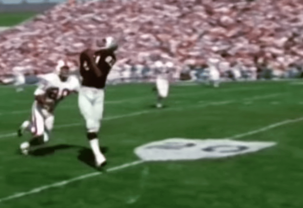
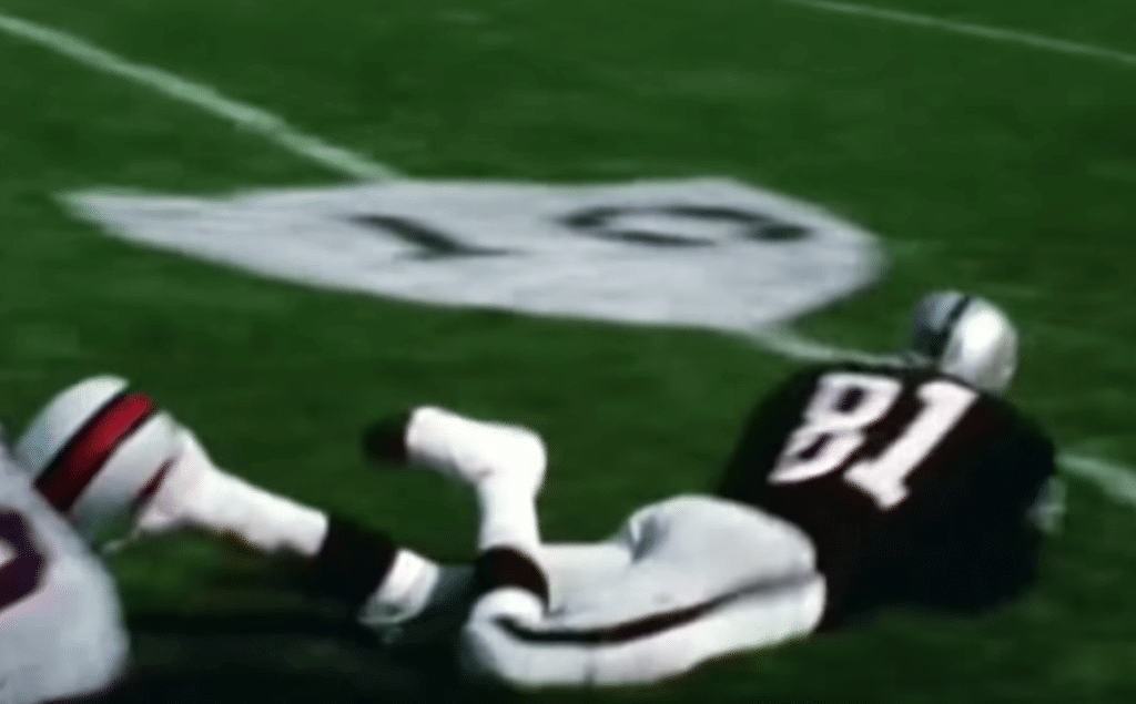
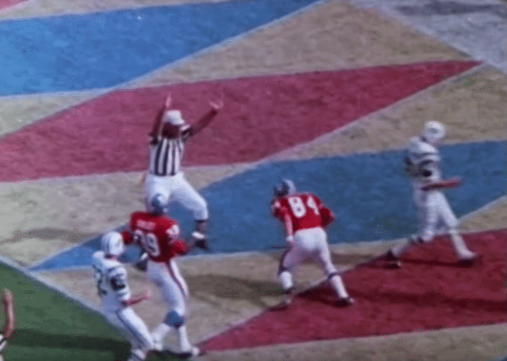
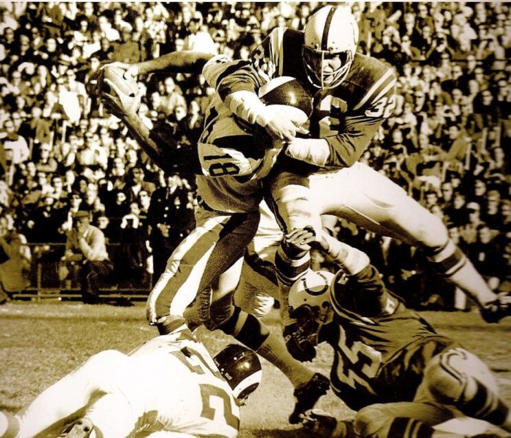
I haven’t watched the entire two-hour video yet, but I’ve jumped around and sampled various sections to get a feel for it. Here are some things I spotted (for all of these, you can click to enlarge):
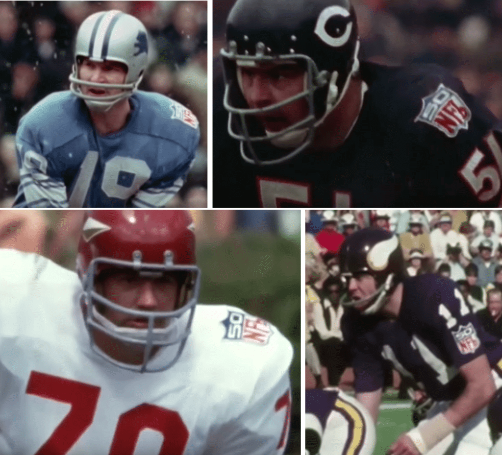
• If your primary experience with the NFL 50th-anniversary patch comes from seeing it on the Vikings’ white jerseys in Super Bowl IV, you’ll have fun spotting it on lots of other jerseys:
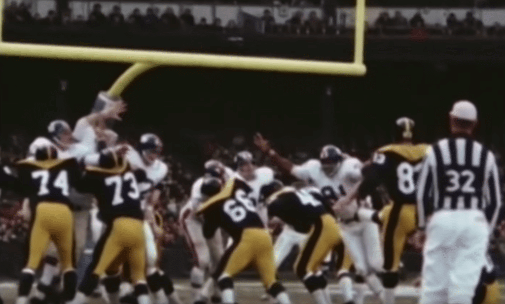
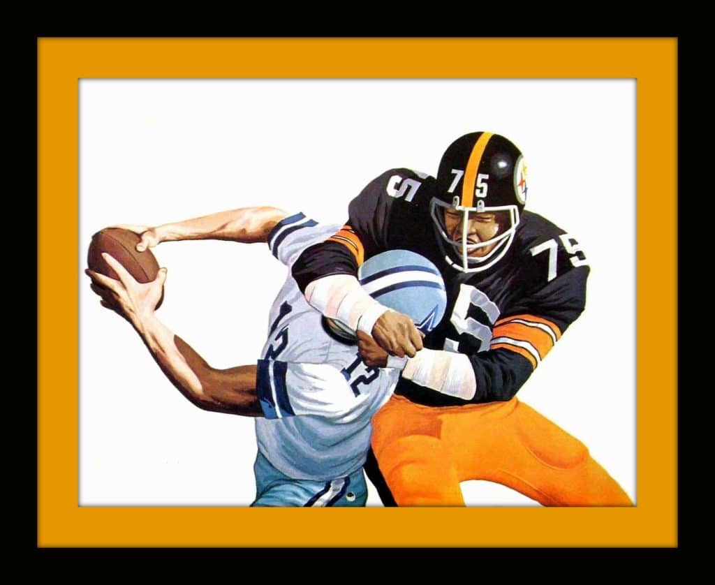
• I can never get enough of the Steelers’ Batman uniforms:
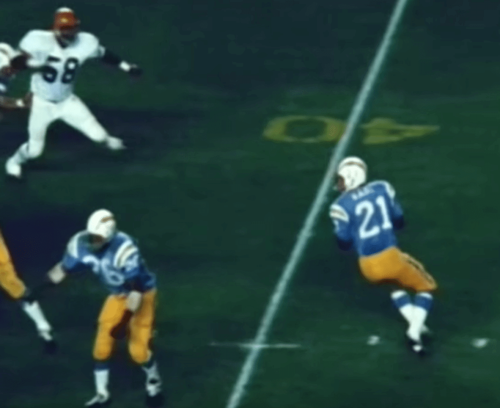
• At one point the Chargers had yellow yard-marker numbers, and at another point they had blue numbers in a diamond shape with yellow sideline hashmarks:
• Similarly, at one point the Raiders had shield-shaped yard markers:
• In recent years, the Broncos have sometimes used a diamond-themed throwback/retro end zone pattern, which I love. But the original pattern on which it’s apparently based was even better. Here’s the throwback, followed by the original:
I like that throwback, but I love the original pattern from the video. So good!
And there’s more. The Oilers’ silver helmets! Actual jersey sleeves! And mud — sooooooo much mud.
The video is cleverly arranged, too. There’s a whole section of interceptions, a section of cheerleaders, a section of field goal attempts, a section of injuries — it’s all been put together with a mind toward sequencing and progression, not just a haphazard assortment of highlights.
Have I convinced you yet? Watch this video already!
Click to enlarge
Collector’s Corner
By Brinke Guthrie
First up is this 1976-1977 NFL calendar from Pizza Hut. The 50th anniversary was in 1969, right? So why does it say “53 years of professional football” in 1976? The big thing here, though, is the cover photo. This one shows Mean Joe Greene unscrewing the head of Roger Staubach as if it were the cap on a ketchup bottle.
It looks like the calendar came out in the fall of 1976, so we’ll assume Greene and Staubach were chosen because they competed in the previous Super Bowl. But there are lots of giveaways: No red stripe on Roger’s helmet, no bicentennial patches, and the Steelers logo decal is on the wrong side. And all of that is because Staubach and Greene were not the players that the artwork was based on. Here’s the original photo, which shows Mike Curtis trying to decapitate Roman Gabriel:
Yep, you’ve got to get up pretty early in the morning to sneak one past your Collector’s Corner columnist!
Now for the rest of this week’s picks:
• Notice the face of this 1970s New York Jets watch made by Lafayette. There’s a small football player running around on the second hand! The seller says it used to belong to a member of the front office.
• This 1970s Detroit Tigers bumper sticker says, “Go for It,” and the tiger has a baseball bat in his mouth. First time I’ve ever see it done that way.
• They missed the red on Mr. Red’s cap for this 1970s embroidered patch.
• Take a look at the helmet art on the back of this 1970s Steelers soap on a rope set.
• Leroy Kelly of the Browns was the featured player on this set of 1970s collector’s cups from Burger King.
• Here’s a 1970s Rams varsity jacket from Sears. The seller says it has been worn, but the tags and patch look remarkably free of fading, given the age.
• One more for the Rams: This 1970s coffee mug has a nice little gold trim along the rim.
• How about these 1970s NHL team cards? (We’ve seen these before as posters, like this one for the Rangers.)
• Check out the modern ’70s vibe on this 1974 ALCS program cover for the A’s and the O’s.
• This set of nine NFL helmet stickers dates back to the early 1970s, prior to the Chargers changing to blue lids in 1974.
Seen an item on eBay that would be good for Collector’s Corner? Send any submissions here.
Click to enlarge
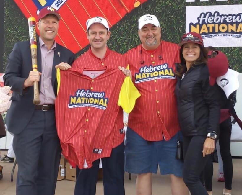
ITEM! Hebrew Nationals update: Remember my recent-ish post about the all-Jewish softball team in Albuquerque, N.M., called the Hebrew Nationals? Their story has gotten so much attention that they were actually honored at Albuquerque Civic Plaza yesterday. The guy holding up the jersey is Conagra rep Dan Skinner, who’s really the mastermind behind all of this; the guy wearing the jersey next to him is the softball team’s manager, Scott Fliegel, who I interviewed for that recent-ish blog entry; and the guy holding the bat is Albuquerque mayor Tim Keller (who you’d think would have more important things to do, but maybe he’s a big fan of softball and/or uniforms and/or hot dogs, and who can blame him for any of that?).
Dan Skinner, the Conagra guy, reports that the Hebrew Nationals had a game last night against a team called — get this — the Chicharrones. An epic battle of kosher vs. treif! No word on which one won.

Membership update — and so it begins: As I mentioned yesterday, we had a hugely successful 2019 Purp Walk, with over 40 new membership enrollments, so now membership card designer Scott M.X. Turner and I are processing them all — which means I’m dealing with a lot of purple, ugh. Some of the new cards (including Raymond Chen’s beautiful Nuggets treatment, shown at right — click to enlarge, it’s worth it to see the fine detail) have already been added to the membership card gallery, and we’ll continue to add more in the coming days as we work our way through the pile of purple orders.
Speaking of which: One of the trickier requests came from reader Mark Malazarte, who wanted his card to be based on the Lakers’ pinstriped City alternates. The tricky part is that the pinstripes are actually typography:
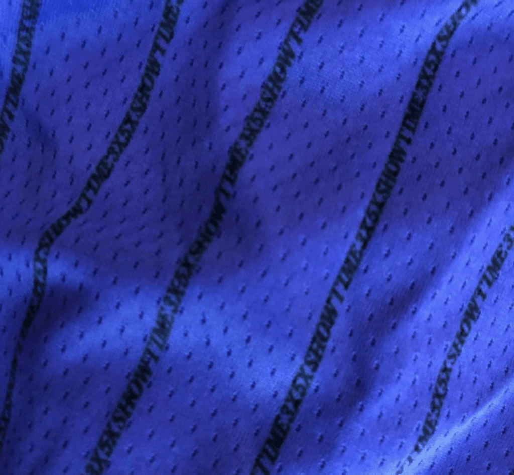
I wasn’t sure Scott would be able to execute that — but he did! Check it out (click to enlarge to get the full effect):

I doubt that the lettering will be visible on the printed card (maybe with a magnifying glass?), but I love that Scott was able to be true to the original design, right down to the stupidest gimmick!
Ordering a membership card is a good way to support Uni Watch (which, quite frankly, could use your support these days). And remember, a Uni Watch membership card entitles you to a 15% discount on any of the merchandise in our Teespring shop and our Naming Wrongs shop. (If you’re an existing member and would like to have the discount code, email me.) As always, you can sign up for your own custom-designed card here, you can see all the cards we’ve designed so far here, and you can see how we produce the cards here.
ITEM! Anniversary countdown in final stages: Don’t look now, but we’re only five days away from Sunday, May 26. That will be exactly 20 years after the very first Uni Watch column was published in The Village Voice. That will kick off a series of celebrations that I hope to keep going through most of this year. The celebrations will include the following:
• Although the anniversary falls on a Sunday, I’ll be taking over for Phil and handling that day’s content. I’ll have some thoughts on Uni Watch’s 20th birthday and will also unveil our new anniversary logo.
• We’ll be having an anniversary party at the 773 Lounge on Saturday, June 29, from 2-6pm.
• We will have a special piece of anniversary merchandise. It’s going to be sort of ridiculous and I don’t actually expect anyone to purchase it, but I’m having fun putting it together.
• We will also have a special 20th-anniversary shirt, which will tie in with something else that’s celebrating its 20th anniversary this year. It’s going to be awesome — you’ll see.
And there will be more — hopefully a lot more. Stay tuned.

Click to enlarge
KRC update: The latest installment of Key Ring Chronicles is about a brass thimble. Check it out here.
The Ticker
By Alex Hider

Baseball News: Last season, the Phillies briefly experimented with 3D helmet logos on their red helmets before ditching them due to poor quality. Well, it looks like the Phils are bringing them back, as they reappeared last night. Additional info here (from Tim Kelly). … Speaking of the Cubs/Phils game, the Ball/Strike/Out counter on the Wrigley scoreboard wasn’t working last night (from @CubbieBlue74). … Nats SS Trea Turner still had a pink Mother’s Day ribbon on his gray jersey last night. It was Washington’s first road game since Mother’s Day, so I’m sure Turner’s jersey from last week got accidentally recycled (from Sam Yarnell). … Astros P Lance McCullers Jr. has been wearing jerseys of old ’Stros players to the ballpark this year. Yesterday, he wore an ’80s Craig Biggio jersey (from Ignacio). … Reader Michael Brantner points out that the Padres wore their typical Sunday alts — desert camo — the other day along with their Armed Forces weekend caps, resulting in clashing camos. … Mariners IF/OF Dee Gordon wore blue and yellow two-in-ones on Sunday. We’re usually opposed to two-in-ones, but this was arguably an improvement over the camo legwear (from Tim Dunn). … Reds blog Redleg Nation (highly recommended to all Reds fans in the uni-verse) has been publishing blog posts about each team the Reds are honoring with throwbacks this season. Here’s the post they published for the 1912 uniforms the Reds wore on Sunday (from Tyler Nees). … Justin Barrientos was playing MLB’s Home Run Derby mobile game and noted that former Twins great Rod Carew is wearing a jersey Minnesota has never worn before — note the jersey script and the sleeve patch. … The Hall of Fame holds 5K and 10K runs in Cooperstown over Memorial Day weekend, and Nate Tweedie notes that the medals are made to look like Hall of Fame plaques. … The Salt Lake Bees wore uniforms commemorating the 150th Anniversary of the completion of the Transcontinental Railroad last night (from Neymar Garciaparra). … Tim Tebow’s Syracuse Mets “Paw Patrol” jersey sold for $890 at auction, a team record over the last six seasons (from Phil). … The Fresno Grizzlies have started wearing their “Taco” jerseys every Tuesday, and this year’s uniform is a nice mix of green, red and cream (from Paul Braverman). … This story about the first woman to play in Puerto Rico’s top baseball league makes it clear that the amount of ads teams wear on their uniforms is staggering (from Marcus Hall). … Xavier wore some nice X-emblazoned stirrups over the weekend (from Robby Margason). … The plate umpire during last night’s Georgia 7A state championship game was wearing a cap that did not match the rest of his crew’s (from Paul Grigg). … We may have had this before, but it’s worth repeating: The Astros use a tequila sunrise bat weight in their on-deck circle (from Ignacio Salazar). … Phillies 2B César Hernández was wearing a Philadelphia 76ers “Phila Unite” T-shirt under his jersey last night. Here’s the full shirt design (from many readers). … Impressive job last night by Fox, which posted a graphic with era-appropriate team-logos, some of which dated back more than a century. … Twins P Martín Pérez wore the wrong cap last night (good spot by Nate Burbeck). … Mason County High School in Kentucky has poached the Royals’ chest script (from Josh Claywell). … Rookie New York Congresswoman Alexandia Ocasio-Cortez joked about mistaking the Nats’ logo for a Walgreens logo (from Dan Carr).

NFL News: Another voice of reason: Pro Football Talk thinks the Dolphins should switch to wearing their throwbacks full-time (from Phil). … This photo was taken last year and tweeted again yesterday, but the Eagles and members of German soccer team Bayern Munich swapped jerseys (from Sam McKinley). … Wichita Heights High School in Kansas has poached the Falcons’ logo on their basketball court (from Matt Newbery).

Hockey News: The Sabres have unveiled two 50th-anniversary logos. Many fans have have noted that the primary version, which will be worn as a jersey patch, does not have the motion lines above and below the team’s familiar buffalo silhouette, which makes it look like the buffalo is lying down or even dead, instead of charging. … Yesterday was the 40th anniversary of the WHA’s final game. In that game, Oilers captain Paul Shmyr celebrated his Ukrainian heritage by wearing a captain’s “K” instead of a “C” (from Moe Khan).

Basketball News: Cross-listed from the baseball section: César Hernández of MLB’s Philadelphia Phillies was wearing a 76ers “Phila Unite” T-shirt under his jersey last night. Here’s the full shirt design (from many readers). … We’ve had this before, but here’s more info on how the National Federation of State High School Associations has instituted a number of rule changes for next season — the most significant of which bans uniforms where the number is the same color as the rest of the jersey. New rules also allow players to roll the waistbands on their shorts, change headband-width requirements, and eliminate rules about the color of hair ties (from Phil). … Cross-listed from the NFL section: Wichita Heights High School in Kansas has poached the NFL’s Atlanta Falcons’ logo on their basketball court (from Matt Newbery).

Soccer News: Lots of items from soccer guru Josh Hinton: Spain is pulling out of its apparel deal with Adidas, which was supposed to run through 2026; Chelsea’s goaltender uniforms for next season have leaked; Macron will make Guinea’s and Kenya’s uniforms for the 2019 Africa Cup of Nations; English side Aston Villa has agreed to a new apparel deal with Kappa (also from Ed Zelaski); German club RB Leipzig will wear this patch during the DFB Pokal final this weekend. … This note from Chelsea indicates that Premier League jersey numbers and NOBs will look a little different next season (from Mike Murphy). … Cross-listed from the NFL section: This photo was taken last year and tweeted again yesterday, but the Philadelphia Eagles and members of Bayern Munich swapped jerseys (from Sam McKinley). … Apparel company Hummel is now the “preferred apparel partner” (?) of the fourth-tier National Premier Soccer League (from Ed Zelaski). … “Juventus’s new shirts are halved, with one white sleeve and one black,” says Denis Hurley. The base layers don’t reflect that, but they will wear white or black base layers depending on which shorts and socks are being used.”

Grab Bag: If you didn’t get enough purple from last week’s Purple Amnesty Day, you should check out this old 99% Invisible podcast about the Purple Hotel in Chicago (from Egon Schiele). … Speaking of purple, this piece shares some highlights and lowlights of Nike’s work with the University of Washington (from Phil). … This blog gives a grade to every uniform that will be worn during the upcoming Cricket World Cup (from @jerrypemberton). … The Black Hills State Yellow Jackets in South Dakota had quite the logo back in the day (from David Petroff). … Tennis player Simona Halep will wear this bee-printed Nike dress during the French Open — a pattern that straddles the line between paying homage and copying a Gucci pattern (from Stephanie Suarez). … Shoney’s, the southern restaurant chain, has a new logo (from Griffin Smith). … Round Table Pizza, a chain located in the western US, has a new logo as well (from Jacob Neville).
Our latest raffle winners are Jim Cardinal and Todd Herzog, each of whom has won a Uni Watch membership card. Congrats to them, and big thanks to reader Jay Bryson for sponsoring this raffle. We’ll have another raffle tomorrow. — Paul
Just a guess on the home plate umpire wearing a different cap in the 7A Georgia photo. Looks like the 3 base umpires are wearing special caps for the occasion. There probably wasn’t one made with a shortened visor for the plate umpire, which necessitated him wearing his own cap to be able to fit it under his mask. Hard telling without a front view.
In Collectors’ Corner, there’s no red in Mr. Reds’ cap on that embroidered patch because it’s not a 70s patch. It’s a 90s patch. His sleeveless jersey is the other giveaway.
Huh- I didn’t pick up he was wearing a vest. But the other thing is, it looks like #20, when Mr Red always had #27.
I think you could argue the Twins jersey Carew is wearing in the HR Derby game is not well done. But they wore this style jersey in 1972. I can’t tell if that jersey has buttons, which the ’72 jersey did, and the patch is different.
link
The name lettering and outline might also be reversed on the HR Derby game, too.
I was the one that sent in the Rod Carew picture. I thought they were going for the 1972 jersey as well, because there was no number on the front. However, the ’72 jersey didn’t have a name on the back, and the numbers were red. Also, the video game jersey has the current Twins patch on the sleeve, no large color areas on the sleeve cuffs, and the MLB patch on the back collar. No Twins jersey ever looked like this!
Sorry – meant to attach this!
link
Shoney’s is somewhat sports related: Alex Schoenbaum, the founder of Shoney’s was a football player at Ohio State and was drafted by the Brooklyn Football Dodgers in the 7th round of the 1939 NFL draft. Also Schoenbaum Stadium, a soccer stadium in Charleston, WV is named after him.
Don’t forget their most famous franchisee, professional wrestler Scott Steiner, who actually had a solid amateur collegiate wrestling career as well at the University at Michigan.
link
Wow…props to Scott for the amazing work on the Lakers City alternate card…
He truly does amazing work on ALL the membership cards. The level of detail, the precision in the colors….you have to really love what you do to be that good. Glad he shares his gift with all of us.
Paul- I like my new membership card very much. Thanks for the feedback and collaboration. It was a perfect way to celebrate the site’s anniversary. The card commemorates purple amnesty day without being too purple.
Glad you like, Jim — thanks for enrolling!
So, what is worse, pajama pants or two-in-ones?
link
I don’t know if this is a coincidence or what, but I noticed the icon of the crossed out pistol is missing from the top of the page, and one of the ads I had was for some military looking rifle.
Seems very weird. I know they’re targeted ads, but I don’t look at or search for firearms.
I know you’re not super pro guns and thought you would like to know that firearms are being advertised on your site.
Really wish for the 100th year logo, the NFL would have just put 100 in the top of the shield like they had the 50 in it in 1969… Would have been a proper progression, and SO much better looking.
You Sir definitely have the sports aesthetic designers eye –
Your description of what a potentially great logo update should be was spot on. I was expecting the NeFFL to do this since it was so totally obvious that an homage to the shield logo, because that design really worked, became an iconic image, in part because of it’s bigly-hugeness and simple styling.
Alas no, they surprised me with a new level of design boobery, that no one I have asked even considers it worth talking about. The design bar hits rock bottom and the NeFFL has started digging.
Sorry to break the news, but it looks like those nice X-emblazoned stirrups on Xavier are two-in-ones.
Wow Scott and Paul were able to make my card! Looks gorgeous! Thanks guys!
It should be noted that the fan response to the Sabres 50th anniversary logo has been near universally comprised of calls for a return to royal blue.
link
I wouldn’t call the Padres desert camouflage jerseys too typical these days; the team has defaulted to the navy camouflage for most of their Sunday games.
A small “NFL history-related” note on that marvelous Volsky video: at 41:50 to 42:00 or so, the video shows the Mac Percival’s game-winning free kick field goal for the Bears against the Packers on November 3, 1968. The only free kick field goal in the NFL since Percival’s was made by Ray Wersching of the San Diego Chargers on November 21, 1976. So it’s now been over 50 years since there was a successful free kick field goal made in the NFL.
For those who don’t know, a free kick field goal can be made by the receiving team after a fair catch, with the receiving team lining up as if for a kickoff with one player acting as the holder for the field goal attempt. As with a kickoff, the defense is required to be 10 yards away from the kicking team.
1976 was 43 years ago, but yeah.
The complete list of free kick field goals is here.
Wersching’s is the only successful one since the goal posts were moved to the back of the end zone. It was a 45 yarder, I don’t know what happened in that game to get the Chargers the ball on the Bills’ 35 for the attempt (shanked kick, or wind?) but the circumstances that permit even an attempt don’t come up very often.
link
Soooo…NFL-AFL video, then. Not that the AFL ever gets ripped off when the 60’s are discussed.
Good point! I’ll add that to the text.
Dave Volsky’s YouTube site is aces. He’s uncovered so much NFL Films music and video goodness that a fan can spend hours there…I know I have.
At 2:08, there’s a very quick uniform item…
Daryl Lamonica’s Number 3 is in Silver on the black helmet stripe.
Jim Otto’s Number 00 Is in black on both sides of the black helmet stripe.
The Phillies have been using the raised letters on their Sunday blue alt helmets all season, as well.
Here’s an image from their recent Sunday game against the Rockies (note the DPM patch):
link
This photo’s caption states it’s Harper’s first Phillies HR, which occurred on March 31:
link
i always liked those raider yard markers in the little shields. iirc the chefs did ones with arrowheads too
The video is awesome! Thanks for sharing that. A few things caught my eye, first were the great ref unis that the AFL had back in the day. Next, the Vikings white jerseys had the Northwestern stripes like the purple jerseys. Predated the shoulder rings it seems. The Redskins, name and logos aside, looked much better color scheme-wise than they do wearing similar colors now. The Bills looked better too and the Chargers magnificent. In fact, most teams looked better then than now. I also liked the Falcons red helmet black jersey look. Thanks again for posting it Paul.
The Twins cap with the mustard outline around the TC logo is never the wrong hat. Anything that makes the red C easier to see on the navy cap is an improvement, so the players wearing the non-outlined TC cap are wearing the wrong hat. No matter what the team’s style guide might say. A majority in the wrong is still wrong.
In regards to the NFL/AFL video, did the groundskeeping crews just not give a shit? Did the teams just not have groundskeeping crews?
“The 50th anniversary was in 1969, right? So why does it say “53 years of professional football” in 1976?”
Just a guess, but the list is based on players through the previous season, 1975. That would have been the 53rd anniversary of the NFL which came to be in 1922. There were a few seasons before that when it was known as the APFA. Those seasons are recognized in the NFL history books. But to make things more complicated, 1975 would have been the 54th season of the NFL. Could be wrong, but it might be a combination of ignoring the APFA and mixing up an anniversary for total seasons.
looked much better color scheme-wise than they do wearing similar colors now.
He’s uncovered so much NFL Films music and video goodness
As a big fan of the music in NFL Films productions (a ton of great stuff from KPM), this has been in my YouTube playlist for a while. Unfortunately I typically run through that at work, where I listen but don’t necessarily watch.
Agreed that Volsky’s vids are fantastic though.
Am I correct in seeing a knights helmet in the negative space between the d and T of the new Round Table logo?