Click to enlarge
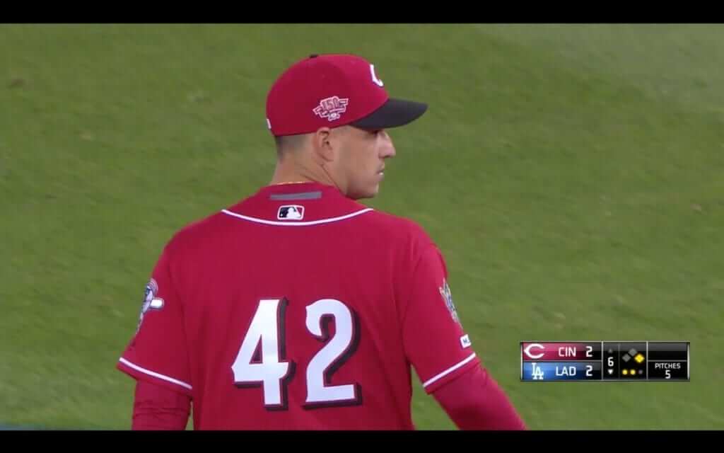
Yesterday was Jackie Day, so everyone wore No. 42. It’s one of my favorite uni-driven promotions and unquestionably Bud Selig’s greatest (only?) positive legacy. I understand why some people think only one player per team should get to wear No. 42, I understand why some fans and broadcasters are annoyed when they can’t keep track of the players, and I understand why reader Mark in Shiga will inevitably complain that most of the teams didn’t vertically center their numbers properly after removing the NOBs, but I like Jackie Day just the way it is. I love the sea of 42s, I love all the NNOBs, I love to see more players going high-cuffed for the occasion, and I love seeing all of the team rosters on MLB.com showing nothing but 42s. Would I want them to do this more than once a year? No. But for one day each season, it’s a treat.
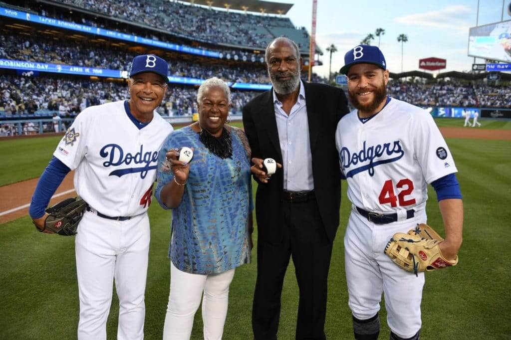
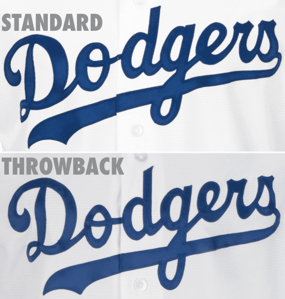
The new wrinkle this year is that the Dodgers wore Brooklyn throwbacks — a nice idea, but the execution was a bit of a hodgepodge. The caps were supposedly based on 1947 — the year of Jackie’s MLB debut — but the cap logo, as you can see in the photo above (that’s Jackie’s children, Sharon and David, posing with Dodgers skipper Dave Roberts and catcher Russell Martin), was comically large compared to the real thing. Here’s another shot:
As for the jerseys, the Dodgers didn’t add red numbers to their jerseys until 1952, so it didn’t make sense to include that for yesterday’s game either. And why couldn’t they have used throwback batting helmet logos instead of using their usual “LA” logo?
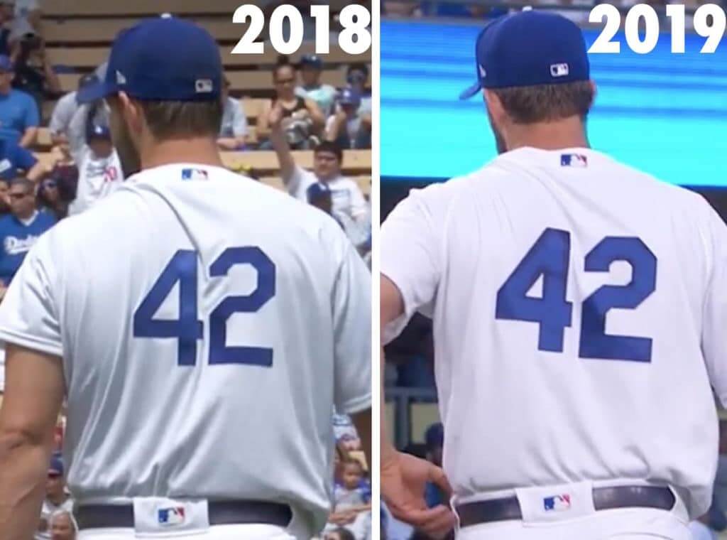
They did make certain throwback adjustments, though. The back numbers, for example, were thicker than usual. Here’s a side-by-side-comparison (I managed to get almost identical shots of Clayton Kershaw, exactly one year apart; click to enlarge):
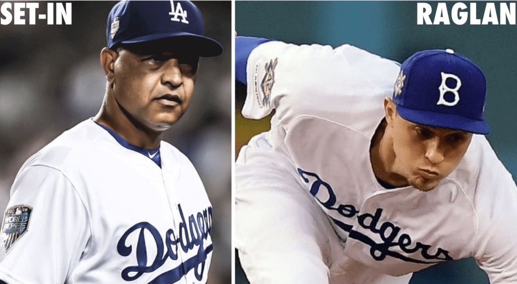
They also used raglan sleeves instead of set-in sleeves — a subtle but discernible tailoring modification (click to enlarge):
They also used a retro version of their chest insignia, although the differences are extremely subtle and hard to discern (click to enlarge):
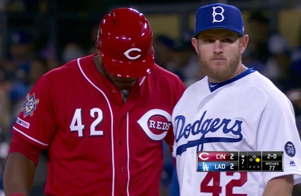
In other Jackie Day developments:
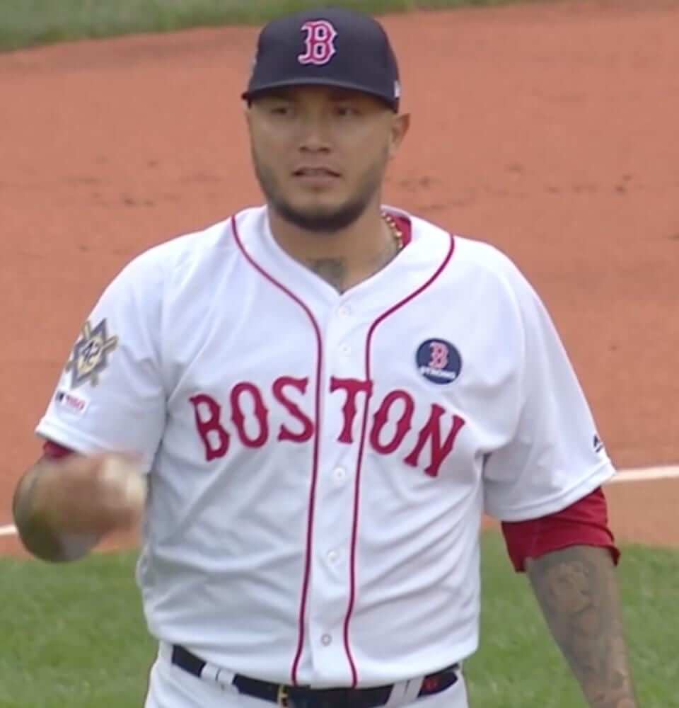
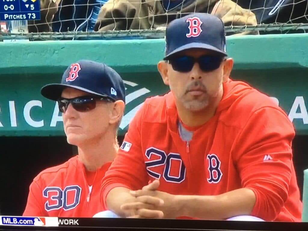
• Yesterday was Patriots Day in Massachusetts, so the Red Sox wore their “Boston Strong” uniforms — the first time that that uni has gotten the 42 treatment:
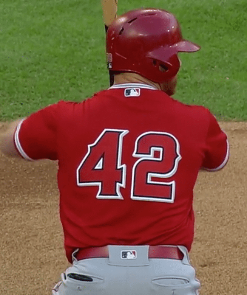
• The Angels — one of a handful of teams that wore solid-colored alternate jerseys yesterday — had particularly large uni numbers, or maybe it’s just that their number font has such thick strokes:
• As you know, the Reds are the only team not wearing the MLB 150 patch this season, because they’re wearing their own 150th-anniversary patch instead. But last night they did wear the MLB 150 patch, in conjunction with the Jackie patch:
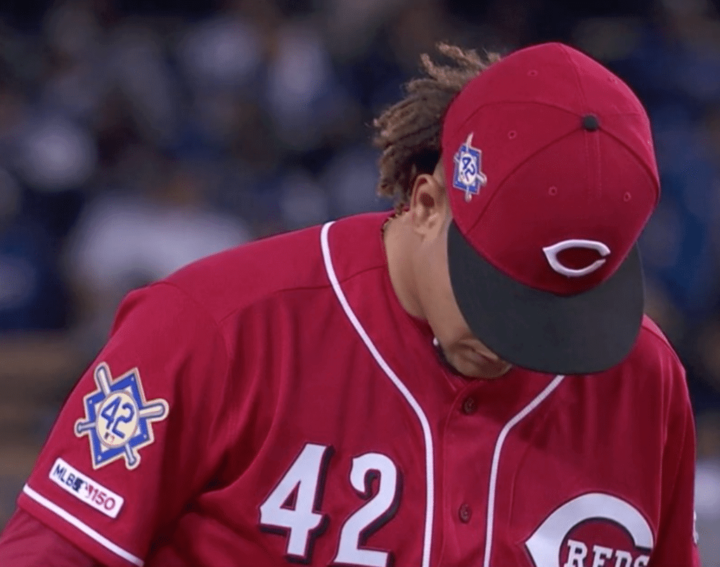
• Speaking of the Reds, shortstop Jose Iglesias wore the wrong cap. He had the team anniversary mark instead of the Jackie Day logo (click to enlarge):
• Phillies outfielder Bryce Harper wore lots of UCLA-themed gear. Jackie did attend UCLA, of course, although I suspect this particular tribute owed more to the fact that Harper has an endorsement deal with Under Armour, which is UCLA’s outfitter.
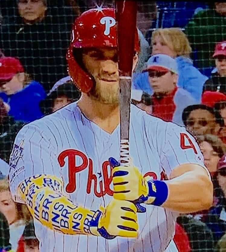
Bryce Harper wearing UCLA-themed shoes tonight for Jackie Day. pic.twitter.com/Ml0brfWD64
— Paul Lukas (@UniWatch) April 15, 2019
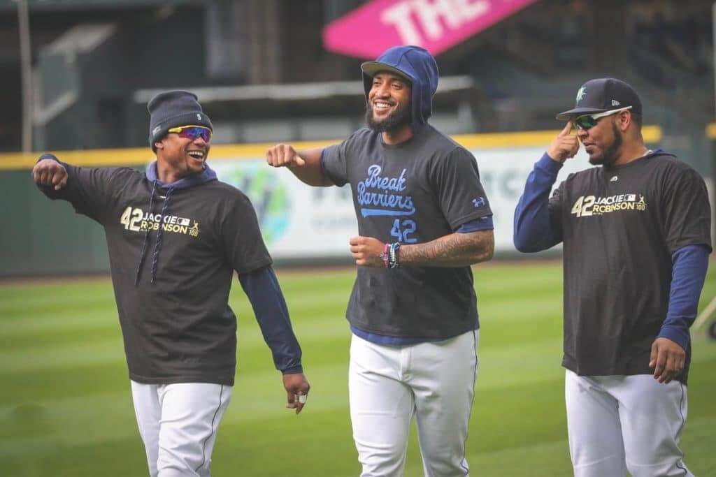
• Many players opted to wear Jackie-themed T-shirts during pregame activities:
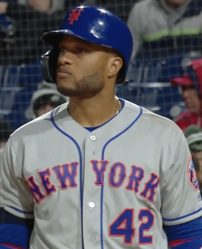
• Mets second baseman Robinson Canó, who was named after Jackie and wears No. 24 because it’s an inverted 42, wore Jackie-themed spikes, as did many other players:
You inspired me to play the game that I love. You broke every barrier to pave the way for generations to come. Thank you Jackie. My name, my number. Honoring you today and every day. #Jackie42 #JackieRobinsonDay pic.twitter.com/uXv80xt1ZD
— Robinson Cano (@RobinsonCano) April 15, 2019
@UniWatch in the @Rangers game @LinoDeShields is wearing one clear that has Jackie Robinson’s face and his time with the Dodgers shown, his other chest is Kansas City Monarch’s themed, Robinson’s team from his time in the Negro League #Jackie42 pic.twitter.com/Pa9t9wzBzg
— Jonathan Shaw (@jonny_shaw_10) April 16, 2019
• Did you know that former MLB outfielder Dave Henderson wore No. 42 as a shout-out to Jackie? I didn’t. His sons threw out the first pitch in Seattle last night, wearing replicas of their dad’s old Mariners jersey:
Nice moment prior to tonight's #Mariners game when Dave Henderson's sons threw out the ceremonial first pitch wearing their dad's trident jersey. Hendu wore #42 to honor Jackie Robinson. #Jackie42 pic.twitter.com/uW2tEtL6LH
— Phantom Dreamer (@ChrisRichardsPD) April 16, 2019
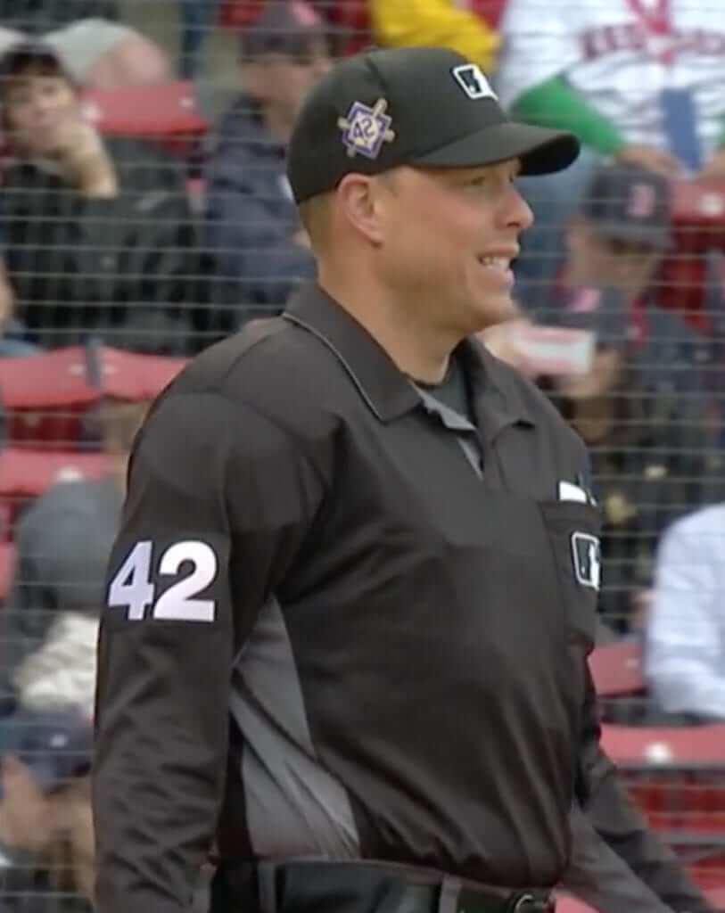
• As usual, the umpires also participated in the uni-driven celebration:
• The 42isms did not include dugout gear, however — or at least not for the Red Sox:
So that was yesterday. The 10 MLB teams that had yesterday off will wear No. 42 today. This will result in certain teams doing the 42 thing for a second consecutive day. The Orioles, for example, were 42-clad yesterday against the Red Sox, and they’ll maintain the 42 treatment for tonight’s game against the Rays, who did not play yesterday. Similarly, the Red Sox, who wore 42 at home yesterday, will wear 42 on the road for their game tonight against the Yankees, because the Yanks were off today. (Personally, I wish they’d restrict the 42 treatment to one day. If a team has the day off, they can wear 42 the next year.)
As a fascinating footnote to Jackie Day, here’s a really interesting article about how the Dodgers misguidedly assigned No. 42 to a rookie pitcher in 1969. Highly recommended reading.
Finally, there’s this, which is a good note to go out on:
Vin and Mrs. Robinson. #Jackie42 pic.twitter.com/QswmskJ5DQ
— Los Angeles Dodgers (@Dodgers) April 16, 2019
(My thanks to all contributors, including Mike Barnes, Mike Chamernik, Jakob Fox, @ejl1984, and of course Phil. My thanks also to Chris Creamer for research assistance.)
Click to enlarge
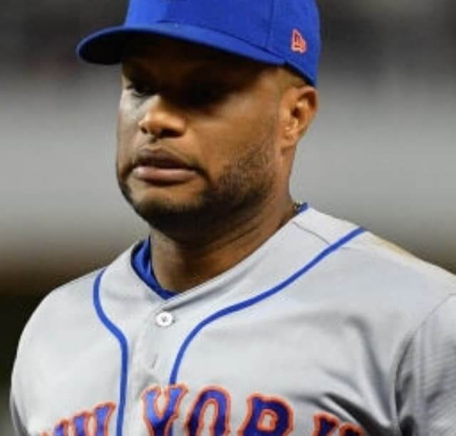
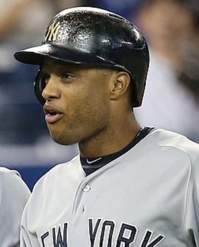
Who’s got the button: As longtime readers may recall, back when Pedro Martinez pitched for the Mets in the late 2000s, we noticed that he often had his top jersey button buttoned but his second button unbuttoned, which sometimes created a Napoleonic gap in his jersey that a reader — I no longer recall who — dubbed the “Pedro Porthole.” Last night I noticed Mets second baseman Robinson Canó doing the same thing (see above).
I figured his button had come loose and that it was just a random thing. But just in case, I did some quick photo research — had Canó previously sported the Pedro Porthole during his brief tenure with the Mets? Yup:
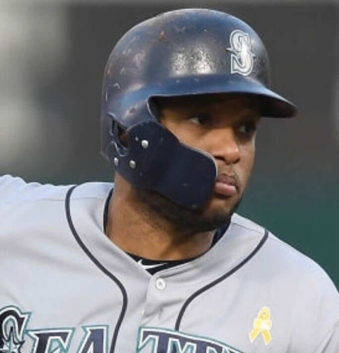
Hmmm. Had he also done this with the Mariners? Yup:
Hmmmmmmmmm. Had he also done this with the Yankees? Yup!
(In case you’re wondering: I chose photos of road jerseys because it’s harder to discern the buttons and buttonholes on a white jersey. But he does it with home jerseys too.)
To be clear: Canó doesn’t always leave the second button open. But based on my admittedly uncomprehensive photo research, I’d say he does it a good 85 to 90 percent of the time. That’s a much higher rate of Pedro Porthole-age than Pedro himself had. Perhaps we should rename this phenomenon the Canó Cavity or something along those lines. The Canópening? Something else?

Click to enlarge
EPL uni-tracking project: I received a note last night from reader Tom Gronek, as follows:
For a while now, I’ve been trying to find something that would show me what Premier League teams have worn from week to week. So about a month ago I decided to start my own website where I created a “road map” of what each team has worn. Since I don’t have a fancy graphics software, I did the jerseys up as a cross-stitch with a full-season recap as well as individual weekly recaps.
I tried to keep true to the real things but some may not have ended up 100% accurate. In most cases, I included special patches, alternate advertising, etc., such as the poppies that every team wore during Week 12.
You can explore Tom’s website here.
Click to enlarge
Collector’s Corner
By Brinke Guthrie
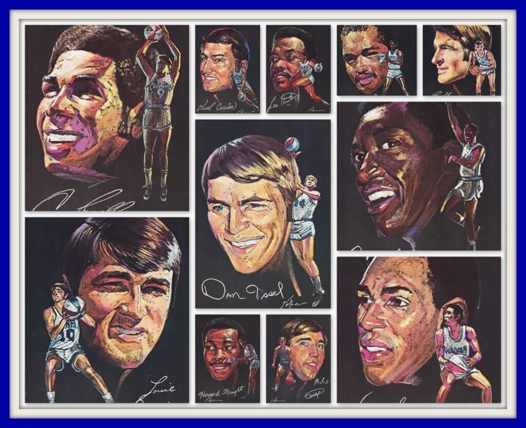
Had these, you bet I did! Here’s a set of 1971 Kentucky Colonels Pro Star Portraits from one of the masters, Nick Volpe. We bought our gas at Marathon in the Louisville suburb of St. Matthews to get these. They also offered a poster and a set of thermal cups, one of which I still have!
Now for the rest of this week’s picks:
• Last week we featured a 1970 game program for the Boston Red Sox. More good stuff this week with this 1979 Minnesota Twins scorecard. Nice and clean with current team logos on the cover. And just 75 cents! The seller notes this was for the 1979 home opener vs. the Angels (a 6-0 loss against Nolan Ryan, as it turns out).
• This San Francisco Giants bumper sticker (not 1970s as the ad states; they used this logo 1983-1993, according to Chris Creamer) also includes KNBR 68 — still the radio home of the Giants today — “for the good times.”
• These 1970s New York Knicks wristbands are still sealed in their package.
• A funky font can be found on this 1970s Expos pennant.
• This eBay seller is offering a pair of Swatch-like Bulova sports watches featuring the Chicago Bulls and Blackhawks.
• Turn It Up San Diego: Charger Power is the theme of this 1990s T-shirt.
• Get a set of four Milwaukee Brewers “Barrelman” glasses in this auction.
• Here’s another baseball glass, this time for the 1970s Baltimore Orioles. Every time I see something 1970s-ish for the O’s, I think of the 1970 World Series and how Brooks single-handedly killed the Reds. Some things you just don’t forget.
• Look at this 1970 movie ad. Joe Willie had just pulled off his Super Bowl win, and the bright lights of Hollywood beckoned. The movie was called Norwood. The ad proclaims “It’s Good Time Glen and Super Joe, Doin’ What They Do Best!” With a cast that included Pat Hingle, Dom DeLuise, and Meredith MacRae, how did I miss this one? Wait, I would’ve been 10, that’s how.
Luv Ya Blue! This Houston Oilers gumball helmet is still MIC (mint on card) and has an offer for Orange Products’ great goalpost kit — just a buck!
Seen an item on eBay that would be good for Collector’s Corner? Send any submissions here.

ITEM! Another one-day raffle: Reader Blair Hough, who won one of our recent membership raffles, has generously paid it forward by purchasing another membership, which we’re going to raffle off today.
To enter, send an email to the raffle address by 7pm Eastern today. One entry per person. I’ll announce the winner tomorrow. Please join me in thanking Blair for donating this prize.
Click to enlarge
’Tis the season: Don’t look now, but Cinco de Mayo is just a few weeks away, which means it’s the perfect time for our Uni Watch Spanish-language T-shirt, available in a wide range of colors (click to enlarge):
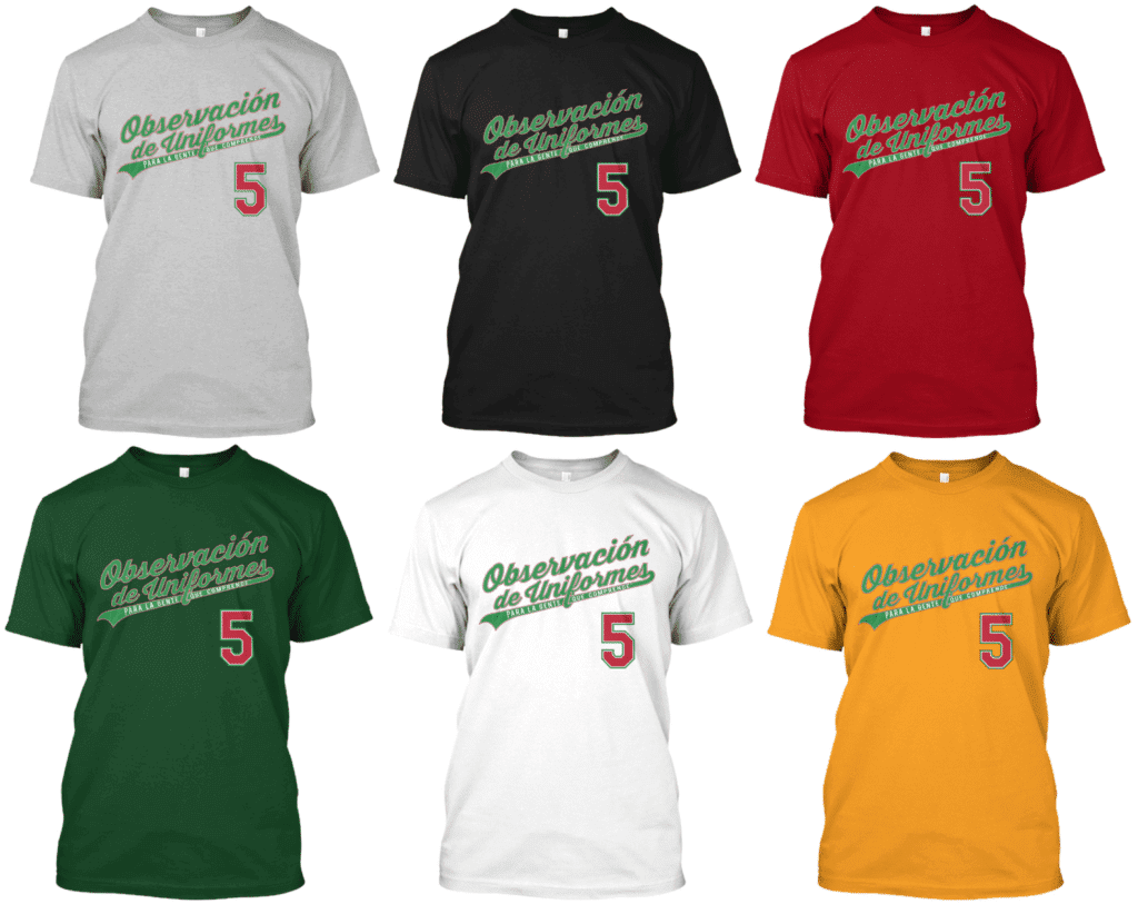
You can order them here. My thanks, as always, for considering our products.

Click to enlarge
ITEM! Cap update: Eighty-some Uni Watch Classic Caps arrived yesterday at the home of reader Mark LaFountain, who, as I explained last week, will now become our official Uni Watch Cap Fulfillment Manager. Mark has placed the caps in some storage bins that I provided for him, and now we’re just waiting for some cardboard box mailers. Looks like they’ll arrive by Thursday, so we should be open for cap business on Friday. Stay tuned, and thanks for your patience.
Click to enlarge
KRC update: The latest installment of Key Ring Chronicles is about a little metal thingie with geographic coordinates stamped into it. Check it out here.
The Ticker
By Paul

’Skins Watch: McGill University, which is located in Montreal, will no longer call its teams the Redmen. A committee will be convened to help choose a new school athletics name (from Noah Sidel). … “Redmen” was also recently dropped by a Utah high school.

Baseball News: The Green Bay Booyah, a new collegiate summer wood-bat team, unveiled their mascot and inaugural uniforms (from Brian Kerhin). … Here’s a 1977 photo of funk musician George Clinton wearing a catcher’s mask (great find by Max Weintraub). … Featherweight boxer Christopher “Pitufo” Diaz has a set of Pirates/Clemente-themed boxing gloves. Here they are in action (from Ryan Connelly). … New uniforms for the New Jersey Jackals of the Can-Am League. Lots of cap options, too, plus they’ll have a Game of Thrones uni on May 30. … Speaking of, another Can-Am team, the Sussex Miners, have Star Wars unis on June 8 and New Jersey Cardinals throwbacks on June 22. … Mets 1B Dom Smith protested an ump’s call last night by throwing down his helmet and snapping the C-Flap right off of it.

Football News: Two Chargers players — DL Joey Bosa and RB Melvin Gordon — have new uni numbers. … Some new uni number assignments for the Broncos and Ravens, too. … Indiana, which had been NNOB, is bringing back NOBs (thanks, Phil).

Hockey News: Kellogg’s has been running a Frosted Flakes commercial during the NHL playoffs. Reader Ted Arnold notes that the snippet of game footage at the very beginning of the ad shows the Canucks vs. the Golden Knights. “The Canucks aren’t even in the playoffs (nor were they last year), so no way this is even remotely accurate,” he says. “How hard would it have been to have at least gotten a clip from an actual playoff game, even if it was from last year? A bit lazy on the part of the Kellogg’s marketing team and their ad agency.” … The statue of Sir Walter Raleigh at the Raligh Convention Center has been dressed in a Hurricanes uniform (from James Gilbert). … Beginning this fall, all ECHL sticks, helmets, visors, gloves, and pants will be supplied by Warrior (from Thomas Hill). … New uniforms for the QMJHL’s Charlottetown Islanders (from Wade Heidt).

Basketball News: Whoa, check out this really interesting basketball net from a court in Brazil. Never seen anything like that! (From @BvrlyTweetmaker.) … The soccer team San Antonio FC saluted the Spurs with a “fiesta”-themed kit. … Cincinnati presented new coach John Brennan with a No. 1 jersey (from Adam Clements).

Soccer News: Some kit leaks for Liverpool and Inter Milan (from Josh Hinton). … Cross-listed from the basketball section: San Antonio FC saluted the NBA’s San Antonio Spurs with a “fiesta”-themed kit.

Grab Bag: The U.S. Army has finally decided that a reflective belt is not necessary in the daytime (from Greg Franklin). … NASCAR driver Jimmie Johnson ran in the Boston Marathon yesterday. “He got bib number 4848, which I’m sure is not a coincidence,” notes our own Jamie Rathjen. … Check out these weird Star Wars-themed Coca-Cola bottles. … Here’s why the Redcoats wore red in the Revolutionary War. … Cross-listed from the baseball section: Featherweight boxer Christopher “Pitufo” Diaz has a set of Pittsburgh Pirates/Clemente-themed boxing gloves. Here they are in action (from Ryan Connelly). … The good news is that Pepsi has decided not to put advertising in space after all. The bad news is that they were ever considering it in the first place.
In the article about the Dodgers rookie getting 42, what’s the patch on the jersey he’s wearing?
Dodgers 50th anniversary in LA, from 2008:
link
Caption says it’s his original jersey from 1969. If so, why would that patch have been added to it? It does appear to be wool flannel, and it has raglan sleeves. Could be a retail replica — but again, why would it have the 2008 patch? Odd.
“The famous jersey? It’s not on display. He has two of them, wrapped in plastic, hanging in a closet, both given to him by the Dodgers during an old-timers’ celebration in 2008.”
He’s probably just wearing the jersey from the old-timer’s game. The caption may incorrectly identify it as one of the two original jerseys.
I think it is creative captioning. It says “dons the 42 jersey” but based on the context of the article, I highly doubt that the actual original jersey sat in storage at Chavez Ravine for nearly 40 years just in case. More likely it is a replica.
That’s not a legit 1969 jersey. Dodgers didn’t have NOB in 1969 nor did they have a huge wordmark and front number like that. The front number appears to be 7″ tall.
If we’re voting, I’m going with Canópening. And I am voting a thousand times. This is brilliant. I feel like a T-shirt design isn’t far behind.
Agreed.
Brewers didn’t wear white at home last night. Navy jerseys, white pants. Cardinals wore road gray.
Ah, my bad — will fix text.
I feel like the speculation on Bryce Harper wearing UCLA gear because they are a UA school is a bit of a reach.
It’s fairly obvious. Ask yourself this: Would Harper have worn those accessories and shoes if either he or UCLA were affiliated with Nike rather than UA?
No, of course not. In fact, for that tweet that I posted about Harper’s shoes, the shoe photos were sent to me *by UA.*
who’s to say Harper didn’t approach them about doing it? I am sure he did that with the Phillie Phanatic cleats he wore…UA may be his brand, but why do you immediately see it as a tail wagging the dog scenario?
Sure — let’s say Harper approached UA. But could it have happened if not for the corporate alignment? No, it could not have.
Also: Getting these things made takes time. Ask yourself which scenario is more likely: (a) Bryce Harper spent spring training thinking to himself, “Hmmmm, what will I wear for Jackie Day?” or (b) Bryce Harper’s UA rep had Jackie Day circled on his calendar and brought it up with him several weeks back.
Right.
Also, it’s interesting to see that you get to be “sure” about something, but you disparage me when I say I “suspect” something. You appear to grant yourself a privilege but do not extend that same privilege to me.
If you think my observation in today’s text was a reach, so be it. Let’s please move on. Thanks.
Schools can have different manufacturers provide gear. Take a walk around any campus book store where they sell anything with the schools name/logo. Schools with on-field athletic teams outfitted by (Nike/UA/Adidas/Whoever) don’t limit themselves to that particular brand outside of those official school teams.
There’s no reason those shoes couldn’t have been New Balance or Adidas or whatever. Harper’s not playing *for* UCLA in those cleats.
Take a walk around any campus book store where they sell anything with the schools name/logo.
Sigh. Yes, there’s a variety of retail merch. That’s not what we’re talking about.
Find me a non-UA player who wore UCLA-themed accessories last night and then we can talk, OK? OK.
School merch can certainly be made by different manufacturers, but I think you’d be hard-pressed to find a school as high profile as UCLA currently having licensed gear made by multiple athletic companies (Nike, Adidas, UA, etc). This happened quite a bit in the past and probably still does at more obscure schools, but it’s no coincidence that Harper’s UCLA gear wasn’t made by Nike. One of the not at all accidental byproducts of the recent trend towards schools “unifying their brand” across all sports by using consistent logos, colors, fonts, etc is increasing the visibility of the brand that is ostensibly responsible for the “brand unifying.” Hence the presence of the maker’s mark not just on uniforms and equipment, but also on official team websites and Twitter accounts, as well as around locker rooms, on buildings and signs around campus, and anything else they can slap a logo on.
Corporate sponsorship could certainly have been it. Though my initial thought was Harper was wearing that because the contrasting colors stood out and he just wanted more attention. Probably a combination of the two.
I agree with Paul but either way the move is self-serving on Harper or UA’s part. It’s obvious through the discussion that the attention is more on them than Jackie Robinson.
I don’t have the clip, but the Phillies hometown broadcasters did, in fact, say that UCLA themed accessories were provided to Bryce by UA because he is Bryce is one of their guys.
that might be true, but Bryce has worn special cleats every year for Jackie Day, all made by UA. Why doesn’t he get credit here? Instead it gets filed under “UA is trying to pimp one of their schools” or some crap.
Todd, you keep attributing things to me that I didn’t say. I did not say anything about the tail wagging the dog; I did not say “pimp”; etc. Please stick to what’s actually been said and stop mischaracterizing me. Thanks.
Robinson Crues-hole.
“Whoa, check out this really interesting basketball net from a court in Brazil. ”
Famous quote?
link
The article states (and I missed this before):
The famous jersey? It’s not on display. He has two of them, wrapped in plastic, hanging in a closet, both given to him by the Dodgers during an old-timers’ celebration in 2008.
Ah, I missed it too!
The Dodgers jerseys yesterday also had raglan sleeves instead of the current design. Minor point, but interesting that they went to that length to do that.
Oh, great catch — I missed that. Will add to text!
I would love to take credit for noticing, but I actually read it in a twitter post last night.
Wait a minute — here’s Kershaw from last night:
link
That is not a raglan sleeve.
Ah, but this *is* a raglan sleeve:
link
So Kershaw apparently had different jersey tailoring than everyone else had!
I see the raglan on the Kershaw photo. It’s hard to tell on his right shoulder, but I clearly see the raglan sleeve on his left.
You know what? You’re right? I was misinterpreting the seam pattern. Thanks!
In that photo of Jackie and his teammates, Jackie is wearing a zippered jersey and the others have the button downs.
link
Kellogg’s has been running a Frosted Flakes commercial during the NHL playoffs. Reader Ted Arnold notes that the snippet of game footage at the very beginning of the ad shows the Canucks vs. the Golden Knight.
Golden Knights, not Golden Knight.
Also Paul, I am a huge fan. I’m 15 years old and I’m sure but my parents and friends are annoyed with every little uniform detail that I point out, so I’m glad i found Uni Watch. Thank you so much for doing this!
Thanks for catching the typo, Jefferson — will fix. Glad to provide an outlet and community for you and everyone else who Gets It™!
I may be in the minority, but count me as one of those fans who does not care for all of baseball wearing 42. Unless you’re watching your favorite team, it’s frustrating trying to identify the players. Unless my team is on TV, I usually opt out of watching and just read about the games later that night or the next day. I’d be more in favor of teams wearing 42 patches or hats with 42 instead of the team logo.
On a side note to the Ray Lamb article: Seeing as how it would be 11 years later before he would play for the Dodgers, wouldn’t Fernando Valenzuela have technically been wearing Ray Lamb’s 34?
I like the salute to Jackie Robinson but think the American League should wear 14 in tribute to Larry Doby. Robinson was the first African American to break the color barrier but Doby was the first to to do it in the AL and this should not be overlooked or forgotten by MLB. Having everyone wear the same number doesn’t bother me given the reason and I’m pretty good at identifying players.
I’ll agree with Paul that a big deal should be made on Jackie Day but I’ll agree to disagree on the execution. Sadly, this day has joined Mothers Day, Fathers Day and Armed Forces Long Weekend as times where I can only enjoy baseball on the radio.
I’m surprised that two of the biggest chargers stars have changed numbers I thought that players that change numbers had to buy up unsold inventory or something or is this just a rumour that someone made up that I thought sounded plausible.
It appears that the CFL’s Edmonton Eskimos will not be changing their name to the more culturally sensitive Edmonton Empire after consultation with Inuit tribes. link
Although the name “Eskimo” was commonly used to refer to all Inuit and Yupik people of the world, this name is considered derogatory in many other places because it was given by non-Inuit people and was said to mean “eater of raw meat.”
This is an interesting facet to the cultural appropriation issue that I don’t think gets talked about enough: What’s the right course of action when a significant percentage of the appropriated culture wants to keep the name (because it makes them feel honored or because they just don’t care or whatever)?
It’s going to take a lot of willpower for me not to snap up that Green Bay Booyahs checkered road cap. Stuff like that just hits my cap weakness, even though I more or less stopped collecting caps years ago.
Did anyone guess that Tottenham were the only EPL team to wear one uniform (so far) this season?
If pressed, I’d have guessed Wolverhampton and their chrome orange.
This shows how little I’ve been paying attention to the EPL…when did my favorite team (West Bromwich Albion) get relegated?
Yeah, I would’ve guessed Wolverhampton as well.
The grid shown isn’t complete. It’s missing the times Tottenham changed, which I would imagine should be what the blank spots are.
Wolves have to change against Watford, and vice versa, so they should only change once, but they have (more superfluously) a few more times.
NORWOOD (1970).
What’s that horrible stench? It’s coming from this video! I’m always a sucker for dumb-ass studio flicks from the past, and this road movie has all of the proper elements, none of the necessary talent and a genuinely mind-numbing cast. What were the producers thinking?! Since this is based on a novel by Charles Portis, who also wrote TRUE GRIT — which made a shitload of money — I guess they decided to reunite that movie’s least talented stars, Glen Campbell and Kim Darby. And just to make sure Glen wasn’t the crappiest actor on board, they offered NY Jets quarterback Joe Namath his first screen role!
link
The Green Bay Booyahs are a rebrand of Green Bay Bullfrogs (started 2007) of the Northwoods League to coincide with their move to a new stadium this season. Personally I think it was an upgrade.
I didn’t get a screenshot but Dwight Smith Jr. of the Orioles was wearing one of the Jackie Day socks as an arm sleeve.
Several players were doing this. Justin Turner of the Dodgers, e.g.
The Lets Go Tribe podcast talked about jersey choices for the Indians starting pitchers, and said they are going to undertake cataloging the jersey choices of the current starters.
When will it be time for Red Man chewing tobacco to change their name. Has anyone seen the picture on their packages? Yikes
It would be funny if they replaced the portrait of the Native American with one of Joe Stalin. Then they could keep the name.
Or a suburban Republican. Then they could keep the name. ;)
Anyone else notice the KC Royals logo I n the Twins scorecard (Collector’s Corner)? The Royals script is in red. Twins screw up?
Though the Redmen name is gone, McGill sports teams won’t need to change their uniforms as the team with no name. No imagery that needs to be changed. The uniforms don’t say Redmen – at least the football ones for sure:
link
The women’s teams are called the Martlets. Guys could go with that but I guess they want something different.
The Dodgers should go back to the thicker number full time.
They absolutely should, and this used to be their normal thickness. They added the white under-layer, supposedly because blue ink would bleed onto the jersey and stay there when they took numbers off to change them, and then when it was no longer needed, they stuck with the thin “inside” layer only.
The thin font looks great when used for NOBs, but the numbers should be thick and bold when there are no names overshadowing them.
Chargers just announced they’re going back to powder blue as the primary next season. With yellow facemasks!
Avs rookie defenseman Cale Makar’s name on the back of his sweater was rendered in the wrong font. It was the font the Avs use for their alternate sweaters (and used for their primaries pre-adidas redesign).
Makar : link
Tyson Barrie:
link
Why does everyone hate Bud Selig? Explain what he did wrong.
1) Interleague play.
2) All-Star winner gets to host World Series.
3) Expanded playoffs that push season into November.
4) Sunday Night Baseball (including for season opener).
5) Presided over steroid era while turning a blind eye.
And so on.
Moved the Astros to the American League instead of his Brewers.
I have always thought that the steroid era was a Faustian bargain concocted by the players and owners to goose interest in baseball. Which it most certainly did. Who will forget the thrill ride that 1998 was. Of course once it ran its course both sides made like Captain Renault and were shocked – shocked!!! – that PED use was so rampant. (‘Your winnings, sir.’. ‘Thanks. Now: EVERYBODY OUT!’)
You seem more interested in how people reacted to the thing, instead of the thing itself.
I don’t care if people were shocked, not shocked, pretended to be shocked, whatever. I only care that it was bad for baseball and will forever be a black mark on the game’s history. And Selig was deeply complicit in that.
The most egregious thing Selig ever did was allowing the Rockies and Marlins franchises to be Colorado and Florida instead of Denver and Miami, ending 117 years of the National League always being a league of city teams.
Absolutely disgusting and totally unforgivable.
Let the silly state and regional teams play over in the league where they don’t even play real baseball with the DH.
You know, I never thought about that.
And then the next NL team — the D-backs — also got a state name!
Bud Selig is perhaps the best commissioner of all time – including others from the big 4 sports
Another thing he “did” wrong was allow the Brewers to retire a number for him even though he never set foot on the field.
And they didn’t pick some bizarre number that no player would ever want, like the Cardinals did with 85 for August Busch. No, the Brew Crew permanently deprived every future player from being able to wear the most fundamental number of all the integers; the building block from which all numbers are created.
Of all the horrible number retirements in baseball history, this one is the worst.
A little something extra for the hockey uni news today. Last night Calgary Flames G Mike Smith wore his throwback facemask on the road in Denver. He never wears this mask with the white uniform. Had only been worn with the throwback third before.
link
Paul, thanks for the shout-out! (I’ve long since given up on these teams even caring about how the numbers are pushed too far down the players’ backs… though the observant Yankees still pay attention.)
I’ve never been a fan of the mass retirement of a number by an entire league, but if that has to be done, then I really like how that number makes a comeback like it does on Jackie Robinson Day. And we get to see a whole bunch of normally-NOB-festooned jerseys in rare number-only splendor!
So many teams look so good with this style. Look at the Angels jersey above — with an NOB above the number, it’s way too garish, but with just the “42” there, the extra layers and shadows and red-on-red still works. Same for the Texas Rangers. I’d love to see more teams ditch the NOBs.
That Red Sox Patriot’s Day jersey! A dual commemorative triple patched jersey! Be still my jersey collecting heart. Just awesome.