The New York State Lottery has been running a TV commercial lately that’s set in a ballpark. Like most lottery commercials, it’s pretty stupid, but this one happens to be fairly uni-notable. Honestly, I hadn’t paid close attention to it myself until Mets Police blogger Shannon Shark mentioned it to me the other day, at which point I took a closer look. I suggest that you spend a few seconds to take a look yourself (see above).
Okay — a talking glove. Like I said, it’s pretty stupid. But damn, they really went the extra mile on the uni-centric art direction. Shannon and I thought it would be fun to create dueling blog posts offering our takes on this commercial. He posted his analysis on Mets Police last last night, but I haven’t read it yet because I didn’t want it to influence my own take, which commences now:
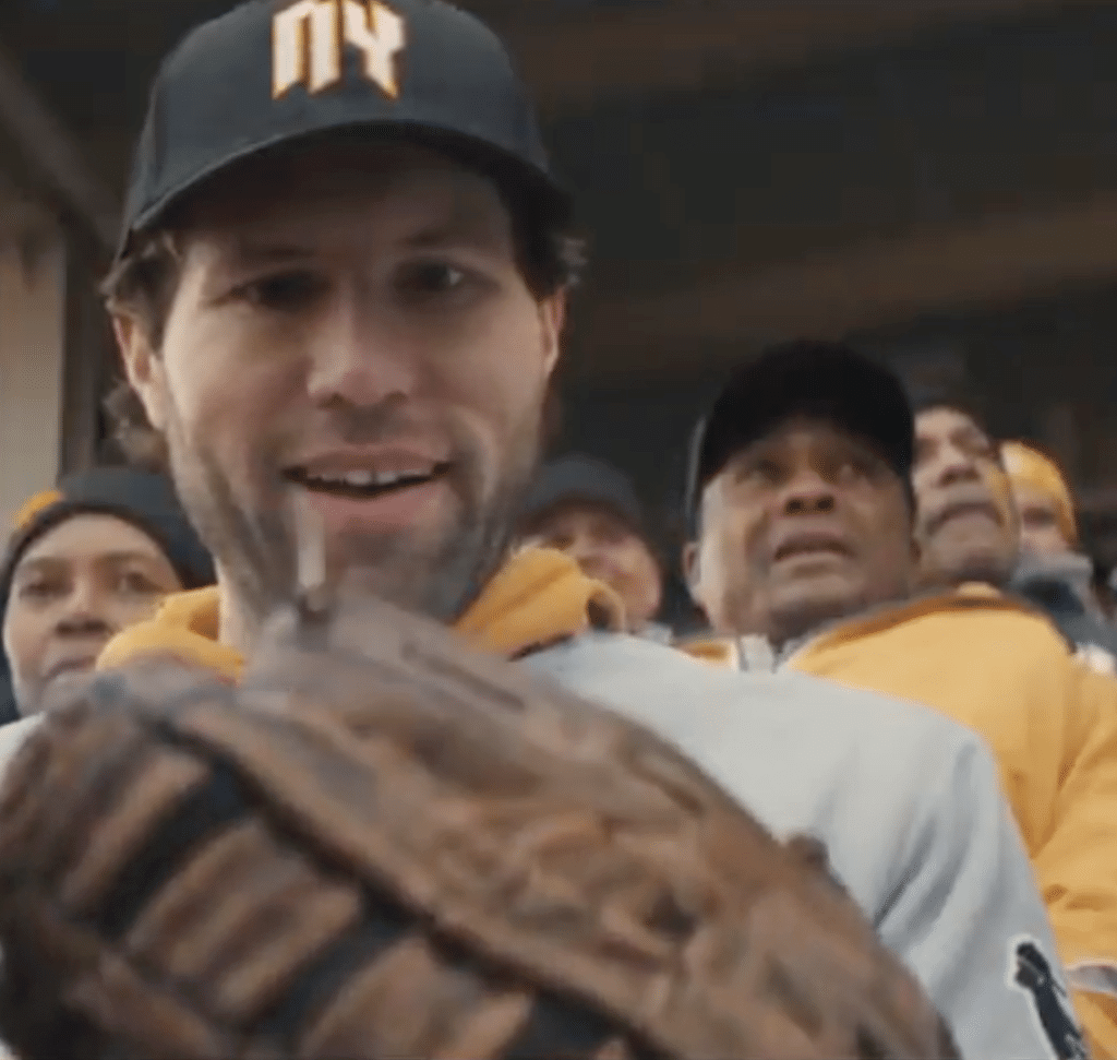
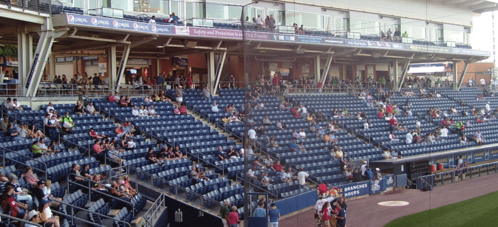
1. Let’s start with this image (click to enlarge):
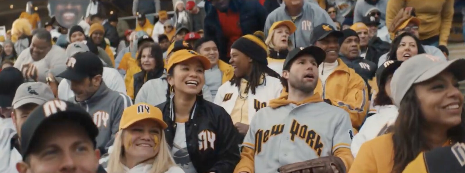
Whatever this team is, they have a lot of merch. I count the following:
• Two different jerseys: grey and white (both with “New York” lettering).
• At least six different caps: black, yellow, and grey with an “NY” logo, and then those same three colors with a bird logo. (There are also people with red caps, although it’s unclear whether they’re for the same team as all the other merch.)
• At least four different jackets: dark grey with “NY” and white sleeve stripes; light grey with “NY” and no sleeve stripes; black dugout-style with “NY”; yellow with no visible insignia and grey sleeve stripes.
• A grey sweatshirt with “NY” on the chest.
• At least two knit caps: one mostly black, one yellow. While these don’t have any visible logos, I’m assuming they’re related to the fictional team that everyone else is rooting for.
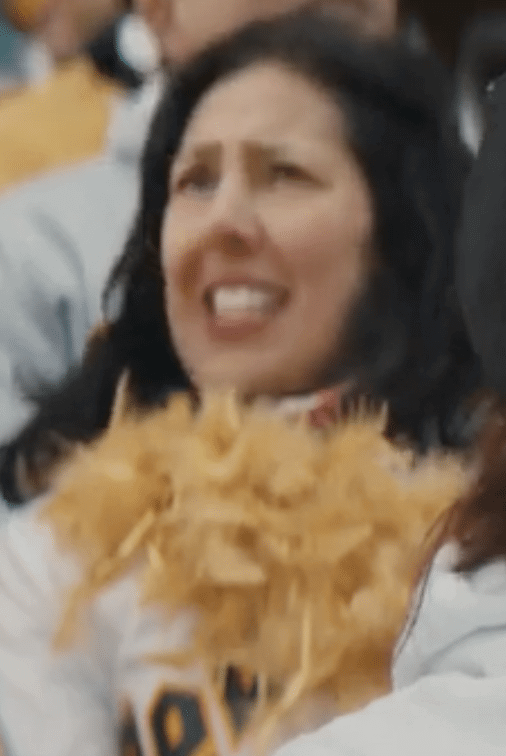
There’s also someone in the background holding a big face sign — a nice touch!
2. Let’s take a closer look at that bird logo:
It appears to be a bird carrying a baseball bat! The logo shows up again on the shirt being worn by the peanut vendor (who also has an “NY” visor and all of the buttons you’d expect a vendor to have; click to enlarge):
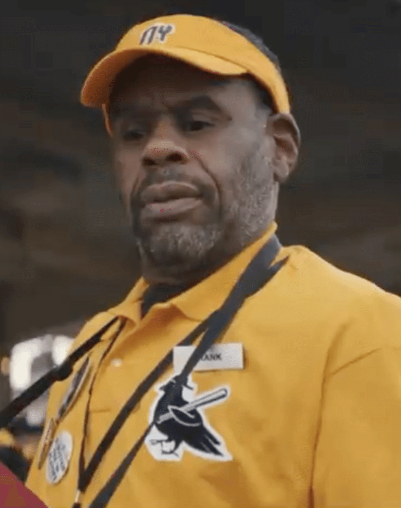
A bird carrying a bat and wearing a backwards baseball cap!
Shannon, the Mets Police guy, has decided that the team is called the New York Pigeons, and that sounds about right. I confess that I would not have come up with that on my own — Shannon gets all the credit.
3. Now let’s look at the main guy’s jersey. It has an “NY” patch on one sleeve:
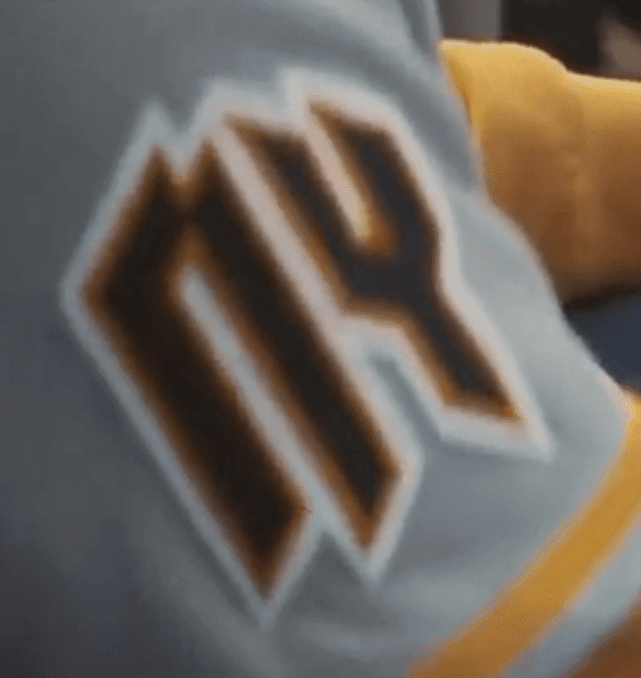
And although it’s hard to see, he has the pigeon logo on the other sleeve:
As for the back, it’s No. 7 and appears to be NNOB:
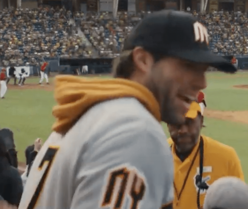
I happily note that the jersey, like all of the rest of the merch, does not appear to have a maker’s mark.
4. I mentioned earlier that someone in the crowd is holding up a sign with a giant face. Someone else is holding what appears to be a “Happy Birthday” sign:

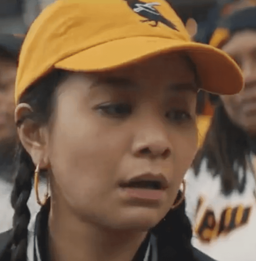
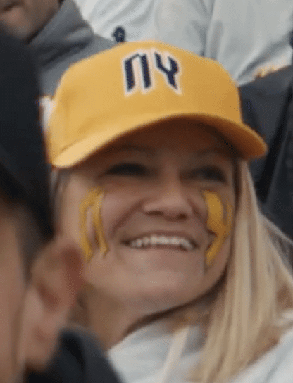
5. One woman in the crowd is wearing yellow “NY” face paint:
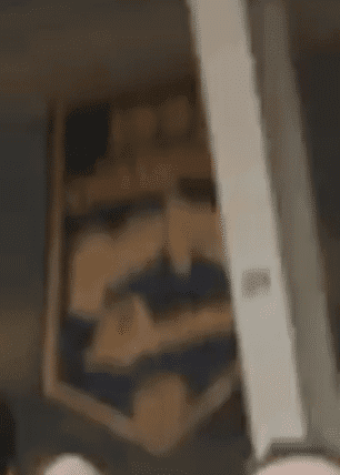
6. They even went the extra mile by giving the team what appears to be some sort of of championship banner hanging in the rafters, although it’s too blurry to make out the wording:
7. The weirdest wardrobe detail of all: One of the women in the crowd appears to be wearing a feather boa. Maybe feathers because of the bird-based team..? Take a look:
8. You know what else looks weird? A baseball glove without any maker’s marks or other graphics:
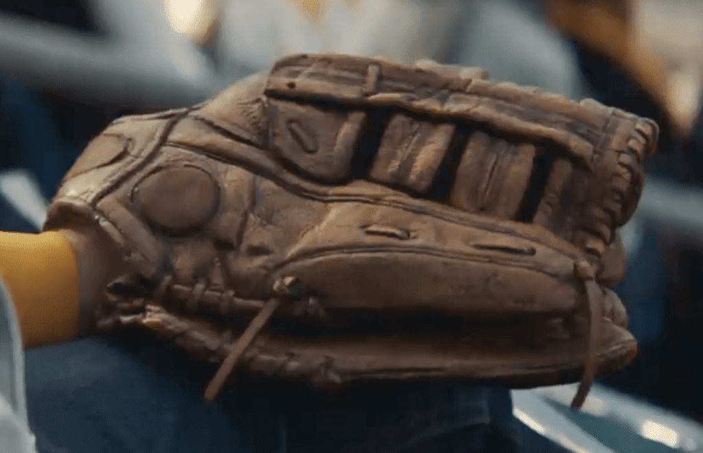
Obviously, they couldn’t get clearance from Rawlings or Wilson or whomever. But given the level of detail they went to with the rest of the commercial, I’m mildly surprised they didn’t invent a manufacturer for the glove.
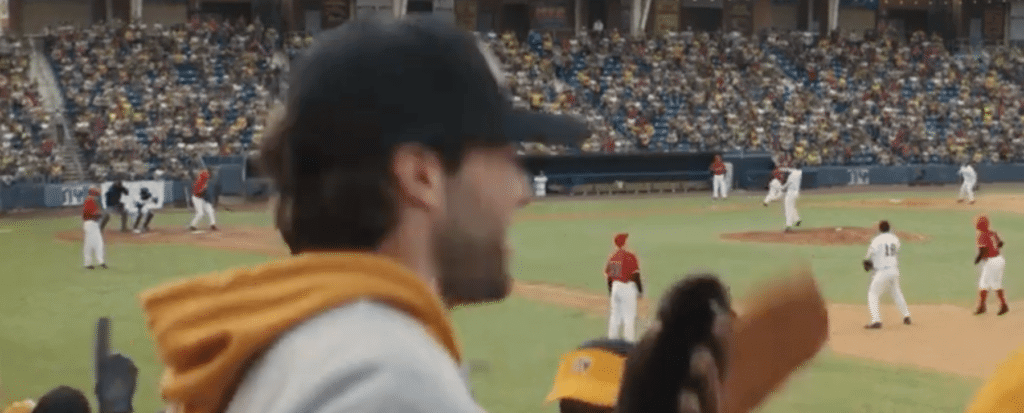
9. And you know what’s even weirder? Neither team on the field is wearing yellow. Weirder still, both teams appear to be wearing white (click to enlarge):
10. And where did they film this commercial? Looks like they used the ballpark where the Single-A Staten Island Yankees play. Here are two shots from the commercial:
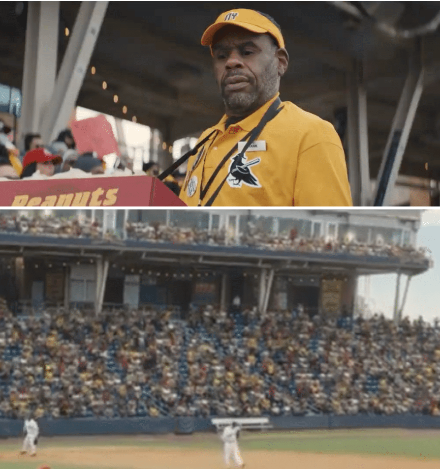
And here’s a shot from that ballpark, clearly showing the same architecture:
11. And then the turd in the punchbowl — the payoff for all of this turns out to be an apostrophe catastrophe. Ugh!
———
So that’s my take. Again, you can read Shannon Shark’s post about this same commercial here.
Who produced this commercial? The ad agency that’s been handling the New York Lottery account in recent years is McCann Erickson. And by fairly remarkable coincidence, that’s the same ad agency that created the Astros’ tequila sunrise uni design back in the 1970s! So maybe this commercial paid such close attention to the uni details because uniforms are in McCann’s DNA.
Somewhere in here I should probably mention that I’m generally opposed to state lotteries, which prey on the poor, serve as a regressive back-door tax, blah-blah-blah. But let’s give credit where it’s due: They — or at least McCann Erickson — put a lot of uni-related thought into this ad.
(Special thanks to Shannon Shark for jump-starting this entry, and thanks also to the Tugboat Captain for figuring out where the commercial was shot.)
Click to slightly enlarge
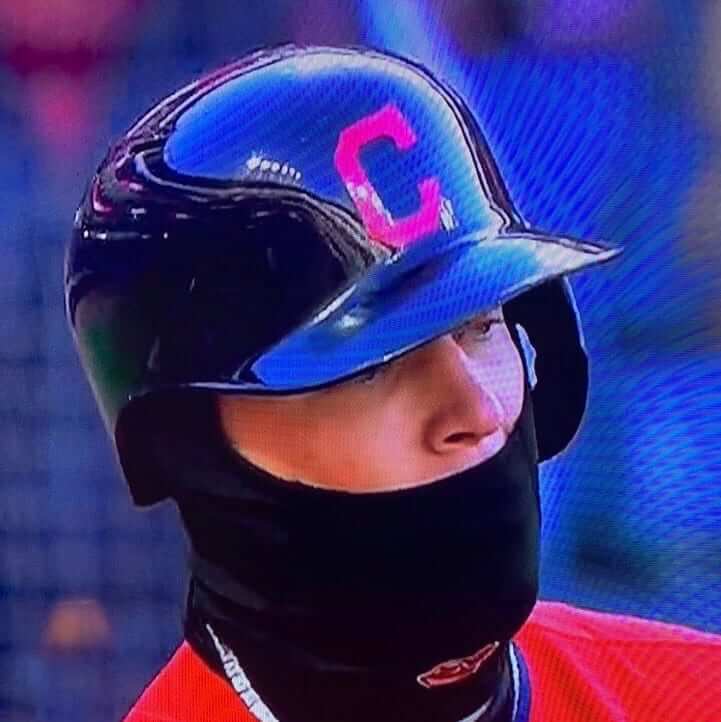
Not dead yet: Many readers noticed that Chief Wahoo made an unauthorized return to the field yesterday, appearing on Indians catcher Roberto Perez’s balaclava. After all of the Wahoo controversy and the team’s attempt to put it behind them, why would they be issuing this accessory? It’s not like they didn’t know that early-April games in Cleveland can be chilly.
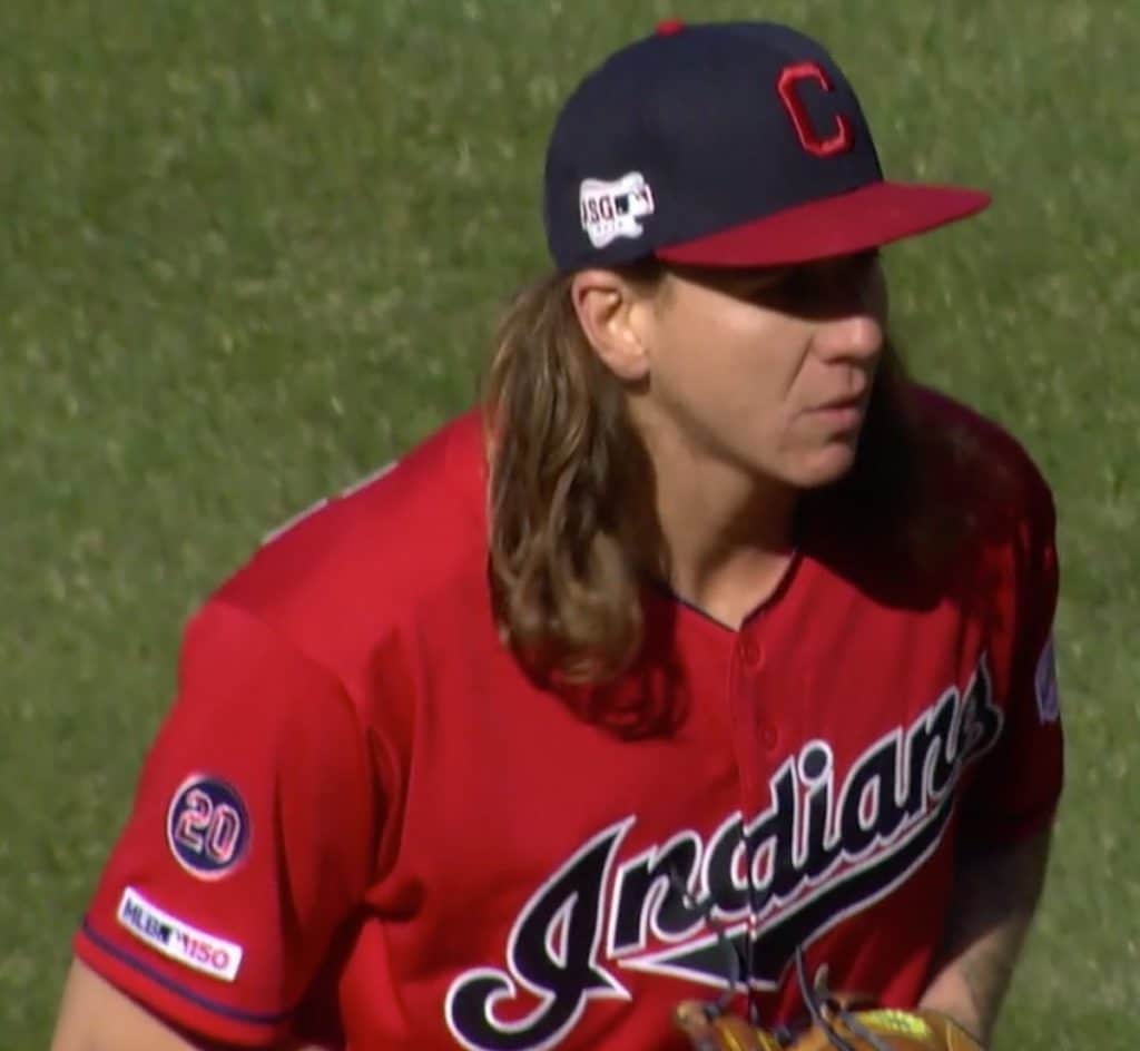
Speaking of the Indians, they debuted their new red alternates yesterday’s home opener and also wore their one-day Frank Robinson memorial patch for the occasion:
(Big thanks to @ObieMassillon for the Perez screen shot.)
April Fool’s recap: Yesterday was April 1, so of course there were lots of pranks — some better than others — ricocheting around the uni-verse. Here are the ones I’m aware of, although I’m sure there were others:
A historic jersey for a historic year.#Bears100 pic.twitter.com/p0ZsbSjO7Z
— Chicago Bears (@ChicagoBears) April 1, 2019
Bears to sport triple-digit jerseys in 2019 to celebrate centennial season.
📰 : https://t.co/HnhAk3E9DN pic.twitter.com/DY5EajLyvn
— Chicago Bears (@ChicagoBears) April 1, 2019
Uhhh ohhhh!!! Triple digit, can’t wait to rock the 112 this season pic.twitter.com/nxgocBc9y6
— Allen Robinson II (@AllenRobinson) April 1, 2019
BREAKING: this season on June 31st, we will be playing as the Omaha Potholes! pic.twitter.com/KxIrVeJYuY
— Omaha Storm Chasers (@OMAStormChasers) April 1, 2019
Our iconic U statue gets an update to match the new @CanesFootball #turnover chain. 🙌 #umiami pic.twitter.com/Yh0gy8t1Bg
— University of Miami (@univmiami) April 1, 2019
Coming soon to our @RawlingsSports Custom Glove Builder…https://t.co/FdF9yk59Dd #TeamRawlings pic.twitter.com/0emoGiqYr4
— Baseball Express ⚾ (@BB_Express) April 1, 2019
CONFIRMED: New design for #UNC #football #ArtificialTurf Kenan Stadium field. pic.twitter.com/SnRWHmrUpL
— James Gilbert (@jamesleegilbert) April 1, 2019
That Omaha Potholes prank is the one people seemed to like the most. Based on the response, I have a feeling the Storm Chasers might actually go ahead and do a one-game Potholes makeover at some point this year.
Collector’s Corner
By Brinke Guthrie
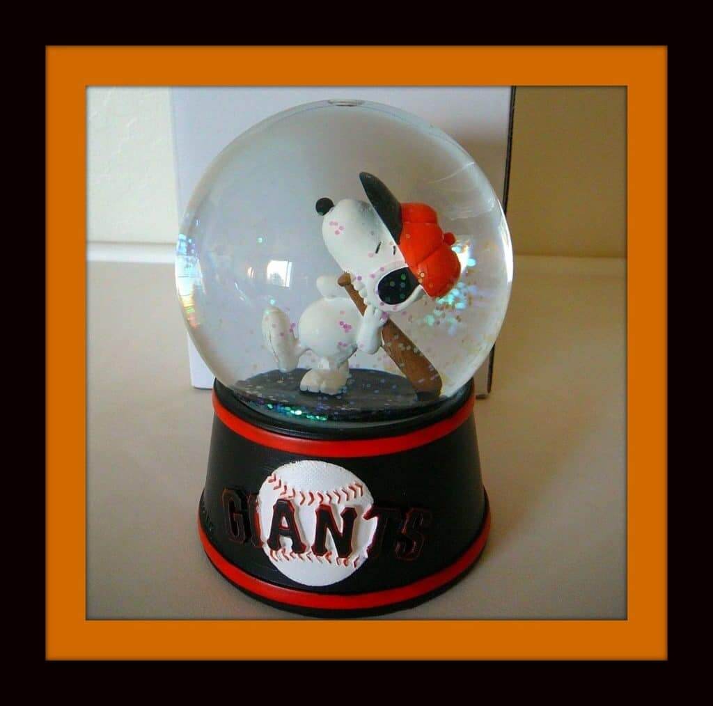
Baseball season is fully underway, so let’s lead off with Snoopy trying to go deep in this San Francisco Giants snow globe. This one is from 2016 and I have mine sitting right by me as I type this. The late Charles Schulz lived close by (Petaluma) and perhaps this is why the Giants do a Peanuts giveaway every year (this year it’s Woodstock on Aug. 31).
Now for the rest of this week’s picks:
• Does anyone think that maybe they should’ve made this Browns seat cushion a different color? To provide some contrast, perhaps?
• This kids-size Sears Dolphins jacket has a “varsity” D on the chest rather than a full-size Dolphins logo.
• This Chicago White Sox painter’s cap has their 1970s batter logo on top.
• Look For The Star! This 1980s Rams Starter jacket has that classic Hollywood satin-y look to it. Couldn’t you just imagine Farrah wearing this on Charlie’s Angels?
• This Reebok Rams jersey has the KISS wordmark (as in Gene Simmons) on the nameplate.
• Check out these 1970 canvas sneakers with MLB team logos along the rubber outsole.
• Someone is selling photos of new Buccaneers coach Bruce Arians depicted as — you guessed it — Bucco Bruce.
• I always loved the Padres font as depicted on this 1970s pennant.
• Ever collect 1970s Big Signs from Fleer? This one is for the Kansas City Royals.
Seen an item on eBay that would be good for Collector’s Corner? Send any submissions here.
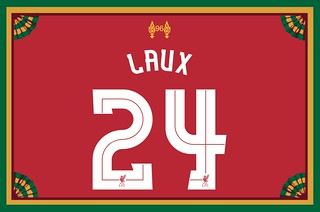
Membership update: A bunch of new designs have been added to the membership card gallery (including Jeff Laux’s card, shown at right, which is based on this Liverpool soccer jersey).
Ordering a membership card is a good way to support Uni Watch (which, quite frankly, could use your support these days). And remember, a Uni Watch membership card entitles you to a 15% discount on any of the merchandise in our Teespring shop and our Naming Wrongs shop. (If you’re an existing member and would like to have the discount code, email me.) As always, you can sign up for your own custom-designed card here, you can see all the cards we’ve designed so far here, and you can see how we produce the cards here.
And speaking of memberships, the winner of yesterday’s one day raffle for a complimentary membership is Taylor Warntjes (who has chosen a mid-’90s Orlando Magic theme for his card). Congrats to him, and big thanks to reader Jason Hillyer for donating the membership fee. We’ll have another membership raffle tomorrow.
The Ticker
By Alex Hider

Baseball News: The Tigers may have shrunk the logo on their caps, but they haven’t yet done so on their batting helmets (from Jon). … Pirates 2B Erik Gonzalez was wearing a glossy batting helmet during the team’s home opener yesterday. The rest of the team was in matte (from @jookyhc). … Speaking of Gonzalez, Tom Whitfield noticed some NOB inconsistencies between Gonzalez and Pirates OF Corey Dickerson. … Cardinals LF Marcell Ozuna is losing the “2” on the “23” decal on his shinguard (from @mrmichael21). … Speaking of equipment, Dodgers 3B Justin Turner says he’d be on the injured list if not for the wrist guard he wore this weekend (from Jakob Fox). … The Reds threw it way back for Sunday’s ticket design. I would assume we’ll be seeing more of these as the season progresses (from @KingDeshavius). … Staying in Cincy, the Reds have added a uniform outfield memorial to Frank Robinson. Honestly, they should be doing this for all their retired numbers (from Joanna Zwiep). … The Phillies’ logo tweaks have some fans seeing stars — Dallas Cowboy stars, to be exact. Of course, that’s a big no-no in Philly (from David Magaña). … Teams will again wear cap patches for Jackie Robinson Day on April 15 (from @ThatRodneyGuy). … From Sunday’s post: Phil Ticked an item about the letters “AMDG” inscribed on the mound in San Diego but wasn’t sure what they meant. According to Kevin Downs, those letters stand for the Latin phrase “Ad maiorem Dei gloriam,” or “For the greater glory of God.” It’s the motto of the Jesuits, an order of Catholicism, and Nick Margevicius — the Padres’ pitcher at the time — attended a Jesuit high school in his native Cleveland. … Here’s more info on the Iowa Cubs’ “Scouting jerseys” that they’ll wear in April (from John Russell). … LSU wore their gorgeous throwback uniforms last night (from Brody Miller). … Grand Rapids Community College has added a throwback uni this season (from Dave Murray). … At least one member of the White Sox still had the MLB 150 cap patch yesterday. That patch was supposed to be just for Opening Day last Thursday.

NFL News: It appears that the draft day caps for this season will feature city or state flag motifs, and leaks of the caps may have given us a preview of the new Jets logo (from Chaz, Phil Primato, and Adam Ryan). … The Browns introduced WR Odell Beckham Jr. to the media yesterday, and did so with a Color Rash jersey (from Throck). … Speaking of the Browns, they dropped a few hints for their 2020 redesign yesterday (from John Sabol and Jim Parry).
College/High School Football News: Looks like West Virginia is teasing a new uniform (from Nate). … It appears some Georgia Tech players have been wearing helmets with a triple stripe during spring practice. Others are wearing traditional white helmets (from Michael Zoid). … Frankfort High School (Kentucky) will have a new orange uniform next season (from Josh Claywell).

Hockey News: The Coyotes tweeted a time-lapse video showing all the work that goes into creating their game-day graphics (from Lauryn Feauto). …Las Vegas Lights FC, the USL soccer club in Vegas, wore Golden Knights-inspired jerseys on Saturday (from Steve Pastorino). … Bruins C David Krejčí’s uniform pants are reportedly more than a decade old and have an out-of-date team logo (from Skott Daltonic).

NBA News: The Sixers are holding a “design-a-T-shirt” contest. Enter here (from Chris Sykes). … Clippers PF Montrezl Harrell paid tribute to rapper Nipsey Hussle on his sneakers on Sunday night. Heat G Dwyane Wade and Raptors PF Kawhi Leonard wore their own memorials. Nipsey Hussle was shot in killed in Los Angeles on Sunday evening. (from Mike Chamernik). … Newly signed Hawks C Isaac Humphries will wear No. 8 (from Etienne Catalan). … The Wisconsin Herd of the D League is holding an NCAA-style bracket to determine their best themed jersey of the season.

College Hoops News: Nebraska is taking a fan vote to determine the design of its new basketball court (from Jack Wade). … Brandon Wright-Rowan’s NCAA tournament color tracker has been updated through the Elite 8.

Soccer News: Manchester United’s home uniform for next season has reportedly leaked (from Josh Hinton). … Ever wondered what all the mascots in Japan’s J-League look like? Today’s your lucky day (from Jeremy Brahm). … Cross-listed from the hockey section: Las Vegas Lights FC of the USL wore jerseys inspired by the NHL’s Vegas Golden Knights on Saturday (from Steve Pastorino).

Grab Bag: This year marks the 50th running of Atlanta’s Peachtree Road Race, one of the largest 10Ks in the country. Mizuno made some retro running gear to mark the occasion (from Kyle Dawson). … Last night’s episode of Barry on HBO featured a subtle reference to Cleveland sports (from Mark Simoncelli Jr.). … Staples appears to have a new logo. “I believe this is their first overhaul of the logo ever,” says former Staples employee Pete Garofalo.

Click to enlarge

What Paul did last night: My brother Roy usually lets me celebrate my birthday with my friends and then treats me to a nice dinner a week or two later, just the two of us (I do the same for his birthday). Last night he took me out to the great Manhattan steakhouse Sparks. We started with some bluepoint oysters (Roy and I are from the Long island town of Blue Point, so we always like to get bluepoints), then split a really good salad (didn’t photograph that, sorry), then had steaks with hash browns and broccoli (that’s mine shown above), and then I had a slice of walnut-pecan pie. By that point we were totally stuffed, but I guess the staff must have heard Roy mention something about my birthday, because they brought us this complimentary slice of birthday cheesecake:

How nice is that? We could only manage a bite or two, but it was a nice capper to a very nice night.
Our next family birthday comes next week, when my mom turns 95 (!).
Good on Roy for taking you to that great steakhouse! I’ve only been there a handful of times, but guessed it from the pattern on the plate before reading the text. Culinary uni-watching
Sparks is wonderful. The first time I went there was around 1990 (when the place was still “famous” for Mafia boss Paul Castellano having been murdered right in front of the restaurant a few years earlier). My then-galpal and I were just kids at the time, and we were surrounded by tables of what seemed to be very high-powered Important Grown-Ups, but the staff treated us just as courteously and professionally as they treated everyone else. That’s as it should be, of course, but it still made a big impression on me.
I was there summer of 1996 and the place was packed with a bunch of us crowding in the waiting area.
In walked Woody Allen and his *girlfriend* Soon-Yi, and they got seated rightaway.
My mom told me that it is tough to get into a restaurant after a famous person gets shot nearby. Likely the most my mom thing she ever said.
I actually went to Sparks for my high school graduation dinner in 1991. It was fabulous- one of the top 10 best meals I’ve had in my entire life. And best of all, it was FREE. As we were dining, one of the other patrons recognized my father (who owned a limo company) and invited me over – turns out he was the CEO of Pepsico’s NY franchise, and at the end of our meal he had our entire tab (six people) placed on his bill. Yes, a spectacular dinner on Pepsi’s dime. :)
I agree that the details in the ad are amazing, and also agree that lotteries are a regressive back-door tax, etc. I assume this ad was expensive to produce, given all the detail. Do you think the intricate details will really increase lottery revenues? Since the NY Lottery is supposed to benefit public education, isn’t an ad this intricate kinda stealing from schools? (And what if that kind of design consideration went into public works?)
Setting aside the larger question of the secular and theological morality of state lotteries, advertising is not a zero-sum proposition where every dollar spent making or distributing an ad is one dollar less in revenue or profits. Rather, advertising is planed with the goal of increasing revenue. An ad might cost, say, $300,000 to produce an air, but if as a result of the ad campaign the producer gains $600,000 in new revenue, the ad will have been worth the expense. Whereas if a cheaper version of the ad would cost only $100,000 to produce and air but only brings in $300,000 in new revenue, the “cheaper” ad will have just cost the advertiser $100,000 in lost revenue.
So no, every dollar spent on producing the excellent uni-details of this ad is not a dollar stolen from New York schools.
The first Twitter embed for April Fools Day doesn’t seem to be April Fools related or from this year.
Hmmm. It was so over-the-top absurd that I thought it must be a prank. Now removed.
Florida had academics-inspired uniforms for April Fools Day, and I think they actually look pretty good.
link
If that’s the new Jets logo, I’m fine with it.
It is fine but would be better if it was kelly green. Hat features black as well. If the Jets will be using black in their uniforms, it is a better aesthetic decision for them to go with kelly green. This hat appears to be the same hunter green shade with black.
Basically, if they are not switching to kelly green then I will be disappointed.
You’re going to be disappointed.
Check out link, which I’m guessing is where the leak came from. The discussion is in German (I think), but note that the back of the hat is half-green and half-black. Very, very bad sign.
Then again, the guy on the right is wearing a nice vintage Falcons jersey…
Photographic evidence of Krejci’s pants
link evidence of Krejčí’s pants with the old B’s logo
Cool breakdown of the lottery ad. I wonder if the team is the NY Meadowlarks — one of the names considered for the Mets. I think meadowlarks are bright yellow, which would fit with the colors.
Those New York Pigeons (?) duds are the best-looking fictional uniforms since the 1939 New York Knights. The colors are a mistake – the black at least needs to be blue, and probably the yellow needs to be orange too – but the cap and jersey logos and scripts are fantastic. Any team that looked like that would have me as a casual fan even if it played in New York.
but if they went blue/orange it could be taken as a knock-off of the Mets.
Not of it was dark navy instead of royal. But you’re right – the colors work for the ad. If it were a real-life team, though, Pittsburgh colors would be wrong for the Big Apple.
Those are New York Stars (WFL 1974) colors.
Could always go for the traditional pigeon colours – grey with green and purple.
link
I’m not sure why the UNC football thing is obviously a joke, but I guess I just don’t underestimate the possible goofinesss.
Looking at those draft day caps, I don’t like most of them, but I do like the Bills incorporation of the lightning bolts from the city flag. The history of electric power in the city is interesting and I actually think works well with the Bills visual identity. Not so sure about some of the others.
I actually love that field. If they can have big ridiculous half-court logos in college basketball, why not football?
i sent in the Chief Wahoo reference too in Barry, i didn’t even register that the other torn up sticker could be the new cavs logo
Not that it really matters, but the glove in the lottery commercial is a Wilson (the oval shaped wrist logo patch and the welting pattern give it away). The leather quality looks kinda cheapish, so I’m guessing it’s a purposely weathered version of this A950 model:
link
It DOES matter, and I was just about to point out that it was a Wilson, but I checked the comments and saw that you had already done so.
I’ll buy a NY lottery ticket if it gets me a chance to win Pigeons merch.
I’m biased, but I think the Bears prank was best. It’s their 100th season and there are so many retired numbers that multiple players have to share a number in training camp, making triple-digit numbers a possibility. (The team has announced no more retired numbers, however.). Plus, the Bears number font is so thin that they might even be able to pull it off. I didn’t fall for it but it was pretty slick.
The lack of a serif on the Bears’ “1” (the Cubs should go back to this!) is the biggest thing that makes three digits possible; a number 111 would look like some kind of three-stripe logo.
In Japanese baseball, three digits are routinely given out to developmental players as well as staffers and trainers, but as far as I know, since that system began, no team has had a non-serifed 1 on any of its uniforms. Now I really want to see the number 111 or 101 in this font!
I believe it was Mizuno, not Puma that made the retro running gear for the Peachtree Road Race.
Collector’s Corner: Should be Bruce Arians, not Brian.
Fixed.
In that lottery commercial the on-field action doesn’t match the situation: the guy reaches up and catches the foul ball, but on the field the pitcher is just delivering the pitch.
Ticker, Baseball re: AMDG copy reads that the Jesuits are “an order of Catholicism” which doesn’t really make sense. Might I suggest saying that the Jesuits are “an order of Catholic priests.”
I’ll take the Pigeons over the other team the NYSL did some years back.
The International Cricket Council (ICC) had a uni related April Fool’s tweet:
link
Those triple stripe helmet decals are showing up on Georgia Tech’s gold helmets as well during Spring Practice.
link
I always had a soft spot for GT because my first ever uniform (football more years ago than I care to recount) was a knockoff of their gold jersey with the navy and white sleeve stripes. Absolutely gorgeous. I came to like the Jackets even more during the Paul Johnson era, even though the uniforms started to look really bad with those goofy swirls. Combining their abandonment of option football and the billboardification of their uniforms, I think I no longer have fondness for any ACC team.
What was that on Julio Urias’ socks last night? A beach scene?
NFL draft hats
link
totally didn’t see the ticker today
The incorporation of city flag elements on draft caps makes me sad that there’s not a team in St. Louis, which has a great city flag.
Brinke. “Sparky” Schulz lived in Santa Rosa.
Yes. Moved from MN to Sebastopol, then Santa Rosa.
ah you’re right. Well, Snoopy was from Petaluma.
-I’ve caught that Ny lottery commercial a few times over the last couple of days. I love all the uni-touches.
-RE: the NFL draft caps, i’m Going to paste over what o said on the Uni Watch Facebook page.
“The “city/state flag” motif is a bit pandery, but I do like that it’s led to different templates for the teams as opposed to one uniform design. It works better for some than others for sure.”
I disliked the Indians red jersey until I saw it on the field yesterday. Seems like the home jerseys with the script Indians would benefit from the script I logo of the early 2000’s on the cap rather than the block C which pairs better with the road uniforms. The current hats are a dumpster fire. At least outline the C in white.
I actually like the Block C as it is, as it looks like an older hat, like something you’d wear until it got so ratty it fell off your head.
One thing that drives me MAD is that the Indians use a “block” style C and then also uses script for the team name. Choose one or the other!
BTW…those red jerseys have already become my favorite Indians jersey in my lifetime.
The Dodgers have been doing block hat lettering with script jersey lettering for decades and it’s a terrific combo that I have no problem with at all, while the Indians’ effort is lackluster. Say what you want about the appropriateness of Wahoo, but that logo paired just fine with their 1994-2010 script uniforms.
I really miss the Indians’ white NNOB alternate, though. Supposedly they’re not using it this year now that they have that red one.
The font from the ad jerseys looks like the one from the New York knights. They were the team that Robert Redford played on during the 1984 movie The Natural.
I used to have that Sox painter’s cap. Would’ve been a stadium giveaway in probably ’82 or ’83. I wore the hell out of it and every once in a while wish I knew what ever happened to it.
LOL! Painters caps were HUGE in the early 80’s!
Flashback!
In the lottery ad article, I still don’t understand the reference to”.. both teams wearing white …” when there are red jerseyed coaches, runners,etc…what’s up?
The presumably visiting team in red jerseys seems to be wearing white pants. Which often happens in amateur games, sometimes happens in collegiate games, rarely happens in minor-league games, and never happens in big-league games.
Nothing wrong with white pants on the road if the jersey has a color! The Chicago Cubs did this for years, as do many Japanese teams right now.
(The Tohoku Rakuten Golden Eagles have never had any color other than white for their pants, either home or road, IIRC. They have always worn white jerseys at home and red jerseys on the road.)
The red-jerseyed team has white pants.
“This year marks the 50th running of Atlanta’s Peachtree Road Race, one of the largest 10Ks in the country. Puma made some retro running gear to mark the occasion”
That is Mizuno, not Puma
Fixed.
In regards to the Staples ticker item, I’m a former Staples employee myself, but still friendly with a lot of people in the corporate organization. The new logo unveiling was the highlight of the annual sales meeting, and occurred yesterday. My linkedin feed has it all over the place, and to echo the ticker item, it is the first real redesign of Staples’ logo that I can recall as well.
Credit where credit is due: Paul’s oft-repeated prediction that the AAF would fold quickly appears to have come true, as the league announced that it is suspending operations immediately.
Still, I’m glad Uni Watch did a story on the uniforms.
Good thing my crystal ball was working that day. ;)
Really sad that they are not going to at least finish the season. Especially for the players who work hard to try and win a championship to just have it cut short.
sad for the guys that got hurt, even Johnny Manziel
And with the league folding, what happens to the players and coaches equipment and uniforms?
It’s really, really hard to imagine that this detail helps in any way. As a uni-fan, I found it absolutely fascinating and enjoyable. But I cannot fathom those things result in the sale of any tickets. Maybe it’s not outrageously expensive to incorporate this kind of detail?
Pigeons are blue. Indeed, the blue-clad NYCFC have semi-officialised that unofficial nickname.
I suggest that, on account of the yellow, the team must be called the Canaries.
then their minor league affiliate could be the Canarsie Canaries
LSU: Those unis will actually be worn tonight. Yesterday’s photos came from a practice.
link
The White Sox personnel with opening day’s MLB150 cap patch still on is pitching coach Don Cooper
Even if the Omaha Storm Chasers do decide to go Omaha Potholes some day, that day will never be June 31.
This may have come up here many times before, for all I know, but it’s the first time I’ve come across this series. Under the quiz is a playlist with links for all numbers from #1-#28. Many of the images are from awhile back and together contain a wealth of fun uni finds.
link
Even though it was a prank, I really liked the possible new field design for UNC. I liked the throwback logo at mid-field.