Click to enlarge
[Editor’s Note: Today Jamie Rathjen, who usually does the Tickers that appear on Mondays and is also our most soccer-savvy staffer, is stepping up to fill us in on yesterday’s big Women’s World Cup news. Enjoy. — PL]
By Jamie Rathjen
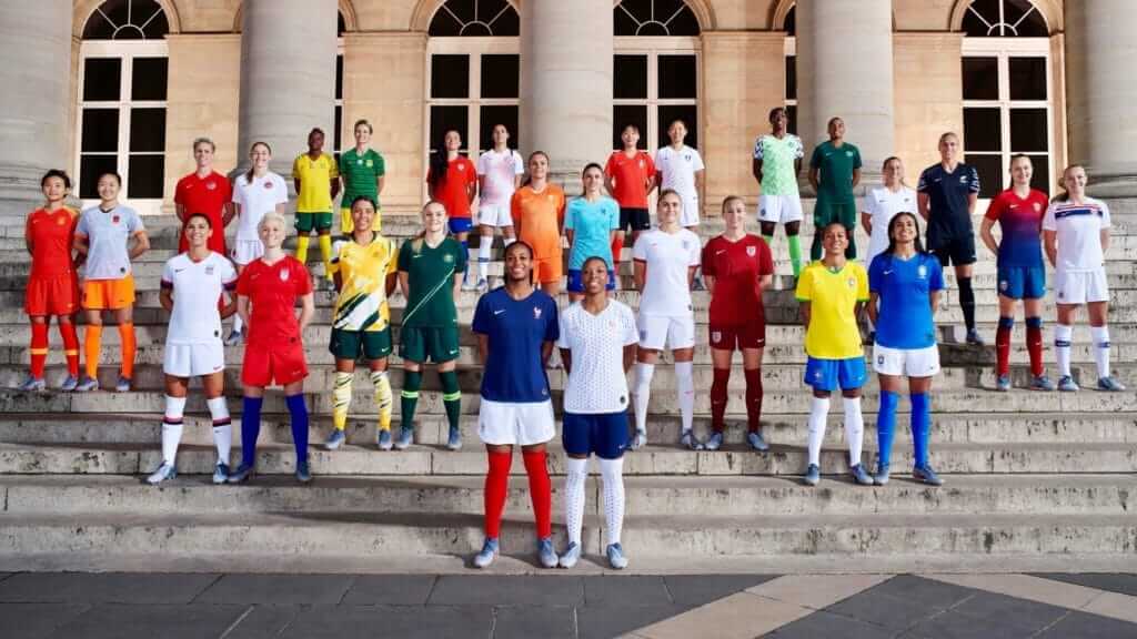
A big kit unveiling for this summer’s Women’s World Cup in France took place yesterday in Paris, as Nike revealed what all 14 of its participating teams will wear at the tournament.
For several of the countries involved, including England and France, yesterday marked the first time they did not simply receive the same kit as the men’s team. (England went a step further by switching to dark red as second choice, moving away from the traditional bright red and the less-traditional dark blue.) Non-Nike women’s teams receiving their own kits for the World Cup include Germany, Scotland, Spain, and Sweden, meaning that about half of the tournament’s 24 teams have at least one kit that is different from those of their male counterparts.
The USWNT have already received their own looks on several occasions, including a gold shirt worn in 2007 and 2008 and a white kit with black and neon accents from the last World Cup. The Americans instead took the exact opposite approach from the other teams, because shortly after the kit launch it was announced that the men’s team would also receive the just-revealed red outfit.
My favorites from yesterday’s unveiling include the white U.S. and England kits, both of which feature sleeve stripes, as well as Australia’s yellow shirt, which as always is in the Uni Watch color scheme.
The U.S. white kit is claimed to be reminiscent of that worn by the 1999 World Cup winners, but I don’t see any similarities except that it’s mono-white. The new kit’s numbers would have to be red, not blue, for it to truly echo the 1999 design.
A few other observations:
• France’s white shirt features hexagonal polka-dots but has gold numbers in the press release photo, which I can’t imagine will be very legible.
• Canada recently switched to Nike from Umbro, but Nike’s first efforts for them are very plain.
• China received a grey and orange second-choice combination, which works surprisingly well.
• It’s important to note that not all of these kits are new. The smaller countries represented, including Chile, New Zealand, South Africa, and South Korea, have already worn both of the kits that were “revealed” yesterday. In addition, Nigeria’s kits may be recognizable from the men’s World Cup last summer. Other participants in the unveiling, including Australia, the Netherlands, and Norway, only received one new kit.
The new kits will generally debut during international friendlies in April.
In other news from yesterday, Nike also became the ball manufacturer for all UEFA women’s competitions, including the Champions League and Euro 2021. Three different companies now make the balls for UEFA competitions, as Adidas and Molten split the men’s side.
Click to enlarge
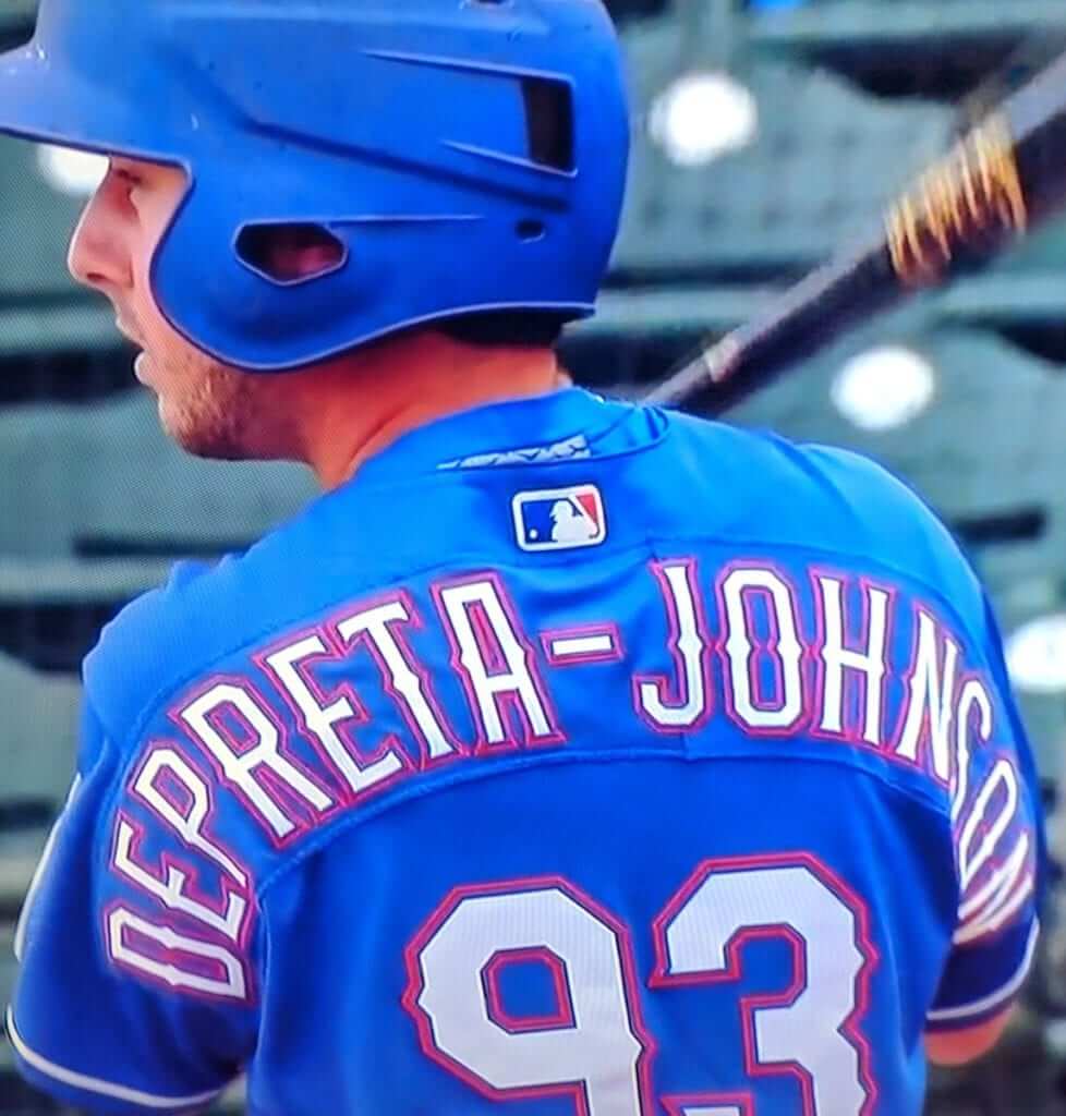
Hyphenation Nation, continued: Lots of people freaked out yesterday when Rangers prospect Tyler Depreta-Johnson — a low-level minor leaguer who’s not on the 40-man roster — got into yesterday’s spring training game against the Royals.
Yes, Depreta-Johnson has a long surname (14 letters plus a hyphen). But his sleeve-to-sleeve NOB looked particularly clunky for three reasons:
1. Depreta-Johnson is a little fella, at least by MLB standards — 5’9″, 180 pounds. So his back isn’t as broad, and his jersey therefore isn’t as wide, as the average ballplayer’s.
2. Because he’s a minor leaguer who was just visiting the major league camp, Depreta-Johnson’s NOB lettering is on a nameplate (instead of being direct-sewn like the big leaguers’ NOBs), which add bonus clunkiness to the equation. And just to make things clunkier still, he appears to have a two-piece nameplate, which is something I don’t think I’ve ever seen before!
3. This can’t be said often enough: The Rangers’ jerseys, with the three-color typography and the ridiculous talons and spikes protruding off of the numerals and letterforms, make just about anyone’s name look clunky — even simple names like “Smith” and “Jones.” Worst jersey typography in the bigs.
Anyway, it could’ve been worse. Remember how Salty looked when he played for the Rangers?
Click to enlarge
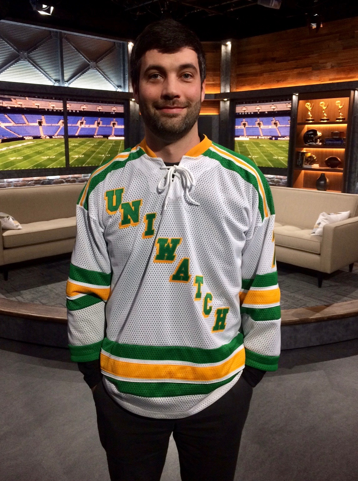
Auction winner: Here’s reader Matt Brevet, wearing the one-of-a-kind Uni Watch hockey jersey, made by the one and only Wafflebored, that we recently auctioned off. Looks great, Matt — enjoy!!
Meanwhile, Wafflebored has made another really special jersey that we’ll be auctioning off soon. I’ll have more to say about that tomorrow — stay tuned.
Click to enlarge
Collector’s Corner
By Brinke Guthrie
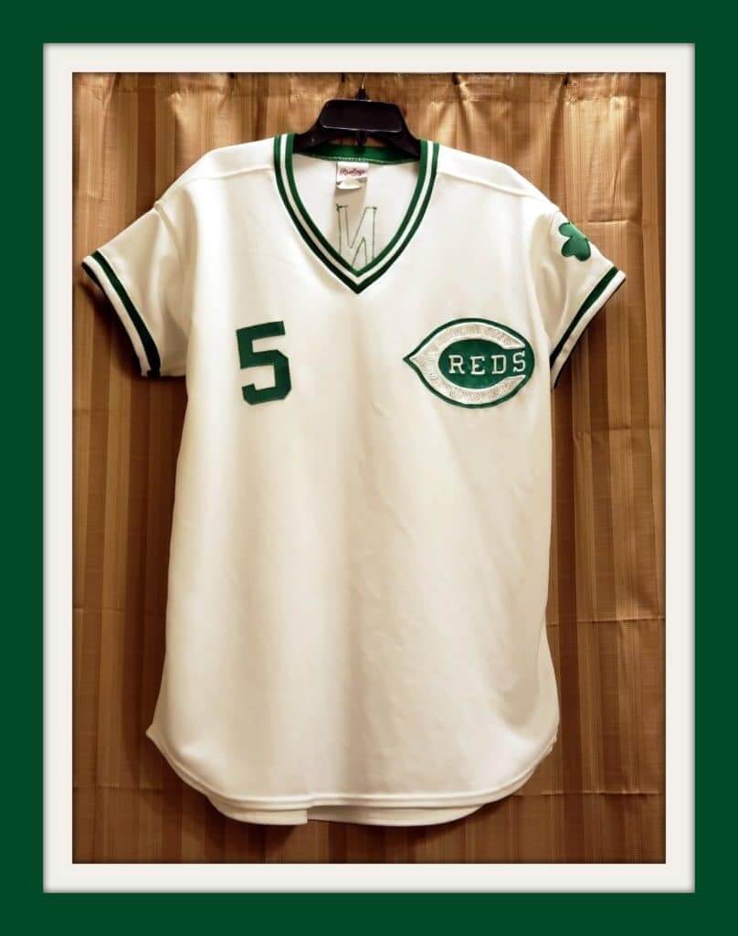
St. Patrick’s Day is coming up this Sunday, so we’ve got one of the jerseys that started the whole St. Paddy’s/MLB thing way back in 1978 — a Cincinnati Reds Johnny Bench jersey, made by Rawlings and trimmed in green with the shamrock on the left sleeve. I sure do remember that chain-stitched C-Reds logo.
The eBay seller says, “It is not game-worn. I bought it years ago, off a guy. You customized it by having the sleeves tailored to make it look game authentic.”
Now on with the show:
• Nellie Fox, aka “Mr. Chewing Tobacco” (!!!), says, “Try my chewing tobacco, it’s the GREATEST.” And here’s a free tobacco sample for ya, still sealed in the package after all these years. (And look at the back of the package — see all those big leaguers who agreed with Nellie!)
• Wowsers, check this one out: a 1970s iHOP NFL standings board (“Helmets on Parade!”) complete with all 26 then-current teams.
• iHOP also used to have thermal cups for both NFL conferences. This one is for the AFC.
• Since blue/orange is my favorite color combo, I really love the look of this 1960s NY Knicks pennant. [Brinke, all this time I’ve known you and I had no idea about this color combo preference. You’re a Mets fan waiting to happen! — PL]
• How about the artwork on this 1960s Tigers/Yankees scorecard.
• Check out this set of four 1960s Cincinnati Royals (predecessor of the Sacramento Kings, kids) mugs!
• I’ve never seen one of the 1970s NFL helmet plaques (in this case for the Rams) referred to as a “licensed decorator plaque” before.
• This 1950s keychain says, “George Mikan wears Pro Keds.”
• One more for Mr. Mikan (aka Mr. Basketball): this 1950s Scott’s Potato Chips basketball card.
• Always liked the shield-format logo shown on this 1960s 49ers foil picnic blanket.
Seen an item on eBay that would be good for Collector’s Corner? Send any submissions here.
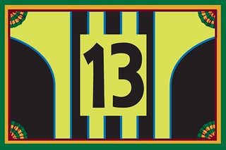
Membership update: A bunch of new designs have been added to the membership card gallery, including Timothy O’Malley’s card, shown at right, which is based on the jerseys that Manchester City wore in 1999 (here’s a stand-alone view of the jersey). An inspired request!
This is the part where I say that ordering a membership card is a good way to support Uni Watch (which, quite frankly, could use your support these days). And remember, a Uni Watch membership card entitles you to a 15% discount on any of the merchandise in our Teespring shop and our Naming Wrongs shop. (If you’re an existing member and would like to have the discount code, email me.) As always, you can sign up for your own custom-designed card here, you can see all the cards we’ve designed so far here, and you can see how we produce the cards here.

Burning question: As you know, I include those little “Click to enlarge” indicators throughout the site for photos that are, you know, enlargeable by clicking. I started doing it years ago because I had previously used photos that fit on the page and were not click-enlargeable. Then I learned how to do the enlarging code and figured I’d better let the readers know that certain photos had this new functionality.
Many years later, should I keep bothering to include the “Click to enlarge” notations? Does it actually provide useful information for you? Do any of you even bother to click on the enlargeable photos to see the larger view? Even if you do click on photos, do you need a note telling you that you can do so, or can you just find out for yourself by clicking and then seeing if anything happens?
(Please don’t ask me to add an icon to enlargeable photos, like a magnifying glass or a full-screen symbol. Too much hassle, sorry.)
Just to clarify: I will definitely keep making photos click-enlargeable when possible. What I’m asking you here is whether I should bother to keep including the little “Click to enlarge” notes. Here, let me know what you think:
[totalpoll id=”108241″]
Thanks!
The Ticker
By Alex Hider

Baseball News: The Phillies are giving away a bobblehead of Chase Utley dressed in the outfit he wore to the team’s 2008 championship parade (from Michael MPH). … This Reds’ spring training photo from about 1972 shows 1B Tony Perez wearing cleats with Adidas stripes — a no-no back then for the famously straitlaced Big Red Machine (from Brice Wallace). … The Aberdeen IronBirds will play as the Steamed Crabs and will wear these caps in July (from Andrew Cosentino). … The Delmarva Shorebirds have Maryland-flag inspired jerseys (from Marcus Hall). … Contained in this Reddit post is a link to an enormous database of NCAA baseball uniform templates. Just about every school you could think of is included (from @ballandmitt). … Lots of striped hosiery action in last night’s Arkansas/Ole Miss softball game. Kevin McLaughlin notes that the Rebels were wearing the old Red Sox stripe pattern design (from Michael Hicks). … Also from Brice, there was a bit of uni-watching in a recent “Baby Blues” comic strip.

Football News: Here’s a look at the football uniforms that New Era is making for the upcoming CFL combine (from Moe Khan). … Bowling Green is holding a bracket to determine the best helmet in school history (from Matthew Daley). … Notre Dame QB Ian Book has a new helmet (from Bryan). … Gotta like the simplicity of the “XU” logo on Xavier’s 1973 helmet (from Jake Holton).

Hockey News: The Maple Leafs wore white at home for last night’s game against the Lightning, prompting a slew of “as it should be” comments from hockey fans (from James Beattie).

NBA News: Reader Scott Novosel’s proposed T-shirt design for the WNBA’s Chicago Sky has moved into the Final Four in the team’s design contest. Voting for the two takes place on Tuesday and Wednesday on the Sky’s Twitter page (from Nick Doffing). … Kendall Jenner is dating Sixers PG Ben Simmons, and she wore a personalized jersey with a “Kenny” shoulder patch to a game the other day (from Michael MPH). … Andre Ingram will wear No. 20 with the Lakers (from Etienne Catalan). … Color-vs.-color games are pretty routine now in the NBA. Still, last night’s Jazz/Thunder game was really colorful (from @bryanwdc).

College Hoops News: Kevin Willmott, a professor at the University of Kansas, recently won an Oscar for co-writing BlacKkKlansman, and the basketball team presented him with a jersey with an Oscar statuette in place of a number (from Matt Renick). … Nebraska presented its seniors with four different framed jersey styles on Senior Day last weekend. Jordan Johnson points out that the two seniors who received the same jersey style are walk-ons. … A restaurant in Starkville, Miss., is celebrating Mississippi State’s SEC championship by toasting an “SEC Champs” logo into their burger buns (from Chicago Gump).

Soccer News: Portuguese club Belenenses has a new crest (from Mike D.). … Slick new uniforms for Forward Madison FC of USL League One (from @NYisBLUE). … Redditor r/FCCPosterGuy is designing game day posters for all of FC Cincinnati’s home games. Here’s his take on the team’s home opener against Portland.

Grab Bag: New league logo for Major League Lacrosse. … Interesting apostrophe placement in this vertical sign in Logan, Utah (from @akaggie). … This Pittsburgh family painted their garage door in the ’80s with all of the city’s championship sports teams (from Jim Vilk). … Thor-themed uniforms for the Aussie football team Western Bulldogs (from James MacNeil and Allen Stephens). … New sport-by-sport pictograms for the 2020 Tokyo Olympics. If you like those, you’ll also like these pictograms from previous Olympics dating back to 1964 (from Jeremy Brahm and Joel Mathwig, repsectively).

Dick Armstrong, 1924–2019: Dick Armstrong, the last remaining person to have worked with Connie Mack and the creator of MLB’s first costumed mascot, who I profiled back in January, died yesterday. He would have turned 95 later this month.
The cause was cancer, which he’d been battling for some time.
Dick was a true gentleman, but he could get cranky about one topic: He was annoyed that Mr. Met is often cited as MLB’s first costumed mascot, when in fact Mr. Oriole, who Dick created, predated Mr. Met by more than a decade. Shortly after my profile of him ran here on Uni Watch, I wrote a short article about the new Mascot Hall of Fame that will run next month in Amtrak’s seat-pocket travel magazine, The National. While reporting that story, I made the Hall aware of Dick and Mr. Oriole, and they agreed to revise their exhibits to set the record straight. Dick seemed very happy about that, and I hope it gave him some comfort in his final days.
Former Cooperstown mayor Jeff Katz was the one who steered me toward Dick. He suggested that I interview him more than a year before I finally got around to doing so. I regret that delay, because it would have been great to have more time getting to know Dick, who was a fascinating character and a perfect example of a life well lived. R.I.P.
Chewing tobacco … that’s a definite ‘70s memory, link.
I looked like that in the Army. Used chewing tobacco (rather than cigarettes) to keep me awake.
Can I talk about Nike’s number font? The Chinese player wearing the gray and orange is wearing number 7, and I’ve only seen the dash through (Does that have a name? Surely one of us knows! It’s Uni Watch!) a handful of times on uniforms. So that’s rare and cool, but then, this dash doesn’t even go through all the way! I…kind of like it! Even though it looks like my version of a cursive capital F at first glance.
7-with-line doesn’t have its own name (in English at least) as far as I know. It is common in continental European countries, though not on uniforms.
The line drawn through the 7 (and the Z if you roll that way) is called a stroke or a bar.
link
Sorry it isn’t a more exotic name.
When I took university math, our professors insisted on strokes in all 7s and Zs and 0s. Too many 7s and 1s and Zs and 2s and Os and 0s floating around.
New Era’s first CFL Combine outfits have been in use already. Western Regional Combine happening in Edmonton right now ahead of the National Combine.
He is how New Era’s first effort looks in action:
link
link
Really enjoyed a lot of the kits that came out yesterday for the WWC. Nice to see the ladies take center stage for a change.
Just read on Twitter the men’s fit of the Aussie jersey is already sold out. They must love that design scheme down under.
I like these US kits better than recent kits over the last couple of years though I wish they used navy as a main change color instead of red.
I like U.S. in navy better than U.S. in red as well. Our national teams in most sports (except field hockey) much prefer blue, so red is a little weird when it appears.
“Please don’t ask me to add an icon to enlargeable photos, like a magnifying glass or a full-screen symbol. Too much hassle, sorry”
But what if it was THE Uni-Watch magnifying glass logo?!?!
On the ‘City of Champions” garage door, what’s the “h” on the far right stand for?
The first thing that came to mind was the Pittsburgh Hornets (AHL hockey team), but that doesn’t make much sense, because they folded in 1967, and although they wore black and gold for 3 years in the 50s, their colors were red & white for most of their existence. Could possibly be a local high school, or maybe the family’s last name started with H, and they wanted something to fill the last panel.
The picture was on Twitter yesterday and if you read in the comments it really was an N. A very bad N but it was for their local high school Norwin.
Ah, mystery solved! The color of the “n” came across more black than blue to me, but I still don’t think I would have made the connection with Norwin, because I was also thinking it was an “h”. If you happen to revisit this comment, maybe you can help me out. I was thinking of looking for clues in the comments, but following the link in the ticker shows the picture without any comments. I’m rather Twitter-challenged, is there a way to follow that link back to its native environment in Twitter where I can see comments, or was it just a coincidence that you saw it on Twitter too?
I know Uni Watch isn’t about the fan retail merchandising experience, but the 2019 USWNT uniforms are excellent, especially compared with the dreck the national teams have worn the last few years. And I’m a much more passionate fan of the women’s team. Yet Nike continues to make women’s-sized versions of the men’s team jerseys available at retail but not men’s-sized versions of the women’s team jerseys. I want a jersey with three stars and Morgan or Rapinoe on the back!
From link: “it wasn’t until 2015 that Nike began making women’s soccer jerseys in men’s sizes so that more male fans could buy them.”
They’ve announced that there will be mens sizing for USWNT jerseys this year. I prefer the mens cut and want those 3 stars above the crest!
Proofreading:
In the soccer ticker, I’m pretty sure that should read “all of FC Cincinnati’s HOME games”
Thanks. Fixed.
I thought it might be some sort of new exciting promotion.
At first glance, that Leafs-Lightning game looks like an intrasquad scrimmage. But, yeah, white at home is how it should be.
Yea my first thought was “of all the teams to play against to switch up the uniform seasonal trend, this is probably the most confusing 2-team combination possible”. I get confused as to who’s who every so often already when these 2 teams play each other and they’re wearing the ‘normal’ dark-home/white-road combos.
When the Lightning made the switch to blue and white, they should have considered going with shoulder yokes. Blue shoulder yokes on white jerseys. White yokes on the blue jerseys. Would have differentiated more from the Leafs from a distance, have been a nod to the original Lightning uniforms that had the yokes, and would have looked nice.
The mere fact that special uniforms exist for the CFL Combine, and that they’re plugged with a slick, professionally-produced Twitter video tells me that maybe the uni-world has jumped the shark.
The mere fact that you used the term “jumped the shark”…
I’ll let someone else finish the sentence. ;)
As best I can tell, Nike either had a photo shoot for the handful of pictures linked to above (including the action shots of French, Canadian, & Chinese players), or they took existing game photos and ‘shopped the players into the new kits and added some spectacular Nike advertising in the backgrounds. Right? In the picture of the Chinese player, they’ve even gone so far as to sneak a couple of swooshes on the player in red & black (one on the shirt, one on the right shoe), which bothers me a little bit because, based on how her arm appears over the Chinese player’s arm, it seems she was added after the fact, so it’s almost like they took their swooshifying of everything just a teensy bit farther than they really needed to. Except with the ad boards behind the Canadian players in all three images there, strangely enough…
white home uniforms are possibly the most bland sight in all of sports . all home uniforms for every sort should be colorful. make the visitors wrap themselves in pale, white, boring disappointment.
Hi folks. I have 12 pairs of stirrups that I’m ready to part with. I haven’t been on the uni-watch boards for a couple years, so I’m a bit out of the loop. Is there a place where it would be ok for me to post items for sale? I don’t want to break any rules, it’s just that all of you are the exact target audience! I’m not trying to make a bunch of money, just need to clear out my closet a bit.
If there is a good place to post this or if anyone would like more information, let me know. Thanks!
I voted yes only because I view this site on my phone. Whenever I try to view it on my laptop, there are constant ads and popups which always interferes with the links and photos.
Mr. Depreta-Johnson’s crasy-looking shoulders aside, those Rangers jerseys would look so much better if they were NNOB. Check out this beautiful jersey from Jackie Robinson day, when every team is NNOB.
The number font is the same one that most major league teams use, only with little spikes at certain spots. It gives the numbers a distinctive appearance but when you stick them on the NOB letters it looks ridiculous.
The NOBs clutter the jerseys up but the three layers and font spikes look fine if there are no names.
I generally prefer white at home in the NHL, but I’m biased toward the red-sleeved white jerseys the Red Wings have had since 1956, which gives them a visually interesting look compared to their more monotone red jerseys (and white sleeves on the red jersey just wouldn’t look right).
FYI: The Bell Centre had the TED 7 memorials up in the corners tonight. The Canadiens were one of the nine teams that didn’t play a home game during the March 7-10 period during which the memorials were scheduled to be up. None of the other teams in that category that have played home games the last two nights (Toronto, Philadelphia, and Minnesota on Monday, and Buffalo, St. Louis, and Winnipeg tonight) have had the memorial up.
It’s possible the Habs had the memorial up because they were hosting the Red Wings. Detroit does visit St. Louis, Buffalo, and Vegas (who won’t have another home game until St. Patrick’s Day) later this month, though I’d be surprised if these teams roll out the tribute then.
The memorial in Montreal can be viewed in the NHL.com highlight video: link
The Australian World Cup shirt brings back memories of the late 80’s-early 90’s men’s “spew” shirt:
link